This website is now archived. To find out what BERG did next, go to www.bergcloud.com.

Search results for 'eat me'

SVK feature in Judge Dredd Megazine June 2011

As we get closer to shipping SVK, there’s a bit more appearing about it.

Matt ‘D’Israeli’ Brooker, our incredible artist and co-creator is interviewed in the pages of the Judge Dredd Megazine this month.

Alongside insights from the man himself about working with Warren, the technology and techniques he employed to illustrate SVK – there’s a bit of a scoop…

…in that there’s a sneak peak of his awesome cover art for SVK

SVK in Judge Dredd Megazine

Creating a warm welcome

I’ve been thinking about new employee orientation lately. We’ve had four new people join BERG since the start of 2011 and we’re about to add two more, so there’s been a lot of orientating going on here.

When I worked at a company with more than 600 employees and was directly responsible for hiring and training a team of 10 employees, we had a very in-depth orientation programme that lasted for weeks and had been continually refined over a couple of decades.

New employee orientation for a small, relatively new company like BERG is obviously a very different thing. For one thing, since we’re so much smaller, it takes a lot less time to learn about the organisation and the people in it. That doesn’t mean, of course, that it’s any less important to have some sort of induction process.

Early in 2010, shortly after I started working at BERG, Matt Webb – being the wise and good company manager that he is – had me start compiling a checklist of all the things we needed to make sure happened when a new person joined us. At the time it was mostly geared toward short-term contractors since that’s mostly who were joining us in the spring and summer of 2010. Since then the list has grown and evolved and its focus has turned toward full contract employees. It seems like every time a new person comes on we think of two or three more things that need to be added to the list. The checklist is divided into four categories:

  1. Things the new employee needs to be provided with (keys, an email address, computer kit, access to the network server)
  2. Things the new employee needs to provide us with (biog and headshot for the website, details to get on payroll)
  3. Things the new employee needs to know (who everyone else is and what they do, general company policies, how to request holiday, location of the first aid kit)
  4. Admin that needs to happen (add their details to various spreadsheets, get them on payroll, add them to the blog rota)

I’ve been wondering if there’s anything else that we’re missing – other things we should be doing to ease new people into the BERG culture besides having a checklist. I had a quick browse around the internet which wasn’t particularly helpful – most of what I found was either blindingly obvious or not especially relevant for very small companies like BERG. I did stumble across a couple of things, though, that seemed relevant for companies of any size and worth sharing.

The first was from William H Truesdell who, in 1998, wrote on The Management Advantage Inc’s website:

Explain your organisation’s mission and its philosophy of doing business.

  • “The way we do things around here…”
  • “We believe that our customers are…”
  • “Nothing is more important than…”

Those would be good things for a company to think about and have an answer to even if they aren’t doing it for the sake of new employee organisation. It seems to me that last one in particular – “Nothing is more important than…” could give a lot of great insight in the space of just one sentence to a new person joining the organisation.

The second thing was from Alan Chapman on businessballs.com. Chapman has quite a lot of material there about new employee orientation and training which emphasises ‘whole-person’ development, and he suggests saying something along these lines to a new employee:

“You’ve obviously been recruited as a (job title), but we recognise right from the start that you’ll probably have lots of other talents, skills, experiences (life and work), strengths, personal aims and wishes, that your job role might not necessarily enable you to use and pursue. So please give some thought to your own special skills and unique potential that you’d like to develop (outside of your job function), and if there’s a way for us to help with this, especially if we see that there’ll be benefits for the organisation too (which there often are), then we’ll try to do so…”

A little later he says,

So much of conventional induction training necessarily involves ‘putting in’ to people (knowledge, policies, standards, skills, etc); so if the employer can spend a little time ‘drawing out’ of people (aims, wishes, unique personal potential, etc) – even if it’s just to set the scene for ‘whole person development’ in the future – this will be a big breath of fresh air for most new starters.

Based on my experience, I think he’s probably right.

That’s a little bit of BERG’s still very new and very evolving New Employee Orientation story. If your company does anything interesting or creative for new employees that you’ve found to be helpful, fun, innovative, etc, we’d love to hear about it!

Welcome Phil Gyford

He’s already received his shop coat and has teamed up with Alice to form BERG’s crack cryptic crossword team, so after a good 4 months of working with us it’s high time I gave our newest team member, Phil Gyford, a proper welcome post!

Phil has been an extraordinary presence in the UK web industry ever since I first got to know him back in the late 90s, and I’ve admired his work throughout the intervening time. He’s not only a first class Creative Technologist, having designed and implemented many beautiful, innovative websites, he’s also been an actor, model maker, illustrator and futurist. This diversity is rare to find in somebody who is also capable of focus and execution. His own website gyford.com is testament to his vast back catalogue.

For me one of the most valuable things Phil brings into the team is an incredible attention to detail. You only have to look at his recent work on our Github account to see that in full effect. When creating the relatively straight forward Little Printer Miniseries engine in PHP Phil’s written over 3000 words of documentation and examples as well as fully commented code. This is great in and of itself, but the fact that it immediately opened up Little Printer to people who’d previously considered it out of their reach proves how powerful great documentation can be.

As BERG Cloud grows in terms of capability and features, demonstrating and communicating these becomes ever more important and Phil’s going to be key in making that happen.

Connbox: prototyping a physical product for video presence with Google Creative Lab, 2011

At the beginning of 2011 we started a wide-ranging conversation with Google Creative Lab, discussing near-future experiences of Google and its products.

We’ve already discussed our collaboration on “Lamps”, the conceptual R&D around computer vision in a separate post.

They had already in mind another brief before approaching us, to create a physical product encapsulating Google voice/video chat services.

This brief became known as ‘Connection Box’ or ‘Connbox’ for short…

BERG-Chaco-Connbox-20110714-003

For six months through the spring and summer of 2011, a multidisciplinary team at BERG developed the brief based on research, strategic thinking, hardware and software prototyping into believable technical and experiential proof of a product that could be taken to market.

It’s a very different set of outcomes from Lamps, and a different approach – although still rooted in material exploration, it’s much more centred around rapid product prototyping to really understand what the experience of physical device, service and interface could be.

As with our Lamps post, I’ve broken up this long report of what was a very involving project for the entire studio.


The Connbox backstory


The videophone has an unusually long cultural legacy.

It has been a very common feature of science fiction all the way back to the 1920s. As part of our ‘warm-up’ for the project, Joe put together a super-cut of all of the instances he could recollect from film and tv…

Videophones in film from BERG on Vimeo.

The video call is still often talked about as the next big thing in mobile phones (Apple used FaceTime as a central part of their iphone marketing, while Microsoft bought Skype to bolster their tablet and phone strategy). But somehow video calling has been stuck in the ‘trough of disillusionment’ for decades. Furthermore, the videophone as a standalone product that we might buy in a shop has never become a commercial reality.

On the other hand, we can say that video calls have recently become common, but in a very specific context. That is, people talking to laptops – constrained by the world as seen from webcam and a laptop screen.

13 September, 18.57

This kind of video calling has become synonymous with pre-arranged meetings, or pre-arranged high-bandwidth calls. It is very rarely about a quick question or hello, or a spontaneous connection, or an always-on presence between two spaces.

Unpacking the brief

The team at Google Creative Lab framed a high-level prototyping brief for us.

The company has a deep-seated interest in video-based communication, and of course, during the project both Google Hangouts and Google Plus were launched.

The brief placed a strong emphasis on working prototypes and live end-to-end demos. They wanted to, in the parlance of Google, “dogfood” the devices, to see how they felt in everyday use themselves.

I asked Jack to recall his reaction to the brief:

The domain of video conferencing products is staid and unfashionable.

Although video phones have lived large in the public imagination, no company has made a hardware product stick in the way that audio devices have. There’s something weirdly broken about taking behaviours associated with a phone: synchronous talking, ringing or alerts when one person wants another’s attention, hanging up and picking up etc.

Given the glamour and appetite for the idea, I felt that somewhere between presence and video a device type could emerge which supported a more successful and appealing set of behaviours appropriate to the form.

The real value in the work was likely to emerge in what vehicle designers call the ‘third read’. The idea of product having a ‘first, second and third read’ comes up a lot in the studio. We’ve inherited it by osmosis from product designer friends, but an excerpt from the best summation of it we can find on the web follows:

The concept of First, Second, Third Read which comes from the BMW Group automotive heritage in terms of understanding Proportion, Surface, and Detail.

The First Read is about the gesture and character of the product. It is the first impression.

Looking closer, there is the Second Read in which surface detail and specific touchpoints of interaction with the product confirm impressions and set up expectations.

The Third Read is about living with the product over time—using it and having it meet expectations…

So we’re not beginning with how the product looks or where it fits in a retail landscape, but designing from the inside out.

We start by understanding presence through devices and what video can offer, build out the behaviours, and then identify forms and hardware which support that.

To test and iterate this detail we needed to make everything, so that we can live with and see the behaviours happen in the world.

connbox for blogging.016

Material Exploration


We use the term ‘material exploration’ to describe our early experimental work. This is an in-depth exploration of the subject by exploring the properties, both inate and emergent of the materials at hand. We’ve talked about it previously here and here.

What are the materials that make up video? They are more traditional components and aspects of film such as lenses, screens, projectors, field-of-view as well as newer opportunities in the domains of facial recognition and computer vision.

Some of our early experiments looked at field-of-view – how could we start to understand where an always-on camera could see into our personal environment?

We also challenged the prevalent forms of video communication – which generally are optimised for tight shots of people’s faces. What if we used panoramic lenses and projection to represent places and spaces instead?

chaco_Connbox_2012-03-10_TDA.010

chaco_Connbox_2012-03-10_TDA.009

In the course of these experiments we used a piece of OpenFrameworks code developed by Golan Levin. Thanks Golan!

We also experimented with the visual, graphic representation of yourself and other people, we are used to the ‘picture in picture’ mode of video conferencing, where we see the other party, but have an image of ourselves superimposed in a small window.

We experimented with breaking out the representation of yourself into a separate screen, so you could play with your own image, and position the camera for optimal or alternative viewpoints, or to actually look ‘through’ the camera to maintain eye contact, while still being able to look at the other person.

Connbox-lens-projection-tests-00001

One of the main advantages of this – aside from obviously being able to direct a camera at things of interest to the other party – was to remove the awkwardness of the picture-in-picture approach to showing yourself superimposed on the stream of the person you are communicating with…

There were interaction & product design challenges in making a simpler, self-contained video chat appliance, amplified by the problem of taking the things we take for granted on the desktop or touchscreen: things like the standard UI, windowing, inputs and outputs, that all had to be re-imagined as physical controls.

This is not a simple translation between a software and hardware behaviour, it’s more than just turning software controls into physical switches or levers.

It involves choosing what to discard, what to keep and what to emphasise.

Should the product allow ‘ringing’ or ‘knocking’ to kickstart a conversation, or should it rely on other audio or visual cues? How do we encourage always-on, ambient, background presence with the possibility of spontaneous conversations and ad-hoc, playful exchanges? Existing ‘video calling’ UI is not set up to encourage this, so what is the new model of the interaction?

To do this we explored in abstract some of the product behaviours around communicating through video and audio.

We began working with Durrell Bishop from LuckyBite at this stage, and he developed scenarios drawn as simple cartoons which became very influential starting points for the prototyping projects.

The cartoons feature two prospective users of an always-on video communication product – Bill and Ann…

Durrell_firstsketches1

This single panel from a larger scenario shows the moment Bill opens up a connection (effectively ‘going online’) and Ann sees this change reflected as a blind going up on Bill’s side of her Connbox.

Prototyping


Our early sketches on both whiteboards and in these explorations then informed our prototyping efforts – firstly around the technical challenges of making a standalone product around google voice/video, and the second more focussed on the experiential challenges of making a simple, pleasurable domestic video chat device.

prototype_sketches

For reasons that might become obvious, the technical exploration became nicknamed “Polar Bear” and the experimental prototype “Domino”.

Prototype 1: A proof of technology called ‘Polar Bear’

In parallel with the work to understand behaviours we also began exploring end-to-end technical proofs.

We needed to see if it was possible to make a technically feasible video-chat product with components that could be believable for mass-production, and also used open-standard software.

Aside from this, it provided us with something to ‘live with’, to understand the experience of having an always-on video chat appliance in a shared social space (our studio)

chaco_Connbox_2012-03-10_TDA.013

chaco_Connbox_2012-03-10_TDA.014

Andy and Nick worked closely with Tom and Durrell from Luckybite on housing the end-to-end proof in a robust accessible case.

It looked like a polar bear to us, and the name stuck…

chaco_Connbox_2012-03-10_TDA.016

chaco_Connbox_2012-03-10_TDA.017

The software stack was designed to create something that worked as an appliance once paired with another, that would fire up a video connection with its counterpart device over wireless internet from being switched on, with no need for any other interface than switching it on at the plug.

chaco_Connbox_2012-03-10_TDA.015

We worked with Collabora to implement the stack on Pandaboards: small form-factor development boards.

chaco_Connbox_2012-03-10_TDA.018

Living with Polar Bear was intriguing – sound became less important than visual cues.

It reminded us all of Matt Webb’s “Glancing” project back in 2003:

Every so often, you look up and look around you, sometimes to rest your eyes, and other times to check people are still there. Sometimes you catch an eye, sometimes not. Sometimes it triggers a conversation. But it bonds you into a group experience, without speaking.

Prototype 2: A product and experience prototype called “Domino”


We needed to come up with new kinds of behaviours for an always on, domestic device.

This was the biggest challenge by far, inventing ways in which people might be comfortable opening up their spaces to each other, and on top of that, to create a space in which meaningful interaction or conversation might occur.

To create that comfort we wanted to make the state of the connection as evident as possible, and the controls over how you appear to others simple and direct.

The studio’s preoccupations with making “beautiful seams” suffused this stage of the work – our quest to create playful, direct and legible interfaces to technology, rather than ‘seamless’ systems that cannot be read or mastered.

In workshops with Luckybite, the team sketched out an approach where the state of the system corresponds directly to the physicality of the device.

Durrell_firstsketches2

The remote space that you are connecting with is represented on one screen housed in a block, and the screen that shows your space is represented on another. To connect the spaces, the blocks are pushed together, and pulled-apart to disconnect.

Durrell outlined a promising approach to the behaviour of the product in a number of very quick sketches during one of our workshops:

DB_sketches_large

Denise further developed the interaction design principles in a detailed “rulespace” document, which we used to develop video prototypes of the various experiences. This strand of the project acquired the nickname ‘Domino’ – these early representations of two screens stacked vertically resembling the game’s pieces.

chaco_Connbox_2012-03-10_TDA.026

As the team started to design at a greater level of detail, they started to see the issues involved in this single interaction: Should this action interrupt Ann in her everyday routine? Should there be a sound? Is a visual change enough to attract Ann’s attention?

The work started to reveal more playful uses of the video connection, particularly being able to use ‘stills’ to communicate about status. The UI also imagines use of video filters to change the way that you are represented, going all the way towards abstracting the video image altogether, becoming visualisations of audio or movement, or just pixellated blobs of colour. Other key features such as a ‘do not disturb blind’ that could be pulled down onscreen through a physical gesture emerged, and the ability to ‘peek’ through it to let the other side know about our intention to communicate.

Product/ID development


With Luckybite, we started working on turning it into something that would bridge the gap between experience prototype and product.

BERG-Domino-20120221-006

The product design seeks to make all of the interactions evident with minimum styling – but with flashes of Google’s signature colour-scheme.

BERG-Domino-20120221-005

The detachable camera, with a microphone that can be muted with a sliding switch, can be connected to a separate stand.

BERG-Domino-20120221-012

This allows it to be re-positioned and pointed at other views or objects.

BERG-Domino-20120221-020

This is a link back to our early ‘material explorations’ that showed it was valuable to be able to play with the camera direction and position.

Prototype 3: Testing the experience and the UI


Final technical prototypes in this phase make a bridge between the product design and experience thinking and the technical explorations.

This manifested in early prototypes using Android handsets connected to servers.

BERG-Connbox-20111021-002

BERG-Connbox-20111021-001

chaco_Connbox_2012-03-10_TDA.032

chaco_Connbox_2012-03-10_TDA.033

Connbox: Project film


Durrell Bishop narrates some of the prototype designs that he and the team worked through in the Connbox project.

The importance of legible products


The Connbox design project had a strong thread running though it of making interfaces as evident and simple as possible, even when trying to convey abstract notions of service and network connectivity.

I asked Jack to comment on the importance of ‘legibility’ in products:

Connbox exists in a modern tradition of legible products, which sees the influence of Durrell Bishop. The best example I’ve come across that speaks to this thinking is Durrell’s answering machine he designed.

When messages are left on the answering machine they’re represented as marbles which gather in a tray. People play the messages by placing them in a small dip and when they’ve finished they replace them in the machine.

Screen Shot 2013-02-25 at 16.36.07

If messages are for someone else in the household they’re left in that persons bowl for later. When you look at the machine the system is clear and presented through it’s physical form. The whole state of the system is evident on the surface, as the form of the product.

Making technology seamless and invisible hides the control and state of the system – this path of thinking and design tries to place as much control as possible in the hands of the end-user by making interfaces evident.

In the prototype UI design, Joe created some lovely details of interaction fusing Denise’s service design sketches and the physical product design.

For instance, I love this detail where using the physical ‘still’ button, causes a digital UI element to ‘roll’ out from the finger-press…

Legible-interaction2

A very satisfying dial for selecting video effects/filters…

Legible-interaction3

And here, where a physical sliding tab on top of the device creates the connection between two spaces

Legible-interaction1

This feels like a rich direction to explore in future projects, of a kind of ‘reverse-skeuomorphism‘ where digital and physical affordances work together to do what each does best rather than just one imitating the other.

Conclusion: What might have been next?


At the end of this prototyping phase, the project was put on hiatus, but a number of directions seemed promising to us and Google Creative Lab.

Broadly speaking, the work was pointing towards new kinds of devices, not designed for our pockets but for our homes. Further explorations would have to be around the rituals and experience of use in a domestic setting.

Special attention would have to be given to the experience of set-up, particularly pairing or connecting the devices. Would this be done as a gift, easily configured and left perhaps for a relative who didn’t have a smartphone or computer? How could that be done in an intuitive manner that emphasised the gift, but left the receiver confident that they could not break the connection or the product? Could it work with a cellular radio connection, in places where there no wireless broadband is found?

connbox for blogging.027

What cues could the physical product design give to both functionality and context? What might the correct ‘product language’ be for such a device, or family of devices for them to be accepted into the home and not seen as intrusive technology.

G+ and Hangouts launched toward the end of the project, so unfortunately there wasn’t time in the project to accommodate these interesting new products.

connbox for blogging.029

However we did start to talk about ways to physicalize G+’s “Circles” feature, which emphasises small groups and presence – it seemed like a great fit with what we had already looked at. How might we create a product that connects you to an ‘inner circle’ of contacts and the spaces they were in?

Postscript: Then and Now – how technology has moved on, and where we’d start now


Since we started the Connbox project in the Spring of 2011, one could argue that we’ve seen a full cycle of Moore’s law improve the capabilities of available hardware, and certainly both industry and open-source efforts in the domain of video codecs and software have advanced significantly.

Making Connbox now would be a very different endeavour.

Here Nick comments on the current state-of-the-art and what would be our starting points were we (or someone else) to re-start the project today…

Since we wrapped up this project in 2011, there’s been one very conspicuous development in the arena of video chat, and that is the rise of WebRTC. WebRTC is a draft web standard from W3C to enable browser to browser video chat without needing plugins.

As of early 2013, Google and Mozilla have demonstrated this system working in their nightly desktop browser builds, and recorded the first cross-browser video call. Ericsson are one of the first groups to have a mobile implementation available for Android and iOS in the form of their “Bowser” browser application.

WebRTC itself is very much an evolution of earlier work. The brainchild of Google Hangout engineers, this single standard is implemented using a number of separate components. The video and audio technology comes from Google in the form of the VP8 and iLBC codecs. The transport layer has incorporated libjingle which we also relied upon for our Polar Bear prototype, as part of the Farsight 2 stack.

Google is currently working on enabling WebRTC functionality in Chrome for Android, and once this is complete, it will provide the ideal software platform to explore and prototype Connbox ideas. What’s more, it actually provides a system which would be the basis of taking a successful prototype into full production.

Notable precedents


While not exhaustive, here are some projects, products, research and thinking we referenced during the work…


Thanks

Massive thanks to Tom Uglow, Sara Rowghani, Chris Lauritzen, Ben Malbon, Chris Wiggins, Robert Wong, Andy Berndt and all those we worked with at Google Creative Lab for their collaboration and support throughout the project.

Thanks to all we worked with at Collabora and Future Platforms on prototyping the technology.

Big thanks to Oran O’Reilly who worked on the films with Timo and Jack.

Lamps: a design research collaboration with Google Creative Labs, 2011

Preface

This is a blog post about a large design research project we completed in 2011 in close partnership with Google Creative Lab.

There wasn’t an opportunity for publication at the time, but it represented a large proportion of the studio’s efforts for that period – nearly everyone in the studio was involved at some point – so we’ve decided to document the work and its context here a year on.

I’m still really proud of it, and some of the end results the team produced are both thought-provoking and gorgeous.

We’ve been wanting to share it for a while.

It’s a long post covering a lot of different ideas, influences, side-projects and outputs, so I’ve broken it up into chapters… but I recommend you begin at the beginning…


Introduction


At the beginning of 2011 we started a wide-ranging conversation with Google Creative Lab, around near-future experiences of Google and its products.

Tom Uglow, Ben Malbon of Google Creative Lab with Matt Jones of BERG

During our discussions with them, a strong theme emerged. We were both curious about how it would feel to have Google in the world with us, rather than on a screen.

If Google wasn’t trapped behind glass, what would it do?

What would it behave like?

How would we react to it?

Supergirl, trapped behind glass

This traces back to our studio’s long preoccupation with embodied interaction. Also, our explorations of the technologies of computer vision and projection that we’ve talked about previously under the banner of the “Robot-Readable World”.

Our project through the spring and summer of 2011 concentrated on making evidence around this – investigating computer vision and projection as ‘material’ for designing with, in partnership with Google Creative Lab.

Material Exploration


We find that treating ‘immaterial’ new technologies as if they were physical materials is useful in finding rules-of-thumb and exploring opportunities in their “grain”. We try as a studio to pursue this approach as much as someone trying to craft something from wood, stone, or metal.

Jack Schulze of BERG and Chris Lauritzen, then of Google Creative Lab

We looked at computer-vision and projection in a close relationship – almost as one ‘material’.

That material being a bound-together expression of the computer’s understanding of the world around it and its agency or influence in that environment.

Influences and starting points


One of the very early departure points for our thinking was a quote by (then-)Google’s Marissa Meyer at the Le Web conference in late 2010: “We’re trying to build a virtual mirror of the world at all times”

This quote struck a particular chord for me, reminding me greatly of the central premise of David Gelernter‘s 1991 book “Mirror Worlds“.

I read “Mirror Worlds” while I was in architecture school in the 90s. Gelernter’s vision of shared social simulations based on real-world sensors, information feeds and software bots still seems incredibly prescient 20 years later.

Gelernter saw the power to simply build sophisticated, shared models of reality that all could see, use and improve as a potentially revolutionary technology.

What if Google’s mirror world were something out in the real world with us, that we could see, touch and play with together?

Seymour Papert – another incredibly influential computer science and education academic – also came to our minds. Not only did he maintain similar views about the importance of sharing and constructing our own models of reality, but was also a pioneer of computer vision. in 1966 he sent the ‘Summer Vision Memo“Spend the summer linking a camera to a computer, and getting the computer to describe what it saw…”


Nearly fifty years on, we have Kinects in our houses, internet-connected face-tracking cameras in our pockets and ‘getting the computer to describe (or at least react to) what it saw seems to be one of the most successful component tracks of the long quest for ‘artificial intelligence’.

Our thinking and discussion continued this line toward the cheapness and ubiquity of computer vision.

The $700 Lightbulb


Early on, Jack invoked the metaphor of a “$700 lightbulb”:

Lightbulbs and electric light went from a scientific curiosity to a cheap, accessible ubiquity in the late 19th and early 20th century.

What if lightbulbs were still $700?

We’d carry one around carefully in a case and screw it in when/where we needed light. They are not, so we leave them screwed in wherever we want, and just flip the switch when we need light. Connected computers with eyes cost $500, and so we carry them around in our pockets.

But – what if we had lots of cheap computer vision, processing, connectivity and display all around our environments – like light bulbs?

Ubiquitous Computing has of course been a long held vision in academia, which in some ways has been derailed by the popularity of the smartphone

But smartphones are getting cheaper, Android is embedding itself in new contexts, with other I/Os than a touchscreen, and increasingly we keep our data in the cloud rather than in dedicated devices at the edge.

Ubiquitous computing has been seen by many as in the past as a future of cheap, plentiful ‘throw-away’ I/O clients to the cloud.

It seems like we’re nearly there.

In 2003, I remember being captivated by Neil Gershenfeld’s vision of computing that you could ‘paint’ onto any surface:

“a paintable computer, a viscous medium with tiny silicon fragments that makes a pour-out computer, and if it’s not fast enough or doesn’t store enough, you put another few pounds or paint out another few square inches of computing.”

Professor Neil Gershenfeld of MIT

Updating this to the present-day, post web2.0 world – where if ‘it’s not fast enough or doesn’t store enough’ we request more resources from centralised, elastic compute-clouds.

“Clouds” that can see our context, our environment through sensors and computer vision, and have a picture of us built up through our continued interactions with it to deliver appropriate information on-demand.

To this we added speculation that not only computer-vision would be cheap and ubiquitous, but excellent quality projection would become as cheap and widespread as touch screens in the near-future.

This would mean that the cloud could act in the world with us, come out from behind the glass and relate what it sees to what we see.

In summary: computer vision, depth-sensing and projection can be combined as materials – so how can we use them to make Google services bubble through from the Mirror World into your lap?

How would that feel? How should it feel?

This is the question we took as our platform for design exploration.

“Lamps that see”


One of our first departure points was to fuse computer-vision and projection into one device – a lamp that saw.

Here’s a really early sketch of mine where we see a number of domestic lamps, that saw and understood their context, projecting and illuminating the surfaces around them with information and media in response.

We imagined that the type of lamp would inform the lamp’s behaviour – more static table lamps might be less curious or more introverted than a angle-poise for instance.

Jack took the idea of the angle-poise lamp on, thinking about how servo-motors might allow the lamp to move around within the degrees of freedom its arm gives it on a desk to inquire about its context with computer vision, track objects and people, and surfaces that it can ‘speak’ onto with projected light.

Early sketches of “A lamp that sees” by Jack Schulze

Early sketches of “A lamp that sees” by Timo Arnall

Of course, in the back of our minds was the awesome potential for injecting character and playfulness into the angle-poise as an object – familiar to all from the iconic Pixar animation Luxo Jr.


And very recently, students from the University of Wellington in New Zealand created something very similar at first glance, although the projection aspect is missing here.

Alongside these sketching activities around proposed form and behaviour we started to pursue material exploration.

Sketching in Video, Code & Hardware


We’d been keenly following work by friends such as James George and Greg Borenstein in the space of projection and computer vision, and a number of projects in the domain emerged during the course of the project, but we wanted to understand it as ‘a material to design with’ from first principles.

Timo, Jack, Joe and Nick – with Chris Lauritzen (then of Google Creative Lab), and Elliot Woods of Kimchi & Chips, started a series of tests to investigate both the interactive and aesthetic qualities of the combination of projection and computervision – which we started to call “Smart Light” internally.

First of all, the team looked at the different qualities of projected light on materials, and in the world.

This took the form or a series of very quick experiments, looking for different ways in which light could act in inhabited spaces, on surfaces, interact with people and things.

In a lot of these ‘video sketches’ there was little technology beyond the projector and photoshop being used – but it enabled us to imagine what a computer-vision directed ‘smart light’ might behave like, look like and feel like at human scale very quickly.

Here are a few example video sketches from that phase of the work:

Sketch 04 Sticky search from BERG on Vimeo.

Sketch 06: Interfaces on things from BERG on Vimeo.

One particularly compelling video sketch projected an image of a piece of media (in this case a copy of Wired magazine) back onto the media – the interaction and interference of one with the other is spellbinding at close-quarters, and we thought it could be used to great effect to direct the eye as part of an interaction.

Sketch 09: Media on media from BERG on Vimeo.

Alongside these aesthetic investigations, there were technical explorations for instance, into using “structured light” techniques with a projector to establish a depth map of a scene…

Sketch 13: Structured light from BERG on Vimeo.

Quickly, the team reached a point where more technical exploration was necessary and built a test-rig that could be used to prototype a “Smart Light Lamp” comprising a projector, a HD webcam, a PrimeSense / Asus depth camera and bespoke software.

Elliot Woods working on early software for Lamps

At the time of the project the Kinect SDK now ubiquitous in computer vision projects was not officially available. The team plumped for the component approach over the integration of the Kinect for a number of reasons, including wanting the possibility of using HD video in capture and projection.

Testing the Lamps rig from BERG on Vimeo.

Nick recalls:

Actually by that stage the OpenNI libraries were out (http://openni.org/), but the “official” Microsoft SDK wasn’t out (http://www.microsoft.com/en-us/kinectforwindows/develop/developer-downloads.aspx). The OpenNI libraries were more focussed on skeletal tracking, and were difficult to get up and running.

Since we didn’t have much need for skeletal tracking in this project, we used very low-level access to the IR camera and depth sensor facilitated by various openFrameworks plugins. This approach gave us the correct correlation of 3D position, high definition colour image, and light projection to allow us to experiment with end-user applications in a unified, calibrated 3D space.

The proto rig became a great test bed for us to start to explore high-level behaviours of Smart Light – rules for interaction, animation and – for want of a better term – ‘personality’.

Little Brain, Big Brain


One of our favourite things of the last few years is Sticky Light.

It’s a great illustration of how little a system needs to do, for us to ascribe personality to its behaviour.

We imagined that the Smart Light Lamp might manifest itself as a companion species in the physical world, a creature that could act as a go-between for you and the mirror-worlds of the digital.

We’ve written about digital companion species before: when our digital tools become more than just tools – acquiring their own behaviour, personality and agency.

Bit, Flynn’s digital companion from the original Tron

You might recall Bit from the original Tron movie, or the Daemons from the Philip Pullman “His Dark Materials” trilogy. Companions that are “on your side” but have abilities and senses that extend you.

We wanted the Lamp to act as companion species for the mirror-worlds of data that we all live within, and Google has set out to organise.

We wanted the lamp to act as a companion species that illustrated – through its behaviour – the powers of perception that Google has through computer vision, context-sensing and machine-learning.

Having a companion species that is a native of the cloud, but on your side, could make evident the vast power of such technologies in an intuitive and understandable way.

Long-running themes of the studio’s work are at play here – beautiful seams, shelf-evidence, digital companion species and BASAAP – which we tried to sum up in our Gardens and Zoos talk/blog post , which in turn was informed by the work we’d done in the studios on Lamps.

One phrase that came up again and again around this areas of the lamps behaviour was “Big Brain, Little Brain” i.e. the Smart Light companion would be the Little Brain, on your side, that understood you and the world immediately around you, and talked on your behalf to the Big Brain in ‘the cloud’.

This intentional division, this hopefully ‘beautiful seam’ would serve to emphasise your control over what you let the the Big Brain know in return for its knowledge and perspective, and also make evident the sense (or nonsense) that the Little Brain makes of your world before it communicates that to anyone else.

One illustration we made of this is the following sketch of a ‘Text Camera’

Text Camera from BERG on Vimeo.

Text Camera is about making the inputs and inferences the phone sees around it to ask a series of friendly questions that help to make clearer what it can sense and interpret.

It reports back on what it sees in text, rather than through a video. Your smartphone camera has a bunch of software to interpret the light it’s seeing around you – in order to adjust the exposure automatically. So, we look to that and see if it’s reporting ‘tungsten light’ for instance, and can infer from that whether to ask the question “Am I indoors?”.

Through the dialog we feel the seams – the capabilities and affordances of the smartphone, and start to make a model of what it can do.

The Smart Light Companion in the Lamp could similarly create a dialog with its ‘owner’, so that the owner could start to build up a model of what its Little Brain could do, and where it had to refer to the Big Brain in the cloud to get the answers.

All of this serving to playfully, humanely build a literacy in how computer vision, context-sensing and machine learning interpret the world.

Rules for Smart Light


The team distilled all of the sketches, code experiments, workshop conversations and model-making into a few rules of thumb for designing with this new material – a platform for further experiments and invention we could use as we tried to imagine products and services that used Smart Light.

Reflecting our explorations, some of the rules-of-thumb are aesthetic, some are about context and behaviour, and some are about the detail of interaction.

24 Rules for smart light from BERG on Vimeo.

We wrote the ‘rules’ initially as a list of patterns that we saw as fruitful in the experiments. Our ambition was to evolve this in the form of a speculative “HIG” or Human Interface Guideline – for an imagined near-future where Smart Light is as ubiquitous as the touchscreen is now…


Smart Light HIG

  1. Projection is three-dimensional. We are used to projection turning a flat ‘screen’ into an image, but there is really a cone of light that intersects with the physical world all the way back to the projector lens. Projection is not the flatland display surfaces that we have become used to through cinema, tv and computers.
  2. Projection is additive. Using a projector we can’t help but add light to the world. Projecting black means that a physical surface is unaffected, projecting white means that an object is fully illuminated up to the brightness of the projector.
  3. Enchanted objects. Unless an object has been designed with blank spaces for projection, it should not have information projected onto it. Because augmenting objects with information is so problematic (clutter, space, text on text) objects can only be ‘spotlighted’, ‘highlighted’ or have their own image re-projected onto themselves.
  4. Light feels touchable (but it’s not). Through phones and pads we are conditioned into interacting with bright surfaces. It feels intuitive to want to touch, grab, slide and scroll projected things around. However, it is difficult to make it interactive.
  5. The new rules of depth. A lamp sees the world as a stream of images, but also as a three-dimensional space. There is no consistent interaction surface to interact with like in mouse or touch-based systems, light hits any and all surfaces and making them respond to ‘touch’ is difficult. This is due to finger-based interaction being very difficult to achieve with projection and computer vision. Tracking fingers is technically difficult, fingers are small, there is limited/no existing skeletal recognition software for detecting hands.
  6. Smart light should be respectful. Projected light inhabits the world alongside us, it augments and affects the things we use every day. Unlike interfaces that are contained in screens, the boundaries of the lamps vision and projection are much more obscure. Lamps ‘look’ at the world through cameras, which mean that they should be trustworthy companions.

Next, we started to create some speculative products using these rules, particularly focussed around the idea of “Enchanted Objects”

Smart Light, Dumb Products


These are a set of physical products based on digital media and services such as YouTube watching, Google calendar, music streaming that have no computation or electronics in them at all.

All of the interaction and media is served from a Smart Light Lamp that acts on the product surface to turn it from a block into an ‘enchanted object’.

Joe started with a further investigation of the aesthetic qualities of light on materials.

Projection materials from BERG on Vimeo.

This lead to sketches exploring techniques of projection mapping on desktop scales. It’s something often seen at large scales, manipulating our perceptions of architectural facades with animated projected light, but we wanted to understand how it felt at more intimate human scale of projecting onto everyday objects.

In the final film you might notice some of the lovely effects this can create to attract attention to the surface of the object – guiding perhaps to notifications from a service in the cloud, or alerts in a UI.

Then some sketching in code – using computer vision to create optical switches – that make or break a recognizable optical marker depending on movement. In a final product these markers could be invisible to the human eye but observable by computer vision. Similarly – tracking markers to provide controls for video navigation, calendar alerts etc.

Fiducial switch from BERG on Vimeo.

Joe worked with physical prototypes – first simple nets in card and then more finished models to uncover some of the challenges of form in relation to angles of projection and computer vision.

For instance in the Video object, a pulley system has to connect the dial the user operates to the marker that the Lamp sees, so that it’s not obscured from the computer vision software.

Here’s the final output from these experiments:

Dumb things, smart light from BERG on Vimeo.

This sub-project was a fascinating test of our Smart Light HIG – which lead to more questions and opportunities.

For instance, one might imagine that the physical product – as well as housing dedicated and useful controls for the service it is matched to – could act as a ‘key’ to be recognised by computer vision to allow access to the service.

What if subscriptions to digital services were sold as beautiful robot-readable objects, each carved at point-of-purchase with a wonderful individually-generated pattern to unlock access?

What happened next: Universe-B


From the distance of a year since we finished this work, it’s interesting to compare its outlook to that of the much-more ambitious and fully-realised Google Glass project that was unveiled this summer.

Google Glass inherits a vision of ubiquitous computing that has been strived after for decades.

As a technical challenge it’s been one that academics and engineers in industry have failed to make compelling to the general populace. The Google team’s achievement in realising this vision is undoubtedly impressive. I can’t wait to try them! (hint, hint!)

It’s also a vision that is personal and, one might argue, introverted – where the Big Brain is looking at the same things as you and trying to understand them, but the results are personal, never shared with the people you are with. The result could be an incredibly powerful, but subjective overlay on the world.

In other words, the mirrorworld has a population of 1. You.

Lamps uses similar techniques of computer vision, context-sensing and machine learning but its display is in the world, the cloud is painted on the world. In the words of William Gibson, the mirrorworld is becoming part of our world – everted into the spaces we live in.

The mirrorworld is shared with you, and those you are with.

This brings with it advantages (collaboration, evidence) and disadvantages (privacy, physical constraints) – but perhaps consider it as a complementary alternative future… A Universe-B where Google broke out of the glass.


Postscript: the scenius of Lamps


No design happens in a vacuum, and culture has a way of bubbling up a lot of similar things all at the same time. While not an exhaustive list, we want to acknowledge that! Some of these projects are precedent to our work, and some emerged in the nine months of the project or since.

Here are a selection of less-academic projects using projection and computer-vision that Joe picked out from the last year or so:


Huge thanks to Tom Uglow, Sara Rowghani, Chris Lauritzen, Ben Malbon, Chris Wiggins, Robert Wong, Andy Berndt and all those we worked with at Google Creative Lab for their collaboration and support throughout the project.

BERG is looking for a game artist!

We don’t often post on our blog when we’re looking for folks to help out on projects – we’re blessed with a great network of collaborators, some frequent, some less regular. But sometimes acts of God happen, and a Game Artist we had lined up for some brilliant work with us has just been offered a year-long project of a lifetime! Which is super news for him! But it means we’re looking for someone to help us on a project which is slightly more humble but which still promises to be excellent fun.

We’re looking for someone to pick up a super, slightly unusual Android smartphone game which we’ve made an early prototype of, and to run with it to develop the visual design / graphics further for a new version of the game. It’ll be an 8-week contract gig ideally working here in our studio near Old Street, working to create simple, playful and characterful graphics with some animations, working with another game / UX designer here, plus sound designers. The game will be built by a development team based elsewhere who will be heavily consulted throughout.

If this sounds up your street (or up the street of someone you know), please get in touch with me at sp@berglondon.com. We’re looking for someone to start immediately!

Update on Friday 26 October: We have now filled this position. Thanks very much to everyone who helped spread the word and to those who got in touch  – I’ll be in touch individually with everybody over the next couple of days.

BBC Dimensions: integrating with BBC News

Back in 2009, we started the work that would become http://howbigreally.com and http://howmanyreally.com with the BBC, releasing those two prototypes over the last two years under the banner of “BBC Dimensions“.

Our intention from the beginning was to design the service as a module that could be integrated into bbc.co.uk at a later date if they proved successful with audiences.

Earlier this year, Alice worked with the engineers at BBC News to do just that, and now the first BBC News stories featuring the “How Big Really” module are starting to appear.

Here are a couple of examples – a story on the vast amount of space given over to car parking in the world, illustrated with the module juxtaposing the total space used by parked cars over the island of Jamaica!

http://howbigreally.com functionality integrated into BBC News

…and a more recent example showing the size of a vast iceberg that has just broken free of a glacier on Greenland.

http://howbigreally.com functionality integrated into BBC News

Of course, as with the original http://howbigreally.com prototype, you can customise the juxtaposition with the post-code of somewhere you’re familiar with – like your home, school or office.

The team worked hard to integrate the prototype’s technology with BBC News’s mapping systems and the the look/feel of the site overall.

Here’s Alice on some of the challenges:

We worked with the BBC Maps team to create a tool that could be used by editors, journalists and developers to create How Big Really style maps. Chris Henden and Takako Tucker from the team supplied me with the BBC Maps Toolkit and did a great job of explaining some of its more nuanced points, particularly when I got into trouble around Mapping Projections.

The tool takes an SVG representation of an area, including a scale element, converts it to a JSON object that is then rendered onto a map using the BBC Maps Toolkit. Immediate feedback allows the map creator to check their SVG is correct, and the JSON representation of the shape can then be used to build the map in future.

It’s really satisfying for us to see something that started as a conceptual prototype back in 2009 find it’s way into a daily media production system of the scale and reach of BBC News.

Thanks to all the team there – also Chris Sizemore, Lisa Sargood and Max Gadney for shepherding the project from whiteboard sketches to become part of the BBC journalist’s digital toolkit.

“Sometimes the stories are the science…”

This is a blog post about a type of work we find successful – namely, video prototyping – and why we think it’s valuable.

We’ve made quite a few films in the last couple of years, that have had some success – in how they describe products, technologies and contexts of their use in public.

We’re lucky enough to work with Timo Arnall, as creative director, who guides all of our film output and is central to the way that we’ve been able to use the moving image as part of our design process – more of which later.

Film is a great way to show things that have behaviour in them – and the software, services and systems that literally animate them.

Embedded in Time.

A skilled film-maker can get across the nature of that behaviour in a split-second with film – which would take thousands of words or ultra-clear infographics.

They can do this along with the bonuses of embedding humour, emotional-resonance, context and a hundred other tacit things about the product.

Film is also an easy way to show things that don’t exist yet, or can’t exist yet – and make claims about them.

We’ve all seen videos by corporations and large design companies that are glossy and exciting illustrations of the new future products they’ll almost certainly never make.

Some are dire, some are intriguing-but-flawed, some are awesome-but-unbelievable.

This is fine!

More than fine!

Brilliant!

Ultimately they are communications – of brand and ambition – rather than legal promises.

Some of these communications though – have enormous purchase on our dreams and ambitions for years afterwards – for better, or for worse.

I’m thinking particularly of the Apple ‘Knowledge Navigator’ film of 1987, important in some of the invention it foreshadowed, even while some of the notions in it are now a little laughable.It was John Sculley‘s vision – not Jobs – and was quite controversial at the time.

Nevertheless, designers, technologists and businesses have pursued those ideas with greater and lesser success due to the hold that film had over the collective psyche of the technology industry for, say, 20 years.

Hugh Dubberly was working at Apple at the time points out some of the influences the film in a piece on his studio’s website:

“We began with as much research as we could do in a few days. We talked with Aaron Marcus and Paul Saffo. Stewart Brand’s book on the “Media Lab” was also a source—as well as earlier visits to the Architecture Machine Group. We also read William Gibson’s “Neuromancer” and Verber Vinge’s “True Names”.

Of course the company that authored it, Apple, I’d argue built it eventually to some extent with the iPhone.

The gravity well of the knowledge navigator was enormous, and fittingly, Apple punched out of it first with real product.

As Andy Baio and Jason Kottke has pointed out – their predicted time horizon for some of the concepts realised in the iPhone 4S and particularly Siri was uncannily accurate.

This ‘communications gravity’ – the sheer weight of the ‘microfuture’ portrayed shifts the discussion, shifts culture and it’s invention just a little bit toward it.

They are what Webb calls (after Victor Papanek, I believe) ‘normative’ – they illustrate something we want to build toward.

They are also commercial acts – perhaps with altruistic or collegiate motives woven in – but commercial all the same.

They illustrate a desirable microfuture wherein Brand-X’s product or services are central.

Dubberly, in his piece about Knowledge Navigator points out the importance of this – the influence the film had on the corporate imagination of the company, and of competitors:

“What is surprising is that the piece took on a life of its own. It spawned half a dozen or more sequels within Apple, and several other companies made similar pieces. These pieces were marketing materials. They supported the sale of computers by suggesting that a company making them has a plan for the future.

One effect of the video was engendering a discussion (both inside Apple and outside) about what computers should be like. On another level, the videos became a sort of management tool.

They suggested that Apple had a vision of the future, and they prompted a popular internal myth that the company was “inventing the future.”

Very recently, we’ve seen the rise of two other sub-genres of concept video.

It’s very early days for both, but both are remarkable for the ‘communications gravity’ they generate for very different commercial endeavours.

First of all – what Bruce Sterling has called the ‘vernacular video’ – often of products in use – created for startups and small companies.

Adam Lisagor has been hailed as the leader in this genre by Fast Company – and his short films for the like of Flipboard, Square and Jawbone have in many ways been defining of the vernacular in that space. They are short, and understated – and very clear about the central benefit of the product or service. Perfect for the sharing and re-sharing. Timo’s written about Adam’s work previously on his personal blog, and I’d agree with him when he says “He’s good at surfacing the joy and pleasure in some of the smallest interactions”. They serve as extraordinarily elegant pitches for products and services that are ‘real’ i.e. has usually already been made.

Secondly – the short videos that illustrate the product intentions of people on Kickstarter, often called ‘campaign videos’ – outlining a prototype or a feasibility investigation into making a product at small scale.

They are often very personal and emotive, but mix in somewhat of a documentary approach to making and construction around prototypes. They serve as invitations to support a journey.

So far, so what?

Video is a well-known way of communicating new or future products & services that reaches the mainstream – and we are seeing a boom in the amount of great short communication about design, invention and making with ever-higher production value as the tools of creation fall in cost, and the techniques of using them become available to small, nimble groups of creators.

Well, we think that’s just half of the potential of using video.

There is a great deal of potential in using video as a medium for design itself – not just communicating what’s been designed, or imagined.

Jack and Timo drew this for me a couple of months ago when we were discussing an upcoming project.

Public Prototyping = New Grammars

We were talking about the overlap between invention and storytelling that occurs when we make films, and how and why that seems to happen.

On the right is the ‘communications gravity’ that I’ve already talked about above – but the left-hand circle of the Venn is ‘product invention’.

During a project like Mag+ we used video prototyping throughout – in order to find what was believable, what seemed valuable, and how it might normalise into a mainstream product of worth.

In the initial workshopping stages we made very quick sketches with cut-up magazines, pasted together and filmed with an iPhone – but then played back on an iPhone to understand the quality of the layout and interaction on a small screen.

From these early animatics to discuss with our client at Bonnier R&D, we moved to the video prototype of the chosen route.

There were many iterations of the ‘material quality’ of the interface – we call it the ‘rulespace’ – the physics of the interactions, the responsiveness of the media – tuned in the animation and video until we had something that felt right – and that could communicate it’s ‘rightness’ in film.

You find what is literally self-evident.

You are faking everything except this ‘rulespace’ – it’s a block of wood, with green paper on it. But as we’ve written before, that gets you to intuitions about use and gesture – what will make you tired, what will feel awkward in public places, how it sits on the breakfast table.

Finding the rulespace is the thing that is the real work – and that is product invention through making a simulation.

Why we make models

We are making a model of how a product is, to the degree that we can in video. We subject it to as much rigour as we can in terms of the material and technological capabilities we think can be built.

It must not be magic, or else it won’t feel real.

I guess I’m saying sufficiently-advanced technology should be distinguishable from magic.

Some of that is about context – we try and illustrate a “universe-next-door” where the new product is the only novelty. Where there is still tea, and the traffic is still miserable.

This increases belief in our possible microfuture to be sure – but it also serves a purpose in our process of design and invention.

The context itself is a rulespace – that the surface and behaviour of the product must believably fit into for it to be successful. It becomes part of the material you explore. There are phenomena you discover that present obstacles and opportunities.

That leads me to the final, overlapping area of the Venn diagram above – “New Grammar”

This summer I read “The Nature Of Technology: What it is and how it evolves” by W. Brian Arthur. I picked it up after reading Dan Saffer’s review of it, so many thanks to him for turning me on to it.

In it, Arthur frames the realtionship between ‘natural phenomena’ as discovered and understood by science, and how technology is that which ‘programs phenomena to our use’.

“That a technology relies on some effect is general. A technology is always based on some phenomenon or truism of nature that can be exploited and used to a purpose. I say “always” for the simple reason that a technology that exploited nothing could achieve nothing.”

“Phenomena are the indispensable source from which all technologies arise. All technologies, no matter how simple or sophisticated, are dressed-up versions of the use of some effect—or more usually, of several effects.”

“Phenomena rarely can be used in raw form. They may have to be coaxed and tuned to operate satisfactorily, and they may work only in a narrow range of conditions. So the right combination of supporting means to set them up for the purpose intended must be found.”

“A technology is a phenomenon captured and put to use. Or more accurately I should say it is a collection of phenomena captured and put to use. I use the word “captured” here, but many other words would do as well. I could say the phenomenon is harnessed, seized, secured, used, employed, taken advantage of, or exploited for some purpose. To my mind though, “captured and put to use” states what I mean the best.”

“…technology is more than a mere means. It is a programming of phenomena for a purpose. A technology is an orchestration of phenomena to our use.”

This leads me to another use of film we find valuable – as documentary evidence and experimental probe. What Schulze calls ‘science on science’.

The work that he and Timo did on RFID exploring it’s ‘material’ qualities through film is a good example of this I think.

It’s almost a nature documentary in a way, pointing and poking at a phenomena in order to capture new (often visual) language to understand it.

Back to W.Brian Arthur:

“…phenomena used in technology now work at a scale and a range that casual observation and common sense have no access to.”

I think this is what Jack and Timo are trying to address with work such as ‘Immaterials’, and reffering to in the centre of their Venn – creating new grammar is an important part of both design investigation, and communication. It is an act of synthesis that can happen within and be expressed through the film-making process.

Arthur’s book goes on to underline the importance of such activities in invention:

“A new device or method is put together from the available components—the available vocabulary—of a domain. In this sense a domain forms a language; and a new technological artifact constructed from components of the domain is an utterance in the domain’s language. This makes technology as a whole a collection of several languages, because each new artifact may draw from several domains. And it means that the key activity in technology—engineering design—is a form of composition. It is expression within a language (or several).”

He goes on to quote Paul Klee on the the importance of increasing the grammar we have access to:

“…even adepts can never fully keep up with all the principles of combination in their domain. One result of this heavy investment in a domain is that a designer rarely puts a technology together from considerations of all domains available. The artist adapts himself, Paul Klee said, to the contents of his paintbox. “The painter… does not fit the paints to the world. He fits himself to the paint.” As in art, so in technology. Designers construct from the domains they know.”

I think one of the biggest rewards of this sort of work is finding new grammar from other domains. Or what Arthur calls the importance of ‘redomaining’ in invention.

“The reason… redomainings are powerful is not just that they provide a wholly new and more efficient way to carry out a purpose. They allow new possibilities.”

“A change in domain is the main way in which technology progresses.”

“…a single practitioner’s new projects typically contain little that is novel. But many different designers acting in parallel produce novel solutions: in the concepts used to achieve particular purposes; in the choice of domains; in component combinations; in materials, architectures, and manufacturing techniques. All these cumulate to push an existing technology and its domain forward.”

“At the creative heart of invention lies appropriation, some sort of mental borrowing that comes in the form of a half-conscious suggestion.”

“…associates a problem with a solution by reaching into his store of functionalities and imagining what will happen when certain ones are combined.”

“Invention at its core is mental association.”

It’s not necessarily an end product we are after – that comes through more thinking through making. And it also comes from a collegiate conversation using new grammars that work unearths.

But to get a new language, a map, even if it’s just a pirate map, just a confident sketch in an emerging territory – is invaluable in order to provoke the mental association Arthur refers to.

We’re going to continue to experiment with video as a medium for research, design and communication.

Recent efforts like ‘Clocks for Robots‘ are us trying to find something like a sketch, where we start a conversation about new grammar through video…

About a decade ago – I saw Oliver Sacks speak at the Rockerfeller Institute in NYC, talk about his work.

A phrase from his address has always stuck with me since. He said of what he did – his studies and then the writing of books aimed at popular understanding of his studies that ‘…sometimes the stories are the science’.

Sometimes our film work is the design work.

Again this is a commercial act, and we are a commercial design studio.

But it’s also something that we hope unpacks the near-future – or at least the near-microfutures – into a public where we can all talk about them.

Suwappu app prototype – toys, stories, and augmented reality

You may remember Suwappu, our toy invention project with Dentsu — those woodland creatures that talk to one-another when you watch them through your phone camera. You can see the film – the design concept – here or (and now I’m showing off) in the New York at Moma, in the exhibition Talk to Me.

Here’s the next stage, a sneak peek at the internal app prototype:

Direct link: Suwappu app prototype video, on Vimeo.

It’s an iPhone app which is a window to Suwappu, where you can see Deer and Badger talk as you play with them.

Behind the scenes, there’s some neat technology here. The camera recognises Deer and Badger just from what they look like — it’s a robot-readable world but there’s not a QR Code in sight. The camera picks up on the designs of the faces of the Suwappu creatures. Technically this is markerless augmented reality — it’s cutting-edge computer vision.

Suwappu-20111006-008

And what’s also neat is that the augmented reality is all in 3D: you suddenly see Deer as inside a new environment, one that moves around and behind the toy as your move the phone around. It’s all tabletop too, which is nicely personal. The tabletop is a fascinating place for user interfaces, alongside the room-side interfaces of Xbox Kinects and Nintendo Wiis, the intimate scale of mobiles, and the close desktop of the PC. Tabletop augmented reality is play-scale!

But what tickles us all most about Suwappu is the story-telling.

Seeing the two characters chatting, and referencing a just-out-of-camera event, is so provocative. It makes me wonder what could be done with this story-telling. Could there be a new story every week, some kind of drama occurring between the toys? Or maybe Badger gets to know you, and you interact on Facebook too. How about one day Deer mentions a new character, and a couple of weeks later you see it pop up on TV or in the shops.

The system that it would all require is intriguing: what does a script look like, when you’re authoring a story for five or six woodland creatures, and one or two human kids who are part of the action? How do we deliver the story to the phone? What stories work best? This app scratches the surface of that, and I know these are the avenues the folks at Dentsu are looking forward to exploring in the future. It feels like inventing a new media channel.

Suwappu is magical because it’s so alive, and it fizzes with promise. Back in the 1980s, I played with Transformers toys, and in my imagination I thought about the stories in the Transformers TV cartoon. And when I watched the cartoon, I was all the more engaged for having had the actual Transformers toys in my hands. With Suwappu, the stories and the toys are happening in the same place at the same time, right in my hands and right in-front of you.

Here are some more pics.

Suwappu-20111006-001

The app icon.

Suwappu-20111006-002

Starting the tech demo. You can switch between English and Japanese.

Suwappu-20111006-004

Badger saying “Did I make another fire?” (Badger has poor control over his laser eyes!)

Suwappu-20111006-009

Deer retweeting Badger, and adding “Oh dear.” I love the gentle way the characters interact.

You can’t download the iPhone app — this is an internal-only prototype for Dentsu to test the experience and test the technology. We’re grateful to them for being so open, and for creating and sharing Suwappu.

Thanks to all our friends at Dentsu (the original introduction has detailed credits), the team here at BERG, and thanks especially to Zappar, whose technology and smarts in augmented reality and computer vision has brought Suwappu to life.

Read more about the Suwappu app prototype on Dentsu London’s blog, which also discusses some future commercial directions for Suwappu.

BBC Dimensions: How Many Really?

Update, February 2013: Howmanyreally.com has now finished its prototype trial, and is no longer live.


About two years ago, we started work with Max Gadney on a series of workshops looking at how digital media could be used for relating stories and facts from both history and current affairs.

One of the concepts was called ‘Dimensions’ – a set of tools that looked to juxtapose the size of things from history and the news with things you are familiar with – bringing them home to you.

About a year ago, we launched the first public prototype from that thinking, http://howbigreally.com, which overlaid the physical dimensions of news events such as the 2010 Pakistan Floods, or historic events such as the Apollo 11 moonwalks on where you lived or somewhere you were familiar with.

It was a simple idea that proved pretty effective, with over half-a-million visitors in the past year, and a place in the MoMA Talk To Me exhibition.

Today, we’re launching its sibling, howmanyreally.com

BBC Dimensions: How Many Really

You can probably guess what it does from the URL – it compares the numbers of people who experienced an event with a number you can relate to: the size of your social network.

For example, the number of people who worked at Bletchley Park cracking codes and ushering in the computer age…

bletch_home

I can sign in with my Twitter account

bletch_1

and I’m placed at the centre…

bletch_2

Clicking to zoom out shows me in relation to those I follow on Twitter…

bletch_3

Zooming out again places that group in relation to those working at Bletchley Park in 1945.

bletch_4

Which, in turn, is then compared to the Normandy Landings

bletch_5

…and finally the 1.5m people in the Home Guard

bletch_6

Despite the difference between the size of the final group and your social network, it can still just be made out at the centre of the diagram, helping us imagine the size of the group involved in these efforts during World War 2.

Of course this visualisation owes much to the pioneering work of the Office of Charles & Ray Eames – particularly their “Powers of 10” exploration of relative scale, which is a shared source of inspiration in the studio.

There is another type of comparison featured in the prototype – one which during development we likened to an assembly in a school playground – where your friends are gathered into different groups.

For example, this one looks at home ownership in England and Wales:

homes_home

Starting again from your twitter network…

homes_1

This visualisation starts to arrange your social network in groups…

homes_2

relating to the different experiences…

homes_3

homes_4

homes_5

and you can also rollover the individual avatars in this version, to see the individual’s experience…

homes_hilight

All the ‘dimensions’ in howmanyreally.com allow you to post what you’ve discovered to your social networks, if you want…

homes_post_to_twitter

There are a lot of influences on howmanyreally – both from the Eames, and in the case above – the work of Isotype, which I hope we’ll go into in a further post.

But for now let me encourage you to explore howmanyreally.com yourself. It’s little bit of a different animal from its sibling IMHO, which had such an immediate visual punch. This is a slower burn, but in my experience playing with it, I’ve found it can be just as powerful.

Both human history and current affairs unfortunately feature an high percentage of turmoil and tragedy.

While I’ve selected some rather neutral examples here, juxtaposing your friends with numbers of those injured, enslaved or killed through events in the past can really give one pause.

In its way, I’ve found howmanyreally.com a tool for reflection on history. A small piece that I can loosely join to a larger exploration of the facts. I really hope that’s your experience too.

If you don’t wish to use your social network accounts in connection with howmanyreally, you can enter a number you’re familiar with to centre the comparison on – for instance the size of a school class, or those in your office perhaps.

own_numbers

Or you can choose one of the comparisons we’ve prepared – for instance the number of people typically in a large cinema…

thing_numbers

As with howbigreally.com – if the prototype is successful, these new visualisations are designed to be incorporated as an element within the bbc.co.uk history and news sites. So do give your feedback to the BBC team through the contact details on the site.

It’s just left to me to say thanks to the team at the BBC who originally commissioned these explorations into history at human scale, including Lisa Sargood, Chris Sizemore, and Max Gadney.

Howmanyreally (and Dimensions as a whole) has been a fascinating and rewarding piece to work on, and thanks many members of the studio who have made it happen: Nick Ludlam, Simon Pearson, Matt Webb, Denise Wilton – and the core team behind its genesis, design and development: Alex Jarvis, James Darling, Peter Harmer and Tom Stuart.

Mouse-Trap/Ghost-Trap: Summer teaching at SVA

Jack and I taught a short class at SVA’s Interaction Design MFA this July.

We’d visited previously for a week in the Spring, and Liz Danzico was kind enough to invite us as part of their Summer School programme.

The two days started with thinking-through-drawing exercises we like to call “Hopeful Monsters” based around an exercise we’ve described on the blog before, and other drawing activities around generating ‘Inbreds and Hybrids’ that we were introduced to by our friend Matt Ward from Goldmsith’s Design faculty.

Hopeful Monsters

Initial thinking and brainstorming about cheap, ubiquitous, mundane technologies leads to fantastic leaps as the particpants draw on the whiteboard.

As always there are dead ends and flights of fancy – but, as always – there are a couple of intriguing combinations and mutant products that have an itchy promise to them…

Hopeful Monsters

The mutating, morphing quality of drawing our hopeful monster objects on the whiteboard…

Hopeful Monsters

Hopeful Monsters

Always contrasts interestingly with the more procedural, mechanical evolutionary drawing produced by tables of post-it-pixels…

Hopeful Monsters

On the second day, we deployed our secret weapon!

We were lucky enough to have Durrell Bishop of the mighty Luckybite join us, and set us all an incredible brief for the day – design a mouse trap, and a ghost trap…

We’d asked the group to think about their favourite traps overnight, and come back with a drawing.

My favourite I think was this diagram of the boulder trap in Raiders of the Lost Ark.

So much peril encapsulated in a stick figure!

The day saw the group tangle with the realities of catching mice, and then swap to the more symbolic, reality-shaping nature of designing a ghost-trap.

Hopeful Monsters

Some favourites – from many – include…

Jill’s self-composting mouse-trap

Rafa’s CCTV gargoyle ghost-trap

Peter’s ghost-traps, including the awesome ‘Dark Sucker’, which we hope he builds…

And… Nora’s Black Cat/White-Cat ghost-trap service
Hopeful Monsters

Fantastic fun, and everyone produced really excellent, surprising stuff.

Thanks again to Liz Danzico, Qing Qing Chen and, of course, the group who attended the workshop and threw themselves into it so fully in the NYC heat…

Finally – I had great fun one of the afternoons taking photos of the group with an iPhone and a magnifying glass while they drew…

IMG_1414

SVA Hopeful Monsters Workshop (magnified)

SVA Hopeful Monsters Workshop (magnified)

‘Talk to Me’ at MoMA

Talk to Me, MoMA’s new exhibition about design and the communication between people and objects opened this week at the Museum of Modern Art in NYC. We’re very proud to be a part of a show that pulls together so many potent strands of contemporary design:

New branches of design practice have emerged in the past decades that combine design’s old-fashioned preoccupations—with form, function, and meaning—with a focus on the exchange of information and even emotion. Talk to Me explores this new terrain, featuring a variety of designs that enhance communicative possibilities and embody a new balance between technology and people, bringing technological breakthroughs up or down to a comfortable, understandable human scale.

There is an enormous amount of work that we value and admire across the exhibition. A range of games from the experimental Passage, Chromaroma and Sharkrunners to Little Big Planet, SimCity and Spore. It’s great to see Usman Haque’s Pachube alongside other sensor networks and platforms such as Homesense and Botanicalls.

There are physical interactive products such as David Rose’s ever-impressive connected medicine container Glowcaps, the exquisitely crafted musical interfaces Monome and Tenori-on, the empowering iOS payment interface Square and the characterful and playful Tengu, alongside popular apps like Talking Carl and Wordlens.

There’s a wide range of mapping work, from the early and potent They Rule to Prettymaps, Legible London, Ushahidi and Walking Papers. And there is plenty of work that defies classification such as Camille Scherrer’s The Haunted Book, Kacie Kinzer’s wonderfully simple and affective social Tweenbots and Keiichi Matsuda’s Augmented (hyper) Reality.

BERG has seven works in the show. The bendy maps Here and There, the interactive exploration of scale BBC Dimensions, the films made with the Touch project exploring the qualities of touch and RFID: Nearness and Immaterials: Ghost in the Field, our collaborations with Dentsu London on Media Surfaces: Incidental Media, The Journey and the augmented toys Suwappu.

For such a broad exhibition it is great to see all of the works curated and presented with such thought and attention to the quality of each piece.

The exhibition takes place in the MoMA Special Exhibitions Gallery, from 24 July until 7 November 2011. Thanks to Paola Antonelli and the Talk to Me team for the excellent and patient work in putting this all together.

Welcome Alice

I am very happy to officially welcome Alice Bartlett to BERG! She has joined us as a Creative Technologist, and will be employing her wide ranging technology skills in bringing our various creations to life.

I like to think that there’s a common feeling of optimism and enthusiasm that we all share at BERG, and Alice is no exception. She is a great communicator, highly engaging in how she talks about her work, and I’m looking forward to her future contributions to the studio immensely.

She joins us from Assanka, where she was involved in numerous projects, most recent, the ground-breaking Financial Times HTML5 application for tablets. Her old colleagues were also helpful enough to point out those parts of the old job she would most like to continue with.

For the last two weeks, Alice has been involved with a studio project which has served as an introduction to our working practices, as well as getting some practical Rails experience under her belt. From Schulze’s original brief, Alex Jarvis has worked on the look and feel of the site, and Alice on the HTML and Rails backend.

Shipping your code is arguably the most important part of any development work, which means this internal project was designed to have public visibility. It also helps ensure that matters like deployment and ops are encountered, and given the eventful first couple of hours we had with the SVK launch, that’s important experience indeed!

Shuu.sh: getting started

To that end, I would like to unveil shuu.sh. Quoting from the site, it is:

“… a web-based twitter reader that displays the updates of the people you follow in relation to the frequency of their tweets. It aims to amplify the people that don’t usually get heard, and scale back those with frequent updates.”

Alice and Alex have both done a brilliant job in a short amount of time, and if you’re a Twitter user, you should go have a look.

Friday links: instrumentation, smelly robots and love stories

A glut of interesting stuff on the studio list this week.

Matt Jones sent round an intro to Biophilia, Björk’s new multimedia project. As you’d expect from the small Icelandic bundle of re-invention, her new work is a departure from her previous oeuvre; Biophilia isn’t just an album, it’ll be accompanied by ten iPad apps. Her tour isn’t simply a tour. Starting with the Manchester International Festival, she’ll be continuing with a number of residencies across the world involving live performances and workshops.

Yesterday I watched the making of her new iPad-controllable celeste, the Gameleste. I love it, especially the little burst of Bach’s Invention No. 13 in A minor on organ in the middle:

The Gameleste – a custom instrument for Björk from Andy McCreeth on Vimeo.

Next door, RIG have been pumping out Robyn this morning [“I’ve got some news for you / Fembots have feelings too“], which seemed fitting as Matt Jones sent round Kevin Grennan‘s work The Smell of Control: Fear, Focus, Trust from this year’s graduate show of Design Interactions at RCA. It explores the blurring lines between robot and human interaction.

“The contrast between the physical anti-anthropomorphic nature of the machines and the olfactory anthropomorphism highlights the absurd nature of the trickery at play in all anthropomorphism”


Robot with sweat gland, from The Smell of Control

Mr Jones also sent round this genre mashup video. If only Amazon really sold a choose-your-own-adventure plot device button to sex up the weekend.

Plot Device from Red Giant on Vimeo.

Timo and Alex had their interest piqued by Nizo, which promises to bring Super 8 film goodness to the iPhone. I like the scrolling effect on their homepage. A nice way of tease-introducing the features which the app will contain.

Terminator 2 is twenty years old on Sunday. This stop-motion tribute is totally mesmerising:

Splitscreen: A Love Story was filmed entirely on a Nokia N8 and sent round the studio by Denise. Nicely shot, and not without a healthy dollop of romance-cheese.

Splitscreen: A Love Story from JW Griffiths on Vimeo.

Happy weekending!

Welcome Andy Huntington

So I’m terribly pleased to announce that this week we are formally joined by Andy Huntington. We’ve known Andy for many years and began working with him as “Schulze & Webb” on the Olinda project. More recently, for the last year or so, he’s been designing and prototyping products with us.

Andy Huntington

Andy’s joining us as a Hardware Producer & Designer. He’ll be shifting between the design landscape and the dark pit of component sourcing, board design and manufacture. No doubt he’ll rub shoulders with Nick too in embedded software stuff. Initially his focus will be split between physical prototyping on Chaco and internal new product development on Barringer.

I first knew Andy during our studies at college. I sat at the next desk. Much of Andy’s work is around design of sound installations and musical instruments. I can only hope that his indentured servitude here can pay back a small percentage of the psychic debt he incurred at college during the development of his tappers project.

tap tap tap……..

tap…

tap..

*solder solder*

tap tap tap…

I still wake up screaming from the taps.

He’s a great force and I can’t wait for him to punch products into the world.

Tuesday Links: Historic film titles, airshows, public figures and Thatcher’s death-gesture

It was a busy week last week, so Friday links have rolled over to Tuesday.

Lots of historical things this week. A brilliantly curated and annotated collection of movie title cards and trailers. A work of incredible devotion by Christian Annyas via @LukeScheybeler:

An early colour autochrome photograph of equally early airshows, via Claes Källarsson:

Some early photos of Steve Jobs and Bill Gates, Matt Webb says: “There’s something uncanny about these unstudied portraits of people taken before they got to be such presences in the world.”:

And another historical artefact from Steve Jobs on marketing, branding and values, this is why Steve is absolute #1 mind-gangster. Via O’Reilly radar / gnat:

In one of the stranger moments last week Durrell Bishop reminded us of Maggie Thatcher killing a multi-million pound British Airways branding project with a simple gesture:

Thursday links: melty roads, back-o-the-web, generative sound, isochronic maps and Vicky

As tomorrow is a holiday, the weekly BERG links post is coming to you one day early this week!

It’s been a rather quiet week on the BERG studio list, but we (where “we” mostly = Matt Jones) did manage to dig up some interesting things from the internets.

Jason Kottke linked to Clement Valla’s collection of “melty roads” – Google Earth images where the 2D-to-3D mapping doesn’t quite work. Browsing through the images invokes an Inception-like world.

Via Khoi Vinh we discovered the brilliant “Back of a Web Page” Tumblr. Ever wonder what those Twitter birds do behind the scenes?

One afternoon we heard some odd bloopy music coming over the studio speakers, and Matt Jones confessed he’d been playing with Batuhan Bozkurt’s Otomata, a generative sound sequencer.

Go over and have a play yourself!

Via Mike Migurski came Xiaoji Chen’s Isochronic Singapore. It’s fascinating to see the city of Singapore expand and contract like a living, breathing thing as average travel times change from hour to hour and day to day.

Chen has been playing with other dynamic maps of Singapore as well:

Finally, via our neighbour and RIG super group member Alex Deschamps-Sonsino, a list of Robots, Cyborgs and Computers in Film and TV. It seems that list hasn’t been updated in at least five years (and therefore actually feels rather short), but for me the best thing about it is it reminded me of something I had completely forgotten about: the TV show Small Wonder. Ah, mid-80s American family sitcoms. Most of them are best forgotten, actually…

Vicky the robot child!

Welcome Timo Arnall

The studio’s experiencing some turbulent times at the moment – all good – as we get busier, reach further and grow.

On that last note, I have an awesome announcement to make. Our long time friend and collaborator Timo Arnall is joining us full-time as a Creative Director here at BERG. He needs little introduction – he is a accomplished researcher, designer, photographer, film maker and conference speaker.

04 September 2010 - 18.28.41

We’ve been working with Timo in various ways since Matthew and I formed Schulze & Webb back in 2006. Our collaborations increased in scale as we began working on the Touch project investigating Near Field Computing at AHO. For instance, we went from this RFID Hacking Workshop in 2006 through to the “Immaterials” and “Nearness” film work in 2009.

Timo’s thinking, film-making and interaction design knowledge was also a huge contributor to our work on Mag+, and subsequently, he collaborated with us on the design of Popular Science+. This is to name just a few of the projects he has contributed to.

Timo is among that rare category of people with a broad, inventive literacy across the design, technology and product spectra as well as having awesome deep trenches of skill across graphic design, product design, design research, writing, photography, video production, post-production, drawing, lighting, and architecture.

He also has a long standing dedication to Nike Footscape.

In addition to leading product and service design projects with our clients (alongside Denise) as Creative Director, his responsibilities will also include managing and directing BERG’s communications output.

Timo is a capable designer in many traditional forms – but in many ways his preferred design medium for exploring interactions is video. His responsibilities will begin on a brief for Chaco, but we also have the pleasure of including him in some client workshops on Uinta.

On a personal note, I’ve known Timo since childhood – I look forward to his continuing influence on me personally, also to watch both how he affects the room, and it affects his work.

Many cheers for the acquisition of the blonde-posthuman-photon-railgun Timo Arnall!

Happy days…

Suwappu: Toys in media

Dentsu London are developing an original product called Suwappu. Suwappu are woodland creatures that swap pants, toys that come to life in augmented reality. BERG have been brought in as consultant inventors, and we’ve made this film. Have a look!

Suwappu is a range of toys, animal characters that live in little digital worlds. The physical toys are canvasses upon which we can paint worlds, through a phone (or tablet) lens we can see into the narratives, games and media in which they live.

Dentsu London says:

We think Suwappu represents a new kind of media platform, and all sorts of social, content and commercial possibilities.

Each character lives in different environments: Badger lives in a harsh and troubled world, Deer lives in a forest utopia, Fox in an urban garden, Tuna in a paddling pool of nicely rendered water. The worlds also contain other things, such as animated facial expression, dialogue pulled from traditional media and Twitter, and animated sidekick characters.

Suwappu Deer and Tuna

The first part of this film imagines and explores the Suwappu world. Here we are using film to explore how animation and behaviours can draw out character and narrative in physical toy settings. The second part is an explanation of how Suwappu products might work, from using animal patterns as markers for augmented reality, to testing out actual Augmented Reality (AR) worlds on a mobile phone.

Suwappu real-time AR tests

We wanted to picture a toy world that was part-physical, part-digital and that acts as a platform for media. We imagine toys developing as connected products, pulling from and leaking into familiar media like Twitter and Youtube. Toys already have a long and tenuous relationship with media, as film or television tie-ins and merchandise. It hasn’t been an easy relationship. AR seems like a very apt way of giving cheap, small, non-interactive plastic objects an identity and set of behaviours in new and existing media worlds.

Schulze says:

We see the media and animation content around the toys as almost episodic, like comic books. Their changing characters, behaviours and motivations played out across different media.

Toys are often related as merchandise to their screen based counterparts. Although as products toys have fantastic charm and an awesome legacy. They feel muted in comparison to their animated mirror selves on the big screens. As we worked with Dentsu on the product and brand space around the toys we speculated on animated narratives to accompany the thinking and characters developed.

In the film, one of the characters makes a reference to dreams. I love the idea that the toys in their physical form, dream their animated televised adventures in video. When they awake, into their plastic prisons, they half remember the super rendered full motion freedoms and adventures from the world of TV.

Each Suwappu character can be split into two parts, each half can be swapped with any other resulting in a new hybrid character. Each character has its own personality (governed by its top half) and ‘environment’ (dictated by its bottom half). This allows the creatures to visit each other’s worlds, and opens up for experimentation with the permutations of characters personality and the worlds that they inhabit. It’s possible to set up games and narratives based on the ways that the characters and their pants are manipulated.

Suwappu 3D registration

This is not primarily a technology demo, it’s a video exploration of how toys and media might converge through computer vision and augmented video. We’ve used video both as a communication tool and as a material exploration of toys, animation, augmented reality and 3D worlds. We had to invent ways of turning inanimate models into believable living worlds through facial animation, environmental effects, sound design and written dialogue. There are other interesting findings in the exploration, such as the way in which the physical toys ‘cut out’ or ‘occlude’ their digital environments. This is done by masking out an invisible virtual version of the toy in 3D, which makes for a much more believable and satisfying experience, and something we haven’t seen much of in previous AR implementations.

We all remember making up stories with our toys when we were young, or our favourite childhood TV cartoon series where our toys seemed to have impossible, brilliant lives of their own. Now that we have the technology to have toys soak in media, what tales will they tell?

Welcome Denise

Denise Wilton
^ Denise Wilton by matlock, on Flickr

I’m so happy that Denise is joining the studio as Creative Director.

She’s been one of my favourite designers for such a long time, and has incredible instincts for product strategy and voice, service design and user interface across both digital and physical domains.

Her understanding of community and systems to support them from her time at both b3ta.com and moo.com is second-to-none. The depth of craft and care she brings to work is awesome.

She’s also a lovely illustrator, for instance this treatise on robotics:

Finished

I think we first met through Cal Henderson and Tom Coates who were working with her at Emap way back when, but – I got to work with her and really understand what an incredible designer she is back in 2005, when she help me design and illustrated a game/toy I was making as part of my research into ‘Play’ at Nokia Insight & Foresight, with Tom Hume and our friends at Future Platforms.

Twitchr: Most viewed snaps

Twitchr was defined by Denise’s beautiful work and art direction. Her dedication to detail she displayed on its design and the playfulness she pours into every one of those details is something I can’t wait to see her bring to our work at BERG.

Icon in computer break out shock

Welcome onboard, Denise!

Instruments of Politeness

We weren’t at SxSW, but some of our friends were – and via their twitter-exhaust this report by David Sherwin of FrogDesign from a talk by Intel’s Genevieve Bell popped up on our radar.

In her panel yesterday at South by Southwest, Genevieve Bell posed the following question: “What might we really want from our devices?” In her field research as a cultural anthropologist and Intel Fellow, she surfaced themes that might be familiar to those striving to create the next generation of interconnected devices. Adaptable, anticipatory, predictive: tick the box. However, what happens when our devices are sensitive, respectful, devout, and perhaps a bit secretive? Smart devices are “more than being context aware,” Bell said. “It’s being aware of consequences of context.”

Here’s a lovely quote from Genevieve:

“[Today’s devices] blurt out the absolute truth as they know it. A smart device [in the future] might know when NOT to blurt out the truth.”

This in turn, reminded me of a lovely project that Steffen Fiedler did back in 2009 during a brief I helped run at the RCA Design Interactions course as part T-Mobile’s ongoing e-Etiquette project, called “Instruments of Politeness“.

These are the titular instruments – marvellous contraptions!

They’re a set of machines to fool context-aware devices and services – to enable you to tell little white lies with sensors.

For instance, cranking the handle of the machine above simulates something like a pattern of ‘walking’ in the accelerometer data of the phone, so if you told someone you were out running errands (when in fact you were lazing on the sofa) your data-trail wouldn’t catch you out…

Links for International Women’s Day

If you’ve missed that today is the 100th anniversary of International Women’s Day, well, you’ve not been spending much time on Twitter today, have you? Here are a few links in honour of the day:

Nicholas Kristof and Sheryl WuDunn have started a movement with their book Half the Sky. (The title comes from an ancient Chinese proverb: “Women hold up half the sky.”)

When Fangirls Attack collects links (LOTS of them) to articles on gender in comics.

The Guardian list their Top 100 women. Tellingly, only two of the 100 fall in the category of Technology.

Channel 4 Food have a list of the most inspiring foodie ladies in Britain.

TEDWomen is a treasure trove of talks and performances by awesome, inspiring women.

Today is a great day to re-read Sojourner Truth’s 1852 speech Ain’t I A Woman. (Or, even better, hear it read by Maya Angelou.)

And finally, if you really have been absent from Twitter today and haven’t seen EQUALS‘ video of 007, er… Daniel Craig dressing in drag to make a point about gender inequality, please watch it now:

;

SVK: Meet Thomas Woodwind

SVK: Meet Thomas Woodwind

Woodwind is the protagonist in SVK, the comic we’re publishing by Warren Ellis and Matt “D’Israeli” Brooker in April 2011.

This is one of Matt’s early character sketches for Thomas Woodwind, who is quite the piece of work…

Here’s Warren’s character notes from an early treatment:

THOMAS WOODWIND:  I’m seeing a man of six feet or so, quite lean, with a good Patrick Stewart-ish skull fuzzed with very short pale hair. Paranoid eyes. Tending to very long black coats, probably with poacher’s pockets sewn on the inside.  A bluetooth earpiece cupping each ear, with front facing limbs (where the IR LEDS are). Also wears black gloves, I think – no fingerprints, reduction of epithelials.

Like I say – a piece of work all in all. He’s a classic Ellis character, with a mind like a steel-trap and a sharp tongue to match. He also makes Jason Bourne look like he’s trying too hard…

We’ll have some more news about the project likely next week, but I also want to point you at the site we’ve built where SVK will live. There’s not a lot there yet… but for now you can sign up for news about SVK’s release at getsvk.com

Our experimental rockets are our people

Some sad-but-proud news!

Tom Armitage

Tom Armitage was employee #1, making the leap to join BERG before it was named BERG. For 2 years he’s been both creative technologist and writer, leading technology on several projects, and also running the online face of the studio through his blogging and longer form pieces. When he’s coding, he has the rare gift of solid interaction design intuitions. And in the room, he seems to know of every weird design project and obscure game ever, and can hook you up with relevant links to whatever you’re researching.

And now he’s off! Tom is joining the London game design studio Hide & Seek as a Game Designer. We’ve been watching Hide & Seek for a while — they’re an exciting practice in the rapidly growing area of games and public experiences. And Tom is passionate about games and what they mean to people. Check out his recent talk, Things Rules Do.

It’s a great move for Tom, and we’re very proud of him.

Matt Brown

Matt Brown has been with us as senior designer and chief of music since mid 2009. He’s a wide-ranging and inventive talent, as deft with illustration and composing music as he is prototyping procedurally generated graphics and crafting beautiful and natural interfaces. He’s grown into running projects with us, and working directly at the weird creative coherence where multiple design strands overlap and coincide. When I talk about BERG as a studio, producing work which is inventive, beautiful and populist, it’s Matt’s work which has been right at the centre of that.

And at the end of March, he’s off too. Matt is moving from London to Cupertino, to invent the future as part of a jaw-droppingly impressive team. He’s joining the Human Interface Device Prototyping group at Apple as a designer/prototyper.

The news of his leaving is countered only by our terrific pride at seeing our boy done so good.

Culture

Our culture and way of working is what makes us BERG. And our culture is made by our people. Everyone here has a colossal impact on the life of the room. Nobody just “fits in,” we grow together — learning, teaching and developing as we go. Tom and Matt B are irreplaceable, we’ll miss them enormously!

That said, one of the things that makes me most pleased is that the studio is a place that people travel through and move on from. I’m proud of our alumni! When they achieve great things, I admit I take a good deal of satisfaction that a fellow traveller has carried a little bit of BERG into the world.

We keep it quiet, but the secret history of our name is that is stands for the British Experimental Rocket Group. Our experimental rockets are our people.

So what next?

The studio will grow and change. We’re established enough that we can treat these moments as opportunities. It was surprising and gratifying to have Fast Company place us #4 in their list of most innovative design firms, in such illustrious company as Stamen, IDEO and Pentagram!

And so I have more changes to announce — soon, when the ink is dry. I can’t wait to tell you.

In the meantime, please lift a glass to Tom and Matt! Congratulations fellas, well done both of you, and thank you for being part of the journey.

Friday Links: Light with character, some graphic design, and music videos

Sticky Light is an installation that projects a laser that sticks to lines and solid objects. There’s no camera – just a laser and a photodector. It’s incredibly responsive, and completely captivating. The dot of light takes on a surprising amount of personality, darting around, occasionally getting lost and confused, and then suddenly slipping away to explore its surroundings when released.

That such a nuanced impression of character could be formed from such a seemingly simple actor reminded me of Ken Perlin’s Polly: a prism that walks around a surface. That may not sound like much, but once you start playing with the various animation loops programmed into it, you might well change your mind. “Dejected” is heartbreaking. And yet: it’s a triangular prism. Marvellous.

Two pieces of graphic design that caught my eye. First, via Paul Mison, a spread from Marie Neurath’s Railways Under London. There’s a bit more on the output of the Isotype Institute, and some lovely examples of their work for children, over at the Science Project blog.

Kafka

Secondly, via Frank Chimero, this lovely selection of covers for Kafka’s books by Peter Mendelsund. Mendelsund has a great blogpost on the design of the covers for publisher Shocken.

Finally, two music videos with interesting visual treatments. Firstly, Echo Lake’s Young Silence, which used a Kinect’s depth camera to film the band. It’s not a raw output, of course. There’s a lot of visual processing, and compositing of co-ordinates that’s followed up, but it makes the video very striking – and much like a low-budget take on Radiohead’s House Of Cards video, filmed on LIDAR.

And, to end, Chairlift’s Evident Utensil. This came up in discussion in the studio when we were talking about the aesthetics unique to video in the digital age, such as stabilisation, or as in these videos, what happens when keyframe data goes missing. The answer to the latter can be seen in the Chairlift video – and in several other examples of Datamoshing.

Announcing SVK: an experimental publication by Warren Ellis, D’Israeli & BERG

We love comics.

Comics break the rules of storytelling, invent new ones, and break them again – more often than almost any other media.

We are also fortunate to know – and occasionally enjoy the twisted guidance of – one of the best writers in comics and speculative fiction: Mr Warren Ellis.

Warren is actually to blame for coming up with the name BERG for us back in the summer of 2009, based on our shared love of Nigel Kneale.

So, we were thrilled when he said yes earlier this year to Jack’s proposal of working together on a storytelling project.

The result, coming in early 2011, is SVK.

What is SVK?
It’s going to be a very beautifully-printed object – a graphic novella, drawn by one of our very favourite artists – Matt “D’Israeli” Brooker – who Warren collaborated with on “Lazarus Churchyard” back in 1991. I think I’m right in saying it’s their first major collaboration since then…

We can’t tell you too much more just yet, as they are both currently hard at work on it, but Warren describes SVK as “Franz Kafka’s Bourne Identity”.

Brilliant.

It’s also a story about looking, and it’s an investigation into perception, storytelling and optical experimentation that inherits some of the curiosities behind previous work of the studio such as our Here & There maps of Manhattan.

For us – it’s also an investigation into new ways to get things out in the world, and as a result we’re talking about SVK now because we’re looking for people, brands and companies who would like to be in the SVK project…

Looking for advertisers
There are going to be a small number of opportunities to feature advertising – which will be as inventive as the story itself. We’re talking to people now, so that we can go to print with them in February 2011.

If you’re in advertising or marketing, and you’d like to talk more about it, email info@berglondon.com with “SVK” in the subject.

Designing media?

So we made a film with Dentsu London called Making Future Magic: light painting with the iPad. “Making Future Magic” is Dentsu London’s big creative statement.

The film was crazy popular, a million views in 2 weeks, and played out on national TV.

It showed a novel technique mixing light painting and stop animation. And it’s beautiful to watch!

More than the film…

If you’re a fan, you can get the music from iTunes (and read the liner notes).

Or you can buy the print-on-demand book, which collects the best still images, and adds behind-the-scenes photos.

Now if you want to get involved, meet Penki! Penki is an iPhone app to help you create the same light painting you saw in the film. There’s a Penki Flickr group so you can share photos. Or you can use it in your personal projects.

Beyond these, there are two other films: Media Surfaces: Incidental Media and Media Surfaces: the Journey. Where the light painting film communicates a brand through technique and aesthetics, these are video sketches that put forward concepts as discussion points.

And there’s been a lot of really good discussion.

What’s going on here?

A communication film. Music and a book for fans to purchase. An iPhone app to do it yourself, and a place to socialise. Two video sketches, and a broad discussion.

What I think we’re doing is designing media.

It’s not like the old days where you just had TV or radio or newspaper, and you were stuck in a “broadcast” world or a “visual” world or whatever.

Now every element of this Making Future Magic project contributes to a brand space which has been designed to be a beautiful spectacle but also inviting to fans and people who want to join in, with a sprinkling of conversation starter.

Instead of thinking about a film, what we’re really thinking about is the relationship between Dentsu London and its audience/friends/coinhabitants-of-the-world!

And given that relationship, we consider what artefacts can we drop in and what media we can use to build the relationship, create a conduit for conversation, and demonstrate Dentsu London’s very particular brand of Making Future Magic.

We create content and create media all at once.

Mix and match! It feels like cooking up a potion. Designing media.

Some favourite sci-fi about each of the planets

Mercury

In 2057, the Sun is dying, and the Earth is freezing. So the ship Icarus 2 goes on a mission to reignite it with a massive bomb. This is the movie Sunshine, and if you get a chance to see it, watch it on a big screen. The crew themselves watch the Sun close-up, awestruck, from a view-port the exact dimensions of a movie screen, so the Sun fills your picture too and you spend half the film bathing in powerful yellow light. Like some kind of church.

On the way, they slingshot past – and watch – Mercury, and this sequence is accompanied by one of the best tracks on the remarkable soundtrack (Paul Murphy/Underworld).

Venus

Earth is crazy over-populated and an effort to colonise Venus has begun. But nobody wants to go, because Venus is a terrible place to live. The Space Merchants (Frederik Pohl and C. M. Kornbluth) is about an executive at the advertising agency with the account to sell Venus as an idea.

This is against the back-drop of a world gone totally consumerist. A terrorist organisation named ‘the Consies’ fights against the status quo. I wrote about this on my personal blog in 2007.

Earth

Most people die in some kind of unknown pandemic. Ish Williams lives, and Earth Abides (George Stewart) tells of the next 80 years, from the scrabble to survive, the re-use of the useless artefacts of civilisation, and the early days of fragile rebuilding. The story goes into great detail, and is utterly convincing. In the third section, our main character is elderly and frail, and the narrative comes at you as a patchy, foggy lucidity, as is as excellent a meditation on old age as I’ve read anywhere, sci-fi or otherwise.

Mars

The first words on Mars are spoken by John Boone: “Well, here we are.” He later joins the First Hundred, the groups that colonises Mars in 2026. Over the following decades, terraforming begins, other colonists arrive, John travels, and cities are built. In 2056, he makes a speech at Nicosia, a new city, and is murdered.

Kim Stanley Robinson’s trilogy Red Mars, Green Mars, Blue Mars tells the story of 200 years of future history. It is a trilogy about friendships, science and nature and people and the social negotiation between and of all of them, terraforming, politics and constitutions, space elevators, and the solar system.

Jupiter

Jupiter is the destination of the spaceship Discovery in the film 2001: A Space Odyssey. I fell in love at a young age with the infinity of Jupiter and the artificial intelligence, HAL. Stanley Kubrick spoke about HAL in this 1969 interview:

One of the things we were trying to convey in this part of the film is the reality of a world populated — as ours soon will be — by machine entities who have as much, or more, intelligence as human beings, and who have the same emotional potentialities in their personalities as human beings. We wanted to stimulate people to think what it would be like to share a planet with such creatures.

(Kubrick interview via kottke.)

Jupiter also features in Ken Macleod’s books. I’ll repeat what I said in week 279:

There’s a bit in Ken Macleod’s sci-fi quartet, the Fall Revolution series, where Dave Reid’s company “Mutual Protection” are in orbit around Jupiter, building a massive, complex structure to instantiate a wormhole to the edge of the universe. It takes several years. To build it they have whole populations of uploaded human consciousnesses that occupy and run construction robots (uploaded minds are easier than writing artificial intelligences). They call these robot clusters macros.

Saturn

Before the planets formed, the solar system was the accretion disc, a vast spinning disc of trillions of asteroids and planetoids. Here lived the space spiders, and I’ll quote from the book:

On plains of web as broad as continents, palaces of silken thread arose. On silken parachutes the spiders’ young went soaring outwards on the solar wind to colonise clumps of lonely stone still further from the Sun. Spider musicians stretched harps of web across the sky, and filled the aether with their music. Spider artists caught sunlight in great discs of web, and broke it into rainbows.

Beautiful. That was a billion years ago. Now the spiders live in a much reduced accretion disc: Saturn’s rings. Philip Reeve’s book is sci-fi meets steampunk meets Victorian adventure yarn: Larklight.

Uranus

There’s not much that springs to mind for me about Uranus, other than it moves around the Sun by rolling, like a ball, rather than spinning like all the other planets.

Neptune

In 2 billion years, Neptune is the home of the 18th species of humankind. Humanity’s history has been one of alternating triumph and tragic almost-extinction (Last and First Men, Olaf Stapledon.) Each species is human in a different way: with music at their heart, or artificial giant brains, or born to live in the air, or squat like crabs.

The 18th human has dozens of sexes, six legs, and an eye in the top of its head which – when they link together in planetwide telepathic communion – lets them see far into space like a single large area telescope.

Also Neptune is my favourite colour blue, and it has all kind of magical resonances for me which you can read about in the final slides of my presentation, Escalante.

The talk ends like this:

Blue is a good colour. It’s the colour of Neptune, of course; it’s the colour of the future of humanity. It is the colour of deep seas and of Cherenkov radiation. When we finally move on from Earth in the late 24th century and take over the solar system, our city-sized generation ships will take off into clear blue skies just like this.

And so on.

(Here are two previous talks of mine about sci-fi: Sci-fi I like (2006); and A science fictional tour of the solar system (2008).)

Media Surfaces: The Journey

Following iPad light painting, we’ve made two films of alternative futures for media. These continue our collaboration with Dentsu London and Timo Arnall. We look at the near future, a universe next door in which media travels freely onto surfaces in everyday life. A world of media that speaks more often, and more quietly.

“The Journey” is the second ‘video sketch’ in the pair with ‘Incidental Media’ – this time looking at the panoply of screens and media surfaces in a train station, and the opportunities that could come from looking at them slightly differently.

The Journey

The other film can be seen here.

There’s no real new technology at play in any of these ideas, just different connections and flows of information being made in the background – quietly, gradually changing how screens, bits of print ephemera such as train tickets, and objects in the world can inter-relate to make someone’s journey that bit less stressful, that bit more delightful.

There’s a lot in there – so I wanted to unpack a few of the moments in the film in this (rather long!) blog post and examine them a bit.

The film can be divided into two halves – our time in the station, and our time on the train.

The train journey itself is of course the thing at the centre of it all – and we’re examining how what we know about the journey – and the train itself, in some cases – can pervade the media surfaces involved in ways that are at once a little less ‘utilitarian’ and a little more, well, ‘useful’…

The first group of interventions could be characterised as the station wrapping around you, helping you get to your seat, on your train, for your journey, with the least stress.

Let’s start at the ticket machine.

Media Surfaces: The Journey: ticket vending

The screen supposes two things – that it knows where it is (it doesn’t move around much) and it knows where your train (in this case, “Arthur” – trains are people too!) is leaving from, and when. So why not do a simple bit of reassurance here? It’s twenty minutes to Arthur’s departure and it’s a 3 minute walk.

You’ve got 17 minutes to play with! Get a sandwich? A coffee? Or go and find your seat…

Before we do that I just want to point our something about the ticket machine itself…

Media Surfaces: The Journey: ticket machines that calm down the queue

There’s the screen we’ve been interacting with to get our ticket, but there’s also a LED scroller above that.

As you can see in the concept sketch below, we’ve supposed that the scroller could give reassurance to the people in the queue behind you – maybe displaying the average turn-around-time of serving tickets to travellers, so if there is a queue, you’ll know how quickly it might move.

Media Surfaces: The Journey: Screens for the queue & you

I think when I was drawing this I had in mind the awesome-but-as-yet-unrealised scheme by Lisa Strausfeld and Pentagram NYC for a videowall in Penn Station.

I think I first saw this presented by Lisa Strausfeld at a conference some 8 or so years ago now, but it’s still wonderful. The large video wall has loads of different layers of information kind of interpolated and displayed all at once, at different ‘resolutions’.

So that if you’re approaching the station from down the street you read some overall information about the running of the station that day, and the time, and as you get closer you see news and stock prices, then closer again and you actually see the train times when you get close enough to crane your neck up at them.

Really clever, and a huge influence on us. The notion of several ‘reads’ of the information being presented on the same surface – if handled well, as in the Pentagram proposal – can be very powerful.

We’ve taken a much less high-tech approach, using the multitude of existing screens in the station, but staging the information they present intelligently in a similar way as you approach the platform and your train itself.

For instance, little messages on concourse screens about how busy the station is overall that morning…

Media Surfaces: The Journey: Stations that talk to you

As we get to our platform we get the message that the train is going to pretty full but the station systems know where the bulk of reserved seats are, and can give us a little timely advice about where to hunt for a free place to sit…

Media Surfaces: The Journey: Platforms that talk to you

We’ve hinted in this image at a little bit of nice speculative quiet new technology that could be placed by the station workers: magnetically-backed e-ink signs – again displaying reassuring information about where the busy portions of the train will be.

Media Surfaces: The Journey: Expectation-Setting

These little inventions have hopefully got you to your train (Arthur, remember?) on time, and in a more of a relaxed state of mind. So, as we board the train we might have time to note that this is Arthur’s favourite route…

Media Surfaces: The Journey: Arthur's favourite journey

If not, it doesn’t matter. It’s not a functional improvement to your journey but these touches lead to an appreciation of the service’s scale or reach and, if you are a regular traveller, inject a bit of recognition and delight into the otherwise routine.

Once onboard, we continue to explore opportunities for these incidental, different reads of information to both inform and delight.

In the first film ‘Incidental Media’, we introduce the concept of “Print can be quick” – looking at all the printed ephemera around us and how it can be treated as a media surface for more personalised, contextualised or rapidly-updated information.

After all, most of the printed matter associated with a train journey is truly print-on-demand: your tickets, your receipts and, as in this example, the printed reservation stub placed on the seat by the train attendants.

Media Surfaces: The Journey: Can I sit here?

Here we wanted to look to the reassurances and reads that one takes of the reservation stubs as you move down the carriage – either with a reserved seat to find, or perhaps without a reservation on a busy train, opportunistically looking for an unoccupied seat that might be reserved for a latter portion of the train’s total journey.

In one of our concept sketches below we’re exploring that first case – could your ticket be the missing jigsaw piece to the reservation stub?

A bit Willy Wonka magic ticket!

Media Surfaces: The Journey: Reservations sketch

Privacy would be preserved by just using your first initial – printed large with salutations, attracting your eye easily to zero in on your seat as perhaps you struggle down the aisle with your baggage.

The final version used in the film takes this on board, but balances it a little more with the second use-case, that of the opportunistic search for a free seat by someone without a reservation. To answer that case, the portion of the journey that the seat is occupied for is clearly legible, whereas the initials of the traveller are only visible on scrutiny.

Media Surfaces: The Journey: Reservations sketch

If it is indeed your reserved seat, on closer scrutiny you’ll also notice the weather forecast for your destination…

Again – worth noting brilliant past work in this area that’s an influence on this idea. Our friend Brian Suda’s redesign of an airline boarding pass that uses typographical hierarchy of the printed object to reassure and delight.

Here you can see that the time of your flight is clearly visible even if your boarding pass is on the floor.

Lovely stuff.

Finally, some pure whimsy!

We wanted again to examine the idea that print can be nimble and quick and delightful – creating new forms of post-digital ephemera for collecting or talking about.

First of all, using the ticket to introduce you again to Arthur, your train, and perhaps extending that to recognising the last time you travelled together.

Media Surfaces: The Journey: Train factoids

But let’s go further.

We know that we’re going to be passing certain places at certain times, to some accuracy, during our journey.

The burgeoning amount of geo-located data about our environment means we could look to provide snippets from Wikipedia perhaps, with timings based on how they intersect with your predicted journey time – alerting you to interesting sights just as they pass by your window.

Media Surfaces: The Journey: paper-based AR

These tiny, personalised, collectable paper-spimes provide a kind of papernet augmented-reality – giving a routine journey an extra layer of wonder and interest.

Media Surfaces: The Journey: paper-based AR

As with “Incidental Media”, we’ve tried in “The Journey” to illustrate ‘polite media’ tightly bound to and complimenting one’s context. Media that lives and thrives usefully in the interstices and intervals of everyday routine and technology – indeed ‘making future magic’ instead of the attention arms race that the near-future of urban screens and media could potentially devolve into.

The Journey is brought to you by Dentsu London and BERG. Beeker has written about the films here.

Thank you to Beeker Northam (Dentsu London), and Timo Arnall, Campbell Orme, Matt Brown, and Jack Schulze!

Media Surfaces: Incidental Media

Following iPad light painting, we’ve made two films of alternative futures for media. These continue our collaboration with Dentsu London and Timo Arnall. We look at the near future, a universe next door in which media travels freely onto surfaces in everyday life. A world of media that speaks more often, and more quietly.

Incidental Media is the first of two films.

The other film can be seen here.

Each of the ideas in the film treat the surface as a focus, rather than the channel or the content delivered. Here, media includes messages from friends and social services, like foursquare or Twitter, and also more functional messages from companies or services like banks or airlines alongside large traditional big ‘M’ Media (like broadcast or news publishing).

All surfaces have access to connectivity. All surfaces are displays responsive to people, context, and timing. If any surface could show anything, would the loudest or the most polite win? Surfaces which show the smartest most relevant material in any given context will be the most warmly received.

Unbelievably efficient

I recently encountered this mixing in surfaces. An airline computer spoke to me through SMS. This space is normally reserved for awkwardly typed highly personal messages from friends. Not a conversational interface with a computer. But now, those pixels no longer differentiate between friends, companies and services.

Mixing Media

How would it feel if the news ticker we see as a common theme in broadcast news programmes begun to contain news from services or social media?

Media Surfaces mixed media

I like the look of it. The dominance of linear channel based screens is distorted as it shares unpredictable pixels and a graphic language with other services and systems.

Ambient listening

This screen listens to its environment and runs an image search against some of the words it hears. I’ve long wanted to see what happens if the subtitles feed from BBC television broadcast content was tied to an image search.

Media Surfaces ambient listening

It feels quite strange to have a machine ambiently listening to words uttered even if the result is private and relatively anodyne. Maybe it’s a bit creepy.

Print can be quick

This sequence shows a common receipt from a coffee shop and explores what happens when we treat print as a highly flexible, context-sensitive, connected surface, and super quick by contrast to say video in broadcast.

Media Surfaces print can be quick 01

The receipt includes a mayorship notification from foursquare and three breaking headlines from the Guardian news feed. It turns the world of ticket machines, cash registers and chip-and-pin machines into a massive super-local, personalised system of print-on-demand machines. The receipt remains as insignificant and peripheral as it always has, unless you choose to read it.

Computer vision

The large shop front shows a pair of sprites who lurk at the edges of the window frames. As pedestrians pass by or stand close, the pair steal colours from their clothes. The sketch assumes a camera to read passers-by and feed back their colour and position to the display.

Media Surfaces computer vision 01

Computer vision installations present interesting opportunities. Many installations demand high levels of attention or participation. These can often be witty and poetic, as shown here by Matt Jones in a point of sale around Lego.

We’ve drawn from great work from the likes of Chris O’Shea and his Hand from Above project to sketch something peripheral and ignorable, but still at scale. The installation could be played with by those having their colours stolen, but it doesn’t demand interaction. In fact I suspect it would succeed far more effectively for those viewing from afar with no agency over the system at all.

In contrast to a Minority Report future of aggressive messages competing for a conspicuously finite attention, these sketches show a landscape of ignorable surfaces capitalising on their context, timing and your history to quietly play and present in the corners of our lives.

Incidental Media is brought to you by Dentsu London and BERG. Beeker has written about the films here.

Thank you to Beeker Northam (Dentsu London), and Timo Arnall, Campbell Orme, Matt Brown, and Matt Jones!

“Post-Digital Printed Augmented Reality”

PaperCamp 2 was on Saturday. It was ace.

PaperCamp is all about, well, paper. As the PaperCamp 1 wiki says,

“whether that’s looking at material possibilities of paper itself, connecting paper to the internet and vice-versa with things like 2d-barcodes, RFIDs or exotic things like printing with conductive inks… it’s about the fact that paper hasn’t gone away in the digital age – it’s become more useful, more abundant and in some cases gone and got itself bionic superpowers.”

Roo and Ben have done a couple of lovely write-ups. As Ben said, “Stuff is happening at the moment that I feel we’ll look back upon and enjoy saying, I was there. Papercamp was one of those.”

Anyway, I rambled a bit about some things, and gave everyone a few behind-the-scenes glimpses of some ideas we’ve had around paper over the last few months at BERG, so I thought I’d share a few slides here. But first, here’s some stuff we like.

Making and thinking with paper

I remember doing tons of these Albers paper studies at school. You know, just lovely bits of material exploration. Finding the inherent properties of things. And there was loads of it going on throughout the day on Saturday.

Cutting and folding paper is a common way of exploring the material of other ideas too. Say, mathematics. There must be something in the crossover of immaterial and material, and the ease and immediacy of making as thinking. Say, people like Gerry Stormer, who makes gorgeous “Origamic Architecture”…

… and David Huffman (the same David Huffman that invented Huffman encoding), who is really into curved folds.

And then of course, there’s this magical self-folding origami that came out of MIT and Harvard a few months back. It’s clumsy but mind-blowing. During the talk, we were told by Ben that it works because “it’s covered in stuff”.

Paper and data and storytelling

Seeing as we’re reading from screens more and more in our everyday lives, maybe the pressure might be off books and paper as things that need to impart information. They’re being freed up as something we can do new things with. And, of course, the web has given us loads of new ways to feed information back on to (and into) paper itself.

It makes me think of things like Bruno Munari’s brilliant Look Into My Eyes

Bruno Munari "Look Into My Eyes"

…or the colossal Star Wars pop-up book by Matthew Reinhart, which I think would be loads better if it had no text.

What if we ignored printing altogether, and imagined what we could do with just data and paper? Datadecs (by our mates RIG and Andy Huntington) looks at this idea in a typically charming way (OK, they’re not made of paper, but you know).

And Nick O’ Leary’s Paper Graphs point at some similar loveliness. Now I’ve got my christmas decorations, I want data-driven presents under the tree too.

Prototype Paper Pie Chart

Then there are the projects that take the best bits of everything: the web; printing; paper; maps; context of use and so on. James Bridle’s A Wide Arm Of Sea is a fully immersive, locative, pervasive, contextually-aware, haptic, 3D augmented reality experience. All printed on a bit of newspaper.

Some recent BERGian papery thinking

We’ve been dancing with a few ideas around paper here at BERG in a few recent projects too. They haven’t made it into the world (yet, maybe), but we thought that they’d be worth sharing.

One idea that didn’t make it past the drawing board for BBC Dimensions was Post-Digital Printed Augmented Reality. Or, Sticking A Bit Of Paper In Front Of Your Face.

If we knew, say, the height of the Saturn V rocket; roughly what height you are, and how far away the horizon is, maybe we could make a paper sextant to help you imagine where the tip of the rocket would be if it were in front of you.

Or how about how the silhouette of a Spitfire if it was zooming over you, x distance away at x altitude?

Or how about how big the Great Pyramid of Giza would be if it was on the horizon?

I know, I know. But it could totally work!

Also, here are some of the experiments around the cut-out-and-keep schools we did for Schooloscope back in July. We already had all the parameters in place to draw a picture of a school on the site, so why not use the same variables to draw data-driven pop-up postcards, that fold up and lock together without needing glue? We didn’t get time to look at this in as much detail as we’d hoped to at the time, but it’s there in the idea drawer.

Getting the fold to lock into place nicely was important – the thinking being that this could be a little souvenir that could sit nicely on a desk or wherever. You can imagine the little school sitting on a road, maybe with the sky painted in behind, or pointing to other schools nearby, and so on. We think there’s something really exciting in combining dry datasets with the graphic language of cereal boxes, or Pokemon cards or whatever.

Anyway. I told you this would be a bit of a ramble. Hopefully it points at bigger, cleverer, juicier things happening around paper and the web. I can’t wait to see what else pops up (sorry) over the coming months.

Introducing BBC Dimensions

About a year ago we did some workshops with the BBC, to look at new ways in which history could be explored and explained using digital media. We came up with 30 or so ideas which got narrowed down to 5 ‘microbriefs’ for possible future prototyping.

BBC History Workshop, July 2009

One of our favourites from the off was an idea we called “Dimensions”.

BBC Dimensions original sketch

From our original concept document:

“We want to bring home the human scale of events and places in history. The Apollo 11 Moon walk explored an area smaller than Trafalgar Square; the distance between your WW1 trench and the enemy could only be as much as from your front door to the street corner.
Dimensions is a feature on websites that juxtaposes the size of historical events with your home and neighbourhood. You’re hearing about the span of the base of the Great Pyramids, or the distance of the book depository from JFK, or the extent of the Great Fire of London… Dimensions overlays this map on a satellite view of where you live.”

Earlier this year we began to design and build a public prototype of the BBC Dimensions concept which we’re putting live today.

It lives at http://howbigreally.com and it’ll be available as a trial for the next few months.

Let me give you a little tour.

BBC - Dimensions
The home page is a collection of what we’ve been calling ‘packages’ – themed collections of ‘Dimensions’. For instance here: ‘The War On Terror, ‘Space’ and ‘Depths’

What’s a Dimension then? Well, basically what it says right there on the homepage: “Dimensions takes important places, events and things, and overlays them onto a map of where you are.”

You can have a play right there and then by entering your postcode or a place name. It understands most things that google maps understands. We’ve built the prototype using google maps, but there’s no reason why it couldn’t work on top of another mapping system eventually.

As we were building the prototype, the BP Deepwater Horizon oil-spill disaster occurred, and you might have seen the excellent visualisation at http://www.ifitwasmyhome.com/ by Andy Lintner.

When we saw that and how well it was received – we knew we were on the right track! Dimensions is a platform to explore a lot more in that vein.

Wandering into the ‘Space’ package reveals a few different types of dimension – sizes, plans, routes.
BBC - Dimensions - Space

The routes, such as that taken by the Apollo 11 moonwalkers mentioned in the original concept really can be revealing when juxtaposed on your postcode, or an area you know well…

BBC - Dimensions - The Apollo 11 Moonwalks

For instance if I type in our studio’s postcode…

BBC - Dimensions - If the Apollo 11 Moonwalks happened around BERG's studio!

I can see that Buzz and Neil would have barely left the building’s carpark…

Some Dimensions let you go a step further, literally – by allowing you to plot a route around your neighbourhood, or perhaps your commute, or perhaps a nearby bit of countryside – so that you can viscerally experience the distances involved.

BBC - Dimensions - Creating a walkable route of the Apollo 11 Moonwalks

You point and click on the map to make your walk like so – a little gauge runs along the bottom so you can see how far you have left to plot…

BBC - Dimensions - Creating a walkable route of the Apollo 11 Moonwalks

…and when you’re happy with your route you can print out a map to take on your dimensional ramble.

BBC - Dimensions - Creating a walkable route of the Apollo 11 Moonwalks

The distance just about takes us from the front-door of our studio to a refreshing pint in one of our locals, The Book Club. Just the thing after a moonwalk.

And that’s Dimensions!

One of the things I love about it is things like that – where something huge and momentous is made grokkable in the familiar. I also love that that’s all it really does.

It’s a bit like a digital toy – that just does one thing, very clearly (we hope) and delights in doing so.

It’s imagined that if the prototype is successful, it will be integrated into the main BBC site for embedding into history and news storytelling online.

The prototype system that we’ve made allows designers and producers at the BBC to create as many Dimensions as they want to using standard SVG creation tools. It’s also possible that this system could be opened up for local history enthusiasts to create their own dimensions to contribute.

The BBC worked with KeltieCochrane to create the initial content that’s in this prototype, and it was fantastic to see the system we built fill up with their work. My favourite’s The Colossus of Rhodes. Brilliant.

We’ll write some more here about both possible futures and the behind-the-scenes of Dimensions later. In the mean-time, many thanks to Matt Brown, Tom Armitage, Matt Webb, Phil Gyford and Paul Mison who worked on this with me, and Max Gadney for giving us a lovely brief.

Alan Kay once said that “A change of perspective is worth +80 IQ points”– that’s the goal of BBC Dimensions. So long as it delivers tiny bursts of that along with the little grins of ah-ha it seems to generate, we’ll be very happy.

You can find the BBC Dimensions prototype at http://howbigreally.com

Friday Links: nostalgic cameras, pixels, materials, and impulscriptions

holga-d.jpg

I liked this take on what a Digital Holga might look like (the Holga, if you’re not aware, is a little toy camera). It’s well presented and has some lovely illustrations, but the two things I liked most were: the rotatable control panel, making it simple to convert for left-handed use; and the idea that, whenever it might exist, it should always use a previous generation of sensor technology. Built-in nostalgia.

A couple of links from Matt J: first, Greg Allen linking to Alvy Ray Smith on displays, and pixels: His point turns out to be, not that pixels aren’t squares, but that square pixels suck.

And secondly, for the materials science folder: new research that makes the ability to print lasers much closer to reality – which, of course, points to several interesting futures.

Nick found this NPR website designed specifically for the iPad as an interesting example of what websites designed for touch look like.

Giles Turnbull coined a nice neologism in his write-up of Economist direct – “impulscriptions“; not a true subscription, but one-click issue purchasing when the current edition takes your fancy. Lovely service.

And finally, I really enjoyed this paragraph from Robin Sloan’s link to Matt J’s previous post (on Hopeful Monsters and the Trough of Disillusionment):

“Hybrids are smooth and neat. Interdisciplinary thinking is diplomatic; it thrives in a bucolic university setting. Chimeras, though? Man, chimeras are weird. They’re just a bunch of different things bolted together. They’re abrupt. They’re discontinuous. They’re impolitic. They’re not plausible; you look at a chimera and you go, “yeah right.” And I like that! Chimeras are on the very edge of the recombinatory possible. Actually — they’re over the edge.”

Hopeful Monsters and the Trough Of Disillusionment

Last Saturday, Matt Webb and I hosted a short session at O’Reilly FooCamp 2010, in Sebastopol, California.

The title was “Mining the Trough of Disillusionment”, referring to the place in the Gartner “Hype Cycle” that we find inspiration in – where technologies languish that have become recently mundane, cheap and widely-available but are no longer seen as exciting ‘bullet-points’ on the side of products.

For instance, RFID was down in the trough when Jack and Timo did their ‘Nearness’ and ‘Immaterials’ work, and many of the components of Availabot are trough-dwellers, enabling them to be cheap and widely-available for both experimentation and production.

While not presenting the Gartner reports as ‘science’ – they do offer an interesting perspective of the socio-technical ‘weather’ that surrounds us and condenses into the products and services we use.

In the session we examined the last five years of the hype cycle reports they have published – it’s kind of fascinating – there are some very strange decisions as to what is included, excluded and how buzzwords morph over time.

After that we brainstormed with the group which technologies they thought had fallen, perhaps irrevocably, into the trough. It was fun to get so many ‘alpha geeks’ thinking about gamma things…

Having done so – we had a discussion about how they might breed or be re-contextualised in order to create interesting new products.

These “hopeful monsters” often sound ridiculous on first hearing, but when you pick at them they illustrate ways in which a forgotten or unfashionable technology can serve a need or create desire.

Or they can expose a previously unexploited affordance or feature of the technology – that was not brought to the fore by the original manufacturers or hype that surrounded it. By creating a chimera, you can indulge in some material exploration.

The list we generated is below, if you’d like to join in…

It was a really fun session, that threw up some promising avenues – and some new products ideas for us… Thanks to all who attended and participated!

"Trough of disillusionment" session, Foo10

  • Mobsploitation (a.k.a. Crowdsourcing…)
  • Artificial Intelligence
  • <512mb thumbdrives
  • Blinking Lights (esp. in shoes)
  • Singing Chips (esp. in greetings cards)
  • Desktop Web Apps
  • Cameras
  • Accelerometers
  • MS Office Apps
  • Physical Keyboards
  • Mice
  • Cords & Wires in general
  • Non-Smart Phones
  • RSS
  • Semantic Web
  • Offline…
  • Compact Discs
  • Landline Phones
  • Command Lines & Text UIs
  • Privacy
  • P2P
  • MUDs & MOOs
  • Robot Webcams & Sousveillance
  • Google Wave
  • Adobe Flash
  • Kiosks
  • Municipal Wifi
  • QR Codes
  • Pager/Cellphone Vibrator motors
  • Temporary Autonomous Zones

Some pictures, moving and still, for the Easter Weekend

It’s Easter break in the UK – a pair of public holidays on Friday and Monday that give us a long weekend – and so we’re off for a few days. To send you on your way: some pictures and films, presented with citation and links, but without comment. Have a happy Easter.

sf-covers.jpg

lynchhead.jpg

jvallee.jpg

pier.jpg

Eyke Volkmer’s SF covers, via but does it float.

Huge David Lynch Head Sculpture by Jamie Salmon, via Dangerous Minds.

The work of Julian Vallée, via ISO50

Nilgun Kara’s photography (via Mappeal)

ENIGMATICA via Brandon

A Turing Machine

“All the time in the world” talk at Design By Fire 2009, Utrecht

My talk at DxF2009 in Utrecht last week was an hour’s wander around the idea of Time, particularly historical and cultural ideas of time.

My focus was time as a material for interaction design that we should deconstruct and reconstruct in order to create products and services that take advantage of new real-time web technologies.

BERG featured in UKTI/Monocle creative industries survey

monocle_BERG_coverpamphlet

We’re extremely happy to be included alongside friends and colleagues such as SixToStart, Poke and Dunne & Raby – as well as in the company of such established design industry heavyweights as SeymourPowell in the UK Trade & Investment “Creative Industries” supplement in November’s Monocle magazine.

Monocle_BERG

Pulse Links: Home Automation, Personal Informatics

Some great exploration around the idea of personal informatics in this fantastic post from Lee Maguire, which hinges nicely on this question:

So what happens when the device that records your medical status is also the device you use to update your social connections?

Far more interesting than the “write” of home automation is the “read” of gathering personal informatics.

HP have been marketing their “personal servers” recently, but exploring the site reveals that they think the primary purpose of a home server is being a smart NAS: storing media. Wouldn’t it be more interesting to have a home server that ran applications, gathered informatics? And to do so in a simple, consumer-friendly manner.

This is the pattern that devices like the Current Cost embody: it sits in your house, and sucks up information. It’d be nice for that to be part of a platform, perhaps one I can get at over my home broadband connection.

Right now, this is all doable, but at the geekier end of the spectrum. Andy Stanford-Clarke put his house on Twitter (the account is now private, but there’s a good screengrab here) – its energy consumption, its water consumption, its doorbell, its telephone. This was lots of work and fiddly, but wouldn’t it be nice if it was easier? Andy’s collected some links about the project here.

If there was to be a personal informatics server – rather than a baby-NAS – then it could be even smaller, even simpler than the HP models. It’d be something more at a router scale. One of the best examples on the market of a product that’d be an ideal personal informatics server is probably the Netgear NSLU2 (discontinued, but available secondhand); whilst it’s designed to turn USB hard disks into network-attached storage, it also works very well as a silent, low-power Linux server, ideal for performing simple, network-connected tasks. Even more interesting is the Viglen MPC-L – a low-power, AMD-Geode based computer with keyboard, mouse, and Xubuntu distribution for £99. Whilst it’s underpowered for most desktop computing tasks, it’s an ideal miniature server. Whilst Viglen haven’t made that use of it explicit, it’s surely in the back of most geek’s minds. Andy Stanford-Clarke has connected some notes on the Viglen here.

The next question: how do you get that kind of functionality/platform out of complex, bespoke Linux boxes and onto routers (or digiboxes, or similarly pervasive white boxes), with a UI anyone could use?

I’m not sure. But you could do worse than starting them early on the idea of personal informatics – exactly what the Power Hog does. It’s a piggy bank that plugs into an electrical outlet. The pig’s nose is another outlet, but one that can only be activated by putting coins into the piggybank. The piggybank can, of course, later be emptied; but what a lovely way to teach children about the cost of energy. And it’s a smart piece of product design: because the nose (and, presumably, tail) are removable components, the Power Hog can be internationalised with a set of adaptors, rather than through multiple, costly, SKUs.

Editorial approaches to mobile media

One bit of consultancy we’ve done recently has been on new programme formats for mobile devices. It was a bit of a dash–just a few days thinking and writing, and a week to pull together communication material.

The brief was set by the BBC, and there was a progressive clause in the contract: S&W do the thinking, produce communication material and present to the project team there; the BBC can use any of the ideas without restriction, but we retain copyright on the report itself.

So while I could, in theory, copy and paste the report into this blog, it seems fairer to let the folks have a good run at developing the programme ideas themselves. I’ll talk a little about our approach and the deliverables instead.

Mobile Media, 2 posters

Approach

The brief was this: what would successful programmes broadcast to mobile devices be? Put aside, for the moment, interactivity and on-demand programming.

(The BBC are looking ahead a little, as you can see.)

It seems to us that successful programming has to acknowledge three factors: the technological constraints, possibilities and expectations of the medium; the interests of the audience, and; the situation in which the programming and audience meet.

TV and radio have long histories as media and are well understood. For TV, the audience varies and so we have different channels to cater for demographics and interest (the situation is more-or-less fixed, though there are different TV channels for certain situations like gyms and bars). The situation of radio varies more, but again different stations cater for focused and backgrounded listening. And of course, programming content varies over the day for both TV and radio–whether it’s late night or mid afternoon is a great predictor of the audience and its constraints.

Programming for mobile devices, on the other hand, will land in unpredictable and highly variable situations… it’s a huge factor compared to the variability of the audience (and we can forget the constraints of the medium, for the moment, given it’s too new to have historical momentum).

We focused on finding a way to talk about the experience of different situations.

Two axes seem important:

  • Mobility. Can the viewer/listener devote 30 minutes to this programme, or are they grabbing a few minutes that could end at any moment? That is: can they sit, or must they move?
  • Attention. Must the viewer/listener background the programme because the situation demands attention, or can they concentrate?

Using these two axes we can break the situation of members of the audience down into four archetypical situations. The situation will demand…

  • attention (but the viewer can control their movement): like being at work.
  • nothing (the viewer can concentrate, and control their movement): home.
  • mobility and attention: it’s like being out shopping.
  • just mobility (but the viewer can concentrate on something else): on the bus.

(Incidentally, if persona are archetypal people, what would be a good word for archetypal situations?)

Given that – and the technological possibilities of the medium – we can take basic programme ideas and coerce them into being particularly good for the common audience situations, rather than just so-so.

We ended up with three main clusters of programme concepts:

  • News (at various attention levels)
  • Radio-like: High mobility and backgrounded
  • TV-like: Low mobility and focused

Other factors come into play too, of course. Mobile devices – in particular mobile phones – are very intimate devices. We did some experiments with video and found the full face, straight to camera pieces were significantly better for these devices than presenters talking from behind a desk (Ze Frank‘s natural medium, perhaps). Oh, and the way people use their phones when they’re killing time… there’s some fascinating research there too.

But anyway, I don’t want to say much more. Just that frameworks like these aren’t a replacement for inspiration and thinking… it’s important to take them with a pinch of salt and be ready to discard them. What a framework is good for is as an explanatory tool, communicating the rationale of a nuanced concept through an organisation so that it can be developed and not reduced as it gets passed on.

Deliverables

Usually for this kind of consultancy we develop a slide deck in workshops with the client, or turn up and present. Since these programme concepts needed to transmit through the BBC, a different form was called for.

The image at the beginning of this post is of two of the three posters we delivered (each A2: 16.5 x 23.4 inches).

On the left, the poster discusses the background to the project, frameworks, and how the ideas could develop with interactivity and location awareness in the future. The poster on the right presents news and three other programme concepts (including a development of Ambient EastEnders).

Below is the third poster. It presents three more concepts, and some thoughts about successful forms of mobile video. All three look pretty tremendous printed large.

Mobile Media, popcorn poster

Experimental posters

Producing posters was an experiment for us–successful, I think. We were pleased to work with Alex Jarvis, who brought to bear his exceptional talent on the graphic design and illustration.

Plus we got to explore the idea of a poster as a kind of zooming user interface, where there are a series of self-similar levels of detail that progressively reveal as you move closer to the paper. So when you stand across the room, half the paper is legible with a title and a huge graphic. Moving closer, half of the rest (a quarter) become legible with a subtitle for the main segment and more concept titles. At the closest level of reading, the poster functions as a page of broadsheet. The next time around I’d like to investigate that more.

Thanks

I’d like to thank Dan Pike and the project team at the BBC for choosing to bring us in to work on this, and for their open approach. I look forward to seeing where the concepts are taken in the future!

Metal phone

So where did all this work end up? Metal Phone is a project that comprises a mobile and a machine, and talks to all the strands we’ve been investigating: personalisation, manufacture, materials and so on. Read on for a discussion of the themes and lots of pictures.

Metal Phone, melting

Briefly, we’ve been using a low-melting point alloy that allows us to cast and recast a mobile phone shell using only hot air or water. It’s a remarkable piece to hold in your hand, mainly because it looks like a regular phone as if it were made by the ancient Egyptians, or found on the sea floor. (It’s also really heavy because it’s mostly lead.)

The ease of this manufacture means that we get to discuss the local factory angle of personalisation. That is, could purchasing a mobile phone be more like a performance of manufacture? Could it be more like a vending experience? To this end, Metal Phone comes with a machine that melts and reforms a phone around the internals of a standard Nokia handset (the 5140i).

Jack has been working a lot on this project over the past couple of months and he’s currently showing it at the Royal College of Art’s Summer Show 2006 in London (on till 2 July, if you want to see it).

There’s a lot more to say about this project, and also the other investigations we’ve commissioned that took us to this point, but for the moment I just wanted to post the text from the leaflet that goes with the project, and show you some photos.

For members of the press, print-quality photos of everything you see here are available if you mail us at info@berglondon.com.

Melting metal in a saucepan

INTRODUCTION

Metal Phone is a mobile phone within limits. You’ll need strong pockets. The metal reduces the effectiveness of the aerial so you’ll need to be closer to the transmitter. If you leave your mobile on the dashboard of your car on a hot day, you’ll come back to find the components in a pool of liquid metal. It’s not advisable to hold the phone in your hands for too long—cadmium is present in a low concentration.

Side-by-side with the Nokia N70

FLUIDITY

The Nokia 5140i is an illusory object. Disconnected from the network when you’re underground, it becomes a lump of plastics and metals. Although safe in your hands, you wouldn’t want to eat the components. It, too, would lose its shape in an oven—in time, it would break apart anyway.

The appearance of solid edges to this phone—in time, space, and the market-place—is maintained at great effort. The Nokia is a brief confluence in the flows of all these materials, held in place by utilising glues, factories, the entire knowledge of the behaviour of plastics; college degrees and health and safety and the insistence marketing has on a handset (rather than separate pieces) in the first instance.

The mobile phone acts as a thing because material science and market forces make it a thing. Consumer electronics do not drop into the world formed like rocks and trees. They exist because of human endeavour.

RECHANNELLING

If this endeavour was rechannelled, could the Metal Phone be other things? Could its natural fluidity be sped up and used in the co-design of the object, instead of being locked out of the production line?

Insert SIM

EXPECTATIONS

In the hand, Metal Phone asks questions of our expectations of mobile phones, pushed by its aesthetic and material qualities. The weight and seemingly permanent form is set against the ephemeral nature of the alloy housing. Of course Metal Phone isn’t permanent—it also explores personalisation in mobile phone products. The project looks at people’s ability to alter and choose the form of their phones and what affects this, as much as the effect the static form has on their beliefs and ideas around those objects.

The phone mold, open

PERMANENCE INVERSION

Though fluid, Metal Phone offers a new kind of permanence: it offers relief from sculpted plastic forms yet makes no attempt to accommodate interface by changing the surface shape. The shape is no longer defined by constraints such as manufacturing cost or the fashion in electronics. A consumer may upgrade the interior and the screen interface a dozen times, but keep the weight and form of the shell the same for a decade.

The recasting machine

CONSUMER MACHINE

Metal Phone seeks to undermine the current experience of choosing a plastic replica fastened by a security tag to the wall of a handset outlet. The machine represents a vending model for fabrication of the phone in-store, extending the production line to the buyer’s palm. Metal Phone proposes an experience in which consumers witness and participate in the fabrication of their products through novel techniques at the point-of-sale and subsequently.

Melting apparatus close-up

FUTURE

Schulze & Webb are continuing their work with Metal Phone and are developing a more consumable range of transformable products. Metal Phone is an extension of work for Chris Heathcote of Nokia, Insight Foresight Group (now NEXT) to develop prototypes exploring personalisation in mobile phones.

Week 242

Tuesday was super incredible. Kari’s been studio manager for three whole days (she works one day a week), and she’s already running payroll. She’s an incredible cultural fit, I’m really pleased.

Also Tuesday I was surrounded by conversations about different projects. Kendrick! Ashdown! Bonnier! The studio can tip from total silence to conversations bubbling about multiple projects. It’s a joy to sit here and hear Nick figuring out some element of hypnotic ambient iPhone interfaces, Tom and Matt B chewing over Ashdown, sketching and prototyping, and an ad hoc crit bouncing between Campbell’s computer and the whiteboard, reviewing and drawing. Trying to conjure up the feeling of it now, all I can see is the mid afternoon tropical storm in a rainforest, intense and noisy, blood heat, it fills you brim full and overfilling, verdant and electric. And then suddenly it subsides and there’s a humid air with crystal clarity, and the invisible and deafening sound of insects.

I don’t care if you don’t understand. It’s awesome to be in the room.

And then the rest of the week, wow, what can I say. Great meetings with great opportunities. But more than that, the pipeline is good. Two small projects that have emerged over the last few weeks are both going ahead. Two huge ones moved excitingly closer. And two other huge ones are tantalisingly close to landing. We’ll have to choose between them, which is tragic, but there are worse problems to have. But we’ll have to be careful. Some projects are all-consuming, and if we grow much more then that’s maybe too fast — we’d risk our culture. So, you know, jigsaw the projects, make sure we don’t grow/shrink/grow/shrink but maintain core teams, that sort of thing.

This bit of bringing work in is hard. Fortunately Jack and Matt J do it really well.

So you know I came into the studio the other weekend and did planning, scenarios and strategies? It was so I’d be prepped for quick decisions if a bunch of these things came off. And happily, I feel prepped. It turns out we live in scenario 4.

And so this is maybe a good a time as any to declare an end to the era we’re in at the moment, the one that started back in August 2009 at the birth of BERG, the one we’ve called the Escalante. Goodbye! It’s been great!

We’re not at cruising altitude, but we’re the right animal now to keep climbing. The past couple of weeks have been focused more on execution than positioning. Super good. We’re having the right conversations with friends and clients, the foundations have been laid, blah blah blah. It was funny — on Tuesday I brought my old 2006 sketchbook in the studio. I’d dug it out to read the first business plan I wrote for Schulze & Webb, from September 2006 when we started taking it seriously as an enterprise. I’d divided the plan into short, medium and long term, and thought about what would characterise our work, our clients, and what we’d need to do to get there. And you know what? We’re just about lifting into the “long term” section of that plan. Not bad.

So yeah, to speak at least for me and Jack and Matt J, we’re exhausted, have had nights this week not sleeping because everything is happening at once, a beautiful nightmare as Jack said, it’s riding the crocodile, it’s an emotional roller-coaster, or rather emotional pinball, whew – the future doesn’t arrive gradually but in giant sloppy waves, in/out/in/out another rhythm, deep blue water then bare wet sand, smacking you and washing through you, then pulling you under and out before rolling in and over again, a Pacific rip-curl that punches you and takes your breath away – and goodness I hope it all really comes off because there are some terrific projects out there and we might just get to be part of them.

Hello life in Scenario 4.

Friday Links

It’s been a busy week as ever here, and so I’m writing these quickly while I’m backing up my laptop.
Why don’t you read these while you back up yours?

Here are the links this week as they arrived in our inboxes:

Monday
Dw: An overview of a new font design app

Tuesday
MW: The acquisition of Lanyrd by Eventbrite (Congrats from all of us!)
AJ: Surreal Animated GIFs of Faceless People With Moving Mechanical Parts in Their Heads
DW: Following on from a lunchtime discussion about the aesthetics of deserted cities in Elysium
MW: The Q Camera

Wednesday
DF: Zip bags from Japan (not to be confused with Heatherwick’s)
HR: Lovely drawings created by an illustrator and her four year old child

Thursday
KS: Technology Will Save us Makathon

Friday
MW: An oral history of Apple design, in six parts. First four parts have been published so far, two to come next week.
Part one
Part Two
Part Three
Part four

That’s all for now.

Week 429

Another four day week for #429 as we were all off yesterday enjoying the sunny Bank Holiday Monday. The 429 is a bus that goes from Crockenhill to my home town of Dartford, or the other way, of course. It’s also the model number of a rare Ford Mustang variant named the Boss 429, which is one of the better looking muscle cars. Oh, and a Bell 429 Helicopter, which is less interesting.

Work themes this week: Chaco, Siniwava, Little Printer, Lawyers, insurance.

Music themes this week: A lot of people are going to see a lot of bands (with guitars) that I’ve never heard of. Adam’s going to see a band I’ve never heard of here, which looks pretty good.

New trends this week: Fraser’s been walking around with half a stamp stuck to his elbow. Bold, take note.

People not in the office at the time of writing this blog post: Kari, Nick, Phil.

Two main work streams this week that don’t involve lawyers or insurance consolidation. Denise, Alice, Adam, Fraser, Alex (me), and Andy are working on Little Printer / BERG Cloud things including: servers, hardware, social media, customer service, hackdays, design. Jack, Neil, Andy, Dan and Mark are working on various aspects of Chaco, whilst Joe, Charlie (remotely), Laurence (remotely), Saar (remotely) and me (Alex) are working on bits of Siniwava. Helen is keeping the office running perfectly and making sure we all get paid, as usual.

We haven’t had that much music on in the office lately, but I’ve been digging through past FACT Magazine Mixes for some background music. If you like that kind of thing, you might also enjoy MJ Cole’s Panoramic EP, which is brilliant.

Bye!

Week 425

‘Tis the season for summer holiday, and we are operating with a skeleton crew this week.

Mark, Denise, Joe, Andy and Neil are all enjoying some well-deserved holiday. Matt is sorting a house move. Jack isn’t on holiday, but he isn’t here either due to the fact that he is Stateside for Chaco purposes. We’re wishing him “Happy birthday!” from afar today.

Which leaves the other seven of us plus the delightful contractors (namely Charlie, Saar and our long-term buddies Fraser and Phil W) who are gracing us with their presence these days.

Nick, Charlie, Saar and Alex all have a hand in Sinawava this week. At the moment, it seems to be a lot of iPhone and Bluetooth and getting graphics to work right. We had a lovely message of appreciation from the client on that project at the end of last week, and the recognition of the incredible work that our crew has been doing was gratifying, to say the least.

Alice, Alex, Adam, Phil G, Phil W and Nick are doing their regular superb work on various bits of BERG Cloud and Little Printer. Phil W is revising screens on the dev board in order to provide physical things with their own BERG Cloud address. Alice is working on messaging and developer relations and doing some general needed maintenance on the site. Adam is keeping an eye on everything as more Little Printers come online to make sure that nothing falls over. Nick is implementing updates to make it possible for Little Printer to upload as much data as it downloads. Alex is doing some design around messaging and is helping with a bit of ad hoc packaging design. He’s also been playing a bit with a brand new A1 printer that was just randomly given to us. (Right place at the right time, that.)

More Little Printers arriving in people’s homes means lots more questions about what Little Printer can and can’t do and why it’s not doing what its owner expected it to do. Sometimes that’s because of misplaced expectations. Sometimes it’s a matter of wishful thinking and we agree that yes, it would be great if Little Printer could do that and it may well be able to do that someday, but in the meantime, look at the awesome things it does RIGHT NOW! And every now and then it’s because there’s actually a technical glitch (often to do with connecting to the owner’s internet router) and we do the best we can remotely to troubleshoot and try to get the Little Printer and his/her owner humming along together as quickly as possible. That’s what Fraser and I have mostly been doing. Fraser is also busily keeping the BERG Cloud blog updated with fresh content. (That’s me practicing lingo for my next career as a social media consultant. Seriously, though, it’s good. You should read that blog too.)

Last but most definitely not least, Helen is heroically defending us from suppliers whose customer service – to put it mildly – leaves something to be desired. At least we’re learning a good lesson in what not to do when you’re providing customer service. She’s also doing her usual bang-up job of making sure that all the pounds and pence are accounted for and slotted in exactly where they should go.

We’re having the first proper grey, rainy day that we’ve had in weeks, but in lieu of sunshine, we all had free cake. Which was nice.

I think that’s it from our little corner of Shoreditch. Have a good week wherever you are!


Week 424

This week you find us in a hot and humid London. Rumours of thunder and lightening abound, and as ever with the weather around the city, there’s disagreement as to whether we really had a storm last night or some people just have an overactive imagination. Last time I checked it was raining frogs – it’s not my fault people were too busy with ‘computers’ to see it for themselves.

There’s a lot of people in the studio this week, all hands on deck on the following projects:

Sinawava: Charlie / Mark / Joe / Laurence / Nick / Saar / Alex

Chaco: Daniel / Neil / Jack

Customer Service: Fraser / Kari / Helen

Little Printer: Phil G / Alice / Adam / Denise / Nick

Finance: Helen / Matt

Fulfilment: Helen / Andy / Matt

Birthday: Andy

Keen eyed readers will spot a few people working on multiple projects, dashing from one to the other like the kids that used to appear in both sides of those long, long school photos. I’d better go before one whizzes past and all the papers on my desk swirl off into the middle distance.

Week 424, we are in you.

Week 423

Area Code 423 is a US area code in Tennessee that covers two separate areas of East Tennessee.

Principal cities in the northern part of the area code region are Bristol, Johnson City and Kingsport (more commonly known as the Tri-Cities). The principal cities in the south are Chattanooga and Cleveland.

I was fortunate enough to see Sweet Bird of Youth, by Tennessee Williams at the Old Vic on Friday night starring Kim Cattrall (of Sex and the City fame). The play was really quite wonderful and I highly recommend you go to see it. However the theatre was uncomfortably cool so I’d suggest you take along a jumper or cardigan.

It’s also quite cool inside our office – as London swelters outside, we have aircon providing comfort and Adam, when not tinkering with picture messaging on Little Printer, made some cold brew coffee for us all yesterday which was quite refreshing.

You can find out how to make cold brew coffee yourself here.

Going through the studio this week we remain busy on the two nice projects from Chaco, and Sinawava continues to draw in more help with Charlie, Laurence and Saar all joining us for the next few weeks.

Alex is also joining team Sinawava to bring in some much sought after top notch graphic design.

The big news this week is that Little Printer batch two will be shipping this Thursday! If you haven’t already done so you can order yours here as they are selling out fast.

Helen, Fraser and others are calmly and efficiently preparing the BERG Cloud for a doubling in numbers which is extremely exciting.

Nick is helping out in small ways in lots of places, ensuring everything BERG Cloud related work as planned.

The learning continues from last week and Denise who continues to wrangle After Effects is finding the experience less painful, she is also doing some very smart thinking around Berg Cloud communications.

Kari is fulfilling her full job description for half of this week. Then off to Amsterdam without her kids. She is excited beyond measure.

Laurence, is working through a frankly huge list of animations. Charlie, is performing the tricky task of making these animations play at exactly the right time on the iPhone – this is harder than you might think.

Phil is keen to join team Sinawava as he has heard that ‘this where the action is at’. Until then he’s tweaking faces on Little Printer.

Fraser as well as tweeting and blogging about the Little Printer shipment, will be shipping a whole bunch of Little Printers to Australia, with new plugs and everything.

I’m busy shepherding some of our projects through the studio.

Alice will be diligently sticking to deadlines.

Neil, has finished assembling all of the Flocks which just need to be greased up, flight tested and packed up for shipping.

Andy will be receiving samples from China and thinking about future printers.

Joe is learning more than he could have imagined about Bluetooth LE.

Matt is undertaking some logistical work behind the scenes, and when not playing with Dev Boards and Arduinos will be consulting his calendar trying to avoid odd meetings.

Jack is busy on Chaco & Chaco, and is further developing partnerships for Sandbox.

In other news we have run out of storage.

Fridays Links

That’s right. Two Fridays. Double the links. So kick back, put on http://www.youtube.com/watch?v=T1mUMbhZ8Go and settle in for some bits of the studio list for the last couple of weeks.

Dogs http://twentytwowords.com/2013/06/28/dogs-dress-in-their-owners-clothes-pose-for-professional-portraits-8-pictures/

Cats http://vimeo.com/69181785

Fish http://vimeo.com/68721490

Text http://adarkroom.doublespeakgames.com/

Wool https://twitter.com/Natalie_KateM/status/352408583171895296/photo/1

Light http://www.wired.com/design/2013/07/the-invisible-images-coming-from-our-favorite-devices

UI http://goodui.org/

Slarcle http://en.wikipedia.org/wiki/No_symbol and http://timoarnall.tumblr.com/post/42094840547/no-smartphones-symbol-traditionally-no-phone

Maps http://wearedata.watchdogs.com/start.php?locale=en-EN&city=london

Pi http://madebynathan.com/2013/07/10/raspberry-pi-powered-microwave/

Robot http://www.youtube.com/watch?v=zkBnFPBV3f0

Cars http://carinteriors.tumblr.com/

Bikes http://www.creativereview.co.uk/cr-blog/2013/july/rain-not-train

Weekend.

Week 422

It’s week 422.

The year 422 BC was known as the “Year of the Tribunate of Capitolinus, Mugillanus and Merenda”, a year in which the Spartans routed the Athenians in the Battle of Amphipolis. Back in London, in 2013 (known as the “Year After the Year of the London Olympics”), bus 422 transports travellers between North Greenwich and Bexleyheath, a journey you can experience for yourself, somewhat rapidly, in this phantom ride video:

Obviously, the bus itself is invisible but, for your education and entertainment, here are plenty of photos of various bus 422s.

Meanwhile, back in the air-conditioned BERG studio, there is a lot of building, testing, reinstalling, organising and learning going on.

Mr Cridge is juggling two “incredibly interesting” Chaco projects and celebrating the approval of the third part of the third phase of Sinawava. He will also be reformatting his Samsung Android telephone in an effort to regain some virtual space. We wish him well.

Mr Ludlam is doing some BERG Cloud bridge socket work, continuing the development of dev board firmware, and writing a blog post about last weekend’s Maker Faire, which excited and impressed all who attended.

Mr Lewry is, as ever, elbow-deep in Zendesk, calmly fielding excited queries about the increasingly-imminent deliveries of the next batch of Little Printers. He is also doing his ongoing, and excellent, “bloggy, tweety stuff”.

Ms Rogers is preparing administrative details for the next Little Printer production run, testing a “dashboard thing”, and battling the ever-present demons of accounting. Godspeed, Ms Rogers!

Ms Bartlett is working on exciting things to do with Little Printer messaging, and anticipating some secret work that will arrive any day now. She is also eating biscuits, even, it has been noted, before elevenses. The author was warned from divulging this revelation, so let us keep it between ourselves.

Mr Usher is filling more #FLOCK clock houses with the magical “bits” which imbue the mechanical birds with avian life, and also doing remarkably clever things with dev boards.

Mr Jarvis is, like Ms Bartlett, working on new Little Printer messaging tools, plus continuing to learn the many secrets of Processing, and also bringing home the Little Printer that was working so hard at the Designs of the Year exhibition.

Mr Huntington is continuing his intricate work with the dev board, and folding up things he learned while at Fabrica into “useful stuff”. He will also be reinstalling Mac OS X in an effort to conjure new life into his computer.

Mr Johnson has his ever-typing hands full with web sockets, “exciting new features” for Little Printer, and behind-the-scenes #FLOCK work, all before, in a well-deserved break, seeing ‘Tristan & Yseult’.

Mr Webb is “going to meetings and parties this week”, plus a panel discussion at Creative Bytes, and an internet of things event with the BBC. He will be having some respite from this socialising by getting to grips with the mysterious workings of an Arduino.

Ms Wilton is, among her always-admired graphical and linguistic duties, attempting to conquer another of Adobe’s fearsome beasts, After Effects, because “apparently animated GIFs don’t cut it anymore”. We await her cursing with covered ears.

Your author, Mr Gyford, is currently immersing himself gently in Ruby on Rails in order to enable the creation of more, almost mythical, “exciting new features” for Little Printer.

Outside of the studio – indeed, outside of this kingdom – Messrs Malia and Schulze, along with the nimble-fingered fellows of Luckybite, are orchestrating further workshops at Fabrica, photos of which are appearing at an impressive rate in the Instagram feed of said institution’s Mr Hill.

And that is all the news we have for you. We thank you for reading this bulletin for week 422, the HTTP Status Code representing “Unprocessable Entity”. May your entities, dear reader, remain fully processed.

Week 421

THIS WEEK AT BERG

Joe, Jack, a long lost Timo, and a very special guest are working on a top secret Chaco project.

Sinawava is now ‘Awesome and happening’.

Matt has a bazillion meetings to attend, is helping at Bethnal Green ventures and is speaking at an IOT gig in Greenwich.

Alice is reworking some BERG Cloud functionality and meeting up with a friend of BERG about a very cool use for Little Printer,

Alex is continuing to get to grips with the basics of processing and wangling some bits for the next run of Little Printers.

Denise is doing some copy bits and bobs as well as working on some very exciting new BERG Cloud features with Alex and Alice.

Andy is finishing off hardware for Fabrica, reviewing his learning from last week’s trip to Italy and speaking at a hardware startup in Brighton.

Neil’s finishing off #flock, making some dev boards and helping with Chaco when needed.

Mark is working on Sinawava, chatting with Chaco and selling Little Printers.

I am finishing off the year end accounts, finalising details for fulfilment and organising the next production run.

Phil is doing his own thing.

Kari is shipping out paper and ensuring all the pre-orders are up to date and as they should be.

Fraser is blogging, tweeting, packing, chasing, emailing, selling and Zendesking.

And last but not least, Nick is working with Andy and Adam on the dev boards, doing some bridge server business, performing dev board investigations and going to the Mini Maker Faire with Matt, Alice and Adam on Saturday. They’d love to see you there.

Friday links

TINY VERSIONS OF YOU

BRILLIANT TURNTABLE BASED AUDIO VISUAL EXPERIENCES

Social Satan from Sculpture on Vimeo.

TOM ARMITAGE AND FRIENDS DOING GREAT WORK

AN EXCELLENT ROBOT ARM

A SMART CLOCK

NEIL USHER HASN’T SEEN MARY POPPINS

KANYE WEST’S NEW ALBUM

3D MAPPING THE KNOWN UNIVERSE

Cosmography of the Local Universe (FullHD version) from Daniel Pomarède on Vimeo.

HAVE A WONDERFUL WEEKEND!

Friday Links

I can’t remember how this came up over lunch, but it turns out there’s a horror movie about QR codes that re-program your mind to not see them. Or something. Here’s the trailer.

It’s time for you to see the fnords.

The big news of the week – apart from the fact our governments are spying on everything – was the reveal of iOS 7, with lots of pretty pastels replacing the photorealistic textures that used to dominate the user interface. Even the BBC ran an article called What is skeuomorphism (with a few quotes from yours truly).

For me, the highlight of the Apple keynote was Anki:

Remote control toy cars, all driven by Bluetooth from the phone, all independently steering themselves with artificial intelligence? What’s not to like.

Some stuff to read:

The Internet of Actual Things, by Giles Turnbull at The Morning News.

“Your light bulbs will narrate their agonizing deaths.”

The New Aesthetic: James Bridle’s Drones and Our Invisible, Networked World, at Vanity Fair. Awesome to see multiple friends-of-BERG (including our own Matt Jones) in a brilliant and well-deserved profile of James. Says Bridle: “It’s the thing we’re living inside, and I’m keeping an eye on it.”

Fnord.

Hey, so Little Printer exists in the Marvel universe.

And finally, the science fiction corridor archive.

corridor

Week 418

Week 418 is muggy. This new office doesn’t have working air con, and so everyone looks a bit shiny like they could do with patting down with some kitchen towel or one of those talcum-laced anti-shine papers that they sell in Boots. Everyone, that is, except Andy Huntington whose complexion is mysteriously matte. Maybe he has a secret stash somewhere in the crowded shelves of his workshop.

This week Denise has gone to Sweden to speak at Creative Summit. I hope she’s having a good time and has figured out how to pronounce Å and Ä.

Helen is on a holiday, she’s in Tunisia. The studio hasn’t quite fallen to pieces in her absence, but I did just have to read a HMRC PDF about VAT so let’s just say I’m excited for her to return next week.

This week, along with his usual responsibilities of making up creative new nicknames for people in the studio and trying to cuddle-monster Mark Cridge and Tom Taylor, Jack is in meetings and doing a lot of R&D.

Adam is back from France, and this week is working on the dev board site for BERGCloud. The first prototype dev boards arrived last week. They have this brilliant map of Old St on the back of them.

Dev Boards for Fabrica

Dev Boards for Fabrica

This week Neil is soldering components onto these using our brand new soldering oven.

Phil G is working on new publications, earlier today he and Alex finished off a new one for kids, you can check it out here. Alex has also been putting the final touches to the new design for the BERGCloud remote site, which we launched yesterday.

Joe is working on Sinawava with Laurence.

Kari is calendar wrangling and doing admin.

Fraser revealed to us at all hands that the spoonerism for his name is almost “Lazer Fury” and I was laughing too much at that to write down what he said his tasks were for this week. I can only imagine that they are writing the newsletter and responding to suport requests as usual.

Nick is helping Phil W, Adam and Joe on their respective pieces of work.

Mark is responding to emails.

Matt Webb is listening to me complain about VAT, writing emails and having meetings.

Andy is keeping an eye on the Little Printer second run assembly, helping Neil to assemble the dev boards, planning for the BERGCloud sandbox at fabrica and getting #Flocks up and running.

I am writing weeknotes, shipping the new remote design and fixing any bugs, boggling about Android Chrome’s weirdness around -webkit-overflow-scrolling: touch and grumbling about VAT.

Onwards.

Week 413

Very late weeknotes. Alice was on holiday last week but I fear I’d have been told off if she was around. Although, strangely it’s easier to write a summary of the week once it’s finished. So what’s been going on?

Like a tiny army we carried a fair few (read: lots) of wrapped, stickered and sealed Here & There maps to the Post Office across windy Old Street to send on their ways, near and far. (There’s still some available, if you like that sort of thing). Helen wins employee of the week for some extraordinary Post Office endurance.

Loads of Little Printer / BERG Cloud things happening as usual. Tying loose ends for manufacture / Remote edits / Website planning / sales / firmware / hardware / operations / Dev Kit progress / picking and packing (we’re selling paper for Little Printers now if you missed it… it comes in a nice box)… it’s quite exciting selling actual things to actual people, and we’re all learning a lot.

The workshop reminded me of my Grandad’s aviary this week, as Andy and Neil fine tune sounds for #Flock. Unlike ‘Sounds of the Serengeti’ which has become an off-key regular on bergtunes, I quite enjoyed this. I might pinch the sounds from Andy next week.

Aside from all of that business, there’s been a lot of workshop consolidation, Keynote’in, customer service and the other stuff that keeps the office ticking along. Looks like the weather’s turned in typical British fashion, which gives us another week to try and work out how to turn the air conditioning on in the new office.

And because I like inflicting my musical wanderings during my time on this blog, this week I’ve been enjoying the skippy niceties of Kaytranada. Until next time!

Friday links

With Here & There available again for a bit Denise found this Inception style advertisement for Telenor in Norway:

Telenor – Dekning from Nordisk Film Shortcut – Oslo on Vimeo.

Phil shared around Chris Heathcoate’s kindleframe info screen.

Timo and Jack were both excited by the NeoLucida kickstarter.

My twitter stream threw up this slightly scary glimpse into the future of 3D websites.

        .---.
       |   '.|  __
       | ___.--'  )
     _.-'_` _%%%_/
  .-'%%% a: a %%%
      %%  L   %%_
      _%\'-' |  /-.__
   .-' / )--' #/     '\
  /'  /  /---'(    :   \
 /   |  /( /|##|  \     |
/   ||# | / | /|   \    \
|   ||##| I \/ |   |   _|
|   ||: | o  |#|   |  / |
|   ||  / I  |:/  /   |/
|   ||  | o   /  /    /
|   \|  | I  |. /    /
 \  /|##| o  |.|    /
  \/ \::|/\_ /  ---'|
  
   The candy merchant

And thanks to Nick we are all trapped in a world where candy is currency trying to farm lollipops with aniwey’s amazing ascii art adventure game Candy Box.

Week 412

It feels like a while since I’ve written weeknotes. Partially that’s because last week I was on holiday – watching cricket, soaking in the sun, ambling through crowded markets – and this week I’ve spoken at two conferences with all the attendant prep, etc, that brings. And so I’ve been in a different headspace for a while and even two weeks ago feels like a lifetime away.

^ this is where I was the week before this. Sigh.

The view from the beginning of the week

This was what things looked like at All Hands on Tuesday, if I pick out a single point for each person…

Phil G was drawing graphs for Little Printer publications.

Kari was on Here & There.

Andy had started assembling the new dev boards.

Alex was finalising Little Printer paper sale details.

Denise was reviewing a proposal for Uinta.

Alice was doing everything, but mainly lots of Little Printer shop things. She’s on holiday next week.

Helen has been on Little Printer sales to, helping out with opening the shop to Australia and New Zealand.

Fraser: Newsletter week.

Nick… working on the next version of the firmware and OS for the upcoming batch of BERG Cloud Bridge units.

Neil is restarting Little Printer Hospital.

Jack and Joe were both in a workshop with Hogum, and that’s run all week. (The meeting room is coated in post-its, the funny sharpie sketches on the walls look hilarious, and it sounds like it was a good strategy and invention workshop all round.)

Adam was at Alton Towers. That was just Tuesday. The remainder of the week consisted of fewer roller coasters.

Mark was away.

I was speaking at Write the Future and Point, both in London. At #WTF13 I spoke about treating products as people, as a response to the alienating complexity of technology, and Meg Jayanth has written a brilliant response: Don’t Hate Me Because I’m Digital. Buses that flirt! Singing cities!

The view from the end of the week

Now I’m finally getting a moment to catch my breath, I’m reviewing what’s been going on over the past couple of weeks – while I’ve been away – and I’m becoming increasingly amazed and proud at what the team have been up to.

Look at what’s launched…

  • New! BERG Cloud Dev Kits — the same platform that we used to build Little Printer is now available for anyone. Develop using Arduino or Raspberry Pi, then snap on the BERG Cloud dev board to get APIs, user management, fleet management, and loads more. This is a huge shift for BERG, a real glimpse of where we’re heading. Let’s connect everything.
  • Our first 3rd party using BERG Cloud is… Twitter! Here’s #Flock, the connected cuckoo clocks that sings when you’re retweeted, followed, or faved. Twitter is giving away these limited edition items to select partners. The first was awarded to O2 (Telefonica).
  • You need more paper for Little Printer? You can buy more paper for Little Printer! BPA-free (BPA is the chemical traditionally used in thermal paper. You wouldn’t put it in food, so we prefer not to put it in paper), with a recycled and recyclable core.
  • Little Printer now on sale in Australia and New Zealand for the first time ever, in addition to the USA, Canada, and EU including UK. So wherever you are, you can get your Little Printer now. You won’t have long to wait.
  • The New York Times on Little Printer! Can I say that again? The New York Times on Little Printer! We’re currently rolling out a major new capability in the API for Little Printer: push content. Where the existing API allows users to receive scheduled content (say, headlines at 7am daily), the Push API allows for notifications at any time — if there’s breaking news, you wanna hear about it right away! I am super, super proud that we have a breaking new push publication from such a high-calibre publisher. I know everyone’s worked very hard to make this happen, so thank you all! There are more terrific new publications too — read more here. Go to your BERG Cloud Remote to subscribe to these publications and many more.

And, in a blast from the past, legendary Schulze & Webb era map-projection-R&D-masquerading-as-art project “Here & There” – now part of the New York MoMA permanent collection – is back on sale! In our recent studio move we found the last remaining 180 pairs of maps (you receive both the uptown and downtown Manhattan maps when you purchase), so up on the shop they go! I think we have only 60 left now – from the original 1,000 – and when they’re gone they’re gone. Get yours now.

I should go away for two weeks more often

In the busy-ness of the past two weeks, it’s easy to concentrate on the hectic rushing around and miss the big picture… that this was when BERG turned hard into the corner. Increasingly we’ll work on Little Printer, and our platform BERG Cloud. On supporting developers and the community, and collaborating with clients to validate their ideas and then bring their connected products to life.

What you can see in these launches is a deepening of our offer — everything from the Dev Kits – as proved with #Flock – to the new publications which really show where Little Printer is going. And this is a challenging and competitive space we’re moving into.

That the team is riding these rapids, negotiating these changes, and launching so much… well, I’m a proud fella. What a great team. Thanks folks!

Friday Links

Disney continue to make me want to work in their research department with this smart light project HideOut.

Hideout board game by Disney Research.

Hideout board game by Disney Research.

I found this excellent page of CSS creatures (make yours and submit via twitter): http://bennettfeely.com/csscreatures/

Tom Stuart sent this JavaScript ray tracer (http://zenphoton.com/), which is pretty lovely but does rather warm up my computer.

Here is a topical animated GIF about football that made me laugh aloud: 81d11910-b12b-41a1-ad67-d0dd9f079930

Week 411

“Andy’s looking a bit Patrick Swayze in Dirty Dancing,” quoth Helen. (Apparently it’s the black t-shirt.) And thus began our weekly All Hands meeting this morning.

Happy St George’s Day! It’s a beautiful day in Shoreditch. The sun is shining, the windows are open, the scent of blossoming trees wafts on the breeze… it feels like spring is finally here.

The beautiful weather certainly has had an impact on people’s moods. Yesterday at lunch time everyone sat around munching on their sandwiches and looking at their phones. Today people were conversing and joking and lingering. On both days Alice and Phil G were preoccupied with the Guardian’s Cryptic Crossword puzzle. Some things don’t change regardless of the weather.

Here’s the 411 (geddit?) on what’s happening at BERG this week in case you’re interested:

Jack: writing proposals for partnerships around BERG Cloud and the dev kits that we announced last week. He’s also spending a lot of time in meetings, meetings, meetings. (Possibly with you?)

Mark: sales, sales and more sales. Writing a blog post. Handling a small tsunami of interest that followed on from the announcement of the dev kits and #FLOCK.

Joe: doing some fun exploration of physical interfaces.

Adam: working on making the BERG Cloud Bridges more efficient and getting Kachina onto live BERG Cloud.

Alex: working on Remote v2 graphics and behaviours as well as the Dev Shield design.

Neil: doing some more work on #FLOCK. (A lot of people did good work to get #FLOCK into the world. Neil the Night Owl is probably the only one who consistently did so at 2:00am.)

Helen: running lots of numbers and figures around Little Printer second run production.

Fraser: Little Printer customer service & PR and doing some work towards making it possible to sell Little Printer in some more countries than those we are currently certified to sell in. (Fingers crossed!) Also working on the announcement of a product that will soon be going on sale. (Watch this space!)

Phil G: diagramming what happens when you subscribe to a publication for Little Printer and rationalising the code around certain publications. Also working on developing some new pubs.

Denise: planning for future IA around Little Printer and Remote. Also doing some development on the dev site.

Andy: working on the dev boards and Kachina and getting the workshop ready for Luckybite to move into this week. We’re looking forward to having them around!

Alice: working on the web shop for the product that will be going on sale soon as well as some publication changes on Remote.

Nick: chatting with the folks in Slovenia who are involved with Little Printer production (and will soon be playing their part in the second production run), working with Phil W and Andy on dev board firmware, and going to talk to some school kids about promising careers in hardware, software, etc. Here’s to the next generation!

Matt: enjoying a well-deserved holiday! Well, we know he’s on holiday. We trust he’s enjoying it. And we hope he’s not spending too much time looking at his email. (Matt!)

People are BUSY this week!

As for myself, I’m mostly doing my usual mix of customer service, diary wrangling and general studio management. Also compiling a long list of things that Matt has to deal with when he gets back. (It will wait, Matt!)

The forecast is for winter to return next week (ugh), so we’re enjoying the sunshine while we can. That may or may not involved bunking off early to enjoy a pint in the sunshine. I’ll never tell.

Friday Links

There have been a couple of launches this week. So the first link is the announcement of our Dev Kits over at BERG Cloud. Exciting times for us, and lots to build on there.

Joe and I are working on some physical interface stuff at the moment, and Joe sent this video of interchangeable controls for the Teenage Engineering OP-1. We love the rubber band controlled knob at the start of the demo.

More from Malia. We love the work of David O’Reilly and he writes about the changing use of time in animation:

I made these videos to illustrate more clearly how contrast in timing was something that has a clear progression from the 30s to the 90s

I like the annotation for movement in animation he uses too.

From Helen, wringing out a water-soaked cloth in space.

Bunny Huang writes about the $12 feature phone he found in a market in China.

We need someone with a cat to get one of these.

Matt Webb pointed us towards an interesting Kickstarter. Dropbox meets Bittorrent meets local private storage.

Denise unearthed this video explaining Japanese research project looking at gesture based UI and projection. It’s great to see a different tack in the area of the Lamps project we produced last year.

Friday Links

Stop-motion fruit and veg in a music video. DJ Yoda Feat. Roots Manuva and Kid Creole & The Coconuts – U No Likey Like That

Projection mapping ahoy. Willow – Sweater

Colourful cables from Tricot Light

Processing extension for Illustrator drawscri.pt

Cloud Party! Looks like Second Life; works in your browser!

Hyperlapse is all over the web this week. Awesome fly-throughs of Google Streetview journeys.

Drawnimal App. Gorgeous!

Regenerations

Regeneration

The term regeneration (also known as renewal), in the British science fiction television series Doctor Who, is a biological ability exhibited by Time Lords, a race of fictional humanoids originating on the planet Gallifrey. This process allows a Time Lord who is old or mortally wounded to undergo a transformation into a new physical form and a somewhat different personality.

Yesterday and today we’ve been moving into what will be the 7th BERG office (counting S&W’s premises and our secret spin-office, BERG#9) – it’s my fourth.

A bit like Doctor Who’s different incarnations, while still the same company, the spaces we’ve worked in have created very different feeling BERGs.

And, a bit like Doctor Who, I guess you have one incarnation that you always think is the best, or ‘yours’.

115 Bartholomew Road
Jack and Matt worked together first of all in 115 Bartholomew Road, Kentish Town. I visited their space a couple of times while they worked on projects for me and Chris Heathcote at Nokia.

schulze & webb in their technoshed

Untitled

Untitled

Hewett Street
Hewett St saw S&W move to London’s fashionable Shoreditch, just before Matt Biddulph jokingly dubbed it “Silicon Roundabout”. It saw the beginning of our habitual co-habiting with RIG and Newspaper Club. It was also where I started working more formally with Jack and Matt as an advisor while I spent most of my time on Dopplr.

hewett street

Tom Armitage became Employee#1…
First day

21 July (London 11)

It was also where Olinda was launched…
Olinda launch party, Schulze and Webb HQ

…and Matt crowdsourced a large amount of tiny cattle.
DSC_0003.NEF

“Sh*t Office”
I’m sure it’s a coincidence, but my joining full-time coincided with us moving to a tiny room, heated by a sunlamp, at the less-than-salubrious end of Scrutton Street. It was quickly dubbed “Sh*t Office”. Matt Brown joined us, as did Nick Ludlam.

Concentration

It was also where the regeneration of S&W into BERG took place…

Wall of BERG

Wall of BERG

The BRIG
We moved, with RIG to the other end of Scrutton Street, to a floor of a former printing company that quickly became known as The Brig.

10 October, 18.08

We had a bit more room to work and make, we were able to customise the space modestly and this space was really where BERG started to fire on all cylinders IMHO.

Shelving

23 June, 17.46

05 March, 17.47

05 July, 18.28

24 January, 16.32

11 October, 18.32

19 April, 10.18

18 April, 18.17

11 November, 11.24

23 June, 16.28

I think, like Tom Baker is “my” Doctor, this version of the BERG space feels like the one I’ll remember most fondly…
29 November, 17.07

Corsham St
After a couple of years in the BRIG we moved to our Corsham St space at the beginning of 2012. Much bigger than any of our previous studios, and we weren’t sharing with any of our friends.

A bit more grown-up perhaps, and to start-off with I felt a bit like we rattled-around in it, but as soon as the final push to launch Little Printer kicked in, the place started to hum.

18 January, 11.08

16 January, 11.49

18 January, 11.09

24 January, 12.57

Neil Usher

It also meant, that once LP was out in the world we had room to invite folks round for hackdays…

Hacking

Hack day and Dads' track

I think that’s when Corsham Street felt really alive, when it was full of friends and new acquaintances, all working really enthusiastically on something.

City Road
And now, BERG has just regenerated into it’s latest incarnation, an eyrie on the edge of “tech city” where BERG Cloud can be taken to the next level!

We’ve got our friends from Newspaper Club back in digs with us, and it’s going to be interesting to see how this new, quite different, more cellular space influences the way BERG works.

Unpacking

CEO

Clock/Monolith

It’s a step that I won’t be around to see first-hand, as today’s my last day at BERG, and this is my last blog post.

It’s a bittersweet moment, to look back on four years of working with incredible people on awesome projects. I’ve been very lucky to be in each one of the rooms above.

We’re going back to Corsham St now, to have a leaving party – where I’ll raise a glass to the next regeneration of BERG…

Final Friday links from Corsham Street

BERG

So we’re packing up and moving out, this is the last set of Friday links from Corsham Street. I’ll keep this simple.

Knolling

Toast

Super Mega Mega Toaster from Scott van Haastrecht on Vimeo.

Naked gun iPhone attachments

The Story of my app

– Cat on a Roomba / Cats on Roombas

– Awesome projection bike lights

– Seeing in circles

Seeing in circles from Oscar Lhermitte on Vimeo.

Meshworms

The Death of Laptops

Wooden computers

– The sounds of algorithms

– Tube touch ins/outs

And finally – a few musical numbers that have been on the studio sound system to see you through the weekend –

Did the rounds months / years ago but Cyril Hahn’s remix of Destiny’s Child ‘Say my name’ is still very good

As is his remix of Mariah Carey (no really)

And finally because I make no attempt to hide that I love a bit of garage, NDREAD’s ‘About your love’ is a wicked little track.

Have a lovely weekend, we’ll see you next week from new BERG.

Week 406

It’s moving preparation week here, and the studio is dominated by a cheerfully coloured pile of packing crates, waiting for us to fill them with our accumulated possessions. This coming Tuesday, we’re packing up and moving to our new space across the other side of Old Street roundabout.

In amongst the preliminary packing and new space preparation, it’s business as usual. Andy, Neil and I have been working on Kachina, and as I write this we have some filming happening in the studio, documenting the development process and surfacing the hidden layers of work that go into finished products.

Jack and Joe are continuing their discussions and prototyping around physical interfaces. Joe also flew over to Belfast and ran a short workshop with design students on the University of Ulster’s MFA Multidisciplinary Design course.

Helen and Kari have been working out the studio move logistics, involving the moving company, insurance, locksmiths and all sorts, and Fraser has been working his usual magic with Little Printer customer service and outreach.

On to Little Printer. Alex and Alice have been working on the preparation and running of LP at the Design Museum for the Design of the Year 2013 exhibition. Adam has been putting the final touches to our new Push Publication API which we’ll making some exciting announcements about next week. Denise has also been working hard on the future direction of LP’s interface and interactions, as well as design work for Kachina.

Simon’s been spinning a number of plates, including helping with Kachina and the Design Museum work, scouting the Ideal Home Show and finalising handover plans for next week. Matt Jones has been working on the Hogum workshop plan, and lastly Matt Webb has been overseeing work with the accountants, and has a meeting diary so densely populated that it’s in danger of collapsing in on itself.

This was week 406!

Ch-ch-ch-ch-changes

I mentioned back in October that we’d fallen off the end of our business plan. Well-regarded consultancy, prototyping products with major clients? Tick. Our own products? Tick. So when we shipped Little Printer, I’m not kidding it was the oddest feeling – I felt like we were done.

Actually, we’ve just begun.

Since I got back from vacation mid January we’ve been working on a new business plan, one that takes us right into the idea of BERG Cloud as a platform. Over 2012, our consultancy focused more and more on connected products: In 2013, we’re actively prioritising collaborations that use and build our technology. In 2012, we shipped our first consumer product. Now, we’re working on on-ramps to the platform for everyone. Dev boards are in progress!

The network is the new electricity. Connecting products is the electrification of the 21st century. And we want to be a big part of that.

But announcements of our work in these areas are to come. Sadly, we have some other changes… Two of the team are moving on.

Matt Jones

Way back in 2005, when this place was still called Schulze & Webb Ltd, our first client was Nokia, our first project was Continuous Partial Attention, and the fella who hired us there was one Matt Jones. Then, in 2009, we joined forces. A little later the company became BERG, and we built the awesome, inventive, ambitious, fun, consultancy-and-product-hybrid that is the studio we have today.

BERG has loads to thank Matt for. The consultancy business is a reflection of his insights and practices, and a good part of our intellectual foundations also come from him — our abiding interest in computer vision, “be as smart as a puppy,” immaterials… And, personally, I simply love his presence in the room.

Circumstances change. Last year, Matt started a family and became a brilliant dad. And then he was approached about a terrific job that fits incredibly well with his plans for 2013 — I’ll let him say more about that elsewhere. Long story short, at the end of March, Matt Jones is off to New York City. We’ll miss him! But we’re not letting go entirely…

Matt’s keeping an involvement in the company, so we’ll still get the benefits – albeit less frequently – of his smarts, energy, and vision. So we can have that as consolation! We’ll continue to be fellow travellers.

Simon Pearson

Simon’s been with us for two years, initially as our very first project manager – his remit was to invent the “BERG way” of running projects – and over time he’s taken on involvement in pretty much every part of how the company functions: Sales, budgeting, ops, supply chain and fulfilment, and more. Latterly he’s been Head of Little Printer, and he’s steered our first product from factory-ready to factory gate, then onto prioritising and launching features with the team, bridging product and marketing.

Simon is creative and energetic — his first love is music, and he’s off for a new journey into that. We wish him the best of luck!

We can’t replace Simon, just like we can’t replace Matt. We’ll each take on part of their old jobs, but I know there will still be something left undone… And I think what we’ll find is that whoever we bring in will have their own uniqueness, and they’ll fill that gap but do much more besides, and we can’t guess what that’ll look like.

Rockets

The secret of the name BERG is that it’s an acronym: the British Experimental Rocket Group. I said once that our experimental rockets are our people and that I’m always proud to see what BERG alumni move onto and accomplish. My aspiration is that at BERG we learn to think big – to invent culture! – and one day we’ll have a PayPal Mafia all of our own.

So I’m proud, yes, of Matt Jones and Simon both, excited to see what they’ll do next, but it’s bittersweet because we’ll miss them!

I’m prouder still of what the team is creating here at BERG. There are always opportunities in change. Our 2013 strategy is a corner-turn, and we’ll be able to grow in new directions from this. We’re moving premises, too, at the end of March – to somewhere higher up, somewhere with carpets instead of concrete floors, somewhere quieter with double glazing, a place for making and building. So that’s a geographic accompaniment to the changes. It’s a new chapter for us.

Matt, Simon — I raise a glass to you both! Thank you for being with us on this journey, and all the best for your own new chapters!

Week 405

405: Method not allowed.

BERGs collection of objects -people, tools, the furniture, our new kettle…- is moving studio in two weeks, and whilst there are many things we’ll all miss about our current housing, the heating is not one of them. In the middle of another cold snap and we are all freezing. There are some other weird things about this building, yesterday something large and heavy fell onto the roof, it made quite a frightening noise but we have no idea what it was. The office meeting room has sprung a leak as has the window above Alex’s desk. One of the toilet windows has a mesh instead of glass making a trip in there something you really have to summon the courage for.

It was my birthday yesterday, Kari bought a cake and managed to fit 26 candles on it, which was actually quite alarming. Everybody sung happy birthday.

This is what working at BERG is like, celebrations and leaky windows.

Work with Kachina continues. Simon, Mark, Nick, Neil (Usher usher usher), Andy, Matt Jones and Denise are all interacting with it in various ways. Bringing their own special sauce to the table.

Nick is looking quite French these days, I think it’s a new scarf and the fact that the wind is giving his hair considerable volume. He is working on our BERG Cloud developer borad, which will bring BERG Cloud to new products.

Adam is looking down the wrong end of the telescope, implementing an OAuth provider for a new version of the BERG Cloud publications API which publishers will be able to push to. I have been involved in this work as well, roleplaying the developer of such a publication.

Joe is working on Kemp. Tomorrow he is giving a two hour workshop on skecthing and thinking at the RCA with service design students.

Alex is working on an installation for the Design Museum, which Little Printer will be at. He is also finishing a revision of the design for BERG Cloud remote.

This Thursday is BERG Cloud newsletter day, so Fraser is pulling together content for that. I’m always surprised how much changes in a fortnight around here, more than you could put in a news letter, for sure. If you want to subscribe to the mail out, you may do so here: http://bergcloud.com/littleprinter/

Kari is planning The Big Move. Doggedly tracking down the people in charge of our new building and demanding answers to hard hitting questions like “Where do we take the bins out to?” and “how do we get our post?”.

Andy is chasing up a the colour additive for Little Printer, as with every part of a supply chain, hussleing is required.

Mark is looking at the way businesses can interact with BERG Cloud.

Matt Webb is in meetings. He is also ████████████ and █████████ ███████ ███████.

I’m finishing off a publication that has been in the making since about June last year, more about that in the news letter (hint hint). I’m also doing other things: documentation and tooling for v2 of the publications API, keeping the number of emails flagged in my inbox down at 0, writing the software for the Design Museum installation, and simplifying the publication submission steps for developers.

Jack is on a baby retreat. Presumably for his children. Helen is looking after a sick person but will be back tomorrow.

Week 404

The temptation to leave this post blank, or not write it at all, was overwhelming this week – given the obvious HTTP status gag, but I couldn’t bring myself to.

Sunny All-Hands

Last Saturday we had our second Little Printer Hack Day, and although the kettle blew up 10 minutes prior to folks arriving, we are enormously thrilled with how successful the day was and how many good ideas came out of it. Alice wrote about it in lots more detail over on the BERG Cloud blog.

This week sees Andy at the soldering bench for project Kachina, making accidentally tuneful motors and strange hamster noises, whilst Neil makes sketches and models out of foam board. Nick, as usual, is helping make sure the digital nervous system that connects all the moving parts works seamlessly. They are a good team.

Jack has been helping Joe, who is creating a social network of all the apps and hardware on his desk, making everything talk to everything, some for the first time, and the result is called Kemp (not Ross, although there are some similarities…). In fact, everyone’s gone a bit multi-disciplinary this week. Jack even joined github.

Little Printer is stateside at SxSW as part of Hackney House Austin – so if you’re lucky enough to be there then do swing by to say hello. Back in London, work in the LP team continues on a chunk of new technical functionality, readying new shop additions and co-ordinating a couple of upcoming exhibition appearances.

Matt Webb and Mark have a busy week having various meetings in various places, like electrons – you know they’re there and feel their influence, but not quite sure where.

Matt Jones is in the middle of a big piece of writing about Scrobblers, and just brought some Revels in for us all. I hope I don’t get a coffee one.

Friday Links

Yo, whassup?

My rhymes blow your mind and you think it’s tyrannical
If a rapper tries to step I’m gonna get puritanical
Flow so radical, make the fellas all company
My rhyme profile makes the ladies accompany
If you can’t handle this then you’re nothing but a diner
Sweeter than molasses, and stronger than a Shriner…

/drops the mic

Anyway. Enough about me. More about Friday links.
First up Alex shared the RapBot, a freestyle 80s battle rap generator (via BERG friend Ben Bashford). It works really well. And talking of both Ben and autogenerated text, I’m still enjoying Robot Bashford on Twitter.

Alex also shared a link to this animated gif of crowds leaving Wembley Stadium:

You have to watch it right to the end, when all the people are gone… (A little Friday humour for you there).

Simon reminded us that the Bristol Maker Faire is on 23rd March. and Fraser shared a link to the Kinetica Art Fair which has just opened in London.

Matt Jones (via Gene Becker & Nicolas Nova on twitter) sent us this video, showing stabilisation for spinning cameras:

And Andy pointed us at this video, containing a bike, a man and a very nice cat:

Matt Jones also mentioned the new Google+ Sign in, which is outlined on their developer blog.

And I think that’s it for now. If you’re still looking for something to read, earlier this week MJ posted a summary of some work we completed last year, for Google Creative Lab. It’s one hell of a blog post and has more links than you could shake a stick at.

Have a great weekend.

Week 402

Mount Lushan

In 402 AD The Pure Land school of Buddhism founds a monastery upon the top of Mount Lushan, from the beautiful slopes of which they contemplated timeless mysteries of existence – including perhaps why the HTTP Status code 402 ‘ Payment Required’ is as yet so underused.

Week 402 in the BERG studio sees a number of folk on holiday – Simon and Mark are missed, while Helen has subjected herself to Wildfire Protocol and as a result is home fighting a cold.

Joe is in Belgium as I type, giving a talk about some of the studio’s processes, habits and approaches to work. I had a sneak preview yesterday and it’s a cracking presentation – hope it makes it online.

So, to business.

Jack lectured at the RCA Design Products course yesterday, and for the rest of week will be occupied with thoughts and writing about future BERG Cloud products, pursuing some sales proposals, and working on Chevelon.

Nick’s finishing some work on Saguaro, then the rest of the week is devoted to all things BERG Cloud: bolstering our monitoring capabilities, working with phil wright on some revisions to new electronics for Chelly, and some software revisions to the infrastructure of BERG Cloud so it’s more able to accommodate things other than Little Printer in the near-future… He’ll also be leading chats with the team around improving the BERG Cloud API.

Andy’s working on Kachina, nudging the Chelly dev board along, and pursuing purchase orders for the next round of LP manufacturing with the attendent international supply chain  and sourcing fun. He also informs me of a PB he scored on his bike this morning, coming over Highgate Hill…

Adam’s making servers in BERG Cloud better, paying special attention to scaling; and participating in the BotWorld design thinking.

Alice is making some important changes to our shop, to be able to sell new rolls of paper to people!

Neil’s working with Andy on Kachina, and spending some quality time in Little Printer Hospital fixing people’s LPs to send back to them.

Denise is working on Chevelon, Saguaro’s final-final-final tweaks, and then devoting the rest of her time to some new Little Printer stuff coming your way soon…

Alex is doing some work on the next iteration of the BERG Cloud Remote UI, thinking and designing how we organise and present the panoply of LP publications we are starting to get,  getting prepped for the next LP hack day, and excitingly, helping to design the Little Printer exhibit for the upcoming Designs Of The Year show at the Design Museum.

The Olympic Cauldron vs Little Printer. Which would you rather have in your kitchen?

The Olympic Cauldron vs Little Printer. Which would you rather have in your kitchen?

We’re up against the London Olympic Cauldron by Thomas Heatherwick in the product design category, so to make sure we’re not upstaged I’m imagining he’ll be bringing his best Danny-Boyle-showman-instincts into play and we’ll be getting LP to abseil into the museum from Tower Bridge or something.

Kari’s doing her usual awesome job of BERG Cloud and Little Printer customer service, particularly at the moment sending out paper rolls to keen folk who have been printing like the clappers since they got their Little Printer.

Fraser’s talking to prospective Little Printer publishers, and dealing with some upcoming public appearances for the little fella at some exhibitions and events, including we think, SxSW…

Matt Webb in his own words, is “on the hustle” this week, which constitutes – amongst other things – property negotiations (we have to move out of our current studio building soon as it’s being demolished!), interviews (with him), sales, and deputising for Simon on projects.

Charlatan/Martyr/Hustler by Joey Roth – sits in the entrance to our studio…

It’s also his birthday week – he’s a spritely 35!

I’m working remotely with Timo, to document some past project work we hope to put public soon, writing weeknotes and pursuing some sales opportunities for future studio work.

We really want to line-up some exciting projects in the domain of connected products, services and hardware for the summer, so if you have something you’d like to work with us on, please get in touch.


Week 400


I know Sunday is an unusual day to publish the weeknotes but working aboard the good ship BERG is not a nine-till-five. God put his feet up on Sunday, but just think what he might have created if he wasn’t so lazy…

Light-hearted blasphemy aside, here’s a retrospective look at the highlights of week four hundred.

Norsk harbinger of sublime design, Timo Arnall, was in the studio at the beginning of the week, diligently flexing his final cut and blog-writing muscles. He has now returned to Oslo to continue his PHD work –  hopefully we’ll be able to see the fruits of his labour soon. Phil Gyford also returned to Corsham street this week to do some final work for Sagguaro.

Matt Jones finally brought his baby twins Olive and Bryn in to meet the studio and there was much cooing and delight from everybody. I was simply amazed to see they weren’t wearing Vulpine onesies…

Joe has been working hard on Shiprock and he’s really not used to proper work anymore so now he’s made himself ill. While he was at home keeping Lemsip in business, we all enjoyed seeing and playing with the first prototype of his brainchild known as ‘project Kemp’ (Joe believes projects should be named after fictional hard-men rather than Colorado rocks). Get well soon Joe!

Little Printer in one form or another is on the minds of most of us in the studio. There is so much complexity, unique work and bubbling potential hidden in that cute white cube, and it is carefully being unlocked as the weeks go by with Alice, Alex, Denise (who’s also been in client workshops this week), Adam and Nick  all  working on new publications and features. Simon, Helen, Kari and Fraser have also been working hard with Little Printer-related endeavours, dealing with customers and organising further production.  As well as working on project Kemp and Kachina, Andy and I have been trying to get to the bottom of physical performance issues with Little Printer, conducting post-mortems on customer returns and testing new parts.

In some ways it feels like BERG is more McLaren than Macintosh; Little Printer is a piece of mass-produced consumer electronics, but rather than simply shifting units designed to be obsolete when the next lot of SKUs is shipped, we are honing, tuning and learning from our creation, developing new features, functionality and flexibility to improve the customer experience. It is quite unique to work in this way, and Jack and Matt W have been working hard the last few weeks to ensure we continue to do so.

Week 401 starts in 3 hours, so I bid you all goodnight.


Friday Links

Good morning citizens of the Internet! My quiet revolution to bring back Friday Links is limping along, inasmuch as some people always remember and some people always forget. My latest idea is maybe what we need is an animated glitter GIF? Also, maybe some confused metaphors? What if that’s what’s missing?

Glitter GIF

SO what hairballs of greatness have the cats that I work with coughed into my litter box this week?

Alex sent us an animated GIF of how a lock works. You’ve likely seen this already being the hip plugged in individuals that you are, but in case you haven’t, behold:Key GIF

If you would like to see inside a key factory (the answer is ‘YES’), there is a video for that too:

Denise went to Design of Understanding last Friday, it sounded excellent. She returned with many stories, chief among them, that of the ex-mayor of Bogota:

“Famous initiatives included hiring 420 mimes to make fun of traffic violators, because he believed Colombians were more afraid of being ridiculed than fined”

Wikipedia

Alex shared this video about mechanical principles:

Denise shared Autographer, “the worlds first intelligent, wearable camera”, made by the amazingly named OMG PLC. (Calm down everyone, OMG stands for ‘Oxford Metrics Group’). Autographer combines a bunch of sensors and an camera to take photos at the best moments throughout the day.

Matt Jones sent an article about building moon bases using 3D printing with the materials available on the surface of the planet.

And that concludes Friday Links! Happy Friday everybody. February will be better, I promise.

Week 398

I took comprehensive notes at All Hands on Tuesday, in order to write this.

But my laptop had a catastrophic failure mid-week, and I had to blow away the drive and reinstall everything. I’m pretty good with back-ups, and I keep pretty much everything in Dropbox or in some cloud or another. But I had about two and a half un-filed documents that I lost. So, yeah.

It seems quieter than we’re used to in the studio. December ended with a flurry, and a trillion brilliant contractors. It was crowded. 2013 has begun with a more intense focus on Little Printer and the BERG Cloud operating system, and that means it’s mainly just the core group in the room.

I’m loving it, though it took a week or two for me to get used to the tempo change. Less like a sprint, and more like a hike. I tell you what’s wonderful, and that’s the feeling that everything we do is building on this platform for Web-powered things that we’ve created, and it slowly but surely gets better and better.

So I’ve spent most of 2013 putting together our new business plan. There’s a lot to do! Like: Where are we going to be in 10 years? So how are we going to get there? What’s a realistic product roadmap? Given all of this, what do we need to do… well, *tomorrow?*

Almost there. Still a spreadsheet or two to do.

One of the consequences is that we have new criteria to choose our client collaborations. We’re prioritising looking for and taking work that helps build BERG Cloud, either directly, or by helping us build expertise in particular tech or areas of UX.

That’s not to say we’re *only* working with clients on platform projects. Last week, three of us were out workshopping on a hardware accessory. This week, it’s product invention for mobile, and some hardware prototyping (both slightly longer projects).

And I guess it’s the workshops at client offices, and the crazy number of meetings that have contributed to the mellow vibe.

Um, what else happened?

I had some lunches.

I spent about 90% of my time either talking face to face, or on my own thinking things out with whiteboards and post-its. A lot of it is that business plan I mentioned. Such an incredible week to be able to spend most of it letting ideas about the future turn over in my head. So helpful.

I am STUPID behind on email. (Kari has been off sick, and without her help my inbox is a disaster zone.)

Is that it? I think so, and besides we’re heading to the pub now to see some friends. Sorry it hasn’t been very specific. Honestly, had you seen my notes, you would have been *amazed.*

Monday links

A good variety in last week’s links!

From Adam, Losing My Religion on a major scale rather than minor. Mostly works.

From Matt W, How much would it cost to build a deathstar?

Also from Adam, why President Obama would choose to fight the horse-sized Duck

From Joe, Wii U with panorama view

From Denise, Rudiments – the new tiny robots from Microsoft Research.

And finally, From Alex, the slightly incredible World of Warcraft theme park in China.


Friday Links

In typical January style everyone’s a bit all over the place putting into action all the bits they’ve been thinking about over Christmas but settling down nicely. In random mood fashion there’s been a whole bunch of odd bits shared since we got back.

My personal favourites are those shared by Denise. The first of which I can only imagine is a link to what she imagines people with iPhones get up to at the weekends followed by a link to a digital pencil microscope – that’s right – a HD Digital LED Microscope that looks like a pencil.

On a slightly more surreal note Alex shared what it would look like if a whole bunch of fireflies appeared out of nowhere, max’d up their glowing power, and stormed towards each other to create a black hole. At least I think that’s what it is.

From far off lands, Timo linked us to a short film entitled THE FUTURE OF CINEMA with Douglas Trumball followed up with a related article in which Jacob Kastrenakes points out that without realising it, in 24 frames-per-second films, ‘we’ve allowed ourselves to exist in an Impressionistic world of filmmaking’.

Matt Jones shared an abundance of links including:

a micro-examination of how the new gmaps for iOS displays maps by Mike Migurski

– an interesting piece from Twitter about how they’re going to monitor and utilise the live data from tweets

– a Japanese infoviz from 1887

– and a link for those not wanting to aggravate people when redesigning apps.

Joe forwarded a link to Teenage Engineering’s new, and lovely, wireless speaker. Slightly bizarre that the majority of the comments at the bottom are discussing the title of the article but a nice thing nonetheless. On a different subject entirely he also sent round a link to Streetview Explorer. An ‘old project that permits a new way to look upon Google’s visually arresting 3d flatland’.

Matt Webb shared a video selection of some e-things at CES as well as a link about why the width of his face doesn’t matter.

Andy, whilst using a hosepipe to suckle petrol from next door’s lorry, came across wireless device-to-device charging. Much more impressive.

We’ve also spent a little time reflecting on the wonder that is Kickstarter with a round up of the team, what it achieved in 2012 and a couple of current projects:

The world’s thinnest watch

 Good night lamp

Happy January all.

Week 396

Happy New Year!

So here we are: the first blog post of 2013. This is my first time with the keys to the blog since coming back from maternity leave, which is a bit exciting and a bit daunting.

It has been interesting coming back after being away for nine months. A lot changed in the time that I was away. I arrived back to a studio with about twice as many people in it as when I went away. Two of those additions were regular staff (Neil and Mark), the rest were contractors working on various projects that had been taken on while I was away. So not only were there a bunch of people around that I didn’t know, they were working on a lot of projects that I had no clue about. It was rather disorienting. This is BERG we’re talking about, though, so of course they were a bunch of really lovely people working on some amazingly interesting projects and doing a genius job of it. That’s pretty much the way things go around here.

A lot of those projects wrapped up before Christmas so now we find ourselves in a bit of a lull period. Helen, Fraser and I are spending a lot of time on customer service for Little Printer including trying to track down Little Printers that never made it to their intended homes. We shipped 1,000 of them and the vast majority were delivered with no problem, but when you are relying on human beings to do the actual sorting and delivery of anything, it’s inevitable that there will be a few that will go AWOL. Thankfully most people have been remarkably understanding and patient about that fact, and we are doing our best to get replacement Little Printers out as quickly as possible.

(By the way, even if you aren’t a Little Printer owner or particularly interested in becoming one, may I suggest that you have a look at the BERG Cloud blog, especially this entry in which Fraser posted some lovely photos of Little Printers in their homes. Thanks again to the folks who have been sharing those with us!)

Just before the holidays we said goodbye to James Darling, and last week we said hello to Adam Johnson who has joined BERG as a software engineer. Nick put him right to work on a BERG Cloud bug which Adam had sorted in very short order.

As for the rest of us… Alice is doing a fab job supporting Little Printer publication developers and also has her hands in Kachina, a new internet connected product that we’re working on with a client. Andy is trying to get to the bottom of some issues with Little Printer paper jams. Alex is working on various aspects of BERG Cloud as well. Denise is having a go at creating a Little Printer publication. Joe and Jack and doing classified new product development. Neil is recovering from what is either food poisoning or a really nasty stomach bug. Simon is trying to schedule a cocktail mixing workshop. (Seriously. He’s also doing his usual fab job of keeping projects running!) Mark is doing what he says on the tin and developing new consulting opportunities as well as keeping current consulting projects moving along. Matt Jones is doing a bit of sales and a bit of studio shepherding.

—–

Seven years ago, Matt Webb wrote a business plan for Schulze & Webb, the company that became BERG. (You can see that actual business plan right here.) In it, the long term plan included making and selling our own products. With the shipping of Little Printer last month, we have now fallen off the edge of that business plan.

So Matt has been doing a lot of thinking about the future of BERG and when I say a lot, I mean a LOT. He shared his mullings with us today, and his brain dump filled up three very large whiteboards. It’s a great story, but you’ll just have to stay tuned to see how that all turns out, I’m afraid.

We hope you have a great 2013!

Weeks 392 and 393

Another double header of Week Notes that recognises what a frantically busy period we have just been through. A time of lots of projects wrapping up and finishing on what’s been a pivotal BERG year.

Lamotte came to happy Swindon based conclusion after an unexpected and rather tedious three hour much delayed train journey for Eddie, Olly and Simon. Fortunately work was accepted warmly and we’re into the last stages of voiceover recordings and finishing touches.

Paiute was also wrapped up this week by Jack, Denise and Simon (with lots of previous help from Pawel) and we’ll see where that leaves us for more great work in the next stages on that project in 2013.

Our first work on Oso was done, dusted and delivered in double quick time over the past three weeks – with Matt, Matt Ward and Joe’s Sao Paolo suntans fading from that workshop we hope for more collaborations with what we hope will be a great client in 2013 as well.

We’ve reached a pivotal point on Sinawava with two major phases of work recently complete, including a little collaboration with LSU led by Mark and Joe. We await a decision on if this very smart device will see the light of day, will find out where we stand early in the New Year.

And of course on Little Printer we’re tying up the last loose ends on the first batches of deliveries which are now ensconced in homes around the world. Our diagnostics are showing around half of the first batch online during the day at anyone time and we expect that to increase further when Santa delivers the last lot to their final homes on Christmas day. If you haven’t already noticed there should be a special Christmas themed messaging treat available for each printer.

Over a year after completing the project Matt returned from paternity leave to deliver an awesome and well worth a read post which goes into an amazing amount of detail on the wonderful lamps project we conducted with Google Creative Lab last year. He was very chuffed about getting that out as was a good cross-section of twitter.

Two new projects have begun already this week, including a new project for a new client, Kachina. More on that in the Spring when things are further along.

Our Christmas bash at the Eagle was a great success, hat tip to Kari for making that happen last Wednesday. Heads were sufficiently sore the next morning but not overly so.

Oh, and of course Matt Webb got married on Saturday to the lovely Angela! Many BERGers were in attendance and lots of poor quality dancing was enjoyed by all, helped along by a huge Battenburg cake and wedding disc jockey action from Alex (who managed to trigger the noise alarms in the Barbican twice).

So that’s it for 2012. The world did not end today. Loose ends have been tied up. Unused holiday is being taken and we’ll see you for a fresh start in early 2013.

Merry Christmas and Happy New Year!

Friday Links – Doomsday & Xmas edition

So apparently the world was scheduled to end today. I haven’t checked properly yet, our studio seems okay; the sky doesn’t appear to be on fire and no locusts have found their way in yet either. I’ll pop out for lunch in a bit and find out for sure, first I have to publish FRIDAY LINKS…

Sorry to disappoint all the people who diligently stockpiled supplies and nuke-proofed their garden sheds, but the 21-12-12 doomsday was first predicted in an issue of Gran’t Morrison’s The Invisibles and later verified by Mulder and Scully. The Mayan calender in fact goes on for another 7000 years or so.

DARPA and Boston Dynamics  have been continuing their ever enduring quest to create sky-net and released another video of ‘Big-Dog’. Now it responds to voice commands and is called LS3. At some point they’ll realise that they’ve just developed  a really, really expensive and slightly rubbish donkey. Don’t get me wrong, the work they’ve been doing is nothing short of amazing but Big-Dog has a long, long, long way to go before it could come close to being able to do this.

NASA have been working on allowing their astronauts to squat, lunge and sit cross legged with a delightful new space suit, Don’t get too excited, you may have seen it before…

This is supposed to be a Xmas edition of Friday links so here is a video of people punching, massaging, stretching and throwing giant lumps of sugar  as well as a link to some wonderfully festive ‘ChristmasGifs’ for you to send to your friends and loved ones.

Merry Xmas!


Week 390 and 391

Ten things that happened in the last ten days at BERG:

1) After an intensely busy time for the whole Little Printer team, and in particular Nick, Alice, Fraser, Helen and Alex, we finally began shipping. We celebrated with bunting! Today we started seeing the first pictures of Little Printers in the wild. Massively, massively rewarding. And, whilst we monitor our servers and publications and customer service channels, obviously, we’re also planning our next bits of functionality and shipments. More of that over on the BERG Cloud blog in due course!

2) Joe, Matt Webb and Matt Ward went to Sao Paulo for a workshop. It is currently 23 degrees warmer there than in London.

3) We said goodbye to James Darling and Pawel Pietryka. They are off to new exciting things, via jagermeister and beer. You should hire them both, if not for their amazing respective technical and design skills, then for their killer fashion instincts. They brought the Hip to BERG, in that they look like they’d be at home in an episode of Blossom from 1991. I miss them greatly.

4) Jack moved house. He must have lost his razor in the process; he is now the hairiest he has ever been. It’s quite something. In contrast, Matt Webb was on CNN last week talking about Little Printer looking very well coiffed indeed.

5) Andy returned from his most recent bout of The Babies (four people have caught The Babies this year at BERG, and Matt Jones is hoping to return next week after his case) and then lost half a tooth.

6) Eddie, Matt and Ollie continued to bring Lamotte a stage closer to real life with some focussed client workshopping (which involved a fair bit of giggling).

7) Saguaro was passed round for us all to play with and test, and it’s a beautiful thing. As that project nears its finish, we must say ‘see you later’ to Matt Walton and Phil Gyford this week, too. Hopefully, on the upside, that also means we can have some more cake.

8) The mighty Neil and Greg Borenstein wrapped up project Auryn last week – a challenging project, but one we learned a lot from.

9) Neil, Luke, Denise and Jack are all hard at work finishing up Paiute, for which Alice’s internet-famous nails are going to make another special appearance tomorrow.

10) Kari organised our Christmas dinner and also got us a brand new recycling bin!


Friday links

It’s Friday. I wasn’t expecting that… It’s been a busy week. We’ve got demos any minute and so these are some links to give you a five minute break from your work too.

This week, Eddie shared a link to a game created for the Norwegian milk company, Litago, which uses players photographs to create playable platforming levels.

Andy shared a link ‘in equal parts OMG and WTF'; the papers selection for this years’s SIGGRAPH:

James found this Warner Brother’s site hiding at the back of the internet attic.

Phil G shared a Sound Slice, made by Adrian Holovaty, who (co)created Django, and ChicagoCrime.org and EveryBlock. A smooth interface, it lets you annotate guitar videos to help you learn new songs.

And Saar shared this a little while ago, but I’ve only just had time to watch it. Dumb ways to die.

I should to go. My head’s on fire. Have a great weekend.

Friday Links

Welcome to Friday Links. Today I am going to provide the links with wild assertions about what bigger categories of BERG interest they fit in.

Internet of Things Meta Watch

As the concept of Internet of Things continues to seep into more people’s brains (A waiting list of 57 for the next IoTLDN, with Matt Webb speaking!), naturally, the common patterns get pulled out and satirised. isittheinternetofthings.com does this well.

Music Hacking Watch

It’s been great to see Music Hack Days move from purely data driven (eg listening data) hacks to more artistic ones. My favourite meeting of the two so far has to be The Infinite JukeBox

Influencing Culture Watch

“Design is about cultural invention” is, to me, one of Jack’s founding principals of BERG. So you can imagine how excited we were to see that the new Avengers comic has Tony Stark owning a device that sounds awfully like a Little Printer.

Browser War Watch

As someone who wasn’t ‘in the business’ during the first browser wars, I’m more used to years of IE6 apathy. So watching the new browser war unfold, with adverts everywhere, very odd. But accompanying it is the commissioning of some great HTML experiments. Like Chrome Experiment’s ‘Stars’, this weeks example.

Infrastructure Hacking Watch

Any time I see a bit of software toying with massive infrastructure, I get tingles. This week’s tingle supplied by Randomized Consumerism.

Atom Watch

Shipping atoms is hard. Whilst I sat in my tower of software, watching the hardware being developed for Little Printer was a very eye opening experience. I hold a new reverence for atoms. Read about Jawbone’s process of developing Up to get a little bit of this.

3D Printing Watch

3D Printing. Proper good 3D printing.

Software Defined Radio Watch

Software Defined Radio is something that seems to rapidly moving from hobbyists to something that could be quite game changing for many products. See it’s first strides here .

‘Plussing’ Watch

We’re a big fan of Walt Disney’s ‘plussing’. So we admire this.

Toys with AI Watch

Speaking of Walt Disney… loosely… there’s a new company making some promising looking AI toys.

Have a great weekend.

Week 387

There are four major projects in the studio at the moment.
There are twenty three people working hard to create beautiful and inventive products.
There has been a studio reshuffle so everyone has new neighbours.
We’ve seen exciting drawing sessions, electronic prototyping, cardboard models, coding, meetings, group lunches, wooly hats, graphics, new shoes, 3D prints, business strategies, pints, project planning, engineering, Frazzles crisps, CAD models, Lemsip, PCBs, presentations, GUIs, video games, characters illustration, information design and more.
All to a milling-machine soundtrack.
Oh, and we’ve just found out that we’ve been drinking double-strength tea.
Probably a major reason the studio such a busy and exciting place to be.

Friday Links

This is my first Friday links. First up is attention to detail which is something we all take very seriously.

Joe found this brief DVD extra from the excellent (and very Scottish) Brave from Pixar where they went to extraordinary levels of detail right down to the modelling of individual threads

A slightly longer example of this level of detail was picked out by James from back in the day on Wall-E.

It’s always nice to see something that we’ve put out in the world get picked up and adapted somewhere else. Timo found this library of objects inspired by our own iPad light painting.

This example even has an audio guide track to help with the painting.

Running Man from Hugo Baptista on Vimeo.

I’m writing this whilst BERG drive time plays in the background so it is fitting that two musical links tickled our fancy this week. The first found by Fraser suggests that;

“Now, for the first time in history, this compilation uses innovative digital techniques to convert historic “pictures of sound” dating back as far as the Middle Ages directly into meaningful audio.”

Not sure what that actually means but worth a look at dust-digital.com/feaster

At the other end of the spectrum the good folks at Google Creative Labs have put together another Chrome experiment so you can ‘Jam’ in real time at jamwithchrome.com. I have it on good authority that if you hold down the keys A. C. I. D. at the same time you get an 303 drum machine as an easter egg (but that may not be true).

All around us we see the cost of new technology dropping precipitously, not least with the Txtr Beagle e-reader costing a mere £8 and which Jack found recently reviewed in the Guardian.

We were really impressed until James noted that;

“The txtr beagle can be offered at such a low price because its cost will be subsidised by mobile carriers. The beagle itself won’t be sold individually; you’ll only be able to get one is by purchasing it when you sign up for a mobile phone contract on specific carriers.”

So how much does it cost really?

Finally I’m very relieved to say that even your Jeans can now get involved in Social Media.

Denise found this over at PSFK and I’m sure you will be glad to hear you can share your ‘happiness level’ featuring eight different modes to choose from – how did we ever cope until now?

Friday links

It’s Friday, and therefore time for a look at what’s been flying around the studio mailing list!

Timo sent in a link to a Bat for Lashes cover story on Pitchfork which features some well paced parallax and animation effects.

Staying in the same vein, Saar posted a link to a BBC News article cum infographic entitled James Bond: Cars, catchphrases and kisses.

Joe shared the latest Boston Dynamic / DARPA robot video that was allowed to become public. Just think what they must have left on the cutting room floor.

Alex posted a video of an odd looking experimental car from Nissan called the Deltawing.

In commemoration of CEEFAX closing down this week, I posted a link to a lovely, nostalgic Twitter client called Twefax.

Lastly, I’m sneaking this in as a bonus, since it didn’t get posted to our internal mailing list, but it’s an interesting peek into the hidden infrastructure that is needed to run very large scale web services.

That’s a wrap. Have a good weekend folks!

Week 383

It’s the end of the week and I’m late with weeknotes, which I was supposed to write on Tuesday.

Right now it’s Friday Demos and Andy has just phoned-in his demo in from a van on the motorway, where he and Simon are driving back from delivering all kinds of packaging and components to the Little Printer assembly team some hours north.

Honestly I couldn’t understand very much of what he said. Motorways and speakerphone don’t mix terribly well!

So, quickly:

I’ve spent this week in lots of meeting people, and dipping my feet back in a couple of projects I’m picking up from Matt Jones now he’s away for a couple months. Some cracking stuff. One mobile project, in which Alex is getting tarty with his design and Phil G is getting all motion graphics with his HTML5. The combo is powerful, that to-and-fro… When we were doing Mag+, the actual app development, it was conspicuous that the process of going from animations in After Effects to iOS code on the iPad was a real one-way street. Not so good, because the design of motion under your fingers is so dependent on the micro-experience of the moment, and you want that iteration. It’s lovely to see that iteration present in the animations and interactions in Alex and Phil’s work. They’re able to back-and-forth, design and build and experiment between them, make and try and iterate. Good. It makes for good work, that practice. A second project involves smartphone peripherals and a connection between the real world and the screen. And gosh – it’s been on whiteboard and then in diagrams and then on circuit boards and bench tests and now… seeing it all come together in demos, our first end-to-end, today was a treat.

I have to be cryptic until 2013, sorry!

Plus! Alice and I went to the Birmingham NEC yesterday to set up Little Printer at Grand Designs Live. Lots of fun! I like to show Little Printer to people, I like to see Little Printer in the world, and I like people in the studio – like Alice – to see Little Printer in the world too, especially seeing how people respond to it. It builds empathic connection with our customers.

Other big news this week is that we now have one of those spring door closers on the studio door, so the door closes automatically. OH HAPPY DAYS!

But mainly I’ve been enjoying Mark Cridge, our brand new Director of Consulting, properly getting his feet under the table and beginning to make some noise. It’s brilliant, provoking all kinds of thoughts and discussions about the next and upcoming unfolding of BERG.

Which means we’ve been having lots of strategy chats, and we’re all writing presentations and plans to have more discussion around, and the results of that are

[redacted]

or at least, currently. More on that soon! We’re doing our first annual reviews at the moment; once we wrap those we’ll give ourselves a couple of weeks to digest, then launch our latest plans. Internally anyway, externally the proof is in the pudding.

Plans are good.

The way you have to think about things is very different between, well, five people and fifteen going on twenty.

Hey, I was going through an old notebook the other day to find this, and I thought you might get a kick out of it too. It’s from back when BERG was Schulze & Webb and it was just two of us – Jack Schulze and me – and, if I remember correctly, we’d just decided to turn down any work we were offered that only used one of us. So we’d only work together and together we would change the world, yeah! And we imagined that the world would leap at us, you know, that we’d be drowning in work. And of course we weren’t, because nobody knew we were alive, and those who did didn’t know what we were about.

So I wrote a business plan, my first business plan, over six years ago now back in September 2006!

I don’t know whether the business plan helped us get work right there at the beginning. We got some great advice about marketing ourselves too, in a low-fi and very human but effective way, and yes things eventually worked out, and now here we are.

Some perspective: the iPhone was announced January 2007. A business plan from before the iPhone! Ancient history.

Disclaimer. I feel like an idiot sharing this.

And was it useful? Kinda. It made me feel like there was a plan.

Did we follow it? Kinda. I like to think it kept us on the same page. We’ve fallen off the end of it now. We are longer than the long term. Deep space.

Here it is.

Mark Cridge joins BERG as Director Of Consulting

I’m delighted to say that Mark’s joined BERG as our new Director of Consulting this week.

The Cridge

Mark’s a friend that Jack, Matt and myself have known for some years now. While he was piloting the giant digital media and communications spaceship called GlueIsobar, we’d get together for a pint or three and ask him for advice. He founded Glue and built it into not only a mighty commercial force, but a culture that prized invention and creativity.

So, it was natural for us when we found out he was looking for a new challenge (over a pint or three) that we suggest BERG was just that.

We’ve built BERG over the last 6 years into a busy studio that creates not only what we think are pretty inventive connected products for ourselves to take to market (like Little Printer), but consults on connected products, services (and the strategy behind them) for some of the biggest technology, media and consumer brands in the world.

But we want to do more of that work – inventing the near-future and getting it into the world – with more clients, and get more fantastic inventive people in the studio to do it.

Mark is just the right person to help us grow our consultancy and he’s written a little bit about joining the studio from his perspective on his blog. I’m really happy he’s decided to come on board for the next phase of BERG as a colleague and a friend.

Friday Links

FRIDAY LINKS IS BACK, BABY.

It has been six weeks since the last Friday Links, I googled “friday links” and the top two hits were both BERG. It was then that the gravity of the situation hit me. Many people employ offices full of gap year arts students to write fluff pieces linking to their blog in order to gain the coveted top hit on Google. We got there just by tirelessly posting links every Friday. And then they just slipped away.

Well, this is the relaunch. Friday Links is Britney, and the last six weeks were it’s 2007. I’ll be fighting tooth and nail and bullying who I have to bully to get Friday links on the blog each week from now on.

FIRST LINK:
http://worrydream.com/LearnableProgramming/
This post has been all over Twitter and for good reason. In a lengthly but well worth reading essay Bret Victor responds to the Khan Academy’s online environment for learning to program. What results is a brilliant specification for an interactive environment for acquiring the mindset for coding. I hope somebody takes this design and runs with it.

NEXT UP:
I saw this via @fat on Twitter. Swiping though GIFs! I dare you not to lose 15 minutes just clicking and swiping.

PENULTIMATELY:
So, do you want to see what the guy who lead the team that invented the Roomba, Rodney Brooks, is up to now? (The answer is a definitive ‘yes’). Since leaving his post as CTO of iRobot in 2008, Brooks has been working on a robot that he hopes will revitalise American manufacturing:

“My aspirations are high for this robot. This is the first mass-produced, slightly sentient humanoid robot”

Here’s the video:

Check out the full article

AND FINALLY:
This article about the cave systems that run under Nottingham has made me want to visit Nottingham quite a lot: http://bldgblog.blogspot.co.uk/2012/09/caves-of-nottingham_11.html

Feel free to tweet about our exciting relaunch using the #fridaylinks hashtag.

Week 381

If the first 16 prime numbers created a club, the club would be called ‘381’, because that’s what they add up to. And naming clubs after numbers is cool.

I’m on weeknotes this week. Weeknotes is a funny one these days, as there’s so many people and so much going on that a) it turns into a long list and b) my notes from All Hands make no sense to me now. So I’m going to describe the studio as it is now.

Right now, I’m sitting in Alice’s After School Club. There are 10 Little Printer publishers sitting around the office dining table, comparing methods of printing greys.

We’ve now squeezed in the final pair of desks we’re going to fit in these offices. We have 24 now! That’s a lot. When I joined 18 months ago, we had 10. I’m interested in what has scaled and what hasn’t.

We still have All Hands every Tuesday, where we make sure everyone knows what everyone else is up to. We also have Friday Demos, where we show off that work in person. Both of these still work great, taking a bit longer, but definitely worth it. We moved Friday Demos to later in the day as we discovered that beer goes very well with it. It’s now the last thing we do in the week before heading to the pub with dizziness over just how much work gets done in this office every week.

One massive cultural shift for me has been the number of conversations in the office. With fewer of us, there was only ever one conversation that everyone was involved with. Now there are many.

We still have decentralised buying of snacks and milk. Today we had custard creams, chocolate digestives and salty pretzel sticks.

We currently get through 1,000 teabags a month.

Week 379

This week feels a bit like the start of a new term for a few reasons:

1) I’ve just returned from a week-long holiday split between Sweden and Spain, which (as all good holidays should) felt much longer.
2) Lots of new projects are just underway [Lots of new people! Lots of new desks! A bit cosier for all of us!]
3) It’s early September, the days are shortening and folks are donning their workcoats again [How do we work the boiler again?]

The changing of the season and the slightly more crowded studio has predictably led to wildfire (which I’ve written about before), which is currently affecting Mr Joe Malia, Matt Jones and James Darling. Get well, all!

Fraser has been writing about Little Printer over on the BERG Cloud blog. Alice has been fervently working on Little Printer developer tools, which are looking pretty comprehensive now. Nick and Andy have been pouring over some more graphs about electronics, reports and I’ve been talking with publishers about producing publications.

Sinawava has seen action from Tom, Durrell, Pawel, Neil, Joe and Saar on many fronts including filming, electronics production and testing, Solidworks business, milling beautiful graphics, and today, music. Next week this particular project soup will be simmered down into its essence.

Annika has been talking to people far and wide for Paiute along with Jack.

Our phones have been buzzing all week with early prototypes for Saguaro which has been created between Alex, Denise, Matt Walton and Phil Gyford. That project is at its widest point, where the ideas start to merge and coalesce and come back together.

Otherwise the day-to-day activities of the studio continue – Matt Webb is working on a couple of proposals and attending a few events (he’s speaking at PSFK tomorrow morning where he’ll be making a little announcement about Little Printer). Helen has her hands in everything as usual, though this week I mean that quite literally as she’s been doing a bit of hand modelling in addition to keeping us all well behaved and well organised.

And that’s week 379.

Week 378

Week 378, and there have been a number of new faces in the studio. Paiute continues apace and Annika Bruysten has joined us in the studio to work on the research phase of that project, guided by Jones and Jack.

Everyone working on Saguaro (Alex, Matt Walton, Denise, Jones and Phil) has been down in the material exploration mines, doing quick sketch implementations of the various ideas which came out of the initial workshops. The rest of us in the studio have been participating as users, offering feedback on what’s working well, and what needs refinement. All very positive.

On to Little Printer. Alice is on holiday in Italy, but has been keeping in touch, as is now the tradition. James, Andy and I have been pushing forward on many fronts. Software stack improvements, optimisation and the next batch of boards to test for EMC.

Neil has been making us some clever programming jigs using the milling machine (and a lot of Dremelling) that will help us mass produce the physical circuit boards. We’ve also had some time for a bit of creative fun involving the iPhone camera. More details are up on the BERG Cloud blog. Speaking of the blog, Fraser and Helen are continuing to do great work in fielding the inquries coming in to Zendesk.

Pawel Pietryka has joined us for the next few months working on Sinewava and other projects, and has started off helping Joe with some slick graphic design work which we got to see at our Friday demos.

We just about made it through last week with Simon being away, and this week we’ve all breathed a huge sigh of relief as he’s back and doing his usual marvellous job keeping all of our projects running smoothly.

Lastly, Webb has been involved numerous meetings and a mountain of email, some relating to the business in general, and some specifically to current projects, all of them helping the company scale.

That was the week that was!

Week 377

Week 377 in the studio. There were no week notes last week because nobody reminded Jack. The fault lies with all of us really, and we’re all feeling the consequence of our actions. Jack is well known for writing the best week notes.

Last week, to get you up to speed, saw a great reshuffle of desks. I am now so far away from Alex Javis, who I previously sat opposite, that I can barely see him. Joe’s eyebrows are also now out of my peripheral view. It’s a lot easier to concentrate on my screen down this end of the office, but I sure am going to miss those eyebrows. The reason for this shuffle is that we are taking some new people in to help with a couple of big projects. Our office has three new desks to accommodate all these bodies, which include Phil “Send me back to the BRIG” Gyford, Matt “another Matt” Walton, Saar “Phil’s not the only hardware guy in town” Drimer and Neil Usher (no relation to actual Usher (maybe some relation? (no, not really))).

Aside from acclimatising to our new desks this week goes like this:

Work on BERG Cloud and Little Printer continues, James Darling has done ALL HIS TICKETS. You go, James Darling. This week he embarks on another ‘too secret for week notes’ bit of BERG Cloud. Nick is doing more EMC work on the Bridge. He is also (in his spare time) hacking an absolutely sick iPhone prototype app for Little Printer. We have to wait for him to demo it but there are whispers that it is, as Jack would say, “AMAZEBALLS”. This week Matt Webb is stacking the papes, pressing the flesh, and other glamorous sounding ways of saying “having meetings”. He is also filling in for Simon as best he can whilst Simon is on holiday. I am working on developer tools for publishers and hackers who want to make Little Printer publications. Last week I delivered a Printer to Lanyrd so they can test their publication and have a go with our developer tools alpha. I’m also putting our render stack through it’s paces sending weird and wonderful publications that have been sent in by eager developers around the world. Last week I discovered that Little Printer can speak Hebrew, and at the weekend I tested the SVG->PNG element of Webkit with great results. If you’ve got an idea for a publication, here’s the address publishers@bergcloud.com.

Matt Jones, Joe Malia, Neil Usher (…usher …usher), Saar Drimer and Jack Schulze are working on various Sinawava projects. Tom and Durrell are making regular appearances at the studio for this work too. When BERG week notes jumps the shark, I hope someone has the wherewithal to give those guys a spin-off series. Matt Jones is also going to see some Paralympics on Friday. Saar is getting a lot of fun looking electrical components in the post. It’s good to see someone challenging Andy’s post monopoly finally.

Matt Jones and Jack are also working on an unpronounceable project. It’s spelt Paiute, if anyone would like to do an audioboo of how it’s actually pronounced here is my attempt: http://audioboo.fm/boos/936977-pauite. You can hear in my inflection that I am not at all sure that I’ve got it right.

Denise, Alex and Phil Gyford are doing design work for Saguaro. This involves a lot of experimenting with code and graphics. Denise and Alex are also doing a bit of design work for BERG Cloud.

Helen is doing numbers, contracts and payroll. She has great nail varnish on today, a ‘very now’ minty green that I reckon is probably made by Barry M. I read a great article about the cosmetics brand Barry M the other day. The guy that founded it is actually called Barry.

Andy is in India this week, he is communicating with us via a Little Printer on his desk though, much to my delight. Timo remains in the wilderness, advancing all of human knowledge with his PhD. Kari is still on maternity leave. I’m hoping she’ll swing by the studio soon, this weekend she was definitely at the Green Belt festival.

That’s your lot. Send me your Audioboos though, for the good of the studio.

Little Printer available for pre-orders now!

We’re celebrating! Little Printer is available for pre-orders from today.

* Read the blog post announcing pre-orders
* Check out new features on the product page
* Pre-order Little Printer!

This is an incredible feeling.

I love this studio. Awesome work, folks.

Friday Links

This week we travel to Mars vicariously through the Curiosity Rover.

Firstly, a panorama!

http://photojournal.jpl.nasa.gov/jpegMod/PIA16029_modest.jpg

Secondly, a GIF!

http://www.nasa.gov/images/content/674831main_pia16014_full.gif

And let’s not forget about the Opportunity rover which has been there since 2004.
One of the many panoramas it sent back:
http://www.panoramas.dk/mars/greeley-haven.html

Lastly, a sunset sent home by the Spirit rover in 2005, and I reiterate … FROM MARS!!
http://www.nasa.gov/multimedia/imagegallery/image_feature_481.html

Strange times are these in which we live. Exciting too.

N.B. Thanks to http://istwitterwrong.tumblr.com/post/29049627659/are-those-pictures-of-mars-from-the-curiosity-rover for fact straightening. Via Alice Bartlett. And Andy Huntington received an honourable mention for providing much moral support during the curation of these links.

Week 374

“It would appear that ‘the future has taken root in the present.” (1) “The hardest thing is deciding what I should tell you and what not to.” (2)

Matthew, Jack and Matt J are out of the studio today to “take a deep breath of life and consider how it should be lived” (3) because “your focus determines your reality” (4) and these are the focus pullers of BERG.

Everyone else is seated around a long red table for our weekly catch-up, proclaiming what the week ahead will bring. “It’s funny how different things look, depending on where you sit.” (5)

Simon continues to project manage LP, Lamotte et al. with aplomb, deftly applying his “very particular set of skills; skills acquired over a very long career” (6) wherever required.

Alice harnesses “the world of the electron and the switch; the beauty of the baud” (7) to “prepare something special” (8) for users of LP. Particularly, dev tools and the shop. “It’s a beautiful system.” (9) “Cue the cheesy inspirational music.” (10)

On Monday and Tuesday James worked hard on LP. For the remainder of the week he’ll be at a festival of music in Winchester. For those of you that don’t know, Winchester “is a major party town” (11) and home to the “best party ever!” (12) I may be exaggerating but it does sound like it will be a good one.

Alex has taken the week off work to perform live at the festival. He DJ’s with a crew known as ‘Merk Chicken’, and “when (people) hear the music, (they) just can’t make their feet behave.” (13) Their sets are garnering an ardent following. Keep an eye out for them.

Anyway “let’s forget about the music right now”. (14) Elsewhere in the studio, Nick is exploring the LP code mines to see “just how deep the rabbit-hole goes” (15)

Andy is holding a soldering iron and performing intricate open-heart surgery on LP. “It’s kind of a delicate situation,” (16) I wouldn’t disturb him if I were you.

Denise is fine-tuning the print and pixels that form the LP launch material, preparing for the day that it will be “out there properly, in the public domain.” (17)

Helen is tending to the responsibilities associated with a studio manager in the second week of the month. She also watched live Olympic hockey this week, which sounds like tremendous fun, in spite of Team GB dramatic loss. Personally, “I’m much better at video hockey” (18) but I don’t think it qualifies as an official part of the worlds biggest sports festival. Yet.

Ruth and Phillip are doing heroic things with code, character animation and late nights. It all “sounds like hard work to me.” (19) Looking forward to the end-of-phase presentation on Friday.

Fraser is new to the studio! “Welcome to ‘The Program'” (20) Fraser. He’ll be writing copy for LP and manning the customer services desk after launch.

Nationally, eyeballs are fixed on the Olympics because “if you can’t be an athlete, be an athletic supporter.” (21) And everyone’s mood seems buoyant. “More please” (22)

“That’s the way it crumbles… cookie-wise.” (23)

The quotes peppering this update are taken from a totally arbitrary selection of movies. How many did you get?

1. Excalibur (1981)
2. The Terminator (1984)
3. Man of La Mancha (1972)
4. Star Wars: Episode I – The Phantom Menace (1999)
5. The Bourne Ultimatum (2007)
6. Taken (2008)
7. Hackers (1995)
8. The Illusionist (2006)
9. The Net (1995)
10. Bruce Almighty (2003)
11. Cabin Fever (2002)
12. 21 Jump Street (2012)
13. Grease (1978)
14. Kickboxer (1989)
15. The Matrix (1999)
16. Driving Miss Daisy (1989)
17. In the Loop (2009)
18. Big (1988)
19. Clue (1985)
20. The Bourne Legacy (2012)
21. Grease (1978)
22. The Simpsons Movie (2007)
23. The Apartment (1960)

Week 373

Mid-week notes.

This is week 373 and the first week of the Olympics in London. The roads are a little clearer, public transport eerily quiet and everyone is cycling home like they’re Wiggo.

The studio is roughly 50/50 working on Lamotte and Little Printer. We have the enjoyable, continuing presence of folk over from the States to progress the technical aspects of Lamotte in parallel with the design being lead by Joe. Much tea is flowing.

Little Printer is an extraordinary, but non-competitive game of Downfall, with the red team working on the shop, BERG Cloud functionality and some behind the scenes delight. The green team are testing and identifying issues with hardware, tidying embedded software and cranking the supply chain handle. We have to make sure the right number of the right coloured balls fall in the right order. Right.

Jones has been out speaking this morning at Hackney House and is generally on call for Lamotte. He’s been passing large volumes of text to Jack, which Jack will be reciprocating.

After a fallow patch we’ve hit on a rich seam of birthdays featuring Jack and Denise. Helen, while juggling costs, LP budgets and general studio management has not shown any lack of determination when it comes to celebratory cup cakes. Exceptional.

Guardian Headliner: The newspaper that looks back at you…

Headliner is an experiment in online reading that BERG conducted in a short project with The Guardian. It uses face detection and term extraction to create “a newspaper that looks back at you”

Headliner: Final Prototype

It’s part of a series of experiments and prototypes that they are initiating with internal and external teams. You can try it for yourself here: http://headliner.guardian.co.uk

Headliner: Final Prototype

Jack led the project and we got a dream-team of past collaborators to work with on it: Phil Gyford, who had already done loads of thoughtful designing of new reading experiences for the Guardian with his ‘Today’s Guardian‘ project, and brilliant designer James King who we had worked with previously on the Here & There Maps.

I asked Jack, Phil and James to share their thoughts about the process and the prototype:

Jack Schulze:

Faces come up in News articles a lot, editors exercise artistry in picking photos of politicians or public figures at their most desperate. Subjects caught glancing in the wrong direction or grimacing are used to great effect and drama alongside headlines.

Headliner makes use of face detection to highlight the eyes in news photographs. It adds a second lens to the existing photo, dramatising and exaggerating the subject. It allows audiences to read more meaning into the headline and context.

Headliner: Final Prototype

Graphically Headliner departs from the graphic rules and constraints news has inherited from print. It references the domain’s aesthetic through typography but adopts a set of behaviours and structures only available in browsers and on the web.

Phil Gyford:

We wanted to retain much of what makes Today’s Guardian a good reading experience but find more in the text and images that we could use to make it less dry. We decided to rely solely on the material we can get from the Guardian’s API, alongside other free services and software.

We looked at various ways of extracting useful data from the text of articles. It had been some years since I’d last dabbled with term extraction and I was surprised that it didn’t seem wildly better than I remembered. We settled on using the free Calais API to pull useful terms out of articles, but it’s quite hit and miss — some places and peoples’ names that seem obvious to us are missed, and other words are erroneously identified as significant. But it gave us a little something extra which we could use to treat text, and also to guess at what an article was about: we could guess whether an article was focused on a person or a place, for example.

We wanted to do more with the articles’ images and focusing on faces seemed most interesting. We initially used the Face.com API to identify faces in the images and, in particular, the eyes. This worked really well, and with a bit of rotating and cropping using PIL we could easily make inevitably small pictures of eyes. (All the article text and images are pre-processed periodically on the back-end using Python, to create a largely static and fast front-end that just uses HTML, CSS and JavaScript.)

Antero face.com experiments

Unfortunately for us Face.com were bought by Facebook and promptly announced the imminent closure of their API. We replaced it with OpenCV using Python, which is trickier, and we don’t yet have it working quite as well as Face.com’s detection did, but it’s a good, free, alternative under our control.

Enlarging the cropped eye images looked great: eyes that seemed guilty or angry or surprised, emphasising the choices of picture editors, stared out at you below a headline. We tried giving these images a halftone effect, to emphasise the newspaper printing context of the stories, but unfortunately it didn’t work well with such tiny source images. (Here’s the code for the half toning effect though.)

Headliner: Early Graphic Studies

Browsers treated the drastically zoomed images differently. Chrome and Safari tried to smooth the grossly enlarged images out, which sometimes worked well, but we liked the effect in Firefox, which we could force to show the now-huge pixels using `image-rendering: -moz-crisp-edges;`. The chunky pixels made a feature of the cropped portions of images being so small, and we wanted to show this very raw material on all browsers. This was easily done on the front-end using the excellent Close Pixelate JavaScript.

If we didn’t have any detected eyes to use, we didn’t only want to enlarge the supplied photo — we wanted some variety and to use more of the data we’d extracted from the text. So, if we’d determined that the article was probably focused on a place, we used Google’s Static Maps API to display a satellite image centred on the location Calais had identified.

Headliner: Final Prototype

We put all that together with a front-end based, for speed, on the original Today’s Guardian code, but heavily tweaked. We make images as big as we possibly can — take advantage of that huge monitor! — and enlarge the headlines (with the help of FitText) to make the whole thing more colourful and lively, and an interesting browsing experience.

James King:

To start with, we were most interested in how we might integrate advertisements more closely into the fabric of the news itself. Directing the readers attention towards advertising is a tricky problem to deal with.

Headliner: Design Development

One of the more fanciful ideas we came up with was to integrate eye-tracking into the newspaper (with support for webcams) so that it would respond to your gaze and serve up contextually relevant ads based on what you were reading at any particular moment.

Headliner: Design Development

This idea didn’t get much further than a brief feasibility discussion with Phil who determined that, given the tight deadline, building this would be unlikely! What did survive however, was the idea that the newspaper looks back at you.

Eyes are always interesting. Early on, we experimented with cropping a news photo closely around the eyes and presenting it alongside a headline. This had quite a dramatic effect.

Headliner: Design Development

In the same way that a news headline can often grab the attention but remain ambiguous, these “eye crops” of news photos could convey emotion but not the whole story. Who the eyes belong to, where the photo is taken and other details remain hidden.

Headliner: Design Development

In the same way that we were summarising the image, we thought about summarising the story, to see if we could boil a long story down to a digestible 500 words. So we investigated some auto-summarising tools only to find that they didn’t do such a good job of selecting the essence of a story.

Headliner: Design Development

Perhaps they take a lot of customisation, or need to be trained with the the right vocabulary, but often the output would be comical or nonsensical. We did discover that Open Calais did a reasonably reliable job of selecting phrases within text and guessing whether it referred to a person, a place, an organisation etc. While we felt that Open Calais wasn’t good enough to draw inferences from the article, we felt we could use it to emphasising important phrases in the headlines and standfirsts.

Typographically, it made sense to use Guardian Egyptian for the headlines, although we did explore some other alternatives such as Carter One – a lovely script face available as a free Google font.

Headliner was a two-week experiment to explore the graphic possibilities of machine-learning and computer vision applied to content.

Not everything works all the time, it’s a prototype after all – but it hints at some interesting directions for new types of visual presentation where designers, photo editors and writers work with algorithms as part of their creative toolbox.

Friday links

– “We took a rat apart and rebuilt it as a jellyfish”


– Cat Tunnel Sofa


Lightning at 7,207 FPS


Sprouts


5,500 pixels illuminated by digital light


The first CGI? From 1963


“Knightmare: Television for the videogame generation”


– And finally, retro-interactive-olympics themed niceness from the guardian.


Week 371

It’s currently Monday of Week 372, and I’m writing this regarding last week. So I’m late with these notes and I’ll not talk about what everyone’s been up to but instead I’ll talk about what’s in my head.

For one reason and another (I’ll tell you over a coffee, remind me) we were locked out of the studio for a couple days last week and had to variously bunk at the offices of generous friends in the neighbourhood, and work at home. Disruptive.

Over the week Matt Jones pointed me at a Wikipedia article about black start. A black start is (and let me quote from the article here) “the process of restoring a power station to operation without relying on the external electric power transmission network.”

Like, let’s say you have a hydroelectric plant. You need falling water to drive the turbines. But how do you open the sluices without a pre-existing supply of electricity?

Or let’s say it’s summer and the power grid has been down for a while. As soon as you boot it up, aircon will come on all over the city, a demand much greater than aircon switching on and off in the “steady state” situation, so suddenly you’re overloaded. Which means you need a rolling power-up.

“Black start” is full of considerations and strategies.

Like bootstraps: a battery starts a diesel generator, starts a hydro station, energises a subset of the grid, ignites a coal station, restarts the nuclear plant.

I was burgled recently, and between my partner and myself we had no house keys (all gone), no cash and no cards, and the knowledge somebody might come back. The boot-up was all from our phones. Use the phone to get an emergency credit card; scrabble around for pennies to get the bus to get the card; get cash, get a locksmith, get security on the house. Once stable and secure, get more cards, get replacement gear, etc.

You know, I remember reading this great book, Lion’s Commentary on UNIX, an annotated version of the source code of an early operating system. And in it you can see the very first moment of the sun, the code that runs to declare what is a “file” anyway, and what a “process” is, and then you can use those concepts to bootstrap the next level of complexity.

I find these deeply fascinating ideas!

Because we’re in our own black start right now.

Not just getting back into the studio last Friday morning, although that’s what made me draw the connection.

But we’re starting a design studio whose mission is to use the network to transform every existing product, and to invent new ones.

Little Printer is a part of that — bringing into the world something that isn’t quite a product, isn’t quite a service, and isn’t quite media. Something new. And meanwhile battling such immaterial forces as radio (don’t talk to me about radio frequency interference, although we’re past that particular corner now) and risk/finance/law (which turns out to be a hideously complex part of setting up the supply chain and sales).

Also the consultancy. We just finished our first unabashed product design work right in the middle of the “smart product” sector. Networked kitchenware with [redacted] as a client. And I’m super proud of it. It’s beautiful, inventive, and – mostly importantly for me – accessible. This product won’t be just for smart product connoisseurs, it’ll be for everyone. We’re just starting on the second phase now.

Other consultancy work touches various parts of what smart products mean, to experience, for interfaces, in terms of new norms, for companies and for humans. So one our ways of transforming products will be influencing their design by collaborating with the R&D departments of major technology firms. But this kitchenware work is the sharp end of it: thinking through making, in order to invent products that end up in people’s homes. More of that please.

And all this is tough, you know, starting up an autopoietic system from scratch, trying to get every single part to move simultaneously.

So getting a studio like this up-and-running feels like a black start.

One day we’ll be our own power station, humming along and lighting up a city of smart products, ones touched by particular BERG values — happiness and hope, whimsy, socialising, play, excitement, culture, invention.

In the meantime: we do what has to be done. Fire up the diesel generators! Jump start the heavy turbines by flashing the electricity grid with a solar flare to create a potential difference across 2,000 miles! (Can we arrange that? I suppose not, but it’s worth a go.)

You take on work to build capabilities to generate experience and expertise. You punt the ball as high as possible into the air, judging that you can get a team beneath it before it comes down. You jumpstart. You do things during the process that you wouldn’t do in operation. But during the start, there’s no point waiting. It’s the order that matters. Order and speed.

And I look at the things that I’m doing, and when my intuition tells me that something isn’t right – because that’s not what a fully operating machine would do – or when my intuition tells me something is necessary but my logic queries it — I try to remember that this is just where we are in the process, and double-check my assumptions. Remember this: These are the revolutionaries going town to town in Cuba, doing what needs to be done to close in on Havana. One day someone will have to figure out the national endowment for the arts. But not today. This is the bootstrap, where you cut through and do what has to be done because this is what you’ve got, and you gotta get to the point where the run loop runs. This is the colonisation of Ka, of Thalassa, of Reiradi, of Sindychew. It’s the runway, it’s why people take funding (we didn’t, we’ve been going 7 years and every 24 months it’s a bigger bootstrap), it’s what you do to make the reaction self-sustaining so you can light up the city. It’s the black start.

So yeah, that’s what was on my mind last week, in week 371. And then over the weekend I relaxed by spending a couple of days in the sun watching the cricket. South Africa methodically trounced England, if you really want to know.

The black start.

Our practice Little Printer Hack Day

As Little Printer gets closer to launch, we’re figuring out how to best work with publishers — not just creating the simplest possible way to get content on LP, but also how to share design tips and work closely to invent the handiest, most delightful publications.

So to learn, we asked a couple dozen of our smartest – and most forgiving – friends to the BERG studio for a practice Little Printer Hack Day. (A Hack Day is a day spent with a load of people all coding side-by-side to make and show off neat ideas.)

It was hugely energising. Lots of pizza, beer, and demos of the publications everyone made.

Alice organised, and did a fantastic job! It was fun, super creative, and we received incredibly valuable feedback and ideas on the technical method of integrating with Little Printer, and more generally on the usage and service.

I got my hands dirty too, and I’ve not coded for ages. The publication I made wasn’t as pretty as the other dozen or so demos, but hey it’s me writing this blog post so I get to show what I made:

Alice has a write-up of Little Printer Hack Day — go read it!

And just to say: Now we have a better idea what we’re doing, we’re keen on having more events like this soon. Thank you Alice, and thank you everyone who was able to come!

Friday links

It’s customary to say ‘thank God it’s Friday’, but I’m not religious, so instead, ‘Thank the internet for Friday links!’

This week’s line-up features an abundance of robots, flying things, invisible stuff and bears, so if you like flying robot stuff (and bears), you’re in for a treat.

ROBOT STUFF

FLYING STUFF

INVISIBLE STUFF

BEARS

Happy weekend-ing all.

Week 368

OK, so I’m still relatively new to week notes (and all this number stuff), so, unlike other folk in the studio, I find the number thing quite interesting, which, is rather annoying, as 368 is bit rubbish. That said, it is a song by Jamie T and a bus route that goes past my old hangout in Chadwell Heath. Do with that what you will.

This week in the studio, things are hotting up. Somewhat because Alice is in shorts, but mainly due to the impending launch of Little Printer, and a whole host of other exciting projects. This is what we’re all up to:

Alice is finishing phase one of our shop which is looking lovely, and more importantly, works. She is also spending time prepping for Saturday’s ‘practice hack day’ which looks to be lots of fun.

Nick is dealing with some firmware and coding, and working with Andy to finish tweaking boards. Andy is also ‘looking at plastics’. I imagine this means he’s at the checkout at Tesco watching people struggle to open the bags, but there’s no way he’d be watching the bags and not eating the food, so one can presume it is to do with Little Printer.

Simon continues to watch over everyone’s activities, ensuring things run smoothly whilst helping Jack finish an epic Silverton proposal. He is also shaping Phase II of Sinawava and reading through lots of legal stuff.

Matt Jones is back in the studio and reacclimatising to life outside a yurt . Conversation on Monday was particularly difficult but now he’s back in the swing of things and using this period of adjustment to get down to writing ‘proposals and things’.

Jack is here, there and everywhere. Where is he? No one knows. We do know however that he is making an important decision today. He is also doing a little bit on Ouray, helping Matt Jones ‘back into the dough like a fine yeast’ and taking some time out with Matt Webb to discuss BERG plans.

Apart from chats with Jack, Matt Webb is out and about at various talks / meetings, and is hoping to spend what little free time he has running through some company admin.

James is refactoring server database structures amongst other things, which, makes a lot of sense if you know what’s going on, but is too complex for me to explain in week notes.

As is the way of Denise, she is being a helper and a guider, and doing a little bit of lots of things, most notably helping Alex with Little Printer stuff and continuing her super cute work on Ouray.

Alex is continuing his Little Printer marathon this week by arranging photoshoots, working on instruction manuals, sticky labels, and an array of UI bits.

Aside from the regulars, we have the continued pleasure of Eddie Shannon and Phil Gyford’s company, with them working on Lamotte and Antero respectively. Eddie has been whittling down a mass of exciting concepts to around 10/11 ‘super solid ones’, aided by Joe who is also doing some video prototyping. Phil is being his usual fantastic self and ‘glueing together stuff from last week’.

I am elbow deep in spreadsheets, working on budgets and end of month/year things. I am also helping Alice with the weekend’s activities and writing week notes on Tuesday. 

Week 366

Every time we do our all hands I try and rush us past the bit where we talk about the significance of the number associated with the week. Personally I find it boring. You can all go look at the Wikipedia page for 366 if you like, but since I am in the driving seat this week and I’m feeling scrappy, I’m not going to tell you anything about it.

This week sees the start of a new project, Antero. We have pulled in two superstars to help with it, James King and Phil Gyford. Phil is the reason I have a “Phil 4-eva” sticker on my laptop, I’m very excited to have the BRIG crossword team back together. James, I would say, is in my top 5 all time favourite Jameses. He is surprisingly tall, but has the approachability of a regular height person.

This week Simon is managing the certification for Little Printer, lots of pulling together of technical documents for submission to the Department of Safety First (I made that name up). He is also running planning meetings and chasing parts of the Little Printer component supply chain that are moving a little slowly for our liking.

Nick, CTO to the stars, has been at the front line of weird antenna problems, right down there in the hex dumps with Phil mining for bugs and frying them with his tremendous brain. It’s tough work and I feel for them, but they seem to have found a fix for last week’s problems and came in this week with the gusto of people who know they’re unstoppable.

James King is doing sketching on Antero. I don’t know if anyone has told him about Friday Demos yet, but I am hoping to see some of his work then. He is currently sat in Matt Jones’ chair whilst Jones takes a well earned holiday.

Alex is finishing some graphics for the Bridge. He’s waiting for some new sneakers in the post that he stayed up until midnight to order, I’m quite excited about seeing them. This week he is also helping me with the shop, cutting up assets for me to drop in to various parts of Shopify.

I am writing week notes. HIYAAA! Also chipping away at the shop from which you will be able to buy Little Printer, and putting the documentation for the Publications API in to a sensible and beautiful format.

Helen is doing ‘P11D’ forms. I have no idea what those are. I could google it, but I’m actually not sure it would aid my understanding. She is also putting together the annual return and, ominously, “making sure money comes in on time”.

Denise is working on Ouray. I can see her screen from my desk, there is some extreme cuteness going on for this project. She is also keeping her hand in Little Printer work, slinging out assets like a boss.

James Darling is working on what he describes as “either too secret or too obscure” for week notes.

Joe is wrapping up Sinawava and getting a haircut. Shepherding all the pieces of a project that started in the week I last wrote week notes is no mean feat.

Eddie Shannon continues to work with us on research for Lamotte. He was out last week, but now he’s back and aggressively making tea for everyone in the studio.

Jack is working with Denise on Ouray, watching over the finer points of Little Printer design, and sketching on Vallecito.

Absent form the studio this week are Matt Jones, Matt Webb and Andy. Jones is in a yurt (we think). Webb is in California for Foocamp and a holiday. Andy is in Shenzen visiting the factories making the Little Printer / Bridge casing. He’s also possibly eaten chicken feet.

Tuesday Links

Pshhhkkkkkkrrrrkakingkakingkakingtshchchchchchchchcch*ding*ding*ding”

The Mechanics and Meaning of That Ol’ Dial-Up Modem Sound. Annotated using Soundcloud comments.

Circuit pens over at Wired.

A stop-frame animations about the expansion of Oslo Airport.

Meshu create jewellery from 4SQ data.

Aga get connected

Sculptural data visualisations

SketchSynth enables people to draw controls onto paper and operate software using them.

Week 363

Week 363 or CCLXIII as the Romans would have noted it. The year 363 only became 363 after the introduction of Anno Domini in year 525, which was not widely used in Europe until the middle ages, so year 363 was not then what it is now! The number 363 is the sum of nine consecutive primes (23+29+31+37+41+43+47+53+59) and any subset of 363 is divisible by 3.

As this is my first weeknotes, I’ll introduce myself: I’m Vanessa. I’ve been working with BERG since March, so I’m the newest member of the team and still learning lots. I’m responsible for Business Development.

This week has seen the hottest day of the year so far at a sunny 27 degrees – summer has finally made an appearance. With such a jump in temperatures, we’ve all been melting in the studio as the sun pours through the skylights. But we’re not complaining…sunshine is always welcome!

Sinawava were in the studio this week for the last review before the final few weeks of the project. Joe has been working on this – and on CAD models and technical experiments with Luckybite along with preparing to set up the packaging designers and model makers for the next phase of the project.

Nick and Andy have been to Slovenia and have arrived back with gifts of Slovenian chorizo-type sausage once again. They’ve been testing prototypes and tiny components for Little Printer: tiny enough to inhale…apparently.

Alice has been working on the Miniseries platform for Little Printer and supplying us with very welcome ice-pops and iced-coffees to keep us cool.

James, who I haven’t seen yet this week, has been doing lots and lots of bits for Little Printer in Codebase and working a special demo for Matt Webb show off.

Little Printer has also been the main focus for both Denise and Alex. Denise has been working on publications and Alex has been working on wireframes and visuals for the shop.

Matt Webb has been busy with a number of sales meetings with some prospective new clients and meeting with Sinawava on Wednesday. He’s also been in meetings with the lawyers and been on a flip-flop buying mission.

Matt Jones has had a mostly sales-focused week apart from Wednesday with Sinawava visiting the studio. He was supposed to have Friday off but has turned into more of a work-from-home day instead of time off.

Jack has been working on sales, Sinawava and…the next BERG cloud product!

Simon is still away in sunny California and definitely missed, so we’ll be delighted to have him back in the studio next week when we can breath a sigh of relief!

I have been writing proposals for a number of really exciting new projects involving weird existing technologies. I’ve also been drafting phase 2 for an existing client, so the next few months should see some more really interesting projects in the studio.

Sunday Links

Well, inevitably after I gave the others loads of stick for not getting the weekly links out on a Friday, I don’t manage it either. Humble pie for brekkie on Monday when I see them all next.

Anyway!

Here’s what was flying around the studio e-mail list this week.

Alex found this 121-megapixel satellite photo of Earth

Denise pointed us at these lovely British birds made of Lego.

Andy caused much excitement (and used many exclamation marks in his email) when he announced there was a new Katamari Damacy soundtrack…

A slo-mo jumping (portly) cat!

James pointed to the interesting, elegant UI details used in the new iteration of the (already-rather-good) Soundcloud.

Take a look at the video here of a flying robot that swoops to perch on a human’s hand like a falcon. It gets incredible around a minute and thirty seconds in…

Andy pointed out this very interesting development in home automation and ‘domotics’ from a startup called “Electric Imp” as reported on Gizmodo:

Electric Imp came out of hiding today, announcing a line of Imp cards that can be installed on any electronic device to put it online and even control it. The little cards appear almost identical to standard SD cards, but have WiFi antennae and embedded processors. You can install them to existing devices using some of the circuit boards Imp sells, and the company is in talks with OEMs to get them Imp slots pre-installed on a range of products. Once installed, they connect to the Internet and Imp’s cloud-based software controls, allowing them to both be controlled remotely and work in conjunction with other connected devices.

One to watch perhaps.

Matt Webb pointed out this interesting company, http://www.quadrigram.com/ who market themselves as a visual programming language for creating visualisations from complex streams of live data (for instance from sensor-laden nets of things…)

Andy pointed to http://chirp.io/ who’s stated aim from their website is to ‘teach the machines to sing’ but making links into music…

James shared http://littlebigdetails.com/ with the list, which does precisely what it says on the tin. Lots of very nice UI touches of the sort that lift a product or service to an extra level of consideration, commodity and delight.

And finally, as a nod to the biggest film of the year so far, and tribute to the recently-deceased illustrator/author, here’s how Maurice Sendak might have drawn the Avengers.

Have a great week!

BERG x Ericsson: ‘Joyful net work’ and Murmurations

Ericsson’s UX Lab have recently been doing some important and brave work around the Internet of Things. We have been particularly intrigued by their concept of using social networks as a model to understand complex networks.

This is smart, it builds on our innate familiarity with social networks, but also acts as a provocation for us to think differently about the internet of things. It also happens to cross over with many of the BERG’s interests including Little Printer, BERGCloud and very close to the ‘Products are people too‘ concept that has been guiding much of our work.

14 March, 17.46

So over the last few months BERG and Ericsson have been working in partnership to explore some practical and poetic approaches to networks and smart products. We have been developing concepts around the rituals and rhythms of life with connected things, and creating some visualisations based on network behaviours. Phase 1 of this project is complete, and although we can’t talk about the entire project, we thought it would be good to show some of our first sketches.

You can also read more about the collaboration from Ericsson’s perspective here.

We kicked off in a product invention workshop where some really strong themes emerged.

There are huge areas of network-ness, from the infrastructure to the protocols, from the packets to the little blinking lights on our routers, that are largely ‘dark matter‘: immaterial and invisible things that are often misunderstood, mythologised or ignored.

There are a few long-term efforts to uncover the physical infrastructure of our networks. Ericsson itself has long understood the need to both explain the technology of networks and their effects.

But – we mostly feel like the network is out of our control – tools to be able to satisfyingly grasp and optimise our own networks and connected products aren’t yet available to us. Working towards products, services and visualisations that make these things more legible and tangible is good!

Joyful (net)work: Zen Garden Router

2012-03-18 | 20-31-44

Inspired by Matt Jones’ idea of a ‘Zen garden router’ this video sketch focuses on the ongoing maintenance and ‘tuning’ of a domestic ecosystem of connected products, and the networks that connect them. We have modified a standard router with a screen on its top surface, to make network activity at various scales visible and actionable at the point at which it reaches the house. We’ve used a version of the beautiful ‘Toner’ maps by our friends at Stamen in the design.

This looks to metaphors of ‘joyful work’ that we engage with already domestically – either mechanisms or rituals that we find pleasurable or playful even if they are ‘work’. Here there are feedback mechanisms that produce more affect and pleasure – for instance the feedback involved in tuning a musical instrument, sound system or a radio. Gardening also seems to be a rich area for examination – where there is frequent work, but the sensual and systemic rewards are tangible.

Network Murmurations

Different network activity has vastly different qualities. This is an experiment using projection mapping to visualise network activity in the spaces that the network actually inhabits.

When loading a web page a bunch of packets travel over WiFi in a dense flock. While playing internet video packets move in a dense stream that persists as long as the video is playing. On the other end of the scale a Bluetooth mouse or a Zigbee light switch where tiny, discrete amounts of data flow infrequently. Then there are ‘collisions’ in the network flow or ‘turbulence’ created by competing devices such as microwaves or cordless phones.

We use as inspiration a ‘murmuration‘ of starlings, a beautiful natural phenomenon. In this visualisation the ‘murmuration’ flits between devices revealing the relationships and the patterns of network traffic in the studio. Although this sketch isn’t based on actual data on network traffic, it could be, and it seems that there is great scope in bringing more network activity to our attention, giving us a sense of its flows and patterns over time.

The network is part of our everyday lives. Seeing the network is the first step to understanding the network, acting on it, and gaining an everyday literacy in it. So what should it look like? These video sketches are part of our ongoing effort to find out – a glimpse of our first phase of research, there is more work in the pipeline that we hope to be able to talk about soon.

Thanks to the Ericsson’s UX Lab for being great R&D partners.

Friday (Monday) links

A slightly delayed summary of what’s been floating around the BERG mailing list in the last week.

Matt Webb sent us Music for Programming:

A series of mixes intended for listening

while programming to aid concentration

and increase productivity (also compatible

with other activities).

In our ongoing email series entitled ‘HTML5 watch’, we found Suit up or Die Magazine and the browser version of ‘Cut the Rope‘.

Simon sent us the IBM Glass engine, which ‘enables deep navigation of the music of Philip Glass. Personal interests, associations, and impulses guide the listener through an expanding selection of over sixty Glass works.’

I really like this blog from the people behind the NYT graphics department, showing some of the data sketching behind their infographics.

Nick found this really nice prototype for a cursor based iPad keyboard.

This is what happens when you put a Kinect and a projector over a sandpit:

And finally, this has blown my mind this week. Araabmuzik plays live sets on Akai MPCs. There’s a lot of clips floating around of him making hiphop beats on the fly, but this dubstep clip is particularly good. Enjoy.


Week 359

Okay so week 359 is a bit mad.

We take it in turns to write weeknotes (there’s a rota on the wall), but I wasn’t around for All Hands this week. Matt Jones kept the following notes and emailed them to me afterwards.


Wolf 359 is an awesome star!

It's also where the stand against the Borg takes place.

MW - visits from the taiwanese and swedish. sales meetings. dealing with studio stuff

SP - sales and new project set-ups, capacity planning. LP publications.

VOC - working up proposals, case-studies, target list of consumer products companies, proposition development

NL - bridge code to get claiming working under the new crypto scheme with james, documentation of apis. more cleverness under the hood

AH - going to slovenia, LP production ready boards, bridge production

AB - chuska wrap-up, working on LP 

JD - working on realising the service design of LP with denise and nick, a lot of whiteboarding

DW - publications stuff for LP, packaging with alex, sales and proposals

HR - a mountain of scanning, making sure everyone gets paid, helping simon with his studio dashboard spreadsheets

AJ - LP packaging - deadline this week... wrapping up chuska...

MJ - working on sales, helping alex with wrapping up chuska and doing some work on sinawava

JS - ???

Thanks Matt!

So here’s what’s occupying my head this week…

1. I’ve been to a bunch of brilliantly exciting client meetings this week. One of the things that seems to have changed in how we approach projects, in 2012, is that there’s more collaboration with clients earlier in their initial process of developing the brief. We get to poke at much more why the project is happening, and what it’s meant to achieve, and we get to feed in what we find super interesting right now, and our intuitions. So I’ve spent a good amount of time every day this week very enthusiastic about this, setting up brilliant briefs, feeling expansive with ideas and possibilities.

Then for some reason there have been lots of meetings with interesting people this week: a trade delegation from Taiwan, organised by UKTI and hosted by ustwo; a group of executives from the Bonnier Group on a training day; more with individuals. These are good opportunities to speak out loud about projects and about BERG, and I find that talking is an act of recall, improvisation, and renewing of mental tracks during which valuable thinking happens.

Alongside that, to be honest, I’m having a pretty heavy week, dealing with some of that kind of stuff where (a) the best person in the company to deal with it is me, and (b) it’s tiring to think about.

Switching rapidly between conversations that delight me and mental work that grinds me down has its own particular effect: to be fully involved in each activity, the feelings appropriate to the other activity have to be contained or suspended for the moment, and it’s that continual packing/unpacking/repacking that creates a novel kind of tiredness, a kind that I can only describe as – I don’t know whether this word exists outside the UK – radgy.

Which means I’m having to watch myself. If I look at something and I don’t like it, is that a real opinion or am I just a bit annoyed at everything? If I think somebody is agitated about something, are they actually or is it my own agitation I’m seeing?

It’s good to be aware of this I suppose, but phew, turbulence is tiring.

2. Here’s the thing. If you asked me to sum up the mood of the studio this week, I’d say frazzled and radgy. Is that because it’s me that’s frazzled and radgy and so I’m seeing it where it doesn’t exist and focusing on it where it does? Or is it because everyone’s tired at once, certain streams of Little Printer are coming to a head and that’s pressured, a couple of recent projects might have been recently or might be currently in the middle of their “lost in the fog” phase (which often happens but you need to find your way out of it by knack or luck), we’ve had a crunchy couple of weeks of multiple projects at crunchy points anyway, and I’ve not been paying the Room enough attention?

Some combination of the two I suppose. These things happen.

And I guess this says a bunch about my temperament but I’m reminded of running and those real grinds of hills you sometimes encounter that make your muscles burn and your lungs feel like hot raisins. I love that feeling.

Mainly what I’ve been saying this week (about my own week) is “it’s all a lot of fun.” It’s not the kind of fun that I go to the pub for, sure, but it’s the kind of fun where you listen closely to your muscles and you cuddle up to the sting and you feel the push to keeping running up the hill as a resolved exuberance. And boy it stings, you can’t think of anything else.

As fun as it is, you make sure to do your stretches afterwards so that it doesn’t sting next time.

3. I haven’t done weeknotes for a while, and it’s a shame my turn on the rota has fallen on a week I’m feeling particularly introspective!

So let me also say that this week my general (and hidden from the studio) obsession with David Bowie’s 1972 single Starman continues.

Here it is on YouTube:

As you listen, listen out for (from this description by Thomas Jones) the build-up of tension as the song opens, and the sense of as he says “release and climax” when the chorus kicks in. Here’s what’s happening:

What happens is that for the first time, the melody hits the tonic; Bowie gets through 15 bars in F major without singing an F, and then on the word ‘starman’ he hits two of them, an octave apart.

It’s astounding to hear once you know what’s going on, grab your headphones and listen to it now. That first staaaar-maan gives me shivers.

I believe that the reason I can’t stop listening to the song is that here, in week 359, our own chorus hasn’t yet kicked in, and I’m impatient, I can’t wait.

Week 358

It is, just about, week 358. Last night we were dancing for Matt Jones’ birthday. Simon has just brought in bacon sandwiches for everyone.

The week has been, like the weather, changeable. Right now it is sunny, so I am writing the week notes now. On Tuesday, when we have our all-hands catch up, it was not sunny, and there were only 7 of us in the studio, so this week’s list is not comprehensive.

Alex, among lots of other things, is wrapping up (geddit?) the packaging work for Little Printer. Simon and Andy went to Leatherhead for some reason. Denise has been doing all sorts of Little Printer stuff, bar a short break to do some D&AD judging. Matt W is working on Sinawava (as is Joe), a workshop and sales. He’s also went to Milan design fair to show off Little Printer. Alice and I are working on Berg Cloud internals. Andy is doing circuit designs. And…

Jack is back! He’s working in the afternoons, currently mainly with Joe on Sinawava. It’s good to have him back.

This is the sort of week you look back on fondly. It was a hard week, but worth it. And the dancing helped.

New Nature: a brief to Goldsmiths Design students

"Death To Fiction" minibrief, Goldsmiths Design

The project we ran in the spring with the Goldsmiths Design BA course was not ‘live’ in the sense that there was a commercial client’s needs informing the project, but it was an approximation of the approach that we take in the studio when we are working with clients around new product generation and design consultancy.

It was also an evolution of a brief that we have run before at SVA in New York with Durrell Bishop – but with the luxury of having much more time to get into it.

Our brief was in two parts – representing techniques that we use in the early stages of projects.

The first half: “Death To Fiction” stems from our love for deconstructing technologies, particularly cheap everyday ones to find new opportunities.

It’s a direct influence from Durrell – and techniques he used while teaching Schulze, Joe Malia and others at the RCA – and also something that is very familiar to many craftspeople – having at least some knowledge of a lot of different materials and techniques that can then inform deeper investigation, or enable more confident leaps of invention later on in the process. It also owes a lot to our friend Matt Cottam‘s “What is a Switch?” brief that he’s run at RISD, Umea, CIID and Aho…

We asked the students to engage with everyday technology and manufactured, designed goods as if it were nature.

“The Anthropocene” has been proposed by ecologists, geologists and geographers to describe the epoch marked by the domination of human influence on the Earth’s systems – seams of plastic kettles and Tesco “Bags For Life” will be discovered in millions of years time by the distant ancestors of Tony Robinson’s Time Team.

There is no split between nature and technology in the anthropocene. So, we ask – what happens if you approach technology with the enthusiasm and curiosity of the amateur naturalist of old – the gentlemen and women who trotted the globe in the last few centuries with sturdy boots, travel trunks and butterfly nets – hunting, collecting, studying, dissecting, breeding and harnessing the nature around them?

The students did not disappoint.

Like latter-day Linneans, or a troop of post-digital Deptford Darwins – they headed off into New Cross and took the poundstretchers and discount DIY stores as their Galapagos.

After two weeks I returned to see what they had done and was blown-away.

Berg: New Nature brief

Chewing-gum, Alarm-clocks, key-finders, locks, etch-a-sketches, speakers, headphones, lighters, wind-up toys and more – had all been pulled-apart, scrutinised, labelled, diagrammed, tortured, tested, reconstructed…

"Death To Fiction" minibrief, Goldsmiths Design

"Death To Fiction" minibrief, Goldsmiths Design

Berg: New Nature brief

And – perhaps most importantly I had the feeling they had not only been understood, but the invention around communicating what they had learnt displayed a confidence in this ‘new nature’ that I felt would really stand them in good stead for the next part of the project, and also future projects.

Berg: New Nature brief

It was all great work, and lots of work – the smile didn’t leave my face for at least a week – but a few projects stood out for me.

"Death To Fiction" minibrief, Goldsmiths Design

"Death To Fiction" minibrief, Goldsmiths Design

Charlotte’s investigations of disposable cameras, Helen’s thought-provoking examination of pregnancy tests, Tom’s paper speakers (which he promised had worked!), Simon’s unholy pairings of pedometers and drills, Liboni and Adam’s thorough dissections of ultrasonic keyfinders and the brilliant effort to understand how quartz crystal regulate time by baking their own crystal, wiring it to a multimeter and whacking it with a hammer!

"Death To Fiction" minibrief, Goldsmiths Design

Hefin Jones’ deconstruction of the MagnaDoodle, and his (dramatic, hairdryer-centric) reconstruction of it’s workings was a particularly fine effort.

The second half of the brief asked the students to assess the insights and opportunities they had from their material exploration and begin to combine them, and place them in a product context – inventing new products, services, devices, rituals, experiences.

We’ve run this process with students before in a brief we call “Hopeful Monsters”, which begins with a kind of ‘exquisite corpse’ mixing and breeding of devices, affordances, capabilities, materials and contexts to spur invention.

We’d pinched that drawing technique way back in 2007 for Olinda from Matt Ward, head of the design course at Goldsmiths so it only seemed fitting that he would lead that activity in a workshop in the second phase of the brief.

Berg: New Nature brief

The students organised themselves in teams for this part of the brief, and produced some lovely varied work – what was particularly pleasing to me was that they appeared to remain nimble and experimental in this phase of the project, not seizing upon a big idea then dogmatically trying to build it, but allowing the process of making inform the way to achieve the goals they set themselves.

We closed the project with an afternoon of presentations at The Gopher Hole (thanks to Ossie and Beatrice for making that happen!) where the teams presented back their concepts. All the teams had documented their research for the project as they went online, and many opted to explain their inventions in short films.

Here’s a selection:

A special mention to the ‘Roads Mata’ team, who for me really went the extra-mile in creating something that was believably-buildable and desirable – to the extent that I think my main feedback to them was they should get on KickStarter

There were sparks of lovely invention throughout all the student groups – some teams had more trouble recognising them than others, but as Linus Pauling once said “To have a good idea you have to have a lot of ideas”, and that certainly wasn’t a problem.

I wonder what everyone would have come up with if we had a slightly longer second design phase to the project, or introduced a more constrained brief goal to design for. It might have enabled some of the teams to close in on something either through iteration or constraint.

Next time!

As it was I hope that the methods that the brief introduce stay with the group, and that the curiosity, energy and ability to think through making that they obviously all have grows in confidence and output through the coming years.

They will be a force to be reckoned with if so.

Friday Links

It’s Friday 13th, and at the time of writing, all is well. There will be thirteen of us around the table for demos later on though, and if the Last Supper or Norse myths are anything to go by, Wikipedia doesn’t fancy our chances. Better get on with Friday links while I still can.

Simon started the week off with the Hackday Manifesto. A handy list of things to think about if you’re organising a hack day. (One of the more memorable hack days I attended got struck by lightening. It sent the building into panic mode and large vents opened in the roof as the rain fell on our laptops. It’s not on the list, but try to avoid that if you can.)

Nick sent around this video of a robot…

…And Alex spotted a ham boning robot in the related links.

Andy, shocked to find that ‘it’s not all internet of things and albums on Kick Starter’, shared a link to the Sisters of the Lattice: Mystical Conjoined Twins Tour + Film, and Alex got us back on track with Pebble, an E-paper watch for iPhone and Android.

I enjoyed this lovely use of ASCII on Twitter, spotted via @mildlydiverting. Use the J key to go forward, and K to reverse.

MW returned from the USA to share these optical illusions with us, and MJ finished up with texts from dogs.

That’s all for now – we’re just discussing boiling a can of condensed milk for four hours, so I’d better go.

Easter Links

There’s been lots of exciting things circulating the studio this week; bacon butties, choccies, beer, the usual, but with the most notable of all being the simply delectable mango, courtesy of our Simon (and I think Sainsburys – good work guys). All the edible things aside, here’s some bits for you to enjoy.

A solar powered calculator preparing to take on the world.

What life was like in the swinging sixties.

The robot company bought by Amazon… Simply astounding.

An article about why you can’t stop throwing those birds.

The future of comics?

And finally… the biggest Creme Egg you’ve ever seen. (Bigger than a kettle):

Happy Easter all.


Week 356

IT’S NEARLY EASTER which means chocolate (and beers) for all. So, in preparation of the short week (and beers), everyone at BERG is suitably busy and the studio is buzzing.

This week, Silverton continues with a bit of filmmaking from Timo and Joe alongside other bits with Denise and Matt Jones. Timo is also putting together some words for Chuska whilst mentally preparing for some exciting weeks ahead.

Alex, Alice and James are working their socks off juggling being creatively brilliant for Chuska, whilst each having their own BERG Cloud bits to do to ensure it’s coming along nicely. Denise is also working with Alex on Little Printer to get the packaging looking beautiful.

Nick is stitching together his crytographic layers (I’m not even sure what that means but I think it involves coding ’til his fingers drop off), and getting down to some problem solving.

Andy a.k.a. Busy BERG Barringer Bee is living up to his name and, in true Andy style, is pulling together lots of bits of everything Little Printer related.

Matt Jones and Matt Webb are off to a surprise workshop and engaging with future work proposals before Wednesday, when Jones is booked in for a talk, and Thursday when Webb is off to Vegas to win some money… I mean, attend an awards ceremony.

Vanessa is settling in nicely and, alongside helping Andy speak Irish, is putting together some case studies for us whilst helping Webb, Jones and Simon with proposals. Simon is also spending some time this week cracking on with an exciting Little Printer mini-project. 

This is an exciting week for myself as it’s first time on the blog and thus into the world of BERG online. I’m also only in 2 days this week, so have lots to do in little time. Adieu.

“Companion Species” in Icon’s special edition on Mobile Phones

Icon #106

Will Wiles, the Deputy Editor of the design magazine Icon, asked us recently to contribute to a special issue on Mobiles Phones alongside James Bridle, Kazys Varnelis, Marko Ahtisaari and Will Self, among others.

I wrote a short piece on smartphones as ‘companion species’, that reflects a lot of ongoing themes and discussions in the studio around designing the behaviour of sensate devices with ‘fractional intelligence‘.

They see the world differently to us, picking up on things we miss.

They adapt to us, our routines. They look to us for attention, guidance and sustenance. We imagine what they are thinking, and vice-versa.

Dogs? Or smartphones?

Mobile devices (can we still call them phones?) are being packed full of sensors, processing power. They are animated by ever-more-sophisticated software, dedicated to understanding the world around them (in terms of advances in computer vision and context-awareness) and understanding us (speech recognition and adaptive ‘agent’ software such as Apple’s ‘Siri’)

They are moving – somewhat awkwardly – from being our tools to becoming our newest companion species.

Donna Haraway, theorist on our transformation into cyborgs, published ‘The Companion Species Manifesto’ in 2003. It addresses the relationship between domestic dogs and humans, but there is much in there to inspire designers of smartphones, apps and agents.

“Cyborgs and companion species each bring together the human and non-human, the organic and technological, carbon and silicon, freedom and structure, history and myth, the rich and the poor, the state and the subject, diversity and depletion, modernity and postmodernity, and nature and culture in unexpected ways.”

Using inspirations from theory such as Haraway, and fiction – such as Philip Pullman’s ‘Daemons’ from his ‘Dark Materials’ books – we can perhaps imagine a near-future that is richer and weirder than the current share-everything-all-the-time/total-gamified-personal-productivity obsessions of silicon valley.

A future of digital daemons would be one of close relationships with software that learned and acted intuitively – perhaps inscrutably at first, but with a maxim of ‘do no harm, with maximum charm’.

Intel’s Genevieve Bell recently spoke of the importance of designing relationships with – and crucially, between our technologies – so that we not in the centre of an arms-race of ever-more-complex 1-to-1 interactions with our phones, tablets and apps. She memorably quoted a research subject that likened her collection of digital devices to a ‘needy backpack of baby birds’

Much better to have one faithful, puppy-smart daemon device, working at our side to round everything (and every thing) up and relate what it senses to us?

At BERG we are fond of quoting MIT roboticist Rodney Brooks – who said that fifty years of sustained work by the brightest and the best in artificial intelligence would get us things that were ‘smart as puppies’ if we’re lucky.

This seems like a fine goal to us, rather than creating uncanny, flawed and frustrating analogues of human intelligence and interactions – such as Siri, or if we cast our minds back a decade – Microsoft’s ‘Clippy’.

This future might also free the form of our devices – from glowing rectangles that suck our attention from the world, to subtler physical avatars representing our companions – things that listen, watch, speak – to us and for us.

Our companion species as are likely to inhabit the biomimetic descendants of the Nike fuelband or the now-mundane bluetooth headsets as Ive’s perfectionist slabs of glass and alloy.

Also, companion species might be shared, as a family pet is now – bound to home and hearth rather than the predominant 1-to-1 ‘personal computing’ paradigm of the last 40 years or so.

What forms might these ‘household spirits’ take? Nest’s smart thermostat has pursued the Ives/Rams route of tasteful (if ironically, cold) elegance, whereas our own Little Printer takes a rather different approach…

There will be more diverse responses to these new categories of digital/physical extensions to ourselves, our homes, cars and cities. Which is as it should be.

I hope it triggers explosion of form and interaction beyond the glowing touchscreen hegemony. The advent of ‘digital companion species’ should be a cambrian moment for design.

Thursday Links

I am going for a bike ride in Kent tomorrow, so this is the state of my inbox as of the end of Thursday.

Timo shares “Warriors of the Net” -a video from the 1990’s that I am pretty sure I watched in an ICT lesson at school. It is probably the root cause of my deep seated fear of sysadmin, and anything lower down the TCP/IP stack than the application layer. Leave that stuff to the neck beards, I say. I do wish BERG videos had more gravel toned voice overs though.

It also has this natty website: http://www.warriorsofthe.net/about.html

Timo also shared Robin Sloan’s Fish. I had to borrow an iPhone to experience this, but it was well worth it. A lovely and thought provoking thing.

Stamen’s maps were also all over the web this week. Most impressive is the watercolour view, but I also really like the toner view.

Timo (again) shared this video from Nature and MIT about seeing round corners with lazers.


Denise shared these brilliant stereographic drawings: http://robotmafia.com/stereographic-drawings-by-dain-fagerholm/

Denise also shared this story about an author who has written software to automate writing sports reports. This is both pretty impressive AND gives me a great idea for Friday Links…

Sunday links: CNC bots, parallel lines and Terry Wogan

From Nick, piccolo, the tiny CNC bot:

Piccolo the tiny CNC-bot from diatom studio on Vimeo.

From Denise, Dog Ear, a new publication on a bookmark by Fallon:

Dog Ear, by Fallon

From Alex, Synchromy – an animation by Norman McLaren from 1971 created by using an optical film printer:

From Timo, Intersections in the age of driverless cars. This gave me the willies.

Matt Jones shared this picture of a Hydroelectricity Plant, which reminded me of John Glen-era Bond movies:

Hydroelectricity Plant

James, like the rest of us, really like the new design of Fix My Street, especially the way it scales for different sizes of devices. Check out what needs doing near our studio.

From Jack, reaDIYmate – build an internet-connected thing in 10 minutes:

Shouts to @alruii for sharing Terry Wogan’s Secret Pirate Radio, brainchild of the marvellous Peter Serafinowicz:

Week 353

It’s 4:55pm on Wednesday, and this is my most frequent type of view on Week 353 – the week calendar. Most of what we’re up to is here. With all the minutiae removed, I wonder if it’s possible to guess who is who?

It just so happens that a number of client projects have recently finished or are wrapping up at the moment, at much the same time, and several new ones are kicking off. The processes around getting everything in place to start & finish are numerous and I’m running through my checklists to make sure everything is set up correctly. Helen’s been doing similar, arranging travel and keeping the finances in check.

Matt Jones, Timo and Joe are all involved in a kick-off workshop for Silverton this week and our clients are here with us. Today we can just about hear animated conversation coming from our meeting room. It’s the first time we’ve run a workshop in our new studio space, which we’ve well and truly settled into now. Matt Webb has been involved in this a bit too, alongside writing proposals for upcoming projects, making decisions about Little Printer and bringing delicious curry to the studio for lunch.

Alex has been furthering the packaging design for Little Printer, as well as producing assets for the next iteration of the remote site ready to be built. He’s also going to be leading a new project, Chuska, in the coming weeks with Alice and James, who are also working on publications and infrastructure for Little Printer and BERG Cloud. They’ve also been out and about filming with Timo for Lamotte, and making toast at 5pm, which makes the whole studio a bit peckish.

Denise has been drawing owls and foxes for Lamotte (for Timo, who will be making them fly) and generally steering the design and content of Little Printer.

When Andy isn’t strong-arming the studio into drinking coffee or eating doughnuts, he’s overseeing the tooling and production of the various parts that go into the physical Little Printer, tweaking electronics, ordering parts and lining up all the hoops we’ll be jumping through en-route to announcing pre-orders. He’s also been shouting numbers and letters that I don’t fully understand across the studio to Nick who’s been working fervently on immediate tweaks to the lower-level software on Little Printer, and working with Phil on the remaining functionality we want to implement.

Jack and Kari are both missed, although occasionally pictures of tiny humans who look a little like them are sent around the studio.

Last but not least, please let it be known that the number 353 is a double sexy prime – that is, the numbers which are six away on either side (347 and 359) are also primes. Ooh-err.

Notes on videophones in film

(It’s good at the beginning of projects to research what’s come before, and Joe is pretty spectacular at finding references and explaining what’s interesting about each one. He’s done this for a few projects now, but we’ve never made his research public. Last year Joe put together a set of appearances of videophones in film. It’s a lovely collection, and it was a stimulating way to think around the subject! So I asked him to share it here. -Matt W)

Metropolis (1927)

Features wall-mounted analogue videophone. Joh Fredersen appears to use four separate dials to arrive at the correct frequency for the call. Two assign the correct call location and two smaller ones provide fine video tuning. He then picks up a phone receiver with one hand and uses the other to tap a rhythm on a panel that is relayed to the other phone and displayed as flashes of light to attract attention.

Transatlantic Tunnel (1935)

Features two very different pieces of industrial design at either end of the call.

This device displays similarities to the form of a TV set…

And this one has been designed to appear more like furniture. The screen is low down in a self-contained wooden unit designed a seated caller.

Out of the Unknown (1965)

User’s own image is reflected back to them until a connection is made. Possibly to confirm that the camera is working correctly. The hexagonal screen is an extension of a mobile chair.

2001: A Space Odyssey (1968)

A public booth containing a large phone unit. The system communicates that it is in a ‘ready’ state through the screen. A call is made by entering a number into the type-pad and a connection established on pickup

Colossus: The Forbin Project (1970)

We see five or six openly shared phones and connected screens sitting on a desk in the White House.

It is apparent that a single video feed can be broadcast to multiple screens in parallel, as below, or exclusively to a single one.

Space: 1999 (1975-1977)

The monotone blue phone screen has been designed into the very architecture of the craft.

And here requiring a key to connect.

Blade Runner (1982)

An outdoor, public phone service. Network information is displayed on screen implying that it is subject to change. When Deckard begins to dial a ‘transmitting’ notification appears. The cost of the call is shown when the receiver line is closed.

The screen is used as a canvas, covered in scrawled messages. A cross indicates the optimal position for viewer’s head.

Back to the Future Part II (1989)

Marty McFly is contacted by Needles his coworker. The video feed features personal information about the person in view, favourite drinks and hobbies.

Real-time message input can be expressed as video overlays.

Or push print-outs.

When not in use the screen displays a Van Gogh self portrait.

The Jetsons (1962-1988)

Videophones throughout the series. Rather than command desk space they lower from the ceiling when required. They appear to come with either a handset or microphone.

Star Trek II: The Wrath of Khan (1982)

Circular screen set into a square frame emerging from a pillar unit.

Gremlins 2: The New Batch (1990)

Shows a AT&T VideoPhone 2500 prototype with space for hand written addresses. When the video feed is lost the system defaults to a voice exchange through the handset.

Star Trek Nemesis (2002)

Pop-up screen set into the desk. Appears when call is received. Only visible when required.

The Rock (1996)

One way video stream displayed on multiple, wall inset screens.

The Simpsons: Lisa’s Wedding (1995)

A “Picturephone” uses a rotary dial to make calls. A camera housed in the device is distinctly visible in a trapezium above the screen. Set in the future, the device seems to be a new invention that Marge isn’t quite used to yet, as she visibly crosses her fingers guaranteeing that Homer will behave at the forthcoming wedding.

Moon (2009)

Ruggedised video phone for use in zero gravity. No function available for hiding outgoing video stream is evident as Sam Bell uses his hand to cover the camera.

And finally… the super cut of all of them

Watch the videophones supercut on Vimeo.

Week 352

There is a general sense of curiosity held by the people who work in this room.


It’s evident through the sheer volume of web links exchanged each week.
Some of these fall away quickly but others gather such traction that they live on for days as a sort of rolling cultural Katamari Demacy.


Tracing lines back through these threads imparts individual preoccupations and quietly reveals the collective interests of the studio.

So, here are a few things that people have been up to and what’s captured their attention in week 352.

Andy has been chasing up sizeable quantities of power adapters and continued to receive ‘proof of life’ for atoms in constellations of his design. You can read more about this intriguing image at:
http://bergcloud.com/blog/


He also sent around the output of a collaboration between visuals artists Memo Akten and Quayola.


http://vimeo.com/37967381

These animations are described on thecreatorsproject.com as ‘a study of the relationship between the human body and movement’ rendered through abstract 3d forms. This prompted a discussion about the visual queues required to convey a sense of human movement. Matthew discussed the conflicts and payoffs between 2d and 3d. And Timo highlighted the capacity for the simple lines and dots of ‘motion capture’ to create hugely characterful movements. “There’s a magic about seeing human movement in the simplest of forms, like this.” (examples below).

Denise spent time designing characters for a forthcoming animation that plays a part in a project for Uinta. And readying an exciting proposal for a potential client.

She forwarded this little poem to the group:


http://pinterest.com/pin/106749453637547898/

And the beautiful Clouds project by Amsterdam based Berndnaut Smilde. This sparked some conversational speculation on the possibility of channeling this into the design of consumer electronics.


http://the-design-ark.com/2012/03/clouds-by-berndnaut-smilde/

Then, of course, the inevitable question of whether we could keep a cloud as a studio pet cropped up. It’s yet to be answered.

James, the impenetrable logic dynamo and fashion maverick, has spent the week sculpting code and sharing some splendidly weird links.

First up, this animated gif of a chirpy chap spotted in a couple of eggs, which I looked at for way too long.


http://www.lememe.com/wp-content/uploads/2012/02/57890589505.gif

He also suggested that if Jack were to design an album sleeve it might look something link this:


Timo prepared the Silverton workshop for next Tuesday and managed to find time to write an excellent blog post with Nick entitled: ‘Swiping Through Cinema, Touching Through Glass’. (Read it here: http://berglondon.com/blog/2012/03/08/swiping-cinema-touching-glass/)
He’s also been filming and editing for Uinta and Chaco projects with Oran.

He shared this NASA image from the March 6. A “Multiple-wavelength View of X5.4 Solar Flare”.


http://www.flickr.com/photos/gsfc/6962299865/

And also this slice of optical motion capture processing (mentioned above)


http://www.youtube.com/watch?v=Z9dMzTTgAZ4

Helen spent the week coordinating with different parties to ensure ongoing organisational legitimacy and defend the studio against exposure to fire or other catastrophes.

Alice, the Little Printer whisperer, has managed to convince the the device to send and receive picture messages. I now have My Little Pony and Power Puff Girls receipts on my desk.
Her other major triumph this week has been to discover an image of Rihanna throwing up ribbons. On loop.


http://28.media.tumblr.com/tumblr_luvkboF9zC1r31cpxo1_500.gif

Nick can usually be found lurking in the Linux mines. Or Tooting.
He sent around a link to the ‘Freescale Mechatronics Robot’ coupled with the message, “Anyone fancy a walking development board? Now with added ‘face’.”


http://www.freescale.com/webapp/sps/site/prod_summary.jsp?code=FSLBOT

And a project by Fay McCaul concerned with “….embedding reflective material into cotton yarn and using fibre optics and iridescent acrylic to create unconventional materials”


http://www.tentlondon.co.uk/news/exhibitor-profile-fay-mccaul#overlay-context=news-category/exhibitor-news (more info: Fay McCaul.)

Jones stands upon stilts, like a shepherd of the Landes, extending his field of vision for a string of sales meetings, workshops and presentations.


http://woodtrekker.blogspot.com/2010/11/mouleyre-shepherd-of-landes-france.html

He’s also been very active on the mailing list.


http://www.flickr.com/photos/markcph/5290175436/

The new iPad app from Bloom.io


http://biologic.bloom.io/

A PhD research project making AI that can design, evaluate and develop entire video-games.


http://www.gamesbyangelina.org/

Spacewalking helmet, fully loaded: 3 videocams, old lights and new LEDs, plus nose pad to clear ears inside.


From a tweet by chris hadfield
https://twitter.com/#!/Cmdr_Hadfield/status/177375221437833216

Wearable projector makes any surface interactive by Hrvoje Benko of Microsoft Research.


http://www.psfk.com/2012/03/wearable-interactive-projector.html

And evidence of tool use in bears.


http://www.bbc.co.uk/nature/17264679

Alex spent much of the week fusing artistry with pragmatism to find fitting ways to present the LP systems architecture to the user.
He’s also been hyperactive on the studio mailing list, in a very good way.

Starting with ‘Fresh Guacamole’ in which the director, PES, ‘transforms familiar objects into fresh guacamole’.


http://www.youtube.com/watch?v=FQMO6vjmkyI

The stunning stunts of Jorian Ponomareff.


http://www.youtube.com/watch?v=7a9VG4N5DfY

He also pointed out a post by Stephen Wolfram on his attitude towards the quantified self.

“One day I’m sure everyone will routinely collect all sorts of data about themselves. But because I’ve been interested in data for a very long time, I started doing this long ago. I actually assumed lots of other people were doing it too, but apparently they were not. And so now I have what is probably one of the world’s largest collections of personal data.”


http://blog.stephenwolfram.com/2012/03/the-personal-analytics-of-my-life/

A new supermarket scanner that recognises food by it’s colour and shape, no barcodes needed.


http://designtaxi.com/news/351869/New-Supermarket-Scanner-Recognizes-Food-No-Barcodes-Needed/

LEGO Space Shuttle Launched Into The Stratosphere.


http://designtaxi.com/news/351818/LEGO-Space-Shuttle-Launched-Into-The-Stratosphere/

And finally the latest DARPA robot named ‘Cheetah’ sets speed record for legged robots.


http://www.youtube.com/watch?v=d2D71CveQwo

Simon is the gravity to which all projects are subject. Involved in everything to some degree.

This week he described the similarities and differences between Channel 4’s new service …

http://www.radiotimes.com/news/2012-03-08/channel-4-launches-new-channel,-4seven

and the BERG project Shownar: http://berglondon.com/projects/shownar/

He also showed everyone the Dollar Shave Club website which features one of the finest corporate videos I’ve seen in recent memory (which admittedly doesn’t say much, but it is very good).


http://www.dollarshaveclub.com/

Webb distinguishes scale from perspective in a series of sales and logistical meetings. He and Jones presented the outcome of the Kletting project to Uinta and he generally mans the helm of this good ship.

In response to Andy’s post about ‘Form’ he wrote this: “A 2d animation can do anything at all. When you watch this …”


http://www.youtube.com/watch?v=BBgghnQF6E4

“It mimics a 3d scene, like a live-action movie, but it’s not 3d: it’s constructed to look awesome to the viewer. Micky’s ears exist outside the 3d world, they exist entirely for the viewer and the screen, you can’t even imagine what they might look like to anyone else in the frame, they transcend the world of the cartoon.”

“But when you watch a Pixar movie – a 2d render of a 3d scene – or this thing, the magic of the moving screen is replaced by a view into a world which has to obey the physics of the 3d. Its potential is somehow made smaller. It exists independently from me, and so somehow there’s less room for it to explode into magic.”

In other dispatches, he notified people of the Microsoft holoreflector project to which Alex pointed out that the typing position is under and behind the display. It was agreed that this is Odd! Neat!


http://www.extremetech.com/computing/120293-microsoft-research-shows-off-see-through-3d-display-holoreflector-illumishare

And excitedly sent around the Sim City announce trailer:


http://www.youtube.com/watch?v=kztNWdhRdnw

Finally, I have been feeling somewhat under the weather and a tad delirious. But you’ve probably noticed that.

Swiping through cinema, touching through glass

The studio is continually interested in the beautiful and inventive stuff that can happen when you poke and prod around the edges of technology and culture. Mag+ emerged from a curiosity from both Bonnier and BERG about reading on tablets while Making Future Magic emerged from experiments with light painting and screens.

Early last year we were experimenting with product photography for a retail client pitch. We wondered how we could we use cinematic techniques to explore product imagery.

Watch the video of our experiments on Vimeo.

What would happen if instead of a single product image or a linear video, we could flick and drag our way through time and the optical qualities of lenses? What if we had control of the depth of field, focus, lighting, exposure, frame-rate or camera position through tap and swipe?

Swiping through cinema

This is a beautiful 1960’s Rolex that we shot in video while pulling focus across the surface the watch. On the iPad, the focus is then under your control, the focal point changes to match your finger as it taps and swipes across the object. Your eye and finger are in the same place, you are in control of the locus of attention.

Jack originally explored focus navigation (with technical help by George Grinsted) in 2000, and now Lytro allow ‘tap to focus’ in pictures produced by the ‘light field camera‘.

The lovely thing here is that we can see all of the analogue, optical qualities such as the subtle shifts in perspective as the lens elements move, and the blooming, reflection and chromatic abberations that change under our fingertips. Having this optical, cinematic language under the fine control of our fingertips feels new, it’s a lovely, playful, explorative interaction.

Orson Welles’ Deep Focus.

Cinematic language is a rich seam to explore, what if we could adjust the exposure to get a better view of highlights and shadows? Imagine this was diamond jewellery, and we could control the lighting in the room. Or to experiment with aperture, going from the deep focus of Citizen Kane, through to the extremely shallow focus used in Gomorrah, where the foreground is separated from the environment.

Cold Dark Matter by Cornelia Parker.

What if we dropped or exploded everyday objects under a super high-frame rate cinematography, and gave ourselves a way of swiping through the chaotic motion? Lots of interesting interactions to explore there.

Touching through glass

This next experiment really fascinated us. We shot a glass jar full of thread bobbins rotating in front of the camera, on the iPad you can swipe to explore these beautiful, intricate colourful objects.

There is a completely new dimension here, in that you are both looking at a glass jar and touching a cold glass surface. The effect is almost uncanny, a somewhat realistic sense of touch has been re-introduced into the cold, smooth iPad screen. We’re great fans of Bret Victor’s brilliant rant on the problems of the lack of tactility in ‘pictures under glass‘, and in a way this is a re-inforcement of that critique: tactility is achieved through an uncanny visual re-inforcement of touching cold glass. This one really needs to be in your hands to be fully experienced.

And it made us think, what if we did all product photography that was destined for iPads inside gorgeous Victorian bell jars?

Nick realised this as an App on a first-generation iPad:

Each of the scenes in the Swiping through Cinema app are made up of hundreds (and in some cases thousands) of individual images, each extracted from a piece of real-time HD video. It is the high speed manipulation of these images which creates one continuous experience, and has only become possible relatively recently.

During our time developing Mag+, we learnt a great deal about using images on tablets. With the first-generation iPad, you needed to pay careful attention to RAM use, as the system could kill your app for being excessively greedy, even after loading only a handful of photographs. We eventually created a method which would allow you to smoothly animate any number of full-screen images.

With that code in place, we moved onto establishing a workflow which would allow us to shoot footage and be able to preview it within the app in a matter of minutes. We also consciously avoided filling the screen with user interface elements, which means that the only interaction is direct manipulation of what you see on-screen.

With the Retina display on the third-generation iPad, we’re really excited by the prospect of being able to move through super crisp and detailed image sequences.

We’re really excited about re-invigorating photographic and cinematographic techniques for iPads and touchscreens, and finding out how to do new kinds of interactive product imagery in the process.

Week 351

351 is a Harshad number, sum of five consecutive primes and also the designation of an extremely-loud V8 engine by Ford from the 1960s.

Here’s what’s revving at BERG this week, as recounted around our big red table on Tuesday morning…

Simon as per usual is running all our projects in the studio and also making sure Little Printer and BERG Cloud gets delivered on time. This week we’re finishing up a few client projects, so he’s helping wrap them up and deliver them to their respective homes. He’s also working on documentation for Little Printer, and helping with our ongoing sales process.

Timo’s working with Oran O’Reilly on editing some films for Chaco, and planning some Uinta filming with me. He’s also been doing some design research with Nick that hopefully we can show very soon. He’s the lead on one of the new client projects coming into the studio, codenamed ‘Silverton’, so he’s starting some research on that.

Andy’s working hard on Little Printer – paying particularly attention to assembly, diagnostics, testing samples, and certification. He’s also been investigating manufacturing options for Ojito – an invention of ours that we may revisit shortly.

Alice’s week is full of Little Printer dev work and Guardian Cryptic Crossword wrangling at lunchtime around our big red table, with our visiting cryptic expert, Phil Wright.

Nick’s working on Little Printer hardware and software with Phil and James Darling – and as I mentioned doing a spot of design research and filming with Timo.

James is helping NL with all of the LP work to get us to the next milestone, which is a list on a whiteboard with words on it I am not clever enough to understand. Luckily for me, James, Nick, Phil and Alice are more than clever enough.

Joe’s working pretty much full-time on the final presentation for Uinta’s Kletting project, making storyboards and images with Alex to communicate new service concepts.

The graphic style of the deliverable that they’ve come up with is lovely – halfway between storyboards, comic books, system diagrams and arresting montages of images that communicate some quite complex things really clearly.

Alex has been heads down on Kletting final deliverable work with Joe, teaching at the LCC for a day today, finalising our online shop designs for BERG Cloud, packaging design for Little Printer and starting to do some really brilliant product graphic experiments for the BERG Cloud ‘Bridge’ unit.

Denise has been supporting Joe and Alex as the creative director on the Kletting work, applying her service-design expertise to Little Printer stuff. In her non-copious spare time thinking about some iPad experiments with typography and doing a little bit of character design for an animated sequence Timo and myself are planning for a Uinta film.

MW’s been really pushing on our sales process to make sure it’s bringing in the right sort of work for the studio and in tandem with that thinking about project planning for the different shapes of new projects that are coming in, which will stretch us in new and interesting ways we hope. He’s also dealing with our finances along with Helen, and getting used to using a Windows Mobile phone after years of iOS…

Helen’s deep into spreadsheets, running the studio, replying to people getting in touch with us with various requests and helping MW with the finances.

I’ve been helping with the finishing stages of our current projects for Uinta, all of which I’m pleased as punch with – and concentrating on sales with MW to line up what we’re doing for clients through the spring and into summer.


AOB: I’m pleased to report the lights in the loo work, there’s a good deal on Innocent veg pots at the local supermarket which have pretty much dominated lunch for 50% of the studio, and we had a cracking return for BERG Drinks last night at The Reliance, where much amber fluid was drunk and Yahtzee was played by our friends from MakieLab.

We had a visit from our friend Einar of Voy, and we’re expecting some students from his university AHO in Oslo later this afternoon.

Daffodil
^ Daff Photo by BERG Alumni Paul Mison

Other than that – Happy St. Davids Day, and happy week 351!

Sunday links

What have we been looking at this week?

Telecommunications services for the 1990s

Friend of BERG Tom Stuart is writing a book for O’Reilly: Understanding Computation

answering questions about computation and the fundamental mechanics of programming languages: how do they really work? what can they really do? what do the programs we write in them really mean?

Music video watch:

“lonely AI whose efforts to reach out to its creators ends in tragedy” by @johnpavlus.

Injection moulding watch:

Injection moulding of 72 screw caps in less than 3 secs

Mattel’s Apptivity iPad toys enhance ‘Fruit Ninja’, ‘Cut the Rope’, and ‘Angry Birds’ gameplay

Pneutu.be

Nine block pattern generator

Wrap Your Head Around These Gears

The Strongest Weapon In the World a.k.a. Weapons of Mass Happiness / 2006

Adafruit IoT Printer Project Pack “Internet of Things” printer

Nike+ new sensor array using Bluetooth LE.

The Mu

Weekend in SF from robert mcintosh on Vimeo.

Related: CINESTAR-360 COMPLETE PACKAGE

And the quest for a studio dog continues, Maddie is our inspiration.

Suwappu in Designs Of The Year 2012

Suwappu at Designs Of The Year, Design Museum

Suwappu – the augmented-reality toy we invented with Dentsu London is a nominee this year in the Digital category of the Designs Of The Year show at London’s Design Museum.

Suwappu-20111006-004

It’s in great company – with other nominees in the category such as the Kinect, the Guardian’s iPad app (which we also consulted on, with Mark Porter and the brilliant internal team at the paper), High Arctic by UVA and others.

The Suwappu certainly get around a bit – here they are last year where they went to Pop!Tech with me to speak about toys, play and learning in a Robot-Readable World.

Suwappu at Pop!Tech

And last year they also lived for a while at MoMA, at the Talk To Me exhibit

We worked with Dentsu London from their original idea to bring them to life through model-making and animation, and then build working prototype software on the cutting-edge of what’s possible in computer-vision on smartphones.

It’s great to have partnerships like this that can rapidly get all the way from a strategic idea ‘What if toys were a media channel’ through to working, real things that can be taken to market.

That’s our favourite thing!

Of course – it’s a lovely bonus when they get recognised in a wider cultural context such as MoMA or the Design Museum.

As well as making our own products, we spend most of our time in the studio working closely in partnership with clients to create new things for them – making strategy real through research, design, making and communication.

Do get in touch if you and your company would like to work with us this way.

Here & There in MoMA’s permanent collection

Back in 2009, BERG created Here & There — a horizonless projection of Manhattan, and a new kind of city map that let you see simultaneously where you are and where you’re going. (The art prints are not currently on sale, and we’re not currently planning a reprint.)

schulze-holding-posters

Last year, the uptown and downtown maps were included in Talk to Me, an exhibit at MoMA – the Museum of Modern Art in New York – about design, things, technology and people, alongside some incredible peers and inspirational design work. (Read about Here & There on the Talk to Me website.)

(Here & There at Talk to Me, photo by Fiona Romeo.)

Last week, our Here & There maps became the latest addition to the Museum of Modern Art’s permanent collection.

I feel privileged and proud that our maps of Manhattan now have a permanent home in New York and at MoMA!

Many thanks to MoMA’s Acquisition Committee, and huge congratulations to the team: Jack Schulze, James King, and Campbell Orme.

If you’d like to read more, our previous blog posts about Here & There dig into the appearances and design influences of the project.

(A thought… we’ve been wondering about Here & There for other cities, perhaps as public display and taking the concept in new directions. It would have to be in partnership with a brand, so if you have any ideas then do get in touch: info@berglondon.com.)

Week 349

A prime, the sum of 3 consecutive primes, and the number of seats in the Swedish Parliament it would seem.

Retrospective (and rather list-like) week notes this week, and what a week! Not least, there have been 3 babies born, safely and I’m sure soundly. Hooray!

In the studio it’s been busy as usual. Simon’s been out and about wrapping up a project for Uinta. Matthew’s been juggling a mix of sales and interviews around Little Printer.

Nick has been doing a marvellous job traversing the full height of the Little Printer/Berg Cloud stack, and moving house, to top it all.

Joe, Alex and Denise have also been working on a part of the Uinta wrap up (called LaMotte) while cracking on apace with the comms surrounding another project (called Kletting).

James and Alice have been licking the cloud-side bits of Berg Cloud into shape. Some significant heavy lifting going on.

Denise is continuing to refine information architectures and feeding into Kletting, whilst joining Alex, Simon and myself for some Little Printer packaging design. Good stuff.

Timo was away for the start of the week, but back in time to launch our next BERG event at St. Bride’s on March the 21st, and in time to see it sell out!

We’ve just had another cracking Friday demos, with a special guest appearance from Matt Biddulph, who’s here for 2 weeks. Lovely.

Things are moving apace. We’ve just had cake to celebrate Matthew’s birthday. It’s drive-time.

That was week 349.

Friday links

Friday links for week 346, a few things that have been zipping around our mailing list for the last 5 days. I’m keeping it image heavy this week.

Jones sent around the slightly terrifying ‘math blind AI that teaches itself basic number sense’. He also pointed out this article from Don Norman on AI:

The point is that AI is now powerful enough to be commonplace. Not only does it assist in such mundane tasks as restaurant selection, but it helps out in critical safety situations such as military applications, the control of industrial equipment, and driving.

Timo found this discussion on the ethnography of robots.

After reading the Steve Jobs biography this came as no shock, but this post on Apple’s attention to detail with packaging is a good read, and something we’re going to be obsessing over as a studio in the coming months.

There was also a lot of discussion over Ubuntu’s new interface, dismissing menu bars for a launcher style UI:

In our continuing quest to invent a reason to buy a quadcopter to fly around the beams of our new office ceiling all day, Alice sent around this clip of an autonomous flying tracking robot:

We’ve had a lot of incredible pictures of the solar storm flying around. This is a good one:

This is another good one:

And on a similar note this timelapse video of the Yosemite National Park is worth a watch.

Yosemite HD from Project Yosemite on Vimeo.

Via Tom Armitage we found this knitted waveform scarf of the amen break by Andrew Salomone:

Which also revealed the ‘Recursive Cosby Jumper‘:

And the ‘Bitmap balaclava‘:

That’s it for this week. Here’s a picture of a tiny smiling pig. Enjoy your weekends.

Friday Links

We started this week, as all weeks should be started. With a video of a creature, on YouTube. Not a kitten, but a corvid. A crow.

There’s something completely delightful about this. As I watched it slide down the roof I found myself thinking – ‘Ha! nice, but lucky’. As I watched the rest of the video, I thought it was less luck, and more that the crow was having fun.

There’s some discussion about it here. I thought this was interesting:

‘… when humans look at a crow doing something human-like, they have a very hard time not seeing themselves as the crow.”

It reminds me of Hello Little Fella, where people see human faces in — as Wikipedia puts it — ‘vague and random stimulus’. Turns out there’s a word for that, and it’s Pareidolia. There’s also a word for the loss of this ability, ‘Prosopagnosia’. It’s taking a huge amount of strength not to fall down a Wikipedia worm hole right now, but the links are there if you have more time. (Chuck Close, a painter of hyperrealistic portraits has prosopagnosia. Apperceptive prosopagnosia is particularly interesting.)

Anyway, to continue.

Alex shared a link to a beautiful 360 degree panorama from the Shard at dusk, and this periscope rifle. I hope the two are unrelated.

After some time out of the office, Matt Jones has been on a link-sharing roll this week. There’s an open source espresso machine (which came via Jennifer Magnolfi), and a piece entitled “The Future Isn’t What It Used To Be”, by BERG friend Jamais Cascio, discussing the problems of future technology prediction.

There was also this Sinclair advert from 1983, and a rather spectacular advert for a dishwasher — a question of which Matt asks: “Is this the best advert ever? Lady fighter pilots, jetpack robot transforming baby bjorn dishwashers and coffee…”

Nick sent us this link of a 3d printing machine that works with concrete. It’s beautiful to watch…

And Alex also shared this link of a record player that plays slices of wood…

YEARS from Bartholomäus Traubeck on Vimeo.

And that’s all for now. Early links this week – so enjoy the rest of the day, and have a great weekend.

Your Friday links on Monday

Apologies for the late Friday links post! I had a rather epic Friday the 13th. Apparently there are two more of them in 2012 which is a lot for one year. (Damn these leap years that start on a Sunday!) I think I’ll spend those other two in bed. Or better yet, a cave. Anyway, to the good stuff…

Matt Jones sent us a link to this blog entry about the portrayal of Mars as a communist utopia in Russian popular culture. It’s worth having a look for the images if nothing else.

Also via Jones came a link to the new BMW Art Car designed by Jeff Koons which Jones described as “well new aesthetic“:

Joe sent us a link to this BBC News story about Sesame Street teaming up with Microsoft and using the Kinect to create “two-way television”.

Nick sent a link to this video of dynamic face remapping which is both fascinating and quite creepy:

Face Substitution from Kyle McDonald on Vimeo.

Simon sent us a link to PINOKY which looks like it might be fun to play with for all of about 15 minutes:

Finally, via our friend and former BERG colleague Tom Armitage we discovered Fingle, the iPad game based around the thrill of touching someone else’s fingers:

Fingle Gameplay Trailer from Game Oven Studios on Vimeo.

That’s it for this last week’s links! Enjoy your week!

Week 344

Factoid of the week: the year 344 was a leap year starting on a Sunday. As is 2012. How about that.

Week 344 in the BERG studio has a lot of to-ing and fro-ing. Joe rejoined the studio (back from the US trip with Jones & Webb) on Tuesday. Jones stayed in the US for a couple of extra days but has just arrived back in the studio, straight from the airport. What can I say, he is hardcore. Webb was at CES in Las Vegas yesterday (we can’t wait to get his report) and continues his US mini-tour in San Francisco today. James Darling is still on a tropical beach somewhere. Other BERG folk have been out to see GPs and osteos, track down packages, run various errands, etc. At the same time, we’ve had a number of visits from clients/partners and also have several contractors spending time in the studio this week. So it’s still felt like the busy, buzzing hub that it usually is.

Let me say a quick word about two people who have been mentioned in passing in previous weeknotes without much other explanation as to who they are. Phil Wright is a contractor who has been helping us out with the development of Little Printer since April of last year. He spends most days in the studio and has his own desk and everything, so although he remains on contract status, he feels like part of the regular BERG team. Helen Rogers joined us for two afternoons a week at the beginning of December to start training to take over for me as our Studio Manager when I go on maternity leave at the beginning of February. From this week she’s up to four afternoons a week, and from the start of February, she’ll be four full days a week. It’s been a treat to work with her thus far as she is super clever and catches onto everything so quickly. It’s nice knowing that the studio will be in very competent hands when I step away in a few weeks. Watch for more info about her to show up in the Studio section of the website soon!

As for the rest of the BERGians, this week Simon is doing some rounding off of project costs for 2011 and looking at capacity planning for 2012, leading some workshops on the continued development and future of Little Printer, coordinating various bits of Uinta projects that we have on the go, and working through the final issues that still need to be resolved in the new studio. In case you missed it, he also posted adverts for two new positions that we’re looking to hire for. If you’re interested in working for BERG, please do have a look to see if either of those describes you!

Nick has been working on the technical architecture for BERG Cloud, thinking about chips and font rendering for Little Printer and doing some work on the Suwappu app.

Joe has been catching up on what he missed being out for a week and getting his feet back under him. He’s mainly working on integrating animation in a couple of Uinta projects.

Denise is still very generously handling most of the enquiries that come in about BERG Cloud and Little Printer. She’s also continuing work on the UI and IA for the internet side of Little Printer.

Alex has the fun job of developing the brief for the Little Printer packaging and unboxing experience. He’s still doing some work on Uinta this week and is also helping to make the new studio a happier, more accommodating place with a functional doorbell and signage.

Alice is also involved in the font rendering work for Little Printer and is doing some early stage investigative work into dev tools for people who want to create their own publications for Little Printer.

Timo is working on a Uinta animation brief and is also doing some shooting for a 90 second test pilot. I’m sure more will be revealed about that in good time, but it’s potentially pretty exciting.

Andy is making good use of our CitySpring courier account, sending various components hither and yon. He’s also having conversations about what should be printed on the back of Little Printer. I suppose most people don’t really think too much about the copy on the back of their electronics, but it turns out it’s pretty important.

As for me, I have been doing all the usual financial admin, trying to wrap up some last bits of business around moving studio, ordering office supplies, handling all the general (i.e. non-Little Printer or BERG Cloud) enquiries that come in to the studio, etc. Today I get to teach Helen how to run the quarterly VAT return. (Exciting stuff, eh?) And I’ve been getting kicked in the ribs (from the inside) pretty much the whole time I’ve been typing this. Maybe that second cup of tea wasn’t such a great idea after all…

Hiring

Quick update on Monday January 23rd: thanks to all who’ve applied already! We’ll be accepting applications for these positions until Friday 27 January.

We’re looking to expand the studio a little more as we begin 2012.

BERG is a thirteen-strong design studio at present, made up of a mixture of multi-skilled designers and creative technologists researching and developing media and technology. We also have a super team of extras who help us out. There’s more about our work here.

We’re beginning the search for a couple of new people to join us!

Firstly a Business Development Manager, part time. This person will manage our pipeline of upcoming consultancy work, finding and shaping new projects, working with existing clients and finding new ones with whom BERG can do exciting work.

Secondly – another Project Manager. You’ll be working across a few of our internal projects like Little Printer and BERG Cloud as well as client projects, ensuring things run smoothly and efficiently in the studio.

If you’re interested, or know someone who might be, then you can download the full job descriptions.

To apply, please send your CV with a covering note in to info@berglondon.com and we’ll get back to you as soon as we can!

Gardens and Zoos

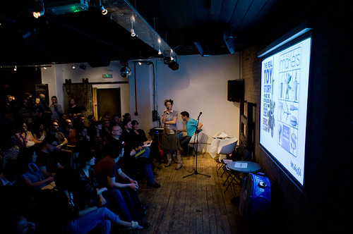
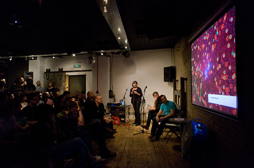
This is a version of a talk that I gave at the “In Progress” event, staged by ‘It’s Nice That‘ magazine.

It builds on some thoughts that I’ve spoken about at some other events in 2011, but I think this version put it forward in the way I’m happiest with.

Having said that, I took the name of the event literally – it’s a bit of a work-in-progress, still.

It might more properly be entitled ‘Pets & Pot-plants’ rather than ‘Gardens & Zoos’ – but the audience seemed to enjoy it, and hopefully it framed some of the things we’re thinking about and discussing in the studio over the last year or so, as we’ve been working on http://bergcloud.com and other projects looking at the near-future of connected products.

And – with that proviso… Here it is.

Let me introduce a few characters…

This is my frying pan. I bought it in Helsinki. It’s very good at making omelettes.

This is Sukie. She’s a pot-plant that we adopted from our friend Heather’s ‘Wayward Plants‘ project, at the Radical Nature exhibit at the Barbican (where “In Progress” is!)


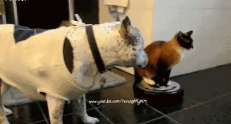
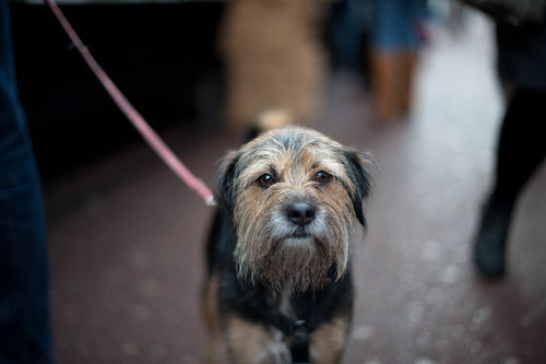
This is a puppy – we’ll call him ‘Bruno’.

I have no idea if that’s his name, but it’s from our friend Matt Cottam’s “Dogs I Meet” flickr set, and Matt’s dog is called Bruno – so it seemed fitting.


And finally, this is Siri – a bot.


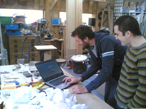
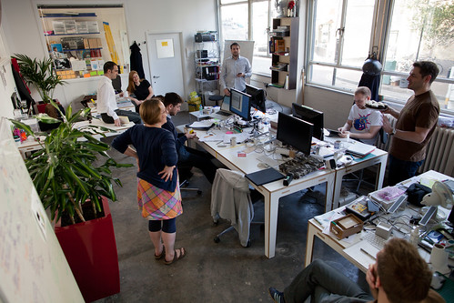
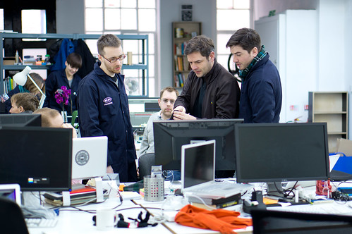
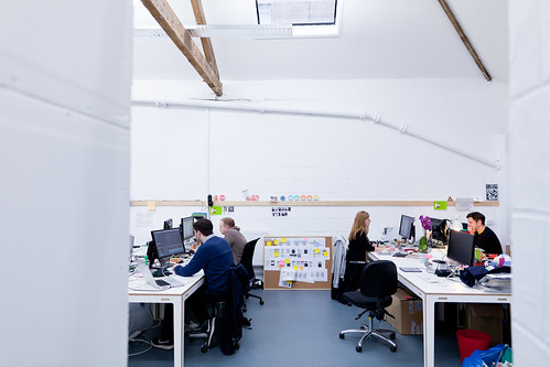
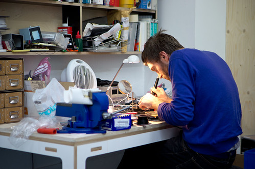
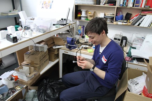
And, I’m Matt Jones – a designer and one of the principals at BERG, a design and invention studio.


There are currently 13 of us – half-technologists, half-designers, sharing a room in East London where we invent products for ourselves and for other people – generally large technology and media companies.


This is Availabot, one of the first products that we designed – it’s a small connected product that represents your online status physically…


But I’m going to talk today about the near-future of connected products.

And it is a near-future, not far from the present.


In fact, one of our favourite quotes about the future is from William Burroughs: When you cut into the present, the future leaks out…


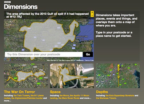
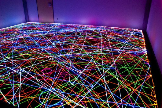
A place we like to ‘cut into the present’ is the Argos catalogue! Matt Webb’s talked about this before.

It’s really where you see Moore’s Law hit the high-street.

Whether it’s toys, kitchen gear or sports equipment – it’s getting hard to find consumer goods that don’t have software inside them.


This is near-future where the things around us start to display behaviour – acquiring motive and agency as they act and react to the context around them according to the software they have inside them, and increasingly the information they get from (and publish back to) the network.

In this near-future, it’s very hard to identify the ‘U’ in UI’ – that is, the User in User-Interface. It’s not so clear anymore what these things are. Tools… or something more.

Of course, I choose to illustrate this slightly-nuanced point with a video of kittens riding a Roomba that Matt Webb found, so you might not be convinced.


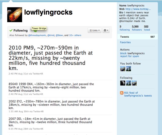
However, this brings us back to our new friends, the Bots.


By bot – I guess I mean a piece of software that displays a behaviour, that has motive and agency.


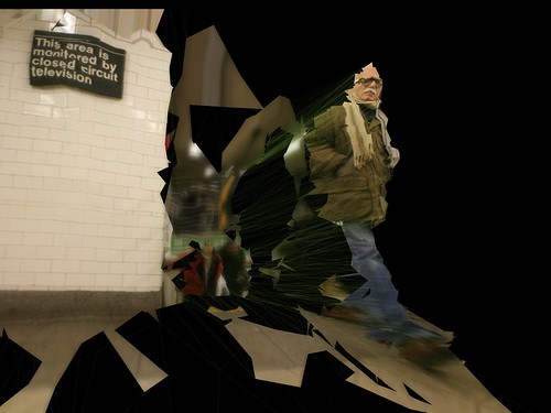
Let me show a clip about Siri, and how having bots in our lives might affect us [Contains Strong Language!]

Perhaps, like me – you have more sympathy for the non-human in that clip…


But how about some other visions of what it might be like to have non-human companions in our lives? For instance, the ‘daemons’ of Phillip Pullman’s ‘Dark Materials‘ trilogy. They are you, but not you – able to reveal things about you and reveal things to you. Able to interact naturally with you and each other.


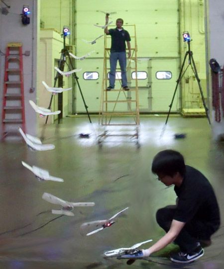
Creatures we’ve made that play and explore the world don’t seem that far-fetched anymore. This is a clip of work on juggling robot quadcopters by ETH Zurich.

Which brings me back to my earlier thought – that it’s hard to see where the User in User-Interfaces might be. User-Centred Design has been the accepted wisdom for decades in interaction design.

I like this quote that my friend Karsten introduced me to, by Prof Bertrand Meyer (coincidentally at professor at ETH) that might offer an alternative view…

A more fruitful stance for interaction design in this new landscape might be that offered by Actor-Network Theory?


I like this snippet from a formulation of ANT based on work by Geoff Walsham et al.

“Creating a body of allies, human and non-human…”

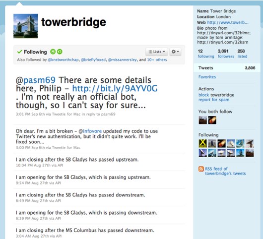
Which brings me back to this thing…

Which is pretty unequivocally a tool. No motive, no agency. The behaviour is that of it’s evident, material properties.


Domestic pets, by contrast, are chock-full of behaviour, motive, agency. We have a model of what they want, and how they behave in certain contexts – as they do of us, we think.

We’ll never know, truly of course.

They can surprise us.

That’s part of why we love them.


But what about these things?

Even though we might give them names, and have an idea of their ‘motive’ and behaviour, they have little or no direct agency. They move around by getting us to move them around, by thriving or wilting…

And – this occurred to me while doing this talk – what are houseplants for?

Let’s leave that one hanging for a while…


And come back to design – or more specifically – some of the impulses beneath it. To make things, and to make sense of things. This is one of my favourite quotes about that. I found it in an exhibition explaining the engineering design of the Sydney Opera House.

Making models to understand is what we do as we design.

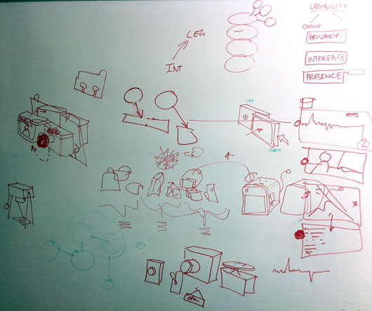
And, as we design for slightly-unpredictable, non-human-centred near-futures we need to make more of them, and share them so we can play with them, spin them round, pick them apart and talk about what we want them to be – together.


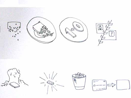
I’ll just quickly mention some of the things we talk about a lot in our work. The things we think are important in the models, and designs we make for connected products. The first one is legibility. That the product or service presents a readable, evident model of how it works to the world on it’s surface. That there is legible feedback, and you can quickly construct a theory how it works through that feedback.


One of the least useful notions you come up against, particularly in technology companies, is the stated ambition that the use of products and services should be ‘seamless experiences’.

Matthew Chalmers has stated (after Mark Weiser, one of the founding figures of ‘ubicomp’) that we need to design “seamful systems, with beautiful seams”

Beautiful seams attract us to the legible surfaces of a thing, and allow our imagination in – so that we start to build a model in our minds (and appreciate the craft at work, the values of the thing, the values of those that made it, and how we might adapt it to our values – but that’s another topic)


Finally – this guy – who pops up a lot on whiteboards in the studio, or when we’re working with clients.

B.A.S.A.A.P. is a bit of an internal manifesto at BERG, and stands for Be As Smart As A Puppy – and it’s something I’ve written about at length before.


It stems from something robotics and AI expert Rodney Brooks said… that if we put the fifty smartest people in a room for fifty years, we’d be luck if we make AIs as smart as a puppy.

We see this an opportunity rather than a problem!

We’ve made our goal to look to other models of intelligence and emotional response in products and services than emulating what we’d expect from humans.

Which is what this talk is about. Sort-of.

But before we move on, a quick example of how we express these three values in our work.

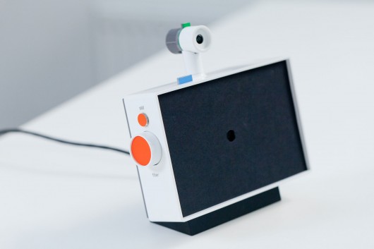
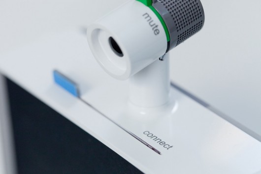
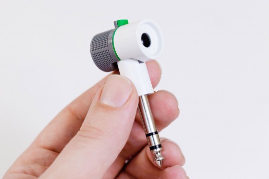
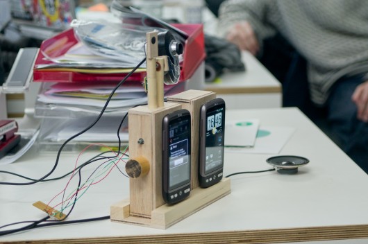
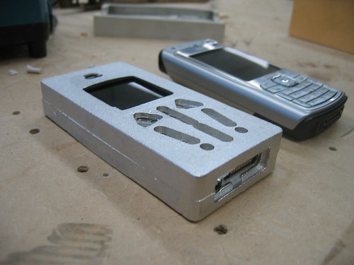
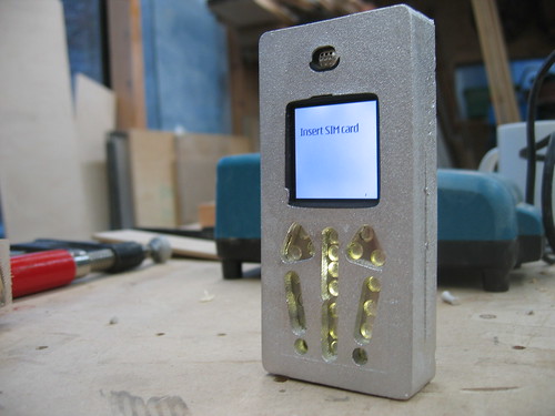
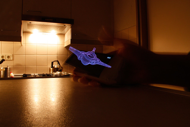
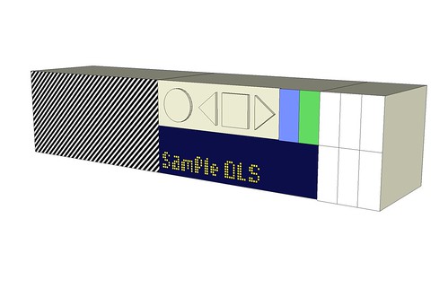
“Text Camera” is a very quick sketch of something that we think illustrates legibility, seamful-ness and BASAAP neatly.

Text Camera is about making the inputs and inferences the phone sees around it to ask a series of friendly questions that help to make clearer what it can sense and interpret. It kind of reports back on what it sees in text, rather through a video feed.

Let me explain one of the things it can do as an example. Your smartphone camera has a bunch of software to interpret the light it’s seeing around you – in order to adjust the exposure automatically.

So, we look to that and see if it’s reporting ‘tungsten light’ for instance, and can infer from that whether to ask the question “Am I indoors?”.

Through the dialog we feel the seams – the capabilities and affordances of the smartphone, and start to make a model of what it can do.

So next, I want to talk a little about a story you might be familiar with – that of…

I hope that last line doesn’t spoil it for anyone who hasn’t seen it yet…

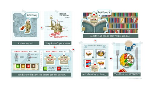
But – over the last year I’ve been talking with lot to people about a short scene in the original 1977 Star Wars movie ‘A New Hope’ – where Luke and his Uncle Owen are attempting to buy some droids from the Jawas that have pulled up outside their farmstead.


I’ve become a little obsessed with this sequence – where the droids are presented like… Appliances? Livestock?

Or more troublingly, slaves?

Luke and Uncle Owen relate to them as all three – at the same time addressing them directly, aggressively and passive-aggressively. It’s such a rich mix of ways that ‘human and non-human actors’ might communicate.

Odd, and perhaps the most interesting slice of ‘science-fiction’ in what otherwise is squarely a fantasy film.

Of course Artoo and Threepio are really just…

Men in tin-suits, but our suspension of belief is powerful! Which brings me to the next thing we should quickly throw into the mix of the near-future…


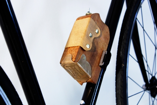
This is the pedal of my Brompton bike. It’s also a yapping dog (to me at least)

Our brains are hard-wired to see faces, it’s part of a phenomena called ‘Pareidolia

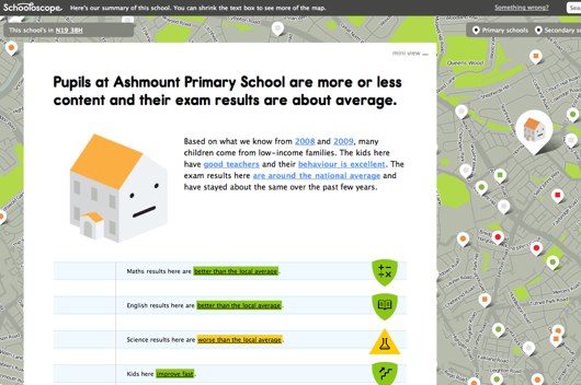
It’s something we’ve talked about before on the BERGblog, particularly in connection with Schoolscope. I started a group on flickr called “Hello Little Fella” to catalogue my pareidolic-excesses (other facespotting groups are available).

This little fella is probably my favourite.

He’s a little bit ill, and has a temperature.

Anyway.

The reason for this particular digression is to point out that one of the prime materials we work with as interaction designers is human perception. We try to design things that work to take advantage of its particular capabilities and peculiarities.

I’m not sure if anyone here remembers the Apple Newton and the Palm Pilot?

The Newton was an incredible technological attainment for it’s time – recognising the user’s handwriting. The Palm instead forced us to learn a new type of writing (“Graffiti“).

We’re generally faster learners than our technology, as long as we are given something that can be easily approached and mastered. We’re more plastic and malleable – what we do changes our brains – so the ‘wily’ technology (and it’s designers) will sieze upon this and use it…

All of which leaves me wondering whether we are working towards Artificial Empathy, rather than Artificial Intelligence in the things we are designing…

If you’ve seen this video of ‘Big Dog’, an all-terrain robot by Boston Dynamics – and you’re anything like me – then you flinch when it’s tester kicks it.

To quote from our ‘Artificial Empathy’ post:

Big Dog’s movements and reactions – it’s behaviour in response to being kicked by one of it’s human testers (about 36 seconds into the video above) is not expressed in a designed face, or with sad ‘Dreamworks’ eyebrows – but in pure reaction – which uncannily resembles the evasion and unsteadiness of a just-abused animal.

Of course, before we get too carried away by artificial empathy, we shouldn’t forget what Big Dog is primarily designed for, and funded by…

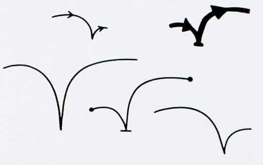
Anyway – coming back to ‘wily’ tactics, here’s the often-referenced ‘Uncanny Valley’ diagram, showing the relationship between ever-more-realistic simulations of life, particularly humans and our ‘familiarity’ with them.

Basically, as we get ever closer to trying to create lifelike-simulations of humans, they start to creep us out.

It can perhaps be most neatly summed up as our reaction to things like the creepy, mocapped synthespians in the movie Polar Express…

The ‘wily’ tactic then would be to stay far away from the valley – aim to make technology behave with empathic qualities that aren’t human at all, and let us fill in the gaps as we do so well.

Which, brings us back to BASAAP, which as Rodney Brooks pointed out – is still really tough.

Bruno’s wild ancestors started to brute-force the problem of creating artificial empathy and a working companion-species relationship with humans through the long, complex process of domestication and selective-breeding…

…from that point the first time these kind of eyes were made towards scraps of meat held at the end of a campfire somewhere between 12-30,000 years ago…

Some robot designers have opted to stay on the non-human side of the uncanny valley, notably perhaps Sony with AIBO.

Here’s an interesting study from 2003 that hints a little at what the effects of designing for ‘artificial empathy’ might be.

We’re good at holding conflicting models of things in our heads at the same time it seems. That AIBO is a technology, but that it also has ‘an inner life’.

Take a look at this blog, where an AIBO owner posts it’s favourite places, and laments:

“[he] almost never – well, make it never – leaves his station these days. It’s not for lack on interest – he still is in front of me at the office – but for want of preservation. You know, if he breaks a leg come a day or a year, will Sony still be there to fix him up?”

(One questioner after my talk asked: “What did the 25% of people who didn’t think AIBO was a technological gadget report it to be?” – Good question!)

Some recommendations of things to look at around this area: the work of Donna Haraway, esp. The Companion Species Manifesto.

Also, the work of Cynthia Brezeal, Heather Knight and Kacie Kinzer – and the ongoing LIREC research project that our friend Alexandra Deschamps-Sonsino is working with, that’s looking to studies of canine behaviour and companionship to influence the design of bots and robots.

In science-fiction there’s a long, long list that could go here – but for now I’ll just point to the most-affecting recent thing I’ve read in the area, Ted Chiang’s novella “The Lifecycle of Software Objects” – which I took as my title for a talk partly on this subject at UX London earlier in the year.

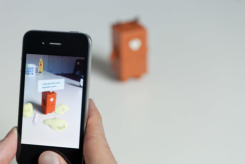
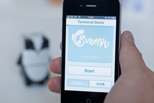
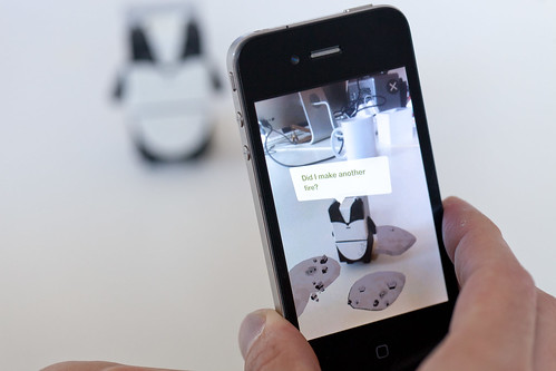
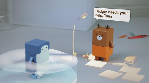
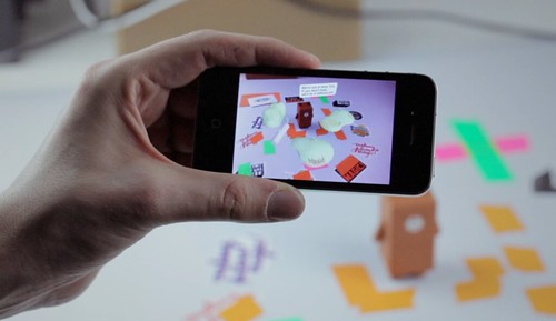
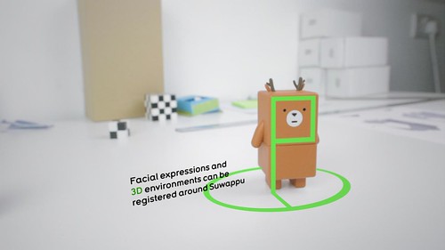
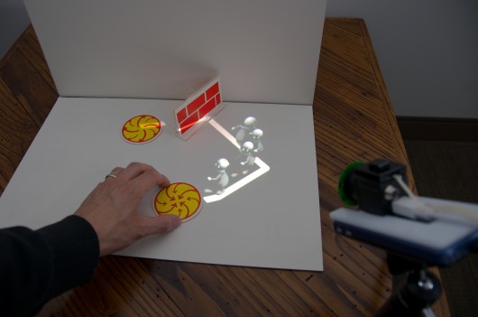
In our own recent work I’d pick out Suwappu, a collaboration with Dentsu London as something where we’re looking to animate, literally, toys with an inner life through a computer-vision application that recognises each character and overlays dialogue and environments around them.

I wonder how this type of technology might develop hand-in-hand with storytelling to engage and delight – while leaving room for the imagination and empathy that we so easily project on things, especially when we are young.

Finally, I want to move away from the companion animal as a model, back to these things…

I said we’d come back to this! Have you ever thought about why we have pot plants? What we have them in the corners of our lives? How did they get there? What are they up to?!?

(Seriously – I haven’t managed yet to find research or a cultural history of how pot-plants became part of our home life. There are obvious routes through farming, gardening and cooking – but what about ornamental plants? If anyone reading this wants to point me at some they’d recommend in the comments to this post, I’d be most grateful!)

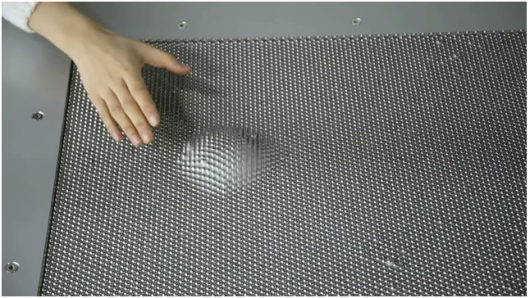
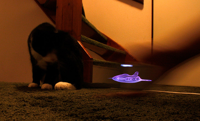
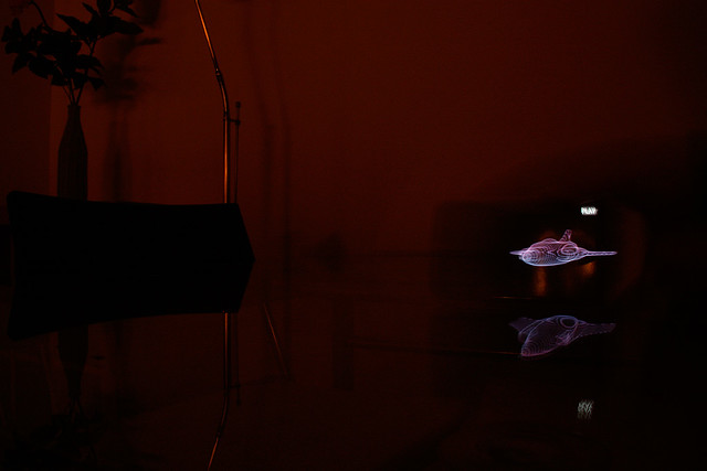
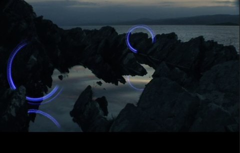
Take a look at this – one of the favourite finds of the studio in 2011 – Sticky Light.

It is very beautifully simple. It displays motive and behaviour. We find it fascinating and playful. Of course, part of it’s charm is that it can move around of its own volition – it has agency.

Pot-plants have motives (stay alive, reproduce) and behaviour (grow towards the light, shrivel when not watered) but they don’t have much agency. They rely on us to move them into the light, to water them.

Some recent projects have looked to augment domestic plants with some agency – Botanicalls by Kati London, Kate Hartman, Rebecca Bray and Rob Faludi equips a plant not only with a network connection, but a twitter account! Activated by sensors it can report to you (and its followers) whether it is getting enough water. Some voice, some agency.

(I didn’t have time to mention it in the talk, but I’d also point to James Chamber’s evolution of the idea with his ‘Has Needs’ project, where an abused potplant not only has a network connection, but the means to advertise for a new owner on freecycle…)

Here’s my botanical, which I chose to call Robert Plant…

So, much simpler systems that people or pets can find places in our lives as companions. Legible motives, limited behaviours and agency can illicit response, empathy and engagement from us.

We think this is rich territory for design as the things around us start to acquire means of context-awareness, computation and connectivity.

As we move from making inert tools – that we are unequivocally the users of – to companions, with behaviours that animate them – we wonder whether we should go straight from this…


…to this…

Namely, straight from things with predictable and legible properties and affordances, to things that try and have a peer-relationship, speaking with human voice and making great technological leaps to relate to us in that way, but perhaps with a danger of entering the uncanny valley.

What if there’s an interesting space to design somewhere in-between?

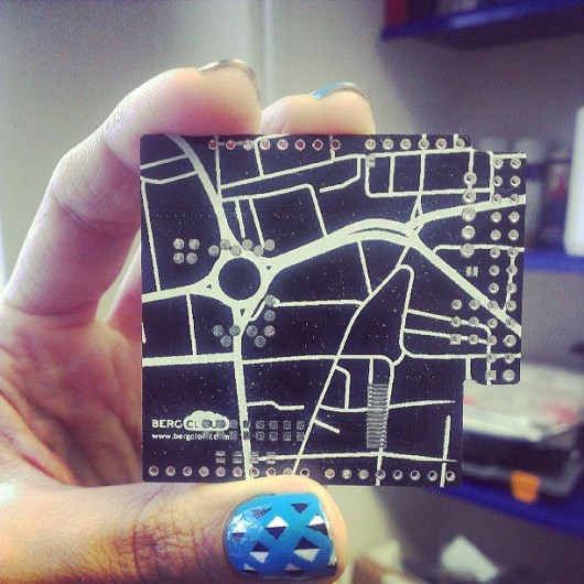
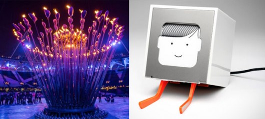
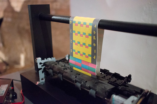
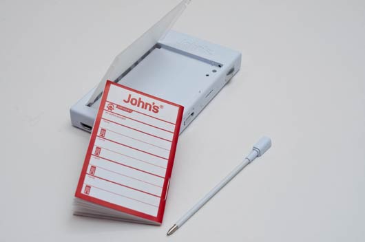
This in part is the inspiration behind some of the thinking in our new platform Berg Cloud, and its first product – Little Printer.

We like to think of Little Printer as something of a ‘Cloud Companion Species’ that mediates the internet and the domestic, that speaks with your smartphone, and digests the web into delightful little chunks that it dispenses when you want.

Little Printer is the beginning of our explorations into these cloud-companions, and BERG Cloud is the means we’re creating to explore them.

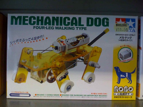
Ultimately we’re interested in the potential for new forms of companion species that extend us. A favourite project for us is Natalie Jeremijenko’s “Feral Robotic Dogs” – a fantastic example of legibility, seamful-ness and BASAAP.

Natalie went to communities near reclaimed-land that might still have harmful toxins present, and taught workshops where cheap (remember Argos?) robot dogs that could be bought for $30 or so where opened up and hacked to accommodate new sensors.

They were reprogrammed to seek the chemical traces associated with lingering toxins. Once release by the communities they ‘sniff’ them out, waddling towards the highest concentrations – an immediate tangible and legible visualisation of problem areas.

Perhaps most important was that the communities themselves were the ones taught to open the toys up, repurpose their motives and behaviour – giving them the agency over the technology and evidence they could build themselves.

In the coming world of bots – whether companions or not, we have to attempt to maintain this sort of open literacy. And it is partly the designer’s role to increase its legibility. Not only to beguile and create empathy – but to allow a dialogue.

As Kevin Slavin said about the world of algorithms growing around us“We can write it but we can’t read it”

We need to engage with the complexity and make it open up to us.

To make evident, seamful surfaces through which we can engage with puppy-smart things.

As our friend Chris Heathcote has put so well:

Thanks for inviting me, and for your attention today.


FOOTNOTE: Auger & Loizeau’s Domestic Robots.

I didn’t get the chance to reference the work of James Auger & Jimmy Loizeau in the talk, but their “Carnivorous Robots” project deserves study.

From the project website:

“For a robot to comfortably migrate into our homes, appearance is critical. We applied the concept of adaptation to move beyond the functional forms employed in laboratories and the stereotypical fictional forms often applied to robots. In effect creating a clean slate for designing robot form, then looking to the contemporary domestic landscape and the related areas of fashion and trends for inspiration. The result is that on the surface the CDER series more resemble items of contemporary furniture than traditional robots. This is intended to facilitate a seamless transition into the home through aesthetic adaptation, there are however, subtle anomalies or alien features that are intended to draw the viewer in and encourage further investigation into the object.”

And on robots performing as “Companion Species”

”In the home there are several established object categories each in some way justifying the products presence through the benefit or comfort they bring to the occupant, these include: utility; ornament; companionship; entertainment and combinations of the above, for example, pets can be entertaining and chairs can be ornamental. The simplest route for robots to enter the home would be to follow one of these existing paths but by necessity of definition, offering something above and beyond the products currently occupying those roles.”

James Auger is currently completing his Phd at the RCA on ‘Domestication of Robotics’ and I can’t wait to read it.

Monday links: photon bullets, licky lizards and dark futures

Monday is the new Friday. We were moving studio last week, so it was a quiet week for links. Here we go:

Trillion frame per second video is pretty astonishing. “Nothing in the universe looks fast to this camera” according to MIT researcher Andreas Velten:

Here’s a Bearded Dragon playing Ant Crusher. This is the first time I’ve seen a reptile using a tablet device – I hope it’s not the last.

Timo was intrigued by looking behind the scenes of Charlie Brooker’s Black Mirror.

Week 340

These weeknotes are coming live from somewhere between Gatwick Airport and Haywards Heath, travelling at about 37mph. Joe and I are on our way to see Future Platforms who are doing some development work with us, and our fortnightly review and planning meetings are quite animated.

340 is the number of words that Betsy the Border Collie from Austria can understand. James Darling has hitch-hiked along the A340 near Aldermaston in Berkshire.

At the end of this week we are migrating to our new studio space. Co-ordinating the move of thirteen people from two locations in short time has been a bit of a challenge, and has involved much hard work from people with larger muscles than I. Here’s a little teaser of how our new space looks and how it’s changed over the last two weeks.

In the midst of packing up, we are still very busy on all projects. Timo, Alex and Matt Jones have been moving around Shoreditch by night filming for Uinta, stopping occasionally to watch footage and talk excitedly about what to shoot next over pizza and cola.

Work on Little Printer and BERG Cloud continues on many fronts. James D, Andy, Denise, Alice and Nick are variously looking at IA, infrastructure, manufacture plans, communications, whilst keeping up with the queries and comments we’ve been receiving via bergcloud.com, which have been super. They’ve have been keeping me, Matt W, increasingly-pregnant Kari and Denise busy in particular. If we haven’t quite got to your email yet we apologise, we’re doing our very best!

In January, Matt W (who you can hear on yesterday’s Radio Roundabout) will be clocking up at least 13,090 miles in the air en-route to a Uinta workshop, before dropping in on CES and meeting people to talk about Little Printer across the US. His itinerary is here if you’d like to catch him. Matt J and Joe will be attending at least the first part of this adventure.

This is a mere fly-by of what we’re up to, as usual, but I must now disappear to pack more things into crates.

Tonight, we are having a traditional Christmas dinner and a thimble of sherry to celebrate a year of good work (which I’ve been lucky enough to be part of for the past 7 months or so). I’ve been informed Matt Jones is bringing party games and Joe Malia may do a dance. I’m bracing myself.

Week 339

After weeks of breathless hyperfunction, the studio has finally decompressed into a state of relative quiescence. This momentary intermission has witnessed a dispersal of people like dandelion seeds riding a collective sigh of relief. Did I really just write that? Jack can be found scaling the spectacular mountains of South Africa while Alice is shrouded in the shadows of York’s historic architecture. Denise spent the early week relaxing amongst the vineyards of Southern France and Nick chose to recuperate in Balham. In front of Battlefield 3 no doubt.

Back in the studio, the Little Printer announcement triggered a wave of public attention that quickly grew to a towering tsunami of electronic enquiries. Zendesk is fast becoming Application Of The Week and customer service is faster becoming a widely held expertise.

Simon has continued to display superhuman project management prowess until today when he conceded the fragility of a mortal shell and bowed out early with an unpleasant sounding cold. He has been involved heavily in pretty much all studio work and continues to be an organisational epicentre from home.

Kari spent the afternoon concurrently introducing Helen to the studio systems and pushing LP emails under the appropriate eyeballs.

Matt Jones is working hard to steer multiple projects for Uinta with one hand while orchestrating proposals and ‘sales’ with the other. It’s like watching Fantasia but with robots and rockets where enchanted brooms once stood.

Alex shifted his attention from creating nicely thought through visual design for Little Printer to nicely thought through visual design for Uinta. He continues to stick rigidly to ‘New Health Century’ when most have failed. Namely, myself.

Denise lends an assured lilt to customer service and continues to carefully broaden Little Printer’s personality.

When not wrapped up in paper suppliers, Andy is working closely with Uri on manufacture and with Durrell and Tom on “the Bridge”. He also attached some LEDs to a pair of gloves which looks well glam and most people thought was proper ace.

Timo has been joined by Alex in Berg 9 this week. It is said that is you listen carefully, at quiet moments in Shoreditch, you can hear the sound of Drum ‘n’ Bass emanating from their lofty tower. I think I saw Alex drag a sub-woofer up there the other day. I hope they’re ok. Timo is working on a proposal for Silverton while editing footage for Uinta and guiding UI thinking.

Matt W is working tirelessly to transform short emails into long phone calls and casting telescopic thoughts into the future to create the roadmap for Little Printer. He is also working on accounts.

James can be found scouting for ways to improve the LP IA. He returns with answers to questions we didn’t know we had. He briefly wore a snood like a sweatband and still looked cool.

Nick has returned from Balham and is now working closely with Tim Bacon to draw a vector between video, data and 3D software to mind bending effect. I just had a glance some work in progress. It’s difficult to comprehend what it all means but it looks incredible.

Lots will change next week. The mounting anticipation is hotter than a … you get the idea.

Week 337

It’s week 337, which is a permutable prime. I imagine they’re pretty rare.

For our All Hands this week there were only 6 of us in the studio space, intended for 6. We could breathe. Jack, Timo and Denise were out filming our freshly returned Barry prototype. Nick was almost certainly with them, but he was on holiday so he ought not to have been. Joe and James were quarantined. Jones returned from a NESTA breakfast event where he was sparring with Usman Haque about the Internet of Things.

The remainder of the week was more of the same for the majority above, including the quarantine in Joe’s case. We’ve had just about enough of studio fever round here. Otherwise Alice, James and Alex are presently fighting the wall of todos in the run up to exciting things. Matthew is writing a talk and going over contracts.

There’s a new project with Uinta kicking off, while work on the existing briefs continues apace and new studio space preparations are high on the agenda. We’re excited about moving, but we’ve only got 5 days to have the space turned from an art gallery into a functioning studio with a meeting room and workshop which as yet, don’t exist. Plenty of site visits, photos, details and logistics filling up fair chunk of Simon, Kari and myself’s week.

Also taking up most of the week, from my perspective, was some longer-than-anticipated dental treatment. And due to these week notes being from my perspective, they reflect my week at BERG: quite short. Sorry.

That’s all from me. Back to the studio.

Friday Links

A bumper crop of videos this week.

Denise pointed to this from Wired UK, 2D patterns assembling into 3D objects once exposed to light.

You’ve probably all seen this ISS timelapse by now. But I can’t stop watching it.

Chairman Bruce‘s Venn diagram on product invention merits study.

In the ‘things you can spend money on dept.’ Matt W pointed to this New Aesthetic backpack, and Alex pointed out that our friend Brendan Dawes has got his new Beep store up and running which is awesome.

From our ‘robot-readable world dept’, Kari shared this advert she saw for a children’s toy video camera with face tracking A.R. capabilities

In the ‘giant nutty land-art dept’ Andy shared this sculpture in Germany

Alex shared this ‘superhydrophobic’ nanotech

Reminds me of ‘The Man in The White Suit’

Robofold! Robot-Readable-haircuts for footballers!! Rhianna vomiting ribbons!!!

Finally, Kari won ‘subject line of the week’ prize with her email to the list entitled ‘Big Brass Nuts’… Which turned out to be this marvellous film about hand-casting a short run of beautiful metal things rather than a meditation on Schulze’s sales techniques…

Have a great weekend!

Tomorrow’s World

We staged a small event for Internet Week Europe – a night of drinks and ten minute talks. We were totally suprised when it sold out in under ten minutes!

Tomorrow's World - Alice Taylor

Thanks to our great speakers: Alice Taylor, James Bridle, Karsten Schmidt, Fiona Romeo, Jamais Cascio, Russell Davies and Warren Ellis.

Tomorrow's World - Russell Davies

At the end of the night, I asked the packed little room at The Gopher Hole whether we should do it again – and the result was a resounding “yes” – so stay tuned in the new year!

Tomorrow's World - Fiona Romeo

Thanks to Beatrice, Kevin and all at The Gopher Hole, Penny Shaw at Internet Week Europe and most importantly everyone who came along on the night!

Friday links: personality, perfection and smoke rings

As the world starts testing Siri, with all the usuals, Alex found an interesting link discussing Siri’s personality. It’s fascinating times for copywriting in its many forms. As we get frustrated with product copy becoming over friendly, it’s tricky line to tread for the writers of AI. Siri seems to have it nailed, but it’ll be fun looking for the inevitable imitations over the next few years. (How many witty answers can you give to ‘What’s the meaning of life?’)

iCloud Icon

While we’re talking about Apple, Matthew sent around this link pointing to the origins of the iCloud logo. The golden ratio! So perfect. Only Apple could create such visual magic. Oh.

Monocle Radio

Matthew also sent around a link to this Monocle radio (above), which he spotted via @antimega. Described as ‘An update of the Heritage model’ it now has an iPod/iPhone remote control application and full coverage of DAB. Perhaps this heritage design (or the price tag) will ‘nurture the desire to keep':

“If you build in emotional value, people will keep products longer and take more care of it; this of course saves energy and materials. It is the difference between selling an ordinary hi-fi and selling amazing sound.”

Which is discussed further in this article, relating to products in general — found by Alex, on Core77.

Lytro

Like everyone else we’ve been looking at the Lytro camera (above) – with its ‘shoot now focus later’ technology. Timo, sent around the first link to a written review, and Alex followed up with this additional review with videos.

We all loved this video of ‘quantum levitation’, too, first spotted by Alex.

Matthew pointed us at this waste reclamation power plant in the heart of Copenhagen:
“It’s a massive incinerator that burns household rubbish to make electricity.
Two things:
1. they’ve shaped it like a mountain, and in the winter it’ll have snow and 3 ski runs down from the top

2. it emits smoke—well, CO2. But instead of a plume, the smoke stack stores up the CO2 until it reaches 1 ton, and then puffs out a smoke ring.”

Wonderful!

Week 332

The cold but sunny London mornings see us in the middle of week 332. We’re all much healthier this week, with last weeks human bugs all ticketed, fixed and filed.

Jack and Matt Jones are in New York as I type. They’ve gone for a mix of reasons; secret client meetings and non-secret public speaking.

As nice as NY is, it’s an exciting time to be in the studio. It feels like everything has come on leaps an bounds in the past few weeks. Projects are getting more visual—more tangible—by the day. Andy has just unwrapped a package which saw us all trailing in his wake on the path to Statham (the tiny back room in Berg). This is another part of Weminuche falling in to place—and it’s so easy to see how everyone’s different type of work will manifest itself now.

Alex and I have been creating the visual side of Weminuche, working closely with James and Alice. There’s a general feeling of delight as wireframes become working prototypes. (As a visual designer working on digital design, I still get so excited as things start working that I wish I could pick stuff up and squish it).

My part of the design is also uncovering bugs for Nick to wrangle. He’s extremely gracious every time ‘Oh, that’s good… It’s good to know that might happen, I’ll look into it now’. And he does. I keep waiting for the ‘ARGH! Enough! Can’t you just leave it for 5 minutes?!’ but it’s not happened as yet. Nick is working closely with Andy too, who is often buried headfirst in spreadsheets, and schematics.

Nick is also working with Joe and Simon, on the Uinta project. Again, it’s such a delight to see this developing, Joe’s design is beautiful, despite the fact that every time you talk to him he’s had some new kind of technological disaster. (Latest: laptop monitor has stopped working).

Timo is planning and editing new films. Due to our office space issues, he’s hidden away in our temporary other office (known as BERG 9), but does appear now and again for cups of tea and the odd meeting. I’m looking forward to seeing the plans for the next film, which will support some of the work Matthew is doing.

Kari and Simon are, as ever, the people that keep us going. Kari by booking flights for new workshops and continuing the ever frustrating search for new office space. It sounds like we’re getting there, but it’s certainly not been easy. Simon has been keeping control of client and internal projects, and doing a good job of keeping us in touch with some of the people outside the office we’re also working with.

All in all, interesting times.

Friday links: tree climbing, old package designs, robot recon, ultrasound-in-your-pocket and ferrofluids

The BERG studio list has been a bit quiet this week. I don’t know if it’s that everyone has been so buried in their work that they haven’t had much time to follow interesting links, or if it’s just been a quiet week out on the internets in general. A few noteworthy things have come floating past, though.

Via Matt Jones we discovered a simple but ingenious tool for any amateur tree climber: First Branch, “for when you want to climb a tree, but the first branch is just out of reach.”

Alex alerted us to Fast Company’s article about the NewProductWorks Collection where you can find “every product in food, beverage, household, health & beauty care, baby care, pet products, etc” going back as far as the 1960s. Of course “you” would need to be in a particularly qualified position because it is not, unfortunately, open to the public. I wonder if working for BERG would get me in. I would so love to see that.

Matt Jones sent this video of the Recon Scout Throwbot, a throwable robotic reconnaissance agent for use by the military, which doesn’t just seem like something out of science fiction, it actually is. (Sort of. Minus the intelligence anyway. So far…)

Also via Jones came news of a new ultrasound accessory for your smartphone. I’m sure there are plenty of celebrities who will be relieved to know that they only need to shell out $8,000 for their own private, in-home ultrasound equipment rather than $100,000. More seriously, this could be a great advance for global healthcare.

And finally, Joe delighted us with a magnetic liquid hedgehog from Russia:

Which then sent me into a rabbit hole of Ferrofluid videos on YouTube. There’s some pretty awesome stuff out there.

Have a good weekend, everyone!

Guardian iPad app launched

Congratulations to all the team at The Guardian for launching their iPad app this week.

BERG played a small role at the very beginning of the process with initial product workshops, Nick contributing his experience on iOS prototyping and Jack consulting on the interaction design with Mark Porter and the team.

Andy Brockie who led the internal design team there has put together a great ‘behind-the-scenes’ gallery of the process, and newspaper design guru Mark Porter has an in-depth blog post about his involvement here.

From that post, a snippet about some of the ‘algorithmic-art-director‘ workflow the team invented:

Unlike the iPhone and Android apps, which are built on feeds from the website, this one actually recycles the already-formatted newspaper pages. A script analyses the InDesign files from the printed paper and uses various parameters (page number, physical area and position that a story occupies, headline size, image size etc) to assign a value to the story. The content is then automatically rebuilt according to those values in a new InDesign template for the app.

It’s not quite the “Robot Mark Porter” that Schulze and Jones imagined in the workshops, but it’s as close as we’re likely to see in my lifetime. Of course robots do not make good subs or designers, so at this stage some humans intervene to refine, improve and add character, particularly to the article pages. Then the InDesign data goes into a digital sausage machine to emerge at the other end as HTML.

Fascinating stuff, and perhaps a hint of the near-future of graphic design…

It was a pleasure working with the team there, and Mark especially. The final result looks fantastic, and more importantly perhaps reads beautifully and downloads extremely quickly. Well done to all involved!

And now, we can now finally exclusively reveal our prototype sketch for Robot Mark Porter…

Friday Links

It’s Friday the 7th of October, and this is Berg Friday Links.

The recommended soundtrack for this edition of Friday Links is Keygen Jukebox, provided by Andy, and my favourite link of the week.

Alex provided us with this link to a 1971 Nintendo product.

We got excited enough about this new Roland 3D hobby mill that we started talking about the games consoles we used when we were kids.

There’s been a bit of interest in Point Of View videos on the list, bringing up these examples: The Stampede by Biting Elbows, Cinnamon Chasers – Luv Deluxe, Prodigy – Smack My Bitch Up (NSFW) and the game Mirror’s Edge.

We also had a mini discussion on the greater debate around what now seems to have been coined wackaging. Denise, the person I would most trust on this issue, gave us this:

Main thing is that writing in that style and doing it well isn’t easy. And it’s not quick. It doesn’t just trip off the tongue, its not like writing an email to your mates. Get it right, and people like it. Get it wrong and it’s really offensive. It’s also very difficult to tell people how to get it right. Christopher Hitchens explains it better:

To my writing classes I used later to open by saying that anybody who could talk could also write. Having cheered them up with this easy-to-grasp ladder, I then replaced it with a huge and loathsome snake: “How many people in this class, would you say, can talk? I mean really talk?” That had its duly woeful effect.

Alex provided us with this animated gif:

And finally, from Denise via She Went of Her Own Accord, is New Old Jokes Home:

My robot wife has gone to the Carribbean.
Jamaica?
No, she came ready-manufactured.

Have a good weekend.

Thanks Steve.

We probably wouldn’t be doing what we do if Steve Jobs hadn’t done what he did.

To mark his passing this week, I asked the studio for their stories of first contact with Apple.

Kari:

In 1983 when I was 10 years old, my school got about 10 shiny new Apple IIe computers and decided that we should learn a little basic programming. They divided us into two groups. Half of the class learned Basic, and the other half – the group that I was in – learned Logo. I remember feeling like we were pretty important and very cool for learning how to do computer programming. And I loved that I could change a few letters and number and make the turtle do different things. It gave me a great sense of autonomy.

Alex:

The thing about buying an apple product is that you’re sold an experience. It’s not all about the industrial design of the product, or the UI, or anything else, it’s the russian doll effect of unpeeling layers of a sealed box and feeling like you’ve bought something really special, which is something I’d never really experienced with a consumer product until I bought my first iBook at uni. If you can make people smile before they’ve even lifted the product out of the box, I think you’re almost half way there.

Denise:

My first introduction to the word of computing was at home. We had a commodore PET and graduated to the BBC Micro. I have only one sibling, so aside from a few fights over who got to play space invaders next, we were lucky enough to be able to use a computer when we wanted to. It was never a big deal, there was no fear involved for six year old me.

Two things changed this. First, the BBC moved from the front room to my father’s study. Home computing was work computing, not a play thing. Second, we started ‘doing computers’ at school. This meant looking over the shoulders of 30 other kids at the one, perhaps two, computers available. It meant a fight to get to the front—a fight I wasn’t that fussed about joining. (I’d already seen a computer anyway).

And so I didn’t touch a computer again until university in the early 90s, by which time I’d learnt to fear them. We weren’t trained in ‘desktop publishing’ on my degree course. Yet again, scheduling educational computer time involved a bit of a fight, and so I squared up to a Mac at last, and wondered how the hell I was going to get the file I’d just made off the desktop and on to a disk.

After a split second’s thought, I picked up the picture of the file and put it on the picture of a disk. Seemed obvious. Was obvious. Worked. Turned out that using computers was really easy.

Better than that, it meant that when I said yes to my first design job as a penniless graduate, was handed a magazine to design and a deadline for the end of the week I had a tool to use. Not quite as easy as using a pencil, but not so far off.

At the end of the month, I got paid. Thanks Steve, for feeding me.

Joe:

One of my first encounters with a Mac was back in 1996 during a High School ‘Design & Technology’ lesson. I think it was a Macintosh LC 580. Anyway, it was reasonably new but already grubby with the greasy fingerprints of overzealous teenagers. I turned it on and the screen flickered with light. A blinking apparition of a disk appeared alongside a question mark. I remember taking this to mean that it had crashed so I reached back, opened my hand and struck the monitor really, really hard. The next thing I remember was a jolt of shock as the class teacher screamed at me from across the room. I got sent out. Apparently the question mark was normal.

The second and more favourable memory was the first time I saw pictures of the first iPhone on the internet. I remember looking at it and thinking that I was seeing the device that featured in so many of my sci-fi fuelled childhood dreams. A screen that you could hold in your palm. That would show you videos. That would let you communicate to your friends. Find your way around. Somehow Apple had made real something that I could only conjure up in my imagination and it felt magic to be part of the generation that got to see it happen.

Simon:

1994, using an Macintosh II in IT at secondary school. My only other prior exposure to computers had been Apricot and Amstrad (we had a CPC6128 with a colour screen). I was amazed by the tiny size and loading speed. No tapes! It was the first computer I’d ever used with more than one word processing font.

Matthew:

The first Mac I owned was an LC475, and that pizza box unit is still at my mum’s house, the insides chewed away by mice which is what happens if you leave computers hanging around in houses in the countryside. I loved that computer: I made fanzines and I made art. I connected to my first BBS, through a 2400 baud modem I bought from a classifieds ad at the back of a magazine. When I connected, that very first time, when I saw the future and everything changed, pivoted on the spot and pointed towards a much larger very different future, the stereo was playing Pink Floyd’s A Momentary Lapse of Reason. The standout single from that album is called “Learning to Fly.”

The first Mac I saw was at a house of my dad’s friend, a man named Dave, and he had one of those all-in-one Macs, and I was very young. This was a long time before the LC475 that I had, and the strong memory of seeing it was the reason I would, when I was older, get that LC475. I was amazed at three things: the GUI which looked like pen-and-ink draftsmanship; that the power button was on the keyboard instead of being on the back of the box, and that the keyboard was a separate, independent thing; and that there was no computer: there was just the screen, the thing that you used. I couldn’t believe it. I looked at it for a long time.

Jack:

I don’t really care what anyone else than Steve does.

Timo:

‘Bloody Steve’ we used to shout, as Finder windows lost their positions, as CDs were teased with paperclips or the screens of Titanium laptops fell off. Schulze & I have lambasted Jobs over the years for faults in OSes and problems with Apple hardware, but that was before we realised how hard it is to do even basic hardware and software properly at scale. My respect for him grew enormously as Apple moved from computing and swallowed up ever more industries that I cared about. Perhaps the most significant thing I have learnt from Jobs is that his products were absolutely his politics.

My story:

It was 1986, I was 14, and working at Harris Printers in my hometown in South Wales after school everyday and most saturdays. I cleaned, collated, folded, packed print. Sometimes I got to make litho plates on the big Agfa camera, and sometimes I got to use the ancient treadle-powered letterpress. I sometimes got to do layout with Letraset and typesetting galleys from an IBM golfball printer. I convinced the owner that something called DeeTeePee was the next big thing, and we should buy a Mac Se30, Quark Xpress and Adobe Illustrator 1.0. I think with the Radius display and Laserwriter+ it must have come to about £20k or so. It was an incredible machine. What you saw was what you did was what you got. You moved things on a screen that seemed real, not abstractions. My only computer experiences, like most kids till then had been a BBC Model B, or a Vic-20, abstract and arcane. This was something that everyone, in the printers, in my family, my school friends – everyone – could see was different. It was when I first felt I wouldn’t have to choose between technology and art.

Thanks Steve.

Week 330

Fact of the week: 330 is the number of dimples in a British golf ball according to Wikipedia.

So having been on holiday all of last week, I’m only just catching up with what’s been going on in the studio and am still not quite sure I’ve sussed it all out. Since I’m the one that actually makes up the blog rota, though, I have only myself to blame for assigning myself to write weeknotes the week after I’ve been on holiday. Trust me, I won’t do that again.

When I asked Matt Webb what last week was like, his summary was, “There was drama.” Unsurprisingly, when much of your work is dependent on the whims and wishes and ever-changing timelines of clients, things can go a bit pear-shaped. As regular readers of this blog will know, however, BERG is not a company that has all its eggs in one basket, so one client throwing us for a loop doesn’t completely knock us off balance. Nevertheless, there has been drama and so we’re having to deal with that.

In terms of what various folks are up to this week…

Matt Jones, Jack and Alex (who celebrated his one-year anniversary at BERG today!) are doing work on Uinta in preparation for a presentation on Thursday. Matt & Jack are also spending lots of time doing general company planning and re-planning and thinking about sales. Alongside all that, Jack has his fingers in Barry design. He’s also looking at lots of documents.

Barry is also occupying Alex, Denise, Alice, James, Nick, Matt Webb and Andy. Besides following up with various partners & suppliers and chasing China for quotes, Andy is specifically doing some reflecting on the last year of Barry development. (Side note: Because of my role and the fact that I don’t work on Fridays – thus missing weekly studio demos – I only get to see very small slivers of the progress that’s been made on Barry. I do catch a whiff of the excitement and anticipation around it every now and then, though. And I can say with some confidence: it’s going to be pretty spectacular, people.)

Simon, Alice, James and Nick had a meeting at the pub yesterday to make some decisions around Barry and are now working to implement those. There are still a number of near-term decisions that still need to be made, though. Since Nick, James and Alice are now sitting in the main room of the studio where I am (having previously been based in Statham next door), I’m overhearing lots more about the code and technology underlying Barry. Most of the time I have no idea what it means, but it’s rather fun to eavesdrop on anyway and to see them working to solve problems together.

Joe is mostly working on Uinta this week, fleshing out the system underneath the recently approved “look and feel”. He and Simon will be spending some time out of the studio this week meeting with partners who are doing some work on that project alongside us.

Simon is, as usual, skillfully balancing multiple project and clients and partners – this week it’s mostly Chaco, Uinta, Barry and Suwappu with the occasional random bit of SVK and other stuff thrown in. It involves lots and lots of post-it notes. Which is causing me a bit of anxiety because he’s out this afternoon and the wind is blowing the post-it notes around and I have no idea what sort of system he’s organised them into and if you come back and all your carefully assemble post-it notes are out of order, Simon, I apologise. Blame our need for fresh air.

And as well as dealing with the drama stirred up last week, Matt Webb is planning, thinking about finances & sales and having lots of coffee with various people. I hope for his sake some of that is decaf.

Timo’s holiday has stretched into this week and we’re looking forward to welcoming him back tomorrow.

As for me, I’m working furiously to catch up with all the bookkeeping, replying to lots of general studio correspondence, booking travel, updating spreadsheets, doing customer service for SVK (it’s not to late to buy one!) and chasing non-responsive suppliers and overdue invoices. And eating cake. There seems to be lots of cake this week.

I hope that wherever you are, whatever you’re doing, there’s cake there too. Have a good week!

Friday links: first-person music videos, biological lightpainting and synthesis…

Alex shared this music video by Biting Elbows. Imagine what would happen if The Office met Peep Show and Doom. The first-person perspective makes this really engaging.

Matt W shared another first-person video from Cinnamon Chasers. Dark and compelling:

Jones shared this beautiful biological lightpainting:

Nick shared Kevin Karsch‘s work on inserting synthetic objects into still images.

Jones also shared Slate’s Robottke experiment. How easily could you be replaced by a robot?

And finally, though you’ve probably seen it already, this is some quantised dubstep dancing that Matt Webb sent round early in the week. If this could be synthesised, it’d make a great music visualisation.

Happy weekends, all (and an especially toasty one if you happen to be in the UK).

Week 329

Following a super-busy week last week, we’re barely pausing for breath in the studio.

Alice has her headphones in, whizzing up some javascript which will eventually be part of Dimensions 1. Alex, Matt Jones, Jack and Joe are busy sketching for Uinta, and all but Joe will be out of the studio having workshops with them next week. Joe and Jack are also continuing to hone the latest Chaco work.

Nick has skilfully managed to migrate all of us (and our various email setup preferences) to Google for Domains. It’s a fiddly and time-consuming task, but switching all our email and calendars is already making all our lives easier – especially mine. Being able to automatically see calendars reliably makes juggling the commitments of this group of busy folk that much easier.

James, Alice, Andy, Nick, Jack and Matt W are all working on various parts of Weminuche and Barry. I’m also paying close attention to these projects as we focus on what we need to talk about and deliver imminently. Andy’s making and requesting quotes, Jack is poking and pondering, James is refactoring, Alice is rendering, Matt W is communicating and numerating, and Nick is adminning. I think I just invented a new word.

Like many companies our size, we are more than the sum of permanent folk here in the studio. We work with a burgeoning group of occasional co-conspirators, and at this precise moment we’re working with a great number. A lot of my time is spent planning the work we do with our partners, involving the right people, putting in place the necessary documents. There’s a lot of that going on this week as we kick off another raft of making, primarily for Chaco and Uinta.

The latest project with Dentsu London is wrapping up this week, and Matt will be writing about that shortly.

Our new overspill studio is set up and is a hive of productivity. Now we have extra space, it’s easier for us to think through making. We can set up our prototypes and experiments permanently so we can revisit, tweak, tinker and revise without having to pack down and set up each time. It’s a very good thing.

Timo, Kari and Denise are all away having a rest. In the meantime their desks have inevitably been occupied by people and things.

SVK’s genesis: a chat with Schulze and Webb

In July, on the day that we first published SVK, I sat down with Jack and Matt to talk through the ideas behind the project – both in terms of the storytelling and the business challenges of bringing it into the world.

This week we released the second print run of SVK, so I thought I’d share it on the blog.

Jack Schulze: I’d been reading comics a lot, they’re some of the most sophisticated graphic output I’ve been exposed to.

I was following the work of Warren [Ellis] and Grant Morrison very closely. I found something in common between them — in some of the stories they were writing they were folding the form of the comic back into the material of the story, so that the comic was sort-of self-aware.

Specifically I’m thinking of Warren’s ‘Planetary’/’Batman’ crossover, where there are different Batmen from the various eras brought into it – from Adam West’s TV Batman to tougher modern versions, perhaps drawn from Ennis or Frank Miller. The whole thing only works because there are 80 years of ‘Batman’ comics to draw on.

More recently I was impressed with the storytelling structure of Warren’s ‘Aetheric Mechanics’. Also, Grant Morrison’s ‘The Filth’, where at some points the characters interact with the gutters and borders of the comic page. And – all this against the background of my continuing obsession for Garth Ennis’ interpretation of ‘The Punisher’.

This is brave work — in terms of the broadest sense of graphic design. I started to think about how we might make a comic with those qualities. Of course, not being comics writers or artists, we came up with a loose idea about what we could do with the technologies of ink and printing to build a story which was about looking. We wanted to see how we could use the fabric of printing and fold that back into the narrative. Looking is a preoccupation of the studio going back to projects like Glancing by Matt Webb, through to the Here & There Maps of Manhattan.

Matt Jones: you wrote an outline proposal, with the project name ‘Blacklight”, in the spring of last year – 2010?

JS: Yeah. Once I realised with Matthew that it would be possible, and he could shape it into something we could formally include in the work of the company, I had to write it down and find a way to get it made!

Original SVK Proposal: codename "Blacklight"

MJ: So, in terms of that moment of thinking about it as a product, what was your thought process? As I remember, there was a distinct moment when it tipped into reality, and you said “we could do this…”

JS: Well, there are always a lot of ideas like that floating around the studio and that was one I’d been quite, sort of, bullish on and I think that it was something that we’d discussed for quite some years. At least I think you [nods at Matt Webb] had been aware of it — and when I brought it back to you, it was because I thought I’d found a way of making it. Not anything to do with money, just literally making it — getting it written and drawn… I think you saw something in it where it had the right sort of characteristics to fit a pipeline of work that we needed in order to get it somewhere…

Matt Webb: Yes. I think the job of the studio is to bring our own ideas to life – that it’s something inventive, hopefully something that has some cultural importance – but mainly to have fun, make stuff y’know? When you can make that kind of thing achievable, when it gets some kind of independence from the client work so you can do it yourself, that’s really interesting.

There was a realisation that it [SVK] could be a kind-of ‘crystal’ business in its own right. That it could be made to work through advertising, cover-price, direct sales, working with really awesome people. There’s something about the project – I mean, independent from the fact that Warren and Matt Brooker have made a really good story… that’s also … I don’t know… it sort of commoditises the tools of business in a funny sort of way — that those tools are at the service of creative works instead of the other way around.

JS: I think to expand on that, there was something that the map had taught us — that Matthew had found a way of allowing us to make anything we wanted — as long as it would pay for itself. And that’s the kind of objective, other than the cultural impact, that the project sort of builds its own infrastructure around it, and that it doesn’t cost us anything to do so, and maybe makes a small profit.

MJ: so it’s sort of a ratchet-effect thing — a system that could be used on other products?

MW: The system we have is putting physical things into people’s hands — with all that implies — warehousing, taking money, customer support…which is something that loads of other businesses have, big ones and small ones, but for us it’s completely new and it’s an investment, so this [SVK] is an excuse for us to make that investment

MJ: Jack, what’s your recollection of approaching Warren about SVK?

JS: Well, we’d written the proposal and Matthew had written a structure of how cashflows and process could be described to make it possible and satisfying to everyone taking part. And the proposal was a combination of early thoughts — some of them very detailed and some of them much larger themes. It’s located in London, the idea of ‘looking’ being an important component, but apart from that we weren’t very precious. A lot of the remainder was up for grabs. After that, I think we just took Warren to the pub and poured beer on him until he agreed. [laughs] Beer-boarding!

MJ: Ah. [laughs] I had that recollection as well – I thought you might have more details!

JS: No! I think that was it! But I think also there was something that caught his imagination — which was that you could take the tropes of AR, Augmented reality… and do them in ink. That you were, y’know, augmenting the page. That you have a scene that has a reality common to everyone, and then a special perspective unique to a particular tool. It’s obviously not the same as augmented reality but it has a sufficient number of parallels to feel part of the same aesthetic.

MJ: Yeah, it feels for instance like the things Jamais [Cascio] is talking about in his essay in the book, the subjective realities that people will start to have through technology…

JS: Yeah and I think AR is something, as Bruce Sterling and Kevin Slavin demonstrate, that people like talking about despite its limited arrival in our hands — so I think in that respect it struck a note with Warren.

MJ: What’s struck both of you most about the process?

JS: I was amazed that from that proposal, and one meeting with Warren and Matt Brooker their communications and process was *so* well-oiled. That they basically just went and did it. In contrast to most of our projects into new territories that involve endless meetings and workshops, figuring out new processes… and although it was delayed by illnesses and various stuff… that the actual creative process — of making a narrative — was extraordinarily fluent. And I’m sure that was to do with Matt [Brooker] & Warren — I’m sure it’s not the same with every comic. And just to see in the result how much of the core important elements of the original concept have remained in, despite the fact there’s now an entire universe and story, I just found it very satisfying to work with someone with that level of trust…

SVK

MW: There was something amazing about how Warren took on the concept and almost reestablished it and made it his own. It’s an idea that could have very easily have become gimmicky, or be used just to look cool. But for it to have taken on so much of the core of the story — and it’s a cracking story — that was quite amazing. I don’t know how Warren does that.

JS: It succeeds as a comic in it’s own right — without the UV layer completing it…

MJ: you might have just answered my final question — what do you think of the finished product?

JS: I think it’s great! I’m really, really proud of it. It’s better than I could have hoped when I was imagining what it could be before it was written and drawn. And it’s just fun to see Warren’s process from the inside and have something that satisfying emerge at the end of it. I think it’s awesome.

MW: There’s something interesting about being a design studio and not being responsible for the… creative surface of what comes out…

JS: Yeah, that’s one of the core components… It’s been really interesting. It has been a true collaboration in that sense, in that the combination of figuring out the processes and the experience of the product, and having the early idea — that tangle of ideas happening with someone outside the studio. It didn’t seem like what I would understand to be a typical work-for-hire relationship. It seemed like everyone involved had their heart in it, and invested themselves in the project. I thought that was great.

SVK is available only online from http://getsvk.com

Vacancies!

Update: We’ve had a bunch of great responses! We’re no longer looking to meet folks through this route — keep an eye on the blog for future vacancies and more formal hiring. Thanks! -Matt.

So, we’ve got a few projects coming up, and I’d like to expand our network of awesome collaborators.

We’re a little studio — there are only 13 of us permanent, plus a handful of totally excellent regulars. We’re always busy, researching and developing media and tech for a wide variety of companies. And we work on our own stuff too.

There are a handful of roles that I’d like to find folks for, probably as contractors. I’m not going to write up these as full job specs yet, because it’s still early days. This is a gentle testing of the waters, and I won’t treat it like a full skills screen/interview/etc process. If we meet and hit it off, brilliant, we’ll make some magic. Otherwise I’ll put out a more formal call in a month or so!

Given all of that… if any of these gigs sounds like you, drop a note + your CV to info@berglondon.com, and we’ll sort out a coffee if it looks like we have a match.

Those gigs:

  • Book-keeper: 1-2 days/week. We’re looking for an assistant to Kari, our studio manager. As part of her job, she runs payroll, does the book-keeping, receives and pays invoices, run VAT returns, and provides information to our accountants at year-end. Kari has written an operations manual on how our book-keeping works, and the position will start with shadowing her for a month or more. This will be an ongoing, part-time role, ideally kicking off before the end of the year. Experience with Xero (our accounts software) highly desirable.
  • Designer-coder(s) au fait with openFrameworks (we’ll be looking at public code contributions), projection mapping, and live video manipulation, for a project or two beginning later this year. Experience in computer vision is a plus, as is the ability to blog publicly about work. The project definitions will start off pretty loose — we’re looking for collaborators to work with the software and ideas we’ll have already developed, and find and show off new possibilities. We’re looking at starting very early in 2012 for this, maybe earlier, and would like to start meeting people now.
  • A developer highly skilled with 3D and manipulating 3D models, large polygon counts, and graphics. Additional skills: making beautiful visual output; tight code for future mobile output. The first iteration is a clearly defined project, for delivery before the end of the year for an internal prototype. This would be a contracting position, starting as soon is practical.
  • Producer with experience working with specialists in interaction design; product design; short-run manufacture; electronics; software development. We’re increasingly getting projects that run from experimental prototyping to speculative short-run manufacture of physical products with screens and electronics. While we have project management and hardware producer/R&D skills, in the long-term I’d like to expand the team, and so this is a good opportunity to work with a new contractor producer dedicated to a single project. Great communication is a must: this is a client-facing role, and being able to define and demystify roadmaps will be a big part of it. So a background in prototyping and/or embedded software would be very useful. I reckon this a 50% role for 3-6 months, and will likely involve a little travelling. It starts as soon as we meet the right person.

All roles are based out of our East London studio — we’re not quite big enough for remote working. No guarantee that we’ll actually take anyone on at this point. It’s all contingent on finding the right brilliant person!

Anyway, drop info@ a note if any of these gigs resonate.

Thanks, and please feel free to pass this on!

Friday Links

In this weeks links we watch the weather float by with Poietic:
http://www.poietic.co.uk/ourwork/floatingforecaster

Take a tour of the giant-abandoned-nuclear-power-plant where they filmed The Abyss.
http://io9.com/the-abyss/

Get under the skin of the ‘Hands’ scene from Labyrinth.
http://www.youtube.com/watch?v=Dcg9ssRwpfE

See the original sketches for the Back to the Future II MAG shoes.
http://www.nicekicks.com/2011/09/nike-air-mag-officially-unveiled/

Head out on a quest for the aurorae.
http://vimeo.com/28740524
(Royal Observatory Greenwich/ Lonelyleap, incorporating time-lapse footage of aurorae by Ole C. Salomonsen’ Produced by Anne Hollowday)

Denise points us towards ‘a robot autonomously folding a pile of 5 previously-unseen towels.’
http://www.youtube.com/watch?v=gy5g33S0Gzo

Mull over a blog entry from Bryan Clark about the need to create systems capable of negotiating with users.
http://clarkbw.net/blog/2009/05/14/negotiate-with-your-users/

“I always advocate against simple (and especially modal) dialogs in user interfaces because they aren’t there to help the user get past the problem, more like work through the emotional issues the software is having.”

Finally, in the studio we drink a lot of tea so the subject of a tea-making-robot inevitably cropped up.

Timo compiled a list of links to get a sense of how far humankind has got in this great endeavour.

Teabot
http://www.youtube.com/watch?v=Xl-WbiyJIDQ

Lego
http://www.youtube.com/watch?v=NhQ4mv4zsHk

An industrial robot in 1988:
http://www.youtube.com/watch?v=RcttVn2y6v0

Another ABB industrial robot:
http://www.youtube.com/watch?v=6CiuXy5UY1w

A speculative teapot carrier
http://vimeo.com/4587297

Have a great weekend!

Week 325

It is week 325 at BERG. The number 325 is the same as the number in the year 325 AD, which is when Gladiatorial combat was outlawed in the Roman Empire. This week is the holiday season, so lots of people are away for all or parts of the week, Jones, Ludlam and Pearson are all taking rests.

Things continue to build across the various projects we have in hand. Everything feels larger than it did before, more potent and charged. Sometimes I wince with it like preparing to touch a metal button in a hotel lift with nylon carpets.

Andy is working on some special PCBs, we nearly have a final design for one set which means we can push ahead with prototyping in East Asia. This represents a tipping point for the project, most of the design and technical frameworks have been established in the physical. We are now at the stage of resolving problems and evolving a prototype towards production. Andy also ran a thirty meter ethernet cable from a little box along the ceiling and into another room. I’m told that this will improve things for Nick.

Alex is resolving the brand thinking for Barringer, it’s exciting to see a visual language grow around a product concept we’ve known for so long. Later in the week he will be sketching concepts for the early design thinking for Uinta which I’ll be working closely on.

Denise and James are chewing hard on the IA for Weminuche, this is a tough task with technical and behavioural overhead as well as some unresolved known unknowns. Alice is waiting for resolution on this like a coiled nuke.

Timo is directing some of the Chaco work. He and I met with Phil Baines mid week to discuss typographic grids for an article we’re writing.

Joe is back from holidays and beginning second phase video work with Timo and I for Chaco, his sketches are great. The milling machine purrs, phones buzz, Alice’s fingernails shine in an ocean of glamourless Dell monitors. Someone has stolen Nicks display port to mini display port cable. That is what’s happening.

Friday Links

It’s Friday, just after 4pm; It must be time for links!

First up –

Eindhoven’s Bart Hess, explores and applies a number of video techniques from time slicing to the utterly captivating, if not slightly nauseating, motion stabilisation.

Stabalise Motion from bart hess on Vimeo.

Jerry’s Map, has been steadily gathering views on Vimeo after 2 years, brought to our attention by @infovore it sensitively tells a story of an extraordinary endeavour which sits between collage and world building.

Jerry’s Map from Jerry Gretzinger on Vimeo.

An altogether different imagining of a world came through from a bldgblog post describing Simone Ferracina’s Theriomorphous Cyborg project, courtesy of Jones.

Alex picked up on this visualisation of the increasing variety of colours in the Crayola palette from 1903-2010 …

… while also scaring us all with a bit of downward scrolling terror (with sound).

There was a little unpacking of Laptops and Looms of which Denise and I attended all, and some respectively last week. It was a 3 day experiment/conference summed up by Paul Miller and decompressed by Rachel Coldicutt. In addition to the talks it was also an amazing chance to visit some parts of the British Industrial Past while discussing it’s potential future.

Happy (Bank Holiday in the UK) Weekend.

Week 324

Another Harshad number.

The weather can’t decide if it’s on holiday or not. Some of the studio can. Nick is enjoying some very well earned time away following a stint of work on Uinta and a cracking Friday demo of the latest Weminuche manoeuvres. That leaves Alice and James valiantly coding to great effect. I may even have seen a fist bump as items literally drop off the todo wall.

Work on Barringer is gaining greater momentum as Alex’s beautiful graphic directions are being chosen, Denise’s AIs unpacked, provisional tools commissioned, part numbers accumulated, circuits checked, unboxing explored.

Jones, Kari and Simon are all out from the end of the week. This means there’s a reasonable amount of prepping for the smooth running of the studio in their absence. On the whole though, it’s nice to have a room which isn’t so crowded. It feels like there’s a bit more space for some of the smaller, quicker projects simmering away too: Timo and Jack conspiring with Jones. Timo also keeps hinting that he’s working on a blog post…

Matthew, following on from the high of the cricket result, is continuing to interrogate information architectures, talk with lawyers and accountants, in addition to the ongoing search for a larger studio space.

All. Good. Stuff.

Friday Links

Last weekend we were looking at a pioneering ’50s Synthesizer that was unearthed in a French barn. The photo above reminded us of Norman McLaren’s early experimental films where he not only scratched the animation directly onto celluloid, but created the soundtrack by scratching the optical track too.

In order to create music on the Oram, a composer painted waveforms directly onto 35mm film strips which were fed into the machine. Inside, photo-electronic cells read the light pattern and interpreted it as sound.

Lovely! It was built by Daphne Oram in 1957, a year before she co-founded the BBC Radiophonic Workshop.

Alice Bartlett unearthed this uncanny movie of ‘Swarmanoid’ modular robots that specialise in ‘manipulating objects and climbing, some in moving on the ground and transporting objects, and some in flying and observing the environment from above‘. Amazing to watch these little beings adapt around our human environments. In similar territory, we’re monitoring the development in drone technology, including the ‘Raven‘, a military drone that is somewhat like a model airplane that fits in a backpack. “At its simplest, a Raven acts as a flying pair of binoculars that can look over the next hill”. Fast, cheap and out of control.

Many in the studio have been experimenting with (and like Chris Heathcote giving up on) Tiny Tower with its tiny, AI-driven version of Facebook. James Darling has been experimenting with other forms of software-generated social avatars with Weavrs, discovering that his mutant creation is a bit of an arse. The studio is very much enjoying the astutely-observed impersonation that is Peter Molyneux 2, especially his comments on the rumours of pico-projectors in next-gen consoles.

A recently unearthed Apple patent for “schematic maps” reminded us very strongly of Linedrive research from Siggraph back in 2001 and of course of Walking Papers by Michal Migurski.

Bill Buxton’s collection of 30 years of UIs and devices is great, via @kaeru.

We’re enjoying Charlie Stross on the next 50 years of security, which is actually a brilliant bit of general near-futurism on the security implications of Shannon’s limit, energy, lifelogging, DIY genomics and democracy:

From being an afterthought or a luxury – relevant only to the tiny fraction of people with accounts on time-sharing systems in the 1970s – security is pushed down the pyramid of needs until it’s important to all of us. Because it’s no longer about our property, physical or intellectual, or about authentication: it’s about our actual identity as physical human beings.

From Matt Jones, news that IBM is creating chips based on the human brain, battling the Von Neumann Bottleneck with neurosynaptic chips, where ‘the integrated memory is represented by synapses, computation by neurons and communication by axons‘. This apparently is aimed towards our sensor heavy future:

“If today’s computers are left brained, rational and sequential then cognitive computing is intuitive and right-brained and slow, but the two together can become the future of our civilization’s computing stack.”

Matt Jones also discovered this visual essay about the design of displays in Star Wars films. Dan O’Bannon and Bob Greenberg created realistic computer simulations and displays with traditional rostrum animation methods inspired by Douglas Trumbull, and went on to collaborate with Larry Cuba on vector-based computer graphics.

The highly credible look of these displays went on to influence other simulated computer systems and displays in films like Alien and Blade Runner. These tropes are still clearly visible in cinema today, over 40 years later. An incredible legacy that Dan O’Bannon should be proud of.

Loosely related: the quiet despair of the Starship Enterprise (via Khoi Vinh).

Just as Matt Webb returned from the Worldships conference at the Interplanetary Society, Nick Ludlam discovered that SpaceX has been given permission to start flights up to the International Space Station. Perhaps there is hope in spaceflight yet.

We’re still not sure if we agree with the analysis, but the Meat to Math Ratio is an interesting provocation:

“In a data-driven world, the true measure of any organization, from a regional government to a global conglomerate, is its meat-to-math ratio. This sounds like a cold statement, saying machines are better than people. That’s not the point here: machines are better with people, and companies that can’t augment their employees with data and tools, that cling to antiquated ideas like broadcast, and that can’t turn their data exhaust into insight and innovation, are doomed.”

Via @janchipchase is this $80 Android phone from Huawei, which, although suffering from limited memory and battery-life problems, is apparently selling very well in Kenya. Making the OLPC look less like a failure and more like a mistake in product category.

A cinema-furniture hybrid, this Inception Chair by Vivian Chiu has ‘hand-cut grooves that notch inside each other, securely connecting them together but making it easy to disassemble‘.

Alex Jarvis found this Gorgeous furniture by Rupert Blanchard (via @LukeScheybeler) who only uses “broken, discarded and odd drawers that no longer have a carcass” and sets himself a rule “to only use objects that no longer fulfil the purpose for which they were originally created.

And finally brilliant long-exposure photography from the front of trains, incredible how three-dimensional these images feel.

Week 323


It’s mid-August and BERG’s entire studio is in action. However, this week the main room is almost empty, a third of the studio is off-site in a hotel suite running workshops, two more are hidden away in other parts of the building, working up scripts and new projects. For such a busy week, it feels unusually airy, spacious and studious.


As the week begins, James Darling makes sure the entire studio is aware of the current week number by updating BERG’s internal signage system.


Matt Jones takes charge of the whiteboard during a workshop with project Uinta. Jones has developed a specialist technique for unpeeling post-it notes that makes sure they adhere to surfaces for the duration of the workshop. He does not take kindly to post-it misuse.


Alice Bartlett sits behind a wall designed to shield her work from prying eyes, with only a small square opening for light and conversation. She is writing code for project Weminuche.


Nick Ludlam tidies up post-it notes for the workshop with project Uinta. The concepts involve technology projections for 2013 and the workshop is at the stage where they are discussing shoes for pigeons.


Andy Huntington, just returned from holiday, sets up the Roland milling machine for its week of making components for various prototypes.


Denise Wilton discusses progress in the information architecture around the huge project pinboard for Weminuche and Barringer.


Alex Jarvis sketches out the identity for project Barringer and Weminuche in pencil in his sketchbook before developing designs on-screen.


Jack Schulze and Timo Arnall fight the noise of the milling machine whilst on a teleconference with Stockholm, discussing the outline of new projects.


Joe Malia uses a whiteboard for quick storyboard sketching during the workshop for project Uinta.


Kari Stewart is in the middle of the studio, quietly managing the flow of inputs and outputs.


Matt Webb juggles the facilitation of the workshop on project Uinta while managing his Tiny Tower, in a process that could be described as ‘continuous partial research’.


This week sees regular collaborators Durrell Bishop and Tom Hulbert from Luckybite in the studio, here gathered around prototypes, discussing the next iteration of design work for project Chaco.

Simon Pearson could not be featured due to a sudden bout of fever. We all wish him a speedy recovery!

BERG in Icon #99

We’re happy to report the work of the studio is featured in Icon #99 out this month, with an eight page piece written by deputy editor Will Wiles.

BERG-ICON-20110815-002

It’s in an issue focussing on Artificial Intelligence that also has a great article by our friend James Bridle on the architecture and psychogeography of server farms…

My favourite thing is the picture of (nearly) all of us on the steps behind the studio…

BERG-ICON-20110815-001

The cover however, has deployed the latest in anti-theft technology, by featuring three exhausted, stubbly ne’er-do-wells staring out at you…

BERG-ICON-20110815-006

Blimey!

Friday links

Last time I wrote Friday Links, a few weeks ago, I was suffering from a serious fish finger sandwich lethargy. This memory, which maybe now permenantly entwined with my Friday Links experience, is making me really want a fish finger sandwich again. Luckily, its Friday, and I have a can of Lech Premium. Almost as good.

The first link I’m sharing is a website dedicated to robot art. This came from Timo. When I first saw this, I thought it was going to be a site of art created by robots. Some people think that art cannot be created by robots, that art requires some deeper intellectual thought that can’t (yet) be recreated artificially. I think these people might consider that in this context the robot is just an extension of it’s creator (who is not a robot) and so any art the robot creates is actually the product of the creator.

Anyway, this site isn’t robots doing art, it’s art doing robots:

robot art


Nice!


Alex supplies our next link, this very lovely project from the Korea Advanced Institute of Science and Technology.

This table has a little “mole” living in it, which moves around and can be hooked up to a depth sensor to interact with people. The video explores the possibility of playing games using the mole to move objects around, and interacting with the mole itself.


Matt Jones sent round the astonishing KinectFusion project, which uses a Kinect to map a room. As well as mapping the room in time with the user moving the Kinect around it, the video also shows what happens when you throw a little particle system into the mix, at round 4.00 there is a really impressive augmented reality ‘explosion’.

Really nice stuff.


Bit more art now, this time from Denise.

From http://www.changethethought.com/mobius-federation-square/:

Created by environmental design group Eness, MÖBIUS is a sculpture comissioned by the city of Melbourne that was photographed and animated over two weeks in May 2011. The piece consists of 21 green triangles that can be configured into several cyclical patterns creating the optical illusion of motion. This is a really fantastic example of public artwork, as the individuals who interact with the space inevitably become part of the art itself.


MÖBIUS from ENESS on Vimeo.


And thats all my links. Have a good weekend all.

Week 322

It’s week 322 here at BERG, and I have been left in charge of weeknotes.

322 has a sort of interesting Wikipedia page, under the “Technology” header it says:

 “The first dependable representation of a horse rider with paired stirrups was found in China in a Jin Dynasty tomb.”

Looking at the page for the number 322, we find that unlike last weeks notably boring entry, 322 is actually quite good. The sort of number you would be pleased to find seated at your table at a wedding. Of course 322 would be too modest to tell you all at once, but as the Wikipedia entry points out:

 “322 is a sphenicnontotientuntouchablehashard number. It is also seen as a Skull and Bones reference of power”

Keeping these facts in mind, what is the everyone up to this week?

Alex and Matt Jones are planning Uinita. This involves conference calls and Alex saying “yeahhhh, brilliant” a lot. Alex is also continuing with Barry work and mending his busted shoulder. As Alex shares bits of Barry design for us all to ponder, I look around Statham, which is papered in drawings and work taking shape, and think how brilliant it is that I get to work here.

Denise is continuing with Barry, steering the project and working through the tiny details of how everything happens with James.

Along with talking through the difficult stuff with Denise,  James is also planning the next Barry sprint with Simon, and continuing to code on Barry. James also has a new pair two new pairs of trousers, which I am very pleased to see.

This week Simon has his project managing fingers in many pies; Chaco, BBC Dimensions 1 and 2, Barry and continuing to roll along the SVK reprint.

Joe is on Suwappu phase 2, and working with Nick on making.

Jack is working on Suwappu and overseeing the continuing work on Barry.

Timo is writing proposals and working on Chaco sketching with Matt Jones.

Matthew Webb is touching many different projects, in the way he does. Guiding the direction of things at a very high level as well as getting down into the decisions about atoms that crop up. He is also doing ‘finances’ which I am unable to explain further, though I suspect it’s paperwork.

Kari is also on the finance admin, apparently the second week of the month is always finance admin heavy. She’s also doing the housework involved with the end of the financial year, which probably means more paperwork.

Nick is working on the technical side of Barry with James and I, as well as starting the technical tippy tappy on Suwappu 2, following Joe’s designs.

And that concludes my very first week notes. What say you, internet? week notes? or weak notes?

Friday links

We start this week’s links sent to our studio mailing list with one from Jack, that combines three subjects close to our heart – robotics, short-run manufacture by small companies, and small companies talking about trying to do new things so others can learn from it. This blog from Modular Robotics is a wonderful insight into all three.

Timo sent http://thenounproject.com/ adding that it was “A bit like an updated http://www.gerdarntz.org/isotype, and includes quite a lot of icons from http://www.aiga.org/symbol-signs/.

To follow on with another icon, as it were… Alex pointed us to this Dieter Rams interview

We got a little excited about the potential of the WIMM platform despite the (IMHO) rather anodyne product video!

Timo unearthed this gorgeous 1964 footage of the building of the Victoria Line – the website reveals “This was to be British Transport Films largest single project in terms of the quantity of footage that was shot.”

More British Transport ephemera from Matt Webb, on how cars and cities chat to each other using magnets:

In Southampton when I was growing up, we had one of the world’s first adaptive traffic routing systems, where the traffic light delays would alter dynamically depending on traffic. At night they would switch to an “on demand” model: the main route at a crossroads would remain green, while the minor route would only go green 15 seconds after a car had approached it.

Since this was detected by the induction loop, and since an induction loop only has magnetic flux through it when a material is *moving* over it, if you sat in a static car waiting for the traffic light to turn from green to red again, it would never reactivate. (I sat for 15 minutes one, still at a red light on a minor route, to make sure it didn’t come on by accident. It turned green as soon as I moved the car just a little bit.)

Here’s a nice hack:

Ambulances had *moving* parts underneath them, to trigger a stronger signal in the induction loop. In Southampton, this was used to identify emergency vehicles moving up to the lights, and preferentially change traffic lights green a hop or two ahead of them on likely routes.

Some people build these into their cars to get better treatment by these routing systems.

http://www.wikihow.com/Trigger-Green-Traffic-Lights

Finally, all that remains is Alice’s recommendation of a Chrome experimental video by the band OK Go & Pilobolus, which allows us to put their best feet forward in order to say happy Friday from all of us in the studio…

The Robot-Readable World

QR

I gave a talk at Glug London last week, where I discussed something that’s been on my mind at least since 2007, when I last talked about it briefly at Interesting.

It is rearing its head in our work, and in work and writings by others – so thought I would give it another airing.

The talk at Glug London bounced through some of our work, and our collective obsession with Mary Poppins, so I’ll cut to the bit about the Robot-Readable World, and rather than try and reproduce the talk I’ll embed the images I showed that evening, but embellish and expand on what I was trying to point at.

Robot-Readable World is a pot to put things in, something that I first started putting things in back in 2007 or so.

At Interesting back then, I drew a parallel between the Apple Newton’s sophisticated, complicated hand-writing recognition and the Palm Pilot’s approach of getting humans to learn a new way to write, i.e. Graffiti.

The connection I was trying to make was that there is a deliberate design approach that makes use of the plasticity and adaptability of humans to meet computers (more than) half way.

Connecting this to computer vision and robotics I said something like:

“What if, instead of designing computers and robots that relate to what we can see, we meet them half-way – covering our environment with markers, codes and RFIDs, making a robot-readable world”

After that I ran a little session at FooCamp in 2009 called “Robot readable world (AR shouldn’t just be for humans)” which was a bit ill-defined and caught up in the early hype of augmented reality…

But the phrase and the thought has been nagging at me ever since.

I read Kevin Kelly’s “What technology wants” recently, and this quote popped out at me:

Three billion artificial eyes!

In zoologist Andrew Parker’s 2003 book “In the blink of an eye” he outlines ‘The Light Switch Theory’.

“The Cambrian explosion was triggered by the sudden evolution of vision” in simple organisms… active predation became possible with the advent of vision, and prey species found themselves under extreme pressure to adapt in ways that would make them less likely to be spotted. New habitats opened as organisms were able to see their environment for the first time, and an enormous amount of specialization occurred as species differentiated.”

In this light (no pun intended) the “Robot-Readable World” imagines the evolutionary pressure of those three billion (and growing) linked, artificial eyes on our environment.

It imagines a new aesthetic born out of that pressure.

As I wrote in “Sensor-Vernacular”

[it is an aesthetic…] Of computer-vision, of 3d-printing; of optimised, algorithmic sensor sweeps and compression artefacts. Of LIDAR and laser-speckle. Of the gaze of another nature on ours. There’s something in the kinect-hacked photography of NYC’s subways that we’ve linked to here before, that smacks of the viewpoint of that other next nature, the robot-readable world. The fascination we have with how bees see flowers, revealing animal link between senses and motives. That our environment is shared with things that see with motives we have intentionally or unintentionally programmed them with.


The things we are about to share our environment with are born themselves out of a domestication of inexpensive computation, the ‘Fractional AI’ and ‘Big Maths for trivial things’ that Matt Webb has spoken about this year (I’d recommend starting at his Do Lecture).

And, as he’s also said before – it is a plausible, purchasable near-future that can be read in the catalogues of discount retailers as well as the short stories of speculative fiction writers.

We’re in a present, after all, where a £100 point-and-shoot camera has the approximate empathic capabilities of a infant, recognising and modifying it’s behaviour based on facial recognition.


And where the number one toy last Christmas is a computer-vision eye that can sense depth, movement, detect skeletons and is a direct descendent of techniques and technologies used for surveillance and monitoring.

As Matt Webb pointed out on twitter last year:


Ten years of investment in security measures funded and inspired by the ‘War On Terror’ have lead us to this point, but what has been left behind by that tide is domestic, cheap and hackable.

Kinect hacking has become officially endorsed and, to my mind, the hacks are more fun than the games that have published for it.

Greg Borenstein, who scanned me with a Kinect at FooCamp is at the moment writing a book for O’Reilly called ‘Making Things See’.

It is a companion in someways to Tom Igoe’s handbook to injecting behaviour into everyday things with Arduino and other hackable, programmable hardware called “Making Things Talk”.

“Making Things See” could be the the beginning of a ‘light-switch’ moment for everyday things with behaviour hacked-into them. For things with fractional AI, fractional agency – to be given a fractional sense of their environment.

Again, I wrote a little bit about that in “Sensor-Vernacular”, and the above image by James George & Alexander Porter still pins that feeling for me.

The way the world is fractured from a different viewpoint, a different set of senses from a new set of sensors.

Perhaps it’s the suspicious look from the fella with the moustache that nails it.

And its a thought that was with me while I wrote that post that I want to pick at.

The fascination we have with how bees see flowers, revealing the animal link between senses and motives. That our environment is shared with things that see with motives we have intentionally or unintentionally programmed them with.

Which leads me to Richard Dawkins.

Richard Dawkins talks about how we have evolved to live ‘in the middle’ (http://www.ted.com/talks/richard_dawkins_on_our_queer_universe.html) and our sensorium defines our relationship to this ‘Middle World’

“What we see of the real world is not the unvarnished world but a model of the world, regulated and adjusted by sense data, but constructed so it’s useful for dealing with the real world.

The nature of the model depends on the kind of animal we are. A flying animal needs a different kind of model from a walking, climbing or swimming animal. A monkey’s brain must have software capable of simulating a three-dimensional world of branches and trunks. A mole’s software for constructing models of its world will be customized for underground use. A water strider’s brain doesn’t need 3D software at all, since it lives on the surface of the pond in an Edwin Abbott flatland.”

Middle World — the range of sizes and speeds which we have evolved to feel intuitively comfortable with –is a bit like the narrow range of the electromagnetic spectrum that we see as light of various colours. We’re blind to all frequencies outside that, unless we use instruments to help us. Middle World is the narrow range of reality which we judge to be normal, as opposed to the queerness of the very small, the very large and the very fast.”

At the Glug London talk, I showed a short clip of Dawkins’ 1991 RI Christmas Lecture “The Ultraviolet Garden”. The bit we’re interested in starts about 8 minutes in – but the whole thing is great.

In that bit he talks about how flowers have evolved to become attractive to bees, hummingbirds and humans – all occupying separate sensory worlds…

Which leads me back to…


What’s evolving to become ‘attractive’ and meaningful to both robot and human eyes?

Also – as Dawkins points out

The nature of the model depends on the kind of animal we are.

That is, to say ‘robot eyes’ is like saying ‘animal eyes’ – the breadth of speciation in the fourth kingdom will lead to a huge breadth of sensory worlds to design within.

One might look for signs in the world of motion-capture special effects, where Zoe Saldana’s chromakey acne and high-viz dreadlocks that transform here into an alien giantess in Avatar could morph into fashion statements alongside Beyoncé’s chromasocks…

Or Takashi Murakami’s illustrative QR codes for Louis Vuitton.


That a such a bluntly digital format such as a QR code can be appropriated by a luxury brand such as LV is notable by itself.

Since the talk at Glug London, Timo found a lovely piece of work featured by BLDGBLOG by Diego Trujillo-Pisanty who is a student on the Design Interactions course at the RCA that I sometimes teach at.

Diego’s project “With Robots” imagines a domestic scene where objects, furniture and the general environment have been modified for robot senses and affordances.

Another recent RCA project, this time from the Design Products course, looks at fashion in a robot-readable world.

Thorunn Arnadottir’s QR-code beaded dresses and sunglasses imagine a scenario where pop-stars inject payloads of their own marketing messages into the photographs taken by paparazzi via readable codes turning the parasites into hosts.

But, such overt signalling to distinct and separate senses of human and robots is perhaps too clean-cut an approach.

Computer vision is a deep, dark specialism with strange opportunities and constraints. The signals that we design towards robots might be both simpler and more sophisticated than QR codes or other 2d barcodes.

Timo has pointed us towards Maya Lotanʼs work from Ivrea back in 2005. He neatly frames what may be the near-future of the Robot-Readable World:

Those QR ‘illustrations’ are gaining attention because they are novel. They are cheap, early and ugly computer-readable illustration, one side of an evolutionary pressure towards a robot-readable world. In the other direction, images of paintings, faces, book covers and buildings are becoming ‘known’ through the internet and huge databases. Somewhere they may meet in the middle, and we may have beautiful hybrids such as http://www.mayalotan.com/urbanseeder-thesis/inside/

In our own work with Dentsu – the Suwappu characters are being designed to be attractive and cute to humans and meaningful to computer vision.

Their bodies are being deliberately gauged to register with a computer vision application, so that they can interact with imaginary storylines and environments generated by the smartphone.

Back to Dawkins.

Living in the middle means that our limited human sensoriums and their specialised, superhuman robotic senses will overlap, combine and contrast.

Wavelengths we can’t see can be overlaid on those we can – creating messages for both of us.

SVK wasn’t created for robots to read, but it shows how UV wavelengths might be used to create an alternate hidden layer to be read by eyes that see the world in a wider range of wavelengths.

Timo and Jack call this “Antiflage” – a made-up word for something we’re just starting to play with.

It is the opposite of camouflage – the markings and shapes that attract and beguile robot eyes that see differently to us – just as Dawkins describes the strategies that flowers and plants have built up over evolutionary time to attract and beguile bees, hummingbirds – and exist in a layer of reality complimentary to that which we humans sense and are beguiled by.

And I guess that’s the recurring theme here – that these layers might not be hidden from us just by dint of their encoding, but by the fact that we don’t have the senses to detect them without technological-enhancement.

I say a recurring theme as it’s at the core of the Immaterials work that Jack and Timo did with RFID – looking to bring these phenomena into our “Middle World” as materials to design with.

And while I present this as a phenomena, and dramatise it a little into being an emergent ‘force of nature’, let’s be clear that it is a phenomena to design for, and with. It’s something we will invent, within the frame of the cultural and technical pressures that force design to evolve.

That was the message I was trying to get across at Glug: we’re the ones making the robots, shaping their senses, and the objects and environments they relate to.

Hence we make a robot-readable world.

I closed my talk with this quote from my friend Chris Heathcote, which I thought goes to the heart of this responsibility.

There’s a whiff in the air that it’s not as far off as we might think.

The Robot-Readable World is pre-Cambrian at the moment, but perhaps in a blink of an eye it will be all around us.

This thought is a shared one – that has emerged from conversations with Matt Webb, Jack, Timo, and Nick in the studio – and Kevin Slavin (watch his recent, brilliant TED talk if you haven’t already), Noam Toran, James Auger, Ben Cerveny, Matt Biddulph, Greg Borenstein, James George, Tom Igoe, Kevin Grennan, Natalie Jeremijenko, Russell Davies, James Bridle (who will be giving a talk this October with the title ‘Robot-readable world’ and will no doubt take it to further and wilder places far more eloquently than I ever could), Tom Armitage and many others over the last few years.

If you’re tracking the Robot-Readable World too, let me know in comments here – or the hashtag #robotreadableworld.

Week 321

It’s week 321.

As is the custom (at least when I can find it in time), we begin our weekly all-hands meeting with a burst of the theme to Battle Of The Planets and a fact from wikipedia about the week number.

It turns out that the entry about 321 is extremely boring, and no-one apart from me remembers Ted Rogers. So we’ll go straight into what’s happening this week.

Alex is back in the studio after an exciting incident involving his bike, his shoulder, a road and one of London’s characteristically-careful and considerate drivers. Good to have him back and on the mend. He’s working this week on Barry, and his monitor is full of incredibly-detailed, pixel-perfect illustrations and type. It’s looking lovely.

Denise is also working on Barry all week, but more on the service and product design aspects as well as the overall direction of the thing. She’s been working with the printers on the prep for the next run of SVK – so if you missed out first time round, make sure to sign up at http://getsvk.com for news about the next print run!

Joe’s working on Suwappu phase 2, concentrating on UI and visual design to collaborate with Nick on building.

Nick’s planning out some of the Suwappu tech architecture, ramping up on a Uinta project in terms of research and prep, doing more architecture work on Barry, and also descending into some embedded code darkness.

James is deep in Schooloscope tweaks and data-munging He’s also Barry spec-writing and development, integrating his work with Alice’s and working on turning the IA into code, refactoring as he goes. Busy fella.

Alice is stuck into Barry work with James and and Alex. Barry’s been cracking along as a result, with lots of progress and intermittent whoops from the team.

Schulze is mainly writing with Timo this week – on Chaco and some other projects. Timo, back from holiday, meanwhile is planning for Chaco and Uinta outputs, doing some treatments for scripts for a couple of other things that are bubbling away. He’s also switched on his scholarly mind-modules – doing research for an article he’s writing which I’m quite excited about.

Kari’s doing a bit of SVK customer service, writing some documentation and pursuing year-end company financials stuff with MW.

Simon’s negotiating a lot of complexity this week. There’s SVK reprint planning, Uinta workshop planning, Chaco planning, Schoolscope and Suwappu project management, writing user-stories for Barry, finalising phase two of Dimensions and generally keeping us all honest and pointing in the right direction. At this rate, his trip Burning Man at the end of the month is going to seem like a walk in the park to him.

Matt Webb wasn’t at all hands as he was out chasing down an exciting lead that might resurrect some old inventions… But he sent a telegram to be read out, framing the week for him as “Meetings-y”. He’s going to be on top of Schooloscope and company financials apart from that.

For me, this is a bit of a pause-for-breath week. I’m prepping for some new projects for Uinta, and ongoing work for Chaco – but also hoping to be doing a bit of thinking and writing here on the blog – while my giant metaphorical plastic sit-in log slowly ratchets up the incline, before the next steep drop of the future-flume we call BERG…

Three…

Two…

One

Friday links: flashed faces, buttons, rapping paper, alternative ipsum, Ford and Beeker

With at least a quarter of the studio gone on any given day this week, it’s been a bit quiet on the studio email list, but there have still been a few gems popping up.

Alice sent round a link to “The Flashed Face Effect”: the phenomenon that normal faces flashing by look monstrous when you’re viewing them with your peripheral vision. It’s another one of those fascinating things the brain does, and scientists still aren’t really sure why.

Denise pointed out Bill DeRouchey’s SXSW presentation on The History of the Button. It’s a fascinating walk through the past century looking at how buttons developed, what they signified, where we’ve gotten to now and where things might be going.

Matt Jones found the utterly delightful Rapping Paper. I’d be tempted to just frame the Run DMC “It’s Tricky” paper and hang it on my wall.

Nick pointed us to Bacon Ipsum, for when your Lorum Ipsum needs to be a little meatier. Simon countered with his friend Katie’s Vegan Ipsum for those among us that eschew meat and meat products.

Another last minute entry from Jones: his friend Steve Murray created “Forty Fords”, a tribute to Harrison Ford in commemoration of his 40th credited big screen appearance.

And finally, just for fun (we do quite like a bit of fun round here after all), I will leave you on this lovely Friday with the inimitable Beeker, doing an impressive multi-dubbed video rendition of Ode To Joy. That is, until it all goes a bit… err… badly.

Have a great weekend!

Week 320

Week 320, and there’s almost as many people in the studio as there was when I started here, back in week two hundred and seventy something. Most people are out of the office for some reason or another, which makes tea rounds a lot easier than usual. It’s gonna be a slightly empty office next week too, as myself, Jack, Matt Jones and Simon are off to the US for a few days of workshops. We’re currently listening to Hot Sauce Committee Part Two. I’ve been making people listen to David Rodigan’s Thursday night sets on Radio 2 as well.

I’ll start with the people not here. Jack & Matt Jones are currently in the US presenting something a great deal of the team have been working on for the last few months. I’m hoping Matt Webb is currently having a holiday and not working too much. Timo’s working out of the office this week, after going to the opening of Talk to Me at MoMA with Jack & Jones where a few of our recent projects are being exhibited, and working on Chaco related bits.

Joe is off today, but has been working on some Chaco related stuff, and is now working on a document trying to define our design process as a company – speaking to myself and Denise to try and solidify our ways of attacking design challenges going forward. It’s a hard thing to put on paper but will be fantastic to see progress, and also an essential thing to have sorted as we continue to grow as a company.

The back room (more commonly known as Statham) currently contains the mighty brains of Andy, Nick, Alice & James Darling – concentrating mostly on all things Weminuche. Andy did a bit of office tidying at the end of last week after a crazy few days. Denise is working with James on some IA and I’m working with Alice on some graphical elements. James is also doing some work on Schooloscope. I’ve been talking to Nick about cars in between his work on Weminuche & Chaco.

The mighty Simon Pearson is doing his usual brilliant job of herding our flocks of projects and making them work properly. He’s also been working with Kari running the customer service for SVK. He’s on a lot of conference calls trying to make things happen – and working with Denise on Suwappu. Kari’s only in for a few days this week, but keeping the office running like a well oiled machine as usual.

That’s it – I’m keeping weeknotes short this week. Super busy as usual but strangely quiet, at the same time.

Friday links

Just discussing the fact we’re a Mattless office for the day (they’re both in NY). It’s not something that happens often, and so to soothe this slight unease, it feels fitting that we start Friday links with a BBC archive of the Moon landings, from Matt Webb. It has “lots of telly clips from the past 42 years”, including interviews, episodes of Panorama and a very young looking Patrick Moore, hosting The Sky at Night.

Apple Stoer

You might well have seen this by now, as it’s been quite widely discussed online, but Andy sent around this post on fake Chinese Apple stores earlier this week, titled ‘Are you listening, Steve Jobs?’ It’s quite extraordinary – and a little bit ‘uncanny valley’, if it’s possible to use that in this context. It’s almost right, but you can sense something’s up.

We had a bit of discussion about the Window to the World concept, from Toyota, a link discovered via @antimega. In the end we got slightly sidetracked by the comments. The fury at the child’s parents for not buckling her into a seatbelt, and the wrath of others for bringing that up. Feel free to dream about the future, but make sure you sweat the details.

James and Nick discussed Tubetap, an app that enables you to apply for a refund from Transport for London at the tap of a button – or several buttons. And on that note, Fix My Transport from MySociety is in beta testing at the moment – but for commuters like me, on multiple forms of public transport – looks like it could be great. (Also, it has the best tagline ever.)

Nick also found a bunch of Little Fellas over on Craftzine. You can’t always spot them in the wild, so why not make one?. I’d like to see them applied to the LittleDog Robot mentioned last week.

Robot eyes

Friday Links

This week I, Alice Bartlett, have been given the keys to the blog and the responsibility for curating the very cream of the BERG mailing list links for your Friday enjoyment. I’ve eaten a rather large fish finger sandwich for lunch, so you’ll have to excuse me if I seem a little sluggish.

First up, a video in which Walt Disney explains the multipane animation camera. Walt shows very plainly how the multipane camera works whilst accompanied by a classic Disney soundtrack and Mickey Mouse.

Next, things get a little creepy. Here is a robot dog. It’s creepy isn’t it?

This led to a discussion about how you make creepy things likeable. The robot dog in this next video is disturbing until you see it get kicked, at which point it becomes vulnerable and not something to be afraid of.

Here is a blog post about hacking cheap cameras to remove the infra-red filter, meaning you can see how different things (plants, mainly) reflect infra-red and near infra-red light.
http://www.publiclaboratory.org/tool/near-infrared-camera

Finally, here is a bit of thinking on the rise of the faux-vintage photograph: http://thesocietypages.org/cyborgology/2011/05/12/the-faux-vintage-photo-part-iii-nostalgia-for-the-present/

And so that concludes Week 318 links, and also my first post on the BERG blog. Happy Friday everybody.

Week 318

It’s a little difficult to work out exactly what’s going on in Week 318 because THERE IS SO MUCH. (“Let me explain. No, there is too much. Let me sum up.” It feels like that.)

Projects that are on the go or bubbling up again this week include:
Chaco x3
Dimensions
Barry / Weminuche
Suwappu (with Dentsu London)
Schooloscope
SVK
Here and Then

All Hands on Tuesday morning was a little head spinning as fourteen different people reeled off all the things they were working on this week. Most folks have their hands in more than one project at a time. Simon and Matt Webb, because of the nature of their jobs, are each trying to pay attention to at least five different projects over the course of the week if not all in one day. Lord bless ’em.

A major project on the boards this week is a Chaco presentation which Matt Jones and Jack will be bringing to New York at the end of the week. Alex and Timo are both contributing their respective talents to that along with Matt and Jack.

In addition to that, Timo is working on creating films about the different Chaco projects. Every now and then he points his camera at something for a while, moves some things around and points his camera again. And then goes back to his computer to make it into magic. Joe is helping out by contributing animations.

There’s plenty of ongoing work on the various Chaco projects. Nick is tweaking software so that it can be shipped and just work. (Seems like a worthy use of time to me: I like it when things just work.) Andy and Simon are both doing a lot of liaising with our external collaborators some of whom are literally on the other side of the world.

Now that Shuush is in the world and getting some attention, Alice is working on making some tweaks to that. Most of her time is being spent on Barry, though, so she has temporarily relocated to Statham 2 which could also be called The Barry War Room. Also working on Barry / Weminuche this week are Alex, Denise, James, Nick and Andy.

Tom and Alex are pushing Dimensions closer and closer to a deliverable thing. Tom has swapped places with Alice for the week and it’s been very nice to have him in the main room. He’s a lot more talkative than I thought.

And the Suwappu project with Dentsu (carrying on from this) is kicking off this week. That’s another project where we have third party collaborators. Just keeping track of all the external collaborators is a job in itself around here – mostly down to Simon.

Schooloscope has been a tad neglected of late due to available hands to work on it, but it’s getting a bit of a polish this week thanks to James.

And now that SVK is in the world and, for the last week, has been landing in customers’ hands, we’ve moved on to the Customer Support phase – which is how I’ve been spending most of my week with lots of help from Simon and Matt Webb. (They are angels, really.) On the one hand, it’s frustrating that there are glitches and things need remedying, but on the other hand, most requests for customer service are accompanied by exclamations of delight at the comic itself, the packaging, the overall product, etc. It’s very gratifying to hear from so many people who really, really like a thing we did. (Note: if you didn’t manage to grab a copy during the 48 hours that it was on sale before selling out, add your email address at getsvk.com to be notified when the second printing becomes available!)

Phew! I’m sure there’s stuff that I missed, but I think that’s probably an adequate summary.

It’s Thursday morning and it’s actually kind of sunny outside and Matt Jones is playing Django Reinhardt on the studio stereo. Happy Bastille Day!

Friday Links

This week, the mailing list was filled with a lot of unhappy BERGians isolating their sniffles from the studio and nice comments from the world about SVK and Shuu.sh. Those were interspersed. with these links.

I love this project of BBC iPlayer for Kindle. Clever.

I had a very quick play with Kyle McDonald’s FaceOSC today, plugging it into Ableton Live.

Podalyzer has some really nice copy, my favourite of which is this facebook oAuth success message. I like how it thinks of oAuth as a friendly introduction facilitated by facebook instead of a functional transaction of personal details.

You can now get a 3D printed mini-me for only €59.90!

Art/photography critics evaluate Google Street View’s ‘photograph of the entire world’

On our regular “Parallax Watch” feature, this week’s entry was “Hobo Lobo of Hamelin”, a story illustrated in Parallax.

This image didn’t help those sniffles. (via @evenioslo)

Happy weekend all!

Week 316

It’s a muggy week here in London. Yesterday the temperature topped 30°C, today the air is thick with electric anticipation. The sky is dark and grumbly. This is the occasionally oppressive London summer. Our windows are flung wide, in an attempt to dissipate the heat from the thirteen human radiators working inside our little studio. This is how full it’s become:

BERG Studio, Friday 23 June 2011
23 June, 16.28, by Timo

Thinking and doing continues. Dimensions 2 is being refined, thought about, refined some more by Tom, Alex and Matt Jones. It’s nearly ready.

Alice (who incidentally has already been sitting in two different desks since joining as we shuffle around) has been working on a studio project which I’ve just taken a look at over her shoulder. It’s looking great. More will be revealed shortly on that.

Chaco is beginning to coalesce and the material exploration work is really taking form this week. Timo and Joe are making, creating, and will later be filming. Matt J is writing. Nick has spent most of the day in our meeting room calibrating, lining up, tweaking. Andy has been busy doing similar with some other bits of the project, as well as buying and testing lots of bits and bobs from our good friends Maplin and Farnell. He just bought a new soldering iron with SmartHeat technology and has reassured us all this is a very good thing indeed.

Being from a primarily digital background it’s been refreshing and eye-opening to work on SVK at this crucial final stage where we’re getting it ready to go. The many steps involved between printing and launch have taken time. Lead times are long when dealing with physical products. Whilst we wait for the necessary shipping processing tasks to be completed we’re not sitting on our hands. We’re writing, tweaking, photographing, designing, coding and testing. Lots of testing. Nick, Alex, and especially Matt Jones have been very busy on these elements. Matt Webb and Kari have been masterminding our customer service strategy and tools. It’s all very close now.

Nick, Jack, Denise and Timo are sitting on the sofa discussing barry slightly breathlessly. Deciding what’s important and what’s next. It’s the one project I haven’t put my arms around yet. It’s as though I’m saving it for last like a delicious truffle.

I’ve been here for four weeks now, getting up to speed with the studio and getting stuck in with day-to-day organisation, making lists of immediate priorities on live projects. I’ve also doing some metawork outside of this, tracking project spend, and forecasting resource for future projects for the next six months with help from Matt Webb. It’s exciting. So many good things to do.

This week we’ve been listening to The Minutemen, Jim O’Rourke, and we’re currently listening to Tony Tribe’s version of Red Red Wine, part of a suitably summery reggae mix by Alex. Later in the week I’m going to sneak some Janelle Monáe onto the speakers following her super set at Glastonbury on Saturday night.

Fat raindrops are falling, people on the pavement outside are scurrying past clutching umbrellas. The studio lights have become brighter than the sky.

Thinking and doing continues.

Evolving an imaginary logo

Another batch of SVK torches have arrived in the office… Which reminded me to tell the story of the SVK logo.

Alex and, before him – Matt Brown, had been working up some fairly slick logos; which didn’t seem to quite fit with the story or the world of Thomas Woodwind.

I had a bit of a brain-fart and sent the following to Alex and Jack to see if we could spike it in a new direction.

Heimdall is the public brand – it’s the respectable, publicly-traded corporation with the big HQ – that’s got a polished logo that cost £18 million quid from Wolff-Olins or Interbrand.

SVK is a skunkworks project.

Its logo was never meant to be seen by civilians. It’s an in-joke, a source of nerd-pride. It’s been developed by sociopathic geniuses who haven’t talked to anyone normal since 1998. It’s likely got a logo that they generated in WordArt Wizard in Powerpoint.

It’s perhaps more of the world of the sorts of insignia that Trevor Paglen collects

Of course – this is a reasonable, plausible direction – but we are also making an object that we want people to respond to – so maybe it shouldn’t be completely unpolished.

Perhaps then…

The nerds in the SVK team picked the most socialised one of their number to beg the person in corporate marketing and design whose iphone they once de-bricked to give them a spare hour before the pub to tidy it up

“no, i’m afraid – it’s above your pay grade to ask what SVK means. sorry yeah, no it’s an awesome logo. thanks. it’s just a joke for the guys. yeah i was being a dick. etc.”

Hey presto. They got a logo.

Other things that got thrown in the pot…

Goat’s eyes are unnerving (to most people?) and often feature in the portrayal of the demonic…

Although this one seems quite sweet.
Ol' Goat Eyes

And… some of Gavin Rothery’s awesome art-direction evolution and process around the movie Moon, …aaaand fictional logos in James Bond Movies…

Oh, and I almost forgot – Warren pointed us at SCHWA. Remember SCHWA?

Anyway.

Here’s Alex’s evolution of the SVK logo based on those discussions and influences…

SVK Logo development

And what the final version looks like:

SVK: logoside

Standby for more SVK news…

Friday Links believes that the aliens are already among us

Here’s a video called Mark Wahlberg talks to animals:

(Thanks Jack.)

About half-way through the video, Wahlberg speaks to a chicken. This reminds me: you know how many birds there are in the world, actual individual birds? One hundred billion.

You know what birds there are most of? Domesticated chickens. There are 24 billion domesticated chickens alive right now. That means that if you are talking to a bird, there is a one in four chance it is a domesticated chicken.

Origin of birds: birds are tiny dinosaurs.

An iPhone docks that expresses alarmclockness:

Alarm Dock, by Areaware.

From via frog’s product design team, who say:

Alarm clocks, calculators, and cameras are some of these disappearing products. The smart devices themselves are shrinking so much that they don’t offer a lot of opportunity for formal expression either – especially since most of their physicality happens to be a screen. … [but this is also an opportunity.] These iPhones serving as alarm clocks now could use a dock that expresses “alarm clock” as well as those flip clocks did years ago. Like the feeling of a phantom limb, there is a form that feels right and like it has always been there. Augmented by a flip clock app, this dock made by Areaware returns meaningful form to the sliver of a device that will wake you up.

From Denise, a little pointer to Emily Post’s 1922 guide to etiquette, Etiquette in Society, in Business, in Politics and at Home. The chapter on Conversation contains some advice which might be well-taken for users of social media:

A FEW MAXIMS FOR THOSE WHO TALK TOO MUCH—AND EASILY!

The faults of commission are far more serious than those of omission; regrets are seldom for what you left unsaid.

The chatterer reveals every corner of his shallow mind; one who keeps silent can not have his depth plumbed.

Don’t pretend to know more than you do. To say you have read a book and then seemingly to understand nothing of what you have read, proves you a half-wit. Only the very small mind hesitates to say “I don’t know.”

Above all, stop and think what you are saying! This is really the first, last and only rule. If you “stop” you can’t chatter or expound or flounder ceaselessly, and if you think, you will find a topic and a manner of presenting your topic so that your neighbor will be interested rather than long-suffering.

Remember also that the sympathetic (not apathetic) listener is the delight of delights. The person who looks glad to see you, who is seemingly eager for your news, or enthralled with your conversation; who looks at you with a kindling of the face, and gives you spontaneous and undivided attention, is the one to whom the palm for the art of conversation would undoubtedly be awarded.

Here is the Hindenburg flying over Manhattan in 1936/1937:

Not Just a Perch for King Kong, via david galbraith on the twitters.

Alice recommends Beyonce’s performance of “Run the World” at the Billboard Awards 2011:

Too right! The play between illumination, Beyonce, real/projected, and huge screens is electric. It’s like you can see her aura, and her aura is performance. Powerful!

Hey, humans could have geomagnetic sight (via @bruces):

The ability to see Earth’s magnetic field, thought to be restricted to sea turtles and swallows and other long-distance animal navigators, may also reside in human eyes.

Tests of cryptochrome 2, a key protein component of geomagnetic perception, found that its human version restored geomagnetic orientation in cryptochrome-deficient fruit flies.

Two immediate associations:

ONE – this is the North Paw anklet from Sensebridge.

A North Paw is an anklet that tells the wearer which way is North. The anklet holds eight cellphone vibrator motors around your ankle. A control unit senses magnetic north and turns on and off the motors. At any given time only one motor is on and this motor is the closest to North. The skin senses the vibration, and the wearer’s brain learns to associate the vibration with direction, giving the wearer an intuitive sense of which way is North.

TWO – you know that light is polarised? That is, it wiggles in a direction, like up/down or side-to-side. In 3d theatres, the lenses in the glasses are polarised in two different ways to pick up two different pictures.

Yet human beings are already able to perceive the polarisation of light. The sense of it is called Haidinger’s brush. It is very faint, and visible because the blue cones on the retina lay circularly around the centre of the retina. Each cone molecule is longer than it is fat, and responds better to light which is wiggling in the same direction it lies. Sweet.

I would like to see the magnetic field-lines of pop.

From Simon, here is a cat caught barking like a dog by a human, which then resumes meowing:

Cats are parasites on the flows of social interaction between living things.

Between all particles in the universe, there is a constant interchange of exchange particles carrying force, virtual particles popping in and out of existence, negotiating interaction.

Between all people, there is a constant flow of favours, emotion, status, power, love, hate, redirected attention. Cats feed on these, like whales filtering plankton from the sea.

Whale baleen.

Humans never worked to domesticate animals. They flocked to us to feed on us, thriving on us like the weird pockets of life around deep ocean volcanic vents.

Who’s to say that there aren’t similar pockets of life emerging on the internet, feeding off the energy expended by YouTube comment fiends, and the vast computing capacity dumped into the internet oceans by spam engines?

The Search for Internet Intelligence:

A non-human intelligence operating within and at the scale of the global communications network is possible. Such an intelligence would have a huge impact on our global civilization. We seek tools and skills for detecting such an intelligence with falsifiable and scientific evidence.

(Thanks Matt Jones.)

Alien life could already be here.

Oh, here’s a thing:

Rainmaking bacteria that live in clouds may have evolved the ability to spur showers as a way to disperse themselves worldwide, a recent study found.

There’s life in the clouds.

Week 315

As I write this it’s actually Saturday, before the beginning of week 315, and I’m in the studio doing a few odds and ends, browsing the web, and listening to music.

Odds and ends include: configuring Zendesk to use as our customer support help desk once SVK goes on sale, and thinking. I’m not really working hard, just idling.

I don’t get enough time to think. There’s always something else to do. I get good thinking done when I go out for dinner on my own, as I did last week. Before my food arrived, I wrote in my sketchbook some problems with how we currently structure long-term client engagements, then I wrote some opportunities, and then I made some notes about a better engagement structure and what we need to do to bring that about. More of that later.

Dinner was at Viet Hoa where I had chicken in tamarind and egg-fried rice, and fizzy water.

I’m listening to the Amelie soundtrack and before that to Nero’s Dubstep Symphony, which was on the studio speakers a whole bunch in week 314. Good BWAAA BWAAA sounds, played by the BBC Philharmonic Orchestra. There’s no-one else in, and outside it’s alternating between heavy showers with thunder, and bright sun.

#

Idling: They say dreaming is the brain’s way of processing the day’s events and emotions. A necessary process of defragmenting, filing, and letting things come to rest and join up. Idling is a waking dream, time to be with work but not to be working, to let events and activity settle out and resolve, and let ideas and strategy take form in an unforced way. A necessary process.

#

A few hours later – still Saturday – I’m reading an article called A Brief History of the Corporation: 1600-2100 section by section, and interspersing this with reading the monthly Profit and Loss and Balance Sheets of the company from the past year.

While the P&L (actual and projected) is my main tool to make financial decisions day-to-day, the Balance Sheet – the ledger of the company’s assets and liabilities – determines how well I sleep at night.

I use the at-hand assets of the company in a number of ways:

  • as a “safety net” in the event that we can’t make payroll for a number of months. This is because the new work pipeline is 3 months long. If we screw up at the beginning of the pipeline (regarding positioning and new prospects), that mistake might only be visible 2-3 months later. (Aside: we visit the pipeline once a week, in a meeting led by Matt Jones, who is head of sales. The pipeline runs from prospects through meetings, proposals, contract, and finally through to Work in Progress. Like a gut, all stages should be equally full, and work prospects should move continuously and smoothly.)
  • as tax savings, for annual corporation tax and quarterly VAT.
  • to spend and then earn again afterwards, for example in the printing and sales of SVK. This is an investment, which has associated risk: the money might not be earned back, but there is also a possibility it will multiply. This can be directed at a number of projects simultaneously.
  • as savings against future, unknown large expenditure.
  • as a buffer to invest in growth. For example, taking on a new space or growing the staff are both expenses, but they should result in being able to accept more work or higher paid work. There is a time lag before the money is made back.
  • as security on future new product development, to provide backbone during that time. It would put us in a weak position, for example, to only be able to afford to print the comic if we took external investment. That would result in a bad deal. Cash in the bank to afford NPD means you have a strong BATNA, and that means you can be choosier over your path. (I was able to put a name to this instinct after reading Getting to Yes, which I recommend highly.)
  • to smooth the natural oscillations that emerge from variable payment terms, expenses, etc.

Each of these has an associated risk profile. For example, I might want to call on the safety net once every 24 months. Printing SVK has a risk profile that reduces the overall capacity by £x,000 for 30 days, and I’m also exposed to a certain probability that the risk capacity is reduced permanently.

The P&L represents flows that continuously replenish and discharge the risk capacity. High flow is both good and bad: a high turnover means there’s always room to do a bit of belt tightening or delay paying expenses, so that’s helpful. But a high turnover also exposes us to great potential oscillations.

You have to have turnover though. If you’re not moving, it’s hard to start. Turnover has inertia.

My sleepness nights are caused when I feel that risk is over-extended, for whatever reason: flow drops (or flow projection drops), available capacity decreases, capacity demand increases, more uses become apparent, several low-probability risk events look like they may coincide. All of these mean me having to make an intervention, which itself has to occur over time and is therefore concerted, so has a possibility of failure – and this is where I get nervous. The level of exposure at which I am prepared to hold risk, at what capacity, is my tolerance.

I attempt to run the company perpetually at medium-risk, with occasional forays into high-risk to grow – trusting ourselves to surf this tightrope – don’t laugh at the mixed metaphor, that’s what it feels like – and sometimes it takes a while to get my sea legs at a new scale, to discover what a tolerance of “medium” feels like when the numbers themselves change. Your sensitivity and tolerance improve only with practice. I wish I’d been given toy businesses to play with at school, just as playing with crayons taught my body how to let me draw.

I’ve written in these weeknotes before how I manage three budgets: cash, attention, risk. This is my attempt to explain how I feel about risk, and to trace the pathways between risk and cash. Attention, and how it connects, can wait until another day.

#

Reading about the history of the corporation reminds me about my public discussion with Mark Leckey at the Serpentine, before I went on holiday. During the Q&A, I mentioned my belief that products and companies are both regarded better as entities transcendent from humans, with their own goals and motivations, rather than being reducible to human use or human intentions.

This caused some consternation in the audience.

But I think it’s true. The company’s decisions aren’t actually the shareholders’ decisions. A company has a culture which is not the simple sum of the opinions of the people in it. A CEO can never be said to perform an action in the way that a human body can be said to perform an action, like picking an apple. A company is a weird, complex thing, and rather than attempt (uselessly) to reduce it to people within it, it makes more sense – to me – to approach it as an alien being and attempt to understand its biology and momentums only with reference to itself. Having done that, we can then use metaphors to attempt to explain its behaviour: we can say that it follows profit, or it takes an innovative step, or that it is middle-aged, or that it treats the environment badly, or that it takes risks. None of these statements is literally true, but they can be useful to have in mind when attempting to negotiate with these bizarre, massive creatures.

(Also, in contradiction, companies are made out of people, at least partially, and we are responsible for their actions. It’s not simple.)

#

It’s raining again outside, and it’s time for me to walk home to get ready for a night out.

#

I said I wouldn’t speak about attention, but here’s a sneak peak of what I would say. Attention is the time of people in the studio, and how effectively it is applied. It is affected by the arts of project and studio management; it can be tracked by time-sheets and capacity plans; it can be leveraged with infrastructure, internal tools, and carefully grown tacit knowledge; and it magically grows when there’s time to play, when there is flow in the work, and when a team aligns into a “sophisticated work group.”

Attention is connected to cash through work.

Attention is connected to risk via feelings. A confident Room is a risk-taking, resilient company. A company over-extended in risk will sap attention. Between attention and risk, where the rubber hits the road, are confidence, the group mentality, ability to read the present and the future, desire and ambition, happiness.

#

Now I really have to go.

#

It’s Monday afternoon, and we’ve just had a visit from a dozen of so students from the design faculty of the University of Delaware. We talked to them about how the studio works, product invention workshops, material exploration (which I once wrote up as “thinking through making”), Tuesday All Hands and Friday Demos, and so on. We didn’t chat about balance sheets, or risk, or attention or cash.

In fact, I don’t know whether it’s necessary to think about these things to have a company. I doubt it is.

But I do enjoy it.

#

Don’t think just because I’m banging on about the company that I don’t care about the work. I do, you should see it! There are projects that make me feel like I’m witnessing new stars being born. The studio is a nebula. But I can’t talk about them yet.

#

Also I enjoy interrogating my own decision making, and giving names to my instincts.

#

A little sketch of the studio: it’s mid afternoon. Everyone is occupied with work and there’s no chatter. Unusually there is gentle blues on the speakers, a female vocalist. It’s busy enough that every couple of minutes somebody walks in or out of the door. Click clack. I can see Nick’s screen, which is showing a lot of code, and Matt J’s, who is typing emails. Joe’s screen I can’t see, but he is moving between drawing on paper, and looking at his screen, holding the mouse in one hand and his chin in another. He’s sort of twisting his head at his monitor, like a labrador trying to figure out one of those Magic Eye pictures. It’s raining outside and the room feels only just slightly too dim for June.

#

On SVK:

Let me get off my chest what everyone in the studio is feeling about SVK right now. It is frustrating. Warren and Matt Brooker finished the comic weeks ago. And then it’s just been one thing after another. Getting the layouts correct. Proof-reading. Waiting for time at the printers. Printing (actually that was very handsome). Assembly. Delivery to the warehouse, followed by inventory of the delivery, followed by breaking up the pallets into individual items and a second inventory (this all takes a lot of time). Delivery tests, and final tests of the payment, fulfilment, and invoicing systems. That’s the critical path — other tasks slot in alongside and don’t add to the elapsed time: preparation of launch publicity materials, the customer support system, bookkeeping integration, etc. So much time, and damn, we just want to get it in your hands.

On the upside, the story is awesome, and the art is brilliant. The comic as an artefact is better than I had hoped. It’s actually an excellent yarn, well told and clever and tight and funny. There was a risk that the twist would be gimmicky, but nope. Warren is astounding.

Also, SVK is a little crystal business.

We’ve integrated systems to do warehousing, fulfilment, accounts, and customer support, with the minimum of overhead. One of the big difficulties of working with physical things is supply chain management, the work of channeling flows of raw materials into products, and directing them into the hands of customers. It’s easier when you have infrastructure, so that’s what we’ve set up.

I feel like I’ve got a new hammer, and now I’m looking around for things to warehouse and sell.

So if we can do our own sales and distribution, that actually opens up a lovely area of business. I spoke about this in an interview on GigaOM: “If you own your own distribution, you can afford to spend more on making a quality product instead, made for a smaller number of more discerning people. You avoid the trap of needing a hit that sells millions and millions of something — but spending most of that on marketing and distribution, and having a bunch of failures — which is the trap I believe a lot of big mass manufacture companies are in. ‘Product’ will be reinvented, just as music and media were reinvented by iTunes and blogs: there is a world appearing in between the big guys and the little hobbyists. The middle is getting filled in.”

The happy middle! It means we get to work with Warren Ellis and Matt Brooker, that’s what it means.

I like having the knowledge in the Room of how all this stuff works. It means we’re putting where our money where our mouth is, to an extent, and can speak with a little more knowledge with clients.

But really I like it because I enjoy putting together a machine for channeling flows with minimum intervention, a toy business, a machine that hooks together with well-oiled joints, and runs with smooth and happy regularity.

Turns out I’m becoming a supply chain management fan.

To this point, the folks next door, Newspaper Club, are an inspiration. They have a website for people to design newspapers, they print newspapers with partners, they ship newspapers, they have customer support, all joined up. A well put together, well-oiled machine.

What else can you do with that?

Deleuze and Guattari called this an abstract machine, which I like because it implies that the machine is virtual – an arrangement rather than a single constructed edifice – and also that it can be copied, reused. It is independent, a bit, from that which is being produced. So when I see a particular abstract machine I wonder: what else you can do with that?

#

That reminds me: a funny thing happened when Simon started as project manager. As he got up to speed, projects went much smoother, Jack and Matt J spent more time on the sales pipeline, and suddenly all the work proposals piled on top of each other like an oppressive stack. It turns out that – because they were connected by being rivals for the same people’s time – project management and sales were geared together. The machine was at equilibrium before, but we were depending on part of it sticking. Simon fixed that, and now we have a different problem: sales is running too fast. This is also, as it happens, an opportunity: we can attempt to combine these proposals into fewer, larger engagements, now we have the attention to try it.

Our pattern used to be to do workshops, and then engage in larger projects. Maybe now we’re larger, we can do projects, and then those turn into retainer relationships. Retainers would last for a year or more, and include month by month research, out of which projects would bubble. That’s what I was sketching at dinner the other night, and I wrote it up as an email and then a presentation today.

Also recently I’ve been making spreadsheets to track capacity, and Simon has been working on spreadsheets to report on project budget usage. Infrastructure! Tools!

Simon is planning to write up these systems as a kind of operations manual, a Choose Your Own Adventure for how to deal with projects. (Kari’s already done this for financial and general admin.) What else can you do with that?

We used to have ways to do these things, approximations at least, but we had 7 people on the payroll in January, and we have 13 this month (lost 2, gained 8). In a growing company all your processes are broken.

Plus we’re all learning as we go.

The room, the physical room, is full, and sometimes it feels like a pressure cooker. I can’t look into space and think without my gaze landing on a person’s face. Bubble bubble. I can’t joke about it, it’s not fun. When everyone gets drunk on Friday night and goes to the pub, they have a quiet word and complain about it to me. It’s on my radar folks.

#

I guess another reason I spend a lot of time thinking about the company is because I’m pre-occupied with failure. I’m confident that the work will be beautiful, inventive and mainstream. And I’m confident that we’re aware of how important it is that the Room is a happy one. The company as a corporate entity feels like my responsibility. My job is to let the studio do what the studio wants to do, and to not crash it or stall it.

Two ways we fail:

The first is ignorance–we may err because science has given us only a partial understanding of the world and how it works. There are skyscrapers we do not yet know how to build, snowstorms we cannot predict, heart attacks we still haven’t learned how to stop. The second type of failure the philosophers call ineptitude–because in these cases the knowledge exists, yet we fail to apply it correctly. This is the skyscraper that is built wrong and collapses, the snowstorm whose signs the meteorologist just plain missed, the stab wound from a weapon the doctors forgot to ask about.

(The Checklist Manifesto, Atul Guwande, summarising Towards a Theory of Medical Fallibility, Gorovitz and MacIntyre, 1975.)

I don’t buy it, at least not in the field of invention.

Ignorance is a marker of somewhere interesting to dig. “Thinking through making” is really a dialogue between the designer and the material, one which reveals the unknown unknowns. Once you’ve become aware of your ignorance, you can do something with it, trade it in for interesting things. Also naivety gives you strength.

Ineptitude is a worry. You have to pay due diligence to your own ineptitude. But again, if you’re not getting shit wrong a good proportion of the time, you’re not learning hard enough.

Here’s another description of failure, from Ernest Hemingway in Across the River and Into the Trees.

So, the Colonel thought, here we come into the last round and I do not
know even the number of the round. I have loved but three women and have lost them thrice.

You lose them the same way you lose a battalion; by errors of judgment; orders that are impossible to fulfill, and through impossible conditions. Also through brutality.

So I look out for these, these are what I look out for.

#

Two more moments from Monday, week 315:

First thing this morning, Joe bought Kinder Surprise chocolate eggs for everyone in the studio. They have prizes inside. Matt Jones got an aeroplane. Alex got a small car with a website written on the bottom, and if you go to that website, you can play a game of driving around a racetrack where you hold your hands as if you’re holding a steering wheel, and the game figures out what to do by looking at you with the webcam. Computer vision. I got a coquettish hedgehog.

Right now, in the evening, we’re moving places so that people who need the big desks have the big desks, and people who don’t so much have either have the two-thirds-length shared desks, or share a desk (I now share a desk with Kari). I’m writing this as everyone is moving objects around and wiping tables. It seems to involve a lot of collisions, and a little bit of dancing, and painfully hard high 5s. We’ve moved our massive plant pots outside, and replaced them with smaller ones that perch on shelves or on the corners of things.

#

Time passes.

#

Now we’ve just had Tuesday All Hands, it’s traditional that I give a run-down of what people are doing this week. But 13 people were speaking, so maybe I should do something more impressionistic.

More people are working on the Chaco projects this week, as the work kicked off with various external contractors comes to fruition and it’s time for the various streams to converge. It seems like, with these projects, we’re going through a tipping point from exploration to minimum viable product (MVP) and its associated communications. You go for the MVP because you need to get to an end-to-end experience as soon as possible. You can’t tell how well something will work until it’s sitting there in your sweaty palm.

That tip-over is an important part of our process, and it’s tough. It often feels like a crisis moment, when you are forced to shear off branches of the infinite exciting possibilities and come down to one.

Another important part of our process is to think about the MVP and its communications simultaneously. I’m inspired by Apple in this respect: I’ve heard that they have strong Product Marketing roles. That’s clever, to have final responsibility for the product features and for the way the product is understood in a single person, in a single brain.

People involved: JS (who is on holiday in New York, but has been having meetings), MJ, DW, JM, NL, TA, AH, SP, me (a little). External contractors involved include software engineers, model makers, and product designers.

Dimensions 2, the follow-up to How Big Really with the BBC, is going through what TS calls “productionising.” It’s working, fully, in WebKit browsers, but it needs to work with a broader set, and it’ll also need to go through tuning, and then the project launch process.

People involved: TS, DW, SP, AJ.

AB is finding her feet (only her second week!) and learning new computer languages through the project called Flagstaff. Other people involved: JM, AJ. It’s a good training project, and should have some public results.

Then there’s SVK (people: MJ, AJ, DW, NL, KS. I’m running a help desk training session shortly), and our other new product development (DW, NL, JD, AH, JS, PW, plus a number of external companies). The NPD all happens in the back room, the one we call New Statham.

#

There’s a lot going on. It’s a good Room, even if it is rather full to the brim.

What else can you do with that?

#

It feels like the studio has plumped out nicely the last few months. We’ve got the right group of people to do the work and projects we were attempting to do, we’ve grown into ourselves. Maybe we’ve reached a plateau of sorts, a place to concentrate on the work and on making this particular abstract machine work well — time to nurture the interconnections, feed the rhizome.

And so we’re ready to do what’s becoming the goal and approach for BERG: build an awesome Room, then – by design and hard work – ignite some beautiful, inventive singularity right in the middle of it, one that changes how people think and produces massive and unpredictable new opportunities. My aspiration: to be the best at knowing how to improvise through these provoked singularities and, in the hot heart of them, to forge new culture.

Week 314

Glancing over my shoulder I catch sight of Nick enter purposefully from the adjacent room. He’s clutching an electronic rig and wearing an expression that tells me ‘something has worked’. He sets the contraption down on a table and takes a step back. Jack leans in to probe the item and seems pleased if a little taken aback. A flurry of exchanges spin up and ebb into conversation of possibilities and more experiments. I get the feeling that something new is being invented. A feeling that is becoming increasingly familiar as I settle into life at BERG.

The group has expanded quite a bit recently and that pattern continues this week as we welcome Alice Bartlett to the fold.  She has taken the helm of a new project we’re calling Flagstaff and I overheard her describe it as ‘worryingly easy’ yesterday. It’s nice to see her adapt effortlessly to the studio milieu and I’m looking forward to working with her in the near future.

It would seem that Britain is the only place where the weather has a sense of irony. It’s June yet the skies appear to have been drawn from the pen of Cormac McCarthy. Bleak.

With some kind of oracular insight, Matt Webb has dodged much of the gloominess by spending the past week in Cyprus. He’s back in the studio now and described his return to work as. “that bit in Finding Nemo where the fish stick fins into the turtle current and get whipped across the world at a thousand mph.” If email piled up on the floor like post when you return from your holiday I imagine he’d be really struggling to get through his front door right now. He’s also spent time meeting with Uinta, reviewing aspects of Chaco and overseeing project running. Cyprus probably feels very far away.

Matt Jones has also carefully outmanoeuvred the dour weather by compassing half the globe to Foo Camp in California. In spite of his absence from the studio his echoes still ripple though the BERG blog. I understand he’ll be back with us tomorrow; likely tanned and equipped with many tales of far off lands. While in sunnier climes he’s also been meeting with Uinta people, reviewing Dimensions 2 copy and preparing for, what has been dubbed, SVK Friday. No doubt there will be much more about this to follow shortly, so definitely keep a UV sensitive eye out.

Schulze has now left the studio, bound for the States on a short break (and a few meetings). I spent the early part of the week working with him on Chaco and intermittently throughout the week on Chaco alongside the excellent Tim Bacon. Jack is dividing his time between every aspect of Chaco while planning the layout out a new potential studio space. We had a brief stroll to peer through the window on Monday; it looks big. In addition to all this, he’s also hoovering up a lot of admin which leaves very little time to for him to enjoy his Grazia.

Nick has Physics tied up in the room known as Statham. It’s cooperating now

With so many people out of the office early week the development team emerged from Statham and took up residence in the main studio. Nick is now tapping away a few desks across from me focussing the online SVK lasers on tomorrow. He’s managing development on all things Chaco while ensuring that Alice grows with the grain of the studio without hitting any knots. He’s also keeping track of developments from Elliot in South Korea.

Andy has has introduced an eclectic melange of deep funk to the speaker system which has lead to much imitation slap bass around the studio. When not setting the Scrutton St alight with his musical oeuvre, Andy is spending much of his time planning and reviewing work on Chaco. He’s also lending his skilful touch to Barringer, sourcing components and pestering PCB manufacturers.

James’ time is largely being devoured by the implementation of Weminuche, the rest is given to helping out Alice on Flagstaff. A powerful team by my reckoning. James and I have hatched a plan to go to yoga one day. We’re going to keep it that vague for now.

Tom is predominantly polishing off Dimensions 2 now. So close now. He and Alex have conversations about whether a panel should be moved one, or two, pixels to the left. Tom demonstrated the project to the studio last week at Friday demos to a warm reception. I’m looking forward to see it live in the world now

Kari has pulled out the induction sheet once again for Alice. Keys have been dispatched, general directions provided and contracts issued. She is also juggling emails about Schooloscope and lending a deft touch to the preparations for SVK Friday.

I can see a slither of Alex’s face between two large monitors, he looks like Goliath bearing down on Stonehenge in an, as of yet, unwritten fantasy novella. He’s putting together the final pieces of SVK and generating assets for Dimensions 2 with Tom and Simon. He also maintains close radio contact with Peter Harmer who continues to unearth invaluable stories for the project from afar.

Timo is firing photons across the entire Chaco spectrum. I’ve caught glimpse of the video of some experiments he’s currently editing together and it’s pretty special. The work is leading the project into fresh domain where rules have to be invented to help navigate new paths of enquiry. All part of a days work. He was also clever and has been abroad for much of the week.

It’s Simon’s third week now and I’ve noticed his masterful technique of organising people without making them feel like they’re being organised. Consequently all the projects appear to be running like clockwork now. It’s great to have him around.

When I look at Denise’s screen I see a flood of charming sketches for Chaco. It seems that there is a lot of work to do in a short space of time but the foundations are being set with rigorous thinking and sketching. She’s currently chatting to Simon about copy for Dimensions 2.

Phew! That’s everyone.

It’s sunny now.

Ditto

We’re a design studio, so we like going to the degree shows that pop up around London this time of year — London has a number of extremely strong design courses, and seeing what the students are up to is always an inspiration. A couple of weeks ago it was the Goldsmiths Design 2011 Show, and my personal favourite there was Ditto by Matt House. This is what he says:

Copying is fundamental to development and social interaction, yet it is viewed negatively in education and creative fields. With new media, reproduction is engrained in culture allowing us to embrace this phenomenon. How do individuals respond when you reiterate, reprocess and reclaim their property? We are the generation that remix, parody and re-enact. Go henceforth and copy.

(He says it twice, naturally.)

So what did he do? At the core of his show piece was a performance: he sat opposite you wearing a bowler hat (like a Magritte), and copied exactly everything you did, while you were doing it. What you spoke, how you moved, what you drew, your expressions.

I have never felt anything so uncanny. You lose yourself in the mirror-feeling, and it gets confused in your head where free will comes from.

His work speaks directly to the nature of novelty and invention, culture and the individual, and to the creative act — particularly now, in the 21st century, where everything is copy-and-pastable, the whole world is a palette to be dabbed and painted using our new brushes. It’s a wonderful feeling, to be forced to encounter this insight so abruptly!

Anyway, Matt House recently put a new video online, where he literally puts my words and the words of Matt Jones in his own mouth.

He’s taken bits of our public talks and patched them into his own movements. It makes me think: where does character come from? Ideas? He is deliberately being a blank slate, and this accentuates the individuality of Jones, me, and him.

This is weirder for me than for you, I’m sure, but I love it, and here it is:

berg copy from Matt House on Vimeo.

I am (not) sitting in a room

I first came across Alvin Lucier’s “I am sitting in a room” through the Strictly Kev/Paul Morley masterpiece mix “Raiding The 20th Century”.

It’s an incredibly simple but powerful piece, that becomes hypnotic and immersing as his speech devolves into a drone through the feedback loop he sets up in the performance.


The space that he performs in becomes the instrument – the resonant frequencies of the room feeding back into the loop.

From wikipedia:

I am sitting in a room (1969) is one of composer Alvin Lucier’s best known works, featuring Lucier recording himself narrating a text, and then playing the recording back into the room, re-recording it. The new recording is then played back and re-recorded, and this process is repeated. Since all rooms have characteristic resonance or formant frequencies (e.g. different between a large hall and a small room), the effect is that certain frequencies are emphasized as they resonate in the room, until eventually the words become unintelligible, replaced by the pure resonant harmonies and tones of the room itself. The recited text describes this process in action—it begins “I am sitting in a room, different from the one you are in now. I am recording the sound of my speaking voice,” and the rationale, concluding, “I regard this activity not so much as a demonstration of a physical fact, but more as a way to smooth out any irregularities my speech might have,” referring to his own stuttering.

Playing around with the kinect/makerbot set-up at Foo set me thinking of Lucier’s piece, and how the sensor-vernacular interpretation could play out as a playful installation…

First, we need a Kinect chandelier.

Then, we scan the original ‘room’ with it.

Next, we print a new space using a concrete printer.

Which we then scan with the Kinect chandelier…

And so on…

One could imagine the degradation of the structure over the generations of scanning and printing might become quite beautiful or grotesque – a kind of feedback-baroque. And, as we iterate, printing spaces one after the other – generate a sensor-vernacular Park Güell

If anyone wants to give us an airship hanger and a massive concrete printer this summer, please let us know!

Prophet, speak what’s on your mind

If you’ve heard of artist Royal Robertson, chances are you heard of him the same way I did: via Sufjan Stevens. Sufjan’s most recent album, The Age of Adz, was inspired by Royal Robertson’s art and features one of his pieces on the album cover.

Robertson (1936-1997) was born and lived most of his life in Louisiana. He left school at age 13 and in his late teens apprenticed as a sign painter in the western US. Later in his life, when his wife of 19 years – and mother of his 11 children – left him for another man and took all their children to Texas with her, he descended into paranoid schizophrenia. He declared himself a prophet and began to record his visions in his paintings. Frequent themes in his paintings included spaceships and aliens, futuristic cities, Biblical and religious references, numerology and misogyny, the latter apparently spurred by his wife’s betrayal.

In this video, Sufjan Stevens talks about Robertson and performs “Get Real, Get Right” with some of Robertson’s images appearing on the screen behind him.

Friday links: Comics, Space & Rizzle Kicks

Another Friday, another round-up of the various things that have been flying around the office mailing list this week.

Core 77 are running a feature on visualisations of The Metropolis in comics. Part 1 is all about the night:

Simon sent this around – a video from the camera mounted on each of space shuttle Endeavour’s rocket boosters:

Timo sent around the trailer for producer Amon Tobin’s live tour:

Matt Jones sent around Olafur Eliasson‘s latest exhibition ‘Your rainbow panorama‘ – a 360 degree viewing platform ‘suspended between the city and the sky’, which looks incredible.

Denise pointed us to this (via @antimega), a wonderful video of dust devils lifting plastic sheets from strawberry fields:

Finally, as the sun’s out here in London and music features fairly high on our agenda at 6pm on a beautiful Friday evening, Matt Webb sent around this video from Brighton based duo Rizzle Kicks – a superbly produced video, and quite a nice track as well. Enjoy!

Icon’s “Rethink”: turning receipts into ‘paper apps’

Icon magazine asked us to contribute to their monthly “Rethink” feature, where current and commonplace objects are re-imagined.

Icon #97 Rethink: redesigning the receipt

We continued some of the thinking from our “Media Surfaces” work with Dentsu, around how retail receipts could make the most of the information systems that modern point-of-sales machines are plugged into…

Icon #97 Rethink: redesigning the receipt

A little quote from our piece:

We’ve added semi-useful info-visualisation of the foods ordered based on “what the till knows” – sparklines, trends – and low-tech personalisation of information that might be useful to regulars. Customers can select events or news stories they are interested in by ticking a check box.

We think the humble receipt could be something like a paper “app” and be valuable in small and playful ways.

Icon #97 Rethink: redesigning the receipt

Read all about it in this month’s Icon #97, available at all good newsagents!

Friday links: The future back then, colours, posters and pedal power

It’s Friday. Here are links to some of what’s been blowing around the studio this week.

There’s an interview Geoffrey Hoyle about his 70’s book 2011: Living in the Future looking back at looking forward with some lovely, yet not altogether pleasing to the author, illustrations. via @futuryst

Jones pointed us to filmonpaper.com, Eddie Shannon’s extraordinary archive of film posters.

Datamoshing rears it’s glitchy head again with Yung Lake – Datamosh via @philgyford and kottke. ‘sCool because it’s nerdy…. And made better by a bit of context in the form of a how to and David O’Reilly’s first compression transitions in 2005.

Timo points to Bluefin labs, an ambitious initiative growing from the Speechome project, building on Deb Roy’s work. Couple that with this and we should be about ready for an O’Reilly Baby Hacks book.

Glorious hues are revered from the golden age of comics and despised in 10 modern movies that are better in black and white.

And if you’re trying to make the most of your space too just be glad you don’t have this much stuff on your desk.

Of course, no week would be complete without an elaborate machine, and this human powered helicopter is quite something.

Happy Weekend!

Week 311

So. Week 311. A full studio, even without everyone here. Not too full to prevent the entertaining of visitors though.

Timo is away today in Berlin, braving the ash-related disruptions which threatened to keep me out of the studio for the last part of the week. Ash hasn’t kept Chaco away either – here for another couple of days workshopping with Jones and Jack.

Joe has been fleshing out some lovely UI ideas for Uinta bringing this phase to a close. This might leave him with some spare headspace for Jack to fill gleefully. It’ll be great to get his eyes on more things in the coming weeks.

Denise and Alex are valiantly making those final shuffles towards pressing the big PRINT button attached to the SVK machine. There’s black light at the end of the tunnel. Not. Long. Now.

Kari mentioned in our weekly all hands meeting, that this week, like most others, she’ll be doing the usual. We asked her to elaborate. A (partial) explanation followed: year end considerations; ordering parts; chasing project activity; payroll; contracts; property searches; insurance admin… leaving us all somewhat stunned and wholly grateful – spontaneous applause followed.

Nick’s engaged in high and low level project discussions in addition to briefing early-riser Tom Stuart who’s here to add some additional code sauce for a while.

Matthew’s been in contract negotiations, meetings around town, working through project timelines and architectures while bemoaning the lack of a compiler on his laptop. Still, he’s got iTunes and he’s not afraid to use it. Thursday morning’s BPM have nary been so high.

There has been more material exploration, sketching and treatment writing at the hands of Jack and Timo. Jack’s also been working with myself and collaborators to map out the next few weeks for Barringer. Lots of little pushes on a project with many, many parts. Such plans cause me to think in lists – something which has infected this week note.

Jones? Well, in addition to his (extensive) usual, he’s mostly been having his picture taken with William Gibson. Visitors are good.

Book watch: being human, being a teenage geek, retelling Shakespeare and good ol’ (new) science fiction

If you’re the type who makes up a summer reading list, here are a few that you may want to add to it. (Disclaimer: I haven’t read any of these books yet, so including them here does not constitute a personal recommendation.)

The Most Human Human by Brian Christian came to the studio’s attention via Matt Jones. In his review of the book, Peter Merholz says, “It’s a delightful and discursive book, wending its way through cognitive science, philosophy, poetry, artificial intelligence, embodied experience, and more. The author, Brian Christian, writes with a deft touch, in an episodic and occasionally meandering style that feels like you’re taking part in a good conversation.”

The Geeks Shall Inherit the Earth: Popularity, Quirk Theory, and Why Outsiders Thrive After High School is unlikely to come as a surprise to any adult who would describe their teenage self as a geek. In the book author Alexandra Robbins explains “Quirk Theory”: “many of the differences that cause a student to be excluded in school are the same traits or real-world skills that others will value, love, respect, or find compelling about that person in adulthood and outside of the school setting.” She also looks at how school teachers and administrators may be complicit in propping up conventional ideas of who is popular and who is not. Listen to an NPR interview with Robbins and read the prologue to the book here.

The Great Night by Chris Adrian takes the story of A Midsummer Night’s Dream and retells it, in a manner of speaking, in a San Francisco park setting. The San Francisco Chronicle’s review described it as “droll, dark and challenging”, adding that “through his own form of magical realism, Adrian boisterously and bravely tests the limits of our capacity to ‘actually understand anything’ about suffering and joy.”

Embassytown, the latest from China Miéville, came out earlier this month. Reviewing it in the Guardian, Ursula LeGuin called it a “fully achieved work of art” and said, “In Embassytown, [Miéville’s] metaphor – which is in a sense metaphor itself – works on every level, providing compulsive narrative, splendid intellectual rigour and risk, moral sophistication, fine verbal fireworks and sideshows, and even the old-fashioned satisfaction of watching a protagonist become more of a person than she gave promise of being.”

The Quantum Thief is the first novel from Finnish author Hannu Rajaniemi. It came out in the UK last year but has just been published in the US by Tor Books. In a science fiction round-up in the Guardian, Eric Brown said, “No précis does real justice to Rajaniemi’s unique, post-singularity vision. Nothing is as it is now, and the author makes no concessions to the lazy reader with info-dumps or convenient explanations. Patience is required and rewarded: the author knows his future and reveals it piecemeal with staggering intellectual legerdemain… A brilliant debut.”

Sensor-Vernacular

Consider this a little bit of a call-and-response to our friends through the plasterboard, specifically James’ excellent ‘moodboard for unknown products’ on the RIG-blog (although I’m not sure I could ever get ‘frustrated with the NASA extropianism space-future’).

There are some lovely images there – I’m a sucker for the computer-vision dazzle pattern as referenced in William Gibson’s ‘Zero History’ as the ‘world’s ugliest t-shirt‘.

The splinter-camo planes are incredible. I think this is my favourite that James picked out though…

Although – to me – it’s a little bit 80’s-Elton-John-video-seen-through-the-eyes-of-a-‘Cheekbone‘-stylist-too-young to-have-lived-through-certain-horrors.

I guess – like NASA imagery – it doesn’t acquire that whiff-of-nostalgia-for-a-lost-future if you don’t remember it from the first time round. For a while, anyway.

Anyway. We’ll come back to that.

The main thing, is that James’ writing galvanised me to expand upon a scrawl I made during an all-day crit with the RCA Design Interactions course back in February.

‘Sensor-Vernacular’ is a current placeholder/bucket I’ve been scrawling for a few things.

The work that Emily Hayes, Veronica Ranner and Marguerite Humeau in RCA DI Year 2 presented all had a touch of ‘sensor-vernacular’. It’s an aesthetic born of the grain of seeing/computation.

Of computer-vision, of 3d-printing; of optimised, algorithmic sensor sweeps and compression artefacts.

Of LIDAR and laser-speckle.

Of the gaze of another nature on ours.

There’s something in the kinect-hacked photography of NYC’s subways that we’ve linked to here before, that smacks of the viewpoint of that other next nature, the robot-readable world.


Photo credit: obvious_jim

The fascination we have with how bees see flowers, revealing animal link between senses and motives. That our environment is shared with things that see with motives we have intentionally or unintentionally programmed them with.

As Kevin Slavin puts it – the things we have written that we can no longer read.

Nick’s being playing this week with http://code.google.com/p/structured-light/, and made this quick (like, in a spare minute he had) sketch of me…

The technique has been used for some pretty lovely pieces, such as this music video for Broken Social Scene.

In particular, for me, there is something in the loop of 3d-scanning to 3d-printing to 3d-scanning to 3d-printing which fascinates.

Rapid Form by Flora Parrot

It’s the lossy-ness that reveals the grain of the material and process. A photocopy of a photocopy of a fax. But atoms. Like the 80’s fanzines, or old Wonder Stuff 7″ single cover art. Or Vaughn Oliver, David Carson.

It is – perhaps – at once a fascination with the raw possibility of a technology, and – a disinterest, in a way, of anything but the qualities of its output. Perhaps it happens when new technology becomes cheap and mundane enough to experiment with, and break – when it becomes semi-domesticated but still a little significantly-other.

When it becomes a working material not a technology.

We can look back to the 80s, again, for an early digital-analogue: what one might term ‘Video-Vernacular’.

Talking Heads’ cover art for their album “Remain In Light” remains a favourite. It’s video grain / raw quantel as aesthetic has a heck of a punch still.

I found this fascinating from it’s wikipedia entry:

“The cover art was conceived by Weymouth and Frantz with the help of Massachusetts Institute of Technology Professor Walter Bender and his MIT Media Lab team.

Weymouth attended MIT regularly during the summer of 1980 and worked with Bender’s assistant, Scott Fisher, on the computer renditions of the ideas. The process was tortuous because computer power was limited in the early 1980s and the mainframe alone took up several rooms. Weymouth and Fisher shared a passion for masks and used the concept to experiment with the portraits. The faces were blotted out with blocks of red colour.

The final mass-produced version of Remain in Light boasted one of the first computer-designed record jackets in the history of music.”

Growing up in the 1980s, my life was saturated by Quantel.

Quantel were the company in the UK most associated with computer graphics and video effects. And even though their machines were absurdly expensive, even in the few years since Weymouth and Fisher harnessed a room full of computing to make an album cover, moore’s law meant that a quantel box was about the size of a fridge as I remember.

Their brand name comes from ‘Quantized Television’.

Awesome.

As a kid I wanted nothing more than to play with a Quantel machine.

Every so often there would be a ‘behind-the-scenes’ feature on how telly was made, and I wanted to be the person in the dark illuminated by screens changing what people saw. Quantizing television and changing it before it arrived in people homes. Photocopying the photocopy.

Alongside that, one started to see BBC Model B graphics overlaid on video and TV. This was a machine we had in school, and even some of my posher friends had at home! It was a video-vernacular emerging from the balance point between new/novel/cheap/breakable/technology/fashion.

Kinects and Makerbots are there now. Sensor-vernacular is in the hands of fashion and technology now.

In some of the other examples James cites, one might even see ‘Sensor-Deco’ arriving…

Lo-Rez Shoe by United Nude

James certainly has an eye for it. I’m going to enjoy following his exploration of it. I hope he writes more about it, the deeper structure of it. He’ll probably do better than I am.

Maybe my response to it is in some ways as nostalgic as my response to NASA imagery.

Maybe it’s the hauntology of moments in the 80s when the domestication of video, computing and business machinery made things new, cheap and bright to me.

But for now, let me finish with this.

There’s both a nowness and nextness to Sensor-Vernacular.

I think my attraction to it – what ever it is – is that these signals are hints that the hangover of 10 years of ‘war-on-terror’ funding into defense and surveillance technology (where after all the advances in computer vision and relative-cheapness of devices like the Kinect came from) might get turned into an exuberant party.

Dancing in front of the eye of a retired-surveillance machine, scanning and printing and mixing and changing. Fashion from fear. Quantizing and surprising. Imperfections and mutations amplifying through it.

Beyonce’s bright-green chromakey socks might be the first, positive step into the real aesthetic of the early 21st century, out of the shadows of how it begun.

Let’s hope so.

Week 309

We’re all back in the studio.

The week begins early monday morning with Webb and myself wondering whether we can move the desks around to accomodate some more people. This week feels like a gathering of momentum, a breath before another push, change-down, dig-in.

As the evenings get longer and lighter, and our little room gets fuller – so do the pavements outside the studio with drinkers in the local pub.

Summer is coming.

Constructive Summer, hopefully.

This week Schulze is co-writing seven documents at once, like some kind of crazy prog-rock rick-wakemanesque figure on keyboards. He’s continuing to direct the work overall on Chaco, planning that a bit more after some great leaps with the combined BERG/client team on that last week. He’s also having fun with lawyers, and writing an article for Eye that I’m looking forward to reading. He’s also working a bit with Denise on Barringer.

Denise is in the final pre-press throes of SVK, discussing last details with the printers. She’s also writing a ‘bible” for barry – editorial and design choices that will define it. I keep glimpsing it over her shoulder – it’s full of the sort of care and detail I’d expect from her.

Joe is into the last two week of the current project for Uinta, teleporting between 30,00ft views of the system concept to the detail of individual interactions and aesthetic touches. He’s cranking. I make him a lot of tea.

[I forgot that I put the kettle on when I started writing this and had promised a lot of people in the studio tea. BRB.]

[Ok. Back]

Kari is working on monthly dashboard stuff that she and MW produce to figure out how we’re all doing. She was also chasing our SVK torches around the UK’s customs infrastructure.

And got results!!!

SVKs

They arrived yesterday.

MW is on Barry planning, meetings, consolidating our project management tools and processes, trying to find us new property, scrutinising our sales and resources pipeline for the coming months. I am making him a lot of tea also.

Timo is Brussels, and joining us occasionally as a little floating head, via Skype. He’s co-writing with Jack, working on some awesome material and video explorations for Chaco, doing some process and planning work.

He’s also thinking about making. We had a conversation at the end of our weekly ‘all-hands’ meeting about better ways of recording and presenting the various experiments we do (that don’t have a direct client or product outcome, we’re always fiddling with something or scratching some itch) without slowing down the work or becoming less nimble about it. There are little curiosities and tests that might be half-formed in our studio that could be public, faster.

MW recalled his lab book from university (he was a physicist, once, after all) as a great quick structure for writing up experiments.

This isn’t it – it’s one of Alexander Shulgin’s – but it’s nice to think of a template or format where things can be methodically and quickly observed and shared.

I just bought one of these.

It’s a weatherproof bird-watching journal, and it’s structured to capture all of the information a bird-watcher would want. What notebooks should we have for material explorations, or for prototyping?

Anyway.

Alex is working on Chaco, Uinta, SVK final bits and bobs – and he’s out this afternoon teaching at the LCC.

Nick’s been meeting some freelance developers, working on a Barry sprint with Denise, looking after SVK online shop work, hardware chatting with andy, and beginning writing a technical spec for some of the Chaco work. Andy’s chatting about documentation with suppliers, Chaco planning/speccing, and thinking about how to use contractors on it.

And finally, I guess, me.

I’ve been helping Joe on Uinta, a bit of writing and thinking for Chaco, and lots of admin stuff for the studio. Mainly that’s been looking at the pipeline with Jack and Matt.

I’m learning more and more (primarily through talking it out with MW) about the ‘biodynamics’ of a small-but-growing studio like ours. Where you need to leave things to grow, and what needs to be encouraged or watched more carefully. Iterating and improving the tools and ways to do that is something that sometimes feels like wasted time when you could be designing or making something, but it’s not.

You have to have macroscopes for these tides and turns in the system you’re embedded in or you can’t see them creeping up on you. It’s good to spend a bit of time on that, so that you can really focus on the quality of the work being produced without too much worry.

Our friend James Wheare built a bit of a macroscope – called twitshift. It sends you your twitters from exactly a year ago.

Exactly a year ago I was congratulating Matt Brown and Tom Armitage on launching Schooloscope.

They’re no longer in the room with us (and Matt Brown’s not even in the same country anymore – it was his first week at Apple this week I think…), so I’ll put my 1st birthday congrats to our awesome alums here…

Lab-books, macroscopes, Shenzen, hardware, people, place.

All in this busy little room. All in week 309.

Culture “comfort food”

Due to a lack of time and a lack of inspiration, I asked my Berg colleagues to help write my blog entry this week. Inspired by a recent NPR Pop Culture Happy Hour podcast, I asked them what they would consider their pop culture “comfort foods”: music, movies, books, TV shows, games, etc that they return to time and again because they are comfortable and familiar, bring you back to a happy place, create a certain feeling in you, etc. NPR’s Linda Holmes described it as things that “we turn to when we get into a cultural rut and want to reawaken our love of the things we love, as it were.”

I can think of so many things that fit in this category for me. Here’s a few:

  • The Sound of Music (both the film and the soundtrack)
  • Pride and Prejudice – both the book and the films (both the Colin Firth & Jennifer Ehle version and the Keira Knightley & Matthew Mcfadyen version)
  • The West Wing
  • Buffy the Vampire Slayer
  • U2 – Achtung Baby (brings me right back to my first year at university)
  • Hem – Eveningland
  • A House Like a Lotus and A Ring of Endless Light by Madeleine L’Engle

I’m happy to say that everyone in the studio humoured my request. Here’s what they had to say:

Jack Schulze:

  • Point Break
  • Winnie the Pooh

Timo Arnall:

  • Midnight Run, must have watched it 50 times. The most re-watchable film of all time.
  • Also Rhubarb and Custard (As a kid I slept under the animation table at Bob Godfrey Studios on Neal St, still remember Bob doing the voices).
  • I still return to many of Kieslowski’s films, they were formative in my understanding of film.

Matt Jones:

  • Indiana Jones And The Last Crusade
  • The Invisibles
  • “Can’t buy a thrill” by Steely Dan

Andy Huntington:

  • Princess Mononoke
  • Yo La Tengo – Little Honda just for the distortion sound if nothing else
  • Any video of Sister Rosetta Tharpe I can find
  • The drum battle where Steve Gadd (he starts at 2.45 in the clip below) launches a stomp attack on Vinnie Colaiuta and Dave Weckl and their supple wrists.

Joe Malia:

  • Spirited Away
  • Mario
  • Robocop

Nick Ludlam:

  • Asimov’s “Robots of Dawn”
  • Mystery Science Theatre 3000 episodes
  • Underworld’s “Second Toughest In The Infants”

Matt Webb:

  • Once Upon a Time in the West, which has the single best concentrated set piece scene of any film at any period in history. It is beautiful, epic, speaks truth to humans, society, and history, and I can watch it infinitely.
  • Starship Troopers, the book, and actually any sci-fi stories from the 1940s to the 1970s I can find in second hand shops or Project Gutenberg
  • 30 Rock

Alex Jarvis:

  • ‘F-Zero’ / ‘Unirally’ for games
  • Songs in the Key of Life by Stevie Wonder for music
  • ‘C’était un Rendezvous’ for moving image

Denise Wilton:

  • Ladder of Years by Anne Tyler
  • And the films: My neighbour Totoro (for the scene at the bus stop)
  • Bourne Ultimatum (for the scene at Waterloo station)
  • This nutrigrain ad from a billion years ago, which I don’t think ever got aired but gets better every time you watch it:

So how about you? What are your culture “comfort foods”?

Week 307

It’s a short week in the UK, and so far the sun is shining on the three working days that make up week 307. We have two ill people (get well soon, James and Nick!), and everyone else is busy.

I have on my desk

  • Pantone Books
  • Alan Moore’s ‘Yuggoth Cultures (and other growths)’
  • print proofs
  • paper samples
  • a mock up of SVK
  • the biggest cup of tea in the office

I’ve been working on SVK and Weminuche this week, two very different projects.

SVK is a comic, written by Warren Ellis and drawn by Matt Brooker. BERG are publishing it – and you’ll be able to get hold of it online really soon.

As someone with a past involving magazines, it’s been fascinating to see the way a comic gets put together. I’m used to pre-agreed flatplans, to sending off pages out of sequence to the reader but in the right section order for printing, moving pages about when ads change. A comic is completely different. There’s a script first, roughs at different stages, a story that evolves. The evolution is amazing – as is watching Matt J’s reaction to each new page of artwork. Such a look of sheer delight you’d think he didn’t know what was coming. I’m very excited to see this printed – but I think we might need medical help for Jones.

Weminuche is a lot of fun, although I’m not allowed to talk about it. Between you and I, it currently involves moustaches and the possibility of a soul patch. This is an idea I’ve thrown into the mix, we’ll see if I can make it work. It means I get to look at facial hair on the internet, which is an area of research generally neglected by the Bergians in the past.

Other project work continues. Alex and Joe have been teaming up to work for a client we’ve code-named Uinta. (Is it just me, or do we seem to choose difficult-to-spell project names?) There’s been post it notes, discussion and a lot of progress made recently. Joe (sitting next to me) is currently creating some beautiful mock-ups of a world to come.

Timo, Jack, Matt J and Andy are starting to work for Chaco (another client code name). There’s a couple of projects on the go and ideas have been shared out loud for the past few weeks. It sounds like there’s a real opportunity for delight here, and I can’t wait to see how it all pans out.

Matt W has been catching up with everyone and planning current and future projects. He’s also been thinking about ways we can squeeze more desk space out of the office. It’s not an easy task. Kari has been helping him look for new studio space and generally keeping us all in order.

There’s a partitioned room in the office, which is where Andy is currently hiding. He’s knee deep in bits of physical hardware and says little when you drop in except ‘I think it’s time for ice-cream’.

I think he could be right.


Matt Jones speaking at Sci-Fi London Festival, 30th April – on SVK, and the work of Warren Ellis

I’m pleased to have been invited to speak at Sci-Fi London’s Comics day, on Saturday April 30th about the work of Warren Ellis – our Chairman-Emeritus and collaborator on SVK.

I’ll be alongside friend-of-BERG Matt Sheret and Ian Edginton (co-creator of such wonders as Stickleback, Leviathan and Scarlet Traces with frequent collaborator D’Israeli, co-creator of SVK).

I hope to show some sneak peaks of SVK as well as discussing the influence our dialog with Warren and comics in general have had on our studio.

Here’s the panel description from the Sci-Fi London site:

3.30pm – The work of Warren Ellis
Writer Ian Edginton (who collaborated with Ellis on X-Force), Matt Jones (principal, BERG design who commission Ellis’ new comic SVK) and Matthew Sheret (writer, whose love of comics started with Warren’s work) discuss the work of comic book / multimedia writer Warren Ellis who has penned some of the most influencial SF comics of the last twenty years.

Followed by 20 min preview screening of new documentary – “WARREN ELLIS: CAPTURED GHOSTS”

Week 306

Three of the last four weeks have seen at least part of the BERG team decamping to the States – California, then Oregon, then New York – for client meetings. This week, the most exotic place anyone is traveling for BERG work is Swindon. But mostly we’re all here. Which is nice.

Work on the two newest projects – Uinta and Chaco – is revving up. Matt Jones and Joe, the newest Bergian, have been furiously sketching on Uinta in order to wrap up the ideation phase for a presentation this afternoon. Over in the other room, Timo is doing sketching for Chaco.

Lots of people have their fingers in SVK: testing processes, wrangling adverts, solving problems, chasing quotes, and generally trying to get answers to lots and lots of questions that are still hanging in the air. Alex is doing a tremendous job of making sure we’re remembering what all those questions are that still need answering. We’re learning a whole lot about production, warehousing, promotion and sales – which was a big reason for doing this after all. And we’re kinda making up project management via trial and error as we go.

As I type, Jack, Nick, Denise and Alex have put their heads together to try to answer some more questions and make some more decisions around Weminuche. Elsewhere Andy is updating Gantt charts and chasing manufacturers to get production quotes. This is a long project with a lot of little exciting developments along the way. And as with SVK, there’s lots and lots of learning happening almost daily.

This week it’s Nick’s turn to do interviewing: we’re hoping to add another creative technologist to our midst soon. Project manager interviews are wrapping up this week. And since the addition of two more team members means we’ll be busting out of our lovely little space here on Scrutton Street, Matt Webb has just been out having a look at some potential new space. And I’ve been trawling the internet looking for more options. (My conclusion: there are waaaaay too many websites that promise to help you find office space in London, and the vast majority of them are rubbish. At least for our purposes.) As Matt said on Twitter today, “What I’d really like is someone in East London with a spare massive loft. Anyone?”

Today there were cupcakes to celebrate Matt Jones’ birthday (which is technically tomorrow). I suspect there may be more food later as RIG are hosting a Tupperware party next door. Awesome.

Outside the sky is bright blue and the sun is shining brilliantly. It’s the hottest day of the year so far. I predict, based on the weather forecast, that this week will include plenty of Silicon Carpark lunches and Magnums.

Friday Links: Superpowers, vintage handhelds, Gregorian code chanting and Computer Vision

Here are a few things of note which have been posted to the BERG studio mailing list this week.

Superpowers Poster

Matt Jones linked to a lovely poster from Pop Chart Lab, which organises and visualises the taxonomy of super-hero and super-villan powers. For instance, Powers of the Body/Superhuman Ability/Super Strength shows itself to be a highly populous category, but Weapons Based/Powered Prostheses/Armored Suit/Armored Suit with Telescopic Legs less so, highlighting a possible Darwin Awards subtext to it all.


Aerogun Field handheld game

Alex linked to Pica-Pic, a Flash site which lovingly recreates vintage 80’s handheld electronic games from around the world.


Matt Webb linked to a page detailing an algorithm for calculating exactly when Easter falls in the Gregorian calendar, which itself is a republishing of an anonymous correspondant in Nature, from April 1876. Hot pseudocode is hot!


And finishing on a video, Matt Jones also linked to this clever idea demonstrated on an iPad 2, marrying up a 3d engine with facial tracking from the front-facing camera. Have a great weekend, folks!

A few Thursday delights

There have been several things that have come across my radar via the Twittersphere this week that I’ve found charming and delightful. I’ve not come up with a coherent narrative for them, though, so I’m just going to list them a la a links post. Bonus points if you can connect them in the comments!

Via my very handicrafty friend @thatdeangirl I discovered The High Church of Gaming. Here are some beautiful kneeling pads which incorporate imagery from Super Mario, Zelda and Sonic the Hedgehog and bring together two things that almost never go together: religion and video gaming.

Another friend @dankauf tweeted a link to the gorgeous and fascinating project / live show The Ice Book. It uses light and projection to tell a story on a pop-up book:

The Ice Book (HD) from Davy and Kristin McGuire on Vimeo.

According to the McGuires, “It tells the story of a mysterious princess who lures a boy into her magical world to warm her heart of ice. It is made from sheets of paper and light, designed to give a live audience an intimate and immersive experience of film, theatre, dance, mime and animation.”

And finally, via @iainarcher, Nano Guitar! Created in 2003 by scientists at Cornell University, it’s 10 microns long and has six strings that are played by targeting them with miniature lasers creating one of the highest sounds every recorded. And really, why not?

Week 305

After a fairly quiet start to the week on Monday, it’s suddenly feeling a lot like normal service has resumed. With Matt W, Jack, Matt J and Timo out last week, the rest of us has a quiet, industrious time here. Now we’re back to levels of energy and activity in the room which make this such a unique and brilliant place to work.

Matt Webb is spending a good deal of this week interviewing candidates for our Project Manager role, and he and I have been chatting about the upcoming interviews next week, for the Creative Technologist position. Kari is making the interview process into a wonderfully efficient machine, booking the interview times, and collating all the CVs.

Hiring is a good thing for us right now, and new people will allow us to scale our work, but it brings with it very urgent questions of how we scale physically. Once we’ve filled these two roles, our ratio of staff to desks will tip over one, and somebody will be bumped onto the sofa until we find a new office. Either that, or we go for Plan B, the BERG mezzanine floor!

Speaking of new people, our office is now home to the fantastic Joe Malia, and as I write this, he’s busy getting his neural pathways tuned to the special Schulze wavelength. Schulze and Timo are in NYC for a brief spell of work that will keep them out of the country all week. Denise and Alex are busy working on preparing the shop for SVK, and Denise is also spending time on Weminuche, absorbing all of the unspoken potential of the project, and sketching beautiful pixels to capture and express them.

Andy spent some time at the National Electronics Week in Birmingham this week, and if we had a sweepstake for “person most likely to be wielding a soldering iron”, he’d win by a very comfortable margin. Back at his desk, he’s been pouring over schematics for circuit boards and helping me wire up various development boards together, also for the Weminuche project.

Last, but by no means least, Matt Jones is kicking off the studio portion of project Uinta with Joe, and is also giving the closing keynote on the first day of UX London 2011. This is week 305!

Week 304

In another file on my laptop I’ve got the notes I was intending to write here. They’re all about how to structure risk in projects in order to leave the maximum room for unintended invention.

Whatever. I’m in no state to finish them. I’ve been eight timezones away for the past week with Matt J, Jack and Timo (who has joined us as a creative director!), I just flew back in, and my head feels like it’s full of bees.

I don’t know if you’ve ever played the game Canabalt. You should, it’s fun. That’s what the week has been like. Wake up early, read new resumes for the project manager position and decide whether to interview or not. Up, shower, downstairs. Drink coffee, respond to latest changes in a contract being negotiated, write a response to a media request, arrange meetings for next week, finalise another contract. Finish coffee, off to workshops, back, catch up on emails from the day, out for dinner, bed.

While we were on the road, Timo and Jack launched Suwappu with Dentsu London, our first gig as official “consultant inventors.” And toys too! Sweet.

So with so many people away it was quiet in the studio. Nick tells me it was industrious, and that’s the truth. I spent my first hour back in today being shown what’s been going on. Ads for the comic, testing the online shop and fulfilment, continuing mini breakthroughs and prototyping in our own new product development, etc. Lots!

It’s very sunny here too. A good Spring day in London.

I’ll see more at 4pm at Friday demos. Between that and Tuesday All Hands, there’s a nice rhythm to the week.

I’m not sure when we’ll all be back in the studio at the same time again. I think Jack may be off to New York next week, to kick off an engagement that will see us through the next six months or so. But we also have someone new starting on Monday, and then these two positions we’re just starting interviews for, and then, gosh, we’re out of desks. I don’t really want to move, but it does mean, on top of everything else going on, I’m now also looking around for new premises. Somewhere in Shoreditch with a bit of character, a bit of room to grow, a quiet room, a meeting room, and a space to run workshops and make films. I’m getting on the estate agent train. Do let me know if you have any ideas or serendipitous opportunities.

I’m looking forward to travel pausing for a bit, and having everyone back in the same room. There have been lots of changes recently, and the Room – which in my head I’ve started capitalising, Room not room – is nothing if not a culture – a particular stance to design and the world, and shared values – a way to work which is beautiful, popular and inventive – and a network of people in which ideas transmit, roll round and mutate, and come back in new forms and hit you in the back of the head. The Room is what it’s all about. It’s a broth that requires more investment than we’ve been giving it recently. So, yeah, that.

It’s the end of week 304 folks.

Go on a nerdy day trip!

The last couple of days of hot, sunny weather in London have got me thinking about holidays and doing so put me in mind of Ben Goldacre’s crowd-sourced collection of Nerdy Day Trips. As Ben says,

I am a very big fan of nerdy day trips, from Sea Forts to abandoned nuclear bunkers,dead victorian racecourses, roads that are falling into the groundnarrow gauge railwaysthat take you to a power station, wherever. I like decaying infrastructureterrifying modernity, and enthusiast-run museums with 6 pages of small-font text explaining every exhibit (looking at you, Bletchley Park).

So he started collecting them on a map and asking anyone with a suggestion not yet on the map to add it. There are a few obvious ones here like Down House, former home of Charles Darwin, and the Greenwich Royal Observatory. But I reckon most of these are places that only locals would have heard of – and some of them may well only be known to locals who live within half a mile or less. (Case in point: I reeled off a list of about a dozen spots from around the country to a group of my colleagues – all of whom grew up in the UK – and only one person had heard of one of them.)

Here’s a sampling of places you will find on the map, places which will almost certainly appeal to any person with nerdy proclivities and quite possibly to non-nerds as well.

Cresswell Crags in Nottinghamshire – the earliest British cave art, some of it dating back nearly 13,000 years ago.

Flag Fen Archaeology Park in Peterborough – see a 3,500 year old perfectly preserved Celtic wooden monument and explore a reconstructed Bronze Age village.

The Seaford Museum in Martello Tower no. 74, East Sussex – the museum contains, among other things, “collections of domestic appliances covering the first half of the 20th century, office machinery from early typewriters and copiers to computers and a particularly large collection of radios and television sets.”

Cragside in Northumberland – country home of Victorian inventor Lord Armstrong and the first house in the world to be powered by hydro-electricity. The house is full of gadgets, and there’s a huge adventure playground for the kids.

The Electric Brae in Ayrshire, Scotland – a mysterious place where cars roll uphill!

The Ossuary at St Leonard’s Church in Hythe, Kent – 2,000 skulls and 8,000 long bones, all nicely piled in the crypt.

The Williamson Tunnels Heritage Centre in Liverpool – an labyrinth of tunnels built by eccentric philanthropist Joseph Williamson during the first half of the 19th century.

The Needles Battery on the Isle of Wight – built in the last half of the 19th century as a defence against an invasion by France.

The Birr Castle Telescope in Co Offaly, Ireland – the largest telescope in the world when it was built by the Third Earl of Rosse in the 1840s, where the spiral nature of galaxies was first discovered.

Have a look at the map on Ben’s site to find places closer to you (at least if you’re in the UK or Ireland) and if you know of any other “nerdy day trip” destinations that aren’t included yet, add them yourself!


New physics books for physics lovers & phobes alike

Caveat: I’ve not actually read either of these books so I can’t personally recommend them, but both of them came to my attention this week (thanks to National Public Radio in the US) and seemed like books that might be of interest to BERG blog readers.

How did Leonardo da Vinci and Jules Verne predict the future with such accuracy whilst so many others – such as IBM, The New York Times and the US Patent Office – get things so wrong? And what lessons can we take from their successes or mistakes to help us predict the world of 2100? Such questions are addressed by Michio Kaku in his new book The Physics of the Future: How Science Will Shape Human Destiny and Our Daily Lives by the Year 2100 (published in the UK by Allen Lane, May 5th 2011).

Read an exerpt from Physics of the Future here and if you have seven minutes, listen to the interview as well where Kaku talks about telepathically fried eggs, identity recognition contact lenses, invisibility cloaks – the technology for all of which already exists, he says – and the fact that in 100 years we’ll think about chemotherapy the same way we now regard bleeding with leeches.

The second book is Quantum Man: Richard Feynman’s Life in Science by Lawrence Krauss (published in the UK by W. W. Norton & Co, April 12th 2011).

With this volume, Krauss, himself a physicist at Arizona State University and author of The Physics of Star Trek, has written a biography of Feynman (1918-1988) that focusses on his science more than his personality and, in doing so, touches on nearly ever major scientific development of the 20th and 21st centuries.

Listen to an interview with Krauss (or read the transcript) from NPR’s Science Friday here.

Hiring!

Update on Thursday 31 March: We’ve been contacted by some great folks! So we’ll stop accepting applications for these particular roles on Sunday. But please don’t let that stop you getting in contact if you’ve got something really special! We look at all CVs and portfolios, even when there aren’t any positions open, and keep everything on file for when there are.

So, we’re looking to grow a little!

BERG’s a small design studio, just nine of us at the moment. We’re always busy, researching and developing media and tech for a wide variety of companies. And we work on our own stuff too.

And I’m looking for a couple of folks to join the team.

First, a project manager. We’ve never worked with a project manager before, so a lot of this is about you being a great fit with the room. But we also know we’re a bit scatty and divided between too many projects, so we’re ready for a cracking communicator with top-notch organisational skills to manage development and delivery across the whole studio.

Second, a creative technologist. You’ll be working on new and existing projects, in small teams and alongside other technologists. You’ll be a self-starter, pushing forward development using your own good product instincts. And you’ll have different technical skills and itches to bring to the room too, ones we don’t currently know we need.

If either of these positions sounds like you, download the job descriptions here.

If it sounds like someone you know, please do pass this on!

And then send your CV with a cover note to Kari at ks@berglondon.com and we’ll get back to you as soon as we can. We’re planning to interview in early April, and make decisions soon after.

Week 302

It’s a nice day today.

I’m sitting in the small back room of the BERG office. Four of us (Nick, Matt B, Andy and I) have set up shop in here to get stuck into Weminuche for a little while. It’s a room to get immersed in the project – the walls, whiteboards and desks are covered in thoughts and experiments.

On Monday there was a clean, empty desk where Tom usually is. He’s gone to be a games designer, a beautiful fit. But already we have a new human to boost the studio back up to a cosy over-capacity. Denise is new BERG! (Proper welcome post coming soon). Denise is one of the many people I knew of and admired long before I met them or had any career of my own, but have never told. We went to have a welcome lunch in the sun today.

Matt J and Jack are away doing boss things in far away places. Instagram tells me they are still eating.

Matt Brown, as well as drawing things for me to make, as well as lining everything up for the SVK launch, is mind melding with Denise before his life is packed into boxes and flown to Cupertino.

Alex is taking the work the two of us have done on Dimensions 2 and moving it to the next level, along with other SVK bits and bobs.

Kari is handling all this arrival and departure of staff, smoothly as ever.

Andy is working on things that I can’t figure out how to describe without breaking secrets. He’s also breaking keyboards.

I was unconvinced about week 302 when it started – I couldn’t find a single good thing about the number 302, there was a bit of unwell hanging in the air and I got a rubbish hair cut. But now the windows are wide open, the weather is perfect, Scrutton Street feels homely and we have a Denise! It’s a nice day today.

Coffee? Yes please!

You don’t have to spend much time around BERG to work out that when it comes to coffee, supermarket grounds and a cafetière don’t cut it – at least not for long. Coffee geekery has an important place in the life of the studio, and the Shoreditch area of East London (where BERG’s current studio is located) is a great place to be based if you are a coffee geek. In fact, it becomes easy to take for granted the access to fantastic coffee that we have here.

I’m not going to go into the recent history of London’s coffee scene because that’s been covered rather exhaustively, recently by Bean Scene magazine. Also, I’m not going to try to list all the best coffee shops in East London because that’s been done a lot too (just google “London best coffee”), and besides there’s an app for that – and the folks who created it are on Twitter. I’m just going to highlight a few things that you might like to know if you’re planning to visit BERG or East London any time soon and want to know where to get a great cup of coffee.

Coffee stall on Whitecross St. - perhaps better than Coffee@

Less than a half mile away from the studio up on Shoreditch High Street you’ll find Prufrock tucked into the front of clothes shop Present. It’s very much a “blink and you’ll miss it” kind of place. I have no idea how many times I walked past it without ever noticing that it was there. Prufrock founder Gwilym Davies was the 2009 world barista champion. If you’re going to be around for more than a couple of days, you may want to have a go at Gwilym’s disloyalty card which he created to encourage coffee fans to patronise other high quality coffee shops around London. (I recommend Nick Wade’s lovely account of his disloyalty card tour and accompanying photos.) If you want to visit Prufrock, look for the “The Golden Horn Cigarette Company” sign outside. Prufrock Café has also recently opened in Leather Lane.

A mile and half from the studio in Bethnal Green is the home of Square Mile Coffee Roasters. Square Mile’s director James Hoffmann was the world barista champion in 2007 and is a prominent figure in the London coffee scene. You can’t buy Square Mile coffee at that location but they have an online shop. They also do a monthly subscription service. Last month James started a short weekly video podcast about coffee. One of the most interesting things Square Mile have done lately is collaborate with London-based Kernel Brewery to create Suke Quto Coffee IPA. It’s quite lovely!

Of course, with all this revitalisation going on in the London coffee scene, it was only a matter of time before someone decided to put on a festival. Sure enough, on August 8th-11th 2011, the folks who run The London Coffee Guide are putting on The London Coffee Festival at The Old Truman Brewery in Brick Lane. That’s just a half mile walk from the studio.

Any discussion about BERG and coffee wouldn’t be complete without a mention of The Shed (aka The Hut, The Shack, etc). It’s a branch of Taylor Street Baristas located in a little garden shed in a car park just off of New North Place. Since it opened late last year, we only have to walk about 200 feet to get really good coffee. Lucky us!

New! Awesome coffee around the corner from us!

p.s. Want to know how to make great coffee at home using Science? Scientific American is here to tell you how.

Week 301

It’s my turn on the blog rota this week, which means I get to do weeknotes!

We usually start our Tuesday 10am weekly standup with both a) theme music (this week was Hoyt Curtin‘s rousing theme music for “Battle Of The Planets”) and b) a fact about the week number.

301 is:

…the sum of three consecutive primes (97 + 101 + 103), happy number in base 10, and a HTTP status code, indicating the content has been moved and the change is permanent (permanent redirect).

This week, we are both a happy number – but also going through some permanent change.

Week 301

It’s Tom’s last week with us before he heads to the golden lands of games design, and we’re going to be sending him off in style at the end of it.

For now though, BERG Employee #1 is documenting all of the awesome work he’s done in the last two years and change. He’s also working on the website and e-commerce system for SVK, and setting up some maintenance dashboards behind the scenes for Schooloscope.

Matt Brown is cranking on Barringer. As we garner more knowledge about how we’re going to make it, that’s leading us into more confident exploration of its aesthetics.

Matt’s been pulling together beautiful moodboards, references, material samples and examples under the umbrella of what he calls “New British Modern“.

I’ll bet we’ll be talking more about “NBM” here soon. The voice and surface of the product is almost there – it’s tantalising. He’s also working to support Alex on Dimensions2 and SVK this week.

Alex is wrangling ad production for SVK, and working hard on getting the interaction design and visual direction of Dimensions2 together for an end-to-end demo for tomorrow at a client workshop.

Dimensions2 is a slightly different beast to the original “HowBigReally.com” prototype – and it’s revealing nice new corners and opportunities as Alex gets deeper into the detail of both the visuals and the cracking bits of code-sketching that James is doing alongside him.

James is also creating some more end-to-end demos in code for Weminuche this week. Looking forward to Friday Demos on that one.

Jack has a bunch of meetings with potential new clients, but his studio time is divided between work with Timo bringing Haitsu home, and sketching with me and Timo on work for a new project: Chaco.

Which means, wonderfully – that Timo is in the studio with us this week!

Andy is busy with supplier meetings and research on Barringer. Nick is consulting on Chaco, Haitsu and working with James on Barringer. Matt W. is talking with accountants about R&D and lawyers about IP – as well as attending various new business meetings with Jack and myself. Kari is keeping the machinery of the studio going with process, prodding and peerless music selections.

I’m helping out with Dimensions2, SVK, going to a few meetings and typing – always typing… But – very excited about starting to sketch a little on Chaco. It’s in the very early stages but it involves working again with a favourite immaterial of mine – SpaceTime…

There. I think that’s everything! Busy times.

The content has been moved and the change is permanent. 301.

Week 300

Three hundred weeks!

Everybody likes a number ending in zeroes.

Matt J and Jack are still in New York, where they’ve been teaching at the School of Visual Arts. They return tomorrow morning, landing straight back into the thick of things at the studio. (Well, they land at the airport really. They’re not falling out of the sky back into their seats, though it’s an amusing thought).

Matt W is also away, talking at FITC Amsterdam. He’ll be back on Thursday, I think.

Everyone else is here, and busy.

I’m working on Schooloscope this week – scraping new Ofsted inspections, little bits of maintenance. I’ve also been working around SVK – firming up the infrastructure around selling things. That’s coming together nicely out of several disparate pieces.

Alex is hard at work on various different design elements relating to SVK – working with advertisers, promoting the product, designing websites to sell it. Important stuff.

Nick’s darting around between a selection of technical prototypes, as well as ongoing work on Weminuche. Every now and then he waves people over to his desk to show us some magic working; every time we wander over, he shows us magic.

A box of fruit arrived this afternoon, which is all down to James. This scheme – wherein various people through Brig put a pound in an envelope, and we get a box of fruit delivered a week, has been christened Fruit Club; Alex even designed a logo. I am enjoying the fruits of Fruit Club as I type.

Workwise, James is attacking both Dimensions and Weminuche this week – the former likely heading towards a nice demo on Friday.

(We’ve started doing Friday demos – sometime in the middle of the afternoon, anyone who, on Monday said they’d have something to demo, shows it to whoever’s around. We usually all try to cram around monitors, or break out the projector; it’s really exciting to see work you’ve not been involved with emerging. James and I will definitely be showing things this week; there might be more Weminuche to show, too).

Matt B is mainly focused on Barringer, but he’s also got some fingers in SVK this week – including hitting “go” on some exciting buttons.

Last week, Kari was inside mass of dense accounting and reporting work, which has now been complete, and we await the results of it. This week, she’s writing a bit, keeping on top of admin, and keeping track of the flows of information and work, in and out of the company.

I went over to the studio doors just now, to check the list Kari maintains of what everyone’s doing – she updates it every Tuesday after our standups. At the top is the week number – and this week, 300 is in a different colour, a larger size.

Which made me smile.

SVK decloaks in Wired magazine

Wired UK magazine gets the scoop on the secret of our upcoming comic collaboration, SVK:

Why should superheroes have all the fun? In SVK, a new one-shot comic by Warren Ellis (Transmetropolitan) and Matt Brooker (2000 AD), you get a power of your own: mind-reading.

Shine the special torch (bundled with the book) on the page and you reveal the characters’ thoughts, printed in UV ink.

Boom!

I gotta tell you, it’s magical.

(That’s a little of Matt Brooker’s test art.)

Read more at Wired: How Warren Ellis is using torchlight for his latest comic.

We’re due to publish Ellis and Brooker’s creation in April 2011. Sign up for news of SVK’s release at getsvk.com.

Friday links

Hello! Here is some scoopage from the studio mailing list this week.

Timo, Einar and Jørn launched their new, beautiful lightpainting film looking at the invisible terrain of WiFi networks in urban spaces:

Mr Jones found this delightful little idea for an RFID record player by Bertrand Fan:

Tom spotted these magical ‘diorama maps’ of London and Tokyo by Sohei Nishino:

diorama_london

Everyone enjoyed Alice Bartlett’s “machine that dispenses chocolate according to nice or mean things that people say on twitter“…

All of it

… and here is a 3D macro lens.

Also, we have been listening to some Justin Bieber slowed down 800%, playing a lot of Tiny Wings, and watching some workmen practicing capoeira outside in the street.

That is all. Happy Friday!

A few links for your Friday

Matt Jones sent this lovely bit of musical mojo – “a collaborative music and spoken word project conceived by Darren Solomon from Science for Girls” –  to the studio a couple of weeks ago, and I immediately spent at least twenty minutes playing with it. Hypnotic.

Matt Webb found this gorgeous isometric map of Hong Kong. I’ve not yet been to Hong Kong, but looking at it from this perspective, the immense density of the city started to sink in. Look at all those high rise buildings smushed in together!

Via Alice Taylor ‘s round-up of Toy Fair USA we discovered Kauzbots. How great are these? You get a cuddly handcrafted robot toy and support a good cause at the same time. I think several people I know may be getting these as gifts this year.

Finally, in case you missed it yesterday, the last Discovery space shuttle mission launch:

We’ve been sending humans into space for fifty years now, and there are two main thoughts that usually occur to me whenever I reflect on the fact of space flight: 1) “WTF?! We send people into space! There are people LIVING in space on the International Space Station! Un-effing-believable!” and 2) In the 1960s people expected by now that we’d have colonised the moon and interplanetary travel would be no big deal. What happened? Why aren’t we there yet?

Week 298

Week 298 and I think we’re all experiencing a bit of emotional fatigue. In just the last five days we’ve been tossed between sadness at the news of colleagues leaving us and exhilaration from incredibly exciting, almost-too-good-to-be-true news and opportunities. It’s all a bit much, really. But we’re pushing on. It’s Tuesday and everything is ticking over. However, as Matt Webb pointed out on Twitter last week, there’s a decent chance that by Friday everything will have gone completely mental again.

With Tom back from his California escapade, we are once again completely full up in the studio. So full, in fact, that Matt Webb has had to sacrifice his desk – bless him – and is working from the sofa as we await the delivery of a couple of new desks.

Matt working on the sofa; beneath him is the fabulous map blanket by our friends at Pistil SF

In project news, SVK is getting tantalisingly close to it’s formal introduction into the world. Matt Jones, Matt Brown, Alex and Tom are all hard at work on the various finishing touches and bits that need to be in place on our end. Of course Warren Ellis and Matt “D’Israeli” Brooker are doing the heavy creative lifting on that one, but since they are toiling away in their own locales, we unfortunately don’t get to see the day-to-day progress of their work.

Jack and Timo’s work on Haitsu was nearly derailed by a combination of missing HMRC paperwork and an incompetent UPS delivery person, but they persevered and are making progress on that. Moments ago I witnessed them totally geeking out over photographic equipment.

Matt Jones, Alex and James are doing more sketching and scheming around Dimensions II in preparation for a presentation later this week.

Weminuche is a many-tentacled hydra that continues to take up a lot of the studio’s time and attention, and some of our incredibly talented partners on that project have been spending time in the studio lately to feed into various bits, push us out of groupthink mode and help solve problems in ways that only they are able to. We are very grateful for their input.

(Sidenote: I’ve been reading Steven Johnson’s Where Good Ideas Come From: The Natural History of Innovation, and it’s been really fascinating to see a lot of the things he talks about playing out in real time in the studio. If you are in any sort of creative, innovative field and haven’t read it yet, by all means add it to your reading list!)

Elsewhere in the studio brainspace pitches & bids are being assembled, legal matters are being worked out, teaching content is being prepared. And underlining all of it is good music, plenty of laughter, and genuine affection for each other. There are going to be massive changes coming to the studio soon. As I type this, though, everyone is simply focussed on the task at hand, keeping all of it ticking along. If everything is mental again come Friday, we’ll deal with it. Because that’s what we do.

Four Thousand Years of Urban Growth

Chandler book cover

In his opening session at City Tracking, Stamen‘s Eric Rodenbeck showed us this book. Tertius Chandler’s Four Thousand Years of Urban Growth is a historical census of the world, derived from almost any source Chandler can find.

The book sat on the front table in the room we were sharing for the duration of the conference; a constant reminder of cities past and present, fallen and still-standing. I spent some time skimming through it, and found its contents as marvellous as Eric intimated.

In the first section of the book, Chandler tours the world, listing individual cities and their populations over time.

Dieppe

Here’s some of the listing for Dieppe, in France.

As well as a running total, there’s a citation for how that figure was derived. Sometimes, it’s based on direct quotation. But sometimes, it’s based on something more like a calculation. For instance, that 1600 figure for population is based on the number of churches in the city, and the average congregation size for those churches.

Baghdad

Here’s some of the listing for Baghdad, around the 8th century AD. In 932 AD, he uses several sources: the number of doctors (and how many citizens they served); the number of baths in the city; and the area the city covered. His final figure – of 1.1 million – is closest to the estimation derived from area. Chandler includes other figures in his notes, even if he’s not comfortable with their accuracy; see, for instance, the “reputedly 2,000,000” in 833, derived from the 1910 Encyclopedia Britannica. Chandler is clearly happier with the more conservative estimate derived from the area in the 1960 Encylopedia of Islam.

City tables

At the end of the book are tables of the world’s largest cities listed by era, with their populations. These are some of the listings for a few thousand years ago.

Finally, there’s a short textual appendix that serves as a short biography of the forty largest cities in each century, from 100-1970. From all his numbers and tables, Chandler weaves a narrative of how the world’s powers and economies have shifted and changed. For instance:

“China dominates the first city tables. At 1400 and 1500 it has each time 11 of the 40 cities. At 1600 China still has the topmost place, and 2 of the top 10, but Spain, with only one in the top 10, barely trails China overall with 6 to China’s 7. The Spanish cities include 1 in America, 1 in Portugal, and 3 in Italy. In 1700 China is ahead again with 9. In 1800 it has 9, as to 10 in the burgeoning British Empire, albeit the latter has only 1 on Britain itself. Britain and China thus rule just under half of all the 40 cities at 1800…”

It’s a marvellous artefact that’s now sadly hard to track down. As Eric quite rightly noted, those neat tables are crying out to be digitised in some form. It was kind of Eric to share Chandler’s remarkable book with us (and to let me share it with you) – and as a starting point for two days of talking about cities, it felt most appropriate.

Saturday Links: Watson, Isotype and off-road computing

At the beginning of the week, Matt Brown linked to a website featuring the work of Gerd Arntz and pointed out that many of the iconic shapes you see there were drawn around 85 years ago. Coincidentally, there is a small Isotype exhibition running at the V&A in London, until the 13th of March.

Alex found a video which explains the thinking behind the face of Watson, the Jeopardy-winning IBM supercomputer. The concept of a spacial arrangement of colours to convey emotions is reminiscent of the Drones in Ian M. Banks’ Culture novels.

Lastly, a bit of nostalgia. One of my most vivid memories of the Amiga era was formed by a game called Drive IFF, which arrived on the front of Amiga Format magazine in June 1991. Ostensibly a racing game, it owed more to the concept of the game grid from the original Tron movie than it did to games like Outrun.

Drive IFF screenshot

To race, you need a track, and the developer’s brilliant idea was to dramatically simplify the entire design and rendering process. The racetrack is designed in plan view, and the resulting image is mapped onto the floor of a vast plain. The SNES featured a similar technique in Super Mario Kart, a year or so later.

The game didn’t enforce any boundaries, so when you reached the edge of the racetrack image loaded into a specific area of your computer’s memory, you simply carried on into the unknown. I was less interested in the gameplay, but was fascinated by the concept of this game as a window into the computer’s unconcious. In fact, the game was so unbounded it was possible to drive far enough into the unconscious space to crash the entire computer. We grabbed a short video of it in action, running in an emulator.

Roads? Where we’re going we don’t need roads.

Artificial Empathy

Last week, a series of talks on robots, AI, design and society began at London’s Royal Institution, with Alex Deschamps-Sonsino (late of Tinker and now of our friends RIG) giving a presentation on ‘Emotional Robots’, particularly the EU-funded research work of ‘LIREC‘ that she is involved with.

Alex Deschamps-Sonsino on Emotional Robots at the Royal Institution

It was a thought-provoking talk, and as a result my notebook pages are filled with reactions and thoughts to follow-up rather than a recording of what she said.

My notes from Alex D-S's 'Emotional Robots' talk at the RI

LIREC‘s work is centred around a academic deconstruction of human emotional relations to each other, pets and objects – considering them as companions.

Very interesting!

These are themes dear to our hearts cf. Products Are People Too, Pullman-esque daemons and B.A.S.A.A.P.

Design principle #1

With B.A.S.A.A.P. in mind, I was particularly struck by the animal behaviour studies that LIREC members are carrying out, looking into how dogs learn and adapt as companions with their human owners, and learn how to negotiate different contexts in a almost symbiotic relationship with their humans.

December 24, 2009_15-19

Alex pointed out that the dogs sometimes test their owners – taking their behaviour to the edge of transgression in order to build a model of how to behave.

13-February-2010_14.54

Adaptive potentiation – serious play! Which lead me off onto thoughts of Brian Sutton-Smith and both his books ‘Ambiguity of Play’ and ‘Toys as Culture’. The LIREC work made me imagine the beginnings of a future literature of how robots play to adapt and learn.

Supertoys (last all summer long) as culture!

Which led me to my question to Alex at the end of her talk – which I formulated badly I think, and might stumble again here to write down clearly.

In essence – dogs and domesticated animals model our emotional states, and we model theirs – to come to an understanding. There’s no direct understanding there – just simulations running in both our minds of each other, which leads to a working relationship usually.

14-February-2010_12.42

My question was whether LIREC’s approach of deconstruction and reconstruction of emotions would be less successful than the ‘brute-force’ approach of simulating the 17,000 years or so domestication of wild animals in companion robots.

Imagine genetic algorithms creating ‘hopeful monsters‘ that could be judged as more or less loveable and iterated upon…

Another friend, Kevin Slavin recently gave a great talk at LIFT11, about the algorithms that surround and control our lives – that ‘we can write but can’t read’ the complex behaviours they generate.

He gave the example of http://www.boxcar2d.com/ – that generates ‘hopeful monster’ wheeled devices that have to cross a landscape.

The little genetic algorithm that could

As Kevin says – it’s “Sometimes heartbreaking”.

Some succeed, some fail – we map personality and empathise with them when they get stuck.

I was also reminded of another favourite design-fiction of the studio – Bruce Sterling’s ‘Taklamakan

Pete stared at the dissected robots, a cooling mass of nerve-netting, batteries, veiny armor plates, and gelatin.
“Why do they look so crazy?”
“‘Cause they grew all by themselves. Nobody ever designed them.”
Katrinko glanced up.

Another question from the audience featured a wonderful term that I at least I had never heard used before – “Artificial Empathy”.

Artificial Empathy, in place of Artificial Intelligence.

Artificial Empathy is at the core of B.A.S.A.A.P. – it’s what powers Kacie Kinzer’s Tweenbots, and it’s what Byron and Nass were describing in The Media Equation to some extent, which of course brings us back to Clippy.

Clippy was referenced by Alex in her talk, and has been resurrected again as an auto-critique to current efforts to design and build agents and ‘things with behaviour’

One thing I recalled which I don’t think I’ve mentioned in previous discussions was that back in 1997, when Clippy was at the height of his powers – I did something that we’re told (quite rightly to some extent) no-one ever does – I changed the defaults.

You might not know, but there were several skins you could place on top of Clippy from his default paperclip avatar – a little cartoon Einstein, an ersatz Shakespeare… and a number of others.

I chose a dog, which promptly got named ‘Ajax’ by my friend Jane Black. I not only forgave Ajax every infraction, every interruption – but I welcomed his presence. I invited him to spend more and more time with me.

I played with him.

Sometimes we’re that easy to please.

I wonder if playing to that 17,000 years of cultural hardwiring is enough in some ways.

In the bar afterwards a few of us talked about this – and the conversation turned to ‘Big Dog’.

Big Dog doesn’t look like a dog, more like a massive crossbreed of ED-209, the bottom-half of a carousel horse and a black-and-decker workmate. However, if you’ve watched the video then you probably, like most of the people in the bar shouted at one point – “DON’T KICK BIG DOG!!!”.

Big Dog’s movements and reactions – it’s behaviour in response to being kicked by one of it’s human testers (about 36 seconds into the video above) is not expressed in a designed face, or with sad ‘Dreamworks’ eyebrows – but in pure reaction – which uncannily resembles the evasion and unsteadiness of a just-abused animal.

It’s heart-rending.

But, I imagine (I don’t know) it’s an emergent behaviour of it’s programming and design for other goals e.g. reacting to and traversing irregular terrain.

Again like Boxcar2d, we do the work, we ascribe hurt and pain to something that absolutely cannot be proven to experience it – and we are changed.

So – we are the emotional computing power in these relationships – as LIREC and Alex are exploring – and perhaps we should design our robotic companions accordingly.

Or perhaps we let this new nature condition us – and we head into a messy few decades of accelerated domestication and renegotiation of what we love – and what we think loves us back.


P.S.: This post contains lost of images from our friend Matt Cottam’s wonderful “Dogs I Meet” set on Flickr, which makes me wonder about a future “Robots I Meet” set which might illicit such emotions…

Oranges and Lemons

This week I’ve been thinking about wall decorations for kids’ bedrooms. I’ve found two prints of the “Oranges and Lemons” nursery rhyme which I really like.

New North Press produced this one in collaboration with Richard Ardagh.

I happened to spot it out of the corner of my eye as I was walking past their gallery one afternoon. (It’s only a few minutes walk from the studio.) Apparently I should have walked in and purchased it on the spot because their print run of 130 is now sold out. They do still have some equally delightful prints of “One for Sorrow”, “London Bells” and Pop! Goes the Weasel” still available. Check them out.

In trying to find that one online, I also stumbled across this one by Martin Wilson:

By all means, do go to Wilson’s website and read the story of how he created that one.

Alas, my husband thinks they may be a bit too severe for a two-year-old’s bedroom wall. I guess if you will focus on the execution bit, they might be. But given our great affection for both urban ephemera and for East London, we might have to find a space for Wilson’s somewhere else in our home.

The Chairman’s Birthday

It’s Warren Ellis‘s birthday.

18jan11

Warren and BERG are intertwingled. We’re working with him on SVK, and he’s a massive influence on our thinking. One of our patron-saints in the realm of sufficiently-advanced literature – alongside Gibson, Sterling, LeGuin, Ballard, Morrison, Moorcock and many others. He’s also been a great friend and supporter of our work.

You might not know however, as he points out in this interview at Den Of Geek, just what a pivotal role he played in the formation of BERG…

One of the organisations that I’ve discovered through your blog is BERG, the design consultancy firm. And you’re collaborating with them on a comic called SVK. I was wondering if there was anything else you could tell us about that.

I really can’t. You see, I didn’t know this whole thing was going to happen, because, if I did, I would have tried to move it, because I’m under NDA or instructions not to talk about pretty much everything I’m working on right now.

It is the worst possible time to be doing two or three hours of phoners. What’s there to say about SVK – Yeah, it’s a thriller comic I’m doing with my old mate, Matt Brooker (D’Israeli), who I did Lazarus Churchyard with back in the day. And BERG will be publishing it. And there is a weird visual aspect to it that I can’t talk about yet, but if it works it’s going to be really kind of unique.

Some of BERG’s projects have been quite fascinating, so it will be interesting to see what they do with the medium of comics.

Yeah, I’ve known them for years. I knew them when they were still Schulze and Webb. In fact, it was me who named the company BERG. That was my fault! [laughs]

Happy Birthday Chief, from all of us in the studio.

Bells!

Our friends at Tellart made something lovely this week.

“Bells” lets you compose a tune using tiny digital toy bells on the web, which will then through the magic of the internet, solenoids and electromagnetism play out in their studio on ‘real’ tiny toy bells.

I chose to render a version of “Here Come The Warm Jets” by Brian Eno…

Playing Eno with http://bells.tellart.com/

And a few minutes later got to see Matt Cottam and Bruno ‘enjoying’ it in Providence, RI…

Playing Eno to Bruno

Nice!

Week 297

After Jack’s wonderful entry last week, it’s now my turn in the new rota system. Stand by for action!

Dimensions phase two, last week’s unnamed mystery project, is beginning to build up momentum, with Alex, Matts J and B, and James currently sitting on the sofa, plotting and reviewing the first week’s development. Given the continuing interest in the first phase of the project, I’m really looking forward to watching this one evolve.

Matt Webb’s deep in the talk preparation trenches, ahead of his appearance at the Royal Institution on Wednesday, talking about domestic Artificial Intelligence. A number of us will be in the audience, and we hope you’ll be able to join us. It should be a great evening!

Timo is spending time with us this week, and he and Jack are flitting in and out of the office, working on Haitsu. They’ve turned our meeting room into a temporary film studio while they test out various ideas, and Timo’s lighting equipment is making the normally dark room shine out brightly across the office.

Matt Jones has been hard at work on SVK, and will be making some exciting announcements about it in a few days time, but I won’t say too much more about that here.

Tom is still in San Francisco until next week, and with his return, the studio will be at peak capacity, with all of the available desks occupied. Over the next few weeks, we’re wanting to pull yet more people into the studio to work with us, so it’s going to get very cosy in here.

Week 296

Matthew has introduced a blog rota, which means I have been handed the WordPress keys for a couple of posts! This kind of post is called a weeknote.

The best and most conspicuous thing to happen this week is the introduction of James Darling. He is awesome fruit from this month’s human harvest. He has brilliant hair and is notoriously fashionable. By the end of Monday he was committing code. He brings a great presence to the practice and I look forward greatly to seeing where he takes things. We went for some mini boozing with him and our friends from RIG in our local pub the Kings Head. It’s brilliant to have these people around.

The RIG super crew has swelled next door. I had a coffee with Russell this week, which left me excited to see what emerges from there.

Tom A is our outlying satellite, polluting the west coast with his weapons-grade thinking. He is visiting our awesome friends at Stamen for their Data and Cities conference, we await blog posts from beyond the Atlantic and daring tales of battles with data.

Jones went to Glasgow for an afternoon to tell students some facts and he has been working hard on presentations and developing a big project with a big company. Two new things have begun this week. I’m working on the early stages of project Haitsu, and Matt Brown, Alex Jarvis and James have kicked off another project whose codename I’ve forgotten. Several wheels have found traction and have begun to kick in at once. Exciting times.

Yesterday, two awesome meetings happened around our internal product development. Partners and contractors visited the studio to discuss their developments. As the meetings overlapped, design thinking venned with system development, each party peeking over the others shoulder. It’s a fantastic feeling to see hardware prototypes, circuit diagrams and software architectures spring up on whiteboards and through milling machines as we move closer to production.

All in all things are awesome.

ABCs for cool geeks-in-training

As the mother of a two-year-old, I, like just about every other parent, often think about what I can do to aid my child’s development. And as someone (like all of us here at BERG) who’s passionate about design and rather fond of sci-fi, I’m keen that my daughter is introduced to those things and hopefully will enjoy them too. (Incidentally, what’s the right age for an introduction to Star Wars: A New Hope? Seven? Eight? In any case, we have a few years.)

Right now my daughter is starting to be able to identify letters, and they are coming fast and furious. We already have a number of ABC books around, but I’ve recently discovered a few more that I think are must haves for a very small geek-in-training:

Star Wars ABC – Need I say more?

Charley Harper’s ABC – Beautiful illustrations that will no doubt be more appreciated by parents than by toddlers, but hey, may as well expose them to lovely design early on, right?

ABC 3D – Pop-up books are always cool, and this one is beautiful as well.

The City ABC Book – A lesson in Looking Around You and Noticing Things.

Dr Seuss’s ABC – For sheer fun, silliness and inventiveness, it’s hard to beat Dr Seuss. “Oscar’s only ostrich oiled an orange owl today,” and “Many mumbling mice are making midnight music in the moonlight… mighty nice!”

And finally, Nerdy ABC Flashcards – A is for Atom! B is for Binary Code! N is for Neuron! U is for Uvula! Brilliant.

Any other suggestions? Please leave them in the comments!

Matt Webb speaking in February about the future, robots, and artificial intelligence

Ben Hammersley is curating a series of three lectures at the Royal Institute of Great Britain during February. The RI is a 200-year-old research and public lecture organisation for science. Much of Faraday’s work on electricity was done there.

One of the lectures is with me!

All three lectures are at 7pm, and they are…

  1. Uncanny & lovable: The future of emotional robots, by Alexandra Deschamps-Sonsino (also of @iotwatch on Twitter, where she tracks the emerging Internet of Things). This is on the 10th, this coming Thursday.
  2. Botworld: Designing for the new world of domestic A.I. — I’m giving this lecture! My summary is below. It’s on Wednesday 16th February.
  3. Finally, A.I. will kill us all: post-digital geopolitics, with Ben Hammersley, series curator and Editor-at-large of Wired UK magazine. Date: Thursday 24th February.

You’ll need to book if you want to come, so get to it!

My talk is going to build on a few themes I’ve been exploring recently at a couple of talks and on my personal blog.

Botworld: Designing for the new world of domestic A.I.

Back in the 1960s, we thought the 21st century was going to be about talking robots, and artificial intelligences we could chat with and play chess with like people. It didn’t happen, and we thought the artificial intelligence dream was dead.

But somehow, a different kind of future snuck up on us. One of robot vacuum cleaners, virtual pets that chat amongst themselves, and web search engines so clever that we might-as-well call them intelligent. So we got our robots, and the world is full of them. Not with human intelligence, but with something simpler and different. And not as colleagues, but as pets and toys.

Matt looks at life in this Botworld. We’ll encounter a zoo of beasts: telepresence robots, big maths, mirror worlds, and fractional A.I. We’ll look at signals from the future, and try to figure out where it’s going.

We’ll look at questions like: what does it mean to relate emotionally to a silicon thing that pretends to be alive? How do we deal with this shift from ‘Meccano’ to ‘The Sims’? And what are the consequences, when it’s not just our toys and gadgets that have fractional intelligence… but every product and website?

Matt digs into history and sci-fi to find lessons on how to think about and recognise Botworld, how to design for it, and how to live in it.

I’ll be going to Alex’s and Ben’s too. I hope to see you there.

Tom at Data & Cities, San Francisco, this week

I’m going to be attending the Data & Cities conference that our friends at Stamen are organising this week (on the 10th and 11th of February). I’ll be writing some notes from it whilst I’m there, with any luck. It’s set to be a great event.

And also: my first time in San Francisco! Looking forward to it a lot.

Things with an end

I bought some Nike Mayfly running shoes.

Nike Mayfly

They are ultra-lightweight, and quite lovely.

Nike Mayfly

They are so light because they were designed with a definite lifespan.

They are only built to last for 100km.

Nike Mayfly

On a good day, I usually run 10km.

These shoes are shoes I can use maybe ten times.

Nike Mayfly

This defined sense of the object’s limited-life reinforces it’s narrative.

The thing is a clock.

It’s beginning, middle and end will be marked.

And indeed, the object itself asks you to record the beginning…

Nike Mayfly

…and to do right by it’s end.

Nike Mayfly

This is planned obsolescence with conviction – and as a result it involves you with the object, it’s materiality and your use of it to a greater degree than most mass-produced goods.

I haven’t run in them yet.

I’m waiting for just the right moment to start the clock on their life, and take my first steps in them – towards their end.

Monday Links: UFOs, fractal lightshades, power cables, and discount coffee

UFO On Tape (iTunes link) is a game for iOS that simulates tracking a UFO with a video-camera. The magic is in the game’s total commitment to an aesthetic: the grainy, fuzzy simulated video; the panicked advice from a girl next to you; and, best of all, the way the iPhone embodies the video camera – it is, after all, also a camera itself – as you fling it around, oblivious to the real world, tracking an imaginary flying saucer. Good stuff.

Last week, Matt J gave a crit to final-year students in Wassim Jabi’s ‘Digital Tectonics Studio’ at the Welsh School of Architecture. He shared this footage of a model by Tom Draper, exploring the idea of a mechanical screen in front of a building that would cast shadows similar to a dragon curve fractal. In order to explore what this might work like – what it’d feel like to experience those shadows, how you might mechanically create those shadows out of rods – he had to build. Thinking through making. There are also some lovely photos of the model.

Lineblock

Line Block by Korean designers Junbeom So, Lee Ji Eun, Yi-Seo Hyeon, Heo-Hyeoksu and Jeong Minhui proposes an alternative to cable tangles: power cables that can be joined together through tongue-and-groove rubber. I also liked that, in the cross-section, the cable is a surprised little fella. (via Yanko Design)

These links are a bit late because last Friday I was at The Design Of Understanding – a day-long conference at the St Bride Library. It was a cracking event, with lots to chew over – I’ll see if I can get my notes up soon.

Friend-of-Berg Chris Heathcote talked about New New Media – a swift overview of ubicomp and other aspects of situated computing. One highlight was when he took apart the common example of coffee shops offering you a discount as you walk by, asking:

…what ratted on you? Your Nike+ talking shoes, using a credit card nearby, your car number plate being recognised, your phone reporting your location, or your Oyster card informing the system that you’ve just come out of Oxford Circus tube?

The whole example is good – but I liked the idea of ubiquitous computing devices tattling on you, like naughty children; Chris’ use of “ratted” reminds us that such behaviours can be as much a hindrance as a help. The full talk is definitely worth your time.

Friday Links: Music for Shuffle, Light Painting, Hand-Waving, and Ken Garland

Music for Shuffle

Matt B wrote about Music For Shuffle this week: a single composition made out of many audio files, designed to be played in random orders on any devices. And, of course, when I say “wrote about”, I also mean composed. You should go and listen to it right now!

Matt explained more:

I set myself a half-day project to write music specifically for shuffle mode – making use of randomness to try and make something more than the sum of its parts. The ever-brilliant Russell Davies (who works a few desks away at the BRIG) sowed the seed of the idea in my head around January 2011.

Over an hour or so, I wrote a series of short, interlocking phrases (each formatted as an individual MP3) that can be played in any order and still (sort of) make musical sense.

Brilliant. Matt’s notes on influences and the process behind the composition make for great reading: as ever, there’s a lot of thought and insight there, expressed succinctly, and lots of nice jumping-off points within his notes.

Timo pointed out this video of “procedural lightpainting”. The video explains the process very nicely: an animation, played out on a projector, keyed against the distance of a piece of paper from the projector. When you leave a camera-shutter open long enough, it captures a three-dimensional light-painting. The Flickr group of the results is marvellous, with examples including detailed graphs and more abstract – but no less beautiful – imagery.

Another form of light-painting, this time from Daito Manabe. By firing a laser at a wall coated in fluorescent paint, an image appears. As subsequent “passes” of the laser describe element closer to the foreground of the image, those areas of the wall are “activated” again and stay brighter; the elements towards the rear of the image stay darker. It takes a while to process what’s happening when you first see it, but the moment it all clicks into place feels great.

Chris Harrison’s Abracadabra is a prototype interface for very small devices. What might a rich interface for a device too small for a touchscreen look like? Harrison’s interface is based upon magnets: a tiny magnet on the fingertip, detected by a two-axis magnetometer in the device – providing enough sensitivity to track movements in a horizontal plane, as well as a “clicking” action in the z-axis. Extending the space of physical interaction outside the device makes a lot of sense, and it’ll be interesting to see where this kind of interface goes in the next few years.

Fizzogs

picture by Pour toujours…

Fizzogs popped up on the studio mailing list last week, and there followed a brief reminiscence for Ken Garland’s work for Galt Toys, which included the marvellous Connect. Matt J bought his copy in; even the box is gorgeous:

Connect

Simple, well designed games, with lovely graphic design and colours, that still manage – very much – to be toys to be played with.

Finally, some nice writing and thinking from Ben Bashford about the personalities of smart products. Keen to avoid what he describes as Reality Clippy, Ben considers all the places that an object with personality might jar with its behaviour in the world:

Unless the behaviours and personalities of these things that compute are designed well enough the things that are not so good about them or unavoidable have the potential to come across as flaws in the object’s character, break the suspension of disbelief and do more harm than good. Running out of batteries, needing a part to be replaced or the system crashing could be seen as getting sick, dying – or worse – the whole thing could be so ridiculous and annoying that it gets thrown out on its ear before long.

There’s lots of other nice points in here; too many to quote. Notably, I liked the idea of considering what an object’s Attract Mode might be; similarly, using role-playing/method-acting/improv as sources of experience in designing subtle experiences. Good stuff.

Asleep and Awake

screens turned off

These two objects are asleep. They’re not in use; they’re waiting to be used. You approach them, touch a button, stroke a switch, and they wake up.

screens turned on

The iPad bursts into life, its backlight on, the blinking “slide to unlock” label hinting at the direction of the motion it wants you to make. That rich, vibrant screen craves attention.

The Kindle blinks – as if it’s remembering where it was – and then displays a screen that’s usually composed of text. The content of the screen changes, but the quality of it doesn’t. There’s no sudden change in brightness or contrast, no backlight. If you hadn’t witnessed the change, you might not think there was anything to pay attention to there.

glowing-rect.jpg

It’s glowing rectangles all the way down: those backlit screens that suck your attention. Matt J described it nicely a few years ago:

the iPhone is a beautiful, seductive but jealous mistress that craves your attention, and enslaves you to its jaw-dropping gorgeousness at the expense of the world around you.

When the iPad wakes up, everything else in the room disappears; your attention’s been stolen by that burst of light.

This metaphor has percolated right into mainstream understanding. Look at this Microsoft advert: they’re making a virtue of a phone that, ideally, you have to look at less.

But, of course, when you look at the phone, it lights up and steals your attention.

Attention-seeking is something we often do when we’re uncomfortable, though – when we need to remind the world we’re still there. And the strongest feeling I get from my recently-acquired Kindle is that it’s comfortable in the world.

kindle.jpg

That matte, paper-like e-ink screen feels familiar, calm – as opposed to the glowing screens of so many devices that have no natural equivalents. The iPad seems natural enough when it’s off – it has a pleasant glass and metal aesthetic. But hit that home button and that glow reveals its alien insides.

Perhaps the Kindle’s comfort is down to its single-use nature. After all, it knows it already has your attention – when you come to it, you pick it up with the act of reading already in mind.

That comfort is important to the Kindle’s intended purpose, though. As I wrote on Flickr:

“…this is a device that always seems content with itself. Just sitting there, not caring if you pick it up or not. Like a book.”

If this device is to replace, for many people, a book, it needs to manifest some of those qualities: safe, nonthreatening, no more distracting than a few hundred of pages of text intend to be. It needs a quiet confidence to make you trust it more.

I took this photograph the other weekend because, reading some short stories in a coffee shop, the reader looked perfectly at home with wood, and paper, and clocks, and illustration. To paraphrase Sesame Street: some of these things are like the others. It was strange to see an electronic device so at home in the physical realm (mainly thanks to that uncanny screen) – and yet the Kindle looks somehow out of place next to more “active” devices such as my laptop, phone, or TV.

That “quiet confidence” runs both ways, too: the Kindle’s sleeping state is practically identical to its “awake” state, and it’s equally comfortable in both. By contrast, I don’t think the iPad is comfortable when it’s asleep: it just turns its backlight off entirely. Nothing to see here, carry on.

If Mujicomp is all about devices we’re comfortable inviting into our homes, shouldn’t we be inviting in devices that will be comfortable in those environments? Not awkward, seeking attention through flashing lights or occasional, violent bursts into life, but well-appointed, content devices. Devices that are as happy “asleep” as “awake”, that don’t crave attention with bright screens, but earn it through modest usefulness, and good companionship. House-trained products.

The Kindle, much like a paperback book, is just as happy “asleep” as it is in use. It’s a reminder that the design of genuinely ubiquitous devices and products is not just about what they are like in use; it is also about what they are like when they are just present.

Tinker says goodbye

This is sad! Tinker is closing (by Alexandra Deschamps-Sonsino, CEO and Co-Founder). Tinker were pioneers in the design and creation of the Internet of Things — you can see from their projects that they’ve run the gamut from fun, interactive, physical installations, to useful smart objects for the home. Through workshops, publicity and use, Tinker was also instrumental in popularising Arduino, a valuable and open source electronics platform for prototyping interactive objects, aimed at designers and hobbyists. That’s a big deal. As computation fills the products and rooms around us, it has to happen in simple, delightful, and mainstream ways. How to do it? As a thoughtful design studio with massive technical chops, Tinker was making those discoveries for us, and helping others make those discoveries for themselves.

On a personal note, we’re friends and neighbours with those at Tinker (we’ve shared a building for the last couple of years), and it’s not going to be the same in the London scene without Tinker’s presence.

However!

Read Alex’s valedictory blog post again: at least three little entities are blossoming out of Tinker already, and the old team will have their own journeys too. Tinker’s ideas, knowledge and sensibilities will spread widely and influence many companies, both new and established, and that can only be a good thing.

Thank you Alexandra! As she says, Onwards!

New Year, New Friday Links

We’re practically all back in the studio after New Year – Jack and Kari return next week. The studio mailing list is humming again – lots of links from over the holidays being shared, not to mention interesting tidbits sniffed out from CES, and a general buzz from being back in the studio and back at work. Jolly good. Here’s a small selection from what we all saw this week.

angrybirds-knockonwood.jpg
From CES, an example of the digital becoming physical; in this case, a brand created relatively cheaply in the digital world starts to make inroads into the physical. Mattel’s Angry Birds: Knock On Wood is a tabletop game based on Rovio’s ubiquitous mobile game, transporting the bird-flinging action into the real world.

marbelous.jpg

Andy shared this post from the Ponoko blog on the work of the ontwerpduo design studio. I loved Marbelous, their table with a built-in marble run.

crayola-maker.jpg

Alex found the Crayola Crayon Maker. You put old wax crayons in, melt them down, and then mould that mixture into new, multicoloured, crayons. They’re different every time. It’s not a million miles away from our Metal Phone; I like that it emphasises the wax-ness of wax, as it were: this is a material you can shape and mould, so why not make products that let you shape and mould otherwise unwanted crayons.

Matt J pointed out this beautiful Flickr set of playing cards for Braniff Airlines, designed by Alexander Girard in the late 1960s. Each card teaches a tiny fragment of foreign language, alongside a simple, stylized illustration. I really like the colour palette used in the images – just blue and red on top of the black-and-white line art.

zhengzhou.jpg

Photo credit – duxn-wy on Panoramio

Business Insider have collected this set of images of “ghost towns” in China – vast, empty residential and business districts, often in remote parts of the country, built as part of a huge property bubble in the country.

It’s quite a thing to see urban planning on this scale: universities designed to house 2.3 million students; whole city districts practically empty. And, of course, everything planned out up-front: there’s no organic growth here; just new towns dropped onto the map in one fell swoop. And now, the prevalence of aerial imagery allows us to see these cities from afar, their empty car parks and deserted streets preserved for history on Google Earth.

Thursday Links: a drawerful of photographs, fictional logos, flashy advertising, and space

John Kestner’s Tableau is a nightstand that drops photos it “sees” in its Twitter feed into its drawer, to be discovered by its owner. It can also upload images of things placed into its drawer. Kestner describe it as an “anti-computer experience”:

The nightstand drawer becomes a natural interface to a complex computing task, which now fits into the flow of life.

zorin-blog.jpg

Matt J found this site collecting logos from through the James Bond movies. The Bond films are a franchise fascinated with branding and status; it’s great to see the branding of the many fictional corporations and firms in the franchise juxtaposed like this.

This BMW cinema commercial – produced by Serviceplan Munich – uses the after-image of text flashed at a cinema audience to reveal text to them only when they close their eyes. It’s a high-powered version of the Image Fulgurator, although here, the image is left in your sight (temporarily) rather than your photograph (permanently).

wheelock-1.jpg

I loved astronaut Douglas Wheelock’s photographs taken from the International Space Station. This one (above) is of the Bahamas, but whether facing earth or the stars, his pictures are beautiful.

One more to end on: the moon.

wheelock-2.jpg

Conversational UI: a short reading list

When we first started discussing Havasu, I prepared some notes around the topic: prior art, interesting ideas about language we might like to include, interfaces that are more conversational than you might expect. I thought it might be worthwhile sharing that list – not only to show you what was going around my head whilst I was building Havasu, but also because I think it’s interesting. Here’s what I wrote.

Tom Carden – “Chatbots for to-do list management

Friend-of-Berg Tom Carden wrote this four years ago, about a to-do list shaped like a push-pull stack, that’s addressed over IM. There’s only one bot, which every user talks to privately. But most important was this line:

“It’s a chatbot rather than a command line utility or a website because I want it to follow me home and I want it to be private and immediate.”

Private and immediate feels important.

Grice’s Maxims of Conversation

These are proposed by the philosopher Paul Grice, and are a fair dissection of what conversation looks like. They’re also great guidelines for UI. Consider the Maxim of Quantity:

  • Make your contribution as informative as is required for the current purposes of the exchange.
  • Do not make your contribution more informative than is required.

The former is obvious, but the latter’s as important in conversational interfaces – by not offering up too much, you help restrict the types of information a user will return.

Matt W pointed out to me that the most important part of the maxims is the foundation they’re built upon – the Co-operative Principle, which he explained thus (again, on Interconnected, a few years ago):

“Participants assume that a speaker is being cooperative, and thus they make conversational implicatures about what is said”. What this means is that the bot must make maximum use of all that the user [interviewer?] has said, or at least make conversationally clear what’s understood and not.

The Jack Principles (PDF)

These have come up in conversation from time-to-time over the years. They’re the founding principles Jellyvision used when building videogame-cum-quiz-show You Don’t Know Jack.

The PDF is clear, concise, and right about many things. They feel a lot like Grice’s Maxims for interactive forms of media; very much required reading if you’re interested in conversational UI. I’d end up reproducing the whole thing if I’m not careful, so instead, one quotation about conversations, which Jeff Atwood cited in 2004:

in a conversation, you can’t unilaterally decide what gets discussed. The other person is not a machine. He can place his own limits on the conversation. He can steer the conversation in one direction, just as much as you can. The control of the conversation is shared.

Interactive Fiction

I’m a fan of Interactive Fiction – which is generally used to refer to what once might have been called “text adventures”.

Some IF games like to play games with the parser itself – the interface the player uses to interact with the game world.

Violet turns the parser into a character. It’s not just the interface that understands the player’s language; it’s an imagined version of the player character’s absent girlfriend, pleading with him to finish the thesis he promised he would. Failure in the game is responded to with polite disappointment; misunderstanding the player’s intention turns to sweet confusion. The parser doesn’t have a personality; it’s adopting a persona. It gives the parser a softer, more tolerant feeling than one that says “command not recognised” or “I can’t do that”.

(Violet, is, incidentally, my primary recommendation for anyone looking to try IF at the moment).

Lost Pig is a game about an orc, called Grunk, who has lost a pig. Grunk is somewhat stupid – he’s nowhere near as literate as the player. As such, you realise you’re “commanding” someone less intelligent than you, and are less surprised when they’re stupid or can’t understand. You also end up keeping your instructions much simpler. Again, an example of how the language/tone of the interface alters how users address it, without having to provide direct instructions on the sort of language necessary to communicate with it.

SNAP

SNAP appears in my existing information flows – in the original example we supplied, RSS. It politely observes the conventions of that space. Conversational UI should do this, too – if a UI is going to exist on Twitter, it should be well- behaved and follow the conversations of the space. So, in the case of a Twitter bot, it shouldn’t be high-traffic; it shouldn’t hold conversations in public that ought to be private.

BASAAP

By making a parser/client/bot that’s only as smart as it need to be, you don’t get the cognitive dissonance of something that looks smart but falls apart when you get your syntax wrong. (Compare, for instance, with Applescript or ELIZA). Good bots don’t pretend to be anything they’re not.

From this point I got thinking about BEAM robots, and specifically, the way that approach considers sensors.

So: if you know what appendages a bot has, you know what it’s capable of. And so, really, a chatbot shouldn’t pretend to have eyes and ears – or “see” or “hear” – because it doesn’t. It has a text parser; it has scrapers; it has rules. Finding a way to be honest in the parser without using inaccurate metaphors is important.

BASAAP also suggests lots of little, single purpose bots, acting together. Matt J and I chatted about this and discussed the idea of things that aren’t really things – Twitter lists, groupings of friends in Facebook or IM, to-do lists, calendars – gaining little, chatty, BASAAP AIs that represent them and act as conversational UIs to them

Interconnected, Feb 2002

Another take on many-small-bots, in an old post from Matt W’s blog:

“The user path has to be short… Instead of one bot, have several”.

Several bots again. I like the idea that the bot is the “verb” – rather than choosing complicated instructions to tell one bot, you choose the appropriate bot for the task, and then tell it simple things. Choosing a bot narrows what you’re going to say.

If bots are to communicate with one another, could that be public too? Everyone should use the same messaging bus, human or machine. If I talk to them on Twitter, they should talk to one another on Twitter. Unless it can’t be avoided, but then they should at least talk about it. (“I sent JohnBot a package of binary data too big to put here.”)

Nonne and Num

This is a personal thing I always come back to, and here seems relevant to talking to bots in simple language. Nonne and num are words in Latin that appear in questions, and all they really do is indicate the expected answer. They are sometimes loosely translated as “surely”. For instance: “Surely you’re coming out with us on Friday night?” is a nonne question, and “surely you’re not going to eat that?” is a num question.

I like the idea that you can shape the language someone will use in an answer by the language you ask the question in. What are the equivalents in a conversational UI?

Packrati.us

Packrati.us is a nifty service – it watches your Twitter stream, and when you post any links, it automatically posts them to Delicious for you. So it’s not conversational like a chatbot, but it’s conversational like Lanyrd is – it’s a polite listener, eavesdropping, and being useful/busy in the background, but not overstepping its boundaries.

Moving a conversation between platforms

When I first wrote chatbots, more of my conversation happened on IM. Now, IM is reserved for more higher priority conversation; I tned to use Twitter for low-level, occasional banter, like sending URLs to friends. I like the idea that a conversation might move between platforms – an eavesdropping bot might work things out from my Twitter stream and trickle information back to me; but, if it needed something detailed, or urgent, or required information that could only really emerge in a conversation… an IM bot could take over the same conversation. And when it was done, the outcome and remaining announcements would flow back somewhere else.

John’s Phone

johnsphone-1.jpg

I mentioned the John’s Phone on the studio mailing list last week. We ended up getting one to look at in the studio; it arrived this week, and I spent some time exploring it.

The John’s Phone is a simple mobile phone made by Dutch design firm John Doe. The phone came about as an attempt to take the ultra-simplicity of their From The Supermarket to a mobile phone. To quote their blogpost on the subject:

We’ve always wondered why most affordable phone looks so dull and boring. All cell phones are great high-tech product we like to use every day. Why not spend more time in designing. It’s the things we don’t see that are the most essential to creating a great design. A great design is a present. Why not make yourself happy with a present everyday in your pocket.

johnsphone-2.jpg

It’s a really immediate product: the entire front face is devoted to the keypad and physical interface. The top of the phone has an LCD display, positioned much like an old-fashioned pager; the side of the phone, which you can just see in the pictures above, has a rocker switch for volume, a SIM card slot, a switch for the ringer volume, and a power switch.

The phone makes its intention clear: the immediacy of use and that interface is more important to it than any screen or display-based interaction. It’s all about phone calls and phone numbers.

The John’s Phone is almost exactly the same size as an iPhone 4 – but its keypad takes up as much space as the touch screen does on the iPhone. The touchscreen has become a focal point of the design of smartphones, the hardware being designed around that bright rectangle. The John’s Phone is equally designed around its interface (or, at least, the “input” element of that interface) – it just happens to be a physical keypad.

johnsphone-3.jpg

There are delightful, surprising touches. There’s a biro hidden down the side, where you might expect a stylus on an old touchscreen phone. You can use it to write in the addressbook hidden in the back of the phone.

But that paper addressbook sums up some of the problems with a phone this simple. Is that simplicity for the purpose of simplification, or to support an aesthetic of simplicity?

The website for the phone claims that it’s “the world’s simplest cellphone“. That’s true – if you agree with their idea of what a cellphone is.

For instance, if you believe text messaging to be a fundamental feature of a cellphone, then the John’s Phone doesn’t even live up to your expectations of what a mobile phone is. But if all you want your mobile phone to do nothing but send and receive calls – which is true of many phone owners – then it really is a simple, satisfying expression of that goal. Satisfaction with the device comes down to what your expectations – or requirements of it – are when you first pick it up.

That aesthetic of simplicity is at times complicated by the technology the phone runs on. Whilst John Doe promote the paper addressbook as the best way to store your phone numbers, reading the manual reveals that there is a ten-number memory built into the phone.

How do you put numbers into that memory? By typing **1*01234567890# (to put “01234 567890″ into slot “1”).

Doesn’t that, as an interface, feel totally at odds with the aesthetic the physical device is cultivating?

(Of course, “reading the manual” seems like an activity also at odds with a device already so explicit in its physical form; had I not done so, I’d have been perfectly happy not knowing about that feature.)

button-closeup.jpg

At first, the character-design on the “hello” and “goodbye” buttons seems at odds with the restrained, minimal physical exterior.

As you use the phone, though, you’ll get to see a lot more of that character. He’s called Fony, and he appears throughout the phone’s operation. He’ll wave hello and goodbye to you when you turn the phone on and off.

fony-asleep.jpg

When the phone’s asleep, you might see him tucked up in bed.

fony-electrocuted.jpg

When you charge the phone, he gets electrocuted from time to time (which seems curel to a character I’d imagine I was supposed to be sympathetic towards).

I can appreciate the care and attention in the realisation of Fony. He’s charming and never intrusive on the phone’s screen, often explaining what the phone’s currently doing through his appearance (rather than through text, which there’s very little space for). John Doe say (in their explanation of his design) that “Fony makes John’s a friendly phone“. I think he’s part of that friendliness – but not nearly as much as the much more immediate friendliness of the clear, simply designed hardware.

It’s important to factor the price of the product into any discussion of it. The John’s Phone costs €70 – about £50. That puts it in line with fairly cheap pay-as-you-go phones. (And: the John’s Phone is sold unlocked from any carrier, so that’s £50 without any carrier-subsidy).

Price changes the the relationship to a product. At £150, this would be a premium product designed for a wealthy few as a provocative statement – but likely a “second phone”.

At the current price, it’s a much more relevant purchase for a wider audience. If that price were even lower, new – and larger – audiences become available.

johnsphone-4.jpg

It’s only fair, in the end, to criticise the John’s Phone in light of that initial quotation from John Doe, which serves as a kind of design brief:

A great design is a present. Why not make yourself happy with a present everyday in your pocket.

A device that makes you happy; a device that is a delight every time you pick it up. By those criteria, the John’s Phone is clearly a success. Everyone who’s seen ours wants to pick it up and take a look; everyone who picks it up smiles, and plays with it, explores its secrets; everyone wants to answer the question “is it really a phone”?

Yes, it is. And it’s not just an ultra-simple phone; it’s an affordable ultra-simple phone, that you can buy right now. All credit to John Doe for taking their vision of what a mobile phone could be, and making it real, at the right price.

1,000

Jack Schulze and I were named in The One Thousand, the Evening Standard’s list of the 1,000 most influential Londoners!

Here we are (in the ‘new players’ list), and here (in New Media).

We went to their party last night, which had a great view over London, and was filled with interesting people and generous quantities of champagne.

It’s flattering (and super weird!) to be named, and wonderful to have recognised the beautiful, inventive and popular work the studio is putting out. You couldn’t ask for a better team.

If you’re visiting our site because of the article, please do watch our films and have a poke through our projects. You’ll find we’re a design studio and product invention company, and we like working with media and technology in really human ways.

Thank you Evening Standard!

Product invention workshops

A big part of what we do is workshops for product invention and for strategy. They’re also a tool in our work in design, communications, and R&D.

I talk with people about how these work a fair amount, so I thought I’d put my notes here.

Background

We get involved early in projects. Our clients have very broad questions. For example, how do we maintain and build the value of magazines in an age of digital tablets; what new storytelling opportunities are there with digital media in the domain of “history”; how can TV formats take advantage of two screens now everyone has laptops or phones?

These are strategy questions, and we answer them with strategic recommendations and product invention.

Why product invention? Because strategy has to take into account three big realities:

  • The material. If we’re working with a magazine, what are the existing editorial processes? If we’re working with technology, what’s new and what’s possible? If we’re working with data, what can be revealed with algorithms? The material is the clay in our hands.
  • Business needs. Design is at least one third organisational change. All projects beyond prototypes are collaborative — how will people in your firm organise to support and build your product? Do you have the right capabilities, or how can they be built? Some ideas are beautiful, in theory, but a distraction for your particular company… how can you tell if it’s a good idea or not?
  • People and the market. Call them customers, readers, or users, they’re all people. And human psychology is bigger than your product. People now expect to be treated as peers, and involved in the product conversation. The market has its own expectations too. A good product will market itself… if it fits the market well.

By forcing our strategy recommendations to be expressed in the form of products, we ensure they’re buildable and amazing, make business sense for this particular organisation, and take advantage of the accelerant that is the market.

Attendees

We use 2 principals (from Matt Jones, Jack Schulze and me), and run the workshop over 3 full days. We prefer to use the client’s offices, and have maximum 3-4 in the room other than ourselves. These people should represent

  • deep knowledge of the material with which we’re working, and its opportunities (eg, if it’s a magazine, then knowledge of the editorial process and how editorial decisions get made). This is often a technologist
  • audience/market/customer insight. This is usually an editor or product manager
  • the strategic aims and business needs of this project. This is generally the project sponsor

And, somewhere in this mix, the authority to say “yes.” If we don’t have that, it’s almost impossible to discover what the project is really about.

We like working with clients. Invention happens between us. Everyone asks a lot of questions. Often the stupidest questions are the most revealing.

Format

Before the workshops start, we work with the client to figure out the brief: what the material and context is, what form the output should take (usually a presentation, if it’s a standalone workshop), and what the purpose of the overall project is. We’re keen to discover who needs to be convinced: often the ultimate aim is a public prototype… but just as often, we’re informing the strategy of the investors or management.

This brief is often revised as the workshops happen, but it’s good to have a starting point.

The format is loooose. It’s improvised jazz, with whiteboards. But there are some commonalities.

Day 1 is typically “download.” We’ll present/discuss initial thoughts, and we like everyone in the room to do some homework and present for at least 5 minutes too. Most of the day is discussion and whiteboards. If it’s ideation rather than strategy, we’ll collect as many ideas as possible. The rule is: if you say it, you have to write it on a post-it. The other rule is: you have to use fat pens. If people don’t write enough on the walls, sometimes we refuse to let them sit down.

Day 2 is about mapping the territory. If we’ve been gathering ideas, on day 2 we’ll run exercises to cluster these ideas, and sketch candidate products around them. By the end of the day, we should have a shortlist of concepts to take forward. If this is primarily a strategy workshop, we’ll be collecting principles and ways of framing the discussion as we go.

Day 3 takes each of the concepts in turn, prioritises it, and builds it into a product microbrief. We’re aiming to create 3 to 6.

Output takes the form, generally, of these microbriefs. A microbrief is how we encapsulate recommendations: it’s a sketch and short description of a new product or effort that will easily test out some hypothesis or concept arrived at in the workshop. It’s sketched enough that people outside the workshop can understand it. And it’s a hook to communicate the more abstract principles which have emerged in the days.

Outcomes

Often the microbriefs are used internally to kick off a project, or as the basis for a RFP or strategy document. Sometimes we need more time to produce standalone illustrations or documents for circulation. Often the project sponsor already has exactly what they need to go ahead and write their own project brief.

Or the microbriefs can go on to be built as prototypes. This is a great way to test a concept against the three realities of the material, the market, and the business. Sometimes BERG is involved. More regularly the client prototypes internally or with their digital agency.

And then there’s product invention itself. The third possible outcome is that we already know we’re going on to create something – like a film, an iOS app, or an ongoing research effort – and here the microbriefs are in the form of options in a proposal, or a roadmap. The workshop is the kick-off to a longer relationship.

(Product invention workshops are one of several ways we work. If you’d like to talk about whether these would suit your new project, please do drop me a note at info@berglondon.com. We’re always happy to chat.)

Links for a Friday afternoon: demon-haunted notebooks, spinning records, cardboard and spaceships

Josh DiMauro sent us this sketch of a “Demon-Haunted Notebook” (inspired by Matt J’s talk from last year’s Webstock conference). He explains:

The notebook would have a unique name and id, and a daemon would watch for “tribute” — online sharing of what you put in it.

The tough bit of implementation would seem to be defining a way to pay tribute, and to make it fun and easy, rather than onerous.

I liked “paying tribute” a lot. There’s more nice thinking and sketching over at Josh’s post.

Via Kitsune Noir comes this pinhole photograph by Tim Franco, taken with a camera perched on a 7″ single. The film is exposed for the duration of the record. Beautiful.

On a similar note, Alex shared the above video. It’s a Red Raven Movie Record. There’s a series of images printed on the inner part of the record, and a mirror device that stands over the spindle. As the record plays, it provides its own soundtrack for the animation around the spindle.

muji-binos.jpg

Via Duncan Gough comes this lovely piece of paper product design: Muji’s Cardboard Binoculars.

This is Jonathan M. Guberman and Jim Munroe’s Automatypewriter. It’s a typewriter wired into a computer that you can (currently) play Zork on. The thing I like most – and what sets it apart from just being a typewriter turned into a teletype – is how the keys move when the machine is typing from itself. It turns it from being merely a printer, and into a ghostly writing-device. And, when used to play interactive fiction, makes it clear that the game being told is played out between both the player and the parser – writing the same text on the same device.

This is a part of a game of Artemis playing out. From the official website:

Artemis is a multiplayer game that lets you and your friends play as a starship bridge crew. One computer displays the main screen and runs the simulation server. The rest serve as bridge station consoles, like Helm, Comms, Weapons, Science, and Engineering.

In a nutshell: it simulates combat sequences from the Star Trek franchise. The captain doesn’t get a computer; instead, he has to tell everyone else in the room what to do. And so the captain’s role isn’t really part of the game mechanics at all; it’s a purely social role. The team are reliant on each other to display the appropriate screens on the main screen, execute decisions, and act on orders. And there’s nothing in the game stopping them from disagreeing or taking individual action.

The game is just some computation, network code, and a graphics engine; the real game plays out in the discussion between the crew and the decisions they make. Underneath the geeky exterior is a truly social game.

Tom at Interesting North, 13th November

I’m going to be speaking at Interesting North in Sheffield on Saturday 13th November. Alongside a great lineup of speakers, I’ll be giving a talk called – at the moment – Five Things Rules Do, which I’ve summarised thus:

The thing that make games Games isn’t joypads, or scores, or 3D graphics, or little bits of cardboard, or many-sided dice. It’s the rules and mechanics beating in their little clockwork hearts. That may be a somewhat dry reduction of thousands of years of fun, but my aim is to celebrate and explore the many things that games (and other systemic media) do with the rules at their foundation. And, on the way, perhaps change your mind at exactly what rules are for.

It’s already sold out, but if you’ve got a ticket – perhaps see you there!

5 iPad magazines now on the Mag+ platform

I wanted to point out a little milestone!

You may remember we built Popular Science+ for the iPad — available on the day the iPad was launched (3 April), it was the first magazine available, and based on our Mag+ concept from December 2009 with Bonnier.

What you might not know is we spent that time building a platform. Mag+ is

  • a way to read magazines on tablets, and a file format to package up editorial, assets and interactions
  • InDesign integration to go from existing paper magazines to the Mag+ format, with custom tools to aide design, iPad previewing, and publishing
  • e-commerce and customer relationship servers, and integration

Over the summer, we took this system from prototype to hand-over: for the past months, Bonnier have developed the platform, deepened the integration, and are now rapidly adding features and titles.

First is was Popular Science…

…now there are five magazines on the Mag+ platform! In three languages. All launched on the App Store, all published every month.

Read more about the platform and see the magazines at magplus.com.

And have a look at PopSci’s write-up of the four new mags. They’re really worth a look.

The various art directors are really beginning to understand the visual design possibilities of Mag+, the layouts are moving way beyond the simple right-column, left-photo place we started. It’s exciting to see, and exciting to imagine what comes next.

I’m really pleased to see Bonnier developing the platform so well, and to see the seeds we planted together blossom so beautifully.

(Read more about the Mag+ project here.)

Week 280

The milling machine is buzzing away next door. It’s been dormant a long while: mainly because we needed a new bit for it. A few weeks ago we acquired said bit, and now it’s being put to use. I’ve never heard it in action since I joined Berg.

The studio sounds different this week.

There’s a different mixture of voices, for starters. Jack’s out at meetings with clients a lot right now, so his desk is quiet. Matt W’s on a well-deserved holiday until next week. Matt J is off to Barcelona tomorrow to talk at the Mobile Design Conference, as part of Barcelona Design Week. Daniel Tull started on Monday and is working with us – mainly Nick – for a few weeks on some iOS work.

New sounds on the stereo. The speakers have moved to the middle table where, at the moment, Matt B, Alex, Daniel and I sit, which means we’re often in charge of the studio’s soundtrack. Alex put on a lot of New Jack Swing this morning; a lively start to the day. (Well, I liked it).

There are new project names on everyone’s tongues: Wupatki; Havasu; Gallup. New projects bring new Dutch to the conversations about them – “Dutch” being what we call the domain-specific vernacular that projects evolve, which Matt has talked about before.

Who’s doing what right now: Alex is working on Gallup, which is looking great; I’m looking forward to getting stuck into it in the not-too-distant-future. Right now, though, I’m hacking away at a small internal brief we’re calling Havasu, which is a material exploration into a territory we’re interested in.

(I’m also writing a weeknote for the first time. I’m not quite sure if I’m doing it right).

Nick, Daniel, and Campbell are working on Wupatki; Matt J’s been dropping in and chatting with them, giving a little bit of a steer now and then; he’s just left the studio for a meeting. Kari’s been digging out some assets for Gallup, and is catching up with everyone about progress. Matt B and Andy are working on Barringer today, and are responsible for the buzz of the milling machine.

Or, rather, they were responsible for it. The milling machine has stopped.

What the studio sounds like now: Lamb on the stereo, heavy rain outside, typing conversation. Time for me to get back to my state machines.

Week 279

Alex Jarvis has joined our design team! Nick Ludlam has gone from a contractor to become our full-time CTO! Matt Jones is now a partner!

Kari has taken on project management of internal projects. I’ve given her two goals:

  1. Velocity
  2. No surprises

She pulls projects through the studio while project leads push. It’s working well. I’ll leave tomorrow for a week’s holiday a confident man.

These things I’ve been working on are a combination of things: processes, tacit knowledge, published goals, regular meetings of particular sorts. In short, part of my job now is creating the software of the studio, in this sense: software’s strange duality as both information and machine.

At the end of the last week, I looked at the shape and flows – the software – of the studio and saw it had become ship-shape.

And so this week – after three months consolidating, learning to read and garden this synthetic ecology – I took the studio out of its holding orbit and – well, you’ll see.

There’s a bit in Ken Macleod’s sci-fi quartet, the Fall Revolution series, where Dave Reid’s company “Mutual Protection” are in orbit around Jupiter, building a massive, complex structure to instantiate a wormhole to the edge of the universe. It takes several years. To build it they have whole populations of uploaded human consciousnesses that occupy and run construction robots (uploaded minds are easier than writing artificial intelligences). They call these robot clusters macros.

Macros.

There’s something about this combination of sustained effort, and the use of leveraged software and effort, that makes me think of what’s just beginning, right now. So that’s what we’re doing, making and running macros to build a wormhole. Continuous effort, hard scaling, big goal. I don’t know what to call it, but this voyage has a particular character.

Ken Macleod, the author, has this perfect quotation on his blog. Get this:

Work as if you lived in the early days of a better nation.

Yes!

Links from around the studio: paper computing, computer vision, simple and small

Matt J was busy running Papercamp last Saturday. One of my favourite things to emerge from the day was Basil Safwat’s Processing.A4. It’s computational cardboard; you follow the instructions on it to replicate the output of the Substrate Processing script.

Troika have launched their new artwork, Shoal, in Toronto.

Spanning across a 50 meter long corridor, 467 fish-like objects wrapped in iridescent colours and suspended from the ceiling rotate rhythmically around their own axis to display the movements and interdependency typical to school of fish.

Beautiful, though.

Niklas Roy’s My Little Piece of Privacy is a delightful computer-vision project:

My workshop is located in an old storefront with a big window facing towards the street. In an attempt to create more privacy inside, I’ve decided to install a small but smart curtain in that window. The curtain is smaller than the window, but an additional surveillance camera and an old laptop provide it with intelligence: The computer sees the pedestrians and locates them. With a motor attached, it positions the curtain exactly where the pedestrians are.

I really enjoyed his video of it – first, the project displayed-as-is, and then a detailed explanation of what the computer’s “seeing”. Through both parts, the hilarity of the little, jerkily moving curtain is not lost.

I’ve been enjoying dataists – a new blog about the science and interprtation of data – a great deal recently. Today’s post about What Data Visualisation Should Do is particularly good:

…yesterday I focused on three key things – I think – data visualization should do:
1. Make complex things simple
2. Extract small information from large data
3. Present truth, do not deceive

The emphasis is added to highlight the goal of all data visualization; to present an audience with simple small truth about whatever the data are measuring.

That felt like a nice addition to some of the topics covered in Matt J’s talk at citycamp and my own talk on data from a few weeks ago – but do read the whole post; it’s an insightful piece of writing.

Finally, some stop-motion animation. Our friends Timo Arnall and Matt Cottam recently linked to the videos some of their students at the Umeå Institue of Design produced during their week working on stop-motion techniques. They’re all charming; it’s hard to single any of them out – they’re all lovely – but the dancing radio (above) was a particular favourite.

Open Data for the Arts – Human Scale Data and Synecdoche

This is a short talk that I gave as part of a 45-minute workshop with Matthew Somerville at The Media Festival Arts 2010. As part of a session on how arts and cultural bodies can use open data, I talked about what I felt open data was, and what the more interesting opportunities it affords to are.

What is open data?

I’d describe “open data” as: “Making your information freely available for reuse in practical formats with no licensing requirements.

It’s not just sticking some data on a website; it’s providing it in some kind of data-format (be it CSV, XML, JSON, RDF, either via files or an API) for the intended purpose of being re-used. The more practical the format, the better.

You can still own the copyright; you can still claim credit. That doesn’t stop the data being open. But open data shouldn’t require payment.

More importantly:

What isn’t open data?

It’s not just sticking up web pages and saying it’s open because you won’t tell me off for scraping it.

It’s not any specific format. One particular crowd will tell you that open data has to be RDF, for instance. That is one format it can be, but it doesn’t have to be.

The success of your open data platform depends on how useful people will find it.

How do I know if it’s useful?

A good rule of thumb for “good open data” – and, by “good”, I mean “easy for people to use”, is something I’ve seen referred to as “The P Test“, which can be paraphrased as:

“You can do something interesting with it – however simple – in an hour, in a language beginning with P.”

Making something super-simple in an hour in Perl/PHP/Python (or similar, simple scripting language, that doesn’t begin with P, like Ruby or Javascript) is a good first goal for an open data set. If a developer can’t do something simple in that little time, why would they spend longer really getting to grips with your information? This, for me, is a problem with RDF: it’s very representative of information, as a data format, but really, it’s bloody hard to use. If I can’t do something trivial in an hour, I’m probably going to give up.

What are the benefits of open data?

The big benefit of open data is that it gets your “stuff” in more places. Your brand isn’t a logo, and it isn’t a building; it’s this strange hybrid of all manner of things, and your information is part of that. That information might be a collection, or a catalogue, or a programme. Getting that information in more places helps spread your brand.

As well as building your profile, open data can also build collaboration and awareness. I can build something out of someone else’s information as a single developer messing around, sure – but I can also build products around it that stand alone, and yet build value.

schooloscope-od.jpg

For instance, Schooloscope. Schooloscope looks at data about UK schools and put it together to give you a bigger picture. A lot of reporting about schools focuses on academic performance. Schooloscope is more interested in a bigger picture, looking at pupil happiness and change over time. We built this site around DFE data, Edubase data, and Ofsted reports. We’re building a product in its own right on top of other people’s data, and if the product itself is meaningful, and worthwhile… then that’s good for both your product and the source data – not to mention that data’s originators.

But for me, the biggest thing about open data is: it helps grow the innovation culture in your organisation.

The number-one user of open data should be you. By which I mean: if your information is now more easily accessible via an API (for instance), it makes it easier to build new products on top of it. You don’t have to budget for building interfaces to your data, because you’ve done it already: you have a great big API. So the cost of innovation goes down.

(A short note on APIs: when you build an API, build good demos. When I can see what’s possible, that excites me, as a developer, to make more things. Nothing’s worse than a dry bucket of data with no examples.)

Similarly: the people who can innovate have now grown in number. If you’ve got information as CSV – say, your entire catalogue, or every production ever – then there’s nothing to stop somebody armed with Excel genuinely doing something useful. So, potentially, your editorial team, your marketing team, your curators can start exploring or using that information with no-one mediating, and that’s interesting. The culture begins to move to one where data is a given, rather than something you have to request from a technical team that might take ages.

And, of course, every new product that generates data needs to be continuing to make it open. Nothing’s worse than static open data – data that’s 12, 18 months old, and gets updated once a year as part of a “big effort” – rather than just adding a day to a project to make sure its information is available to the API.

What’s the benefit for everyone else?

This is just a short digression about something that really interests me. Because here’s the thing: when somebody says “open data”, and “developers using your information”, we tend to imagine things like this:

red-dot-fever.jpg

Schuyler Erle called the above kind of map “red dot fever”: taking geolocated data and just putting it all on a map, without any thought. This isn’t design, this isn’t a product, this is just a fact. And it’s about as detached from real people as, to be honest, the raw CSV file was.

So I think one thing that open-data allows people to do is make information human-scale. And by which I mean: make it relevant, make it comprehensible, move it from where the culture might be to where *I* am.

And that lets me build an ongoing relationship with something that might have been incomprehensible.

I should probably show you an example.

tower-bridge-od.jpg

This is a Twitter bot that I built. It tells you when Tower Bridge is opening and closing. I stole the data from their website.

Or rather: Tower Bridge itself tells you when it’s opening and closing. Things on Twitter talk in the first person, so it should be itself. It becomes another voice in my Twitter stream, not just some bot intruding like a foghorn.

It exposes a rhythm. I built it because I used to work near Tower Bridge – I saw it every day. I liked the bot most when I was out of London; I’d see it opening and closing and know that London was still going on, still continuing. It has a silly number of followers, but not many of them interact with it daily. And yet – when you do, it’s useful; some friends found it helpful for reminding them not to leave the office for a bit.

And: you learn just how many times it opens/closes, but not in a numeric way; in a visceral way of seeing it message you.

lowflyingrocks-od.jpg

This is Low Flying Rocks by my friend Tom Taylor. It’s a bot that scrapes NASA data about asteroids passing within 0.2AU AU of Earth (an AU being 0.2 of the distance from the Earth to the sun). That’s quite close! What you discover is a) there are lots of asteroids passing quite close, and b) we know that they’re there. You both learn about the universe, and a little bit about our capacity to understand it. And you learn it not in some big glut of information, but slowly, as a trickle.

It feels more relevant because it’s at my scale.

And that leads to my final point.

Synecdoche

I want to talk about synecdoche, because I think that’s what these kind of Twitter bots are.

Synecdoche’s a term from literature, best explained as “the part representing a whole“. That’s a terrible explanation. It’s better explained with some examples:

A hundred keels cut the ocean“; “keel” stands for “ship“. “The herd was a hundred head strong“; “head” stands for “cow“.

So: for me, Tower Bridge is synecdoche, for the Thames, for London, for the city, for home. Low Flying Rocks is synecdoche not only for the scale of the universe, all the activity in the solar system, the earth’s place in that – but also for NASA, for science, for discovery.

Synecdoche allows you to make big, terrifying data, human-scale.

I was thinking, to wrap this session up, about a piece of data I’d like if I was building a Twitter bot, and I decided that what I’d love would be: what the curtain at the Royal Opera House was doing.

curtain.jpg

It sounds boring at first: it’s going to go up and down a few times in a performance. That means once an evening, and perhaps the odd matinee.

But it’s also going to go up and down for tech rehearsals. And fire tests. And who knows what else. It’s probably going up and down quite a lot.

And, as that burbles its way into my chat stream, it tells me a story: you may only think there’s a production a day in the theatre, but really, the curtain never stops moving; the organisation never stop working, even when you’re not there. I didn’t learn that by reading it in a book; I learned it by feeling it, and not even by feeling all of it – just a tiny little bit. That talking robot told me a story. This isn’t about instrumenting things for the sake of it; it’s about instrumenting things to make them, in one particular way, more real.

Yes, from your end, it’s making APIs and CSV and adding extra functionality to existing projects that are probably under tight budgets. But it allows for the things you couldn’t have planned for.

Open Data allows other people to juxtapose and invent, and tell stories, and that’s exciting.

Light Painting with an HTC Desire

Janine Pauke has been emulating the light-painting technique we used in Making Future Magic. Instead of an iPad, she’s been using her mobile phone, and slicing her own 3D models up.

We found her pictures on Flickr yesterday and were delighted.

Her results are just lovely. A small, neon spaceship flies through a house; the otherworldly glow of the phone’s screen is juxtaposed with the warm tungsten bulbs of the everyday world.

And, of course, by painting in the world, you capture all the details of the world in the background. A bemused cat by the stairs; the bright lights above a stove; a blurry arm, dragging the phone through the air.

It’s great to see someone else using the technique so effectively. Beautiful pictures, Janine!

All photographs © Janine Pauke.

Making Future Magic: the book

There were an awful lot of photos taken for the Making Future Magic video that BERG and Dentsu London launched last week; Timo reckons he shot somewhere in the region of 5500 shots. Stop-frame animation is a very costly process in the first instance, but as the source we were shooting was hand held (albeit with locked-off cameras) and had only the most rudimentary of motion-control (chalk lines, black string and audio progress cues), if a frame was poorly exposed, obscure or fumbled, it left the sequence largely unusable. This meant that a lot was left on the cutting room floor.

In addition, we amassed a stack of incidental pictures of props, setups, mistakes, 3D tests and amphibious observers during the film’s creation.

Clicking through these pictures, it was clear that a book collecting some of these pictures, offering little behind-the-scenes glimpses alongside the finished graded stills used in the final edit, was the way forward. As well as offering a platform for some of the shots that didn’t make the final cut, the static prints want to be pored over, allowing for the finer details and shades (the animations themselves had textures and colours burnt into them in prior to shooting, so as to add a disruptive quality) to come through.

Our copies arrived today from Blurb. The print quality and stock is fantastic – especially considering it’s an on-demand service – and for us it’s great to have a little summary of a project that doesn’t require any software or legacy codecs to view it and will remain ‘as is’. We’ve made the book available to the public and in two formats; you can get your hands on the hardcover edition here, and the softcover here.

More images of the book are up here.

Week 276

Each week, Kari spends 5 minutes with each person in the studio recording what they’ve been up to. We do this so nobody has to keep time-sheets. Here’s my week.

Last Tuesday (the 14th), we launched the short film Making Future Magic. It hit 400,000 views in 2 days (it’s currently over double that). The video was picked up by Gizmodo, Stephen Fry, and William Gibson. I wasn’t on the film team, but helped with the launch preparation and saw it come together. The day Cam, Timo and Jack hit on the techniques that went on to become stop-motion light painting, it was electric just to have them in the room.

Also last Tuesday afternoon, we had the kick-off meeting for Project Blacklight. It has been slow to start, this one, as it’s a pretty unusual enterprise for us. One quirk is that the financials aren’t completely fixed yet, and they have to be before I continue conversations with potential backers and advertisers. The print tests and quotes over the next couple weeks will firm those up. Blacklight should make for an exciting start to 2011.

On Wednesday I had a meeting with a potential new client with Matt Jones. This particular client is interested in our product invention workshop, which we run either standalone or as a prelude to pretty much all our design work. It’s 3 days of intense knowledge download, concepting and co-creation, and sketching. The client ends up with around 5 “microbriefs,” which is what we call the sketches and descriptions of the products or services we come up with around their business and brief. They then take those briefs off to their existing agencies and internal teams, or ask us to make a proposal for one or more of them. (BBC Dimensions started this way, one of a half dozen products to come out of an invention workshop aimed at history storytelling and digital.)

I had a catch-up with Nick over lunch, covering everything from my current thoughts about the studio’s direction, to his progress meeting iOS developers, and what weird ideas are tickling him at the moment (I’ll make sure our proposals steer in that direction). It was really good. So I’m going to spend 45 minutes with each of the studio, individually, every two weeks on Wednesdays. It’s funny how, even in a small room, you can miss chances to really spend time together.

Jack and Matt J had a long-anticipated getting-to-know-you meeting with another possible client in the afternoon, and we spent an hour after that chewing over possibilities.

But mainly on Wednesday I was working on my talk for the Do Lectures, which was in Wales. I spoke on Thursday evening, and went from sci-fi, to the early years of electrification, to the idea that is really making me bubble at the moment: Fractional A.I. This riffs of Dave Winer’s application of fractional horsepower to the Web, where he says that new products can be made by taking an old one and scaling it down.

What if we had fractional artificial intelligence? This is another way of saying Matt J’s maxim to Be As Smart As a Puppy, and also a topic I covered in my Mobile Monday Amsterdam talk What comes after mobile. It’s a topic I’m fleshing out.

Thursday and Friday was talks, walks in the Welsh countryside (there’s a beautiful river there and you can take a short hike up the gorge. Lots of ancient woodland and slate landscapes), late-night conversations, and inspiration. You should watch the 2010 videos when they’re up.

Whilst I was away, a project proposal was accepted, and we’ll start that project off this week.

Euan Semple gave me a lift back to London on Sunday night, and I waited at Slough railway station for a train. While there, I found a stuffed dog in a box. The dog is called “Station Jim,” and he used to raise money for charity. He was quite a character by all accounts, and died in the closing years of the 1800s. I mentioned Station Jim on Twitter… and @stationjim replied! Fractional A.I. indeed. We had a little chat.

Monday, yesterday, we had a kick-off meeting for the next stage of Project Barringer. Andy is working with us a day a week to produce a pretty significant strand of the project. It’s nicely complex – lots of different skills and people involved – and a good blend of design and hard tech. But risky. So the next two stages are: prototype; detailed costings for production. We’ll have to do some pretty serious analysis at every stage of this one.

In the afternoon I caught up on a few projects. I wanted to get an update on the next film (it’s going well — the team have just been meeting to discuss the last few bits of copy), and Tom and Matt B have been working on league tables for Schooloscope and those are tantalisingly close now. I went out with Jack in the evening to run through contracts. After 40 minutes discussing “worst case scenarios” I got home a bit grouchy. It’s funny the ways in which work affects your personal life. Not just emails arriving late at night, feeling tired from working hard, or elated after a launch, but subtle emotional spillover. I try to keep an eye on that. I’m undecided yet whether a high level of self-knowledge is an advantage or hindrance for the kind of invention and design we do. But it’s important for general wellbeing.

Which brings us to today.

This morning we’ve had our All Hands, during which we had our first project updates from active new product development. These projects are like invisible people, so they deserve to have their say about their week’s activity.

I’ve set up, with Kari, an old laptop to run Dropbox. We’ve pretty much entirely shifted to Dropbox for file-sharing from our in-studio server, but that means our archives aren’t up to date. So: archiving.

A few copies of the Making Future Magic book arrived in the post (print on demand; designed by Cam. Very pretty). And I pointed Matt B at Tunecore because we’d like to put the film music on iTunes.

Jack and Matt J are at a workshop on Wednesday and Thursday, so I’ll help them prep that later. I think I’m sneaking in a massage after lunch (lunch is with some iOS developers, so we can keep them in mind for future projects). And this afternoon and over the rest of the week, I am way behind on keeping project proposals moving through the pipeline, so I want to concentrate on that. There are a bunch. Oh, and emails: way behind on those too. I have a little list of people to whom I really owe a Hello.

Last: Jack, Matt J and I were going to go out for dinner with an Interesting Person tonight, but that’s been moved to tomorrow. I can still make it — I’m not sure about the other two.

Otherwise, generally thinking about what’s happening next, and seeing where I can nudge or smooth the way as appropriate. To be honest, that’s most of my time.

So that’s my week!

Making Future Magic – a bit about the music

Some of you might have seen this film we released with our friends from Dentsu London the other day. At the time of writing, it’s had over half a million views. Whoa.

Also, a few people have been asking about the music we used, so I thought I’d chat a little bit about it. We wrote it ourselves, here in the studio. I pasted it all together, with direction and input from Schulze, Timo, Beeker and the rest of the Dentsu crew.

Some of the best bits about working at BERG are how everyone, despite having particular specialist skills, gleefully ignores boundaries, disciplines, labels and predefined processes, and allows themselves space to just run with things when they get excited. Deciding to do the music for the first Making Future Magic film ourselves was one of those moments.

“Yeah, so who are your influences then?”

About ten days ago, after the animation had reached a final(ish) edit, I happened to overhear Schulze, Timo and Cam batting a few ideas around about potential soundtrack music. I hadn’t really been involved in the project so far, but at this point I dropped what I was doing, went a bit Barry from High Fidelity, and started throwing some MP3s at them.

Over that afternoon, we chewed on some of Aphex Twin’s prepared piano robotics; the sinister, codeine-fuelled fizzes of Oneohtrix Point Never; the anodyne, bleepy piano washes of Swod and Jan Jelinek; the fuzzy felt collages of The Focus Group; the tranquil-yet-demented drone of Mandelbrot Set; Finnish free jazz kraut-metallers Circle; ultra-hip dub-glitchers Mount Kimbie; the electric guitar symphonies of Glenn Branca; some Eno-squelched dulcimer by Laraaji; downright weirdness by Basil Kirchin, and of course the obligatory Reichs, Glasses and Rileys. Maybe a dash of Yellow Magic Orchestra at the end, too, just for sheer melodic charm and natty suits.

That weekend, on a long train journey, and with a few hours to kill, I was listening back to the tunes we’d picked out, and thought I’d sketch out some musical ideas to accompany a few clips of the current edit, just as a little exercise. Like loads of people I know, I do enjoy a bit of noodling around with things like Ableton Live, Logic, Beatmaker on the iPhone and so on. So I had a crack at it.

On the Monday morning, everyone had a listen, and nudged me to do a little more, just to see where it went. Gradually, things began to firm up into a “proper job”. I’d never written music for a film (or anything else, for that matter) ever before, but hey, everyone knows the best way to learn something is simply to set a risky week-away deadline involving potential public ridicule. So here went nothing.

Designing the Music – first sketches

We all know that a lot of the unseen (yet most satisfying) work in design goes into getting rid of things. Tidying up. Wielding Occam’s Razor. Making things unnoticeable. Getting things under the hood working so well you forget they’re there. All that good stuff. There are obvious parallels to this in music, but I guess this applies even more so to making soundtracks.

Not your rousing, whistle-able belters of your Williamses or Morricones; I’m thinking more about Bernstein’s work for the Eames films, John Cameron’s haunting soundtrack to Kes, anything on the KPM label, or, say, Clint Mansell, whose Moon soundtrack got quite a rinsing here in the studio last year. There’s a quiet unselfishness to this type of music which I’m really drawn to – it’s kind of half-there, beckoning you to invent accompanying stories and pictures in your head, and sometimes it’s at its best when you don’t really notice it. I imagine this rings lots of little bells in the heads of anyone involved in design or making things – it definitely does for me.

As I say, I’d never really written any music before, so pretty much used these little scraps of what I know about design (and what I love about film music) as a way in. Finding the grain of a material and playing with it; hitting on an idea and not getting in the way of it; looking for patterns; making references to other, familiar concepts, using broad brush strokes first, then (quite literally) tuning and polishing – all the usual approaches, really. The same way we’d work with any (im)material here at BERG.

So, here are the three first sketches I did. The visual glitchiness of the animation was the main thing I wanted to complement, so I went outside, made some little field recordings on my phone, chucked them all into the computer, then pressed record and left it on. I assembled the samples into few rhythms, teased out little patterns of pitch, timbre and so on, and eventually, after a few hours, out popped a few bits and pieces. It took me about 6 hours of jamming to come up with three one-minute ideas. Told you I was new at this.

That was a bit Chris Isaak meets Twin Peaks. Bland. Nah. Next.

A po-faced Radiohead rip-off. Cheesy moody piano. Banal drum-and-bass-by-numbers rhythm. Overall, nah.

We all sat up at this one. Warm, bubbly ARPy synths; Reichy scales and patterns; plinky, poppy glockenspiels; pentatonic scales giving off a subtle whiff of J-Pop (which might sit nicely with the Dentsu folks), and it had the most potential to grow melodically. Tick!

Building out the musical structure

After that, it was time to work out how this sketch would evolve to fit across the whole film. The first task was to build the scaffolding we wanted to hang everything off, by translating the timing of each visual cut into bars and beats, which I did with a metronome and a few big sheets of paper. I grabbed Schulze, talked about where we wanted the main narrative pivots to be, and stuck those on post-it notes.

Since we had three sections to work with (Making, Future and Magic), everything pretty much finished itself after that. We’d built the scaffolding, so now all that was needed was the rest of the building – from the main zones down to furniture, textures, colours and so on. I blocked in the main themes and some large areas of texture, then just worked my way down to polishing little details. I don’t know much about how composers work, but this bit wasn’t all that different from we usually get from whiteboards and post-its down to pixels and working code.

Jack and Timo were still making edits to the film as I was composing, so I needed to leave a bit of slack here and there to adjust to their timings. I made little modular loops of different lengths (3, 4, and 5 notes, in different rhythms, at different speeds), which meant I could cut or extend little phrases here and there, ignoring strict time signatures as needed. Again, just simple, common sense stuff, really.

The final mix

After 3 or 4 days of tuning and polishing, we had an overall structure everyone was pretty happy with, so we got in touch with the chaps at Resonate to help us mix and master everything – the proper, detailed tuning. Big big thanks to Liam and Andy for being super helpful at such short notice! Aside from treating a novice like me very kindly, they brought a level of clarity and depth to the mix way beyond what my ears had previously heard. Here are the before and after versions. Spot the difference!

Before mixing:

Mixed and mastered:

And of course here’s the finished film.

Overall, the music took us about 6 or 7 days. A mere blip compared to the weeks of late nights that went into the animation, but a nice example of how when the studio is simmering nicely, everyone’s interests, hobbies and hunches tend to bubble to the surface and happily get put to use, all in the name of doing Good Stuff.

Making Future Magic: light painting with the iPad

“Making Future Magic” is the goal of Dentsu London, the creative communications agency. We made this film with them to explore this statement.

(Click through to Vimeo to watch in HD!)

We’re working with Beeker Northam at Dentsu, using their strategy to explore how the media landscape is changing. From Beeker’s correspondence with us during development:

“…what might a magical version of the future of media look like?”

and

…we [Dentsu] are interested in the future, but not so much in science fiction – more in possible or invisible magic

We have chosen to interpret that brief by exploring how surfaces and screens look and work in the world. We’re finding playful uses for the increasingly ubiquitous ‘glowing rectangles’ that inhabit the world.

iPad light painting with painter

This film is a literal, aesthetic interpretation of those ideas. We like typography in the world, we like inventing new techniques for making media, we want to explore characters and movement, we like light painting, we like photography and cinematography as methods to explore and represent the physical world of stuff.

We made this film with the brilliant Timo Arnall (who we’ve worked with extensively on the Touch project) and videographer extraordinaire Campbell Orme. Our very own Matt Brown composed the music.

Light painting meets stop-motion

We developed a specific photographic technique for this film. Through long exposures we record an iPad moving through space to make three-dimensional forms in light.

First we create software models of three-dimensional typography, objects and animations. We render cross sections of these models, like a virtual CAT scan, making a series of outlines of slices of each form. We play these back on the surface of the iPad as movies, and drag the iPad through the air to extrude shapes captured in long exposure photographs. Each 3D form is itself a single frame of a 3D animation, so each long exposure still is only a single image in a composite stop frame animation.

Each frame is a long exposure photograph of 3-6 seconds. 5,500 photographs were taken. Only half of these were used for the animations seen in the final edit of the film.

There are lots of photographic experiments and stills in the Flickr stream.

Future reflection

light painting the city with Matt Jones

The light appears to boil since there are small deviations in the path of the iPad between shots. In some shots the light shapes appear suspended in a kind of aerogel. This is produced by the black areas of the iPad screen which aren’t entirely dark, and affected by the balance between exposure, the speed of the movies and screen angle.

We’ve compiled the best stills from the film into a print-on-demand Making Future Magic book which you can buy for £32.95/$59.20. (Or get the softcover for £24.95/$44.20.)

My piece on iPad magazines for Icon’s September 2010 issue.

Icon September Issue: piece on (near-)future of digital magazines by me

Outgoing editor Justin McGuirk asked me to write a little about the near-future of digital magazines for Icon #87, in which I talk a bit about challenges of the context they now find themselves in as a media form, as well as things we think we learned during the Mag+ project.

They’ve kindly allowed us to republish it here.

Since the launch of the Apple iPad six months ago, the world of digital magazines has seen fevered activity and hyperbolic punditry.

Big names such as Wired, Vanity Fair, Time and Popular Science (which our studio, BERG, helped to bring to the iPad with the Mag+ platform) have released editions into the App Store and made proclamations that it’s the future of magazines.

However, the very term “digital magazine” smacks of “horseless carriage”, Marshall McLuhan’s term for an in-between technology that is quickly obsolete. While nothing is certain about the future of any media, there is no doubt that the digital tablet form will grow in popularity, with the iPad being joined later this year by numerous other (possibly cheaper) competitors mainly powered by Google’s Android operating system.

So, what does the future really hold for digital magazines? We can identify some challenges and some opportunities. One certainty is that the manner by which we discover and purchase magazines will be given a hefty thump by the switch to digital. We are in a world of search rather than browse – which perhaps in turn leads to a change in the role of cover design, from “buy me, look what’s inside” to “you know what’s inside, but here is an incredible, evocative image”. In many ways it’s a return to the “classic” magazine covers of the 1950s and 60s, privileging the desirability of the object itself rather than shouting about every feature.

The bounded “object-ness” of the magazine embedded in the world of the endless, restless internet is seen by most as an anachronism, but it is also one of its greatest attributes. Research we received from our client Bonnier as part of the brief for the Mag+ concept indicated that people really were attached to the magazine as a form of media that creates a bubble of time to indulge in reading – and as a contrast to other, faster forms of media.

Meeting this need – while acknowledging the breadth, speed and interconnectedness of the internet – is a design condition that has not been satisfied fully by the current crop of digital magazine offerings, our efforts included. But stay tuned.

Another change in what we might term the “attention economics” of digital magazines is that their new neighbours in the app ecosystem are not other magazines, but games, spreadsheets, supermarket delivery apps, photography apps and so on. One device is now the conduit for vastly different activities and experiences.

And yet – at least in the current user-interface paradigm of Apple and Google – they all get pretty much the same real estate on screen. You have to decide between killing time with a magazine, playing Angry Birds or ordering your Ocado delivery based on the same visual evidence.

Perhaps future iterations of mobile and tablet operating systems will have a more media-led approach, as evidenced by the new Windows Phone 7 mobile operating system (yes, that’s right, Microsoft has made a more media-centric user interface than Apple) – leading to magazine icons being bigger or more varied on the media surface.

Still, having such vastly different neighbours nestling so close creates a new context for an old form that has heavier production costs than its new competitors. A casual game developed by five people commands the same attention of a magazine produced by 25. That is remarkably imbalanced, but don’t think these attention economics will stand. The production and form of the magazine cannot fail to be affected. Internet-native publishers such as gadget expert Gizmodo, fashion maven The Sartorialist or critically minded gamer Rock, Paper, Shotgun are smaller and nimbler. And eventually they’ll be able to publish to the same canvas as the big boys and girls – and be able to charge for their expert curation and commentary.

Which brings us to some of what I’ve started to call “two-star problems”. In the consumocracy of the App Store, star ratings are all, and unfortunately most of the current magazine offerings have only two stars, compared to the four- or five-star world of games and other apps. Even Wired and, I’m sad to say, Popular Science garner a “must-try-harder” three stars. Consumer dismay at customer service, reliability, consistency, pricing and the overall offer seem to lead to these relatively low ratings. Consumers’ expectations are determined by the value they see offered by software producers compared to traditional media producers.

So where to head? What are the opportunities? I think they are supplementary to what magazine publishers see as their existing strengths in writing, curation and design. They will emerge from their less glamorous but equally deep knowledge of subscriptions, service and “belonging”.

Take the best of what you understand of your readership and the decade or so that many magazines have spent on the internet and look to exploit the social technologies of the web, rather than run to present your content as an isolated recapitulation of a mid-1990s CD-ROM.

Create hybrids and experiment – not with the empty (and costly) spectacle of embedding jarring 3D and video, but with data, visualisation, sociality, location-based services, semantic technologies.

There’s no reason that the feel of a well-designed, valuable, curated object shouldn’t be complemented when placed properly in the roaring, sparkling stream of the internet. And experiment not just with editorial content, but also with advertising. I’d rather have a live link to the latest Amazon price for a camera than a spinning 3D video of it.

Tablets promise to be transformative – in their context of use and how well they can display content – but they do not wish away the disruptive challenge (and opportunity) the internet presents to magazine publishers.

This is the beginning of a tumultuously exciting time for magazines and those who produce them – not an end to the “free-for-all” of the web as many would love to believe. More experimentation, not less, is what’s called for. As a reader and a designer, I’m looking forward to that.

Friday Links: Light painting

This Friday: a collection of links from the studio mailing-list, all about light painting.

kalaam-530.jpg

Image: Poésie by kaalam on Flickr

Julian Breton’s work as Kaalam has already featured on the blog but it’s too beautiful not to include again in today’s collection of links. Influenced by Arabic script, he paints delicate, abstract calligraphy into his photographs as they are being exposed. There’s more on his Flickr profile and his website.

evensong.jpg

Sophie Clements’ stunning film Evensong films a series of moving light-patterns in Argyll. Mounted on rigs such as spinning wheels, there’s a magic in the way the lights interact with their environment: dancing around poles, reflecting in pools. It’s striking to see light painting such as this in moving, rather than still images.

lightdraw.jpg

Nils Völker has been buildling a robot for created coloured light drawings. Once the pattern is programmed into it, it trundles around the floor, turning its light on and off as necessary, tracing the pattern whilst a camera takes a long exposure. Whilst not as pretty as Kaalam’s work, there’s something interesting in automating this kind of work. It’s also strange to see this machine at work, as this video testifies: whilst it works, you can’t really see what it’s doing. It only makes sense when viewed as a long-exposure.

seven-roombas-1.jpg

Photo: IBR Roomba Swarm in the Dark IV by IBRoomba

Völker’s robot drew the patterns it was told to. But light painting techniques can also reveal the behaviours of smarter robots. The above picture comes from the Roomba Art group on Flickr – where people upload long exposures of their automated vacuum cleaners having attached lights to them. This image shows seven Roombas – each with a different colour LED – working all at once; you can see their starting points in the middle of the room, and the odd collision. It’s a very pretty remnant of robots at work. The rest of the pool is great, too.

caleb-charland.jpg

Photos: Light Sphere with Right Arm and Cigarette Lighter and Arcs with Arms and Candles by Caleb Charland

Caleb Charland’s images take a variety of approaches to light painting. Some are multiple exposures; some are long-duration, single exposures. Some are very much about the artist’s presence in the image (albeit in ghostly ways); in others, the artist is largely absent. They’re all lovely, though; I particular like his use of naked flames in his images.

sun-over-clifton.jpg

Justin Quinnell’s six-month exposure of the Clifton Suspension Bridge could be described as light painting using the sun. The duration of the exposure allows you to see the sun’s transit shift with the seasons. Justin has more long-exposure pinhole photography at his website.

Ludichocolate

I’m very enamoured of Cadbury’s “Spots Vs Stripes” chocolate bars.

Spots Vs Stripes

There’s all sorts of adverts around London, covering every bus-stop, little loops on urban-screens, giving them a big push – and a fancy website full of the latest social-casual-game-flash-o-rama. But, the purity and brilliance of the chocolate bar itself is what really stands out.

You unwrap it (carefully… this was a bit of a point-of-failure with my first one…) and you discover three chunks of chocolate: one with spots on it, one with stripes on – and one labelled ‘winner’.

Spots Vs Stripes

Inside the wrapper is a challenge – to share with a friend – each of you adopting the side of spots or stripes. The winner, naturally gets the ‘winner’ chunk at the end.

Brilliant.

To see play and small-group-sharing designed into something everyday like this is inspirational. Amusingly, Cadburys appear to have been awarded the role of ‘Official Treat Provider’ by the London 2010 Olympics.

Spots Vs Stripes

The treat of Spots Vs Stripes is the play it affords, as much as the chocolate…

B.A.S.A.A.P.

Design principle #1

The above is a post-it note, which as I recall is from a workshop at IDEO Palo Alto I attended while I was at Nokia.

And, as I recall, it was probably either Charlie Schick or Charles Warren who scribbled this down and stuck it on the wall as I was talking about what was a recurring theme for me back then.

Recently I’ve been thinking about it again.

B.A.S.A.A.P. is short for Be As Smart As A Puppy, which is my short-hand for a bunch of things I’ve been thinking about… Ooh… Since 2002 or so I think, and a conversation in a california car-park with Matt Webb.

It was my term for a bunch of things that encompass some 3rd rail issues for UI designers like proactive personalisation and interaction, examined in the work of Byron and Nass, exemplified by (and forever-after-vilified-as) Microsoft’s Bob and Clippy (RIP). A bunch of things about bots and daemons, conversational interface.

And lately, a bunch of things about machine learning – and for want of a better term, consumer-grade artificial intelligence.

BASAAP is my way of thinking about avoiding the ‘uncanny valley‘ in such things.

Making smart things that don’t try to be too smart and fail, and indeed, by design, make endearing failures in their attempts to learn and improve. Like puppies.

Cut forward a few years.

At Dopplr, Tom Insam and Matt B. used to astonish me with links and chat about where the leading-edge of hackable, commonly-employable machine learning was heading.

Startups like songkick and last.fm amongst others were full of smart cookies making use of machine learning, data-mining and a bunch of other techniques I’m not smart enough to remember (let-alone reference), to create reactive, anticipatory systems from large amounts of data in a certain domain.

Now, machine-learning is superhot.

The web has become a web-of-data, data-mining technology is becoming a common component of services, and processing power on tap in the cloud means that experimentation is cheap. The amount of data available makes things possible that were impossible a few years ago.

I was chatting with Matt B. again this weekend about writing this post, and he told me that the algorithms involved are old. It’s just that the data and the processing power is there now to actually get to results. Google’s Peter Norvig has been quoted as saying “All models are wrong, and increasingly you can succeed without them.“.

Things like Hunch are making an impression in the mainstream. Google Priority Inbox, launched recently, make the utility of such approaches clear.

BASAAP services are here.

BASAAP things are on the horizon.

As Mike Kuniavsky has pointed out – we are past the point of “Peak Mhz”:

driving ubiquitous computing, as their chips become more efficient, smaller and cheaper, thus making them increasingly easier to include into everyday objects.

This is ApriPoco by Toshiba. It’s a household robot.

It works by picking up signals from standard remote controls and asks you what you are doing, to which you are supposed to reply in a clear voice. Eventually it will know how to turn on your television, switch to a specific channel, or play a DVD simply by being told. This system solves the problem that conventional speech recognition technology has with some accents or words, since it is trained by each individual user. It can send signals from IR transmitters in its arms, and has cameras in its head with which it can identify specific users.

Not perhaps the most pressing need that you have in your house, but interesting none-the-less.

Imagine this not as a device, but as an actor in your home.

The face-recognition is particularly interesting.

My £100 camera has a ‘smile-detection’ mode, which is becoming common. It can also recognise more faces that a 6-month old human child. Imagine this then, mixed with ApriPoco, registering and remembering smiles and laughter.

Go further, plug it into the internet. Into big data.

As Tom suggested on our studio mailing list: recognising background chatter of people not paying attention. Plugged into something like Shownar, constantly updating the data of what people are paying attention to, and feeding back suggestions of surprising and interesting things to watch.

Imagine a household of hunchbots.

Each of them working across a little domain within your home. Each building up tiny caches of emotional intelligence about you, cross-referencing them with machine learning across big data from the internet. They would make small choices autonomously around you, for you, with you – and do it well. Surprisingly well. Endearingly well.

They would be as smart as puppies.

Hunch-Puppies…?

Ahem.

Of course, there’s the other side of domesticated intelligences.

Matt W.’s been tracking the bleed of AI into the Argos catalogue, particularly the toy pages for some time.

They do their little swarming thing and have these incredibly obscure interactions

The above photo of toys from Argos he took was given the title: “They do their little swarming thing and have these incredibly obscure interactions”

That might be part of the near-future: being surrounded by things that are helping us, that we struggle to build a model of how they are doing it in our minds. That we can’t directly map to our own behaviour. A demon-haunted world. This is not so far from most people’s experience of computers (and we’re back to Byron and Nass) but we’re talking about things that change their behaviour based on their environment and their interactions with us, and that have a certain mobility and agency in our world.

I’m reminded of the work of Rodney Brooks and the BEAM approach to robotics, although hopefully more AIBO than Runaways.

Again, staying on the puppy side of the uncanny valley is a design strategy here – as is the guidance within Adam Greenfield’s “Everyware”: how to think of design for ubiquitous systems that behave as sensing, learning actors in contexts beyond the screen.

Adam’s book is written as a series of theses (to be nailed to the door of a corporation or two?), and thinking of his “Thesis #37″ in connection with BASAAP intelligences in the home of the near-future amuses me in this context:

“Everyday life presents designers of everyware with a particularly difficult case because so very much about it is tacit, unspoken, or defined with insufficient precision.”

This cuts both ways in a near-future world of domesticated intelligences, and that might be no bad thing. Think of the intuitions and patterns – the state machine – your pets build up of you, and vice-versa. You don’t understand pets as tools, even if they perform ‘job-like’ roles. They don’t really know what we are.

We’ll never really understand what we look like from the other side of the Uncanny Valley.

Mechanical Dog Four-Leg Walking Type

What is this going to feel like?

Non-human actors in our home, that we’ve selected personally and culturally. Designed and constructed but not finished. Learning and bonding. That intelligence can look as alien as staring into the eye of a bird (ever done that? Brrr.) or as warm as looking into the face of a puppy. New nature.

What is that going to feel like?

We’ll know very soon.

Patina

leicam4.jpg

I saw this picture via The Online Photographer a few days ago. It’s a Leica M4, being sold second-hand right now on eBay, for the premium prices such cameras command.

I loved the wear at the edges, where the black paint has been worn away to reveal the brass underneath. It’s not broken; it hasn’t been mistreated. It’s just been well-used in its 35-year-odd lifespan.

And, in some ways, it’s more attractive for its wear. This isn’t a camera that’s been locked away in its packaging by an over-protective collector; it’s been well-used for its intended purpose. Part of the attraction to such an object isn’t just the aesthetic quality of its patina: there’s also something attractive about the action that wear represents. As a photographer, I’m attracted to this wear because in some ways, it represents the act of photography.

I’m not sure I’m explaining this well. Here’s another example.

prayer-feet.jpg

I was looking through my links for other articles about wear and patina, and I found this Reuters photograph from last year. It’s of the floor of a Tibetan monastery, where, over twenty years of daily prayer, Hua Chi has worn his own footprints into the floor.

He has knelt in prayer so many times that his footprints remain deeply, perfectly ingrained on the temple’s wooden floor.

Every day before sunrise, he arrives at the temple steps, places his feet in his footprints and bends down to pray a few thousand times before walking around the temple.

The footprints are three centimeters (1.2 inches) deep where the balls of his feet have pressed into the wood.

1.2 inches of prayer. There’s something beautiful about the smooth imprints of a human foot worn into wood. But the wear itself also comes to symbolise the action that led to it: in this case, Hua Chi’s prayers.

Patina is the effect of actions made solid; photography into worn paint, prayer into a worn floor. It is verbing turned into a noun.

Shared Lives

Nouns and verbs. That reminded me of this post about “The Life Of Products” by Matt W, from nearly four years ago. Matt wrote:

Products are not nouns but verbs. A product designed as a noun will sit passively in a home, an office, or pocket. It will likely have a focus on aesthetics, and a list of functions clearly bulleted in the manual… but that’s it.

Products can be verbs instead, things which are happening, that we live alongside. We cross paths with our products when we first spy them across a crowded shop floor, or unbox them, or show a friend how to do something with them. We inhabit our world of activities and social groups together… a product designed with this in mind can look very different.

Wear is, of course, both a noun and a verb. It’s the verb that inevitably happens through use, and it’s the noun that the verb leaves behind. Patina is the history of a product written into its skin.

And, of course, it takes time for wear to occur. Objects start their lives pure, unworn, ready to be both used and shaped by that use. In Products are People Too, Matt’s 2007 talk from Reboot 9, he said:

Products exist over time. We meet them, we hang out with them, we live life together.

Patina is a sign of a life shared.

tarnished-laptop.jpg

Here’s a life I’ve shared.

This is my three-and-a-half year old laptop. It’s my second aluminium Mac, and, just as with my previous laptop, the surface has tarnished right underneath where my palms rest. It’s not a fault – that black speckling is just what happens when perispiration meets aluminum. It’s not as beautiful as the Leica, or the monastery floor – but it’s not as ugly as cracked and chipped plastic.

I think that might be one reason I’ve kept it quite so long: the material and form of the exterior have encouraged me to hold onto the laptop. Certainly much longer than if it had been poorly constructed, becoming damaged rather than worn.

In his talk at Frontiers of Interaction in 2009, Matt J showed this photograph of Howies’ “Hand-Me-Down jacket”.

It’s a jacket that’s designed to last. Howies ensure they have the materials to repair it, encouraging the owner to mend the jacket rather than throw it out. Inside the jacket is the label above: name tags to last several generations, indicating periods of ownership.

The label is surprising because it serves as a reminder that the product will last. The encouragement to pass something on, and to measure ownership in years, acts as a reminder that there’s no reason to throw the jacket out.

It seems absurd to have to be reminded of that.

But: how many essentially functional pieces of clothing have you or I thrown out? How many items that could be repaired have ended up in the bin? How many objects have never had the time to acquire a patina – thrown out before their time was truly up?

It’s sad that we have to be reminded that objects can last. I cannot deny that there’s a role for inexpensive, cheaply-manufactured, and somewhat disposable products – but they shouldn’t condition us into thinking that’s how all products are.

Designing things that want to be kept

I read an article – which, alas, I can’t find a link to at the moment – about the disposal and lifespan of mobile phones in the USA. The most shocking item in it was that, when questioned as to the lifespan of a mobile phone, most Americans responded with “about 24 months”. A mobile phone may not last like a Leica or a Stradivarius… but it’ll last a good bit longer than two years before it’s beyond use.

24 months was, of course, the length of common cellphone contracts. And so, as contracts expired, and network providers told their customers they were eligible for a new phone, they began to assume there had to be something wrong with the old phone. And it would go in the bin.

When the patina an object gains is attractive, it acts as an encouragement to keep it. Good jeans really come into their own as they wear down and develop creases, rips, rough patches. It’s why my favourite pair say something along the lines of “wash me as little as possible!” inside.

It’s important to note: the wear I’m discussing isn’t related to things breaking. Things break because they’re worn out, or poorly designed, or used inappropriately. Patina is that wear which comes from entirely “correct” usage of a product. That usage might be intense – a professional guitarist’s instrument will acquire patina far faster than mine will – but it is, nontheless, the intended usage of the object.

I’m not sure patina can be designed. After all, it’s a product of the relationship between product and owner.

The form it takes can be shaped – by the materials used in a product, by the nature and frequency of operations that an owner might perform. I suppose that a product can be designed to age gracefully, to wear attractively; it’s just the exact nature of that wear that’s out of a designer’s hands.

In considering the patina a product might develop, you of course have to ask a series of interesting questions: about longevity, about sustainability, about materials, about manufacturing. Going beyond “peak X” and towards “resilient X”, as Matt J said. But I think the most interesting questions – at the very heart of that consideration – are emotional ones. “What if someone adores your product? What if someone really does want to make a product a part of their life? What will your product look like when it’s been worn into the ground by virtue of its own success?

I don’t think there are single answers to those questions, but they’re great questions to have to consider.

(One answer, which leaps to mind for me, can be found in The Velveteen Rabbit – one of those children’s books that manages to be, of course, both profoundly sad and yet uplifting with it. The toy rabbit in question discovers that if his owner loves him enough, he becomes real. Products are people, too, right there in 1920s children’s books).

jim-marshall-m4.jpg

Another Leica M4 to end with: this one belonging to the photographer Jim Marshall, noted for his music photography since the 60s. (If you don’t know the name, you’ll almost certainly know his work).

Marshall made so many striking images with this camera and others like it, and, in that making, gave it its unique patina. It’s a camera as rock’n’roll as the subjects it shot. Somewhere in that wear – buried in the scuff-marks, the scratches, the flaked paint – are Jimi Hendrix, John Coltrane, Johnny Cash at Folsom Prison: the “life lived together” of Marshall and his camera.

Alumni Watch: Spot Goes To School

spot-goes-to-school.jpg

One of the pleasures of being at BERG is the people you get to work with. The core group in the studio is small, so we often work with collaborators on larger projects. They bring something fresh to the mix in the studio, making their own mark both on the work we do and the culture of the space.

Earlier this year, Lei Bramley worked with us – primarily, with Nick – on developing the iPad reader application for Mag+. It was great to have him around.

It’s always nice to know what BERG alumni are up to. Lei’s just finished helping Penguin with their iPad version of Spot Goes To School, which looks like an interesting take on what a rich, interactive children’s book can be. You can find out more on the iTunes Store.

Lei told us that “it was a lot of fun, although I have the recurring whistling theme music branded onto my brain!” It’s a really nice product.

Week 272

Studio leylines

One of the things that was easier, writing these notes about the studio back in 2009, was that the room was smaller. There’s something about stewing in each other’s pheromones. You share moods. If the week was tiring, you were all tired. If you had the sherbet fizz of excitement in your belly, you knew that was the collective unconscious of the studio at large.

In August 2010, we’re too big for that. We’re not big by any means! Eight people, a network of experts, and just taken on a ninth – Alex Jarvis is joining us in October! – but big enough for different moods and senses to sit together in the same space.

When three people are buzzing, collectively discovering a new filming technique, you can see the static sparks fly between them and the energy is infectious. Conversely, a feeling of difficulty or defeat when a particular project is crunching can rise like some deep magma upswell and roll around the studio almost tidally before it’s recognised, digested and massaged out.

Mood transmission follows lines of physical proximity, conversations, and collaboration.

Part of the job of gardening a studio – a community of people – is to encourage the right transmissions and tides. By weaving together sources of energy, in reinforcing loops, a collective exuberance may take place.

Exuberance is a period in the development of the brain that lasts until 10 years of age. It is an over-production of connections between neurons, a decade-long acid trip seeing the secret alignments of the universe. During your teenage years, your brain sculpts itself into a mirror of the reality it has chosen to perceive, pruning away possible worlds.

Exuberance is a state only entered into with care. It’s frazzling. We maybe don’t have to use it right now.

We have a lot on at the moment: internal R&D, film-making, design and communications work, ops and infrastructure, the sales pipeline… projects are giant invisible bears that roam around the studio tickling ribs and cracking heads. Recently projects have been colliding, not in a way where that has been affecting the work, but in odd second-order ways: people have to task-switch too much; tasks appear suddenly when they’re urgent instead of being apprehended; the gardening of the studio becomes automatic and unthinking. That needs to be looked at.

When I write these notes, I’m aware that I’m now just one perspective. When I look around, easiness and effort sit side-by-side. This studio has many voices.

What matters now are how different characters refract light differently as illumination moves between them, and how the interference patterns of the waves and rhythms of different projects interacting can be either choppy or smooth. Complexity. I have no ways to understand this. My brain’s picture of reality isn’t yet sculpted like this.

So I’m thinking about ways to manage a small big room instead of a big small room.

All of which feels like growing up a bit.

Autopoiesis is a process whereby a system produces its own organization and maintains and constitutes itself in a space. E.g., a biological cell, a living organism and to some extend a corporation and a society as a whole.

The studio we’re creating together is not only a garden that grows culture, but at the same time garden capable of self-gardening. We sometimes overlook this capacity in humans I think, because of the organ focus we have on the body. There is an organ for thinking. There is an organ for cleaning the blood. There is an organ for digesting the world into particles. These are clearly demarcated. There is also an organ for self-growth, but it isn’t demarcated in the same way. It is distributed into the molecules of every cell in the body. It exists on the organisational plane. So the organs of regulated self-creation in our studio will be psychic and structural, but they have existence none-the-less. I want to be able to spend more time looking for and looking after this organ.

For some reason today, I’m preoccupied with the leylines and gravities and internal terrain of the studio.

12 months

I monitor three budgets: attention; cash; risk. All are flows to be directed. Attention: how many minutes do we have as a studio, any how many can be spent in experimental or undirected ways? Cash: how can cash-flow be managed to build up working capital to invest, versus spend freely to buy more attention to spend? Risk: how tolerant are the attention and cash budgets to delay or failure?

We can direct some flow into the infrastructure of the studio machine: our calcified processes, libraries and knowledge that operate automatically, and give our future attention and cash greater leverage.

In the last 12 months, we’ve consulted on design strategy with Nokia, the BBC, Sitra, Bonnier, Layar, BILD and Absolut. We’ve written articles in Icon and Edge, had press in Wired and Creative Review. We’ve made a movie about RFID, re-invented the magazine with Mag+ — and created a digital magazine publishing platform that excited Apple. We’ve released Michel Thomas, Schooloscope, and BBC Dimensions. We’ve moved premises, built a team, and have significant internal and client projects well underway.

From this, we’re building decent leverage of our activity. The conversations we have with people now are less like client/supplier interactions, and more like figuring out how to start relationships. Good.

Behind the mountains there are mountains, so enjoy the climb. It’s a good feeling to look at the mountain-tops and, even in a little way, know we have room to choose the path.

BERG

And of course, on 19 August last year, we launched as BERG.

A beautiful, difficult, inventive, frazzling, exuberant, rewarding, wonderful garden.

One year!

Friday links

More chaff and some wheat from our studio mailing list. Tom’s away on holiday in welsh Wales, so this maybe a little more haphazard than his usual excellent curation.

We found out from David Weinburger that “The ‘points’ by which we measure fonts were adopted in the 18th century. They are 144th of the length of the foot of the king of France at that time.” – which prompted the response in the studio of “Hang on, doesn’t that mean the French king had feet only 2 inches long? Maybe he was a baby.”

The awesome Stamen‘s new prettymaps.stamen.com by the awesome Aaron Straup-Cope is pretty awesome.
prettymaps, London

Nick introduced us to a couple of iPhone games which Timo immediately got addicted to.

A gallery of spacesuit-helmet reflections

Nick sent the studio this link to the plans that Audi have to turn their cars into mobile wifi hotspots. Maybe he’s dropping hints for a corporate car. Conversely, we’re wondering if we can do anything in the parking spots outside the studio for Park(ing) Day which is just 6 weeks away.

Here’s Dan Hill writing about what Arup Australia did for Park(ing) Day back in 2008.

arup park

Not sure we’ll be able to get a chicken in ours.

Talking of cities – I’ve been loving Tim Carmody of BERG-favourites Snarkmarket standing in for Jason at Kottke.org. His post on “Cities as Hypertext” is worth a read.

“whenever I read anything about the web rewiring our brains, foretelling immanent disaster, I’ve always thought, geez, people — we live in cities! Our species has evolved to survive in every climate and environment on dry land. Our brains can handle it!

Yep.

Greg Allen on the design of the proposed 1964 Westinghouse World’s Fair Pavilion, the comedy-subtitling of which I have been forbidden from using on this blog by my more mature colleagues.

Scott Berkun’s lessons from Wave and Kin include these words to live by:

Google Wave was weird, but cheap. Compared to Kin, which likely involved dozens of people and man-months, Wave was likely done by a small team of people. That was their biggest cost! If you’re going to have failures, even visible ones, better cheap and small, that expensive and large.

And finally…

Robotwatch! Cam pointed us to the robot that is going to explore the interior of the Pyramids, however exploration is nowhere to be found on the robot version of Maslow’s hierarchy of needs…

Hierarchy of Robot Needs

Have a lovely weekend, and be nice to robots when you meet them.

AT-AT day afternoon from Patrick Boivin on Vimeo.

Friday Links: rolling, mapping, driving, products.

This week’s been buzzing and busy – everybody’s back in the studio after a week of holidays, festivals, and trips to India. That means the studio mailing list has been buzzing again, and so it’s time to take the cream of the links and get them onto the blog.

Matt J found Gearbox, a company making “smart toys” to pair with your smartphone. Their first toy is a ball that rolls the direction you tilt your phone in. They explain:

We are then leveraging the connectivity and computing power of the phone to create a fully interactive experience for the user. Our first app for the ball is Sumo. I throw my ball on a table, you throws yours on the table and then we can try and sumo each others ball off the table. However, while our physical balls are moving there is also an onscreen component with online stats, profiles, damage, powerups and other aspects of gameplay that aren’t possible with a regular remote control toy. For instance, when the balls collide they can sustain “damage” and roll slower or I could get a powerup to reverse your controls for a few seconds.

Aside from the games we produce we are also opening up the APIs for the ball so any app developer with no hardware knowledge can build their own games or applications and bring them to the real world.

Smashing; it’s the open-API that really sets these toys apart from something more constrained, like Sony’s Rolly. And this is only their first product!

hustler-poster.jpg

Joey Roth’s ‘Charlatan / Martyr / Huslter‘ poster has been doing the rounds, recently, and with good reason – it’s lovely. But equally lovely is the attention to detail on the webpage selling it. Matt W sent it to our internal list, commenting on how the product page “communicates desire” – the closeups of the type and paper stock, the shot (reproduced above) of copies being stacked. It reinforces that it’s not just an EPS on a piece of paper; it’s a real product, and Roth’s website makes you want it.

fata-morgana.jpg

Damon Zucconi’s Fata Morgana is, essentially, Google Maps without the Maps: roads, land, and water are all stripped away leaving just place names and street names. Even zoomed in, as above, the effect persists. Maps made just of names and streets aren’t a new thing – but there’s a strange juxtaposition in seeing them in slippy, interactive javascript form.

Here’s a short demonstration of an official version of The Settlers of Catan for Microsoft’s Surface. It’s a little underwhelming – very literal in some of its metaphors. That said, I loved the interaction between physical tokens and the board – in particular, the way the “visor” has an X-ray effect on cards underneath it. By making it a very realistic – and carefully masked – X-ray effect, the metaphor actually holds up better. It’s very much an understanding of the Surface as a Magic Table rather than a big window.

racer.jpg

And finally – this is Racer. An old arcade cabinet; a remote control car on a small circuit; a remote camera, and timing circuitry. Put them together and you’ve got this charming and effective game. A tiny, remote-control version of C’était un Rendez-vous, if you like. This video of it in action is great – alas, I couldn’t embed it, so I hope the link suffices.

Wonderlab

I was lucky enough to be invited to take part in the Wonderlab a few weeks ago. The official site described it like so:

[An event that brings] together some of the smartest creatives from the digital, gaming, theatre and performance fields, to spend three days exploring where digital tools and the ethos of play will take us next.

Ever since I got back from it, though I’ve mainly been asked what the Lab actually was.

Now that I’ve decompressed from the intensity of those three days, it’s easier to both write about the event itself, and answer that question. The short video above may provide some hints, but might also just look like a bunch of grownups talking and playing games. It deserves a more detailed explanation.

The Lab was a small event, with 10 invited participants from a variety of backgrounds – performers, artists, designers, technical types. We all were, however, connected by our interest in play or games. Given the tiny size, and that it was invite-only, it doesn’t feel fair to label it as a conference. And though there was a great deal of freedom in our discussions and sessions over the three days, the Lab differed from a conference in that a definite outcome was required: as a group, we had to present “our findings” – whatever they’d turn out to be – in the format of a card game.

You could have called it a three-day game-design workshop, except it’s not entirely fair to call it a workshop, either: the format of our conclusion may have been dictated, but what conclusion we were aiming for was not clear to begin with. We had a trajectory, the event shaped by tiny, five-minute talks from each of the participants and a range of guest speakers, all talking about something that “blew their mind”, and leading into subsequent discussion. We had a few sessions where we raised topics we felt relevant to the discussion of play and games, and as the Lab went on, definite themes emerged. And then, we would have to stop talking, and make things – tiny, prototype games to prove a point; collaborative rulsets in a session of Nomic; slowly putting what we “thought” and “believed” into practice. And then, from a practical session, back to discussion and analysis.

The term “Lab” eventually proved to be the most succinct explanation of affairs. It was a space that encouraged both exploration and experimentation, not favouring one of the other, and definitely emphasising the value of thinking through making. By the end of the three days, we’d designed about two-and-a-half games each, and explored countless others. Nothing focuses the mind like having to put your discoveries and beliefs into physical, playable form.

The Lab fostered a growing literacy of games, considering “literacy” as Alan Kay did – the ability to read and write in a given medium. Early on, we played a simple parlour game called Chairs: the goal being to stop a slowly walking player from sitting down on the last available chair by moving between chairs yourselves. It’s a simple game, and yet as a group, we were terrible at it. But after the initial burst of hilarity, we took it apart: what’s going on, why are we failing, what are the simple guidelines to ensure success. We were still lousy with our newly considered perspective – and I would love to build an AI simulation just to prove how dumb you can play to win the game – but we were beginning to understand our lousiness. And thus the Lab continued: talks, discussions, or games would be presented, taken apart, put back together. I valued being asked to prove or embody a belief; the test was not to succeed, but merely to try.

What did I actually get out of it that I can explain in a concrete sense?

One overriding theme was the ethics of game-design. It’s a huge topic, especially in this post-Jesse-Schell universe, and we explored it very thoroughly in some of the sessions. By the end, we’d designed both a game you could only lose, and a game where everybody would win. We created rules that were, in the real world, entirely unethical, but within the closed system of the game we were playing not only ethical but effectively irrelevant. We considered ethics of structured, rule-based play – games themselves – versus the ongoing act of unstructured play.

For someone so interested in games as systemic media (to quote Eric Zimmerman), I was surprised by how enamoured I became in the performative aspects of games. That was no doubt in part down to the insight brought to our sessions by the numerous particiapnts with performance backgrounds. In my notes, I wrote

Games don’t have to be performance-based, but games that don’t afford performance are weaker for it

This is, I guess, what Matt J has previously described as toyetics – it’s the fun you can have with a system, the ways it affords non-structured play, the ways it encourages you to interact with other people in a social capacity. It’s the fun you can have just playing. Games aren’t just rules – they’re rules you can play with, and the best games often afford the best play.

I also finally became convinced of the value of MDA [pdf] as a framework for understanding games; previously, it had never really clicked with me. In particular, I came to appreciate the value of rules and Mechanics emerging from Dynamics – often in the form of exploration or improvisation. If the act of play isn’t fun, or challenging, or interesting, why should a game that demands non-fun actions be any good at all? Guest speaker Tassos Stevens put this much better than I currently can in his wonderful short talk, Make Believe:

Game arises from play. A ruleset crystallises a set of actions distilled from an experience of play. That crystal can be popped in your pocket to be played with again and again, any time, any place, with anyone entranced by its sparkle. It gets chipped and scratched, then rubbed and polished… the very best thing about it is that if we want to, we can smash it up and grind it into paste to make believe anew.

Make Believe, by Jimmy Stewart (by Tassos Stevens).

What we were doing at the lab was learning how to make games arise.

The game we eventually presented, to a small invited audience, was Couple Up: a site-specific parlour-game, based on getting the guests invited at the final session from one room (where they were socialising) to another (where there was booze). It used cards as a social token, but the game was played in conversations between players. From the video above, it might seem slight, and whimsical; it’s certainly a little bit broken, and needs some revisions. But at it’s core are a few things we wanted to explore: designing ethical games; designing games that forced you to learn to “read” them; games that afford performance; games that exploit hidden knowledge (both on the part of the players and game-makers. That explorations happened not only in the making, but also in watching our guests play the game, and subsequently discuss it with us afterwards.

The standard of discussion and quality of the participants and speakers throughout the lab was fantastic. The fact we were reigned-in, asked to stop taking and start explaining ourselves through making, was an important challenge, and a visible reminder of the value of thinking through making. And, of course, though our subject matter was play through the lens of games of all forms, I can already see the ways many of the lessons I learned apply to my work in design.

Some of the output of the Lab was very immediate – new colleagues, new ideas to take away. Some of it is lodged into my brain, not taking form right now, but burning away, and will no doubt nag me for the rest of the year. It acted like so many of my favourite conferences – not a reminder of things that I’ve failed to do in my work, or things that have to change immediately, but things to be thinking about in the long term, and to be incorporated into future output. Not One Big Idea, but a hundred ideas, percolating away, growing and mutating until they’re ready to use. I’ll be making use of what I learned in so many projects, and so much work, from here on out.

As such: it was a privilege to take part; thanks to Margaret, Miranda, Alex, and everyone at Hide & Seek who organised the event, not to mention LIFT and the Jerwood Foundation for their support – and, most of all, to the other participants, who all brought something wonderful to the mix.

(You can see all the participants’ short talks, and a succession of more general videos, at the Wonderlab 2010 Youtube channel. My own five-minute talk, on the German boardgame Waldschattenspiel, is here)

India

I accompanied the Prime Minister’s trade mission to India last week, part of the business delegation visiting Bangalore and Delhi to meet with companies and government. Alongside the business delegation were sports, education, local government and technology.

What can I say? To see even a glimpse of India’s colossal and vibrant democracy was invigorating. And it was only a glimpse: the two days were tightly managed, and I saw mostly board rooms in the Ministry of Commerce and the futuristic landscape of the Infosys campus. My experience of India was a ribbon seen from a coach going between venues.

Watching the discussions between ministers and CEOs was like watching a slow ballet between planets. India will lift hundreds of millions out of poverty before the decade is done, and the infrastructure required needs engineering and financing (to mention just one topic of conversation). It’s always been a fascination of mine how individual action integrates into society-wide change, and it’s good to have a brief look at one mechanism and one corner of that puzzle.

I’ve returned with a new picture of India. The level of entrepreneurialism, the careful attacks on large problems, the energy… it can only be good for the culture of the UK have closer links with this. I don’t know how I or we can be involved, but I’ve made a few connections and will do my best.

Of course being so close to government was good. David Cameron took a number of ministers, and there are particular issues close to my heart: how the Internet start-ups and small businesses in London can somehow ignite into a stronger community, and contribute to the recovery. I asked for thoughts and advice, and I’ve come back with a few ideas about what could help there.

And the conversations with various CEOs etc: it’s not often you have this kind of access if you’re not in that orbit, and in as much as you can learn anything in snatched conversations between events and on coaches, I feel like I have a much better understanding of that world.

On a personal note, it was a joy to see India and meet people there. I’ve never visited although I’m half Indian myself (my mother is East African Indian, and moved from Nairobi to London in 1970). So for me there was a happy and proud confusion of personal and racial identity that permeated the entire trip.

I’m going to follow up on a few conversations this week. And also get a massage to try and fix my back, which hasn’t forgiven me for the amount of time I’ve put it in aeroplane seats recently.

More: read the Prime Minister’s Bangalore speech setting out the reasons for the visit. And here I am in the background in the Evening Standard, which is one for the scrapbook.

Robotwatch

One emerging trend on the internal mailing list has been a steadily growing number of threads about robots – covering both big mechanical things, and also more domestic models, and even (as in the case of Barbie below), barely-bots. Time to start gathering those up!

barbie-camera2.jpg

Gadgetwise point out the Barbie Video Girl Doll. It’s a Barbie doll, with a video camera embedded in it, so you can make movies pointed from her point of view, and a slightly immersion-breaking screen in her back. You can also transfer videos off the doll via a USB connector. And, as the Gadgetwise article point out, “because the doll can be posed, she doubles as a pretty good tripod.

It’s more than just a doll because it’s a sensing object, albeit not a very smart one. Still make it walk and you’d have something not unlike a telepresence robot for kids.

The Wall Street Journal last week covered Autom – a robotic weight-loss coach. Weight-loss programs could be just be software applications, but the vaguely anthropomorphic robot perhaps adds a layer of reassurement and engagement:

Autom also uses social cues to seem more lifelike, a big psychological difference from working with a static computer screen. She blinks her eyes, turns to look at who she’s talking to, and ends conversations by saying, “I hope we can talk again about your progress,” in a female voice.

IEEE-robots.jpg

From the end of 2008, it’s a map of the top 10 countries of the world by Robot Population Density, as part of this IEEE Spectrum article. Of course, it’s very specifically talking about industrial robots, but it’s an eye-opening set of figures nontheless.

And finally, some fictional robots – namely, this gorgeous set of illustrations for a Russian children’s book from 1979, entitled Your Name? Robot.

Week 265

Tom is hammering away at Schooloscope. He’s off at a conference about play and invention next week, so hoping to get this month’s feature release cooked before then.

Nick and Matt B are in the other room, working together on new product development. They’re aiming to take a tech proof of concept to minimum viable product.

Two other products – one near term, the other medium – are also taking shape.

Campbell, Timo, Jack and Matt J are working on a film called Future Magic.

There’s been a lot of business development this week. Lots of exciting conversations. And accounts: it was financial year end recently, and that’s a good chance to revisit processes with Kari. I like that company administration runs so smoothly, like a machine. I’ve been making higher level metrics, attempting to attach meaningful numbers to the budgets of cash, attention and risk.

Last week I was in California with Matt J, recharging, hiking, and attending Foo Camp. There was a lot about robotics there – everything from articulation to low-cost development to fractional A.I. – and it has influenced my thinking considerably. Most of my thinking happens in conversations, or while writing, or while drawing.

The week before that we handed over Mag+, the end of a 9 month journey. It went from R&D design concept to iPad app, and from there to a constellation of systems and processes (production tools and help-desks), which were finally divided up and stitched back into a broader corporation to run as “business as usual.” That’s how R&D should happen. I’m pleased.

On our last night in San Francisco, walking back to the hotel from hosting drinks for our West coast friends, we passed the Apple Store, and just as we went past the giant iPad in the window started playing this. A great sign-off to Mag+.

It’s odd to be back in the studio, able to pay attention once again to health, growth and direction. It’s wonderful. This is a self-sustaining spaceship now. A culture garden full of my favourite people.

I can see the mountain-tops. I can see the stars. And I am impatient for them.

Clearing out the link-bucket: generative text, magic tables, Moscow subway map

Nick found this lovely work from Karsten “Toxi” Schmidt: a cover for Print magazine. The final piece of work – a 3D print-out of generated text – is lovely; just as beautiful, however, are all the steps in the process, “growing” type through reaction diffusion. The video above is one such illustration, but the whole write-up is fascinating, and definitely worth your time.

Matt J’s post a few days ago about ‘magic tables reminded me of a recent post by Jason McIntosh over at The Gameshelf, comparing the iPad to cocktail arcade cabinets. You know: those cabinets with the screen in the table, designed to be sat around, a part of a conversation rather than a focused activity. Like the in picture above. McIntosh makes some strong points, most notably:

Thinking about what defines a particular game medium, one doesn’t always consider elements like the player’s physical posture, and where they sit relative to their fellow players. But the experience of playing a digital game with a friend on the iPad proves quite different than that of sitting side-by-side on a couch with Xbox controllers in hand, or sitting alone with a mic strapped to your head. Your sense of posture and presence is part of the game’s medium, as much as the material of the game’s manufacture.

Presence as part of a medium – fantastic.

I enjoyed this gigantic, Lego-Mindstorms-powered chess set. Not as much for the technological “wow” factor as the little details: the Knights’ legs pawing at the air as they move, and, best of all, the way the pieces politely get out of each others’ way as they move about. Machines embody politeness in a most curious way.

moscow-metro.jpg

Art Lebedev have redesigned the Moscow Metro map. Never an easy task, subway mapping, but the result is striking. I’m not sure how much better or worse it is than the previous map: I’m not a Moscow local. But it’s clear from the fascinating “process” page just how much care and attention went into the design. The inner ring is clearly iconic, but their more eccentric representations are perhaps the most interesting – the topographic versions in particular.

nyc-compass-rose.jpg

And, finally, how’s this for proper augmented-reality: NYC The Blog report that stencilled compass roses are appearing spray-painted outside subway exists, to help travellers’ get their bearings. Brilliant, and not a screen held at head-height in sight.

Magic tables, not magic windows

A while back, in 2007, I wrote about ‘a lost future’ of touch technology, and the rise of a world full of mobile glowing attention-wells.

“…it’s likely that we’re locked into pursuing very conscious, very gorgeous, deliberate touch interfaces – touch-as-manipulate-objects-on-screen rather than touch-as-manipulate-objects-in-the-world for now.”

It does look very much like we’re living in that world now – where our focus is elsewhere than our immediate surroundings – mainly residing through our fingers, in our tiny, beautiful screens.

Andrew Blum writes about this, amongst other things, in his excellent piece “Local Cities, Global Problems: Jane Jacobs in an Age of Global Change”:

Like a lot of things here, they are deeply connected to other places. Their attention is divided. And, by extension, so is ours. While this feeling is common to all cities over time, cell phones bring the tangible immediacy of the faraway to the street. Helped along by media and the global logistics networks that define our material lives, our moment-to-moment experience of the local has become increasingly global.

Recently, of course, our glowing attention wells have become larger.

We’ve been designing, developing, using and living with iPads in the studio for a while now, and undoubtedly they are fine products despite their drawbacks – but it wasn’t until our friend Tom Coates introduced me to a game called Marble Mixer that I thought they were anything other than the inevitable scaling of an internet-connected screen, and the much-mooted emergence of a tablet form-factor.

It led me to think they might be much more disruptive as magic tables than magic windows.

Marble Mixer is a simple game, well-executed. Where it sings is when you invite friends to play with you.

Each of you occupy a corner of the device, and attempts to flick marbles into the goal-mouth against the clock – dislodging the other’s marbles.

Beautiful. Simple. But also – amazing and transformative!

We’re all playing with a magic surface!

When we’re not concentrating on our marbles, we’re looking each other in the eye – chuckling, tutting and cursing our aim – and each other.

There’s no screen between us, there’s a magic table making us laugh. It’s probably my favourite app to show off the iPad – including the ones we’ve designed!

It shows that the iPad can be a media surface to share, rather than a proscenium to consume through alone.

Russell Davies pointed this out back in February (before we’d even touched one) saying:

[GoGos]’d be the perfect counters for a board game that uses the iPad as the board. They’d look gorgeous sitting on there. We’d need to work out how to make the iPad think they were fingers – maybe some sort of electrostatic sausage skin – and to remember which was which.

gogos on an iphone

Inspired by Marble Mixer, and Russell’s writings – I decided to do a spot of rapid prototyping of a ‘peripheral’ for magic table games that calls out the shared-surface…

Magic table games

It’s a screen – but not a glowing one! Just a simple bit of foamboard cut so it obscures your fellow player’s share of the game board, for games like Battleships, or in this case – a mocked-up guessing-game based on your flickr contacts…

Magic table games

You’d have a few guesses to narrow it down… Are they male, do they have a beard etc…

Magic table games

Fun for all the family!

Anyway – as you can see – this is not so serious a prototype, but I can imagine some form of capactive treatment to the bottom edge of the screen, perhaps varying the amount of secret territory each player revealed to each other, or capacitive counters as Russell suggests.

Aside from games though – the pattern of a portable shared media surface is surely worth pursuing.

As Paul Dourish put it in his book “Where the action is” – the goal would be

“interacting in the world, participating in it and acting through it, in the absorbed and unreflective manner of normal experience.”

Designing media and services for “little-ass” rather than “big-ass” magic tables might propel us into a future not so removed from the one I thought we might have lost…

Friday Links: Lego Printer, Phonetikana, Napkin Maps

It’s a hot afternoon in the studio, and the weekend is just around the corner; time to wrap up the week with a selection of links from around the studio.

So good it appeared on the studio mailing list twice: a printer made out of Lego and a felt pen. Jack really liked the little workmen all over it: working hard to make your document.

bing-destination-maps.jpg

From the Information Aesthetics blog comes news of Bing’s Destination Maps. Automatic rendering of sketchy, vague maps – almost pirate maps – based on an address and an area to focus on. The end results are entertaiing, but also surprisingly useful: reducing the complexity of traditional digital maps down to the level most people require.

pan-am-guides.jpg

Some lovely graphic design linked over on Monoscope: these beautiful covers of Pan Am City Guides, designed by George Tscherny in the 1970s.

sci-am.png

From the esoteric But Does It Float, a series of beautiful old Scientific American covers.

uniqlo-phonetikana.jpg

Via Phil Gyford comes Johnson Banks’ Phonetikana: a typeface that adds pronunciation guidelines into the strokes of katakana, helping make the phonetic script more approachable to foreigners.

dutch-shirts.jpg

And finally, with the World Cup soon upon us, something football related. James Governor sent us a link to these lovely shirts for the Dutch football supporters organisation. The picture explains everything; delightful.

And that’s a wrap. Matt J’s got S Express on the stereo, which it’s probably time to head out into the glorious evening outside and get the weekend started. Have a good one!

Week 260

Project update time.

Client work. Trumbull (a little project with the BBC) is heading towards prototype. The production tools on the back-end of Mag+ are about to have a significant improvement, and the app is soon to have its next feature release — after a particularly tough development cycle. Schooloscope is a week or so away from its next feature release.

Internal work. Availabot is physically and electronically coming together. My mind is turning to software and to fulfilment. Weminuche has slowed due to sourcing delays. It needs to get to end-to-end demo before we proceed.

Opportunities. We had to turn one big possibility down. But July is pretty clear for us concentrate on a particular other (I’m sketching system diagrams to prep). My mind is on what client work we have in for August — we’re at only about one half capacity for that month so far.

I’m enjoying my personal less hectic pace. On my desk at the moment I have the old El Morro project proposal, written overnight on January 28th, and I realise that basically, since that evening, I’ve barely seen friends and colleagues, barely replied to email, and not had time to sit and consider at all. Time to re-connect with the community, and to do a bit of thinking.

Week 259

It’s been a while since I’ve done a weeknote. It’s been busy!

Mag+ continues. The first iPad app on the platform, Popular Science+, got a cracking write-up on the Apple website: The magazine of tomorrow.

Nick and Lei are working on the next version of the app, and on scaling up. James is working on the authoring tools, aided by Loz and Simon who are making it easier for first-time users and laying the foundations for better InDesign integration. Campbell is our production expert, both helping James and answering queries from a few different magazine production teams. Together with Jack and Matt J, he’s also designing features for the version after next.

Schooloscope moves towards its second feature release! Tom’s working on that, while Matt B works on designs for the planned third release. Kari is replying to queries and feedback. Ben is helping us with data. (Here’s the Guardian’s write-up of Schooloscope.)

Both Mag+ and Schooloscope are now in operations. Ops is pretty new to us, and the continuous involvement it requires doesn’t play well with the clear open space you need for free inventive work. We’re using Tender for a helpdesk, and Codebase to track bugs and allocate features to releases.

The Michel Thomas iPhone app press releases will go out this week (get the behind-the-scenes tour). Matt B and Nick have done great work.

Trumbull is working towards demo: that’s Matt B, Paul and Matt J.

Jack and Matt J were in Amsterdam last week with Layar.

Andy continues working towards end-to-end demo for Weminuche. He’ll rope Tom in this week. Jack continues working with electrical engineers on Availabot. A previously unnoticed requirement about USB power draw led to a small design change, which led to a bigger opportunity to simplify the bill of materials, which had an impact on the industrial design. It’s utterly fascinating how all the different bits link together.

The last few months have been so busy. I completely underestimated the real impact of “Scenario 4.” (In short: it was that everyone’s been too busy to even think.)

But the nice situation now is that, with our capacity slowly coming back over the next month or two, we have the chance to speak with prospective new clients in a considered and practical way. So: lots of having coffee with people. Good good.

Links after a lull

The studio is nice and full and humming and buzzing and it’s a great place to be, but gosh, we’ve been busy. And being busy working on projects – like Schooloscope, launched in beta this week – means there hasn’t been as much time for writing as normal.

Even if posts don’t make it to the blog, though, there’s a steady hum on the internal studio mailing lists – bursts of banter, links to curios dredged up from around the internet – and all good fodder for a post full of videos after a quiet period. Time to start clearing that backlog.

Campbell found this delight – the winner of the “Best Visual Illusion of the Year Contest” 2010. It’s brilliant, and the reveal is obvious and uncanny all at once:

Each week, we like to begin and end our Tuesday morning all-hands meeting with a piece of theme music. Matt B and Matt J tend to take the lead there, and this week, Matt J picked “La Serenissima” by Rondo Veneziano – which can’t really be experienced without its surreal animated video:

The lovely stop-motion video for Cornelius’ “Fit Song” came up in conversation one afternoon:

Last week, Matt W tried to explain the magic of the Enchanted Tiki Room at Disneyland, and eventually found us a video of it:

It’s now quite a while since the skies went quiet under the threat of volcanic ash. I loved this animation, based on data from flightradar24.com, showing just how quiet European airspace went for a week.

And that’s a full slate, I think. Have a lovely weekend.

Say hello to Schooloscope

Schooloscope is a new project from BERG, and I want to show it to you.

What if a school could speak to you, and tell you how it’s doing? “I have happy kids,” it might say. “Their exams results are great.”

Schools in England are inspected by a body called Ofsted. Their reports are detailed and fair — Ofsted is not run by the government of the day, but directly by Parliament. And kids in schools are tracked by the government department DCSF. They publish everything from exam results to statistical measurements of improvement over the school careers of the pupils.

Cooooomplicated.

What Schooloscope does is tell you how your school’s doing at a glance.

There are pictures of smiling schools. Or unhappy ones, if the kids there aren’t happy.

Each school summarises the statistics in straightforward, natural English. There are well over 20,000 state schools in England that we do this for. We got a computer to do the work. A journalism robot.

You can click through and read the actual stats afterwards, if you want.

Why?

A little of my personal politics. Education is important. And every school is a community of teachers, kids, parents, governors and government. The most important thing in a community is to take part on an equal footing and with positive feeling. Parents have to feel engaged with the education of their children.

As great as the government data is, it can be arcane. It looks like homework. It’s full of jargon… and worse, words that look like English but that are also jargon.

Schooloscope attempts to bring simplicity, familiarity, and meaning to government education data, for every parent in England.

A tall order!

This is a work in progress. There are lots of obvious missing features. Like: finding schools should be easier! There are bugs. There’s a whole bunch we want to do with the site, some serious and some silly. And full disclosure here: over the next 6 months we’re working on developing and commercialising this. Schooloscope is a BERG project funded by 4iP, the Channel 4 innovation fund. Is it possible to make money by being happily hopeful about very serious things and visualising information with smiling faces? I reckon so.

Anyway. The way we learn more is by taking Schooloscope public, seeing what happens, and making stuff.

The team! Tom Armitage and Matt Brown have worked super hard and made a beautiful thing which is only at the start of its journey. They, Matt Jones and Kari Stewart are taking it into the future. Also Giles Turnbull, Georgina Voss, and Ben Griffiths have their fingerprints all over this. Tom Loosemore and Dan Heaf at 4iP, thanks! And everyone else who has given feedback along the way.

Right, that’s launch out of the way! Let’s get on with the job of making better schools and a better Schooloscope.

Say hello to Schooloscope now.

Week 255

It’s been a while since we’ve done a weeknote.

Deadlines, exhaustion, seismic events both real and psychic have conspired against us, but still – very remiss of us. We’ll try and resume normal service as soon as possible.

Busy times, a full studio, a lot on deck. Week 255. Off we go.

The week started with some nice recognition of Mag+ from Apple: there’s an in-depth look at the project we called El Morro in the iPad section of their website.

El Morro continues – the team are working on improving the reading experience, adding some extra capabilities to the platform, and most importantly perhaps – ensuring that the toolkit and knowledge necessary to create Mag+ is transferred to where it belongs in the editorial teams.

As the ashcloud subsided, face-to-face around a whiteboard replaced skype calls as few of our friends from Bonnier came over from Stockholm for a really useful day of workshops to that end, and as I type Mark P. from their US team is sat with the guys working away.

Jack and myself had an interesting chat with magazine art-director-and-enthusiast extraordinaire Jeremy Leslie over breakfast on Wednesday – hearing his feedback on the challenges and opportunities of Mag+ and digital magazines in general was awesome.

Ashdown is coming on leaps and bounds since going into Alpha, with Tom and Matt B. heroically-cranking through the phase we’ve started to call ‘tuning’ in the studio.

We don’t really have a fixed process at BERG, but we have approaches that we use and evolve. We’ve talked about the phase we tend to call ‘material exploration‘ before – and in fact Tom has written in depth about that in association with Ashdown, but ‘tuning’ is where I guess the instincts you’ve acquired for the territory and the material throughout the project really serve. It’s about taking the time once the core features and functionality are working to try and make the elements sing in harmony and shine them up best as time allows.

The first product from Ashdown is being tuned now, and I think the team have made something really gorgeous. Alongside the visuals and the interactions – the voice of the product is being tuned too. We’ve been joined today by Giles Turnbull who we worked with a lot on matters of tone and writing while I was at Dopplr, and he’s helping with that. Nice to have him in the studio today.

Back to ‘tuning’ – there’s an element of Disney’s ‘plussing‘ there, and trying to inject delight where you can – but the word ‘tuning’ just seems to fit better for us. It might be about removing things as much as ‘plussing’. When you find the signal, making sure that you are removing anything that impedes it, and do everything you can to amplify it.

Other projects.

Kendrick’s time for tuning has passed, and fingers-crossed it will shortly be in the world. Nick’s been shepherding that process in part this week. Trumbull’s design is progressing nicely – but a resource hiccup has put things back a little bit. I’ve been working to resolve that with Kari and Matt W this week, and, again – fingers crossed – we have a solution.

Jack had a great production engineering meeting on Availabot (remember that?) which left him grinning, and there are a couple other of our own projects, including Weminuche, which are starting to walk rather than crawl which is really satisfying to see.

As I started to scribble down what to put in this weeknote, it was mid-afternoon on Friday. It’s a long weekend here in the UK – we have a holiday on Monday.

The studio was waving goodbye to Webb, who had to leave a little early to go and buy shoes before travelling to an event this weekend. Everyone looked a little disturbed to be left in the studio as he went – a situation we’re not used to, and is usually quite the reverse.

The last few weeks have been crazy-busy for all of us, but especially him. He’s held the BERG helicarrier together through some extreme turbulence recently and seen that it’s still delivered, and I’m very glad we’re back in a rhythm that allows him to go and buy shoes.

After all – you make the road by walking.

Happy Friday from week 255.

Popular Science+

In December, we showed Mag+, a digital magazine concept produced with our friends at Bonnier.

Late January, Apple announced the iPad.

So today Popular Science, published by Bonnier and the largest science+tech magazine in the world, is launching Popular Science+ — the first magazine on the Mag+ platform, and you can get it on the iPad tomorrow. It’s the April 2010 issue, it’s $4.99, and you buy more issues from inside the magazine itself.

See Popular Science+ in the iTunes Store now.

Here’s Jack, speaking about the app, its background, and what we learned about art direction for magazines using Mag+.

Articles are arranged side by side. You swipe left and right to go between them. For big pictures, it’s fun to hold your finger between two pages, holding and moving to pan around.

You swipe down to read. Tap left to see the pictures, tap right to read again. These two modes of the reading experience are about browsing and drinking in the magazine, versus close reading.

Pull the drawer up with two fingers to see the table of contents and your other issues. Swipe right and left with two fingers to zip across pages to the next section. Dog-ear a page by turning down the top-right corner.

There’s a store in the magazine. When a new issue comes out, you purchase it right there.

Editorial

Working with the Popular Science team and their editorial has been wonderful, and we’ve been working together to re-imagine the form of magazines. Art direction for print is so much about composition. There are a 1,000 tiny tweaks to tune a page to get it to really sing. But what does layout mean when readers can make the text disappear, when the images move across one another, and the page itself changes shape as the iPad rotates?

We discovered safe areas. We found little games to play with the reader, having them assemble infographics in the act of scrolling, and making pages that span multiple panes, only revealing themselves when the reader does a double-finger swipe to zoom across them.

It helps that Popular Science has great photography, a real variety of content, and an engaged and open team.

What amazes me is that you don’t feel like you’re using a website, or even that you’re using an e-reader on a new tablet device — which, technically, is what it is. It feels like you’re reading a magazine.

Apple made the first media device you can curl up with, and I think we’ve done it, and Popular Science, justice.

From concept to production

The story, for me, is that the design work behind the Mag+ concept video was strong enough to spin up a team to produce Popular Science+ in only two months.

Not only that, but an authoring system that understands workflow. And InDesign integration so art directors are in control, not technologists. And an e-commerce back-end capable of handling business models suitable for magazines. And a new file format, “MIB,” that strikes the balance between simple enough for anyone to implement, and expressive enough to let the typography, pictures, and layout shine. And it’s set up to do it all again in 30 days. And more.

It’s all basic, sure. But it’ll grow. We’ve built in ways for it to grow.

But we’ve always said that good design is rooted not just in doing good by the material, but by understanding the opportunities in the networks of organisations and people too.

A digital magazine is great, immersive content on the screen. But behind those pixels are creative processes and commercial systems that also have to come together.

Inventing something, be it a toy or new media, always means assembling networks such as these. And design is our approach on how to do it.

I’m pleased we were able to work with Popular Science and Bonnier, to get to a chance to do this, and to bring something new into the world.

Thanks!

Thank you to the BERG team for sterling work on El Morro these last two months, especially the core team who have sunk so much into this: Campbell Orme, James Darling, Lei Bramley, Nick Ludlam and Timo Arnall. Also Jack Schulze, Matt Jones, Phil Gyford, Tom Armitage, and Tom Taylor.

Thanks to the Popular Science team, Mike Haney and Sam Syed in particular, Mark Poulalion and his team from Bonnier, and of course Bonnier R&D and Sara Öhrvall, the grand assembler!

It’s a pleasure and a privilege to work with each and every one of you.

See also…

Week 248

What the studio looks like at almost 4pm on Friday 12 March:

Campbell is in the small room at the end, working on editorial layouts and user interface assets, both part of the El Morro project.

Also in the small room is Timo. He’s working on editorial in InDesign and how to encode this in XML, in the file format we’ve created. Sitting with him is Lei, who is working on a software renderer which does layout. The pages don’t look quite right and we’re chasing towards a demo app, so Lei and Timo are working together to iron out bugs in both the renderer and the XML.

Nick is crouched by their desk. He and Lei are talking about a bug in the way XML is imported into the database that the renderer uses. This is all for El Morro.

In the larger room, Matt B has his headphones in and is working on page designs for Ashdown. Yesterday evening, he, Tom and I drew out a system for how the main Ashdown webpage should behave, in great detail. Using this detailed system, Matt is able to work on the visual and information design.

Tom would usually be working on Ashdown too, but today he’s busy with the Authoring Tool for El Morro. Eventually this tool will create the XML for El Morro automatically from InDesign, so Timo doesn’t have to do it by hand, but not yet: that’s what Tom is working on.

James has a day off. Phil and Tom T, who have worked with us for odd days recently, are away. Kari is with us Tuesdays and Thursdays so she’s not here today. The room feels a little empty. Sparse not airy.

Jack and Matt J went out a little before noon for a meeting. They’re still out.

What the studio looks like at 8.30pm, same day:

Campbell and Timo are in the smaller room. Matt J is at his desk in the main room, working on a project plan. Jack bought us all pizza and left just recently. Nick and Lei are working still. I feel guilty that we’re all still here. My responsibility to the people is that we all should have left by now; to the project, it’s that we wind up with a great looking build tonight. I’m going to stand up now, and insist that we start bringing this thing in to land.

It’s 1am.

We all left a little before midnight. My guilty feelings got washed away once I saw how pretty it’d become, what we’re making. I’m up still, at home now, chewing over the day.

I chew over a lot of things, late at night.

I read yesterday about the origin of Windows and on page 3 of the article, Tandy Trower describes the four jobs in designing Windows 3.0: hands-on interface design; establishing usability testing processes; creating guidelines; prototyping. And so I think about the systems around design that are necessary for organisational change and success, and the necessity of explaining them in break-downs like this.

And this lunchtime I read Warren Buffett’s letter to the shareholders of Berkshire Hathaway Inc. which is his thing, you know, 98% of his fortune, and it has crispy clarity and deep insight, so I think about that.

I’m thinking about some glum, or concerned, or tense faces I’ve glimpsed at any given moment in the studio over the week, what the related factors are or were, and what I can do. Happy ones too, and what’s working well. There’s a project that is proving tough despite its apparent simplicity, and I’m trying to put my finger on why. I’m thinking about how intellectual property functions, and the legal and descriptive frameworks by which it becomes a thing you can sell or license. I’m thinking pretty hard about Jack and Matt J’s responses to a couple different project proposals, because they have senses of smell I don’t have, and so I’m spending time interpreting their reactions in order to come to my own opinions. A quarter hour ago, I had a browser window open to check something to do with cash-flow that won’t matter for another two months. I’m thinking about how to increase delegation more deliberately, and how to balance that with cohesion in studio output.

Look: it’s been a great week. Exciting, actually, now I think about it, but it’s late and late makes me reflective. I have no worries about the studio. But I wanted to get at how mentally occupying this kind of enterprise is. I am certain that Jack nor Matt think any less about the studio than this. (I know it; every morning they effortlessly resolve concerns I’d only just realised I had.) Nor anyone who writes weeknotes.

Meanwhile one of the old standards has come on iTunes. Andy Williams, Kisses Sweeter Than Wine. When I was a very little one, my dad used to sing this at bedtime. I wonder if my sister remembers. There’s a bird outside that thinks it’s morning and is singing.

Good night.

Week 247

I’m at home with a glass of red wine at my new desk. I’m writing these notes late. It’s already week 248.

Jack and Matt J were in Berlin briefly last week, on a media design consultancy gig. I’ll quote from The Medium is the Massage, Marshall McLuhan/Quentin Fiore (1967) for a second:

The wheel is an extension of the foot. The book is an extension of the eye. Clothing, an extension of the skin. Electronic circuitry, an extension of the central nervous system. Media, by altering the environment, evoke in us unique ratios of sense perceptions. … When these ratios change, men change.

Media is both our environments and that which mediates us. Our cinema and our glasses.

Cinema… books, television, radio, circus, salons, telegraph and telephone: our media used to be hard to invent. They came along once a generation. But now what we call “new media” is really ten thousand new media. The question for a newspaper moving to new media, I mean really moving to new media, is not how to build a CMS blah blah delivery platform blah blah for the whatever. It’s what you want the equaliser settings to be, for social interaction, for immersion, for gameplay, highbrow/lowbrow, predilection to truth, emotional resonance, etc. We don’t just publish, we get to invent the medium into which we publish.

Super fun.

Also this time last week I got a pretty down-to-earth reminder about product innovation. Product innovation has its own path.

We’ve been having a tough time with Ashdown. That’s not fair. It has been a perfect response to the brief (our own brief) to present and contextualise information well. But it hasn’t become a product. I felt that most keenly when I presented the current private version to a Very Important Person about three weeks ago. And in that presentation, I had to do most of the talking. If you need to narrate a thing, it’s not a product.

A product tells you what to do. It fills you with motivation — you want to use it, and you know what you’ll get. And when you don’t get exactly that, you’ll be tickled and delighted. (If it’s a good product; frustrated otherwise.) A product markets itself. It can be described so people can tell other people about it. It has a voice, and an opinion about how the world should be. You know where its value is… and what the value exchange is. Inside an organisation, teams can rally behind a product. A product has meaning, and goals. Products can succeed. Or fail. Products tell you, the designer, how they should grow.

So with Ashdown we’ve had data and an area and a design direction… but no product (we’re intending to make a suite of products). And Matt Brown, who is leading the project day to day, has now found the product. It’s taken all kinds of approaches to get there. Tom Loosemore has been part of crits. Tom A has been making experiments with generative journalism. We’ve tried big wireframes and little sketches.

But on Monday last week Matt managed to crack it. We now have a single line motto for the product. We have a tone. And we have a map of the site where we can see what the user motivation is at every page. Clicking through will feel like a good joke being told. It has rhythm. And everything unfolds from there.

If you looked at the sketches, who knows whether you’d be able to tell that something’s changed. But I can tell you now that the week before I wasn’t sure what we were making, and in week 237 – with Matt’s page of post-it notes and pen drawings – I feel totally confident that it’s cracked. It’s a product now, it’ll tell us what it wants to be.

But it’s humbling, to get there only now, and to be honest none of this “product innovation” chatter counts until we also execute and get to market. So let’s see what happens this week, and I want for us to work much better at cracking the product thing (and continuing to crack it — product focus in a project has to be maintained every week, every week) in future work.

Oh there’s a bunch more to say.

Kendrick is making its way to launch. I wrote a short teaser blog post about it a few days ago, based on one of Matt B’s icons.

El Morro is halfway through. It’s the biggest project we’ve done, and it lasts only a little under two months. I can sketch out seven distinct parts. They meet like dominos. It’s like building a bridge from the middle. Last week and this week the various components started linking up.

Most of what I do now is have 20 minute chats with people designing and building various parts of El Morro. The chats are easy because the team is incredible. People want to know how to build their particular bit, so they grab the relevant other people and make decisions. If there’s a need for clarification or knowledge of the ultimate client ambitions, that’s when I get pulled in for one of those 20 minute chats.

What else.

Kari is producing, weekly, summaries of what everyone is up to this week and next, and a per-project status, in a sentence or three. These are invaluable. Also she’s moving to two days a week, and spending the extra day project managing some new product development. We’re terrible at letting NPD slip, and my hope is that it’ll really happen with some of our established client process applied to it.

I’m learning a lot about my own process, talking Kari through what I believe is needed. Project initiation docs, briefing packs, milestones… all of this sounded like so much hot air until I saw I bumped up against what it was all helping with. I mean, when you know what you have to write down at the beginning of a project to help a team work together and keep on time and on budget and to allow room for the design to blossom and find the way, what else do you call it but a project initiation document?

I’m talking about process, which is a sure sign that I should wrap up and head to bed.

What I noted down to talk about in week 247 were a few old lessons I’d been relearning. What products are, how I use project management. I wanted also to say a few words about tuning and about documentation. I haven’t got t those.

But really when I think back over last week I think about how strange everything feels. I’m not used to the scale. I’m not used to the systems in these sketches. I mean roughly, but not fully. I’m watching a team of 8 bring a thing to life and I’ve no idea how it works, the path from individual action, I mean the tap of the finger that types the curly bracket, that somehow manifests and becomes the breathtaking beauty and correctness that I want to see, I mean how does that even occur; do you need to be dreaming of heaven while you type a subroutine because I doubt it, yet if not that, if that’s not the way beauty happens in software, then what? We plan projects we have full confidence in but there’s a moment because we’ve never done this project before at 3am where you wake up and go, Hang on, really? (And if we all didn’t do that, I’d be worried, so ok.)

So there’s an opposite of deja vu which is in action all the time, a feeling that, whatever it is, it should be familiar, but it’s not at all, and for me this strangeness creates both a risk aversion and then an overcompensating overconfidence, and I alternate between then, ultimately averaging out but only after talking and sketching a lot with Jack and Matt, and what’s left is a residual strangeness to the whole world. Gosh the walls are white. Gosh the sky is blue. Gosh it’s 2010 and here we are, this is the studio we create and this is the work we do, and aren’t we lucky, we work hard and the work is good, and maybe those adjectives are a good a way as any to sum up week 247: Strange. Lucky. Hard. Good.

Links: Fashiony and Tiny and Making Do

Over lunch on Thursday, Russell showed us his S2H Replay – a really simple “activity monitor/pedometer thing“. I really liked his post about it earlier in the week:

it feels way more like the future than the fitbit because it’s cheap, fashiony and simple.

The Replay is $20. It doesn’t need any connectivity to share your fitness scores – a code appears on the Replay’s screen and you type it into the S2H website. It makes a smiley face when you’ve done enough exercise. And that rubber bracelet is clearly designed to be replaced/customised/given away as a freebie.

Russell’s post has lots more detail and insight. As well as the device, I liked Russell’s use of “fashiony” as a watchword: something that feels fun and now and a little bit pop. Or to use a metaphor: the Replay isn’t Ikea, it’s American Apparel. For something like the Replay, I think that’s a good quality to have.

Makedo looks like a fun take on construction toys: “a set of connectors for creating things from the stuff around you“. It’s a construction set made only of connectors and hinges; the raw materials are left for you to find. The video above has some good examples of its possibilities. My only doubt is if Makedo is toy-ish enough; the website makes it seem targeted more to an older, crafting audience. But there’s a charm and inventiveness in both the toy, and the play it enables, that I like, and I think that makes it worth a link. (Via Alice Taylor, who saw Makedo at the Toy Fair).

dsiware-game.jpg

I think this was my favourite thing I saw this week: a downloadable game for Nintendo’s DSi. The aim of the game is to find letters hidden in 3D scenes, styled a bit like a cardboard toy theatre, by tilting the device around. The video you need to see is the second one down on this page – I can’t embed it. It’s mindboggling: a game all about perspective and visual trickery, which looks utterly beautiful. Even more impressively: the DSi has no accelerometer, just two 640×480 cameras – so all that movement is being calculated through motion tracking.

I was mainly taken with how beautiful it was, though. The only sad thing: I don’t read Japanese, I have no idea what it’s called. I hope it comes out in the English-speaking world soon.

radiolarians.jpg

Image: taken from Amos Topping’s slide of Radiolarians

Anne Galloway linked to this great SEED slideshow of Victorian Microscope Slides.

Some beautiful images here, but also a fascinating juxtaposition of scientific marvel – “tiny objects now made visible” – with aesthetics – “tiny objects arranged beautifully“. (Anne’s original post; the collector Howard Lynk’s own website)

Finally: scratching and drumming with a set of holographic heads. (via Scott Beale). This is a live performance of Chris Cairns’ Neurosonics Audiomedical Labs inc, and elevates it from “nifty video effects” to something far more ingenious. It made me laugh, too.

Week 245

It’s one of those weeks where I find it hard to remember what’s happened.

Jack and Matt J are in San Francisco, so there have been a lot of Skype calls between us.

Timo is here too, working on El Morro. He’s sitting in the second room which is called Statham. Campbell is in Statham too. He was sitting at Jack’s desk which is next to, and at right angles to mine, but changed yesterday. Nick is sitting at Jack’s desk. At Nick’s old desk is James who started Thursday. Bringing James in at this point was perfect timing. His presence is a forcing move to the project specification being refined, clarified, and better explained.

James is sitting opposite Tom. To the right of James and to the left of Tom is a sofa from Muji. On the sofa from Muji are two desks from Unto This Last partially assembled. These desks are half as long again as the ones at which James and Tom are sitting, and will replace those desks this afternoon. One of the old shorter desks will go into Statham. The other will go into the shared meeting room.

To the right of Tom is Matt B. He hasn’t moved. Opposite Matt B is Matt J’s desk which cannot be occupied. It is piled with books and files and whatnot, all of which used to be underneath the desk. But on Tuesday the studio flooded, and so the rest of the week has been punctuated by gurglings from the plug of the sink (which is where the water came from), and negotiations between the landlord and Tom Taylor, with whom we share. There’s going to be a pump and pipe put in so the sink leads to a separate drainage point. The current drainage point also has a feed from the roof so when it rains and the drain is blocked, our sink is the water’s only means of egress.

“Egress” sounds like the name of a sea bird.

During the development of Shownar, this time last year, we found ourselves having to refer very precisely to weird abstract concepts that arose from the data. To have conversations without misunderstandings, we made up words and put a long dictionary on the wall with the title “Teach yourself Dutch.” Because for some reason the project lingo got called Dutch.

It’s not really Dutch. It’s English. But to an English speaker listening in on us talking in this lingo, it wouldn’t be comprehensible.

El Morro has its own Dutch. Dutch, the project lingo, is never just a shorthand. It expresses things that, eventually, cannot be fully expressed in regular English. It ends up having its own grammar, and members of the team end up having to become fluent speakers of it.

In El Morro, a good part of Dutch – the dictionary, if you like – is defined in a spec which is 11 pages long. Timo is learning how to speak Dutch, and practises every day. Whereas we’ve written the dictionary, he’s inventing the idioms. He might need new words, in which case we’ll revise the dictionary. It’s funny, this process of inventing Dutch, because in a few weeks we’ll have a much larger team and everyone will need to speak it. It’ll start to carry meanings of its own, and its structure will encourage particular kinds of new Dutch poetry, poetry that we never imagined.

When I speak about ecological management, this is one of the things I mean. The invention of the right kind of Dutch can steer the project creatively without explicit directing. Just as the ambient knowledge and visibility of studio activity helps people operate with autonomy and agency with respect to running and selling projects. I’m not great at ecological management yet, but it’s the star by which I measure myself.

It is after lunch.

We have now assembled the new desks and everyone and everything has moved around. There are eleven seats in the studio. We have run out of the good chairs again.

Week 244

It’s Saturday and I’m at my kitchen table with a cup of tea. I enjoy working Saturdays so long as they’re optional. So far I’ve sketched the latest rev of an XML specification, drawn a cartoon of a workflow and written a commentary on it, replied to a few emails (though I’m still way behind), and checked the accounts.

My attention this week has been dominated by El Morro. It’s larger than we’re used to both technically and with regard to personnel, so the usual processes need to be re-invented. For instance, we need to be more formal with documenting issues, working decisions, and goals. In terms of people: Jack and Timo are in New York, and next week Jack and Matt J will be in San Francisco. Nick is wrapping Kendrick soon to move onto El Morro, Tom’s attention is going to be divided from Ashdown, and we’re extremely pleased to have two new team members for this project. James Darling starts Thursday, and Phil Gyford is with us again for the next two weeks to help springboard. As Campbell finishes with Service+, he’ll also join the team. And we’re still looking for an iPhone developer. We’re based in London, working alongside teams in Stockholm, San Francisco, and New York.

It’s complex. But we thought carefully and planned tightly before taking it on, so it’s doable. You have to trust your boots. It’s the possibility of collateral damage that I feel the need to de-risk.

For instance: Kendrick is drawing, beautifully, to a close (over the next month), and the last week has seen a new focus and a kind of “coming into focus” for Ashdown. Matt B, Tom and Nick have their hands full with both, but with the attention of principals so divided, I’m concerned that studio attention might drift too. So that’s a way that processes break during growth: our old ways of managing projects aren’t as effective anymore, and we need to find new methods. A kind of growing up. I’ve got a few ideas, but I plan to open the discussion with the team on Monday.

Hang on, let me get a glass of water.

Back.

It’s like the accounts. The shift to a new system and my financial projections worked for maybe two months, and now growth means they’re broken again. Jack asked me on Monday night last week some questions I couldn’t answer. So on Tuesday I put together new templates for analysing per-project profit and loss, and creating per-project budgets that feed into an overall studio budget. It’s finer grained than I had before, and it’ll create new jobs for Kari, but necessary and fascinating. Imagine building a boat while you’re standing on it. One minute you’re building fishing rods and oars, the next you’re creating a rota to monitor for driftwood, and the next month you’re figuring out how to feed the R&D group you’ve delegated to invent radar.

A minute only ever lasts a minute. Hard work and efficiency only gets you so far. What you put in the minute has to adapt.

Now my mind turns to what growth is for. That’s been the subject of several conversations recently because Scenario 4 is hard, and we all need to know it means something. Well we’ve always had a product business in mind: beautiful, inventive, popular products for the home, ones that make solid our design and technical beliefs, that make the everyday more joyful and humane. Products that couldn’t come from anyone but us. So there’s that. And previously I’d been focused on building the right team with the right expertise and capacities for such a moonshot. But we’re there almost there. The studio is a machine humming and waiting for just such a challenge to take on together. And so now my mind is turning to bootstrapping in a less abstract way, and using the time these current projects buy as the means to plan more direct steps.

Ha! I’m listening to iTunes on shuffle, and a track from A Momentary Lapse in Reason by Pink Floyd has come on. This was playing when I got my first modem in 1994, and went online from my own computer for the first time. That is half my life away.

Let me wrap up.

It’s a big moment for us when friends who have worked on a particular project decide to join us on an ongoing basis, whether it’s for a couple of months or for much longer. When somebody is part of the studio and contributing to any and all projects, that means they become part of the creative life of BERG. They contribute to – and have taken personal responsibility for – its culture, its creative direction, its work, and its instincts.

At the drinks we hosted on Wednesday, celebrating Deep Blue’s victory over Garry Kasparov in 1996, I didn’t do my usual “talk nonsense for 5 minutes,” but instead called out the people who make up BERG, here in Scenario 4 and week 244.

So I want to do the same right now, because it’s a huge deal that we’re all in the same room together, doing this thing together, and saying it out loud to you here is the best way I can think of to show how I feel that.

Jack Schulze! Matt Jones! Tom Armitage! Matt Brown! Nick Ludlam! Kari Stewart! Campbell Orme!

What a team!

Thursday Links: a bit of colour around the place

There’s lots of text on the blog at the moment. Time to add a little bit of colour with some links that have been floating around the studio.

goldenhook.jpg

Following last week’s link to Reknit, friend-of-BERG Rod McLaren gave me a link to Goldenhook. It’s a French business selling knitted goods with a twist:

Golden Hook is an innovative fashion brand which allows you to create made-to-order beanies by choosing your beanie style, material, and color. You also choose the authentic grandmother who will knit your beanie from our gallery of grandma photos.

Authenticity being sold through choice – and a personal connection to whoever’s knitting your new hat. Fun, although if Goldenhook is anything to go by, Granufacture isn’t very cheap yet.

sausagefingers.jpg Meanwhile, from Kottke – and a great many other sites – comes news of increased sales of miniature sausages in Korea:

Sales of CJ Corporation’s snack sausages are on the increase in South Korea because of the cold weather; they are useful as a meat stylus for those who don’t want to take off their gloves to use their iPhones.

Meat styluses. I really have no sense for the Korean market: might this be a hoax? No idea; it doesn’t seem so, given the coverage. And it definitely works, as this video of someone playing Taiko Drum Master with a pair of sausages demonstrates. That’s one way to keep your fingers warm.

mujilego.jpg

Matt Jones sent this to the studio mailing list last week, and it was destined for the blog from the get-go: a beautiful collaboration between Lego and MUJI Japan. It’s so simple: a model made out of a combination of Lego pieces and what look like origami squares, with pre-punched holes for joining the paper to the bricks. And: what a cheery crocodile.

Finally, via our frequent collaborator Timo Arnall comes a striking depiction of one potential Augmented future, courtesy of Keiichi Matsuda. Matsuda writes:

The latter half of the 20th century saw the built environment merged with media space, and architecture taking on new roles related to branding, image and consumerism. Augmented reality may recontextualise the functions of consumerism and architecture, and change in the way in which we operate within it.

In his video, the home becomes another space for being advertised to in – with the catch that the more advertising you choose to be subjected to, the more revenue you’ll generate. The glitches in the AR system, and the horrible Girl From Ipanema cover are the icing on an entertaining (if somewhat bleak) cake.

Hiring developers!

I’m currently looking for two developers for some iPhone work, and my usual networks have run dry. Here’s who I’m after:

iPhone developer. Great knowledge of iPhone APIs and developing. There’s a lot of UI and network activity with this app, so you’ll need to be rigorous to identify and catch possible failure modes to keep everything smooth. As ever, awesome user experience is what we’re after, so you’ll be working closely with experienced designers and an incredible lead architect and developer, and you’ll need to translate conversations and requirements into solid, beautiful code. You’ll need to learn fast.

Back-end developer. There are multiple servers that support this app, all interacting with one another. So you’ll need a good eye for Web services, both designing and implementing the protocols. Scaling and robustness are key, so you’ll be able to make a judgement about what we need and get the right solution. You’ll probably work with Rails, since this system is patterned on one we’ve just developed and we’d like to build on the same effort. You’ll need to go all the way from setting up staging and production servers and databases, to tools for deployment and ops, to rough and ready client-facing front-ends for managing content.

What I’ll be looking for, in both roles is…

  • experience. Have you done this before? We need to get this right with the minimum of iteration. Show me what you’ve done: we love working with people better than us.
  • London-based. We work better when we sit together. You’ll spend at least half your time in a small but busy design studio, with multiple big projects and certain kind of culture… you can get a picture of that from the weeknotes.
  • responsibility and team-work. You’ll need to take ownership of challenges and come up with solutions before other people even notice, and communicate and listen constantly so we’re all playing well together.

It’s short notice: starting in a week or so, for a two month contract.

Know anyone like this? Please pass this on!

Is this you? Get in touch! I’d like to be speaking with candidates late on Monday 8th, so drop me a line by the end of the weekend: mw@berglondon.com.

Maps and macroscopes

I wrote this article for Scroll Magazine in October 2009, to coincide with my Web Directions keynote, Escalante. It builds on the themes in my June 2009 talk, Scope. The piece is now online here but it’s always nice to have a record on your own site so here it is! And go pick grab yourself a copy of Scroll. It’s a lovely, lovely mag.

Richard Feynman, the 20th century American physicist, was once challenged by an artist friend as to whether a scientist could see the beauty in a flower: “You take this all apart and it becomes a dull thing.”

Feynman worked on the atomic bomb and developed the theory of quantum chromodynamics. He didn’t agree.

“I could imagine the cells in there, the complicated actions inside which also have a beauty,” he said in an interview, telling the story of his response. “I mean it’s not just beauty at this dimension of one centimetre, there is also beauty at a smaller dimension, the inner structure. Also the processes, the fact that the colours in the flower evolved in order to attract insects to pollinate it is interesting – it means that insects can see the colour. It adds a question: Does this aesthetic sense also exist in the lower forms? Why is it aesthetic? All kinds of interesting questions which shows that science knowledge only adds to the excitement and mystery and the awe of a flower. It only adds; I don’t understand how it subtracts.”

In addition to being a physicist, Richard Feynman is (sadly: was) one of the very few, very great explainers.

This double view of a flower doesn’t fixate on its beauty. When you see two scales simultaneously – the flower in your hand; the atoms and processes of nature at a global scale – your consciousness ricochets between them, producing awe and enlightenment both. Maybe Feynman’s story resonates particularly for me. I was trained in physics.

Stewart Brand, pivotal in the creation of the earliest electronic communities and the culture of the Internet, is another hero of mine. He’s both a connector and explainer. In 1966 he started a movement in San Francisco, distributing buttons with the message, ‘why haven’t we seen a photograph of the whole Earth yet?’ He campaigned for Nasa to turn its cameras back on the planet and show it to us, laid out.

In the early 1970s Nasa obliged and published the Blue Marble photo. You will have seen it: the Earth hangs as a crystal sphere of white, blue and precarious brown, alone in a black cosmos.

You see yourself and the planet all at once, two perspectives overlaid. We’re hardened to such images now and it’s tough to imagine what it was like, a generation ago, to have the God’s eye view of the Blue Marble for the first time.

Brand later spoke about why he’d campaigned. “People act as if the earth is flat, when in reality it is spherical and extremely finite, and until we learn to treat it as a finite thing, we will never get civilization right.”

Feynman’s flower and Brand’s whole Earth are, to me, scientific instruments. Biologists have microscopes. Astronomers and peeping toms have telescopes. The instruments we have here, to use the designer John Thackera’s term, are macroscopes.

Thackara gives a definition: “A macroscope is something that helps us see what the aggregation of many small actions looks like when added together.”

A macroscope will focus ideas as a microscope focuses light. It’s a tool for the designer. A designer’s job is not only to fulfil their craft, in graphics, or furniture, or silver or whatever it may be. And it’s not only to understand all kinds of context and produce objects that are aesthetically and functionally pleasing. A designer’s job is also to invent culture.

I make that addition, to the designer job specification, prompted by my business partner Jack Schulze. In a recent interview he attacked the view that design is about solving problems: “Obviously designers do solve problems, but then so do dentists. Design is about cultural invention.”

Schulze points out this feature of design because otherwise design is not distinguishable from others of the many processes of creation. Great products can come out of processes such as ethnography, market analysis, opportunistic use of the cheap products of the Chinese manufacturing industry, and luck. Design is but one approach. Design’s differentiation, says Schulze – and I concur – is its obligation to participate in and invent the world. There is an obligation for designers to push culture forward, and because of that, to be relevant.

Since I’m being pedantic about the definition of design, I could easily be as pedantic about the definition of culture. Happily Bruno Munari, Italian designer and author of “Design as Art,” supplies a working definition of “culture” which is both adequate and profound. Culture, he says, is “the things that make life interesting.”

But the world is changing at pace and at scale. To remain relevant, let alone interesting, is a struggle if culture is too large and too broad to apprehend. Take, for example, the global financial system, which in late 2008 and early 2009 almost collapsed and took civilization with it. The cleverest people in the world – the cleverest people by any measure you can name – cannot tell a cohesive story about the near collapse of the banks. We can’t say why it happened. It is too big to see.

Why haven’t we seen a photograph of the whole financial system yet?

To see the banks and, by extension, all of culture on a human scale, we need a special sort of instrument: a macroscope. A macroscope could show us the personal effect of debt and finance on a human scale, and the globalised system together. It would help us make connections and to make human connection. And from there, act.

Such an ability to feel the human scale and the grand view all at once seems like a superpower. Recently, at BERG, we attempted to visualise this superpower as it would change the way you navigated a city, the urban environment being the archetypal human creation which is lived in but also too large to comprehend.

The result is a new kind of map projection, and a map of Manhattan named “Here & There.” The projection warps the city grid, showing the top-down and street view in one. Now, looking over conventional photos of the New York skyline, I notice the absence of my new power to see here and spy there together, and being able to plot a path between them.

A macroscope of the banks would have the long zoom power of Feynman’s point of view of a flower, and the visual clarity of the map of Manhattan.

I believe our job is the creation of Here & Theres for all sorts of matters of cultural importance. Macroscopes give all of us sight of our place in the world, and the power to participate in it; and, as designers, they help us understand culture more directly, in order – ultimately, and simply – to better engage in our craft with integrity and relevance.

Weekly(ish) links: Knitting, Indium, and introducing AR through advertising

Last week’s links slipped over into this week’s. If you read Matt’s weeknotes for last week – week 242 – you can probably understand why. But! Better to be late than to forget them.

reknit.png

I loved Reknit: a site for turning unwanted woolen goods into new products. You send off an unwanted pullover, it gets unravelled, and sent back to you as something new. This month, it’s a scarf; next month, you’ll get something else based on a vote (in the running: a beanie, iPod case, cut-off gloves, or socks). If you don’t have a sweater to recycle, the site even offers to find you your nearest Goodwill store, where you can no doubt buy many new, old, scarves. This isn’t a large-scale industry, though; it’s the creator’s mother. And that’s the bit I really love, encapsulated in its tag line: this month, my mom will turn your old x into a new y. It won’t ever be a big operation, but it opens up her knitting to a slightly wider audience than the rest of her family. Lovely. Matt Brown coined something similar in the studio last week: small scale Gran-ufacture.

years-left.png

On a slightly more sombre note, Matt Jones sent this image to the studio mailing list, from a 2007 New Scientist article on the depletion of Earth’s natural resources. The stat that really caught our eye was the dwindling resources of Indium. Indium’s a critical component of LCD displays, and whilst, obviously, other screen technologies are available – and will continue to be developed – Matt noted that it’s a reminder that non-screen-based interactions (like those in Availabot or made possible through RFID) have an environmental value as well as a technological one.

Fauxgmented Reality

The picture on the right is an advert I saw on the tube last week, for the University of East London. We write a lot about Augmented Reality on the blog, but I always assume we’re coming from a technologically informed/privileged position. So when I saw this on the tube, I did a double take; this is a faux-AR image of the Thames, with UEL facilities and landmarks picked out not only by map-pins, but also glassy iPhone-style bubbles. Perhaps the point of reference is meant to be mapping, but the combination of the popups with the photograph feels exactly like AR to me; the idea that AR was already a usable metaphor for advertising was very surprising. It’s also a reminder of the ability advertising has to introduce new concepts, rather than just illustrate old ones.

It’s not all serious links about Augmented Reality, or the Earth’s dwindling resources, on the studio mailing list, though; there’s also a decent amount of “here, look at this!“. It’s alright to like pretty things. I found this video from friend-of-BERG Alex Jarvis, and just had to share it. Ingenious animation, beautiful sketching; seems like the right thing to end these links with.

Everting A.R.: “Crossing Borders” by Choy Ka Fai

More on the theme of ‘Gibsonian-eversion‘ or pushing augmented reality into the physical world, this time a video speculation by Choy Ka Fai of RCA Design Interactions.

This work was part of the “Future of Etiquette” project I worked on with the year one group on the course, to a brief in part from T-Mobile’s design research team in Berlin.

RCA DI/T-Mobile project: final tutorials

Ka Fai constructed a simple apparatus using cheap laser-pointers that indicated the field of view of a digital camera to those in the surroundings.

In early design probes on the streets of Berlin, one of the most fascinating ‘protocols’ observed by passers-by was how almost universally the use of a camera created a spatial barrier between the photographer and the subject, that, at least for a short period of time, was seen as impassable.

Fascinating, in that most cameras are now digital, and there is no film to be wasted by the incursion of passer-bys in shot as perhaps there was only ten years ago. The etiquette is a hang-over from a previous technology perhaps…

The video below illustrates a period of time in Trafalgar Square, London – imagining that that invisible barrier is made visible – making clear the overlaps, frictions and interactions the cameras could create in such a highly-photographed piece of the city.

CROSSING BORDERS from KA5@RCA on Vimeo.

Everting A.R. and changing the city with light: the work of ANTIVJ

Matt Webb and myself were down in Bristol on Friday, for the last of our initial workshops kicking off a project named Trumbull.

During the afternoon, we had a bit of a treat, as we shared the workshop with a couple of the guys from ANTIVJ, who self-describe as a ‘video label’.

The work they showed was literally fantastic.

They map the surfaces of buildings precisely, and craft their projections accordingly, in order to then create amazing performances with light and sound – hinting perhaps at an augmented reality everted from the screen and onto the city as 21stC trompe l’oeil*.

Entrancing stuff, but my mind was really blown about 3mins 50seconds in…

AntiVJ & Crea Composite: Nuit Blanche Bruxelles from AntiVJ on Vimeo.

* c.f. our colleague Timo Arnall’s speculations on “everted A.R.”

Week 241

Nik, one of the builders, was in this morning smoothing out some of the plastering work here at the new studio, and Robbie, the electrician, came in to move the light-switches around. He also swapped the florescent tubes out for much brighter, bluer ones. The old ones were yellow, like the 1970s.

Our 10am all-hands today was a full house. We all stood up in the meeting room because there aren’t enough chairs. We have some more chairs on order, but the ones we prefer are industrial workshop chairs with anti-static wheels and they’ll take 2-3 weeks to arrive. They’re not too pricey and they’re super good on your lower back. Kari ordered four this afternoon.

In the all-hands: Nick, Tom, Matt B, Kari, Jack, Matt J, me.

Let’s do a pretty detailed weeknote today, I’ve got time.

Kendrick: Nick is implementing custom controls so we can have a beta iPhone app polished and in the hands of the client as soon as. Matt B is supporting there, with designs and assets.

Ashdown: Tom is working on data, performance and infrastructure. Matt B is wireframing the entire beta site on the wall. It’s good to have that, it’s a mix between a map and a goal. But it’s something we can collaboratively chew over and sketch on. That’s the best pattern Jack and I picked up during consultancy, actually from one of our clients: always put something on the table, no matter how half-formed the concept, and then it’s perfectly okay to critique it and pull it to bits… but only if you can replace it with something better. It’s a strategy that means you’re always left with a working concept, and not something about which you know everything that’s wrong but nothing that’s right.

Service+, for Bonnier, is bursting into life since Jack and Matt J got back from San Francisco at the weekend. Matt briefed us in the all-hands this morning, and it was great for everyone to see the project shape, design ideas and timelines. I’d like to do that for all big new projects. Chris H is working with us on this, and Campbell will be for a month too. I’m looking forward to having him sit with us in the studio.

Trumbull is a new project that started yesterday: this week Matt J and I have a series of workshops defining a product. It’s supposed to be Web and mobile, with a good eye to how it’ll work with telly, but all our favourite ideas so far are about taking it offline, mainly onto bits of paper. After this week we’ll schedule about two months of design and development. We’re not yet clear what that that’ll be — that’s the point of the invention workshops.

A smattering of other things that came up this morning: Tom is supplying data to Nicolàs for data-mining; Jack is commissioning furniture and writing a Product Description Specification for Availabot (I write that in caps because it’s a Very Serious Document); Jack is going to Copenhagen Friday to teach; we’ve got creds on a big project code-named Logan today, and three or four other major ones also pipelined for meetings and proposals; Matt J, Jack and I are going out for a long breakfast meeting tomorrow morning.

The three of us used to go out on Wednesday afternoons for what we called Design Direction sessions. Really they were ways to get to know each other better, in the new working relationship we were figuring out. But the sessions stopped as we got busier.

Without the two of them in the studio last week, I was reminded what weird multiplier network effects happen in a studio like this. We feed off each other so much — ideas emerge in sparks during conversations that roll around the room. So we need to communicate better. We’ll talk about big projects, the strategy, the shared values, and hey, the things we don’t do so well: sharing information internally about self-initiated projects; knowing our dreams and aspirations. Chewing the fat together to work better together. It’s easy for two people for find time to talk about these things, but three rarely happens by coincidence.

So I’ve put a long session in the calendar for tomorrow, and then a long breakfast every Wednesday for the next few months.

Processes and visibility are coming along well. The new accounting software will really help with individual project P&Ls, which we really need, and Kari and I did a whole lot of the work in moving to Xero today. The client projects pipeline is on the wall behind me, as is a month by month calendar till end June which shows studio activity each week (by project stage). We’re also using OmniPlan to make a Gantt chart of all projects, and who’s involved in each stage (with percentages).

A lot of these I did on Saturday. Jack phoned me on Friday night and I couldn’t get to sleep for thinking about capacity and possibilities. I came into the studio in the morning and did built scenarios from the ground up, looking at the risks and opportunities in each, and roughing out strategies. Tools for thinking.

It sounds dull, but these print-outs are the first step towards Here & Theres for the studio’s two major resource constraints, the ones I mentioned way back in week 221: cashflow and attention. We need a studio-wide literacy and knowledge of the landscape of both of these, to best be able to navigate.

For my own part, I’m looking forward to caring about attention and cashflow less… or at least Kari and these processes meaning I don’t need to obsess about them day to day. It’s true I get a kick out of operations management (which is what this part of my job is), but that’s not my vocation, and the kick I get is just my OCD speaking.

As to what I do care about, it’s the gestalt: happiness, growth, and direction, and not how I do it but how we do it, together. I’m not sure I’m terribly good at it yet (it requires a level of self-awareness that I’ve yet to develop), and in fact I slip an awful lot, but maybe it’s because I find it so hard that I find it so fulfilling.

Anyway, that’s what’s going on and what I’m thinking about in week 241. You’ll pick up from my cadence today that it feels nicely business-as-usual and manageable. Not too exuberant, not too beaten up. That’s good, it means there are clear skies.

Friday links: drawing with light, AR in the Alps, and making music

Some links from around the studio for a Friday afternoon. Firstly, a video:

Graffiti Analysis 2.0: Digital Blackbook from Evan Roth on Vimeo.

Evan Roth’s “Graffiti Analysis 2.0″. Roth is trying to build a “digital blackbook” to capture graffiti tags in code. He’s started with an ingenious – and straightforward – setup for motion capturing tags: a torch taped to a pen, the motion of which is tracked by a webcam. The data is all recorded in an XML dialect that Roth designed – the Graffiti Markup Language – which captures not only strokes but also rates of flow, the location of the tag, and even the orientation of the drawing tool at start; clearly, it’s designed with future developments – a motion-sensing spraycan, perhaps – in mind.

But that’s all by the by: I liked the video because it was simple, ingenious, and Roth’s rendering of the motion data – mapping time to a Z-axis, dousing the act of tagging in particle effects – is really quite beautiful.

kalaam-530.jpg

Image: Poésie by kaalam on Flickr

I showed it to Matt W, and he showed me the light paintings of Julien Breton, aka Kaalam (whose own site is here). Breton’s work is influenced by Arabic script and designs, and the precision involved is remarkable – so often light-painting is vague or messy, but there’s a remarkable cleanliness and precision to Breton’s work. Also, as the image above demonstrates, he makes excellent use of both depth and the environment he “paints” within. If you’re interested, there’s a great interview with Breton here.

Image: Mont Blanc with “Peaks” by Nick Ludlum on Flickr

Nick’s off skiing this week, but he posted this screengrab from his iPhone to Flickr, and it’s a really effective implementation of AR. It’s an app called Peaks that simply displays labels above visible mountain-tops. It’s a great implementation because the objects being augmented are so big, and so far away, that the jittery display you so often get from little objects, nearby, just isn’t a problem. A handful of peaks, neatly labelled, and not a ropey marker in site.

And finally: Matt B’s Otamatone arrived. It’s delightful. A musical toy that sounds and works much like a Stylophone: you press a contact-sensitive strip that maps to pitch, but it’s the rubber mouth of the character – that adds filtering and volume just like opening and closing your own mouth – that brings the whole thing to life. You can’t see someone playing with it and not laugh!

It’s a product by Maywa Denki, an artist makes musical toys and sells them as products; previous musical toys include the Knockman Family, all of which are worth your time watching as much of you can on Youtube.

And if you get your own Otamatone, and practice really hard, maybe you could play with some friends:

Week 240

A brand new studio, but it feels really quiet. Nick is on holiday for the week. Matt Jones was in New York participating in the Microsoft Research Social Computing Symposium earlier this week, which focussed on “city as platform.” He’s currently in San Francisco with Jack, who is also on the road, working with Bonnier and Kicker on the next stage of Mag+. That’ll start ramping up more for us next week. Jack was in the studio on Monday putting up shelves. There’s a lot to do to settle into a new space, but wow it’s such a treat. I feel like I can stretch out here. There’s three times the space, it’s warmer, and it’s bright.

Tom is in the studio this week. He’s working on Ashdown, our UK schools project with Channel 4/4iP. He’s been extracting grades from tens of thousands of school inspections so we can start displaying a measure of pupil well-being, among other things.

Matt B is also here, sitting a couple of desks to my right, just outside the room we call “New Statham” (don’t even ask). He’s working on Kendrick, and the idea there is to learn from our on-phone prototype to completely map out the every screen and final visual designs of the beta version of the app. (Kendrick is a collection of iPhone apps for language learning, and the core team on that is Nick and Matt.) There are some features we’re leaving out of the beta – such as the first-run experience – but otherwise it’s about beauty and polish. It’s looking lovely, but there’s a risk of some screens being a bit too polished in a Bang & Olufsen stand-offish kind of way. More popular and approachable, with maximum beauty!

And it was Kari Stewart’s first day as studio manager on Tuesday! She’s making an enormous difference already. There’s a lot of admin she’s picking up, and the big thing we’re tackling together is how to a. provide a view of capacity and activity of the studio coming up; and, b. track projects so that we can build up a record of how we’ve done on each — frankly how much each project costs.

So I’m wanting to focus on project accounting and management accounts in the next couple of months. Are long consultancy jobs really profitable, given they mean principals are out of the studio and unavailable for even ambient involvement in other projects during that time? Are we good at estimating? It’s a concern of mine that, as BERG grows and the number of concurrent projects increases, we could accidentally paint ourselves into a cash-flow corner. Management accounts are about building ways to make these things visible. The financial accounts, projections, weekly catch-ups and ad hoc notes have previously been more than enough… but not so much now, and definitely not in another 3 months. There’s one or two larger projects I want in, so we need to de-risk growth.

My sister works at a medium-sized civil engineering firm, and they grade their projects (A, B, or C) in three ways: how profitable it was; how easy the client was to work with and how much they enjoyed the project; its strategic importance. I’d like to be able to do something similar.

And how can all of this be done with the minimum of overhead, and without distorting or risking what is a super pleasant working environment? I’m not keen on rules or explicit processes. I believe this kind of structure has to be thought of ecologically — how can it be included such that supporting it is still the easiest way to work, and that it naturally encourages good decisions without being an imposition, in the ecology of the studio itself?

A simple example, previously, has been putting the new work pipeline on the wall, and updating it every week. I’ve not pasted it up in the new studio yet, and that’s a problem. But just its presence kept us thinking about keeping the pipeline healthy and moving. So that’s the sort of thing I mean. But this is potentially a lot more heavy-weight, so I need to move with consideration.

I’m still learning what kind of tools are good for these needs, and really still figuring out what our needs are. But that’s the big picture of what Kari and I will be working on, in addition to the day-to-day studio life-support systems. Given that, I’m really curious to know what other people use for planning and tracking, so I’ve been asking around, and spotting other people’s work practices is one of the reasons I like reading weeknotes. Your own comments and thoughts are very welcome!

So that’s my week, in a nut-shell. I’ve been able to be much more involved with Tom and Ashdown, and Matt B and Kendrick, and I’ve really enjoyed that, and there’s a whole bunch of meetings and talking on the phone. I get to show off the new space and recent work, so it’s all good stuff.

Tuesday Links: Drawings, Diagrams, Drawing Machines

A long while without links: I blame December deadlines and moving studio. A shame, given we’d been collecting a whole series of links on the studio mailing list; time to rectify that by sharing them with you, starting with a selection of articles connected by the theme of drawing.

Hand grid with guide grid by atduskgreg on Flickr

Melt Triptych – Center Portrait from Peter Esveld on Vimeo.

Drawing Machines 2009 – the blog that kicked off the idea for this post, which we found after they linked to our little Inductive Truck prototype.

Accompanying a Fall 2009 class at ITP, the blog is full of links to all sorts of automated and programattic drawing devices, as well as examples of final work. I particularly liked Greg Borenstein’s post on drawing grids distorted by gravity, in an attempt to make visible the weight of objects, and enjoyed Peter Esveld’s Melt Triptych (also above) a lot.

DAM.11453.xg9qe.De.2.jpg
Edward Zajec ram2/9 plotter drawing 1969

A lovely selection of plotter drawings from the 1960s – a very early example of artwork created entirely digitally, with a surprising variety of styles on display.

And how about this: the Great Diagrams in Anthropology, Linguistics, & Social Theory pool over on Flickr, full of diagrams of linguistic constructions, social spaces, Polynesian tattoos, and suchlike. Exciting.

cybernetic_serendipity.jpg

Untitled, Computer print-out with coloured pen and ink, Harold Cohen, 1969, from the V&A collection

And we – we being BERG – can’t talk about computer art without reference to Cybernetic Serendipity, the 1968 exhibition of computer art originally shown at the ICA. There’s a nice overview of it – and its importance – at the ICA website, and also in these original descriptions from its curator, Jasia Reichardt.

The Harold Cohen above is a lovely sample of it – its gridded pattern of cursive loops remind me a little of the distortion patterns Matt was playing with a while back.

Week 237

Officially we’re closed this week. But on Monday we packed up the old studio, and yesterday Tom, Matt B, Tom Taylor (from RIG) and I moved all our collective stuff 100 yards down the road and piled it up in the new place.

I ache!

But it feels great. Imagine that in a Tony the Tiger voice. Grrreat!

I’m popping down there later so the locksmith can do the windows. And once all the odds and ends are finished between Christmas and New Year, I’ll pop down again and straighten out some desks so we have a running start on the 4th.

So yes, we’re closed next week too. I won’t write anything for week 238.

I just had a look back at our work from 2009. Chronologically:

  • Shownar, a telly and radio guide based on data-mining the social Web for buzz (BBC). Shownar was a successful prototype, and its technology and ideas will be integrated into bbc.co.uk in 2010.
  • The Incidental, a map and guide to the Milan furniture fair, printed nightly and updated from the social Web (with Fromnowon, the British Council, and Åbäke). The Incidental was also published at the London Design Festival and I’m sure it’ll be back.
  • Here & There, maps of Manhattan projected in plan and from street level simultaneously, our first product and sold online. It was a great success for us.
  • Nearness and Immaterials, short film explorations of RFID and connection without touching (Touch project). These films have each had over 100,000 views.
  • Mag+ interaction design and video on the future of digital magazines. The video established the reading experience as central, has had 200,000 views in just under a week, and received fantastic write-ups from the NY Times, Guardian, Engadget, Gizmodo, All Things Digitial, Wired, Core77, Creative Review and many more.

Ashdown and Kendrick, both projects on this scale, are well underway, and there are three workshop/invention gigs over 2009 I haven’t mentioned, with another two just starting up. There are two or three self-initiated projects which haven’t yet seen the light of day.

Then there’s the rebrand from Schulze & Webb, two studio moves including this one, and general growth and everything that comes with it — the Dayeujin and the Escalante.

Also we’re having fun.

This is going to sound weird: it feels like we’d done more.

Growing takes a ton of energy. If you grow and want people to be as happy as when you were smaller, able to focus on the work yet have that work continuously improve, and have the studio benefit from that growth too… well, developing everything from cultural values to patterns for workshop proposals to financial projections takes effort to get going. Scaling is hard.

There’s a little more growth I want to do in the early part of the year, and one more ingredient to throw into the mix, then I want to turn some of that growth energy into basic work and studio energy.

But enough about that.

On the whole, a good 2009.

That feels like an awesome thing to be able to say. A good 2009!

Grrreat!

A short advertisement: if you’re looking for a New Year resolution, and you have a small company or work freelance, consider keeping weeknotes! Bryan Boyer aggregates several at weeknotes.com and it’s an awesome learning experience reading how other people work. Personally I find reflecting each week helps me and helps the studio, and clients and friends seem to like them. There’s something about the regularity that surfaces things that otherwise wouldn’t come up. The form is like a click track. Anyway. You should do it, and let me know if you do.

Advert over.

See you on the other side!

Week 236

I started writing this yesterday, waiting for an appointment at the bank. Forms to sign. The business specialist was double-booked — I had to wait and wasn’t in a good temper about it. Bad karma: I double-booked myself later, and didn’t realise I was supposed to be meeting Ben about cybernetics. When he phoned me, I was in a meeting about Kendrick with Nick and Matt Brown. We were sketching out the next rev of the UI. Actually, Nick and Matt were sketching. I was asking questions. Do you think this screen should transition into the learning room? Is that inconsistent with the quick play functionality?

I’m now writing with a mug of tea before heading to a meeting across town. I have a 10,000 lux Lumie lamp next to my kitchen table. It’s the spectrum and brightness of the noon desert sun.

We’re having an eventful last week before Christmas!

Our cooperation with Bonnier R&D is public: the Mag+ concept video shows a digital magazine that prioritises the reading experience. A video prototype like this is an establishing shot and it’s done its job. 79,000 views on Vimeo in a day (now 102k), and some astoundingly flattering write-ups. I’m proud of the team, their design, research, instincts, and aesthetics.

It’s four hours later.

Matt Jones and I had an early meeting near Waterloo – getting experienced advice about a possible major project – and then we came back to a very packed studio. Matt Brown, Tom Armitage and Nick Ludlam were all in. We’ll be sharing the Ashdown alpha with some friends and family and Tom is busy wrapping up development on that. He’s building a kind of fruit machine for data exploration. And Nick is rounding off a build of Kendrick today that we can install on our iPhones and use over the holidays. That’ll help enormously with the next round of design.

That’s three people. Our friends Andy Huntington and Tom Taylor were in too, working on their own things and hanging out. So with me and Matt back, and then Ben Griffiths popping in to deliver the gobs and gobs of data he’s been scraping (very elegantly! I’m impressed), well, it was pretty full of life. Crowded.

It’s our last day in this studio. We all got presents yesterday. On Tuesday we’re moving into the new place which we’re sharing with RIG. I can’t wait. Here’s a pic. It’s a great space, and you couldn’t want for a better firm or a better group of folks to share with. RIG are the folks behind Newspaper Club, one of our favourite things going on right now. This is going to be good. Energy feeds off energy.

I, on the other hand, feed off food. It’s lunchtime.

It’s two hours later.

Good lunch, and good meeting. Heading off a potential soft spot in the team first quarter next year.

I swung by the new studio on the way back. The builders are running a little behind schedule but we’re still on for Tuesday.

Gimme Shelter is on the stereo. I remember it from the soundtrack to Wild Palms (Oliver Stone/Bruce Wagner/1993). Wild Palms is about telly and holograms and is set in Los Angeles in 2007. In 1993 that felt impossibly future.

Other news this week: Shownar has reached the end of its life, at least in this incarnation. It’ll be rolled out across bbc.co.uk in various ways in the early part of 2010. It’s sad to see it go. This time last year we were tendering for the project. The docs were submitted just before Christmas, and we won the project just before the new year. At the time, the company was me and Schulze.

How far we’ve come!

And we’ve not reached cruising altitude yet. We’re not quite at the second act. Not quite. Give me a few more weeks.

It was a pleasure last night to see so many friends at the pub for impromptu work drinks. If you were there, thanks for coming! Standing outside in the snow with Matt Jones, drinking hot rum and looking back over the first few months of BERG, that’s what it’s all about. What a ride. What a ride.

Mag+, a concept video on the future of digital magazines

I’ve got something I want to share with you.

We’ve been working with our friends at Bonnier R&D exploring the future of digital magazines. Bonnier publish Popular Science and many other titles.

Magazines have articles you can curl up with and lose yourself in, and luscious photography that draws the eye. And they’re so easy and enjoyable to read. Can we marry what’s best about magazines with the always connected, portable tablet e-readers sure to arrive in 2010?

This video prototype shows the take of the Mag+ project.

You can see this same video bigger on Vimeo.

The articles run in scrolls, not pages, and are placed side-to-side in kind of mountain range (as we call it internally). Magazines still arrive in issues: people like the sense of completion at the end of each.

Mag+ in landscape

You flip through by shifting focus. Tap the pictures on the left of the screen to flip through the mag, tap text on the right to dive in.

Bedside manner

It is, we hope, like stepping into a space for quiet reading. It’s pleasant to have an uncluttered space. Let the Web be the Web. But you can heat up the words and pics to share, comment, and to dig into supplementary material.

Heated Mode

The design has an eye to how paper magazines can re-use their editorial work without having to drastically change their workflow or add new teams. Maybe if the form is clear enough then every mag, no matter how niche, can look gorgeous, be super easy to understand, and have a great reading experience. We hope so. That gets tested in the next stage, and rolled into everything learned from this, and feedback from the world at large! Join the discussion at the Bonnier R&D Beta Lab.

Recently there have been digital magazine prototypes by Sports Illustrated, and by Wired. It’s fascinating to see the best features of all of these.

Many teams at Bonnier have been involved in Mag+. This is a synthesis of so much work, research, and ideas. But I want to say in particular it’s a pleasure to collaborate with our friends at R&D. And here at BERG let me call out some specific credits: Jack Schulze, Matt Jones, Campbell Orme and Timo Arnall. Thanks all!

Treemap ToC

(See also Bonnier R&D’s Mag+ page, where you can leave comments and contact Bonnier, and the thoughts of Kicker Studio — who will be expanding the concept to robust prototype over the next few months in San Francisco! BERG’s attention has now moved to the social and wider services around Mag+ – we’ll be mapping those out and concepting – and we’re looking forward to working with all the teams into 2010. Awesome.)

Week 234

The building work on the new studio started Monday. There are walls going up. Earlier today Schulze chose where the new plug sockets go. I understand the internal glazing is going to look wonderful.

Things are underway.

Let me speak about that for a minute.

There’s a time, in projects, where you’re in the middle. You can see neither horizon. Last year, when I was running a lot, I used to hate running along canals. Time passed but I would have no sense of momentum. Nothing changed; bridges would take hours to arrive. Space was not being consumed.

In our Tuesday 10am round-up, I tried to put my finger on it. “There’s nothing in crunch,” I said, but that wasn’t right — Schulze is doing pretty much nothing but closing this phase of our prototyping with Bonnier, ahead of his travelling next week, and Matt Jones is spending a good deal of time with him too.

The crunch is pretty intense. We just postponed this evening’s Christmas dinner because three people need to work. Even with five remaining it would feel both lonely and, knowing other people were up against it, somewhat mean. We’ll re-arrange. I admit, it’s disappointing.

But as Kendrick finds its feet, and Ashdown uncloaks, and builders build, and pitches are pitched, one crunch is now only part of the mix.

So it’s the whole studio that is underway, and it has been for a few weeks. You don’t notice the forest till you’re in it. Our three main projects have pace. Business development has pace. Closing has pace. The general business of the studio has pace. And this is a different way of working. It’s not struggling to warm our limbs up or to build up momentum, it’s a new kind of feeling, a new kind of push. To maintain.

The hazard here is a kind of fatigue. I don’t mean tiredness. We’re alert, happy and joking, and working hard. The studio is a joy to be in. Little victories twice a day!

I mean there is a risk of a fatigue that manifests as a kind of loss of mindfulness. There are effects. When the studio rhythm is threatened, it is now harder to meet that disruption with welcoming equanimity… and we have to, because change is good. And it is harder to focus on longer-term, hard graft, self-initiated projects, because that, in a way, devalues the hard work and the great thump-thump-thump rhythm of what keeps the studio running. In a funny way it becomes as hard to see the big picture as when you’re right at the beginning of a start-up and living week by week.

This is a new kind of challenge, a different kind of mountain to the one we’ve scaled over the last quarter. I’m paying attention to it.

Maybe I’m projecting: It’s raining hard outside, I’m still behind on things and still tired from being ill last week, we’re in the run-down with Christmas with lots to do, I’m disappointed about not going out for dinner tonight with the guys, the studio has never been simultaneously so entertaining and productive, and everything is blossoming. It is tumultuous. Yet I feel impatient for the future, I want to show you things. There are things I want to add.

And, as Matt Jones has just pointed out, there is apocalyptic post rock with very long titles on the stereo, and that can’t help but contribute.

I mention all this here because this is life in week 234, and if you recognise what I’m talking about then I would welcome your comments.

Ashdown x 4iP

The suite of UK education products we’ve been designing and building, codenamed Ashdown, is also known as School Report Card.

I am extremely happy to say, today, that Ashdown is funded by an investment from 4iP/Channel 4. Read 4iP’s reasons for investing, and what TechCrunch Europe find interesting.

For us, it’s the ideal project: Ashdown has to be beautiful, inventive and mass-market. There’s the humanising of big data, with big information design and technical challenges. And it’s about citizenship. Giving people tools to know and understand more, to have agency in the world and to work together – as parents, teachers, pupils and government – to improve schools and society. These are all goals and qualities we care about deeply.

It’s an important moment for us, too, an opportunity for BERG to put its product and design instincts on the line. And, strategically, Ashdown is in an good space for us, sitting neatly between client services and our self-funded new product development. It brings good balance to the studio.

We love working with the folks at 4iP, and we’re totally looking forward to seeing where this takes us. It’s been full of great challenges already.

Check out our posts about Ashdown so far for a taste of our approach. More in the coming months!

Week 233

I’m currently at home with a stack of decongestants and a swimming head. Being ill at a time the studio is running at capacity is decided not what’s needed, but I’ve been out of sorts for weeks, so it’s time to fix it with Albos oil, no going out, and a stack of books. I’ve just finished reading Where wizards stay up late and next is either Founders at work or The Pixar Touch. These last two are because I’m curious about what sort of company BERG is. I mean, we have values and ambitions – some tacit, some known, and some being worked out – but what sort of beast would we like to be? What are the qualities of successful studios? Where are the well-trodden paths? I’m curious about Pixar, because their work is inventive, beautiful and popular, and because of how highly they value creative processes. Also because they were a technology company and production house for nine years, and then leapt to storytelling and Toy Story. So: reading.

Meanwhile, back in the closing weeks of 2009, we’re running three multi-month projects: Ashdown, Kendrick, and this stage of our work with Bonnier. Each will have public output over the coming two or three months. Very public in some cases. It was busy early this week and I moved from my desk to the sofa. In the room were, in clockwise order from my normal desk: Nick Ludlam (who has joined us for a couple months to work on iPhone development in Kendrick. He’s startlingly talented, and we love having him here); Tom Armitage (writing, deep deep data diving, and bringing Ashdown to life); Matt Jones (design direction, business development and a little travelling this week); Matt Brown (who has a cosy nest of monitors and graphics tablets, out of which comes beautiful, clever visuals and a startlingly broad selection of music); and Jack Schulze (who is in and out filming a lot of the time). Elsewhere: Georgina Voss continues her research around UK education, Benjamin Manktelow continues his into cybernetics, and we’re working with two other designers pretty much full time too. The studio is pretty crowded and there’s no room for meetings, so I’m pleased that the builders start work Monday on partitioning the new studio space. That should take three weeks, during which time we have some sweet pitches and maybe some workshops. And of course, this week, there’s been the usual mix of risks, exciting prospects, project flutters, and surprises.

On surprises: I tell you, there is nothing, nothing that makes me happier than when someone says “hey, look at this,” and they’ve made something incredible. It must be happening twice a day at the moment, and it makes my heart sing.

It’s good, the studio humming along like this. The work is good, the pipeline is being kept healthy and moving, and admin is under control. But as I said, we are at capacity, and that has its consequences. We aren’t able to spend enough time on our own projects and when one of us is running at a little less than 100% – like me, this week – we’ll feel it. I know I’m behind on proposals and important conversations, by several weeks in some cases, and while I should be able to catch up, it should never have happened. Even the small things: there have been some great comments on the blog recently, about business strategy even, and I wanted to address them — but ran out of time this week. We have no burst capacity… I, personally, have no burst capacity. That means strategic growth (as opposed to organic growth) is put at risk.

So I’m also giving thought to how we can be more efficient and relaxed with the same level of output. Can proposals and sales be more routinised? What else? Why do some innocuous tasks suddenly feel like a Big Deal and become hard to do? How can well-being and happiness be maintained? Maybe we should print out more pictures.

I’m too cryptic. Let’s bring this down to earth. It’s a lovely, productive studio full of lovely, productive people. I bought some new brown shoes on Tuesday. And if you’d like something to read before you wind up the week, may I direct your attention towards our first guest editorial on this blog, by our friend and inspiration Megan Prelinger, and we are extremely proud to have her contribute on design, technology, and mid-century Modern: Another Science Fiction: An Intersection of Art and Technology in the Early Space Race. Wonderful.

Another Science Fiction: An Intersection of Art and Technology in the Early Space Race

Matt Jones writes...

This week, we’re proud to present a guest post from Megan Prelinger, cofounder of The Prelinger Library. Megan’s piece is the first in an occasional series of guest blogposts we're going to commission from friends, colleagues and others we admire. In it, she previews her book "Another Science Fiction: Advertising the Space Race 1957–62" that hits on some of our studio's obsessions - mid-20thC art, design and... rocketry...

As an historian, I dig through found evidence of past decades looking for unseen intersections between technology and design. The two were of course close mutual contextualizers during the mid-century Modern era and incredibly, the untapped historical record of this era is rich and multi-layered: Monthly and weekly periodicals recorded events as they unfolded, catching disinformation and hypotheses along with facts, and a tremendous range of imagery that was never captured in books or annuals as part of the designated record of the era.

Artwork: Number IX by Oli Sihvonen. Advertisement: LASL in Missiles & Rockets, 1 Feb., 1960

Artwork: Number IX by Oli Sihvonen. Advertisement: LASL in Missiles & Rockets, 1 Feb., 1960

The most compelling imagery is in industrial trade magazine advertising. Aviation Week and Missiles and Rockets of the 1950s and 60s, were both published out of the U.S. during the peak of the Cold War.

Aviation Week, October 1957

Aviation Week, October 1957

Aviation Week has published since the 1940s and is still a world leader in covering military and civilian aerospace technology developments. Missiles and Rockets was a short-lived competitor (1956 – 65), whose pages made up for in style what they lacked in tenure.

Missiles and Rockets, February 1958

Missiles and Rockets, February 1958

Within the realm of monthly and weekly periodicals, trade publications aimed at working professionals within industry are less examined than their internationally-known general interest counterparts such as Science and Scientific American. Together they offer a body of advertising literature that forms a time capsule of the emerging dynamic between design and technology during the late 1950s and very early 1960s, the peak of technological eruption during the Cold War in the U.S. During those years mid-century Modern design asserted itself within the trade-based advertising literature as a powerful visual language with a killer application.

Recruitment advertisements for the Los Alamos Scientific Laboratory in Los Alamos, New Mexico, illustrate a special case of the relationship between Modernism and industry. This is a set of five images appropriated from regional fine painters into service for the recruitment campaign at Los Alamos.

Artwork: Space by Charles Stewart. Advertisement: LASL in Missiles and Rockets, 26 Nov., 1962

Artwork: Space by Charles Stewart. Advertisement: LASL in Missiles and Rockets, 26 Nov., 1962

The dominant activity of the Laboratory was then, as now, nuclear weapons development. A place seared into public memory by its role as the site of the research and testing of the first atomic bomb, the Laboratory has, since the end of the civil nuclear rocket programs, been mostly a weapons research laboratory. However in the 1950s and 60s there was initiative and federal funding to adapt the atomic legacy to civil purposes. Toward that end Project Rover, sited at the Laboratory, was devoted to the development of a strictly civil-applicable nuclear rocket. The project yielded the NERVA (Nuclear Engine for Rocket Vehicle Application) rocket — mothballed before it was ever tested after political support for it dried up — and the development of small nuclear batteries used in lunar exploration. In those, Laboratory’s program roster included civil space activity as a very large second area of research and development. The dominance of space-related visual motifs in these artworks indicates the widespread prevalence of the civil space program as a leading face of a technological directive that served both martial and peaceful objectives.

Between the two World Wars, a fine arts tradition was established and flourished in nearby Taos, New Mexico, founded by both American and European expatriate artists. Members of this group were thousands of miles from the other early modernist painters, yet their work was in dialogue with the dominant themes of modernism. In New Mexico the movement took shape in the emphasis on a spare, sun-dominated landscape expressed in the works of the Taos artists.

Painter Emil Bisttram started making paintings titled Space Images as early as 1954.1 In his work, the interplanetary and interstellar landscape of space that the enormous New Mexico sky brought into close juxtaposition with the high desert is recast as a suitable subject for depiction in an abstract expressionist mode. Bisttram’s Ascending, has been subtitled by the Laboratory: “scientific objectivity characterizes the examination of natural forces in the experimental laboratories at Los Alamos.”2 In the painting, Bisttram combines an abstraction of space with a strong suggestion of the mechanical engineering processes that will get us there:

Artwork: Ascending by Emil Bisttram, 1958. Advertisement: LASL in Missiles and Rockets, 6 June, 1960

Artwork: Ascending by Emil Bisttram, 1958. Advertisement: LASL in Missiles and Rockets, 6 June, 1960

The form that dominates the center right of the painting, and the lines that attach all the forms to one another, are suggestive of engineering diagrams. Or even internal rocket structure, or just the process of forming connection between one idea and the next. One possible extrapolation, that the abstracted systems/bodies at the top, bottom, and left center of the image represent planets and orbits, is left to the viewer’s imagination.

The geographic relationship between the LASL research station and the landscape that inspired the Taos artists led to a neighborly connection between the two that adds considerable depth to the relationship between the images and their “subject matter.” Incredibly, a catalog prepared for an exhibition of the works, titled Art and the Atom, explains that the works were not commissioned for the advertisements. Instead advertisements were created by Laboratory personnel director Robert Meier based on pre-existing artworks. In other words, the “profound dialogic relationship with environment”3 that inspired the artists was an independent parallel to the functionally dialogic relationship with the environment held by the LASL nuclear test facility. These parallel lines of development are expressed poetically in Art and the Atom:

“The artist is aware of space, mass, motion and energy. He is cognizant of our world in conjunction with outer space and is abreast of the development in the world of science. He searches intuitively rather than theoretically. The scientist is equally involved with the same observations. He explores the potentials; he is the discoverer: the man of research. Both artist and scientist are involved with the mysteries of the Universe.”
—Leone Kahl, Director, Stables Art Gallery, Taos, ca. 19634

Exhibition catalog, pub. The Stables Art Gallery of Taos. n.d., circa 1963.

Exhibition catalog, pub. The Stables Art Gallery of Taos. n.d., circa 1963.

In the foreword to Art and the Atom, Reginald Fisher, then director of the El Paso Museum of Art, writes that “the semantics of this exhibition revolve around such terms as: space, energy, motion, dynamics, thrust, propulsion, acceleration, curiosity, probe, experiment, empirical, technology, mystery, experience.” He notes that the paintings were selected from pre-existing artworks “on the basis of the capacity of the particular piece to portray symbolically the essence of the research field under consideration [for recruitment].” The remaining historical evidence of this transaction between industry and artist is mute on the question of how the artists felt having their works utilized in this manner, or whether any chose to opt out.

Below is a straightforward meditation by Bisttram on the shapes and spaces that emerge when a painter contemplates a starscape. The inky midnight blue shades here echo the tones used by Van Gogh in his Starry Night, but here space is foregrounded through the omission of a ground plane. The figure–ground shift in this image has captured what the Earth-centric regulatory approach to space neglects to account for: that in space there is no “ground,” only the whole new spatial logic of the solar system environment. Titled Moon Magic by the artist, its catalog description carries the added thought, “Mysteries of the universe provide the dynamics for projects.”

Artwork: Moon Magic by Emil Bisttram, 1958. Advertisement: LASL in Missiles and Rockets, 25 April, 1960

Artwork: Moon Magic by Emil Bisttram, 1958. Advertisement: LASL in Missiles and Rockets, 25 April, 1960

Taos artist Oli Sihvonen extends the visual language connecting atomics research and space themes to the regional landscape. In the top image (far above), a background field that could be sand, desert, or stylized space billows behind a round shape that suggests the sun, or of course, the atom, or perhaps is meant to suggest both at the same time. The work is titled Number IX, and in the catalog bears the subtitle “Diverse scientific interests ranging from basic research to space problems.” The organic shape of the rippled background suggests the desert, a natural environment. The image takes a step toward minimalism in its reduction of the field to its two dominant shapes, the golden rectangular ground and the spherical black figure of the “sun.”

The work below by Sihvonen is titled Blue Spot, subtitled “Experimentation in nuclear motion and energy:”

Artwork: Blue Spot by Oli Sihvonen. Advertisement: LASL in Missiles and Rockets, 5 October 1959

Artwork: Blue Spot by Oli Sihvonen. Advertisement: LASL in Missiles and Rockets, 5 October 1959

The blue spot disrupts the conventionally romantic stylization of planetary or solar bodies by contracting the sphere to its minimal form. Sihvonen here seems to references the early 20th century Russian constructivists, with the prolonged vertical angular shape aimed at the planetary circle. It brings to mind El Lissitzsky’s constructivist graphic composition Beat Back the Whites with the Red Wedge which pioneered the use of juxtaposed triangle and circle as a graphic strategy to represent political conflict. I find it ironic that the graphic legacy of Communist action should be re-articulated and put into service — whether with or without the artists’ sanction — in the service of American Cold War-era weapons and civil space technological programming.

The investigation that yielded the discovery of these artworks and their history is part of a larger project: In Spring 2010 Blast Books will publish my monograph Another Science Fiction: Advertising the Space Race 1957–62, which gathers and interprets over 175 advertising images from Aviation Week and Missiles and Rockets. It clusters the advertisements into five subjects, including those that recruit for satellites, for human space exploration, for propulsion systems engineering, and for projects that recast space as a new landscape. Lastly, Mid-Century Modern Space rounds out the book with a longer discussion of industry’s use of modern design in advertising. This essay was adapted from this chapter.

The book itself is but one product of the cultural enterprise co-developed by my spouse Rick and myself: The Prelinger Library (http://www.prelingerlibrary.org), a private research library that is open to the public in San Francisco. We are an experimental, image-appropriation friendly library with both analog and digital holdings, including over 30,000 titles and ephemeral artefacts in the areas of media, technology, and landscape and social history. Thanks to BERG for visiting us this past summer! All are invited.

  1. Gerald Peters Gallery, Modernist Themes in New Mexico: Works by Early Modernist Painters. Introduction by Barbara G. Bell.
  2. Art and the Atom: An Exhibition of Contemporary Art Used in Scientific Advertisements. Gallery catalog, Stables Art Gallery, Taos. Robert Meier, Assistant Personnel Director in Charge of Recruitment, Los Alamos Scientific Laboratory, curator. N.d., circa 1963.
  3. Art and the Atom, first verso page of Foreword.
  4. Art and the Atom, first verso page of “Catalogue” section.

1 in 3 schools are what? A story of what statistics can tell us

In the UK, schools are inspected every few years to make sure they’re educating kids well and run effectively.

Ofsted, the agency that visits the schools and writes the inspection reports, yesterday released their 2008/09 Annual Report. It’s a 160 page beast of stats, strengths and weaknesses, everything schools and the government need to focus their congratulations and new efforts. There’s a short commentary at the beginning which is great, but on the whole it has quite a lot of technical language.

The Daily Mail covered the report with a shocking headline, How 1 in 3 schools fail to provide adequate teaching. Gosh.

We decided to have a basic poke at the numbers ourselves, since we’ve just started working on Ashdown and have them all handy. (Ashdown is our name for a suite of beautiful and useful products we’re making for parents and teachers around UK schools data.)

So let’s have a look.

It’s pupils that matter to parents, so let’s look at 9- and 14-year-olds.

There are some 160,000 9-year-olds at schools in England that have been inspected in the last year (between September 2008 and August 2009). And about 161,000 14-year-olds, if you care about secondary schools. Let’s see how they break down…

9+14-year-olds at recently inspected schools in England

Pupils at schools recently graded by Ofsted in England

Happy schools are better schools.

A shade off two-thirds of all 9-year-olds and all 14-year-olds go to schools that are good or outstanding. But how about that Daily Mail headline? What does “not adequate” mean?

To find out about that I should say something about how Ofsted gives grades to schools. This is the terminology bit.

Oftsed grades

Ofsted do a few types of inspection, one of which is called a “Section 5 Inspection.” At the top of a report (here’s an example, taken totally at random) there’s a line called “Overall effectiveness of the school.” Right by it is a grade… 1 and 2 are outstanding and good respectively. There are also grades 3 and 4.

Grade 3 is “satisfactory.” You can read how Ofsted inspectors evaluate schools. It’s a bit dry, but in a nutshell a grade of ‘satisfactory’ means this: there’s nothing wrong with student performance, school leadership, value for money, or possibilities for improvement. Ofsted promise to inspect the school again within 3 years, and will make an interim visit just about half the time.

“Inadequate,” grade 4, means something is wrong with either how the kids are being educated, or the ability of the teachers to lead and improve the school. It’s pretty harsh.

1 in 3 schools are what?

Looking at our numbers, one in three pupils go to schools that are satisfactory or inadequate. Hang on, the headline said “fail to provide adequate teaching.” But only one in twenty pupils go to “inadequate” schools. Nineteen out of twenty go to schools that are satisfactory or better.

My confusion, I guess, arises because the headline uses a word which is very close to Ofcom’s own terminology – “inadequate” (grade 4) and “adequate” (in the headline, unused by Ofsted) – and so becomes ambiguous. That’s a shame. Is satisfactory adequate or not? I have no idea. How much do we care? The ambiguity obscures these discussions, but it’s great that journalism is provoking them. It’s huge, the difference in the numbers, between “satisfactory” being a grade we celebrate or one we don’t tolerate.

It’s also worth thinking about the purpose of these kind of statistics. What are stats for?

Let’s revisit Ofsted inspections. If you look again at a report (here’s another random example) and scroll riiight to the bottom, you’ll get a letter from the inspectors themselves written to the pupils of the school. In it the inspectors outline the strengths and weaknesses of the school, and what the school (and the pupils) need to do to improve. And that’s the whole point. It reinforces what’s good, and points out where effort is needed.

The Annual Report does a similar job. It’s a summary view to help focus the congratulations and efforts of parents, teachers and government bodies. Is it great or a concern that 19 out of 20 pupils go to schools that are satisfactory or better? Should we say only 19 out of 20?

In short: is “satisfactory” good enough? These numbers don’t tell us. That’s a matter for public debate.

A new kind of journalism

Holding that the job of statistics is to help target effort, we can go a little further.

We made another chart, for pupils at the “most deprived” schools, and how those schools are doing. Ofsted define the “most deprived” schools as the 20% of schools with the highest proportion of free school meals, so we did the same. (That means we’re looking at inspected schools in England that offer free school meals to 26% of their pupils or more.)

9+14-year-olds-02a

Pupils at “most deprived” schools recently graded by Ofsted in England

A couple of things to note here… the first is that we’re dealing with 37,000 9-year-olds and 23,000 14-year-olds. That’s a lot of kids. The second is that the general shape of the graph has changed. There are, proportionately, more inadequate schools.

And that’s an interesting story: if you’re a pupil aged 9 or 14, anywhere in England, we’ve seen you have about 1 in 20 chance of being at inadequate school. But if you go to one of the most deprived schools, that’s more like 1 in 13.

Now that sucks. Should we really allow there to be more inadequate schools in the most deprived areas? Shouldn’t those schools, in fact, be so well funded that they’re better than schools in general? Well, that priorities decision is a matter for our democratic system, and these are the kind of numbers journalism can provide to inform that debate.

Reports and reporting

What Ofsted’s Annual Report shows is that most pupils – a very large majority – go to schools that are satisfactory, good, or outstanding. But that pupils who go to the most deprived schools aren’t quite as lucky. I still don’t know what the difference is really like, on the ground, between a “satisfactory” and a “good” school, but I’ll reveal my personal politics: I’m glad I now have an opinion where the government should be targeting my tax money, and, from the inspection evaluation notes, I think that the report shows that generally schools are doing a great job.

There are a hundred stories like this in the data. It’ll take a bunch of hard graft and some clever maths to find the really surprising stories (that’s part of what we’re up to). But it’s all there. Actually it’s mostly all there in Ofsted Annual Report too, but percentages are hard to read and so another big part of Ashdown’s job is to add friendly meaning and understanding. That is, to point out which of these hundreds of numbers are important, from the perspective of pupils, parents and teachers.

Thanks Tom for a whole load of number crunching very early in the project, and thanks Matt Brown for whipping up these graphs!

Now back to your regularly scheduled programming…

Humanising data: introducing “Chernoff Schools” for Ashdown

“Hello Little Fella” is a group I started on Flickr a few years ago, spotting faces.

For a little while I had been taking pictures of objects, furniture, buildings and other things in my environment where I recognised, however abstract, a face.

I tagged them with what I thought the appropriate greeting – “hello little fella!”  – and soon it caught on with a few friends too.

Currently there are over 500 pictures from 129 people in there.

This is not an original thought – there are many other groups such as the far-more-successful “Faces In Places” – which has over 14000 pictures and almost 4000 members.

Why is it so popular?

Why do we love recognising faces everywhere?

In part, it’s due to a phenomenon called “Pareidolia”

“[a] psychological phenomenon involving a vague and random stimulus (often an image or sound) being perceived as significant. Common examples include seeing images of animals or faces in clouds, the man in the moon, and hearing hidden messages on records played in reverse.”

Researchers, using techniques such as magnetoencephalography (!) have discovered that a part of our brains – the Fusiform Face Area – makes sure anything that resembles a face hits us before anything else…

Here comes the science bit – from Early (M170) activation of face-specific cortex by face-like objects. by Hadjikhani, Kveraga, Naik, and Ahlfors:

“The tendency to perceive faces in random patterns exhibiting configural properties of faces is an example of pareidolia. Perception of ‘real’ faces has been associated with a cortical response signal arising at approximately 170 ms after stimulus onset, but what happens when nonface objects are perceived as faces? Using magnetoencephalography, we found that objects incidentally perceived as faces evoked an early (165 ms) activation in the ventral fusiform cortex, at a time and location similar to that evoked by faces, whereas common objects did not evoke such activation. An earlier peak at 130 ms was also seen for images of real faces only. Our findings suggest that face perception evoked by face-like objects is a relatively early process, and not a late reinterpretation cognitive phenomenon.”

So, all-in-all humans are very adept at seeing other human faces then – even if they are described in abstract, or not even human.

How might we harness this ability to help humanise the complex streams of data we encounter every day?

One visualisation technique that attempts to do just that is the “Chernoff Face”

Hermann Chernoff first published this technique in 1972 (the year I was born).

Matt’s Webb’s mentioned these before in his talk, ‘Scope’, and I think I first became aware of the technique when I was at Sapient around ten years ago. Poking into it at that time I found the investigations of Steve Champeon from 1995 or so into using a Java applet to create Chernoff faces.

There’s interesting criticism of the technique, but I’ve been waiting for the right project to try it on for about a decade now – and it looks like Ashdown just might be the one.

Ashdown is our codename for a suite of products and services around UK schools data. We’re trying to make them as beautiful and useful as possible for parents, teachers and anyone else who’s interested. There’s more on Ashdown here.

Over the last couple of weeks, the service design of the ‘alpha’ has started to take shape – and we’ve been joined by Matthew Irvine Brown who is art-directing and designing it.

In one of our brainstorms, where we were discussing ways to visualise a school’s performance – Webb blurted “Chernoff Schools!!!” – and we all looked at each other with a grin.

Chernoff Schools!!! Awesome.

Matt Brown immediately started producing some really lovely sketches based on the rough concept…

drawing_2009-11-16 0.jpeg

And imagining how an array of schools with different performance attributes might look like…

drawing_2009-11-16 1.jpeg

Whether they could appear in isometric 3D on maps or other contexts…

drawing_2009-11-20

And how they might be practically used in some kind of comparison table…

chernoff-schools-nearby_500w

Since then Tom and Matt Brown have been playing with the data set and some elementary processing code – to give the us the first interactive, data-driven sketches of Chernoff Schools.

It’s still early days – but I think that the Chernoff Schools are an important step in Ashdown finding its character and positioning – in the same way as the city-colours and ‘sparklogos’ we came up with early on in Dopplr’s life were.

It’s as much a logo, a mascot and an endearing, ownable emblem as it is a useful visualisation.

I can’t wait to see how the team develops it over the coming months.

Week 232

Let me get the business plate-spinning out of the way. Yesterday we completed the year-end accounts, which I first mentioned here in week 218. On the face of it, 2008/09 wasn’t much better than 2007/08 — revenue was up, but margins were down. But look closer: July to December 2008 was flat. Even stevens. January through June 2009 made up for it, and at the same time the company reconfigured for growth (Tom and Matt J both started; Shownar launched and with it came our focus on media design), the beginning of the Great Leap Forward. You can see a shift from high-burn short consultancy by principals to multiple, simultaneous longer projects with teams, and our wage bill shoots up too. The decreased margins have paid for increased available attention, which has been parlayed into the building of internal expertise, cash-flow, and room to experiment and invest. We’ll need that.

Also recently and this week: Accounts for Ashdown set up and first VAT return submitted (it’s a separate company for funding purposes), and I’m enjoying Xero which is just as quirky as MYOB but more modern; two office manager interviews, and very hopeful about one of those; some consultancy with the BBC on the Shownar transition on Thursday; couple of contracts to chase (Kendrick will start Monday); talking with the architects about options and clarifications with builders.

Matt Jones is out the office for the rest of the week, at the RCA for the Design Interactions brief, in Stockholm with Bonnier, and speaking at CAT London. Jack Schulze is out of the office all week, in Oslo with AHO for workshops and with Touch, and in Stockholm with Bonnier.

Ashdown will be announced imminently. Matt Brown has been designing for the alpha last week and this, prettiness and thoughtfulness are coming through. Tom is breathing code into some of the designs, and beginning to answer some deep questions about the nature of the data. The data Ashdown deals with is not easily modelled or poured into structured databases. It’s messy and must be interrogated with code that starts broken and gradually gets more sophisticated. We’ve taken to calling this kaizen, the discipline of continuous small improvements. What we’re doing isn’t hard in that we need genius insights, it’s hard in the sense it will take 3 months of baby steps to get there. Kaizen. At the moment everything is broken. Next month it won’t be broken quite so much. Let’s go.

Meanwhile: Georgina Voss has begun her research into UK education, and Benjamin Manktelow is swimming in cybernetics.

I think I should spend some time this week visualising company activity and team capacity.

Matt Jones speaking at CAT event, November 19th, London

I’ll be giving a short talk about the work of our studio – focussing on what we call “Immaterials” – at the CAT London event next Thursday, 19th November.

Friends-Of-BERG Adam Greenfield, Kevin Slavin and Iain Tait will be prognosticating also, so it promises to be a fine day of futurity and fun.

Hope to see some of you there.

Seeing the world

For the new faces; hello! I’m Georgina, and I spent the summer with BERG, conducting a social and economic history of the so-called ‘Silicon Roundabout’ community cluster around the Old Street area. The project itself is tying up, and we’ll be launching the stories document in January 2010. It’s been a summer of research and analysis.

How analysis works

At Reboot earlier this year, Matt talked about macroscopes: instruments that show where you are in the big context. That was an unexpected resonance for me: in making sense of my material, I’ve used my own analytical macroscope to see the social world and how the details of the microinstances shape the macroculture.

To begin, this is my macroscope – analysis is personal to the researcher and specific to the research context. There’s a lot of super-smart writing and consideration of different ways to do it, but no set definite procedure. My doctoral work – between 2003 and 2008 – was on technology communities in the adult entertainment industry, and in the course of that research, this is what I learned about the process of analysis:

  • Analysis isn’t a boxed-off process. Understanding how it all fits together doesn’t happen only at the end, sitting at a desk with the fieldnotes, interview transcripts and other material. It’s ongoing, from the opening research question to the fieldwork to the storytelling. It includes the codified and also the tacit – the hunches and ideas that hit in the downtime when three concepts tessellate together (often at either midnight or 6am).

  • Analysis is iterative. Because worlds are complex and full of stuff, the early stages of observation simply document (‘There are trade events’) rather than give definitive answers (‘There are trade events because…‘). But there are sparks in the descriptions – instances which are interesting because they happen frequently, or very rarely; because although they come unprompted from different places, they refer to a related thing (‘Community’, ‘network’, ‘family’, ‘Men’s club’, ‘incestuous’).

    Sparks can also be the interesting and the unexpected. They cluster together to light up the research question, illuminating what to find out more about: Is there a widespread sense of community? Do trade events create or maintain communities? Do communities affect innovative activities?. Sparks show the dark contrast too: Who is not in the community and why? If trade events are so important, who doesn’t go? And the loop goes around.

    But analysis is cautious. There are a lot of sparks, and there’s a danger in seeing patterns where there’s only random noise, or weighting one spark over others too much too early.

Analysis grows into themes

Analysis identifies abstract themes. Sparks represent ideas and concepts; given that, they can be collected into emergent categories that represent actual phenomena. And because sparks are complex and contain multitudes they can belong to many different themes; for instance, in my doctoral research, the ‘community’ sparks fitted into both the ‘We Are A Community‘ theme (collecting structures which create and maintain the social network of the industry) and ‘Technology How?‘ (collecting the ways technologies are built using input from the network).

Eventually, repeated events occur, routines are the same, the material becomes saturated and new sparks are infrequent. Throughout my research, the ‘Wild West’ story about the history of the industry came up again and again.

Analysis gives flesh to the themes by triangulating material from different sources against each other. The categories are filled out with finer and finer details. I found the boundaries and limits of the ‘We Are A Community‘ theme by asking questions until I was scraping at the edges: Who was in the community? How did they join? Where and when was the community maintained? How were communications created? Who wasn’t in the community? Where in physical/virtual space did the community ever converge?

Storytelling

In the end, analysis leads to storytelling. Each theme is a sheet of coloured acetate with a pattern on, beautiful and individual in its own right – but when they’re layered over each other, a picture emerges. Fitting the themes together tells the story of which answers the original question, and any others which have emerged along the way.

Like the analysis, storytelling is specific to the context: for the research on pornography, the story started at the macrolevel of industry and spun down into the microworld of people. For Old Street, and the upcoming January stories document, there are a number of ways to choose the adventure.

Week 231

We are joined this week by Matthew Irvine Brown! Check out his portfolio. He’s primarily working on design for Ashdown, and possibly on Kendrick. That makes five of us in the room now, and our first meeting with the Ashdown team all together was fantastic: great energy. I’m beginning to see the path from design aspirations to product.

Tom Armitage is occupied with Ashdown this week, deep into scraping data. He’s editing a short article the blog this week too, by Georgina Voss, updating us about her ethnography on Silicon Roundabout. Matt Jones is on Ashdown, helping with the Bonnier project, following up a little biz dev, and is today at the RCA as part of his ongoing involvement in the Design Interactions brief on the future of manners.

Schulze is working with a little team on interaction design and video evidencing for Bonnier. Then he’s off to New York for a meeting or two and to speak at the Idea Conference. Schulze is away in Stockholm and maybe Oslo next week too, and it’s always tricky to have one of us away: it’s quite a delicate design sense we’re developing between us all here, and it’s one that’s fostered by working together, co-located, constantly pitching in, debating, sketching and sharing. That’s what makes it a studio I suppose. And it’s something I’d like to protect, especially in these early days, but there’s a balance to be struck. Travelling also means fresh eyes and new perspectives.

I’m liaising with builders to get quotes for the conversion of the new studio space, with accountants to answer queries on the year end and move to better book-keeping software, and researchers for: Ashdown; Silicon Roundabout; cybernetics. There are two contracts to chase and two proposals to complete. I know I say this every three months or so, but I’m busier and more productive than I’ve ever been. Last week we hosted drinks for our friends, in honour of Laika, and I got to say a few words about beginnings in general (and science fiction, of course). It’s exciting.

Oh, and there’s some new basic stuff on this site: new projects and a new talk.

I want to say something about these weekly updates, which I have now tagged ‘weeknotes’ at the inspiration of Bryan Boyer who also writes weekly updates. Kicker Studio summarise their weekly activity; Six to Start are occasional diarists; and our friends at Stamen this week posted about their first week at their new HQ. I love these.

An active blog is like a green activity light in instant messaging. For those of us who aren’t habitual bloggers, week notes help the process become regular. But more than that, companies are so often opaque. I write here whatever’s going on and whatever’s on my mind, and make connections I didn’t expect with readers I didn’t know I had. Little doors open to empathy. Running a small company is both hard and the best thing in the world. These week notes act as a kind of diary of reflections for me – I find writing them personally helpful – but they also trigger conversations with friends in similar situations about what they’ve seen before and what they’ve learned. I’d love for more companies and studios like us to keep week notes. I learn a lot, both writing and reading them, and it satisfies my nosiness as to what’s actually going on.

Links for a Monday Morning

  • wikireader.jpg
    How come I’d never heard of WikiReader before? It’s a $99 device for reading Wikipedia from a memory card. There’s no network connection of any form, just a micro-SD slot, meaning it’ll last for a year on three AA batteries. You can update it at any point by downloading a new dump; if that’s not possible, you can get a new dump sent to you on a memory card for a small fee. It’s got a touch-screen, so the UI doesn’t have to be localised – foreign keyboards can be implemented in software. And, best of all, it has a hardware button marked “Random” – capturing one of the hidden joys of Wikipedia.

    It feels like a nice companion to an e-reader: book in one hand, universal lookup device in the other, and not a network connection in site. The chunky form-factor also makes it really robust and immediate; something I’d consider slinging in a bag, especially for trips abroad. It’s designed by Openmoko, and available now.

  • oomouse81.png
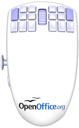
Another open-source product making its debut in hardware is the OpenOffice.org Mouse (pictured left). Eighteen buttons, an analogue joystick… I admit to sucking my teeth in disbelief when I first saw it; the comparisons that have been made to the Homer seem justified.

    But take a step back, and consider it more slowly, and perhaps it’s not the car-crash it seems; instead, its problems are more subtle. Chris Messina has a sharp takes on this:

    What I worry about, however, is that pockets of the open source community continue to largely be defined and driven by complexity, exclusivity, technocracy, and machismo… so far I’ve see little indication that open source developers take seriously the need for simpler, easier, and more intuitive future-forward interfaces. Perhaps I’m wrong or just uninformed, but so long as products like the OpenOfficeMouse continue to characterize the norm in open source design, I’m not likely going to be able to soon recommend open source solutions to anyone but the most advanced and privileged users.

    Friend of BERG Phil Gyford picks up a similar point:

    The problem isn’t that it has appalling design — it’s poor and uninspired, but it’s not the worst thing ever.

    The fundamental problem is that the product is aiming for two very specific, probably unreconcilable, niche audiences (hard-core gamers and hard-core office workers) while associating itself with a brand (OpenOffice) that wants to be completely mainstream.

    I think Phil’s right. If this was pitched as, say, an EVE Online mouse, I’d probably go “oh, that makes sense for a game and UI that complex”. But for a brand trying to be taken seriously as a mainstream alternative to expensive office suites, this seems misguided, and only perpetuates preconceived notions of Open Source’s attitude towards design.

  • Schulze has bought a new car, and trust him to buy the only car I’ve seen with its own font. That is: not a font designed for the car, but a font made by the car.

    Toyota motion-captured an iQ from overhead using software written in openFrameworks, and used it to generate a handwriting font built out of careful cornering and handbrake turns. It feels like the opposite of DHL’s fake GPS art: Toyota are keen to show the software and prove it actually works. Best of all, they’ll even let you download – and use – the font itself.

  • I couldn’t let a round-up of links go with a mention to James Bridle’s recreation of MENACE, Donald Michie‘s learning machine to play noughts-and-crosses built only out of matchboxes and beads, which he first demonstrated at Playful two weeks ago.

    James was kind enough to bring his MENACE to a recent BERG drinks evening, and it drew the gasps it thoroughly deserves; 301 matchboxes is an imposing piece of computing.

  • And, finally, a nice little piece of what you might call design research: Giles Turnbull investigates nomenclatures for legobricks, surveying a selection of children he knows:

    This language of Lego isn’t just something our family has invented; every Lego-building family must have its own vocabulary. And the words they use (mostly invented by the children, not the adults) are likely to be different every time. But how different? And what sort of words?

    Hence, a survey. I asked fellow parents to donate their children for a few minutes, and name a selection of Lego pieces culled from the Lego parts store.

    Lovely. (Personally, I called a Brick 1×1 a “one-bobble” and a plate 1×1 a “flat one-bobble”).

Tangled histories

wykobi_quadratic_bezier_intersection

I saw Brian Eno and Steven Johnson in conversation on Monday night at the ICA, and Johnson talked about an approach he calls the long zoom or maybe consilience. The invention of air (the subject of his book) must take in the context of the Enlightenment; the energy and machines released by the Industrial Revolution; discussions, letters and social relations; and the shift from alcohol to coffee. All scales interconnect. None determine.

I enjoy these interwoven histories. In Pandora’s Hope, Bruno Latour tells how Pasteur and microbes bring each other to life, buttressed by laboratory experiments and arguments in letters to other scientists. Pasteur, microbes and instruments each have their own capacities to act and collaborate, and it’s only in their actions that we remember any of them; that history is made.

Yesterday morning I had an exciting meeting with a potential cybernetics researcher. I hope it works out. We found tight knots and long arcs: gnosis, McLuhan, Shannon’s information theory, mind/body, and Neuromancer; racism, eugenics, Mead, post-structuralism; prosthetics and body modification.

movie_narrative_charts_large

Listopad

We’re now 20 years after the Prague Revolution of November 1989, that threshold year for modern Europe. It is a tangled history: all views of the events are partial and are often contradictory. No single factor determines. Historical trajectories lasting five decades are as important as lies told to credulous protestors, and as important as an invisible-to-us political game played between the secret police of Soviet Russian and Czechoslovakia. All we can do is tell stories.

The Prague revolution is a history best seen as constructive interference; a kind of aleph moment of trajectories and events; a cloud formation in a particular spot brought about by humidity and foliage and gaps in the clouds, a nest or complex of feedback loops; a self-reinforcing discontinuity.

Some years ago I made a timeline from journals and journalism I could find online. 1989 is right at the beginning of online personal narrative, which is one of the qualities that attracted me. In the end I wrote a story about Martin Smid, the student who didn’t die, but whose death at the hands of the police catalysed the revolution: Listopad, Prague 1989.

I don’t know why I write this. I’m interested in tangles and multi-actor histories, and how you tell stories in them. Books are for the linearisable. Hypertext is for hyperhistories. I’m curious about how simple patterns in behaviours or social relationships somehow persist, complexify and grow over decades and hundreds of thousands of people, and somehow don’t die away.

That’s one of the reasons I’m interested in cybernetics — surely it’s important, the weird individual relationships, the probes into the nature of being human, the mix of countercultural and military-industrial, the attitudes and ideas, all fermenting in the bottleneck population that contributed so much to modern culture? Surely those patterns persisted and weren’t diluted, and will throw light on the here and now? Beginnings matter.

Week 230

Last week’s financial modelling resulted in a graph of the company’s invoices and cash receipts back to July 2007. I can read my feelings off it month by month: there’s an early year of maintaining one big consultancy gig per quarter coupled with a single long running project. Good. I can read a year ago, November 2008, the beginning of the time I called the Dayuejin – the Great Leap Forward – when we decided to begin to grow. The following six months are spiky: there’s a month of cash followed by a month of drought and hunting for work, and the pattern repeats. Looking at the chart I can remember the inclines and angles of the lines in my legs. It feels like hiking.

It’s satisfying to see this present epoch, the Escalante, made literal in grey and blue. In July 2009 the oscillations finish and we’re at base-camp of a steady climb. The climb won’t last forever, maybe until February next year: at that point I’m aiming for the company to be turning over nicely; cash, business development, work, R&D, exploitation, marketing, growth all running steadily, at comfortable capacity, and together, without stuttering or misfiring. It’s that operational foundation that enables products. New product development and client services live hand in hand: in expertise, ideas, attention and freedom. So I have my eye on what it will mean to achieve the Escalante – and what comes afterwards – and I’m working on building the right structures and bringing in the right projects to make that happen.

That’s the big picture. Weminuche is a big part of what happens post Escalante. And the new studio. And the people. And, and, and. But from here to there…

I guess we’re a product design company, whether it’s for Web, mobile, print, networks or consumer electronics. “Product” for us means something which you can attach marketing messages to, that has a business model in it, that has goals and success criteria, that you can rally a team behind, that is coherent to the consumer… services, content, community and experience are immaterials that we work with, intrinsically, but frankly: if you can’t say what it is in a sentence and you can’t sell it, why should we make it or why should anyone else pay us to make it? We like to make products designed to be part of social lives and part of society.

Now as part of the invention process there are weird and often gorgeous experiments and explorations. But I’m pleased to be able to say that the Here & There maps did well commercially, in addition to coming out of a long-running research project, and the collaborations with Touch succeeded in the marketplace of attention. You gotta get to market to know whether what you’re doing is any good.

I don’t know, maybe I’m being unnecessarily dogmatic, but the idea of “product” is a thread that runs through a lot of our work, and I’m trying to think through and unpack what we really mean by that.

Anyway. The projects we’re working on right now – primarily Ashdown and consulting with Bonnier – have to be considered as products (with service layers! Living in our social groups!), and executed with inventiveness and beauty and popularity.

And the two projects I mentioned at the end of week 229, they have to be about inventiveness and beauty and popularity too. A quick update on those: it was a great Friday last week. We have codenames for both now. I’ve commented on a draft of the contract for Walnut. And on Kendrick we’ve agreed budgets and the engagement fee, and we’re waiting to see the contract and PO. Massively exciting.

I should say what we’re up to this week…

Schulze and Matt are working with Bonnier at the beginning of this week. Schulze will move onto organising builders for the new studio, and planning how we invest in the development of two products of our own. He’s also working on pitching Weminuche, and helping with Ashdown.

Matt Jones will focus on Ashdown. It’s an Ashdown week in the studio: everyone has something to do. I’m going to rustle up some meetings, Tom is building scrapers for data and making more visualisations, and Matt is leading the design effort. Matt Brown, previously Lead Interaction Designer at Last.fm, is joining us to work on this (and other things) for a few months, and he’s starting next Monday: it’s super exciting and a big moment for us, and we’re prepping the ground so he can get off to a flying start.

Three Matts. This is going to be confusing.

Tom’s also writing for the website this week. We need to keep an eye on general marketing because of how busy we’re going to be on projects for the next couple months. If the website’s not growing, that’ll bite us come February.

I’m on contracts, pitches, interviewing, and bedding down the new operations infrastructure we now need. For instance: we have an intranet. The long ascent of the Escalante always comes back to the moment by moment. If it’s true, that behind the mountains there are mountains, then you shouldn’t climb only for the view, but for the climb itself. Make every step satisfying.

Week 229

Tom is on holiday. Matt Jones was with the RCA Design Interactions programme on Monday launching a brief on the Future of Etiquette, in collaboration with T-Mobile. He’s currently in Berlin with that. Aside from that: Ashdown; helping Schulze with Bonnier; gentle biz dev.

Schulze is gently biz deving too, on top of developing last week’s low fi video prototypes for Bonnier with Campbell Orme, more Ojito designs and costings, and organising building works for the new studio.

I’m using this brief moment of calm to catch up on emails, writing, pitches and chores, and to build simple financial models of the company to give us a better view on the next couple of quarters. It’s got too complex to manage from looking at the books and invoices. The consequences of not doing certain kinds of biz dev or not watching cash or growth don’t become apparent for a few months. So: spreadsheets. I have to admit, I enjoy it.

(Also I’m holding my breath over two projects I’d really love for us to land this week. Don’t tell anyone I get this nervous.)

Toiling in the data-mines: what data exploration feels like

Matt’s mentioned in the past few summaries of weeks that I’ve been working on ‘material exploration’ for a project called Ashdown. I wanted to expand a little on what material exploration looks like for code and what it feels like to me, because it feels like a strange and foreign territory at times. This is my second material exploration of data for BERG, the first being at the beginning of the Shownar project.

There are several aspects to this post. Partly, it’s about what material explorations look like when performed with data. Partly, it’s about the role of code as a tool to explore data. We don’t write about code much on the site, because we’re mainly interested in the products we produce and the invention involved in them, but it’s sometimes important to talk about processes and tools, and this, I feel, is one of those times. At the same time, as well as talking about technical matters, I wanted to talk a little about what the act of doing this work feels like.

Programmers very rarely talk about what their work feels like to do, and that’s a shame. Material explorations are something I’ve really only done since I’ve joined BERG, and both times have felt very similar – in that they were very, very different to writing production code for an understood product. They demand code to be used as a sculpting tool, rather than as an engineering material, and I wanted to explain the knock-on effects of that: not just in terms of what I do, and the kind of code that’s appropriate for that, but also in terms of how I feel as I work on these explorations. Even if the section on the code itself feels foreign, I hope that the explanation of what it feels like is understandable.

Material explorations

BERG has done material explorations before – they were a big part of our Nokia Personalisation project, for instance – and the value of them is fairly immediate when the materials involved are things you can touch.

But Ashdown is a software project for the web – its substrate is data. What’s the value of a material exploration with an immaterial substrate? What does it look like to perform such explorations? And isn’t a software project usually defined before you start work on it?

Not always. Invention comes from design, and until the data’s been exposed to designers in a way that they can explore it, and manipulate it, and come to an understanding of what design is made possible by the data, there essentially is no product. To invent a product, we need to design, and to design, we need to explore the material. It’s as simple as that.

There’s a lot of value in this process. We know, at a high level, what the project’s about: in the case of Ashdown, Matt’s described it as “a project to bring great user experience to UK education data“. The high level pitch for the project is clear, but we need to get our hands mucky with the data to answer some more significant questions about it: what will it do? What will it feel like to use? What are the details of that brief?

The goals of material exploration

There are several questions that the material exploration of data seeks to answer:

  • What’s available: what datasets are available? What information is inside them? How easily are they to get hold of – are they available in formatted datasets or will they need scraping? Are they freely available or will they need licensing?
  • What’s significant: it’s all very well to have a big mass of data, but what’s actually significant within it? This might require datamining, or other statistical analysis, or getting an expert eye on it.
  • What’s interesting: what are the stories that are already leaping out of the data? If you can tell stories with the data, chances are you can build compelling experiences around it.
  • What’s the scale: getting a good handle on the order of magnitude helps you begin to understand the scope of the project, and the level of details that’s worth going into. Is the vast scale of information what’s important, or is it the ability to cherry-pick deep, vertical slices from it more useful? That answer varies from project to project.
  • What’s feasible: this goes hand in hand with understanding the scale; it’s useful to know how long basic tasks like parsing or importing data take to know the pace the application can move at, or what any blockers to a realistic application are. There is lots of scope to improve performance later, but knowing the limitations of processing the dataset early on helps inform design decisions.
  • Where are the anchor points: this ties into “what’s significant”, but essentially: what are the points you keep coming back to – the core concepts within the datasets, that will become primary objects not just in the code but in the project design?
  • What does it afford?: By which I mean: what are the obvious hooks to other datasets, or applications, or processes. Having location data affords geographical visualisation – maps – and also allows you to explore proximity; having details of Local Education Authorities allows you to explore local politics. What other ideas immediately leap into mind from exploring the data?

To explore all these ideas, we need to shape the data into something malleable: we need to apply a layer of code on the top of it. And it can’t just exist as code: we also need the beginnings of a website.

This won’t be the final site – or even the final code – but it’s the beginnings of a tool that can explain the data available, and help explore them, to designers, developers, and other project stakeholders, and that’s why it’s available, as early as possible, as an actual site.

To do this, the choice of tools used is somewhat important, but perhaps more important is the approach: keeping the code malleable, ensuring no decisions are too binding, and not editorialising. “Show everything” has become a kind of motto for this kind of work: because no-one else knows the dataset yet, it’s never worth deeming things “not worth sharing” yet. Everything gets a representation on the site, and then informed design decisions can be made by the rest of the team.

What does the code for such explorations look like?

It’s a bit basic. Not simple, but we’re not going to do anything clever: architecture is not the goal here. It will likely inform the final architecture, and might even end up being re-used, but the real goal is to get answers out of the system as fast as possible, and explore the scale of the data as widely as possible.

That means doing things like building temporary tables or throwaway models where necessary: speed is more important than normalisation, and, after all, how are you going to know how to structure the data until you’ve explored it?

Also, because we’re working on very large chunks of data, it’s important that any long running processes – scrapers, parsers, processors – need to be really granular, and able to pick up where they left off; my processing tasks usually only do one thing, and require running in order, but it’s better than one long complex process that can’t be restarted – if that falls over in the middle and can’t be restarted, it’s a lot of time (a valuable resource at these early stages) wasted.

It’s also important that there’s a suitably malleable interface to the data for you, the developer. For me, that’s a REPL/console of some sort – something slightly higher level than a MySQL terminal, that lets you explore codified representations of data (models) rather than just raw information. Shownar was built in PHP, and whilst it was, for many reasons, the right choice of platform for the project, I missed having a decent shell interface onto the system. On Ashdown, I’m working in Rails, and already the interactive console has made itself indispensable. For a good illustration of the succinct power of REPLs, and why they’re a useful thing to have around for data exploration, it’s definitely worth reading Simon Willison’s recent post on why he likes Redis.

Visualisation

Visualisation is a really important part of the material exploration process. When it comes to presenting our explorations, it’s not just enough to have big lists, and vast, RESTful interfaces on top of blobs of data: that’s still not a very effective translation of the stories the data tells. Right now, we don’t need to be fussy about what we visualise: it’s worth sticking graphs everywhere and anywhere we can, just to start exploring new representations of the data. It’s also useful to start learning what sort of visual representations suit the data: some data just doesn’t make as much sense in a graph as a table, and that’s OK – but it’s good to find out now.

Because now isn’t the time to be shaving too many yaks, when it comes to visualisation libraries and tools, the ones that are fastest or that you are most familiar with are probably the best. For that reason, I like libraries that only touch the client-side such as the Google Charts API, or gRaphael (which I’ve been using to good effect recently). Interactive graphs, of the kind gRaphael makes trivial, are more than just eye candy: it’s actually really useful, with large datasets, to be able to mouse around a pie chart and find out which slice corresponds to which value.

Visualisation isn’t just a useful lens on the data for designers; it can be hugely beneficial for developers. A recent example of the usefulness of visualisation for development work in progress comes from this video behind the scenes on Naughty Dog’s PS3 game Uncharted 2: Among Thieves. About twenty seconds in, you can see this image:

of a developer playing the game with a vast amount of telemetry overlaid, reacting as he plays. It’s not pretty, but it does provide an immediate explanation of how gameplay affects the processors of the console, and is clearly an invaluable debugging tool.

What data exploration feels like

It often feels somewhat pressured: time is tight and whilst an hour spend going down the wrong alley is fine, a day spent fruitlessly is somewhat less practical. At the same time, without doing this exploration, you won’t even know what is “fruitless”. It can be frightening to feel so directionless, and overcoming that fear – trusting that any new information is the goal – is tough, but important to making progress.

It can also be overwhelming. Shownar ended up with a massive dataset; Ashdown’s is huge already. That dataset – its meaning, its structure – gets stuck in your head, and it’s easy to lose yourself to it. That often makes it harder to explain to others – you start talking in a different langauge – so it becomes critical to get it out of your head and onto screens.

It also feels lonely in the data-mines at times. Not because you’re the only person working on it, but because no-one else can speak the language you do; the deeper you get into the data, the harder you have to work to communicate it, and the quicker you forget how little anyone else on the project knows.

Invention becomes difficult: being bogged down in the mechanics of Making It Work often makes it hard for me to have creative ideas about what you can do with that data, or new ways of looking at it. Questions from others help – a few simple questions about the data opens enough avenues to keep me busy all day. One thing we tried to do was ensure that I made a “new graph” every day; the graph should only take about 30 minutes to write the code and do, but it ensures that I don’t spend all my time on writing processing or scraping code.

At times, the code you’re writing can feel a bit string and glue – not the robust, Quality Code you’d like to be writing as a developer. I’d like to TATFT, but this isn’t the place for it: we’re sculpting and carving at the moment, and the time for engineering is later. For now, getting it on the screen is key, and sometimes, that means sacrifices. You learn to live with it – but just make sure you write the tests for the final product.

There are a lot of pregnant pauses. For Ashdown, I’ve had long-running processes running overnight on Amazon EC2 servers. Until I come in the next day, I have no idea if it worked, and even if it did work, whether or not it’ll be useful. As such, the work is bursty – there’s code, and a pause to gather results, and then a flurry of code, and then more gathering. All I’ve learned to date is: that’s the rhythm of exploration, and you learn to deal with it.

What emerges at the end of this work?

For starters, a better understanding of the data available: what there is, how to represent it, what the core concepts are. Sometimes, core concepts are immediately obvious – it’s likely that “schools” are going to be a key object in Ashdown. Sometimes, they’re compound; the core concept in Shownar turned out to be “shows”, but how the notion of a ‘show’ was represented in the data turned out to be somewhat complex. As part of these core concepts, the beginnings of a vocabulary for the application emerge.

Technically, you’ve got the beginnings of a codebase and a schema, but much of that might be redundant or thrown out in future; you shouldn’t bet on this, but it’s a nice side effect. You also might, as a side effect of building a site, have the beginnings of some IA, but again, don’t bet on it: that’s something for designers to work on.

You should also have a useful tool for explaining the project to colleagues, stakeholders, and anyone coming onto the project new – and that tool will allow everyone else to gain insight into just what’s possible with the data available. Enabling creativity, providing a tool for non-developers to explore the data, is the key goal of such exploration. And that leads into a direction and brief for the final piece of software – and it’s a brief that you can be confident in, because it’s derived from exploration of the data, rather than speculation.

And then, the invention can begin.

Cybernetics: researcher wanted

I’m into cybernetics. Or rather: I think that the cybernetics movement of mid last century is the hidden nexus of interconnected postwar history.

cybenetics interconnections

The 1946 Macy Conference is kind an aleph moment. In attendance were people intrinsically involved in computers and prosthesis (the collaboration of man and machine), modern anthropology and modern neuroscience (what it means to be human), game theory (the Cold War and the conversion of people into cogs). We can trace direct paths through counterculture and social organisation, decentralisation and the Web, and to a socialist Chilean internet. There are connections to cults, advertising, social software and games, rocketry, suburbia, complexity theory and ecology. Historical roots lie in golems and pneumatic tubes, science fiction and weaving, pataphysics and the telegraph. The language of our information society was created, often knowingly, by these people. Cybernetics is the beautiful and ugly and ambiguous heart of our information society.

I have a dozen or so books in my collection that directly speak about these era. Two that stand out are both by Steve Joshua Heims: Constructing a Social Science for Postwar America: The Cybernetics Group, 1946-1953; and John von Neumann and Norbert Wiener: From Mathematics to the Technologies of Life and Death.

What’s wonderful about this history is that it’s a history of people. It’s all people who know people. The messy social world of this invented science that then vanishes undermines its own contention that humans can be modelled as components. It is a story that cannot be linearised, it is a hypertext history; a hyperhistory of actors and networks, only tellable through contradictory, subjective points of view. Yet there are aspects of known history that, I believe, only make sense when you see the hidden particle traces, the lives of the attendees of the Macy Conferences and who they knew.

It has been a pet project of mine, for a few years, to somehow tell this story. Many of the key participants are no longer with us. Understanding the modern world, in this time of change, is important. It should be known that common practices in our innocuous online spaces were thrashed out as military efforts. Conversely it should be known that the mindset computers were borne out of was reactionary and weird and perverse from the very outset.

Help wanted

I’d like some help assembling the research. I’m not sure precisely where it’ll go – for a while I thought I’d write a book, and now I have other ideas – but what I do know is that I’d like to work with a researcher for 3-6 months to turn books, articles and references into research notes: the foundation for future work.

I have a starting set of books, and a pretty clear idea of what I need as output (one reference point is Anne Galloway’s re/touch encyclopaedia). If you’re the researcher I’d like to work with, you’re already knowledgeable about postwar America and one or two of the topics associated with cybernetics. You’re good with book research, following leads like a hungry investigative journalist, and diligent with references. You’re probably in research academia in an allied field, and you may have your own use for this work. This is a part-time job, and it’s maybe another small piece of funding for you. You’ll be a self starter, and glory in interconnections and libraries both.

Why am I talking about this in public? Well, I don’t know the right researcher. Is this you, or is it someone you know? It’s speculative work – just following my nose – and I can put about £3,000-5,000 aside. If you’d like to have a chat, please do get in touch.

Ashdown: researcher wanted

As Webb has mentioned in this week’s update, I’m leading a project in the studio called Ashdown, which is in it’s very early stages.

One of the things we need is a researcher to undertake a small sub-project for a few weeks, to help us understand the territory we’re designing for.

Have a read of the mini-brief below. It might be you!

Introducing Ashdown
Ashdown is an information system we are developing – that will manifest in a number of products relating to the UK’s educational system. Each will be built on a combination of publicly-available data sources and be made unique by the quality and insight of its presentation. The products have a variety of potential audiences: from journalists and commentators to policy-makers, teachers and parents. Each one will be gorgeous.

What do we need
We need to build up a profile of these different audiences, particularly teachers and parents – around the UK. We are looking for a researcher who can do some quick field research and create a bundle of assets that can inform the design of our products: interviews, personas, videos, relationship maps. We want someone who can provide some analysis, synthesis and have some opinions also – that we can use in our process as designers.

Who we’re looking for
Probably an individual, probably someone based near London so we can spend time together, probably someone who knows people in or related to education (getting out and finding the right people around the UK is a must), and who is happy running this piece of work themselves, for us.

When / How
We would like to have a final report and assets by the end of November 2009, and we have a £1,000 budget + reasonable expenses put aside for this.

If you’re interested yourself get in touch with me: mj [at] berglondon.com, or if you know someone who might fit the bill – please do let them know about this opportunity.We’re looking to get started as soon as we can!

Week 228

I’m back. Holidays are good, I can thoroughly recommend them. And if you’re interested in the talk, Escalante, I gave while I was away, you can listen to the MP3 recording and see the bibliography.

Thanks Matt Jones for giving the week 226 and week 227 updates while I was away! He’s funnier but I talk more about business strategy. Let’s get on with the show.

Ashdown is a project to bring great user experience to UK education data. There’s a lot of it. Tom is working hard on material exploration, ingesting data sets and visualising connections and context within the data, to help designers understand and invent. I’m hoping he’ll say more about that process, from a code perspective, on this blog this week. But just now he was taking movies and chopping them into frames for some studio experiment or another, something Schulze has been working on.

Matt Jones is away today, speaking at Design by Fire in the Netherlands. I’m not kidding: he’s speaking about the nature of time. It’s possible we’ll be in a workshop together later this week, and otherwise he’s following up new business opportunities and working on Ashdown. I’m hoping he’ll get a chance to make us some more business cards and to arrange a party.

Last week Matt and Schulze were in Stockholm working with the Bonnier Group, kicking off a project that runs through to December. Bonnier are fascinating: a 150 company multinational media conglomerate with interests in radio, television, books, games and cinema, they’re also privately owned (since 1804) and able to take the long view. The R&D division – our previous and current client – works across the entire group without barriers, and is uniquely both exploratory and business savvy.

It used to be there were just a few media: telly, radio, books, phones, those kind of things. But I don’t think it makes sense to say that the Web is simply one more medium. The different services built on top of the Web have such different qualities: they are differently social; differently permanent or ephemeral; differently immersive or ambient. Flickr is a medium. YouTube is a medium. Blogs are a medium. What gave a medium its characteristics used to be the technology itself – the pipes and means of production – but with the Web that’s no longer true. What makes a medium a medium is itself up for design. The Web is not one medium, it is too fluid for that. The Web is ten thousand media, and you get to choose and invent which you use.

Schulze calls this media design and increasingly it’s what our strategy work involves. Interestingly companies up and down the media stack want the same thing. Content companies, distribution companies and technology companies are in a process of convergence. To put it bluntly: Facebook, Google, Apple, Nokia, BBC, Bonnier, the Guardian, Microsoft are becoming direct competitors, which never used to be the case.

So we’re doing media design for Bonnier, which involves strategy, invention and prototyping, and Schulze is half on that this week.

The other half of Schulze’s time is on Ojito. The manufacturing costs, timings and bill of materials are firming up, but there are a few other design and cost estimates to figure out on the route to market before we give it a GO/NO GO. If this doesn’t get in your hands via a client partnership (which is about 50% possible), this work is our pre-requisite to taking it to market ourselves.

Me, this week I’m on admin. There’s a contract to put together for a new hire, more work to be done on book-keeping, and the financial projection and work pipeline to be brought up to date. I have some invoices to chase, others to raise, and some phone calls to make. It’s incredible how much time that all takes.

I’m also working on bringing in Weminuche, and thinking hard about some challenges I see for the company on a six month timescale.

Coming back to work, I’m enormously proud of what the guys achieved while I was away. There’s been some great work completed, more brought in, and some startling opportunities developed.

But with the benefit of the distance a holiday brings, I’m aware that I’m not sufficiently able to support the right creative environment in the studio while I’m so preoccupied with admin. Matt and Schulze took me aside when I got back to give the same message. Growing pains.

I need a part-time office manager, and if you know someone who’s interested in (initially) a day a week, please ask them to get in touch and I’ll get back to them with a job spec.

That’s more or less most of what’s going on. A busy week 228.

Why social matters

A few years ago I read a book called Bowling Alone by Robert Putnam. It introduced me to the term social capital.

Social capital is an abstract measure that wraps up how many people you know, the information flow in your network, how many people owe you favours, that kind of thing.

High social capital goes hand in hand with being in groups, and with knowing your neighbours. People with high social capital have better jobs, live longer, and are healthier and happier. In areas with high social capital, there’s less litter, and car drivers behave better at road junctions. It’s big things and little things.

It’s a big deal. If you aren’t in any groups, and you joinjust one, your odds of dying next year are cut in half. If you’re a smoker and aren’t in any groups, statistically it’s about the same whether you should join a group or quit smoking. (Source.)

Many aspects of living are correlated with low social capital but a couple stand out. What damages social capital, at least that we know of, at least in the US, is two things: commuting, and watching television. Both stop you spending time with your friends and neighbours.

So as increased commuting times and TV dinners spread across the USA, social capital dropped drastically between 1975 and the end of the century. In that time, the average number of times Americans had friends over for dinner in a year dropped from 15 to half that.

I suspect, if we had ways to see it, we’d realise we just passed through a Great Depression of the social world.

Social software and Web 2.0

Social software was a buzz word a few years ago. It came from a realisation that websites, being online, could include people and groups of people in a way desktop applications couldn’t. Social software meant new design considerations and a renewed acknowledgement that different people use computers differently. Showing off, sharing, politeness and play would have to take their place next to usability.

I wrote a short summary of social software ideas back in 2004.

Web 2.0 is now another hackneyed buzzword, and it’s hard to remember what a shift it was when the modern Web started emerging. To me, Web 2.0 is social software releasing what it could be when social is baked in from the foundations, instead of being added as an extra to an old-school news site or online shopping catalogue.

Why social matters

It now feels natural to incorporate our friends into photo management, encyclopaedias and tracking our finances. I love that Web 2.0 has been so successful it barely needs to be pointed out and the ideas from social software are part of everyday Web design discourse.

But it’s important to remember that for ten years – a decade – the Web was not a naturally social space, where conversations and creativity could flourish side-by-side and hand-in-hand – and for many, now, it’s still not. That we’re prepared to give away our rights and privacy in exchange for leaving comments or joining a chat system in a game tells me that we’re still starved for social connection online.

The fact that our hobbies are social again is great. Flickr builds social capital, Twitter builds social capital. The fact that are hobbies are social again is important.

Social means showing off and sharing, and politeness and play, yes. But social also means healthier, wealthier and happier, and that’s a big, big deal. I believe that’s why social matters.

The bit of social I particularly care about is small groups, and my close friends and family, and I believe we’re still not designing well there. But that’s a story for another day.

The Pillar Of Autumn

Autumn arrived abruptly in our studios last week, and we weren’t the only people feeling it.

Our friends upstairs at Pachube are wiring up the world for real-time sensor-data sharing, and so were able to see the sudden addition of electric heaters in the building through the spike in the graph below…

Week 227

Webb’s on holiday after delivering his keynote at Web Directions South. He’ll post the slides/notes when he returns from his spirit journey but in the mean-time here’s the bibliography.

Tom is still doing his data-botany for Ashdown, running around in servers with his butterfly net made of finest regexp to see what he can find, and making beautiful magnified watercolour illustrations for the info-bestiary.

The edges are starting show in this particular patch-ecology, as are the gaps – not only in terms of what’s not there, but also the space-between where we could add data-on-data and make interesting new things to show people. Again this is an approach that worked really well while we were developing Shownar, and it’s bearing fruit already for Ashdown.

I’m still working on some initial Ashdown brief writing and project planning (which is coming on leaps-and-bounds thanks to Tom’s investigations), a bit of new business development and going to the inaugural Icon Minds event tomorrow to see Bruce Sterling talk “Design Fiction” with Dunne + Raby.

Schulze started the week with a splash, launching the Immaterials film, as part of our collaboration with Timo, Einar and the Touch project It’s since been io9‘d, Ellis‘d and Slashdotted and we’re really pleased with how both the tech and design communities are engaging with it.

He’s also working with our modelmakers on new, improved Ojito prototypes and looking at manufacturing options and sorting out the final stages of our negotiations for a new studio.

Both Jack and myself are off at the end of the week to Sweden to run a really exciting new media design project workshop for one of our favourite clients which will be intense.

Finally – as Autumn has finally arrived and we found ourselves shivering in the studio, we’ve invested in some state-of-the-art thermoregulation apparatus, that we’ve codenamed “Ojiter”.

Ojiter

(O-heater… Geddit?).

Dont worry.

Normal pun-free programming resumes next week when Webb returns…

Friday Links: Yet More AR, eBooks, and Atari


  • Augmented Reality Link Of The Week #1: Scope, by Frank Larsome. Scope is an AR tabletop wargame, played with special markers and (in a nice touch) any toys you have lying around. The interface and “game” elements are all projected onto the scene through the goggles.

    I like this because it’s consistent and realistic in its use of AR: it makes sense to wear goggles or some other kind of apparatus, because you’re an army commander surveying a battlefield. And I like that reality is genuinely being augmented here: the AR element is interface and head-up display, as opposed to some 3D element pretending to be real but clearly failing at that. AR is, quite rightly, part of the novelty of Scope.

    [via GameSetWatch]

  • And from the sublime to the ridiculous, as it were. This is Tribal DDB Asia’s “3D McNuggets Dip“, “The first 3D Augmented reality dipping game with McNuggets”.

    It’s AR as pure novelty: a marker to be used with a Flash webcam app, dragging an AR McNugget around a screen much like you might with a mouse, the sole novelty in the proposition being AR. It’s barely AR; it’s more Marker As Interface – much closer in implementation to the way a Wii Remote might be used.

    And what’s it all in aid of? Promoting a foodstuff made of both chicken and mechanically separated meat.

    [also via GSW]

  • Enough AR; onto ePublishing. Not the launch of the Kindle to international customers – but rather, the December launch of a series of eBooks for children.

    Excitingly, they’ve been targeted not at existing eReaders, nor a simplified eReader aimed at children, but to a device with a touchscreen that many kids already own: the Nintendo DS.

    It’s a deal between publishers Egmont Press and Penguin, with games company EA. The titles are priced at £24.99 – nearly the cost of a full DS game, but each cartridge has “6-8″ titles on it, which cuts the cost per book down to that of a paperback. And then, of course, there’s all the supplemental material.

    I like the idea of Flips (as the titles are known) because they’re basically nothing new: an existing product retargeted simply by aiming at a new, simpler, cheaper platform – and one that many kids already have. There’s nothing complex here in the software or the strategy, but if the implementation’s good, then perhaps they’ll be a success.

    Sure, the DS screen isn’t as easy on the eyes as a Kindle’s, and the resolution is lower, but that might be less of an issue for ten- and eleven- year olds.

    It’ll be interesting to see how they sell; it’ll also be interesting to see if it sparks interest in reading, and also where they’ll be stocked: games shops are likely to carry them, but will bookshops as well? We’ll find out in December, just in time for the Christmas rush.

  • atari-catalog
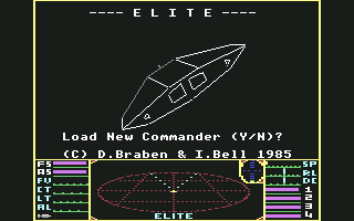
And, finally, a small piece of gaming nostalgia that made me smile: the 1978 Atari catalogue, featuring titles for the VCS/2600. I like it if only for its emphasis on anything but the game screens, instead focusing on the large amounts of commissioned art. That cover brings nothing to mind so much as Mr Benn, and reminds me of the escpaism – the different outfits one can wear – that computer games have always had at their heart.

Escalante, a bibliography

Escalante

I had the privilege of opening Web Directions South here in Sydney, this morning, with a hike through fanufacture, science fiction, social capital, cybernetics, and Neptune. The reception has been great and I totally enjoyed myself! What more can a man ask for.

A few folks requested a bibliography, so here we go. You can pretty much reconstruct my entire talk from this. Books and articles, in order of appearance!

Week 226

Matt Webb’s down-under preparing for his talk at Web Directions South, prior to him going on holiday for a bit, so I’m writing the weekly update! I’m drunk with the power!

So – in summary: Schulze is spending the week in zero-g combat training, Tom is playing with an orangutan genome that he got from some guy in Zurich and I’m building a laser-harp.

Not really.

Jack’s working on Ojito some more this week, and with me on new business development. He’s also working on some animations with Timo for the Touch project.

Tom is still engrossed in material exploration of the data sets for Ashdown as Webb described so nicely in Week 225.

He’s wrangling it now to the point of finding the interesting edges and qualities to output that into graphical, understandable diagnostic artefacts that will help us when the design begins in earnest. I find this really useful in particular, as more of visual thinker – helps me get my head round the territory far faster. Boundary objects.

He’s also doing a little bit of sound design on the side for our casual game proto that we’re delivering at the end of the week. Busy boy!

I’m still working with Paul Pod on that sprint. It’s been a really short intense project but I’m super-pleased with how it’s going and from what we can tell so is the client – hopefully it will lead to something bigger…

My creative direction for it so far has been “Y’know… Peggle meets that Röyksopp video!

Luckily, having worked with Paul before he’s able to understand garbling like that from me, and go far beyond what I imagine.

I’m also preparing the project plan and internal briefing documents for Ashdown. Writing a brief for a project that you’re going to design might seem a little odd, but of course it’s still valuable in order to really set some goals and scope going in.

What else? Well, I’ve already mentioned the new business development meetings with Jack, and I’m writing a final proposal for a mobile storytelling tool we hope to prototype.

Ok – with that, it’s back to the laser-harp.

Friday Links: Narcisissm, the Everyday, and Pancake-Picking Robots

  • GameSetWatch reports on the cancelled American Idol arcade machine by developer Raw Thrills. A shame it’s been cancelled; it looks fantastic:

    Players stand in front of a green screen while the game films them and creates a music video background while they sing. Their performance is then emailed to them or burnt onto a DVD players can take home.

    How’s that for a piece of product design? I particularly like that it offers you a choice of DVD or emailed video file – the latter leads to an instant community of Star Studio videos on Youtube, the former to replayable experiences for families. Of course, the make-or-break is going to be the quality of the videos, and whilst they’re obviously somewhat cheesy, the output – from a cheap green-screen in a photobooth-sized cabinet isn’t half bad, when you watch the videos of the developers playing:

    Would it have sold DVDs to kids in malls and arcades across the US? We’ll never know.

  • I always enjoy Chris Dahlen’s writing, and his lateset column for Edge Online – about “user-generated, machine-mediated content – UGMMC, or ‘Ugh-Meck’” is a cracker. User-generated content is a hot topic in the games industry right now, but it’s not without its drawbacks – notably, the time and skill required to make anything in even the most basic of game editors.

    Dahlen proposes something different: using content that players are already making – on serivces like Twitter or last.fm – and working that into their games:

    “…what if you make personalisation easier? Consider a game that brings your real world into your game world, all on its own. It could grab data from the internet about the real world and the gamers that live in it, and weave it into the game experience, for an effect that is both surprising and personally meaningful. You would see yourself in a game without having to put yourself there.”

    Dahlen’s clearly only scratching the surface – it is, after all, a column rather than a design document – but he’s expounding on something good. And he ends on a note about narcissism that I find convincing in its poetry:

    “…even used sparingly, Ugh-Meck personalises an experience for even the laziest user. It shows us our reflection – however tiny, however distorted – inside our games, an experience that is guaranteed to mesmerise us.”

  • Another writer I’m a big fan of is Joe Moran, an academic at Liverpool John Moores Univeristy specialising in cultural history, and author of the marvellous Reading the Everyday, which I’ve written about on my own blog before (and spoken to many people about at length).

    Anyhow, it turns out that Moran has a blog, and has been blogging for quite a while, merging posts about things that interest him with published journalism. It’s a must-subscribe if you’re interested in the quotidian and mundane that is actually so important; recent highlights include a history of the 999 emergency phone-number, early writing on motoring, and a defence of pigeons.

  • And finally, here’s a video of a pancake-sorting robot, that can stack 400 pancakes a minute. Why? Because I like videos of robots in factories, especially when they’ve got arms as interesting as that one. Worth watching to the end to see it really hit its stride.

Stories as macroscopes

Last night I saw David Hare’s “The Power of Yes” at the National Theatre. It’s subtitled “A dramatist seeks to understand the financial crisis”.

National Theatre _ Productions _ The Power of Yes

In the playwright’s own words, spoken by Anthony Calf as he takes the stage at the beginning, playing David Hare:

“This isn’t a play. It’s a story. It doesn’t pretend to be a play. It pretends only to be a story. And what a story! How capitalism came to grinding halt. Where were you on September 15th 2008. Do you remember? Did you even notice? Capitalism ceased to function for about four days. This summer I set out to find out what happened.”

The huge bare stage is then flooded with characters, although the actors are playing real people – some anonymous however – and for the next two hours, you are gripped by, as one of the characters describes it “…a Greek tragedy”.

It’s funny, informative and through the eyes of Hare – the ‘fool’ who can ask stupid questions of the financiers – you get a complete picture of the financial crisis of 2007-2009 both in terms of the abstract-big-picture of what went wrong with the system, and the human-scale – what went ‘wrong’ with the people.

Here and there if you like.

“The Power of Yes” is a macroscope for the financial system – as Webb called for in his talk at Reboot this year.

This was the first time not only that I felt I’d really understood ‘credit default swaps’ (despite enjoying songs about them) and the other arcane instruments at the heart of the situation, but also the motivations behind the actors (if you’ll pardon the pun) involved in the real-life drama.

Thinking of all of the newspaper and tv news coverage that there’s been, it’s remarkable to me at least that a dramatist not a journalist, economist or political scientist did this.

The_Wire

But then I think of another favourite macroscope, another Greek tragedy, about a favourite subject of mine: cities – which was created by a dramatist who was a journalist, David Simon – and recall Oliver Sachs saying

“…sometimes the stories are the science”

Week 225

Material exploration is the process of getting your hands dirty in order to realise inherent possibilities. Forms for consumer electronics and big, interconnected data are both clays to learn and sculpt. Ashdown is a data heavy project, and Tom is beginning the material exploration now, building systems to ingest data for manipulation and folding, so that – in the design process – we can ask the data what it wants to be, and have that dialogue that happens between material and designer during thinking through making.

That’s Tom’s focus. Matt is focused on a casual game prototype in a two week sprint on another big data project. You have to want to keep clicking, and that’s such an experiential requirement: everything else can be mocked, but this part needs to be designed. Paul Pod is in the studio to work together with Matt on this, and he’s great to have around. (Paul also worked with us on The Incidental.) Matt is our golden boy this week: his recent future cities column at io9 provoked a stellar review from Bruce Sterling. “BERG has become a new Archigram”?? Bruce, that’s terrifically flattering hyperbole, thank you! Now we really have something to live up to.

Jack is prepping the launch materials for the next film to be released (post Nearness). That’s for Tuesday next. He’s working with a mechanical engineer on one project, and will have what we hope is the production-ready Ojito back from the model maker tomorrow. There are a few more costs to figure out before we can make a go/no go. Last week’s workshop we had together with Brian Boyer of Sitra went well, and I’m pleased to see Brian beginning weekly updates for the Helsinki Design Lab.

Me, I’m writing a talk, clarifying points for the accountants, and filling in forms this week, together with the usual progressing of business development. (The pipeline is looking healthy at all stages this week, with all hands taking the lead on a variety of projects.) I’ll be sitting on a panel at the Wired Intelligence Briefing on Thursday, and on Saturday flying to Australia to open Web Directions South and to have a holiday.

A holiday? I’m serious, a holiday.

BERG in this month’s Icon magazine

Will Wiles of Icon magazine interviewed me briefly for his article in the current (October) issue, on developments in augmented reality and impacts of architecture and urban design.

It’s a good overview aimed at a non-technical audience, and it’s great to see the discourse about AR in a design magazine rather than the usual more tech-oriented venues.

Also, gratifying to be quoted alongside our friends Eric Rodenbeck from Stamen and Usman Haque from Pachube/Haque Design+Research.

Week 224

The exciting news this week is that terms were agreed on Ashdown. This is a project on the scale of Shownar so will keep us occupied in various ways for at least the next six months. It’s a shame Matt Jones is on holiday this week, as he’s leading it — we’ll have to celebrate once he’s back.

Tom’s broken ground on Ashdown already: the first stage is material exploration, and so there’s data to be ingested and explored by designers.

I had hoped we could coincide Ashdown with another project using similar resources, and take advantage of being able to bring in long-term contractors, but we’re facing the traditional problem: closing deals always takes longer than I think. That’s getting some more of my attention now… how can risk be minimised and the process eased to move toward contract, when there’s investment that needs to be made simultaneously on both sides? I need to learn more about closing, especially in this industry, so any book recommendations or pointers are much appreciated.

That aside, I’m getting pretty confident in the process behind bringing in and balancing client services. Next up is to get as confident about new product development. We’re pretty good at the design process itself – developing briefs and finding the inventive steps – but across many products, there are questions: how much to invest in feasibility; how much should be known at the point of go/no go; how to continue to commercialise ideas. We have limited attention and investable cash, and physical things cost more – in cash terms – than websites, so it can’t be a matter of working late to try out ideas. Schulze made some good suggestions yesterday.

In terms of work: Matt, as I said, is on holiday. Tom has been writing and coding for data exploration on Ashdown. Schulze is split between business development meetings in media design/consultancy (his particular speciality), managing contractors on one product concept, and working on feasibility for two more. He’s in a client workshop with me today. I’ve been chasing invoices and fielding emails this week, and arranging a workshop for next Monday to kick off a two week sprint on a kind of playable demo. There were two talks for me – UX Week last Friday in San Francisco, and a panel at Digital Architecture London on Monday – and that always eats more time than I expect.

As Ashdown gets plugged into regular work, my attention is moving to the next big project to activate, one we call Weminuche.

My Weekend On Series 40

Taking my iPhone to a music festival didn’t really seem like the most sensible idea: a capacitive touchscreen in a potentially muddy field? A battery that only just lasts a day? It’s not exactly suited to the wilderness, not to mention a little fragile.

At the same time: it’s exactly the place that connectivity comes in handy, for finding lost friends. And so I decided to take a spare. Unfortunately, all my old phones are locked to the wrong network, so it was time to make a trip to a phone shop and buy a cheap pay-as-you-go phone.

2760-closed

I ended up with the Nokia 2760, otherwise known as the “second cheapest Nokia in the shop”, which seemed like a safe bet. The clamshell form factor was another layer of protection from the elements (when I wasn’t sure what the weather would be like), and perhaps more importantly, meant that the keypad buttons were much larger than on equivalent candybar-shaped devices. That was a distinct advantage given the potential for drunk, clumsy texting when in the vicinity of the Somerset Cider bus.

I spent a weekend away from pervasive connectivity, from GPS, from Twitteriffic, from thousands of apps, and instead just took the state-of-the-art when it comes to really cheap, no-frills phones.

And, you know, it was absolutely fine. The phone does everything you’d expect it to: it makes calls, it sends texts, it has a simple camera, and it has an alarm clock. I still have the muscle memory for Nokia’s T9 implementation. I could have installed Opera Mini on it (far better than the built-in browser) primarily for using Twitter, but really, I wouldn’t mess with it in any other way. And, of course, the hardware is great, as you’d expect from a firm with the industrial design experience of Nokia: it’s pleasant to hold in the hand, and it certainly doesn’t feel cheap. Also, it’s small; smartphones really have made me forget how tiny phones had got at one point, and the 2760 is a reminder that much smaller packages still exist.

Using the Nokia over the long weekend also reminded me that my usage of mobile phones has actually changed very little in the past decade. When it comes to the functionality of a phone, there’s almost no difference between my iPhone and the Nokia: they call, they make texts, they have a few useful features. Most of the change in my use comes down to the “smart” half of the smartphone: all the features that have converged from other devices. I no longer carry an iPod around with me; I no longer need an A to Z on me; I write my to-do lists into Things rather than my notebook; I can get on the web without complicated Bluetooth rituals.

2760-open

But none of it is necessarily unique – or vital – to my experience of the phone-as-mobile-communicator. I enjoyed the practicality and immediacy of the Nokia. I often find the wall of phones you see in shops tiring now – a series of black slabs, all identical in appearance thanks to the ubiquitous touchscreen, all to be distinguished by the software they run (which is usually never demonstrated in shops). The 2760 wears its phone-ness on its sleeve.

The magic of mobile phones is, first and foremost, that they are wireless communicators. You can talk, to other people, anywhere in the world, without wires. Everything else – all the magic in your convergence device – is something else. What phones have become, but perhaps they’ve transcended that description of phone-ness. All that is nice to have, for sure, and I’m very glad to have my iPhone back, but I was not once inconvenienced.

And here’s the big takeaway for me: it was fascinating to realise just how good the low-end products on the mass market today are. It’s easy to talk excitedly about innovation, and the new possibilities brought by every-more-advanced technology. It’s not much harder to be excited by products for emerging and developing markets, finding ingenious ways to bring costs right down and, potentially, change lives that have never experienced new kinds of technology. But it’s a lot harder to be excited the territory that lies between those two: refinement for the mass market of the developed world; products so unashamedly not new, but instead a continuation of past innovation, often doing nothing more than bringing that technology to a wider market at a lower price.

That’s as much part of design as new and shiny, and we don’t talk about it enough. The design community talks a lot about products like the iPod, but never the $20 MP3 players you find in the Sears catalogues. We talk about Chumbys and Pleos, but never the hundreds of items on shelves in Toys R Us right now, that are selling, and played with, and distill (sometimes well, sometimes terribly) so many of the ideas we, as a design community, talk about, into a $30 toy.

We shouldn’t stop talking about the iPods and the Roombas, either, but it’s worth remembering there is a world outside the five or six ubiquitous examples that do the rounds in conference season. And that’s what I learned when I bought a cheap mobile phone to take to a field.

Nearness

Last week Timo and I finished filming and editing Nearness. Earlier in the year BERG was commissioned by AHO/Touch to produce a series of explorations into designerly applications for RFID (more to come on what that means). Over the coming weeks BERG will be sharing the results of the work here and on the Touch blog.

The film Nearness explores interacting without touching. With RFID it’s proximity that matters, and actual contact isn’t necessary. Much of Timo’s work in the Touch project addresses the fictions and speculations in the technology. Here we play with the problems of invisibility and the magic of being close.

The work refers fondly to the Fischli and Weiss The Way Things Go film and its controversial offspring The Honda ‘Cog’ commercial. There are of course any number of awesome feats of domestic engineering on YouTube. Japanese culture has taken the form to its heart. My favourite examples are the bumpers in the kids science show Pythagora Switch. Here’s a clip.

Our twist is that the paired objects do not hit or knock, they touch without touching.

Matt Jones at Design by Fire conference, October 20th, Utrecht

I’m really looking forward to heading to Utrecht in October to participate in the 2009 Design by Fire conference, as apart of what looks like a fine programme ranging from the very practical to, well, me.

Here’s the pitch for my talk from the site:

Closing keynote: “We have all the time in the world”

People, places, time. The triumvirate of factors at play in mobile, social, locative services might be familiar at the surface level to designers and developers.

Our relationships to each other, the cities and places we inhabit and navigate have been transformed in the last few years by the technology, products and services that we have designed — but what about that last one of the three — time?

Using examples from the development of Dopplr.com and other services — alongside historical and science-fictional perspectives — Matt will explore what we might call “neochronometry” and illustrate some directions we could take as interaction designers to treat time as a material.

Hope to see you there!

Hello, Ojito!

Hello, Ojito!
Ojito is the name of a new 3d viewing toy we’re making. We took the first prototypes to FooCamp recently, and it got a great reception – but more importantly we got great feedback. Thanks to all!

We’ll be talking more about Ojito in the extremely-near-future, but for now here’s the logo and our mascot for the project. As Matt Webb found out on our trip, “Ojito” means “Little Eye” in Portuguese, which inspired me to create this little fella.

Hello, Ojito!

Week 222

Let’s keep it short and sweet. Schulze is working on video all week with Timo for the RFID design research and communication project. Tom is breaking ground on our new fulfilment system, named Springdale, which will be used in consumer sales in the future. He’s also writing, and in this morning’s crit showed a component of last week’s toy experimentation he built. It manipulates video and looks like it has lots of other uses. Neat.

Matt J is doing design work on Ojito and research on upcoming projects. Ashdown is close to kicking off and he’s leading that — the subsidiary holding company is formed and there are just a few more logistical hoops to jump through.

My priorities this week are coding for the racing car, and admin: anything in the pipeline needs to be progressed, and there is a list of tasks for the year end accounts which really must be done this week. (The pipeline is the list of projects pre-contract, everything from prospect through proposal to purchase order. It’s healthy to keep the pipeline full at every stage, and everything moving.)

Schulze has just walked in the door with Timo, so I’m off to lunch with them now. Enjoy your week!

Post-dConstruct links

Skimming through my notebook on returning from dConstruct, it seemed worth expanding a few scrawled notes into hyperlinks.

  • Adam Greenfield brought up Schelling Points – “[solutions] that people will tend to use in the absence of communication, because it seems natural, special or relevant to them” – as a way of describing natural meeting points in cities. Interesting that a descriptor from game theory works equally well for Eros or the Grand Central Clock. The Wikipedia page on the topic explains more.
  • Robin Hunicke used the word (or, rather, acronym) QWAN a few times – the Quality Without A Name, as described by the architect and academic Christopher Alexander in his book The Timeless Way Of Building:

    “This oneness, or the lack of it, is the fundamental quality for anything. Whether it is in a poem, or a man, or a building full of people, or in a forest, or a city, everything that matters stems from it. It embodies everything.

    Yet still this quality cannot be named.”

    I think, though, that when Robin used the term, it was very much lowercase: qwan, a straightforward piece of vocabulary.

  • Jones and I had chatted about Eng-Fi – engineering fiction – as part of British childhood in the audience at dConstruct; I returned home to find Warren Ellis had pursued a similar path in his latest Wired UK column, on why, for educational purposes at the least, the BBC should repeat Thunderbirds:

    Thunderbirds is Rescue Fiction. All kids respond to rescue scenarios. Rescue Fiction is emotionally maturing – it removes the wish for magic, religion or flying people to zoom in to save the day; it confirms that it is a far more glorious and dazzling thing to invent ways to rescue ourselves.

    Rescue fiction, engineering fiction; whatever you call it, invention truly is a glorious and dazzling thing.

  • And, as a bonus link, from the chat in the studio this afternoon: Dick Van Dyke is a computer animation enthusiast. Yes, that Dick Van Dyke.

Week 221

Matt Jones and I have been in San Francisco this week, for meetings and a conference (an event called Foo Camp). We’ve been demoing Ojito, a cheap 3D device for the iPhone we’ve developed. Although it wasn’t the purpose of the trip, we’ve pitched it maybe two dozen times, sometimes in less than a minute in a corridor, and it’s fascinating how that process helps distill a product concept and clarify its route to market.

I met one guy and he was like, “oh, great name, how did you come up with it,” so I told the story: we give all our projects codenames after places on the Colorado Plateau. We need essentially meaningless names for the dark projects, and it’s one of my favourite regions in the world. Ojito is a place there. And he replied, “no, no, you don’t understand. I speak Portuguese. Ojito, it means LITTLE EYE.” Auspicious.

My plan for the remainder of this week is to write Ojito up as a plan and cost it, and catch up on the admin that’s difficult to do away — invoicing, payroll and so on: there’s an approved suppliers list the company needs to get on otherwise we’ll lose our chance at a project, and the other big task is setting up a subsidiary company to run Ashdown so that project can start. The wheels are in motion but I need to speak with the bank.

Jack and Tom are in London, working together on a toy I’m really looking forward to seeing. It needs a codename. I understand there are stickers involved. That’ll continue next week.

Tom has been spit-and-polishing the website. Jack has been finishing the stationery templates for invoices and so on. Next week he’s doing some video work with Timo on our RFID research project.

Energy is important to new product development, and to creating new work, as is perspective. It’s easy to get mired in even the most exhilarating work and lose sight of what’s important in a product, and work is always better – and easier – when it’s approached with bright eyes and an open, confident nature. For projects that last longer out of the public eye, you need willpower too.

Conversations and conferences help (Matt J and Tom are both at dconstruct this Friday). What erodes these feelings is a lack of stability. In that spirit, the big news this week is mundane: we’ve been waiting for invoices to two clients to be paid… and in the last couple days, the money landed in the bank. Frankly it’s a relief. Large company bureaucracy can make the payment process time-consuming to navigate, and now especially – what with expanding and investing in new product ideas – Berg’s two major resource constraints are attention and cash flow. Having these invoices paid makes me realise quite how tense I’ve been about the latter for the last month (I don’t mind saying that most of my waking cycles go to thinking about the company), and it’ll be good to return to the normal situation of just having too many exciting projects to work on. That’s life in the Escalante.

This is BERG

Some history

Jack Schulze and I dispute where we met, but I know when we first worked together. In 2005 he offered to have his students design icons for some experimental social software I was making. He showed me the options, and the best one had gone against specific requirements in my brief. I picked it anyway. It wasn’t from any of his students it turned out. He’d done the work himself and put it under my nose secretly.

Schulze & Webb Ltd isn’t the original name of the company. Schulze and I renamed an off-the-shelf company we bought in summer 2005 — that’s often the easiest way to start up in the UK. So for a while the company was called Z.V.B. Ltd. “What does that stand for, Zero Version Behaviour?” said Schulze’s dad. And that particular company was formed 1 June 2005. I like that it pre-dates us, if only by a few weeks.

In the summer of 2008 we began the Dayuejin. It’s important to name the eras of a company. It gives a sense of purpose, and of history. The Dayuejin is also known as the Great Leap Forward. To make the products we wanted, we needed more money petrol, which needed bigger projects, which needed more people and a bigger studio, which needed more money, which needed our own projects to build confidence. Everything had to move forward at once. It took a year, more or less, to find the right way to do it and lock it in.

The current era started last week. It’s the Escalante, the Grand Staircase. We’re in the third stage of the business plan I wrote in 2006. Tom Armitage started with us as lead developer and writer at the beginning of 2009. Matt Jones joined mid this year.

Today

This is an invention, strategy and new product development design company. Schulze looks after NPD. Matt Jones looks after design and client services. I help keep the wheels turning. In addition to Tom, there is a network of expert practitioners in electronic and mechanical engineering, industrial design, print, 3D, animation, videography, visualisation, data-mining, coding and technical development. We have growing experience in more and more of fulfilment and the supply chain, with patents in progress, and some neat products either out of the door or in development.

I look at the ideas, people, projects, ways of working, products in development, our friends and culture, and I have to say it: I’m proud. S&W laid the right foundation, and it’s bittersweet to say goodbye to this part of our lives.

We need a name for the next four years. I’ll ask Schulze to say more about the brand in the coming days. For the moment, from all of us, welcome.

A new name

This is BERG.

Week 219

It’s the last week of Schulze & Webb because we’re renaming the company on Thursday. S&W no longer says what we are: four permanents and a network of expert practitioners, working in design strategy, invention and new product development for ourselves and others. The new name is good for the next four years… and more on that in a day or two.

Tom’s working on the website. It’s super clean, and the launch scope is good and tight. It’s all built in WordPress so we can add to it continuously — a big problem with the current one is how hard it is to update, given how busy we get. Matt Jones is on that too. He’s designed it as a hypertext, all cross-linked so browsing is a flow of reading. He’s also writing, sketching and designing as the deliverables are created for the two design strategy projects. And he’ll be on business development towards the end of the week.

Jack is working on negotiations for the new studio, developing our new branding, and today is with our model maker on various projects… one is Ojito, prototypes of which Matt J and I are hoping to take to California when we visit next week.

I’m writing, one design strategy doc and a little copy for the website. And I’m still on business. The Ashdown contract needs to be run past our solicitor, which is new for us but it’s more complex than ones we’ve signed before. And I have my fingers crossed that we’ll be able to move the iPhone app job forward towards kick-off later this week too.

See you on the other side of the re-brand!

Matt Webb at Web Directions South, October 6-9 in Sydney

I’m super pleased to have been invited to give the opening keynote at Web Directions South in Sydney at the beginning of October.

In 2008, I closed Web Directions North in Vancouver with Movement, on designing flow into the Web, and making applications in which action creates action. It was one of my favourite conferences.

This year I’m presenting Escalante:

The long run to the turn of the millennium got us preoccupied with conclusions. The Internet is finally taken for granted. The iPhone is finally ubiquitous computing come true. Let’s think not of ends, but dawns: it’s not that we’re on the home straight of ubicomp, but the beginning of a century of smart matter. It’s not about fixing the Web, but making a springboard for new economies, new ways of creating, and new cultures.

The 21st century is a participatory culture, not a consumerist one. What does it mean when small teams can be responsible for world-size effects, on the same playing field as major corporations and government? We can look at the Web – breaking down publishing and consuming from day zero – for where we might be heading in a world bigger than we can really see, and we can look at design – playful and rational all at once – to help us figure out what to do when we get there.

You may recognise the themes from Scope which opened reboot11 (catch the video here) in which I spoke about the personal roots of the invention of culture… and also about million mile tomatoes, JFK, and the Moon.

I’ll build on these topics at Web Directions. The leverage small groups have now to invent and participate in culture is wonderful, and the Web is at the very front of that. We’re at the beginning of a complex, remarkable world of exciting possibilities and responsibilities both. I want to look up and take in those wide blue skies.

It’s also my first trip to Australia, so recommendations of things to do and people to see are much appreciated. I think I’ll be able to extend my trip to about a week after the conference itself, but let’s see what happens. It should be ace, and I hope to see you there.

Matt Webb at UX Week, September 15-18 in San Francisco

I’m excited to be opening the final day of UX Week 2009 with an exploration of what we can learn from the Web about smart products.

Smart products bring their own design challenges. Internet-connected devices and plastic filled with electronics behave in unexpected ways: what does it means for a physical thing to side-load its behaviour, or for a toy to have its own presence in your social network? What we’ve learned about user experience on the Web is a great place to start: social software, adaptation, designing for action creating action — these are principles familiar on the Web, and still valuable when design is not on the screen but in your hands.

We’ve learned a lot in the recent couple years about designing when there are a lot of moving parts: software, plastic, mechanics, embedded electronics, multiple teams and languages, standards, component costs, fulfilment… it’s a lot to put together and still retain a focus on user experience, and user adaptation. There’s no single project where we’ve got it all right — but there are a load of lessons, and I want to share some of them.

The talk is called Design is in your hands.

I’m in town 17—20 September, so if you’re at UX Week or in San Francisco the day after, let’s hang out.

“Preparing Us For AR”: the value of illustrating of future technologies

When I wrote about Text In The World over on my personal blog a few weeks ago, our colleague Matt Jones left a comment:

“preparing us for AR” (augmented reality)

And this got me thinking about the ways that design and media can educate us about what future technologies might be like, or prepare us for large paradigm shifts. What sort of products really are “preparing” us for Augmented Reality?

A lot of consumer-facing the output of Augmented Reality at the moment tends to focus on combining webcams with specifically marked objects; Julian Oliver’s levelHead is one of the best-known examples:

But when AR really hits, it’s going to be because the technology it’s presented through has become much more advanced; it won’t just be webcams and monitors, but embedded in smart displays, or glasses, or even the smart contact lenses of Warren Ellis’ Clatter.

So whilst it’s interesting to play with the version of the technology we have today, there’s a lot of value to be gained from imagining what the design of fully-working AR systems might look like, unfettered by current day technological constraints. And we can do that really well in things like videos, toys, and games.

Here’s a lovely video from friend and colleague of Schulze & Webb, Timo Arnall:

Timo’s video imagines using an AR map in an urban environment. I particularly like how he emphasises that there are few limitations on scale when it comes to projecting AR – and the most convenient size for certain applications might be “as big as you can make it”. Hence projecting the map across the entire pavement.

Here’s another nice example: the Nearest Tube application for the iPhone 3GS:

This is perhaps a more exciting interpretation of what AR could be, and what AR devices might be (not to mention a working, real-world example): the iPhone becomes a magic viewfinder on the world, a Subtle Knife that can cut through dimensions to show us the information layer sitting on top of the world. It helps that it’s both useful and pretty, too.

Games are a great way of getting ready for the interfaces technologies like AR afford. Here’s a clip I put together from EA Redwood Shores’ Dead Space, illustrating the game UI:

Dead Space has no game HUD; rather, the HUD is projected into the environment of the game as a manifestation of the UI of the hero’s protective suit. It means the environment can be designed as a realistic, functional spaceship, and then all the elements necessary for a game – readouts, inventories, not to mention guidelines as to what doors are locked or unlocked – can be manifested as overlay. It’s a striking way to place all the game’s UI into the world, but it’s also a great interpretation of what futuristic, AR user interfaces might be a bit like.

Finally, a toy that never fails to make me smile – the Tuttuki Bako:

This is Matt Jones playing with a Tuttuki Bako in our studio. You place your finger into the hole in the box, and then use it to control a digital version of your finger on screen in a variety of games. It’s somewhat uncanny to watch, but serves as a great example of a somewhat different approach to augmented realities – the idea that our bodies could act as digital prosthetics.

All these examples show different ways of exploring an impending, future technology. Whilst much of the existing, tangible work in the AR space is incremental, building upon available technology, it’s likely that the real advances in it will be from technology we cannot yet conceive. Given that, it makes sense to also consider concepting from a purely hypothetical design perspective – trying things out unfettered by technological limitations. The technology will, after all, one day catch up.

What’s exciting is that this concept and design work is not always to be found in the work of design studios or technologists; it also appears in software, toys, and games that are readily consumable. In their own way, they are perhaps doing a better job of educating the wider world about AR (or other new technologies) than innumerable tech demos with white boxes.

Upcoming Conference: Develop 2009

Next week is Develop in Brighton, the UK’s premiere games industry conference, and I’m going to representing Schulze & Webb in two sessions there.

The first session is part of “Evolve“, a single day before the conference proper combining their old online and mobile tracks into something more focused on the edges of the games industry – so now including social and casual gaming as well.

With a panel of industry experts, I’ll be asking the question “What Do Social Networking Sites Have To Offer The Games Industry“:

Facebook and Myspace each have over 100m unique users. The users of these sites are not only coordinating their leisure time through them, but spending their leisure time on them, and even playing games on them. What does that mean for the games industry? How can traditional games and game companies engage with the social networks – their users, their platforms, and the core gamers already using them? Are Facebookers casual-gamers-in-waiting? This panel invites representatives from top social networks to explain what gaming means for their products, and how they can support your efforts as games developers.

Hopefully, given the panel’s strengths and expertise, we can come up with some wide-ranging – and interesting – answers.

In addition to that, as part of the conference proper, I’m going to be talking about Games As A Service: what service design is, what it means for games and products of the future, and how some of the territory Schulze & Webb has been exploring when it comes to unproduct might apply to games. It’s called Beyond The Box: Games As A Service:

The effort and finances needed to build full retail games is growing unsustainable. But what if you weren’t making a product? What would Games As A Service look like? Services encourage loyalty; they turn products into platforms; they empower users; they play well with others and connect to existing services; and at the large scale, they wrap other products and become super-products. Using examples from inside and outside the games industry – from tiny, open-source Davids to console-licensed Goliaths – Tom Armitage examines already successful notions of service design and explores what it will mean for your games, big or small.

If you’re in Brighton for the conference, do say hello; alternatively, if you stumble across this after the talks, do drop us a line – it’d be great to hear from you.

Pulse Links: Playful Products, Text In The World

This is the Bayer Didget:

Didget

Didget is a blood sugar monitor that plugs into a Nintendo DS, and interfaces with its own game cartridge. Bayer explain that it ‘converts test results into reward points that children can use to unlock new levels and buy in-game items‘. Cheap, too, at only £30 (plus the cost of a DS, obviously), but what a great idea: turning a serious health issue into both visualized data and fun. And it fits a much more pressing need than Nintendo’s own Vitality Sensor pulse monitor:

vitalitysensor

Still, other companies are also experimenting with toys and games built out of simple feedback loops driven by peripherals. Uncle Milton Industries have the Force Trainer (with obligatory Star Wars tie-in branding):

which “monitors brainwave activity and allows [the player] to control a small ball that moves through a 10 inch training tower using focus and concentration“. To clarify: you don’t think about moving the ball; the ball moves based on your brainwave patterns, and so the trick is to learn how to control the output of your brain at a very general level. The effect is still close enough to magic, though, for the purposes of entertainment.

Mattel are also getting in on the neurofeedback toys with Mind Flex:

which Engadget explains as requiring ‘players to concentrate really hard in order to power a fan that’ll float a ball through the hoops‘. Perhaps underwhelming as a game or toy, then, but the novelty factor of the neurofeedback loop has got to be worth something. Mattel reckon it’s worth $80.

More fun in the world with your DS: Tecmo’s Treasure World turns every wifi hotspot in the world, locked or otherwise, into a potential source of treasure – and you can hunt for treasure with your DS closed. And, on top of that, there’s a remarkably comprehensive web integration. Brandon Boyer at Offworld has got an ultra-detailed writeup, but if you’re short on time, the trailer video should do:

And finally, some text design from videogames and movies.

A screengrab from the forthcoming Splinter Cell: Conviction, which turns the mission objectives into text overlaying the world for only the player to see. I take a quick historical tour of the idiom of representations of text within 3D space over at infovore.org.

Stating the obvious: the book you can read with one hand.

Just a little obvious aside, this – but something that only struck me this morning as I was heading to the studio. I mentioned it to Webb, and he said “write it down” so here we are.

It’s been said that 2009 is the year that e-books go mainstream, with the industrial and service design of Amazon’s Kindle and Stanza on the iPhone doing the same for the format as the iPod and iTunes did for MP3/digital music.

Maybe – but 2009 could be said to be the year that one-handed reading became enjoyable for the first time since we invented the form-factor of the book when the codex arrived about 2000 years ago.

Since then, we’ve made all sorts of gizmos and gadgets to enable one-handed reading.

thumbthing

And machines too!

Look at this handsome fella for digitising entire volumes quickly:

1600

It features SureTurn Advanced Page Turning Technology!

I guess that’s no-handed reading, but… anyway…

We’ve invented technologies to deal with the form-factor of the book and change our bodies’ relationship to it, but now we’ve separated the wine from the bottle, we’re free to try different ways of reading.

As I say, it’s stating the bloomin’ obvious, but the freedom to read in short bursts and constrained situations that the UI of Stanza gives is transformative.

Reading on trains, tubes, buses, queues becomes not only possible, but a pleasure.

"...hard-earned experience rendered obsolete by deflationary time"

That’s perhaps the thing I’m trying to get to.

We just did something it took 2000 years to figure out. Amongst all the talk of disrupting business systems, revolutionising access to knowledge etc, ergonomic innovation is being overlooked in the discussion of the e-book future.

What’s next?

Shownar

Some weeks back, halfway through the development of Shownar, I saw a whole bunch of messages on Twitter about a mix on BBC Radio 1. That was the Jaguar Skills Gaming Weekend mix — it’s no longer on iPlayer, but that turned into an ace afternoon with ace music.

More recently the Reith Lectures have been on Radio 4. Shownar’s finding a load of blog posts about the lectures, really insightful ones. I didn’t realise the lectures were on until they popped up on the site one morning.

This is a website I now check daily…

Shownar

Shownar

Shownar tracks millions of blogs and Twitter plus other microblogging services, and finds people talking about BBC telly and radio. Then it datamines to see where the conversations are and what shows are surprisingly popular. You can explore the shows at Shownar itself. It’s an experimental prototype we’ve designed and built for the BBC over the last few months. We’ll learn a lot having it in the public eye, and I hope to see it as a key part of discovery and conversation scattered across BBC Online one day.

Dan Taylor tells the story on the BBC Internet blog, so I won’t say more here except for a few thanks…

Dan calls out our colleagues at the BBC. I’d like to thank especially him and Kat Sommers. Our data partners at Nielsen, Twingly and Yahoo!, as well at the LiveStats team inside the BBC — it’s been a pleasure to work with you. Major kudos to the folks behind the BBC Programmes database and system for creating such a fundamental piece of infrastructure. And to everyone working for and with S&W: Max Ackerman, Jesper Andersen, Nick Ludlam, Jack Schulze, and most especially Tom Armitage, Phil McCarthy and Phil Gyford, great work and well done all! I’m proud to work with all of you.

The idea of using computers to watch and reflect audiences, to find not just what’s popular but what’s surprisingly popular, turns out to be a number-crunchingly heavy task. I hope that Shownar, during this phase of its development, becomes a site people genuinely use daily to join in talking about and with the BBC, and to widen their consumption to previously undiscovered, engaging programmes. There’s a feedback address on the site — please use it! We’re after stories of where it works and where it doesn’t, and some insight into whether this kind of product really does change habits. It has mine.

We go public today: Shownar.

Maps as service design: The Incidental

Schulze & Webb worked as part of the team producing a unique service for the world’s biggest furniture and design event: Salone del Mobile in Milan, this year.

The British Council usually maintains a presence there, promoting British design and designers through an exhibition. This year, they had decided they would rather present some kind of service offering rather than a physical exhibition in a single venue.

Daniel Charny, of Fromnowon contacted us early on in the project, when they were moving the traditional thinking of staging an exhibition of to something that was more alive, distributed and connected to the people visiting Salone from Britain whilst also connecting those around the world who couldn’t be there.

From the early brainstorms we came up with idea of a system for collecting the thoughts, recommendations, pirate maps and sketches of the attendees to republish and redistribute the next day in a printed, pocketable pamphlet, which, would build up over the four days of the event to be a unique palimpsest of the place and people’s interactions with it, in it.

Åbäke, a collective of graphic designers who came up with the look and identity of the finished publication, alongside a team from the British Council ventured out to Milan to establish a temporary production studio for The Incidental, while S&W provided remote support from the UK, and the technology to harvest the twitter posts, blog mentions and flickr photos to be included in the edition, overlaid on the map to be produced overnight.

One thing that’s very interesting to us that is using this rapidly-produced thing then becomes a ’social object’: creating conversations, collecting scribbles, instigating adventures – which then get collected and redistributed.

As author/seer Warren Ellis points out, paper is ideal material for this:

“…cheap. Portable. Biodegradable/timebound/already rotting. Suggestion of a v0.9 object. More likely to be on a desk or in a pocket or bag or on a pub table than to be shelved. More likely to be passed around.”

The Incidental is feedback loop made out of paper and human interactions –  timebound, situated and circulating in a place.

Here’s the first edition from the Wednesday of the event:

There’s some initial recommendations from the British Council team and friends, but the underlying abstracted map of Milan remains fairly unmolested.

Compare that to the last edition on Saturday, where the buzz of the event has folded back into the artifact:

blog-pic-2

The map now becomes something less functional – which it can probably afford, as you the visitor have internalised it – and becomes something more emotional or behavioural: a heat-map-like visualisation of where’s hot and what’s happened.

The buzz about TheIncidental during the event was clear from the twitterfeed, which itself was feeding the production.

We were clearly riffing on the work done by our friends at the RIG with their “Things our friends have written on the internet” and the thoughts of Chris Heathcote, Aaron and others who participated in Papercamp back in January.

Since then there’s been a flurry of paper/map/internet activity, including the release recently of the marvellous Walking-Papers project by Mike Migurski of the mighty Stamen, which we talked about briefly in The New Negroponte Switch.

As well as coverage from more design-oriented blogs such as PSFK and Dezeen, there was also some encouraging commentary from our peers – many of whom saw this as the first post-Papercamp project.

Ben Terrett of the RIG said:

“Over in Milan at the Salone di Mobile they’ve created a thing called The Incidental. It’s like a guide to the event but it’s user generated and a new one is printed every day. When I say user generated, I mean that literally. People grab the current day’s copy and scribble on it. So they annotate the map with their personal notes and recommendations. Each day the team collect the scribbled on ones, scan them in and print an amalgamated version out again. You have to see it, to get it. But it’s great to see someone doing something exciting with ‘almost instant’ printing and for a real event and a real client too.

The actual paper is beautiful and very exciting. It has a fabulous energy that has successfully migrated from the making of the thing to the actual thing. Which is also brilliant and rare.”

To quote the patron saint of S&W again, Warren Ellis said:

“This is a wonderful idea that could be transposed to other events.”

Aaron Straup-Cope of Flickr, and author of many thoughts on what he calls the Papernet said:

“they are both lovely manifestations of Rick Prelinger’s “abundant present” and a well-crafted history box, something that people can linger over and touch and share, for the shape of the event.”

Our neighbours in East London, and brand identity consultants Moving Brands said:

“What a great way to create international conversation and connecting the tangible with the digital.”

Russell Davies said:

“I love the way it gets past digital infatuation and analogue nostalgia. Digital stuff is used for what it’s good for; eradicating time and distance, sharing, all that. Analogue stuff is used for what it can do well; resilience, undestandability, encouraging simple, human contributions. It’s properly ‘post digital’, from a design team and a client who are fluent in the full range of media possibilities. Not just digital, not just print. It integrates media in the same way real people do; knowing what it’s like to send a twitter and knowing what it’s like to scribble a note on a beermat at 3 in the morning.”

All credit to the team who were in Milan. They worked some punishing hours producing the paper each day, partly due to the demanding nature of the event itself and of course the demanding nature of trying something completely new. Huge and hearty congratulations to them for pulling it off.

As we didn’t attend Salone, it was only recently when we got together with the British Council team to discuss what worked and what didn’t that we saw the finished artifacts.

blog-pic-1

It was fantastic to see and touch them. In that moment, it became obvious that their dual-role was as both service and souvenir.

Stories about Silicon Roundabout

[Allow me to introduce Georgina Voss! She’s based with us over the summer, doing a study of the Old St area. If you’re in the area, it would be super helpful if she could meet you too. Read what she has to say then get in contact. -Matt]

So this is like the first day at school for me, complete with new bright orange backpack – finding out where people go at lunchtimes, which groups hang out where, and what makes this different from other schools.

But to back up a bit. I’m a researcher from Brighton, an ethnographer with an interest in the in creative industries, communities and user activities. I’ve just arrived at Old Street this morning for a project on the place itself. There’s a growing cluster of tech, new media and design firms around here, which the denizens have playfully called Silicon Roundabout after its Californian big brother. The aim is to carry out an ethnography of the social world of Silicon Roundabout: where it came from, how it operates, where people go and what they do, what does it mean to work in a place like this? AnnaLee Saxenian did something very similar with her work on the rise of Silicon Valley and decline of Route 128 in the late 1980s (published as Regional Advantage: Culture and Competition in Silicon Valley and Route 128). Using an ethnographic approach to examine the culture of the two places, Saxenian uncovered the casual communities and networks in California which cut across the formal boundaries of firms. Compared to the more hierarchical and rigid social structures and histories of Route 128 in Massachusetts, people working in the start-ups of the Valley were able to share and develop ideas more easily.

And this is what is interesting here: what stories and histories are there to tell about Silicon Roundabout? Hi-tech clusters are nothing new – in the UK alone there we have Silicon Fen (Cambridge). Silicon Beach (Brighton) and Silicon Glen (the Central Belt triangle in Scotland). But there aren’t any narratives about the culture and norms around the Roundabout, and it’d be pretty fascinating to dig into this. Matt at S&W is interested too, so he’s given me a desk and space on the blog through the summer – and here I am.

But I need help! What I’m doing is observational fieldwork, and that means meeting people and chatting and hanging out and observing. It would be ace to meet people who work around here (and further afield too) – chats over coffee, cake or beer would be great. I’ll be here 2-3 days a week, in the daytime and the evening too. At the moment I’m with the boys in Schulze & Webb (battling with the wireless on my prehistoric laptop, eating homemade biscuits). Whilst I’m being hosted by them throughout the project, it would also be very useful to spend time with other companies on the Roundabout too, from between a few days to a couple of weeks. You can get hold of me at gsvoss@gmail.com if you’re interested – it would be very splendid to hear from folks.

(Some background on me. I like researching, writing and teaching about outlaw innovation, the creative industries, communities, technology histories, user activities, gender and sexuality, and ethics. I finished my PhD in 2008 – the thesis was on how the North American online adult entertainment industry innovated around technologies, and whether their stigmatized status affected what they did. If you like I can tell you more when we have coffee.)

Here & There influences

I’m going to tell you a little bit about the influences on Here & There, a project about representation of urban places, from when it began. It was warmly received when I first presented some corners of it back at Design Engaged in 2004, before Schulze & Webb existed. Here & There is a projection drawing from maps, comics, television, and games.

This particular version is a horizonless projection in Manhattan. The project page is here, where large prints of the uptown and downtown views can be seen and are available to buy.

I’ve been observing the look and mechanisms in maps since I began working in graphic design. For individuals, and all kinds of companies, cities are an increasing pre-occupation. Geography is the new frontier. Wherever I look in the tech industry I see material from architects and references and metaphors from the urban realm. Here & There draws from that, and also exploits and expands upon the higher levels of visual literacy born of television, games, comics and print.

The satellite is the ultimate symbol of omniscience. It’s how we wage wars, and why wars are won. That’s why Google Earth is so compelling. This is what the map taps into.

The projection works by presenting an image of the place in which the observer is standing. As the city recedes into the (geographic) distance it shifts from a natural, third person representation of the viewer’s immediate surroundings into a near plan view. The city appears folded up, as though a large crease runs through it. But it isn’t a halo or hoop though, and the city doesn’t loop over one’s head. The distance is potentially infinite, and it’s more like a giant ripple showing both the viewers surroundings and also the city in the distance.

schulze-holding-posters

Origins and sources

Some of my favourite maps are drawn by a British writer, walker and accountant named Alfred Wainwright. Phil Baines provides background:

“Wainwright was an accountant born in Lancashire who fell in love with the English Lake District and moved there to live and work. All his free time was spent walking the fells, and he began his series of seven ‘pictorial guides to the Lakeland Fells’ in 1952 as a way of repaying his gratitude to them. The work took 13 years.” (Type & Typography)

Wainwright’s walking maps are drawn to suit their context of use, the books are intended to be used while walking. As the reader begins their walk, the map represents their location in overview plan. As the walk extends through the map, the perspective slowly shifts naturally with the unfolding landscape, until the destination is represented in a pictorial perspective view, as one would see it from their standpoint.

Wainwright spread

This is a reversal of the Here & There projection. In Wainwright’s projection we stand in plan, and look into perspective. Wainwright’s view succeeds in open ground where one can see the distance… but in a city you can only see the surrounding buildings. Wainwright and Here & There both present what’s around you with the most useful perspective, and lift your gaze above and beyond to see the rest.

David Hockney presents a fantastic dissection of perspective in the film A Day on the Grand Canal with the Emperor of China or Surface Is Illusion But So Is Depth. He describes a very old painting from China which depicts a journey along the grand canal. I really like how he describes the scene as ‘making sense.’

He justifies a deviation from Western perspective, that to represent things as they strike your eye is not even functionally as good as some other interpretative distortions. In this painting in which there’s a grossly distorted perspective, in which there aren’t even any rules, it still makes sense because it changes how you put yourself in the painting, and that changes where you put yourself outside it.

Augmented reality

There is a element in the map, in the uptown view, of a bus. Its destinations in both directions are shown. (I love NY bus routes, the cross town super power!) This is to explore how augmenting the map with local information might work.

bus-context

One of my intentions with the project is to make an exploration into way-finding devices. One of my favourite examples of augmented reality is from these American Road maps from 1905. The map is stored in a book, and good for only one route. In fact, it isn’t a map as we’d typically understand one.

American Road Maps 1905

Michaels, H. Sargent. Photographic Runs: Series C, Chicago to Lake Geneva to Delavan, Delavan to Beloit. Chicago: H. Sargent Michaels, 1905. Used with permission from Prof. Robert French, Osher Map library, University of Southern Maine, Owls Head Transportation Museum.

The book dates from before the national road sign infrastructure was introduced to American highways or inter-city roads. Each page is a photo of a junction, with every junction between the two cities included, and an arrow is drawn over the photo to say which direction to take. As the driver progresses along their route, they turn pages, each junction they arrive at corresponding to the one in the current photo. (Many thanks to Steve Krug for the sharing his discovery of these great pieces.)

First person to God games

I don’t like the way maps (in-game maps) work in most video games. They seem to break my flow of play, and locating one’s actor in the game isn’t satisfying. I’d love to see a first person or third person shooter where the landscape bent up to reveal a limited arc of the landscape in plan over distance. As a video game, the Here & There projection slides from Halo, through GTA into Syndicate, to end in SimCity.

game collage

Although I never played it, I’ve heard a lot about Luigi’s Mansion for the Nintendo GameCube. Luigi wonders around a haunted mansion and hoovers up ghosts with a vacuum cleaner. I heard about a mechanic in the game which involved a virtual Gameboy Advance in the game. Luigi could take it out and use it to inspect the world. The game played out in the third person with a view of Luigi in place, but I think when you look in the Advance, it gave a first person view from Luigi’s position. Well, if it didn’t, it should have done.

I know that in some special games the Gameboy Advance could be plugged into the GameCube, to be used as a special controller. It would be amazing to use the second screen in a controller for that first person perspective. Imagine if you could guide your actor around in third person and glance down at the screen in your hands for close inspection or telescopic sniping.

Powers and cities

Recently Matt Jones and Rod Mclaren discussed Jason Bourne and James Bond and how they use cities. Jones characterises Bourne in contrast to Bond:

“… in addition, Bourne wraps cities, autobahns, ferries and train terminuses around him as the ultimate body-armour”

For Bourne, the city is his power, Jones continues:

“A battered watch and an accurate U-Bahn time-table are all he needs for a perfectly-timed, death-defying evasion of the authorities.”

I like to talk about the projection as a superpower, the power to be both in the city and above it.

Last year Warren Ellis wrote an Iron Man arc called Extremis. As ever, fine stuff. And with great pictures from Adi Granov too.

Ellis, unsatisfied with controlling the Iron Man suit by normal means (sensors, or weeny joysticks in the gloves or something) as an exoskeleton (picture Ripley in the clumsy Powerloader), Stark must ingest the Extremis serum in order to match his enemy, Mallen, and prevent him from his destructive path into Washington. The serum welds Stark to his tech. It leaves him ‘containing’ the membrane-like ‘undersheath’ he uses to control the Iron Man suit. It is stored inside his bones.

Iron Man mind control

The final sequence of panels in the penultimate book has Stark wearing the Iron Man suit, setting off to confront his enemy, his recent transformation has left him with new powers…

Iron Man leaves to confront Mallen

“I can see through satellites now.”

What a thought! Within one field of view, to be both in the world and to see yourself in it. The power of looking through, and occupying, your own field of vision. Awesome.

What if the projection appeared inside location-aware binoculars? Hold them up, and live satellite images are superimposed in ‘the bend’ onto the natural view of the city as it lifts up into plan! You’d see the traffic and people that just pulled out of view into a side street from above mapped onto your natural view.

Timo Arnall posted a video showing a Google Streetview pan controlled with the digital compass inside the device:

It begins to reveal how Here & There might feel if it were moving beneath your feet.

Thanks

I would like to thank both James King (art direction) and Campbell Orme (technical direction) for their tireless efforts in bringing this work to life. Email them and make them work on your stuff. They are talented, humane and brilliant designer/thinkers.

Art prints of Here & There have been produced in a limited run and can be purchased here. Please buy one and stick it on a wall.

Here & There, and Wired UK

As long as I’ve know Jack Schulze, he’s been working with maps. The first one I remember was a way of mapping Barbican, which is a three dimensional architectural maze of a housing and cultural development in central London, and notoriously difficult to find your way around. I’ll get him to dig out the results.

Late last year he started working with James King and Campbell Orme on an equivalent projection of Manhattan. We’ve had huge prints of the results in the studio these last few weeks, and it’s startling to look at: at the bottom of the map, buildings stand in three-dimensions. Then, looking into the distance, the city curls up and around into the sky, smoothly transforming into a more traditional map.

Here’s a detail of that happening:

uptown-detail.jpg

You should see the entire thing.

ANYWAY. What I mean to say is that, as his friend and business partner, I’m enormously proud to announce the following:

First! Here & There — a horizonless projection in Manhattan is out in the world for people to see.

Second! It is featured in Wired UK magazine, issue 2, which hits the shops today. Not only has it been given a massive gatefold (not kidding, you have to see it), but there’s a photo of Jack with his big blue eyes too. Awww.

Third! Here & There is just too beautiful to keep to ourselves, and too high res to keep to the Web. So we’ve produced a limited run of art prints, and we’re selling them as from today.

Check out the Here & There project website to read more and get prints. Happy day!

Fantastical Design

Sometimes, it’s worth joining the dots between a few things you find. In this case, that was this image of a breadboard that dumps its crumbs onto a birdfeeder.

(The original image isn’t available at the moment, http://curroclaret.es having been temporarily taken offline due to excess bandwidth; I’ll link to it in due course.)

It’s both a piece of design and a visual joke: it connects two ideas (birds eat crumbs; breadboards collect crumbs) in the shortest possible distance. The entire rationale, the entire concept behind the design is laid flesh. Is it a product, a thing that makes sense in the world? Not really. The realities of kitchen design start to impinge if you think about it too long. Instead, it’s perhaps best to look at it and smile; if there’s something to be learned from it, it’s perhaps that two ideas really be connected as simply as with a bent piece of tubing.

The birdfeeder made me think a little about other examples of fantastical design, both real and imaginary. I’m not sure I’m anywhere near finding a deep interconnected thread between these, but I think as a juxtaposition of images, they all tie nicely together. In the meantime, here’s where the birddfeeder lead me.

Coincidentally, it made for a nice comparison to a recent post from friend of S&W Rod Mclaren, where he posits the idea for a combined filing cabinet and stove:

It also reminded me of a presentation of Matt’s about some of his favourite science fiction and the ideas therein, and, specifically, this slide:

There’s obviously a historical precedent for this kind of fantastic design and thought – practical ideas realised in somewhat absurd means – such as Heath Robinson’s gusset tightener:

or, if you’re American, the fantastic contraptions of Rube Goldberg:

Fantastical, outlandish design somewhat comes to a head in the work of Tim Hunkin, who somehow manages to balance a delightful sense of the absurd with solid, realistic technical skill; he’s only interested in the working and the real, and yet his sense of the absurd is at least as well refined as Heath Robinson’s.

What do all these things have in common? They explore the value of the absurd, be it absurd simplicity – as in the birdfeeder – or absurd complexity – as in Heath Robinson’s complex series of magnets and pulleys. What value does this kind of sketching, or thinking-out-loud, have for the practicing designer? I’m not entirely sure – after all, I am not a “practicing designer” myself. They remind me a little of Matt Ward’s sketching technique (which Jack discussed in his talk about Olinda): starting at extremes, and slowly iterating towards realism (and complexity). The birdfeeder, the filing cabinet, the shredder, all act a little like another form of “physical Powerpoint”: they may not be realistic, but they are highly expressive. And maybe that’s the value of this kind of design. Once the aims or thinking behind an artefact have been explained clearly, and succinctly – no matter how absurd – then it’s possible to iterate towards realism, towards a more sensible and sensical design.

The Utility of the Unfinished

This video got me thinking.

It’s footage of a simple Augmented Reality experiment from a programmer at British independent games developers Introversion, imagining what one element (the world map) of their strategy game Defcon might look like if there was an AR component to it.

I’m not as interested in the technical aspect of this experiment as I am the aesthetic.

I was struck by how well-suited the blue-on-blue, information-dense and highly representational display of Defcon is as an aesthetic for augmented reality. It helps to have a clear distinction between the real and the augmented. By making the augmented several degrees lower in fidelity than the real, it enhances the utility of the augmented elements. It creates seams between the real and the unreal, and helps the user process both real-world and AR information faster.

A few other things that struck me as being similar to this:

Jack spoke at This Happened in London last year about the Olinda project, and talked a little at the end about the form factor. Specifically: why it doesn’t look “prettier”. And he explains:

Each of the elements are trying to say what they do themselves in their own language.

Matt has described this to me as “physical PowerPoint”. You instantly know from looking at this thing that it’s not necessarily finished yet; not quite complete. And rather than letting you down, that incompleteness (in this case, an aesthetic one) opens up a communication. It informs the observer that they can engage in a kind of dialogue with the radio, about what it is and what it does. Its form is not final, and that means that there is still space to explore and examine that form. A more finished project would shut out any such exploration from the user or observer, and simply impose its form on them; the only reactions left are accepting that form, denying it, or ignoring it.

monospaced type

Monospaced type that’s used for writing, not code. Most corporate communication takes on the same form: laser-printed, perhaps even letter-headed, smartly formatted documents, all of which look finished. But it’s so rare that the kind of documents we use in corporate communications are finished. More likely, they’re work in progress – either iterations of a report yet to be completed, reference materials for negotiations yet to be conducted, or as starting points for discussions that likely end on a completely different note. So why present them as concrete, unapproachable objects? By presenting the documents in barely-styled (yet thoughtfully laid out) monospace text, their role as intermediate objects becomes more obvious.

fabbed plastic
(Image from maxbraun, under a Creative Commons licence).

Rapid-prototyping plastic. The not-quite complete has not just look, but also feel, and as rapid-prototyping becomes more and more commonplace – and better understood by a wider audience – that unusual texture of fabbed plastic will quickly become another useful shorthand for “not a sketch, but not complete either”. This is a tactile shorthand that emphasises the boundaries between the world (of complete, final materials) and the work-in-progress.

Wireframe in situ

One technique that S&W has been using recently to illustrate design work is placing sketches or wireframes in situ. Whilst wireframes themselves are incomplete artefacts, designed to be work in progress, they still suffer for being uniformly incomplete. Wireframes themselves can be almost too beautiful, and this means that it becomes all-too-easy to criticise them as only wireframes, rather than as part of a product that exists in the world. Contextualising the sketches into the photograph places the design into the world. This enables the design to be understood within the world, and also (importantly) to highlight the seams between the unfinished design and the finished world around it.

How finished an artefact is is an important indicator of its relationship to the world: not just an indication of where it is in its lifecycle, but also one that explains how it should be understood, and that opens a dialogue between the observer and the artefact. It’s important that there is authenticity in the unfinished state. All the examples above are of things that are in a transition state between non-existant and final; they are not finished items that have then been distressed or made to appear cosmetically unfinished.

This is unlikely to be the last time I’ll write about this stuff on Pulse Laser; it feels like it has legs, and it’s something that I’m noticing more and more examples of. Given that, it only seems appropriate that this post remains

Endless Notebooks

“I’d describe myself as an inventive, but bad, prototyping engineer; I’ve got a shallow knowledge of most fabrication processes”

One of the things Jack has a shallow knowledge of is bookbinding. This morning, he’s talking to me about some interesting notebooks he’s been making, and about a product – and service – that could emerge from his explorations into this craft. Jack shows me a selection of books in various stages of completion. The process of manufacture, especially at the one-off scale he manufactures them, is relatively simple, and worth explaining, as it’s critical to his subsequent explorations into product.

You start with the paper, and the insides. Your paper stock is folded over to create several sections of the appropriate size and thickness. Once these have all been created, they’re stitched along their spine to hold the section together, and cut (usually with a guillotine) to the same thickness. This isn’t the primary way the spine holds together; it’s more of a convenience. Then, the sections are glued together, with a three thin strips of tape extending horizontally over the first and large page, and a thick scrim wrapping their outer edges. Finally, a thin piece of paper is strongly glued over the spine, and it’s this glue that holds the spine together.

Jack demonstrates the uncovered book

All that remains is to add the cover – two pieces of card for the front and back, and a third thin one for the spine, along with endpapers and a cloth covering. The book is not made to fit its cover – the cover is cut to match the paper size, however that has turned out. The end result is almost exactly like any hardback book you’d find for sale today.

Why make your own notebooks, though? What’s wrong with the ones on the shop shelves?

Designing books around needs rather than form-factor

One reason to make your own book is to meet needs that existing books cannot. In Jack’s case, this is all about the paper – or, rather, how the paper reacts to different kinds of writing implement. Whilst a fairly traditional, smooth paper stock makes sense for writing notes in ballpoint, or sketching with pencil, Jack also likes to work with a thick brush pen, and a much thicker, rougher stock suits this better.

(I tend to approach purchasing notebooks by thinking about form-factor first, and considering the paper second. When you’re making your own, it’s much easier to reverse that thought-process and think about the paper first – and, based on my own experience of notebooks, that’s likely to lead to much greater satisfaction with the end product.)

Given that Jack likes to both write and draw in his sketchbooks, why not make a book that includes both paper types? He shows me a book without a cover. The uncovered book has three paper stocks in it: a regular, smooth stock at the front for writing notes; a thick, rough stock at the back for brushwork; and, in the middle, larger pieces of paper that are folded in. Some of these unfold into a roughly A3-sized piece of paper; one, in the center, unfolds into a giant panorama for illustrating skylines.

Jack demonstrates the panorama page

The three stocks are built up and then bound together into a cover. This immediately demonstrated something else that Jack learned from the uncovered book: whilst the three sections were equally sized in terms of page count, they really should have been equal in thickness: because the paper stocks are all of different thicknesses, the book ends up being slightly lopsided.

There were two other notable problems with this book: firstly, that because of the different kinds of work that occur in each section, Jack was more likely to use up one section faster than another, and secondly, that it still ends.

The next experiments were about building a book that wouldn’t end.

Making a re-usable sketchbook

The next notebook Jack shows me is made of nine sections of pages, bound into three bound clusters – like three little sketchbook inners. These are bound together into a book, but not in a traditional manner; instead, the piece of scrim at the end of the section “overlaps” and sticks up into the pages, clearly indicating the end of a section. The scrim makes the binding process obvious to the book’s owner, and it’s the binding process – and the user’s visibility of it – that allows the idea of a service to form around this product.

Jack points out the scrim in the reusable notebook

Jack explains his notion of the service: it’s a way to preserve the contents of your notebook as an archive, whilst keeping the book in use as an ongoing tool. When you get to the second fold of scrim, you should find a note telling you it’s time to send the book off to be dismantled. This needs to be a really fast process for the service to work well – overnight, ideally; whilst your notebook is away, you won’t be able to take notes, so we need to make sure it can be returned to you as fast as you can. Fortunately, rebinding the book is a very, very quick process, especially for a skilled binder. It is, after all, just glue.

The service cuts out the sections from your book, and rebinds it with new sections. It also scans all the pages that have been removed and uploads them to a Flickr-like service. This is definitely a secondary characteristic of the service, and not the primary goal; however, so many notebooks are destined to be scanned, it seems sensible to offer it, and it helps act as another kind of archival, more akin to backup. The service then returns the freshly bound book, and the archived sections, to the sender.

There’s nothing to force us stopping at just binding pages in. The service could also bind in content printed on demand – upcoming trips from Dopplr, editorial content, short fiction, favourite photographs from Flickr. The notebook becomes genuinely personalised for the owner. I note that the service paradigm makes it possible to know quite accurately how much on-demand content to provide – the more frequently a notebook owner sends their book in, the shorter the timeframe the Dopplr page should cover, for instance.

When Jack suggested the notion of editorial content he asked “what if Monocle had a sketchbook at the back?” I thought back to Rod McLaren observing that the stock Monocle is printed on is particularly apt for drawing on:

What if we reverse that idea: make the a notebook, printed on beautiful stock, with sixteen pages of Monocle at the back? Given such a service is likely to be subscription-based, what better model to use than one of publishing a magazine – except it’s a customised magazine, built especially for you, and largely blank pages?

And this, of course, matches the way we work: a small amount of work in progress, ongoing, imperfect; the rest archived off for reference and posterity. There’s still value in that remainder, but it’s not worth carrying around everywhere with you. The notebook remains of relevance in the present; the separated, archived sections become archival content. This reminds me a lot of Hedeigger: the current notebook, in your hands, is Zuhanden, “ready-to-hand”, a practical concern; the archival sections are Vorhanden, “present-at-hand”, reified information.

I’ve seen other forms of endless notebooks on shop shelves, recently. They have a fold like an envelope on the back cover, and when you reach the end of one book, you tuck the cover of the next into it and keep going. Of course, this eventually becomes unwieldy, but it’s a far simpler solution to a notebook running out.

Jack’s product, however, engages a little more with the notion of bookhood in the notebook: that the book should only be the things of immediate concern, and there needs to be an important way to transition content from the book to the archive. It also focuses on the notebook solely as a product – and the most interesting thing Jack talked to me about was not the notebook as a product, but the notebook as a service.

A service built around permanence

One other interesting aspect of such a service was the idea of a way to emphasise the permanence of the bookmaking process: specifically, by limiting the number of covers in circulation.

The content of these sketchbooks always belongs to the owner; the archived sections and the online archive likewise. But the covers are the property of the service; as more people use them, the binding process means that the back endpaper will build up with patina and wear, giving the book a character of itself. When you cancel your subscription, you turn in your notebook one last time, and receive only archival content back. A new subscriber will get their sketchbooks bound into those covers, the history of previous owners building up on the rear endpaper. I liked that as a way as emphasising the permanence not only of the binding process, but of books themselves, as Jack himself pointed out: ‘books are the longest-surviving information artefacts we have,’ made out of cloth, and glue, and paper – but mainly glue: ‘glue’s amazing‘.

The idea of a service built around these endless notebooks is a fascinating one. I commented that the big weak link in the chain is having to turn in your notebook to update it; finding ways to make this is swift and painless as possible is going to be very important.

I think that the service makes more sense the more local it becomes: rather than couriering your notebook special delivery to a centralized binding point, why not just turn it in at a local franchise? That helps to stress the value of the contents – you can hand over your notebook yourself, ensuring it doesn’t get lost in transit – and also helps cut out the slowest part of the process, the transport. Local binding services might become like 1-hour photo developing services; a drum scanner, a skilled binder, and a lot of glue are all you need. By building the service around local nodes, it also becomes likely that the service will become more personal, and that’s also critical to overcome the trust boundaries that most creatives will likely have when it comes to letting their notebook out of their site.

Finally, the local aspect of such a service can be brought out in another way: through the paper stock used. Paper is manufactured at local levels and it makes sense to build such services around products from local papermills or suppliers. As long as a representative of the overall service confirms that paper stock is fit for use, it means that regional franchises will all have appropriate regional variance in their final product; another way that history and patina is worked into the shells.

It’s likely such a service might not be cheap, but it’s easy to see how the combination of archival, digital backup, and endless pages might be attractive to a certain kind of creative, especially if the franchise outlets were near enough to their hubs. One in Soho, one in Shoreditch; one in the Mission, one in Amsterdam; as a member of a worldwide subscription service, you’d be able to drop into a franchise wherever you were to refresh your book and backup your work, knowing that you were part of an exclusive club built upon one of the strongest, most resilient forms of data storage in history.

And you’d never run out of pages in your notebook, either.

Genuine outbreaks of the future

…is a phrase employed by Warren Ellis, via the fictional character of Tony Stark/Iron-Man to describe the vigor-restoring shock of the new that we all need occasionally.

This year’s Etech conference looks like it will be a veritable spa of such treatments, at least, I certainly hope it will be. S&W have particpated in Etech many times in the past, but – happily – we have been involved in curating it this year – with myself (Advisor to S&W) and Matt Webb having participated in the programme committee.

We’re both really happy with how it’s shaped up, both in terms of the themes and the people coming along to present – with plenty on past/current/future Pulse Laser topics of augmented cities, materials, “pixels-to-plastic” rapid prototyping and maufacturing as well as things we know nothing about but are fascinated by the possibilities of, such as Synthetic Biology.

In tight times, we need to make sure the credit crunch is not accompanied by a “future crunch”. Ingenuity and ideas – genuine outbreaks of the future are what’s needed more than ever. If you can make it to Etech this year, I’m pretty sure that’s what we’ll get.

Early registration discount ends today… after which the price goes up by $300 – but if you use the code “et09gpcc” when you register you’ll continue to get 10% off the cost.

Hurry!

If products are people too, let them have a thousand true fans…

My first post on the Pulse Laser, in my newish role as an advisor to S&W, brings me to consider one of Jack and Matt’s mantras: that products are people too.

As Matt said in his talk at Reboot in 2007, it’s a extremely useful heuristic.

It’s useful in it’s apparent common-sense basis — after all, we personify at the drop of a hat, as Byron, Nass and others have pointed out for many years; but also in the almost absurd directions one can stretch the metaphor in order to see what drops out.

From the anthropomorphic surface-aesthetic of Alessi, to the 1st-person-puppetry of a NASA probe’s twittered stream of reports from another world – it would seem we welcome the products that, at least superficially, perform as people do.

But what other directions can we find then we squeeze the soapbar of this slippery saying a little harder?

One that’s been preoccupying me, and finding it’s way into my discussion with Jack and Matt are the ways that the economics of producing a product and producing media might start mirroring each other. Kevin Kelly posted a fascinating essay on the new economics of scale for artists and craftsmen, called “1000 true fans“.

I find myself asking:  if products are people too, then could they exist with a thousand true fans?

I hope you’ll excuse rather a long quote from Kevin Kelly’s piece as a scene-setter:

“the long tail is a decidedly mixed blessing for creators. Individual artists, producers, inventors and makers are overlooked in the equation. The long tail does not raise the sales of creators much, but it does add massive competition and endless downward pressure on prices. Unless artists become a large aggregator of other artist’s works, the long tail offers no path out of the quiet doldrums of minuscule sales.

Other than aim for a blockbuster hit, what can an artist do to escape the long tail?

One solution is to find 1,000 True Fans. While some artists have discovered this path without calling it that, I think it is worth trying to formalize. The gist of 1,000 True Fans can be stated simply:

A creator, such as an artist, musician, photographer, craftsperson, performer, animator, designer, videomaker, or author – in other words, anyone producing works of art – needs to acquire only 1,000 True Fans to make a living.

A True Fan is defined as someone who will purchase anything and everything you produce. They will drive 200 miles to see you sing. They will buy the super deluxe re-issued hi-res box set of your stuff even though they have the low-res version. They have a Google Alert set for your name. They bookmark the eBay page where your out-of-print editions show up. They come to your openings. They have you sign their copies. They buy the t-shirt, and the mug, and the hat. They can’t wait till you issue your next work. They are true fans.”

Could Kelly’s solution extend to the design, manufacture, marketing and distribution of products?

Cross-reference Kelly with Sterling’s notion of the Spime: something that is information first and last, and a physical thing merely sometimes. Cross-reference Kelly with Gershenfeld’s sub-$20k rapid fab-labs. Design, maufacturing, marketing is becoming contingent, personalised. Distribution is dematerialising, and if one were being optimistic about Sterling’s vision  – so is waste.

On demand, on-desire products.

S&W recently produced an advanced prototype piece of social hardware for the BBC Audio and Music R&D team: a radio called Olinda. When they put the pictures live, there was quite a bit of desire to own an Olinda expressed by those commenting.

I joked with Matt and Jack that they should put the price tag of producing a prototype out there, and see who wanted one – or perhaps the price of a short-run of limited edition Olinda, which would reduce it perhaps from four figures a piece to three… Or perhaps the next generation of Olinda, with their input?

Would people buy something like that?

Perhaps a true fan of an established product designer or brand. After all, in tradtional design the likes of Ross Lovegrove or Marc Newson can command premium prices for their limited edition, but still ultimately mass-produced works.

This would be something different though potentially – not buying into a product design as a brand, but more like micro-investing in a product at it’s conception. Almost like a distributed commission of something that you’ve followed the progress of like a work of art.

Perhaps you’ve been part of the debate, shaping the potentialities – suggesting scenarios or sources of inspiration – or even componentry. Just like the small, passionate fanbase of a much-loved but non-mainstream performing artist there’s a relationship between you and the product, and crucially all the other fans of the product, perhaps mediated by services like GetSatisfaction. Certainly, already, some products on GetSatisfaction already have a fanbase talking to each other. Essential reading for product marketers…

It puts me to mind a little of what Matt Hanson is trying to do in film with A Swarm of Angels. Not only recruiting investment, but particpation in a cultural product they want to bring into the world.

This model would be a potential new spin on both human-centered design and product marketing. Collect the desires and needs of your customer base, but they’ve bought into the design process revealing something new about that. They are true fans of the designers, and the design process – invested in it both financially and aspirationally.

You can see some of this in communities such as Etsy, where crafters and product families definately have fanbases that are loyal to them; and they are rewarded by requests and delightful suprises both in the new products created in the dialogue and the level of attention they receive.

Is this possible in the arena of more complex products with behaviour, connectivity, and services woven into them? Is it possible where there’s not a direct relationship to the artisan or designer – that is, could it scale to work for larger companies and brands? After all, as Kelly says, this isn’t the path to megahits – it’s more about catering to many niches with equal attention, rigor and passion.

I think we’d argue that products and services for ‘generation-c’ can’t afford not to generate, nurture and learn from their ‘fanbase’, as soon the means of creating such products will lie with the fanbase themselves. It’s rich territory for designers and makers working today for sure: creating products and potentialities for products that will garner a fanbase through their lifetime has always been their goal.

In the recent past of industrial design and manufacture this was the mass-produced ‘megahit’ of the ‘design classic': the Aalto stool, the Eames chair, the Ive pods – but the breadth and depth of niches that this post-industrial scenario offers for viable, sustainable, economic exploration is something new I think, and one that post-industrial design firms such as S&W are itching to explore.

As a true fan, as well as advisor, I can’t wait to see what they make of it.

Infinite Zoom into Milk

In 1977 Charles and Ray Eames made a documentary film called Powers of Ten. The second half of the film includes a slow zoom into a man’s hand, right the way through cells and molecules all the way down to an atomic structure. It’s extraordinarily engaging, beginning at a familiar human context, and visualising something desperately distant and unknowable.

About a year ago James King brought a book to my attention from a series called Analysis of the Massproduct Design by Japanese product designer Taku Sato.

Analysis of the Massproduct Design is just like the Eames Powers of Ten video but for everyday products.

Taku Sato book covers

Each book takes a manufactured product and breaks down the content, graphics, construction and packaging page by page. The books are like infinite zooms into fabrication and history.

There are four, in turn looking at Xylitol Lime Mint chewing gum, a Fujifilm disposable camera, ‘Licca the fashion dress up doll by Takara Co.’ and a litre of milk from the Meiji Dairies Corporation. The blurb reads:

…we will take up and focus on one mass-produced product seen everywhere in our daily life without special attention paid to and from the point of view of design we try to take a closer look at and analytically examine it to find what kinds of ideas, efforts, ingenuities have been put in to it.

Each book begins with an overview and in some cases a history. This is from the book on the Fujifilm disposable camera.

Fujifilm overview

As the book progresses, spreads examine the product in greater and greater detail. Near the end of the Fujifilm book, there’s a photographic one micrometer cross section of the film stock.

fujifilm book film detail

One of my favourites spreads is from the book examining Xylitol chewing gum and is titled ‘The Feeling on the Teeth When Chewed.’ It’s about the material qualities of tablets versus sticks of gum. A quote:

The firmness of a chewing gum changes gradually with the passing of the time of its being chewed. In order to make this change of the chewing feeling close to an ideal one, the elements that should make up of the chewing gum are controlled… The figure shows the strength of the chewing exerted in the mouth measured with an analyzing device called RheoMeter. These graphs will tell you how different the chewing feelings are between ordinary sheet-type chewing gum and sugar coated chewing gum.

An ideal chewing feeling! A RheoMeter! They’ve got a machine for testing the chewiness of gum.

chewiness spread

I think Taku Sato actually designed the packaging for the milk carton he analyses. One of the spreads shows what each of the indents on the base of the cartons are for. Ambiguity in the translation adds to the mystery in some cases:

…(image a) is a little dented. This is for securing the stability of the carton when placed straight on a table… The number (image c) is the filling machine’s column index. The embossed information works for cause of the trouble to be clarified when it happens.

Taku Sato milk base

The books feel like imaginary manuals. They offer the seductive illusion that with this book the object can be completely known, all secrets unravelled. They somehow imply that if all was lost, objects like these could be reconstructed with this knowledge alone.

A while back I came across the term ‘Spime’ in Bruce Sterling‘s book Shaping Things. He uses the word to characterise smart objects which talk about their histories, how they were made, where they were sourced, where they’ve been, etc. Spimes might be a cars which announce their locations, or a packaged beef steak which shows the cow it comes from and where that cow was raised.

Sato’s books are raw Spime porn. Objects showing off their shiny interiors, construction and their ancestors. The celebrity biographies of mass produced objects.

Adaptive interfaces

A little while back, I wrote a post titled Widgets, widgets, everywhere in which I suggested all consumer electronics should be thought of as platforms that could run applications created and shared by users. In particular,

If I was a pro-am photographer on a month-long safari shoot, I could grab a custom camera interface from the Web, set up to provide easy-access presets to the light and movement conditions I’d face. I’d repurpose a couple of the external buttons to twiddle parameters in the presets, and have a perfect wildlife interface for four weeks. At home, I’d revert to the general purpose interface or get another one.

This came out of a general idea about Generation C and products and continues like this: Gen C are into co-creation, but they’re also highly capable… so if your product doesn’t allow them to get involved, they’ll do it themselves regardless.

Well, here’s exactly what I was talking about:

DSLR + Nintendo DS

Steven Chapman has created a way to control his DSLR camera with a custom interface on his Nintendo DS. It involves custom cables, custom DS software, a whole lot of smartness, and it saves him time. (Plus it’s playful: there’s a sound trigger thrown in there, just for kicks.)

This is the killer bit:

Where the Canon 5D can do a bracket of three shots, spread two stops apart, and the latest 1DS MKIII series can do a nine shot bracket, the “DS-DSLR” can do any number of shots, and if I don’t like the way it does it, I can rewrite the software to do it better.

And he’s selling the kit.

The power of adaptation. Imagine Canon had meant for this to happen. Imagine they had an App Store to allow people to share and to build businesses around this kind of activity.

Users are in a better position than designers to discover better products and experiences and, increasingly, better positioned to create them too. (Of course the best situation is that designers are also users… which is surprisingly often not the case.) Adaptive design is not just an approach but an opportunity.

Thanks Tom Armitage for the link.

OFF=ON, or, Whatever happened to Availabot?

My favourite trend spotters, trendwatching.com, just put out their monthly newsletter. (These are the folks who identified Generation C a couple years back, which let us finally express how the type of people you get on the Web are actually part of a much larger movement. Gen C comes up in the first few slides of most of our strategy work.)

This month’s trend is OFF=ON:

More and more, the offline world (a.k.a. the real world, meatspace or atom-arena) is adjusting to and mirroring the increasingly dominant online world, from tone of voice to product development to business processes to customer relationships.

Right on.

In the briefing, one of their example products is Availabot. Yes, that old thing. (Here’s a video of Availabot in action.) This is what they said:

Availabot is a golden oldie (it’s an ancient two years old!!), offering a physical representation of presence in instant messenger applications, which means Availabot plugs into your computer by USB, stands to attention when your chat buddy comes online, and falls down when they go away. Brilliant, and somehow very ON=OFF. But it apparently got stuck in concept mode. So could someone please bring this to market? (Just the waves of PR should make it worth the effort.)

It’s so true! Somebody should!

Okay, we should. And we’re going to. Oh, I’ve never said that in public before have I? There’s always a first time: yes, Availabot will make it to market.

Now seems as good a time as any to let you know what happened and what’s happening…

availabot-original-figure.jpg

Ancient history

Way back in the mists of time (that is, 2006), Jack Schulze presented Availabot at the RCA show and picked up his MA. Schulze & Webb had just started, as a design studio and consultancy, and our first project was to make 100 prototypes and see where it took us.

So we made a bunch and put them in a shop, as demonstration models:

availabot-original-shop.jpg

But developing a product is expensive, and starting a consultancy takes a lot of biz dev and effect, so when [insert name of Very Large Toy Company here] saw Availabot, got excited and offered to buy an option, we happily accepted. It was supposed to be for 12 weeks. It dragged on for over a year… and then the option didn’t go anywhere. Ah.

A lot happened in the meantime!

  • Availabot focus-grouped successfully. We know the best target market and how many they’d buy (and for how much).
  • We learned the relative importance of customisation versus basic features and price (customisation is less important than we believed, and we’ve designed a way to inexpensively hit the mark).
  • We had a patent application published: 2008/0122647.
  • We figured out the ancillary businesses.

Oh, and we built a successful design studio (with projects such as Olinda), and a consultancy with clients including Nokia, BBC, Blyk, Ofcom and more, with a great network of designers and a newly established advisory group (and more of that in another post).

But when the option expired, we’d had enough of foot-dragging by [yes, that same Very Large Toy Company again] and we didn’t renew. Time passed… during which time we found new partners, and a new angle.

Going it alone

We recognise the growing Generation C (creation, social, connected people), and believe that the key future way to sell many modern, complex products, media and services is as physical things. It’s impossible to operate like this and not have a knowledge of China. And of course, we still wanted to take Availabot to market.

So we decided to treat Availabot as a world probe: it was decided that we would take Availabot through to the position of being factory ready, and in the process learn as much as possible about the processes of manufacture, and how to develop these kind of complex products with so many moving parts. (Availabot is unusual in that it requires mechanics, embedded electronics, desktop software which knits together lots of other bits of desktop software, and network features.)

And once factory ready prototypes were on the table, we would either go to market ourselves, or partner for either distribution or acquisition plus royalties. The economics of these models are sound.

Which brings us to the present day.

availabot-prototype-desk.jpg

Availabot today

Availabot is almost ready.

What you see above is a couple months old: a test model based on the original model, running on new circuitry with a novel mechanism that is as cheap as we can make it. We’ve been working hard with our electronics and manufacturing partner in Hong Kong to make this reliable, and to give it an open hardware API (over USB), which will of course be published.

The puppet in the picture is a placeholder. The new character development is almost complete. It looks pretty different, and I’m not going to show you photos of that, except to mention that although the customisation is toned down, we’ve come up with some exciting directions. Once the prototypes are finished, they’ll be attached to the newly improved motor and we’ll work on the liveliness of the movements. This is with our London partner and, though them, with visualisers and model makers working with our designs.

The team in Russia and Ukraine, working on the software, are a couple weeks away from finishing the second rev of the desktop software. Visually it’s pretty basic – the polished look comes when we go to market – but functionally it’s all there (there’s a plug-in API so third parties can hook Availabot up to all kinds of presence sources), and exactly what we need to demo the puppet round toy fairs.

And we have subsequent versions and associated businesses mapped out.

So what does factory ready mean?

Factory ready means when we decide to go to market, or we find a partner we’re happy with, there’s a direct path from here to mass production without any re-engineering. Bish bash bosh, in the shops.

availabot-prototype-figure.jpg

Too long; didn’t read

Yeah okay, that was a lengthy story.

Here’s the summary:

  • Availabot was stuck in a confidential options process with [Huge Toy Company] for ages. The work and market research was positive, but we didn’t renew. It’s a shame it didn’t work out.
  • We’re working with partners and companies in London, Hong Kong and Russia to do character development (retaining some level of customisation), the mechanism, electronics, and embedded and desktop software. Future product directions are mapped out.
  • Availabot is a very short way from being factory ready, at which point we’ll start showing the short run of prototypes to prospective partners and decide whether to go to market ourselves or let someone else take it on.
  • We’re not ready to talk to partners until we have a twitchy bit of plastic on the table you can handle. But if you’re big enough, maybe it’s a good time to speak. Big means talking about taking over distribution and marketing globally, and working with us on a standard toy inventor and royalties basis (so I guess I’m talking Spin Master and up). If you’re talking about distribution or sales and you need a boxed product, or white labelling the technology, we’re not in a position to talk to you for a little while yet, sorry.

To be continued…

After so long having to keep quiet, it’s a relief to finally speak publicly. More news soon!

And of course, if you’d like help figuring out your OFF=ON product strategy, need design investigations or prototypes to reach an increasingly social and creative Generation C in the product, Web, mobile, media or services spaces, or can see another way our approach and skills can help your company, get in touch. S&W is over here, where technology is about people first.

How the physical form of Olinda evolved

Since the final form of Olinda is out in the world, I had a dig in the archive – and the studio – this morning and found some of the physical visualisations from along the way. It was fun to look back and see a classic case of thinking through making.

I know Jack will be posting design notes in the coming weeks. For the moment, this is all about the pictures.

From the original proposal

This isn’t physical, but it’s a good place to start: the image is from our proposal document, before any feasibility work. When that begun, we went back to the drawing board and explored other designs: Jack talked before about drawing Olinda as exploration.

The earliest workshop model I can find, use for experimenting with orientation and interface elements

Our original intention was to use bamboo ply and formica to make the radio. We’d come to sloped forward-facing surface of the model by imagining it attempting to look towards you (instead of being on a vertical plane and forcing you to crouch down). It’s a small gesture towards meeting the user half way, and its echoes remain in the final piece.

Another retained element is that the buttons and dials encourage force downwards through the radio into the shelf or table. That means you don’t have to support the radio with one hand while you push a button on its front with the other.

One of many forms made from a collection of wooden blocks

Wood form explorations continued, aided by Jeff Easter, who was working with us on this part of the project.

Again, you can see more mock-ups of these in Jack’s drawing post.

plastic-shell

Here the wood now incorporates a plastic shell (as mocked-up with card).

As we got more into the communications purposes of the project, we realised that the ultimate intention was to demonstrate that a social and Web-like experience was possible in consumer electronics, and in particular DAB radio. But to show this, to people in the industry and at the BBC, Olinda would have to draw more from product processes and aesthetics.

Given the conversation needed to be about particular features and not distracted by a total change in design, this meant the form became more traditional… which in turn led away from wood which, for structural integrity and precision reasons, couldn’t give us the form we needed. It was worth seeing whether we could hang onto some wooden elements.

A brief experiment with vacuum forming, and with carefully worked out proportions

Meanwhile the component sizes – speakers, screens, PCBs and so on – were becoming known. There was a brief foray into vacuum formed plastic to see whether it’d give us the required shape and quality.

The hardware rig, for testing while breadboarding, with the final wood experiment and UI map also visible

On the left you can see the last attempt with wood, investigating whether cabinet making techniques could give enough structural strength and quality of finish to pass muster in the product space. Not quite, is the answer, and the work consumes a lot of workshop time: it turned out to be more economic to use repeatable manufacturing techniques and poured plastic.

But the main model here is not a visualisation but part of the hardware rig used to give a good feel of the interface during software development.

What a radio looks like, 2

There’s the same hardware rig in use.

The rig wasn’t the first instance of the final user interface: Jeff had built a Web-based simulation, so we could feel it in use, and every button press from every state (and time-out events) had been mapped on paper.

Note we hadn’t yet hit on the double dial (the outer dial scrolling through stations alphabetically, the inner learning from your habits and giving you only your most listened). It wasn’t until the Web UI prototype that a good metaphor for the dial emerged, and the idea of coarse+fine tuning (seen also in the Beolit) was one of several factors that took us there..

Finalising the manufacturing technique allowed Jack to develop the form (this is the final CAD model). As I mentioned before, Olinda wears its heart on its sleeve: the form betrays the processes that created it, the ideas beneath it, and its history. There’s no universal visual design scheme, just each interface element being allowed to tell its story. This lets people, I hope, look past the form to concepts like social networks and the Lego-like modularity.

The look of the hardware interface is its own story. Though I’ll mention, briefly, that it was through these computer models that the hardware interface came to be displayed on the end of the friends module too, so that the radio would continue to advertise its modular nature even when assembled.

Olinda parts back square

And there it is. You can see the heritage – chunky controls to advertise use and invite participation; the sloping interface – and how it has developed.

I’ve chosen this image because it illustrates a design decision that emerged very late in the process, only when the weight of the final units could be felt: the placing of the aerial at the base of the main unit. Several radios have it emerging from the top, but this means brushing past the aerial can topple the device over. By having the aerial attach at the bottom, knocking it doesn’t impart enough turning moment to destabilise the radio. Discovering that happened in a real sweaty palm moment.

These photos and more can be found in the Olinda Flickr pool.

Snap

Recently at Web Directions North, I introduced Snap, the syndicated next action pattern. It’s a way to get all those little interactions out of websites, and all in the same place: your newsreader. You can watch and read the presentation here.

In this post, I want to expand on those slides to introduce Snap and show it working.

What kind of ‘next actions’?

There are loads of small next actions. For example:

  • Taking a new bug in a tracker, and accepting it, allocating it, completing it, or marking it as a duplicate
  • For an email or weblog comment in a moderation queue, accepting or deleting it
  • Clicking through and perhaps purchasing a recommended book

It’s tedious to move around the Web to do these actions. It would be better if they were all in the same place. We had this same problem with weblogs and other media, and RSS was invented to syndicate new entries to the desktop.

What I’ve previously suggested is that we need a kind of RSS for interactions–and you can see a mockup here. At the time, the concept got some attention.

Conceptually, each ‘object’ that requires interaction is a feed entry. The actions are shown as an HTML form, and using the form sends data to the website which updates that object. The feed is then updated, changing the original entry to show the new object state. The original object state is no longer visible. This requires the newsreader to allow HTML forms and respond sensibly when feed entries change.

I’ve been working together with Tom Armitage on a proof of concept (of which more in a minute), and the headline is this:

Feed entries can indeed represent interactions, and update to show new states. The user never needs to leave the newsreader.

This is the pattern I’m calling Snap. It works, and we have a demo.

Dentrassi new todo

Demo: Dentrassi

For the proof of concept, we created Dentrassi (Tom did the heavy lifting), a desktop todo list manager which can be run entirely through a newsreader.

Watch a screencast and transcript of Dentrassi in use.

The app demonstrates a number of ideas:

  • There is an admin feed which has persistent entries. One entry includes a form, which is used to add new tasks
  • New tasks appear in the inbox feed, until they are allocated to projects
  • New project feeds are created dynamically: users can subscribe to a project feed from another persistent entry in the admin feed
  • Every task feed entry is smart: each includes a form to show the available interactions, so tagging, task completion and editing all happen inside the newsreader
  • Tasks move from feed to feed so you can focus on different lists of next actions at different times

Tasks only appear in feeds if they require actions. This means there’s a single place you look to find what to do next.

One interesting feature, not in the demo above, is the idea of the deferred task: a task can be pushed into the future by some day – a day, a week or a month – and it then disappears from the feeds, only to reappear when it’s valid again.

Dentrassi possibilities

Imagine having your todo list manager – whether it’s iCal or TaskPaper – expose a Snap interface, so you can use it entirely from your newsreader.

Tasks could then be mixed with interactions from all your other sources – like email moderation or bug tracking – and even tasks from other people in your company. Perhaps tasks from other people would be read-only, or maybe you could collaborate.

Lessons learned for Snap

We learned a lot from Dentrassi. Some points:

  • Stale items: once you act on a feed entry, the entry is stale until the feed is refreshed. Problems are avoided, in Dentrassi, by giving each object a serial number which increments on updates, and refusing to accept updates from forms which don’t pass in the current serial. This isn’t great from a interaction design perspective. Instead each feed item should query the server when it’s viewed, showing a ‘stale’ badge if a refresh is required. If the user is offline, an ‘unknown’ badge should be shown instead.
  • Disappearing entries: an entry will often disappear from a feed once it’s actioned. It’s important that a newsreader allows the entry to vanish, and doesn’t keep its old state as a duplicate entry (GUIDs help here).
  • Keeping interaction in the newsreader: when the follow-up to submitting a form is a success or failure, Dentrassi shows a badge. It would be good to have a standard way of reporting status. But sometimes the follow-up to a form is another form, and that’s tough: the interaction has to move to a website. Using Ajax inside the feed entry will help.
  • Subscribing to feeds from within the newsreader: inside feed entries, new feeds URL should be prefixed with ‘feed:’ to make sure the newsreader handles them directly, instead of opening a Web browser.
  • Working offline: there is currently no way to work offline. It would be good to have the newsreader cache the form data to send… although this may pose a problem if Javascript is being used.

One point to look further at is how to improve newsreader support for this usage. Maybe there could be a Snap profile for Atom, in the same way podcasting is supported by enclosures? If forms were ‘enclosed’ in feed entries, they could be shown separated from the main body – more like a dialog box – and it would be clearer how to use them. This was the look that seemed to make most sense in Dentrassi. In my original mock-up, which just used the straight HTML, the forms look confusing.

Original RSS-I mockup

Other possibilities

I’ve mentioned a number of possibilities for Snap in general:

  • Mixing together multiple ‘next action’ feeds from different sources
  • Having several feeds representing different states of a process, for example different Snap feeds for the different states of a bug in a tracker
  • Desktop applications exposing a Snap interface, for local use. And using the location of the feed request to show full feeds or read-only feeds, for collaboration
  • Having multiple people work on the same applications, each using a different mix of feeds

These are rather abstract, so here are some systems that use these patterns:

  • Multi-player turn-based games, like Risk, or Scrabulous
  • An editorial work-flow for a CMS, where each article goes through a number of states, dealt with by journalists, subeditors, editors and other sign-off parties. The documents could be links to the Web, or included as enclosures. A persistent item would allow the upload of new documents
  • Similarly, an HR system. Employees would use a website or persistent feed item to submit a form, and then track its process using a single feed. The HR team would have an interactive version of the feed
  • iPhoto exposing a Snap feed of all untagged photos, to encourage me to categorise them
  • A blog feed which has all posts, and a comments feed which only shows comments from posts the reader is following. A reader follows and unfollows posts by using a persistent entry in the comments feed
  • The Facebook activity steam, except each entry carries with is contextual interactions: see more/less of this type of item; add this person as a friend; join this group; enlarge this photo; add a comment
  • Feed pipes, slim applications which take a single object through a number of steps in different applications. For example, the same feed entry could represent an untagged photo in iPhoto, then the same photo uploaded to Flickr, which then becomes an object which can be commented on
  • A feed of ‘travellers you might know’ from Dopplr, each having a form to either share trips or ignore for a month

Snap cover art

Snap as part of the Web

RSS/Atom is simple human interface to website content. A REST API is a simple machine interface to website functionality. Jabber/XMPP is gaining attention for being a machine interface to website events. Snap sits in this same constellation: Snap is a simple human interface to common actions, on a website or desktop application.

All of these are ways for websites to get blurry edges and mingle into one another. They offer ways for website to be recombinant, so that each can build on the functionality of others. They also offer ways for websites and applications to be more humane–to let us build around the tasks and experiences of people, rather than the features list of an individual website.

Snap isn’t a technology. Snap is an interaction pattern which works right now, and I’m convinced makes the experience of using websites better. I’m hoping you’ll give it a try.

Next action!

So, what’s next?

Go read Tom’s post on Snap, about building the proof of concept and the interaction design learnings that came out of it–in particular how the big tick is useful for hitting flow states. That’s first.

Second, if you have a web app, it’d be great to see Snap happening. Feel free to drop a mail if you want to bounce ideas around (and I’m sure Tom would be happy to speak with you about it too).

Thanks

Thanks again to Tom Armitage, WDN08 for giving me the opportunity to think about this, and Ben Hammersley for hosting the session which led to this, way back in 2004. (Also…)

RFID icons

Earlier this year we hosted a workshop for Timo Arnall‘s Touch project. This was a continuation of the brief I set my students late last year, to design an icon or series of icons to communicate the use of RFID technology publicly. The students who took on the work wholeheartedly delivered some early results which I summarised here.

This next stage of the project involved developing the original responses to the brief into a small number of icons to be tested, by Nokia, with a pool of 25 participants to discover their responses. Eventually these icons could end up in use on RFID-enabled surfaces, such as mobile phones, gates, and tills.

Timo and I spent an intense day working with Alex Jarvis and Mark Williams. The intention for the day was to leave us with a series of images which could be used to test responses. The images needed consistency and fairly conservative limits were placed on what should be produced. Timo’s post on the workshop includes a good list of references and detailed outline of the requirements for the day.

I’m going to discuss two of the paths I was most involved with. The first is around how the imagery and icons can represent fields we imagine are present in RFID technology.

Four sketches exploring the presence of an RFID field

The following four sketches are initial ideas designed to explore how representation of fields can help imply the potential use of RFID. The images will evolve into the worked-up icons to be tested by Nokia, so the explorations are based around mobile phones.

I’m not talking about what is actually happening with the electromagnetic field induction and so forth. These explorations are about building on the idea of what might be happening and seeing what imagery can emerge to support communication.

The first sketch uses the pattern of the field to represent that information is being transferred.

Fields sketch 01

The two sketches below imply the completion of the communication by repeating the shape or symbol in the mind or face of the target. The sketch on the left uses the edge of the field (made of triangles) to indicate that data is being carried.

Fields sketch 02

I like this final of the four sketches, below, which attempts to deal with two objects exchanging an idea. It is really over complex and looks a bit illuminati, but I’d love to explore this all more and see where it leads.

Fields sketch 03

Simplifying and working-up the sketches into icons

For the purposes of our testing, these sketches were attempting too much too early so we remained focused on more abstract imagery and how that might be integrated into the icons we had developed so far. The sketch below uses the texture of the field to show the communication.

fields-04.jpg

Retaining the mingling fields, these sketches became icons. Both of the results below imply interference and the meeting of fields, but they are also burdened by seeming atomic, or planet sized and a annoyingly (but perhaps appropriately) like credit card logos. Although I really like the imagery that emerges, I’m not sure how much it is doing to help think about what is actually happening.

Fields sketch 05

Fields sketch 06

Representing purchasing via RFID, as icons

While the first path was for icons simply to represent RFID being available, the second path was specifically about the development of icons to show RFID used for making a purchase (‘purchase’ is one of the several RFID verbs from the original brief).

There is something odd about using RFID tags. They leave you feeling uncertain, and distanced from the exchange or instruction. When passing an automated mechanical (pre-RFID) ticket barrier, or using a coin operated machine, the time the machines take to respond feels closely related to the mechanism required to trigger it. Because RFID is so invisible, any timings or response feels arbitrary. When turning a key in a lock, this actually releases the door. When waving an RFID keyfob at reader pad, one is setting off a hidden computational process which will eventually lead to a mechanical unlocking of the door.

Given the secretive nature of RFID, our approach to download icons that emerged was based on the next image, originally commissioned from me by Matt for a talk a couple of years ago. It struck me as very like using an RFID enabled phone. The phone has a secret system for pressing secret buttons that you yourself can’t push.

Hand from Phone

Many of the verbs we are examining, like purchase, download or open, communicate really well through hands. The idea of representing RFID behaviours through images of hands emerging from phones performing actions has a great deal of potential. Part of the strength of the following images comes from the familiarity of the mobile phone as an icon–it side-steps some of the problems faced in attempting to represent an RFID directly.

The following sketches deal with purchase between two phones.

Purchase hands sketch

Below are the two final icons that will go for testing. There is some ambiguity about whether coins are being taken or given, and I’m pleased that we managed to get something this unusual and bizarre into the testing process.

Hands purchase 01

Hands purchase 02

Alex submitted a poster for his degree work, representing all the material for testing from the workshop:

Outcomes

The intention is to continue iterations and build upon this work once the material has been tested (along with other icons). As another direction, I’d like to take these icons and make them situated, perhaps for particular malls or particular interfaces, integrating with the physical environment and language of specific machines.

Small steps towards an imaginary Zune 2.0

Here’s a question: is ‘zune’ – as in the Microsoft Zune – pronounced, in the UK, zoon (as in the US ‘tune’) or zyoon (as in the UK ‘tune’)?

I was thinking today that the ideas behind Web 2.0 are equally applicable to consumer electronics, and it got me wondering: by taking the ideas of Generation C and products, what simple changes would I make to the Zune portable mp3 player?

I’d break it down into the basic Gen C expectations of community, connected devices, and co-creation.

Community. What if the Zune synchronised with a desktop application like iTunes crossed with Flickr crossed with mix tapes? It’d take the best of the Web’s curatorial culture and let people create, share and gift playlists, with facilities for illustration and story-telling (actually, Amazon Listmania goes some way in this direction for books). This would be an application focused on the social cradle-to-grave experience hooks of music, rather than just the momentary commercial transaction like the iTunes Music Store.

Connected. The Zune should include an open, documented hardware API–a couple of copper contacts that act as the transmit/receive of a serial connection, sending out events and exposing a control interface to the player. What would it be used for? Who knows… but personally I’d spend a weekend building a cradle that, whenever the Zune was dropped into it, would immediately begin playing shuffled music and projecting the title on the ceiling. Simple and the kind of thing I’d use daily, but not the kind of thing anyone would bother mass producing. The secondary market around the iPod dock connector is a big part of its popularity, and this is a way Microsoft could challenge that with a much larger, grass roots amateur developer community.

Co-creative. Owners should be involved in the form design of their Zune. While Apple keep development around the dock connector closed, they’re open with the precise proportions of each iPod. This is incredibly useful. In the development of our Metal Phone project, we had to build a 3d model of the internals of the Nokia 5140i (requiring digital callipers and much time) in order to create the casting mold for it. A provided 3d file would have been much appreciated. With the Zune, Microsoft should go one step further: the plastic shells should be interchangeable, with press studs underneath so as to accept covers made from materials like Tyvek and fabric too.

These are first steps–minimal interventions in the functionality, ports and industrial design to make a Generation C product. I just wanted to see what I could come up with, if I was challenged to think of limited changes using this particular approach.

The reason I was thinking about this was because I went to an event this morning at the Microsoft London offices (titled The Online Opportunity – What Makes a Successful Web 2.0 Start-Up?) and it didn’t feel appropriate to ask the question I’d been planning to, about whether Microsoft saw consumer electronics evolving in a similar way as the Web, and what they’d be doing to support it.

As it turned out, the event was aimed at start-ups much larger and more developed than what I regularly consider to be start-ups, and I didn’t find it addressed the ideas of Web 2.0 at all. But Steve Ballmer – their CEO – spoke, and it was a privilege to see him in action– he’s a smart, highly informed and witty speaker. I have no great love or dislike for Microsoft, but much respect for Ballmer based on today. He handled an open Q&A with grace and aplomb, and made impeccable use of framing in language (he repeatedly used words like ‘instance’ and ‘inherit’ that come from an object oriented programming world, making business strategy easily understandable by developers). It was great to listen and learn.

Jeremy Keith has a comprehensive write-up (including my idea for umbrellas with tanning lamps in them). And thank you Ryan Carson for the kind invitation to attend.

Drawing Olinda

Drawing hybrids and inbreds

We are around half way through the development of Olinda, the digital radio prototype we’re building for the BBC. Most of my efforts over the weeks since Matt’s post have been focused on how the object should behave and physically manifest. 

This post discusses some early drawing processes. We use drawing to surface and test many ideas easily and early. These drawing processes are also used to reach unexpected forms, and to examine why an object should look like it does.

About three weeks ago I met with Matt Ward from Goldsmiths. Ward has developed a drawing process which he works through to explore and interrogate ideas. Here we used it to develop ideas around products. His position for understanding how a product can manifest begins with a framework that includes how objects respond to anticipated contexts and tasks, in situations within a culture of consumption. He sketched this for me, and I’ve included it below. I like that it includes the designer, in a ‘context of production’. 

Ward diagram

Ward’s approach is this. Begin by taking an existing radio, and draw it at the centre of a page. From here, choose four contexts or situations for development, like ‘in the kitchen’ or ‘listening to the football’. Write these labels in the four corners of the page surrounding the original sketch of the radio. Then evolve the form in the centre towards imagined new forms in response to the four situations.

The point here is to get away from the original form as far as possible, and to make many drawings. Below there are radios that are – more and less literally – in the contexts of decorating, the bathroom, kitchens and shop shelves.

Early Olinda Sketches

Sometimes this leads to very strange things.

Hand blobs

Critically, the purpose for such an exercise is not to draw good products but to begin evolving forms outside of an expected mold. As soon as a form emerges which catches, it is redrawn on a separate page, and bred between other sketches to develop new hybrids.

Olinda radio hybrids

One is being selective in this process, but it is surprising how little control there is over what you expect to emerge, forcing issues with the sketches rarely yields anything satisfying. But this is not a storming, random process. It is very methodical, as a process of deconstruction. It is using drawing as thinking, which is its power.

What emerges is the discovery of what it is about that original radio that persists, in spite of the violent evolution. The drawings are really about ways of housing these commonalities, so you start thinking in terms of materials very quickly. The other thing that happens is you see particular twists. For example a kitchen radio should have legs, in order to sweep crumbs out from underneath it.

Making and drawing

In parallel to these processes, we have been in the workshop making objects from which to derive further drawings. This process started by thinking out a critical aspect of the form, in this case the connection between the two separate Olinda modules.

Early connector experiments

Once things start to get made, materials start to influence drawings and further made experiments. As the pieces of wood were cut, the shapes started to yield new directions and the wooden blocks emerged as a combinatorial way of interrogating traditional and less likely forms.

Early form tests

These are then fed back into the drawing and imagined interfaces are penned onto surfaces.

Early interface drawings

Some of the drawings begin to imply unlikely material qualities. The social module here looks like it’s been knitted from wool. The drawing is from a little over a week ago, and is based on a model used to investigate certain materials and assembly.

Olinda wool module

When Olinda is an object, it will be a product of unusual influences. It is unlikely that in this project such radical deviations from expected form will be appropriate. But these processes have made it possible to interrogate the assumptions embedded in the form of products. Objects like Olinda respond to forces from many territories, but the reasoning around that is a separate discussion.

The Experience Stack revisited

Since the central point of my experience stack presentation was somewhat obscured because of my playing with the structure, I thought I’d have another bash at it here. Setting an idea up like this feels unnecessarily dogmatic, but frameworks are only meant to be rocket boosters to the actual design so it doesn’t feel too constraining. Anyhow. You can read the original presentation in addition to this article.

Five layers

The experience stack is a way of thinking about the different levels at which experience design operates. Experience design can be thought of as…

  • branding;
  • service design;
  • product design;
  • interaction design;
  • human factors.

Just as with the OSI seven layer model of computer networking, these layers can be thought of in a tiered stack… but not reducible to one another. It is not possible to express the experience of discovery, in the service layer, to the cognitive components in the human factors layer, for example.

Let’s go into these, from the bottom up, and look at the contribution to experience from each.

Human factors

Human factors covers physicality and cognition. Cognition I’ve covered in the Mind Hacks-derived presentation, Assumptions, Attention and Affordances: it means we have to know how people pay attention and the limits on it; the impact of the workings of visual perception, and how things like arrows, shading and visual change are more important than we realise; and how to take advantage of all of this. I would include peripheral vision and tactile feedback in this.

Physicality is about understanding two things: First what I’ll call body thinking (where physical movement affects our emotions), and second, the physical and physical context of the interaction: how does one stand to approach an object, like a radio; how do its movements and shape indicate the possibilities and constraints of interaction. See for example our material explorations in wood and have a look at the identical and complementary shapes photo: that construct would be perfect as a replacement for the Bluetooth pairing process, because it shows clearly and two (and only two) objects are supposed to join together. Or also read about how to make objects ‘disappear’.

Interaction

The interaction layer includes many of the ideas in The Hills Are Alive with the Sound of Interaction Design and From Pixels to Plastic: it takes common interaction patterns like play and sociality (see social software), and positive and negative emotions and drives, and uses them appropriately.

In the Experience Stack presentation, I discussed the different ways in which games start… learning from successful interaction patterns and applying them to the product at hand is definitely part of this layer. (For example, seeing that we enjoy observation can lead to product feature ideas.)

Knowing how people will adapt their product – applying customisation – and showing how that is possible is also, to an extent, part of the interaction layer.

It’s about making the interaction not just something to be learned from the manual, but part of a pleasant, intuitive, engaging experience–and the best way to do that is to learn from other experiences.

Product

In the middle of the stack is how people experience their products–not while directly interacting with them, but nor in the more distant, less controllable way of brand. Products should be firmly identified: a product which has a sentence to identify it and a target audience can also have goals and metrics to tell when it’s performing well, and will be better understood by its team, and its host organisation. Customers will be able to tell other people about it, and develop a personal understanding of the product and how it will behave.

Metaphorically, a product should be ‘shelf-demonstrable’–able to be understood simply from a first look, even if that understanding growth in breadth and richness in the future.

The point of this layer of the stack is two-fold. It says that the best way to have a good product experience is simply to have a good product. But it also says that predictability and a common understanding of the product as a discrete thing is important (it is for this reason that I’ve said previously that products are people too).

Note that this doesn’t mean that a product must only do one thing, because people are capable of seeing very abstract bundles of behaviours as ‘things’… but if a product does two things, the conception of what it’s truly about may need to change. And adaptive design points out that products have fuzzy edges that change at different speeds, but that’s just something to incorporate into the overall understanding of what a product is, and design for accordingly.

Also in this layer are firm identifications of the other actors and situations. Who will be using this product? In what situations? Considering archetypal people and situations can help target product features.

Service

Experience hooks (more) are those moments you remember in your story of your life with a product: how you meet, how you show your product off to friends, how you clean it. When I’ve discussed this before, I’ve referred to unboxing as a key moment in the product life-cycle.

Designing for these moments in the product-as-service is the service design layer of experience, and lets us associate brand ideals with product features. For example, certain experience hooks can be made a feature of–especially social, or particularly easy, for example.

Brand

The experience of the product is cloaked in messages, direct and indirect, which set up mental understandings of the product. A person then uses these models for implicature–the understanding of a product beyond its explicit communication.

It’s rare the brand – this high-level experience – can be seen as separable from the product itself, but Volkwagen’s Night Driving commercial and the site They’re Beautiful by Jackson Fish Market both create experiences beyond the product. These brand experiences affect the use of the product itself because the different layers of the experience stack are indistinguishable in people’s mind, and even weakly associated still bleed into one another.

Consideration of the brand influences what design and feature decisions are made at every other layer in the stack.

Rationale and approaches

Central here is the Generation C trend (people form communities; expect to be connected socially and electronically; Gen C are comfortable with complexity and want control; they are creation and expect co-creation), and their demands. And then ideas like social software and adaptive design point in the direction of a more holistic kind of design. Experience design is what bundles this all together, as it implies that all aspects of the product experience (from every part of the stack) are considered as one by the user, customer, or viewer… and if the experience is awful, they feel awful.

Approaches come out of using the stack–looking for experience hooks and considering the context or situation can help generate ideas. Using the brand as a guiding principle can help select features. Running through the interactions with the product and making sure they’re aligned with emotions and behaviours that are enjoyed or avoided also helps. These are all very direct uses of the experience stack.

More generally, it has to be realised that experience is very badly understood by observation: the designer has to take part. I can sum this up: Nothing is easier than believing we understand experiences we’ve never had (source).

The Experience Stack at d.construct 2007

At d.construct at the end of last week, I presented on the experience stack. This is an idea I’ve been mulling, thinking about the various layers of experience in a way analogous to the seven layer OSI model of computer networking.

As usual, I’ve put the slides and transcript online. Read the Experience Stack.

Some portions of the presentation went well, but overall I wasn’t pleased with my articulation of the ideas. The comments I’ve received and read online are also mixed–some people got a lot out of various slides, while others felt presentation was confusing. That’s a shame. I used to feel okay about confusing pieces, because nonlinearity can be fun and confusing is a price you pay. But I’d prefer now to have a baseline accessible to everyone, so I want to review what happened.

What made the talk confusing

I threw the structure baby out with the bathwater. My presentations so far this year have shared a very definite rhetorical structure. In an attempt to get some distance from this, I organised the material as a fool’s alphabet, starting with A is for adaptive design and finishing with Z is for zooming user interface.

The scattered approach was intended to mirror the experience of people with products, where every pattern is assumed meaningful and so we have to design for all levels of the experience stack simultaneously.

It also meant, however, that the fundamentals of a good presentation were skipped: I did not say, at the beginning ‘this is what you’ll get'; I did not, at the end, give a simple, graspable take-home message (violating my own point about treating everything as products with simple statements of intent); I did not use pacing to help people know when I was illustrating versus when I was building up to a more substantive point.

In short, I took away the contextual cues people use to feel situated and comfortable within a presentation, and removed the explicit ‘resets’ I usually use to help people who have drifted off get back into the flow. In short, people felt lost!

I had too much material. There are simply too many examples in this presentation, and they aren’t grouped well because of the constraints I set myself. I usually leave room to dive into examples if the audience are looking lost, but because of the quantity of material I didn’t give myself time to digress on the fly.

I tried a live demo. No matter that it worked in AV check on the previous day… I was using a Wii remote control to pan and zoom an image embedded in a Quartz Composer movie embedded in a Keynote slide, controlled by an application broadcasting Wiimote data to a custom-written Quartz Composer patch. That’s precarious at the best of times. Ironically it functioned perfectly well technically–I just forgot that I gesticulate a lot more than I notice when I talk, that my hands shake, and that – when I’m on stage – I get so focused that I forget what buttons do what (seriously: I can’t even take photos on stage unless my camera is already turned on, because I can’t remember what button does what).

Other technical problems were the metadata portions of my slides being cut off (my computer recognised the projector differently on the day), a couple of movies freezing (I think because the presentation slides had been set up a lot longer than I’d tested), and the loss of sound.

I didn’t explain the core premise sufficiently. This is partially due to the absence of structure, but also because I could have used the experience stack as a common thread but choose to leave it till later to introduce it. Even then, I didn’t spend enough time explaining myself. Consequently some people didn’t get what they came for (and for those folks, I’ve written up the stack concept itself in a separate post).

Why I made these mistakes

There are two reasons. First, I tried to change too much at once from my usual style. There are problems with using the old rhetorical structure, so I needed to find an alternative… but it would have been better to make that shift with old material. I don’t understand this new material well enough yet to really, really condense it, and my discomfort with this style of presenting almost made me freeze on stage about halfway through. It’s been a long time since that happened.

Second, I took a risk and it didn’t pay off. I wrote the full talk in long-hand before delivering it, and it looked unusual but I genuinely thought it would work. In retrospect I can see that it works better as something written: you need to be able to refer back to make sense of the structural reveals and the examples.

What I was pleased with

All of the above makes it sound like my talk went terribly. It didn’t – I’ve had good comments too – but I’ve had a few talks recently go as well as I could ever hope and that’s pushed my standards pretty high.

I’m still pleased with the experience stack concept itself. I think I have, now, a decent way of understanding and explaining experience design, in a way that draws together my various other explorations.

I enjoyed putting together the slides. I colour controlled the slides again (as discussed in this first slide of Products are People Too), and it really binds them together visually. And the first slide uses gentle video in the background, with the ocean washing the beach behind the title. I’m going to do more with that.

This was also my first outing of the new version of last year’s 2D presentation code, this time integrated with Keynote and using a Wiimote. It didn’t go smoothly, but it had to be used to be understood and I know a lot now about what needs to be built.

Finally I was pleased – and thankful for – the friendliness of those who came to d.construct 2007. I talked with a ton of people afterwards, and my talk got a good reception with at least some of the audience. It was fun to see the notes they’d taken, and to hear about their work.

Books

I’ve been asked for a list of books (and other things to read) mentioned. They are, in order:

And the presentation slides and summary of experience stack idea are also online.

Love the bomb

Here are some clips from some science fiction films I’ve been enjoying recently. There are some really potent sequences, and some nice glimpses from the past into our futures.

This first clip is from the film Ultraviolet, which isn’t very good. There is a really nice sequence around a printable phone:

The following clip is from Runaway with Tom Selleck. Imagine Magnum but in the future, with killer robots and Gene Simmons as the baddie. Awesome. I love the idea that ‘micro-electronics’ might be more dangerous than terrorists with atomic bombs.

This next two clips are my favourites. They are from John Carpenter‘s Dark Star. Long before he dreamt up Snake Plissken, he made this film about four men on a long term mission in space, to blow things up with nuclear bombs (or ‘Thermostellar Devices’).

One of the bombs has a malfunction because a laser broke. In the first clip, the main ship computer has to negotiate with the bomb to convince it not to blow up in the ‘bomb bay’. I love how they’re really polite to each other, but bristling underneath. It feels a lot like when I try to open Mac-based Illustrator DXF files in Solidworks.

This goes fairly smoothly until later, when the bomb is rearmed. One of the crew (Doolittle) has to go and negotiate with the bomb, face to face, to convince it not to explode. It’s quite strange. He talks on a radio headset, but he goes outside in his space suit to look at the bomb, eye to eye. There is a face created by the instruments on one of it’s sides. Terrific cod philosophy too, looks like it’s derived from Kubrick; the bomb turns out to be a little stupid.

It all makes me think of Tom Armitage‘s talk about politeness in software at Reboot 9.0, but in a way that directly misses the point.

BBC Olinda digital radio: Social hardware

If you asked me to pick the two cards Schulze & Webb play with abandon in the consultancy game, they’d be Product and Experience.

Products should be what toy companies call shelf-demonstrable–even sitting in a box in shop, a product can explain itself to the customer (or at least tell its simplest story in a matter of seconds). Organisationally, understanding a website or component of a mobile service as a product means being able to describe it in a single sentence, means understanding the audience, means focusing on a single thing well, means having ‘this is what we are here for’ as a mantra for the team, and it means being able to (formally or informally) have metrics and goals. Here’s it in a nutshell: You know it’s a product when it has an ethos–when the customers and the team know pretty much what the product would do in any given circumstance.

Then we play Experience. The experiential approach is how you and the product live together and interact. The atoms are cognitive (psychology and perception), while the day-to-day is it’s own world: Play, sociality, cultural resonance, and more. Each of these is an area of experience to be individual understood in terms of how it can be used. The third level of experience we deal with is context: How the product is approached (physically and mentally), and how it fits in with other products, people and expectations.

We can go a long way, and make decent recommendations of directions and concrete features, with those two cards.

And now we’re making a radio. As much as we’ve said these approaches apply across media, services and (physical, consumer) product, working with physical products has recently been only in our own research. Hey, until now. Until now!

Olinda is a digital radio prototype for the BBC

For the past month we’ve been working on the feasibility of Olinda, a DAB digital radio prototype for the BBC (for non-UK readers: DAB is the local digital radio standard, getting traction globally). That stage is almost over now – oh and yes, it’s feasible – so now’s a good time to talk.

Olinda puts three ideas into practice:

  • Radios can look better than the regular ‘kitchen radio’ devices. Radios can have novel interfaces that make the whole life-cycle of listening easier. At short runs, wood is more economic as plastic, so we’re using a strong bamboo ply. And forget preset buttons: Olinda monitors your listening habits so switching between two stations is the simplest possible action, with no configuration step.
  • This can be radio for the Facebook generation. Built-in wifi connects to the internet and uses a social ‘now listening’ site the BBC already have built. Now a small number of your friends are represented on the device: A light comes on, your friend is listening; press a button and you tune in to listen to the same programme.
  • If an API works to make websites adaptive, participative with the developer community, and have more appropriate interfaces, a hardware API should work just as well. Modular hardware is achievable, so the friends functionality will be its own component operating through a documented, open, hardware API running over serial.

What Olinda isn’t is a far-future concept piece or a smoke-and-mirrors prototype. There’s no hidden Mac Mini–it’s a standalone, fully operational, social, digital radio.

The intention with Olinda is that it’s maximum 9 months out: It’s built around the same embedded DAB and wifi modules the manufacturers use. And it has to be immediately understandable and appealing for the mass market. Shelf-demonstrable is the way to go.

The BBC should be able to take it to industry partners, and for those partners to see it as free, ready-made R&D for the next product cycle. We have a communications strategy ready around this activity.

So that’s why I’m proud to say that, when complete, the BBC will put the IPR of Olinda under an attribution license–the equivalent of a BSD or Creative Commons Attribution. If a manufacturer or some person wants to make use of the ideas and design of the device, they’re free to do so without even checking with the BBC, so long as they put the BBC attribution and copyright for the IPR that’s been used on the bottom.

More later

The feasibility wraps up in the next week or so, as I budget the build phase. When build starts, we have an intern starting–perhaps two (yes, we got a great response to putting those feelers out). But that deserves its own post.

And there’s a lot to talk about. For start, what Olinda will look like (we have drawings and form experiments). And how the Product and Experience approaches will manifest.

That’s for later. In the meantime, here’s the Frontier Silicon Venice 5 module operating on a breadboard:

Venice 5

The DAB module is wrapped in insulation tape, and you can make out the stereo socket (it’s blurry because it’s standing out of the focal plane) and the antenna. Running from the breadboard is a serial cable to my computer which is assembling and decoding messages for tuning, playing, receiving radio text messages and so on.

Thanks to Tristan Ferne, Amy Taylor and John Ousby and their teams at BBC Audio & Music Interactive for making this happen.

(Incidentally: Olinda, the name of this project, is aspirational, chosen from Italo Calvino’s Invisible Cities (Olinda is transcribed at the bottom of that page). We could do worse that help along the radio industry in the same way Calvino’s city grows.)

Interesting 2007

I gave a talk at Interesting 2007 about three weeks ago now. The day was great and though I wasn’t able to stay for all of it, I really enjoyed myself, and the few talks I did catch were very absorbing. So well done to Russell for sorting all that out.

Me Speaking at Reboot

I gave a talk on comics and while there are some images of me talking about them on Flickr, some people have asked for a list of the comics I discussed. Below is the list and brief descriptions. I’ve also transcribed my talk and put the slides online: Comics and Pictures.

Though I read lots of different comics, I only really follow four authors: Warren Ellis, Grant Morrison, Alan Moore and Garth Ennis. Really, you can’t go that wrong reading stuff by these guys, they are awesome, although many people find Ennis a bit heavy. Here is the list in the order that I discussed them:

  • The Kingdom by Mark Waid and drawn by Ariel Olivetti and Mike Zeck. Wikipedia has a good description of Hypertime, so no need to hunt down this comic if you are just curious.
  • Sea of Red by Rick Remender, Kieron Dwyer and Salgood Sam. This is the one about vampire pirates.
  • New Universal by Warren Ellis and Salvador Larroca. This is the comic I discussed where all the characters are derived from film stars.
  • Planetary by Warren Ellis. This is really good, everyone should read it. There are four main books, all are good. I specifically discussed Planetary Crossing Worlds which includes the Batman story.
  • The Filth by Grant Morrison. This is the best comic that there is, everybody should read this. It is the one with the guy who speaks with thought bubbles.
  • Desolation Jones by Warren Ellis and J.H. Williams III. I’ve mentioned this before. It is a great read, and drawn with deft elegance, really nice work.
  • I spoke about Madman. Very weird but good.
  • I also mentioned a cover from The Flash who can run really fast, and that’s about it.

I’m enjoying a couple of American authors at the moment: Ed Brubaker‘s Criminal, and Joss Whedon‘s Astonishing X-men is good too.

That is the list of comics I mentioned. They stock them at my favourite comic shops: Orbital and Gosh, both nicely located in central London.

A map of things kind of related to comics

Jack and I were in Helsinki last week and he was educating me on comics. I’ve finally read Scott McCloud’s Understanding Comics, in which McCloud presents the Picture Plane, a triangle with pictures on the left, text on the right, realism at the base and iconic at the apex:

Picture Plane

We were debating whether it was totalising or not and so to demonstrate an alternative scheme, we used comics at the centre of a Greimas semantic rectangle. Aside: I didn’t know before, but Greimas was a Lithuanian semiotician. I don’t know if you’ve ever handled Lithuanian currency, but the coins are aluminium and disconcertingly light, like plastic. Holding them is a peculiar experience, as it highlights how much we – well, I – associate weight with worth. Recommended.

Here is a semantic rectangle, from Kim Stanley Robinson’s Red Mars:

Semantic rectagle

The idea is that you start with the inner rectangle and fill in the S first. Robinson’s example is ‘allowed: marriage.’ Then you fill in the opposite, which Robinson gave as ‘not allowed: female adultery.’ The contrary – the stronger negative – is next, and that’s ‘forbidden: incest.’ The bottom left is the hardest, generally. Robinson picks ‘neither forbidden nor not allowed: male adultery.’

The trick is that all the four have to go together like cogs, so if you can’t fill in the bottom left then you’ve probably got one or two of the others wrong.

Then you make combinations of each pair of corners, and create the outer rectangle.

I like to start with the four points of that main rectangle, do the combinations, and then work inwards one step (to find the underlying concepts), then work outwards again, to see what we reach. So that’s what we did. Comics are at the top-right of the third rectangle in (and, below the image, translated out of handwriting):

Semantic rectagle of comics

It’s a bit hard to read.

  • Comics, literature, cinema and shouting are on the main rectangle.
  • These are underpinned by a regular 2-by-2: words vs pictures, crossed with read-by-approach vs endure/accosted-by.
  • The first level of combining yields: Russian iconography; Powerpoint; adverts; graffiti.
  • Recombining yields: Signage; clipart; 2-second understanding; public space.

A sample route is that comics (which are pictures that are read by approaching) combine with literature to make Russian iconography, which itself combines with Powerpoint to make clipart.

I don’t know what it means!

The Hills Are Alive with the Sound of Interaction Design

We’re making our trip to San Francisco in a few days, and speaking at Yahoo! at the end of next week. But if you’d like to catch a public variation of that same presentation, the evening rather than the matinée version if you will, read on…

Sound of Music opening scene

Adaptive Path are generously hosting us on the evening of Tuesday 30 January for a talk about:

How a new generation wants social, creative, networked products, and how design can help not by identifying tasks to be productively performed, but experiences to be deepened and made fun. All told through some of our favourite things, and a series of increasingly tenuous references to The Sound of Music.

The talk is called The Hills Are Alive with the Sound of Interaction Design and, if you’re coming, you should sign up at the upcoming.org event page. See you there!

Japanese repair culture and distributed manufacture

I’ve just finished Cities by John Reader, on the history of cities, and it’s chock full of information and great stories.

Cities, John Reader

This story, on Japanese manufacture, is lengthy but so good I have to quote it in full:

Bicycles were extremely popular in Japanese cities at the end of the nineteenth century, when the import of goods that Japanese manufactures could not compete with on price — or could not make at all — was damaging the national economy. Clearly, if bicycles could be made in Japan, both the massive demand for an individual means of transport and the national economy would be server at the same time. As Jane Jacobs points out in her book The Economy of Cities, Japan could have responded to this challenge by inviting foreign manufacturers to establish plants in the country — though this would have brought little profit to the Japanese themselves. Or they could have built a factory of their own — which would have required large investments in specialised machinery and the training of a skilled labour force. The Japanese followed neither of these options. Instead they exploited an indigenous talent for ‘economic borrowing’ — or imitation, as non-specialists would call it. It worked like this:

Not long after the importation of bicycles had begun, large numbers of one- and two-man repair shops sprang up in the cities. Since imported spare parts were expensive and broken bicycles too valuable to cannabalise, many repair shops found it worthwhile to make replacement parts themselves — not difficult if each of the shops specialised in making only one or two specific parts, as many did. In this way, groups of bicycle repair shops were in effect manufacturing entire bicycles before long, and it required only an enterprising individual to begin buying parts on contract from the repairmen for Japan to have the beginnings of a home-grown bicycle manufacturing industry.

So, far from being costly to develop, bicycle manufacturing in Japan paid for itself at every stage of its development. And the Japanese got much more than a bicycle industry from the exercise. They had also acquired a model for many of their other industrial achievements: imitation and a system of reducing complex manufacturing work to a number of relatively simple operations which could be done in small autonomous workshops. The pattern was applied to the production of many other goods, and underwrote the soaring economic success of Japan during the twentieth century. Sony began life at the end of the Second World War as a small shop making tubes on contract for radio assemblers. The first Nikon cameras were exact copies of the Zeiss Contax; Canon copied the Leica; Toyota Landcruisers were powered by copies of the Chrysler straight-six engine.

Here are the reasons this is great:

  • It’s distributed manufacture, a network of independent units operating as a single factory, but in a more agile way.
  • It reminds us that the idea of interchangeable parts is relatively new–and was a world-changer. It parallelised and distributed manufacture. Are we at the level of interchangeable parts in software yet? Despite common protocols like HTTP, I don’t think so, not quite.
  • It points to an alternative to the mass manufacture and assembly line of Fordism. The parts can be accessed separately from the assembly, we can build our own neighbourhood factories for custom goods! Mass manufacture doesn’t imply treating workers like interchangeable parts too! What’s more, it bootstraps off mass manufacture and makes something different out of it.

The most exciting reason?

This pattern is happening, right now, in India with mobile phones. 100s of small shops repair and rebuild phones with generic components and reverse-engineered schematics, supported by a developed training and tool-production infrastructure.

How long before we’re seeing cheap-as-chips kit phones, assembled by entrepreneurs harvesting the market stands of Delhi?

S&W San Francisco visit

Yes, it’s really happening this time. S&W will be speaking at Yahoo! in the TechDev Speaker Series on Friday 2 February. That means talking about the future of products, media, web apps, and what-not with some brilliant people… and hanging out in California too.

San Francisco satellite view

We’ll be in town for a week! Jack and I are in San Francisco from 24 January, available for meetings from Thursday 25 January through Wednesday 31.

Fancy meeting up?

Here’s what I said before:

I’m happy to do re-runs of previous presentations, or discuss previous work (read our work page for both), and Jack has a good line in maps and graphics that isn’t online yet.

We’re especially curious to speak with folks in product and interaction design, toy companies, physical computing, and R&D in consumer technology hardware and software. Oh, internet/mobile companies too who have interesting social, interaction or interface challenges–but you knew we’d be up for that (read more about our specialities).

So if you’d like to meet up to share ideas, or explore how we could work together in user experience, creative development, or near-term product R&D, please do get in touch.

(Isn’t that a great image? It’s from the NASA Earth Observatory, found via an extremely apt comparison of San Francisco and Sim City.)

RFID Interim update

Last term during an interim crit, I saw the work my students had produced on the RFID icons brief I set some weeks ago. It was a good afternoon and we were lucky enough to have Timo Arnall from the Touch project and Younghee Jung from Nokia Japan join us and contribute to the discussion. All the students attending showed good work of a high standard, overall it was very rewarding.

I’ll write a more detailed discussion on the results of the work when the brief ends, but I suspect there may be more than I can fit into a single post, so I wanted to point at some of the work that has emerged so far.

All the work here is from Alex Jarvis and Mark Williams.

Alex began by looking at the physical act of swiping your phone or card over a reader. The symbol he developed was based on his observations of people slapping their Oyster wallets down as they pass through the gates on to the underground. Not a delicate, patient hover over the yellow disc, but a casual thud, expectant wait for the barrier to open, then a lurching acceleration through to the other side before the gates violently spasm shut.

RFID physical act 01

More developed sketches here…

RFID physical act 02

I suspect that this inverted tick will abstract really well, I like the thin line on the more developed version snapping the path of the card into 3D. It succeeds since it doesn’t worry too much about working as an instruction and concentrates more on a powerful cross-system icon to be consistently recognisable.

Verbs

The original brief required students to develop icons for the verbs: purchase, identify, enter (but one way), download, phone and destroy.

Purchase and destroy are the two of these verbs with the most far-reaching and less immediate consequences. The aspiration for this work is to make the interaction feel like a purchase, not a touch that triggers a purchase. This gives the interaction room to grow into the more complex ones that will be needed in the future.

This first sketch, on purchase, from Alex shows your stack of coins depleting, something nice about the dark black arrow which repeats as a feature throughout Alex’s developments.

RFID Purchase 01

Mark has also been tackling purchase, his sketches tap into the currency symbols, again with a view to represent depletion. Such a blunt representation is attractive, it shouts “this will erode your currency!”

RFID Purchase 03

Mark explores some more on purchase here:

RFID Purchase 02

Purchase is really important. I can’t think of a system other than Oyster that takes your money so ambiguously. Most purchasing systems require you to enter pin numbers, sign things, swipe cards etc, all really clear unambiguous acts. All you have to do is wave at an Oyster reader and it costs you £2… maybe: The same act will open the barrier for free if you have a travel card on there. Granted, passengers have already made a purchase to put the money on the card, but if Transport for London do want to extend their system for use as a digital wallet they will need to tackle this ambiguity.

Both Mark and Alex produced material looking at the symbols to represent destroy, for instances where swiping the reader would obliterate data on it, or render it useless. This might also serve as a warning for areas where RFID tags were prone to damage.

RFID Destroy 01

I like the pencil drawing to the top right that he didn’t take forward. I’ve adjusted the contrast over it to draw out some more detail. Important that he distinguished between representing the destruction of the object and the data or contents.

Williams Destroy sketches

Mark’s sketches for destroy include the excellent mushroom cloud, but he also looks at an abstraction of data disassembly, almost looks like the individual bits of data are floating off into oblivion. Not completely successful since it also reminds me of broadcasting Wonka bars in Charlie and the Chocolate Factory and teleporting in Star Trek, but nice none the less.

Drawing

This is difficult to show online, but Alex works with a real pen, at scale. He is seeing the material he’s developing at the same size it will be read at. Each mark he makes he is seeing and responding to as he makes it.

Jarvis Pen

He has produced some material with Illustrator, but it lacked any of the impact his drawings brought to the icons. Drawing with a pen really helps avoid the Adobe poisoning that comes from Illustrator defaults and the complexities of working out of scale with the zoom tool (you can almost smell the 1pt line widths and the 4.2333 mm radius on the corners of the rounded rectangle tool). It forces him to choose every line and width and understand the success and failures that come with those choices. Illustrator does so much for you it barely leaves you with any unique agency at all.

It is interesting to compare the students’ two approaches. Alex works bluntly with bold weighty lines and stubby arrows portraying actual things moving or downloading. Mark tends towards more sophisticated representations and abstractions, and mini comic strips in a single icon. Lightness of touch and branching paths of exploration are his preference.

More to come from both students and I’ll also post some of my own efforts in this area.

Hello vod:pod

vod:pod is the newest video sharing and aggregator site on the block, and it has a few twists. Three of them:

First, the primary focus is a video collection (a pod) rather than a single one. Collecting can be done by individuals or together. So, for example, here are 4 people collecting indie music. You can scrub over the videos for a rank and rating preview before watching, and the sparkline at the top right gives you an idea of the popularity of the pod.

Second, VodPod lets you upload videos but doesn’t ask for an exclusive relationship. It reaches out into the Web–you can include videos from YouTube, Google Video, and so on in your pod, and keep all of them collected alongside your own ones. These highlighted pods all mix-and-match from different service.

Last is something Mark Hall just told me about: Each video has a low-threshold response widget next to it, so you can say quickly that you loved, just watched, or laughed at what you saw. If you add your Twitter details in your vod:pod profile, that response will also be announced to your Twitter buddies. Simple, social and (importantly) deliberate every time.

There’s a lot more to come – really big features – but I’ll leave it there.

vod:pod is the first service I’ve watched all the way from early concept through to launch. S&W did some very early product ideation and experience work – on how people find videos to watch online, as Mark discusses – and I’ve been following progress since. While the shape of the solution has changed considerably, the core values have been maintained: Organising, socialising, and being part of the Web.

I find that promising, and so vod:pod‘s what we use to host videos for this blog.

Immodesty and hello

We’ve had a bunch of extremely generous links in the past couple of weeks… just as we submerged into deadline mode.

Fimoculous picked out this blog, Pulse Laser, as one of the best blogs of 2006 that you (maybe) aren’t reading. Wow! I’ve had much teasing for being described as “the kind of nerd that all nerds aspire to be.” The other blogs in the list are brilliant; it’s extremely flattering to be placed in that company. Thank you!

And if that weren’t enough, we’re also in a list of Best Interaction Design Blogs 2006. Staggering company again, and thank you. Not bad for a blog that started only at the end of September.

Modesty, once thrown away, it difficult to re-establish. So I’ll continue.

There have also been a number of new readers coming from O’Reilly Radar on the 3C products essay series, and also from a great collection of lessons from animation (on 37signals) which links into one of those same essays.

America 1958

Hello!

What all of that means is there have been a lot of people visiting, with nothing fresh to read.

So, if you’re new here, start with our introductory post.

Then you might also enjoy our most popular posts (our top content to-date as listed by Google Analytics):

  • My printer, my social letterbox, on how taking the lessons of the Web to consumer electronics can make satisfying, simple, social products.
  • Burtin vs. Ellis/Williams compares a spread from Warren Ellis’ Desolation Jones to a page from a U.S. Army rifle disassembly manual. Comics are in everything.
  • Robot arms traverses from from extremely small, mechanical hands to industrial robot arms. Don’t miss the robot-arms-as-DJs link.
  • 3C products, The life of products and Experience hooks is a series about the new creative, connected and community-driven generation, Gen C. It introduces the 3C products they demand, and the design challenges we’ll face.
  • Visiting a model railway exhibition simply shows what we saw, models and layouts. The comments from model railway enthusiasts are of high value.

The image above, by the way, is from American Look (Part III) (1958). It’s a Chevrolet-sponsored film promoting the industry and style of the 1950; part III focuses on the designers themselves. This particular screen grab falls in the segment described:

15:15:20:00 MS Executives point to a model of car which is unveiled; smile and nod approvingly; senior executive shakes hand of subordinate, pats other on back

It somehow seems appropriate. The whole movie is recommended.

Making Senses revisited

Adaptive Path kindly invited me to their offices this morning, where I muddled through my Making Senses talk, on using the human senses as inspiration for next-generation Web browser functionality.

Optic flow

Revisiting the slides, and the conversation afterward, has shown me how to state the argument more directly:

  1. As far as interaction on the computer desktop and the Web goes, navigational and spatial metaphors dominate. On a micro level we talk about direct manipulation of files via icons: Dragging, moving, opening and so on. On a macro level, we have addresses, visiting, and sitemaps.
  2. When a person has navigated to something, they can know what it is because of the navigation itself. For instance, you know you’re in London because you followed all the signposts to London.
  3. In a world of cheap sensors, many, many display surfaces, and high connectivity, we are presented with information without that navigational context. Furthermore, in areas which have traditionally used the navigational metaphor (mainly the Web), navigation might not be the most appropriate approach to reading the news, buying books, or hanging out in chatrooms. Yet still we approach Web design armed with this metaphor.
  4. It’s as important that a thing can be instantly appreciated for what it is, as that it can be navigated to. ‘Instantly appreciate’ means comprehend pre-consciously, just as we instantly appreciate a chair as a chair when looking at it, without having to deliberately deduce the meaning of the pattern of light on our retina.
  5. As a guide to what qualities we should be able to instantly appreciate, we can use human and animal senses to show what features we need to recognise of things in the environment. Sensing these features is sufficient to let us intelligently interact, without navigating.
  6. To summarise these features, we need to be able to detect: Structure, focus and periphery, rhythms of activity, summaries, how this particular thing is situated in the larger environment (and more). The Web browser, as our sensory organs online, should do this job, instead of leaving it to the websites themselves.

Applying the sensory model to Web design triggers a few ideas:

  • The high-level structure of all sites should be represented by the browser in a consistent way, not by each site differently.
  • Regular patterns in browsing (such as the sites visited daily or weekly) should be supported by the browser.
  • Using the extracted keywords of a web page as its ‘scent,’ hyperlinks should indicate how their odour strengthens or detracts from the smell of the current browsing trail.

There are more ideas, but that’s what the presentation discusses and illustrates.

Incidentally, the image at the top of this post is from J. J. Gibson’s The Ecological Approach to Visual Perception, which talks about how we see continuously and actively as we move through space. I’d like to consider browsing the Web in the same light.

Three more enjoyable ways to open packaging

Since the comments on the Experience Hooks post were on unboxing, I thought I’d post about my current favourite packaging.

The following video shows a CD case then a cigarette packet, both opening in an unusual way. You also get to see my neck, and my Norwegian fishing jumper.

The CD, Peeping Tom (collaborations with Mike Patton), is just very cool. The action is unexpected, and the way the keyhole image changes is engaging. It’s the kind of thing you show your friends.

I’m more enamoured with the Benson & Hedges Silver Slide special edition pack. (I don’t smoke–I found this, empty, on a table in a pub.)

B&W Silver Slide

The pack understands that a large component of smoking cigarettes is gifting them to other people. There’s a lot of reciprocity wrapped up in that act: It can be used to develop an aura of generosity, or cashed-in immediately to get a hard-won conversation. See also: Teens and text messages in Alex Taylor’s paper The gift of the gab [PDF].

Silver Slide develops a story around that potent experience hook. Offering the cigarette, overlooked usually but now prominent because of novelty, becomes part of the experience. Really, you don’t need any remaining cigarettes.

My favourite touch: When you slide open the pack, there’s a space to write messages on the inner draw. That’s exactly what social smoking, especially with strangers, is about.

Ketchup bottle top

Taking something much more everyday, I’m also a fan of the squeezable Heinz Ketchup bottle (scroll down) launched a few years ago. Once upon a time, the ketchup bottle was a vehicle for carrying the product–that is, the sauce. Although the glass bottle was used in adverts as a feature, it was pretty tedious to use. The sauce came out slowly, and the rim of the bottle would get grubby. It was hard to clean. The move to a squeezy bottle recognised that the experience of consuming the ketchup was part of the product itself.

The squeezy bottle allows for quick and accurate application of sauce, and – the best feature – the bottle-top has no rim. It has a large, flat top, slightly curved. It’s extremely easy to clean, with a fluid wipe-round action. Because it’s easy, it’s done more often, and my overall experience of living with ketchup has become considerably less grubby. I’m sure grubbiness wasn’t something with which Heinz wanted to be associated.

A previously unpleasant uncatered-for activity intrinsic to the delivery of ketchup has become part of the design. Who knows whether ease-of-cleaning was a factor in the squeezy bottle shift… I’d like to think it was.

Widgets, widgets, everywhere

There’s been rather an explosion of desktop, mobile, browser and Web widgets. Recently, too, I was groping round the idea of web apps situated outside the computer–but not getting very far. Then I was chatting over email about the Chumby, a cute, carryable, dedicated widget platform… and situated web apps ideas finally locked into focus:

Widgets embedded in everything.

My camera, video camera, phone, mp3 player, TV, DVD player and car stereo all have embedded electronics, a control surface and a display. My washing machine and oven have micro-controllers and an interface–I don’t know whether my house thermostat is electronic, but it could be.

In short: I am surrounded by objects which do things, all with embedded computing and screens. What if I could run whatever applications I wanted to on them? What if, let’s say, each of them was a widget platform, allowing code upload and exposing a hardware API to all sensors and controls?

Hardware as an open platform

If I was a pro-am photographer on a month-long safari shoot, I could grab a custom camera interface from the Web, set up to provide easy-access presets to the light and movement conditions I’d face. I’d repurpose a couple of the external buttons to twiddle parameters in the presets, and have a perfect wildlife interface for four weeks. At home, I’d revert to the general purpose interface or get another one.

If I could sell widgets for compact cameras, I’d sell one that was specially made for nights out. It’d assess the conditions and get the best possible picture given the dark, the necessity of taking a quick shot, and the inability of the drunk person holding the camera to stop swaying.

I’d have an interface on my washing machine that had only the single setting I use. I’d load and set the machine early in the morning or late at night, and it’d then display a red, flashing “ready to go” button that I could slap on my way out of the house, after my morning shower. Perhaps it would use the hardware API to the pressure on the water intake, to refuse to start if the shower was in use.

My TV would use its video buffer and the remote control API to give me a dedicated “record this advert” button.

Hey, maybe I’d even hack my vacuum cleaner and have it fight.

Why can’t I write widgets to run on everything in my pockets and everything in my home? I don’t really mean home automation–I mean using the existing control surface to interface with the hardware in a way that I chose.

I want to download widgets off the Web, scan barcodes with my oven to share recipes with my friends on last.microwave, and hard-code my radio to never miss Radio 4 comedy. This is what I mean about 3C products tapping into creativity, community and connectedness, by the way.

What Nikon should do

Professional Nikon cameras aren’t doing so well against Canon right now. If I were Nikon, I’d document the hardware API to the camera files, the jacks, the display and the controls, stick Bluetooth in it, and throw the camera open as a software platform. Then as a professional purchaser, I’d have a significant decision to make: Do I put down a year’s purchasing power on a Canon, and risk having a Nikon-owning competitor later creating an interface that makes them twice as effective… or get a Nikon so I never get left behind?

Embedded widgets are already here

We already have widgets in some things, of course. My Nokia N70 runs Python, which now has the ability to intercept and send SMS, run full-screen apps, and is provided with APIs to the camera, calendar, contacts, the internet and more. That the small Python app can bridge the hardware API with all the other APIs on the internet, using the existing display and keys, is what makes this so powerful.

Here’s another data-point: The Canon imageRunner series of networked copier/scanner/printers have what they call Java MEAP: A platform to write and run your own apps on the copier. (Thanks Simon Wardley for alerting me.) As this MEAP interview says:

It’s not so difficult to include a variety of useful functions in an application so that anyone can use it. Yet, as user requirements vary widely, the application becomes bloated, impairing its operability. … Users can replace the applications as their needs change and enjoy simple operation.

Exactly. Products made for everyone are complex! Let all of us help out to design them just for our friends. Canon’s doing it for workaday, now give me everyday.

Experience hooks

To recap: Generation C demand 3C products, which are the new breed of products taking the internet and their presence in the social world for granted, and treating people as involved, creative peers, not “end users.” As a design and development approach, the route of interaction design and a focus on the product life-cycle is useful. This life-cycle can be thought of as a series of experience hooks, activities around which stories gather. These hooks are opportunities for good design and I want to wrap up by looking at a few a little closer.

Commercials

I mentioned a number of ‘intrinsic activities’ associated with a product, those that aren’t specific to what the product does. They were: Design, manufacture, discovery, selection, being wished-for, purchase, being shown-off, review and resale.

The intrinsic activities are often hard to reach if the scope of design is considered to end at the physical surface of the product. Yet they still contribute, heavily, to ongoing experience of the product… and therefore to the brand (the brand is the sum over all the experiences). Since Gen C relate to their products via the activities they experience together, the design scope should include whatever is necessary to make these hard-to-reach activities good ones.

Design, here, should include advertising and marketing.

The human brain is an incredible thing. It’s a carrier bag of thoughts and emotions, stored by association and popped to the top by association too. Advertising, through whatever medium, can be used to feed in stories that’ll come to the surface when the appropriate experience hook is encountered. Or it can use the memory of a particular experience hook to show what the brand cares about.

Two examples spring to mind:

  • The Coke Happiness Machine commercial dispenses with building a glow of generic “happiness” or “family life” or “Christmas” around the logo of a soft drink. Instead it concentrates on the experience of an important intrinsic activity: Vending. This neglected moment becomes coloured with a story that makes the drink itself sparkle with fantasy and magic. This advert will improve the perceived taste of my bought drink, not just nudge me to purchase it in the first place.
  • Orange, the mobile phone operator, has in the UK a scheme called Orange Wednesdays. Orange mobile subscribers get two-for-one cinema admission once a week. I’m not sure how many people use it, but as marketing that infiltrates (and influences!) conversation, and demonstrates the company’s commitment to personal relationships and small groups, it’s spot on.

Now these are both advertising/marketing efforts that demonstrate a shift from lifestyle or aspirational branding to experience-driven brands–but they remain in traditional media.

More exciting to me are the obsession with experience shown by Amazon and Apple (see yesterday) who have a continuous approach to brand, and new media such as games (a favourite: Project Rub affects your body to communicate its story). What these have in common is interactivity and lack of explicit rules (you use play and experimentation, not instruction manuals, to find your way around Nintendo games, Amazon, and Macs).

Traditional media are good for showing. Games, shops, vending machines, interactivity: these are the media channels for experience.

Focus on individual activities

It was by considering the activities I take part in with my printer that the idea of the printer as social letterbox came about.

If this approach of looking for activities is taken to other products, more new features can be found.

Take the unboxing moment, an experience hook for stories if ever there was one (I discussed unboxing more here). Or customisation in vending machines, as explored in our metal phone project (not just a re-castable lump of metal but a performance mirroring the importance of the transformation).

Experiencing trainers

In my notebook, I have sketches of how each of these could apply to trainers.

On the left: I was trying to find a satisfying approach to customisable shoes. On the one hand, the customisation shouldn’t be superficial and lack meaning, like choosing the colours or adding stickers. On the other, it should carry the intelligence of the designers with it, so a good shoe is easy to make.

Here my sketch shows soles with slots in them, looped through with a continuous strip of velcro. The strip could be wound and re-wound, making a reconfigurable shoe. Patches or ribbons woven into the velcro could decorate it (and I’m sure we’d find a way to cover the ankles). Importantly, the more you did it the better your shoes would become, and there’s the possibility of making uncomfortable or ugly shoes (risk is vital, otherwise doing it well has no value). As well as expertise and social knowledge sharing, there’s the opportunity of more personal artistic expression. I think it would be a pretty interesting instance of co-creation.

On the right: Could unboxing be applied to trainers? Given trainers are tried on before purchases, what doesn’t vary before that great moment you wear them out of the house for the first time? Laces are often threaded in the shop, and even having to unstuff your shoes from a box full of extra-fancy paper would feel inauthentic.

How about peel-off plastic covering the leather stripes on the sides of the shoes? It’s potentially authentic, because the plastic has a protective function, and it wouldn’t be removed just for trying the shoes on. As with the peel-off protection on new mobile phone screens, it would make that experience hook – the transition between shop-owned and me-owned – special.

Technology products and websites benefit from the same approach. How about online radio you can listen to with your friends? My work at the BBC, with Tom Coates, on social software and listening tackled exactly this. (The conference session Reinventing Radio includes our Group Listening prototype towards the end–Tom is hosting the Reinventing Radio presentation [PDF].) Or how about using physical computing to address the process of discovery, besotted-ness, and eventual boredom with novel TV and radio channels. Or even an RSS reader that forgets.

While we’ve used this approach on the Web and in mobile, the physical product opportunities have the most potential. The existing areas of printers, cookers, magazine racks, underwear, wooden toys or any number of other product categories would benefit enormously, I believe, from this kind of design research and product ideation.

From pixels to plastic

Not only is there opportunity with physical things, there’s an imperative. Just as manufacturing techniques are becoming shorter-run and more accessible to individuals and small companies, the knowledge of how to use these techniques is becoming more available. People are learning how to use 3D software using free tools such as Google Sketchup, and stepping more easily to professional software, previously reserved for expert product designers. The communities gathering around actuators, electronics and microcontrollers are infected with the internet sensibility, fully aware of the social worlds their technology will inhabit. And as Instructables shows, they’re sharers through-and-through. Not only this, but the net has put logistics, vending and distribution channels at our fingertips.

We’re looking at, as Tim O’Reilly puts ita future in which the creative economy overflows the thin boundary that separates “information” from “stuff”‘. Traditional manufacturing and technology companies will soon be competing with small, responsive companies who are at once just Good Enough technologically, but way more in tune with the social and creative needs of Generation C.

RFID Brief

Last Thursday I began teaching third year graphic design students at Central Saint Martins College of Art and Design in Holborn, Central London. I’m teaching a group of nine with an old colleague of mine James King. James and I have each written a brief, I’ll post them both here and any exciting results that emerge from the students. The brief is set against an introduction to the technology and is conjunction with Timo Arnall‘s Touch project. Click the image to download the RFID brief as a pdf and the text to follow.

If you have any ideas, solutions or comments yourself, please feel free to add your thoughts to the comments.

rfid brief

Aims

To think functionally. To develop a sense of how signs can work across different contexts with specific meaning.

Brief

Design an icon or series of icons to communicate the use of RFID technology publicly.

Details

RFID is complex because it is very new and there is no simple metaphor that it easily fits. Explore several elements and think about appropriate representation for those. Think about the following:

The act

Think about how the icon should represent the physical act of activating an RFID tag.

This technology works when the RFID tag is brought near the RFID reader. It is important to show how the RFID tag should be used. One of the ways London Transport manage this is to repeatedly broadcast “remember to always touch in… and out with your Oyster card” over their public address system, their logo also represents an image of the card moving in an arc, the logo being printed on the surface of the reader.

The verb

When you swipe the RFID a transaction will take place. This is true in nearly all situations. I want you to develop icons which represent the verb that takes place when the tag is activated.

Develop icons for the following actions:

  • Purchase. Your account will be deducted when you swipe. Imagine your switch card was a digital wallet, and you could use RFID instead of chip and PIN. How would you communicate, that when you swipe, you will be charged.
  • Identify. If you go through this gate your details will be read and known, you could think about a passport.
  • Enter, but one way. If you pass through this door you will not be permitted to leave by it. Think about security at airports.
  • Download. Imagine your phone had an RFID inside it and when you wave your phone at a reader, a file is downloaded to your phone, perhaps a local map.
  • Phone. Imagine if when you waved your phone at the reader, it phoned someone, perhaps a helpline or someone specific.
  • Destroy. If you used the RFID to store sensitive data, and you wanted to delete the data, like from a memory stick, swiping the RFID will erase the data on the stick.

There might be secondary verbs like Open, or Start. Lifts might require people to identify themselves before they gain access to certain floors. Tickets are often purchased inorder to access certain areas, like with Oyster cards. This is important too, think about how you can combine verbs in the system you develop.

Ownership

RFID cards often work in closed systems, where particular companies or institutions have ownership over the system. Starbucks have just released a ‘smart card’. Think about how this can be represented alongside the verbs too. You could think about graphic consistency or colour, or perhaps there is a feature of the icon like a character, which appears across the brand. For the branding side, don’t get distracted by a specific brand that already exists. I want you to just think about the kind of business. So think about the following:

  • an international transport company like an airline
  • a money system, like a bank
  • a supermarket

Some points to remember

The icons should be universal as possible, so English language or culturally specific meaning could make the icon obscure to some people. Think about the context of the reader, does this icon go on doors, busses, airports etc?

Deliverables

Design sketches: For Thursday 23rd at 9am bring the following: 40 sketches with assorted ideas for Act, Verb and Brand. The sketches should be good, not widdly little drawings in a sketch book, make sure the drawings can be seen clearly at a distance. Also, the design should be good, not bad. So try to make it good.

Research: Look at signage and icons in the world and think about how they communicate acts and verbs. Bring in some examples that have influenced your work.

The life of products

Products are not nouns but verbs. A product designed as a noun will sit passively in a home, an office, or pocket. It will likely have a focus on aesthetics, and a list of functions clearly bulleted in the manual… but that’s it.

Products can be verbs instead, things which are happening, that we live alongside. We cross paths with our products when we first spy them across a crowded shop floor, or unbox them, or show a friend how to do something with them. We inhabit our world of activities and social groups together… a product designed with this in mind can look very different.

Activities

What activities occur between me and a product? Taking a book as an example, there are a number of obvious ones: reading, marking a page, noting a comment or reference. There are also a number of activities that are due to the book also being a product which is made, bought and sold–we’ll call them the intrinsic activities. The book is involved in all of these:

  • Design
  • Manufacture
  • Discovery
  • Selection
  • Being wished-for
  • Purchase
  • Being shown-off
  • Discussion/review
  • Resale

Each of these activities associated with a product is a place where stories gather. Each is a hook for experience. When the experience is bad, the story is bad. When the experience is good, the story is good… and stories travel.

Yesterday I talked about Generation C and the way they expect products to fit, as peers, into their connected and creative communities. I said that products, media and services must transform themselves to meet these expectations.

The stories Gen C tell spread in their social and communication networks, and are used by these discerning individuals to assess products. With online and mobile stores, every moment is a buy moment. From a sales perspective alone, the stories had better be great.

At a more conceptual level, the peer relationships Generation C expects mean that the traditional do-as-you’re-told products are inappropriate: A brand that says “I’m cool, associate with me” or “You can be a great runner too” can feel condescending or trite. Gen C likes to be involved in conversations–products should express their brand through the experience. The brand, the stories, the interactions: These are all part of the product.

When we’re trying to design for the whole product, we try to remember to do these:

  • Identify the activities associated with the product, media or service. Design for the whole life-cycle, not just to make certain functions available
  • Focus on the activities intrinsic to the particular product as a thing that can be bought and sold. These are so often overlooked as experience hooks that good design can make a real difference. The intrinsic activities listed above are a good start
  • Use advertising to associate stories with the experience hooks, and to communicate the brand experience. Products are continually assessed, and always communicating the brand through the progression of experiences

Living with products

Amazon and Apple and both companies who pay a great deal of attention to the entire relationship a person has with a product. Especially good is how they deal with those intrinsic activities, those that belong to a thing by virtue of its physicality and existence in the marketplace.

Take Amazon: They don’t just sell products, they sell the whole life-cycle. You discover a book, select it using the reviews, consider it, hang onto it in your basket, finally choose to buy it. Wishlists and permanent book addresses (suitable for emails) understand that, even before you buy it, a book is a social object, present in our social world. Then afterwards you can recommend or review the book, and the site helps (even prompts!) you to sell the book on second-hand.

Apple, both in their online presence and retail stores, understand the ongoing relationship with an Apple product. The online product pages are brochure quality, always with the link to the online store. Putting together a system online is a joy; you gradually select components, learn about them, and ratchet up the price… but slowly, slowly, so there’s never a sticker-shock moment when you realise quite what you’ve specced. The retail stores are made for the funnel from aspiration (gazing into the brightly lit store) to try-out, to select, to purchase, to learn about, to come-back-when-it’s-broken.

The big problem with Apple retail is that it’s not enough about the various experience hooks of what they sell. It’s still too much like a conventional shop, with a sales counter where you do everything in one go. The stores should work more like Oslo Airport where, instead of a single, monolithic check-in experience, you have security check at one gate, boarding card at another, passport at another, and cafes and shops in-between. You move at your own pace, which means queues are smoothed out, and you only follow the process all the way to the end if you’re flying abroad, high security, international and long haul.

An Apple retail store, built like an airport, would have a big desk where you assemble your system, maybe with a form or a Lego-type toy, with assistants to help out. You’d take it to a desk to fetch your computer, and leave with it a few minutes later. In that couple of minutes, you’d make payment almost incidentally, to pass the time. Apple supplies and iPods should have a much simplified process–why not swipe your card when you enter the queue, so your transaction is pre-authorised by the time you get to the front?

It’s important to consider the owner and all the people they encounter as the “user” for any particular product. No design surface is out of scope: Aesthetics, online social software, embedded displays, the billing and vending processes, and more.

Interaction design

To summarise: Generation C, needs new products, media and services. These have to be situated in social lives, be open to co-creation, acknowledge the networks they’ll inhabit, and respect the creativity of the Gen Cs. At S&W we call these, in shorthand, 3C products. The Cs we use are creativity, connectedness and community… but pick any three.

Today I talked about our lives with these products, and the activities we have together. There are activities specific to the product itself, and those intrinsic to the thing as a bought-and-sold product… and all of them are experience hooks, opportunities for functionality appropriate to the context of use, and to bring about the brand experience. Designing for activities – interaction design, really – and taking the lessons of the Web and social software is the best process we’ve found, thus far, to provoke good thinking about the new world of stuff in our homes.

I’ll finish tomorrow with a look at a few experience hooks in particular.

3C products

Generation C

I first heard about Generation C in September of this year, at eurofoo, from Nat. Nat had picked it up from a New Zealand magazine, Idealog, here, which I’ve since received in the post and would recommend. Idealog refer back to trendwatching.com, who first pick up on the meme.

Gen C is a generation of people defined not by age but by activity. The story of how I heard of it has involved two appropriate C-words already: Community; Connectedness.

There are more:

  • Creativity
  • Content
  • Control
  • Complexity

Gen C make their own content. Gen C form strong communities, and care about communication. They want to be connected. Gen C take on broadcast media on their own terms: They get involved, and are happy to make their own celebrities. Gen C control their own lives; they’re happy with complexity and continuous partial attention. Gen C work and live creativity: they work in creative industries, don’t look down on making and crafting, and want to adapt mass market products in acts of co-creation.

Okay, it’s a big game to see how many C-words you can find… but it doesn’t invalidate the observation of this growing group.

Empowerment

I mention Gen C because it’s a trend-watchers’ and marketing observation of a move which is closer to the territory with which I’m more familiar, the internet. The internet sensibility is infecting the world of physical stuff.

What is the internet sensibility? It’s what makes Web 2.0 successful: It’s the ideas of social software, responsive dev teams, niche services and openness. From a more person-centric point of view, we could call it simply empowerment.

There’s a growing community on the internet that realises it is able to easily create new services, and swap ideas and expertise. The realisation is spreading to physical things: Craft and microelectronics are growing in popularity; clothes and home furnishings can be home-made and look professional.

Just as Web 2.0 is built around communities and the peer relationship between content producers and the former audience, Make and Craft magazines are manifestations of the spread to stuff. They are representative not just of the home-made, but an appreciation of growth of (public) creativity and the sharing of expertise. In larger markets, YouTube and MySpace put garage bands and home production alongside much larger efforts; online communities help people learn expert skills, such as photography or car modification.

And products aside, Dan Hill’s analysis of Lost shows this pattern in media; RED at the Design Council put co-creation to use in civic service design.

Expectations

Gen C or the internet sensibility, call it what you will. It’s an opportunity and a threat. The opportunity is easy to see: products, media and services, online and off, that tap into this new world will do well. Take for instance the engine of mobile communication. It drives entire content and connection industries and shows no sign of slowing. Another example: Canon’s Welcome to the playground advert is the perfect brand response to the playful, learning communities at Flickr (thanks Ben for that observation).

Canon advert

But here’s the threat: Gen C isn’t merely about communities, creation and connectedness. It expects those things. Generation C expects:

  • Co-creation. There is a growing constituency which is unhappy with shop-bought products being closed boxes. Adaptive design shows how products should allow themselves to be dissembled and augmented.
  • Sharing. Media sharing isn’t just people getting something for free. As Disney says, piracy is a business model, and it’s popular because it re-orients content from that-which-is-broadcast to that which participates in recommendations, gifting and co-consumption.
  • Sociality. I’ve talked before about how my printer should be a social letterbox. Sooner or later it’ll be frustrating that it’s not, not just an idea (though the Presto‘s getting there). I inhabit my overlapping social lives alongside my products; why do they ignore that context?
  • Networks. Social networks, the internet, and the wireless network in my home. The network allows products to exist in my home instead of on my PC, as with the Availabot–not taking advantage of this potential seems absurd. Physical computing, and the tangible interactions which much accompany it, will soon be the norm.

If these expectations aren’t met, people won’t just be individually frustrated. The proliferation of products in the market means that consumers have become more discerning than ever, and the various networks mean that knowledge and opinions are disseminated widely.

Coupled with short-run manufacture and the shared expert knowledge – that internet sensibility again – this dissatisfaction will lead to rival products which do meet the needs of Generation C.

Existing products, media and services will either adapt or be replaced.

Responses

In the course of this essay I’ve touched on some responses to Generation C and the products they’ll demand, which here we’ve been referring to as 3C products:

  • Participative and social media, shading from fan involvement in big media productions like Lost, to peer production like Ze Frank. There’s the middle ground of the disintermediated professional too, such as lonelygirl15 and Order Order. Phonetags is such an enabler too.
  • The confluence of social software and physical computing, as a way of making products that exist in our sensory worlds, and can therefore be part of our social experience of the environment (think activities like giving and hiding, and abilities such as peripheral vision). I’d point at both Availabot and Jaiku here.
  • Adaptive design, as an approach to making products that aren’t black boxes but involve the end user (ugh, a horrible world) as a peer contributor. Now my camera has a processor in it, why can’t it run a Java app that takes over the interface and gives me a custom interface, designed by me and perfectly appropriate for my purposes?

While the above concepts are useful in thinking in this area, I find more leverage in the shift from the product being something we own to something we live alongside. That takes us into activities, experience and interaction design, which I’ll discuss tomorrow.

Deploy to desktop

Web apps are currently undergoing a renaissance–or perhaps they’re fulfilling the promise made when the genre was created in 1999. The technology, skills and community that go to make these web apps is beginning to turn in many different directions. We’ll soon see a number of different web app species. One I find most exciting is Deploy to Desktop. What if the same skills needed to build complex web apps could be turned to making desktop applications, starting from a simple web app in a HTML renderer window, and iterating to use native widgets, drag and drop, and full OS integration? (More about this in my App After App talk.)

We’re on the way there. Three data-points for that journey:

Apollo is Adobe’s cross-platform runtime, based on Apple’s WekKit, that lets you run HTML/CSS/AJAX apps on the desktop. It works offline, includes an API for communication between Apollo apps, and will let you write database hooks to a local or remote persistent store. The Apollo wrapper will be distributed free, like Acrobat Reader or the Flash Player (personally I think this is the wrong model–apps should be standalone, but we’ll see). Some Apollo screenshots.

Next is WebKit on Rails which is exactly what I wanted to see when I gave that talk. It makes it easy (well, easier) to take your Ruby on Rails web app, wrap it in WebKit, the Mac HTML renderer, and run it as a desktop app. See the list of existing projects for applications you can already download.

Last up is Pyro, which wraps 37signal’s Campfire browser-based live chat application and turns it into a Mac app. Features include a badged application icon (the number of unread messages are shown), drag and drop upload, scripting support and more. Someday all web apps will be available this way.

Celebration of function

This post is going to be about objects that celebrate their functions. This was an area of research for me during my time at the Royal College of Art. I’m going to follow on from Matt’s post on Disco and intrinsic activities. More show than tell here I think.

Here is my favourite piece of video right now. It is from the film 9 and a Half Weeks (via James Auger), and if you can wade your way through Rourke and Basinger power bonking their way around Manhattan you see this tape deck in his apartment. I’ve looped the video a couple of times and slowed it so you can see clearly.

I’m pretty sure it is a Nakamich RX tape deck. Using a system called UDAR (UniDirectional Auto Reverse) it mechanically flips the tape over at the end of each side. Something to do with aligning the heads. It is a fantastic piece of perfomance, and completely intrinsic to the nature and qualities of tape decks. Whatever it’s functional relevance might be, witnessing a mechanical operation so performative is excellent, the object is so discreetly joyful about what it is doing.

I also came across this video of a Red Raven records vinyl (via Alex Jarvis) on Kempa.com, along with some lovely research on vinyl video. It has two components. One is the vinyl, which has a large area of printed imagery on the larger than normal label; the second is a sixteen sided mirror which sits in the middle of your turn table and works like a zoetrope, reflecting the images on the vinyl as it turns and creating animation.

This a is beautiful response to the intrinsic qualities of vinyl and the mechanism of the record deck. More products should include this sort of wit and performative funtionality.

Two recent work talks

First talk!

I visited the London office of Agency.com a week last Friday and reprised Engaging Technology. The gags went down okay – something I’m always nervous about, especially with an end-of-the-working-week audience – and I made a few small changes, mainly to focus the Acts Not Facts slide on interactive agency work. I said:

When I buy a holiday, Expedia makes it feel like I’m engaging with tedious bureaucracy. My ringing phone embarrasses me when it rings on a train or in the cinema. But when I purchase something, that’s not just a cold fact… it’s the first time a product and I engage, and if the purchasing experience is lousy then the brand is damaged. […] And when I’ve talked to advertising planners and folks working in brand communication in the last few months, they’ve all told me that the days you want a product in your life because that product is “cool” or “reassuring” or has a particular lifestyle, whatever the fact… those days are gone. It’s all about the acts instead. What’s it like to purchase? To show off to friends? To sell? To clean? To run in? What are the stories? How do I engage with it, and how does it engage with me?

I keep meaning to post more about how to design for intrinsic activities. Remind me.

Second talk!

This Saturday, I spoke at an away-day for the folks behind BBC Radio 4’s The World Tonight (my slides aren’t online). It was rather disconcerting to see the faces of voices with which I’m extremely familiar–I catch the programme almost every weeknight. I was speaking about the leading edge of media consumption, especially new media, covering old and new media channels (giving some demos–I think hands-on is important in understanding threats and opportunities), social media, citizen journalism, and a little trend speculation on where people will be spending their time in coming years:

Virtual worlds such as Second Life and the creative renaissance evident in Make magazine and more (the example I gave was Instructibles, where the empowerment of creation from the internet has come together with the loosely-coupled collaborative ethos)… both of these feel as energetic and full of potential as blogging did in 1999.

Thanks, too, to Dan Hill and Suw Charman, who were both generous with their help when I was putting together the talk.

I wanted to mention, here, how I concluded the presentation. I’d begun by stating that while technology changes, people mostly don’t. At the end I highlighted one social change that, from my perspective, looks as if it might be taking place:

Far from being an antisocial medium, the internet is enormously social. We in this room are media literate, from being surrounded by tv, cinema, radio, magazines, adverts… People growing up online are surrounded by people, and are socially literate. They’re fully in-tune with small-p politics. Interpersonal politics. Social politics. Sometimes it shows as a lack of respect, because they know how people work and aren’t willing to think that some people are special, just because they have authority. They understand that people are just people. […] There is a small-p political literacy that comes from continually socialising. It manifests both as people forming communities online, and as a lack of respect for big media that means media needs to personalise, and meet people in their communities as peers.

Highly speculative, of course! I also touched, briefly, on social capital.

It’s been a while since I felt like I was banging the drum for the internet. But being online is a large component of most of my friendships, and a lot of those friends I wouldn’t have if it weren’t for the net. Often people who have purely utilitarian use of the internet don’t see that.

I find it enormously heartening that there’s a general intelligence, online, about how people work in groups, gleaned from folks living on mailing lists, making stuff together, and chatting. I wanted to get that across.

Coke Happiness Factory

My favourite television ad at the moment is the Coca Cola one where the chap pushes his money into the vending machine and it triggers a sequence of magical adventures in a fantasy world, culminating in the fireworks-accompanied delivery of a cold bottle of Coke.

Coke Happiness Factory

I like to think that all vending machines look like this inside. It’s a great way to make special the purchasing act.

Aside from product-specific events, like drinking for Coke, almost all our interactions with products are punctuated with moments like this: encountering, selecting, purchasing, showing off, selling. There are more. Each moment is an experience that good product design and advertising can make special, and use as a hook for brand communication. Each is a threshold at which, while the mere physical reality of the world doesn’t change, we’re taken us from one life to another–perhaps from being content with our lot to feeling covetous, or from not owning something to having it. These thresholds may appear small but they carry tremendous weight and meaning for us, are important in our individual and social lives, and are opportunities for design.

Some companies understand this very well. Apple make products that are legendarily pleasurable to unbox. The laptops have a charged battery from the get-go; the iPod box opens to reveal the device like a pearl. Unboxing is a weblog celebrating precisely this experience. Tiffany use high quality packaging to protect the jewels–but also because the glamour of passing over this ownership threshold reflects back on the glamour of the jewellery. (Tiffany have also clothed models in the packaging paper, which builds up the glamourous associations.) As a very different kind of business, Amazon understands that it’s not just about selling books. It’s about being present for customer for the duration of the life-cycle of the book, during browsing, discovering, learning about, wanting, purchasing, reviewing and finally selling on to someone else.

I think that discerning consumers – and we’re all more discerning now – delight in products when these acts are delightful, not because a product is like a cool big brother to us, or has a particular lifestyle we want to associate with.

Anyway, I like the Coke advert because it speaks directly to one of those acts, and also because it’s terribly pretty and vending machines are cool. Duncan’s TV Ad Land has more about Coke Happiness Factory and the team behind it (including a link to a large movie download), and you can watch the ad at YouTube.

Friday feedback

It’s Friday, so let’s see what people have been saying about Pulse Laser…

An easier update first. I mentioned pagefeel, toying with taste, mouthfeel and extra browser functionality. Not only has Ben Gimpert put his culinary talk online, Theomatics of Food, he’s also offered more suggestions for what the browser-mouth could taste. All good stuff.

Now a slightly tougher comment.

Anne Galloway gave us a generous write-up on the first few days of posts, and asked some important questions of my model railway exhibition observations:

Matt’s assumptions about technology, and his expectations of technological progress over time, become very apparent in these excerpts. But what if the values these hobbyists associate with their craft include the beauty and nostalgia of keeping history alive? Or the joyous absorption of manual work and constant maintainance? What if there is a desire to resist automation and ease of use? What could we learn then about what people want and expect from new technological designs?

It’s true, it’s true!

Phil Edward’s comment on Anne’s post amplifies those questions, saying that they’re: “Pretty fundamental questions, in fact – and I dislike and distrust technophiles like Schulze and Webb (and Archigram, for that matter), precisely because they don’t ask them.”

And if that’s the side of us I’m showing, I’m doing something wrong!

I hope what generally colours our work is the preservation of existing practices. While I use technology more than most, I wouldn’t call myself a technophile. I like exploring the possibilities inherent in things, it’s true, and by making and using mainly–can I be a thingphile instead?

But there’s a specific point I should make about technology in the context of this hobby. Here, also, is where my post failed to give the full picture. Take Anne’s point about “keeping history alive.” It feels to me that, 20 years ago when I last went to an exhibition, that the history being kept alive was the railway. New technology went in the service of that modelling: electric points rather than manual points, lights inside trains, electric turntables. The technology felt contemporary, and it felt as if it had been kept contemporary for decades. Today, however, it feels like the history being kept alive is not that of the railway, but of the state of model railways from the late 1980s.

In short: It felt like the hobbyists used to chase technology in pursuit of their modelling more then than they do now, and that’s a big change.

Is this true? I have a low confidence in it, a tiny sample size, and a hazy memory so I don’t even know whether I’m remembering correctly. That’s why I didn’t discuss it… but omitting that comment was a mistake, as my surprise at the technology in play permeated the entire post without any explanation. It’s in that context the absence of computers and monorails stood out for me, not one of a general drive towards progress and automation. (I was as happy as many of the folks there just to watch the model trains move. The smaller the trains the better, for some reason.)

Anne, Phil, I hope this clarification leads to slightly less dismay!

My printer, my social letterbox

One of the trends Jack and I discuss a lot is the internet sensibility hitting the world of plastic products. What happens when stuff is conceived of not as tools, but as participants in our own creative, social, connected lives?

I was talking about this with Nat the other week and spinning up concrete examples. One was what this new wave of product would mean to a fairly traditional technology device, like the printer. So here’s my first off-the-top-of-my-head product idea:

If my desktop printer understood the lessons of social software and Web 2.0, it wouldn’t be attached just to my computer or local network. It’d be accessible by my closest family and friends, too, regardless of where they lived. These people are my primary network, the folks for whom I’d put my neck on the line, and of course I’d let them use my paper and toner, just as I’d happily leave them with my house keys.

But what would this remote printing be used for?

My family would print me photos–currently the 3 of us have a shared folder just for pictures, because it’s easy to use and totally private, but an image landing in a folder doesn’t mirror its social importance to me.

My mum, instead of scanning newspaper clippings and emailing them to me (happily, her scanner has a single button that does that whole job), she would print them straight into my house.

My close friends would send me sketches, or print out long articles that I really must read. Yes, we can do this by email–but everyone in the world can send me articles by email. I have a much closer relationship with these people, so why doesn’t my computer support that?

It’s the desktop printer meets social software meets the fax machine, but in everyday life rather than the office. The printer is no longer a printer, it’s my social letterbox.

Jack drew what it would look like:

Social letterbox (distressed)

The social letterbox printer sits on the wall so that when it’s finished printing, the paper falls to the desk with a satisfying thump. It prints slowly, because it’s often going to be working when I’m not there and there’s no hurry. The paper is probably cheap, perhaps thermal paper.

This is because the new social interactions around the printer now influence its form.

And now we have this letterbox, what else would we see? Perhaps magazines, subscribed to like podcasts, sent as PDFs, that my computer picks up and prints overnight, ready for me to read in the morning–just like iTunes downloading shows for me to listen to on my iPod. I’d love a zine that collated the best of my friend’s essays in their blogs. We’ve got the technology, so why not? We might send sketches – napkin doodles – or hand-written notes more often, knowing they could end up pinned to a wall. For some people, the social letterbox might be the only way they like to receive messages and mails from their family.

All of this points to a very different product from the present-day desktop printer. It could be done today–printer manufactures could bundle social letterbox software with their devices, just as digital camera manufacturers bundle photo management applications. But I think that’d be missing the point: the social interactions change the physical device itself.

As well as having a fast laser printer on the floor, I’d have a smaller, cheaper, slower social letterbox on my desk. I’d buy two printers! And we’ve doubled the size of the printer market, at a stroke.

From pagerank to pagefeel?

Back in June, at reboot8, I presented a series of web browser enhancement ideas based on an investigation of the human senses. (The slides and my notes are online: Making Senses.)

The concept of taste led me to imagine what it would be like to take a hyperlink on a webpage, and pop it in your mouth (taste starts on slide 7). Just like our tongue picks up a 4 or 5 flavours, but sometimes we really enjoy a salty or bitter taste and sometimes we don’t, what are the 4 or 5 tastes of a webpage that we like depending on our mood and nutritional requirements of the day?

Web page taste

In my sketch, tasting a link involves hovering over it and having a flavour summary pop up. This includes a thumbnail of the page at the end of the hyperlink, it’s extracted terms (corresponding to the smell), and a bar chart of the 4 page tastes (flavour is a combination of all of these). The 4 I chose, with only a little thought, were:

  • Is it an outward-linking page, like a contents page, or an inwardly focused page like an essay?
  • Is it frequently updated?
  • Is the text more in the 3rd person, like a corporate or academic page, or more about the 1st person–subjective, like a blog or journal?
  • Do many people link to this page, ie what is its pagerank?

They’re okay, as tastes, I think, but really could be better.

Fast forward a few months…

At eurofoo06, Ben Gimpert presented on the “Theomatics of Food” (he has a culinary background). He spoke about mouthfeel, that sensory experience of taste, materiality, stickiness… it’s a grand word.

Where I really pricked my ears up was when Ben joined taste to mouthfeel. What is the feel, he asked, of the main tastes? He speculated:

  • “Sour” mouthfeel: pucker-y
  • “Salty” mouthfeel: chewy
  • “Bitter” mouthfeel: coating-y
  • “Sweet” mouthfeel: crunchy

(I don’t recall whether he mentioned umami/pungent or spicy in this section too.)

Now this I like. Given those 4 tastes, and their corresponding feelings, are what we need to make a first-pass judgement on whether we need the buckets of chemicals available in any given food… could I use these real tastes to make the equivalent 4 for webpages?

What does my browser-mouth taste when I click a link? What are the basic flavours of HTML? What is the pagefeel?

So I think I’ll revise my original 4 web tastes. They’ll still take a lot of datamining to calculate, but that’s fine. Perhaps crunchy pages are like popcorn, ones people stay on for not much time, but when they click away it tends to be on another, almost identical page. Coating-y pages are ones that linger… could these be social sites, where you get embroiled in the community, sticky sites?

Chewy sites are long and worthwhile: academic papers, pages that are knowledge hubs, using keywords from a lot of separate parts of the web. And I’m not sure what pucker-y/sour is. Sour makes me think of lemons, which makes me think of citric acid at the centre of the metabolic cycle, which tastes nasty but is at the middle of all life. Perhaps the equivalent for the web is hyperlinks. Pages with a lot of hyperlinks on them are the concentrated stuff of life on the web, and so they taste very, very sour.

Okay, enough of that silliness.

I still think it’s worth taking huge quantities of every metric we can gather about the web and web browsing behaviour – page linger time, click-away time, search terms, text reading age, word tense, link network position, everything – and datamining it as much as we can. Maybe out of all of that we’ll find some stable metrics for describing pages, possibly even those pagefeels, and those will be great additions to search engines and web browsers.

Alternative taste suggestions welcome!

Visiting a model railway exhibition

Last weekend saw Jack and I take a trip to the Western Modern Railway Society‘s West Of London Model Railway Exhibition in South Ruislip. It’s been 18 years or more since I’ve been to a model railway exhibition. I wanted to see what it was like now.

Railway controls

First observation: Nothing has changed. The technology is the same as it was–the trains are controlled with a voltage knob wired to the track, and the points are controlled by switches directly connected. I guess I was expecting some involvement of computers, or some automation… but maybe that’s not the point. I did see two chaps operating trains on the same layout, communicating only through on-layout signals, just as regular train operators would. It’s apparently very absorbing, operating the controls.

I don’t know whether this was true when I last went to an exhibition, but the technology was surprisingly unreliable. Trains often needed assistance to get over a rough patch in the track, especially at slow speeds, and people were often doing small amounts of maintenance. The scenery, on the other hand, sometimes looked neglected (on some layouts).

…but maybe that’s to do with the two types of layout we saw. Some layouts were all about having a place to run your model trains. The scenery was incidental, and there a number of layouts had a large sidings to store all the locomotives, carriages and freight.

Railway sidings

The second type of layout was all about the model. The adverts in the background would be in character, the trees and landscape were well decorated, and the whole layout would be accompanied by a narrative of what sort of industry was assumed to be nearby, the purpose of the particular junction, the time period, and so on.

Railway rockies

This model of the Canadian Rockies was particularly impressive, as were the tricks the maker used to create good-looking trees and ground. The whole layout was created in 10 weeks, but the maker generally made only one layout every 3 years. I don’t know how typical that is.

I was surprised not to see any futuristic trains. There was a small layout of Croydon Tramlink and a single layout which included diesel and electric era trains, but otherwise locomotives dominated. But where was the TGV, or a maglev? Perhaps this is simply because layouts with more points are more exciting, and futuristic, high speed trains don’t work like that.

One last point: The show was half layouts and half stands, where the stands combined tool shows, magazine sellers, and individuals making and selling trees or constructed kit locomotives. It was good to see the combination of larger and smaller sellers.

Railway exhibition

In summary, it was fascinating to go an exhibition by hobbyist model-makers, especially ones who have a small industry supporting them, taking mass produced objects (houses and trains) and completing their look for their own layout. But it was disappointing to see the lack of change over the past two decades–though I don’t know how true this is, given my hazy memories and this very small sample size.

What I got most out of the visit was an idea of the various motivations of people in the community. Some like the agency of controlling the train, some like modelling, some are selling, some have train collections they’d like to see on the tracks (but no space for a layout). Without all these people gathered around the single hobby, it wouldn’t do well. But it does make me wonder what other hobbies people would gather around, and what a model railway hobby would look like using modern technology and an internet sensibility. I have a few ideas.

Lines and buttons

History of the Button is a blog, well, “Tracing the history of interaction design through the history of the button, from flashlights to websites and beyond.” [via Chris Heathcote’s links]

It’s great to look at early designs, when buttons were still brand new, and folks were still coming to terms with an action that could trigger an arbitrary amount of work. We think of a button press as the work itself, launching the missile or punching the letter, whatever, not simply completing the circuit that joins the actual cause (mechanical or electrical energy) to the effect. The button has become a by-word for easy. The 1960s sci-fi books I’ve read, when they want to express the maximum amount of crazy future thinking, talk about relays: devices that convert a button press to an action in a circuit that can do anything at all. Yet we barely think about relays now, or how incredible buttons are. When did buttons stop being modern?

(And, really, were they ever modern? A button on a shirt joins two pieces of cloth with effort far less than sewing, and it can be undone, and the physical object provides a focus for interaction too, the affordance that these things can be joined. Perhaps the name and job of “button” gets continually recycled, with only the physical implementation changing over the years.)

On a similar note:

I really enjoy collections of single design elements. Timo Arnall has written The dashed line in use, making the (dashed line) connection between his use of this element in indicating RFID interactions and how it occurs in instruction manuals, paths, graphs, as ellipsis… He also talks about how the line indicates a seam, a visible join between two things that still maintains the two things as separate.

The dashed line for RFID is doubly appropriate first because the field is invisible and, second, because the indicated interaction hasn’t happened yet–it exists only in potential.

Is there a dashed line to be drawn between Timo’s work and the history of the button?

Load New Commander (Y/N)?

Here we are! First post! I’m Matt, Jack will be posting here too, and this is the new weblog from Schulze & Webb. We’ve called it Pulse Laser for various reasons and one of them is that we like Elite:

Elite Load New Commander

The screencap is snarfed from this collection of Elite screens and – fantastically – the Elite manual is also online. While we’re on the subject, the extract from Backroom Boys by Francis Spufford, on the coding of Elite back in 1982, is a great read. I like that the only correction to the article is the year in which Margaret Thatcher denied the existence of society.

Spaceships and politics!

We’ll also be talking about design, the new world of product, and interactions.

I wonder if this is the same first post that everybody makes?

Form and woodturning

Following up on the rubber forms and mechanical wood material explorations, we look here at turned wood, how it reacts with the expectation of the mobile phone, and what questions it provokes.

These wooden pills, made for us by Duncan Kramer, run completely counter to the painful, awkward silicone rubber shapes.

Making by Duncan Kramer

We just wanted these objects in our hands. They look a little like make-up compacts, or something else very definitely non-technological. The wooden surface is organic and permeable; it will absorb things. It smells of wood. When you hold one of these pebbles in your hand, it just begs the question: What if this lit up with phone-ness, how would it look?

In the movie The Final Cut, Robin Williams plays an editor who assembles memorial biopics of regular individuals after they die. His video editing workstation—keyboard, screen housing and all—is wooden. It seems apt.

Robin Williams in The Final Cut.

Wood is organic. Wood weathers. There’s something about turning one of the pills in your hand, and taking two and rubbing and clacking them together. The turned wood pills feel like they should be taking part in rock stacking, or one of Andy Goldsworthy’s natural, ephemeral sculptures.

Stacking.

We go through these explorations because we want to discover the natural movements of the material—what you want to do with them. What are my natural moves with my current mobile phone? I tap it on the table mainly, I guess, and that has no function. But with a wooden phone, like one of these, I want to spin it, and turn it over and over in my palm. These are intuitive actions every bit as valid as our “intuitive” want to poke at a keypad button or flip a toggle switch. I believe that when we use these new materials to make a phone, we should look at how these movements can be used in our everyday interactions.

Other material explorations

Other material explorations are linked from the Materials explored page.

Expectations

Looking at the items I’ve talked about so far, especially the rubber ones, I’m trying to understand why holding a phone-shaped object in my hand seems to spark more ideas than looking at an upshaped material sample. I hasten to add that this post is extremely speculative, but I think it’s something to do with the clash between expectation based on shape and experience of mobile phones, and the reality of the material itself.

There’s something about the proportions of a mobile that says, very loudly, “this is a mobile phone.” In fact, this holds true for all kinds of distinctively proportioned shapes: Television (4:3), postcards (3:2), cinema (16:9) and more. I’ve sketched some below.

Some familiar proportions.

The sense of expectation is so strong that as soon as we encounter something shaped like a mobile phone, we start to treat it as a mobile phone. The shape stands in for the whole mental symbol of “phone.” When people see our wooden phone templates (shown in the post on fabric), for example, they often put one to their ear. It’s only natural to do so.

The flipside of this expectation is that it’s hard to see exactly what’s wrapped up in that single symbol.

It’s easier to explain what I mean if we consider a different, strong symbolic shape. When you watch television, you look at the picture through the TV and not at the device itself… but how much is the plastic box itself bringing to the experience? How can you tell?

Consider typography: Letterforms are extremely strong symbols. Think about the training typographers have to see the arrangement of the material comprising the letters (ink, neon tubes) and its properties as a material (perhaps it dominates the illustrations on the page, or connotes a feeling of modernity) rather than reading the letters themselves.

My question about the mobile phone is: To what degree does my historic experience of mobile phones influence my impressions of and my interactions with this particular physical thing? What is contingent upon the physical object?

By having objects that make you expect mobile-phoneness but then strongly conflict with that expectation, like the high-friction rubber surfaces, this question can be drawn out. In that sense, the silicone rubber material exploration is very simple: It’s about awkwardness and conflict, just to see what it revealed.

Fabric handicraft

This material exploration took us in the direction of fabric and, in particular, what non-specialists would do at home if the phone encouraged them to make use of handicrafts and fabric.

Now, personally I’m not handy with a needle and thread. I can sew a button on, even using the matchstick trick as explained by a Genuine Tailor™, but I don’t have a sewing machine or the kind of knowledge that tells me what angle to cut at, what stitch to use… you get the picture. We were looking for someone who has this kind of knowledge, but wasn’t an expert. Full disclosure: I asked my sister, Kat Webb, to help out.

She’s ideal for this exploration. She has what I’d call “fabric literacy”: She knows her way around the tools, and is adept enough to make simple clothes for parties, or use fabric, beads and stitching for cards and decoration. But she’s not what we’d call a practitioner—it’s an occasional evening pastime only.

(If I can explain a little why this target audience is good: Think about email. Email has to be good for people whose primary job skills aren’t in computers. To design a good email (or IM) application, you can assume basic computer and written literacy, and that’s it. With that starting point, you can see what qualities your email system needs to exhibit. For example, memorable, short email addresses mean people don’t have to learn another interface to record them—they can just write them down with pen and paper. This kind of focus is important.)

Phone templates, made from MDF with a laser cutter

Kat spent an hour or so on each of five pretend phone covers. We gave her some template phone shapes to use as a prop. I’ll show you what she came up with, and talk a little about the ideas they inspire.

Fluffy cover. Making by Kat Webb

Texture

Something this fluffy tells stories by virtue of its difference from regular mobiles. I’ve got my mobile in my hand so much of the time, when I’m expecting a call, mooching on the Underground, or sitting with friends in a bar. Often I’m not even looking at it, I’m just playing. Why shouldn’t it be something that feels pleasant? There’s the problem about it getting dirty, of course, and that fabric wears… but people have pretty and delicate purses which are handled just as often, and those aren’t a problem. So what’s the difference? Maybe it’s something to do with the fact phones don’t invite these kind of covers, and I’ll come back to it later. In the meantime, just think about a mobile you want to stroke.

Money pouch

Taxi

It’s a simple gag, this one: You need somewhere else to keep a spare tenner for the taxi home because if it’s in your wallet on a big night out, it’s going to get spent. And what else do you always have with you? Your phone.

To draw a moral out (admit it, you knew I’d work one in), think about why there aren’t covers like this already: Here’s one reason: It’s hard to make well-fitting covers, because the people who can make creative and good-looking covers generally aren’t engineers. Here’s another: Uses like the “taxi” pocket cover are highly situated in certain social groups and geographical areas. With a culture of mass manufacture, the designers who might make these covers are too far from the people who might buy them, and so the ideas don’t come to fruition.

Instead of this manufacture culture, how about one where phone covers (even the phones themselves) are designed and made locally, in runs of only a few hundred, if that? How could we make it possible for non-experts to co-design the phone for their friends, neighbours, and people in their town? I’m talking about a culture of casual manufacture (that is, amateur and part-time), or folk factories (bottom-up and commonsense).

Beads, felt and flower

Gauze and velcro

Repositioning

Something that doesn’t really come across in these photos is the material itself. The brown background is hard felt, which is tough but can eventually be torn. The red and purple flower petals are made from transparent gauze, which shimmers and can—just—be seen through. The beads are tightly threaded and joined together, and they make a surface that’s fun to run your nail along.

All the elements have velcro on the back, and can be repositioned to sit anywhere on the silk. It’s enjoyable, moving the pieces around to make different patterns. In the spirit of material exploration, these objects make me think in two, quite new directions:

Layering is true to the way paper (in the form of magazines) and fabric (as gauze and crochet) work. It also, as the layers disappear, demonstrates the impermanence of the material. Yet, although removing layers is generally destructive, it’s so compelling: We pick, we peel, we unwrap. How about a cover where the layers are different colours, and can be torn off to reveal the layer underneath, like a gobstopper? You’d spend your idle time making swirl and stripe patterns, or peeling all the way back to a solid colour, or using the torn-off scraps for notes and phone numbers. It would be a cover that invited you to participate with it.

And speaking of participation, I also think of patchwork. If the cover is composed of many similar parts, these flowers, or squares of fabric could be individually decorated and swapped. I’m thinking especially of the pattern of activity in schools around friendship bracelets here (example; more to see; detailed site). Kids invest time in knotting these bands, and give them as a demonstration of friendship and caring. Could individual patches have a similar use, if they were made to be carefully decorated and given to others? I’m wary of appearing to see a cultural practice and advocating leaping in to take advantage of it commercially… Instead I’m just thinking, why doesn’t the physical form of my phone lend itself more to object-centered sociality (ably described by Jyri Engeström)?

These are both ideas I’d like to explore further.

Face

Doll

I’ve left my favourite till last. Kat made me laugh with this—it’s a mobile phone with hair. If you don’t keep its hair up in bunches, you can’t see the screen. To be honest, it feels like I have to give my phone that much grooming, maintenance and attention already, so we might as well make it explicit.

Again, just holding this in my hand sparks ideas: Is playing with a doll a physical casual game for young children? Could we have equivalents now? What other interruptible attractions could the surface of my mobile have—a Zen garden, rosaries?

Reflections

One of the reasons people don’t make covers like this now may be because it’s too difficult. Once you take the plastic cover off a phone, you also lose the keys, the power switch, the splash-proofing, and the battery cover. The outer surface is too solid, and the inner surface is too weak. How good it would be to have an in-between surface which still had keys and splash-proofing, but wasn’t robust enough to go in your pocket with your keys.

Perhaps that surface could also have fabric fasteners on it (as in the third photo, above), to encourage people to make other covers.

I’m reminded of John Maeda talking about nude electronics and fabrics. He said: Have technology toys always been… naked… until recently? […] The object inside can be pure, simple, and cool; while its clothing can be warm, vivacious, and simply outrageous.

Practically, a fabric cover, especially a layered one, means that my phone in my pocket won’t have a tough exterior to smash up my camera or rub away at my jeans. But for people to use fabrics, the covers have to be “vivacious” and “outrageous”, which are judged subjectively, and so we also need a culture of local manufacture. What we’re finding in this exploration is that there are changes the phone manufacturer can do to encourage that, and illustrations we can make to provoke designers into thinking that way.

Other material explorations

Other material explorations are linked from the Materials explored post.

Material explorations

Our major challenge in this strand isn’t “how do we make a phone out of wood?” A mobile phone isn’t just a physical form, so instead we need to investigate how wood affects the networks of people using and creating the phones. Once we’ve researched this, we can design a mobile phone that illustrates those changes, and build it properly. This brings us to the real challenge: How do we even begin finding the answers?

One significant strategy we use is a particular approach to material exploration (another, the use of design briefs, I’ll come back to in a future post). Sometimes thinking can be done with your hands, through a process of making, and through considering the object when it’s finished

Sometimes our best thinking can be done with our hands, through a process of making, and through considering the object when done. The physical object tends to differ from the imagined one, and that difference challenges us to understand and develop it.

Thinking though making

For example: Let’s stick with wood, and say we want to make a wooden phone. We’re attracted by the potential of the warmth and textural qualities of wood. For instance, contrast the particular appeal of wooden toys and their clunk-clunk with the slide-click of a metal keypad cover on a sliding mobile.

Wood is actually one of the materials we explored, and we tried two distinct approaches. We made the simple shape of the mobile phone, and also some larger-scale pieces to try out different wooden movements. We learnt quickly from this process. One point that come up: Although you can make buttons in wood, the build quality doesn’t give the fluidity of movement of plastic buttons. Ratchet mechanism and hinges feel more true to the medium.

From the final shapes, we’re now able to test our expectations. It’s one thing to imagine a wooden mobile phone—it’s quite another to hold it in your hand, and use it as a prop. Whereas we’d started on the warmth and mechanical qualities of the wood, another property now makes itself visible. There’s a gracefulness to the robustness of the wooden surface: A wooden table can show scratches and burns well and improve with age, whereas a scratch on my iPod drives me potty. The material can suggest new avenues that we hadn’t thought to explore initially.

These material explorations operate as catalysts with the ideas that come up from other strategies like brainstorming, and help us reach richer concepts. We can then dedicate the bulk of our time to building those out into physical working prototypes, which can then be used, we hope, as inspiration for designers.

Relationships

There’s another aspect to the material prototypes I haven’t touched on yet, and that’s our relationships with craftspeople and product designers. We use experts to perform these material explorations, preferably whilst we sit with them. Eventually, we may be working with these folks to develop the major prototypes at the end of the project.

The material explorations let us test out different ways to communicate. It turns out that the brief you give to a material-oriented craft worker is a long way from the one you’d use to get the best out of a product designer… but that’s another topic I’ll be coming back to.

Nokia Personalisation – Overview

We’ve been working with Chris Heathcote at Nokia, Insight Foresight on mobile phone personalisation. We’re addressing questions about mobile phone manufacture, and who takes responsibility for how they’re used, and what they represent. The work is grounded heavily in prototyping and making, building on research Chris has already done. We’re documenting the project’s progress and the physical outputs here.

Some early starting points for the project have been to look at how materials affect the form of the mobile, and in particular, what new opportunities for change they give us. Note that this isn’t a product design brief, so we’re not trying to improve the design of mobile phones in general. But rather we’re looking at what happens when the shell of the mobile is made out of paper, for example, or is stitched. These present opportunities that only emerge when you’re not having to go through a 10k+ unit production run. For example, the highest quality products, historically, were often hand-made, and these were the ones most tailored to specific needs.

As well as looking at how materials (and the practices of the people who work with these materials) affect the phone, we’re also looking at how personalisation of Nokia phones can change their meaning or impact culturally.

Large-scale manufacture is inevitably distanced from the very precise social context of use. Once we bring in short-run manufacture, however, the mobile can be more culturally situated. Manufacture can occur locally, and be influenced and shaped by everyday usage. Consider, for example, if there was a factory at the end of your road, making mobile phones in runs of only 200. Would that change the way you engage with the production process or, eventually, alter the way phones existed in the social life of you and your neighbours? We’re pretty sure it would, and that’s one of the areas of investigation.

(Given this, we’re also brushing up against questions about bespoke creation of expensive items. Electronics are often seen as disposable, and on first glance this jars with traditional luxury goods: Antiques are handed down over generations. Then again, expensive clothes are sometimes kept for a single season. So what happens when the clip-on cover is worth more than the phone it houses?)

Making by Robert Phillips.

To sum up: We’re working with practitioners of a number of different crafts to explore how their materials affect the mobile phone. We’re experimenting with the short-run manufacturing techniques available in small workshops and on desktops to look at, for example, the impact of Rapid Form Prototyping on phone housing. We’ll be presenting what we make, and what we figure out, on this blog.

And of course, all comments are welcome! Our email address is below, and please mark your email as private if you’d prefer it not to be on this blog.

—Jack and Matt.