“Hello Little Fella” is a group I started on Flickr a few years ago, spotting faces.
For a little while I had been taking pictures of objects, furniture, buildings and other things in my environment where I recognised, however abstract, a face.
I tagged them with what I thought the appropriate greeting – “hello little fella!” – and soon it caught on with a few friends too.

Currently there are over 500 pictures from 129 people in there.
This is not an original thought – there are many other groups such as the far-more-successful “Faces In Places” – which has over 14000 pictures and almost 4000 members.
Why is it so popular?
Why do we love recognising faces everywhere?
In part, it’s due to a phenomenon called “Pareidolia”
“[a] psychological phenomenon involving a vague and random stimulus (often an image or sound) being perceived as significant. Common examples include seeing images of animals or faces in clouds, the man in the moon, and hearing hidden messages on records played in reverse.”
Researchers, using techniques such as magnetoencephalography (!) have discovered that a part of our brains – the Fusiform Face Area – makes sure anything that resembles a face hits us before anything else…
Here comes the science bit – from Early (M170) activation of face-specific cortex by face-like objects. by Hadjikhani, Kveraga, Naik, and Ahlfors:
“The tendency to perceive faces in random patterns exhibiting configural properties of faces is an example of pareidolia. Perception of ‘real’ faces has been associated with a cortical response signal arising at approximately 170 ms after stimulus onset, but what happens when nonface objects are perceived as faces? Using magnetoencephalography, we found that objects incidentally perceived as faces evoked an early (165 ms) activation in the ventral fusiform cortex, at a time and location similar to that evoked by faces, whereas common objects did not evoke such activation. An earlier peak at 130 ms was also seen for images of real faces only. Our findings suggest that face perception evoked by face-like objects is a relatively early process, and not a late reinterpretation cognitive phenomenon.”
So, all-in-all humans are very adept at seeing other human faces then – even if they are described in abstract, or not even human.
How might we harness this ability to help humanise the complex streams of data we encounter every day?
One visualisation technique that attempts to do just that is the “Chernoff Face”
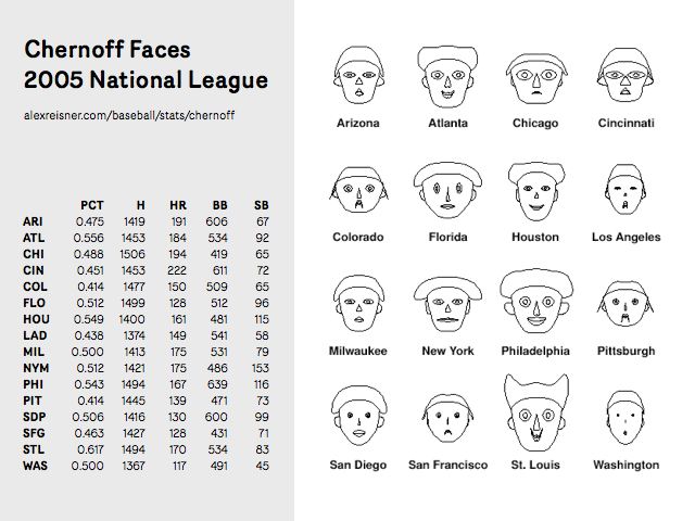
Hermann Chernoff first published this technique in 1972 (the year I was born).
Matt’s Webb’s mentioned these before in his talk, ‘Scope’, and I think I first became aware of the technique when I was at Sapient around ten years ago. Poking into it at that time I found the investigations of Steve Champeon from 1995 or so into using a Java applet to create Chernoff faces.
There’s interesting criticism of the technique, but I’ve been waiting for the right project to try it on for about a decade now – and it looks like Ashdown just might be the one.
Ashdown is our codename for a suite of products and services around UK schools data. We’re trying to make them as beautiful and useful as possible for parents, teachers and anyone else who’s interested. There’s more on Ashdown here.
Over the last couple of weeks, the service design of the ‘alpha’ has started to take shape – and we’ve been joined by Matthew Irvine Brown who is art-directing and designing it.
In one of our brainstorms, where we were discussing ways to visualise a school’s performance – Webb blurted “Chernoff Schools!!!” – and we all looked at each other with a grin.
Chernoff Schools!!! Awesome.
Matt Brown immediately started producing some really lovely sketches based on the rough concept…

And imagining how an array of schools with different performance attributes might look like…

Whether they could appear in isometric 3D on maps or other contexts…

And how they might be practically used in some kind of comparison table…

Since then Tom and Matt Brown have been playing with the data set and some elementary processing code – to give the us the first interactive, data-driven sketches of Chernoff Schools.
It’s still early days – but I think that the Chernoff Schools are an important step in Ashdown finding its character and positioning – in the same way as the city-colours and ‘sparklogos’ we came up with early on in Dopplr’s life were.
It’s as much a logo, a mascot and an endearing, ownable emblem as it is a useful visualisation.
I can’t wait to see how the team develops it over the coming months.
12 Comments and Trackbacks
1. chrislunch said on 23 November 2009...
Sometimes I barely understand what you guys Twitter about, and then you do something like this that makes it all make sense. Wonderful.
2. paulpod said on 23 November 2009...
That made me smile. Really nice.
3. Noah Brier said on 23 November 2009...
Great stuff. Have you guys seen this new American Express commercial: http://www.youtube.com/watch?v=m56F4EKN9hg … it’s all pareidolia.
4. Cait said on 24 November 2009...
I was thinking about this the other day but from a slightly different angle.
When babies are born, they are pre-programmed to in the first couple of days, be able to discern eyes. Eyes and nips (bear with me – the point is that there are two of them, and they’re dark). As their eyesight develops, they can then discern lips, which are also dark – so the very first thing that makes any sense is that clear, primal image.
We then have an imprint so strong, without having done the research I’d be willing to stand on a stage and argue purely from the blazingly obvious really. We *must* as a species have a predisposition toward finding images which echo this first primal vision of safety and comfort. Not merely as consumers, but also as creators. It makes us feel good to create those echoes, because those echoes simply ‘fit’ with what it is to be homan in the first place.
Therefore it makes absolute sense to me that unbeknownst to ourselves, until we started to collect images of things around is – be they throwaway, apparently purely practical or designed to be ‘arty’, many of them have within them an echo of the face. And more than that, the face of the Mother.
That’s pretty cool, I think! (Er, but then, I would).
My only contribution so far:
http://www.flickr.com/photos/zoonie/4130211317/
5. Joshua Schachter said on 25 November 2009...
I’d consider using some sort of statistical analysis to figure out the more significant variables and assign them to the more significant face deformations (cheek hollowness seems to be less important than eye distance, based on my gut reaction to the processing video…)
6. Ben Hosken said on 28 November 2009...
Following on from Joshua’s point…I wonder if the faces of schools whose significant variables tend towards the norm should have a less deformed ie mid range face or maybe it should be the ones with overall high values so when looking at schools we are attracted to the attractive faces? But then looking at the NFL example up the top…it seems I am initially drawn to the outliers.
7. nicolas said on 29 November 2009...
Definitely interesting, we also dealt with my colleague Fabien in our essay called Sliding Friction
Thought, you may be intrigued by the booklet anyway
8. Pedro Daltro said on 29 January 2010...
Wonderful, guys.
9. Jesus said on 23 February 2010...
pareidolium
http://www.flickr.com/photos/photographiosis/sets/72157607002637594/show/
Trackback: Final: interFACE « Adventures in Interaction Design 22 December 2009
[…] real breakthrough in our project came when we realized the concept of pareidolia. After reading an article from Berg about this phenomenon we started thinking about using an actual face as our input for […]
Trackback: andreas04: close to attraction 11 February 2010
[…] simpler route – by representing the individual institutions as building shapes, but putting a simplified face on the end of each shape – like Thomas the Tank […]
Trackback: irvinebrown » Schooloscope 21 April 2011
[…] who pioneered visualising datasets using human features in the 1970s. You can read more about this over on the BERG blog. Initial sketching on paper… During the design process I did a lot of thinking through drawing – […]