This website is now archived. To find out what BERG did next, go to www.bergcloud.com.

Blog posts tagged as 'hardware'

John’s Phone

johnsphone-1.jpg

I mentioned the John’s Phone on the studio mailing list last week. We ended up getting one to look at in the studio; it arrived this week, and I spent some time exploring it.

The John’s Phone is a simple mobile phone made by Dutch design firm John Doe. The phone came about as an attempt to take the ultra-simplicity of their From The Supermarket to a mobile phone. To quote their blogpost on the subject:

We’ve always wondered why most affordable phone looks so dull and boring. All cell phones are great high-tech product we like to use every day. Why not spend more time in designing. It’s the things we don’t see that are the most essential to creating a great design. A great design is a present. Why not make yourself happy with a present everyday in your pocket.

johnsphone-2.jpg

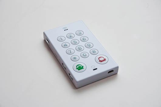
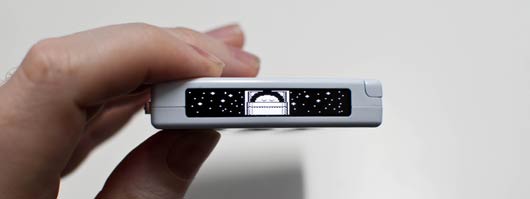
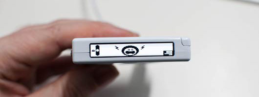
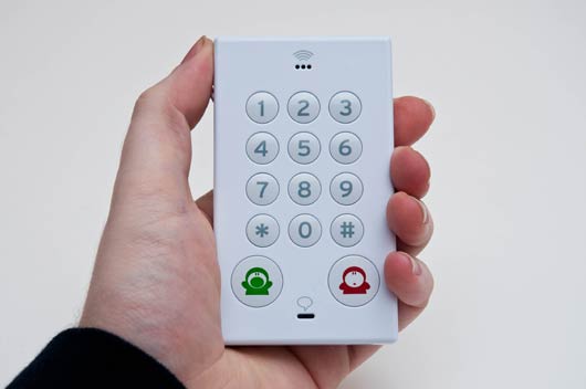
It’s a really immediate product: the entire front face is devoted to the keypad and physical interface. The top of the phone has an LCD display, positioned much like an old-fashioned pager; the side of the phone, which you can just see in the pictures above, has a rocker switch for volume, a SIM card slot, a switch for the ringer volume, and a power switch.

The phone makes its intention clear: the immediacy of use and that interface is more important to it than any screen or display-based interaction. It’s all about phone calls and phone numbers.

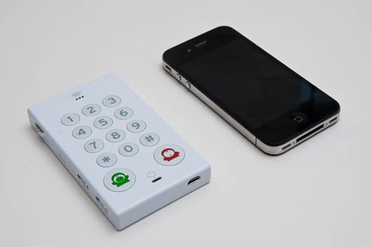
The John’s Phone is almost exactly the same size as an iPhone 4 – but its keypad takes up as much space as the touch screen does on the iPhone. The touchscreen has become a focal point of the design of smartphones, the hardware being designed around that bright rectangle. The John’s Phone is equally designed around its interface (or, at least, the “input” element of that interface) – it just happens to be a physical keypad.

johnsphone-3.jpg

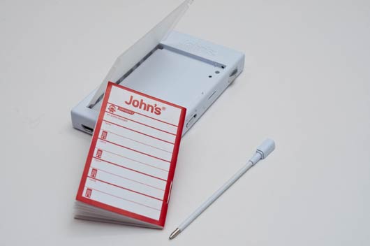
There are delightful, surprising touches. There’s a biro hidden down the side, where you might expect a stylus on an old touchscreen phone. You can use it to write in the addressbook hidden in the back of the phone.

But that paper addressbook sums up some of the problems with a phone this simple. Is that simplicity for the purpose of simplification, or to support an aesthetic of simplicity?

The website for the phone claims that it’s “the world’s simplest cellphone“. That’s true – if you agree with their idea of what a cellphone is.

For instance, if you believe text messaging to be a fundamental feature of a cellphone, then the John’s Phone doesn’t even live up to your expectations of what a mobile phone is. But if all you want your mobile phone to do nothing but send and receive calls – which is true of many phone owners – then it really is a simple, satisfying expression of that goal. Satisfaction with the device comes down to what your expectations – or requirements of it – are when you first pick it up.

That aesthetic of simplicity is at times complicated by the technology the phone runs on. Whilst John Doe promote the paper addressbook as the best way to store your phone numbers, reading the manual reveals that there is a ten-number memory built into the phone.

How do you put numbers into that memory? By typing **1*01234567890# (to put “01234 567890″ into slot “1”).

Doesn’t that, as an interface, feel totally at odds with the aesthetic the physical device is cultivating?

(Of course, “reading the manual” seems like an activity also at odds with a device already so explicit in its physical form; had I not done so, I’d have been perfectly happy not knowing about that feature.)

button-closeup.jpg

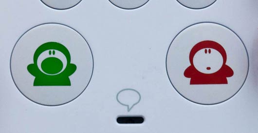
At first, the character-design on the “hello” and “goodbye” buttons seems at odds with the restrained, minimal physical exterior.

As you use the phone, though, you’ll get to see a lot more of that character. He’s called Fony, and he appears throughout the phone’s operation. He’ll wave hello and goodbye to you when you turn the phone on and off.

fony-asleep.jpg

When the phone’s asleep, you might see him tucked up in bed.

fony-electrocuted.jpg

When you charge the phone, he gets electrocuted from time to time (which seems curel to a character I’d imagine I was supposed to be sympathetic towards).

I can appreciate the care and attention in the realisation of Fony. He’s charming and never intrusive on the phone’s screen, often explaining what the phone’s currently doing through his appearance (rather than through text, which there’s very little space for). John Doe say (in their explanation of his design) that “Fony makes John’s a friendly phone“. I think he’s part of that friendliness – but not nearly as much as the much more immediate friendliness of the clear, simply designed hardware.

It’s important to factor the price of the product into any discussion of it. The John’s Phone costs €70 – about £50. That puts it in line with fairly cheap pay-as-you-go phones. (And: the John’s Phone is sold unlocked from any carrier, so that’s £50 without any carrier-subsidy).

Price changes the the relationship to a product. At £150, this would be a premium product designed for a wealthy few as a provocative statement – but likely a “second phone”.

At the current price, it’s a much more relevant purchase for a wider audience. If that price were even lower, new – and larger – audiences become available.

johnsphone-4.jpg

It’s only fair, in the end, to criticise the John’s Phone in light of that initial quotation from John Doe, which serves as a kind of design brief:

A great design is a present. Why not make yourself happy with a present everyday in your pocket.

A device that makes you happy; a device that is a delight every time you pick it up. By those criteria, the John’s Phone is clearly a success. Everyone who’s seen ours wants to pick it up and take a look; everyone who picks it up smiles, and plays with it, explores its secrets; everyone wants to answer the question “is it really a phone”?

Yes, it is. And it’s not just an ultra-simple phone; it’s an affordable ultra-simple phone, that you can buy right now. All credit to John Doe for taking their vision of what a mobile phone could be, and making it real, at the right price.

Monday Links: Visualising memory, books, and the sky at night

Matt mentioned we haven’t had many pictures on the blog recently, so it’s about time I rectified that.

Choose Your Own Adventure

It’s been linked all over the web, but it’s still very much worth pointing out this lovely essay and series of visualisations of Choose Your Own Adventure books. Beyond the obvious prettiness of it, it’s a shrewd piece of work – I particularly enjoyed the insight into the changing editorial trends of the books, obtained simply from the visualisation work. Don’t forget to check out the “animations” and “gallery” at the top of the page – the animated versions of some of the graphics are particularly attractive. A really vivid example of the way visualisation work can be both useful and informative as well as beautiful.

Chumby One

Chumby have launched the Chumby One, a new version of their internet-connected device that can play Flash applications. The Chumby was always a hard product to explain – reliant on applications being installed into it, a squishy and unusual form factor, a quite high price tag. I’m really loving the design of the One, though: it’s much more straightforward and makes its intended usage (a kind of bedside/tabletop connected screen) much clearer. The inclusion of an FM radio helps put it into the bedside category, too. Still, there’s something about its new form factor (well illustrated in this Engadget review that is in many ways more endearing – simple because of its readibility – than the original, squishy box.

The most interesting point – for me, anyhow – is the pricecut. At nearly half the price – $119 compared to $199 – of the original Chumby, it becomes a much more attractive proposition, especially if you’re not entirely sure what you’d do with it. Not only cheaper, then, but also improved. It’s interesting to see a product slowly defining its edges over time.

Bear with me, but I think this is beautiful. It’s ICU64, a real-time debugger for Commodore 64 emulators. On the right in the video is the emulator; on the left is ICU64, displaying the memory registers of the virtual C64. To begin with, you can see the registers being filled and decompressed to in real time; then, you can see the ripple as all the registers empty and are refilled. And then, as the game in question loads, you can see registers being read directly corresponding to sprite animation. What from a distance appears to be green and yellow dots can be zoomed right into – the individual values of each register being made clear. It’s a long video, but the first minute or two makes the part I liked clear: a useful (and surprisingly beautiful) visualisation of computer memory. It helps that the computer in question has a memory small enough that it can reasonably be displayed on a modern screen.

Zeiss Star Projector

Over at BLDGBLOG, Geoff Manaugh ruminates about putting a planetarium projector onto the fourth plinth in Trafalgar Square:

A rain-proof planetarium machine could be installed in public, anchored to the plinth indefinitely. Lurking over the square with its strange insectile geometries, the high-tech projector would rotate, dip, light up, and turn its bowed head to shine the lights of stars onto overcast skies above. Tourists in Covent Garden see Orion’s Belt on the all-enveloping stratus clouds—even a family out in Surrey spies a veil of illuminated nebulae in the sky.

The Milky Way rolls over Downing Street. Videos explaining starbirth color the air above Pall Mall and St. Martin in the Fields goes quiet as ringed orbits of planets are diagrammed in space half a mile above its steeple.

The Zeiss Star Projector Manaugh illustrates his article with is a beautiful object (see above), and it’s the best I can do to illustrate this link; the idea has a few implementation details, you might say, but there’s an undeniable poetry in it, and that idea feels like a very beautiful picture to end on.

Links for a Monday Morning

  • wikireader.jpg
    How come I’d never heard of WikiReader before? It’s a $99 device for reading Wikipedia from a memory card. There’s no network connection of any form, just a micro-SD slot, meaning it’ll last for a year on three AA batteries. You can update it at any point by downloading a new dump; if that’s not possible, you can get a new dump sent to you on a memory card for a small fee. It’s got a touch-screen, so the UI doesn’t have to be localised – foreign keyboards can be implemented in software. And, best of all, it has a hardware button marked “Random” – capturing one of the hidden joys of Wikipedia.

    It feels like a nice companion to an e-reader: book in one hand, universal lookup device in the other, and not a network connection in site. The chunky form-factor also makes it really robust and immediate; something I’d consider slinging in a bag, especially for trips abroad. It’s designed by Openmoko, and available now.

  • oomouse81.png
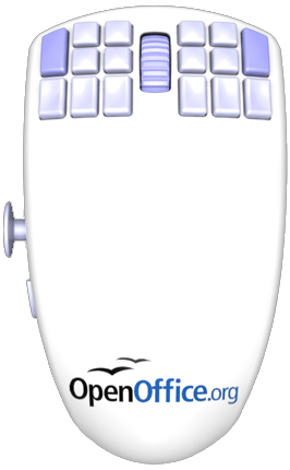
Another open-source product making its debut in hardware is the OpenOffice.org Mouse (pictured left). Eighteen buttons, an analogue joystick… I admit to sucking my teeth in disbelief when I first saw it; the comparisons that have been made to the Homer seem justified.

    But take a step back, and consider it more slowly, and perhaps it’s not the car-crash it seems; instead, its problems are more subtle. Chris Messina has a sharp takes on this:

    What I worry about, however, is that pockets of the open source community continue to largely be defined and driven by complexity, exclusivity, technocracy, and machismo… so far I’ve see little indication that open source developers take seriously the need for simpler, easier, and more intuitive future-forward interfaces. Perhaps I’m wrong or just uninformed, but so long as products like the OpenOfficeMouse continue to characterize the norm in open source design, I’m not likely going to be able to soon recommend open source solutions to anyone but the most advanced and privileged users.

    Friend of BERG Phil Gyford picks up a similar point:

    The problem isn’t that it has appalling design — it’s poor and uninspired, but it’s not the worst thing ever.

    The fundamental problem is that the product is aiming for two very specific, probably unreconcilable, niche audiences (hard-core gamers and hard-core office workers) while associating itself with a brand (OpenOffice) that wants to be completely mainstream.

    I think Phil’s right. If this was pitched as, say, an EVE Online mouse, I’d probably go “oh, that makes sense for a game and UI that complex”. But for a brand trying to be taken seriously as a mainstream alternative to expensive office suites, this seems misguided, and only perpetuates preconceived notions of Open Source’s attitude towards design.

  • Schulze has bought a new car, and trust him to buy the only car I’ve seen with its own font. That is: not a font designed for the car, but a font made by the car.

    Toyota motion-captured an iQ from overhead using software written in openFrameworks, and used it to generate a handwriting font built out of careful cornering and handbrake turns. It feels like the opposite of DHL’s fake GPS art: Toyota are keen to show the software and prove it actually works. Best of all, they’ll even let you download – and use – the font itself.

  • I couldn’t let a round-up of links go with a mention to James Bridle’s recreation of MENACE, Donald Michie‘s learning machine to play noughts-and-crosses built only out of matchboxes and beads, which he first demonstrated at Playful two weeks ago.

    James was kind enough to bring his MENACE to a recent BERG drinks evening, and it drew the gasps it thoroughly deserves; 301 matchboxes is an imposing piece of computing.

  • And, finally, a nice little piece of what you might call design research: Giles Turnbull investigates nomenclatures for legobricks, surveying a selection of children he knows:

    This language of Lego isn’t just something our family has invented; every Lego-building family must have its own vocabulary. And the words they use (mostly invented by the children, not the adults) are likely to be different every time. But how different? And what sort of words?

    Hence, a survey. I asked fellow parents to donate their children for a few minutes, and name a selection of Lego pieces culled from the Lego parts store.

    Lovely. (Personally, I called a Brick 1×1 a “one-bobble” and a plate 1×1 a “flat one-bobble”).

Recent Posts

Popular Tags