This website is now archived. To find out what BERG did next, go to www.bergcloud.com.

Blog posts tagged as 'acts'

Mouse-Trap/Ghost-Trap: Summer teaching at SVA

Jack and I taught a short class at SVA’s Interaction Design MFA this July.

We’d visited previously for a week in the Spring, and Liz Danzico was kind enough to invite us as part of their Summer School programme.

The two days started with thinking-through-drawing exercises we like to call “Hopeful Monsters” based around an exercise we’ve described on the blog before, and other drawing activities around generating ‘Inbreds and Hybrids’ that we were introduced to by our friend Matt Ward from Goldmsith’s Design faculty.

Hopeful Monsters

Initial thinking and brainstorming about cheap, ubiquitous, mundane technologies leads to fantastic leaps as the particpants draw on the whiteboard.

As always there are dead ends and flights of fancy – but, as always – there are a couple of intriguing combinations and mutant products that have an itchy promise to them…

Hopeful Monsters

The mutating, morphing quality of drawing our hopeful monster objects on the whiteboard…

Hopeful Monsters

Hopeful Monsters

Always contrasts interestingly with the more procedural, mechanical evolutionary drawing produced by tables of post-it-pixels…

Hopeful Monsters

On the second day, we deployed our secret weapon!

We were lucky enough to have Durrell Bishop of the mighty Luckybite join us, and set us all an incredible brief for the day – design a mouse trap, and a ghost trap…

We’d asked the group to think about their favourite traps overnight, and come back with a drawing.

My favourite I think was this diagram of the boulder trap in Raiders of the Lost Ark.

So much peril encapsulated in a stick figure!

The day saw the group tangle with the realities of catching mice, and then swap to the more symbolic, reality-shaping nature of designing a ghost-trap.

Hopeful Monsters

Some favourites – from many – include…

Jill’s self-composting mouse-trap

Rafa’s CCTV gargoyle ghost-trap

Peter’s ghost-traps, including the awesome ‘Dark Sucker’, which we hope he builds…

And… Nora’s Black Cat/White-Cat ghost-trap service
Hopeful Monsters

Fantastic fun, and everyone produced really excellent, surprising stuff.

Thanks again to Liz Danzico, Qing Qing Chen and, of course, the group who attended the workshop and threw themselves into it so fully in the NYC heat…

Finally – I had great fun one of the afternoons taking photos of the group with an iPhone and a magnifying glass while they drew…

IMG_1414

SVA Hopeful Monsters Workshop (magnified)

SVA Hopeful Monsters Workshop (magnified)

I am (not) sitting in a room

I first came across Alvin Lucier’s “I am sitting in a room” through the Strictly Kev/Paul Morley masterpiece mix “Raiding The 20th Century”.

It’s an incredibly simple but powerful piece, that becomes hypnotic and immersing as his speech devolves into a drone through the feedback loop he sets up in the performance.


The space that he performs in becomes the instrument – the resonant frequencies of the room feeding back into the loop.

From wikipedia:

I am sitting in a room (1969) is one of composer Alvin Lucier’s best known works, featuring Lucier recording himself narrating a text, and then playing the recording back into the room, re-recording it. The new recording is then played back and re-recorded, and this process is repeated. Since all rooms have characteristic resonance or formant frequencies (e.g. different between a large hall and a small room), the effect is that certain frequencies are emphasized as they resonate in the room, until eventually the words become unintelligible, replaced by the pure resonant harmonies and tones of the room itself. The recited text describes this process in action—it begins “I am sitting in a room, different from the one you are in now. I am recording the sound of my speaking voice,” and the rationale, concluding, “I regard this activity not so much as a demonstration of a physical fact, but more as a way to smooth out any irregularities my speech might have,” referring to his own stuttering.

Playing around with the kinect/makerbot set-up at Foo set me thinking of Lucier’s piece, and how the sensor-vernacular interpretation could play out as a playful installation…

First, we need a Kinect chandelier.

Then, we scan the original ‘room’ with it.

Next, we print a new space using a concrete printer.

Which we then scan with the Kinect chandelier…

And so on…

One could imagine the degradation of the structure over the generations of scanning and printing might become quite beautiful or grotesque – a kind of feedback-baroque. And, as we iterate, printing spaces one after the other – generate a sensor-vernacular Park Güell

If anyone wants to give us an airship hanger and a massive concrete printer this summer, please let us know!

Icon’s “Rethink”: turning receipts into ‘paper apps’

Icon magazine asked us to contribute to their monthly “Rethink” feature, where current and commonplace objects are re-imagined.

Icon #97 Rethink: redesigning the receipt

We continued some of the thinking from our “Media Surfaces” work with Dentsu, around how retail receipts could make the most of the information systems that modern point-of-sales machines are plugged into…

Icon #97 Rethink: redesigning the receipt

A little quote from our piece:

We’ve added semi-useful info-visualisation of the foods ordered based on “what the till knows” – sparklines, trends – and low-tech personalisation of information that might be useful to regulars. Customers can select events or news stories they are interested in by ticking a check box.

We think the humble receipt could be something like a paper “app” and be valuable in small and playful ways.

Icon #97 Rethink: redesigning the receipt

Read all about it in this month’s Icon #97, available at all good newsagents!

Instruments of Politeness

We weren’t at SxSW, but some of our friends were – and via their twitter-exhaust this report by David Sherwin of FrogDesign from a talk by Intel’s Genevieve Bell popped up on our radar.

In her panel yesterday at South by Southwest, Genevieve Bell posed the following question: “What might we really want from our devices?” In her field research as a cultural anthropologist and Intel Fellow, she surfaced themes that might be familiar to those striving to create the next generation of interconnected devices. Adaptable, anticipatory, predictive: tick the box. However, what happens when our devices are sensitive, respectful, devout, and perhaps a bit secretive? Smart devices are “more than being context aware,” Bell said. “It’s being aware of consequences of context.”

Here’s a lovely quote from Genevieve:

“[Today’s devices] blurt out the absolute truth as they know it. A smart device [in the future] might know when NOT to blurt out the truth.”

This in turn, reminded me of a lovely project that Steffen Fiedler did back in 2009 during a brief I helped run at the RCA Design Interactions course as part T-Mobile’s ongoing e-Etiquette project, called “Instruments of Politeness“.

These are the titular instruments – marvellous contraptions!

They’re a set of machines to fool context-aware devices and services – to enable you to tell little white lies with sensors.

For instance, cranking the handle of the machine above simulates something like a pattern of ‘walking’ in the accelerometer data of the phone, so if you told someone you were out running errands (when in fact you were lazing on the sofa) your data-trail wouldn’t catch you out…

Making Future Magic: light painting with the iPad

“Making Future Magic” is the goal of Dentsu London, the creative communications agency. We made this film with them to explore this statement.

(Click through to Vimeo to watch in HD!)

We’re working with Beeker Northam at Dentsu, using their strategy to explore how the media landscape is changing. From Beeker’s correspondence with us during development:

“…what might a magical version of the future of media look like?”

and

…we [Dentsu] are interested in the future, but not so much in science fiction – more in possible or invisible magic

We have chosen to interpret that brief by exploring how surfaces and screens look and work in the world. We’re finding playful uses for the increasingly ubiquitous ‘glowing rectangles’ that inhabit the world.

iPad light painting with painter

This film is a literal, aesthetic interpretation of those ideas. We like typography in the world, we like inventing new techniques for making media, we want to explore characters and movement, we like light painting, we like photography and cinematography as methods to explore and represent the physical world of stuff.

We made this film with the brilliant Timo Arnall (who we’ve worked with extensively on the Touch project) and videographer extraordinaire Campbell Orme. Our very own Matt Brown composed the music.

Light painting meets stop-motion

We developed a specific photographic technique for this film. Through long exposures we record an iPad moving through space to make three-dimensional forms in light.

First we create software models of three-dimensional typography, objects and animations. We render cross sections of these models, like a virtual CAT scan, making a series of outlines of slices of each form. We play these back on the surface of the iPad as movies, and drag the iPad through the air to extrude shapes captured in long exposure photographs. Each 3D form is itself a single frame of a 3D animation, so each long exposure still is only a single image in a composite stop frame animation.

Each frame is a long exposure photograph of 3-6 seconds. 5,500 photographs were taken. Only half of these were used for the animations seen in the final edit of the film.

There are lots of photographic experiments and stills in the Flickr stream.

Future reflection

light painting the city with Matt Jones

The light appears to boil since there are small deviations in the path of the iPad between shots. In some shots the light shapes appear suspended in a kind of aerogel. This is produced by the black areas of the iPad screen which aren’t entirely dark, and affected by the balance between exposure, the speed of the movies and screen angle.

We’ve compiled the best stills from the film into a print-on-demand Making Future Magic book which you can buy for £32.95/$59.20. (Or get the softcover for £24.95/$44.20.)

RFID icons

Earlier this year we hosted a workshop for Timo Arnall‘s Touch project. This was a continuation of the brief I set my students late last year, to design an icon or series of icons to communicate the use of RFID technology publicly. The students who took on the work wholeheartedly delivered some early results which I summarised here.

This next stage of the project involved developing the original responses to the brief into a small number of icons to be tested, by Nokia, with a pool of 25 participants to discover their responses. Eventually these icons could end up in use on RFID-enabled surfaces, such as mobile phones, gates, and tills.

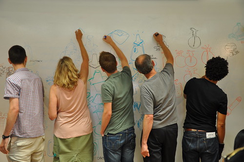
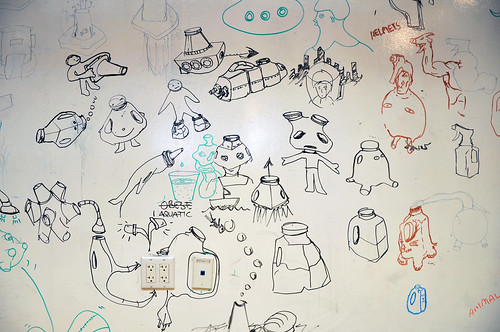
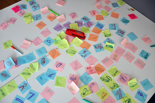
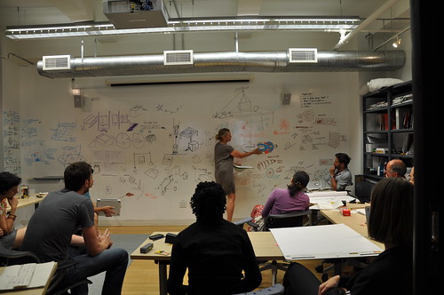
Timo and I spent an intense day working with Alex Jarvis and Mark Williams. The intention for the day was to leave us with a series of images which could be used to test responses. The images needed consistency and fairly conservative limits were placed on what should be produced. Timo’s post on the workshop includes a good list of references and detailed outline of the requirements for the day.

I’m going to discuss two of the paths I was most involved with. The first is around how the imagery and icons can represent fields we imagine are present in RFID technology.

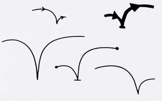
Four sketches exploring the presence of an RFID field

The following four sketches are initial ideas designed to explore how representation of fields can help imply the potential use of RFID. The images will evolve into the worked-up icons to be tested by Nokia, so the explorations are based around mobile phones.

I’m not talking about what is actually happening with the electromagnetic field induction and so forth. These explorations are about building on the idea of what might be happening and seeing what imagery can emerge to support communication.

The first sketch uses the pattern of the field to represent that information is being transferred.

Fields sketch 01

The two sketches below imply the completion of the communication by repeating the shape or symbol in the mind or face of the target. The sketch on the left uses the edge of the field (made of triangles) to indicate that data is being carried.

Fields sketch 02

I like this final of the four sketches, below, which attempts to deal with two objects exchanging an idea. It is really over complex and looks a bit illuminati, but I’d love to explore this all more and see where it leads.

Fields sketch 03

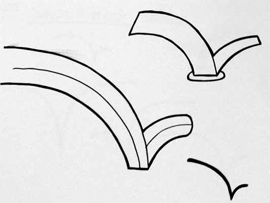
Simplifying and working-up the sketches into icons

For the purposes of our testing, these sketches were attempting too much too early so we remained focused on more abstract imagery and how that might be integrated into the icons we had developed so far. The sketch below uses the texture of the field to show the communication.

fields-04.jpg

Retaining the mingling fields, these sketches became icons. Both of the results below imply interference and the meeting of fields, but they are also burdened by seeming atomic, or planet sized and a annoyingly (but perhaps appropriately) like credit card logos. Although I really like the imagery that emerges, I’m not sure how much it is doing to help think about what is actually happening.

Fields sketch 05

Fields sketch 06

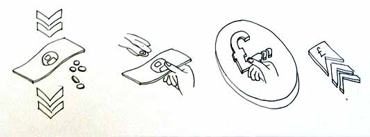
Representing purchasing via RFID, as icons

While the first path was for icons simply to represent RFID being available, the second path was specifically about the development of icons to show RFID used for making a purchase (‘purchase’ is one of the several RFID verbs from the original brief).

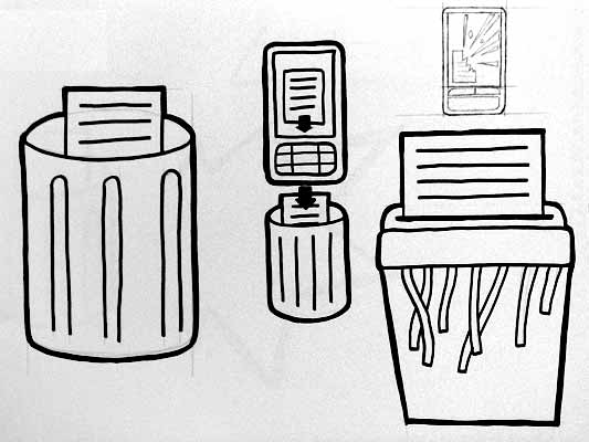
There is something odd about using RFID tags. They leave you feeling uncertain, and distanced from the exchange or instruction. When passing an automated mechanical (pre-RFID) ticket barrier, or using a coin operated machine, the time the machines take to respond feels closely related to the mechanism required to trigger it. Because RFID is so invisible, any timings or response feels arbitrary. When turning a key in a lock, this actually releases the door. When waving an RFID keyfob at reader pad, one is setting off a hidden computational process which will eventually lead to a mechanical unlocking of the door.

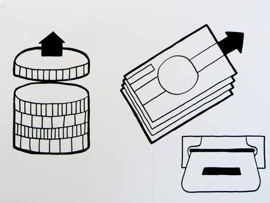
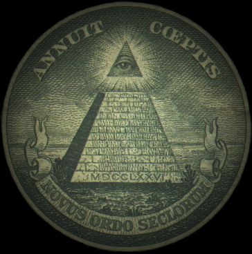
Given the secretive nature of RFID, our approach to download icons that emerged was based on the next image, originally commissioned from me by Matt for a talk a couple of years ago. It struck me as very like using an RFID enabled phone. The phone has a secret system for pressing secret buttons that you yourself can’t push.

Hand from Phone

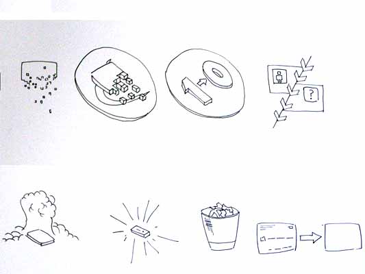
Many of the verbs we are examining, like purchase, download or open, communicate really well through hands. The idea of representing RFID behaviours through images of hands emerging from phones performing actions has a great deal of potential. Part of the strength of the following images comes from the familiarity of the mobile phone as an icon–it side-steps some of the problems faced in attempting to represent an RFID directly.

The following sketches deal with purchase between two phones.

Purchase hands sketch

Below are the two final icons that will go for testing. There is some ambiguity about whether coins are being taken or given, and I’m pleased that we managed to get something this unusual and bizarre into the testing process.

Hands purchase 01

Hands purchase 02

Alex submitted a poster for his degree work, representing all the material for testing from the workshop:

Outcomes

The intention is to continue iterations and build upon this work once the material has been tested (along with other icons). As another direction, I’d like to take these icons and make them situated, perhaps for particular malls or particular interfaces, integrating with the physical environment and language of specific machines.

RFID Interim update

Last term during an interim crit, I saw the work my students had produced on the RFID icons brief I set some weeks ago. It was a good afternoon and we were lucky enough to have Timo Arnall from the Touch project and Younghee Jung from Nokia Japan join us and contribute to the discussion. All the students attending showed good work of a high standard, overall it was very rewarding.

I’ll write a more detailed discussion on the results of the work when the brief ends, but I suspect there may be more than I can fit into a single post, so I wanted to point at some of the work that has emerged so far.

All the work here is from Alex Jarvis and Mark Williams.

Alex began by looking at the physical act of swiping your phone or card over a reader. The symbol he developed was based on his observations of people slapping their Oyster wallets down as they pass through the gates on to the underground. Not a delicate, patient hover over the yellow disc, but a casual thud, expectant wait for the barrier to open, then a lurching acceleration through to the other side before the gates violently spasm shut.

RFID physical act 01

More developed sketches here…

RFID physical act 02

I suspect that this inverted tick will abstract really well, I like the thin line on the more developed version snapping the path of the card into 3D. It succeeds since it doesn’t worry too much about working as an instruction and concentrates more on a powerful cross-system icon to be consistently recognisable.

Verbs

The original brief required students to develop icons for the verbs: purchase, identify, enter (but one way), download, phone and destroy.

Purchase and destroy are the two of these verbs with the most far-reaching and less immediate consequences. The aspiration for this work is to make the interaction feel like a purchase, not a touch that triggers a purchase. This gives the interaction room to grow into the more complex ones that will be needed in the future.

This first sketch, on purchase, from Alex shows your stack of coins depleting, something nice about the dark black arrow which repeats as a feature throughout Alex’s developments.

RFID Purchase 01

Mark has also been tackling purchase, his sketches tap into the currency symbols, again with a view to represent depletion. Such a blunt representation is attractive, it shouts “this will erode your currency!”

RFID Purchase 03

Mark explores some more on purchase here:

RFID Purchase 02

Purchase is really important. I can’t think of a system other than Oyster that takes your money so ambiguously. Most purchasing systems require you to enter pin numbers, sign things, swipe cards etc, all really clear unambiguous acts. All you have to do is wave at an Oyster reader and it costs you £2… maybe: The same act will open the barrier for free if you have a travel card on there. Granted, passengers have already made a purchase to put the money on the card, but if Transport for London do want to extend their system for use as a digital wallet they will need to tackle this ambiguity.

Both Mark and Alex produced material looking at the symbols to represent destroy, for instances where swiping the reader would obliterate data on it, or render it useless. This might also serve as a warning for areas where RFID tags were prone to damage.

RFID Destroy 01

I like the pencil drawing to the top right that he didn’t take forward. I’ve adjusted the contrast over it to draw out some more detail. Important that he distinguished between representing the destruction of the object and the data or contents.

Williams Destroy sketches

Mark’s sketches for destroy include the excellent mushroom cloud, but he also looks at an abstraction of data disassembly, almost looks like the individual bits of data are floating off into oblivion. Not completely successful since it also reminds me of broadcasting Wonka bars in Charlie and the Chocolate Factory and teleporting in Star Trek, but nice none the less.

Drawing

This is difficult to show online, but Alex works with a real pen, at scale. He is seeing the material he’s developing at the same size it will be read at. Each mark he makes he is seeing and responding to as he makes it.

Jarvis Pen

He has produced some material with Illustrator, but it lacked any of the impact his drawings brought to the icons. Drawing with a pen really helps avoid the Adobe poisoning that comes from Illustrator defaults and the complexities of working out of scale with the zoom tool (you can almost smell the 1pt line widths and the 4.2333 mm radius on the corners of the rounded rectangle tool). It forces him to choose every line and width and understand the success and failures that come with those choices. Illustrator does so much for you it barely leaves you with any unique agency at all.

It is interesting to compare the students’ two approaches. Alex works bluntly with bold weighty lines and stubby arrows portraying actual things moving or downloading. Mark tends towards more sophisticated representations and abstractions, and mini comic strips in a single icon. Lightness of touch and branching paths of exploration are his preference.

More to come from both students and I’ll also post some of my own efforts in this area.

Three more enjoyable ways to open packaging

Since the comments on the Experience Hooks post were on unboxing, I thought I’d post about my current favourite packaging.

The following video shows a CD case then a cigarette packet, both opening in an unusual way. You also get to see my neck, and my Norwegian fishing jumper.

The CD, Peeping Tom (collaborations with Mike Patton), is just very cool. The action is unexpected, and the way the keyhole image changes is engaging. It’s the kind of thing you show your friends.

I’m more enamoured with the Benson & Hedges Silver Slide special edition pack. (I don’t smoke–I found this, empty, on a table in a pub.)

B&W Silver Slide

The pack understands that a large component of smoking cigarettes is gifting them to other people. There’s a lot of reciprocity wrapped up in that act: It can be used to develop an aura of generosity, or cashed-in immediately to get a hard-won conversation. See also: Teens and text messages in Alex Taylor’s paper The gift of the gab [PDF].

Silver Slide develops a story around that potent experience hook. Offering the cigarette, overlooked usually but now prominent because of novelty, becomes part of the experience. Really, you don’t need any remaining cigarettes.

My favourite touch: When you slide open the pack, there’s a space to write messages on the inner draw. That’s exactly what social smoking, especially with strangers, is about.

Ketchup bottle top

Taking something much more everyday, I’m also a fan of the squeezable Heinz Ketchup bottle (scroll down) launched a few years ago. Once upon a time, the ketchup bottle was a vehicle for carrying the product–that is, the sauce. Although the glass bottle was used in adverts as a feature, it was pretty tedious to use. The sauce came out slowly, and the rim of the bottle would get grubby. It was hard to clean. The move to a squeezy bottle recognised that the experience of consuming the ketchup was part of the product itself.

The squeezy bottle allows for quick and accurate application of sauce, and – the best feature – the bottle-top has no rim. It has a large, flat top, slightly curved. It’s extremely easy to clean, with a fluid wipe-round action. Because it’s easy, it’s done more often, and my overall experience of living with ketchup has become considerably less grubby. I’m sure grubbiness wasn’t something with which Heinz wanted to be associated.

A previously unpleasant uncatered-for activity intrinsic to the delivery of ketchup has become part of the design. Who knows whether ease-of-cleaning was a factor in the squeezy bottle shift… I’d like to think it was.

Burtin vs. Ellis/Williams

I presented this comparison at Design Engaged last year. I like it because it talks in a really visceral way about how we read visual material. It deals with looking as an act as opposed to something that just happens to your eye. Comics are often disregarded amongst Graphic Design communities. This irritates me since comics deal with such rich and sophisticated material.

Below are two pieces of work, the first is a spread from Desolation Jones by Warren Ellis and J.H. Willliams III. Without revealing too much of my Ellis/Williams fanboydom, the series is excellent but this page is especially deft. Ellis discusses it in his weblog here.

Look at the way the red line connects the sequence.

The line morphs between road markings, Indiana Jones style aerial map views and back to the light trails from the vehicle. Williams guides your eye through the page, setting the page’s pace and rhythm. Optically it is very clever, it deals with how your eye scans at speed and also stitches the cue into the content of the panels.

Desolation Jones

The second image is by Will Burtin (thanks to James King). It is optically similar to the comic.

Although research material on Burtin is fairly thin, I understand that this image was produced during his time designing for the U.S. Army. This image is taken from a manual, illustrating how to disassemble your rifle.

Burtin has drawn two sets of dotted lines over his work. The lines indicate his expectation of how a readers eye will move over the page. The dotted line represents a quick scan of the page, dealing mostly with just the images and the dashed line represents a detailed read.

Will Burtin

Burtin knows how the page is being read, he acknowledges that the reader will read it at different paces, and presumably this has affected his slightly strange layout. Interesting that he expects people to read along gun barrels.

Burtin and Williams both use letters and images, in a sequence, on the page, and expect them to be read in two different ways: First in overview and then in detail. They deal with arrangement, pace and rhythm with the same sensitivity and same language.

Comics are in everything.

RFID Brief

Last Thursday I began teaching third year graphic design students at Central Saint Martins College of Art and Design in Holborn, Central London. I’m teaching a group of nine with an old colleague of mine James King. James and I have each written a brief, I’ll post them both here and any exciting results that emerge from the students. The brief is set against an introduction to the technology and is conjunction with Timo Arnall‘s Touch project. Click the image to download the RFID brief as a pdf and the text to follow.

If you have any ideas, solutions or comments yourself, please feel free to add your thoughts to the comments.

rfid brief

Aims

To think functionally. To develop a sense of how signs can work across different contexts with specific meaning.

Brief

Design an icon or series of icons to communicate the use of RFID technology publicly.

Details

RFID is complex because it is very new and there is no simple metaphor that it easily fits. Explore several elements and think about appropriate representation for those. Think about the following:

The act

Think about how the icon should represent the physical act of activating an RFID tag.

This technology works when the RFID tag is brought near the RFID reader. It is important to show how the RFID tag should be used. One of the ways London Transport manage this is to repeatedly broadcast “remember to always touch in… and out with your Oyster card” over their public address system, their logo also represents an image of the card moving in an arc, the logo being printed on the surface of the reader.

The verb

When you swipe the RFID a transaction will take place. This is true in nearly all situations. I want you to develop icons which represent the verb that takes place when the tag is activated.

Develop icons for the following actions:

  • Purchase. Your account will be deducted when you swipe. Imagine your switch card was a digital wallet, and you could use RFID instead of chip and PIN. How would you communicate, that when you swipe, you will be charged.
  • Identify. If you go through this gate your details will be read and known, you could think about a passport.
  • Enter, but one way. If you pass through this door you will not be permitted to leave by it. Think about security at airports.
  • Download. Imagine your phone had an RFID inside it and when you wave your phone at a reader, a file is downloaded to your phone, perhaps a local map.
  • Phone. Imagine if when you waved your phone at the reader, it phoned someone, perhaps a helpline or someone specific.
  • Destroy. If you used the RFID to store sensitive data, and you wanted to delete the data, like from a memory stick, swiping the RFID will erase the data on the stick.

There might be secondary verbs like Open, or Start. Lifts might require people to identify themselves before they gain access to certain floors. Tickets are often purchased inorder to access certain areas, like with Oyster cards. This is important too, think about how you can combine verbs in the system you develop.

Ownership

RFID cards often work in closed systems, where particular companies or institutions have ownership over the system. Starbucks have just released a ‘smart card’. Think about how this can be represented alongside the verbs too. You could think about graphic consistency or colour, or perhaps there is a feature of the icon like a character, which appears across the brand. For the branding side, don’t get distracted by a specific brand that already exists. I want you to just think about the kind of business. So think about the following:

  • an international transport company like an airline
  • a money system, like a bank
  • a supermarket

Some points to remember

The icons should be universal as possible, so English language or culturally specific meaning could make the icon obscure to some people. Think about the context of the reader, does this icon go on doors, busses, airports etc?

Deliverables

Design sketches: For Thursday 23rd at 9am bring the following: 40 sketches with assorted ideas for Act, Verb and Brand. The sketches should be good, not widdly little drawings in a sketch book, make sure the drawings can be seen clearly at a distance. Also, the design should be good, not bad. So try to make it good.

Research: Look at signage and icons in the world and think about how they communicate acts and verbs. Bring in some examples that have influenced your work.

Recent Posts

Popular Tags