This website is now archived. To find out what BERG did next, go to www.bergcloud.com.

Blog posts tagged as 'rfid'

Marking immaterials

Earlier in our involvement with Touch, Timo and I held a workshop with Alex Jarvis (currently at moo.com) and Mark Williams (now at Venture Three) to explore notation for RFID and the actions hidden in the readers.

One of my favourites that emerged from the day was this one.

Pay-coins.png

It shows how far we were reaching for metaphorical handles – around which to characterise the technology, relying on the verbs associated with the result of the interaction: to Pay, to Open, to Delete etc.

Physically the systems are very different and are more frequently represented by their envelope packaging, like the Oyster card. Branded systems have chosen to use characters, my favourite is the Suica Penguin.

suica.png

During the visualisation work, the cross sections in the readable volumes that emerged began to feel very strong visually. They capture an essential nature in the technology which is difficult to unearth with symbols based on metaphors.

Timo and I experimented with forms which have an almost typographic nature ranging to a more strictly geometric shape.

experimental-icons.png

We settled on this most geometric version. It would be terrific to see this picked up and used as a symbol for the technology in public.

geometric-icon.png

A CC licensed pdf of the ‘geometric’ can be found in the Touch vaults.

The ghost in the field

basic field mapping animation

This image is a photographic mapping of the readable volume of a radio field from an RFID reader. The black component in the image is an RFID reader, similar to the component inside the yellow part of the oyster card reader. The camera has been fixed in its position and the reader photographed. Using a tag connected to an LED we paint in the edges of the readable volume with a long exposure and animate them to show the form.

Following Nearness, the chain reaction film, is Immaterials: The ghost in the field, our next film with Timo Arnall at the Touch project. There are 4 billion RFID tags in the world. They may soon outnumber the people. Readers and tags are increasingly embedded in the things and environments in which we live. How do readers see tags? When we imagine RFID and their invisible radio fields, what should we see? Immaterials explains the experiments we have performed to see RFID as it sees itself.

There is a power to be found in understanding everything from systems, to APIs, to components, to data, through to their enveloping materials (such as plastics and metals) as substrates to interfere with, bend and test. Through this we form complete wholes that make a common cultural sense to people, as products. The common category that contains services, APIs, plastics, componentry and their manufacturing processes is their behaviours and their consistencies, their immateriality.

We need to richly understand the behaviour and nature of the tag interaction with readers. Timo summarises:

It is incredible how often RFID is seen as a long-range ‘detector’ or how little relevant information is contained in technical data-sheets. When this information is the primary material that we are working with as designers, this is highly problematic. By doing these kind of experiments we can re-frame the technology according to our experience of it, and generate our own material knowledge.

There is a sequence in the video where I briefly discuss the directionality of tags. Most tags (and therefore their antenna) are flat. They have a direction. The shape of the readable volume changes according to the antennas orientation to the reader. The following image shows two volumes. The first visualised with green LEDs shows the readable volume from interactions between a reader and a tag parallel to it;  the second, visualised with red LEDs, shows the volume produced by the same tag held perpendicular. Two very distinctive and different shapes can clearly be seen.

parallel and perpendicular mapping

It is not the radio field produced by the reader itself we are looking at. That is much, much larger. The images show the volume in which the energy in the space surrounding the reader is inducing a current large enough to wake and run the RFID chip at the end of the antenna in the tag. The readable volume can be mapped around a tag or inside the field produced by a reader component, but it only exists between the two.

Having produced these visualisations, I now find myself mapping imaginary shapes to the radio enabled objects around me. I see the yellow Oyster readers with plumes of LED fluoro-green fungal blossoms hanging over them – and my Oyster card jumping between them, like a digital bee cross-pollenating with data as I travel the city.

We work with traditional materials and fabrication for our product and industrial design, but the exciting contemporary products of our age are more than the sum of their materials, those poorly bound knots of plastic and silicon in our hands and homes.

Matt Jones described what we do as ‘Post Industrial Design.’ Perfect! Where once industrial design was concerned with radii, form, and finish, we now deal in behaviours, experience, shifting context, and time.

The products we design now are made with new stuffs. Service layers, video, animation, subscription models, customisation, interface, software, behaviours, places, radio, data, APIs and connectivity are amongst the immaterials for modern products.

Immaterials are the new substrates for opportunity and risk in product design.

Next week, Immaterials: Unravelling the antennae.

Nearness

Last week Timo and I finished filming and editing Nearness. Earlier in the year BERG was commissioned by AHO/Touch to produce a series of explorations into designerly applications for RFID (more to come on what that means). Over the coming weeks BERG will be sharing the results of the work here and on the Touch blog.

The film Nearness explores interacting without touching. With RFID it’s proximity that matters, and actual contact isn’t necessary. Much of Timo’s work in the Touch project addresses the fictions and speculations in the technology. Here we play with the problems of invisibility and the magic of being close.

The work refers fondly to the Fischli and Weiss The Way Things Go film and its controversial offspring The Honda ‘Cog’ commercial. There are of course any number of awesome feats of domestic engineering on YouTube. Japanese culture has taken the form to its heart. My favourite examples are the bumpers in the kids science show Pythagora Switch. Here’s a clip.

Our twist is that the paired objects do not hit or knock, they touch without touching.

RFID icons

Earlier this year we hosted a workshop for Timo Arnall‘s Touch project. This was a continuation of the brief I set my students late last year, to design an icon or series of icons to communicate the use of RFID technology publicly. The students who took on the work wholeheartedly delivered some early results which I summarised here.

This next stage of the project involved developing the original responses to the brief into a small number of icons to be tested, by Nokia, with a pool of 25 participants to discover their responses. Eventually these icons could end up in use on RFID-enabled surfaces, such as mobile phones, gates, and tills.

Timo and I spent an intense day working with Alex Jarvis and Mark Williams. The intention for the day was to leave us with a series of images which could be used to test responses. The images needed consistency and fairly conservative limits were placed on what should be produced. Timo’s post on the workshop includes a good list of references and detailed outline of the requirements for the day.

I’m going to discuss two of the paths I was most involved with. The first is around how the imagery and icons can represent fields we imagine are present in RFID technology.

Four sketches exploring the presence of an RFID field

The following four sketches are initial ideas designed to explore how representation of fields can help imply the potential use of RFID. The images will evolve into the worked-up icons to be tested by Nokia, so the explorations are based around mobile phones.

I’m not talking about what is actually happening with the electromagnetic field induction and so forth. These explorations are about building on the idea of what might be happening and seeing what imagery can emerge to support communication.

The first sketch uses the pattern of the field to represent that information is being transferred.

Fields sketch 01

The two sketches below imply the completion of the communication by repeating the shape or symbol in the mind or face of the target. The sketch on the left uses the edge of the field (made of triangles) to indicate that data is being carried.

Fields sketch 02

I like this final of the four sketches, below, which attempts to deal with two objects exchanging an idea. It is really over complex and looks a bit illuminati, but I’d love to explore this all more and see where it leads.

Fields sketch 03

Simplifying and working-up the sketches into icons

For the purposes of our testing, these sketches were attempting too much too early so we remained focused on more abstract imagery and how that might be integrated into the icons we had developed so far. The sketch below uses the texture of the field to show the communication.

fields-04.jpg

Retaining the mingling fields, these sketches became icons. Both of the results below imply interference and the meeting of fields, but they are also burdened by seeming atomic, or planet sized and a annoyingly (but perhaps appropriately) like credit card logos. Although I really like the imagery that emerges, I’m not sure how much it is doing to help think about what is actually happening.

Fields sketch 05

Fields sketch 06

Representing purchasing via RFID, as icons

While the first path was for icons simply to represent RFID being available, the second path was specifically about the development of icons to show RFID used for making a purchase (‘purchase’ is one of the several RFID verbs from the original brief).

There is something odd about using RFID tags. They leave you feeling uncertain, and distanced from the exchange or instruction. When passing an automated mechanical (pre-RFID) ticket barrier, or using a coin operated machine, the time the machines take to respond feels closely related to the mechanism required to trigger it. Because RFID is so invisible, any timings or response feels arbitrary. When turning a key in a lock, this actually releases the door. When waving an RFID keyfob at reader pad, one is setting off a hidden computational process which will eventually lead to a mechanical unlocking of the door.

Given the secretive nature of RFID, our approach to download icons that emerged was based on the next image, originally commissioned from me by Matt for a talk a couple of years ago. It struck me as very like using an RFID enabled phone. The phone has a secret system for pressing secret buttons that you yourself can’t push.

Hand from Phone

Many of the verbs we are examining, like purchase, download or open, communicate really well through hands. The idea of representing RFID behaviours through images of hands emerging from phones performing actions has a great deal of potential. Part of the strength of the following images comes from the familiarity of the mobile phone as an icon–it side-steps some of the problems faced in attempting to represent an RFID directly.

The following sketches deal with purchase between two phones.

Purchase hands sketch

Below are the two final icons that will go for testing. There is some ambiguity about whether coins are being taken or given, and I’m pleased that we managed to get something this unusual and bizarre into the testing process.

Hands purchase 01

Hands purchase 02

Alex submitted a poster for his degree work, representing all the material for testing from the workshop:

Outcomes

The intention is to continue iterations and build upon this work once the material has been tested (along with other icons). As another direction, I’d like to take these icons and make them situated, perhaps for particular malls or particular interfaces, integrating with the physical environment and language of specific machines.

RFID Interim update

Last term during an interim crit, I saw the work my students had produced on the RFID icons brief I set some weeks ago. It was a good afternoon and we were lucky enough to have Timo Arnall from the Touch project and Younghee Jung from Nokia Japan join us and contribute to the discussion. All the students attending showed good work of a high standard, overall it was very rewarding.

I’ll write a more detailed discussion on the results of the work when the brief ends, but I suspect there may be more than I can fit into a single post, so I wanted to point at some of the work that has emerged so far.

All the work here is from Alex Jarvis and Mark Williams.

Alex began by looking at the physical act of swiping your phone or card over a reader. The symbol he developed was based on his observations of people slapping their Oyster wallets down as they pass through the gates on to the underground. Not a delicate, patient hover over the yellow disc, but a casual thud, expectant wait for the barrier to open, then a lurching acceleration through to the other side before the gates violently spasm shut.

RFID physical act 01

More developed sketches here…

RFID physical act 02

I suspect that this inverted tick will abstract really well, I like the thin line on the more developed version snapping the path of the card into 3D. It succeeds since it doesn’t worry too much about working as an instruction and concentrates more on a powerful cross-system icon to be consistently recognisable.

Verbs

The original brief required students to develop icons for the verbs: purchase, identify, enter (but one way), download, phone and destroy.

Purchase and destroy are the two of these verbs with the most far-reaching and less immediate consequences. The aspiration for this work is to make the interaction feel like a purchase, not a touch that triggers a purchase. This gives the interaction room to grow into the more complex ones that will be needed in the future.

This first sketch, on purchase, from Alex shows your stack of coins depleting, something nice about the dark black arrow which repeats as a feature throughout Alex’s developments.

RFID Purchase 01

Mark has also been tackling purchase, his sketches tap into the currency symbols, again with a view to represent depletion. Such a blunt representation is attractive, it shouts “this will erode your currency!”

RFID Purchase 03

Mark explores some more on purchase here:

RFID Purchase 02

Purchase is really important. I can’t think of a system other than Oyster that takes your money so ambiguously. Most purchasing systems require you to enter pin numbers, sign things, swipe cards etc, all really clear unambiguous acts. All you have to do is wave at an Oyster reader and it costs you £2… maybe: The same act will open the barrier for free if you have a travel card on there. Granted, passengers have already made a purchase to put the money on the card, but if Transport for London do want to extend their system for use as a digital wallet they will need to tackle this ambiguity.

Both Mark and Alex produced material looking at the symbols to represent destroy, for instances where swiping the reader would obliterate data on it, or render it useless. This might also serve as a warning for areas where RFID tags were prone to damage.

RFID Destroy 01

I like the pencil drawing to the top right that he didn’t take forward. I’ve adjusted the contrast over it to draw out some more detail. Important that he distinguished between representing the destruction of the object and the data or contents.

Williams Destroy sketches

Mark’s sketches for destroy include the excellent mushroom cloud, but he also looks at an abstraction of data disassembly, almost looks like the individual bits of data are floating off into oblivion. Not completely successful since it also reminds me of broadcasting Wonka bars in Charlie and the Chocolate Factory and teleporting in Star Trek, but nice none the less.

Drawing

This is difficult to show online, but Alex works with a real pen, at scale. He is seeing the material he’s developing at the same size it will be read at. Each mark he makes he is seeing and responding to as he makes it.

Jarvis Pen

He has produced some material with Illustrator, but it lacked any of the impact his drawings brought to the icons. Drawing with a pen really helps avoid the Adobe poisoning that comes from Illustrator defaults and the complexities of working out of scale with the zoom tool (you can almost smell the 1pt line widths and the 4.2333 mm radius on the corners of the rounded rectangle tool). It forces him to choose every line and width and understand the success and failures that come with those choices. Illustrator does so much for you it barely leaves you with any unique agency at all.

It is interesting to compare the students’ two approaches. Alex works bluntly with bold weighty lines and stubby arrows portraying actual things moving or downloading. Mark tends towards more sophisticated representations and abstractions, and mini comic strips in a single icon. Lightness of touch and branching paths of exploration are his preference.

More to come from both students and I’ll also post some of my own efforts in this area.

RFID Brief

Last Thursday I began teaching third year graphic design students at Central Saint Martins College of Art and Design in Holborn, Central London. I’m teaching a group of nine with an old colleague of mine James King. James and I have each written a brief, I’ll post them both here and any exciting results that emerge from the students. The brief is set against an introduction to the technology and is conjunction with Timo Arnall‘s Touch project. Click the image to download the RFID brief as a pdf and the text to follow.

If you have any ideas, solutions or comments yourself, please feel free to add your thoughts to the comments.

rfid brief

Aims

To think functionally. To develop a sense of how signs can work across different contexts with specific meaning.

Brief

Design an icon or series of icons to communicate the use of RFID technology publicly.

Details

RFID is complex because it is very new and there is no simple metaphor that it easily fits. Explore several elements and think about appropriate representation for those. Think about the following:

The act

Think about how the icon should represent the physical act of activating an RFID tag.

This technology works when the RFID tag is brought near the RFID reader. It is important to show how the RFID tag should be used. One of the ways London Transport manage this is to repeatedly broadcast “remember to always touch in… and out with your Oyster card” over their public address system, their logo also represents an image of the card moving in an arc, the logo being printed on the surface of the reader.

The verb

When you swipe the RFID a transaction will take place. This is true in nearly all situations. I want you to develop icons which represent the verb that takes place when the tag is activated.

Develop icons for the following actions:

  • Purchase. Your account will be deducted when you swipe. Imagine your switch card was a digital wallet, and you could use RFID instead of chip and PIN. How would you communicate, that when you swipe, you will be charged.
  • Identify. If you go through this gate your details will be read and known, you could think about a passport.
  • Enter, but one way. If you pass through this door you will not be permitted to leave by it. Think about security at airports.
  • Download. Imagine your phone had an RFID inside it and when you wave your phone at a reader, a file is downloaded to your phone, perhaps a local map.
  • Phone. Imagine if when you waved your phone at the reader, it phoned someone, perhaps a helpline or someone specific.
  • Destroy. If you used the RFID to store sensitive data, and you wanted to delete the data, like from a memory stick, swiping the RFID will erase the data on the stick.

There might be secondary verbs like Open, or Start. Lifts might require people to identify themselves before they gain access to certain floors. Tickets are often purchased inorder to access certain areas, like with Oyster cards. This is important too, think about how you can combine verbs in the system you develop.

Ownership

RFID cards often work in closed systems, where particular companies or institutions have ownership over the system. Starbucks have just released a ‘smart card’. Think about how this can be represented alongside the verbs too. You could think about graphic consistency or colour, or perhaps there is a feature of the icon like a character, which appears across the brand. For the branding side, don’t get distracted by a specific brand that already exists. I want you to just think about the kind of business. So think about the following:

  • an international transport company like an airline
  • a money system, like a bank
  • a supermarket

Some points to remember

The icons should be universal as possible, so English language or culturally specific meaning could make the icon obscure to some people. Think about the context of the reader, does this icon go on doors, busses, airports etc?

Deliverables

Design sketches: For Thursday 23rd at 9am bring the following: 40 sketches with assorted ideas for Act, Verb and Brand. The sketches should be good, not widdly little drawings in a sketch book, make sure the drawings can be seen clearly at a distance. Also, the design should be good, not bad. So try to make it good.

Research: Look at signage and icons in the world and think about how they communicate acts and verbs. Bring in some examples that have influenced your work.

RFID hacking workshop notes

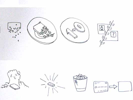
The RFID hacking workshop last week was both thoughtful and productive. I’m going to scoot through what we made and a few of the ideas, and leave any more detailed thoughts for other posts.

Day 1 was introductions and learning the technology. I’ve had a vague idea what RFID was before, but now Matt Karau told us all about it. So what is it? A powered RFID reader reads tags. An RFID tag is one of these:

RFID tag

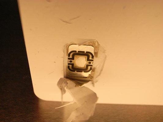
Actually, that’s a smartcard together with an RFID tag–it’s from the inside of an Oyster card, the thing you use to pay on the London Underground. The antenna has broken off. RFID tags come in two flavours:

  • Passive tags have an antenna and a small chip. The RFID reader sends a burst of power at the tag; the power runs through the antenna and powers the chip; the chip does something (maybe just loads an ID, or perhaps does a tiny calculation); the tag sends the data back to the reader and powers down. It might have a little memory too–perhaps 0.5-4Kb.
  • Active tags are as passive ones, but with a battery.

Tags have large antenna loops, and are generally sealed inside a disk of plastic or paper. There are complexities, of course. RFID tags can be joined to sensors, so they report environmental data, or have more complex chips capable of running a tiny OS and cryptography applications, like the Oyster cards. There are different frequencies, different ranges you can hold the reader to invoke the tag, and different standards…

…but, essentially, the basic thing we’re using is a loop of wire that somehow reports the same number each time when you ring it with an electromagnetic field generated by the reader.

(Also on day 1 we had a go at calling the tags “spychips” instead of “RFIDs” every time we referred to them. The specific privacy fear isn’t a view I subscribe to, but it’s enlightening to see your new ideas being inflected by the language you use to reach them. I think it helped us see RFID as a technology in its own right, rather than relying on a single, badly-fitting metaphor.)

Day 2

We started considering the range of RFID on the second day. These thoughts, about how to have interactions in a sphere of thin air a few inches around a hidden tag, led in part to last week’s post on RFID and forced intimacy. They also led to this:

S&W experimenting with RFID

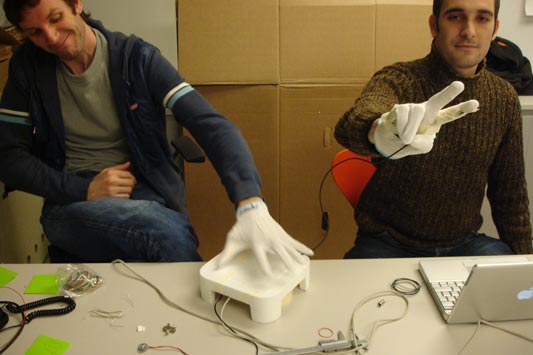
(Thanks Timo for the photo.)

In the palm of each white glove (Jack and I both have one) is an RFID tag. Inside the white polystyrene box is an RFID reader hooked up to a microcontroller (on an Arduino board). The board is also hooked up to a vibrating motor.

When you put your hand near the block, it begins to rumble.

On my glove – I’m on the right of the photo – is a flex sensor, wired up to the controller. The more bent the sensor, the bigger the rumble of the box. So when you approach the reader with an open palm, there’s a gentle vibration. As you make a grabbing gesture, the vibration grows and the white box begins to lead about. It makes a fair racket.

Why do this?

Jack was keen on celebrating the magic of this kind of remote action. What if the vibrating motor was actually a toy car motor? You could approach a car, and push it with your glove, imbuing it with acceleration through empty air. By clenching your fist, it’d zoom faster! You’d have to chase it to keep it moving. With two gloves and two motors, you could control it too.

Are proximity and tensing the hand the correct interactions for these kind of toys? We can only think by making.

Day 3

We’d spent the second day trying to learn some of the intrinsic properties of RFID tags and readers. Some of the ones we discussed were:

  • You can’t see the tags
  • Tags are ways for machines to tell the difference between different lumps of plastic–heading towards what Matt Jones has called a robot-readable planet
  • Knowing a tag’s ID is proof that the reader was geographically there, like the patterned card punches used in orienteering
  • The functional bit is the reader, not the tag

This last point was a revelation to me. RFID interactions are not like button-pushing interactions. With buttons, the smarts are behind the buttons themselves. The buttons trip relays and activate switches. With RFIDs, the smarts are all in the thing you use to push the buttons.

Imagine a computer keyboard, but the keyboard isn’t plugged into anything. Instead, cameras in your fingertips read the letters on the keys, decipher them, and send those letters via a USB cable in your wrist to the computer. That’s more like RFIDs. With buttons, the button pusher is the fungible bit (any finger can be a poking device) and each button is special. With RFID, the button pusher needs to be clever.

Continuing this thought, imagine a keyboard which worked like this. You’d print out paper ones that were better for Quark or Photoshop or whatever. You’d draw ad hoc macro keys on the desk, in erasable pen. Taking this back to RFIDs, does their true potential only emerge when people can make and write their own copy-tags to fill their environments?

Anyway.

Since the reader is the functional bit, different tags can behave in different ways. Perhaps the reader could have a slot in the top, and that’s where you slip in a tag to state the kind of tool the reader is at the moment (a telephone, a camera, a query tool), and there are other kinds of tags that represent objects, like people, places and things. What about stacking tags, or having them interlock in different ways, or… or…

The possibilities multiplied.

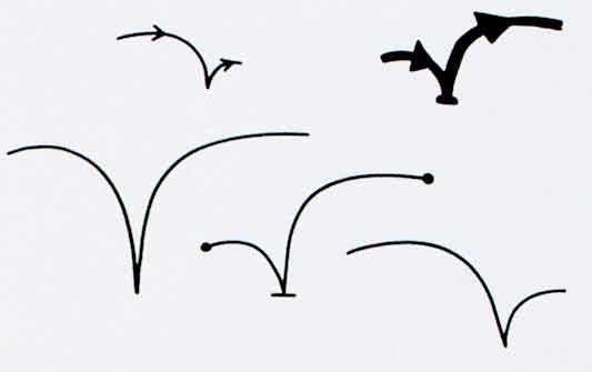
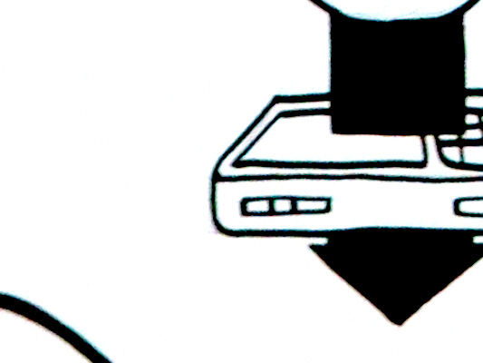
On the third day, we came back to where we’d started on the first day: Trying to get a feel for the field of an RFID reader.

RFID field drawing

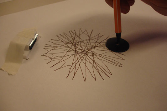
Above is a drawing Timo made, with the RFID reader under a desk and a pen through a hole in the middle of an RFID tag. He drew only when the reader was picking up the tag ID. It’s a beautiful image. (Thanks Timo for the photo. This was when we were seeing if a magnet would distort the field. Other drawings didn’t have that in place.)

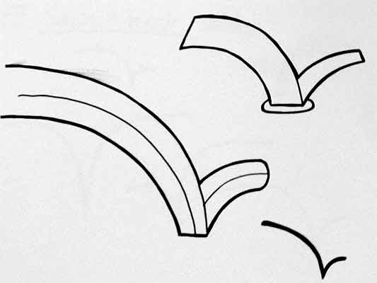
Jack and Timo spent time in the workshop at the Architecture School making a robot pen to do the same thing.

RFID pen drawing

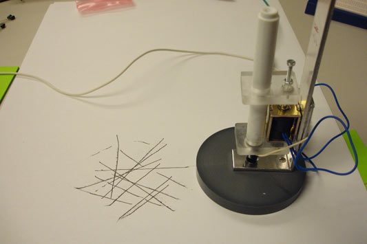
This pen has an embedded RFID tag (Timo’s photo again). It’s wired to the RFID reader, which controls a solenoid pushing the pen up and down. The pen is only down, and drawing, when it’s within range of the reader. You slide it around, and the automation does the rest.

RFID pen

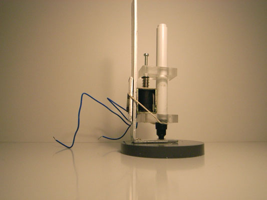
The machine-aided drawings aren’t as beautiful as the totally hand-drawn ones, but ain’t that always the case.

RFID and forced intimacy

S&W is here in Oslo with Timo Arnall’s Touch project for an RFID hacking workshop (check out that hand-drawn antenna field map). Yesterday was introductions, learning about RFID as a technology, and some preliminary explorations.

The work group met for breakfast today, and we discussed promising interactions and potential projects. One of the topics that came up was RFID tag visibility.

I know it’s obvious to state it, but RFID tags are generally hidden. To read a tag, first you have to find it with your reader. Design can make the location of the tag obvious… but wouldn’t it be interesting to embrace the invisibility constraint? Could we take advantage of the seeking behaviour that has to occur?

Consider a car showroom. Imagine no salespeople there, and no prices on the cars. When you entered the showroom, you would be given a RFID reader. There would be an RFID tag, holding the price, hidden somewhere on each car. You’d have to find the rough location of the tag to read the price.

Okay, this would be enormously annoying. But it would force you to step closer to the car, to examine the wing mirror to see if a tag was there, get up close to the paint-work on the door. What would happen?

When you get bright lights and noises in films, you feel excited whether the narrative of the film is exciting or not. Playing Project Rub on the Nintendo DS, the blowing interaction forces you to get adrenalised. Your body is tricked. Maybe getting really close to the car would be a kind of forced intimacy. You would feel better disposed to the car whether you liked it or not, simply by virtue of almost hugging it.

Okay, that’s car showrooms. What about parties for teenagers? We made up a Spin the Bottle type game. Oh, and gave it a pirate theme.

The scenario is this: Everyone who comes to your house party gets a token that looks like a gold coin with an RFID tag in it (holding a unique ID). People at the party take turn with the RFID reader. They have to wear a pirate hat, and the reader looks like a buccaneer’s sword. Let’s say you have the sword. You press a button on the handle, and it chooses a random RFID tag. This is the tag you have to find, by going round to everyone at the party and sweeping them with the sword.

Now let’s say you’re a person with a coin. If you’re not too keen on the person wearing the pirate hat, you’d put the coin in your pocket, or under your collar, so it could be found quickly. But maybe if you fancy the person with the hat, you’d conceal the coin a little, to make it harder to find. Gosh. I think it could get a little bit sexy.

I like this game because it celebrates the invisibility of the RFID tags, the fact they have a short detection range, and that the range can be shortened with material. It’s a treasure hunt game, but it doesn’t matter whether you have the chosen coin or not–it can be flirty in any case. It supports social interactions (ahem) rather than displacing them.

We had other ludicrous game ideas: Croquet where the hoops had tags and the balls had readers, where the balls would speak what you had to do next. “You have taken 4 hits. Now get through hoop 2,” your ball would say. You wouldn’t need the rule book. We also considered playing penny football with RFID tags, the readers snapping onto the edges of the tables and recording the number of goals. They could show the score on LCD screens, and play cheering sounds whenever a goal was scored.

Both of these games feel as silly to me as Slapz, the electronic game that replaces the children’s game Red Hands (or “slaps”).

The forced intimacy treasure game feels just as silly, but much more fun.

Lines and buttons

History of the Button is a blog, well, “Tracing the history of interaction design through the history of the button, from flashlights to websites and beyond.” [via Chris Heathcote’s links]

It’s great to look at early designs, when buttons were still brand new, and folks were still coming to terms with an action that could trigger an arbitrary amount of work. We think of a button press as the work itself, launching the missile or punching the letter, whatever, not simply completing the circuit that joins the actual cause (mechanical or electrical energy) to the effect. The button has become a by-word for easy. The 1960s sci-fi books I’ve read, when they want to express the maximum amount of crazy future thinking, talk about relays: devices that convert a button press to an action in a circuit that can do anything at all. Yet we barely think about relays now, or how incredible buttons are. When did buttons stop being modern?

(And, really, were they ever modern? A button on a shirt joins two pieces of cloth with effort far less than sewing, and it can be undone, and the physical object provides a focus for interaction too, the affordance that these things can be joined. Perhaps the name and job of “button” gets continually recycled, with only the physical implementation changing over the years.)

On a similar note:

I really enjoy collections of single design elements. Timo Arnall has written The dashed line in use, making the (dashed line) connection between his use of this element in indicating RFID interactions and how it occurs in instruction manuals, paths, graphs, as ellipsis… He also talks about how the line indicates a seam, a visible join between two things that still maintains the two things as separate.

The dashed line for RFID is doubly appropriate first because the field is invisible and, second, because the indicated interaction hasn’t happened yet–it exists only in potential.

Is there a dashed line to be drawn between Timo’s work and the history of the button?

Recent Posts

Popular Tags