This website is now archived. To find out what BERG did next, go to www.bergcloud.com.

Blog posts tagged as 'ipad'

Swiping through cinema, touching through glass

The studio is continually interested in the beautiful and inventive stuff that can happen when you poke and prod around the edges of technology and culture. Mag+ emerged from a curiosity from both Bonnier and BERG about reading on tablets while Making Future Magic emerged from experiments with light painting and screens.

Early last year we were experimenting with product photography for a retail client pitch. We wondered how we could we use cinematic techniques to explore product imagery.

Watch the video of our experiments on Vimeo.

What would happen if instead of a single product image or a linear video, we could flick and drag our way through time and the optical qualities of lenses? What if we had control of the depth of field, focus, lighting, exposure, frame-rate or camera position through tap and swipe?

Swiping through cinema

This is a beautiful 1960’s Rolex that we shot in video while pulling focus across the surface the watch. On the iPad, the focus is then under your control, the focal point changes to match your finger as it taps and swipes across the object. Your eye and finger are in the same place, you are in control of the locus of attention.

Jack originally explored focus navigation (with technical help by George Grinsted) in 2000, and now Lytro allow ‘tap to focus’ in pictures produced by the ‘light field camera‘.

The lovely thing here is that we can see all of the analogue, optical qualities such as the subtle shifts in perspective as the lens elements move, and the blooming, reflection and chromatic abberations that change under our fingertips. Having this optical, cinematic language under the fine control of our fingertips feels new, it’s a lovely, playful, explorative interaction.

Orson Welles’ Deep Focus.

Cinematic language is a rich seam to explore, what if we could adjust the exposure to get a better view of highlights and shadows? Imagine this was diamond jewellery, and we could control the lighting in the room. Or to experiment with aperture, going from the deep focus of Citizen Kane, through to the extremely shallow focus used in Gomorrah, where the foreground is separated from the environment.

Cold Dark Matter by Cornelia Parker.

What if we dropped or exploded everyday objects under a super high-frame rate cinematography, and gave ourselves a way of swiping through the chaotic motion? Lots of interesting interactions to explore there.

Touching through glass

This next experiment really fascinated us. We shot a glass jar full of thread bobbins rotating in front of the camera, on the iPad you can swipe to explore these beautiful, intricate colourful objects.

There is a completely new dimension here, in that you are both looking at a glass jar and touching a cold glass surface. The effect is almost uncanny, a somewhat realistic sense of touch has been re-introduced into the cold, smooth iPad screen. We’re great fans of Bret Victor’s brilliant rant on the problems of the lack of tactility in ‘pictures under glass‘, and in a way this is a re-inforcement of that critique: tactility is achieved through an uncanny visual re-inforcement of touching cold glass. This one really needs to be in your hands to be fully experienced.

And it made us think, what if we did all product photography that was destined for iPads inside gorgeous Victorian bell jars?

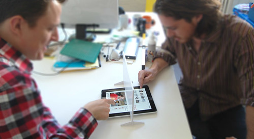
Nick realised this as an App on a first-generation iPad:

Each of the scenes in the Swiping through Cinema app are made up of hundreds (and in some cases thousands) of individual images, each extracted from a piece of real-time HD video. It is the high speed manipulation of these images which creates one continuous experience, and has only become possible relatively recently.

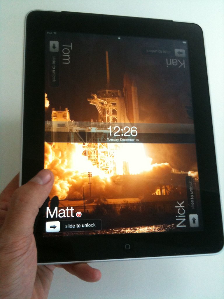
During our time developing Mag+, we learnt a great deal about using images on tablets. With the first-generation iPad, you needed to pay careful attention to RAM use, as the system could kill your app for being excessively greedy, even after loading only a handful of photographs. We eventually created a method which would allow you to smoothly animate any number of full-screen images.

With that code in place, we moved onto establishing a workflow which would allow us to shoot footage and be able to preview it within the app in a matter of minutes. We also consciously avoided filling the screen with user interface elements, which means that the only interaction is direct manipulation of what you see on-screen.

With the Retina display on the third-generation iPad, we’re really excited by the prospect of being able to move through super crisp and detailed image sequences.

We’re really excited about re-invigorating photographic and cinematographic techniques for iPads and touchscreens, and finding out how to do new kinds of interactive product imagery in the process.

Guardian iPad app launched

Congratulations to all the team at The Guardian for launching their iPad app this week.

BERG played a small role at the very beginning of the process with initial product workshops, Nick contributing his experience on iOS prototyping and Jack consulting on the interaction design with Mark Porter and the team.

Andy Brockie who led the internal design team there has put together a great ‘behind-the-scenes’ gallery of the process, and newspaper design guru Mark Porter has an in-depth blog post about his involvement here.

From that post, a snippet about some of the ‘algorithmic-art-director‘ workflow the team invented:

Unlike the iPhone and Android apps, which are built on feeds from the website, this one actually recycles the already-formatted newspaper pages. A script analyses the InDesign files from the printed paper and uses various parameters (page number, physical area and position that a story occupies, headline size, image size etc) to assign a value to the story. The content is then automatically rebuilt according to those values in a new InDesign template for the app.

It’s not quite the “Robot Mark Porter” that Schulze and Jones imagined in the workshops, but it’s as close as we’re likely to see in my lifetime. Of course robots do not make good subs or designers, so at this stage some humans intervene to refine, improve and add character, particularly to the article pages. Then the InDesign data goes into a digital sausage machine to emerge at the other end as HTML.

Fascinating stuff, and perhaps a hint of the near-future of graphic design…

It was a pleasure working with the team there, and Mark especially. The final result looks fantastic, and more importantly perhaps reads beautifully and downloads extremely quickly. Well done to all involved!

And now, we can now finally exclusively reveal our prototype sketch for Robot Mark Porter…

Non-personal computing: sketching a multi-user UI for the iPad

The iPad feels like a household device.

Sofa computing: passable from person-to-person, parent-to-child… And sharable as a ‘multiplayer magic table’ surface, as discussed here previously.

Magic table games

And yet, at time-of-writing, it’s a personal computer.

While parents of my acquaintance have found work-arounds, such as placing their children’s favourite apps on specific ‘pages’ of the homescreen, it’s a device bound to a MacBook or iMac, and an iTunes account – ultimately to an individual, not a small group.

While travelling last month, my wife and I managed to use the iPad as our shared device by basically signing-in and out of our Google accounts. Do-able but laborious.

Switch seems like a useful step in the direction of “non-personal computing”, allowing multiple user accounts for browsing, with a single password for each.

But I thought I’d quickly sketch something that built on the ‘magic-table’ mock-ups I’d been playing with back in the summer – looking enhancing the passable and sharable nature of the iPad as an object in and of the household.

Multi-user iPad UI Sketch

It’s pretty simple, and not much of leap, frankly…

Multi-user iPad: Portrait

The ‘person-in-each-corner’ pattern can already be seen in iPad games such as Marble Mixer and Multipong, so this really just uses the corners of the device in tandem with the orientation sensors to select which of the – up to four* – different users wants to access their apps and settings on the device.

Activity notifications could be displayed alongside the names on the lockscreen so that you could quickly see at a glance if anything needed your attention.

Multi-user iPad: Landscape

And, if you wanted a little more privacy from the rest of your housemates or family, then just a standard iOS passcode dialog could be set.

Multi-user iPad: Passcode

That’s it really.

Just a quick sketch but something I wanted to get out of my head.

The individual nature of the UI and user-model of the iPad seems so at odds to me with its form-factor, the share-ability of its screen technology and it’s emergent context of use that I can imagine something (much more elegant) than this coming from Apple in the near-future.

Of course, they may just want to sell us all one each…


* as well as the four user limit being a simple mapping to the number of corners the thing has, this seems like a very Apple constraint to me…

Making Future Magic: light painting with the iPad

“Making Future Magic” is the goal of Dentsu London, the creative communications agency. We made this film with them to explore this statement.

(Click through to Vimeo to watch in HD!)

We’re working with Beeker Northam at Dentsu, using their strategy to explore how the media landscape is changing. From Beeker’s correspondence with us during development:

“…what might a magical version of the future of media look like?”

and

…we [Dentsu] are interested in the future, but not so much in science fiction – more in possible or invisible magic

We have chosen to interpret that brief by exploring how surfaces and screens look and work in the world. We’re finding playful uses for the increasingly ubiquitous ‘glowing rectangles’ that inhabit the world.

iPad light painting with painter

This film is a literal, aesthetic interpretation of those ideas. We like typography in the world, we like inventing new techniques for making media, we want to explore characters and movement, we like light painting, we like photography and cinematography as methods to explore and represent the physical world of stuff.

We made this film with the brilliant Timo Arnall (who we’ve worked with extensively on the Touch project) and videographer extraordinaire Campbell Orme. Our very own Matt Brown composed the music.

Light painting meets stop-motion

We developed a specific photographic technique for this film. Through long exposures we record an iPad moving through space to make three-dimensional forms in light.

First we create software models of three-dimensional typography, objects and animations. We render cross sections of these models, like a virtual CAT scan, making a series of outlines of slices of each form. We play these back on the surface of the iPad as movies, and drag the iPad through the air to extrude shapes captured in long exposure photographs. Each 3D form is itself a single frame of a 3D animation, so each long exposure still is only a single image in a composite stop frame animation.

Each frame is a long exposure photograph of 3-6 seconds. 5,500 photographs were taken. Only half of these were used for the animations seen in the final edit of the film.

There are lots of photographic experiments and stills in the Flickr stream.

Future reflection

light painting the city with Matt Jones

The light appears to boil since there are small deviations in the path of the iPad between shots. In some shots the light shapes appear suspended in a kind of aerogel. This is produced by the black areas of the iPad screen which aren’t entirely dark, and affected by the balance between exposure, the speed of the movies and screen angle.

We’ve compiled the best stills from the film into a print-on-demand Making Future Magic book which you can buy for £32.95/$59.20. (Or get the softcover for £24.95/$44.20.)

My piece on iPad magazines for Icon’s September 2010 issue.

Icon September Issue: piece on (near-)future of digital magazines by me

Outgoing editor Justin McGuirk asked me to write a little about the near-future of digital magazines for Icon #87, in which I talk a bit about challenges of the context they now find themselves in as a media form, as well as things we think we learned during the Mag+ project.

They’ve kindly allowed us to republish it here.

Since the launch of the Apple iPad six months ago, the world of digital magazines has seen fevered activity and hyperbolic punditry.

Big names such as Wired, Vanity Fair, Time and Popular Science (which our studio, BERG, helped to bring to the iPad with the Mag+ platform) have released editions into the App Store and made proclamations that it’s the future of magazines.

However, the very term “digital magazine” smacks of “horseless carriage”, Marshall McLuhan’s term for an in-between technology that is quickly obsolete. While nothing is certain about the future of any media, there is no doubt that the digital tablet form will grow in popularity, with the iPad being joined later this year by numerous other (possibly cheaper) competitors mainly powered by Google’s Android operating system.

So, what does the future really hold for digital magazines? We can identify some challenges and some opportunities. One certainty is that the manner by which we discover and purchase magazines will be given a hefty thump by the switch to digital. We are in a world of search rather than browse – which perhaps in turn leads to a change in the role of cover design, from “buy me, look what’s inside” to “you know what’s inside, but here is an incredible, evocative image”. In many ways it’s a return to the “classic” magazine covers of the 1950s and 60s, privileging the desirability of the object itself rather than shouting about every feature.

The bounded “object-ness” of the magazine embedded in the world of the endless, restless internet is seen by most as an anachronism, but it is also one of its greatest attributes. Research we received from our client Bonnier as part of the brief for the Mag+ concept indicated that people really were attached to the magazine as a form of media that creates a bubble of time to indulge in reading – and as a contrast to other, faster forms of media.

Meeting this need – while acknowledging the breadth, speed and interconnectedness of the internet – is a design condition that has not been satisfied fully by the current crop of digital magazine offerings, our efforts included. But stay tuned.

Another change in what we might term the “attention economics” of digital magazines is that their new neighbours in the app ecosystem are not other magazines, but games, spreadsheets, supermarket delivery apps, photography apps and so on. One device is now the conduit for vastly different activities and experiences.

And yet – at least in the current user-interface paradigm of Apple and Google – they all get pretty much the same real estate on screen. You have to decide between killing time with a magazine, playing Angry Birds or ordering your Ocado delivery based on the same visual evidence.

Perhaps future iterations of mobile and tablet operating systems will have a more media-led approach, as evidenced by the new Windows Phone 7 mobile operating system (yes, that’s right, Microsoft has made a more media-centric user interface than Apple) – leading to magazine icons being bigger or more varied on the media surface.

Still, having such vastly different neighbours nestling so close creates a new context for an old form that has heavier production costs than its new competitors. A casual game developed by five people commands the same attention of a magazine produced by 25. That is remarkably imbalanced, but don’t think these attention economics will stand. The production and form of the magazine cannot fail to be affected. Internet-native publishers such as gadget expert Gizmodo, fashion maven The Sartorialist or critically minded gamer Rock, Paper, Shotgun are smaller and nimbler. And eventually they’ll be able to publish to the same canvas as the big boys and girls – and be able to charge for their expert curation and commentary.

Which brings us to some of what I’ve started to call “two-star problems”. In the consumocracy of the App Store, star ratings are all, and unfortunately most of the current magazine offerings have only two stars, compared to the four- or five-star world of games and other apps. Even Wired and, I’m sad to say, Popular Science garner a “must-try-harder” three stars. Consumer dismay at customer service, reliability, consistency, pricing and the overall offer seem to lead to these relatively low ratings. Consumers’ expectations are determined by the value they see offered by software producers compared to traditional media producers.

So where to head? What are the opportunities? I think they are supplementary to what magazine publishers see as their existing strengths in writing, curation and design. They will emerge from their less glamorous but equally deep knowledge of subscriptions, service and “belonging”.

Take the best of what you understand of your readership and the decade or so that many magazines have spent on the internet and look to exploit the social technologies of the web, rather than run to present your content as an isolated recapitulation of a mid-1990s CD-ROM.

Create hybrids and experiment – not with the empty (and costly) spectacle of embedding jarring 3D and video, but with data, visualisation, sociality, location-based services, semantic technologies.

There’s no reason that the feel of a well-designed, valuable, curated object shouldn’t be complemented when placed properly in the roaring, sparkling stream of the internet. And experiment not just with editorial content, but also with advertising. I’d rather have a live link to the latest Amazon price for a camera than a spinning 3D video of it.

Tablets promise to be transformative – in their context of use and how well they can display content – but they do not wish away the disruptive challenge (and opportunity) the internet presents to magazine publishers.

This is the beginning of a tumultuously exciting time for magazines and those who produce them – not an end to the “free-for-all” of the web as many would love to believe. More experimentation, not less, is what’s called for. As a reader and a designer, I’m looking forward to that.

Alumni Watch: Spot Goes To School

spot-goes-to-school.jpg

One of the pleasures of being at BERG is the people you get to work with. The core group in the studio is small, so we often work with collaborators on larger projects. They bring something fresh to the mix in the studio, making their own mark both on the work we do and the culture of the space.

Earlier this year, Lei Bramley worked with us – primarily, with Nick – on developing the iPad reader application for Mag+. It was great to have him around.

It’s always nice to know what BERG alumni are up to. Lei’s just finished helping Penguin with their iPad version of Spot Goes To School, which looks like an interesting take on what a rich, interactive children’s book can be. You can find out more on the iTunes Store.

Lei told us that “it was a lot of fun, although I have the recurring whistling theme music branded onto my brain!” It’s a really nice product.

Magic tables, not magic windows

A while back, in 2007, I wrote about ‘a lost future’ of touch technology, and the rise of a world full of mobile glowing attention-wells.

“…it’s likely that we’re locked into pursuing very conscious, very gorgeous, deliberate touch interfaces – touch-as-manipulate-objects-on-screen rather than touch-as-manipulate-objects-in-the-world for now.”

It does look very much like we’re living in that world now – where our focus is elsewhere than our immediate surroundings – mainly residing through our fingers, in our tiny, beautiful screens.

Andrew Blum writes about this, amongst other things, in his excellent piece “Local Cities, Global Problems: Jane Jacobs in an Age of Global Change”:

Like a lot of things here, they are deeply connected to other places. Their attention is divided. And, by extension, so is ours. While this feeling is common to all cities over time, cell phones bring the tangible immediacy of the faraway to the street. Helped along by media and the global logistics networks that define our material lives, our moment-to-moment experience of the local has become increasingly global.

Recently, of course, our glowing attention wells have become larger.

We’ve been designing, developing, using and living with iPads in the studio for a while now, and undoubtedly they are fine products despite their drawbacks – but it wasn’t until our friend Tom Coates introduced me to a game called Marble Mixer that I thought they were anything other than the inevitable scaling of an internet-connected screen, and the much-mooted emergence of a tablet form-factor.

It led me to think they might be much more disruptive as magic tables than magic windows.

Marble Mixer is a simple game, well-executed. Where it sings is when you invite friends to play with you.

Each of you occupy a corner of the device, and attempts to flick marbles into the goal-mouth against the clock – dislodging the other’s marbles.

Beautiful. Simple. But also – amazing and transformative!

We’re all playing with a magic surface!

When we’re not concentrating on our marbles, we’re looking each other in the eye – chuckling, tutting and cursing our aim – and each other.

There’s no screen between us, there’s a magic table making us laugh. It’s probably my favourite app to show off the iPad – including the ones we’ve designed!

It shows that the iPad can be a media surface to share, rather than a proscenium to consume through alone.

Russell Davies pointed this out back in February (before we’d even touched one) saying:

[GoGos]’d be the perfect counters for a board game that uses the iPad as the board. They’d look gorgeous sitting on there. We’d need to work out how to make the iPad think they were fingers – maybe some sort of electrostatic sausage skin – and to remember which was which.

gogos on an iphone

Inspired by Marble Mixer, and Russell’s writings – I decided to do a spot of rapid prototyping of a ‘peripheral’ for magic table games that calls out the shared-surface…

Magic table games

It’s a screen – but not a glowing one! Just a simple bit of foamboard cut so it obscures your fellow player’s share of the game board, for games like Battleships, or in this case – a mocked-up guessing-game based on your flickr contacts…

Magic table games

You’d have a few guesses to narrow it down… Are they male, do they have a beard etc…

Magic table games

Fun for all the family!

Anyway – as you can see – this is not so serious a prototype, but I can imagine some form of capactive treatment to the bottom edge of the screen, perhaps varying the amount of secret territory each player revealed to each other, or capacitive counters as Russell suggests.

Aside from games though – the pattern of a portable shared media surface is surely worth pursuing.

As Paul Dourish put it in his book “Where the action is” – the goal would be

“interacting in the world, participating in it and acting through it, in the absorbed and unreflective manner of normal experience.”

Designing media and services for “little-ass” rather than “big-ass” magic tables might propel us into a future not so removed from the one I thought we might have lost…

Popular Science+

In December, we showed Mag+, a digital magazine concept produced with our friends at Bonnier.

Late January, Apple announced the iPad.

So today Popular Science, published by Bonnier and the largest science+tech magazine in the world, is launching Popular Science+ — the first magazine on the Mag+ platform, and you can get it on the iPad tomorrow. It’s the April 2010 issue, it’s $4.99, and you buy more issues from inside the magazine itself.

See Popular Science+ in the iTunes Store now.

Here’s Jack, speaking about the app, its background, and what we learned about art direction for magazines using Mag+.

Articles are arranged side by side. You swipe left and right to go between them. For big pictures, it’s fun to hold your finger between two pages, holding and moving to pan around.

You swipe down to read. Tap left to see the pictures, tap right to read again. These two modes of the reading experience are about browsing and drinking in the magazine, versus close reading.

Pull the drawer up with two fingers to see the table of contents and your other issues. Swipe right and left with two fingers to zip across pages to the next section. Dog-ear a page by turning down the top-right corner.

There’s a store in the magazine. When a new issue comes out, you purchase it right there.

Editorial

Working with the Popular Science team and their editorial has been wonderful, and we’ve been working together to re-imagine the form of magazines. Art direction for print is so much about composition. There are a 1,000 tiny tweaks to tune a page to get it to really sing. But what does layout mean when readers can make the text disappear, when the images move across one another, and the page itself changes shape as the iPad rotates?

We discovered safe areas. We found little games to play with the reader, having them assemble infographics in the act of scrolling, and making pages that span multiple panes, only revealing themselves when the reader does a double-finger swipe to zoom across them.

It helps that Popular Science has great photography, a real variety of content, and an engaged and open team.

What amazes me is that you don’t feel like you’re using a website, or even that you’re using an e-reader on a new tablet device — which, technically, is what it is. It feels like you’re reading a magazine.

Apple made the first media device you can curl up with, and I think we’ve done it, and Popular Science, justice.

From concept to production

The story, for me, is that the design work behind the Mag+ concept video was strong enough to spin up a team to produce Popular Science+ in only two months.

Not only that, but an authoring system that understands workflow. And InDesign integration so art directors are in control, not technologists. And an e-commerce back-end capable of handling business models suitable for magazines. And a new file format, “MIB,” that strikes the balance between simple enough for anyone to implement, and expressive enough to let the typography, pictures, and layout shine. And it’s set up to do it all again in 30 days. And more.

It’s all basic, sure. But it’ll grow. We’ve built in ways for it to grow.

But we’ve always said that good design is rooted not just in doing good by the material, but by understanding the opportunities in the networks of organisations and people too.

A digital magazine is great, immersive content on the screen. But behind those pixels are creative processes and commercial systems that also have to come together.

Inventing something, be it a toy or new media, always means assembling networks such as these. And design is our approach on how to do it.

I’m pleased we were able to work with Popular Science and Bonnier, to get to a chance to do this, and to bring something new into the world.

Thanks!

Thank you to the BERG team for sterling work on El Morro these last two months, especially the core team who have sunk so much into this: Campbell Orme, James Darling, Lei Bramley, Nick Ludlam and Timo Arnall. Also Jack Schulze, Matt Jones, Phil Gyford, Tom Armitage, and Tom Taylor.

Thanks to the Popular Science team, Mike Haney and Sam Syed in particular, Mark Poulalion and his team from Bonnier, and of course Bonnier R&D and Sara Öhrvall, the grand assembler!

It’s a pleasure and a privilege to work with each and every one of you.

See also…

Recent Posts

Popular Tags