Since the final form of Olinda is out in the world, I had a dig in the archive – and the studio – this morning and found some of the physical visualisations from along the way. It was fun to look back and see a classic case of thinking through making.
I know Jack will be posting design notes in the coming weeks. For the moment, this is all about the pictures.
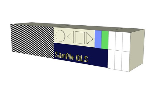
This isn’t physical, but it’s a good place to start: the image is from our proposal document, before any feasibility work. When that begun, we went back to the drawing board and explored other designs: Jack talked before about drawing Olinda as exploration.
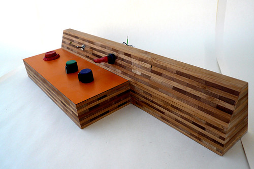
Our original intention was to use bamboo ply and formica to make the radio. We’d come to sloped forward-facing surface of the model by imagining it attempting to look towards you (instead of being on a vertical plane and forcing you to crouch down). It’s a small gesture towards meeting the user half way, and its echoes remain in the final piece.
Another retained element is that the buttons and dials encourage force downwards through the radio into the shelf or table. That means you don’t have to support the radio with one hand while you push a button on its front with the other.
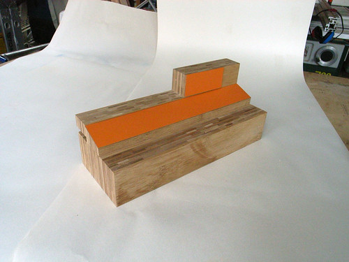
Wood form explorations continued, aided by Jeff Easter, who was working with us on this part of the project.
Again, you can see more mock-ups of these in Jack’s drawing post.
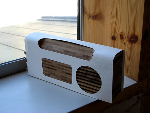
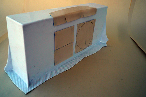
Here the wood now incorporates a plastic shell (as mocked-up with card).
As we got more into the communications purposes of the project, we realised that the ultimate intention was to demonstrate that a social and Web-like experience was possible in consumer electronics, and in particular DAB radio. But to show this, to people in the industry and at the BBC, Olinda would have to draw more from product processes and aesthetics.
Given the conversation needed to be about particular features and not distracted by a total change in design, this meant the form became more traditional… which in turn led away from wood which, for structural integrity and precision reasons, couldn’t give us the form we needed. It was worth seeing whether we could hang onto some wooden elements.
Meanwhile the component sizes – speakers, screens, PCBs and so on – were becoming known. There was a brief foray into vacuum formed plastic to see whether it’d give us the required shape and quality.

On the left you can see the last attempt with wood, investigating whether cabinet making techniques could give enough structural strength and quality of finish to pass muster in the product space. Not quite, is the answer, and the work consumes a lot of workshop time: it turned out to be more economic to use repeatable manufacturing techniques and poured plastic.
But the main model here is not a visualisation but part of the hardware rig used to give a good feel of the interface during software development.
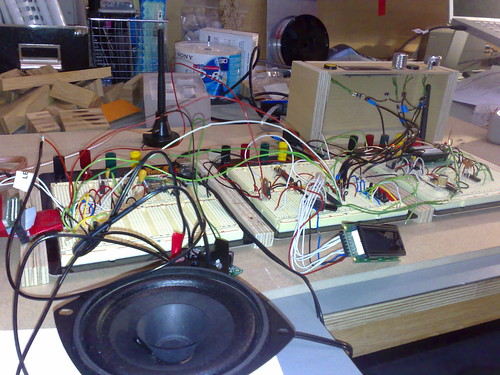
There’s the same hardware rig in use.
The rig wasn’t the first instance of the final user interface: Jeff had built a Web-based simulation, so we could feel it in use, and every button press from every state (and time-out events) had been mapped on paper.
Note we hadn’t yet hit on the double dial (the outer dial scrolling through stations alphabetically, the inner learning from your habits and giving you only your most listened). It wasn’t until the Web UI prototype that a good metaphor for the dial emerged, and the idea of coarse+fine tuning (seen also in the Beolit) was one of several factors that took us there..

Finalising the manufacturing technique allowed Jack to develop the form (this is the final CAD model). As I mentioned before, Olinda wears its heart on its sleeve: the form betrays the processes that created it, the ideas beneath it, and its history. There’s no universal visual design scheme, just each interface element being allowed to tell its story. This lets people, I hope, look past the form to concepts like social networks and the Lego-like modularity.
The look of the hardware interface is its own story. Though I’ll mention, briefly, that it was through these computer models that the hardware interface came to be displayed on the end of the friends module too, so that the radio would continue to advertise its modular nature even when assembled.

And there it is. You can see the heritage – chunky controls to advertise use and invite participation; the sloping interface – and how it has developed.
I’ve chosen this image because it illustrates a design decision that emerged very late in the process, only when the weight of the final units could be felt: the placing of the aerial at the base of the main unit. Several radios have it emerging from the top, but this means brushing past the aerial can topple the device over. By having the aerial attach at the bottom, knocking it doesn’t impart enough turning moment to destabilise the radio. Discovering that happened in a real sweaty palm moment.
These photos and more can be found in the Olinda Flickr pool.
One Comment or Trackback
1. Kars said on 7 May 2008...
This should have been in Buxton‘s book. Having just finished that, I’m impressed with the range of techniques you used to first sketch and then prototype the radio. Wonderful work – thanks for sharing. (And by the way, I love the 2001 aesthetic, don’t listen to the others.)