This website is now archived. To find out what BERG did next, go to www.bergcloud.com.

Blog posts tagged as 'graphics'

Friday Links – Kinects, jittergifs, and robots

Chris O’Shea’s Body Swap is a Kinect-based installation that lets two people control “paper cut-outs” of one another. Especially fun, as the video proves, with two people of very different height – and the provision of music to encourage acting and play is a nice touch.


Photo credit: obvious_jim

Another Kinect-related link: this Flickr set shows what happens when you map depth data (from a Kinect sensor) to a traditional digital camera photograph – and then pivot and distort it in three dimensions. The above image is probably my favourite, but the whole set is worth a look – if only for the way the set progresses through increasingly distorted takes on the original photographs.

3ERD is a tumblelog of jitter-gif photographs from Matt Moore. He’s using a stereoscopic compact camera (a bit like, say, the Fuji W1) to take stereoscopic images – but then turning the left and right image into a two-frame animated gif. The results are uncanny. It’s hard to comprehend that both frames were taken at the same time, however simple the idea may seem; the translation of two images separated in space into two images separated by time is a strange one to wrap your head around. A little slice of bullet-time.

Teriyaki blog

50 Watts’ Space Teriyaki is a wonderful collection of Japanese futurist art and imagery from the seventies and eighties. It veers between the bleak and gynaecological; throughout, though, there’s a fascinating use of colour and form.

And finally: a robot arm, repurposed into a physical feedback system for a racing computer game. It brings a whole new meaning to “force feedback”.

Media Surfaces: The Journey

Following iPad light painting, we’ve made two films of alternative futures for media. These continue our collaboration with Dentsu London and Timo Arnall. We look at the near future, a universe next door in which media travels freely onto surfaces in everyday life. A world of media that speaks more often, and more quietly.

“The Journey” is the second ‘video sketch’ in the pair with ‘Incidental Media’ – this time looking at the panoply of screens and media surfaces in a train station, and the opportunities that could come from looking at them slightly differently.
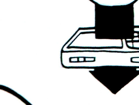
The Journey

The other film can be seen here.

There’s no real new technology at play in any of these ideas, just different connections and flows of information being made in the background – quietly, gradually changing how screens, bits of print ephemera such as train tickets, and objects in the world can inter-relate to make someone’s journey that bit less stressful, that bit more delightful.

There’s a lot in there – so I wanted to unpack a few of the moments in the film in this (rather long!) blog post and examine them a bit.

The film can be divided into two halves – our time in the station, and our time on the train.

The train journey itself is of course the thing at the centre of it all – and we’re examining how what we know about the journey – and the train itself, in some cases – can pervade the media surfaces involved in ways that are at once a little less ‘utilitarian’ and a little more, well, ‘useful’…

The first group of interventions could be characterised as the station wrapping around you, helping you get to your seat, on your train, for your journey, with the least stress.

Let’s start at the ticket machine.

Media Surfaces: The Journey: ticket vending

The screen supposes two things – that it knows where it is (it doesn’t move around much) and it knows where your train (in this case, “Arthur” – trains are people too!) is leaving from, and when. So why not do a simple bit of reassurance here? It’s twenty minutes to Arthur’s departure and it’s a 3 minute walk.

You’ve got 17 minutes to play with! Get a sandwich? A coffee? Or go and find your seat…

Before we do that I just want to point our something about the ticket machine itself…

Media Surfaces: The Journey: ticket machines that calm down the queue

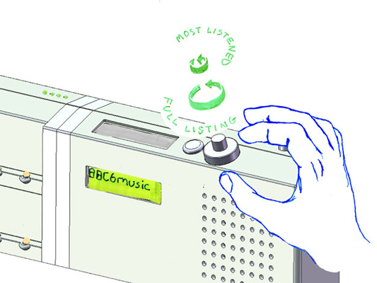
There’s the screen we’ve been interacting with to get our ticket, but there’s also a LED scroller above that.

As you can see in the concept sketch below, we’ve supposed that the scroller could give reassurance to the people in the queue behind you – maybe displaying the average turn-around-time of serving tickets to travellers, so if there is a queue, you’ll know how quickly it might move.

Media Surfaces: The Journey: Screens for the queue & you

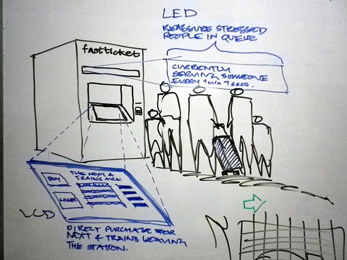
I think when I was drawing this I had in mind the awesome-but-as-yet-unrealised scheme by Lisa Strausfeld and Pentagram NYC for a videowall in Penn Station.

I think I first saw this presented by Lisa Strausfeld at a conference some 8 or so years ago now, but it’s still wonderful. The large video wall has loads of different layers of information kind of interpolated and displayed all at once, at different ‘resolutions’.

So that if you’re approaching the station from down the street you read some overall information about the running of the station that day, and the time, and as you get closer you see news and stock prices, then closer again and you actually see the train times when you get close enough to crane your neck up at them.

Really clever, and a huge influence on us. The notion of several ‘reads’ of the information being presented on the same surface – if handled well, as in the Pentagram proposal – can be very powerful.

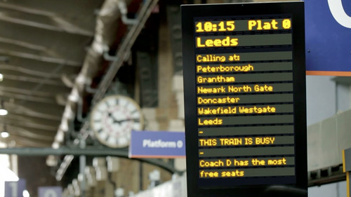
We’ve taken a much less high-tech approach, using the multitude of existing screens in the station, but staging the information they present intelligently in a similar way as you approach the platform and your train itself.

For instance, little messages on concourse screens about how busy the station is overall that morning…

Media Surfaces: The Journey: Stations that talk to you

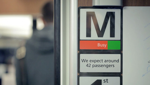
As we get to our platform we get the message that the train is going to pretty full but the station systems know where the bulk of reserved seats are, and can give us a little timely advice about where to hunt for a free place to sit…

Media Surfaces: The Journey: Platforms that talk to you

We’ve hinted in this image at a little bit of nice speculative quiet new technology that could be placed by the station workers: magnetically-backed e-ink signs – again displaying reassuring information about where the busy portions of the train will be.

Media Surfaces: The Journey: Expectation-Setting

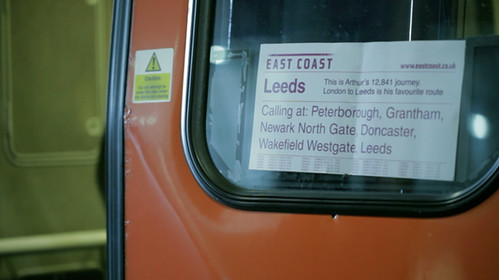
These little inventions have hopefully got you to your train (Arthur, remember?) on time, and in a more of a relaxed state of mind. So, as we board the train we might have time to note that this is Arthur’s favourite route…

Media Surfaces: The Journey: Arthur's favourite journey

If not, it doesn’t matter. It’s not a functional improvement to your journey but these touches lead to an appreciation of the service’s scale or reach and, if you are a regular traveller, inject a bit of recognition and delight into the otherwise routine.

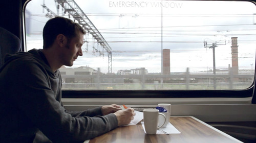
Once onboard, we continue to explore opportunities for these incidental, different reads of information to both inform and delight.

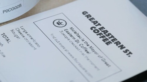
In the first film ‘Incidental Media’, we introduce the concept of “Print can be quick” – looking at all the printed ephemera around us and how it can be treated as a media surface for more personalised, contextualised or rapidly-updated information.

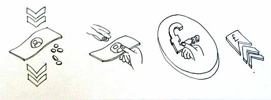
After all, most of the printed matter associated with a train journey is truly print-on-demand: your tickets, your receipts and, as in this example, the printed reservation stub placed on the seat by the train attendants.

Media Surfaces: The Journey: Can I sit here?

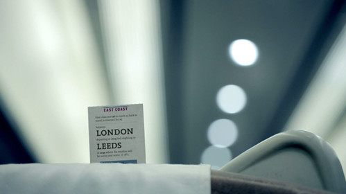
Here we wanted to look to the reassurances and reads that one takes of the reservation stubs as you move down the carriage – either with a reserved seat to find, or perhaps without a reservation on a busy train, opportunistically looking for an unoccupied seat that might be reserved for a latter portion of the train’s total journey.

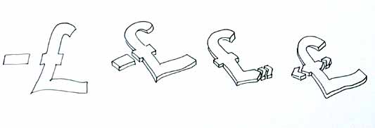
In one of our concept sketches below we’re exploring that first case – could your ticket be the missing jigsaw piece to the reservation stub?

A bit Willy Wonka magic ticket!

Media Surfaces: The Journey: Reservations sketch

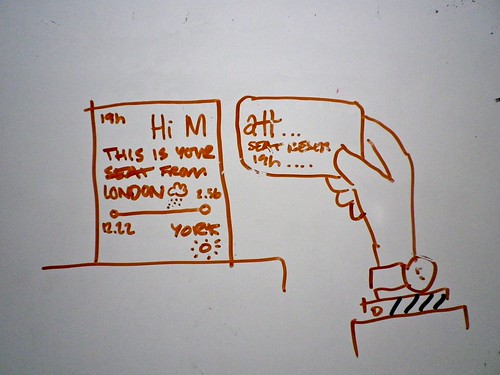
Privacy would be preserved by just using your first initial – printed large with salutations, attracting your eye easily to zero in on your seat as perhaps you struggle down the aisle with your baggage.

The final version used in the film takes this on board, but balances it a little more with the second use-case, that of the opportunistic search for a free seat by someone without a reservation. To answer that case, the portion of the journey that the seat is occupied for is clearly legible, whereas the initials of the traveller are only visible on scrutiny.

Media Surfaces: The Journey: Reservations sketch

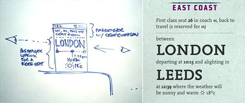
If it is indeed your reserved seat, on closer scrutiny you’ll also notice the weather forecast for your destination…

Again – worth noting brilliant past work in this area that’s an influence on this idea. Our friend Brian Suda’s redesign of an airline boarding pass that uses typographical hierarchy of the printed object to reassure and delight.

Here you can see that the time of your flight is clearly visible even if your boarding pass is on the floor.

Lovely stuff.

Finally, some pure whimsy!

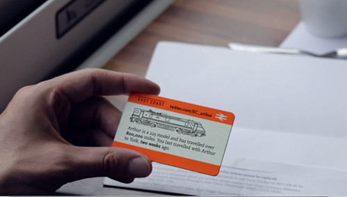
We wanted again to examine the idea that print can be nimble and quick and delightful – creating new forms of post-digital ephemera for collecting or talking about.

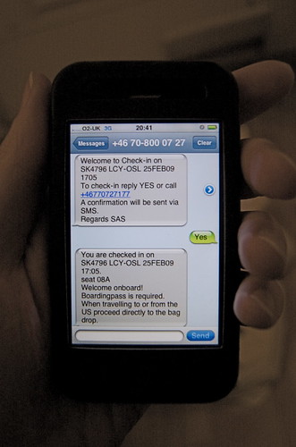
First of all, using the ticket to introduce you again to Arthur, your train, and perhaps extending that to recognising the last time you travelled together.

Media Surfaces: The Journey: Train factoids

But let’s go further.

We know that we’re going to be passing certain places at certain times, to some accuracy, during our journey.

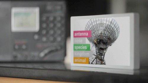
The burgeoning amount of geo-located data about our environment means we could look to provide snippets from Wikipedia perhaps, with timings based on how they intersect with your predicted journey time – alerting you to interesting sights just as they pass by your window.

Media Surfaces: The Journey: paper-based AR

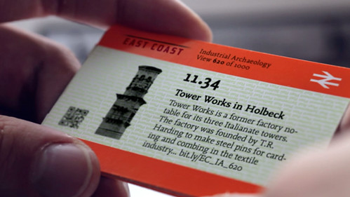
These tiny, personalised, collectable paper-spimes provide a kind of papernet augmented-reality – giving a routine journey an extra layer of wonder and interest.

Media Surfaces: The Journey: paper-based AR

As with “Incidental Media”, we’ve tried in “The Journey” to illustrate ‘polite media’ tightly bound to and complimenting one’s context. Media that lives and thrives usefully in the interstices and intervals of everyday routine and technology – indeed ‘making future magic’ instead of the attention arms race that the near-future of urban screens and media could potentially devolve into.

The Journey is brought to you by Dentsu London and BERG. Beeker has written about the films here.

Thank you to Beeker Northam (Dentsu London), and Timo Arnall, Campbell Orme, Matt Brown, and Jack Schulze!

Media Surfaces: Incidental Media

Following iPad light painting, we’ve made two films of alternative futures for media. These continue our collaboration with Dentsu London and Timo Arnall. We look at the near future, a universe next door in which media travels freely onto surfaces in everyday life. A world of media that speaks more often, and more quietly.

Incidental Media is the first of two films.

The other film can be seen here.

Each of the ideas in the film treat the surface as a focus, rather than the channel or the content delivered. Here, media includes messages from friends and social services, like foursquare or Twitter, and also more functional messages from companies or services like banks or airlines alongside large traditional big ‘M’ Media (like broadcast or news publishing).

All surfaces have access to connectivity. All surfaces are displays responsive to people, context, and timing. If any surface could show anything, would the loudest or the most polite win? Surfaces which show the smartest most relevant material in any given context will be the most warmly received.

Unbelievably efficient

I recently encountered this mixing in surfaces. An airline computer spoke to me through SMS. This space is normally reserved for awkwardly typed highly personal messages from friends. Not a conversational interface with a computer. But now, those pixels no longer differentiate between friends, companies and services.

Mixing Media

How would it feel if the news ticker we see as a common theme in broadcast news programmes begun to contain news from services or social media?

Media Surfaces mixed media

I like the look of it. The dominance of linear channel based screens is distorted as it shares unpredictable pixels and a graphic language with other services and systems.

Ambient listening

This screen listens to its environment and runs an image search against some of the words it hears. I’ve long wanted to see what happens if the subtitles feed from BBC television broadcast content was tied to an image search.

Media Surfaces ambient listening

It feels quite strange to have a machine ambiently listening to words uttered even if the result is private and relatively anodyne. Maybe it’s a bit creepy.

Print can be quick

This sequence shows a common receipt from a coffee shop and explores what happens when we treat print as a highly flexible, context-sensitive, connected surface, and super quick by contrast to say video in broadcast.

Media Surfaces print can be quick 01

The receipt includes a mayorship notification from foursquare and three breaking headlines from the Guardian news feed. It turns the world of ticket machines, cash registers and chip-and-pin machines into a massive super-local, personalised system of print-on-demand machines. The receipt remains as insignificant and peripheral as it always has, unless you choose to read it.

Computer vision

The large shop front shows a pair of sprites who lurk at the edges of the window frames. As pedestrians pass by or stand close, the pair steal colours from their clothes. The sketch assumes a camera to read passers-by and feed back their colour and position to the display.

Media Surfaces computer vision 01

Computer vision installations present interesting opportunities. Many installations demand high levels of attention or participation. These can often be witty and poetic, as shown here by Matt Jones in a point of sale around Lego.

We’ve drawn from great work from the likes of Chris O’Shea and his Hand from Above project to sketch something peripheral and ignorable, but still at scale. The installation could be played with by those having their colours stolen, but it doesn’t demand interaction. In fact I suspect it would succeed far more effectively for those viewing from afar with no agency over the system at all.

In contrast to a Minority Report future of aggressive messages competing for a conspicuously finite attention, these sketches show a landscape of ignorable surfaces capitalising on their context, timing and your history to quietly play and present in the corners of our lives.

Incidental Media is brought to you by Dentsu London and BERG. Beeker has written about the films here.

Thank you to Beeker Northam (Dentsu London), and Timo Arnall, Campbell Orme, Matt Brown, and Matt Jones!

Making Future Magic: light painting with the iPad

“Making Future Magic” is the goal of Dentsu London, the creative communications agency. We made this film with them to explore this statement.

(Click through to Vimeo to watch in HD!)

We’re working with Beeker Northam at Dentsu, using their strategy to explore how the media landscape is changing. From Beeker’s correspondence with us during development:

“…what might a magical version of the future of media look like?”

and

…we [Dentsu] are interested in the future, but not so much in science fiction – more in possible or invisible magic

We have chosen to interpret that brief by exploring how surfaces and screens look and work in the world. We’re finding playful uses for the increasingly ubiquitous ‘glowing rectangles’ that inhabit the world.

iPad light painting with painter

This film is a literal, aesthetic interpretation of those ideas. We like typography in the world, we like inventing new techniques for making media, we want to explore characters and movement, we like light painting, we like photography and cinematography as methods to explore and represent the physical world of stuff.

We made this film with the brilliant Timo Arnall (who we’ve worked with extensively on the Touch project) and videographer extraordinaire Campbell Orme. Our very own Matt Brown composed the music.

Light painting meets stop-motion

We developed a specific photographic technique for this film. Through long exposures we record an iPad moving through space to make three-dimensional forms in light.

First we create software models of three-dimensional typography, objects and animations. We render cross sections of these models, like a virtual CAT scan, making a series of outlines of slices of each form. We play these back on the surface of the iPad as movies, and drag the iPad through the air to extrude shapes captured in long exposure photographs. Each 3D form is itself a single frame of a 3D animation, so each long exposure still is only a single image in a composite stop frame animation.

Each frame is a long exposure photograph of 3-6 seconds. 5,500 photographs were taken. Only half of these were used for the animations seen in the final edit of the film.

There are lots of photographic experiments and stills in the Flickr stream.

Future reflection

light painting the city with Matt Jones

The light appears to boil since there are small deviations in the path of the iPad between shots. In some shots the light shapes appear suspended in a kind of aerogel. This is produced by the black areas of the iPad screen which aren’t entirely dark, and affected by the balance between exposure, the speed of the movies and screen angle.

We’ve compiled the best stills from the film into a print-on-demand Making Future Magic book which you can buy for £32.95/$59.20. (Or get the softcover for £24.95/$44.20.)

Friday Links: Lego Printer, Phonetikana, Napkin Maps

It’s a hot afternoon in the studio, and the weekend is just around the corner; time to wrap up the week with a selection of links from around the studio.

So good it appeared on the studio mailing list twice: a printer made out of Lego and a felt pen. Jack really liked the little workmen all over it: working hard to make your document.

bing-destination-maps.jpg

From the Information Aesthetics blog comes news of Bing’s Destination Maps. Automatic rendering of sketchy, vague maps – almost pirate maps – based on an address and an area to focus on. The end results are entertaiing, but also surprisingly useful: reducing the complexity of traditional digital maps down to the level most people require.

pan-am-guides.jpg

Some lovely graphic design linked over on Monoscope: these beautiful covers of Pan Am City Guides, designed by George Tscherny in the 1970s.

sci-am.png

From the esoteric But Does It Float, a series of beautiful old Scientific American covers.

uniqlo-phonetikana.jpg

Via Phil Gyford comes Johnson Banks’ Phonetikana: a typeface that adds pronunciation guidelines into the strokes of katakana, helping make the phonetic script more approachable to foreigners.

dutch-shirts.jpg

And finally, with the World Cup soon upon us, something football related. James Governor sent us a link to these lovely shirts for the Dutch football supporters organisation. The picture explains everything; delightful.

And that’s a wrap. Matt J’s got S Express on the stereo, which it’s probably time to head out into the glorious evening outside and get the weekend started. Have a good one!

Here & There influences

I’m going to tell you a little bit about the influences on Here & There, a project about representation of urban places, from when it began. It was warmly received when I first presented some corners of it back at Design Engaged in 2004, before Schulze & Webb existed. Here & There is a projection drawing from maps, comics, television, and games.

This particular version is a horizonless projection in Manhattan. The project page is here, where large prints of the uptown and downtown views can be seen and are available to buy.

I’ve been observing the look and mechanisms in maps since I began working in graphic design. For individuals, and all kinds of companies, cities are an increasing pre-occupation. Geography is the new frontier. Wherever I look in the tech industry I see material from architects and references and metaphors from the urban realm. Here & There draws from that, and also exploits and expands upon the higher levels of visual literacy born of television, games, comics and print.

The satellite is the ultimate symbol of omniscience. It’s how we wage wars, and why wars are won. That’s why Google Earth is so compelling. This is what the map taps into.

The projection works by presenting an image of the place in which the observer is standing. As the city recedes into the (geographic) distance it shifts from a natural, third person representation of the viewer’s immediate surroundings into a near plan view. The city appears folded up, as though a large crease runs through it. But it isn’t a halo or hoop though, and the city doesn’t loop over one’s head. The distance is potentially infinite, and it’s more like a giant ripple showing both the viewers surroundings and also the city in the distance.

schulze-holding-posters

Origins and sources

Some of my favourite maps are drawn by a British writer, walker and accountant named Alfred Wainwright. Phil Baines provides background:

“Wainwright was an accountant born in Lancashire who fell in love with the English Lake District and moved there to live and work. All his free time was spent walking the fells, and he began his series of seven ‘pictorial guides to the Lakeland Fells’ in 1952 as a way of repaying his gratitude to them. The work took 13 years.” (Type & Typography)

Wainwright’s walking maps are drawn to suit their context of use, the books are intended to be used while walking. As the reader begins their walk, the map represents their location in overview plan. As the walk extends through the map, the perspective slowly shifts naturally with the unfolding landscape, until the destination is represented in a pictorial perspective view, as one would see it from their standpoint.

Wainwright spread

This is a reversal of the Here & There projection. In Wainwright’s projection we stand in plan, and look into perspective. Wainwright’s view succeeds in open ground where one can see the distance… but in a city you can only see the surrounding buildings. Wainwright and Here & There both present what’s around you with the most useful perspective, and lift your gaze above and beyond to see the rest.

David Hockney presents a fantastic dissection of perspective in the film A Day on the Grand Canal with the Emperor of China or Surface Is Illusion But So Is Depth. He describes a very old painting from China which depicts a journey along the grand canal. I really like how he describes the scene as ‘making sense.’

He justifies a deviation from Western perspective, that to represent things as they strike your eye is not even functionally as good as some other interpretative distortions. In this painting in which there’s a grossly distorted perspective, in which there aren’t even any rules, it still makes sense because it changes how you put yourself in the painting, and that changes where you put yourself outside it.

Augmented reality

There is a element in the map, in the uptown view, of a bus. Its destinations in both directions are shown. (I love NY bus routes, the cross town super power!) This is to explore how augmenting the map with local information might work.

bus-context

One of my intentions with the project is to make an exploration into way-finding devices. One of my favourite examples of augmented reality is from these American Road maps from 1905. The map is stored in a book, and good for only one route. In fact, it isn’t a map as we’d typically understand one.

American Road Maps 1905

Michaels, H. Sargent. Photographic Runs: Series C, Chicago to Lake Geneva to Delavan, Delavan to Beloit. Chicago: H. Sargent Michaels, 1905. Used with permission from Prof. Robert French, Osher Map library, University of Southern Maine, Owls Head Transportation Museum.

The book dates from before the national road sign infrastructure was introduced to American highways or inter-city roads. Each page is a photo of a junction, with every junction between the two cities included, and an arrow is drawn over the photo to say which direction to take. As the driver progresses along their route, they turn pages, each junction they arrive at corresponding to the one in the current photo. (Many thanks to Steve Krug for the sharing his discovery of these great pieces.)

First person to God games

I don’t like the way maps (in-game maps) work in most video games. They seem to break my flow of play, and locating one’s actor in the game isn’t satisfying. I’d love to see a first person or third person shooter where the landscape bent up to reveal a limited arc of the landscape in plan over distance. As a video game, the Here & There projection slides from Halo, through GTA into Syndicate, to end in SimCity.

game collage

Although I never played it, I’ve heard a lot about Luigi’s Mansion for the Nintendo GameCube. Luigi wonders around a haunted mansion and hoovers up ghosts with a vacuum cleaner. I heard about a mechanic in the game which involved a virtual Gameboy Advance in the game. Luigi could take it out and use it to inspect the world. The game played out in the third person with a view of Luigi in place, but I think when you look in the Advance, it gave a first person view from Luigi’s position. Well, if it didn’t, it should have done.

I know that in some special games the Gameboy Advance could be plugged into the GameCube, to be used as a special controller. It would be amazing to use the second screen in a controller for that first person perspective. Imagine if you could guide your actor around in third person and glance down at the screen in your hands for close inspection or telescopic sniping.

Powers and cities

Recently Matt Jones and Rod Mclaren discussed Jason Bourne and James Bond and how they use cities. Jones characterises Bourne in contrast to Bond:

“… in addition, Bourne wraps cities, autobahns, ferries and train terminuses around him as the ultimate body-armour”

For Bourne, the city is his power, Jones continues:

“A battered watch and an accurate U-Bahn time-table are all he needs for a perfectly-timed, death-defying evasion of the authorities.”

I like to talk about the projection as a superpower, the power to be both in the city and above it.

Last year Warren Ellis wrote an Iron Man arc called Extremis. As ever, fine stuff. And with great pictures from Adi Granov too.

Ellis, unsatisfied with controlling the Iron Man suit by normal means (sensors, or weeny joysticks in the gloves or something) as an exoskeleton (picture Ripley in the clumsy Powerloader), Stark must ingest the Extremis serum in order to match his enemy, Mallen, and prevent him from his destructive path into Washington. The serum welds Stark to his tech. It leaves him ‘containing’ the membrane-like ‘undersheath’ he uses to control the Iron Man suit. It is stored inside his bones.

Iron Man mind control

The final sequence of panels in the penultimate book has Stark wearing the Iron Man suit, setting off to confront his enemy, his recent transformation has left him with new powers…

Iron Man leaves to confront Mallen

“I can see through satellites now.”

What a thought! Within one field of view, to be both in the world and to see yourself in it. The power of looking through, and occupying, your own field of vision. Awesome.

What if the projection appeared inside location-aware binoculars? Hold them up, and live satellite images are superimposed in ‘the bend’ onto the natural view of the city as it lifts up into plan! You’d see the traffic and people that just pulled out of view into a side street from above mapped onto your natural view.

Timo Arnall posted a video showing a Google Streetview pan controlled with the digital compass inside the device:

It begins to reveal how Here & There might feel if it were moving beneath your feet.

Thanks

I would like to thank both James King (art direction) and Campbell Orme (technical direction) for their tireless efforts in bringing this work to life. Email them and make them work on your stuff. They are talented, humane and brilliant designer/thinkers.

Art prints of Here & There have been produced in a limited run and can be purchased here. Please buy one and stick it on a wall.

Infinite Zoom into Milk

In 1977 Charles and Ray Eames made a documentary film called Powers of Ten. The second half of the film includes a slow zoom into a man’s hand, right the way through cells and molecules all the way down to an atomic structure. It’s extraordinarily engaging, beginning at a familiar human context, and visualising something desperately distant and unknowable.

About a year ago James King brought a book to my attention from a series called Analysis of the Massproduct Design by Japanese product designer Taku Sato.

Analysis of the Massproduct Design is just like the Eames Powers of Ten video but for everyday products.

Taku Sato book covers

Each book takes a manufactured product and breaks down the content, graphics, construction and packaging page by page. The books are like infinite zooms into fabrication and history.

There are four, in turn looking at Xylitol Lime Mint chewing gum, a Fujifilm disposable camera, ‘Licca the fashion dress up doll by Takara Co.’ and a litre of milk from the Meiji Dairies Corporation. The blurb reads:

…we will take up and focus on one mass-produced product seen everywhere in our daily life without special attention paid to and from the point of view of design we try to take a closer look at and analytically examine it to find what kinds of ideas, efforts, ingenuities have been put in to it.

Each book begins with an overview and in some cases a history. This is from the book on the Fujifilm disposable camera.

Fujifilm overview

As the book progresses, spreads examine the product in greater and greater detail. Near the end of the Fujifilm book, there’s a photographic one micrometer cross section of the film stock.

fujifilm book film detail

One of my favourites spreads is from the book examining Xylitol chewing gum and is titled ‘The Feeling on the Teeth When Chewed.’ It’s about the material qualities of tablets versus sticks of gum. A quote:

The firmness of a chewing gum changes gradually with the passing of the time of its being chewed. In order to make this change of the chewing feeling close to an ideal one, the elements that should make up of the chewing gum are controlled… The figure shows the strength of the chewing exerted in the mouth measured with an analyzing device called RheoMeter. These graphs will tell you how different the chewing feelings are between ordinary sheet-type chewing gum and sugar coated chewing gum.

An ideal chewing feeling! A RheoMeter! They’ve got a machine for testing the chewiness of gum.

chewiness spread

I think Taku Sato actually designed the packaging for the milk carton he analyses. One of the spreads shows what each of the indents on the base of the cartons are for. Ambiguity in the translation adds to the mystery in some cases:

…(image a) is a little dented. This is for securing the stability of the carton when placed straight on a table… The number (image c) is the filling machine’s column index. The embossed information works for cause of the trouble to be clarified when it happens.

Taku Sato milk base

The books feel like imaginary manuals. They offer the seductive illusion that with this book the object can be completely known, all secrets unravelled. They somehow imply that if all was lost, objects like these could be reconstructed with this knowledge alone.

A while back I came across the term ‘Spime’ in Bruce Sterling‘s book Shaping Things. He uses the word to characterise smart objects which talk about their histories, how they were made, where they were sourced, where they’ve been, etc. Spimes might be a cars which announce their locations, or a packaged beef steak which shows the cow it comes from and where that cow was raised.

Sato’s books are raw Spime porn. Objects showing off their shiny interiors, construction and their ancestors. The celebrity biographies of mass produced objects.

Olinda interface drawings

Last week, Tristan Ferne who leads the R&D team in BBC Audio & Music Interactive gave a talk at Radio at the Edge (written up in Radio Today). As a part of his talk he discussed progress on Olinda.

Most of the design and conceptual work for the radio is finished now. We are dealing with the remaining technicalities of bringing the radio into the world. To aid Tristan’s presentation we drew up some slides outlining how we expect the core functionality to work when the radio manifests.

Social module

Social Module sequence

This animated sequence shows how the social module is expected to work. The radio begins tuned to BBC Radio 2. A light corresponding to Matt’s radio lights up on the social module. When the lit button is pressed, the top screen reveals Matt is listening to Radio 6 Music, which is selected and the radio retunes to that station.

Tuning

Tuning drawing

This detail shows how the list management will work. The radio has a dual rotary dial for tuning between the different DAB stations. The outer dial cycles through the full list of all the stations the radio has successfully scanned for. The inner dial filters the list down and cycles through the top five most listened to stations. We’ll write more on why we’ve made these choices when the radio is finished.

Interesting 2007

I gave a talk at Interesting 2007 about three weeks ago now. The day was great and though I wasn’t able to stay for all of it, I really enjoyed myself, and the few talks I did catch were very absorbing. So well done to Russell for sorting all that out.

Me Speaking at Reboot

I gave a talk on comics and while there are some images of me talking about them on Flickr, some people have asked for a list of the comics I discussed. Below is the list and brief descriptions. I’ve also transcribed my talk and put the slides online: Comics and Pictures.

Though I read lots of different comics, I only really follow four authors: Warren Ellis, Grant Morrison, Alan Moore and Garth Ennis. Really, you can’t go that wrong reading stuff by these guys, they are awesome, although many people find Ennis a bit heavy. Here is the list in the order that I discussed them:

  • The Kingdom by Mark Waid and drawn by Ariel Olivetti and Mike Zeck. Wikipedia has a good description of Hypertime, so no need to hunt down this comic if you are just curious.
  • Sea of Red by Rick Remender, Kieron Dwyer and Salgood Sam. This is the one about vampire pirates.
  • New Universal by Warren Ellis and Salvador Larroca. This is the comic I discussed where all the characters are derived from film stars.
  • Planetary by Warren Ellis. This is really good, everyone should read it. There are four main books, all are good. I specifically discussed Planetary Crossing Worlds which includes the Batman story.
  • The Filth by Grant Morrison. This is the best comic that there is, everybody should read this. It is the one with the guy who speaks with thought bubbles.
  • Desolation Jones by Warren Ellis and J.H. Williams III. I’ve mentioned this before. It is a great read, and drawn with deft elegance, really nice work.
  • I spoke about Madman. Very weird but good.
  • I also mentioned a cover from The Flash who can run really fast, and that’s about it.

I’m enjoying a couple of American authors at the moment: Ed Brubaker‘s Criminal, and Joss Whedon‘s Astonishing X-men is good too.

That is the list of comics I mentioned. They stock them at my favourite comic shops: Orbital and Gosh, both nicely located in central London.

RFID Interim update

Last term during an interim crit, I saw the work my students had produced on the RFID icons brief I set some weeks ago. It was a good afternoon and we were lucky enough to have Timo Arnall from the Touch project and Younghee Jung from Nokia Japan join us and contribute to the discussion. All the students attending showed good work of a high standard, overall it was very rewarding.

I’ll write a more detailed discussion on the results of the work when the brief ends, but I suspect there may be more than I can fit into a single post, so I wanted to point at some of the work that has emerged so far.

All the work here is from Alex Jarvis and Mark Williams.

Alex began by looking at the physical act of swiping your phone or card over a reader. The symbol he developed was based on his observations of people slapping their Oyster wallets down as they pass through the gates on to the underground. Not a delicate, patient hover over the yellow disc, but a casual thud, expectant wait for the barrier to open, then a lurching acceleration through to the other side before the gates violently spasm shut.

RFID physical act 01

More developed sketches here…

RFID physical act 02

I suspect that this inverted tick will abstract really well, I like the thin line on the more developed version snapping the path of the card into 3D. It succeeds since it doesn’t worry too much about working as an instruction and concentrates more on a powerful cross-system icon to be consistently recognisable.

Verbs

The original brief required students to develop icons for the verbs: purchase, identify, enter (but one way), download, phone and destroy.

Purchase and destroy are the two of these verbs with the most far-reaching and less immediate consequences. The aspiration for this work is to make the interaction feel like a purchase, not a touch that triggers a purchase. This gives the interaction room to grow into the more complex ones that will be needed in the future.

This first sketch, on purchase, from Alex shows your stack of coins depleting, something nice about the dark black arrow which repeats as a feature throughout Alex’s developments.

RFID Purchase 01

Mark has also been tackling purchase, his sketches tap into the currency symbols, again with a view to represent depletion. Such a blunt representation is attractive, it shouts “this will erode your currency!”

RFID Purchase 03

Mark explores some more on purchase here:

RFID Purchase 02

Purchase is really important. I can’t think of a system other than Oyster that takes your money so ambiguously. Most purchasing systems require you to enter pin numbers, sign things, swipe cards etc, all really clear unambiguous acts. All you have to do is wave at an Oyster reader and it costs you £2… maybe: The same act will open the barrier for free if you have a travel card on there. Granted, passengers have already made a purchase to put the money on the card, but if Transport for London do want to extend their system for use as a digital wallet they will need to tackle this ambiguity.

Both Mark and Alex produced material looking at the symbols to represent destroy, for instances where swiping the reader would obliterate data on it, or render it useless. This might also serve as a warning for areas where RFID tags were prone to damage.

RFID Destroy 01

I like the pencil drawing to the top right that he didn’t take forward. I’ve adjusted the contrast over it to draw out some more detail. Important that he distinguished between representing the destruction of the object and the data or contents.

Williams Destroy sketches

Mark’s sketches for destroy include the excellent mushroom cloud, but he also looks at an abstraction of data disassembly, almost looks like the individual bits of data are floating off into oblivion. Not completely successful since it also reminds me of broadcasting Wonka bars in Charlie and the Chocolate Factory and teleporting in Star Trek, but nice none the less.

Drawing

This is difficult to show online, but Alex works with a real pen, at scale. He is seeing the material he’s developing at the same size it will be read at. Each mark he makes he is seeing and responding to as he makes it.

Jarvis Pen

He has produced some material with Illustrator, but it lacked any of the impact his drawings brought to the icons. Drawing with a pen really helps avoid the Adobe poisoning that comes from Illustrator defaults and the complexities of working out of scale with the zoom tool (you can almost smell the 1pt line widths and the 4.2333 mm radius on the corners of the rounded rectangle tool). It forces him to choose every line and width and understand the success and failures that come with those choices. Illustrator does so much for you it barely leaves you with any unique agency at all.

It is interesting to compare the students’ two approaches. Alex works bluntly with bold weighty lines and stubby arrows portraying actual things moving or downloading. Mark tends towards more sophisticated representations and abstractions, and mini comic strips in a single icon. Lightness of touch and branching paths of exploration are his preference.

More to come from both students and I’ll also post some of my own efforts in this area.

Recent Posts

Popular Tags