This website is now archived. To find out what BERG did next, go to www.bergcloud.com.

Blog posts tagged as 'product'

Connbox: prototyping a physical product for video presence with Google Creative Lab, 2011

At the beginning of 2011 we started a wide-ranging conversation with Google Creative Lab, discussing near-future experiences of Google and its products.

We’ve already discussed our collaboration on “Lamps”, the conceptual R&D around computer vision in a separate post.

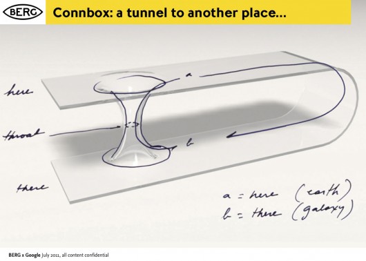
They had already in mind another brief before approaching us, to create a physical product encapsulating Google voice/video chat services.

This brief became known as ‘Connection Box’ or ‘Connbox’ for short…

BERG-Chaco-Connbox-20110714-003

For six months through the spring and summer of 2011, a multidisciplinary team at BERG developed the brief based on research, strategic thinking, hardware and software prototyping into believable technical and experiential proof of a product that could be taken to market.

It’s a very different set of outcomes from Lamps, and a different approach – although still rooted in material exploration, it’s much more centred around rapid product prototyping to really understand what the experience of physical device, service and interface could be.

As with our Lamps post, I’ve broken up this long report of what was a very involving project for the entire studio.


The Connbox backstory


The videophone has an unusually long cultural legacy.

It has been a very common feature of science fiction all the way back to the 1920s. As part of our ‘warm-up’ for the project, Joe put together a super-cut of all of the instances he could recollect from film and tv…

Videophones in film from BERG on Vimeo.

The video call is still often talked about as the next big thing in mobile phones (Apple used FaceTime as a central part of their iphone marketing, while Microsoft bought Skype to bolster their tablet and phone strategy). But somehow video calling has been stuck in the ‘trough of disillusionment’ for decades. Furthermore, the videophone as a standalone product that we might buy in a shop has never become a commercial reality.

On the other hand, we can say that video calls have recently become common, but in a very specific context. That is, people talking to laptops – constrained by the world as seen from webcam and a laptop screen.

13 September, 18.57

This kind of video calling has become synonymous with pre-arranged meetings, or pre-arranged high-bandwidth calls. It is very rarely about a quick question or hello, or a spontaneous connection, or an always-on presence between two spaces.

Unpacking the brief

The team at Google Creative Lab framed a high-level prototyping brief for us.

The company has a deep-seated interest in video-based communication, and of course, during the project both Google Hangouts and Google Plus were launched.

The brief placed a strong emphasis on working prototypes and live end-to-end demos. They wanted to, in the parlance of Google, “dogfood” the devices, to see how they felt in everyday use themselves.

I asked Jack to recall his reaction to the brief:

The domain of video conferencing products is staid and unfashionable.

Although video phones have lived large in the public imagination, no company has made a hardware product stick in the way that audio devices have. There’s something weirdly broken about taking behaviours associated with a phone: synchronous talking, ringing or alerts when one person wants another’s attention, hanging up and picking up etc.

Given the glamour and appetite for the idea, I felt that somewhere between presence and video a device type could emerge which supported a more successful and appealing set of behaviours appropriate to the form.

The real value in the work was likely to emerge in what vehicle designers call the ‘third read’. The idea of product having a ‘first, second and third read’ comes up a lot in the studio. We’ve inherited it by osmosis from product designer friends, but an excerpt from the best summation of it we can find on the web follows:

The concept of First, Second, Third Read which comes from the BMW Group automotive heritage in terms of understanding Proportion, Surface, and Detail.

The First Read is about the gesture and character of the product. It is the first impression.

Looking closer, there is the Second Read in which surface detail and specific touchpoints of interaction with the product confirm impressions and set up expectations.

The Third Read is about living with the product over time—using it and having it meet expectations…

So we’re not beginning with how the product looks or where it fits in a retail landscape, but designing from the inside out.

We start by understanding presence through devices and what video can offer, build out the behaviours, and then identify forms and hardware which support that.

To test and iterate this detail we needed to make everything, so that we can live with and see the behaviours happen in the world.

connbox for blogging.016

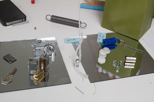
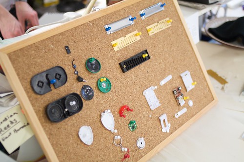
Material Exploration


We use the term ‘material exploration’ to describe our early experimental work. This is an in-depth exploration of the subject by exploring the properties, both inate and emergent of the materials at hand. We’ve talked about it previously here and here.

What are the materials that make up video? They are more traditional components and aspects of film such as lenses, screens, projectors, field-of-view as well as newer opportunities in the domains of facial recognition and computer vision.

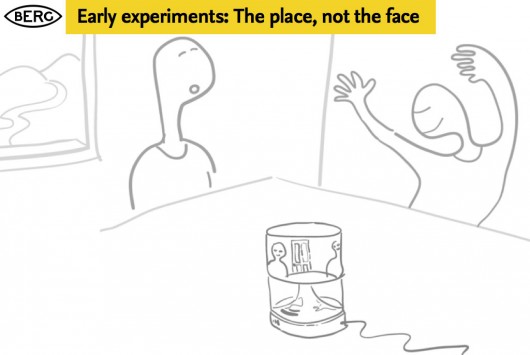
Some of our early experiments looked at field-of-view – how could we start to understand where an always-on camera could see into our personal environment?

We also challenged the prevalent forms of video communication – which generally are optimised for tight shots of people’s faces. What if we used panoramic lenses and projection to represent places and spaces instead?

chaco_Connbox_2012-03-10_TDA.010

chaco_Connbox_2012-03-10_TDA.009

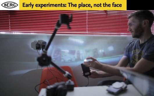
In the course of these experiments we used a piece of OpenFrameworks code developed by Golan Levin. Thanks Golan!

We also experimented with the visual, graphic representation of yourself and other people, we are used to the ‘picture in picture’ mode of video conferencing, where we see the other party, but have an image of ourselves superimposed in a small window.

We experimented with breaking out the representation of yourself into a separate screen, so you could play with your own image, and position the camera for optimal or alternative viewpoints, or to actually look ‘through’ the camera to maintain eye contact, while still being able to look at the other person.

Connbox-lens-projection-tests-00001

One of the main advantages of this – aside from obviously being able to direct a camera at things of interest to the other party – was to remove the awkwardness of the picture-in-picture approach to showing yourself superimposed on the stream of the person you are communicating with…

There were interaction & product design challenges in making a simpler, self-contained video chat appliance, amplified by the problem of taking the things we take for granted on the desktop or touchscreen: things like the standard UI, windowing, inputs and outputs, that all had to be re-imagined as physical controls.

This is not a simple translation between a software and hardware behaviour, it’s more than just turning software controls into physical switches or levers.

It involves choosing what to discard, what to keep and what to emphasise.

Should the product allow ‘ringing’ or ‘knocking’ to kickstart a conversation, or should it rely on other audio or visual cues? How do we encourage always-on, ambient, background presence with the possibility of spontaneous conversations and ad-hoc, playful exchanges? Existing ‘video calling’ UI is not set up to encourage this, so what is the new model of the interaction?

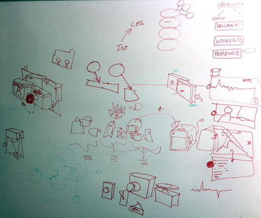
To do this we explored in abstract some of the product behaviours around communicating through video and audio.

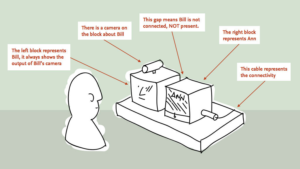
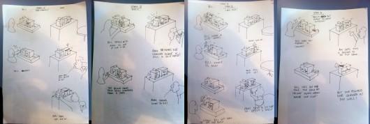
We began working with Durrell Bishop from LuckyBite at this stage, and he developed scenarios drawn as simple cartoons which became very influential starting points for the prototyping projects.

The cartoons feature two prospective users of an always-on video communication product – Bill and Ann…

Durrell_firstsketches1

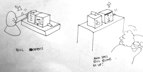
This single panel from a larger scenario shows the moment Bill opens up a connection (effectively ‘going online’) and Ann sees this change reflected as a blind going up on Bill’s side of her Connbox.

Prototyping


Our early sketches on both whiteboards and in these explorations then informed our prototyping efforts – firstly around the technical challenges of making a standalone product around google voice/video, and the second more focussed on the experiential challenges of making a simple, pleasurable domestic video chat device.

prototype_sketches

For reasons that might become obvious, the technical exploration became nicknamed “Polar Bear” and the experimental prototype “Domino”.

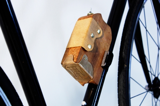
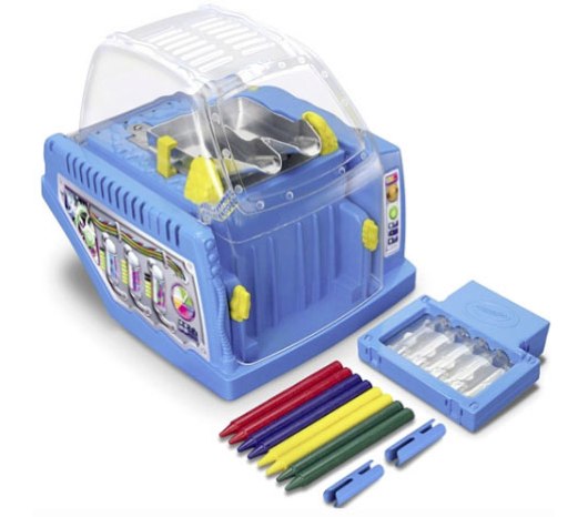
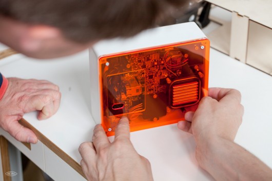
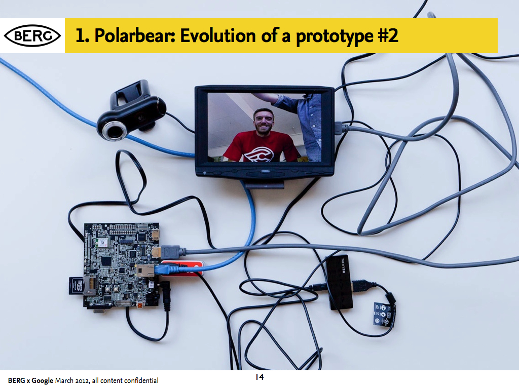
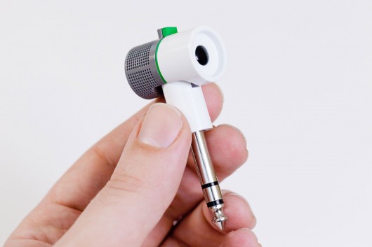
Prototype 1: A proof of technology called ‘Polar Bear’

In parallel with the work to understand behaviours we also began exploring end-to-end technical proofs.

We needed to see if it was possible to make a technically feasible video-chat product with components that could be believable for mass-production, and also used open-standard software.

Aside from this, it provided us with something to ‘live with’, to understand the experience of having an always-on video chat appliance in a shared social space (our studio)

chaco_Connbox_2012-03-10_TDA.013

chaco_Connbox_2012-03-10_TDA.014

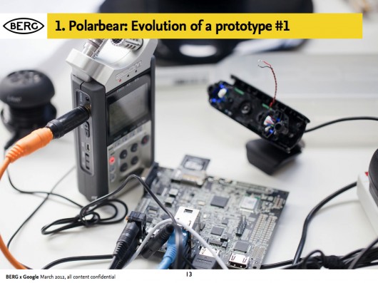
Andy and Nick worked closely with Tom and Durrell from Luckybite on housing the end-to-end proof in a robust accessible case.

It looked like a polar bear to us, and the name stuck…

chaco_Connbox_2012-03-10_TDA.016

chaco_Connbox_2012-03-10_TDA.017

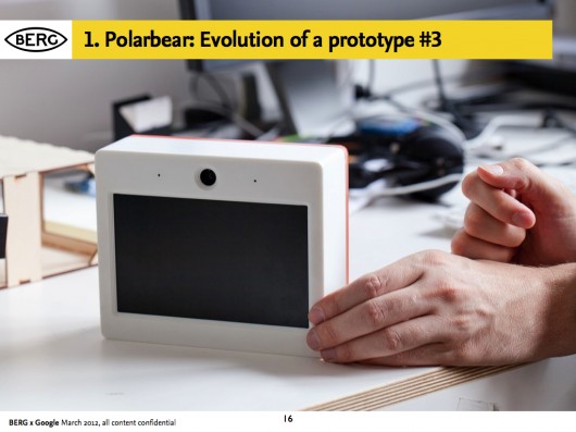
The software stack was designed to create something that worked as an appliance once paired with another, that would fire up a video connection with its counterpart device over wireless internet from being switched on, with no need for any other interface than switching it on at the plug.

chaco_Connbox_2012-03-10_TDA.015

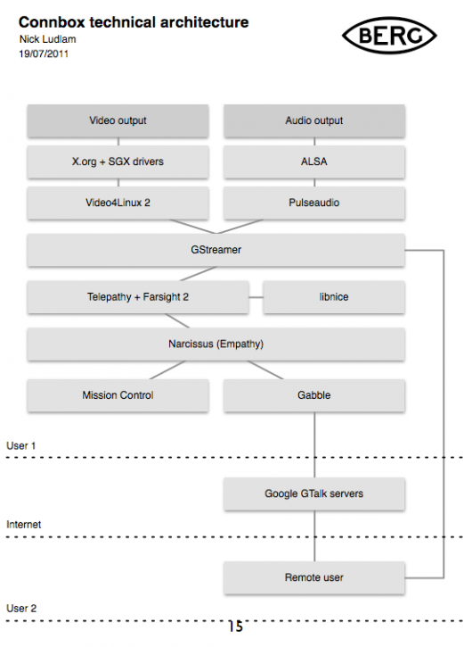
We worked with Collabora to implement the stack on Pandaboards: small form-factor development boards.

chaco_Connbox_2012-03-10_TDA.018

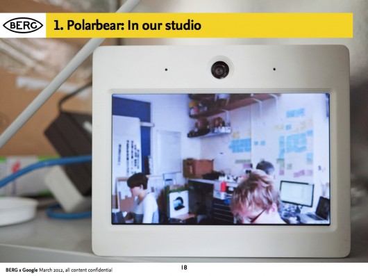
Living with Polar Bear was intriguing – sound became less important than visual cues.

It reminded us all of Matt Webb’s “Glancing” project back in 2003:

Every so often, you look up and look around you, sometimes to rest your eyes, and other times to check people are still there. Sometimes you catch an eye, sometimes not. Sometimes it triggers a conversation. But it bonds you into a group experience, without speaking.

Prototype 2: A product and experience prototype called “Domino”


We needed to come up with new kinds of behaviours for an always on, domestic device.

This was the biggest challenge by far, inventing ways in which people might be comfortable opening up their spaces to each other, and on top of that, to create a space in which meaningful interaction or conversation might occur.

To create that comfort we wanted to make the state of the connection as evident as possible, and the controls over how you appear to others simple and direct.

The studio’s preoccupations with making “beautiful seams” suffused this stage of the work – our quest to create playful, direct and legible interfaces to technology, rather than ‘seamless’ systems that cannot be read or mastered.

In workshops with Luckybite, the team sketched out an approach where the state of the system corresponds directly to the physicality of the device.

Durrell_firstsketches2

The remote space that you are connecting with is represented on one screen housed in a block, and the screen that shows your space is represented on another. To connect the spaces, the blocks are pushed together, and pulled-apart to disconnect.

Durrell outlined a promising approach to the behaviour of the product in a number of very quick sketches during one of our workshops:

DB_sketches_large

Denise further developed the interaction design principles in a detailed “rulespace” document, which we used to develop video prototypes of the various experiences. This strand of the project acquired the nickname ‘Domino’ – these early representations of two screens stacked vertically resembling the game’s pieces.

chaco_Connbox_2012-03-10_TDA.026

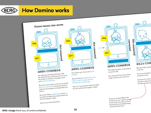
As the team started to design at a greater level of detail, they started to see the issues involved in this single interaction: Should this action interrupt Ann in her everyday routine? Should there be a sound? Is a visual change enough to attract Ann’s attention?

The work started to reveal more playful uses of the video connection, particularly being able to use ‘stills’ to communicate about status. The UI also imagines use of video filters to change the way that you are represented, going all the way towards abstracting the video image altogether, becoming visualisations of audio or movement, or just pixellated blobs of colour. Other key features such as a ‘do not disturb blind’ that could be pulled down onscreen through a physical gesture emerged, and the ability to ‘peek’ through it to let the other side know about our intention to communicate.

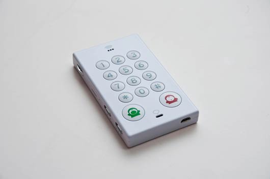
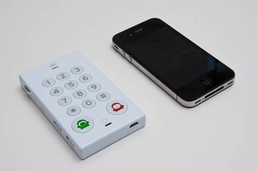
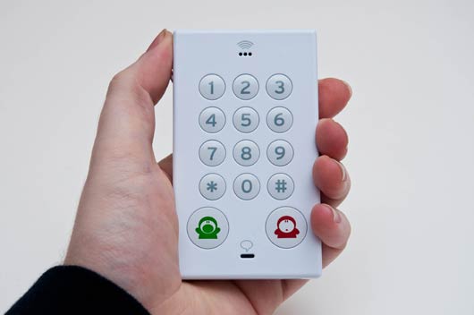
Product/ID development


With Luckybite, we started working on turning it into something that would bridge the gap between experience prototype and product.

BERG-Domino-20120221-006

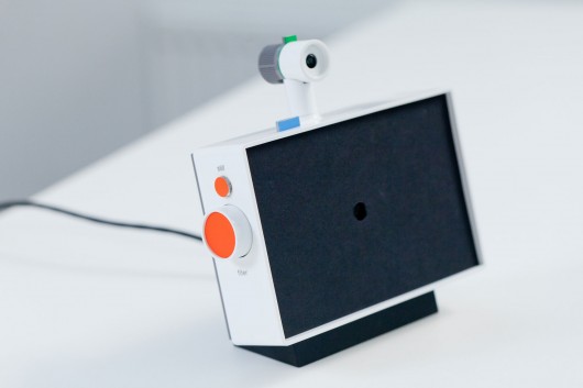
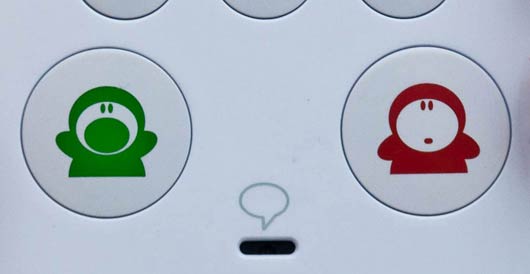
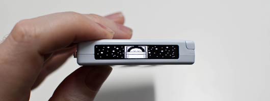
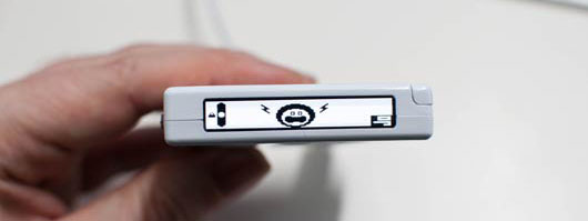
The product design seeks to make all of the interactions evident with minimum styling – but with flashes of Google’s signature colour-scheme.

BERG-Domino-20120221-005

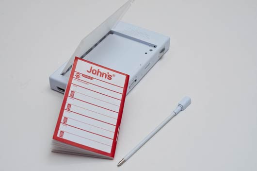
The detachable camera, with a microphone that can be muted with a sliding switch, can be connected to a separate stand.

BERG-Domino-20120221-012

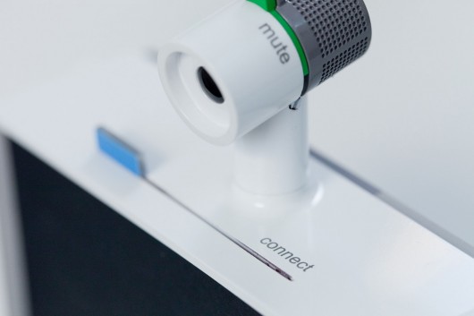
This allows it to be re-positioned and pointed at other views or objects.

BERG-Domino-20120221-020

This is a link back to our early ‘material explorations’ that showed it was valuable to be able to play with the camera direction and position.

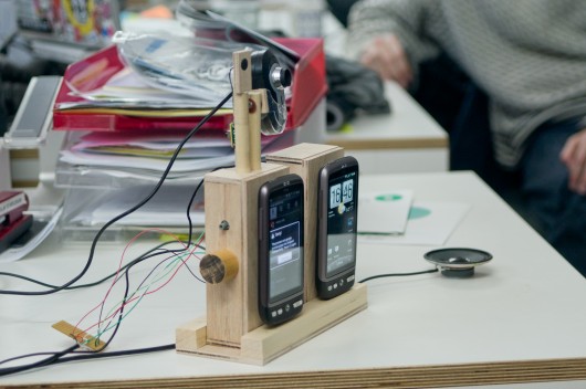
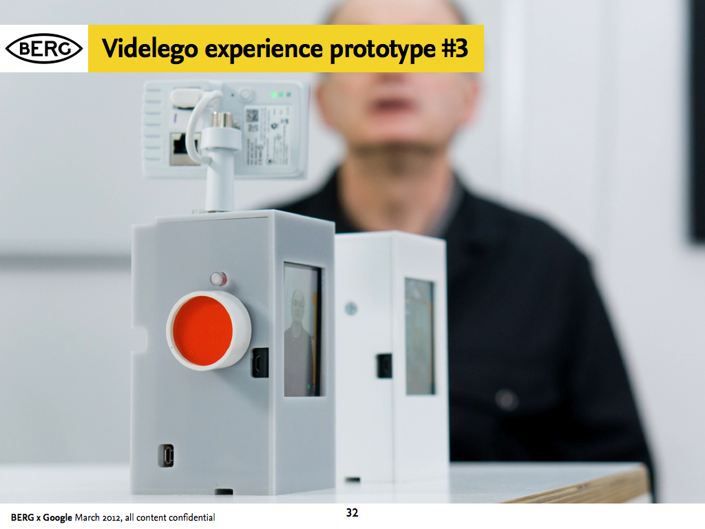
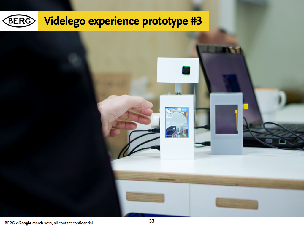
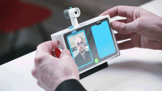
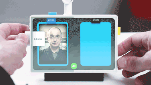
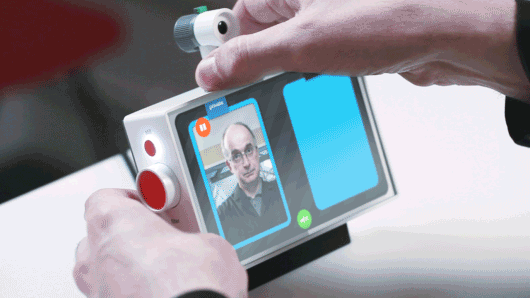
Prototype 3: Testing the experience and the UI


Final technical prototypes in this phase make a bridge between the product design and experience thinking and the technical explorations.

This manifested in early prototypes using Android handsets connected to servers.

BERG-Connbox-20111021-002

BERG-Connbox-20111021-001

chaco_Connbox_2012-03-10_TDA.032

chaco_Connbox_2012-03-10_TDA.033

Connbox: Project film


Durrell Bishop narrates some of the prototype designs that he and the team worked through in the Connbox project.

The importance of legible products


The Connbox design project had a strong thread running though it of making interfaces as evident and simple as possible, even when trying to convey abstract notions of service and network connectivity.

I asked Jack to comment on the importance of ‘legibility’ in products:

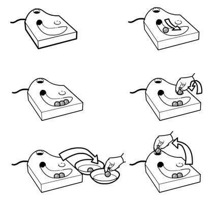
Connbox exists in a modern tradition of legible products, which sees the influence of Durrell Bishop. The best example I’ve come across that speaks to this thinking is Durrell’s answering machine he designed.

When messages are left on the answering machine they’re represented as marbles which gather in a tray. People play the messages by placing them in a small dip and when they’ve finished they replace them in the machine.

Screen Shot 2013-02-25 at 16.36.07

If messages are for someone else in the household they’re left in that persons bowl for later. When you look at the machine the system is clear and presented through it’s physical form. The whole state of the system is evident on the surface, as the form of the product.

Making technology seamless and invisible hides the control and state of the system – this path of thinking and design tries to place as much control as possible in the hands of the end-user by making interfaces evident.

In the prototype UI design, Joe created some lovely details of interaction fusing Denise’s service design sketches and the physical product design.

For instance, I love this detail where using the physical ‘still’ button, causes a digital UI element to ‘roll’ out from the finger-press…

Legible-interaction2

A very satisfying dial for selecting video effects/filters…

Legible-interaction3

And here, where a physical sliding tab on top of the device creates the connection between two spaces

Legible-interaction1

This feels like a rich direction to explore in future projects, of a kind of ‘reverse-skeuomorphism‘ where digital and physical affordances work together to do what each does best rather than just one imitating the other.

Conclusion: What might have been next?


At the end of this prototyping phase, the project was put on hiatus, but a number of directions seemed promising to us and Google Creative Lab.

Broadly speaking, the work was pointing towards new kinds of devices, not designed for our pockets but for our homes. Further explorations would have to be around the rituals and experience of use in a domestic setting.

Special attention would have to be given to the experience of set-up, particularly pairing or connecting the devices. Would this be done as a gift, easily configured and left perhaps for a relative who didn’t have a smartphone or computer? How could that be done in an intuitive manner that emphasised the gift, but left the receiver confident that they could not break the connection or the product? Could it work with a cellular radio connection, in places where there no wireless broadband is found?

connbox for blogging.027

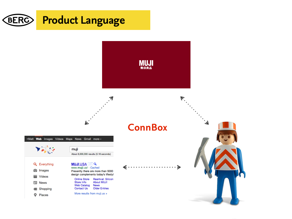
What cues could the physical product design give to both functionality and context? What might the correct ‘product language’ be for such a device, or family of devices for them to be accepted into the home and not seen as intrusive technology.

G+ and Hangouts launched toward the end of the project, so unfortunately there wasn’t time in the project to accommodate these interesting new products.

connbox for blogging.029

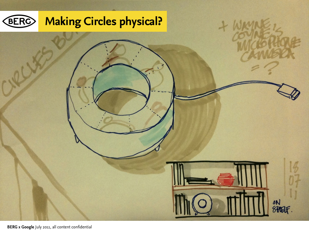
However we did start to talk about ways to physicalize G+’s “Circles” feature, which emphasises small groups and presence – it seemed like a great fit with what we had already looked at. How might we create a product that connects you to an ‘inner circle’ of contacts and the spaces they were in?

Postscript: Then and Now – how technology has moved on, and where we’d start now


Since we started the Connbox project in the Spring of 2011, one could argue that we’ve seen a full cycle of Moore’s law improve the capabilities of available hardware, and certainly both industry and open-source efforts in the domain of video codecs and software have advanced significantly.

Making Connbox now would be a very different endeavour.

Here Nick comments on the current state-of-the-art and what would be our starting points were we (or someone else) to re-start the project today…

Since we wrapped up this project in 2011, there’s been one very conspicuous development in the arena of video chat, and that is the rise of WebRTC. WebRTC is a draft web standard from W3C to enable browser to browser video chat without needing plugins.

As of early 2013, Google and Mozilla have demonstrated this system working in their nightly desktop browser builds, and recorded the first cross-browser video call. Ericsson are one of the first groups to have a mobile implementation available for Android and iOS in the form of their “Bowser” browser application.

WebRTC itself is very much an evolution of earlier work. The brainchild of Google Hangout engineers, this single standard is implemented using a number of separate components. The video and audio technology comes from Google in the form of the VP8 and iLBC codecs. The transport layer has incorporated libjingle which we also relied upon for our Polar Bear prototype, as part of the Farsight 2 stack.

Google is currently working on enabling WebRTC functionality in Chrome for Android, and once this is complete, it will provide the ideal software platform to explore and prototype Connbox ideas. What’s more, it actually provides a system which would be the basis of taking a successful prototype into full production.

Notable precedents


While not exhaustive, here are some projects, products, research and thinking we referenced during the work…


Thanks

Massive thanks to Tom Uglow, Sara Rowghani, Chris Lauritzen, Ben Malbon, Chris Wiggins, Robert Wong, Andy Berndt and all those we worked with at Google Creative Lab for their collaboration and support throughout the project.

Thanks to all we worked with at Collabora and Future Platforms on prototyping the technology.

Big thanks to Oran O’Reilly who worked on the films with Timo and Jack.

New Nature: a brief to Goldsmiths Design students

"Death To Fiction" minibrief, Goldsmiths Design

The project we ran in the spring with the Goldsmiths Design BA course was not ‘live’ in the sense that there was a commercial client’s needs informing the project, but it was an approximation of the approach that we take in the studio when we are working with clients around new product generation and design consultancy.

It was also an evolution of a brief that we have run before at SVA in New York with Durrell Bishop – but with the luxury of having much more time to get into it.

Our brief was in two parts – representing techniques that we use in the early stages of projects.

The first half: “Death To Fiction” stems from our love for deconstructing technologies, particularly cheap everyday ones to find new opportunities.

It’s a direct influence from Durrell – and techniques he used while teaching Schulze, Joe Malia and others at the RCA – and also something that is very familiar to many craftspeople – having at least some knowledge of a lot of different materials and techniques that can then inform deeper investigation, or enable more confident leaps of invention later on in the process. It also owes a lot to our friend Matt Cottam‘s “What is a Switch?” brief that he’s run at RISD, Umea, CIID and Aho…

We asked the students to engage with everyday technology and manufactured, designed goods as if it were nature.

“The Anthropocene” has been proposed by ecologists, geologists and geographers to describe the epoch marked by the domination of human influence on the Earth’s systems – seams of plastic kettles and Tesco “Bags For Life” will be discovered in millions of years time by the distant ancestors of Tony Robinson’s Time Team.

There is no split between nature and technology in the anthropocene. So, we ask – what happens if you approach technology with the enthusiasm and curiosity of the amateur naturalist of old – the gentlemen and women who trotted the globe in the last few centuries with sturdy boots, travel trunks and butterfly nets – hunting, collecting, studying, dissecting, breeding and harnessing the nature around them?

The students did not disappoint.

Like latter-day Linneans, or a troop of post-digital Deptford Darwins – they headed off into New Cross and took the poundstretchers and discount DIY stores as their Galapagos.

After two weeks I returned to see what they had done and was blown-away.

Berg: New Nature brief

Chewing-gum, Alarm-clocks, key-finders, locks, etch-a-sketches, speakers, headphones, lighters, wind-up toys and more – had all been pulled-apart, scrutinised, labelled, diagrammed, tortured, tested, reconstructed…

"Death To Fiction" minibrief, Goldsmiths Design

"Death To Fiction" minibrief, Goldsmiths Design

Berg: New Nature brief

And – perhaps most importantly I had the feeling they had not only been understood, but the invention around communicating what they had learnt displayed a confidence in this ‘new nature’ that I felt would really stand them in good stead for the next part of the project, and also future projects.

Berg: New Nature brief

It was all great work, and lots of work – the smile didn’t leave my face for at least a week – but a few projects stood out for me.

"Death To Fiction" minibrief, Goldsmiths Design

"Death To Fiction" minibrief, Goldsmiths Design

Charlotte’s investigations of disposable cameras, Helen’s thought-provoking examination of pregnancy tests, Tom’s paper speakers (which he promised had worked!), Simon’s unholy pairings of pedometers and drills, Liboni and Adam’s thorough dissections of ultrasonic keyfinders and the brilliant effort to understand how quartz crystal regulate time by baking their own crystal, wiring it to a multimeter and whacking it with a hammer!

"Death To Fiction" minibrief, Goldsmiths Design

Hefin Jones’ deconstruction of the MagnaDoodle, and his (dramatic, hairdryer-centric) reconstruction of it’s workings was a particularly fine effort.

The second half of the brief asked the students to assess the insights and opportunities they had from their material exploration and begin to combine them, and place them in a product context – inventing new products, services, devices, rituals, experiences.

We’ve run this process with students before in a brief we call “Hopeful Monsters”, which begins with a kind of ‘exquisite corpse’ mixing and breeding of devices, affordances, capabilities, materials and contexts to spur invention.

We’d pinched that drawing technique way back in 2007 for Olinda from Matt Ward, head of the design course at Goldsmiths so it only seemed fitting that he would lead that activity in a workshop in the second phase of the brief.

Berg: New Nature brief

The students organised themselves in teams for this part of the brief, and produced some lovely varied work – what was particularly pleasing to me was that they appeared to remain nimble and experimental in this phase of the project, not seizing upon a big idea then dogmatically trying to build it, but allowing the process of making inform the way to achieve the goals they set themselves.

We closed the project with an afternoon of presentations at The Gopher Hole (thanks to Ossie and Beatrice for making that happen!) where the teams presented back their concepts. All the teams had documented their research for the project as they went online, and many opted to explain their inventions in short films.

Here’s a selection:

A special mention to the ‘Roads Mata’ team, who for me really went the extra-mile in creating something that was believably-buildable and desirable – to the extent that I think my main feedback to them was they should get on KickStarter

There were sparks of lovely invention throughout all the student groups – some teams had more trouble recognising them than others, but as Linus Pauling once said “To have a good idea you have to have a lot of ideas”, and that certainly wasn’t a problem.

I wonder what everyone would have come up with if we had a slightly longer second design phase to the project, or introduced a more constrained brief goal to design for. It might have enabled some of the teams to close in on something either through iteration or constraint.

Next time!

As it was I hope that the methods that the brief introduce stay with the group, and that the curiosity, energy and ability to think through making that they obviously all have grows in confidence and output through the coming years.

They will be a force to be reckoned with if so.

Guardian iPad app launched

Congratulations to all the team at The Guardian for launching their iPad app this week.

BERG played a small role at the very beginning of the process with initial product workshops, Nick contributing his experience on iOS prototyping and Jack consulting on the interaction design with Mark Porter and the team.

Andy Brockie who led the internal design team there has put together a great ‘behind-the-scenes’ gallery of the process, and newspaper design guru Mark Porter has an in-depth blog post about his involvement here.

From that post, a snippet about some of the ‘algorithmic-art-director‘ workflow the team invented:

Unlike the iPhone and Android apps, which are built on feeds from the website, this one actually recycles the already-formatted newspaper pages. A script analyses the InDesign files from the printed paper and uses various parameters (page number, physical area and position that a story occupies, headline size, image size etc) to assign a value to the story. The content is then automatically rebuilt according to those values in a new InDesign template for the app.

It’s not quite the “Robot Mark Porter” that Schulze and Jones imagined in the workshops, but it’s as close as we’re likely to see in my lifetime. Of course robots do not make good subs or designers, so at this stage some humans intervene to refine, improve and add character, particularly to the article pages. Then the InDesign data goes into a digital sausage machine to emerge at the other end as HTML.

Fascinating stuff, and perhaps a hint of the near-future of graphic design…

It was a pleasure working with the team there, and Mark especially. The final result looks fantastic, and more importantly perhaps reads beautifully and downloads extremely quickly. Well done to all involved!

And now, we can now finally exclusively reveal our prototype sketch for Robot Mark Porter…

Things with an end

I bought some Nike Mayfly running shoes.

Nike Mayfly

They are ultra-lightweight, and quite lovely.

Nike Mayfly

They are so light because they were designed with a definite lifespan.

They are only built to last for 100km.

Nike Mayfly

On a good day, I usually run 10km.

These shoes are shoes I can use maybe ten times.

Nike Mayfly

This defined sense of the object’s limited-life reinforces it’s narrative.

The thing is a clock.

It’s beginning, middle and end will be marked.

And indeed, the object itself asks you to record the beginning…

Nike Mayfly

…and to do right by it’s end.

Nike Mayfly

This is planned obsolescence with conviction – and as a result it involves you with the object, it’s materiality and your use of it to a greater degree than most mass-produced goods.

I haven’t run in them yet.

I’m waiting for just the right moment to start the clock on their life, and take my first steps in them – towards their end.

New Year, New Friday Links

We’re practically all back in the studio after New Year – Jack and Kari return next week. The studio mailing list is humming again – lots of links from over the holidays being shared, not to mention interesting tidbits sniffed out from CES, and a general buzz from being back in the studio and back at work. Jolly good. Here’s a small selection from what we all saw this week.

angrybirds-knockonwood.jpg
From CES, an example of the digital becoming physical; in this case, a brand created relatively cheaply in the digital world starts to make inroads into the physical. Mattel’s Angry Birds: Knock On Wood is a tabletop game based on Rovio’s ubiquitous mobile game, transporting the bird-flinging action into the real world.

marbelous.jpg

Andy shared this post from the Ponoko blog on the work of the ontwerpduo design studio. I loved Marbelous, their table with a built-in marble run.

crayola-maker.jpg

Alex found the Crayola Crayon Maker. You put old wax crayons in, melt them down, and then mould that mixture into new, multicoloured, crayons. They’re different every time. It’s not a million miles away from our Metal Phone; I like that it emphasises the wax-ness of wax, as it were: this is a material you can shape and mould, so why not make products that let you shape and mould otherwise unwanted crayons.

Matt J pointed out this beautiful Flickr set of playing cards for Braniff Airlines, designed by Alexander Girard in the late 1960s. Each card teaches a tiny fragment of foreign language, alongside a simple, stylized illustration. I really like the colour palette used in the images – just blue and red on top of the black-and-white line art.

zhengzhou.jpg

Photo credit – duxn-wy on Panoramio

Business Insider have collected this set of images of “ghost towns” in China – vast, empty residential and business districts, often in remote parts of the country, built as part of a huge property bubble in the country.

It’s quite a thing to see urban planning on this scale: universities designed to house 2.3 million students; whole city districts practically empty. And, of course, everything planned out up-front: there’s no organic growth here; just new towns dropped onto the map in one fell swoop. And now, the prevalence of aerial imagery allows us to see these cities from afar, their empty car parks and deserted streets preserved for history on Google Earth.

Links for a Friday Evening: Maps and Rivers, Space and Kinetic Sculpture

pistil.jpg

Pistil SF make customised blankets based on OpenStreetMap imagery. The custom maps can be centered around any latitude/longitude, and are available in a variety of custom colour schemes thanks to the Cloudmade styles. Freely available data turned into a beautiful, desirable product.

mr-switch.jpg

Andy spotted Mr Switch – a switch blanking plate designed by John Caswell, that injects character (and a little fella) into any light switch.

romance-river.jpg

I loved James Bridle’s Romance Has Lived Too Long Upon This River. It’s a really abstract representation of the height of the Thames, manifesting as a single-serving webpage. It’s also a synecdoche for the whole river, perhaps even the city of London; a glanceable manifestation of nature, in a window on your computer, or on your tablet, or on your phone. James explains the technicalities – and the romance – over on his blog.

Chris Burden’s Metropolis 2 is a kinetic sculpture: 1200 toy cars racing around a colossal series of tracks. Brilliant. The noise sounds deafening. (via Kottke).

The noise of Metropolis II reminded me of this delightful marble run around a the edges of a room. I particularly like the way deftly curved lengths of wood are used to slow the marbles. It embraces momentum, rather than artificially killing it.

spacelog.jpg

Several of us have been admiring Spacelog this week. It’s a really lovely representation of the space missions it covers, taking original radio chatter and mapping it to not only mission personnel, but also the phases of the mission itself. It’s another kind of macroscope: the many small actions of the vast teams at NASA, distilled into a few hours of spaceflight, and explained through careful representation of that data.

John’s Phone

johnsphone-1.jpg

I mentioned the John’s Phone on the studio mailing list last week. We ended up getting one to look at in the studio; it arrived this week, and I spent some time exploring it.

The John’s Phone is a simple mobile phone made by Dutch design firm John Doe. The phone came about as an attempt to take the ultra-simplicity of their From The Supermarket to a mobile phone. To quote their blogpost on the subject:

We’ve always wondered why most affordable phone looks so dull and boring. All cell phones are great high-tech product we like to use every day. Why not spend more time in designing. It’s the things we don’t see that are the most essential to creating a great design. A great design is a present. Why not make yourself happy with a present everyday in your pocket.

johnsphone-2.jpg

It’s a really immediate product: the entire front face is devoted to the keypad and physical interface. The top of the phone has an LCD display, positioned much like an old-fashioned pager; the side of the phone, which you can just see in the pictures above, has a rocker switch for volume, a SIM card slot, a switch for the ringer volume, and a power switch.

The phone makes its intention clear: the immediacy of use and that interface is more important to it than any screen or display-based interaction. It’s all about phone calls and phone numbers.

The John’s Phone is almost exactly the same size as an iPhone 4 – but its keypad takes up as much space as the touch screen does on the iPhone. The touchscreen has become a focal point of the design of smartphones, the hardware being designed around that bright rectangle. The John’s Phone is equally designed around its interface (or, at least, the “input” element of that interface) – it just happens to be a physical keypad.

johnsphone-3.jpg

There are delightful, surprising touches. There’s a biro hidden down the side, where you might expect a stylus on an old touchscreen phone. You can use it to write in the addressbook hidden in the back of the phone.

But that paper addressbook sums up some of the problems with a phone this simple. Is that simplicity for the purpose of simplification, or to support an aesthetic of simplicity?

The website for the phone claims that it’s “the world’s simplest cellphone“. That’s true – if you agree with their idea of what a cellphone is.

For instance, if you believe text messaging to be a fundamental feature of a cellphone, then the John’s Phone doesn’t even live up to your expectations of what a mobile phone is. But if all you want your mobile phone to do nothing but send and receive calls – which is true of many phone owners – then it really is a simple, satisfying expression of that goal. Satisfaction with the device comes down to what your expectations – or requirements of it – are when you first pick it up.

That aesthetic of simplicity is at times complicated by the technology the phone runs on. Whilst John Doe promote the paper addressbook as the best way to store your phone numbers, reading the manual reveals that there is a ten-number memory built into the phone.

How do you put numbers into that memory? By typing **1*01234567890# (to put “01234 567890″ into slot “1”).

Doesn’t that, as an interface, feel totally at odds with the aesthetic the physical device is cultivating?

(Of course, “reading the manual” seems like an activity also at odds with a device already so explicit in its physical form; had I not done so, I’d have been perfectly happy not knowing about that feature.)

button-closeup.jpg

At first, the character-design on the “hello” and “goodbye” buttons seems at odds with the restrained, minimal physical exterior.

As you use the phone, though, you’ll get to see a lot more of that character. He’s called Fony, and he appears throughout the phone’s operation. He’ll wave hello and goodbye to you when you turn the phone on and off.

fony-asleep.jpg

When the phone’s asleep, you might see him tucked up in bed.

fony-electrocuted.jpg

When you charge the phone, he gets electrocuted from time to time (which seems curel to a character I’d imagine I was supposed to be sympathetic towards).

I can appreciate the care and attention in the realisation of Fony. He’s charming and never intrusive on the phone’s screen, often explaining what the phone’s currently doing through his appearance (rather than through text, which there’s very little space for). John Doe say (in their explanation of his design) that “Fony makes John’s a friendly phone“. I think he’s part of that friendliness – but not nearly as much as the much more immediate friendliness of the clear, simply designed hardware.

It’s important to factor the price of the product into any discussion of it. The John’s Phone costs €70 – about £50. That puts it in line with fairly cheap pay-as-you-go phones. (And: the John’s Phone is sold unlocked from any carrier, so that’s £50 without any carrier-subsidy).

Price changes the the relationship to a product. At £150, this would be a premium product designed for a wealthy few as a provocative statement – but likely a “second phone”.

At the current price, it’s a much more relevant purchase for a wider audience. If that price were even lower, new – and larger – audiences become available.

johnsphone-4.jpg

It’s only fair, in the end, to criticise the John’s Phone in light of that initial quotation from John Doe, which serves as a kind of design brief:

A great design is a present. Why not make yourself happy with a present everyday in your pocket.

A device that makes you happy; a device that is a delight every time you pick it up. By those criteria, the John’s Phone is clearly a success. Everyone who’s seen ours wants to pick it up and take a look; everyone who picks it up smiles, and plays with it, explores its secrets; everyone wants to answer the question “is it really a phone”?

Yes, it is. And it’s not just an ultra-simple phone; it’s an affordable ultra-simple phone, that you can buy right now. All credit to John Doe for taking their vision of what a mobile phone could be, and making it real, at the right price.

Friday Links: Hand Puppets, Shadow Monsters, Nine Eyes, and a Radio

We’ve been closely following the progress on reverse-engineering Microsoft’s Kinect in the studio. My favourite example so far is Theo Watson and Emily Gobeille’s prototype of a hand-puppet. A lot of the early demos of the Open Kinect drivers have, understandably, been very technical in their focus, and not always that attractive visually. I love the hand-puppet because it’s both: not only does it demonstrate skeleton-tracking from the camera-data, but it’s also completely charming.

Matt W pointed out the similarity between the Kinect hand puppet demo and Philip Worthington’s Shadow Monsters. Worthington’s project – from his 2005 RCA show – turns the shadows of people standing in front of it into appendages of monsters. It’s delightful to watch, as teeth and eyes emerge from shadows on the wall.

9eyes.jpg

9eyes is a blog capturing striking images from Google’s Street View camera cars. Some are beautiful; some stark. Some are surprising; some are funny. It’s remarkable not to see how much of the world Google has covered – but to see how much of the world is covered in roads, from which it can be photographed.

Via This Isn’t Happiness comes this beautiful piece of product design: the Sony TR-1825 from 1970. Sliding the radio open reveals its speaker.

Friday Links – Motion Graphics, Light-Painted Data, Receipts for Cities

It’s a Friday afternoon, and I’m about to catch a train to Sheffield. But before I do that, it would be a shame not to round-up some links from the studio mailing list – especially given the box-fresh surroundings of the new BERG website.

data-long-exposure.jpg

Via infosthetics comes this set of photographs from Brian Steen. They depict data over time – in this case, the population of Germany from 1994 and 2009 (in red and white). The images are long exposures of data extruded through space, in a similar technique to that of Making Future Magic. It’s striking to see this technique used for visualisation of data, though – and it’ll be interesting to see where Brian goes with it.

cipher-coca-cola.jpg

Damjan Stanković’s Cipher Glass shows you what’s in it when it’s full of fluid – the name picked out in negative-space on the side when a particular colour fluid is in the glass.

misfits-wall.jpg

Nick pointed out E4’s “Mess With The Misfits” promotional campaign. It’s really clever – dynamically compositing images and text from Facebook into Flash video; it’s also very tasteful, and leaves no trace on your Facebook profile unless you ask it to. A slick, inventive piece of imaging trickery; very cool.

The Official Ralph Lauren 4D Experience is a bombastic name for an impressive piece of motion graphics. Projected onto the side of their 1 New Bond Street store, it uses carefully mapped graphics and video to transform the outside of the store. My favourite segments are the ones where they physically reconfigure the form of the building, such as the transformation at 1:40. It’s always interesting to see the way large brands are using such techniques for promotional purposes.

city-tickets.jpg

Russell spotted Mayo Nissen’s City Tickets. City Tickets was a final thesis project at CIID. It’s a service that proposes using existing parking machines as a platform for citizens to feedback on issues with infrastructure – giving them small, receipt-like pieces of paper to feed back about local issues on. Mayo explains:

City Tickets makes the bureaucratic and opaque workings of governance more transparent and accountable, while redefining the balance of power supporting participatory urban planning and management processes. Updating current machines to also issue city tickets in addition to existing parking tickets allows this existing infrastructure, without the inclusion of any costly additional technology, to be reconsidered as a way to make neighbourhoods more liveable and cities more responsive to the needs and desires of their inhabitants.

It’s simple, acute, and charming: it already feels like a service I’d like to use. And, as we explored in the Media Surfaces films, it’s another exploration of print being quick.

Patina

leicam4.jpg

I saw this picture via The Online Photographer a few days ago. It’s a Leica M4, being sold second-hand right now on eBay, for the premium prices such cameras command.

I loved the wear at the edges, where the black paint has been worn away to reveal the brass underneath. It’s not broken; it hasn’t been mistreated. It’s just been well-used in its 35-year-odd lifespan.

And, in some ways, it’s more attractive for its wear. This isn’t a camera that’s been locked away in its packaging by an over-protective collector; it’s been well-used for its intended purpose. Part of the attraction to such an object isn’t just the aesthetic quality of its patina: there’s also something attractive about the action that wear represents. As a photographer, I’m attracted to this wear because in some ways, it represents the act of photography.

I’m not sure I’m explaining this well. Here’s another example.

prayer-feet.jpg

I was looking through my links for other articles about wear and patina, and I found this Reuters photograph from last year. It’s of the floor of a Tibetan monastery, where, over twenty years of daily prayer, Hua Chi has worn his own footprints into the floor.

He has knelt in prayer so many times that his footprints remain deeply, perfectly ingrained on the temple’s wooden floor.

Every day before sunrise, he arrives at the temple steps, places his feet in his footprints and bends down to pray a few thousand times before walking around the temple.

The footprints are three centimeters (1.2 inches) deep where the balls of his feet have pressed into the wood.

1.2 inches of prayer. There’s something beautiful about the smooth imprints of a human foot worn into wood. But the wear itself also comes to symbolise the action that led to it: in this case, Hua Chi’s prayers.

Patina is the effect of actions made solid; photography into worn paint, prayer into a worn floor. It is verbing turned into a noun.

Shared Lives

Nouns and verbs. That reminded me of this post about “The Life Of Products” by Matt W, from nearly four years ago. Matt wrote:

Products are not nouns but verbs. A product designed as a noun will sit passively in a home, an office, or pocket. It will likely have a focus on aesthetics, and a list of functions clearly bulleted in the manual… but that’s it.

Products can be verbs instead, things which are happening, that we live alongside. We cross paths with our products when we first spy them across a crowded shop floor, or unbox them, or show a friend how to do something with them. We inhabit our world of activities and social groups together… a product designed with this in mind can look very different.

Wear is, of course, both a noun and a verb. It’s the verb that inevitably happens through use, and it’s the noun that the verb leaves behind. Patina is the history of a product written into its skin.

And, of course, it takes time for wear to occur. Objects start their lives pure, unworn, ready to be both used and shaped by that use. In Products are People Too, Matt’s 2007 talk from Reboot 9, he said:

Products exist over time. We meet them, we hang out with them, we live life together.

Patina is a sign of a life shared.

tarnished-laptop.jpg

Here’s a life I’ve shared.

This is my three-and-a-half year old laptop. It’s my second aluminium Mac, and, just as with my previous laptop, the surface has tarnished right underneath where my palms rest. It’s not a fault – that black speckling is just what happens when perispiration meets aluminum. It’s not as beautiful as the Leica, or the monastery floor – but it’s not as ugly as cracked and chipped plastic.

I think that might be one reason I’ve kept it quite so long: the material and form of the exterior have encouraged me to hold onto the laptop. Certainly much longer than if it had been poorly constructed, becoming damaged rather than worn.

In his talk at Frontiers of Interaction in 2009, Matt J showed this photograph of Howies’ “Hand-Me-Down jacket”.

It’s a jacket that’s designed to last. Howies ensure they have the materials to repair it, encouraging the owner to mend the jacket rather than throw it out. Inside the jacket is the label above: name tags to last several generations, indicating periods of ownership.

The label is surprising because it serves as a reminder that the product will last. The encouragement to pass something on, and to measure ownership in years, acts as a reminder that there’s no reason to throw the jacket out.

It seems absurd to have to be reminded of that.

But: how many essentially functional pieces of clothing have you or I thrown out? How many items that could be repaired have ended up in the bin? How many objects have never had the time to acquire a patina – thrown out before their time was truly up?

It’s sad that we have to be reminded that objects can last. I cannot deny that there’s a role for inexpensive, cheaply-manufactured, and somewhat disposable products – but they shouldn’t condition us into thinking that’s how all products are.

Designing things that want to be kept

I read an article – which, alas, I can’t find a link to at the moment – about the disposal and lifespan of mobile phones in the USA. The most shocking item in it was that, when questioned as to the lifespan of a mobile phone, most Americans responded with “about 24 months”. A mobile phone may not last like a Leica or a Stradivarius… but it’ll last a good bit longer than two years before it’s beyond use.

24 months was, of course, the length of common cellphone contracts. And so, as contracts expired, and network providers told their customers they were eligible for a new phone, they began to assume there had to be something wrong with the old phone. And it would go in the bin.

When the patina an object gains is attractive, it acts as an encouragement to keep it. Good jeans really come into their own as they wear down and develop creases, rips, rough patches. It’s why my favourite pair say something along the lines of “wash me as little as possible!” inside.

It’s important to note: the wear I’m discussing isn’t related to things breaking. Things break because they’re worn out, or poorly designed, or used inappropriately. Patina is that wear which comes from entirely “correct” usage of a product. That usage might be intense – a professional guitarist’s instrument will acquire patina far faster than mine will – but it is, nontheless, the intended usage of the object.

I’m not sure patina can be designed. After all, it’s a product of the relationship between product and owner.

The form it takes can be shaped – by the materials used in a product, by the nature and frequency of operations that an owner might perform. I suppose that a product can be designed to age gracefully, to wear attractively; it’s just the exact nature of that wear that’s out of a designer’s hands.

In considering the patina a product might develop, you of course have to ask a series of interesting questions: about longevity, about sustainability, about materials, about manufacturing. Going beyond “peak X” and towards “resilient X”, as Matt J said. But I think the most interesting questions – at the very heart of that consideration – are emotional ones. “What if someone adores your product? What if someone really does want to make a product a part of their life? What will your product look like when it’s been worn into the ground by virtue of its own success?

I don’t think there are single answers to those questions, but they’re great questions to have to consider.

(One answer, which leaps to mind for me, can be found in The Velveteen Rabbit – one of those children’s books that manages to be, of course, both profoundly sad and yet uplifting with it. The toy rabbit in question discovers that if his owner loves him enough, he becomes real. Products are people, too, right there in 1920s children’s books).

jim-marshall-m4.jpg

Another Leica M4 to end with: this one belonging to the photographer Jim Marshall, noted for his music photography since the 60s. (If you don’t know the name, you’ll almost certainly know his work).

Marshall made so many striking images with this camera and others like it, and, in that making, gave it its unique patina. It’s a camera as rock’n’roll as the subjects it shot. Somewhere in that wear – buried in the scuff-marks, the scratches, the flaked paint – are Jimi Hendrix, John Coltrane, Johnny Cash at Folsom Prison: the “life lived together” of Marshall and his camera.

Recent Posts

Popular Tags