This website is now archived. To find out what BERG did next, go to www.bergcloud.com.

Blog posts from 2011

Week 329

Following a super-busy week last week, we’re barely pausing for breath in the studio.

Alice has her headphones in, whizzing up some javascript which will eventually be part of Dimensions 1. Alex, Matt Jones, Jack and Joe are busy sketching for Uinta, and all but Joe will be out of the studio having workshops with them next week. Joe and Jack are also continuing to hone the latest Chaco work.

Nick has skilfully managed to migrate all of us (and our various email setup preferences) to Google for Domains. It’s a fiddly and time-consuming task, but switching all our email and calendars is already making all our lives easier – especially mine. Being able to automatically see calendars reliably makes juggling the commitments of this group of busy folk that much easier.

James, Alice, Andy, Nick, Jack and Matt W are all working on various parts of Weminuche and Barry. I’m also paying close attention to these projects as we focus on what we need to talk about and deliver imminently. Andy’s making and requesting quotes, Jack is poking and pondering, James is refactoring, Alice is rendering, Matt W is communicating and numerating, and Nick is adminning. I think I just invented a new word.

Like many companies our size, we are more than the sum of permanent folk here in the studio. We work with a burgeoning group of occasional co-conspirators, and at this precise moment we’re working with a great number. A lot of my time is spent planning the work we do with our partners, involving the right people, putting in place the necessary documents. There’s a lot of that going on this week as we kick off another raft of making, primarily for Chaco and Uinta.

The latest project with Dentsu London is wrapping up this week, and Matt will be writing about that shortly.

Our new overspill studio is set up and is a hive of productivity. Now we have extra space, it’s easier for us to think through making. We can set up our prototypes and experiments permanently so we can revisit, tweak, tinker and revise without having to pack down and set up each time. It’s a very good thing.

Timo, Kari and Denise are all away having a rest. In the meantime their desks have inevitably been occupied by people and things.

The design behind How many really

How big really is now just over a year old, released just before I started work at BERG, and I still find myself totally engaged with the simplicity of the concept. It’s a solid, easy to digest punch of information that translates unknown quantities into something instantly recognisable. How many really is the second part of the experiment, and I was tasked with working on the design. This is a little write up of the design process.

We started off by following a workshop Webb & Jones had run with the BBC to kick off the initial concept of examining quantity. Myself, James Darling & Matt Brown spent a week whiteboarding, sketching and iterating, to try and nail down some initial ideas.

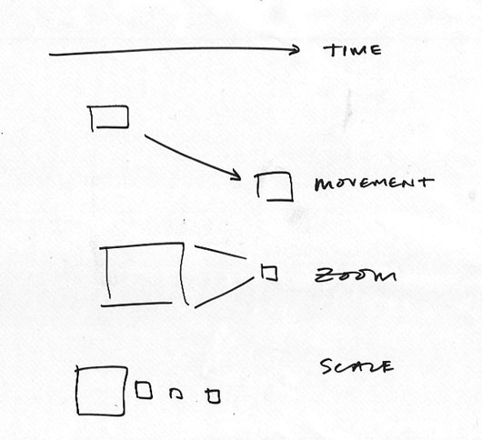
The first thought was the variables with which we could use to convey changes in quantity. Time, movement, zoom & scale were all identified as being potentially useful.

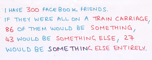
We started to construct sentences that could tell a story, and break down into portions to allow new stories to slot in.

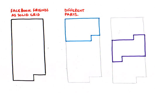
Looking at splitting grids into sections to show different variables.

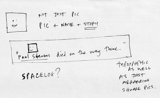
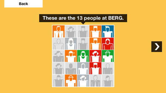
We thought a bit about avatars, and how to use them in visual representations of data, in this case combining them with friends’ names and stories.

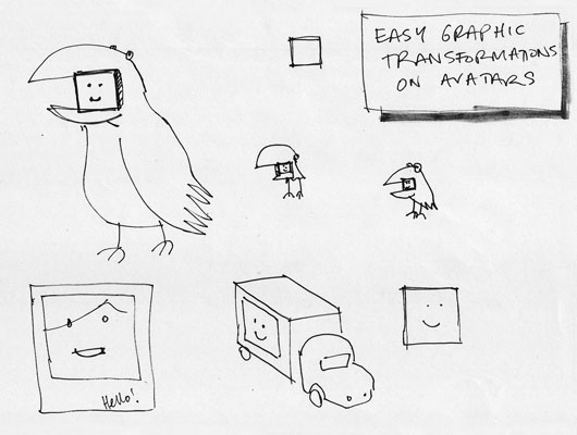
Looking at combining avatars with ‘bodies’. Bird suits, vehicles, polaroids.

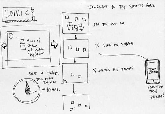
An early narrative concept, setting up the story early on and sending you through a process of experience. We thought about pushing bits of stories to devices in real time.

After a bit more crunching and sketching, we broke everything down into two routes:

  • Scale – influenced by Powers of 10, used to compare your networks to increasing sizes of numbers,
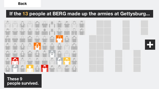
  • Grouping / snapping – used to take your contacts and run them through a set of statistics, applying them personally to historical events and comparing them against similar events in different times.


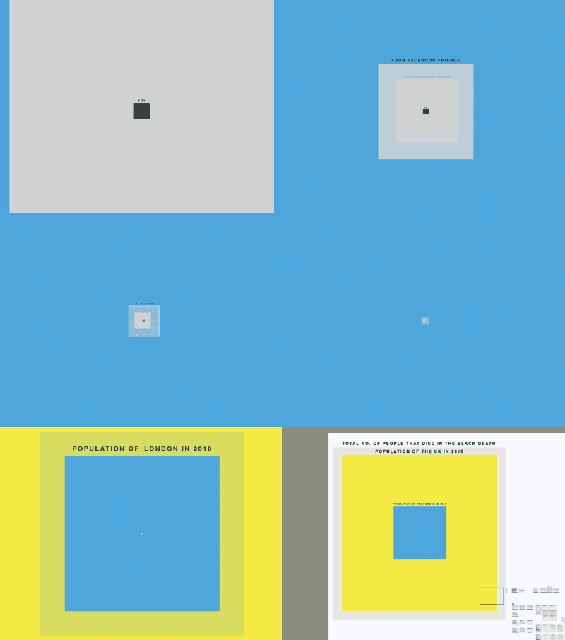
What became clear after the sketching was the need to show a breadcrumb trail of information, to give the user a real sense of their scale compared to the numbers we were looking at. Eames’ Powers of 10 video achieves this – a set of steps, with consistent visual comparisons between each step.

Perfect for showing the relevance of one thing in relation to the next, or a larger collective group. But the variation in the stories we’d be showing meant that we didn’t want bespoke graphics for each individual scenario. We tested out a quick mockup in illustrator using relatively sized, solid colour squares.

Despite the lack of rich textures and no visual indicators of your current position in the story, the impact was there. We added Facebook / Twitter avatars for signed in states, and worked on a colour palette that would sit well with BBC branding.

The next problem was dealing with non-signed in states. How many really was always designed to work with social networks, but we wanted it to be just as relevant with no Facebook or Twitter credentials – for classrooms, for example. We took a trip to the V&A to view the Isotype exhibition that was on at the time.


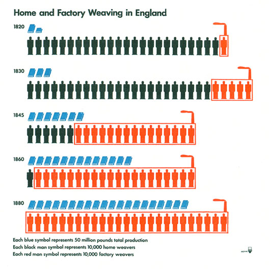
That’s 85 year old iconography and infographic design that looks as relevant today as it did back then. A real sense of quantity through simple pictograms. Completely fantastic. We set about designing a stack of isotype influenced icons to work with the site when users weren’t signed into their social networks.

And the icons in context…

We used a bit of Isotype inspiration for the organisation of the grouping stories – evenly spaced grids of icons or avatars.

The rest of the site was intended to stay consistent with How big really. We used photography in place of bespoke graphics for the story panels, as the graphical output varies for each user.

How many really is an entirely different beast to How big really. Rather than each dimension being a solid, one shot hit, the value is in backing up simple visuals with interesting narratives. We spent almost as much time on the written aspect of stories as we did on the aesthetics and interaction. I hope it gives a little context to numbers and figures we often take for granted. Please do have a browse around!

Friday Links

Video Game in a Box by Teague Labs. Delightful.

dextr + telly

danw’s Toby Barnes’ collection of glanceable displays and devices (above is dextr).

The reconstruction of what a person sees by measuring brain activity:

The left clip is a segment of the movie that the subject viewed while in the magnet. The right clip shows the reconstruction of this movie from brain activity measured using fMRI. The reconstruction was obtained using only each subject’s brain activity and a library of 18 million seconds of random YouTube video.

Physical graffiti that beautifies (via @urbnscl)

Time-lapse taken from the front of the International Space Station. WHOA.

Week 328

I’m writing these notes on the bus back to London. We have a rota to write weeknotes – everyone has a turn – and after months of teasing people when they don’t put notes up early in the week, on Tuesday after All Hands, it’s a little shoddy to have left it till Friday myself.

It’s been an eventful week!

  • Tuesday, How Many Really? launched, a website with the BBC that shows you populations from significant historical times compared to your own social network.
  • We put out a short video product sketch of clocks for robots.
  • On Wednesday, we started furnishing our new overspill office. It’s just over the road, and all Chaco work is shifting over there. It’s far from optimal to split the room like this, but we’re really packed in at the moment, and it’s stifling. So pending the big studio move (we received, and agreed, top-level numbers this week too), we have the overspill office on a short-term lease. The upside here is that James and Alice, who sit in Statham, can sit in the main room with everyone else. But it’s going to be weird and difficult and we’ll have to pay a lot of attention to the split to make sure it’s not damaging. An aside: somehow the office is becoming called “BERG 9 Overspill Area.”
  • And on Thursday, Nick consolidated all our email, calendars and what-not on Google Apps for Business. Our IT has all been a bit organic up till now – the less polite way of saying it would be haphazard and often broken – so this is a good step.

To stick with that Thursday Google consolidation for a second… it’s a shame to no longer allow the variety of email systems and calendar applications that we had before, but there’s a huge benefit in having everyone use the same tools, and having all the tools built by the same company. There’s some kind of network effect — a benefit in sharing protocols and originators.

I don’t like the word “ecosystem” because it feels like something else: maybe all the Google tools align in the same crystal lattice. I choose a crystal because electrons move freely and quickly in the regularity of structure, pausing when they have to cross boundaries where the grain of the lattice changes.

So I have these various lattices in which I live my electronic life. There’s Google for email, calendar, apps etc. Apple for phone, music, photos, and my place of work — my desktop, truly, and my metaphorical pens and paper too really. HDMI at home, which is the lattice that music and video travels through on the way to the speakers and projector after it leaves the Apple lattice. Since I standardised on HDMI (upgrading a couple of bits of kit, discarding handfuls and handfuls of interim convertors and cables), my home AV is way simpler and I get to play music and watch telly without having to remember what switch needs to be turned to whatever setting.

Consolidations of protocol. I don’t know, there’s something in this I want to think about more.

Let me say a little about what projects are on.

Our two Uinta projects are gathering momentum. Simon, Joe, and Matt J were in Brighton on Monday for a meeting with potential collaborators.

Chaco continues, and is well underway. Jack and Timo have been filming this week, and Timo has a shiny new iMac on his desk dedicated to editing and doing maths on pixels. The projects (Chaco is a family of projects) are huge and ambitious, and we’re going to need a broader team to pull them off — in part, that’s what my blog post this week about vacancies was for. (And I encourage you to have a read! There’s hardware and software and all sorts of things we’re interested in.)

Weminuche – the platform – and Barry – the first instance of it – continue too, and almost everyone is involved in some way or another. Looking down my list from All Hands, Denise, Alice, Nick, Alex, Simon, James, Timo, Jack and I all mentioned time spent on that. I’m being cryptic I know. But part of the purpose of these weeknotes is personal, so I can look back one day and remember “ah, that was what we were doing in week such-and-such” and memories will come flooding back. So I pair people names and project names in order to drop a future-anchor into the here and now.

As if that wasn’t enough, SVK second print run sales continue, and we continue to debug our fulfilment and customer service processes. I’m proud of SVK, as an internally run project. It’s hard to push work into the world when you don’t have a client because the temptation is to wait until perfection. But unless you get out into the world, all that work is for nothing anyway, and the experience of making your work public is so transformational to a project that you have to leave time and room to understand and build on that transformation. Launch unfinished, I say! Easy to say, hard to do. Mother birds push their chicks out of the nest before they can fly, but who’s going to learn to fly when somebody’s bringing food to you the whole time? Mother birds must feel horrible. Baby birds must resent them.

And there’s also some more work with Dentsu that I cannot wait to show you. Not long now.

This week I’ve started trying to think about two areas I’m not in the habit of thinking about: sales, and process.

We have a very simple sales model at the moment. We sell the product of our time and thinking. But there’s something in the vague area of long-term research projects, product partnerships, IP, that kind of thing. I don’t know, to be honest. My commercial sense is very undeveloped. All I know is that I know very little, and I see in-front of me a broad, grey, undifferentiated space. So I want to work on that, feel it out, and get to better understand commercial reality.

The other area I want to get deeper on is process. I feel very naive around process right now. I observe that we’re a design company, with a design culture built over 6 years, yet we’re having to cultivate a new engineering culture that sits within it and alongside it, and the two have different crystal grains. It’s good that they do — engineering through a design process can feel harried and for some projects that does not lead to good outcomes. And vice versa. But it throws up all kinds of questions for me: do we really want two domains of engineering and design; what is the common protocol – the common language – of engineering culture, and indeed of our design culture; how do these lattices touch and interact where they meet; how do we go from an unthought process to one chosen deliberately; how is change (the group understanding of, and agreement with a common language) to be brought about, and what will it feel like as it happens.

Again, not things I have much experience with.

And again, as I did last time, I read back over my weeknotes and wonder whether it’s worth thinking about these kind of things. You know, I’ve just spent an hour bus ride noodling about things that maybe only make sense when a company is 100s of people, rather than a dozen plus change. Couldn’t I have spent my time replying to email?

I genuinely don’t know. Other people appear to construct and grow companies without any need for this kind of abstract introspection. Maybe it’d be better to pick the first thing that seems to work and just go for it.

Then again, maybe not. My metric for thinking about this is: ensuring the best possible environment for happiness and invention. Happiness feels like the easier of the two to work towards. It’s more easily identifiable, if not always easy to reach. Invention I see only out of the corner of my eye. Mostly you can only identify invention in retrospect. It is rare and fragile. Keeping hold of that feels worth a bus-ride thinking.
Product sketch: Clocks for Robots

As a studio we have recently been quite pre-occupied with two themes. One is new systems of time and place in interactive experiences. The second is with the emerging ecology of new artificial eyes – “The Robot Readable World”. We’re interested in the markings and shapes that attract the attention of computer vision, connected eyes that see differently to us.

We recently met an idea which seems to combine both, and thought we’d talk about it today – as a ‘product sketch’ in video to start a conversation hopefully.

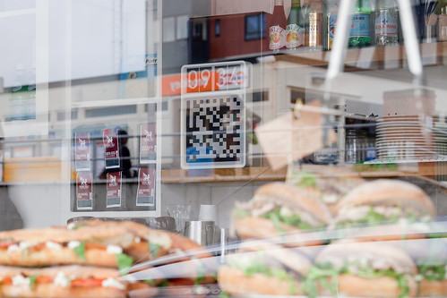
Our “Clock for Robots” is something from this coming robot-readable world. It acts as dynamic signage for computers. It is an object that signal both time and place to artificial eyes.

It is a sign in a public space displaying dynamic code that is both here and now. Connected devices in this space are looking for this code, so the space can broker authentication and communication more efficiently.

BERG-Clocks-20110909-005

The difference between fixed signage and changing LED displays is well understood for humans, but hasn’t yet been expressed for computers as far as we know. You might think about those coded digital keyfobs that come with bank accounts, except this is for places, things and smartphones.

Timo says about this:

One of the things I find most interesting about this is how turning a static marking like a QR code into a dynamic piece of information somehow makes it seem more relevant. Less of a visual imposition on the environment and more part of a system. Better embedded in time and space.

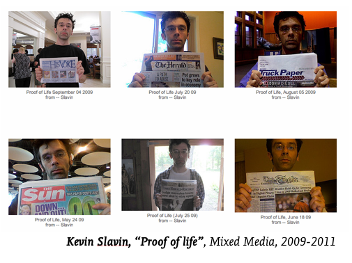
In a way, our clock in the cafe is kind of like holding up today’s newspaper in pictures to prove it’s live. It is a very narrow, useful piece of data, which is relevant only because of context.

If you think about RFID technology, proximity is security, and touch is interaction. With our clocks, the line-of-sight is security and ‘seeing’ is the interaction.

BERG-Clocks-20110909-011

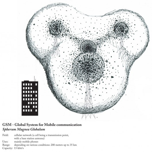
Our mobiles have changed our relationship to time and place. They have radio/GPS/wifi so we always know the time and we are never lost, but it is at wobbly, bubbly, and doesn’t have the same obvious edges we associate with places… it doesn’t happen at human scale.


^ “The bubbles of radio” by Ingeborg Marie Dehs Thomas

Line of sight to our clock now gives us a ‘trusted’ or ‘authenticated’ place. A human-legible sense of place is matched to what the phone ‘sees’. What if digital authentication/trust was achieved through more human scale systems?

Timo again:

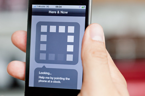
In the film there is an app that looks at the world but doesn’t represent itself as a camera (very different from most barcode readers for instance, that are always about looking through the device’s camera). I’d like to see more exploration of computer vision that wasn’t about looking through a camera, but about our devices interpreting the world and relaying that back to us in simple ways.

BERG-Clocks-20110909-008

We’re interested in this for a few different reasons.

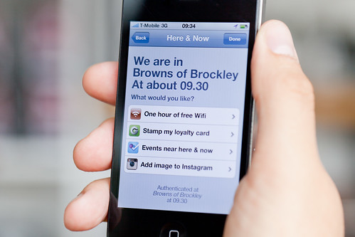
Most obviously perhaps because of what it might open up for quick authentication for local services. Anything that might be helped by my phone declaring ‘I am definitely here and now’ e.g., as we’ve said – wifi access in a busy coffee shop, or authentication of coupons or special offers, or foursquare event check-ins.

BERG-Clocks-20110909-007

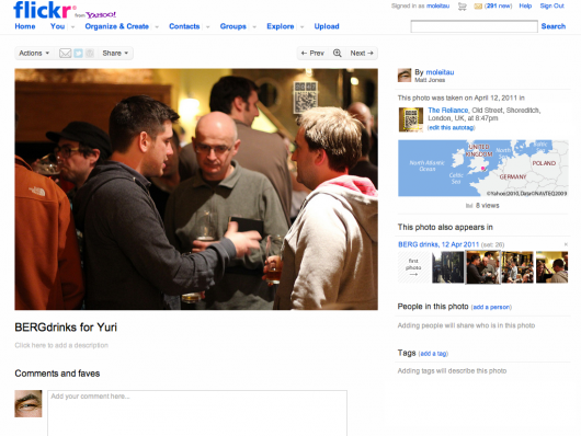
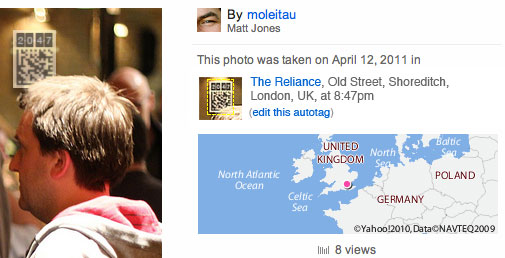
What if there were tagging bots searching photos for our clocks…

…a bit like the astrometry bot looking for constellations on Flickr?

But, there are lots directions this thinking could be taken in. We’re thinking about it being something of a building block for something bigger.

Spimes are an idea conceived by Bruce Sterling in his book “Shaping Things” where physical things are directly connected to metadata about their use and construction.

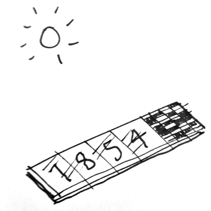
We’re curious as to what might happen if you start to use these dynamic signs for computer vision in connection with those ideas. For instance, what if you could make a tiny clock as a cheap solar powered e-ink sticker that you could buy in packs of ten, each with it’s own unique identity, that ticks away constantly. That’s all it does.

This could help make anything a bit more spime-y – a tiny bookmark of where your phone saw this thing in space and time.

Maybe even just out of the corner of it’s eye…

As I said – this is a product sketch – very much a speculation that asks questions rather than a finished, finalised thing.

We wanted to see whether we could make more of a sketch-like model, film it and publish it in a week – and put it on the blog as a stimulus to ourselves and hopefully others.

We’d love to know what thoughts it might spark – please do let us know.


Clocks for Robots has a lot of influences behind it – including but not limited to:

Josh DiMauro’s Paperbits
e.g. http://www.flickr.com/photos/jazzmasterson/3227130466/in/set-72157612986908546
http://metacarpal.net/blog/archives/2006/09/06/data-shadows-phones-labels-thinglinks-cameras-and-stuff/

Mike Kuniavsky:

Warren Ellis on datashadows

Bruce Sterling: Shaping Things

Tom Insam‘s herejustnow.com prototype and Aaron Straup Cope’s http://spacetimeid.appspot.com/, http://www.aaronland.info/weblog/2010/02/04/cheap/#spacetime

We made a quick-and-dirty mockup with a kindle and http://qrtime.com

BERG-Clocks-20110912-016

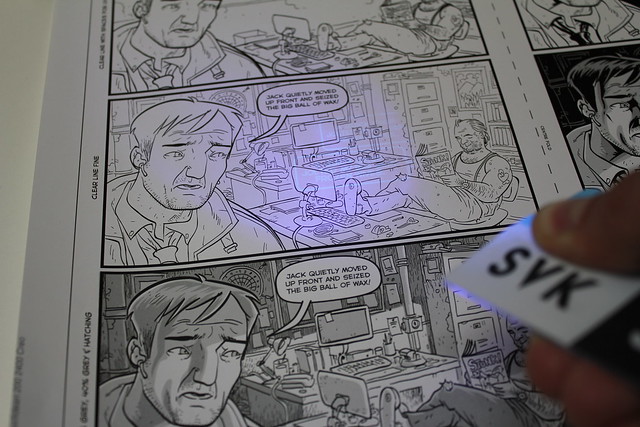
SVK’s genesis: a chat with Schulze and Webb

In July, on the day that we first published SVK, I sat down with Jack and Matt to talk through the ideas behind the project – both in terms of the storytelling and the business challenges of bringing it into the world.

This week we released the second print run of SVK, so I thought I’d share it on the blog.

Jack Schulze: I’d been reading comics a lot, they’re some of the most sophisticated graphic output I’ve been exposed to.

I was following the work of Warren [Ellis] and Grant Morrison very closely. I found something in common between them — in some of the stories they were writing they were folding the form of the comic back into the material of the story, so that the comic was sort-of self-aware.

Specifically I’m thinking of Warren’s ‘Planetary’/’Batman’ crossover, where there are different Batmen from the various eras brought into it – from Adam West’s TV Batman to tougher modern versions, perhaps drawn from Ennis or Frank Miller. The whole thing only works because there are 80 years of ‘Batman’ comics to draw on.

More recently I was impressed with the storytelling structure of Warren’s ‘Aetheric Mechanics’. Also, Grant Morrison’s ‘The Filth’, where at some points the characters interact with the gutters and borders of the comic page. And – all this against the background of my continuing obsession for Garth Ennis’ interpretation of ‘The Punisher’.

This is brave work — in terms of the broadest sense of graphic design. I started to think about how we might make a comic with those qualities. Of course, not being comics writers or artists, we came up with a loose idea about what we could do with the technologies of ink and printing to build a story which was about looking. We wanted to see how we could use the fabric of printing and fold that back into the narrative. Looking is a preoccupation of the studio going back to projects like Glancing by Matt Webb, through to the Here & There Maps of Manhattan.
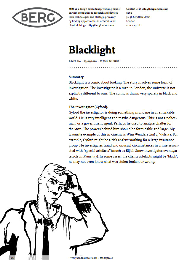
Matt Jones: you wrote an outline proposal, with the project name ‘Blacklight”, in the spring of last year – 2010?

JS: Yeah. Once I realised with Matthew that it would be possible, and he could shape it into something we could formally include in the work of the company, I had to write it down and find a way to get it made!

Original SVK Proposal: codename "Blacklight"

MJ: So, in terms of that moment of thinking about it as a product, what was your thought process? As I remember, there was a distinct moment when it tipped into reality, and you said “we could do this…”

JS: Well, there are always a lot of ideas like that floating around the studio and that was one I’d been quite, sort of, bullish on and I think that it was something that we’d discussed for quite some years. At least I think you [nods at Matt Webb] had been aware of it — and when I brought it back to you, it was because I thought I’d found a way of making it. Not anything to do with money, just literally making it — getting it written and drawn… I think you saw something in it where it had the right sort of characteristics to fit a pipeline of work that we needed in order to get it somewhere…

Matt Webb: Yes. I think the job of the studio is to bring our own ideas to life – that it’s something inventive, hopefully something that has some cultural importance – but mainly to have fun, make stuff y’know? When you can make that kind of thing achievable, when it gets some kind of independence from the client work so you can do it yourself, that’s really interesting.

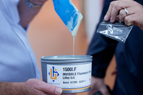
There was a realisation that it [SVK] could be a kind-of ‘crystal’ business in its own right. That it could be made to work through advertising, cover-price, direct sales, working with really awesome people. There’s something about the project – I mean, independent from the fact that Warren and Matt Brooker have made a really good story… that’s also … I don’t know… it sort of commoditises the tools of business in a funny sort of way — that those tools are at the service of creative works instead of the other way around.

JS: I think to expand on that, there was something that the map had taught us — that Matthew had found a way of allowing us to make anything we wanted — as long as it would pay for itself. And that’s the kind of objective, other than the cultural impact, that the project sort of builds its own infrastructure around it, and that it doesn’t cost us anything to do so, and maybe makes a small profit.

MJ: so it’s sort of a ratchet-effect thing — a system that could be used on other products?

MW: The system we have is putting physical things into people’s hands — with all that implies — warehousing, taking money, customer support…which is something that loads of other businesses have, big ones and small ones, but for us it’s completely new and it’s an investment, so this [SVK] is an excuse for us to make that investment

MJ: Jack, what’s your recollection of approaching Warren about SVK?

JS: Well, we’d written the proposal and Matthew had written a structure of how cashflows and process could be described to make it possible and satisfying to everyone taking part. And the proposal was a combination of early thoughts — some of them very detailed and some of them much larger themes. It’s located in London, the idea of ‘looking’ being an important component, but apart from that we weren’t very precious. A lot of the remainder was up for grabs. After that, I think we just took Warren to the pub and poured beer on him until he agreed. [laughs] Beer-boarding!

MJ: Ah. [laughs] I had that recollection as well – I thought you might have more details!

JS: No! I think that was it! But I think also there was something that caught his imagination — which was that you could take the tropes of AR, Augmented reality… and do them in ink. That you were, y’know, augmenting the page. That you have a scene that has a reality common to everyone, and then a special perspective unique to a particular tool. It’s obviously not the same as augmented reality but it has a sufficient number of parallels to feel part of the same aesthetic.

MJ: Yeah, it feels for instance like the things Jamais [Cascio] is talking about in his essay in the book, the subjective realities that people will start to have through technology…

JS: Yeah and I think AR is something, as Bruce Sterling and Kevin Slavin demonstrate, that people like talking about despite its limited arrival in our hands — so I think in that respect it struck a note with Warren.

MJ: What’s struck both of you most about the process?

JS: I was amazed that from that proposal, and one meeting with Warren and Matt Brooker their communications and process was *so* well-oiled. That they basically just went and did it. In contrast to most of our projects into new territories that involve endless meetings and workshops, figuring out new processes… and although it was delayed by illnesses and various stuff… that the actual creative process — of making a narrative — was extraordinarily fluent. And I’m sure that was to do with Matt [Brooker] & Warren — I’m sure it’s not the same with every comic. And just to see in the result how much of the core important elements of the original concept have remained in, despite the fact there’s now an entire universe and story, I just found it very satisfying to work with someone with that level of trust…

SVK

MW: There was something amazing about how Warren took on the concept and almost reestablished it and made it his own. It’s an idea that could have very easily have become gimmicky, or be used just to look cool. But for it to have taken on so much of the core of the story — and it’s a cracking story — that was quite amazing. I don’t know how Warren does that.
JS: It succeeds as a comic in it’s own right — without the UV layer completing it…

MJ: you might have just answered my final question — what do you think of the finished product?

JS: I think it’s great! I’m really, really proud of it. It’s better than I could have hoped when I was imagining what it could be before it was written and drawn. And it’s just fun to see Warren’s process from the inside and have something that satisfying emerge at the end of it. I think it’s awesome.

MW: There’s something interesting about being a design studio and not being responsible for the… creative surface of what comes out…

JS: Yeah, that’s one of the core components… It’s been really interesting. It has been a true collaboration in that sense, in that the combination of figuring out the processes and the experience of the product, and having the early idea — that tangle of ideas happening with someone outside the studio. It didn’t seem like what I would understand to be a typical work-for-hire relationship. It seemed like everyone involved had their heart in it, and invested themselves in the project. I thought that was great.
SVK is available only online from http://getsvk.com

Vacancies!

Update: We’ve had a bunch of great responses! We’re no longer looking to meet folks through this route — keep an eye on the blog for future vacancies and more formal hiring. Thanks! -Matt.

So, we’ve got a few projects coming up, and I’d like to expand our network of awesome collaborators.

We’re a little studio — there are only 13 of us permanent, plus a handful of totally excellent regulars. We’re always busy, researching and developing media and tech for a wide variety of companies. And we work on our own stuff too.

There are a handful of roles that I’d like to find folks for, probably as contractors. I’m not going to write up these as full job specs yet, because it’s still early days. This is a gentle testing of the waters, and I won’t treat it like a full skills screen/interview/etc process. If we meet and hit it off, brilliant, we’ll make some magic. Otherwise I’ll put out a more formal call in a month or so!

Given all of that… if any of these gigs sounds like you, drop a note + your CV to info@berglondon.com, and we’ll sort out a coffee if it looks like we have a match.

Those gigs:

  • Book-keeper: 1-2 days/week. We’re looking for an assistant to Kari, our studio manager. As part of her job, she runs payroll, does the book-keeping, receives and pays invoices, run VAT returns, and provides information to our accountants at year-end. Kari has written an operations manual on how our book-keeping works, and the position will start with shadowing her for a month or more. This will be an ongoing, part-time role, ideally kicking off before the end of the year. Experience with Xero (our accounts software) highly desirable.
  • Designer-coder(s) au fait with openFrameworks (we’ll be looking at public code contributions), projection mapping, and live video manipulation, for a project or two beginning later this year. Experience in computer vision is a plus, as is the ability to blog publicly about work. The project definitions will start off pretty loose — we’re looking for collaborators to work with the software and ideas we’ll have already developed, and find and show off new possibilities. We’re looking at starting very early in 2012 for this, maybe earlier, and would like to start meeting people now.
  • A developer highly skilled with 3D and manipulating 3D models, large polygon counts, and graphics. Additional skills: making beautiful visual output; tight code for future mobile output. The first iteration is a clearly defined project, for delivery before the end of the year for an internal prototype. This would be a contracting position, starting as soon is practical.
  • Producer with experience working with specialists in interaction design; product design; short-run manufacture; electronics; software development. We’re increasingly getting projects that run from experimental prototyping to speculative short-run manufacture of physical products with screens and electronics. While we have project management and hardware producer/R&D skills, in the long-term I’d like to expand the team, and so this is a good opportunity to work with a new contractor producer dedicated to a single project. Great communication is a must: this is a client-facing role, and being able to define and demystify roadmaps will be a big part of it. So a background in prototyping and/or embedded software would be very useful. I reckon this a 50% role for 3-6 months, and will likely involve a little travelling. It starts as soon as we meet the right person.

All roles are based out of our East London studio — we’re not quite big enough for remote working. No guarantee that we’ll actually take anyone on at this point. It’s all contingent on finding the right brilliant person!

Anyway, drop info@ a note if any of these gigs resonate.

Thanks, and please feel free to pass this on!

BBC Dimensions: How Many Really?

Update, February 2013: Howmanyreally.com has now finished its prototype trial, and is no longer live.


About two years ago, we started work with Max Gadney on a series of workshops looking at how digital media could be used for relating stories and facts from both history and current affairs.

One of the concepts was called ‘Dimensions’ – a set of tools that looked to juxtapose the size of things from history and the news with things you are familiar with – bringing them home to you.

About a year ago, we launched the first public prototype from that thinking, http://howbigreally.com, which overlaid the physical dimensions of news events such as the 2010 Pakistan Floods, or historic events such as the Apollo 11 moonwalks on where you lived or somewhere you were familiar with.

It was a simple idea that proved pretty effective, with over half-a-million visitors in the past year, and a place in the MoMA Talk To Me exhibition.

Today, we’re launching its sibling, howmanyreally.com

BBC Dimensions: How Many Really

You can probably guess what it does from the URL – it compares the numbers of people who experienced an event with a number you can relate to: the size of your social network.

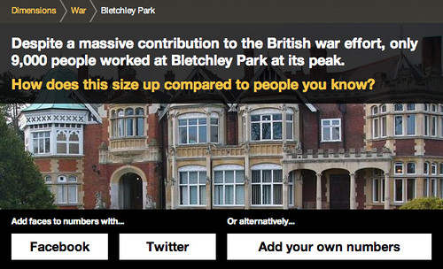
For example, the number of people who worked at Bletchley Park cracking codes and ushering in the computer age…

bletch_home

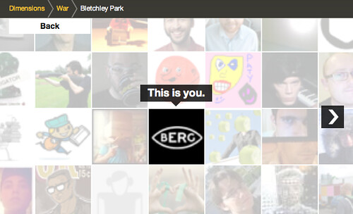
I can sign in with my Twitter account

bletch_1

and I’m placed at the centre…

bletch_2

Clicking to zoom out shows me in relation to those I follow on Twitter…

bletch_3

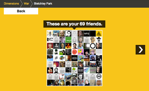
Zooming out again places that group in relation to those working at Bletchley Park in 1945.

bletch_4

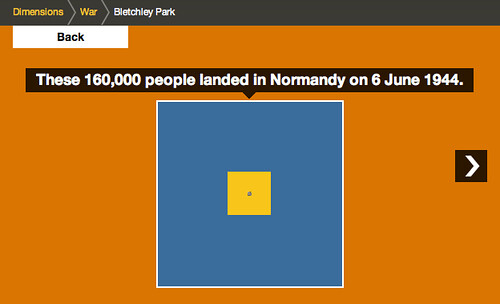
Which, in turn, is then compared to the Normandy Landings

bletch_5

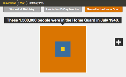
…and finally the 1.5m people in the Home Guard

bletch_6

Despite the difference between the size of the final group and your social network, it can still just be made out at the centre of the diagram, helping us imagine the size of the group involved in these efforts during World War 2.

Of course this visualisation owes much to the pioneering work of the Office of Charles & Ray Eames – particularly their “Powers of 10” exploration of relative scale, which is a shared source of inspiration in the studio.

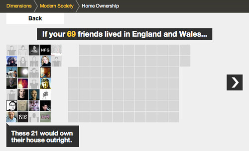
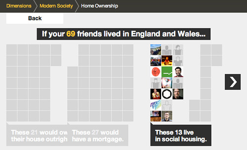
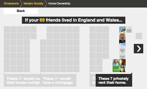
There is another type of comparison featured in the prototype – one which during development we likened to an assembly in a school playground – where your friends are gathered into different groups.

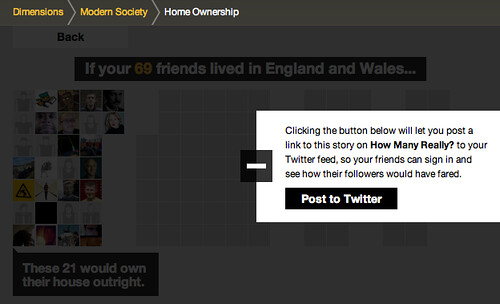
For example, this one looks at home ownership in England and Wales:

homes_home

Starting again from your twitter network…

homes_1

This visualisation starts to arrange your social network in groups…

homes_2

relating to the different experiences…

homes_3

homes_4

homes_5

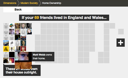
and you can also rollover the individual avatars in this version, to see the individual’s experience…

homes_hilight

All the ‘dimensions’ in howmanyreally.com allow you to post what you’ve discovered to your social networks, if you want…

homes_post_to_twitter

There are a lot of influences on howmanyreally – both from the Eames, and in the case above – the work of Isotype, which I hope we’ll go into in a further post.

But for now let me encourage you to explore howmanyreally.com yourself. It’s little bit of a different animal from its sibling IMHO, which had such an immediate visual punch. This is a slower burn, but in my experience playing with it, I’ve found it can be just as powerful.

Both human history and current affairs unfortunately feature an high percentage of turmoil and tragedy.

While I’ve selected some rather neutral examples here, juxtaposing your friends with numbers of those injured, enslaved or killed through events in the past can really give one pause.

In its way, I’ve found howmanyreally.com a tool for reflection on history. A small piece that I can loosely join to a larger exploration of the facts. I really hope that’s your experience too.

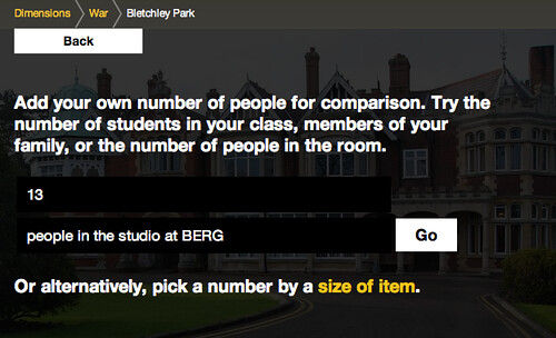
If you don’t wish to use your social network accounts in connection with howmanyreally, you can enter a number you’re familiar with to centre the comparison on – for instance the size of a school class, or those in your office perhaps.

own_numbers

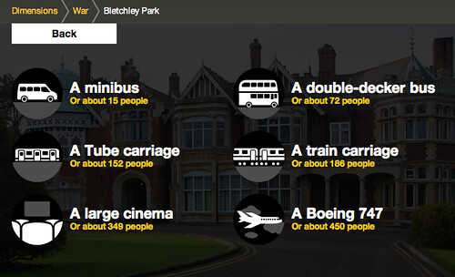
Or you can choose one of the comparisons we’ve prepared – for instance the number of people typically in a large cinema…

thing_numbers

As with howbigreally.com – if the prototype is successful, these new visualisations are designed to be incorporated as an element within the bbc.co.uk history and news sites. So do give your feedback to the BBC team through the contact details on the site.

It’s just left to me to say thanks to the team at the BBC who originally commissioned these explorations into history at human scale, including Lisa Sargood, Chris Sizemore, and Max Gadney.

Howmanyreally (and Dimensions as a whole) has been a fascinating and rewarding piece to work on, and thanks many members of the studio who have made it happen: Nick Ludlam, Simon Pearson, Matt Webb, Denise Wilton – and the core team behind its genesis, design and development: Alex Jarvis, James Darling, Peter Harmer and Tom Stuart.

Friday Links

In this weeks links we watch the weather float by with Poietic:
http://www.poietic.co.uk/ourwork/floatingforecaster

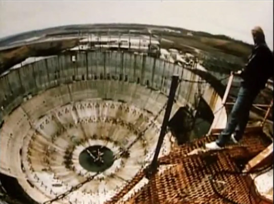
Take a tour of the giant-abandoned-nuclear-power-plant where they filmed The Abyss.
http://io9.com/the-abyss/

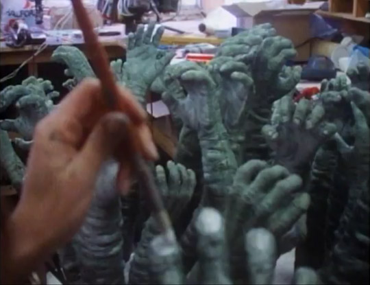
Get under the skin of the ‘Hands’ scene from Labyrinth.
http://www.youtube.com/watch?v=Dcg9ssRwpfE

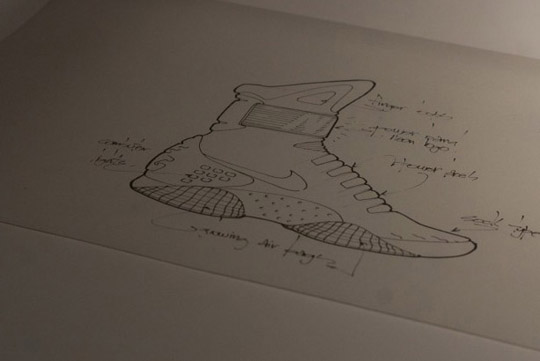
See the original sketches for the Back to the Future II MAG shoes.
http://www.nicekicks.com/2011/09/nike-air-mag-officially-unveiled/

Head out on a quest for the aurorae.
http://vimeo.com/28740524
(Royal Observatory Greenwich/ Lonelyleap, incorporating time-lapse footage of aurorae by Ole C. Salomonsen’ Produced by Anne Hollowday)

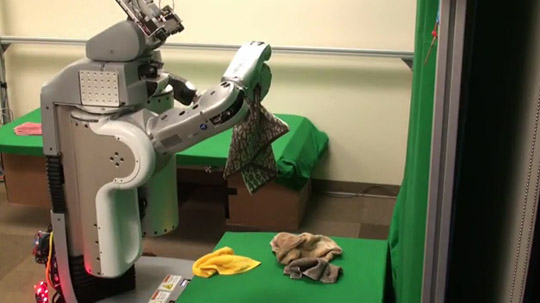
Denise points us towards ‘a robot autonomously folding a pile of 5 previously-unseen towels.’
http://www.youtube.com/watch?v=gy5g33S0Gzo

Mull over a blog entry from Bryan Clark about the need to create systems capable of negotiating with users.
http://clarkbw.net/blog/2009/05/14/negotiate-with-your-users/

“I always advocate against simple (and especially modal) dialogs in user interfaces because they aren’t there to help the user get past the problem, more like work through the emotional issues the software is having.”

Finally, in the studio we drink a lot of tea so the subject of a tea-making-robot inevitably cropped up.

Timo compiled a list of links to get a sense of how far humankind has got in this great endeavour.

Teabot
http://www.youtube.com/watch?v=Xl-WbiyJIDQ

Lego
http://www.youtube.com/watch?v=NhQ4mv4zsHk

An industrial robot in 1988:
http://www.youtube.com/watch?v=RcttVn2y6v0

Another ABB industrial robot:
http://www.youtube.com/watch?v=6CiuXy5UY1w

A speculative teapot carrier
http://vimeo.com/4587297

Have a great weekend!

Week 327

As the faint embrace of another apocryphal summer yields slowly to Autumnal overtures, the studio continues to crackle with activity and electricity.

Messrs Schulze and Arnall conjugate stories with technology for Chaco by focusing light onto semiconductors.

Jones cleaves a path through the reticular branches of Uinta.

Andy solicits a new computer to transmogrify pixels into atoms.

Denise continues to artfully assemble Barringer’s style and savoir-faire.

Simon returns from an American intermission to a freshly embroidered BERG working jacket.

Alice nourishes Barringer with fresh data and eases past her three-month milestone.

Alex is probably horizontal somewhere sunny.

Webb weaves with celerity between Chaco and Uinta meetings.

Kari administers company financials and gracefully handles SVK customer service.

James releases a product into the wild and continues to establish the Weminuche architecture.

Nick speaks fluent Computer to charm the online shop into submission.

And I drew a picture of a man with bendy limbs.

Recent Posts

Popular Tags