This website is now archived. To find out what BERG did next, go to www.bergcloud.com.

Blog posts tagged as 'maps'

BBC Dimensions: integrating with BBC News

Back in 2009, we started the work that would become http://howbigreally.com and http://howmanyreally.com with the BBC, releasing those two prototypes over the last two years under the banner of “BBC Dimensions“.

Our intention from the beginning was to design the service as a module that could be integrated into bbc.co.uk at a later date if they proved successful with audiences.

Earlier this year, Alice worked with the engineers at BBC News to do just that, and now the first BBC News stories featuring the “How Big Really” module are starting to appear.

Here are a couple of examples – a story on the vast amount of space given over to car parking in the world, illustrated with the module juxtaposing the total space used by parked cars over the island of Jamaica!

http://howbigreally.com functionality integrated into BBC News

…and a more recent example showing the size of a vast iceberg that has just broken free of a glacier on Greenland.

http://howbigreally.com functionality integrated into BBC News

Of course, as with the original http://howbigreally.com prototype, you can customise the juxtaposition with the post-code of somewhere you’re familiar with – like your home, school or office.

The team worked hard to integrate the prototype’s technology with BBC News’s mapping systems and the the look/feel of the site overall.

Here’s Alice on some of the challenges:

We worked with the BBC Maps team to create a tool that could be used by editors, journalists and developers to create How Big Really style maps. Chris Henden and Takako Tucker from the team supplied me with the BBC Maps Toolkit and did a great job of explaining some of its more nuanced points, particularly when I got into trouble around Mapping Projections.

The tool takes an SVG representation of an area, including a scale element, converts it to a JSON object that is then rendered onto a map using the BBC Maps Toolkit. Immediate feedback allows the map creator to check their SVG is correct, and the JSON representation of the shape can then be used to build the map in future.

It’s really satisfying for us to see something that started as a conceptual prototype back in 2009 find it’s way into a daily media production system of the scale and reach of BBC News.

Thanks to all the team there – also Chris Sizemore, Lisa Sargood and Max Gadney for shepherding the project from whiteboard sketches to become part of the BBC journalist’s digital toolkit.

Friday Links

SubMap is a visualisation for time and location data on distorted maps. The example above is a point of view map — a projection on a sphere around a particular point.

Planetary Resources is uncloaked this week as a company set up to mine the asteroid belt of our solar system. Yeah. We live in the future.

Planetary Resources is backed by, amongst others, James Cameron, the film director, and Larry Page, CEO of Google. Personally I am somewhat keen on getting society into space. But I didn’t expect it to be done by the International Legion of Billionaires. Brilliant that they’re doing it. Thanks, billionaires!

We are very much in love with Matt Richardson’s Descriptive Camera, which instead of a picture produces a text description of what you shoot, printed on a thermal printer!

Corner of a wood floored room with a tool chest, bike, stack of books, box leaning against the wall, an open door with a bag hanging off the doorknob, and a pair of closed double doors with cables hanging on the handles.

Gorgeous.

It gets better: the text descriptions are produced by anonymous individuals distributed around the world, and compensated for their work through Amazon Mechanical Turk. I love imagining the crowd of the internet all teeny tiny, all inside the camera.

Let’s wrap with a bit of self promotion.

The Lytro lightfield camera is one of those WHOA products — photos that you can refocus at any time. It’s magical. When I ran into them last week, they took a photo of Little Printer. Check it out! You can click to refocus (requires Flash).

Thursday links: melty roads, back-o-the-web, generative sound, isochronic maps and Vicky

As tomorrow is a holiday, the weekly BERG links post is coming to you one day early this week!

It’s been a rather quiet week on the BERG studio list, but we (where “we” mostly = Matt Jones) did manage to dig up some interesting things from the internets.

Jason Kottke linked to Clement Valla’s collection of “melty roads” – Google Earth images where the 2D-to-3D mapping doesn’t quite work. Browsing through the images invokes an Inception-like world.

Via Khoi Vinh we discovered the brilliant “Back of a Web Page” Tumblr. Ever wonder what those Twitter birds do behind the scenes?

One afternoon we heard some odd bloopy music coming over the studio speakers, and Matt Jones confessed he’d been playing with Batuhan Bozkurt’s Otomata, a generative sound sequencer.

Go over and have a play yourself!

Via Mike Migurski came Xiaoji Chen’s Isochronic Singapore. It’s fascinating to see the city of Singapore expand and contract like a living, breathing thing as average travel times change from hour to hour and day to day.

Chen has been playing with other dynamic maps of Singapore as well:

Finally, via our neighbour and RIG super group member Alex Deschamps-Sonsino, a list of Robots, Cyborgs and Computers in Film and TV. It seems that list hasn’t been updated in at least five years (and therefore actually feels rather short), but for me the best thing about it is it reminded me of something I had completely forgotten about: the TV show Small Wonder. Ah, mid-80s American family sitcoms. Most of them are best forgotten, actually…

Vicky the robot child!

Go on a nerdy day trip!

The last couple of days of hot, sunny weather in London have got me thinking about holidays and doing so put me in mind of Ben Goldacre’s crowd-sourced collection of Nerdy Day Trips. As Ben says,

I am a very big fan of nerdy day trips, from Sea Forts to abandoned nuclear bunkers,dead victorian racecourses, roads that are falling into the groundnarrow gauge railwaysthat take you to a power station, wherever. I like decaying infrastructureterrifying modernity, and enthusiast-run museums with 6 pages of small-font text explaining every exhibit (looking at you, Bletchley Park).

So he started collecting them on a map and asking anyone with a suggestion not yet on the map to add it. There are a few obvious ones here like Down House, former home of Charles Darwin, and the Greenwich Royal Observatory. But I reckon most of these are places that only locals would have heard of – and some of them may well only be known to locals who live within half a mile or less. (Case in point: I reeled off a list of about a dozen spots from around the country to a group of my colleagues – all of whom grew up in the UK – and only one person had heard of one of them.)

Here’s a sampling of places you will find on the map, places which will almost certainly appeal to any person with nerdy proclivities and quite possibly to non-nerds as well.

Cresswell Crags in Nottinghamshire – the earliest British cave art, some of it dating back nearly 13,000 years ago.

Flag Fen Archaeology Park in Peterborough – see a 3,500 year old perfectly preserved Celtic wooden monument and explore a reconstructed Bronze Age village.

The Seaford Museum in Martello Tower no. 74, East Sussex – the museum contains, among other things, “collections of domestic appliances covering the first half of the 20th century, office machinery from early typewriters and copiers to computers and a particularly large collection of radios and television sets.”

Cragside in Northumberland – country home of Victorian inventor Lord Armstrong and the first house in the world to be powered by hydro-electricity. The house is full of gadgets, and there’s a huge adventure playground for the kids.

The Electric Brae in Ayrshire, Scotland – a mysterious place where cars roll uphill!

The Ossuary at St Leonard’s Church in Hythe, Kent – 2,000 skulls and 8,000 long bones, all nicely piled in the crypt.

The Williamson Tunnels Heritage Centre in Liverpool – an labyrinth of tunnels built by eccentric philanthropist Joseph Williamson during the first half of the 19th century.

The Needles Battery on the Isle of Wight – built in the last half of the 19th century as a defence against an invasion by France.

The Birr Castle Telescope in Co Offaly, Ireland – the largest telescope in the world when it was built by the Third Earl of Rosse in the 1840s, where the spiral nature of galaxies was first discovered.

Have a look at the map on Ben’s site to find places closer to you (at least if you’re in the UK or Ireland) and if you know of any other “nerdy day trip” destinations that aren’t included yet, add them yourself!


Links for a Friday Evening: Maps and Rivers, Space and Kinetic Sculpture

pistil.jpg

Pistil SF make customised blankets based on OpenStreetMap imagery. The custom maps can be centered around any latitude/longitude, and are available in a variety of custom colour schemes thanks to the Cloudmade styles. Freely available data turned into a beautiful, desirable product.

mr-switch.jpg

Andy spotted Mr Switch – a switch blanking plate designed by John Caswell, that injects character (and a little fella) into any light switch.

romance-river.jpg

I loved James Bridle’s Romance Has Lived Too Long Upon This River. It’s a really abstract representation of the height of the Thames, manifesting as a single-serving webpage. It’s also a synecdoche for the whole river, perhaps even the city of London; a glanceable manifestation of nature, in a window on your computer, or on your tablet, or on your phone. James explains the technicalities – and the romance – over on his blog.

Chris Burden’s Metropolis 2 is a kinetic sculpture: 1200 toy cars racing around a colossal series of tracks. Brilliant. The noise sounds deafening. (via Kottke).

The noise of Metropolis II reminded me of this delightful marble run around a the edges of a room. I particularly like the way deftly curved lengths of wood are used to slow the marbles. It embraces momentum, rather than artificially killing it.

spacelog.jpg

Several of us have been admiring Spacelog this week. It’s a really lovely representation of the space missions it covers, taking original radio chatter and mapping it to not only mission personnel, but also the phases of the mission itself. It’s another kind of macroscope: the many small actions of the vast teams at NASA, distilled into a few hours of spaceflight, and explained through careful representation of that data.

Links round-up: Foursquare visualisation, cute projectorcams, AR videogames, task management

skitched-20100824-105917.jpg

Matt J provided this image of Kodak’s first digital camera, from 1975, and the accompanying story:

It was a camera that didn’t use any film to capture still images – a camera that would capture images using a CCD imager and digitize the captured scene and store the digital info on a standard cassette. It took 23 seconds to record the digitized image to the cassette. The image was viewed by removing the cassette from the camera and placing it in a custom playback device. This playback device incorporated a cassette reader and a specially built frame store. This custom frame store received the data from the tape, interpolated the 100 captured lines to 400 lines, and generated a standard NTSC video signal, which was then sent to a television set.

social-london.jpg

Matt B sent us Anil Bawa-Cavia’s visualisations of Foursquare check-in data for London, Paris and New York. The striking maps (an excerpt of which is displayed above) start by displaying activity across a uniform grid:

In these maps, activity on the Foursquare network is aggregated onto a grid of ‘walkable’ cells (each one 400×400 meters in size) represented by dots. The size of each dot corresponds to the level of activity in that cell. By this process we can see social centers emerge in each city.

There’s more at the link above, and also in Anil’s explanation of the techniques used – where he also provides a dump of all the data.

fella-projectorcam.jpg

Matt W found this lovely design for a digital camera with built-in pico projector. Of course the two lenses are eyes. And everything else stems from there.

Nick pointed out that Epic Win is now on sale. It’s a playful to-do list that turns doing tasks into experience points for an avatar, much as Chore Wars before it. What sets it out for me is just how much value there is in making a functional piece of software – in this case, a to-do list – well-designed and beautiful. It’s fun to use, without getting in the way of the basic task of making lists, and I want to go back to it. It’s worth playing with just for the consistency of its visual design.

Finally, I really liked David Arenou’s “Immersive Rail Shooter”. In it, he takes the standard video-game lightgun game and adds the ability to use the environment for cover, by placing AR tags around a room for the console’s camera to detect. From his site about the project, it appears to be a very much working prototype (as opposed to proof-of-concept video).

What’s really fun for me is that although it uses markers and computer vision to detect the player’s location, the “augmenting” of reality is done not through a camera and a screen – but by changing of the room the player interacts with. All of a sudden, the chair in the real-world becomes cover in the game-world, and so you end up ducking and diving around the living room. No glasses, no holding a mobile phone in front of your face, but the boundary between the game and reality has very definitely been blurred.

Friday Links: rolling, mapping, driving, products.

This week’s been buzzing and busy – everybody’s back in the studio after a week of holidays, festivals, and trips to India. That means the studio mailing list has been buzzing again, and so it’s time to take the cream of the links and get them onto the blog.

Matt J found Gearbox, a company making “smart toys” to pair with your smartphone. Their first toy is a ball that rolls the direction you tilt your phone in. They explain:

We are then leveraging the connectivity and computing power of the phone to create a fully interactive experience for the user. Our first app for the ball is Sumo. I throw my ball on a table, you throws yours on the table and then we can try and sumo each others ball off the table. However, while our physical balls are moving there is also an onscreen component with online stats, profiles, damage, powerups and other aspects of gameplay that aren’t possible with a regular remote control toy. For instance, when the balls collide they can sustain “damage” and roll slower or I could get a powerup to reverse your controls for a few seconds.

Aside from the games we produce we are also opening up the APIs for the ball so any app developer with no hardware knowledge can build their own games or applications and bring them to the real world.

Smashing; it’s the open-API that really sets these toys apart from something more constrained, like Sony’s Rolly. And this is only their first product!

hustler-poster.jpg

Joey Roth’s ‘Charlatan / Martyr / Huslter‘ poster has been doing the rounds, recently, and with good reason – it’s lovely. But equally lovely is the attention to detail on the webpage selling it. Matt W sent it to our internal list, commenting on how the product page “communicates desire” – the closeups of the type and paper stock, the shot (reproduced above) of copies being stacked. It reinforces that it’s not just an EPS on a piece of paper; it’s a real product, and Roth’s website makes you want it.

fata-morgana.jpg

Damon Zucconi’s Fata Morgana is, essentially, Google Maps without the Maps: roads, land, and water are all stripped away leaving just place names and street names. Even zoomed in, as above, the effect persists. Maps made just of names and streets aren’t a new thing – but there’s a strange juxtaposition in seeing them in slippy, interactive javascript form.

Here’s a short demonstration of an official version of The Settlers of Catan for Microsoft’s Surface. It’s a little underwhelming – very literal in some of its metaphors. That said, I loved the interaction between physical tokens and the board – in particular, the way the “visor” has an X-ray effect on cards underneath it. By making it a very realistic – and carefully masked – X-ray effect, the metaphor actually holds up better. It’s very much an understanding of the Surface as a Magic Table rather than a big window.

racer.jpg

And finally – this is Racer. An old arcade cabinet; a remote control car on a small circuit; a remote camera, and timing circuitry. Put them together and you’ve got this charming and effective game. A tiny, remote-control version of C’était un Rendez-vous, if you like. This video of it in action is great – alas, I couldn’t embed it, so I hope the link suffices.

Clearing out the link-bucket: generative text, magic tables, Moscow subway map

Nick found this lovely work from Karsten “Toxi” Schmidt: a cover for Print magazine. The final piece of work – a 3D print-out of generated text – is lovely; just as beautiful, however, are all the steps in the process, “growing” type through reaction diffusion. The video above is one such illustration, but the whole write-up is fascinating, and definitely worth your time.

Matt J’s post a few days ago about ‘magic tables reminded me of a recent post by Jason McIntosh over at The Gameshelf, comparing the iPad to cocktail arcade cabinets. You know: those cabinets with the screen in the table, designed to be sat around, a part of a conversation rather than a focused activity. Like the in picture above. McIntosh makes some strong points, most notably:

Thinking about what defines a particular game medium, one doesn’t always consider elements like the player’s physical posture, and where they sit relative to their fellow players. But the experience of playing a digital game with a friend on the iPad proves quite different than that of sitting side-by-side on a couch with Xbox controllers in hand, or sitting alone with a mic strapped to your head. Your sense of posture and presence is part of the game’s medium, as much as the material of the game’s manufacture.

Presence as part of a medium – fantastic.

I enjoyed this gigantic, Lego-Mindstorms-powered chess set. Not as much for the technological “wow” factor as the little details: the Knights’ legs pawing at the air as they move, and, best of all, the way the pieces politely get out of each others’ way as they move about. Machines embody politeness in a most curious way.

moscow-metro.jpg

Art Lebedev have redesigned the Moscow Metro map. Never an easy task, subway mapping, but the result is striking. I’m not sure how much better or worse it is than the previous map: I’m not a Moscow local. But it’s clear from the fascinating “process” page just how much care and attention went into the design. The inner ring is clearly iconic, but their more eccentric representations are perhaps the most interesting – the topographic versions in particular.

nyc-compass-rose.jpg

And, finally, how’s this for proper augmented-reality: NYC The Blog report that stencilled compass roses are appearing spray-painted outside subway exists, to help travellers’ get their bearings. Brilliant, and not a screen held at head-height in sight.

Friday Links: Lego Printer, Phonetikana, Napkin Maps

It’s a hot afternoon in the studio, and the weekend is just around the corner; time to wrap up the week with a selection of links from around the studio.

So good it appeared on the studio mailing list twice: a printer made out of Lego and a felt pen. Jack really liked the little workmen all over it: working hard to make your document.

bing-destination-maps.jpg

From the Information Aesthetics blog comes news of Bing’s Destination Maps. Automatic rendering of sketchy, vague maps – almost pirate maps – based on an address and an area to focus on. The end results are entertaiing, but also surprisingly useful: reducing the complexity of traditional digital maps down to the level most people require.

pan-am-guides.jpg

Some lovely graphic design linked over on Monoscope: these beautiful covers of Pan Am City Guides, designed by George Tscherny in the 1970s.

sci-am.png

From the esoteric But Does It Float, a series of beautiful old Scientific American covers.

uniqlo-phonetikana.jpg

Via Phil Gyford comes Johnson Banks’ Phonetikana: a typeface that adds pronunciation guidelines into the strokes of katakana, helping make the phonetic script more approachable to foreigners.

dutch-shirts.jpg

And finally, with the World Cup soon upon us, something football related. James Governor sent us a link to these lovely shirts for the Dutch football supporters organisation. The picture explains everything; delightful.

And that’s a wrap. Matt J’s got S Express on the stereo, which it’s probably time to head out into the glorious evening outside and get the weekend started. Have a good one!

Maps as service design: The Incidental

Schulze & Webb worked as part of the team producing a unique service for the world’s biggest furniture and design event: Salone del Mobile in Milan, this year.

The British Council usually maintains a presence there, promoting British design and designers through an exhibition. This year, they had decided they would rather present some kind of service offering rather than a physical exhibition in a single venue.

Daniel Charny, of Fromnowon contacted us early on in the project, when they were moving the traditional thinking of staging an exhibition of to something that was more alive, distributed and connected to the people visiting Salone from Britain whilst also connecting those around the world who couldn’t be there.

From the early brainstorms we came up with idea of a system for collecting the thoughts, recommendations, pirate maps and sketches of the attendees to republish and redistribute the next day in a printed, pocketable pamphlet, which, would build up over the four days of the event to be a unique palimpsest of the place and people’s interactions with it, in it.

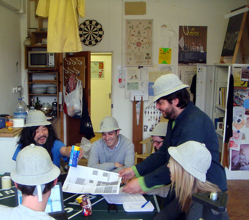
Åbäke, a collective of graphic designers who came up with the look and identity of the finished publication, alongside a team from the British Council ventured out to Milan to establish a temporary production studio for The Incidental, while S&W provided remote support from the UK, and the technology to harvest the twitter posts, blog mentions and flickr photos to be included in the edition, overlaid on the map to be produced overnight.

One thing that’s very interesting to us that is using this rapidly-produced thing then becomes a ’social object’: creating conversations, collecting scribbles, instigating adventures – which then get collected and redistributed.

As author/seer Warren Ellis points out, paper is ideal material for this:

“…cheap. Portable. Biodegradable/timebound/already rotting. Suggestion of a v0.9 object. More likely to be on a desk or in a pocket or bag or on a pub table than to be shelved. More likely to be passed around.”

The Incidental is feedback loop made out of paper and human interactions –  timebound, situated and circulating in a place.

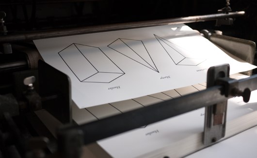
Here’s the first edition from the Wednesday of the event:

There’s some initial recommendations from the British Council team and friends, but the underlying abstracted map of Milan remains fairly unmolested.

Compare that to the last edition on Saturday, where the buzz of the event has folded back into the artifact:

blog-pic-2

The map now becomes something less functional – which it can probably afford, as you the visitor have internalised it – and becomes something more emotional or behavioural: a heat-map-like visualisation of where’s hot and what’s happened.

The buzz about TheIncidental during the event was clear from the twitterfeed, which itself was feeding the production.

We were clearly riffing on the work done by our friends at the RIG with their “Things our friends have written on the internet” and the thoughts of Chris Heathcote, Aaron and others who participated in Papercamp back in January.

Since then there’s been a flurry of paper/map/internet activity, including the release recently of the marvellous Walking-Papers project by Mike Migurski of the mighty Stamen, which we talked about briefly in The New Negroponte Switch.

As well as coverage from more design-oriented blogs such as PSFK and Dezeen, there was also some encouraging commentary from our peers – many of whom saw this as the first post-Papercamp project.

Ben Terrett of the RIG said:

“Over in Milan at the Salone di Mobile they’ve created a thing called The Incidental. It’s like a guide to the event but it’s user generated and a new one is printed every day. When I say user generated, I mean that literally. People grab the current day’s copy and scribble on it. So they annotate the map with their personal notes and recommendations. Each day the team collect the scribbled on ones, scan them in and print an amalgamated version out again. You have to see it, to get it. But it’s great to see someone doing something exciting with ‘almost instant’ printing and for a real event and a real client too.

The actual paper is beautiful and very exciting. It has a fabulous energy that has successfully migrated from the making of the thing to the actual thing. Which is also brilliant and rare.”

To quote the patron saint of S&W again, Warren Ellis said:

“This is a wonderful idea that could be transposed to other events.”

Aaron Straup-Cope of Flickr, and author of many thoughts on what he calls the Papernet said:

“they are both lovely manifestations of Rick Prelinger’s “abundant present” and a well-crafted history box, something that people can linger over and touch and share, for the shape of the event.”

Our neighbours in East London, and brand identity consultants Moving Brands said:

“What a great way to create international conversation and connecting the tangible with the digital.”

Russell Davies said:

“I love the way it gets past digital infatuation and analogue nostalgia. Digital stuff is used for what it’s good for; eradicating time and distance, sharing, all that. Analogue stuff is used for what it can do well; resilience, undestandability, encouraging simple, human contributions. It’s properly ‘post digital’, from a design team and a client who are fluent in the full range of media possibilities. Not just digital, not just print. It integrates media in the same way real people do; knowing what it’s like to send a twitter and knowing what it’s like to scribble a note on a beermat at 3 in the morning.”

All credit to the team who were in Milan. They worked some punishing hours producing the paper each day, partly due to the demanding nature of the event itself and of course the demanding nature of trying something completely new. Huge and hearty congratulations to them for pulling it off.

As we didn’t attend Salone, it was only recently when we got together with the British Council team to discuss what worked and what didn’t that we saw the finished artifacts.

blog-pic-1

It was fantastic to see and touch them. In that moment, it became obvious that their dual-role was as both service and souvenir.

Recent Posts

Popular Tags