The project we ran in the spring with the Goldsmiths Design BA course was not ‘live’ in the sense that there was a commercial client’s needs informing the project, but it was an approximation of the approach that we take in the studio when we are working with clients around new product generation and design consultancy.
It was also an evolution of a brief that we have run before at SVA in New York with Durrell Bishop – but with the luxury of having much more time to get into it.
Our brief was in two parts – representing techniques that we use in the early stages of projects.
The first half: “Death To Fiction” stems from our love for deconstructing technologies, particularly cheap everyday ones to find new opportunities.
It’s a direct influence from Durrell – and techniques he used while teaching Schulze, Joe Malia and others at the RCA – and also something that is very familiar to many craftspeople – having at least some knowledge of a lot of different materials and techniques that can then inform deeper investigation, or enable more confident leaps of invention later on in the process. It also owes a lot to our friend Matt Cottam‘s “What is a Switch?” brief that he’s run at RISD, Umea, CIID and Aho…
We asked the students to engage with everyday technology and manufactured, designed goods as if it were nature.
“The Anthropocene” has been proposed by ecologists, geologists and geographers to describe the epoch marked by the domination of human influence on the Earth’s systems – seams of plastic kettles and Tesco “Bags For Life” will be discovered in millions of years time by the distant ancestors of Tony Robinson’s Time Team.
There is no split between nature and technology in the anthropocene. So, we ask – what happens if you approach technology with the enthusiasm and curiosity of the amateur naturalist of old – the gentlemen and women who trotted the globe in the last few centuries with sturdy boots, travel trunks and butterfly nets – hunting, collecting, studying, dissecting, breeding and harnessing the nature around them?
The students did not disappoint.
Like latter-day Linneans, or a troop of post-digital Deptford Darwins – they headed off into New Cross and took the poundstretchers and discount DIY stores as their Galapagos.
After two weeks I returned to see what they had done and was blown-away.
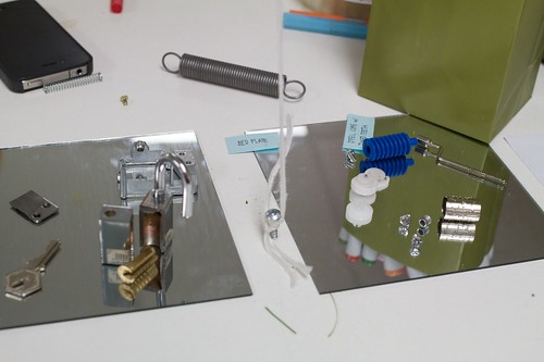
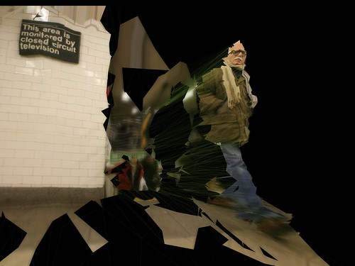
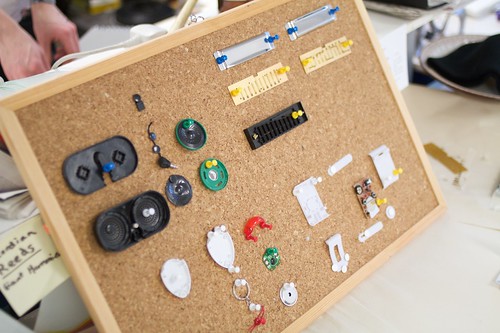
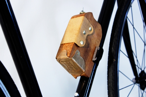
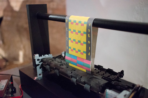
Chewing-gum, Alarm-clocks, key-finders, locks, etch-a-sketches, speakers, headphones, lighters, wind-up toys and more – had all been pulled-apart, scrutinised, labelled, diagrammed, tortured, tested, reconstructed…


And – perhaps most importantly I had the feeling they had not only been understood, but the invention around communicating what they had learnt displayed a confidence in this ‘new nature’ that I felt would really stand them in good stead for the next part of the project, and also future projects.
It was all great work, and lots of work – the smile didn’t leave my face for at least a week – but a few projects stood out for me.


Charlotte’s investigations of disposable cameras, Helen’s thought-provoking examination of pregnancy tests, Tom’s paper speakers (which he promised had worked!), Simon’s unholy pairings of pedometers and drills, Liboni and Adam’s thorough dissections of ultrasonic keyfinders and the brilliant effort to understand how quartz crystal regulate time by baking their own crystal, wiring it to a multimeter and whacking it with a hammer!

Hefin Jones’ deconstruction of the MagnaDoodle, and his (dramatic, hairdryer-centric) reconstruction of it’s workings was a particularly fine effort.
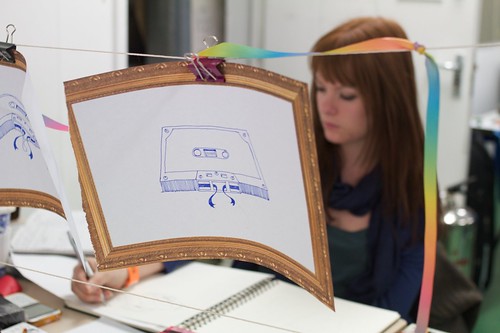
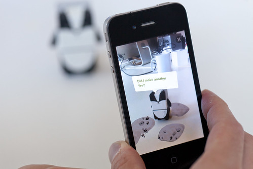
The second half of the brief asked the students to assess the insights and opportunities they had from their material exploration and begin to combine them, and place them in a product context – inventing new products, services, devices, rituals, experiences.
We’ve run this process with students before in a brief we call “Hopeful Monsters”, which begins with a kind of ‘exquisite corpse’ mixing and breeding of devices, affordances, capabilities, materials and contexts to spur invention.
We’d pinched that drawing technique way back in 2007 for Olinda from Matt Ward, head of the design course at Goldsmiths so it only seemed fitting that he would lead that activity in a workshop in the second phase of the brief.
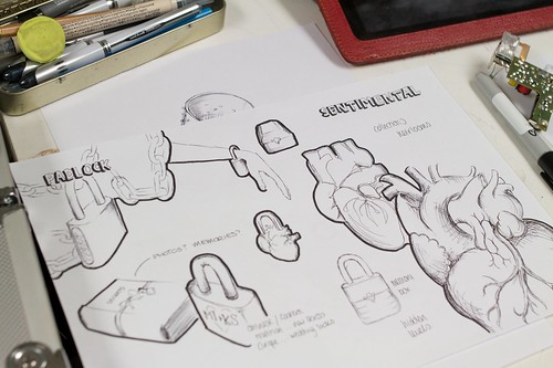
The students organised themselves in teams for this part of the brief, and produced some lovely varied work – what was particularly pleasing to me was that they appeared to remain nimble and experimental in this phase of the project, not seizing upon a big idea then dogmatically trying to build it, but allowing the process of making inform the way to achieve the goals they set themselves.

We closed the project with an afternoon of presentations at The Gopher Hole (thanks to Ossie and Beatrice for making that happen!) where the teams presented back their concepts. All the teams had documented their research for the project as they went online, and many opted to explain their inventions in short films.
Here’s a selection:
- http://roadsmata.wordpress.com/
- http://berg-ers.tumblr.com/
- http://printergame.tumblr.com/
- http://inventosaurs.tumblr.com
- http://Bergdesign.tumblr.com
A special mention to the ‘Roads Mata’ team, who for me really went the extra-mile in creating something that was believably-buildable and desirable – to the extent that I think my main feedback to them was they should get on KickStarter…
There were sparks of lovely invention throughout all the student groups – some teams had more trouble recognising them than others, but as Linus Pauling once said “To have a good idea you have to have a lot of ideas”, and that certainly wasn’t a problem.
I wonder what everyone would have come up with if we had a slightly longer second design phase to the project, or introduced a more constrained brief goal to design for. It might have enabled some of the teams to close in on something either through iteration or constraint.
Next time!
As it was I hope that the methods that the brief introduce stay with the group, and that the curiosity, energy and ability to think through making that they obviously all have grows in confidence and output through the coming years.
They will be a force to be reckoned with if so.


")