This website is now archived. To find out what BERG did next, go to www.bergcloud.com.

Blog posts tagged as 'media'

Swiping through cinema, touching through glass

The studio is continually interested in the beautiful and inventive stuff that can happen when you poke and prod around the edges of technology and culture. Mag+ emerged from a curiosity from both Bonnier and BERG about reading on tablets while Making Future Magic emerged from experiments with light painting and screens.

Early last year we were experimenting with product photography for a retail client pitch. We wondered how we could we use cinematic techniques to explore product imagery.

Watch the video of our experiments on Vimeo.

What would happen if instead of a single product image or a linear video, we could flick and drag our way through time and the optical qualities of lenses? What if we had control of the depth of field, focus, lighting, exposure, frame-rate or camera position through tap and swipe?

Swiping through cinema

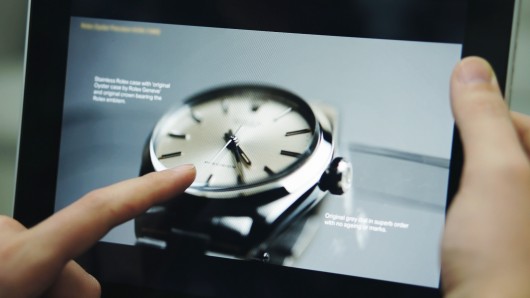
This is a beautiful 1960’s Rolex that we shot in video while pulling focus across the surface the watch. On the iPad, the focus is then under your control, the focal point changes to match your finger as it taps and swipes across the object. Your eye and finger are in the same place, you are in control of the locus of attention.

Jack originally explored focus navigation (with technical help by George Grinsted) in 2000, and now Lytro allow ‘tap to focus’ in pictures produced by the ‘light field camera‘.

The lovely thing here is that we can see all of the analogue, optical qualities such as the subtle shifts in perspective as the lens elements move, and the blooming, reflection and chromatic abberations that change under our fingertips. Having this optical, cinematic language under the fine control of our fingertips feels new, it’s a lovely, playful, explorative interaction.
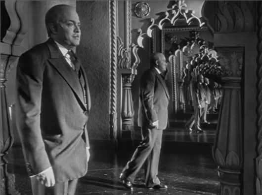
Orson Welles’ Deep Focus.

Cinematic language is a rich seam to explore, what if we could adjust the exposure to get a better view of highlights and shadows? Imagine this was diamond jewellery, and we could control the lighting in the room. Or to experiment with aperture, going from the deep focus of Citizen Kane, through to the extremely shallow focus used in Gomorrah, where the foreground is separated from the environment.
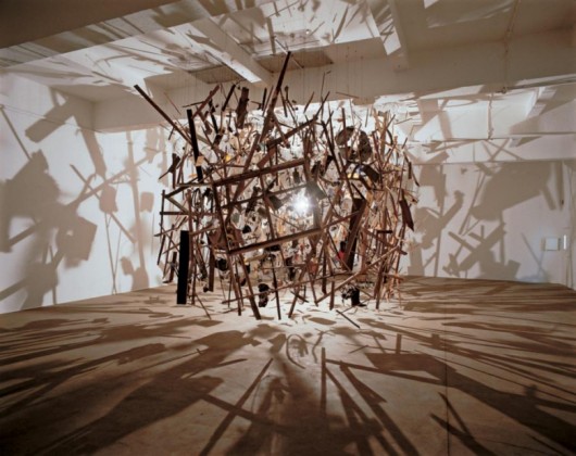
Cold Dark Matter by Cornelia Parker.

What if we dropped or exploded everyday objects under a super high-frame rate cinematography, and gave ourselves a way of swiping through the chaotic motion? Lots of interesting interactions to explore there.

Touching through glass

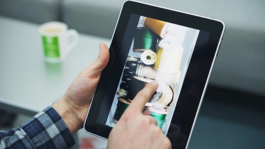
This next experiment really fascinated us. We shot a glass jar full of thread bobbins rotating in front of the camera, on the iPad you can swipe to explore these beautiful, intricate colourful objects.

There is a completely new dimension here, in that you are both looking at a glass jar and touching a cold glass surface. The effect is almost uncanny, a somewhat realistic sense of touch has been re-introduced into the cold, smooth iPad screen. We’re great fans of Bret Victor’s brilliant rant on the problems of the lack of tactility in ‘pictures under glass‘, and in a way this is a re-inforcement of that critique: tactility is achieved through an uncanny visual re-inforcement of touching cold glass. This one really needs to be in your hands to be fully experienced.

And it made us think, what if we did all product photography that was destined for iPads inside gorgeous Victorian bell jars?

Nick realised this as an App on a first-generation iPad:

Each of the scenes in the Swiping through Cinema app are made up of hundreds (and in some cases thousands) of individual images, each extracted from a piece of real-time HD video. It is the high speed manipulation of these images which creates one continuous experience, and has only become possible relatively recently.

During our time developing Mag+, we learnt a great deal about using images on tablets. With the first-generation iPad, you needed to pay careful attention to RAM use, as the system could kill your app for being excessively greedy, even after loading only a handful of photographs. We eventually created a method which would allow you to smoothly animate any number of full-screen images.

With that code in place, we moved onto establishing a workflow which would allow us to shoot footage and be able to preview it within the app in a matter of minutes. We also consciously avoided filling the screen with user interface elements, which means that the only interaction is direct manipulation of what you see on-screen.

With the Retina display on the third-generation iPad, we’re really excited by the prospect of being able to move through super crisp and detailed image sequences.

We’re really excited about re-invigorating photographic and cinematographic techniques for iPads and touchscreens, and finding out how to do new kinds of interactive product imagery in the process.
Suwappu app prototype – toys, stories, and augmented reality

You may remember Suwappu, our toy invention project with Dentsu — those woodland creatures that talk to one-another when you watch them through your phone camera. You can see the film – the design concept – here or (and now I’m showing off) in the New York at Moma, in the exhibition Talk to Me.

Here’s the next stage, a sneak peek at the internal app prototype:

Direct link: Suwappu app prototype video, on Vimeo.

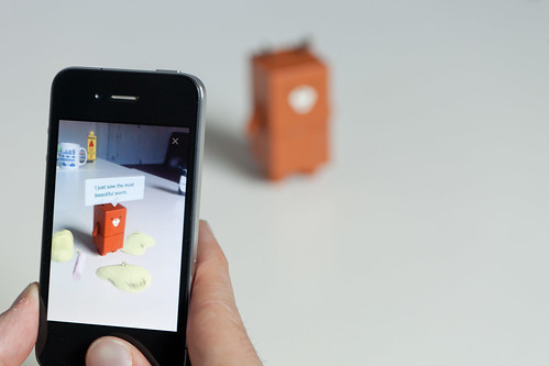
It’s an iPhone app which is a window to Suwappu, where you can see Deer and Badger talk as you play with them.

Behind the scenes, there’s some neat technology here. The camera recognises Deer and Badger just from what they look like — it’s a robot-readable world but there’s not a QR Code in sight. The camera picks up on the designs of the faces of the Suwappu creatures. Technically this is markerless augmented reality — it’s cutting-edge computer vision.

Suwappu-20111006-008

And what’s also neat is that the augmented reality is all in 3D: you suddenly see Deer as inside a new environment, one that moves around and behind the toy as your move the phone around. It’s all tabletop too, which is nicely personal. The tabletop is a fascinating place for user interfaces, alongside the room-side interfaces of Xbox Kinects and Nintendo Wiis, the intimate scale of mobiles, and the close desktop of the PC. Tabletop augmented reality is play-scale!

But what tickles us all most about Suwappu is the story-telling.

Seeing the two characters chatting, and referencing a just-out-of-camera event, is so provocative. It makes me wonder what could be done with this story-telling. Could there be a new story every week, some kind of drama occurring between the toys? Or maybe Badger gets to know you, and you interact on Facebook too. How about one day Deer mentions a new character, and a couple of weeks later you see it pop up on TV or in the shops.

The system that it would all require is intriguing: what does a script look like, when you’re authoring a story for five or six woodland creatures, and one or two human kids who are part of the action? How do we deliver the story to the phone? What stories work best? This app scratches the surface of that, and I know these are the avenues the folks at Dentsu are looking forward to exploring in the future. It feels like inventing a new media channel.

Suwappu is magical because it’s so alive, and it fizzes with promise. Back in the 1980s, I played with Transformers toys, and in my imagination I thought about the stories in the Transformers TV cartoon. And when I watched the cartoon, I was all the more engaged for having had the actual Transformers toys in my hands. With Suwappu, the stories and the toys are happening in the same place at the same time, right in my hands and right in-front of you.

Here are some more pics.

Suwappu-20111006-001

The app icon.

Suwappu-20111006-002

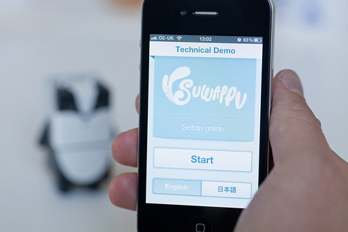
Starting the tech demo. You can switch between English and Japanese.

Suwappu-20111006-004

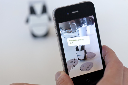
Badger saying “Did I make another fire?” (Badger has poor control over his laser eyes!)

Suwappu-20111006-009

Deer retweeting Badger, and adding “Oh dear.” I love the gentle way the characters interact.

You can’t download the iPhone app — this is an internal-only prototype for Dentsu to test the experience and test the technology. We’re grateful to them for being so open, and for creating and sharing Suwappu.

Thanks to all our friends at Dentsu (the original introduction has detailed credits), the team here at BERG, and thanks especially to Zappar, whose technology and smarts in augmented reality and computer vision has brought Suwappu to life.

Read more about the Suwappu app prototype on Dentsu London’s blog, which also discusses some future commercial directions for Suwappu.

Designing media?

So we made a film with Dentsu London called Making Future Magic: light painting with the iPad. “Making Future Magic” is Dentsu London’s big creative statement.

The film was crazy popular, a million views in 2 weeks, and played out on national TV.

It showed a novel technique mixing light painting and stop animation. And it’s beautiful to watch!

More than the film…

If you’re a fan, you can get the music from iTunes (and read the liner notes).

Or you can buy the print-on-demand book, which collects the best still images, and adds behind-the-scenes photos.

Now if you want to get involved, meet Penki! Penki is an iPhone app to help you create the same light painting you saw in the film. There’s a Penki Flickr group so you can share photos. Or you can use it in your personal projects.

Beyond these, there are two other films: Media Surfaces: Incidental Media and Media Surfaces: the Journey. Where the light painting film communicates a brand through technique and aesthetics, these are video sketches that put forward concepts as discussion points.

And there’s been a lot of really good discussion.

What’s going on here?

A communication film. Music and a book for fans to purchase. An iPhone app to do it yourself, and a place to socialise. Two video sketches, and a broad discussion.

What I think we’re doing is designing media.

It’s not like the old days where you just had TV or radio or newspaper, and you were stuck in a “broadcast” world or a “visual” world or whatever.

Now every element of this Making Future Magic project contributes to a brand space which has been designed to be a beautiful spectacle but also inviting to fans and people who want to join in, with a sprinkling of conversation starter.

Instead of thinking about a film, what we’re really thinking about is the relationship between Dentsu London and its audience/friends/coinhabitants-of-the-world!

And given that relationship, we consider what artefacts can we drop in and what media we can use to build the relationship, create a conduit for conversation, and demonstrate Dentsu London’s very particular brand of Making Future Magic.

We create content and create media all at once.

Mix and match! It feels like cooking up a potion. Designing media.

Media Surfaces: Incidental Media

Following iPad light painting, we’ve made two films of alternative futures for media. These continue our collaboration with Dentsu London and Timo Arnall. We look at the near future, a universe next door in which media travels freely onto surfaces in everyday life. A world of media that speaks more often, and more quietly.

Incidental Media is the first of two films.

The other film can be seen here.

Each of the ideas in the film treat the surface as a focus, rather than the channel or the content delivered. Here, media includes messages from friends and social services, like foursquare or Twitter, and also more functional messages from companies or services like banks or airlines alongside large traditional big ‘M’ Media (like broadcast or news publishing).

All surfaces have access to connectivity. All surfaces are displays responsive to people, context, and timing. If any surface could show anything, would the loudest or the most polite win? Surfaces which show the smartest most relevant material in any given context will be the most warmly received.

Unbelievably efficient

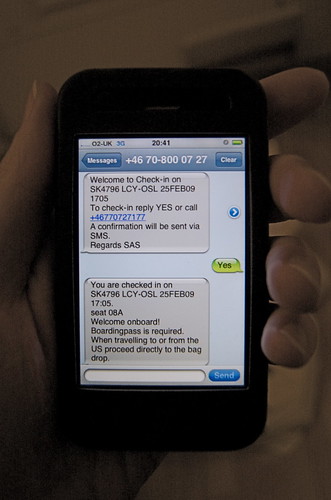
I recently encountered this mixing in surfaces. An airline computer spoke to me through SMS. This space is normally reserved for awkwardly typed highly personal messages from friends. Not a conversational interface with a computer. But now, those pixels no longer differentiate between friends, companies and services.

Mixing Media

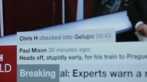
How would it feel if the news ticker we see as a common theme in broadcast news programmes begun to contain news from services or social media?

Media Surfaces mixed media

I like the look of it. The dominance of linear channel based screens is distorted as it shares unpredictable pixels and a graphic language with other services and systems.

Ambient listening

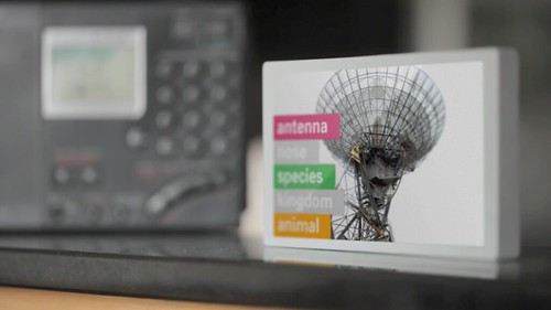
This screen listens to its environment and runs an image search against some of the words it hears. I’ve long wanted to see what happens if the subtitles feed from BBC television broadcast content was tied to an image search.

Media Surfaces ambient listening

It feels quite strange to have a machine ambiently listening to words uttered even if the result is private and relatively anodyne. Maybe it’s a bit creepy.

Print can be quick

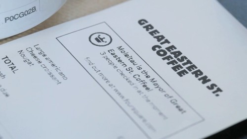
This sequence shows a common receipt from a coffee shop and explores what happens when we treat print as a highly flexible, context-sensitive, connected surface, and super quick by contrast to say video in broadcast.

Media Surfaces print can be quick 01

The receipt includes a mayorship notification from foursquare and three breaking headlines from the Guardian news feed. It turns the world of ticket machines, cash registers and chip-and-pin machines into a massive super-local, personalised system of print-on-demand machines. The receipt remains as insignificant and peripheral as it always has, unless you choose to read it.

Computer vision

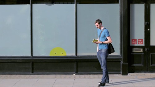
The large shop front shows a pair of sprites who lurk at the edges of the window frames. As pedestrians pass by or stand close, the pair steal colours from their clothes. The sketch assumes a camera to read passers-by and feed back their colour and position to the display.

Media Surfaces computer vision 01

Computer vision installations present interesting opportunities. Many installations demand high levels of attention or participation. These can often be witty and poetic, as shown here by Matt Jones in a point of sale around Lego.

We’ve drawn from great work from the likes of Chris O’Shea and his Hand from Above project to sketch something peripheral and ignorable, but still at scale. The installation could be played with by those having their colours stolen, but it doesn’t demand interaction. In fact I suspect it would succeed far more effectively for those viewing from afar with no agency over the system at all.

In contrast to a Minority Report future of aggressive messages competing for a conspicuously finite attention, these sketches show a landscape of ignorable surfaces capitalising on their context, timing and your history to quietly play and present in the corners of our lives.

Incidental Media is brought to you by Dentsu London and BERG. Beeker has written about the films here.

Thank you to Beeker Northam (Dentsu London), and Timo Arnall, Campbell Orme, Matt Brown, and Matt Jones!

Friday Links: Screens In The World

For this Friday, a selection of links from around the studio about screens-in-the-world.

This video is the output of the TAT Open Innovation project – an exploration of the future of screen technology. Of course, more than ever, “screen” is becoming interchangeable with “device”, as this video explores the actions and interactions made possible by new kinds of device, both mobile and static.

And here’s Freescale Semiconductor’s vision of a screen-driven future. Smart mirrors and see-through tablets are increasingly popular tropes of the future right now.

iron-man-coffee-table.jpg

iron-man-pda.jpg

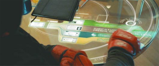
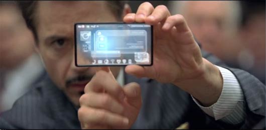
Two more examples of transparent screens – one portable, one embedded in the environment – from Perception’s work on the visual effects for Iron Man 2. Such tropes aren’t just limited to concept videos; they’re also a part of popular culture.

Chris O’Shea’s Hand From Above makes a playful use of giant, public screens. These screens are so often passive, broadcasting devices. It’s strange and jarring – in an exciting way – to see them interacting with us. It’s like they can see.

Keiichi Matsuda’s Domestic Robocop envisages an augmented-reality future where the augmentation outweighs the reality. Practically every surface in Matsuda’s imagined kitchen has the capacity to become a screen – most of which end up displaying advertising, generating income for the homeowner.

There’s an overlap I’m beginning to see here: between “screens everywhere“, and “everything being a screen” and what we’re currently calling augmented reality. Thinking on that, I can’t help but return to this lovely video from our friend and collaborator Timo Arnall. It doesn’t matter how the map appears on the street. For the woman on the bench, the ground in front of her is the most sensible place for the map to appear. Large pieces of information can make good use of large spaces. Why not, then, make the “screen” as big as possible, and use the environment itself?

Recent Posts

Popular Tags