This website is now archived. To find out what BERG did next, go to www.bergcloud.com.

Blog posts tagged as 'lightpainting'

Friday Links: Music for Shuffle, Light Painting, Hand-Waving, and Ken Garland

Music for Shuffle

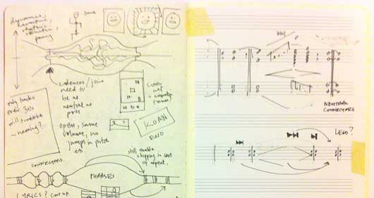
Matt B wrote about Music For Shuffle this week: a single composition made out of many audio files, designed to be played in random orders on any devices. And, of course, when I say “wrote about”, I also mean composed. You should go and listen to it right now!

Matt explained more:

I set myself a half-day project to write music specifically for shuffle mode – making use of randomness to try and make something more than the sum of its parts. The ever-brilliant Russell Davies (who works a few desks away at the BRIG) sowed the seed of the idea in my head around January 2011.

Over an hour or so, I wrote a series of short, interlocking phrases (each formatted as an individual MP3) that can be played in any order and still (sort of) make musical sense.

Brilliant. Matt’s notes on influences and the process behind the composition make for great reading: as ever, there’s a lot of thought and insight there, expressed succinctly, and lots of nice jumping-off points within his notes.

Timo pointed out this video of “procedural lightpainting”. The video explains the process very nicely: an animation, played out on a projector, keyed against the distance of a piece of paper from the projector. When you leave a camera-shutter open long enough, it captures a three-dimensional light-painting. The Flickr group of the results is marvellous, with examples including detailed graphs and more abstract – but no less beautiful – imagery.

Another form of light-painting, this time from Daito Manabe. By firing a laser at a wall coated in fluorescent paint, an image appears. As subsequent “passes” of the laser describe element closer to the foreground of the image, those areas of the wall are “activated” again and stay brighter; the elements towards the rear of the image stay darker. It takes a while to process what’s happening when you first see it, but the moment it all clicks into place feels great.

Chris Harrison’s Abracadabra is a prototype interface for very small devices. What might a rich interface for a device too small for a touchscreen look like? Harrison’s interface is based upon magnets: a tiny magnet on the fingertip, detected by a two-axis magnetometer in the device – providing enough sensitivity to track movements in a horizontal plane, as well as a “clicking” action in the z-axis. Extending the space of physical interaction outside the device makes a lot of sense, and it’ll be interesting to see where this kind of interface goes in the next few years.
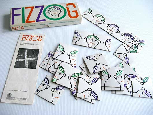
Fizzogs

picture by Pour toujours…

Fizzogs popped up on the studio mailing list last week, and there followed a brief reminiscence for Ken Garland’s work for Galt Toys, which included the marvellous Connect. Matt J bought his copy in; even the box is gorgeous:
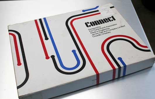
Connect

Simple, well designed games, with lovely graphic design and colours, that still manage – very much – to be toys to be played with.

Finally, some nice writing and thinking from Ben Bashford about the personalities of smart products. Keen to avoid what he describes as Reality Clippy, Ben considers all the places that an object with personality might jar with its behaviour in the world:

Unless the behaviours and personalities of these things that compute are designed well enough the things that are not so good about them or unavoidable have the potential to come across as flaws in the object’s character, break the suspension of disbelief and do more harm than good. Running out of batteries, needing a part to be replaced or the system crashing could be seen as getting sick, dying – or worse – the whole thing could be so ridiculous and annoying that it gets thrown out on its ear before long.

There’s lots of other nice points in here; too many to quote. Notably, I liked the idea of considering what an object’s Attract Mode might be; similarly, using role-playing/method-acting/improv as sources of experience in designing subtle experiences. Good stuff.
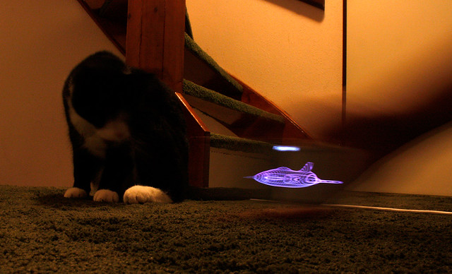
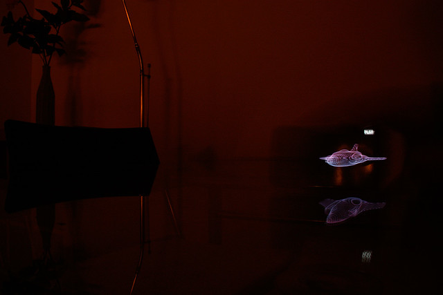
Light Painting with an HTC Desire

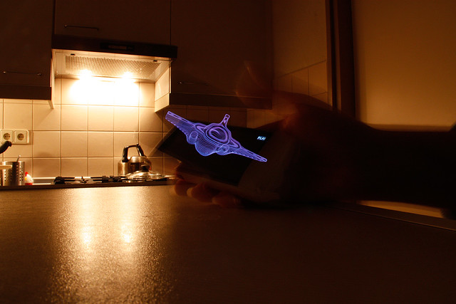
Janine Pauke has been emulating the light-painting technique we used in Making Future Magic. Instead of an iPad, she’s been using her mobile phone, and slicing her own 3D models up.

We found her pictures on Flickr yesterday and were delighted.

Her results are just lovely. A small, neon spaceship flies through a house; the otherworldly glow of the phone’s screen is juxtaposed with the warm tungsten bulbs of the everyday world.

And, of course, by painting in the world, you capture all the details of the world in the background. A bemused cat by the stairs; the bright lights above a stove; a blurry arm, dragging the phone through the air.

It’s great to see someone else using the technique so effectively. Beautiful pictures, Janine!

All photographs © Janine Pauke.

Making Future Magic: light painting with the iPad

“Making Future Magic” is the goal of Dentsu London, the creative communications agency. We made this film with them to explore this statement.

(Click through to Vimeo to watch in HD!)

We’re working with Beeker Northam at Dentsu, using their strategy to explore how the media landscape is changing. From Beeker’s correspondence with us during development:

“…what might a magical version of the future of media look like?”

and

…we [Dentsu] are interested in the future, but not so much in science fiction – more in possible or invisible magic

We have chosen to interpret that brief by exploring how surfaces and screens look and work in the world. We’re finding playful uses for the increasingly ubiquitous ‘glowing rectangles’ that inhabit the world.

iPad light painting with painter

This film is a literal, aesthetic interpretation of those ideas. We like typography in the world, we like inventing new techniques for making media, we want to explore characters and movement, we like light painting, we like photography and cinematography as methods to explore and represent the physical world of stuff.

We made this film with the brilliant Timo Arnall (who we’ve worked with extensively on the Touch project) and videographer extraordinaire Campbell Orme. Our very own Matt Brown composed the music.

Light painting meets stop-motion

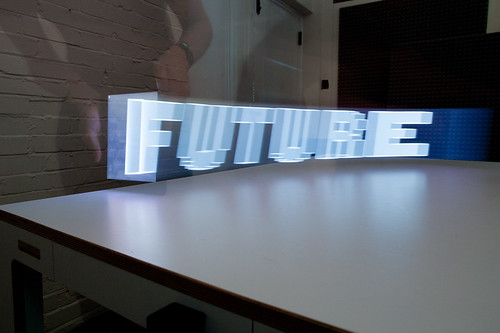
We developed a specific photographic technique for this film. Through long exposures we record an iPad moving through space to make three-dimensional forms in light.

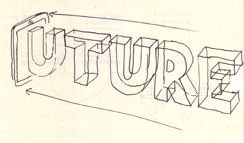
First we create software models of three-dimensional typography, objects and animations. We render cross sections of these models, like a virtual CAT scan, making a series of outlines of slices of each form. We play these back on the surface of the iPad as movies, and drag the iPad through the air to extrude shapes captured in long exposure photographs. Each 3D form is itself a single frame of a 3D animation, so each long exposure still is only a single image in a composite stop frame animation.

Each frame is a long exposure photograph of 3-6 seconds. 5,500 photographs were taken. Only half of these were used for the animations seen in the final edit of the film.

There are lots of photographic experiments and stills in the Flickr stream.

Future reflection

light painting the city with Matt Jones

The light appears to boil since there are small deviations in the path of the iPad between shots. In some shots the light shapes appear suspended in a kind of aerogel. This is produced by the black areas of the iPad screen which aren’t entirely dark, and affected by the balance between exposure, the speed of the movies and screen angle.

We’ve compiled the best stills from the film into a print-on-demand Making Future Magic book which you can buy for £32.95/$59.20. (Or get the softcover for £24.95/$44.20.)

Friday Links: Light painting

This Friday: a collection of links from the studio mailing-list, all about light painting.

kalaam-530.jpg

Image: Poésie by kaalam on Flickr

Julian Breton’s work as Kaalam has already featured on the blog but it’s too beautiful not to include again in today’s collection of links. Influenced by Arabic script, he paints delicate, abstract calligraphy into his photographs as they are being exposed. There’s more on his Flickr profile and his website.

evensong.jpg

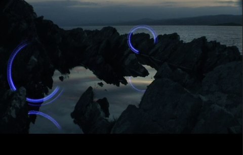
Sophie Clements’ stunning film Evensong films a series of moving light-patterns in Argyll. Mounted on rigs such as spinning wheels, there’s a magic in the way the lights interact with their environment: dancing around poles, reflecting in pools. It’s striking to see light painting such as this in moving, rather than still images.

lightdraw.jpg

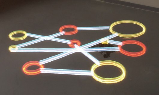
Nils Völker has been buildling a robot for created coloured light drawings. Once the pattern is programmed into it, it trundles around the floor, turning its light on and off as necessary, tracing the pattern whilst a camera takes a long exposure. Whilst not as pretty as Kaalam’s work, there’s something interesting in automating this kind of work. It’s also strange to see this machine at work, as this video testifies: whilst it works, you can’t really see what it’s doing. It only makes sense when viewed as a long-exposure.

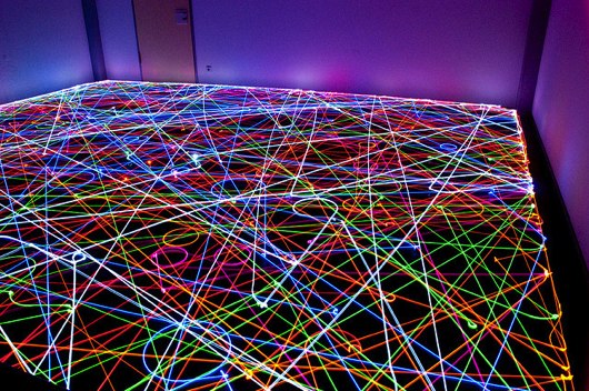
seven-roombas-1.jpg

Photo: IBR Roomba Swarm in the Dark IV by IBRoomba

Völker’s robot drew the patterns it was told to. But light painting techniques can also reveal the behaviours of smarter robots. The above picture comes from the Roomba Art group on Flickr – where people upload long exposures of their automated vacuum cleaners having attached lights to them. This image shows seven Roombas – each with a different colour LED – working all at once; you can see their starting points in the middle of the room, and the odd collision. It’s a very pretty remnant of robots at work. The rest of the pool is great, too.

caleb-charland.jpg

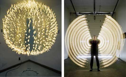
Photos: Light Sphere with Right Arm and Cigarette Lighter and Arcs with Arms and Candles by Caleb Charland

Caleb Charland’s images take a variety of approaches to light painting. Some are multiple exposures; some are long-duration, single exposures. Some are very much about the artist’s presence in the image (albeit in ghostly ways); in others, the artist is largely absent. They’re all lovely, though; I particular like his use of naked flames in his images.

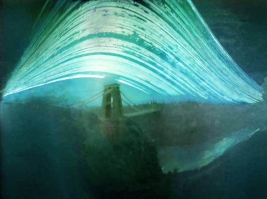
sun-over-clifton.jpg

Justin Quinnell’s six-month exposure of the Clifton Suspension Bridge could be described as light painting using the sun. The duration of the exposure allows you to see the sun’s transit shift with the seasons. Justin has more long-exposure pinhole photography at his website.

Friday links: drawing with light, AR in the Alps, and making music

Some links from around the studio for a Friday afternoon. Firstly, a video:

Graffiti Analysis 2.0: Digital Blackbook from Evan Roth on Vimeo.

Evan Roth’s “Graffiti Analysis 2.0″. Roth is trying to build a “digital blackbook” to capture graffiti tags in code. He’s started with an ingenious – and straightforward – setup for motion capturing tags: a torch taped to a pen, the motion of which is tracked by a webcam. The data is all recorded in an XML dialect that Roth designed – the Graffiti Markup Language – which captures not only strokes but also rates of flow, the location of the tag, and even the orientation of the drawing tool at start; clearly, it’s designed with future developments – a motion-sensing spraycan, perhaps – in mind.

But that’s all by the by: I liked the video because it was simple, ingenious, and Roth’s rendering of the motion data – mapping time to a Z-axis, dousing the act of tagging in particle effects – is really quite beautiful.

kalaam-530.jpg

Image: Poésie by kaalam on Flickr

I showed it to Matt W, and he showed me the light paintings of Julien Breton, aka Kaalam (whose own site is here). Breton’s work is influenced by Arabic script and designs, and the precision involved is remarkable – so often light-painting is vague or messy, but there’s a remarkable cleanliness and precision to Breton’s work. Also, as the image above demonstrates, he makes excellent use of both depth and the environment he “paints” within. If you’re interested, there’s a great interview with Breton here.

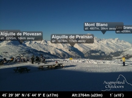
Image: Mont Blanc with “Peaks” by Nick Ludlum on Flickr

Nick’s off skiing this week, but he posted this screengrab from his iPhone to Flickr, and it’s a really effective implementation of AR. It’s an app called Peaks that simply displays labels above visible mountain-tops. It’s a great implementation because the objects being augmented are so big, and so far away, that the jittery display you so often get from little objects, nearby, just isn’t a problem. A handful of peaks, neatly labelled, and not a ropey marker in site.

And finally: Matt B’s Otamatone arrived. It’s delightful. A musical toy that sounds and works much like a Stylophone: you press a contact-sensitive strip that maps to pitch, but it’s the rubber mouth of the character – that adds filtering and volume just like opening and closing your own mouth – that brings the whole thing to life. You can’t see someone playing with it and not laugh!

It’s a product by Maywa Denki, an artist makes musical toys and sells them as products; previous musical toys include the Knockman Family, all of which are worth your time watching as much of you can on Youtube.

And if you get your own Otamatone, and practice really hard, maybe you could play with some friends:

Recent Posts

Popular Tags