This website is now archived. To find out what BERG did next, go to www.bergcloud.com.

Blog (page 52)

Infinite Zoom into Milk

In 1977 Charles and Ray Eames made a documentary film called Powers of Ten. The second half of the film includes a slow zoom into a man’s hand, right the way through cells and molecules all the way down to an atomic structure. It’s extraordinarily engaging, beginning at a familiar human context, and visualising something desperately distant and unknowable.

About a year ago James King brought a book to my attention from a series called Analysis of the Massproduct Design by Japanese product designer Taku Sato.

Analysis of the Massproduct Design is just like the Eames Powers of Ten video but for everyday products.

Taku Sato book covers

Each book takes a manufactured product and breaks down the content, graphics, construction and packaging page by page. The books are like infinite zooms into fabrication and history.

There are four, in turn looking at Xylitol Lime Mint chewing gum, a Fujifilm disposable camera, ‘Licca the fashion dress up doll by Takara Co.’ and a litre of milk from the Meiji Dairies Corporation. The blurb reads:

…we will take up and focus on one mass-produced product seen everywhere in our daily life without special attention paid to and from the point of view of design we try to take a closer look at and analytically examine it to find what kinds of ideas, efforts, ingenuities have been put in to it.

Each book begins with an overview and in some cases a history. This is from the book on the Fujifilm disposable camera.

Fujifilm overview

As the book progresses, spreads examine the product in greater and greater detail. Near the end of the Fujifilm book, there’s a photographic one micrometer cross section of the film stock.

fujifilm book film detail

One of my favourites spreads is from the book examining Xylitol chewing gum and is titled ‘The Feeling on the Teeth When Chewed.’ It’s about the material qualities of tablets versus sticks of gum. A quote:

The firmness of a chewing gum changes gradually with the passing of the time of its being chewed. In order to make this change of the chewing feeling close to an ideal one, the elements that should make up of the chewing gum are controlled… The figure shows the strength of the chewing exerted in the mouth measured with an analyzing device called RheoMeter. These graphs will tell you how different the chewing feelings are between ordinary sheet-type chewing gum and sugar coated chewing gum.

An ideal chewing feeling! A RheoMeter! They’ve got a machine for testing the chewiness of gum.

chewiness spread

I think Taku Sato actually designed the packaging for the milk carton he analyses. One of the spreads shows what each of the indents on the base of the cartons are for. Ambiguity in the translation adds to the mystery in some cases:

…(image a) is a little dented. This is for securing the stability of the carton when placed straight on a table… The number (image c) is the filling machine’s column index. The embossed information works for cause of the trouble to be clarified when it happens.

Taku Sato milk base

The books feel like imaginary manuals. They offer the seductive illusion that with this book the object can be completely known, all secrets unravelled. They somehow imply that if all was lost, objects like these could be reconstructed with this knowledge alone.

A while back I came across the term ‘Spime’ in Bruce Sterling‘s book Shaping Things. He uses the word to characterise smart objects which talk about their histories, how they were made, where they were sourced, where they’ve been, etc. Spimes might be a cars which announce their locations, or a packaged beef steak which shows the cow it comes from and where that cow was raised.

Sato’s books are raw Spime porn. Objects showing off their shiny interiors, construction and their ancestors. The celebrity biographies of mass produced objects.

Adaptive interfaces

A little while back, I wrote a post titled Widgets, widgets, everywhere in which I suggested all consumer electronics should be thought of as platforms that could run applications created and shared by users. In particular,

If I was a pro-am photographer on a month-long safari shoot, I could grab a custom camera interface from the Web, set up to provide easy-access presets to the light and movement conditions I’d face. I’d repurpose a couple of the external buttons to twiddle parameters in the presets, and have a perfect wildlife interface for four weeks. At home, I’d revert to the general purpose interface or get another one.

This came out of a general idea about Generation C and products and continues like this: Gen C are into co-creation, but they’re also highly capable… so if your product doesn’t allow them to get involved, they’ll do it themselves regardless.

Well, here’s exactly what I was talking about:

DSLR + Nintendo DS

Steven Chapman has created a way to control his DSLR camera with a custom interface on his Nintendo DS. It involves custom cables, custom DS software, a whole lot of smartness, and it saves him time. (Plus it’s playful: there’s a sound trigger thrown in there, just for kicks.)

This is the killer bit:

Where the Canon 5D can do a bracket of three shots, spread two stops apart, and the latest 1DS MKIII series can do a nine shot bracket, the “DS-DSLR” can do any number of shots, and if I don’t like the way it does it, I can rewrite the software to do it better.

And he’s selling the kit.

The power of adaptation. Imagine Canon had meant for this to happen. Imagine they had an App Store to allow people to share and to build businesses around this kind of activity.

Users are in a better position than designers to discover better products and experiences and, increasingly, better positioned to create them too. (Of course the best situation is that designers are also users… which is surprisingly often not the case.) Adaptive design is not just an approach but an opportunity.

Thanks Tom Armitage for the link.

OFF=ON, or, Whatever happened to Availabot?

My favourite trend spotters, trendwatching.com, just put out their monthly newsletter. (These are the folks who identified Generation C a couple years back, which let us finally express how the type of people you get on the Web are actually part of a much larger movement. Gen C comes up in the first few slides of most of our strategy work.)

This month’s trend is OFF=ON:

More and more, the offline world (a.k.a. the real world, meatspace or atom-arena) is adjusting to and mirroring the increasingly dominant online world, from tone of voice to product development to business processes to customer relationships.

Right on.

In the briefing, one of their example products is Availabot. Yes, that old thing. (Here’s a video of Availabot in action.) This is what they said:

Availabot is a golden oldie (it’s an ancient two years old!!), offering a physical representation of presence in instant messenger applications, which means Availabot plugs into your computer by USB, stands to attention when your chat buddy comes online, and falls down when they go away. Brilliant, and somehow very ON=OFF. But it apparently got stuck in concept mode. So could someone please bring this to market? (Just the waves of PR should make it worth the effort.)

It’s so true! Somebody should!

Okay, we should. And we’re going to. Oh, I’ve never said that in public before have I? There’s always a first time: yes, Availabot will make it to market.

Now seems as good a time as any to let you know what happened and what’s happening…

availabot-original-figure.jpg

Ancient history

Way back in the mists of time (that is, 2006), Jack Schulze presented Availabot at the RCA show and picked up his MA. Schulze & Webb had just started, as a design studio and consultancy, and our first project was to make 100 prototypes and see where it took us.

So we made a bunch and put them in a shop, as demonstration models:

availabot-original-shop.jpg

But developing a product is expensive, and starting a consultancy takes a lot of biz dev and effect, so when [insert name of Very Large Toy Company here] saw Availabot, got excited and offered to buy an option, we happily accepted. It was supposed to be for 12 weeks. It dragged on for over a year… and then the option didn’t go anywhere. Ah.

A lot happened in the meantime!

  • Availabot focus-grouped successfully. We know the best target market and how many they’d buy (and for how much).
  • We learned the relative importance of customisation versus basic features and price (customisation is less important than we believed, and we’ve designed a way to inexpensively hit the mark).
  • We had a patent application published: 2008/0122647.
  • We figured out the ancillary businesses.

Oh, and we built a successful design studio (with projects such as Olinda), and a consultancy with clients including Nokia, BBC, Blyk, Ofcom and more, with a great network of designers and a newly established advisory group (and more of that in another post).

But when the option expired, we’d had enough of foot-dragging by [yes, that same Very Large Toy Company again] and we didn’t renew. Time passed… during which time we found new partners, and a new angle.

Going it alone

We recognise the growing Generation C (creation, social, connected people), and believe that the key future way to sell many modern, complex products, media and services is as physical things. It’s impossible to operate like this and not have a knowledge of China. And of course, we still wanted to take Availabot to market.

So we decided to treat Availabot as a world probe: it was decided that we would take Availabot through to the position of being factory ready, and in the process learn as much as possible about the processes of manufacture, and how to develop these kind of complex products with so many moving parts. (Availabot is unusual in that it requires mechanics, embedded electronics, desktop software which knits together lots of other bits of desktop software, and network features.)

And once factory ready prototypes were on the table, we would either go to market ourselves, or partner for either distribution or acquisition plus royalties. The economics of these models are sound.

Which brings us to the present day.

availabot-prototype-desk.jpg

Availabot today

Availabot is almost ready.

What you see above is a couple months old: a test model based on the original model, running on new circuitry with a novel mechanism that is as cheap as we can make it. We’ve been working hard with our electronics and manufacturing partner in Hong Kong to make this reliable, and to give it an open hardware API (over USB), which will of course be published.

The puppet in the picture is a placeholder. The new character development is almost complete. It looks pretty different, and I’m not going to show you photos of that, except to mention that although the customisation is toned down, we’ve come up with some exciting directions. Once the prototypes are finished, they’ll be attached to the newly improved motor and we’ll work on the liveliness of the movements. This is with our London partner and, though them, with visualisers and model makers working with our designs.

The team in Russia and Ukraine, working on the software, are a couple weeks away from finishing the second rev of the desktop software. Visually it’s pretty basic – the polished look comes when we go to market – but functionally it’s all there (there’s a plug-in API so third parties can hook Availabot up to all kinds of presence sources), and exactly what we need to demo the puppet round toy fairs.

And we have subsequent versions and associated businesses mapped out.

So what does factory ready mean?

Factory ready means when we decide to go to market, or we find a partner we’re happy with, there’s a direct path from here to mass production without any re-engineering. Bish bash bosh, in the shops.

availabot-prototype-figure.jpg

Too long; didn’t read

Yeah okay, that was a lengthy story.

Here’s the summary:

  • Availabot was stuck in a confidential options process with [Huge Toy Company] for ages. The work and market research was positive, but we didn’t renew. It’s a shame it didn’t work out.
  • We’re working with partners and companies in London, Hong Kong and Russia to do character development (retaining some level of customisation), the mechanism, electronics, and embedded and desktop software. Future product directions are mapped out.
  • Availabot is a very short way from being factory ready, at which point we’ll start showing the short run of prototypes to prospective partners and decide whether to go to market ourselves or let someone else take it on.
  • We’re not ready to talk to partners until we have a twitchy bit of plastic on the table you can handle. But if you’re big enough, maybe it’s a good time to speak. Big means talking about taking over distribution and marketing globally, and working with us on a standard toy inventor and royalties basis (so I guess I’m talking Spin Master and up). If you’re talking about distribution or sales and you need a boxed product, or white labelling the technology, we’re not in a position to talk to you for a little while yet, sorry.

To be continued…

After so long having to keep quiet, it’s a relief to finally speak publicly. More news soon!

And of course, if you’d like help figuring out your OFF=ON product strategy, need design investigations or prototypes to reach an increasingly social and creative Generation C in the product, Web, mobile, media or services spaces, or can see another way our approach and skills can help your company, get in touch. S&W is over here, where technology is about people first.

How the physical form of Olinda evolved

Since the final form of Olinda is out in the world, I had a dig in the archive – and the studio – this morning and found some of the physical visualisations from along the way. It was fun to look back and see a classic case of thinking through making.

I know Jack will be posting design notes in the coming weeks. For the moment, this is all about the pictures.

From the original proposal

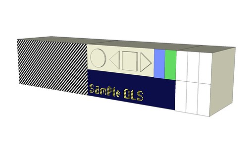
This isn’t physical, but it’s a good place to start: the image is from our proposal document, before any feasibility work. When that begun, we went back to the drawing board and explored other designs: Jack talked before about drawing Olinda as exploration.

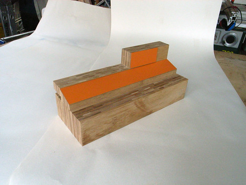
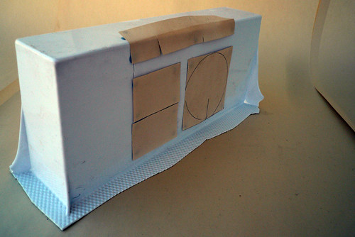
The earliest workshop model I can find, use for experimenting with orientation and interface elements

Our original intention was to use bamboo ply and formica to make the radio. We’d come to sloped forward-facing surface of the model by imagining it attempting to look towards you (instead of being on a vertical plane and forcing you to crouch down). It’s a small gesture towards meeting the user half way, and its echoes remain in the final piece.

Another retained element is that the buttons and dials encourage force downwards through the radio into the shelf or table. That means you don’t have to support the radio with one hand while you push a button on its front with the other.

One of many forms made from a collection of wooden blocks

Wood form explorations continued, aided by Jeff Easter, who was working with us on this part of the project.

Again, you can see more mock-ups of these in Jack’s drawing post.

plastic-shell

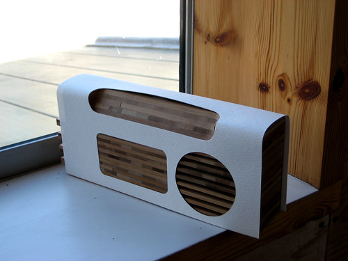
Here the wood now incorporates a plastic shell (as mocked-up with card).

As we got more into the communications purposes of the project, we realised that the ultimate intention was to demonstrate that a social and Web-like experience was possible in consumer electronics, and in particular DAB radio. But to show this, to people in the industry and at the BBC, Olinda would have to draw more from product processes and aesthetics.

Given the conversation needed to be about particular features and not distracted by a total change in design, this meant the form became more traditional… which in turn led away from wood which, for structural integrity and precision reasons, couldn’t give us the form we needed. It was worth seeing whether we could hang onto some wooden elements.

A brief experiment with vacuum forming, and with carefully worked out proportions

Meanwhile the component sizes – speakers, screens, PCBs and so on – were becoming known. There was a brief foray into vacuum formed plastic to see whether it’d give us the required shape and quality.

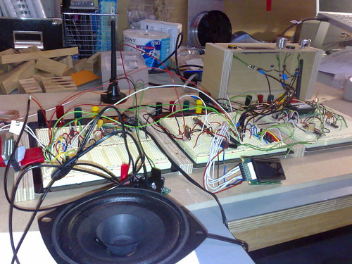
The hardware rig, for testing while breadboarding, with the final wood experiment and UI map also visible

On the left you can see the last attempt with wood, investigating whether cabinet making techniques could give enough structural strength and quality of finish to pass muster in the product space. Not quite, is the answer, and the work consumes a lot of workshop time: it turned out to be more economic to use repeatable manufacturing techniques and poured plastic.

But the main model here is not a visualisation but part of the hardware rig used to give a good feel of the interface during software development.

What a radio looks like, 2

There’s the same hardware rig in use.

The rig wasn’t the first instance of the final user interface: Jeff had built a Web-based simulation, so we could feel it in use, and every button press from every state (and time-out events) had been mapped on paper.

Note we hadn’t yet hit on the double dial (the outer dial scrolling through stations alphabetically, the inner learning from your habits and giving you only your most listened). It wasn’t until the Web UI prototype that a good metaphor for the dial emerged, and the idea of coarse+fine tuning (seen also in the Beolit) was one of several factors that took us there..

Finalising the manufacturing technique allowed Jack to develop the form (this is the final CAD model). As I mentioned before, Olinda wears its heart on its sleeve: the form betrays the processes that created it, the ideas beneath it, and its history. There’s no universal visual design scheme, just each interface element being allowed to tell its story. This lets people, I hope, look past the form to concepts like social networks and the Lego-like modularity.

The look of the hardware interface is its own story. Though I’ll mention, briefly, that it was through these computer models that the hardware interface came to be displayed on the end of the friends module too, so that the radio would continue to advertise its modular nature even when assembled.

Olinda parts back square

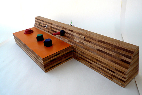
And there it is. You can see the heritage – chunky controls to advertise use and invite participation; the sloping interface – and how it has developed.

I’ve chosen this image because it illustrates a design decision that emerged very late in the process, only when the weight of the final units could be felt: the placing of the aerial at the base of the main unit. Several radios have it emerging from the top, but this means brushing past the aerial can topple the device over. By having the aerial attach at the bottom, knocking it doesn’t impart enough turning moment to destabilise the radio. Discovering that happened in a real sweaty palm moment.

These photos and more can be found in the Olinda Flickr pool.

Olinda, first look

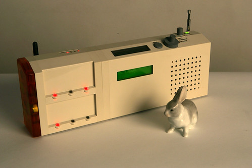
Rabbit infront of the radio

I’m pleased to be able to bring you Olinda, the social radio prototype we’ve designed and built for BBC Audio & Music.

Tristan Ferne, who commissioned Olinda and leads the BBC Radio Labs, is currently at the Futuresonic Conference, discussing what happens when you put social networks and the Web inside consumer electronics – in particular, this radio – and is giving the folks there the very first look. But for those of us not in Manchester…

For background, photos and more, check out Olinda.

Snap

Recently at Web Directions North, I introduced Snap, the syndicated next action pattern. It’s a way to get all those little interactions out of websites, and all in the same place: your newsreader. You can watch and read the presentation here.

In this post, I want to expand on those slides to introduce Snap and show it working.

What kind of ‘next actions’?

There are loads of small next actions. For example:

  • Taking a new bug in a tracker, and accepting it, allocating it, completing it, or marking it as a duplicate
  • For an email or weblog comment in a moderation queue, accepting or deleting it
  • Clicking through and perhaps purchasing a recommended book

It’s tedious to move around the Web to do these actions. It would be better if they were all in the same place. We had this same problem with weblogs and other media, and RSS was invented to syndicate new entries to the desktop.

What I’ve previously suggested is that we need a kind of RSS for interactions–and you can see a mockup here. At the time, the concept got some attention.

Conceptually, each ‘object’ that requires interaction is a feed entry. The actions are shown as an HTML form, and using the form sends data to the website which updates that object. The feed is then updated, changing the original entry to show the new object state. The original object state is no longer visible. This requires the newsreader to allow HTML forms and respond sensibly when feed entries change.

I’ve been working together with Tom Armitage on a proof of concept (of which more in a minute), and the headline is this:

Feed entries can indeed represent interactions, and update to show new states. The user never needs to leave the newsreader.

This is the pattern I’m calling Snap. It works, and we have a demo.

Dentrassi new todo

Demo: Dentrassi

For the proof of concept, we created Dentrassi (Tom did the heavy lifting), a desktop todo list manager which can be run entirely through a newsreader.

Watch a screencast and transcript of Dentrassi in use.

The app demonstrates a number of ideas:

  • There is an admin feed which has persistent entries. One entry includes a form, which is used to add new tasks
  • New tasks appear in the inbox feed, until they are allocated to projects
  • New project feeds are created dynamically: users can subscribe to a project feed from another persistent entry in the admin feed
  • Every task feed entry is smart: each includes a form to show the available interactions, so tagging, task completion and editing all happen inside the newsreader
  • Tasks move from feed to feed so you can focus on different lists of next actions at different times

Tasks only appear in feeds if they require actions. This means there’s a single place you look to find what to do next.

One interesting feature, not in the demo above, is the idea of the deferred task: a task can be pushed into the future by some day – a day, a week or a month – and it then disappears from the feeds, only to reappear when it’s valid again.

Dentrassi possibilities

Imagine having your todo list manager – whether it’s iCal or TaskPaper – expose a Snap interface, so you can use it entirely from your newsreader.

Tasks could then be mixed with interactions from all your other sources – like email moderation or bug tracking – and even tasks from other people in your company. Perhaps tasks from other people would be read-only, or maybe you could collaborate.

Lessons learned for Snap

We learned a lot from Dentrassi. Some points:

  • Stale items: once you act on a feed entry, the entry is stale until the feed is refreshed. Problems are avoided, in Dentrassi, by giving each object a serial number which increments on updates, and refusing to accept updates from forms which don’t pass in the current serial. This isn’t great from a interaction design perspective. Instead each feed item should query the server when it’s viewed, showing a ‘stale’ badge if a refresh is required. If the user is offline, an ‘unknown’ badge should be shown instead.
  • Disappearing entries: an entry will often disappear from a feed once it’s actioned. It’s important that a newsreader allows the entry to vanish, and doesn’t keep its old state as a duplicate entry (GUIDs help here).
  • Keeping interaction in the newsreader: when the follow-up to submitting a form is a success or failure, Dentrassi shows a badge. It would be good to have a standard way of reporting status. But sometimes the follow-up to a form is another form, and that’s tough: the interaction has to move to a website. Using Ajax inside the feed entry will help.
  • Subscribing to feeds from within the newsreader: inside feed entries, new feeds URL should be prefixed with ‘feed:’ to make sure the newsreader handles them directly, instead of opening a Web browser.
  • Working offline: there is currently no way to work offline. It would be good to have the newsreader cache the form data to send… although this may pose a problem if Javascript is being used.

One point to look further at is how to improve newsreader support for this usage. Maybe there could be a Snap profile for Atom, in the same way podcasting is supported by enclosures? If forms were ‘enclosed’ in feed entries, they could be shown separated from the main body – more like a dialog box – and it would be clearer how to use them. This was the look that seemed to make most sense in Dentrassi. In my original mock-up, which just used the straight HTML, the forms look confusing.

Original RSS-I mockup

Other possibilities

I’ve mentioned a number of possibilities for Snap in general:

  • Mixing together multiple ‘next action’ feeds from different sources
  • Having several feeds representing different states of a process, for example different Snap feeds for the different states of a bug in a tracker
  • Desktop applications exposing a Snap interface, for local use. And using the location of the feed request to show full feeds or read-only feeds, for collaboration
  • Having multiple people work on the same applications, each using a different mix of feeds

These are rather abstract, so here are some systems that use these patterns:

  • Multi-player turn-based games, like Risk, or Scrabulous
  • An editorial work-flow for a CMS, where each article goes through a number of states, dealt with by journalists, subeditors, editors and other sign-off parties. The documents could be links to the Web, or included as enclosures. A persistent item would allow the upload of new documents
  • Similarly, an HR system. Employees would use a website or persistent feed item to submit a form, and then track its process using a single feed. The HR team would have an interactive version of the feed
  • iPhoto exposing a Snap feed of all untagged photos, to encourage me to categorise them
  • A blog feed which has all posts, and a comments feed which only shows comments from posts the reader is following. A reader follows and unfollows posts by using a persistent entry in the comments feed
  • The Facebook activity steam, except each entry carries with is contextual interactions: see more/less of this type of item; add this person as a friend; join this group; enlarge this photo; add a comment
  • Feed pipes, slim applications which take a single object through a number of steps in different applications. For example, the same feed entry could represent an untagged photo in iPhoto, then the same photo uploaded to Flickr, which then becomes an object which can be commented on
  • A feed of ‘travellers you might know’ from Dopplr, each having a form to either share trips or ignore for a month

Snap cover art

Snap as part of the Web

RSS/Atom is simple human interface to website content. A REST API is a simple machine interface to website functionality. Jabber/XMPP is gaining attention for being a machine interface to website events. Snap sits in this same constellation: Snap is a simple human interface to common actions, on a website or desktop application.

All of these are ways for websites to get blurry edges and mingle into one another. They offer ways for website to be recombinant, so that each can build on the functionality of others. They also offer ways for websites and applications to be more humane–to let us build around the tasks and experiences of people, rather than the features list of an individual website.

Snap isn’t a technology. Snap is an interaction pattern which works right now, and I’m convinced makes the experience of using websites better. I’m hoping you’ll give it a try.

Next action!

So, what’s next?

Go read Tom’s post on Snap, about building the proof of concept and the interaction design learnings that came out of it–in particular how the big tick is useful for hitting flow states. That’s first.
Second, if you have a web app, it’d be great to see Snap happening. Feel free to drop a mail if you want to bounce ideas around (and I’m sure Tom would be happy to speak with you about it too).

Thanks

Thanks again to Tom Armitage, WDN08 for giving me the opportunity to think about this, and Ben Hammersley for hosting the session which led to this, way back in 2004. (Also…)

Beautiful Beolit

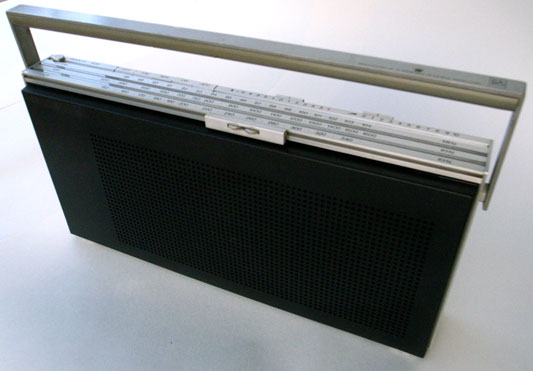
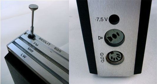
A couple of months back I visited Tom and Durrell at Luckybite to discuss some of the Olinda development. During our conversation, Durrell described one of his favourite portable radios, the Bang & Olufsen Beolit 600. I bought one.

Beolit radio

The range was produced between 1971 and 1981 and aside from its elegance and good audio quality, the detailing is very deft.

Radio details

Tuning with magnets

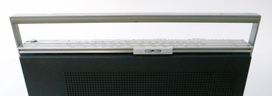
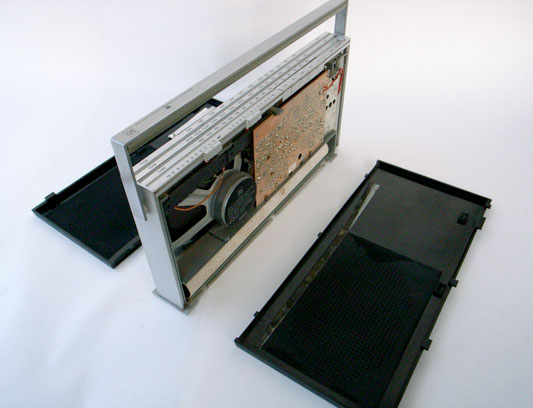
The chassis is constructed from aluminium strips, holding plastic shells front and back. The controls for the radio are spread out along the front and back edges of the top face. On the back edge are buttons for band selection and two sliders for volume and tone. The entire front edge is a horizontal tuning slider.

Tuning slider long
Tuning slider overview

The slider can be grabbed and pushed quickly up and down the length for coarse tuning. To tune precisely the two small kinked wheels are rolled under the thumb to give fine control. The remarkable detail is in how the selected frequency is indicated:

Tuning slider detail

Two very small steel bearings sit in covered grooves in the aluminium chassis, one for each tuning band. The tuning slider conceals a magnet, which drags the bearings along the scale inside their grooves (the aluminium is of course unaffected by the magnetism). The position of the bearings corresponds to markings on the surface of the radio which indicates the frequency the radio is tuned to.

It’s a really nice example of celebrating functionality. There is no functional need for the bearings. The additional cost to develop and manufacture can’t possibly have made financial sense. Why not use an arrow? But tuning is what radios do, and something which articulates this most familiar function so poetically just had to be done.

I love how the furthest bearing twitches along more slowly than the closer one.

Construction

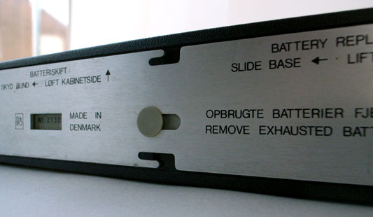
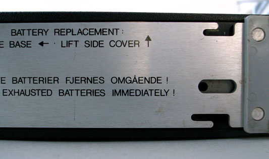
Structurally the radio is a square of four lengths of extruded and cut aluminium, with the front and back plastic shells tucked in. What’s exciting is that taking the radio apart isn’t work: there are no machine screws or self-tappers.

Base fixings
Base fixings 02

The base plate of the radio can slide. Sliding it a little way first unlocks the back shell. Removing the back allows the base to slide more, which releases the more rarely removed front shell. All this is achieved with a clever system of grooves and nooks.

Beolit in bits

Coming off first, the back shell gives access to the battery. The front shell reveals something else.

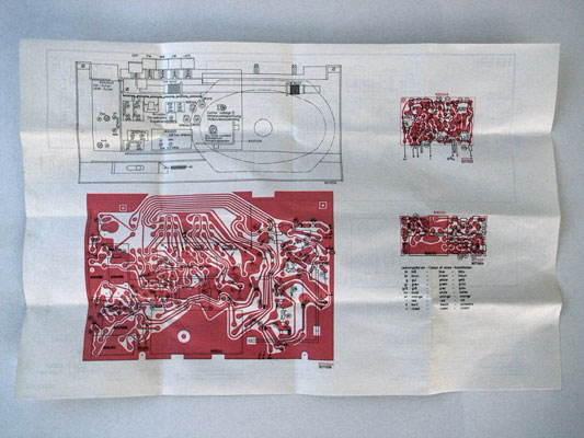
The repair manual

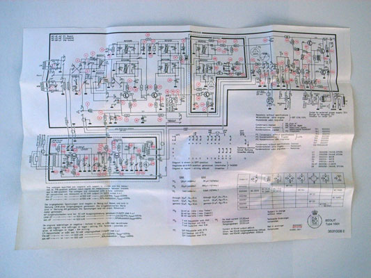
Inside the front shell, there is a little envelope. Inside the envelope there is a piece of folded paper.

Beolit envelope

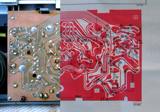
Screen printed on the paper are all the instructions for repairing the radio. There is an abstracted circuit diagram and also an image of the actual PCB. The radio contains its own data sheet, physically!

data sheet physical
data sheet abstract

I’ve cut these last two images together to show that the PCB and the print in the diagram are to scale (the screens were probably made from the same drawing).

data sheet and PCB

Olinda connections

One of Olinda‘s jobs is to communicate the potential for hardware APIs. Matt discussed this in detail in his post on widgets.

Olinda is expandable and modular. For this to be effective, the core services of the central unit really have to be accessible from it’s periphery. We don’t mean superficial expansion or extension of lineout (like adding a speaker), but actually change the nature of the object, to grow from it’s core. There is an obvious predecessor in consumer electronics in hi-fi separates, although it is limited in that the turntable cannot affect the services available through the interface, on the amplifier. The extensions for Olinda will be able to make the radio a new object with each addition (In our case main and social do this).

Part of this project is to discuss modularity. (While designing the physical radio itself is a large part of the work, the larger project is about communicating the core ideas.) The connector is effectively a serial connection between the main unit and the extensions (plus a few extras). This could have manifested as a serial cable with two sockets on each unit, much as they appear on old printers and the like. Although traditional connections and cables have historical precedent, they do not sufficiently raise modularity.

We were clear early that the mechanism for connection should be visible, rather than discreet. It should go out of its way to invite extension (Matt discusses these ideas with reference to the Levittown Homes in his talk, The Experience Stack). One should see how it extends and the connection be mechanically explicit. The use of the mechanism, the act of extending should feel really satisfying too. For the reasons described above the serial cable fails.

Connector developments

Each module needs to include a surface which connects to the previous. Software and power aside, the implication should be that the units are infinitely extensible. To begin with we examined the possibility of a mechanical connection, something with toggle clamps or vertical stacking.

Japanese Joinery 01
Japanese Joinery 02

Kiyoshi Seike’s book on Japanese joinery includes some beautiful imagery, above.

wood test

In some early work we experimented with connections in wood. As the process progressed and more influences on the form of the radio emerged, we chose to explore a system of magnets and studs. This delivered the most satisfying feeling and the building brick aesthetic taps nicely into the familiar heritage of Lego.

This idea came out of both Apple’s MagSafe power connector, and a previous project on RFID which touched on using magnets for tactile feedback to make reading RFIDs more like pressing a button

So in the final model, the entire end surfaces of the modules are positive and negative connectors.

Milled 01
Milled 02

These two images show the progression of the studs, looking for a good fit and a good feel. These models also explore how the magnets are to be included.

copper-connector.jpg

There are eight electrical connections between the modules. These are a line of sprung copper domes, held against copper blanks on the opposite face by the force of the magnets.

Most recent test

Above is the most recent and final connectors prototype before machining, and the image following gives an impression of the final form.

CAD connectors

Much of the early work in this process was produced with the help of Jeff Easter, thanks Jeff!

Olinda interface drawings

Last week, Tristan Ferne who leads the R&D team in BBC Audio & Music Interactive gave a talk at Radio at the Edge (written up in Radio Today). As a part of his talk he discussed progress on Olinda.

Most of the design and conceptual work for the radio is finished now. We are dealing with the remaining technicalities of bringing the radio into the world. To aid Tristan’s presentation we drew up some slides outlining how we expect the core functionality to work when the radio manifests.

Social module

Social Module sequence

This animated sequence shows how the social module is expected to work. The radio begins tuned to BBC Radio 2. A light corresponding to Matt’s radio lights up on the social module. When the lit button is pressed, the top screen reveals Matt is listening to Radio 6 Music, which is selected and the radio retunes to that station.

Tuning

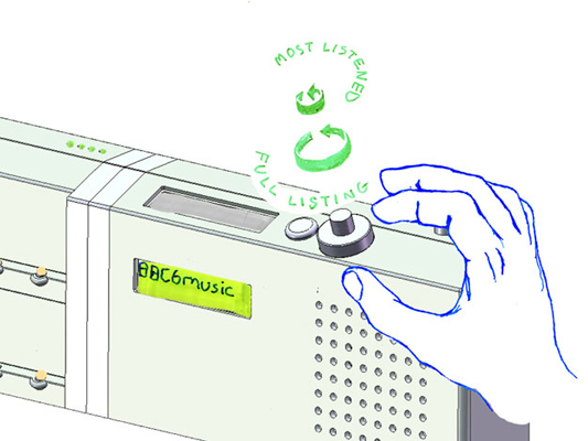
Tuning drawing

This detail shows how the list management will work. The radio has a dual rotary dial for tuning between the different DAB stations. The outer dial cycles through the full list of all the stations the radio has successfully scanned for. The inner dial filters the list down and cycles through the top five most listened to stations. We’ll write more on why we’ve made these choices when the radio is finished.

RFID icons

Earlier this year we hosted a workshop for Timo Arnall‘s Touch project. This was a continuation of the brief I set my students late last year, to design an icon or series of icons to communicate the use of RFID technology publicly. The students who took on the work wholeheartedly delivered some early results which I summarised here.

This next stage of the project involved developing the original responses to the brief into a small number of icons to be tested, by Nokia, with a pool of 25 participants to discover their responses. Eventually these icons could end up in use on RFID-enabled surfaces, such as mobile phones, gates, and tills.

Timo and I spent an intense day working with Alex Jarvis and Mark Williams. The intention for the day was to leave us with a series of images which could be used to test responses. The images needed consistency and fairly conservative limits were placed on what should be produced. Timo’s post on the workshop includes a good list of references and detailed outline of the requirements for the day.

I’m going to discuss two of the paths I was most involved with. The first is around how the imagery and icons can represent fields we imagine are present in RFID technology.

Four sketches exploring the presence of an RFID field

The following four sketches are initial ideas designed to explore how representation of fields can help imply the potential use of RFID. The images will evolve into the worked-up icons to be tested by Nokia, so the explorations are based around mobile phones.

I’m not talking about what is actually happening with the electromagnetic field induction and so forth. These explorations are about building on the idea of what might be happening and seeing what imagery can emerge to support communication.

The first sketch uses the pattern of the field to represent that information is being transferred.

Fields sketch 01

The two sketches below imply the completion of the communication by repeating the shape or symbol in the mind or face of the target. The sketch on the left uses the edge of the field (made of triangles) to indicate that data is being carried.

Fields sketch 02

I like this final of the four sketches, below, which attempts to deal with two objects exchanging an idea. It is really over complex and looks a bit illuminati, but I’d love to explore this all more and see where it leads.

Fields sketch 03

Simplifying and working-up the sketches into icons

For the purposes of our testing, these sketches were attempting too much too early so we remained focused on more abstract imagery and how that might be integrated into the icons we had developed so far. The sketch below uses the texture of the field to show the communication.

fields-04.jpg

Retaining the mingling fields, these sketches became icons. Both of the results below imply interference and the meeting of fields, but they are also burdened by seeming atomic, or planet sized and a annoyingly (but perhaps appropriately) like credit card logos. Although I really like the imagery that emerges, I’m not sure how much it is doing to help think about what is actually happening.

Fields sketch 05

Fields sketch 06

Representing purchasing via RFID, as icons

While the first path was for icons simply to represent RFID being available, the second path was specifically about the development of icons to show RFID used for making a purchase (‘purchase’ is one of the several RFID verbs from the original brief).

There is something odd about using RFID tags. They leave you feeling uncertain, and distanced from the exchange or instruction. When passing an automated mechanical (pre-RFID) ticket barrier, or using a coin operated machine, the time the machines take to respond feels closely related to the mechanism required to trigger it. Because RFID is so invisible, any timings or response feels arbitrary. When turning a key in a lock, this actually releases the door. When waving an RFID keyfob at reader pad, one is setting off a hidden computational process which will eventually lead to a mechanical unlocking of the door.

Given the secretive nature of RFID, our approach to download icons that emerged was based on the next image, originally commissioned from me by Matt for a talk a couple of years ago. It struck me as very like using an RFID enabled phone. The phone has a secret system for pressing secret buttons that you yourself can’t push.

Hand from Phone

Many of the verbs we are examining, like purchase, download or open, communicate really well through hands. The idea of representing RFID behaviours through images of hands emerging from phones performing actions has a great deal of potential. Part of the strength of the following images comes from the familiarity of the mobile phone as an icon–it side-steps some of the problems faced in attempting to represent an RFID directly.

The following sketches deal with purchase between two phones.

Purchase hands sketch

Below are the two final icons that will go for testing. There is some ambiguity about whether coins are being taken or given, and I’m pleased that we managed to get something this unusual and bizarre into the testing process.

Hands purchase 01

Hands purchase 02

Alex submitted a poster for his degree work, representing all the material for testing from the workshop:

Outcomes

The intention is to continue iterations and build upon this work once the material has been tested (along with other icons). As another direction, I’d like to take these icons and make them situated, perhaps for particular malls or particular interfaces, integrating with the physical environment and language of specific machines.

Recent Posts

Popular Tags