This website is now archived. To find out what BERG did next, go to www.bergcloud.com.

Blog posts from December 2010

Announcing SVK: an experimental publication by Warren Ellis, D’Israeli & BERG

We love comics.

Comics break the rules of storytelling, invent new ones, and break them again – more often than almost any other media.

We are also fortunate to know – and occasionally enjoy the twisted guidance of – one of the best writers in comics and speculative fiction: Mr Warren Ellis.

Warren is actually to blame for coming up with the name BERG for us back in the summer of 2009, based on our shared love of Nigel Kneale.

So, we were thrilled when he said yes earlier this year to Jack’s proposal of working together on a storytelling project.

The result, coming in early 2011, is SVK.

What is SVK?
It’s going to be a very beautifully-printed object – a graphic novella, drawn by one of our very favourite artists – Matt “D’Israeli” Brooker – who Warren collaborated with on “Lazarus Churchyard” back in 1991. I think I’m right in saying it’s their first major collaboration since then…

We can’t tell you too much more just yet, as they are both currently hard at work on it, but Warren describes SVK as “Franz Kafka’s Bourne Identity”.

Brilliant.

It’s also a story about looking, and it’s an investigation into perception, storytelling and optical experimentation that inherits some of the curiosities behind previous work of the studio such as our Here & There maps of Manhattan.

For us – it’s also an investigation into new ways to get things out in the world, and as a result we’re talking about SVK now because we’re looking for people, brands and companies who would like to be in the SVK project…

Looking for advertisers
There are going to be a small number of opportunities to feature advertising – which will be as inventive as the story itself. We’re talking to people now, so that we can go to print with them in February 2011.

If you’re in advertising or marketing, and you’d like to talk more about it, email info@berglondon.com with “SVK” in the subject.

Thursday Links: a drawerful of photographs, fictional logos, flashy advertising, and space

John Kestner’s Tableau is a nightstand that drops photos it “sees” in its Twitter feed into its drawer, to be discovered by its owner. It can also upload images of things placed into its drawer. Kestner describe it as an “anti-computer experience”:

The nightstand drawer becomes a natural interface to a complex computing task, which now fits into the flow of life.

zorin-blog.jpg

Matt J found this site collecting logos from through the James Bond movies. The Bond films are a franchise fascinated with branding and status; it’s great to see the branding of the many fictional corporations and firms in the franchise juxtaposed like this.

This BMW cinema commercial – produced by Serviceplan Munich – uses the after-image of text flashed at a cinema audience to reveal text to them only when they close their eyes. It’s a high-powered version of the Image Fulgurator, although here, the image is left in your sight (temporarily) rather than your photograph (permanently).

wheelock-1.jpg

I loved astronaut Douglas Wheelock’s photographs taken from the International Space Station. This one (above) is of the Bahamas, but whether facing earth or the stars, his pictures are beautiful.

One more to end on: the moon.

wheelock-2.jpg

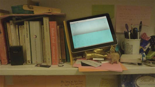
Non-personal computing: sketching a multi-user UI for the iPad

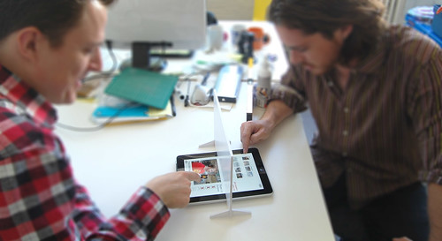
The iPad feels like a household device.

Sofa computing: passable from person-to-person, parent-to-child… And sharable as a ‘multiplayer magic table’ surface, as discussed here previously.

Magic table games

And yet, at time-of-writing, it’s a personal computer.

While parents of my acquaintance have found work-arounds, such as placing their children’s favourite apps on specific ‘pages’ of the homescreen, it’s a device bound to a MacBook or iMac, and an iTunes account – ultimately to an individual, not a small group.

While travelling last month, my wife and I managed to use the iPad as our shared device by basically signing-in and out of our Google accounts. Do-able but laborious.

Switch seems like a useful step in the direction of “non-personal computing”, allowing multiple user accounts for browsing, with a single password for each.

But I thought I’d quickly sketch something that built on the ‘magic-table’ mock-ups I’d been playing with back in the summer – looking enhancing the passable and sharable nature of the iPad as an object in and of the household.

Multi-user iPad UI Sketch

It’s pretty simple, and not much of leap, frankly…

Multi-user iPad: Portrait

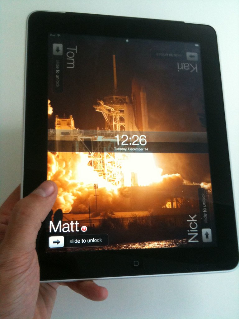
The ‘person-in-each-corner’ pattern can already be seen in iPad games such as Marble Mixer and Multipong, so this really just uses the corners of the device in tandem with the orientation sensors to select which of the – up to four* – different users wants to access their apps and settings on the device.

Activity notifications could be displayed alongside the names on the lockscreen so that you could quickly see at a glance if anything needed your attention.

Multi-user iPad: Landscape

And, if you wanted a little more privacy from the rest of your housemates or family, then just a standard iOS passcode dialog could be set.

Multi-user iPad: Passcode

That’s it really.

Just a quick sketch but something I wanted to get out of my head.

The individual nature of the UI and user-model of the iPad seems so at odds to me with its form-factor, the share-ability of its screen technology and it’s emergent context of use that I can imagine something (much more elegant) than this coming from Apple in the near-future.

Of course, they may just want to sell us all one each…


* as well as the four user limit being a simple mapping to the number of corners the thing has, this seems like a very Apple constraint to me…

Conversational UI: a short reading list

When we first started discussing Havasu, I prepared some notes around the topic: prior art, interesting ideas about language we might like to include, interfaces that are more conversational than you might expect. I thought it might be worthwhile sharing that list – not only to show you what was going around my head whilst I was building Havasu, but also because I think it’s interesting. Here’s what I wrote.

Tom Carden – “Chatbots for to-do list management

Friend-of-Berg Tom Carden wrote this four years ago, about a to-do list shaped like a push-pull stack, that’s addressed over IM. There’s only one bot, which every user talks to privately. But most important was this line:

“It’s a chatbot rather than a command line utility or a website because I want it to follow me home and I want it to be private and immediate.”

Private and immediate feels important.

Grice’s Maxims of Conversation

These are proposed by the philosopher Paul Grice, and are a fair dissection of what conversation looks like. They’re also great guidelines for UI. Consider the Maxim of Quantity:

  • Make your contribution as informative as is required for the current purposes of the exchange.
  • Do not make your contribution more informative than is required.

The former is obvious, but the latter’s as important in conversational interfaces – by not offering up too much, you help restrict the types of information a user will return.

Matt W pointed out to me that the most important part of the maxims is the foundation they’re built upon – the Co-operative Principle, which he explained thus (again, on Interconnected, a few years ago):

“Participants assume that a speaker is being cooperative, and thus they make conversational implicatures about what is said”. What this means is that the bot must make maximum use of all that the user [interviewer?] has said, or at least make conversationally clear what’s understood and not.

The Jack Principles (PDF)

These have come up in conversation from time-to-time over the years. They’re the founding principles Jellyvision used when building videogame-cum-quiz-show You Don’t Know Jack.

The PDF is clear, concise, and right about many things. They feel a lot like Grice’s Maxims for interactive forms of media; very much required reading if you’re interested in conversational UI. I’d end up reproducing the whole thing if I’m not careful, so instead, one quotation about conversations, which Jeff Atwood cited in 2004:

in a conversation, you can’t unilaterally decide what gets discussed. The other person is not a machine. He can place his own limits on the conversation. He can steer the conversation in one direction, just as much as you can. The control of the conversation is shared.

Interactive Fiction

I’m a fan of Interactive Fiction – which is generally used to refer to what once might have been called “text adventures”.

Some IF games like to play games with the parser itself – the interface the player uses to interact with the game world.

Violet turns the parser into a character. It’s not just the interface that understands the player’s language; it’s an imagined version of the player character’s absent girlfriend, pleading with him to finish the thesis he promised he would. Failure in the game is responded to with polite disappointment; misunderstanding the player’s intention turns to sweet confusion. The parser doesn’t have a personality; it’s adopting a persona. It gives the parser a softer, more tolerant feeling than one that says “command not recognised” or “I can’t do that”.

(Violet, is, incidentally, my primary recommendation for anyone looking to try IF at the moment).

Lost Pig is a game about an orc, called Grunk, who has lost a pig. Grunk is somewhat stupid – he’s nowhere near as literate as the player. As such, you realise you’re “commanding” someone less intelligent than you, and are less surprised when they’re stupid or can’t understand. You also end up keeping your instructions much simpler. Again, an example of how the language/tone of the interface alters how users address it, without having to provide direct instructions on the sort of language necessary to communicate with it.

SNAP

SNAP appears in my existing information flows – in the original example we supplied, RSS. It politely observes the conventions of that space. Conversational UI should do this, too – if a UI is going to exist on Twitter, it should be well- behaved and follow the conversations of the space. So, in the case of a Twitter bot, it shouldn’t be high-traffic; it shouldn’t hold conversations in public that ought to be private.

BASAAP

By making a parser/client/bot that’s only as smart as it need to be, you don’t get the cognitive dissonance of something that looks smart but falls apart when you get your syntax wrong. (Compare, for instance, with Applescript or ELIZA). Good bots don’t pretend to be anything they’re not.

From this point I got thinking about BEAM robots, and specifically, the way that approach considers sensors.

So: if you know what appendages a bot has, you know what it’s capable of. And so, really, a chatbot shouldn’t pretend to have eyes and ears – or “see” or “hear” – because it doesn’t. It has a text parser; it has scrapers; it has rules. Finding a way to be honest in the parser without using inaccurate metaphors is important.

BASAAP also suggests lots of little, single purpose bots, acting together. Matt J and I chatted about this and discussed the idea of things that aren’t really things – Twitter lists, groupings of friends in Facebook or IM, to-do lists, calendars – gaining little, chatty, BASAAP AIs that represent them and act as conversational UIs to them

Interconnected, Feb 2002

Another take on many-small-bots, in an old post from Matt W’s blog:

“The user path has to be short… Instead of one bot, have several”.

Several bots again. I like the idea that the bot is the “verb” – rather than choosing complicated instructions to tell one bot, you choose the appropriate bot for the task, and then tell it simple things. Choosing a bot narrows what you’re going to say.

If bots are to communicate with one another, could that be public too? Everyone should use the same messaging bus, human or machine. If I talk to them on Twitter, they should talk to one another on Twitter. Unless it can’t be avoided, but then they should at least talk about it. (“I sent JohnBot a package of binary data too big to put here.”)

Nonne and Num

This is a personal thing I always come back to, and here seems relevant to talking to bots in simple language. Nonne and num are words in Latin that appear in questions, and all they really do is indicate the expected answer. They are sometimes loosely translated as “surely”. For instance: “Surely you’re coming out with us on Friday night?” is a nonne question, and “surely you’re not going to eat that?” is a num question.

I like the idea that you can shape the language someone will use in an answer by the language you ask the question in. What are the equivalents in a conversational UI?

Packrati.us

Packrati.us is a nifty service – it watches your Twitter stream, and when you post any links, it automatically posts them to Delicious for you. So it’s not conversational like a chatbot, but it’s conversational like Lanyrd is – it’s a polite listener, eavesdropping, and being useful/busy in the background, but not overstepping its boundaries.

Moving a conversation between platforms

When I first wrote chatbots, more of my conversation happened on IM. Now, IM is reserved for more higher priority conversation; I tned to use Twitter for low-level, occasional banter, like sending URLs to friends. I like the idea that a conversation might move between platforms – an eavesdropping bot might work things out from my Twitter stream and trickle information back to me; but, if it needed something detailed, or urgent, or required information that could only really emerge in a conversation… an IM bot could take over the same conversation. And when it was done, the outcome and remaining announcements would flow back somewhere else.

Havasu: a material exploration of conversational interfaces

havasu-blog.jpg

This November, I made a robot. It’s called Havasu.

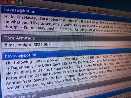
Havasu is a robot that helps you find out what films are on when, and then organise your friends to go. You talk to Havasu through instant messenger.

The purpose of the project was to be a material exploration into conversational interfaces. The Havasu project page explains more:

The goal of the project was to explore ways of interacting that aren’t menus or GUIs; manners of interaction more like dialogue, or polite listening, facilitated by agents or AIs that are could not really be called “smart”. It’s very much in line with the notions of “Fractional AI” and “BASAAP” that we are interested in.

I’ve written about material exploration before. The previous explorations I’ve conducted in code were all about large datasets – TV listings for Shownar, schools for Schooloscope.

Havasu isn’t an exploration of data, though: it’s an exploration of a type of UI. We were seeking to define the qualities that defined a type of interaction – what made an interface conversational. Was it the use and understanding of natural language? Was it the way a conversation flowed? Was it that it was conducted in a more casual manner than an interface that constantly demands your full attention? The easiest way to find out these answers was to build our own conversational UI.

Havasu was built in three weeks. Matt W and I agreed on a fairly simple set of goals for the project:

  • it had to be a conversational interface
  • about film screenings
  • that could be released publicly

You can talk to Havasu yourself. It’s available to any Jabber-compatible instant messanging client (such as Google Talk) as havasu@bot.im. It’s very much not a complete product; it has some rough edges, to say the least.

The material exploration within Havasu wasn’t just writing the code to build the bot: it was interacting with that interface, seeing where it succeeded and failed, and using what we’d learned by both making Havasu and playing with it to determine what makes an interface conversational.

The conclusions we came to – and the suggestions for how the Havasu bot could be improved – are on the Havasu project page.

Links for a Friday Evening: Maps and Rivers, Space and Kinetic Sculpture

pistil.jpg

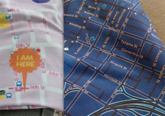
Pistil SF make customised blankets based on OpenStreetMap imagery. The custom maps can be centered around any latitude/longitude, and are available in a variety of custom colour schemes thanks to the Cloudmade styles. Freely available data turned into a beautiful, desirable product.

mr-switch.jpg

Andy spotted Mr Switch – a switch blanking plate designed by John Caswell, that injects character (and a little fella) into any light switch.

romance-river.jpg

I loved James Bridle’s Romance Has Lived Too Long Upon This River. It’s a really abstract representation of the height of the Thames, manifesting as a single-serving webpage. It’s also a synecdoche for the whole river, perhaps even the city of London; a glanceable manifestation of nature, in a window on your computer, or on your tablet, or on your phone. James explains the technicalities – and the romance – over on his blog.

Chris Burden’s Metropolis 2 is a kinetic sculpture: 1200 toy cars racing around a colossal series of tracks. Brilliant. The noise sounds deafening. (via Kottke).

The noise of Metropolis II reminded me of this delightful marble run around a the edges of a room. I particularly like the way deftly curved lengths of wood are used to slow the marbles. It embraces momentum, rather than artificially killing it.

spacelog.jpg

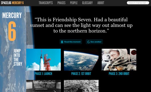
Several of us have been admiring Spacelog this week. It’s a really lovely representation of the space missions it covers, taking original radio chatter and mapping it to not only mission personnel, but also the phases of the mission itself. It’s another kind of macroscope: the many small actions of the vast teams at NASA, distilled into a few hours of spaceflight, and explained through careful representation of that data.

Recent Posts

Popular Tags