This website is now archived. To find out what BERG did next, go to www.bergcloud.com.

Blog posts tagged as 'teaching'

New Nature: a brief to Goldsmiths Design students

"Death To Fiction" minibrief, Goldsmiths Design

The project we ran in the spring with the Goldsmiths Design BA course was not ‘live’ in the sense that there was a commercial client’s needs informing the project, but it was an approximation of the approach that we take in the studio when we are working with clients around new product generation and design consultancy.

It was also an evolution of a brief that we have run before at SVA in New York with Durrell Bishop – but with the luxury of having much more time to get into it.

Our brief was in two parts – representing techniques that we use in the early stages of projects.

The first half: “Death To Fiction” stems from our love for deconstructing technologies, particularly cheap everyday ones to find new opportunities.

It’s a direct influence from Durrell – and techniques he used while teaching Schulze, Joe Malia and others at the RCA – and also something that is very familiar to many craftspeople – having at least some knowledge of a lot of different materials and techniques that can then inform deeper investigation, or enable more confident leaps of invention later on in the process. It also owes a lot to our friend Matt Cottam‘s “What is a Switch?” brief that he’s run at RISD, Umea, CIID and Aho…

We asked the students to engage with everyday technology and manufactured, designed goods as if it were nature.

“The Anthropocene” has been proposed by ecologists, geologists and geographers to describe the epoch marked by the domination of human influence on the Earth’s systems – seams of plastic kettles and Tesco “Bags For Life” will be discovered in millions of years time by the distant ancestors of Tony Robinson’s Time Team.

There is no split between nature and technology in the anthropocene. So, we ask – what happens if you approach technology with the enthusiasm and curiosity of the amateur naturalist of old – the gentlemen and women who trotted the globe in the last few centuries with sturdy boots, travel trunks and butterfly nets – hunting, collecting, studying, dissecting, breeding and harnessing the nature around them?

The students did not disappoint.

Like latter-day Linneans, or a troop of post-digital Deptford Darwins – they headed off into New Cross and took the poundstretchers and discount DIY stores as their Galapagos.

After two weeks I returned to see what they had done and was blown-away.

Berg: New Nature brief

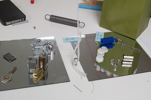
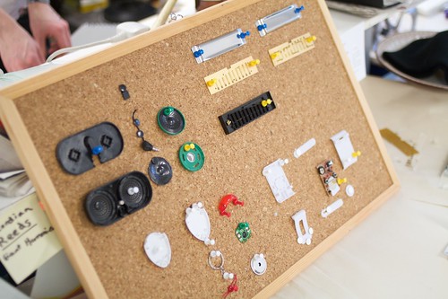
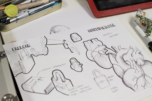
Chewing-gum, Alarm-clocks, key-finders, locks, etch-a-sketches, speakers, headphones, lighters, wind-up toys and more – had all been pulled-apart, scrutinised, labelled, diagrammed, tortured, tested, reconstructed…

"Death To Fiction" minibrief, Goldsmiths Design

"Death To Fiction" minibrief, Goldsmiths Design

Berg: New Nature brief

And – perhaps most importantly I had the feeling they had not only been understood, but the invention around communicating what they had learnt displayed a confidence in this ‘new nature’ that I felt would really stand them in good stead for the next part of the project, and also future projects.

Berg: New Nature brief

It was all great work, and lots of work – the smile didn’t leave my face for at least a week – but a few projects stood out for me.

"Death To Fiction" minibrief, Goldsmiths Design

"Death To Fiction" minibrief, Goldsmiths Design

Charlotte’s investigations of disposable cameras, Helen’s thought-provoking examination of pregnancy tests, Tom’s paper speakers (which he promised had worked!), Simon’s unholy pairings of pedometers and drills, Liboni and Adam’s thorough dissections of ultrasonic keyfinders and the brilliant effort to understand how quartz crystal regulate time by baking their own crystal, wiring it to a multimeter and whacking it with a hammer!

"Death To Fiction" minibrief, Goldsmiths Design

Hefin Jones’ deconstruction of the MagnaDoodle, and his (dramatic, hairdryer-centric) reconstruction of it’s workings was a particularly fine effort.

The second half of the brief asked the students to assess the insights and opportunities they had from their material exploration and begin to combine them, and place them in a product context – inventing new products, services, devices, rituals, experiences.

We’ve run this process with students before in a brief we call “Hopeful Monsters”, which begins with a kind of ‘exquisite corpse’ mixing and breeding of devices, affordances, capabilities, materials and contexts to spur invention.

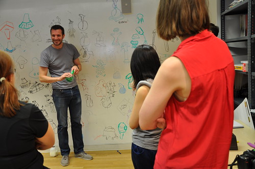
We’d pinched that drawing technique way back in 2007 for Olinda from Matt Ward, head of the design course at Goldsmiths so it only seemed fitting that he would lead that activity in a workshop in the second phase of the brief.

Berg: New Nature brief

The students organised themselves in teams for this part of the brief, and produced some lovely varied work – what was particularly pleasing to me was that they appeared to remain nimble and experimental in this phase of the project, not seizing upon a big idea then dogmatically trying to build it, but allowing the process of making inform the way to achieve the goals they set themselves.

We closed the project with an afternoon of presentations at The Gopher Hole (thanks to Ossie and Beatrice for making that happen!) where the teams presented back their concepts. All the teams had documented their research for the project as they went online, and many opted to explain their inventions in short films.

Here’s a selection:

A special mention to the ‘Roads Mata’ team, who for me really went the extra-mile in creating something that was believably-buildable and desirable – to the extent that I think my main feedback to them was they should get on KickStarter

There were sparks of lovely invention throughout all the student groups – some teams had more trouble recognising them than others, but as Linus Pauling once said “To have a good idea you have to have a lot of ideas”, and that certainly wasn’t a problem.

I wonder what everyone would have come up with if we had a slightly longer second design phase to the project, or introduced a more constrained brief goal to design for. It might have enabled some of the teams to close in on something either through iteration or constraint.

Next time!
As it was I hope that the methods that the brief introduce stay with the group, and that the curiosity, energy and ability to think through making that they obviously all have grows in confidence and output through the coming years.

They will be a force to be reckoned with if so.

Mouse-Trap/Ghost-Trap: Summer teaching at SVA

Jack and I taught a short class at SVA’s Interaction Design MFA this July.

We’d visited previously for a week in the Spring, and Liz Danzico was kind enough to invite us as part of their Summer School programme.

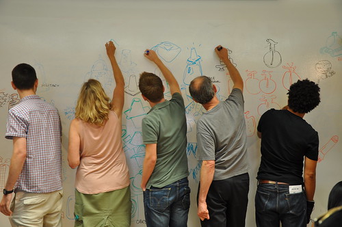
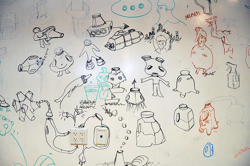
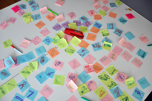
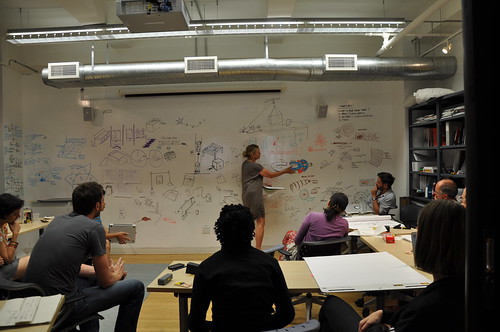
The two days started with thinking-through-drawing exercises we like to call “Hopeful Monsters” based around an exercise we’ve described on the blog before, and other drawing activities around generating ‘Inbreds and Hybrids’ that we were introduced to by our friend Matt Ward from Goldmsith’s Design faculty.

Hopeful Monsters

Initial thinking and brainstorming about cheap, ubiquitous, mundane technologies leads to fantastic leaps as the particpants draw on the whiteboard.

As always there are dead ends and flights of fancy – but, as always – there are a couple of intriguing combinations and mutant products that have an itchy promise to them…

Hopeful Monsters

The mutating, morphing quality of drawing our hopeful monster objects on the whiteboard…

Hopeful Monsters

Hopeful Monsters

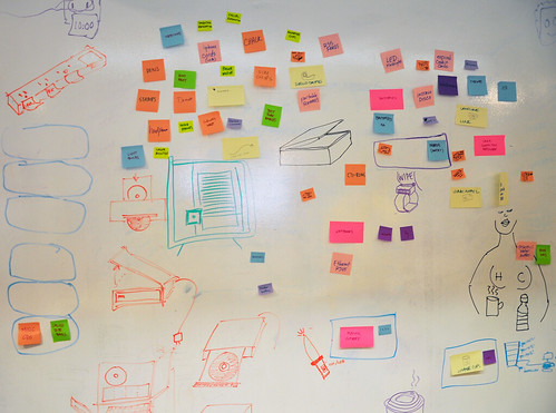
Always contrasts interestingly with the more procedural, mechanical evolutionary drawing produced by tables of post-it-pixels…

Hopeful Monsters

On the second day, we deployed our secret weapon!

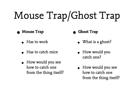
We were lucky enough to have Durrell Bishop of the mighty Luckybite join us, and set us all an incredible brief for the day – design a mouse trap, and a ghost trap…

We’d asked the group to think about their favourite traps overnight, and come back with a drawing.

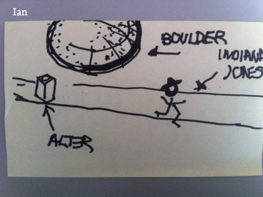
My favourite I think was this diagram of the boulder trap in Raiders of the Lost Ark.

So much peril encapsulated in a stick figure!

The day saw the group tangle with the realities of catching mice, and then swap to the more symbolic, reality-shaping nature of designing a ghost-trap.

Hopeful Monsters

Some favourites – from many – include…

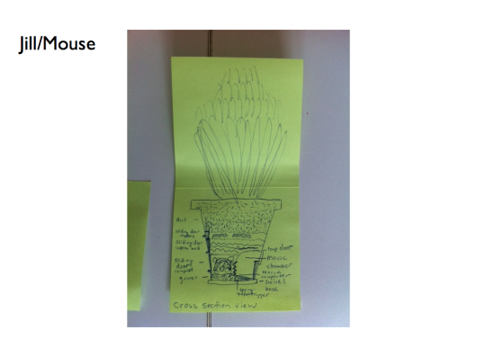
Jill’s self-composting mouse-trap

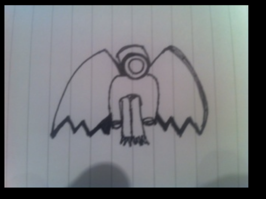
Rafa’s CCTV gargoyle ghost-trap

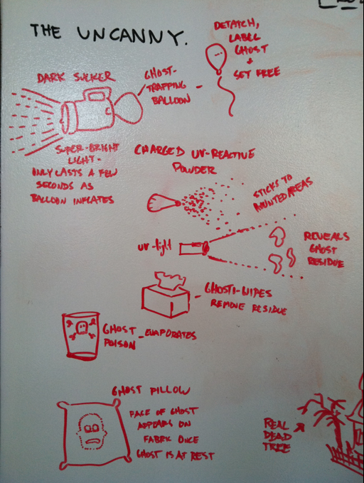
Peter’s ghost-traps, including the awesome ‘Dark Sucker’, which we hope he builds…

And… Nora’s Black Cat/White-Cat ghost-trap service
Hopeful Monsters

Fantastic fun, and everyone produced really excellent, surprising stuff.

Thanks again to Liz Danzico, Qing Qing Chen and, of course, the group who attended the workshop and threw themselves into it so fully in the NYC heat…

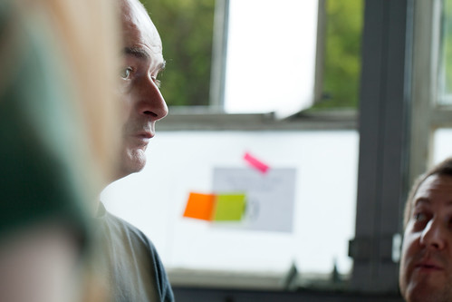
Finally – I had great fun one of the afternoons taking photos of the group with an iPhone and a magnifying glass while they drew…

IMG_1414

SVA Hopeful Monsters Workshop (magnified)

SVA Hopeful Monsters Workshop (magnified)

The Hopeful Monsters of New York

SVA

We’re wrapping up our week teaching at SVA on the interaction course tomorrow.

It’s been an amazingly fun week – with an excellent group of students throwing themselves into material explorations, generative drawing, prototyping behaviour and surfaces and more.

It’s like Sterling’s cave of Taklamakan, made from post-it notes and acetates.

We’ve had a little blog for the week set up where we’re posting the work as it’s produced, and have put the briefs etc.

RFID icons

Earlier this year we hosted a workshop for Timo Arnall‘s Touch project. This was a continuation of the brief I set my students late last year, to design an icon or series of icons to communicate the use of RFID technology publicly. The students who took on the work wholeheartedly delivered some early results which I summarised here.

This next stage of the project involved developing the original responses to the brief into a small number of icons to be tested, by Nokia, with a pool of 25 participants to discover their responses. Eventually these icons could end up in use on RFID-enabled surfaces, such as mobile phones, gates, and tills.

Timo and I spent an intense day working with Alex Jarvis and Mark Williams. The intention for the day was to leave us with a series of images which could be used to test responses. The images needed consistency and fairly conservative limits were placed on what should be produced. Timo’s post on the workshop includes a good list of references and detailed outline of the requirements for the day.

I’m going to discuss two of the paths I was most involved with. The first is around how the imagery and icons can represent fields we imagine are present in RFID technology.

Four sketches exploring the presence of an RFID field

The following four sketches are initial ideas designed to explore how representation of fields can help imply the potential use of RFID. The images will evolve into the worked-up icons to be tested by Nokia, so the explorations are based around mobile phones.

I’m not talking about what is actually happening with the electromagnetic field induction and so forth. These explorations are about building on the idea of what might be happening and seeing what imagery can emerge to support communication.

The first sketch uses the pattern of the field to represent that information is being transferred.

Fields sketch 01

The two sketches below imply the completion of the communication by repeating the shape or symbol in the mind or face of the target. The sketch on the left uses the edge of the field (made of triangles) to indicate that data is being carried.

Fields sketch 02

I like this final of the four sketches, below, which attempts to deal with two objects exchanging an idea. It is really over complex and looks a bit illuminati, but I’d love to explore this all more and see where it leads.

Fields sketch 03

Simplifying and working-up the sketches into icons

For the purposes of our testing, these sketches were attempting too much too early so we remained focused on more abstract imagery and how that might be integrated into the icons we had developed so far. The sketch below uses the texture of the field to show the communication.

fields-04.jpg

Retaining the mingling fields, these sketches became icons. Both of the results below imply interference and the meeting of fields, but they are also burdened by seeming atomic, or planet sized and a annoyingly (but perhaps appropriately) like credit card logos. Although I really like the imagery that emerges, I’m not sure how much it is doing to help think about what is actually happening.

Fields sketch 05

Fields sketch 06

Representing purchasing via RFID, as icons

While the first path was for icons simply to represent RFID being available, the second path was specifically about the development of icons to show RFID used for making a purchase (‘purchase’ is one of the several RFID verbs from the original brief).

There is something odd about using RFID tags. They leave you feeling uncertain, and distanced from the exchange or instruction. When passing an automated mechanical (pre-RFID) ticket barrier, or using a coin operated machine, the time the machines take to respond feels closely related to the mechanism required to trigger it. Because RFID is so invisible, any timings or response feels arbitrary. When turning a key in a lock, this actually releases the door. When waving an RFID keyfob at reader pad, one is setting off a hidden computational process which will eventually lead to a mechanical unlocking of the door.

Given the secretive nature of RFID, our approach to download icons that emerged was based on the next image, originally commissioned from me by Matt for a talk a couple of years ago. It struck me as very like using an RFID enabled phone. The phone has a secret system for pressing secret buttons that you yourself can’t push.

Hand from Phone

Many of the verbs we are examining, like purchase, download or open, communicate really well through hands. The idea of representing RFID behaviours through images of hands emerging from phones performing actions has a great deal of potential. Part of the strength of the following images comes from the familiarity of the mobile phone as an icon–it side-steps some of the problems faced in attempting to represent an RFID directly.

The following sketches deal with purchase between two phones.

Purchase hands sketch

Below are the two final icons that will go for testing. There is some ambiguity about whether coins are being taken or given, and I’m pleased that we managed to get something this unusual and bizarre into the testing process.

Hands purchase 01

Hands purchase 02

Alex submitted a poster for his degree work, representing all the material for testing from the workshop:

Outcomes

The intention is to continue iterations and build upon this work once the material has been tested (along with other icons). As another direction, I’d like to take these icons and make them situated, perhaps for particular malls or particular interfaces, integrating with the physical environment and language of specific machines.

RFID Interim update

Last term during an interim crit, I saw the work my students had produced on the RFID icons brief I set some weeks ago. It was a good afternoon and we were lucky enough to have Timo Arnall from the Touch project and Younghee Jung from Nokia Japan join us and contribute to the discussion. All the students attending showed good work of a high standard, overall it was very rewarding.

I’ll write a more detailed discussion on the results of the work when the brief ends, but I suspect there may be more than I can fit into a single post, so I wanted to point at some of the work that has emerged so far.

All the work here is from Alex Jarvis and Mark Williams.

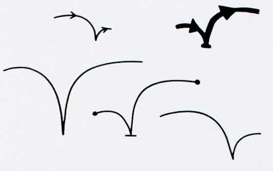
Alex began by looking at the physical act of swiping your phone or card over a reader. The symbol he developed was based on his observations of people slapping their Oyster wallets down as they pass through the gates on to the underground. Not a delicate, patient hover over the yellow disc, but a casual thud, expectant wait for the barrier to open, then a lurching acceleration through to the other side before the gates violently spasm shut.

RFID physical act 01

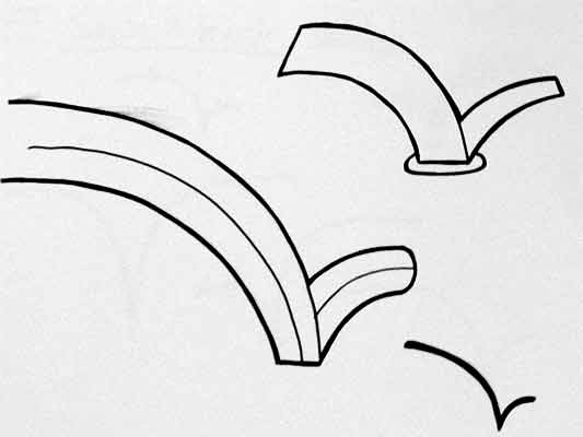
More developed sketches here…

RFID physical act 02

I suspect that this inverted tick will abstract really well, I like the thin line on the more developed version snapping the path of the card into 3D. It succeeds since it doesn’t worry too much about working as an instruction and concentrates more on a powerful cross-system icon to be consistently recognisable.

Verbs

The original brief required students to develop icons for the verbs: purchase, identify, enter (but one way), download, phone and destroy.

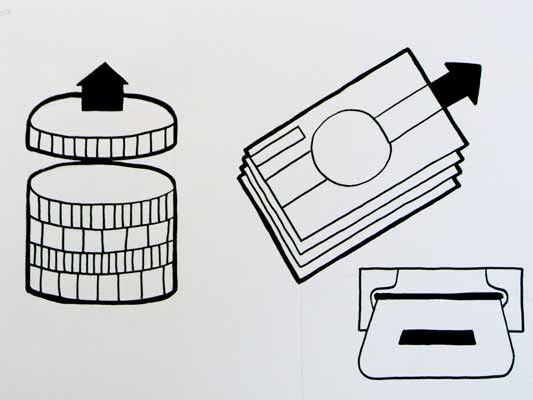
Purchase and destroy are the two of these verbs with the most far-reaching and less immediate consequences. The aspiration for this work is to make the interaction feel like a purchase, not a touch that triggers a purchase. This gives the interaction room to grow into the more complex ones that will be needed in the future.

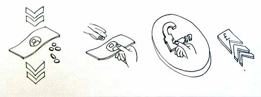
This first sketch, on purchase, from Alex shows your stack of coins depleting, something nice about the dark black arrow which repeats as a feature throughout Alex’s developments.

RFID Purchase 01

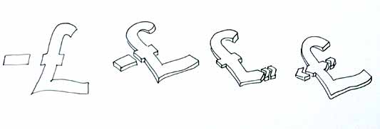
Mark has also been tackling purchase, his sketches tap into the currency symbols, again with a view to represent depletion. Such a blunt representation is attractive, it shouts “this will erode your currency!”

RFID Purchase 03

Mark explores some more on purchase here:

RFID Purchase 02

Purchase is really important. I can’t think of a system other than Oyster that takes your money so ambiguously. Most purchasing systems require you to enter pin numbers, sign things, swipe cards etc, all really clear unambiguous acts. All you have to do is wave at an Oyster reader and it costs you £2… maybe: The same act will open the barrier for free if you have a travel card on there. Granted, passengers have already made a purchase to put the money on the card, but if Transport for London do want to extend their system for use as a digital wallet they will need to tackle this ambiguity.

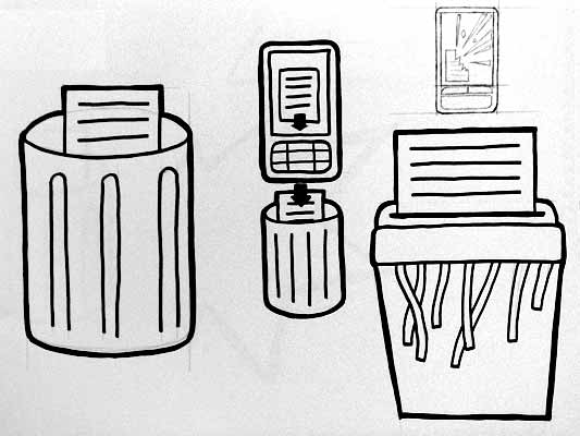
Both Mark and Alex produced material looking at the symbols to represent destroy, for instances where swiping the reader would obliterate data on it, or render it useless. This might also serve as a warning for areas where RFID tags were prone to damage.

RFID Destroy 01

I like the pencil drawing to the top right that he didn’t take forward. I’ve adjusted the contrast over it to draw out some more detail. Important that he distinguished between representing the destruction of the object and the data or contents.

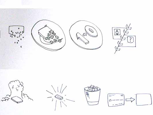
Williams Destroy sketches

Mark’s sketches for destroy include the excellent mushroom cloud, but he also looks at an abstraction of data disassembly, almost looks like the individual bits of data are floating off into oblivion. Not completely successful since it also reminds me of broadcasting Wonka bars in Charlie and the Chocolate Factory and teleporting in Star Trek, but nice none the less.

Drawing

This is difficult to show online, but Alex works with a real pen, at scale. He is seeing the material he’s developing at the same size it will be read at. Each mark he makes he is seeing and responding to as he makes it.

Jarvis Pen

He has produced some material with Illustrator, but it lacked any of the impact his drawings brought to the icons. Drawing with a pen really helps avoid the Adobe poisoning that comes from Illustrator defaults and the complexities of working out of scale with the zoom tool (you can almost smell the 1pt line widths and the 4.2333 mm radius on the corners of the rounded rectangle tool). It forces him to choose every line and width and understand the success and failures that come with those choices. Illustrator does so much for you it barely leaves you with any unique agency at all.

It is interesting to compare the students’ two approaches. Alex works bluntly with bold weighty lines and stubby arrows portraying actual things moving or downloading. Mark tends towards more sophisticated representations and abstractions, and mini comic strips in a single icon. Lightness of touch and branching paths of exploration are his preference.

More to come from both students and I’ll also post some of my own efforts in this area.

RFID Brief

Last Thursday I began teaching third year graphic design students at Central Saint Martins College of Art and Design in Holborn, Central London. I’m teaching a group of nine with an old colleague of mine James King. James and I have each written a brief, I’ll post them both here and any exciting results that emerge from the students. The brief is set against an introduction to the technology and is conjunction with Timo Arnall‘s Touch project. Click the image to download the RFID brief as a pdf and the text to follow.

If you have any ideas, solutions or comments yourself, please feel free to add your thoughts to the comments.

rfid brief

Aims

To think functionally. To develop a sense of how signs can work across different contexts with specific meaning.

Brief

Design an icon or series of icons to communicate the use of RFID technology publicly.

Details

RFID is complex because it is very new and there is no simple metaphor that it easily fits. Explore several elements and think about appropriate representation for those. Think about the following:

The act

Think about how the icon should represent the physical act of activating an RFID tag.

This technology works when the RFID tag is brought near the RFID reader. It is important to show how the RFID tag should be used. One of the ways London Transport manage this is to repeatedly broadcast “remember to always touch in… and out with your Oyster card” over their public address system, their logo also represents an image of the card moving in an arc, the logo being printed on the surface of the reader.

The verb

When you swipe the RFID a transaction will take place. This is true in nearly all situations. I want you to develop icons which represent the verb that takes place when the tag is activated.

Develop icons for the following actions:

  • Purchase. Your account will be deducted when you swipe. Imagine your switch card was a digital wallet, and you could use RFID instead of chip and PIN. How would you communicate, that when you swipe, you will be charged.
  • Identify. If you go through this gate your details will be read and known, you could think about a passport.
  • Enter, but one way. If you pass through this door you will not be permitted to leave by it. Think about security at airports.
  • Download. Imagine your phone had an RFID inside it and when you wave your phone at a reader, a file is downloaded to your phone, perhaps a local map.
  • Phone. Imagine if when you waved your phone at the reader, it phoned someone, perhaps a helpline or someone specific.
  • Destroy. If you used the RFID to store sensitive data, and you wanted to delete the data, like from a memory stick, swiping the RFID will erase the data on the stick.

There might be secondary verbs like Open, or Start. Lifts might require people to identify themselves before they gain access to certain floors. Tickets are often purchased inorder to access certain areas, like with Oyster cards. This is important too, think about how you can combine verbs in the system you develop.

Ownership

RFID cards often work in closed systems, where particular companies or institutions have ownership over the system. Starbucks have just released a ‘smart card’. Think about how this can be represented alongside the verbs too. You could think about graphic consistency or colour, or perhaps there is a feature of the icon like a character, which appears across the brand. For the branding side, don’t get distracted by a specific brand that already exists. I want you to just think about the kind of business. So think about the following:

  • an international transport company like an airline
  • a money system, like a bank
  • a supermarket

Some points to remember

The icons should be universal as possible, so English language or culturally specific meaning could make the icon obscure to some people. Think about the context of the reader, does this icon go on doors, busses, airports etc?

Deliverables

Design sketches: For Thursday 23rd at 9am bring the following: 40 sketches with assorted ideas for Act, Verb and Brand. The sketches should be good, not widdly little drawings in a sketch book, make sure the drawings can be seen clearly at a distance. Also, the design should be good, not bad. So try to make it good.

Research: Look at signage and icons in the world and think about how they communicate acts and verbs. Bring in some examples that have influenced your work.

Recent Posts

Popular Tags