Preface
This is a blog post about a large design research project we completed in 2011 in close partnership with Google Creative Lab.
There wasn’t an opportunity for publication at the time, but it represented a large proportion of the studio’s efforts for that period – nearly everyone in the studio was involved at some point – so we’ve decided to document the work and its context here a year on.
I’m still really proud of it, and some of the end results the team produced are both thought-provoking and gorgeous.
We’ve been wanting to share it for a while.
It’s a long post covering a lot of different ideas, influences, side-projects and outputs, so I’ve broken it up into chapters… but I recommend you begin at the beginning…
- Introduction
- Material Exploration
- Influences and Starting Points
- The $700 Lightbulb
- “Lamps that see”
- Sketching in Video, Code and Hardware
- Little Brain, Big Brain
- Rules for Smart Light
- Smart Light, Dumb Products
- What happened next: Universe-B
- Postscript: the scenius of Lamps
Introduction
At the beginning of 2011 we started a wide-ranging conversation with Google Creative Lab, around near-future experiences of Google and its products.
During our discussions with them, a strong theme emerged. We were both curious about how it would feel to have Google in the world with us, rather than on a screen.
If Google wasn’t trapped behind glass, what would it do?
What would it behave like?
How would we react to it?
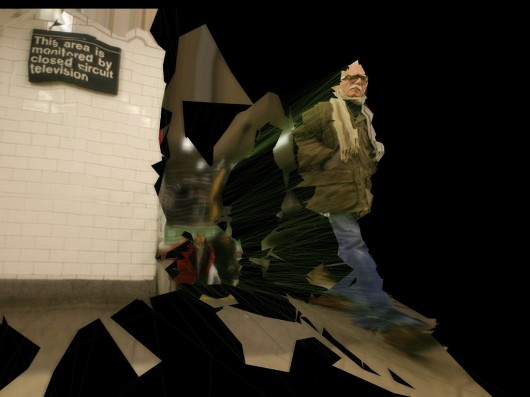
This traces back to our studio’s long preoccupation with embodied interaction. Also, our explorations of the technologies of computer vision and projection that we’ve talked about previously under the banner of the “Robot-Readable World”.
Our project through the spring and summer of 2011 concentrated on making evidence around this – investigating computer vision and projection as ‘material’ for designing with, in partnership with Google Creative Lab.
Material Exploration
We find that treating ‘immaterial’ new technologies as if they were physical materials is useful in finding rules-of-thumb and exploring opportunities in their “grain”. We try as a studio to pursue this approach as much as someone trying to craft something from wood, stone, or metal.
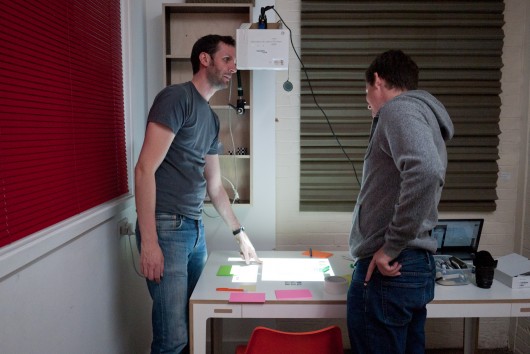
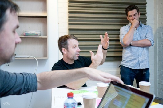
Jack Schulze of BERG and Chris Lauritzen, then of Google Creative Lab
We looked at computer-vision and projection in a close relationship – almost as one ‘material’.
That material being a bound-together expression of the computer’s understanding of the world around it and its agency or influence in that environment.
Influences and starting points
One of the very early departure points for our thinking was a quote by (then-)Google’s Marissa Meyer at the Le Web conference in late 2010: “We’re trying to build a virtual mirror of the world at all times”
This quote struck a particular chord for me, reminding me greatly of the central premise of David Gelernter‘s 1991 book “Mirror Worlds“.
I read “Mirror Worlds” while I was in architecture school in the 90s. Gelernter’s vision of shared social simulations based on real-world sensors, information feeds and software bots still seems incredibly prescient 20 years later.
Gelernter saw the power to simply build sophisticated, shared models of reality that all could see, use and improve as a potentially revolutionary technology.
What if Google’s mirror world were something out in the real world with us, that we could see, touch and play with together?
Seymour Papert – another incredibly influential computer science and education academic – also came to our minds. Not only did he maintain similar views about the importance of sharing and constructing our own models of reality, but was also a pioneer of computer vision. in 1966 he sent the ‘Summer Vision Memo‘ “Spend the summer linking a camera to a computer, and getting the computer to describe what it saw…”
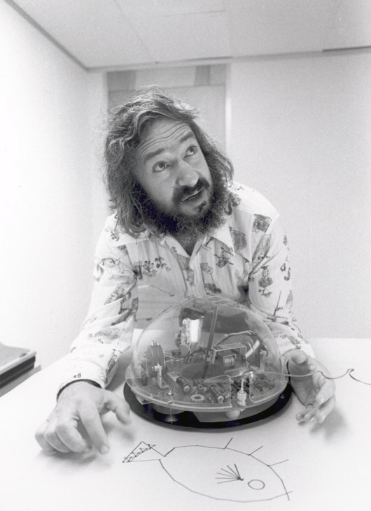

Nearly fifty years on, we have Kinects in our houses, internet-connected face-tracking cameras in our pockets and ‘getting the computer to describe (or at least react to) what it saw seems to be one of the most successful component tracks of the long quest for ‘artificial intelligence’.
Our thinking and discussion continued this line toward the cheapness and ubiquity of computer vision.
The $700 Lightbulb
Early on, Jack invoked the metaphor of a “$700 lightbulb”:
Lightbulbs and electric light went from a scientific curiosity to a cheap, accessible ubiquity in the late 19th and early 20th century.
What if lightbulbs were still $700?
We’d carry one around carefully in a case and screw it in when/where we needed light. They are not, so we leave them screwed in wherever we want, and just flip the switch when we need light. Connected computers with eyes cost $500, and so we carry them around in our pockets.
But – what if we had lots of cheap computer vision, processing, connectivity and display all around our environments – like light bulbs?
Ubiquitous Computing has of course been a long held vision in academia, which in some ways has been derailed by the popularity of the smartphone
But smartphones are getting cheaper, Android is embedding itself in new contexts, with other I/Os than a touchscreen, and increasingly we keep our data in the cloud rather than in dedicated devices at the edge.
Ubiquitous computing has been seen by many as in the past as a future of cheap, plentiful ‘throw-away’ I/O clients to the cloud.
It seems like we’re nearly there.
“a paintable computer, a viscous medium with tiny silicon fragments that makes a pour-out computer, and if it’s not fast enough or doesn’t store enough, you put another few pounds or paint out another few square inches of computing.”
Updating this to the present-day, post web2.0 world – where if ‘it’s not fast enough or doesn’t store enough’ we request more resources from centralised, elastic compute-clouds.
“Clouds” that can see our context, our environment through sensors and computer vision, and have a picture of us built up through our continued interactions with it to deliver appropriate information on-demand.
To this we added speculation that not only computer-vision would be cheap and ubiquitous, but excellent quality projection would become as cheap and widespread as touch screens in the near-future.
This would mean that the cloud could act in the world with us, come out from behind the glass and relate what it sees to what we see.
In summary: computer vision, depth-sensing and projection can be combined as materials – so how can we use them to make Google services bubble through from the Mirror World into your lap?
How would that feel? How should it feel?
This is the question we took as our platform for design exploration.
“Lamps that see”
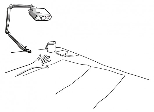
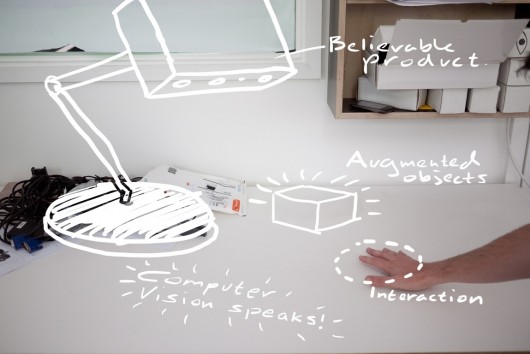
One of our first departure points was to fuse computer-vision and projection into one device – a lamp that saw.
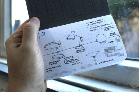
Here’s a really early sketch of mine where we see a number of domestic lamps, that saw and understood their context, projecting and illuminating the surfaces around them with information and media in response.
We imagined that the type of lamp would inform the lamp’s behaviour – more static table lamps might be less curious or more introverted than a angle-poise for instance.
Jack took the idea of the angle-poise lamp on, thinking about how servo-motors might allow the lamp to move around within the degrees of freedom its arm gives it on a desk to inquire about its context with computer vision, track objects and people, and surfaces that it can ‘speak’ onto with projected light.


Of course, in the back of our minds was the awesome potential for injecting character and playfulness into the angle-poise as an object – familiar to all from the iconic Pixar animation Luxo Jr.
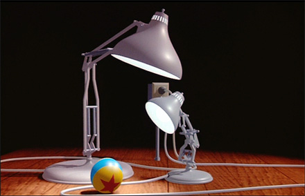

And very recently, students from the University of Wellington in New Zealand created something very similar at first glance, although the projection aspect is missing here.
Alongside these sketching activities around proposed form and behaviour we started to pursue material exploration.
Sketching in Video, Code & Hardware
We’d been keenly following work by friends such as James George and Greg Borenstein in the space of projection and computer vision, and a number of projects in the domain emerged during the course of the project, but we wanted to understand it as ‘a material to design with’ from first principles.
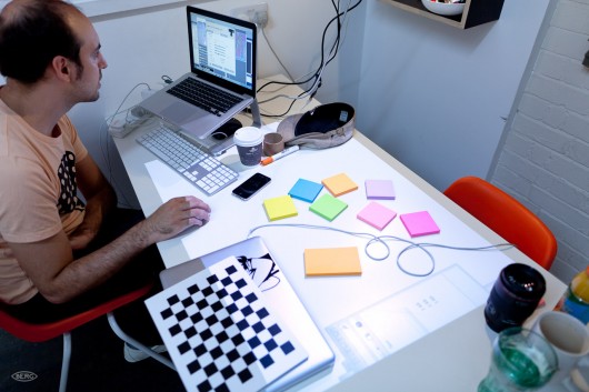
Timo, Jack, Joe and Nick – with Chris Lauritzen (then of Google Creative Lab), and Elliot Woods of Kimchi & Chips, started a series of tests to investigate both the interactive and aesthetic qualities of the combination of projection and computervision – which we started to call “Smart Light” internally.
First of all, the team looked at the different qualities of projected light on materials, and in the world.
This took the form or a series of very quick experiments, looking for different ways in which light could act in inhabited spaces, on surfaces, interact with people and things.
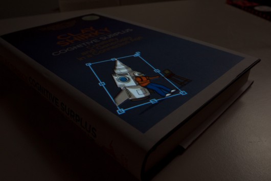
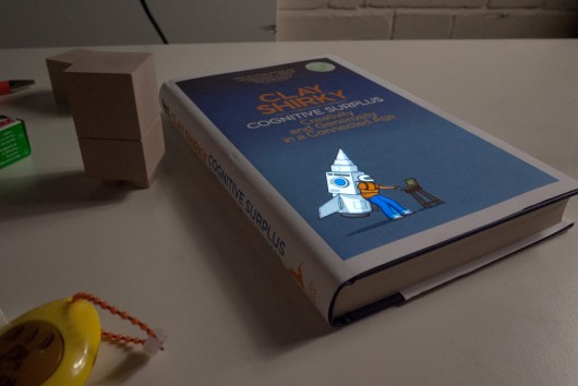
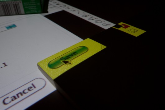
In a lot of these ‘video sketches’ there was little technology beyond the projector and photoshop being used – but it enabled us to imagine what a computer-vision directed ‘smart light’ might behave like, look like and feel like at human scale very quickly.
Here are a few example video sketches from that phase of the work:
Sketch 04 Sticky search from BERG on Vimeo.

Sketch 06: Interfaces on things from BERG on Vimeo.
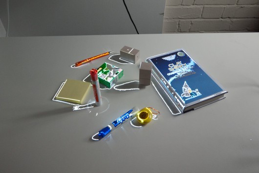
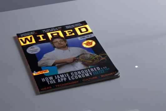
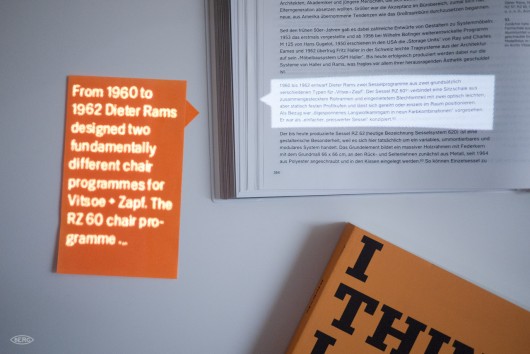
One particularly compelling video sketch projected an image of a piece of media (in this case a copy of Wired magazine) back onto the media – the interaction and interference of one with the other is spellbinding at close-quarters, and we thought it could be used to great effect to direct the eye as part of an interaction.

Sketch 09: Media on media from BERG on Vimeo.
Alongside these aesthetic investigations, there were technical explorations for instance, into using “structured light” techniques with a projector to establish a depth map of a scene…

Sketch 13: Structured light from BERG on Vimeo.
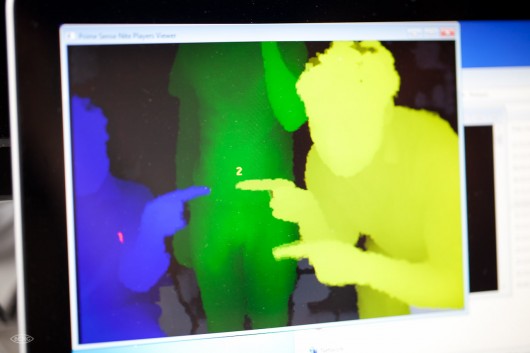
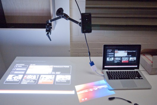
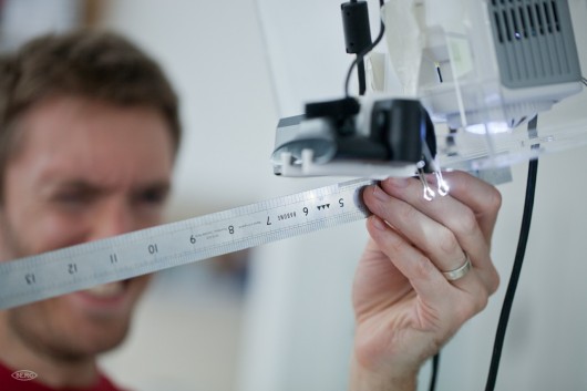
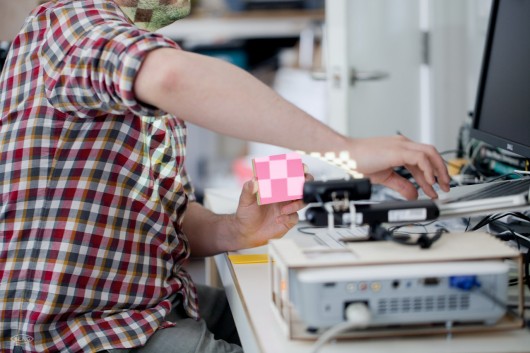
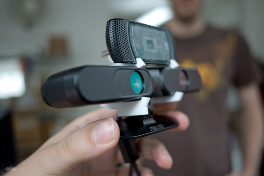
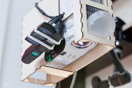
Quickly, the team reached a point where more technical exploration was necessary and built a test-rig that could be used to prototype a “Smart Light Lamp” comprising a projector, a HD webcam, a PrimeSense / Asus depth camera and bespoke software.
At the time of the project the Kinect SDK now ubiquitous in computer vision projects was not officially available. The team plumped for the component approach over the integration of the Kinect for a number of reasons, including wanting the possibility of using HD video in capture and projection.
Testing the Lamps rig from BERG on Vimeo.
Nick recalls:
Actually by that stage the OpenNI libraries were out (http://openni.org/), but the “official” Microsoft SDK wasn’t out (http://www.microsoft.com/en-us/kinectforwindows/develop/developer-downloads.aspx). The OpenNI libraries were more focussed on skeletal tracking, and were difficult to get up and running.
Since we didn’t have much need for skeletal tracking in this project, we used very low-level access to the IR camera and depth sensor facilitated by various openFrameworks plugins. This approach gave us the correct correlation of 3D position, high definition colour image, and light projection to allow us to experiment with end-user applications in a unified, calibrated 3D space.
The proto rig became a great test bed for us to start to explore high-level behaviours of Smart Light – rules for interaction, animation and – for want of a better term – ‘personality’.
Little Brain, Big Brain
One of our favourite things of the last few years is Sticky Light.

It’s a great illustration of how little a system needs to do, for us to ascribe personality to its behaviour.
We imagined that the Smart Light Lamp might manifest itself as a companion species in the physical world, a creature that could act as a go-between for you and the mirror-worlds of the digital.
We’ve written about digital companion species before: when our digital tools become more than just tools – acquiring their own behaviour, personality and agency.

Bit, Flynn’s digital companion from the original Tron
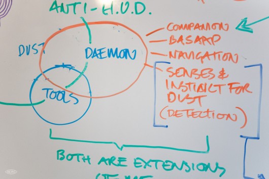
You might recall Bit from the original Tron movie, or the Daemons from the Philip Pullman “His Dark Materials” trilogy. Companions that are “on your side” but have abilities and senses that extend you.
We wanted the Lamp to act as companion species for the mirror-worlds of data that we all live within, and Google has set out to organise.
We wanted the lamp to act as a companion species that illustrated – through its behaviour – the powers of perception that Google has through computer vision, context-sensing and machine-learning.
Having a companion species that is a native of the cloud, but on your side, could make evident the vast power of such technologies in an intuitive and understandable way.
Long-running themes of the studio’s work are at play here – beautiful seams, shelf-evidence, digital companion species and BASAAP – which we tried to sum up in our Gardens and Zoos talk/blog post , which in turn was informed by the work we’d done in the studios on Lamps.
One phrase that came up again and again around this areas of the lamps behaviour was “Big Brain, Little Brain” i.e. the Smart Light companion would be the Little Brain, on your side, that understood you and the world immediately around you, and talked on your behalf to the Big Brain in ‘the cloud’.
This intentional division, this hopefully ‘beautiful seam’ would serve to emphasise your control over what you let the the Big Brain know in return for its knowledge and perspective, and also make evident the sense (or nonsense) that the Little Brain makes of your world before it communicates that to anyone else.
One illustration we made of this is the following sketch of a ‘Text Camera’
Text Camera from BERG on Vimeo.
Text Camera is about making the inputs and inferences the phone sees around it to ask a series of friendly questions that help to make clearer what it can sense and interpret.
It reports back on what it sees in text, rather than through a video. Your smartphone camera has a bunch of software to interpret the light it’s seeing around you – in order to adjust the exposure automatically. So, we look to that and see if it’s reporting ‘tungsten light’ for instance, and can infer from that whether to ask the question “Am I indoors?”.
Through the dialog we feel the seams – the capabilities and affordances of the smartphone, and start to make a model of what it can do.
The Smart Light Companion in the Lamp could similarly create a dialog with its ‘owner’, so that the owner could start to build up a model of what its Little Brain could do, and where it had to refer to the Big Brain in the cloud to get the answers.
All of this serving to playfully, humanely build a literacy in how computer vision, context-sensing and machine learning interpret the world.
Rules for Smart Light
The team distilled all of the sketches, code experiments, workshop conversations and model-making into a few rules of thumb for designing with this new material – a platform for further experiments and invention we could use as we tried to imagine products and services that used Smart Light.
Reflecting our explorations, some of the rules-of-thumb are aesthetic, some are about context and behaviour, and some are about the detail of interaction.
24 Rules for smart light from BERG on Vimeo.
We wrote the ‘rules’ initially as a list of patterns that we saw as fruitful in the experiments. Our ambition was to evolve this in the form of a speculative “HIG” or Human Interface Guideline – for an imagined near-future where Smart Light is as ubiquitous as the touchscreen is now…
Smart Light HIG
- Projection is three-dimensional. We are used to projection turning a flat ‘screen’ into an image, but there is really a cone of light that intersects with the physical world all the way back to the projector lens. Projection is not the flatland display surfaces that we have become used to through cinema, tv and computers.
- Projection is additive. Using a projector we can’t help but add light to the world. Projecting black means that a physical surface is unaffected, projecting white means that an object is fully illuminated up to the brightness of the projector.
- Enchanted objects. Unless an object has been designed with blank spaces for projection, it should not have information projected onto it. Because augmenting objects with information is so problematic (clutter, space, text on text) objects can only be ‘spotlighted’, ‘highlighted’ or have their own image re-projected onto themselves.
- Light feels touchable (but it’s not). Through phones and pads we are conditioned into interacting with bright surfaces. It feels intuitive to want to touch, grab, slide and scroll projected things around. However, it is difficult to make it interactive.
- The new rules of depth. A lamp sees the world as a stream of images, but also as a three-dimensional space. There is no consistent interaction surface to interact with like in mouse or touch-based systems, light hits any and all surfaces and making them respond to ‘touch’ is difficult. This is due to finger-based interaction being very difficult to achieve with projection and computer vision. Tracking fingers is technically difficult, fingers are small, there is limited/no existing skeletal recognition software for detecting hands.
- Smart light should be respectful. Projected light inhabits the world alongside us, it augments and affects the things we use every day. Unlike interfaces that are contained in screens, the boundaries of the lamps vision and projection are much more obscure. Lamps ‘look’ at the world through cameras, which mean that they should be trustworthy companions.
Next, we started to create some speculative products using these rules, particularly focussed around the idea of “Enchanted Objects”…
Smart Light, Dumb Products
These are a set of physical products based on digital media and services such as YouTube watching, Google calendar, music streaming that have no computation or electronics in them at all.
All of the interaction and media is served from a Smart Light Lamp that acts on the product surface to turn it from a block into an ‘enchanted object’.
Joe started with a further investigation of the aesthetic qualities of light on materials.

Projection materials from BERG on Vimeo.
This lead to sketches exploring techniques of projection mapping on desktop scales. It’s something often seen at large scales, manipulating our perceptions of architectural facades with animated projected light, but we wanted to understand how it felt at more intimate human scale of projecting onto everyday objects.
In the final film you might notice some of the lovely effects this can create to attract attention to the surface of the object – guiding perhaps to notifications from a service in the cloud, or alerts in a UI.
Then some sketching in code – using computer vision to create optical switches – that make or break a recognizable optical marker depending on movement. In a final product these markers could be invisible to the human eye but observable by computer vision. Similarly – tracking markers to provide controls for video navigation, calendar alerts etc.

Fiducial switch from BERG on Vimeo.
Joe worked with physical prototypes – first simple nets in card and then more finished models to uncover some of the challenges of form in relation to angles of projection and computer vision.
For instance in the Video object, a pulley system has to connect the dial the user operates to the marker that the Lamp sees, so that it’s not obscured from the computer vision software.
Here’s the final output from these experiments:
Dumb things, smart light from BERG on Vimeo.
This sub-project was a fascinating test of our Smart Light HIG – which lead to more questions and opportunities.
For instance, one might imagine that the physical product – as well as housing dedicated and useful controls for the service it is matched to – could act as a ‘key’ to be recognised by computer vision to allow access to the service.
What if subscriptions to digital services were sold as beautiful robot-readable objects, each carved at point-of-purchase with a wonderful individually-generated pattern to unlock access?
What happened next: Universe-B
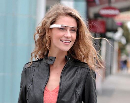
From the distance of a year since we finished this work, it’s interesting to compare its outlook to that of the much-more ambitious and fully-realised Google Glass project that was unveiled this summer.
Google Glass inherits a vision of ubiquitous computing that has been strived after for decades.
As a technical challenge it’s been one that academics and engineers in industry have failed to make compelling to the general populace. The Google team’s achievement in realising this vision is undoubtedly impressive. I can’t wait to try them! (hint, hint!)
It’s also a vision that is personal and, one might argue, introverted – where the Big Brain is looking at the same things as you and trying to understand them, but the results are personal, never shared with the people you are with. The result could be an incredibly powerful, but subjective overlay on the world.
In other words, the mirrorworld has a population of 1. You.
Lamps uses similar techniques of computer vision, context-sensing and machine learning but its display is in the world, the cloud is painted on the world. In the words of William Gibson, the mirrorworld is becoming part of our world – everted into the spaces we live in.
The mirrorworld is shared with you, and those you are with.
This brings with it advantages (collaboration, evidence) and disadvantages (privacy, physical constraints) – but perhaps consider it as a complementary alternative future… A Universe-B where Google broke out of the glass.
Postscript: the scenius of Lamps
No design happens in a vacuum, and culture has a way of bubbling up a lot of similar things all at the same time. While not an exhaustive list, we want to acknowledge that! Some of these projects are precedent to our work, and some emerged in the nine months of the project or since.
- Steve Mann’s Telepointer project (1998) http://en.wikipedia.org/wiki/Telepointer
- Moveable Projected Displays using Projector Based Tracking (2005-2007) by Jonny Chung Lee, Scott E. Hudson, Jay W. Summet and Paul H. Dietz
- Microsoft research: 6th sense (2009)
- Jamie Tunnard’s anglepoise projector (2010) http://www.hhc.rca.ac.uk/3147/all/1/Desklampprojector.aspx
- Omnitouch by Chris Harrison, Hrvoje Benko and Andrew D. Wilson (2011)
- Camara-Lucida by Christian Parsons and Mariano Tepper (2011)
- University of Tokyo: “Invoked Computing” (2011)
- Pico projection of interfaces onto surfaces from Darmstadt University (2012)
- SketchSynth by Billy Keyes of CMU (2012)
Here are a selection of less-academic projects using projection and computer-vision that Joe picked out from the last year or so:
- Display Cabinet by Ben Bashford : http://journal.benbashford.com/post/4530562245
- TSUMIKI by PPP : http://vimeo.com/31836098
- Evolution of Mobile by VodaphoneUK : http://www.youtube.com/watch?v=883UlMNOuX4
- Receipt racer by undef and Joshua Noble : http://vimeo.com/24987120
- Real-life Minecraft Block by Ben Purdy : http://vimeo.com/28124800
- SHOWROOM RICHTI-AREAL by PROJEKTIL : http://vimeo.com/22946428
- Playstation 3 Promos : http://www.youtube.com/watch?v=VrgWH1KUDt4, http://www.youtube.com/watch?v=N_cKsOe7hLI
Huge thanks to Tom Uglow, Sara Rowghani, Chris Lauritzen, Ben Malbon, Chris Wiggins, Robert Wong, Andy Berndt and all those we worked with at Google Creative Lab for their collaboration and support throughout the project.

