This website is now archived. To find out what BERG did next, go to www.bergcloud.com.

Blog posts tagged as 'peripherals'

Magic tables, not magic windows

A while back, in 2007, I wrote about ‘a lost future’ of touch technology, and the rise of a world full of mobile glowing attention-wells.

“…it’s likely that we’re locked into pursuing very conscious, very gorgeous, deliberate touch interfaces – touch-as-manipulate-objects-on-screen rather than touch-as-manipulate-objects-in-the-world for now.”

It does look very much like we’re living in that world now – where our focus is elsewhere than our immediate surroundings – mainly residing through our fingers, in our tiny, beautiful screens.

Andrew Blum writes about this, amongst other things, in his excellent piece “Local Cities, Global Problems: Jane Jacobs in an Age of Global Change”:

Like a lot of things here, they are deeply connected to other places. Their attention is divided. And, by extension, so is ours. While this feeling is common to all cities over time, cell phones bring the tangible immediacy of the faraway to the street. Helped along by media and the global logistics networks that define our material lives, our moment-to-moment experience of the local has become increasingly global.

Recently, of course, our glowing attention wells have become larger.

We’ve been designing, developing, using and living with iPads in the studio for a while now, and undoubtedly they are fine products despite their drawbacks – but it wasn’t until our friend Tom Coates introduced me to a game called Marble Mixer that I thought they were anything other than the inevitable scaling of an internet-connected screen, and the much-mooted emergence of a tablet form-factor.

It led me to think they might be much more disruptive as magic tables than magic windows.

Marble Mixer is a simple game, well-executed. Where it sings is when you invite friends to play with you.

Each of you occupy a corner of the device, and attempts to flick marbles into the goal-mouth against the clock – dislodging the other’s marbles.

Beautiful. Simple. But also – amazing and transformative!

We’re all playing with a magic surface!

When we’re not concentrating on our marbles, we’re looking each other in the eye – chuckling, tutting and cursing our aim – and each other.

There’s no screen between us, there’s a magic table making us laugh. It’s probably my favourite app to show off the iPad – including the ones we’ve designed!

It shows that the iPad can be a media surface to share, rather than a proscenium to consume through alone.

Russell Davies pointed this out back in February (before we’d even touched one) saying:

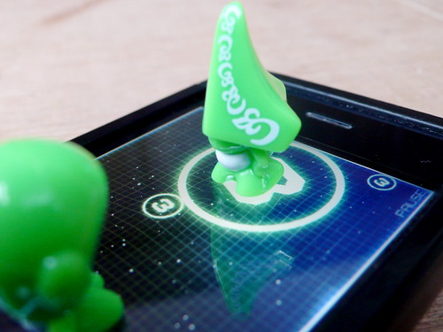
[GoGos]’d be the perfect counters for a board game that uses the iPad as the board. They’d look gorgeous sitting on there. We’d need to work out how to make the iPad think they were fingers – maybe some sort of electrostatic sausage skin – and to remember which was which.

gogos on an iphone

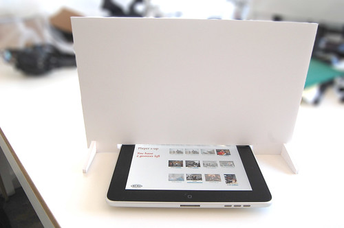
Inspired by Marble Mixer, and Russell’s writings – I decided to do a spot of rapid prototyping of a ‘peripheral’ for magic table games that calls out the shared-surface…

Magic table games

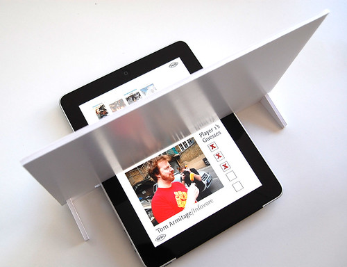
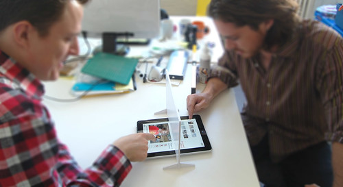
It’s a screen – but not a glowing one! Just a simple bit of foamboard cut so it obscures your fellow player’s share of the game board, for games like Battleships, or in this case – a mocked-up guessing-game based on your flickr contacts…

Magic table games

You’d have a few guesses to narrow it down… Are they male, do they have a beard etc…

Magic table games

Fun for all the family!

Anyway – as you can see – this is not so serious a prototype, but I can imagine some form of capactive treatment to the bottom edge of the screen, perhaps varying the amount of secret territory each player revealed to each other, or capacitive counters as Russell suggests.

Aside from games though – the pattern of a portable shared media surface is surely worth pursuing.

As Paul Dourish put it in his book “Where the action is” – the goal would be

“interacting in the world, participating in it and acting through it, in the absorbed and unreflective manner of normal experience.”

Designing media and services for “little-ass” rather than “big-ass” magic tables might propel us into a future not so removed from the one I thought we might have lost…
Olinda interface drawings

Last week, Tristan Ferne who leads the R&D team in BBC Audio & Music Interactive gave a talk at Radio at the Edge (written up in Radio Today). As a part of his talk he discussed progress on Olinda.

Most of the design and conceptual work for the radio is finished now. We are dealing with the remaining technicalities of bringing the radio into the world. To aid Tristan’s presentation we drew up some slides outlining how we expect the core functionality to work when the radio manifests.

Social module

Social Module sequence

This animated sequence shows how the social module is expected to work. The radio begins tuned to BBC Radio 2. A light corresponding to Matt’s radio lights up on the social module. When the lit button is pressed, the top screen reveals Matt is listening to Radio 6 Music, which is selected and the radio retunes to that station.

Tuning

Tuning drawing

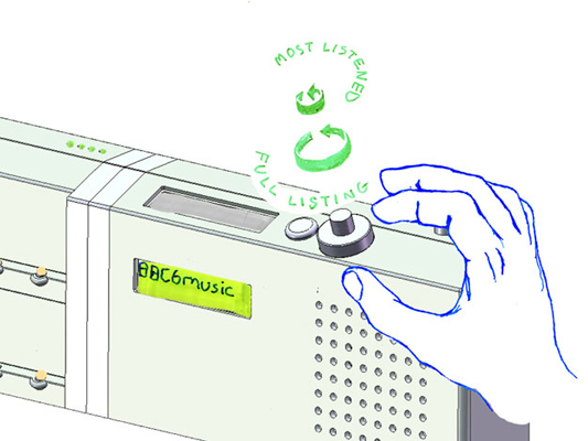
This detail shows how the list management will work. The radio has a dual rotary dial for tuning between the different DAB stations. The outer dial cycles through the full list of all the stations the radio has successfully scanned for. The inner dial filters the list down and cycles through the top five most listened to stations. We’ll write more on why we’ve made these choices when the radio is finished.

Celebration of function

This post is going to be about objects that celebrate their functions. This was an area of research for me during my time at the Royal College of Art. I’m going to follow on from Matt’s post on Disco and intrinsic activities. More show than tell here I think.

Here is my favourite piece of video right now. It is from the film 9 and a Half Weeks (via James Auger), and if you can wade your way through Rourke and Basinger power bonking their way around Manhattan you see this tape deck in his apartment. I’ve looped the video a couple of times and slowed it so you can see clearly.

I’m pretty sure it is a Nakamich RX tape deck. Using a system called UDAR (UniDirectional Auto Reverse) it mechanically flips the tape over at the end of each side. Something to do with aligning the heads. It is a fantastic piece of perfomance, and completely intrinsic to the nature and qualities of tape decks. Whatever it’s functional relevance might be, witnessing a mechanical operation so performative is excellent, the object is so discreetly joyful about what it is doing.

I also came across this video of a Red Raven records vinyl (via Alex Jarvis) on Kempa.com, along with some lovely research on vinyl video. It has two components. One is the vinyl, which has a large area of printed imagery on the larger than normal label; the second is a sixteen sided mirror which sits in the middle of your turn table and works like a zoetrope, reflecting the images on the vinyl as it turns and creating animation.

This a is beautiful response to the intrinsic qualities of vinyl and the mechanism of the record deck. More products should include this sort of wit and performative funtionality.

My printer, my social letterbox

One of the trends Jack and I discuss a lot is the internet sensibility hitting the world of plastic products. What happens when stuff is conceived of not as tools, but as participants in our own creative, social, connected lives?

I was talking about this with Nat the other week and spinning up concrete examples. One was what this new wave of product would mean to a fairly traditional technology device, like the printer. So here’s my first off-the-top-of-my-head product idea:

If my desktop printer understood the lessons of social software and Web 2.0, it wouldn’t be attached just to my computer or local network. It’d be accessible by my closest family and friends, too, regardless of where they lived. These people are my primary network, the folks for whom I’d put my neck on the line, and of course I’d let them use my paper and toner, just as I’d happily leave them with my house keys.

But what would this remote printing be used for?

My family would print me photos–currently the 3 of us have a shared folder just for pictures, because it’s easy to use and totally private, but an image landing in a folder doesn’t mirror its social importance to me.

My mum, instead of scanning newspaper clippings and emailing them to me (happily, her scanner has a single button that does that whole job), she would print them straight into my house.

My close friends would send me sketches, or print out long articles that I really must read. Yes, we can do this by email–but everyone in the world can send me articles by email. I have a much closer relationship with these people, so why doesn’t my computer support that?

It’s the desktop printer meets social software meets the fax machine, but in everyday life rather than the office. The printer is no longer a printer, it’s my social letterbox.

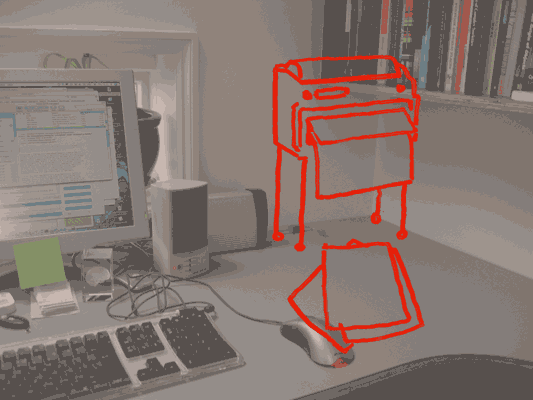
Jack drew what it would look like:

Social letterbox (distressed)

The social letterbox printer sits on the wall so that when it’s finished printing, the paper falls to the desk with a satisfying thump. It prints slowly, because it’s often going to be working when I’m not there and there’s no hurry. The paper is probably cheap, perhaps thermal paper.

This is because the new social interactions around the printer now influence its form.

And now we have this letterbox, what else would we see? Perhaps magazines, subscribed to like podcasts, sent as PDFs, that my computer picks up and prints overnight, ready for me to read in the morning–just like iTunes downloading shows for me to listen to on my iPod. I’d love a zine that collated the best of my friend’s essays in their blogs. We’ve got the technology, so why not? We might send sketches – napkin doodles – or hand-written notes more often, knowing they could end up pinned to a wall. For some people, the social letterbox might be the only way they like to receive messages and mails from their family.

All of this points to a very different product from the present-day desktop printer. It could be done today–printer manufactures could bundle social letterbox software with their devices, just as digital camera manufacturers bundle photo management applications. But I think that’d be missing the point: the social interactions change the physical device itself.

As well as having a fast laser printer on the floor, I’d have a smaller, cheaper, slower social letterbox on my desk. I’d buy two printers! And we’ve doubled the size of the printer market, at a stroke.

Drawing phones

Hello.

I think I’m mostly going to post drawings from my sketchbooks, and talk around those for a while. Since a lot of my thinking starts like this. My sketchbooks are also places where I put ideas that would be too difficult to make, so they just get drawn instead.

I think phones mostly used to look like this:

Old phone drawing

Now they don’t. During our work for Nokia and my time at the RCA, I developed groups of ideas around phones and how their functionality influences their form. The ideas follow a continuing enthusiasm for celebration of function, something that continues to influence the work Matt and I do.

Drawing of phone 01

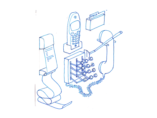
The first is a sketch of a phone dock that distributes all the things I use in the phone into discrete physical instances locally. Pretty self descriptive really, a receipt printer pushes out text messages as they arrive. To make a call, stamp out the number, or add a name card from the Rolodex, then pull down on the indicator lever, the end blinks while it rings and snaps back when the phone returns to idle or someone answers.

Mechanical phone

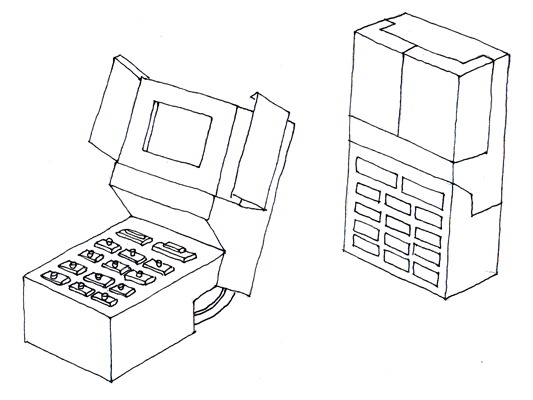
This phone explores the keypad unlock function. As it opens from its locked down position, the screen opens like a flower and all the buttons turn over like little Porsche* headlamps. Locked down, it is completely flush and faceless, no risk of pocket dialling, but fragile, mechanical and slim when open.

*(is it Porsche or am I revising history?)

Extra hand set

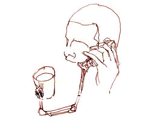
Hands free sets feel quite unsatisfying. Wouldn’t it be better if your phone came with an extra hand? This phone comes with a small robot arm (plugged into your data port), to hold your tea, or mangle paper clips while you are listening to your voice mail. Definitely needs to be more exploration of robot arms in the future.

Recent Posts

Popular Tags