This website is now archived. To find out what BERG did next, go to www.bergcloud.com.

Blog posts tagged as 'interface'

Connbox: prototyping a physical product for video presence with Google Creative Lab, 2011

At the beginning of 2011 we started a wide-ranging conversation with Google Creative Lab, discussing near-future experiences of Google and its products.

We’ve already discussed our collaboration on “Lamps”, the conceptual R&D around computer vision in a separate post.

They had already in mind another brief before approaching us, to create a physical product encapsulating Google voice/video chat services.

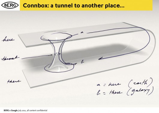
This brief became known as ‘Connection Box’ or ‘Connbox’ for short…

BERG-Chaco-Connbox-20110714-003

For six months through the spring and summer of 2011, a multidisciplinary team at BERG developed the brief based on research, strategic thinking, hardware and software prototyping into believable technical and experiential proof of a product that could be taken to market.

It’s a very different set of outcomes from Lamps, and a different approach – although still rooted in material exploration, it’s much more centred around rapid product prototyping to really understand what the experience of physical device, service and interface could be.

As with our Lamps post, I’ve broken up this long report of what was a very involving project for the entire studio.


The Connbox backstory


The videophone has an unusually long cultural legacy.

It has been a very common feature of science fiction all the way back to the 1920s. As part of our ‘warm-up’ for the project, Joe put together a super-cut of all of the instances he could recollect from film and tv…

Videophones in film from BERG on Vimeo.

The video call is still often talked about as the next big thing in mobile phones (Apple used FaceTime as a central part of their iphone marketing, while Microsoft bought Skype to bolster their tablet and phone strategy). But somehow video calling has been stuck in the ‘trough of disillusionment’ for decades. Furthermore, the videophone as a standalone product that we might buy in a shop has never become a commercial reality.

On the other hand, we can say that video calls have recently become common, but in a very specific context. That is, people talking to laptops – constrained by the world as seen from webcam and a laptop screen.

13 September, 18.57

This kind of video calling has become synonymous with pre-arranged meetings, or pre-arranged high-bandwidth calls. It is very rarely about a quick question or hello, or a spontaneous connection, or an always-on presence between two spaces.

Unpacking the brief

The team at Google Creative Lab framed a high-level prototyping brief for us.

The company has a deep-seated interest in video-based communication, and of course, during the project both Google Hangouts and Google Plus were launched.

The brief placed a strong emphasis on working prototypes and live end-to-end demos. They wanted to, in the parlance of Google, “dogfood” the devices, to see how they felt in everyday use themselves.

I asked Jack to recall his reaction to the brief:

The domain of video conferencing products is staid and unfashionable.

Although video phones have lived large in the public imagination, no company has made a hardware product stick in the way that audio devices have. There’s something weirdly broken about taking behaviours associated with a phone: synchronous talking, ringing or alerts when one person wants another’s attention, hanging up and picking up etc.

Given the glamour and appetite for the idea, I felt that somewhere between presence and video a device type could emerge which supported a more successful and appealing set of behaviours appropriate to the form.

The real value in the work was likely to emerge in what vehicle designers call the ‘third read’. The idea of product having a ‘first, second and third read’ comes up a lot in the studio. We’ve inherited it by osmosis from product designer friends, but an excerpt from the best summation of it we can find on the web follows:

The concept of First, Second, Third Read which comes from the BMW Group automotive heritage in terms of understanding Proportion, Surface, and Detail.

The First Read is about the gesture and character of the product. It is the first impression.

Looking closer, there is the Second Read in which surface detail and specific touchpoints of interaction with the product confirm impressions and set up expectations.

The Third Read is about living with the product over time—using it and having it meet expectations…

So we’re not beginning with how the product looks or where it fits in a retail landscape, but designing from the inside out.

We start by understanding presence through devices and what video can offer, build out the behaviours, and then identify forms and hardware which support that.

To test and iterate this detail we needed to make everything, so that we can live with and see the behaviours happen in the world.

connbox for blogging.016

Material Exploration


We use the term ‘material exploration’ to describe our early experimental work. This is an in-depth exploration of the subject by exploring the properties, both inate and emergent of the materials at hand. We’ve talked about it previously here and here.

What are the materials that make up video? They are more traditional components and aspects of film such as lenses, screens, projectors, field-of-view as well as newer opportunities in the domains of facial recognition and computer vision.

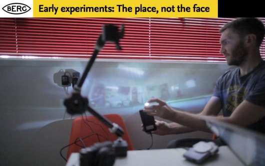
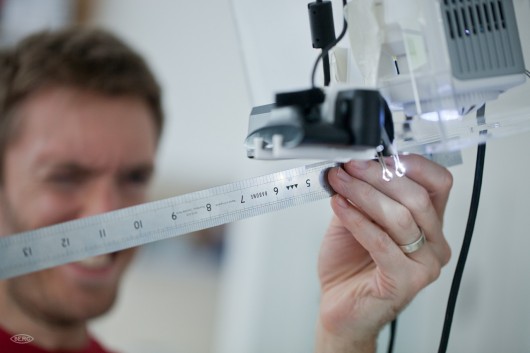
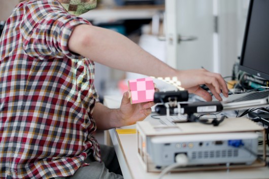
Some of our early experiments looked at field-of-view – how could we start to understand where an always-on camera could see into our personal environment?

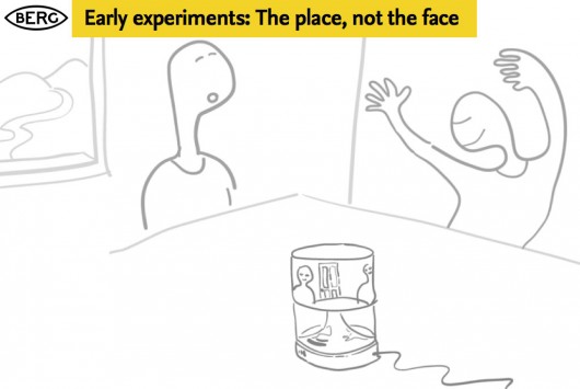
We also challenged the prevalent forms of video communication – which generally are optimised for tight shots of people’s faces. What if we used panoramic lenses and projection to represent places and spaces instead?

chaco_Connbox_2012-03-10_TDA.010

chaco_Connbox_2012-03-10_TDA.009

In the course of these experiments we used a piece of OpenFrameworks code developed by Golan Levin. Thanks Golan!

We also experimented with the visual, graphic representation of yourself and other people, we are used to the ‘picture in picture’ mode of video conferencing, where we see the other party, but have an image of ourselves superimposed in a small window.

We experimented with breaking out the representation of yourself into a separate screen, so you could play with your own image, and position the camera for optimal or alternative viewpoints, or to actually look ‘through’ the camera to maintain eye contact, while still being able to look at the other person.

Connbox-lens-projection-tests-00001

One of the main advantages of this – aside from obviously being able to direct a camera at things of interest to the other party – was to remove the awkwardness of the picture-in-picture approach to showing yourself superimposed on the stream of the person you are communicating with…

There were interaction & product design challenges in making a simpler, self-contained video chat appliance, amplified by the problem of taking the things we take for granted on the desktop or touchscreen: things like the standard UI, windowing, inputs and outputs, that all had to be re-imagined as physical controls.

This is not a simple translation between a software and hardware behaviour, it’s more than just turning software controls into physical switches or levers.

It involves choosing what to discard, what to keep and what to emphasise.

Should the product allow ‘ringing’ or ‘knocking’ to kickstart a conversation, or should it rely on other audio or visual cues? How do we encourage always-on, ambient, background presence with the possibility of spontaneous conversations and ad-hoc, playful exchanges? Existing ‘video calling’ UI is not set up to encourage this, so what is the new model of the interaction?

To do this we explored in abstract some of the product behaviours around communicating through video and audio.

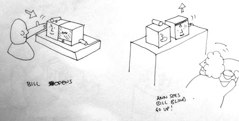
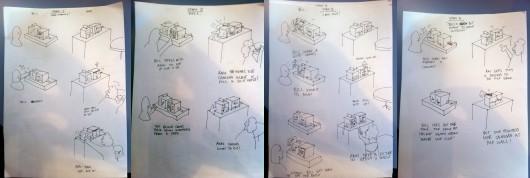
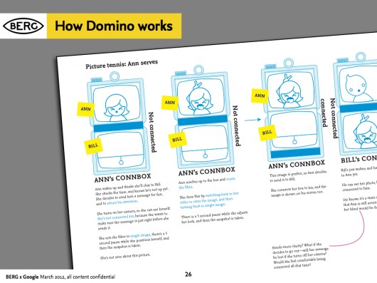
We began working with Durrell Bishop from LuckyBite at this stage, and he developed scenarios drawn as simple cartoons which became very influential starting points for the prototyping projects.

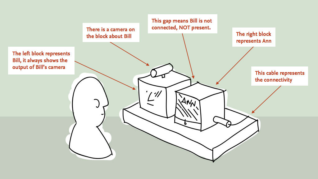
The cartoons feature two prospective users of an always-on video communication product – Bill and Ann…

Durrell_firstsketches1

This single panel from a larger scenario shows the moment Bill opens up a connection (effectively ‘going online’) and Ann sees this change reflected as a blind going up on Bill’s side of her Connbox.

Prototyping


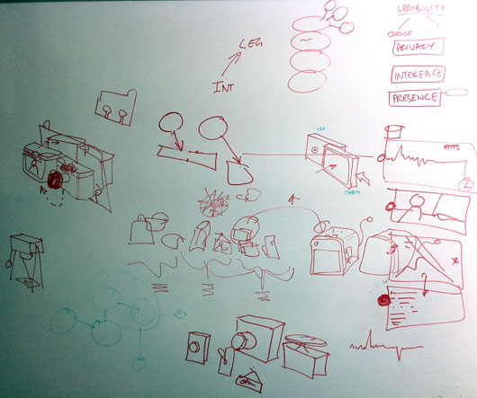
Our early sketches on both whiteboards and in these explorations then informed our prototyping efforts – firstly around the technical challenges of making a standalone product around google voice/video, and the second more focussed on the experiential challenges of making a simple, pleasurable domestic video chat device.

prototype_sketches

For reasons that might become obvious, the technical exploration became nicknamed “Polar Bear” and the experimental prototype “Domino”.

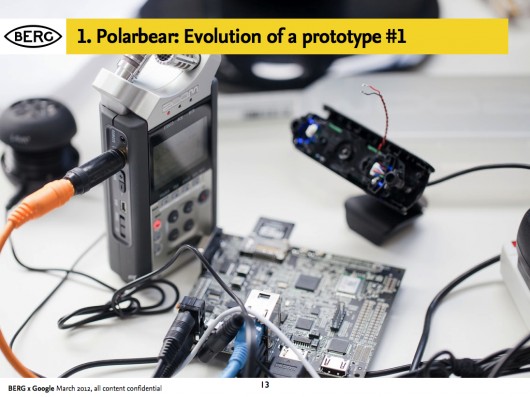
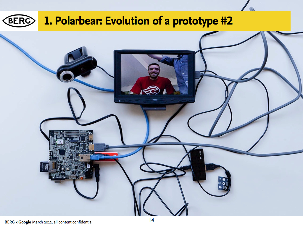
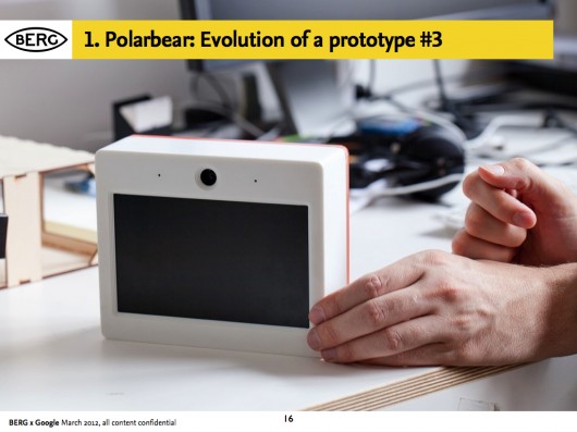
Prototype 1: A proof of technology called ‘Polar Bear’

In parallel with the work to understand behaviours we also began exploring end-to-end technical proofs.

We needed to see if it was possible to make a technically feasible video-chat product with components that could be believable for mass-production, and also used open-standard software.

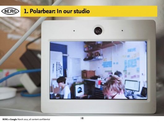
Aside from this, it provided us with something to ‘live with’, to understand the experience of having an always-on video chat appliance in a shared social space (our studio)

chaco_Connbox_2012-03-10_TDA.013

chaco_Connbox_2012-03-10_TDA.014

Andy and Nick worked closely with Tom and Durrell from Luckybite on housing the end-to-end proof in a robust accessible case.

It looked like a polar bear to us, and the name stuck…

chaco_Connbox_2012-03-10_TDA.016

chaco_Connbox_2012-03-10_TDA.017

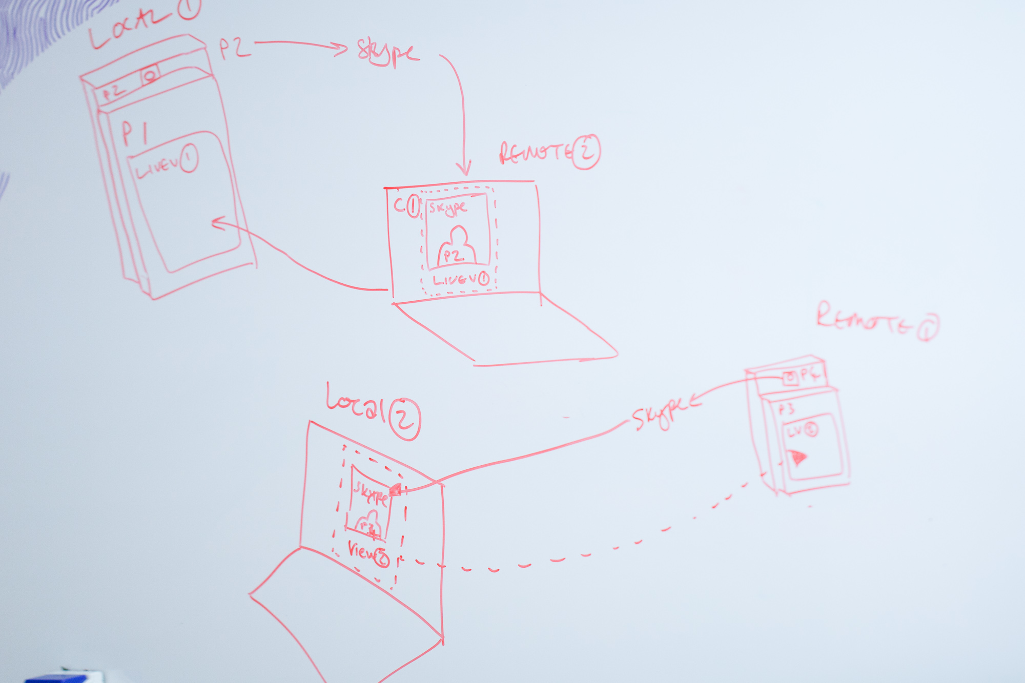
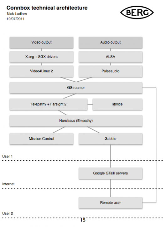
The software stack was designed to create something that worked as an appliance once paired with another, that would fire up a video connection with its counterpart device over wireless internet from being switched on, with no need for any other interface than switching it on at the plug.

chaco_Connbox_2012-03-10_TDA.015

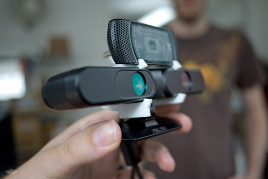
We worked with Collabora to implement the stack on Pandaboards: small form-factor development boards.

chaco_Connbox_2012-03-10_TDA.018

Living with Polar Bear was intriguing – sound became less important than visual cues.

It reminded us all of Matt Webb’s “Glancing” project back in 2003:

Every so often, you look up and look around you, sometimes to rest your eyes, and other times to check people are still there. Sometimes you catch an eye, sometimes not. Sometimes it triggers a conversation. But it bonds you into a group experience, without speaking.

Prototype 2: A product and experience prototype called “Domino”


We needed to come up with new kinds of behaviours for an always on, domestic device.

This was the biggest challenge by far, inventing ways in which people might be comfortable opening up their spaces to each other, and on top of that, to create a space in which meaningful interaction or conversation might occur.

To create that comfort we wanted to make the state of the connection as evident as possible, and the controls over how you appear to others simple and direct.

The studio’s preoccupations with making “beautiful seams” suffused this stage of the work – our quest to create playful, direct and legible interfaces to technology, rather than ‘seamless’ systems that cannot be read or mastered.

In workshops with Luckybite, the team sketched out an approach where the state of the system corresponds directly to the physicality of the device.

Durrell_firstsketches2

The remote space that you are connecting with is represented on one screen housed in a block, and the screen that shows your space is represented on another. To connect the spaces, the blocks are pushed together, and pulled-apart to disconnect.

Durrell outlined a promising approach to the behaviour of the product in a number of very quick sketches during one of our workshops:

DB_sketches_large

Denise further developed the interaction design principles in a detailed “rulespace” document, which we used to develop video prototypes of the various experiences. This strand of the project acquired the nickname ‘Domino’ – these early representations of two screens stacked vertically resembling the game’s pieces.

chaco_Connbox_2012-03-10_TDA.026

As the team started to design at a greater level of detail, they started to see the issues involved in this single interaction: Should this action interrupt Ann in her everyday routine? Should there be a sound? Is a visual change enough to attract Ann’s attention?

The work started to reveal more playful uses of the video connection, particularly being able to use ‘stills’ to communicate about status. The UI also imagines use of video filters to change the way that you are represented, going all the way towards abstracting the video image altogether, becoming visualisations of audio or movement, or just pixellated blobs of colour. Other key features such as a ‘do not disturb blind’ that could be pulled down onscreen through a physical gesture emerged, and the ability to ‘peek’ through it to let the other side know about our intention to communicate.

Product/ID development


With Luckybite, we started working on turning it into something that would bridge the gap between experience prototype and product.

BERG-Domino-20120221-006

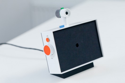
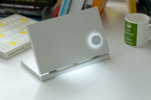
The product design seeks to make all of the interactions evident with minimum styling – but with flashes of Google’s signature colour-scheme.

BERG-Domino-20120221-005

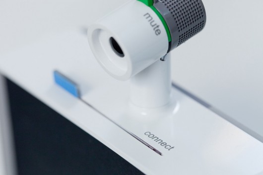
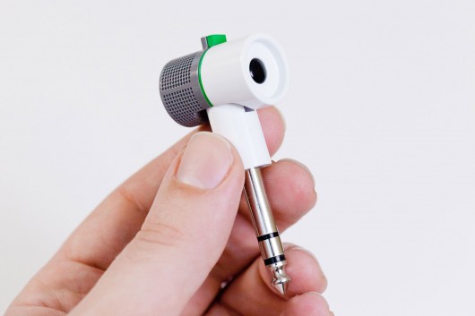
The detachable camera, with a microphone that can be muted with a sliding switch, can be connected to a separate stand.

BERG-Domino-20120221-012

This allows it to be re-positioned and pointed at other views or objects.

BERG-Domino-20120221-020

This is a link back to our early ‘material explorations’ that showed it was valuable to be able to play with the camera direction and position.

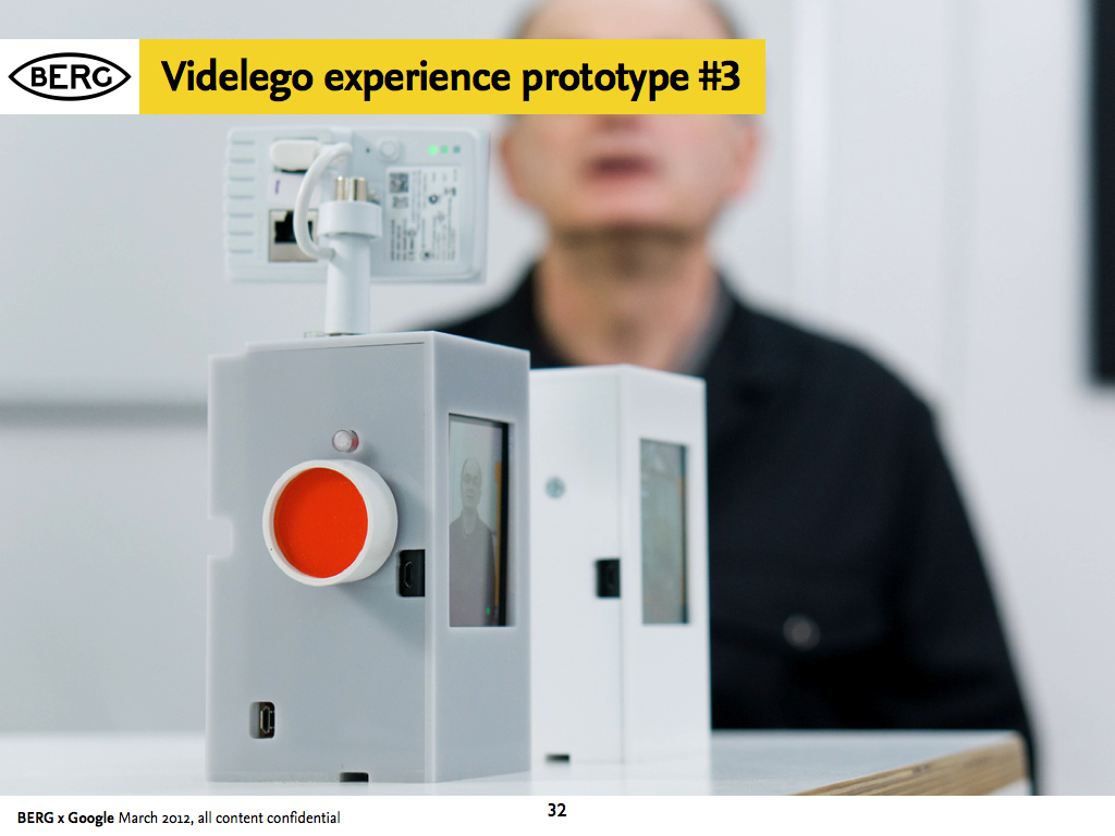
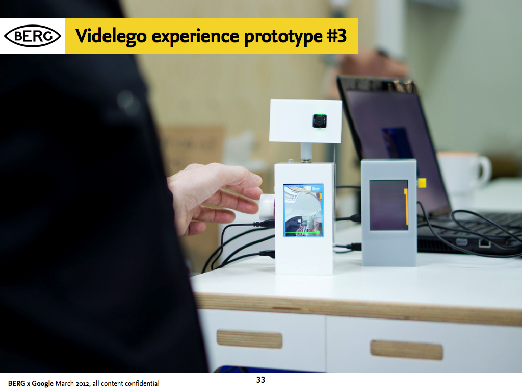
Prototype 3: Testing the experience and the UI


Final technical prototypes in this phase make a bridge between the product design and experience thinking and the technical explorations.

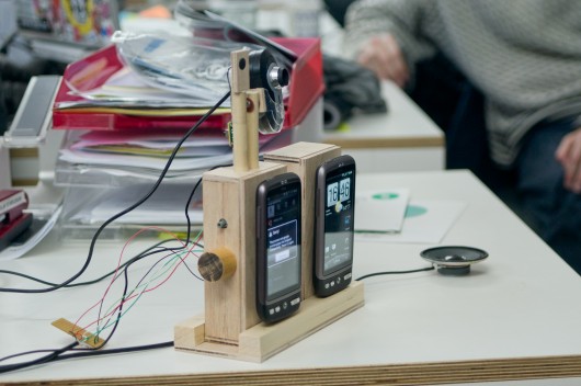
This manifested in early prototypes using Android handsets connected to servers.

BERG-Connbox-20111021-002

BERG-Connbox-20111021-001

chaco_Connbox_2012-03-10_TDA.032

chaco_Connbox_2012-03-10_TDA.033

Connbox: Project film


Durrell Bishop narrates some of the prototype designs that he and the team worked through in the Connbox project.

The importance of legible products


The Connbox design project had a strong thread running though it of making interfaces as evident and simple as possible, even when trying to convey abstract notions of service and network connectivity.

I asked Jack to comment on the importance of ‘legibility’ in products:

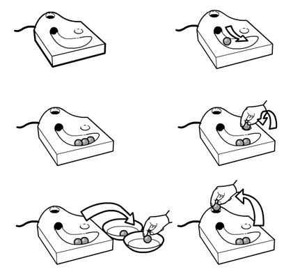
Connbox exists in a modern tradition of legible products, which sees the influence of Durrell Bishop. The best example I’ve come across that speaks to this thinking is Durrell’s answering machine he designed.

When messages are left on the answering machine they’re represented as marbles which gather in a tray. People play the messages by placing them in a small dip and when they’ve finished they replace them in the machine.

Screen Shot 2013-02-25 at 16.36.07

If messages are for someone else in the household they’re left in that persons bowl for later. When you look at the machine the system is clear and presented through it’s physical form. The whole state of the system is evident on the surface, as the form of the product.

Making technology seamless and invisible hides the control and state of the system – this path of thinking and design tries to place as much control as possible in the hands of the end-user by making interfaces evident.

In the prototype UI design, Joe created some lovely details of interaction fusing Denise’s service design sketches and the physical product design.

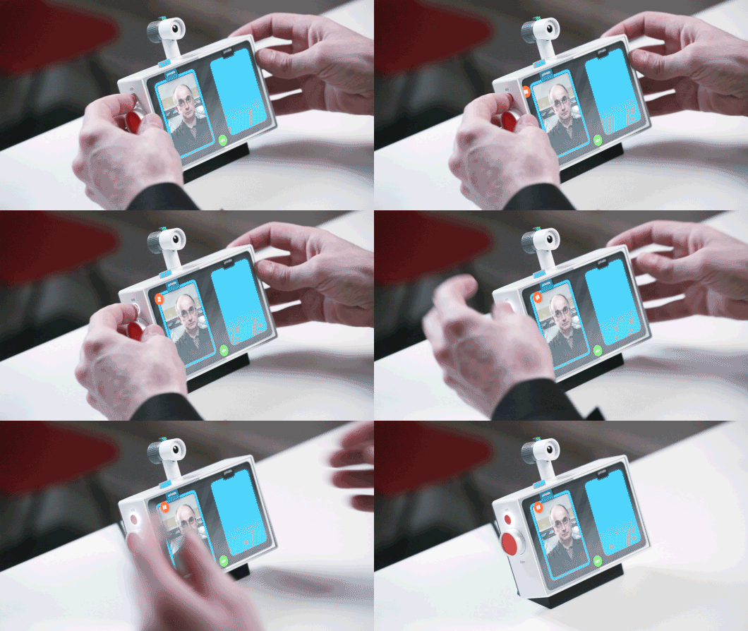
For instance, I love this detail where using the physical ‘still’ button, causes a digital UI element to ‘roll’ out from the finger-press…

Legible-interaction2

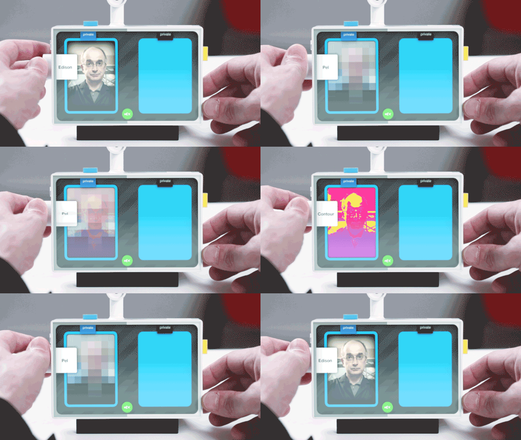
A very satisfying dial for selecting video effects/filters…

Legible-interaction3

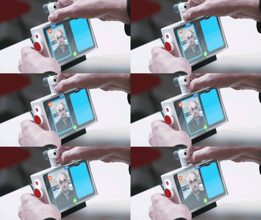
And here, where a physical sliding tab on top of the device creates the connection between two spaces

Legible-interaction1

This feels like a rich direction to explore in future projects, of a kind of ‘reverse-skeuomorphism‘ where digital and physical affordances work together to do what each does best rather than just one imitating the other.

Conclusion: What might have been next?


At the end of this prototyping phase, the project was put on hiatus, but a number of directions seemed promising to us and Google Creative Lab.

Broadly speaking, the work was pointing towards new kinds of devices, not designed for our pockets but for our homes. Further explorations would have to be around the rituals and experience of use in a domestic setting.

Special attention would have to be given to the experience of set-up, particularly pairing or connecting the devices. Would this be done as a gift, easily configured and left perhaps for a relative who didn’t have a smartphone or computer? How could that be done in an intuitive manner that emphasised the gift, but left the receiver confident that they could not break the connection or the product? Could it work with a cellular radio connection, in places where there no wireless broadband is found?

connbox for blogging.027

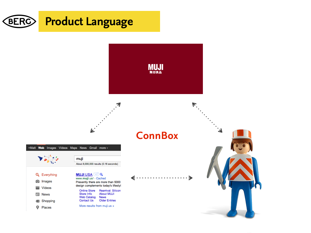
What cues could the physical product design give to both functionality and context? What might the correct ‘product language’ be for such a device, or family of devices for them to be accepted into the home and not seen as intrusive technology.

G+ and Hangouts launched toward the end of the project, so unfortunately there wasn’t time in the project to accommodate these interesting new products.

connbox for blogging.029

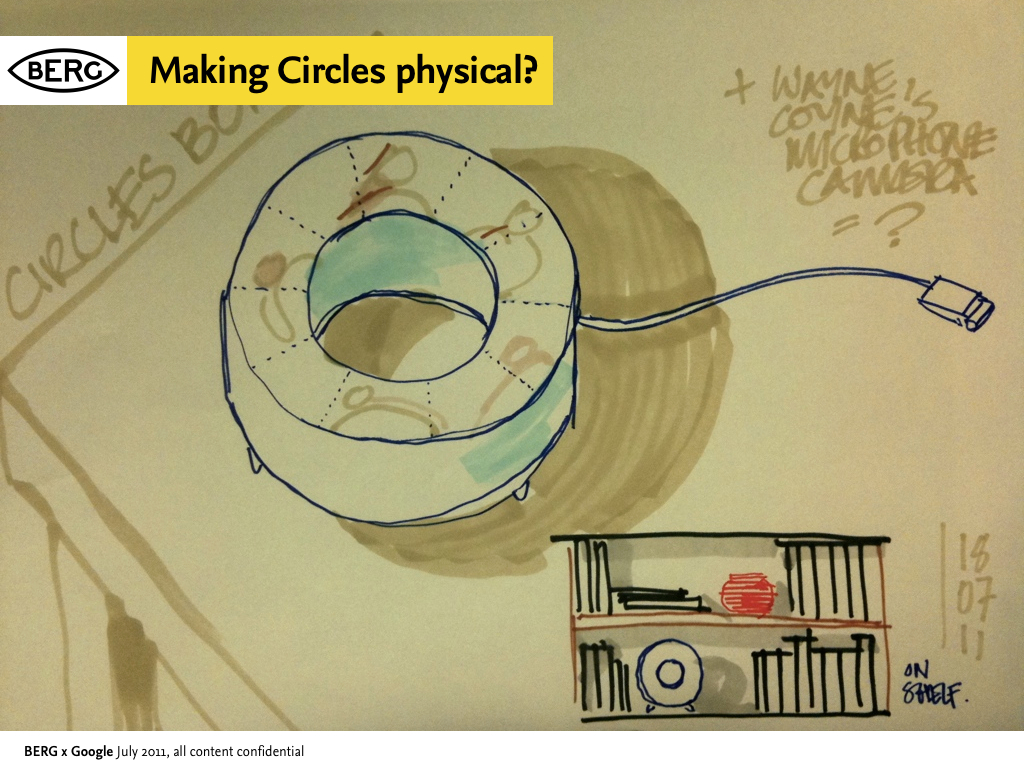
However we did start to talk about ways to physicalize G+’s “Circles” feature, which emphasises small groups and presence – it seemed like a great fit with what we had already looked at. How might we create a product that connects you to an ‘inner circle’ of contacts and the spaces they were in?

Postscript: Then and Now – how technology has moved on, and where we’d start now


Since we started the Connbox project in the Spring of 2011, one could argue that we’ve seen a full cycle of Moore’s law improve the capabilities of available hardware, and certainly both industry and open-source efforts in the domain of video codecs and software have advanced significantly.

Making Connbox now would be a very different endeavour.

Here Nick comments on the current state-of-the-art and what would be our starting points were we (or someone else) to re-start the project today…

Since we wrapped up this project in 2011, there’s been one very conspicuous development in the arena of video chat, and that is the rise of WebRTC. WebRTC is a draft web standard from W3C to enable browser to browser video chat without needing plugins.

As of early 2013, Google and Mozilla have demonstrated this system working in their nightly desktop browser builds, and recorded the first cross-browser video call. Ericsson are one of the first groups to have a mobile implementation available for Android and iOS in the form of their “Bowser” browser application.

WebRTC itself is very much an evolution of earlier work. The brainchild of Google Hangout engineers, this single standard is implemented using a number of separate components. The video and audio technology comes from Google in the form of the VP8 and iLBC codecs. The transport layer has incorporated libjingle which we also relied upon for our Polar Bear prototype, as part of the Farsight 2 stack.

Google is currently working on enabling WebRTC functionality in Chrome for Android, and once this is complete, it will provide the ideal software platform to explore and prototype Connbox ideas. What’s more, it actually provides a system which would be the basis of taking a successful prototype into full production.

Notable precedents


While not exhaustive, here are some projects, products, research and thinking we referenced during the work…


Thanks

Massive thanks to Tom Uglow, Sara Rowghani, Chris Lauritzen, Ben Malbon, Chris Wiggins, Robert Wong, Andy Berndt and all those we worked with at Google Creative Lab for their collaboration and support throughout the project.

Thanks to all we worked with at Collabora and Future Platforms on prototyping the technology.

Big thanks to Oran O’Reilly who worked on the films with Timo and Jack.
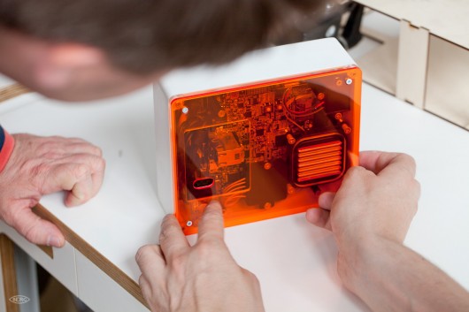
Lamps: a design research collaboration with Google Creative Labs, 2011

Preface

This is a blog post about a large design research project we completed in 2011 in close partnership with Google Creative Lab.

There wasn’t an opportunity for publication at the time, but it represented a large proportion of the studio’s efforts for that period – nearly everyone in the studio was involved at some point – so we’ve decided to document the work and its context here a year on.

I’m still really proud of it, and some of the end results the team produced are both thought-provoking and gorgeous.

We’ve been wanting to share it for a while.

It’s a long post covering a lot of different ideas, influences, side-projects and outputs, so I’ve broken it up into chapters… but I recommend you begin at the beginning…


Introduction


At the beginning of 2011 we started a wide-ranging conversation with Google Creative Lab, around near-future experiences of Google and its products.

Tom Uglow, Ben Malbon of Google Creative Lab with Matt Jones of BERG

During our discussions with them, a strong theme emerged. We were both curious about how it would feel to have Google in the world with us, rather than on a screen.

If Google wasn’t trapped behind glass, what would it do?

What would it behave like?

How would we react to it?

Supergirl, trapped behind glass

This traces back to our studio’s long preoccupation with embodied interaction. Also, our explorations of the technologies of computer vision and projection that we’ve talked about previously under the banner of the “Robot-Readable World”.

Our project through the spring and summer of 2011 concentrated on making evidence around this – investigating computer vision and projection as ‘material’ for designing with, in partnership with Google Creative Lab.

Material Exploration


We find that treating ‘immaterial’ new technologies as if they were physical materials is useful in finding rules-of-thumb and exploring opportunities in their “grain”. We try as a studio to pursue this approach as much as someone trying to craft something from wood, stone, or metal.

Jack Schulze of BERG and Chris Lauritzen, then of Google Creative Lab

We looked at computer-vision and projection in a close relationship – almost as one ‘material’.

That material being a bound-together expression of the computer’s understanding of the world around it and its agency or influence in that environment.

Influences and starting points


One of the very early departure points for our thinking was a quote by (then-)Google’s Marissa Meyer at the Le Web conference in late 2010: “We’re trying to build a virtual mirror of the world at all times”

This quote struck a particular chord for me, reminding me greatly of the central premise of David Gelernter‘s 1991 book “Mirror Worlds“.

I read “Mirror Worlds” while I was in architecture school in the 90s. Gelernter’s vision of shared social simulations based on real-world sensors, information feeds and software bots still seems incredibly prescient 20 years later.

Gelernter saw the power to simply build sophisticated, shared models of reality that all could see, use and improve as a potentially revolutionary technology.

What if Google’s mirror world were something out in the real world with us, that we could see, touch and play with together?

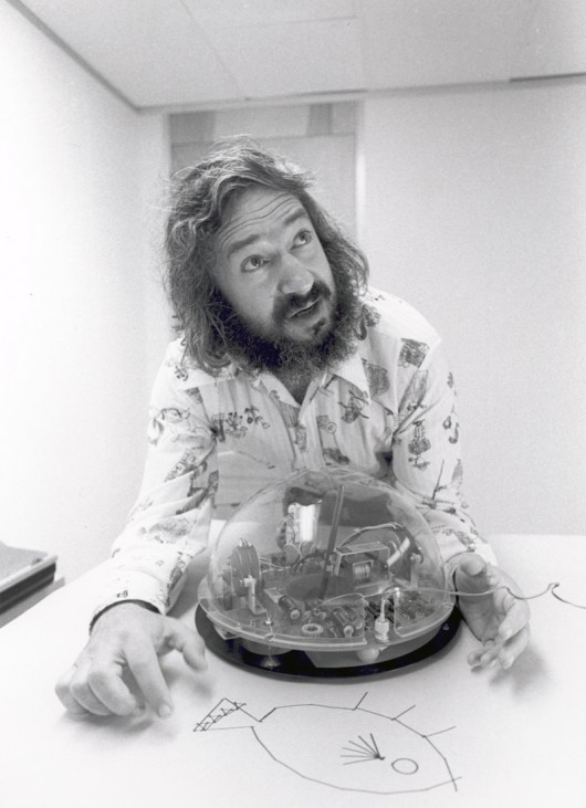
Seymour Papert – another incredibly influential computer science and education academic – also came to our minds. Not only did he maintain similar views about the importance of sharing and constructing our own models of reality, but was also a pioneer of computer vision. in 1966 he sent the ‘Summer Vision Memo“Spend the summer linking a camera to a computer, and getting the computer to describe what it saw…”


Nearly fifty years on, we have Kinects in our houses, internet-connected face-tracking cameras in our pockets and ‘getting the computer to describe (or at least react to) what it saw seems to be one of the most successful component tracks of the long quest for ‘artificial intelligence’.

Our thinking and discussion continued this line toward the cheapness and ubiquity of computer vision.

The $700 Lightbulb


Early on, Jack invoked the metaphor of a “$700 lightbulb”:

Lightbulbs and electric light went from a scientific curiosity to a cheap, accessible ubiquity in the late 19th and early 20th century.

What if lightbulbs were still $700?

We’d carry one around carefully in a case and screw it in when/where we needed light. They are not, so we leave them screwed in wherever we want, and just flip the switch when we need light. Connected computers with eyes cost $500, and so we carry them around in our pockets.

But – what if we had lots of cheap computer vision, processing, connectivity and display all around our environments – like light bulbs?

Ubiquitous Computing has of course been a long held vision in academia, which in some ways has been derailed by the popularity of the smartphone

But smartphones are getting cheaper, Android is embedding itself in new contexts, with other I/Os than a touchscreen, and increasingly we keep our data in the cloud rather than in dedicated devices at the edge.

Ubiquitous computing has been seen by many as in the past as a future of cheap, plentiful ‘throw-away’ I/O clients to the cloud.

It seems like we’re nearly there.

In 2003, I remember being captivated by Neil Gershenfeld’s vision of computing that you could ‘paint’ onto any surface:

“a paintable computer, a viscous medium with tiny silicon fragments that makes a pour-out computer, and if it’s not fast enough or doesn’t store enough, you put another few pounds or paint out another few square inches of computing.”

Professor Neil Gershenfeld of MIT

Updating this to the present-day, post web2.0 world – where if ‘it’s not fast enough or doesn’t store enough’ we request more resources from centralised, elastic compute-clouds.

“Clouds” that can see our context, our environment through sensors and computer vision, and have a picture of us built up through our continued interactions with it to deliver appropriate information on-demand.

To this we added speculation that not only computer-vision would be cheap and ubiquitous, but excellent quality projection would become as cheap and widespread as touch screens in the near-future.

This would mean that the cloud could act in the world with us, come out from behind the glass and relate what it sees to what we see.

In summary: computer vision, depth-sensing and projection can be combined as materials – so how can we use them to make Google services bubble through from the Mirror World into your lap?

How would that feel? How should it feel?

This is the question we took as our platform for design exploration.

“Lamps that see”


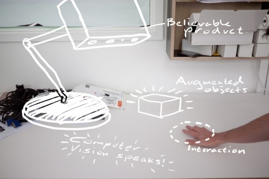
One of our first departure points was to fuse computer-vision and projection into one device – a lamp that saw.

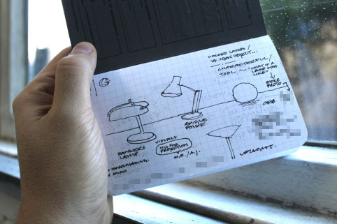
Here’s a really early sketch of mine where we see a number of domestic lamps, that saw and understood their context, projecting and illuminating the surfaces around them with information and media in response.

We imagined that the type of lamp would inform the lamp’s behaviour – more static table lamps might be less curious or more introverted than a angle-poise for instance.

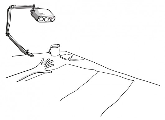
Jack took the idea of the angle-poise lamp on, thinking about how servo-motors might allow the lamp to move around within the degrees of freedom its arm gives it on a desk to inquire about its context with computer vision, track objects and people, and surfaces that it can ‘speak’ onto with projected light.

Early sketches of “A lamp that sees” by Jack Schulze

Early sketches of “A lamp that sees” by Timo Arnall

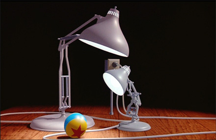
Of course, in the back of our minds was the awesome potential for injecting character and playfulness into the angle-poise as an object – familiar to all from the iconic Pixar animation Luxo Jr.


And very recently, students from the University of Wellington in New Zealand created something very similar at first glance, although the projection aspect is missing here.

Alongside these sketching activities around proposed form and behaviour we started to pursue material exploration.

Sketching in Video, Code & Hardware


We’d been keenly following work by friends such as James George and Greg Borenstein in the space of projection and computer vision, and a number of projects in the domain emerged during the course of the project, but we wanted to understand it as ‘a material to design with’ from first principles.

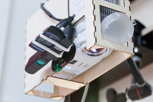
Timo, Jack, Joe and Nick – with Chris Lauritzen (then of Google Creative Lab), and Elliot Woods of Kimchi & Chips, started a series of tests to investigate both the interactive and aesthetic qualities of the combination of projection and computervision – which we started to call “Smart Light” internally.

First of all, the team looked at the different qualities of projected light on materials, and in the world.

This took the form or a series of very quick experiments, looking for different ways in which light could act in inhabited spaces, on surfaces, interact with people and things.

In a lot of these ‘video sketches’ there was little technology beyond the projector and photoshop being used – but it enabled us to imagine what a computer-vision directed ‘smart light’ might behave like, look like and feel like at human scale very quickly.

Here are a few example video sketches from that phase of the work:

Sketch 04 Sticky search from BERG on Vimeo.

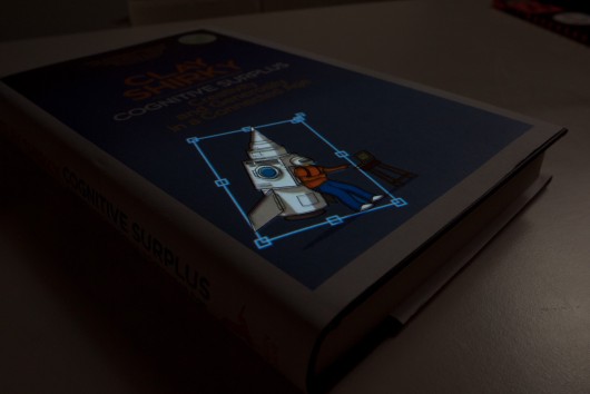
Sketch 06: Interfaces on things from BERG on Vimeo.

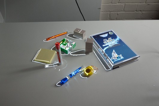
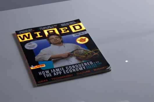
One particularly compelling video sketch projected an image of a piece of media (in this case a copy of Wired magazine) back onto the media – the interaction and interference of one with the other is spellbinding at close-quarters, and we thought it could be used to great effect to direct the eye as part of an interaction.

Sketch 09: Media on media from BERG on Vimeo.

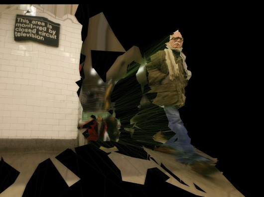
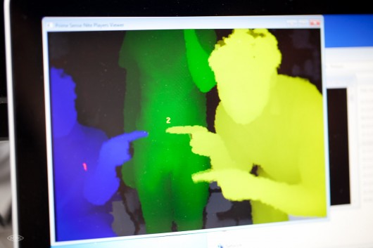
Alongside these aesthetic investigations, there were technical explorations for instance, into using “structured light” techniques with a projector to establish a depth map of a scene…

Sketch 13: Structured light from BERG on Vimeo.

Quickly, the team reached a point where more technical exploration was necessary and built a test-rig that could be used to prototype a “Smart Light Lamp” comprising a projector, a HD webcam, a PrimeSense / Asus depth camera and bespoke software.

Elliot Woods working on early software for Lamps

At the time of the project the Kinect SDK now ubiquitous in computer vision projects was not officially available. The team plumped for the component approach over the integration of the Kinect for a number of reasons, including wanting the possibility of using HD video in capture and projection.

Testing the Lamps rig from BERG on Vimeo.

Nick recalls:

Actually by that stage the OpenNI libraries were out (http://openni.org/), but the “official” Microsoft SDK wasn’t out (http://www.microsoft.com/en-us/kinectforwindows/develop/developer-downloads.aspx). The OpenNI libraries were more focussed on skeletal tracking, and were difficult to get up and running.

Since we didn’t have much need for skeletal tracking in this project, we used very low-level access to the IR camera and depth sensor facilitated by various openFrameworks plugins. This approach gave us the correct correlation of 3D position, high definition colour image, and light projection to allow us to experiment with end-user applications in a unified, calibrated 3D space.

The proto rig became a great test bed for us to start to explore high-level behaviours of Smart Light – rules for interaction, animation and – for want of a better term – ‘personality’.

Little Brain, Big Brain


One of our favourite things of the last few years is Sticky Light.

It’s a great illustration of how little a system needs to do, for us to ascribe personality to its behaviour.

We imagined that the Smart Light Lamp might manifest itself as a companion species in the physical world, a creature that could act as a go-between for you and the mirror-worlds of the digital.

We’ve written about digital companion species before: when our digital tools become more than just tools – acquiring their own behaviour, personality and agency.

Bit, Flynn’s digital companion from the original Tron

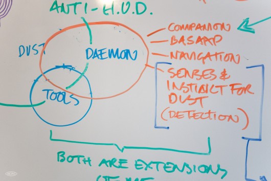
You might recall Bit from the original Tron movie, or the Daemons from the Philip Pullman “His Dark Materials” trilogy. Companions that are “on your side” but have abilities and senses that extend you.

We wanted the Lamp to act as companion species for the mirror-worlds of data that we all live within, and Google has set out to organise.

We wanted the lamp to act as a companion species that illustrated – through its behaviour – the powers of perception that Google has through computer vision, context-sensing and machine-learning.

Having a companion species that is a native of the cloud, but on your side, could make evident the vast power of such technologies in an intuitive and understandable way.

Long-running themes of the studio’s work are at play here – beautiful seams, shelf-evidence, digital companion species and BASAAP – which we tried to sum up in our Gardens and Zoos talk/blog post , which in turn was informed by the work we’d done in the studios on Lamps.

One phrase that came up again and again around this areas of the lamps behaviour was “Big Brain, Little Brain” i.e. the Smart Light companion would be the Little Brain, on your side, that understood you and the world immediately around you, and talked on your behalf to the Big Brain in ‘the cloud’.

This intentional division, this hopefully ‘beautiful seam’ would serve to emphasise your control over what you let the the Big Brain know in return for its knowledge and perspective, and also make evident the sense (or nonsense) that the Little Brain makes of your world before it communicates that to anyone else.

One illustration we made of this is the following sketch of a ‘Text Camera’

Text Camera from BERG on Vimeo.

Text Camera is about making the inputs and inferences the phone sees around it to ask a series of friendly questions that help to make clearer what it can sense and interpret.

It reports back on what it sees in text, rather than through a video. Your smartphone camera has a bunch of software to interpret the light it’s seeing around you – in order to adjust the exposure automatically. So, we look to that and see if it’s reporting ‘tungsten light’ for instance, and can infer from that whether to ask the question “Am I indoors?”.

Through the dialog we feel the seams – the capabilities and affordances of the smartphone, and start to make a model of what it can do.

The Smart Light Companion in the Lamp could similarly create a dialog with its ‘owner’, so that the owner could start to build up a model of what its Little Brain could do, and where it had to refer to the Big Brain in the cloud to get the answers.

All of this serving to playfully, humanely build a literacy in how computer vision, context-sensing and machine learning interpret the world.

Rules for Smart Light


The team distilled all of the sketches, code experiments, workshop conversations and model-making into a few rules of thumb for designing with this new material – a platform for further experiments and invention we could use as we tried to imagine products and services that used Smart Light.

Reflecting our explorations, some of the rules-of-thumb are aesthetic, some are about context and behaviour, and some are about the detail of interaction.

24 Rules for smart light from BERG on Vimeo.

We wrote the ‘rules’ initially as a list of patterns that we saw as fruitful in the experiments. Our ambition was to evolve this in the form of a speculative “HIG” or Human Interface Guideline – for an imagined near-future where Smart Light is as ubiquitous as the touchscreen is now…


Smart Light HIG

  1. Projection is three-dimensional. We are used to projection turning a flat ‘screen’ into an image, but there is really a cone of light that intersects with the physical world all the way back to the projector lens. Projection is not the flatland display surfaces that we have become used to through cinema, tv and computers.
  2. Projection is additive. Using a projector we can’t help but add light to the world. Projecting black means that a physical surface is unaffected, projecting white means that an object is fully illuminated up to the brightness of the projector.
  3. Enchanted objects. Unless an object has been designed with blank spaces for projection, it should not have information projected onto it. Because augmenting objects with information is so problematic (clutter, space, text on text) objects can only be ‘spotlighted’, ‘highlighted’ or have their own image re-projected onto themselves.
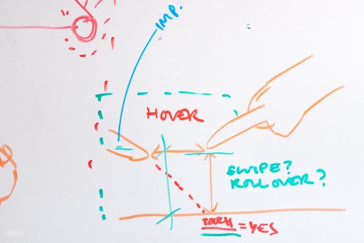
  4. Light feels touchable (but it’s not). Through phones and pads we are conditioned into interacting with bright surfaces. It feels intuitive to want to touch, grab, slide and scroll projected things around. However, it is difficult to make it interactive.
  5. The new rules of depth. A lamp sees the world as a stream of images, but also as a three-dimensional space. There is no consistent interaction surface to interact with like in mouse or touch-based systems, light hits any and all surfaces and making them respond to ‘touch’ is difficult. This is due to finger-based interaction being very difficult to achieve with projection and computer vision. Tracking fingers is technically difficult, fingers are small, there is limited/no existing skeletal recognition software for detecting hands.
  6. Smart light should be respectful. Projected light inhabits the world alongside us, it augments and affects the things we use every day. Unlike interfaces that are contained in screens, the boundaries of the lamps vision and projection are much more obscure. Lamps ‘look’ at the world through cameras, which mean that they should be trustworthy companions.

Next, we started to create some speculative products using these rules, particularly focussed around the idea of “Enchanted Objects”

Smart Light, Dumb Products


These are a set of physical products based on digital media and services such as YouTube watching, Google calendar, music streaming that have no computation or electronics in them at all.

All of the interaction and media is served from a Smart Light Lamp that acts on the product surface to turn it from a block into an ‘enchanted object’.

Joe started with a further investigation of the aesthetic qualities of light on materials.

Projection materials from BERG on Vimeo.

This lead to sketches exploring techniques of projection mapping on desktop scales. It’s something often seen at large scales, manipulating our perceptions of architectural facades with animated projected light, but we wanted to understand how it felt at more intimate human scale of projecting onto everyday objects.

In the final film you might notice some of the lovely effects this can create to attract attention to the surface of the object – guiding perhaps to notifications from a service in the cloud, or alerts in a UI.

Then some sketching in code – using computer vision to create optical switches – that make or break a recognizable optical marker depending on movement. In a final product these markers could be invisible to the human eye but observable by computer vision. Similarly – tracking markers to provide controls for video navigation, calendar alerts etc.

Fiducial switch from BERG on Vimeo.

Joe worked with physical prototypes – first simple nets in card and then more finished models to uncover some of the challenges of form in relation to angles of projection and computer vision.

For instance in the Video object, a pulley system has to connect the dial the user operates to the marker that the Lamp sees, so that it’s not obscured from the computer vision software.

Here’s the final output from these experiments:

Dumb things, smart light from BERG on Vimeo.

This sub-project was a fascinating test of our Smart Light HIG – which lead to more questions and opportunities.

For instance, one might imagine that the physical product – as well as housing dedicated and useful controls for the service it is matched to – could act as a ‘key’ to be recognised by computer vision to allow access to the service.

What if subscriptions to digital services were sold as beautiful robot-readable objects, each carved at point-of-purchase with a wonderful individually-generated pattern to unlock access?

What happened next: Universe-B


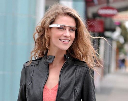
From the distance of a year since we finished this work, it’s interesting to compare its outlook to that of the much-more ambitious and fully-realised Google Glass project that was unveiled this summer.

Google Glass inherits a vision of ubiquitous computing that has been strived after for decades.

As a technical challenge it’s been one that academics and engineers in industry have failed to make compelling to the general populace. The Google team’s achievement in realising this vision is undoubtedly impressive. I can’t wait to try them! (hint, hint!)

It’s also a vision that is personal and, one might argue, introverted – where the Big Brain is looking at the same things as you and trying to understand them, but the results are personal, never shared with the people you are with. The result could be an incredibly powerful, but subjective overlay on the world.

In other words, the mirrorworld has a population of 1. You.

Lamps uses similar techniques of computer vision, context-sensing and machine learning but its display is in the world, the cloud is painted on the world. In the words of William Gibson, the mirrorworld is becoming part of our world – everted into the spaces we live in.

The mirrorworld is shared with you, and those you are with.

This brings with it advantages (collaboration, evidence) and disadvantages (privacy, physical constraints) – but perhaps consider it as a complementary alternative future… A Universe-B where Google broke out of the glass.


Postscript: the scenius of Lamps


No design happens in a vacuum, and culture has a way of bubbling up a lot of similar things all at the same time. While not an exhaustive list, we want to acknowledge that! Some of these projects are precedent to our work, and some emerged in the nine months of the project or since.

Here are a selection of less-academic projects using projection and computer-vision that Joe picked out from the last year or so:


Huge thanks to Tom Uglow, Sara Rowghani, Chris Lauritzen, Ben Malbon, Chris Wiggins, Robert Wong, Andy Berndt and all those we worked with at Google Creative Lab for their collaboration and support throughout the project.

Bells!

Our friends at Tellart made something lovely this week.

“Bells” lets you compose a tune using tiny digital toy bells on the web, which will then through the magic of the internet, solenoids and electromagnetism play out in their studio on ‘real’ tiny toy bells.

I chose to render a version of “Here Come The Warm Jets” by Brian Eno…

Playing Eno with http://bells.tellart.com/

And a few minutes later got to see Matt Cottam and Bruno ‘enjoying’ it in Providence, RI…

Playing Eno to Bruno

Nice!

Mag+, a concept video on the future of digital magazines

I’ve got something I want to share with you.

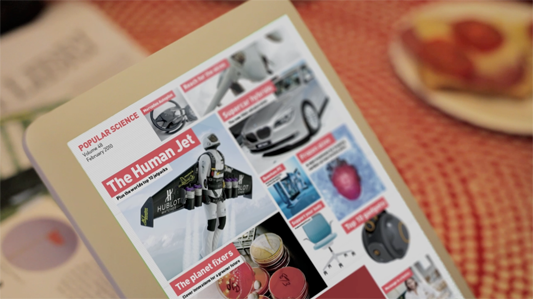
We’ve been working with our friends at Bonnier R&D exploring the future of digital magazines. Bonnier publish Popular Science and many other titles.

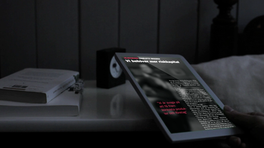
Magazines have articles you can curl up with and lose yourself in, and luscious photography that draws the eye. And they’re so easy and enjoyable to read. Can we marry what’s best about magazines with the always connected, portable tablet e-readers sure to arrive in 2010?

This video prototype shows the take of the Mag+ project.

You can see this same video bigger on Vimeo.

The articles run in scrolls, not pages, and are placed side-to-side in kind of mountain range (as we call it internally). Magazines still arrive in issues: people like the sense of completion at the end of each.

Mag+ in landscape

You flip through by shifting focus. Tap the pictures on the left of the screen to flip through the mag, tap text on the right to dive in.

Bedside manner

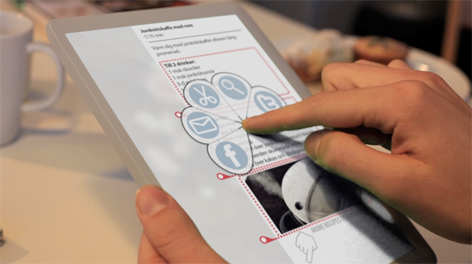
It is, we hope, like stepping into a space for quiet reading. It’s pleasant to have an uncluttered space. Let the Web be the Web. But you can heat up the words and pics to share, comment, and to dig into supplementary material.

Heated Mode

The design has an eye to how paper magazines can re-use their editorial work without having to drastically change their workflow or add new teams. Maybe if the form is clear enough then every mag, no matter how niche, can look gorgeous, be super easy to understand, and have a great reading experience. We hope so. That gets tested in the next stage, and rolled into everything learned from this, and feedback from the world at large! Join the discussion at the Bonnier R&D Beta Lab.

Recently there have been digital magazine prototypes by Sports Illustrated, and by Wired. It’s fascinating to see the best features of all of these.

Many teams at Bonnier have been involved in Mag+. This is a synthesis of so much work, research, and ideas. But I want to say in particular it’s a pleasure to collaborate with our friends at R&D. And here at BERG let me call out some specific credits: Jack Schulze, Matt Jones, Campbell Orme and Timo Arnall. Thanks all!

Treemap ToC

(See also Bonnier R&D’s Mag+ page, where you can leave comments and contact Bonnier, and the thoughts of Kicker Studio — who will be expanding the concept to robust prototype over the next few months in San Francisco! BERG’s attention has now moved to the social and wider services around Mag+ – we’ll be mapping those out and concepting – and we’re looking forward to working with all the teams into 2010. Awesome.)

Beautiful Beolit

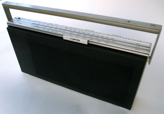
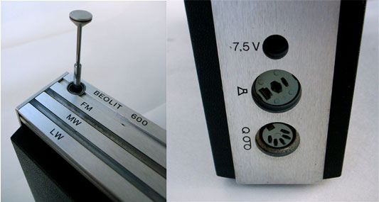
A couple of months back I visited Tom and Durrell at Luckybite to discuss some of the Olinda development. During our conversation, Durrell described one of his favourite portable radios, the Bang & Olufsen Beolit 600. I bought one.

Beolit radio

The range was produced between 1971 and 1981 and aside from its elegance and good audio quality, the detailing is very deft.

Radio details

Tuning with magnets

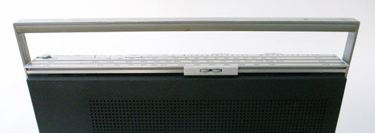
The chassis is constructed from aluminium strips, holding plastic shells front and back. The controls for the radio are spread out along the front and back edges of the top face. On the back edge are buttons for band selection and two sliders for volume and tone. The entire front edge is a horizontal tuning slider.
Tuning slider long
Tuning slider overview

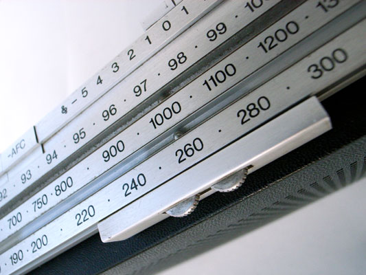
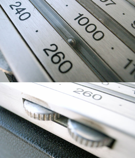
The slider can be grabbed and pushed quickly up and down the length for coarse tuning. To tune precisely the two small kinked wheels are rolled under the thumb to give fine control. The remarkable detail is in how the selected frequency is indicated:

Tuning slider detail

Two very small steel bearings sit in covered grooves in the aluminium chassis, one for each tuning band. The tuning slider conceals a magnet, which drags the bearings along the scale inside their grooves (the aluminium is of course unaffected by the magnetism). The position of the bearings corresponds to markings on the surface of the radio which indicates the frequency the radio is tuned to.

It’s a really nice example of celebrating functionality. There is no functional need for the bearings. The additional cost to develop and manufacture can’t possibly have made financial sense. Why not use an arrow? But tuning is what radios do, and something which articulates this most familiar function so poetically just had to be done.

I love how the furthest bearing twitches along more slowly than the closer one.

Construction

Structurally the radio is a square of four lengths of extruded and cut aluminium, with the front and back plastic shells tucked in. What’s exciting is that taking the radio apart isn’t work: there are no machine screws or self-tappers.

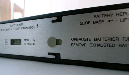
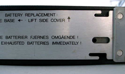
Base fixings
Base fixings 02

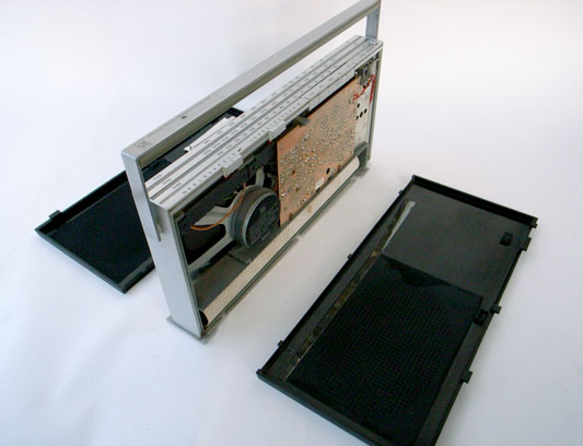
The base plate of the radio can slide. Sliding it a little way first unlocks the back shell. Removing the back allows the base to slide more, which releases the more rarely removed front shell. All this is achieved with a clever system of grooves and nooks.

Beolit in bits

Coming off first, the back shell gives access to the battery. The front shell reveals something else.

The repair manual

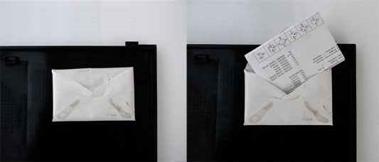
Inside the front shell, there is a little envelope. Inside the envelope there is a piece of folded paper.

Beolit envelope

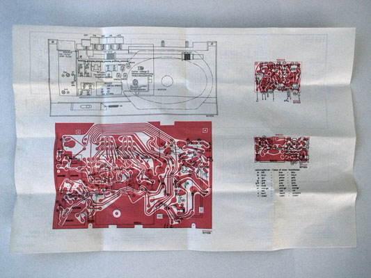
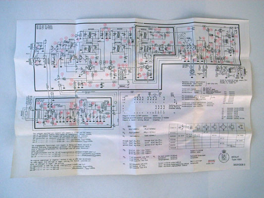
Screen printed on the paper are all the instructions for repairing the radio. There is an abstracted circuit diagram and also an image of the actual PCB. The radio contains its own data sheet, physically!

data sheet physical
data sheet abstract

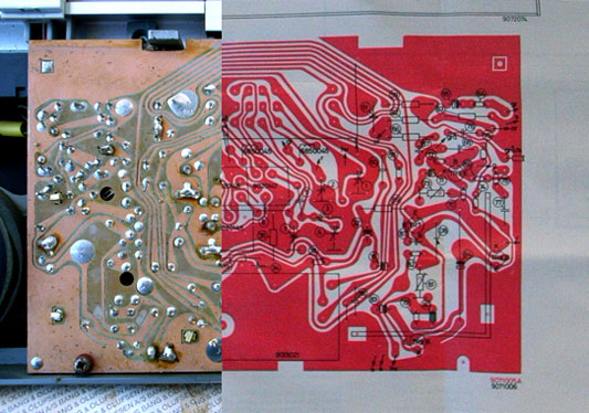
I’ve cut these last two images together to show that the PCB and the print in the diagram are to scale (the screens were probably made from the same drawing).

data sheet and PCB

Olinda connections

One of Olinda‘s jobs is to communicate the potential for hardware APIs. Matt discussed this in detail in his post on widgets.

Olinda is expandable and modular. For this to be effective, the core services of the central unit really have to be accessible from it’s periphery. We don’t mean superficial expansion or extension of lineout (like adding a speaker), but actually change the nature of the object, to grow from it’s core. There is an obvious predecessor in consumer electronics in hi-fi separates, although it is limited in that the turntable cannot affect the services available through the interface, on the amplifier. The extensions for Olinda will be able to make the radio a new object with each addition (In our case main and social do this).

Part of this project is to discuss modularity. (While designing the physical radio itself is a large part of the work, the larger project is about communicating the core ideas.) The connector is effectively a serial connection between the main unit and the extensions (plus a few extras). This could have manifested as a serial cable with two sockets on each unit, much as they appear on old printers and the like. Although traditional connections and cables have historical precedent, they do not sufficiently raise modularity.

We were clear early that the mechanism for connection should be visible, rather than discreet. It should go out of its way to invite extension (Matt discusses these ideas with reference to the Levittown Homes in his talk, The Experience Stack). One should see how it extends and the connection be mechanically explicit. The use of the mechanism, the act of extending should feel really satisfying too. For the reasons described above the serial cable fails.

Connector developments

Each module needs to include a surface which connects to the previous. Software and power aside, the implication should be that the units are infinitely extensible. To begin with we examined the possibility of a mechanical connection, something with toggle clamps or vertical stacking.

Japanese Joinery 01
Japanese Joinery 02

Kiyoshi Seike’s book on Japanese joinery includes some beautiful imagery, above.

wood test

In some early work we experimented with connections in wood. As the process progressed and more influences on the form of the radio emerged, we chose to explore a system of magnets and studs. This delivered the most satisfying feeling and the building brick aesthetic taps nicely into the familiar heritage of Lego.

This idea came out of both Apple’s MagSafe power connector, and a previous project on RFID which touched on using magnets for tactile feedback to make reading RFIDs more like pressing a button

So in the final model, the entire end surfaces of the modules are positive and negative connectors.

Milled 01
Milled 02

These two images show the progression of the studs, looking for a good fit and a good feel. These models also explore how the magnets are to be included.

copper-connector.jpg

There are eight electrical connections between the modules. These are a line of sprung copper domes, held against copper blanks on the opposite face by the force of the magnets.

Most recent test

Above is the most recent and final connectors prototype before machining, and the image following gives an impression of the final form.

CAD connectors

Much of the early work in this process was produced with the help of Jeff Easter, thanks Jeff!

Olinda interface drawings

Last week, Tristan Ferne who leads the R&D team in BBC Audio & Music Interactive gave a talk at Radio at the Edge (written up in Radio Today). As a part of his talk he discussed progress on Olinda.

Most of the design and conceptual work for the radio is finished now. We are dealing with the remaining technicalities of bringing the radio into the world. To aid Tristan’s presentation we drew up some slides outlining how we expect the core functionality to work when the radio manifests.

Social module

Social Module sequence

This animated sequence shows how the social module is expected to work. The radio begins tuned to BBC Radio 2. A light corresponding to Matt’s radio lights up on the social module. When the lit button is pressed, the top screen reveals Matt is listening to Radio 6 Music, which is selected and the radio retunes to that station.
Tuning

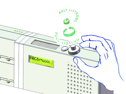
Tuning drawing

This detail shows how the list management will work. The radio has a dual rotary dial for tuning between the different DAB stations. The outer dial cycles through the full list of all the stations the radio has successfully scanned for. The inner dial filters the list down and cycles through the top five most listened to stations. We’ll write more on why we’ve made these choices when the radio is finished.

RFID icons

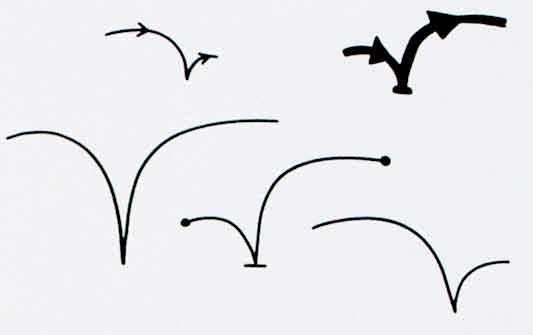
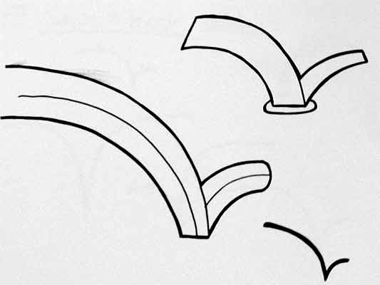
Earlier this year we hosted a workshop for Timo Arnall‘s Touch project. This was a continuation of the brief I set my students late last year, to design an icon or series of icons to communicate the use of RFID technology publicly. The students who took on the work wholeheartedly delivered some early results which I summarised here.

This next stage of the project involved developing the original responses to the brief into a small number of icons to be tested, by Nokia, with a pool of 25 participants to discover their responses. Eventually these icons could end up in use on RFID-enabled surfaces, such as mobile phones, gates, and tills.

Timo and I spent an intense day working with Alex Jarvis and Mark Williams. The intention for the day was to leave us with a series of images which could be used to test responses. The images needed consistency and fairly conservative limits were placed on what should be produced. Timo’s post on the workshop includes a good list of references and detailed outline of the requirements for the day.

I’m going to discuss two of the paths I was most involved with. The first is around how the imagery and icons can represent fields we imagine are present in RFID technology.

Four sketches exploring the presence of an RFID field

The following four sketches are initial ideas designed to explore how representation of fields can help imply the potential use of RFID. The images will evolve into the worked-up icons to be tested by Nokia, so the explorations are based around mobile phones.

I’m not talking about what is actually happening with the electromagnetic field induction and so forth. These explorations are about building on the idea of what might be happening and seeing what imagery can emerge to support communication.

The first sketch uses the pattern of the field to represent that information is being transferred.

Fields sketch 01

The two sketches below imply the completion of the communication by repeating the shape or symbol in the mind or face of the target. The sketch on the left uses the edge of the field (made of triangles) to indicate that data is being carried.

Fields sketch 02

I like this final of the four sketches, below, which attempts to deal with two objects exchanging an idea. It is really over complex and looks a bit illuminati, but I’d love to explore this all more and see where it leads.

Fields sketch 03

Simplifying and working-up the sketches into icons

For the purposes of our testing, these sketches were attempting too much too early so we remained focused on more abstract imagery and how that might be integrated into the icons we had developed so far. The sketch below uses the texture of the field to show the communication.

fields-04.jpg

Retaining the mingling fields, these sketches became icons. Both of the results below imply interference and the meeting of fields, but they are also burdened by seeming atomic, or planet sized and a annoyingly (but perhaps appropriately) like credit card logos. Although I really like the imagery that emerges, I’m not sure how much it is doing to help think about what is actually happening.

Fields sketch 05

Fields sketch 06

Representing purchasing via RFID, as icons

While the first path was for icons simply to represent RFID being available, the second path was specifically about the development of icons to show RFID used for making a purchase (‘purchase’ is one of the several RFID verbs from the original brief).

There is something odd about using RFID tags. They leave you feeling uncertain, and distanced from the exchange or instruction. When passing an automated mechanical (pre-RFID) ticket barrier, or using a coin operated machine, the time the machines take to respond feels closely related to the mechanism required to trigger it. Because RFID is so invisible, any timings or response feels arbitrary. When turning a key in a lock, this actually releases the door. When waving an RFID keyfob at reader pad, one is setting off a hidden computational process which will eventually lead to a mechanical unlocking of the door.

Given the secretive nature of RFID, our approach to download icons that emerged was based on the next image, originally commissioned from me by Matt for a talk a couple of years ago. It struck me as very like using an RFID enabled phone. The phone has a secret system for pressing secret buttons that you yourself can’t push.

Hand from Phone

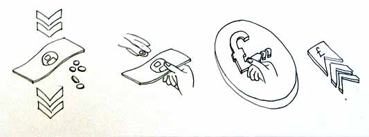
Many of the verbs we are examining, like purchase, download or open, communicate really well through hands. The idea of representing RFID behaviours through images of hands emerging from phones performing actions has a great deal of potential. Part of the strength of the following images comes from the familiarity of the mobile phone as an icon–it side-steps some of the problems faced in attempting to represent an RFID directly.

The following sketches deal with purchase between two phones.

Purchase hands sketch

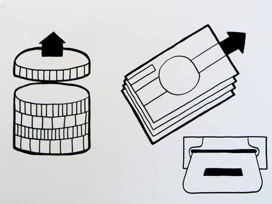
Below are the two final icons that will go for testing. There is some ambiguity about whether coins are being taken or given, and I’m pleased that we managed to get something this unusual and bizarre into the testing process.

Hands purchase 01

Hands purchase 02

Alex submitted a poster for his degree work, representing all the material for testing from the workshop:

Outcomes

The intention is to continue iterations and build upon this work once the material has been tested (along with other icons). As another direction, I’d like to take these icons and make them situated, perhaps for particular malls or particular interfaces, integrating with the physical environment and language of specific machines.

RFID Interim update

Last term during an interim crit, I saw the work my students had produced on the RFID icons brief I set some weeks ago. It was a good afternoon and we were lucky enough to have Timo Arnall from the Touch project and Younghee Jung from Nokia Japan join us and contribute to the discussion. All the students attending showed good work of a high standard, overall it was very rewarding.

I’ll write a more detailed discussion on the results of the work when the brief ends, but I suspect there may be more than I can fit into a single post, so I wanted to point at some of the work that has emerged so far.

All the work here is from Alex Jarvis and Mark Williams.

Alex began by looking at the physical act of swiping your phone or card over a reader. The symbol he developed was based on his observations of people slapping their Oyster wallets down as they pass through the gates on to the underground. Not a delicate, patient hover over the yellow disc, but a casual thud, expectant wait for the barrier to open, then a lurching acceleration through to the other side before the gates violently spasm shut.

RFID physical act 01

More developed sketches here…

RFID physical act 02

I suspect that this inverted tick will abstract really well, I like the thin line on the more developed version snapping the path of the card into 3D. It succeeds since it doesn’t worry too much about working as an instruction and concentrates more on a powerful cross-system icon to be consistently recognisable.

Verbs

The original brief required students to develop icons for the verbs: purchase, identify, enter (but one way), download, phone and destroy.

Purchase and destroy are the two of these verbs with the most far-reaching and less immediate consequences. The aspiration for this work is to make the interaction feel like a purchase, not a touch that triggers a purchase. This gives the interaction room to grow into the more complex ones that will be needed in the future.

This first sketch, on purchase, from Alex shows your stack of coins depleting, something nice about the dark black arrow which repeats as a feature throughout Alex’s developments.

RFID Purchase 01

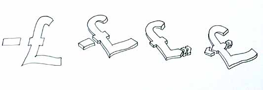
Mark has also been tackling purchase, his sketches tap into the currency symbols, again with a view to represent depletion. Such a blunt representation is attractive, it shouts “this will erode your currency!”

RFID Purchase 03

Mark explores some more on purchase here:

RFID Purchase 02

Purchase is really important. I can’t think of a system other than Oyster that takes your money so ambiguously. Most purchasing systems require you to enter pin numbers, sign things, swipe cards etc, all really clear unambiguous acts. All you have to do is wave at an Oyster reader and it costs you £2… maybe: The same act will open the barrier for free if you have a travel card on there. Granted, passengers have already made a purchase to put the money on the card, but if Transport for London do want to extend their system for use as a digital wallet they will need to tackle this ambiguity.

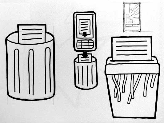
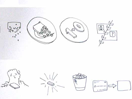
Both Mark and Alex produced material looking at the symbols to represent destroy, for instances where swiping the reader would obliterate data on it, or render it useless. This might also serve as a warning for areas where RFID tags were prone to damage.

RFID Destroy 01

I like the pencil drawing to the top right that he didn’t take forward. I’ve adjusted the contrast over it to draw out some more detail. Important that he distinguished between representing the destruction of the object and the data or contents.

Williams Destroy sketches

Mark’s sketches for destroy include the excellent mushroom cloud, but he also looks at an abstraction of data disassembly, almost looks like the individual bits of data are floating off into oblivion. Not completely successful since it also reminds me of broadcasting Wonka bars in Charlie and the Chocolate Factory and teleporting in Star Trek, but nice none the less.

Drawing

This is difficult to show online, but Alex works with a real pen, at scale. He is seeing the material he’s developing at the same size it will be read at. Each mark he makes he is seeing and responding to as he makes it.

Jarvis Pen

He has produced some material with Illustrator, but it lacked any of the impact his drawings brought to the icons. Drawing with a pen really helps avoid the Adobe poisoning that comes from Illustrator defaults and the complexities of working out of scale with the zoom tool (you can almost smell the 1pt line widths and the 4.2333 mm radius on the corners of the rounded rectangle tool). It forces him to choose every line and width and understand the success and failures that come with those choices. Illustrator does so much for you it barely leaves you with any unique agency at all.

It is interesting to compare the students’ two approaches. Alex works bluntly with bold weighty lines and stubby arrows portraying actual things moving or downloading. Mark tends towards more sophisticated representations and abstractions, and mini comic strips in a single icon. Lightness of touch and branching paths of exploration are his preference.

More to come from both students and I’ll also post some of my own efforts in this area.

Widgets, widgets, everywhere

There’s been rather an explosion of desktop, mobile, browser and Web widgets. Recently, too, I was groping round the idea of web apps situated outside the computer–but not getting very far. Then I was chatting over email about the Chumby, a cute, carryable, dedicated widget platform… and situated web apps ideas finally locked into focus:

Widgets embedded in everything.

My camera, video camera, phone, mp3 player, TV, DVD player and car stereo all have embedded electronics, a control surface and a display. My washing machine and oven have micro-controllers and an interface–I don’t know whether my house thermostat is electronic, but it could be.

In short: I am surrounded by objects which do things, all with embedded computing and screens. What if I could run whatever applications I wanted to on them? What if, let’s say, each of them was a widget platform, allowing code upload and exposing a hardware API to all sensors and controls?

Hardware as an open platform

If I was a pro-am photographer on a month-long safari shoot, I could grab a custom camera interface from the Web, set up to provide easy-access presets to the light and movement conditions I’d face. I’d repurpose a couple of the external buttons to twiddle parameters in the presets, and have a perfect wildlife interface for four weeks. At home, I’d revert to the general purpose interface or get another one.

If I could sell widgets for compact cameras, I’d sell one that was specially made for nights out. It’d assess the conditions and get the best possible picture given the dark, the necessity of taking a quick shot, and the inability of the drunk person holding the camera to stop swaying.

I’d have an interface on my washing machine that had only the single setting I use. I’d load and set the machine early in the morning or late at night, and it’d then display a red, flashing “ready to go” button that I could slap on my way out of the house, after my morning shower. Perhaps it would use the hardware API to the pressure on the water intake, to refuse to start if the shower was in use.

My TV would use its video buffer and the remote control API to give me a dedicated “record this advert” button.

Hey, maybe I’d even hack my vacuum cleaner and have it fight.

Why can’t I write widgets to run on everything in my pockets and everything in my home? I don’t really mean home automation–I mean using the existing control surface to interface with the hardware in a way that I chose.

I want to download widgets off the Web, scan barcodes with my oven to share recipes with my friends on last.microwave, and hard-code my radio to never miss Radio 4 comedy. This is what I mean about 3C products tapping into creativity, community and connectedness, by the way.

What Nikon should do

Professional Nikon cameras aren’t doing so well against Canon right now. If I were Nikon, I’d document the hardware API to the camera files, the jacks, the display and the controls, stick Bluetooth in it, and throw the camera open as a software platform. Then as a professional purchaser, I’d have a significant decision to make: Do I put down a year’s purchasing power on a Canon, and risk having a Nikon-owning competitor later creating an interface that makes them twice as effective… or get a Nikon so I never get left behind?

Embedded widgets are already here

We already have widgets in some things, of course. My Nokia N70 runs Python, which now has the ability to intercept and send SMS, run full-screen apps, and is provided with APIs to the camera, calendar, contacts, the internet and more. That the small Python app can bridge the hardware API with all the other APIs on the internet, using the existing display and keys, is what makes this so powerful.

Here’s another data-point: The Canon imageRunner series of networked copier/scanner/printers have what they call Java MEAP: A platform to write and run your own apps on the copier. (Thanks Simon Wardley for alerting me.) As this MEAP interview says:

It’s not so difficult to include a variety of useful functions in an application so that anyone can use it. Yet, as user requirements vary widely, the application becomes bloated, impairing its operability. … Users can replace the applications as their needs change and enjoy simple operation.

Exactly. Products made for everyone are complex! Let all of us help out to design them just for our friends. Canon’s doing it for workaday, now give me everyday.

Recent Posts

Popular Tags