This website is now archived. To find out what BERG did next, go to www.bergcloud.com.

Blog posts tagged as 'augmentedreality'

Suwappu app prototype – toys, stories, and augmented reality

You may remember Suwappu, our toy invention project with Dentsu — those woodland creatures that talk to one-another when you watch them through your phone camera. You can see the film – the design concept – here or (and now I’m showing off) in the New York at Moma, in the exhibition Talk to Me.

Here’s the next stage, a sneak peek at the internal app prototype:

Direct link: Suwappu app prototype video, on Vimeo.

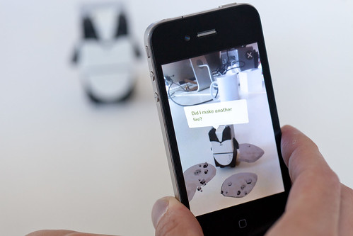
It’s an iPhone app which is a window to Suwappu, where you can see Deer and Badger talk as you play with them.

Behind the scenes, there’s some neat technology here. The camera recognises Deer and Badger just from what they look like — it’s a robot-readable world but there’s not a QR Code in sight. The camera picks up on the designs of the faces of the Suwappu creatures. Technically this is markerless augmented reality — it’s cutting-edge computer vision.

Suwappu-20111006-008

And what’s also neat is that the augmented reality is all in 3D: you suddenly see Deer as inside a new environment, one that moves around and behind the toy as your move the phone around. It’s all tabletop too, which is nicely personal. The tabletop is a fascinating place for user interfaces, alongside the room-side interfaces of Xbox Kinects and Nintendo Wiis, the intimate scale of mobiles, and the close desktop of the PC. Tabletop augmented reality is play-scale!

But what tickles us all most about Suwappu is the story-telling.

Seeing the two characters chatting, and referencing a just-out-of-camera event, is so provocative. It makes me wonder what could be done with this story-telling. Could there be a new story every week, some kind of drama occurring between the toys? Or maybe Badger gets to know you, and you interact on Facebook too. How about one day Deer mentions a new character, and a couple of weeks later you see it pop up on TV or in the shops.

The system that it would all require is intriguing: what does a script look like, when you’re authoring a story for five or six woodland creatures, and one or two human kids who are part of the action? How do we deliver the story to the phone? What stories work best? This app scratches the surface of that, and I know these are the avenues the folks at Dentsu are looking forward to exploring in the future. It feels like inventing a new media channel.

Suwappu is magical because it’s so alive, and it fizzes with promise. Back in the 1980s, I played with Transformers toys, and in my imagination I thought about the stories in the Transformers TV cartoon. And when I watched the cartoon, I was all the more engaged for having had the actual Transformers toys in my hands. With Suwappu, the stories and the toys are happening in the same place at the same time, right in my hands and right in-front of you.

Here are some more pics.

Suwappu-20111006-001

The app icon.

Suwappu-20111006-002

Starting the tech demo. You can switch between English and Japanese.

Suwappu-20111006-004

Badger saying “Did I make another fire?” (Badger has poor control over his laser eyes!)

Suwappu-20111006-009

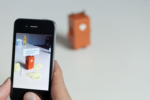
Deer retweeting Badger, and adding “Oh dear.” I love the gentle way the characters interact.

You can’t download the iPhone app — this is an internal-only prototype for Dentsu to test the experience and test the technology. We’re grateful to them for being so open, and for creating and sharing Suwappu.

Thanks to all our friends at Dentsu (the original introduction has detailed credits), the team here at BERG, and thanks especially to Zappar, whose technology and smarts in augmented reality and computer vision has brought Suwappu to life.

Read more about the Suwappu app prototype on Dentsu London’s blog, which also discusses some future commercial directions for Suwappu.
Friday links: drawing with light, AR in the Alps, and making music

Some links from around the studio for a Friday afternoon. Firstly, a video:

Graffiti Analysis 2.0: Digital Blackbook from Evan Roth on Vimeo.

Evan Roth’s “Graffiti Analysis 2.0″. Roth is trying to build a “digital blackbook” to capture graffiti tags in code. He’s started with an ingenious – and straightforward – setup for motion capturing tags: a torch taped to a pen, the motion of which is tracked by a webcam. The data is all recorded in an XML dialect that Roth designed – the Graffiti Markup Language – which captures not only strokes but also rates of flow, the location of the tag, and even the orientation of the drawing tool at start; clearly, it’s designed with future developments – a motion-sensing spraycan, perhaps – in mind.

But that’s all by the by: I liked the video because it was simple, ingenious, and Roth’s rendering of the motion data – mapping time to a Z-axis, dousing the act of tagging in particle effects – is really quite beautiful.

kalaam-530.jpg

Image: Poésie by kaalam on Flickr

I showed it to Matt W, and he showed me the light paintings of Julien Breton, aka Kaalam (whose own site is here). Breton’s work is influenced by Arabic script and designs, and the precision involved is remarkable – so often light-painting is vague or messy, but there’s a remarkable cleanliness and precision to Breton’s work. Also, as the image above demonstrates, he makes excellent use of both depth and the environment he “paints” within. If you’re interested, there’s a great interview with Breton here.

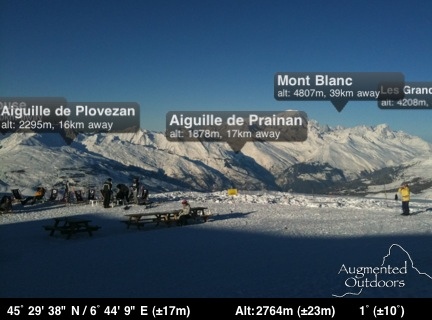
Image: Mont Blanc with “Peaks” by Nick Ludlum on Flickr

Nick’s off skiing this week, but he posted this screengrab from his iPhone to Flickr, and it’s a really effective implementation of AR. It’s an app called Peaks that simply displays labels above visible mountain-tops. It’s a great implementation because the objects being augmented are so big, and so far away, that the jittery display you so often get from little objects, nearby, just isn’t a problem. A handful of peaks, neatly labelled, and not a ropey marker in site.

And finally: Matt B’s Otamatone arrived. It’s delightful. A musical toy that sounds and works much like a Stylophone: you press a contact-sensitive strip that maps to pitch, but it’s the rubber mouth of the character – that adds filtering and volume just like opening and closing your own mouth – that brings the whole thing to life. You can’t see someone playing with it and not laugh!

It’s a product by Maywa Denki, an artist makes musical toys and sells them as products; previous musical toys include the Knockman Family, all of which are worth your time watching as much of you can on Youtube.

And if you get your own Otamatone, and practice really hard, maybe you could play with some friends:

Friday Links: Yet More AR, eBooks, and Atari


  • Augmented Reality Link Of The Week #1: Scope, by Frank Larsome. Scope is an AR tabletop wargame, played with special markers and (in a nice touch) any toys you have lying around. The interface and “game” elements are all projected onto the scene through the goggles.

    I like this because it’s consistent and realistic in its use of AR: it makes sense to wear goggles or some other kind of apparatus, because you’re an army commander surveying a battlefield. And I like that reality is genuinely being augmented here: the AR element is interface and head-up display, as opposed to some 3D element pretending to be real but clearly failing at that. AR is, quite rightly, part of the novelty of Scope.

    [via GameSetWatch]

  • And from the sublime to the ridiculous, as it were. This is Tribal DDB Asia’s “3D McNuggets Dip“, “The first 3D Augmented reality dipping game with McNuggets”.

    It’s AR as pure novelty: a marker to be used with a Flash webcam app, dragging an AR McNugget around a screen much like you might with a mouse, the sole novelty in the proposition being AR. It’s barely AR; it’s more Marker As Interface – much closer in implementation to the way a Wii Remote might be used.

    And what’s it all in aid of? Promoting a foodstuff made of both chicken and mechanically separated meat.

    [also via GSW]

  • Enough AR; onto ePublishing. Not the launch of the Kindle to international customers – but rather, the December launch of a series of eBooks for children.

    Excitingly, they’ve been targeted not at existing eReaders, nor a simplified eReader aimed at children, but to a device with a touchscreen that many kids already own: the Nintendo DS.

    It’s a deal between publishers Egmont Press and Penguin, with games company EA. The titles are priced at £24.99 – nearly the cost of a full DS game, but each cartridge has “6-8″ titles on it, which cuts the cost per book down to that of a paperback. And then, of course, there’s all the supplemental material.

    I like the idea of Flips (as the titles are known) because they’re basically nothing new: an existing product retargeted simply by aiming at a new, simpler, cheaper platform – and one that many kids already have. There’s nothing complex here in the software or the strategy, but if the implementation’s good, then perhaps they’ll be a success.

    Sure, the DS screen isn’t as easy on the eyes as a Kindle’s, and the resolution is lower, but that might be less of an issue for ten- and eleven- year olds.

    It’ll be interesting to see how they sell; it’ll also be interesting to see if it sparks interest in reading, and also where they’ll be stocked: games shops are likely to carry them, but will bookshops as well? We’ll find out in December, just in time for the Christmas rush.

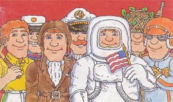
  • atari-catalogAnd, finally, a small piece of gaming nostalgia that made me smile: the 1978 Atari catalogue, featuring titles for the VCS/2600. I like it if only for its emphasis on anything but the game screens, instead focusing on the large amounts of commissioned art. That cover brings nothing to mind so much as Mr Benn, and reminds me of the escpaism – the different outfits one can wear – that computer games have always had at their heart.

“Preparing Us For AR”: the value of illustrating of future technologies

When I wrote about Text In The World over on my personal blog a few weeks ago, our colleague Matt Jones left a comment:

“preparing us for AR” (augmented reality)

And this got me thinking about the ways that design and media can educate us about what future technologies might be like, or prepare us for large paradigm shifts. What sort of products really are “preparing” us for Augmented Reality?

A lot of consumer-facing the output of Augmented Reality at the moment tends to focus on combining webcams with specifically marked objects; Julian Oliver’s levelHead is one of the best-known examples:

But when AR really hits, it’s going to be because the technology it’s presented through has become much more advanced; it won’t just be webcams and monitors, but embedded in smart displays, or glasses, or even the smart contact lenses of Warren Ellis’ Clatter.

So whilst it’s interesting to play with the version of the technology we have today, there’s a lot of value to be gained from imagining what the design of fully-working AR systems might look like, unfettered by current day technological constraints. And we can do that really well in things like videos, toys, and games.

Here’s a lovely video from friend and colleague of Schulze & Webb, Timo Arnall:

Timo’s video imagines using an AR map in an urban environment. I particularly like how he emphasises that there are few limitations on scale when it comes to projecting AR – and the most convenient size for certain applications might be “as big as you can make it”. Hence projecting the map across the entire pavement.

Here’s another nice example: the Nearest Tube application for the iPhone 3GS:

This is perhaps a more exciting interpretation of what AR could be, and what AR devices might be (not to mention a working, real-world example): the iPhone becomes a magic viewfinder on the world, a Subtle Knife that can cut through dimensions to show us the information layer sitting on top of the world. It helps that it’s both useful and pretty, too.

Games are a great way of getting ready for the interfaces technologies like AR afford. Here’s a clip I put together from EA Redwood Shores’ Dead Space, illustrating the game UI:

Dead Space has no game HUD; rather, the HUD is projected into the environment of the game as a manifestation of the UI of the hero’s protective suit. It means the environment can be designed as a realistic, functional spaceship, and then all the elements necessary for a game – readouts, inventories, not to mention guidelines as to what doors are locked or unlocked – can be manifested as overlay. It’s a striking way to place all the game’s UI into the world, but it’s also a great interpretation of what futuristic, AR user interfaces might be a bit like.

Finally, a toy that never fails to make me smile – the Tuttuki Bako:

This is Matt Jones playing with a Tuttuki Bako in our studio. You place your finger into the hole in the box, and then use it to control a digital version of your finger on screen in a variety of games. It’s somewhat uncanny to watch, but serves as a great example of a somewhat different approach to augmented realities – the idea that our bodies could act as digital prosthetics.

All these examples show different ways of exploring an impending, future technology. Whilst much of the existing, tangible work in the AR space is incremental, building upon available technology, it’s likely that the real advances in it will be from technology we cannot yet conceive. Given that, it makes sense to also consider concepting from a purely hypothetical design perspective – trying things out unfettered by technological limitations. The technology will, after all, one day catch up.

What’s exciting is that this concept and design work is not always to be found in the work of design studios or technologists; it also appears in software, toys, and games that are readily consumable. In their own way, they are perhaps doing a better job of educating the wider world about AR (or other new technologies) than innumerable tech demos with white boxes.

Recent Posts

Popular Tags