This website is now archived. To find out what BERG did next, go to www.bergcloud.com.

Blog posts tagged as 'design'

Making Senses revisited

Adaptive Path kindly invited me to their offices this morning, where I muddled through my Making Senses talk, on using the human senses as inspiration for next-generation Web browser functionality.

Optic flow

Revisiting the slides, and the conversation afterward, has shown me how to state the argument more directly:

  1. As far as interaction on the computer desktop and the Web goes, navigational and spatial metaphors dominate. On a micro level we talk about direct manipulation of files via icons: Dragging, moving, opening and so on. On a macro level, we have addresses, visiting, and sitemaps.
  2. When a person has navigated to something, they can know what it is because of the navigation itself. For instance, you know you’re in London because you followed all the signposts to London.
  3. In a world of cheap sensors, many, many display surfaces, and high connectivity, we are presented with information without that navigational context. Furthermore, in areas which have traditionally used the navigational metaphor (mainly the Web), navigation might not be the most appropriate approach to reading the news, buying books, or hanging out in chatrooms. Yet still we approach Web design armed with this metaphor.
  4. It’s as important that a thing can be instantly appreciated for what it is, as that it can be navigated to. ‘Instantly appreciate’ means comprehend pre-consciously, just as we instantly appreciate a chair as a chair when looking at it, without having to deliberately deduce the meaning of the pattern of light on our retina.
  5. As a guide to what qualities we should be able to instantly appreciate, we can use human and animal senses to show what features we need to recognise of things in the environment. Sensing these features is sufficient to let us intelligently interact, without navigating.
  6. To summarise these features, we need to be able to detect: Structure, focus and periphery, rhythms of activity, summaries, how this particular thing is situated in the larger environment (and more). The Web browser, as our sensory organs online, should do this job, instead of leaving it to the websites themselves.

Applying the sensory model to Web design triggers a few ideas:

  • The high-level structure of all sites should be represented by the browser in a consistent way, not by each site differently.
  • Regular patterns in browsing (such as the sites visited daily or weekly) should be supported by the browser.
  • Using the extracted keywords of a web page as its ‘scent,’ hyperlinks should indicate how their odour strengthens or detracts from the smell of the current browsing trail.

There are more ideas, but that’s what the presentation discusses and illustrates.

Incidentally, the image at the top of this post is from J. J. Gibson’s The Ecological Approach to Visual Perception, which talks about how we see continuously and actively as we move through space. I’d like to consider browsing the Web in the same light.

Burtin vs. Ellis/Williams

I presented this comparison at Design Engaged last year. I like it because it talks in a really visceral way about how we read visual material. It deals with looking as an act as opposed to something that just happens to your eye. Comics are often disregarded amongst Graphic Design communities. This irritates me since comics deal with such rich and sophisticated material.

Below are two pieces of work, the first is a spread from Desolation Jones by Warren Ellis and J.H. Willliams III. Without revealing too much of my Ellis/Williams fanboydom, the series is excellent but this page is especially deft. Ellis discusses it in his weblog here.

Look at the way the red line connects the sequence.

The line morphs between road markings, Indiana Jones style aerial map views and back to the light trails from the vehicle. Williams guides your eye through the page, setting the page’s pace and rhythm. Optically it is very clever, it deals with how your eye scans at speed and also stitches the cue into the content of the panels.

Desolation Jones

The second image is by Will Burtin (thanks to James King). It is optically similar to the comic.

Although research material on Burtin is fairly thin, I understand that this image was produced during his time designing for the U.S. Army. This image is taken from a manual, illustrating how to disassemble your rifle.

Burtin has drawn two sets of dotted lines over his work. The lines indicate his expectation of how a readers eye will move over the page. The dotted line represents a quick scan of the page, dealing mostly with just the images and the dashed line represents a detailed read.

Will Burtin

Burtin knows how the page is being read, he acknowledges that the reader will read it at different paces, and presumably this has affected his slightly strange layout. Interesting that he expects people to read along gun barrels.

Burtin and Williams both use letters and images, in a sequence, on the page, and expect them to be read in two different ways: First in overview and then in detail. They deal with arrangement, pace and rhythm with the same sensitivity and same language.

Comics are in everything.

Experience hooks

To recap: Generation C demand 3C products, which are the new breed of products taking the internet and their presence in the social world for granted, and treating people as involved, creative peers, not “end users.” As a design and development approach, the route of interaction design and a focus on the product life-cycle is useful. This life-cycle can be thought of as a series of experience hooks, activities around which stories gather. These hooks are opportunities for good design and I want to wrap up by looking at a few a little closer.

Commercials

I mentioned a number of ‘intrinsic activities’ associated with a product, those that aren’t specific to what the product does. They were: Design, manufacture, discovery, selection, being wished-for, purchase, being shown-off, review and resale.

The intrinsic activities are often hard to reach if the scope of design is considered to end at the physical surface of the product. Yet they still contribute, heavily, to ongoing experience of the product… and therefore to the brand (the brand is the sum over all the experiences). Since Gen C relate to their products via the activities they experience together, the design scope should include whatever is necessary to make these hard-to-reach activities good ones.

Design, here, should include advertising and marketing.

The human brain is an incredible thing. It’s a carrier bag of thoughts and emotions, stored by association and popped to the top by association too. Advertising, through whatever medium, can be used to feed in stories that’ll come to the surface when the appropriate experience hook is encountered. Or it can use the memory of a particular experience hook to show what the brand cares about.

Two examples spring to mind:

  • The Coke Happiness Machine commercial dispenses with building a glow of generic “happiness” or “family life” or “Christmas” around the logo of a soft drink. Instead it concentrates on the experience of an important intrinsic activity: Vending. This neglected moment becomes coloured with a story that makes the drink itself sparkle with fantasy and magic. This advert will improve the perceived taste of my bought drink, not just nudge me to purchase it in the first place.
  • Orange, the mobile phone operator, has in the UK a scheme called Orange Wednesdays. Orange mobile subscribers get two-for-one cinema admission once a week. I’m not sure how many people use it, but as marketing that infiltrates (and influences!) conversation, and demonstrates the company’s commitment to personal relationships and small groups, it’s spot on.

Now these are both advertising/marketing efforts that demonstrate a shift from lifestyle or aspirational branding to experience-driven brands–but they remain in traditional media.

More exciting to me are the obsession with experience shown by Amazon and Apple (see yesterday) who have a continuous approach to brand, and new media such as games (a favourite: Project Rub affects your body to communicate its story). What these have in common is interactivity and lack of explicit rules (you use play and experimentation, not instruction manuals, to find your way around Nintendo games, Amazon, and Macs).

Traditional media are good for showing. Games, shops, vending machines, interactivity: these are the media channels for experience.

Focus on individual activities

It was by considering the activities I take part in with my printer that the idea of the printer as social letterbox came about.

If this approach of looking for activities is taken to other products, more new features can be found.

Take the unboxing moment, an experience hook for stories if ever there was one (I discussed unboxing more here). Or customisation in vending machines, as explored in our metal phone project (not just a re-castable lump of metal but a performance mirroring the importance of the transformation).

Experiencing trainers

In my notebook, I have sketches of how each of these could apply to trainers.

On the left: I was trying to find a satisfying approach to customisable shoes. On the one hand, the customisation shouldn’t be superficial and lack meaning, like choosing the colours or adding stickers. On the other, it should carry the intelligence of the designers with it, so a good shoe is easy to make.

Here my sketch shows soles with slots in them, looped through with a continuous strip of velcro. The strip could be wound and re-wound, making a reconfigurable shoe. Patches or ribbons woven into the velcro could decorate it (and I’m sure we’d find a way to cover the ankles). Importantly, the more you did it the better your shoes would become, and there’s the possibility of making uncomfortable or ugly shoes (risk is vital, otherwise doing it well has no value). As well as expertise and social knowledge sharing, there’s the opportunity of more personal artistic expression. I think it would be a pretty interesting instance of co-creation.

On the right: Could unboxing be applied to trainers? Given trainers are tried on before purchases, what doesn’t vary before that great moment you wear them out of the house for the first time? Laces are often threaded in the shop, and even having to unstuff your shoes from a box full of extra-fancy paper would feel inauthentic.

How about peel-off plastic covering the leather stripes on the sides of the shoes? It’s potentially authentic, because the plastic has a protective function, and it wouldn’t be removed just for trying the shoes on. As with the peel-off protection on new mobile phone screens, it would make that experience hook – the transition between shop-owned and me-owned – special.

Technology products and websites benefit from the same approach. How about online radio you can listen to with your friends? My work at the BBC, with Tom Coates, on social software and listening tackled exactly this. (The conference session Reinventing Radio includes our Group Listening prototype towards the end–Tom is hosting the Reinventing Radio presentation [PDF].) Or how about using physical computing to address the process of discovery, besotted-ness, and eventual boredom with novel TV and radio channels. Or even an RSS reader that forgets.

While we’ve used this approach on the Web and in mobile, the physical product opportunities have the most potential. The existing areas of printers, cookers, magazine racks, underwear, wooden toys or any number of other product categories would benefit enormously, I believe, from this kind of design research and product ideation.

From pixels to plastic

Not only is there opportunity with physical things, there’s an imperative. Just as manufacturing techniques are becoming shorter-run and more accessible to individuals and small companies, the knowledge of how to use these techniques is becoming more available. People are learning how to use 3D software using free tools such as Google Sketchup, and stepping more easily to professional software, previously reserved for expert product designers. The communities gathering around actuators, electronics and microcontrollers are infected with the internet sensibility, fully aware of the social worlds their technology will inhabit. And as Instructables shows, they’re sharers through-and-through. Not only this, but the net has put logistics, vending and distribution channels at our fingertips.

We’re looking at, as Tim O’Reilly puts ita future in which the creative economy overflows the thin boundary that separates “information” from “stuff”‘. Traditional manufacturing and technology companies will soon be competing with small, responsive companies who are at once just Good Enough technologically, but way more in tune with the social and creative needs of Generation C.

RFID Brief

Last Thursday I began teaching third year graphic design students at Central Saint Martins College of Art and Design in Holborn, Central London. I’m teaching a group of nine with an old colleague of mine James King. James and I have each written a brief, I’ll post them both here and any exciting results that emerge from the students. The brief is set against an introduction to the technology and is conjunction with Timo Arnall‘s Touch project. Click the image to download the RFID brief as a pdf and the text to follow.

If you have any ideas, solutions or comments yourself, please feel free to add your thoughts to the comments.

rfid brief

Aims

To think functionally. To develop a sense of how signs can work across different contexts with specific meaning.

Brief

Design an icon or series of icons to communicate the use of RFID technology publicly.

Details

RFID is complex because it is very new and there is no simple metaphor that it easily fits. Explore several elements and think about appropriate representation for those. Think about the following:

The act

Think about how the icon should represent the physical act of activating an RFID tag.

This technology works when the RFID tag is brought near the RFID reader. It is important to show how the RFID tag should be used. One of the ways London Transport manage this is to repeatedly broadcast “remember to always touch in… and out with your Oyster card” over their public address system, their logo also represents an image of the card moving in an arc, the logo being printed on the surface of the reader.

The verb

When you swipe the RFID a transaction will take place. This is true in nearly all situations. I want you to develop icons which represent the verb that takes place when the tag is activated.

Develop icons for the following actions:

  • Purchase. Your account will be deducted when you swipe. Imagine your switch card was a digital wallet, and you could use RFID instead of chip and PIN. How would you communicate, that when you swipe, you will be charged.
  • Identify. If you go through this gate your details will be read and known, you could think about a passport.
  • Enter, but one way. If you pass through this door you will not be permitted to leave by it. Think about security at airports.
  • Download. Imagine your phone had an RFID inside it and when you wave your phone at a reader, a file is downloaded to your phone, perhaps a local map.
  • Phone. Imagine if when you waved your phone at the reader, it phoned someone, perhaps a helpline or someone specific.
  • Destroy. If you used the RFID to store sensitive data, and you wanted to delete the data, like from a memory stick, swiping the RFID will erase the data on the stick.

There might be secondary verbs like Open, or Start. Lifts might require people to identify themselves before they gain access to certain floors. Tickets are often purchased inorder to access certain areas, like with Oyster cards. This is important too, think about how you can combine verbs in the system you develop.

Ownership

RFID cards often work in closed systems, where particular companies or institutions have ownership over the system. Starbucks have just released a ‘smart card’. Think about how this can be represented alongside the verbs too. You could think about graphic consistency or colour, or perhaps there is a feature of the icon like a character, which appears across the brand. For the branding side, don’t get distracted by a specific brand that already exists. I want you to just think about the kind of business. So think about the following:

  • an international transport company like an airline
  • a money system, like a bank
  • a supermarket

Some points to remember

The icons should be universal as possible, so English language or culturally specific meaning could make the icon obscure to some people. Think about the context of the reader, does this icon go on doors, busses, airports etc?

Deliverables

Design sketches: For Thursday 23rd at 9am bring the following: 40 sketches with assorted ideas for Act, Verb and Brand. The sketches should be good, not widdly little drawings in a sketch book, make sure the drawings can be seen clearly at a distance. Also, the design should be good, not bad. So try to make it good.

Research: Look at signage and icons in the world and think about how they communicate acts and verbs. Bring in some examples that have influenced your work.

The life of products

Products are not nouns but verbs. A product designed as a noun will sit passively in a home, an office, or pocket. It will likely have a focus on aesthetics, and a list of functions clearly bulleted in the manual… but that’s it.

Products can be verbs instead, things which are happening, that we live alongside. We cross paths with our products when we first spy them across a crowded shop floor, or unbox them, or show a friend how to do something with them. We inhabit our world of activities and social groups together… a product designed with this in mind can look very different.

Activities

What activities occur between me and a product? Taking a book as an example, there are a number of obvious ones: reading, marking a page, noting a comment or reference. There are also a number of activities that are due to the book also being a product which is made, bought and sold–we’ll call them the intrinsic activities. The book is involved in all of these:

  • Design
  • Manufacture
  • Discovery
  • Selection
  • Being wished-for
  • Purchase
  • Being shown-off
  • Discussion/review
  • Resale

Each of these activities associated with a product is a place where stories gather. Each is a hook for experience. When the experience is bad, the story is bad. When the experience is good, the story is good… and stories travel.

Yesterday I talked about Generation C and the way they expect products to fit, as peers, into their connected and creative communities. I said that products, media and services must transform themselves to meet these expectations.

The stories Gen C tell spread in their social and communication networks, and are used by these discerning individuals to assess products. With online and mobile stores, every moment is a buy moment. From a sales perspective alone, the stories had better be great.

At a more conceptual level, the peer relationships Generation C expects mean that the traditional do-as-you’re-told products are inappropriate: A brand that says “I’m cool, associate with me” or “You can be a great runner too” can feel condescending or trite. Gen C likes to be involved in conversations–products should express their brand through the experience. The brand, the stories, the interactions: These are all part of the product.

When we’re trying to design for the whole product, we try to remember to do these:

  • Identify the activities associated with the product, media or service. Design for the whole life-cycle, not just to make certain functions available
  • Focus on the activities intrinsic to the particular product as a thing that can be bought and sold. These are so often overlooked as experience hooks that good design can make a real difference. The intrinsic activities listed above are a good start
  • Use advertising to associate stories with the experience hooks, and to communicate the brand experience. Products are continually assessed, and always communicating the brand through the progression of experiences

Living with products

Amazon and Apple and both companies who pay a great deal of attention to the entire relationship a person has with a product. Especially good is how they deal with those intrinsic activities, those that belong to a thing by virtue of its physicality and existence in the marketplace.

Take Amazon: They don’t just sell products, they sell the whole life-cycle. You discover a book, select it using the reviews, consider it, hang onto it in your basket, finally choose to buy it. Wishlists and permanent book addresses (suitable for emails) understand that, even before you buy it, a book is a social object, present in our social world. Then afterwards you can recommend or review the book, and the site helps (even prompts!) you to sell the book on second-hand.

Apple, both in their online presence and retail stores, understand the ongoing relationship with an Apple product. The online product pages are brochure quality, always with the link to the online store. Putting together a system online is a joy; you gradually select components, learn about them, and ratchet up the price… but slowly, slowly, so there’s never a sticker-shock moment when you realise quite what you’ve specced. The retail stores are made for the funnel from aspiration (gazing into the brightly lit store) to try-out, to select, to purchase, to learn about, to come-back-when-it’s-broken.

The big problem with Apple retail is that it’s not enough about the various experience hooks of what they sell. It’s still too much like a conventional shop, with a sales counter where you do everything in one go. The stores should work more like Oslo Airport where, instead of a single, monolithic check-in experience, you have security check at one gate, boarding card at another, passport at another, and cafes and shops in-between. You move at your own pace, which means queues are smoothed out, and you only follow the process all the way to the end if you’re flying abroad, high security, international and long haul.

An Apple retail store, built like an airport, would have a big desk where you assemble your system, maybe with a form or a Lego-type toy, with assistants to help out. You’d take it to a desk to fetch your computer, and leave with it a few minutes later. In that couple of minutes, you’d make payment almost incidentally, to pass the time. Apple supplies and iPods should have a much simplified process–why not swipe your card when you enter the queue, so your transaction is pre-authorised by the time you get to the front?

It’s important to consider the owner and all the people they encounter as the “user” for any particular product. No design surface is out of scope: Aesthetics, online social software, embedded displays, the billing and vending processes, and more.

Interaction design

To summarise: Generation C, needs new products, media and services. These have to be situated in social lives, be open to co-creation, acknowledge the networks they’ll inhabit, and respect the creativity of the Gen Cs. At S&W we call these, in shorthand, 3C products. The Cs we use are creativity, connectedness and community… but pick any three.

Today I talked about our lives with these products, and the activities we have together. There are activities specific to the product itself, and those intrinsic to the thing as a bought-and-sold product… and all of them are experience hooks, opportunities for functionality appropriate to the context of use, and to bring about the brand experience. Designing for activities – interaction design, really – and taking the lessons of the Web and social software is the best process we’ve found, thus far, to provoke good thinking about the new world of stuff in our homes.

I’ll finish tomorrow with a look at a few experience hooks in particular.

Robot arms

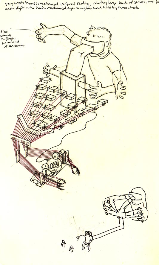
So I’ve been thinking about hands and arms. I started by thinking of extremely small hands, on my hands. So here are some drawings from that thinking.

Physical VR

This drawing is of a toy that shrinks your hands down so you can play in a small world, with small figures. Your fingers are all connected up to a group of flex sensors, which converts the analogue movement to a cluster of servos. The servos collectively control fingers on the small hands by tightening or loosening. So the movements of your fingers become roughly and awkwardly analogous to those of the small hands in the toy. There is also a screen inside some goggles hooked up to a small camera in a glass ball between the two small arms. So when you look in to the goggles, you see what is in front of your arms. There are two wheels which you can twist to point the camera in different directions, like an eye. Kind of like an analogue version of virtual reality, only right in front of you and not virtual.

Hand Finger

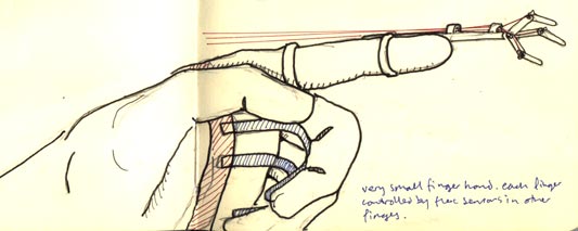
I would also like to have a very small hand at the end of my finger. To pick up pens and things. You control the small hand on one finger using your other fingers, with flex sensors (same as above). You lose one of your big hands to gain a little hand on the end of one of your fingers.

I came across Chad Thornton‘s work. He is at Google now, but he made a mechanical finger as part of his work at Carnegie Mellon Interaction Design programme (nice video here).

Maybe I’m carrying some latent affection for the Radio Shack Armatron here, I don’t know. These themes are common in films. This must be informed by Ripley’s Power Loader from Aliens:

The belt buckle, and rubberised keyboard make her rig seem really convincing, her trainers too, and how she locks into the unit. The cyborg fingers for typing in Ghost in the Shell are nice too.

No doubt there are more. It makes me think of Robocop‘s gun hip too although slightly off topic.

I like them, robot arms. I see them as a celebration of industrial process. I predict they will become a more widespread part of our lives. They are cheaper now (it appears that non-load bearing ones don’t require three phase power either) and since they are multi modal they can perform many tasks, in strange contexts. No doubt FDM or other fittings are/will be available, implications of that could be very large. Imagine a robot arm in your drive thr(o)u(gh), changing a tyre, and then printing out your happy meal. Our lives could become peppered with arrays of multi-buildy-arms.

Robotlab (via Roger Ibars) are a German partnership who have used industrial robot arms to perform a DJ set. Witnessing the arms is as important as their role. I find them disconcertingly accurate, mechanised confidence in something typically so analogue and expert and careful. There is also something about their inflexibility, their inability to reach inside certain arcs, too close to themselves. I like the way they occasionally find a sync with each other, and at other times drift out. I think these guys have a business model set up around this, so I’m very interested to see how that develops.

I want one.

Disco and waiting as an intrinsic activity

When I wrote about the Coke Happiness Factory ad, I mentioned the activities that happen around a product just because it’s something that’s bought and sold. Examples included selecting, purchasing and showing off.

Often the intrinsic activities that surround a thing are ignored. This is a shame. They’re opportunities for design to communicate brand and celebrate the constraints.

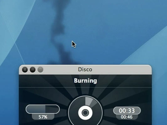
That’s why I’m totally in love with Disco, the new Mac CD/DVD burning app.

Disco app, smoking

It can take ages to burn a disk. Your intrinsic activity is waiting. What does Disco do? It puts a fluid dynamic smoke simulation on top of the window (follow that link to see a movie). And get this, you can interact with it, blowing the smoke with your cursor.

You can watch, you can play. Inspired.

Coke Happiness Factory

My favourite television ad at the moment is the Coca Cola one where the chap pushes his money into the vending machine and it triggers a sequence of magical adventures in a fantasy world, culminating in the fireworks-accompanied delivery of a cold bottle of Coke.

Coke Happiness Factory

I like to think that all vending machines look like this inside. It’s a great way to make special the purchasing act.

Aside from product-specific events, like drinking for Coke, almost all our interactions with products are punctuated with moments like this: encountering, selecting, purchasing, showing off, selling. There are more. Each moment is an experience that good product design and advertising can make special, and use as a hook for brand communication. Each is a threshold at which, while the mere physical reality of the world doesn’t change, we’re taken us from one life to another–perhaps from being content with our lot to feeling covetous, or from not owning something to having it. These thresholds may appear small but they carry tremendous weight and meaning for us, are important in our individual and social lives, and are opportunities for design.

Some companies understand this very well. Apple make products that are legendarily pleasurable to unbox. The laptops have a charged battery from the get-go; the iPod box opens to reveal the device like a pearl. Unboxing is a weblog celebrating precisely this experience. Tiffany use high quality packaging to protect the jewels–but also because the glamour of passing over this ownership threshold reflects back on the glamour of the jewellery. (Tiffany have also clothed models in the packaging paper, which builds up the glamourous associations.) As a very different kind of business, Amazon understands that it’s not just about selling books. It’s about being present for customer for the duration of the life-cycle of the book, during browsing, discovering, learning about, wanting, purchasing, reviewing and finally selling on to someone else.

I think that discerning consumers – and we’re all more discerning now – delight in products when these acts are delightful, not because a product is like a cool big brother to us, or has a particular lifestyle we want to associate with.

Anyway, I like the Coke advert because it speaks directly to one of those acts, and also because it’s terribly pretty and vending machines are cool. Duncan’s TV Ad Land has more about Coke Happiness Factory and the team behind it (including a link to a large movie download), and you can watch the ad at YouTube.

Lines and buttons

History of the Button is a blog, well, “Tracing the history of interaction design through the history of the button, from flashlights to websites and beyond.” [via Chris Heathcote’s links]

It’s great to look at early designs, when buttons were still brand new, and folks were still coming to terms with an action that could trigger an arbitrary amount of work. We think of a button press as the work itself, launching the missile or punching the letter, whatever, not simply completing the circuit that joins the actual cause (mechanical or electrical energy) to the effect. The button has become a by-word for easy. The 1960s sci-fi books I’ve read, when they want to express the maximum amount of crazy future thinking, talk about relays: devices that convert a button press to an action in a circuit that can do anything at all. Yet we barely think about relays now, or how incredible buttons are. When did buttons stop being modern?

(And, really, were they ever modern? A button on a shirt joins two pieces of cloth with effort far less than sewing, and it can be undone, and the physical object provides a focus for interaction too, the affordance that these things can be joined. Perhaps the name and job of “button” gets continually recycled, with only the physical implementation changing over the years.)

On a similar note:

I really enjoy collections of single design elements. Timo Arnall has written The dashed line in use, making the (dashed line) connection between his use of this element in indicating RFID interactions and how it occurs in instruction manuals, paths, graphs, as ellipsis… He also talks about how the line indicates a seam, a visible join between two things that still maintains the two things as separate.

The dashed line for RFID is doubly appropriate first because the field is invisible and, second, because the indicated interaction hasn’t happened yet–it exists only in potential.

Is there a dashed line to be drawn between Timo’s work and the history of the button?

Recent Posts

Popular Tags