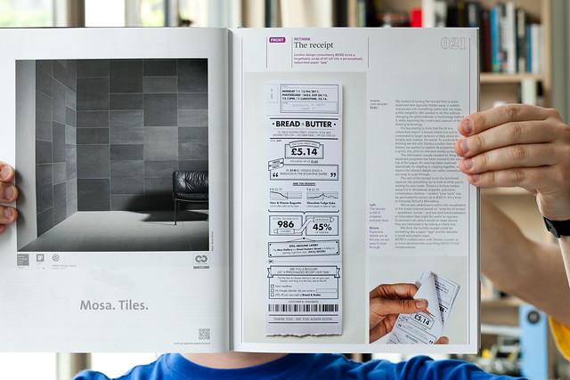
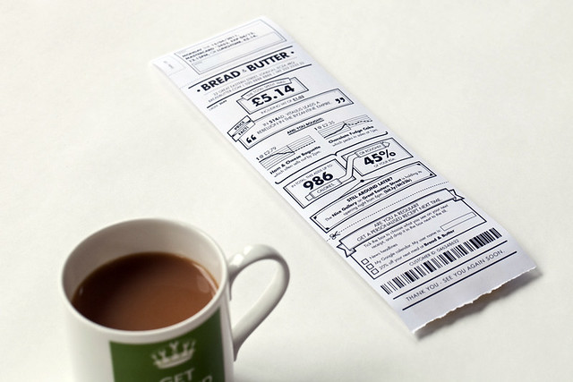
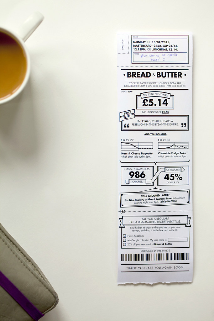
Icon magazine asked us to contribute to their monthly “Rethink” feature, where current and commonplace objects are re-imagined.
We continued some of the thinking from our “Media Surfaces” work with Dentsu, around how retail receipts could make the most of the information systems that modern point-of-sales machines are plugged into…
A little quote from our piece:
We’ve added semi-useful info-visualisation of the foods ordered based on “what the till knows” – sparklines, trends – and low-tech personalisation of information that might be useful to regulars. Customers can select events or news stories they are interested in by ticking a check box.
We think the humble receipt could be something like a paper “app” and be valuable in small and playful ways.
Read all about it in this month’s Icon #97, available at all good newsagents!
So I’m terribly pleased to announce that this week we are formally joined by Andy Huntington. We’ve known Andy for many years and began working with him as “Schulze & Webb” on the Olinda project. More recently, for the last year or so, he’s been designing and prototyping products with us.
Andy’s joining us as a Hardware Producer & Designer. He’ll be shifting between the design landscape and the dark pit of component sourcing, board design and manufacture. No doubt he’ll rub shoulders with Nick too in embedded software stuff. Initially his focus will be split between physical prototyping on Chaco and internal new product development on Barringer.
I first knew Andy during our studies at college. I sat at the next desk. Much of Andy’s work is around design of sound installations and musical instruments. I can only hope that his indentured servitude here can pay back a small percentage of the psychic debt he incurred at college during the development of his tappers project.
tap tap tap……..
tap…
tap..
*solder solder*
tap tap tap…
I still wake up screaming from the taps.
He’s a great force and I can’t wait for him to punch products into the world.
Consider this a little bit of a call-and-response to our friends through the plasterboard, specifically James’ excellent ‘moodboard for unknown products’ on the RIG-blog (although I’m not sure I could ever get ‘frustrated with the NASA extropianism space-future’).
There are some lovely images there – I’m a sucker for the computer-vision dazzle pattern as referenced in William Gibson’s ‘Zero History’ as the ‘world’s ugliest t-shirt‘.
The splinter-camo planes are incredible. I think this is my favourite that James picked out though…
Although – to me – it’s a little bit 80’s-Elton-John-video-seen-through-the-eyes-of-a-‘Cheekbone‘-stylist-too-young to-have-lived-through-certain-horrors.
I guess – like NASA imagery – it doesn’t acquire that whiff-of-nostalgia-for-a-lost-future if you don’t remember it from the first time round. For a while, anyway.
Anyway. We’ll come back to that.
The main thing, is that James’ writing galvanised me to expand upon a scrawl I made during an all-day crit with the RCA Design Interactions course back in February.
‘Sensor-Vernacular’ is a current placeholder/bucket I’ve been scrawling for a few things.
The work that Emily Hayes, Veronica Ranner and Marguerite Humeau in RCA DI Year 2 presented all had a touch of ‘sensor-vernacular’. It’s an aesthetic born of the grain of seeing/computation.
Of computer-vision, of 3d-printing; of optimised, algorithmic sensor sweeps and compression artefacts.
The fascination we have with how bees see flowers, revealing animal link between senses and motives. That our environment is shared with things that see with motives we have intentionally or unintentionally programmed them with.
The technique has been used for some pretty lovely pieces, such as this music video for Broken Social Scene.
In particular, for me, there is something in the loop of 3d-scanning to 3d-printing to 3d-scanning to 3d-printing which fascinates.
Rapid Form by Flora Parrot
It’s the lossy-ness that reveals the grain of the material and process. A photocopy of a photocopy of a fax. But atoms. Like the 80’s fanzines, or old Wonder Stuff 7″ single cover art. Or Vaughn Oliver, David Carson.
It is – perhaps – at once a fascination with the raw possibility of a technology, and – a disinterest, in a way, of anything but the qualities of its output. Perhaps it happens when new technology becomes cheap and mundane enough to experiment with, and break – when it becomes semi-domesticated but still a little significantly-other.
When it becomes a working material not a technology.
We can look back to the 80s, again, for an early digital-analogue: what one might term ‘Video-Vernacular’.
Talking Heads’ cover art for their album “Remain In Light” remains a favourite. It’s video grain / raw quantel as aesthetic has a heck of a punch still.
“The cover art was conceived by Weymouth and Frantz with the help of Massachusetts Institute of Technology Professor Walter Bender and his MIT Media Lab team.
Weymouth attended MIT regularly during the summer of 1980 and worked with Bender’s assistant, Scott Fisher, on the computer renditions of the ideas. The process was tortuous because computer power was limited in the early 1980s and the mainframe alone took up several rooms. Weymouth and Fisher shared a passion for masks and used the concept to experiment with the portraits. The faces were blotted out with blocks of red colour.
The final mass-produced version of Remain in Light boasted one of the first computer-designed record jackets in the history of music.”
Growing up in the 1980s, my life was saturated by Quantel.
Quantel were the company in the UK most associated with computer graphics and video effects. And even though their machines were absurdly expensive, even in the few years since Weymouth and Fisher harnessed a room full of computing to make an album cover, moore’s law meant that a quantel box was about the size of a fridge as I remember.
Their brand name comes from ‘Quantized Television’.
Awesome.
As a kid I wanted nothing more than to play with a Quantel machine.
Every so often there would be a ‘behind-the-scenes’ feature on how telly was made, and I wanted to be the person in the dark illuminated by screens changing what people saw. Quantizing television and changing it before it arrived in people homes. Photocopying the photocopy.
Alongside that, one started to see BBC Model B graphics overlaid on video and TV. This was a machine we had in school, and even some of my posher friends had at home! It was a video-vernacular emerging from the balance point between new/novel/cheap/breakable/technology/fashion.
Kinects and Makerbots are there now. Sensor-vernacular is in the hands of fashion and technology now.
In some of the other examples James cites, one might even see ‘Sensor-Deco’ arriving…
Lo-Rez Shoe by United Nude
James certainly has an eye for it. I’m going to enjoy following his exploration of it. I hope he writes more about it, the deeper structure of it. He’ll probably do better than I am.
Maybe my response to it is in some ways as nostalgic as my response to NASA imagery.
Maybe it’s the hauntology of moments in the 80s when the domestication of video, computing and business machinery made things new, cheap and bright to me.
But for now, let me finish with this.
There’s both a nowness and nextness to Sensor-Vernacular.
I think my attraction to it – what ever it is – is that these signals are hints that the hangover of 10 years of ‘war-on-terror’ funding into defense and surveillance technology (where after all the advances in computer vision and relative-cheapness of devices like the Kinect came from) might get turned into an exuberant party.
Dancing in front of the eye of a retired-surveillance machine, scanning and printing and mixing and changing. Fashion from fear. Quantizing and surprising. Imperfections and mutations amplifying through it.
Beyonce’s bright-green chromakey socks might be the first, positive step into the real aesthetic of the early 21st century, out of the shadows of how it begun.
Our friends at Tellart made something lovely this week.
“Bells” lets you compose a tune using tiny digital toy bells on the web, which will then through the magic of the internet, solenoids and electromagnetism play out in their studio on ‘real’ tiny toy bells.
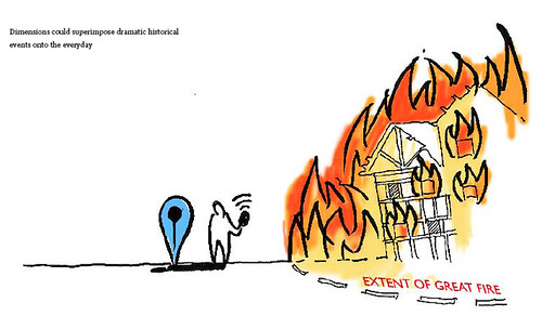
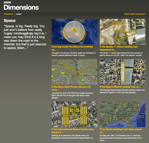
About a year ago we did some workshops with the BBC, to look at new ways in which history could be explored and explained using digital media. We came up with 30 or so ideas which got narrowed down to 5 ‘microbriefs’ for possible future prototyping.
One of our favourites from the off was an idea we called “Dimensions”.
From our original concept document:
“We want to bring home the human scale of events and places in history. The Apollo 11 Moon walk explored an area smaller than Trafalgar Square; the distance between your WW1 trench and the enemy could only be as much as from your front door to the street corner.
Dimensions is a feature on websites that juxtaposes the size of historical events with your home and neighbourhood. You’re hearing about the span of the base of the Great Pyramids, or the distance of the book depository from JFK, or the extent of the Great Fire of London… Dimensions overlays this map on a satellite view of where you live.”
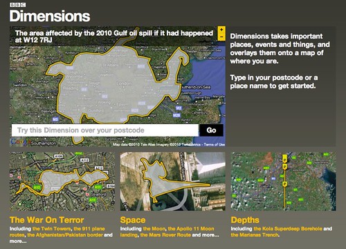
Earlier this year we began to design and build a public prototype of the BBC Dimensions concept which we’re putting live today.
It lives at http://howbigreally.com and it’ll be available as a trial for the next few months.
Let me give you a little tour.
The home page is a collection of what we’ve been calling ‘packages’ – themed collections of ‘Dimensions’. For instance here: ‘The War On Terror, ‘Space’ and ‘Depths’
What’s a Dimension then? Well, basically what it says right there on the homepage: “Dimensions takes important places, events and things, and overlays them onto a map of where you are.”
You can have a play right there and then by entering your postcode or a place name. It understands most things that google maps understands. We’ve built the prototype using google maps, but there’s no reason why it couldn’t work on top of another mapping system eventually.
As we were building the prototype, the BP Deepwater Horizon oil-spill disaster occurred, and you might have seen the excellent visualisation at http://www.ifitwasmyhome.com/ by Andy Lintner.
When we saw that and how well it was received – we knew we were on the right track! Dimensions is a platform to explore a lot more in that vein.
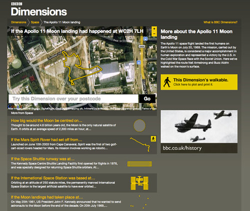
Wandering into the ‘Space’ package reveals a few different types of dimension – sizes, plans, routes.
The routes, such as that taken by the Apollo 11 moonwalkers mentioned in the original concept really can be revealing when juxtaposed on your postcode, or an area you know well…
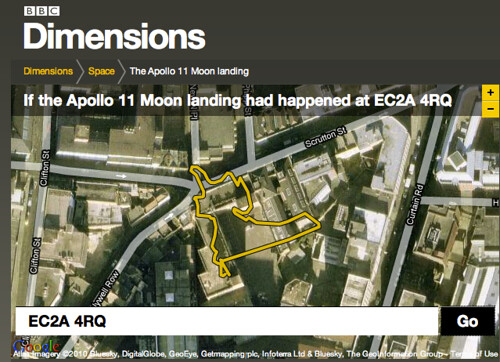
For instance if I type in our studio’s postcode…
I can see that Buzz and Neil would have barely left the building’s carpark…
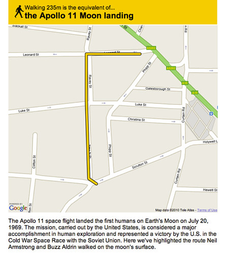
Some Dimensions let you go a step further, literally – by allowing you to plot a route around your neighbourhood, or perhaps your commute, or perhaps a nearby bit of countryside – so that you can viscerally experience the distances involved.
You point and click on the map to make your walk like so – a little gauge runs along the bottom so you can see how far you have left to plot…
…and when you’re happy with your route you can print out a map to take on your dimensional ramble.
The distance just about takes us from the front-door of our studio to a refreshing pint in one of our locals, The Book Club. Just the thing after a moonwalk.
One of the things I love about it is things like that – where something huge and momentous is made grokkable in the familiar. I also love that that’s all it really does.
It’s a bit like a digital toy – that just does one thing, very clearly (we hope) and delights in doing so.
It’s imagined that if the prototype is successful, it will be integrated into the main BBC site for embedding into history and news storytelling online.
The prototype system that we’ve made allows designers and producers at the BBC to create as many Dimensions as they want to using standard SVG creation tools. It’s also possible that this system could be opened up for local history enthusiasts to create their own dimensions to contribute.
The BBC worked with KeltieCochrane to create the initial content that’s in this prototype, and it was fantastic to see the system we built fill up with their work. My favourite’s The Colossus of Rhodes. Brilliant.
We’ll write some more here about both possible futures and the behind-the-scenes of Dimensions later. In the mean-time, many thanks to Matt Brown, Tom Armitage, Matt Webb, Phil Gyford and Paul Mison who worked on this with me, and Max Gadney for giving us a lovely brief.
“…it’s likely that we’re locked into pursuing very conscious, very gorgeous, deliberate touch interfaces – touch-as-manipulate-objects-on-screen rather than touch-as-manipulate-objects-in-the-world for now.”
It does look very much like we’re living in that world now – where our focus is elsewhere than our immediate surroundings – mainly residing through our fingers, in our tiny, beautiful screens.
Like a lot of things here, they are deeply connected to other places. Their attention is divided. And, by extension, so is ours. While this feeling is common to all cities over time, cell phones bring the tangible immediacy of the faraway to the street. Helped along by media and the global logistics networks that define our material lives, our moment-to-moment experience of the local has become increasingly global.
Recently, of course, our glowing attention wells have become larger.
We’ve been designing, developing, using and living with iPads in the studio for a while now, and undoubtedly they are fine products despite their drawbacks – but it wasn’t until our friend Tom Coates introduced me to a game called Marble Mixer that I thought they were anything other than the inevitable scaling of an internet-connected screen, and the much-mooted emergence of a tablet form-factor.
It led me to think they might be much more disruptive as magic tables than magic windows.
Marble Mixer is a simple game, well-executed. Where it sings is when you invite friends to play with you.
Each of you occupy a corner of the device, and attempts to flick marbles into the goal-mouth against the clock – dislodging the other’s marbles.
Beautiful. Simple. But also – amazing and transformative!
We’re all playing with a magic surface!
When we’re not concentrating on our marbles, we’re looking each other in the eye – chuckling, tutting and cursing our aim – and each other.
There’s no screen between us, there’s a magic table making us laugh. It’s probably my favourite app to show off the iPad – including the ones we’ve designed!
It shows that the iPad can be a media surface to share, rather than a proscenium to consume through alone.
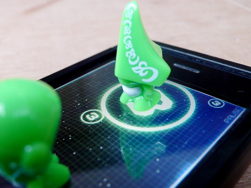
[GoGos]’d be the perfect counters for a board game that uses the iPad as the board. They’d look gorgeous sitting on there. We’d need to work out how to make the iPad think they were fingers – maybe some sort of electrostatic sausage skin – and to remember which was which.
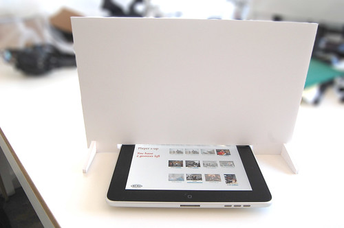
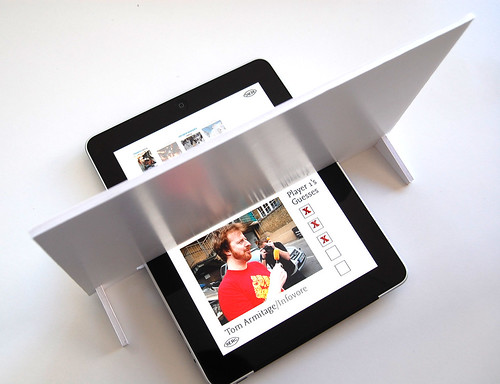
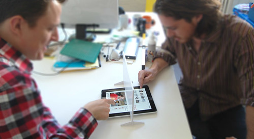
Inspired by Marble Mixer, and Russell’s writings – I decided to do a spot of rapid prototyping of a ‘peripheral’ for magic table games that calls out the shared-surface…
It’s a screen – but not a glowing one! Just a simple bit of foamboard cut so it obscures your fellow player’s share of the game board, for games like Battleships, or in this case – a mocked-up guessing-game based on your flickr contacts…
You’d have a few guesses to narrow it down… Are they male, do they have a beard etc…
Fun for all the family!
Anyway – as you can see – this is not so serious a prototype, but I can imagine some form of capactive treatment to the bottom edge of the screen, perhaps varying the amount of secret territory each player revealed to each other, or capacitive counters as Russell suggests.
Aside from games though – the pattern of a portable shared media surface is surely worth pursuing.
“interacting in the world, participating in it and acting through it, in the absorbed and unreflective manner of normal experience.”
Designing media and services for “little-ass” rather than “big-ass” magic tables might propel us into a future not so removed from the one I thought we might have lost…
Magazines have articles you can curl up with and lose yourself in, and luscious photography that draws the eye. And they’re so easy and enjoyable to read. Can we marry what’s best about magazines with the always connected, portable tablet e-readers sure to arrive in 2010?
This video prototype shows the take of the Mag+ project.
The articles run in scrolls, not pages, and are placed side-to-side in kind of mountain range (as we call it internally). Magazines still arrive in issues: people like the sense of completion at the end of each.
You flip through by shifting focus. Tap the pictures on the left of the screen to flip through the mag, tap text on the right to dive in.
It is, we hope, like stepping into a space for quiet reading. It’s pleasant to have an uncluttered space. Let the Web be the Web. But you can heat up the words and pics to share, comment, and to dig into supplementary material.
The design has an eye to how paper magazines can re-use their editorial work without having to drastically change their workflow or add new teams. Maybe if the form is clear enough then every mag, no matter how niche, can look gorgeous, be super easy to understand, and have a great reading experience. We hope so. That gets tested in the next stage, and rolled into everything learned from this, and feedback from the world at large! Join the discussion at the Bonnier R&D Beta Lab.
Recently there have been digital magazine prototypes by Sports Illustrated, and by Wired. It’s fascinating to see the best features of all of these.
Many teams at Bonnier have been involved in Mag+. This is a synthesis of so much work, research, and ideas. But I want to say in particular it’s a pleasure to collaborate with our friends at R&D. And here at BERG let me call out some specific credits: Jack Schulze, Matt Jones, Campbell Orme and Timo Arnall. Thanks all!
(See also Bonnier R&D’s Mag+ page, where you can leave comments and contact Bonnier, and the thoughts of Kicker Studio — who will be expanding the concept to robust prototype over the next few months in San Francisco! BERG’s attention has now moved to the social and wider services around Mag+ – we’ll be mapping those out and concepting – and we’re looking forward to working with all the teams into 2010. Awesome.)
It’s footage of a simple Augmented Reality experiment from a programmer at British independent games developers Introversion, imagining what one element (the world map) of their strategy game Defcon might look like if there was an AR component to it.
I’m not as interested in the technical aspect of this experiment as I am the aesthetic.
I was struck by how well-suited the blue-on-blue, information-dense and highly representational display of Defcon is as an aesthetic for augmented reality. It helps to have a clear distinction between the real and the augmented. By making the augmented several degrees lower in fidelity than the real, it enhances the utility of the augmented elements. It creates seams between the real and the unreal, and helps the user process both real-world and AR information faster.
A few other things that struck me as being similar to this:
Jack spoke at This Happened in London last year about the Olinda project, and talked a little at the end about the form factor. Specifically: why it doesn’t look “prettier”. And he explains:
Each of the elements are trying to say what they do themselves in their own language.
Matt has described this to me as “physical PowerPoint”. You instantly know from looking at this thing that it’s not necessarily finished yet; not quite complete. And rather than letting you down, that incompleteness (in this case, an aesthetic one) opens up a communication. It informs the observer that they can engage in a kind of dialogue with the radio, about what it is and what it does. Its form is not final, and that means that there is still space to explore and examine that form. A more finished project would shut out any such exploration from the user or observer, and simply impose its form on them; the only reactions left are accepting that form, denying it, or ignoring it.
Monospaced type that’s used for writing, not code. Most corporate communication takes on the same form: laser-printed, perhaps even letter-headed, smartly formatted documents, all of which look finished. But it’s so rare that the kind of documents we use in corporate communications are finished. More likely, they’re work in progress – either iterations of a report yet to be completed, reference materials for negotiations yet to be conducted, or as starting points for discussions that likely end on a completely different note. So why present them as concrete, unapproachable objects? By presenting the documents in barely-styled (yet thoughtfully laid out) monospace text, their role as intermediate objects becomes more obvious.
Rapid-prototyping plastic. The not-quite complete has not just look, but also feel, and as rapid-prototyping becomes more and more commonplace – and better understood by a wider audience – that unusual texture of fabbed plastic will quickly become another useful shorthand for “not a sketch, but not complete either”. This is a tactile shorthand that emphasises the boundaries between the world (of complete, final materials) and the work-in-progress.
One technique that S&W has been using recently to illustrate design work is placing sketches or wireframes in situ. Whilst wireframes themselves are incomplete artefacts, designed to be work in progress, they still suffer for being uniformly incomplete. Wireframes themselves can be almost too beautiful, and this means that it becomes all-too-easy to criticise them as only wireframes, rather than as part of a product that exists in the world. Contextualising the sketches into the photograph places the design into the world. This enables the design to be understood within the world, and also (importantly) to highlight the seams between the unfinished design and the finished world around it.
How finished an artefact is is an important indicator of its relationship to the world: not just an indication of where it is in its lifecycle, but also one that explains how it should be understood, and that opens a dialogue between the observer and the artefact. It’s important that there is authenticity in the unfinished state. All the examples above are of things that are in a transition state between non-existant and final; they are not finished items that have then been distressed or made to appear cosmetically unfinished.
This is unlikely to be the last time I’ll write about this stuff on Pulse Laser; it feels like it has legs, and it’s something that I’m noticing more and more examples of. Given that, it only seems appropriate that this post remains
If you asked me to pick the two cards Schulze & Webb play with abandon in the consultancy game, they’d be Product and Experience.
Products should be what toy companies call shelf-demonstrable–even sitting in a box in shop, a product can explain itself to the customer (or at least tell its simplest story in a matter of seconds). Organisationally, understanding a website or component of a mobile service as a product means being able to describe it in a single sentence, means understanding the audience, means focusing on a single thing well, means having ‘this is what we are here for’ as a mantra for the team, and it means being able to (formally or informally) have metrics and goals. Here’s it in a nutshell: You know it’s a product when it has an ethos–when the customers and the team know pretty much what the product would do in any given circumstance.
Then we play Experience. The experiential approach is how you and the product live together and interact. The atoms are cognitive (psychology and perception), while the day-to-day is it’s own world: Play, sociality, cultural resonance, and more. Each of these is an area of experience to be individual understood in terms of how it can be used. The third level of experience we deal with is context: How the product is approached (physically and mentally), and how it fits in with other products, people and expectations.
We can go a long way, and make decent recommendations of directions and concrete features, with those two cards.
And now we’re making a radio. As much as we’ve said these approaches apply across media, services and (physical, consumer) product, working with physical products has recently been only in our own research. Hey, until now. Until now!
Olinda is a digital radio prototype for the BBC
For the past month we’ve been working on the feasibility of Olinda, a DAB digital radio prototype for the BBC (for non-UK readers: DAB is the local digital radio standard, getting traction globally). That stage is almost over now – oh and yes, it’s feasible – so now’s a good time to talk.
Olinda puts three ideas into practice:
Radios can look better than the regular ‘kitchen radio’ devices. Radios can have novel interfaces that make the whole life-cycle of listening easier. At short runs, wood is more economic as plastic, so we’re using a strong bamboo ply. And forget preset buttons: Olinda monitors your listening habits so switching between two stations is the simplest possible action, with no configuration step.
This can be radio for the Facebook generation. Built-in wifi connects to the internet and uses a social ‘now listening’ site the BBC already have built. Now a small number of your friends are represented on the device: A light comes on, your friend is listening; press a button and you tune in to listen to the same programme.
If an API works to make websites adaptive, participative with the developer community, and have more appropriate interfaces, a hardware API should work just as well. Modular hardware is achievable, so the friends functionality will be its own component operating through a documented, open, hardware API running over serial.
What Olinda isn’t is a far-future concept piece or a smoke-and-mirrors prototype. There’s no hidden Mac Mini–it’s a standalone, fully operational, social, digital radio.
The intention with Olinda is that it’s maximum 9 months out: It’s built around the same embedded DAB and wifi modules the manufacturers use. And it has to be immediately understandable and appealing for the mass market. Shelf-demonstrable is the way to go.
The BBC should be able to take it to industry partners, and for those partners to see it as free, ready-made R&D for the next product cycle. We have a communications strategy ready around this activity.
So that’s why I’m proud to say that, when complete, the BBC will put the IPR of Olinda under an attribution license–the equivalent of a BSD or Creative Commons Attribution. If a manufacturer or some person wants to make use of the ideas and design of the device, they’re free to do so without even checking with the BBC, so long as they put the BBC attribution and copyright for the IPR that’s been used on the bottom.
More later
The feasibility wraps up in the next week or so, as I budget the build phase. When build starts, we have an intern starting–perhaps two (yes, we got a great response to putting those feelers out). But that deserves its own post.
And there’s a lot to talk about. For start, what Olinda will look like (we have drawings and form experiments). And how the Product and Experience approaches will manifest.
The DAB module is wrapped in insulation tape, and you can make out the stereo socket (it’s blurry because it’s standing out of the focal plane) and the antenna. Running from the breadboard is a serial cable to my computer which is assembling and decoding messages for tuning, playing, receiving radio text messages and so on.
Thanks to Tristan Ferne, Amy Taylor and John Ousby and their teams at BBC Audio & Music Interactive for making this happen.
(Incidentally: Olinda, the name of this project, is aspirational, chosen from Italo Calvino’s Invisible Cities (Olinda is transcribed at the bottom of that page). We could do worse that help along the radio industry in the same way Calvino’s city grows.)
")