This is a version of a talk that I gave at the “In Progress” event, staged by ‘It’s Nice That‘ magazine.
It builds on some thoughts that I’ve spoken about at some other events in 2011, but I think this version put it forward in the way I’m happiest with.
Having said that, I took the name of the event literally – it’s a bit of a work-in-progress, still.
It might more properly be entitled ‘Pets & Pot-plants’ rather than ‘Gardens & Zoos’ – but the audience seemed to enjoy it, and hopefully it framed some of the things we’re thinking about and discussing in the studio over the last year or so, as we’ve been working on http://bergcloud.com and other projects looking at the near-future of connected products.
And – with that proviso… Here it is.
Let me introduce a few characters…
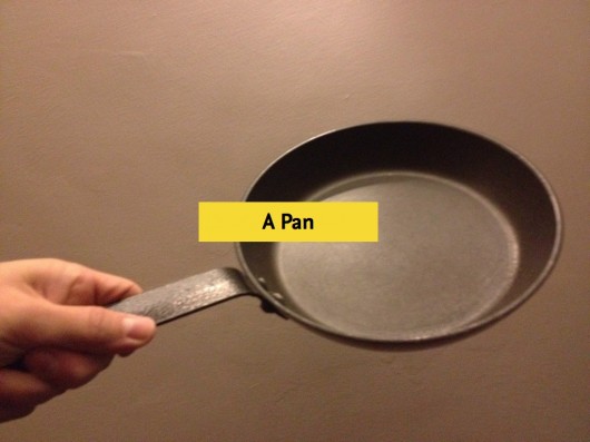
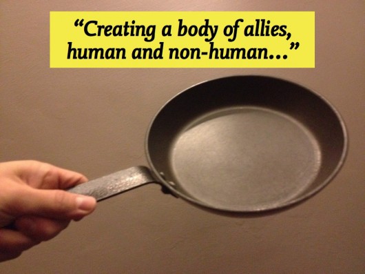
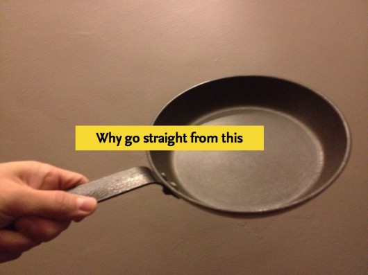
This is my frying pan. I bought it in Helsinki. It’s very good at making omelettes.
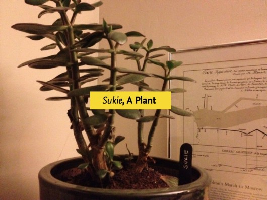
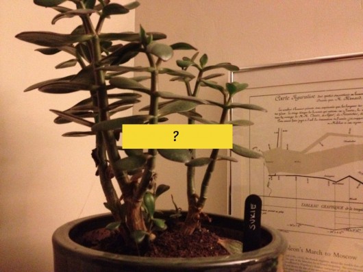
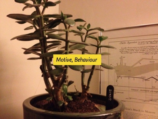
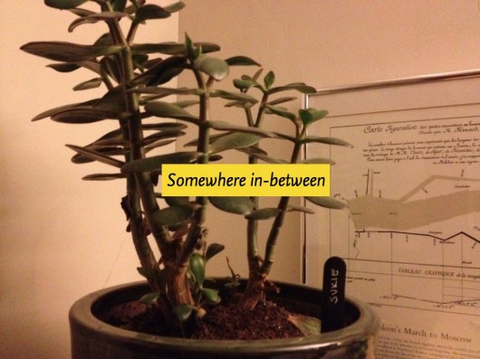
This is Sukie. She’s a pot-plant that we adopted from our friend Heather’s ‘Wayward Plants‘ project, at the Radical Nature exhibit at the Barbican (where “In Progress” is!)
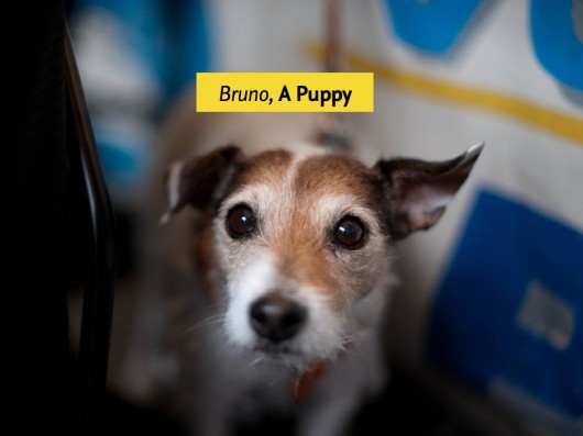
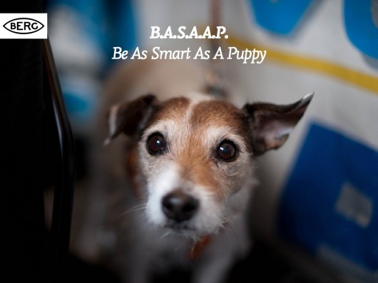
This is a puppy – we’ll call him ‘Bruno’.
I have no idea if that’s his name, but it’s from our friend Matt Cottam’s “Dogs I Meet” flickr set, and Matt’s dog is called Bruno – so it seemed fitting.

And finally, this is Siri – a bot.
And, I’m Matt Jones – a designer and one of the principals at BERG, a design and invention studio.
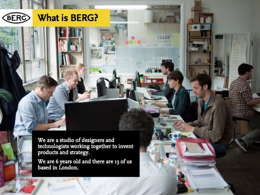
There are currently 13 of us – half-technologists, half-designers, sharing a room in East London where we invent products for ourselves and for other people – generally large technology and media companies.
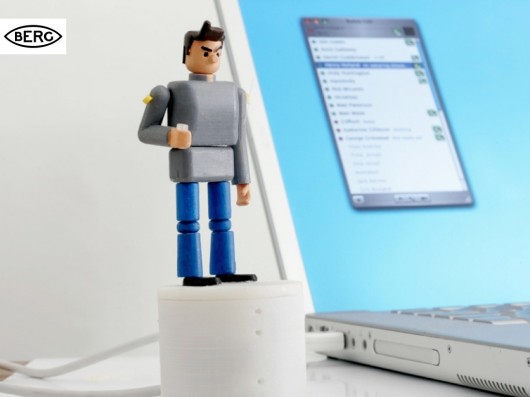
This is Availabot, one of the first products that we designed – it’s a small connected product that represents your online status physically…
But I’m going to talk today about the near-future of connected products.
And it is a near-future, not far from the present.
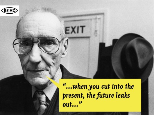
In fact, one of our favourite quotes about the future is from William Burroughs: “When you cut into the present, the future leaks out…“
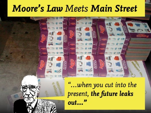
A place we like to ‘cut into the present’ is the Argos catalogue! Matt Webb’s talked about this before.
It’s really where you see Moore’s Law hit the high-street.
Whether it’s toys, kitchen gear or sports equipment – it’s getting hard to find consumer goods that don’t have software inside them.
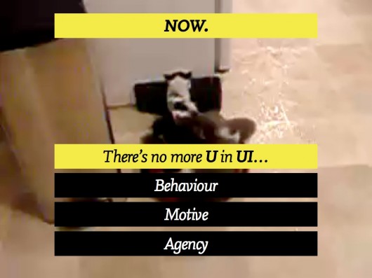
This is near-future where the things around us start to display behaviour – acquiring motive and agency as they act and react to the context around them according to the software they have inside them, and increasingly the information they get from (and publish back to) the network.
In this near-future, it’s very hard to identify the ‘U’ in UI’ – that is, the User in User-Interface. It’s not so clear anymore what these things are. Tools… or something more.
Of course, I choose to illustrate this slightly-nuanced point with a video of kittens riding a Roomba that Matt Webb found, so you might not be convinced.
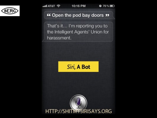
However, this brings us back to our new friends, the Bots.
By bot – I guess I mean a piece of software that displays a behaviour, that has motive and agency.
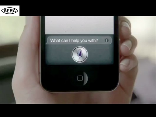
Let me show a clip about Siri, and how having bots in our lives might affect us [Contains Strong Language!]
Perhaps, like me – you have more sympathy for the non-human in that clip…
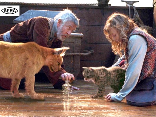
But how about some other visions of what it might be like to have non-human companions in our lives? For instance, the ‘daemons’ of Phillip Pullman’s ‘Dark Materials‘ trilogy. They are you, but not you – able to reveal things about you and reveal things to you. Able to interact naturally with you and each other.
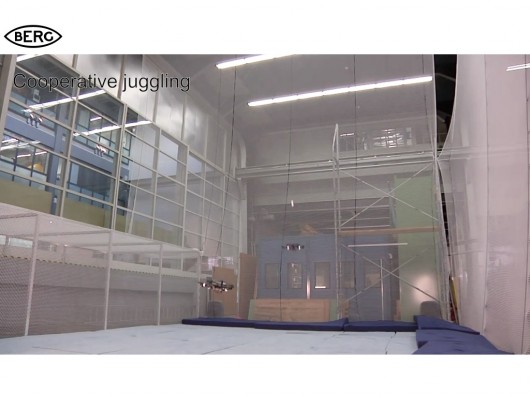
Creatures we’ve made that play and explore the world don’t seem that far-fetched anymore. This is a clip of work on juggling robot quadcopters by ETH Zurich.
Which brings me back to my earlier thought – that it’s hard to see where the User in User-Interfaces might be. User-Centred Design has been the accepted wisdom for decades in interaction design.
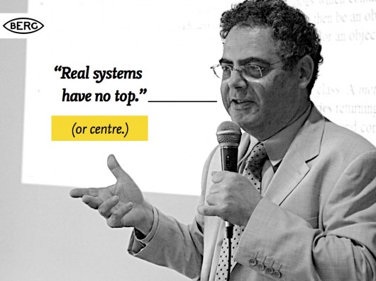
I like this quote that my friend Karsten introduced me to, by Prof Bertrand Meyer (coincidentally at professor at ETH) that might offer an alternative view…
A more fruitful stance for interaction design in this new landscape might be that offered by Actor-Network Theory?
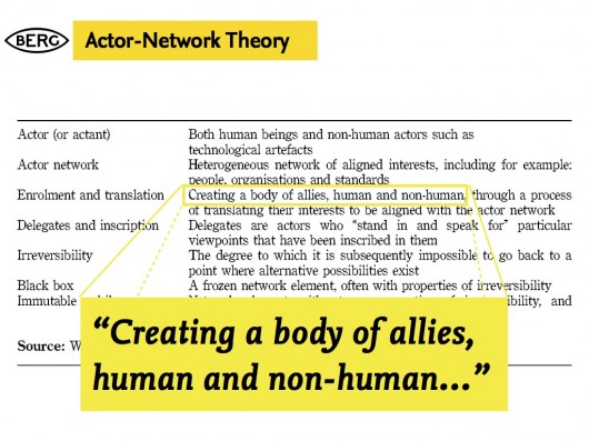
I like this snippet from a formulation of ANT based on work by Geoff Walsham et al.
“Creating a body of allies, human and non-human…”
Which brings me back to this thing…

Which is pretty unequivocally a tool. No motive, no agency. The behaviour is that of it’s evident, material properties.

Domestic pets, by contrast, are chock-full of behaviour, motive, agency. We have a model of what they want, and how they behave in certain contexts – as they do of us, we think.
We’ll never know, truly of course.
They can surprise us.
That’s part of why we love them.
Even though we might give them names, and have an idea of their ‘motive’ and behaviour, they have little or no direct agency. They move around by getting us to move them around, by thriving or wilting…
And – this occurred to me while doing this talk – what are houseplants for?
Let’s leave that one hanging for a while…
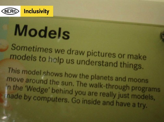
And come back to design – or more specifically – some of the impulses beneath it. To make things, and to make sense of things. This is one of my favourite quotes about that. I found it in an exhibition explaining the engineering design of the Sydney Opera House.
Making models to understand is what we do as we design.
And, as we design for slightly-unpredictable, non-human-centred near-futures we need to make more of them, and share them so we can play with them, spin them round, pick them apart and talk about what we want them to be – together.
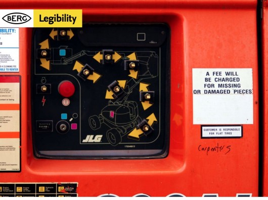
I’ll just quickly mention some of the things we talk about a lot in our work. The things we think are important in the models, and designs we make for connected products. The first one is legibility. That the product or service presents a readable, evident model of how it works to the world on it’s surface. That there is legible feedback, and you can quickly construct a theory how it works through that feedback.

One of the least useful notions you come up against, particularly in technology companies, is the stated ambition that the use of products and services should be ‘seamless experiences’.
Matthew Chalmers has stated (after Mark Weiser, one of the founding figures of ‘ubicomp’) that we need to design “seamful systems, with beautiful seams”
Beautiful seams attract us to the legible surfaces of a thing, and allow our imagination in – so that we start to build a model in our minds (and appreciate the craft at work, the values of the thing, the values of those that made it, and how we might adapt it to our values – but that’s another topic)
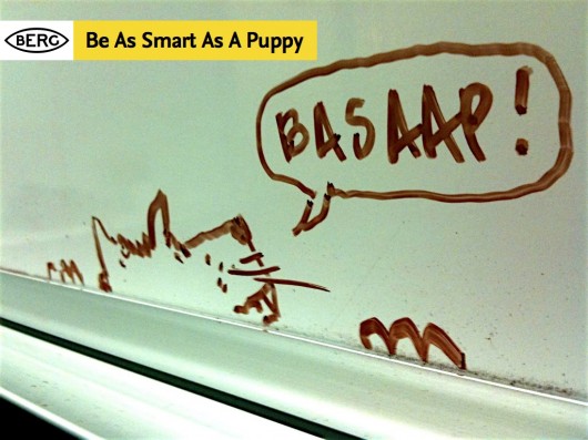
Finally – this guy – who pops up a lot on whiteboards in the studio, or when we’re working with clients.
B.A.S.A.A.P. is a bit of an internal manifesto at BERG, and stands for Be As Smart As A Puppy – and it’s something I’ve written about at length before.
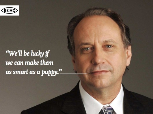
It stems from something robotics and AI expert Rodney Brooks said… that if we put the fifty smartest people in a room for fifty years, we’d be luck if we make AIs as smart as a puppy.
We see this an opportunity rather than a problem!
We’ve made our goal to look to other models of intelligence and emotional response in products and services than emulating what we’d expect from humans.
Which is what this talk is about. Sort-of.
But before we move on, a quick example of how we express these three values in our work.
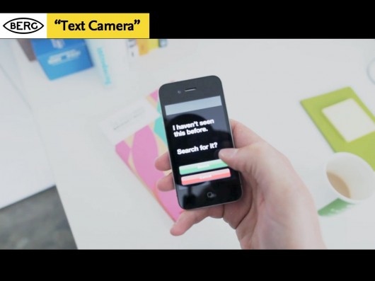
“Text Camera” is a very quick sketch of something that we think illustrates legibility, seamful-ness and BASAAP neatly.
Text Camera is about making the inputs and inferences the phone sees around it to ask a series of friendly questions that help to make clearer what it can sense and interpret. It kind of reports back on what it sees in text, rather through a video feed.
Let me explain one of the things it can do as an example. Your smartphone camera has a bunch of software to interpret the light it’s seeing around you – in order to adjust the exposure automatically.
So, we look to that and see if it’s reporting ‘tungsten light’ for instance, and can infer from that whether to ask the question “Am I indoors?”.
Through the dialog we feel the seams – the capabilities and affordances of the smartphone, and start to make a model of what it can do.
So next, I want to talk a little about a story you might be familiar with – that of…

I hope that last line doesn’t spoil it for anyone who hasn’t seen it yet…
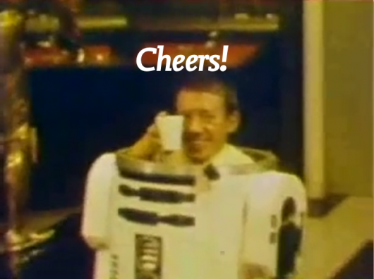
But – over the last year I’ve been talking with lot to people about a short scene in the original 1977 Star Wars movie ‘A New Hope’ – where Luke and his Uncle Owen are attempting to buy some droids from the Jawas that have pulled up outside their farmstead.
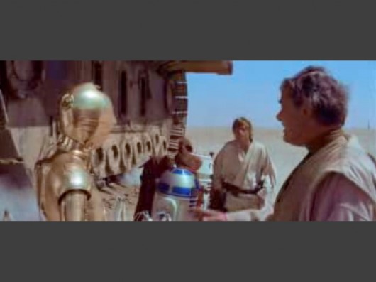
I’ve become a little obsessed with this sequence – where the droids are presented like… Appliances? Livestock?
Or more troublingly, slaves?
Luke and Uncle Owen relate to them as all three – at the same time addressing them directly, aggressively and passive-aggressively. It’s such a rich mix of ways that ‘human and non-human actors’ might communicate.
Odd, and perhaps the most interesting slice of ‘science-fiction’ in what otherwise is squarely a fantasy film.
Of course Artoo and Threepio are really just…
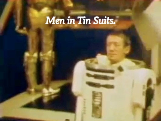
Men in tin-suits, but our suspension of belief is powerful! Which brings me to the next thing we should quickly throw into the mix of the near-future…
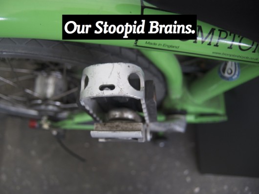
This is the pedal of my Brompton bike. It’s also a yapping dog (to me at least)
Our brains are hard-wired to see faces, it’s part of a phenomena called ‘Pareidolia‘
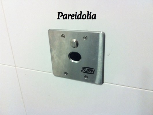
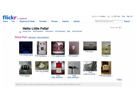
It’s something we’ve talked about before on the BERGblog, particularly in connection with Schoolscope. I started a group on flickr called “Hello Little Fella” to catalogue my pareidolic-excesses (other facespotting groups are available).
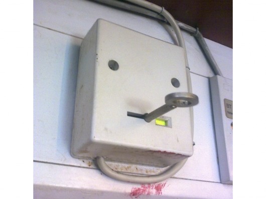
This little fella is probably my favourite.
He’s a little bit ill, and has a temperature.
Anyway.
The reason for this particular digression is to point out that one of the prime materials we work with as interaction designers is human perception. We try to design things that work to take advantage of its particular capabilities and peculiarities.
I’m not sure if anyone here remembers the Apple Newton and the Palm Pilot?
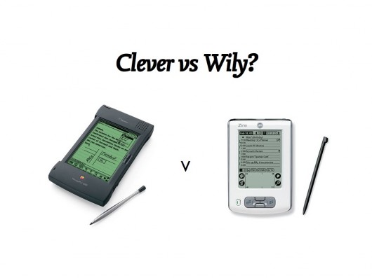
The Newton was an incredible technological attainment for it’s time – recognising the user’s handwriting. The Palm instead forced us to learn a new type of writing (“Graffiti“).
We’re generally faster learners than our technology, as long as we are given something that can be easily approached and mastered. We’re more plastic and malleable – what we do changes our brains – so the ‘wily’ technology (and it’s designers) will sieze upon this and use it…
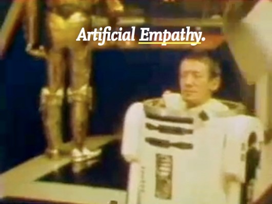
All of which leaves me wondering whether we are working towards Artificial Empathy, rather than Artificial Intelligence in the things we are designing…
If you’ve seen this video of ‘Big Dog’, an all-terrain robot by Boston Dynamics – and you’re anything like me – then you flinch when it’s tester kicks it.
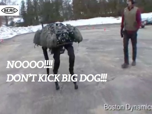
To quote from our ‘Artificial Empathy’ post:
Big Dog’s movements and reactions – it’s behaviour in response to being kicked by one of it’s human testers (about 36 seconds into the video above) is not expressed in a designed face, or with sad ‘Dreamworks’ eyebrows – but in pure reaction – which uncannily resembles the evasion and unsteadiness of a just-abused animal.
Of course, before we get too carried away by artificial empathy, we shouldn’t forget what Big Dog is primarily designed for, and funded by…
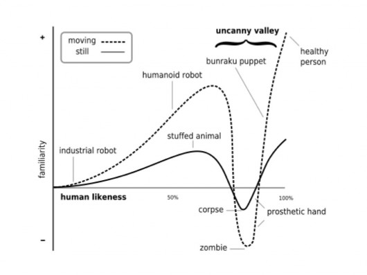
Anyway – coming back to ‘wily’ tactics, here’s the often-referenced ‘Uncanny Valley’ diagram, showing the relationship between ever-more-realistic simulations of life, particularly humans and our ‘familiarity’ with them.
Basically, as we get ever closer to trying to create lifelike-simulations of humans, they start to creep us out.
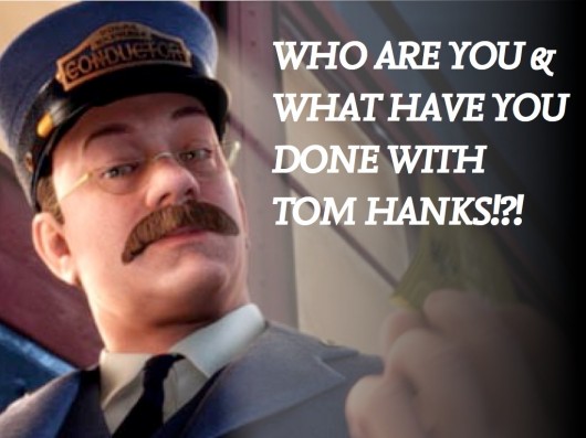
It can perhaps be most neatly summed up as our reaction to things like the creepy, mocapped synthespians in the movie Polar Express…
The ‘wily’ tactic then would be to stay far away from the valley – aim to make technology behave with empathic qualities that aren’t human at all, and let us fill in the gaps as we do so well.
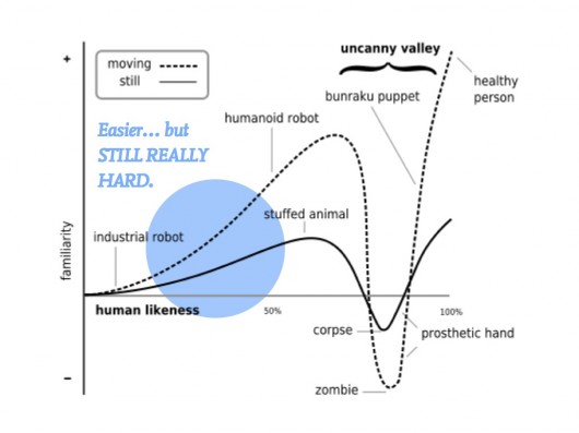
Which, brings us back to BASAAP, which as Rodney Brooks pointed out – is still really tough.
Bruno’s wild ancestors started to brute-force the problem of creating artificial empathy and a working companion-species relationship with humans through the long, complex process of domestication and selective-breeding…
…from that point the first time these kind of eyes were made towards scraps of meat held at the end of a campfire somewhere between 12-30,000 years ago…
Some robot designers have opted to stay on the non-human side of the uncanny valley, notably perhaps Sony with AIBO.
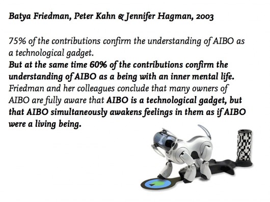
Here’s an interesting study from 2003 that hints a little at what the effects of designing for ‘artificial empathy’ might be.
We’re good at holding conflicting models of things in our heads at the same time it seems. That AIBO is a technology, but that it also has ‘an inner life’.
Take a look at this blog, where an AIBO owner posts it’s favourite places, and laments:
“[he] almost never – well, make it never – leaves his station these days. It’s not for lack on interest – he still is in front of me at the office – but for want of preservation. You know, if he breaks a leg come a day or a year, will Sony still be there to fix him up?”
(One questioner after my talk asked: “What did the 25% of people who didn’t think AIBO was a technological gadget report it to be?” – Good question!)
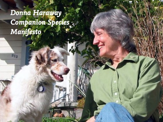
Some recommendations of things to look at around this area: the work of Donna Haraway, esp. The Companion Species Manifesto.
Also, the work of Cynthia Brezeal, Heather Knight and Kacie Kinzer – and the ongoing LIREC research project that our friend Alexandra Deschamps-Sonsino is working with, that’s looking to studies of canine behaviour and companionship to influence the design of bots and robots.
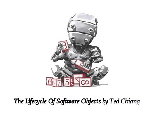
In science-fiction there’s a long, long list that could go here – but for now I’ll just point to the most-affecting recent thing I’ve read in the area, Ted Chiang’s novella “The Lifecycle of Software Objects” – which I took as my title for a talk partly on this subject at UX London earlier in the year.
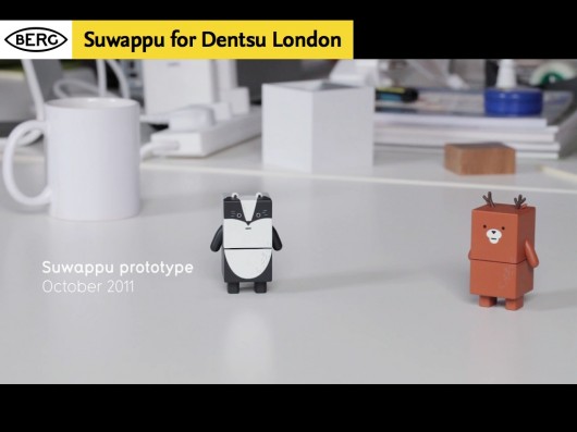
In our own recent work I’d pick out Suwappu, a collaboration with Dentsu London as something where we’re looking to animate, literally, toys with an inner life through a computer-vision application that recognises each character and overlays dialogue and environments around them.
I wonder how this type of technology might develop hand-in-hand with storytelling to engage and delight – while leaving room for the imagination and empathy that we so easily project on things, especially when we are young.
Finally, I want to move away from the companion animal as a model, back to these things…
I said we’d come back to this! Have you ever thought about why we have pot plants? What we have them in the corners of our lives? How did they get there? What are they up to?!?
(Seriously – I haven’t managed yet to find research or a cultural history of how pot-plants became part of our home life. There are obvious routes through farming, gardening and cooking – but what about ornamental plants? If anyone reading this wants to point me at some they’d recommend in the comments to this post, I’d be most grateful!)
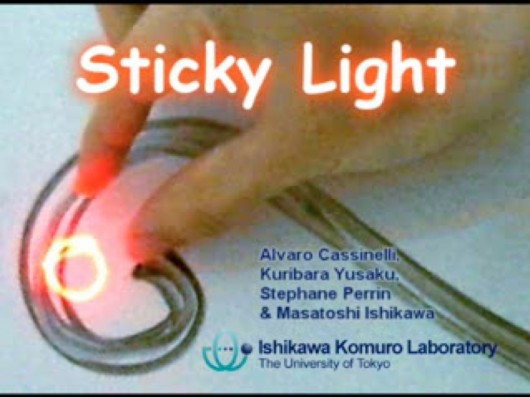
Take a look at this – one of the favourite finds of the studio in 2011 – Sticky Light.
It is very beautifully simple. It displays motive and behaviour. We find it fascinating and playful. Of course, part of it’s charm is that it can move around of its own volition – it has agency.
Pot-plants have motives (stay alive, reproduce) and behaviour (grow towards the light, shrivel when not watered) but they don’t have much agency. They rely on us to move them into the light, to water them.
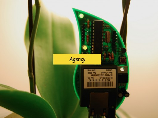
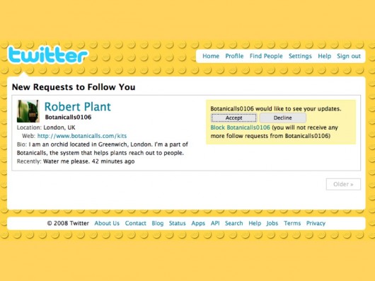
Some recent projects have looked to augment domestic plants with some agency – Botanicalls by Kati London, Kate Hartman, Rebecca Bray and Rob Faludi equips a plant not only with a network connection, but a twitter account! Activated by sensors it can report to you (and its followers) whether it is getting enough water. Some voice, some agency.
(I didn’t have time to mention it in the talk, but I’d also point to James Chamber’s evolution of the idea with his ‘Has Needs’ project, where an abused potplant not only has a network connection, but the means to advertise for a new owner on freecycle…)
Here’s my botanical, which I chose to call Robert Plant…
So, much simpler systems that people or pets can find places in our lives as companions. Legible motives, limited behaviours and agency can illicit response, empathy and engagement from us.
We think this is rich territory for design as the things around us start to acquire means of context-awareness, computation and connectivity.
As we move from making inert tools – that we are unequivocally the users of – to companions, with behaviours that animate them – we wonder whether we should go straight from this…
Namely, straight from things with predictable and legible properties and affordances, to things that try and have a peer-relationship, speaking with human voice and making great technological leaps to relate to us in that way, but perhaps with a danger of entering the uncanny valley.
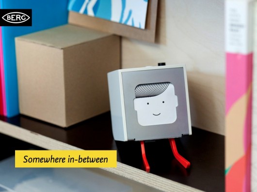
What if there’s an interesting space to design somewhere in-between?
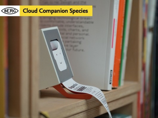
This in part is the inspiration behind some of the thinking in our new platform Berg Cloud, and its first product – Little Printer.
We like to think of Little Printer as something of a ‘Cloud Companion Species’ that mediates the internet and the domestic, that speaks with your smartphone, and digests the web into delightful little chunks that it dispenses when you want.
Little Printer is the beginning of our explorations into these cloud-companions, and BERG Cloud is the means we’re creating to explore them.
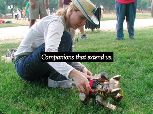
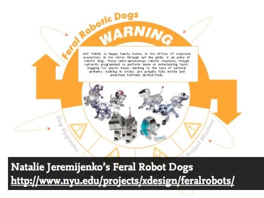
Ultimately we’re interested in the potential for new forms of companion species that extend us. A favourite project for us is Natalie Jeremijenko’s “Feral Robotic Dogs” – a fantastic example of legibility, seamful-ness and BASAAP.
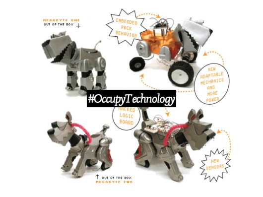
Natalie went to communities near reclaimed-land that might still have harmful toxins present, and taught workshops where cheap (remember Argos?) robot dogs that could be bought for $30 or so where opened up and hacked to accommodate new sensors.
They were reprogrammed to seek the chemical traces associated with lingering toxins. Once release by the communities they ‘sniff’ them out, waddling towards the highest concentrations – an immediate tangible and legible visualisation of problem areas.
Perhaps most important was that the communities themselves were the ones taught to open the toys up, repurpose their motives and behaviour – giving them the agency over the technology and evidence they could build themselves.
In the coming world of bots – whether companions or not, we have to attempt to maintain this sort of open literacy. And it is partly the designer’s role to increase its legibility. Not only to beguile and create empathy – but to allow a dialogue.
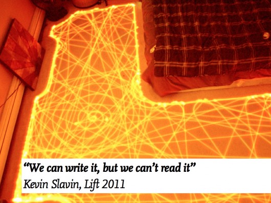
As Kevin Slavin said about the world of algorithms growing around us – “We can write it but we can’t read it”
We need to engage with the complexity and make it open up to us.
To make evident, seamful surfaces through which we can engage with puppy-smart things.
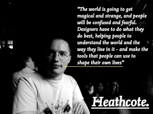
As our friend Chris Heathcote has put so well:
Thanks for inviting me, and for your attention today.
FOOTNOTE: Auger & Loizeau’s Domestic Robots.
I didn’t get the chance to reference the work of James Auger & Jimmy Loizeau in the talk, but their “Carnivorous Robots” project deserves study.
From the project website:
“For a robot to comfortably migrate into our homes, appearance is critical. We applied the concept of adaptation to move beyond the functional forms employed in laboratories and the stereotypical fictional forms often applied to robots. In effect creating a clean slate for designing robot form, then looking to the contemporary domestic landscape and the related areas of fashion and trends for inspiration. The result is that on the surface the CDER series more resemble items of contemporary furniture than traditional robots. This is intended to facilitate a seamless transition into the home through aesthetic adaptation, there are however, subtle anomalies or alien features that are intended to draw the viewer in and encourage further investigation into the object.”
And on robots performing as “Companion Species”
”In the home there are several established object categories each in some way justifying the products presence through the benefit or comfort they bring to the occupant, these include: utility; ornament; companionship; entertainment and combinations of the above, for example, pets can be entertaining and chairs can be ornamental. The simplest route for robots to enter the home would be to follow one of these existing paths but by necessity of definition, offering something above and beyond the products currently occupying those roles.”
James Auger is currently completing his Phd at the RCA on ‘Domestication of Robotics’ and I can’t wait to read it.
