This website is now archived. To find out what BERG did next, go to www.bergcloud.com.

Blog posts tagged as 'mobile'

Instruments of Politeness

We weren’t at SxSW, but some of our friends were – and via their twitter-exhaust this report by David Sherwin of FrogDesign from a talk by Intel’s Genevieve Bell popped up on our radar.

In her panel yesterday at South by Southwest, Genevieve Bell posed the following question: “What might we really want from our devices?” In her field research as a cultural anthropologist and Intel Fellow, she surfaced themes that might be familiar to those striving to create the next generation of interconnected devices. Adaptable, anticipatory, predictive: tick the box. However, what happens when our devices are sensitive, respectful, devout, and perhaps a bit secretive? Smart devices are “more than being context aware,” Bell said. “It’s being aware of consequences of context.”

Here’s a lovely quote from Genevieve:

“[Today’s devices] blurt out the absolute truth as they know it. A smart device [in the future] might know when NOT to blurt out the truth.”

This in turn, reminded me of a lovely project that Steffen Fiedler did back in 2009 during a brief I helped run at the RCA Design Interactions course as part T-Mobile’s ongoing e-Etiquette project, called “Instruments of Politeness“.

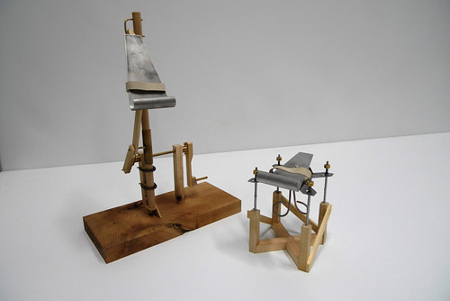
These are the titular instruments – marvellous contraptions!

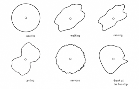
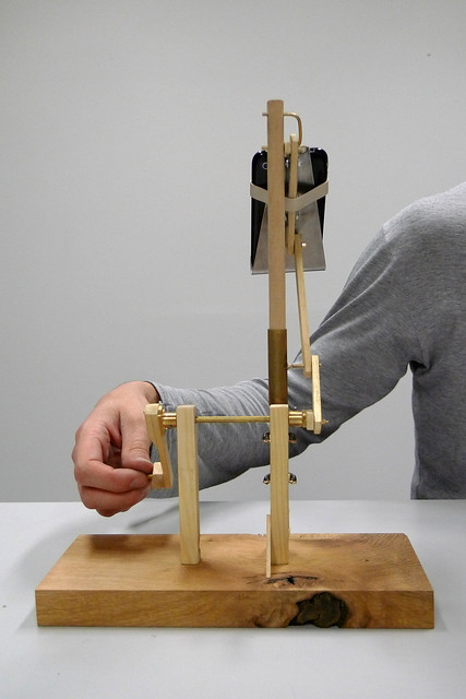
They’re a set of machines to fool context-aware devices and services – to enable you to tell little white lies with sensors.

For instance, cranking the handle of the machine above simulates something like a pattern of ‘walking’ in the accelerometer data of the phone, so if you told someone you were out running errands (when in fact you were lazing on the sofa) your data-trail wouldn’t catch you out…

Friday Links: Music for Shuffle, Light Painting, Hand-Waving, and Ken Garland

Music for Shuffle

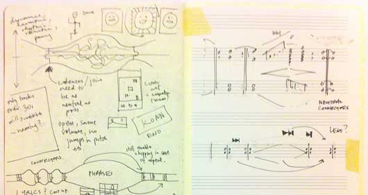
Matt B wrote about Music For Shuffle this week: a single composition made out of many audio files, designed to be played in random orders on any devices. And, of course, when I say “wrote about”, I also mean composed. You should go and listen to it right now!

Matt explained more:

I set myself a half-day project to write music specifically for shuffle mode – making use of randomness to try and make something more than the sum of its parts. The ever-brilliant Russell Davies (who works a few desks away at the BRIG) sowed the seed of the idea in my head around January 2011.

Over an hour or so, I wrote a series of short, interlocking phrases (each formatted as an individual MP3) that can be played in any order and still (sort of) make musical sense.

Brilliant. Matt’s notes on influences and the process behind the composition make for great reading: as ever, there’s a lot of thought and insight there, expressed succinctly, and lots of nice jumping-off points within his notes.

Timo pointed out this video of “procedural lightpainting”. The video explains the process very nicely: an animation, played out on a projector, keyed against the distance of a piece of paper from the projector. When you leave a camera-shutter open long enough, it captures a three-dimensional light-painting. The Flickr group of the results is marvellous, with examples including detailed graphs and more abstract – but no less beautiful – imagery.

Another form of light-painting, this time from Daito Manabe. By firing a laser at a wall coated in fluorescent paint, an image appears. As subsequent “passes” of the laser describe element closer to the foreground of the image, those areas of the wall are “activated” again and stay brighter; the elements towards the rear of the image stay darker. It takes a while to process what’s happening when you first see it, but the moment it all clicks into place feels great.

Chris Harrison’s Abracadabra is a prototype interface for very small devices. What might a rich interface for a device too small for a touchscreen look like? Harrison’s interface is based upon magnets: a tiny magnet on the fingertip, detected by a two-axis magnetometer in the device – providing enough sensitivity to track movements in a horizontal plane, as well as a “clicking” action in the z-axis. Extending the space of physical interaction outside the device makes a lot of sense, and it’ll be interesting to see where this kind of interface goes in the next few years.

Fizzogs

picture by Pour toujours…

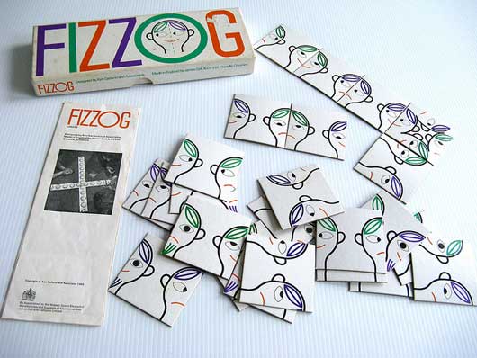
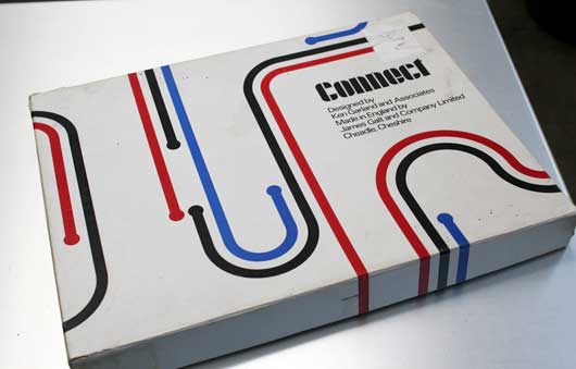
Fizzogs popped up on the studio mailing list last week, and there followed a brief reminiscence for Ken Garland’s work for Galt Toys, which included the marvellous Connect. Matt J bought his copy in; even the box is gorgeous:

Connect

Simple, well designed games, with lovely graphic design and colours, that still manage – very much – to be toys to be played with.

Finally, some nice writing and thinking from Ben Bashford about the personalities of smart products. Keen to avoid what he describes as Reality Clippy, Ben considers all the places that an object with personality might jar with its behaviour in the world:

Unless the behaviours and personalities of these things that compute are designed well enough the things that are not so good about them or unavoidable have the potential to come across as flaws in the object’s character, break the suspension of disbelief and do more harm than good. Running out of batteries, needing a part to be replaced or the system crashing could be seen as getting sick, dying – or worse – the whole thing could be so ridiculous and annoying that it gets thrown out on its ear before long.

There’s lots of other nice points in here; too many to quote. Notably, I liked the idea of considering what an object’s Attract Mode might be; similarly, using role-playing/method-acting/improv as sources of experience in designing subtle experiences. Good stuff.

RFID icons

Earlier this year we hosted a workshop for Timo Arnall‘s Touch project. This was a continuation of the brief I set my students late last year, to design an icon or series of icons to communicate the use of RFID technology publicly. The students who took on the work wholeheartedly delivered some early results which I summarised here.

This next stage of the project involved developing the original responses to the brief into a small number of icons to be tested, by Nokia, with a pool of 25 participants to discover their responses. Eventually these icons could end up in use on RFID-enabled surfaces, such as mobile phones, gates, and tills.

Timo and I spent an intense day working with Alex Jarvis and Mark Williams. The intention for the day was to leave us with a series of images which could be used to test responses. The images needed consistency and fairly conservative limits were placed on what should be produced. Timo’s post on the workshop includes a good list of references and detailed outline of the requirements for the day.

I’m going to discuss two of the paths I was most involved with. The first is around how the imagery and icons can represent fields we imagine are present in RFID technology.

Four sketches exploring the presence of an RFID field

The following four sketches are initial ideas designed to explore how representation of fields can help imply the potential use of RFID. The images will evolve into the worked-up icons to be tested by Nokia, so the explorations are based around mobile phones.

I’m not talking about what is actually happening with the electromagnetic field induction and so forth. These explorations are about building on the idea of what might be happening and seeing what imagery can emerge to support communication.

The first sketch uses the pattern of the field to represent that information is being transferred.

Fields sketch 01

The two sketches below imply the completion of the communication by repeating the shape or symbol in the mind or face of the target. The sketch on the left uses the edge of the field (made of triangles) to indicate that data is being carried.

Fields sketch 02

I like this final of the four sketches, below, which attempts to deal with two objects exchanging an idea. It is really over complex and looks a bit illuminati, but I’d love to explore this all more and see where it leads.

Fields sketch 03

Simplifying and working-up the sketches into icons

For the purposes of our testing, these sketches were attempting too much too early so we remained focused on more abstract imagery and how that might be integrated into the icons we had developed so far. The sketch below uses the texture of the field to show the communication.

fields-04.jpg

Retaining the mingling fields, these sketches became icons. Both of the results below imply interference and the meeting of fields, but they are also burdened by seeming atomic, or planet sized and a annoyingly (but perhaps appropriately) like credit card logos. Although I really like the imagery that emerges, I’m not sure how much it is doing to help think about what is actually happening.

Fields sketch 05

Fields sketch 06

Representing purchasing via RFID, as icons

While the first path was for icons simply to represent RFID being available, the second path was specifically about the development of icons to show RFID used for making a purchase (‘purchase’ is one of the several RFID verbs from the original brief).

There is something odd about using RFID tags. They leave you feeling uncertain, and distanced from the exchange or instruction. When passing an automated mechanical (pre-RFID) ticket barrier, or using a coin operated machine, the time the machines take to respond feels closely related to the mechanism required to trigger it. Because RFID is so invisible, any timings or response feels arbitrary. When turning a key in a lock, this actually releases the door. When waving an RFID keyfob at reader pad, one is setting off a hidden computational process which will eventually lead to a mechanical unlocking of the door.

Given the secretive nature of RFID, our approach to download icons that emerged was based on the next image, originally commissioned from me by Matt for a talk a couple of years ago. It struck me as very like using an RFID enabled phone. The phone has a secret system for pressing secret buttons that you yourself can’t push.

Hand from Phone

Many of the verbs we are examining, like purchase, download or open, communicate really well through hands. The idea of representing RFID behaviours through images of hands emerging from phones performing actions has a great deal of potential. Part of the strength of the following images comes from the familiarity of the mobile phone as an icon–it side-steps some of the problems faced in attempting to represent an RFID directly.

The following sketches deal with purchase between two phones.

Purchase hands sketch

Below are the two final icons that will go for testing. There is some ambiguity about whether coins are being taken or given, and I’m pleased that we managed to get something this unusual and bizarre into the testing process.

Hands purchase 01

Hands purchase 02

Alex submitted a poster for his degree work, representing all the material for testing from the workshop:

Outcomes

The intention is to continue iterations and build upon this work once the material has been tested (along with other icons). As another direction, I’d like to take these icons and make them situated, perhaps for particular malls or particular interfaces, integrating with the physical environment and language of specific machines.

Editorial approaches to mobile media

One bit of consultancy we’ve done recently has been on new programme formats for mobile devices. It was a bit of a dash–just a few days thinking and writing, and a week to pull together communication material.

The brief was set by the BBC, and there was a progressive clause in the contract: S&W do the thinking, produce communication material and present to the project team there; the BBC can use any of the ideas without restriction, but we retain copyright on the report itself.

So while I could, in theory, copy and paste the report into this blog, it seems fairer to let the folks have a good run at developing the programme ideas themselves. I’ll talk a little about our approach and the deliverables instead.

Mobile Media, 2 posters

Approach

The brief was this: what would successful programmes broadcast to mobile devices be? Put aside, for the moment, interactivity and on-demand programming.

(The BBC are looking ahead a little, as you can see.)

It seems to us that successful programming has to acknowledge three factors: the technological constraints, possibilities and expectations of the medium; the interests of the audience, and; the situation in which the programming and audience meet.

TV and radio have long histories as media and are well understood. For TV, the audience varies and so we have different channels to cater for demographics and interest (the situation is more-or-less fixed, though there are different TV channels for certain situations like gyms and bars). The situation of radio varies more, but again different stations cater for focused and backgrounded listening. And of course, programming content varies over the day for both TV and radio–whether it’s late night or mid afternoon is a great predictor of the audience and its constraints.

Programming for mobile devices, on the other hand, will land in unpredictable and highly variable situations… it’s a huge factor compared to the variability of the audience (and we can forget the constraints of the medium, for the moment, given it’s too new to have historical momentum).

We focused on finding a way to talk about the experience of different situations.

Two axes seem important:

  • Mobility. Can the viewer/listener devote 30 minutes to this programme, or are they grabbing a few minutes that could end at any moment? That is: can they sit, or must they move?
  • Attention. Must the viewer/listener background the programme because the situation demands attention, or can they concentrate?

Using these two axes we can break the situation of members of the audience down into four archetypical situations. The situation will demand…

  • attention (but the viewer can control their movement): like being at work.
  • nothing (the viewer can concentrate, and control their movement): home.
  • mobility and attention: it’s like being out shopping.
  • just mobility (but the viewer can concentrate on something else): on the bus.

(Incidentally, if persona are archetypal people, what would be a good word for archetypal situations?)

Given that – and the technological possibilities of the medium – we can take basic programme ideas and coerce them into being particularly good for the common audience situations, rather than just so-so.

We ended up with three main clusters of programme concepts:

  • News (at various attention levels)
  • Radio-like: High mobility and backgrounded
  • TV-like: Low mobility and focused

Other factors come into play too, of course. Mobile devices – in particular mobile phones – are very intimate devices. We did some experiments with video and found the full face, straight to camera pieces were significantly better for these devices than presenters talking from behind a desk (Ze Frank‘s natural medium, perhaps). Oh, and the way people use their phones when they’re killing time… there’s some fascinating research there too.

But anyway, I don’t want to say much more. Just that frameworks like these aren’t a replacement for inspiration and thinking… it’s important to take them with a pinch of salt and be ready to discard them. What a framework is good for is as an explanatory tool, communicating the rationale of a nuanced concept through an organisation so that it can be developed and not reduced as it gets passed on.

Deliverables

Usually for this kind of consultancy we develop a slide deck in workshops with the client, or turn up and present. Since these programme concepts needed to transmit through the BBC, a different form was called for.

The image at the beginning of this post is of two of the three posters we delivered (each A2: 16.5 x 23.4 inches).

On the left, the poster discusses the background to the project, frameworks, and how the ideas could develop with interactivity and location awareness in the future. The poster on the right presents news and three other programme concepts (including a development of Ambient EastEnders).

Below is the third poster. It presents three more concepts, and some thoughts about successful forms of mobile video. All three look pretty tremendous printed large.

Mobile Media, popcorn poster

Experimental posters

Producing posters was an experiment for us–successful, I think. We were pleased to work with Alex Jarvis, who brought to bear his exceptional talent on the graphic design and illustration.

Plus we got to explore the idea of a poster as a kind of zooming user interface, where there are a series of self-similar levels of detail that progressively reveal as you move closer to the paper. So when you stand across the room, half the paper is legible with a title and a huge graphic. Moving closer, half of the rest (a quarter) become legible with a subtitle for the main segment and more concept titles. At the closest level of reading, the poster functions as a page of broadsheet. The next time around I’d like to investigate that more.

Thanks

I’d like to thank Dan Pike and the project team at the BBC for choosing to bring us in to work on this, and for their open approach. I look forward to seeing where the concepts are taken in the future!
Recent Posts

Popular Tags