This website is now archived. To find out what BERG did next, go to www.bergcloud.com.

Blog posts tagged as 'metaphors'

Marking immaterials

Earlier in our involvement with Touch, Timo and I held a workshop with Alex Jarvis (currently at moo.com) and Mark Williams (now at Venture Three) to explore notation for RFID and the actions hidden in the readers.

One of my favourites that emerged from the day was this one.

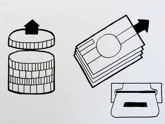
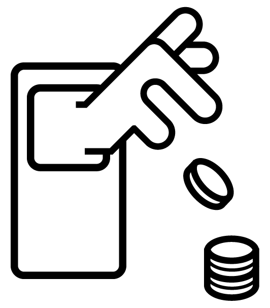
Pay-coins.png

It shows how far we were reaching for metaphorical handles – around which to characterise the technology, relying on the verbs associated with the result of the interaction: to Pay, to Open, to Delete etc.

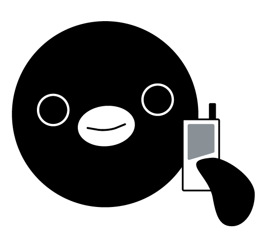
Physically the systems are very different and are more frequently represented by their envelope packaging, like the Oyster card. Branded systems have chosen to use characters, my favourite is the Suica Penguin.

suica.png

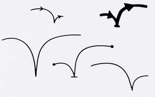
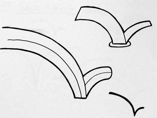
During the visualisation work, the cross sections in the readable volumes that emerged began to feel very strong visually. They capture an essential nature in the technology which is difficult to unearth with symbols based on metaphors.

Timo and I experimented with forms which have an almost typographic nature ranging to a more strictly geometric shape.

experimental-icons.png

We settled on this most geometric version. It would be terrific to see this picked up and used as a symbol for the technology in public.

geometric-icon.png

A CC licensed pdf of the ‘geometric’ can be found in the Touch vaults.

RFID icons

Earlier this year we hosted a workshop for Timo Arnall‘s Touch project. This was a continuation of the brief I set my students late last year, to design an icon or series of icons to communicate the use of RFID technology publicly. The students who took on the work wholeheartedly delivered some early results which I summarised here.

This next stage of the project involved developing the original responses to the brief into a small number of icons to be tested, by Nokia, with a pool of 25 participants to discover their responses. Eventually these icons could end up in use on RFID-enabled surfaces, such as mobile phones, gates, and tills.

Timo and I spent an intense day working with Alex Jarvis and Mark Williams. The intention for the day was to leave us with a series of images which could be used to test responses. The images needed consistency and fairly conservative limits were placed on what should be produced. Timo’s post on the workshop includes a good list of references and detailed outline of the requirements for the day.

I’m going to discuss two of the paths I was most involved with. The first is around how the imagery and icons can represent fields we imagine are present in RFID technology.

Four sketches exploring the presence of an RFID field

The following four sketches are initial ideas designed to explore how representation of fields can help imply the potential use of RFID. The images will evolve into the worked-up icons to be tested by Nokia, so the explorations are based around mobile phones.

I’m not talking about what is actually happening with the electromagnetic field induction and so forth. These explorations are about building on the idea of what might be happening and seeing what imagery can emerge to support communication.

The first sketch uses the pattern of the field to represent that information is being transferred.

Fields sketch 01

The two sketches below imply the completion of the communication by repeating the shape or symbol in the mind or face of the target. The sketch on the left uses the edge of the field (made of triangles) to indicate that data is being carried.

Fields sketch 02

I like this final of the four sketches, below, which attempts to deal with two objects exchanging an idea. It is really over complex and looks a bit illuminati, but I’d love to explore this all more and see where it leads.

Fields sketch 03

Simplifying and working-up the sketches into icons

For the purposes of our testing, these sketches were attempting too much too early so we remained focused on more abstract imagery and how that might be integrated into the icons we had developed so far. The sketch below uses the texture of the field to show the communication.

fields-04.jpg

Retaining the mingling fields, these sketches became icons. Both of the results below imply interference and the meeting of fields, but they are also burdened by seeming atomic, or planet sized and a annoyingly (but perhaps appropriately) like credit card logos. Although I really like the imagery that emerges, I’m not sure how much it is doing to help think about what is actually happening.

Fields sketch 05

Fields sketch 06

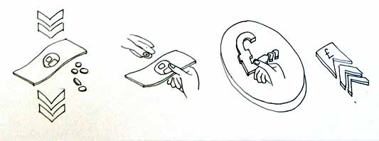
Representing purchasing via RFID, as icons

While the first path was for icons simply to represent RFID being available, the second path was specifically about the development of icons to show RFID used for making a purchase (‘purchase’ is one of the several RFID verbs from the original brief).

There is something odd about using RFID tags. They leave you feeling uncertain, and distanced from the exchange or instruction. When passing an automated mechanical (pre-RFID) ticket barrier, or using a coin operated machine, the time the machines take to respond feels closely related to the mechanism required to trigger it. Because RFID is so invisible, any timings or response feels arbitrary. When turning a key in a lock, this actually releases the door. When waving an RFID keyfob at reader pad, one is setting off a hidden computational process which will eventually lead to a mechanical unlocking of the door.

Given the secretive nature of RFID, our approach to download icons that emerged was based on the next image, originally commissioned from me by Matt for a talk a couple of years ago. It struck me as very like using an RFID enabled phone. The phone has a secret system for pressing secret buttons that you yourself can’t push.

Hand from Phone

Many of the verbs we are examining, like purchase, download or open, communicate really well through hands. The idea of representing RFID behaviours through images of hands emerging from phones performing actions has a great deal of potential. Part of the strength of the following images comes from the familiarity of the mobile phone as an icon–it side-steps some of the problems faced in attempting to represent an RFID directly.

The following sketches deal with purchase between two phones.

Purchase hands sketch

Below are the two final icons that will go for testing. There is some ambiguity about whether coins are being taken or given, and I’m pleased that we managed to get something this unusual and bizarre into the testing process.

Hands purchase 01

Hands purchase 02

Alex submitted a poster for his degree work, representing all the material for testing from the workshop:

Outcomes

The intention is to continue iterations and build upon this work once the material has been tested (along with other icons). As another direction, I’d like to take these icons and make them situated, perhaps for particular malls or particular interfaces, integrating with the physical environment and language of specific machines.
RFID Interim update

Last term during an interim crit, I saw the work my students had produced on the RFID icons brief I set some weeks ago. It was a good afternoon and we were lucky enough to have Timo Arnall from the Touch project and Younghee Jung from Nokia Japan join us and contribute to the discussion. All the students attending showed good work of a high standard, overall it was very rewarding.

I’ll write a more detailed discussion on the results of the work when the brief ends, but I suspect there may be more than I can fit into a single post, so I wanted to point at some of the work that has emerged so far.

All the work here is from Alex Jarvis and Mark Williams.

Alex began by looking at the physical act of swiping your phone or card over a reader. The symbol he developed was based on his observations of people slapping their Oyster wallets down as they pass through the gates on to the underground. Not a delicate, patient hover over the yellow disc, but a casual thud, expectant wait for the barrier to open, then a lurching acceleration through to the other side before the gates violently spasm shut.

RFID physical act 01

More developed sketches here…

RFID physical act 02

I suspect that this inverted tick will abstract really well, I like the thin line on the more developed version snapping the path of the card into 3D. It succeeds since it doesn’t worry too much about working as an instruction and concentrates more on a powerful cross-system icon to be consistently recognisable.

Verbs

The original brief required students to develop icons for the verbs: purchase, identify, enter (but one way), download, phone and destroy.

Purchase and destroy are the two of these verbs with the most far-reaching and less immediate consequences. The aspiration for this work is to make the interaction feel like a purchase, not a touch that triggers a purchase. This gives the interaction room to grow into the more complex ones that will be needed in the future.

This first sketch, on purchase, from Alex shows your stack of coins depleting, something nice about the dark black arrow which repeats as a feature throughout Alex’s developments.

RFID Purchase 01

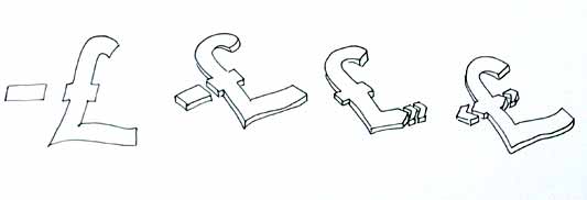
Mark has also been tackling purchase, his sketches tap into the currency symbols, again with a view to represent depletion. Such a blunt representation is attractive, it shouts “this will erode your currency!”

RFID Purchase 03

Mark explores some more on purchase here:

RFID Purchase 02

Purchase is really important. I can’t think of a system other than Oyster that takes your money so ambiguously. Most purchasing systems require you to enter pin numbers, sign things, swipe cards etc, all really clear unambiguous acts. All you have to do is wave at an Oyster reader and it costs you £2… maybe: The same act will open the barrier for free if you have a travel card on there. Granted, passengers have already made a purchase to put the money on the card, but if Transport for London do want to extend their system for use as a digital wallet they will need to tackle this ambiguity.

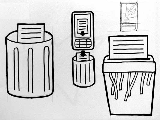
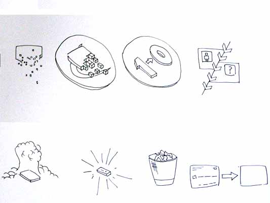
Both Mark and Alex produced material looking at the symbols to represent destroy, for instances where swiping the reader would obliterate data on it, or render it useless. This might also serve as a warning for areas where RFID tags were prone to damage.

RFID Destroy 01

I like the pencil drawing to the top right that he didn’t take forward. I’ve adjusted the contrast over it to draw out some more detail. Important that he distinguished between representing the destruction of the object and the data or contents.

Williams Destroy sketches

Mark’s sketches for destroy include the excellent mushroom cloud, but he also looks at an abstraction of data disassembly, almost looks like the individual bits of data are floating off into oblivion. Not completely successful since it also reminds me of broadcasting Wonka bars in Charlie and the Chocolate Factory and teleporting in Star Trek, but nice none the less.

Drawing

This is difficult to show online, but Alex works with a real pen, at scale. He is seeing the material he’s developing at the same size it will be read at. Each mark he makes he is seeing and responding to as he makes it.

Jarvis Pen

He has produced some material with Illustrator, but it lacked any of the impact his drawings brought to the icons. Drawing with a pen really helps avoid the Adobe poisoning that comes from Illustrator defaults and the complexities of working out of scale with the zoom tool (you can almost smell the 1pt line widths and the 4.2333 mm radius on the corners of the rounded rectangle tool). It forces him to choose every line and width and understand the success and failures that come with those choices. Illustrator does so much for you it barely leaves you with any unique agency at all.

It is interesting to compare the students’ two approaches. Alex works bluntly with bold weighty lines and stubby arrows portraying actual things moving or downloading. Mark tends towards more sophisticated representations and abstractions, and mini comic strips in a single icon. Lightness of touch and branching paths of exploration are his preference.

More to come from both students and I’ll also post some of my own efforts in this area.

Editing documents as playing music

I’m currently reading Dan Saffer’s Designing for Interaction. Well written, well structured; a good introduction to interaction design that’s centred on the web as far as I’ve read, and looks as though it’ll take a broader approach in the second half of the book. This passage, on icons, grabbed me:

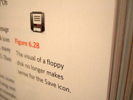
A confusing image can obscure much more than it can illuminate. For example, the disk icon has come to mean “save,” even though, increasingly, many young people have never seen a floppy disk (except perhaps this icon!). Then again, it is difficult to imagine what image could replace it.

Well that’s a challenge if ever there was one.

Save metaphor, disk icon

People don’t use paper files like they use to, and besides, computers aren’t office focused but for the home now. And at home, it’s all about the media.

Could play, pause and the rest replace save and open?

We might have to twist the metaphors a little, but consider the regular set of icons (and I’m sure I’m only thinking of this because I’ve been reading about early play and record icons; more).

Media icons

How about this: On file open dialogs, the play icon would replace the open button. On toolbars, the play icon would be used to trigger the dialog. To close a document, saving automatically, the pause icon would be shown.

The metaphor here is that a document is a continually evolving piece of media. There’s no concept of “save,” what you see on the screen is what’s on the disk. You can never lose work. Play and pause simply mean start and suspend editing.

Ah, but what if you wanted a safe and stable version of your document to always come back to? That’s what the record icon would be for. It’d be analogous to “save as,” kinda, but a better description would be that record means “tag this as stable” in version control. You’d still have your continually evolving document, only the recorded one would be tagged as a version to rely on–an inflection point. This would tie nicely into Apple’s Time Machine, which will let you leaf through previous versions of your files–maybe rewind and fast-forward could be used to step between stable versions.

When I had a dual cassette player, years ago, the second tape deck had a record button for deck to deck dubbing. It only worked if the first was playing. The record button, in our new system, could also be attached as a label any place the currently playing document could be channelled. So record would also show up next to the printer, to dub the open document to paper, and it’d be on the email application, and next to IM buddy names too… it’s a bit of a stretch, this one, but I’d like to try it.

Naturally stop would send your document to the trash.

This change in metaphor, from document as a discrete thing to something which is continuously changing, would affect much of the desktop GUI. Rather than an application which has the command “send to printer,” it has to be a representation of your printer which has the record button on it.

And what does “now playing” mean, given our computers multitask? Perhaps it’s a good thing for us to think of them playing documents over one-another, in a cacophony. It means we’d start thinking about which we focus on, and how to quieten the others–would we have a “stifle” button, to suppress alerts from playing documents that aren’t at the pinnacle of our focus?

Documents as music. What else could replace the disk picture on the open button?

Recent Posts

Popular Tags