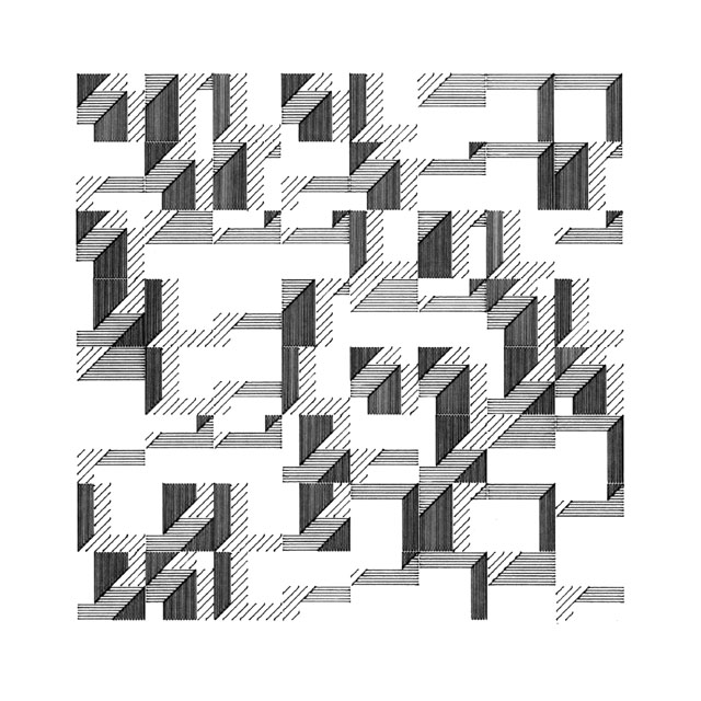
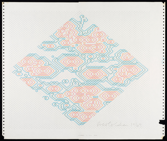
Sticky Light is an installation that projects a laser that sticks to lines and solid objects. There’s no camera – just a laser and a photodector. It’s incredibly responsive, and completely captivating. The dot of light takes on a surprising amount of personality, darting around, occasionally getting lost and confused, and then suddenly slipping away to explore its surroundings when released.
That such a nuanced impression of character could be formed from such a seemingly simple actor reminded me of Ken Perlin’s Polly: a prism that walks around a surface. That may not sound like much, but once you start playing with the various animation loops programmed into it, you might well change your mind. “Dejected” is heartbreaking. And yet: it’s a triangular prism. Marvellous.

Two pieces of graphic design that caught my eye. First, via Paul Mison, a spread from Marie Neurath’s Railways Under London. There’s a bit more on the output of the Isotype Institute, and some lovely examples of their work for children, over at the Science Project blog.
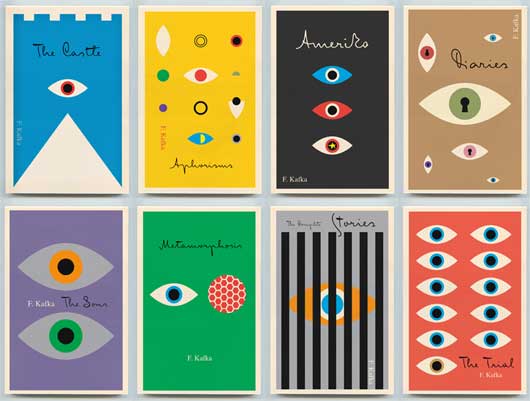
Secondly, via Frank Chimero, this lovely selection of covers for Kafka’s books by Peter Mendelsund. Mendelsund has a great blogpost on the design of the covers for publisher Shocken.
Finally, two music videos with interesting visual treatments. Firstly, Echo Lake’s Young Silence, which used a Kinect’s depth camera to film the band. It’s not a raw output, of course. There’s a lot of visual processing, and compositing of co-ordinates that’s followed up, but it makes the video very striking – and much like a low-budget take on Radiohead’s House Of Cards video, filmed on LIDAR.
And, to end, Chairlift’s Evident Utensil. This came up in discussion in the studio when we were talking about the aesthetics unique to video in the digital age, such as stabilisation, or as in these videos, what happens when keyframe data goes missing. The answer to the latter can be seen in the Chairlift video – and in several other examples of Datamoshing.
