This website is now archived. To find out what BERG did next, go to www.bergcloud.com.

Blog posts tagged as 'celebrating-function'

Things with an end

I bought some Nike Mayfly running shoes.

Nike Mayfly

They are ultra-lightweight, and quite lovely.

Nike Mayfly

They are so light because they were designed with a definite lifespan.

They are only built to last for 100km.

Nike Mayfly

On a good day, I usually run 10km.

These shoes are shoes I can use maybe ten times.

Nike Mayfly

This defined sense of the object’s limited-life reinforces it’s narrative.

The thing is a clock.

It’s beginning, middle and end will be marked.

And indeed, the object itself asks you to record the beginning…

Nike Mayfly

…and to do right by it’s end.

Nike Mayfly

This is planned obsolescence with conviction – and as a result it involves you with the object, it’s materiality and your use of it to a greater degree than most mass-produced goods.

I haven’t run in them yet.

I’m waiting for just the right moment to start the clock on their life, and take my first steps in them – towards their end.

Infinite Zoom into Milk

In 1977 Charles and Ray Eames made a documentary film called Powers of Ten. The second half of the film includes a slow zoom into a man’s hand, right the way through cells and molecules all the way down to an atomic structure. It’s extraordinarily engaging, beginning at a familiar human context, and visualising something desperately distant and unknowable.

About a year ago James King brought a book to my attention from a series called Analysis of the Massproduct Design by Japanese product designer Taku Sato.

Analysis of the Massproduct Design is just like the Eames Powers of Ten video but for everyday products.

Taku Sato book covers

Each book takes a manufactured product and breaks down the content, graphics, construction and packaging page by page. The books are like infinite zooms into fabrication and history.

There are four, in turn looking at Xylitol Lime Mint chewing gum, a Fujifilm disposable camera, ‘Licca the fashion dress up doll by Takara Co.’ and a litre of milk from the Meiji Dairies Corporation. The blurb reads:

…we will take up and focus on one mass-produced product seen everywhere in our daily life without special attention paid to and from the point of view of design we try to take a closer look at and analytically examine it to find what kinds of ideas, efforts, ingenuities have been put in to it.

Each book begins with an overview and in some cases a history. This is from the book on the Fujifilm disposable camera.

Fujifilm overview

As the book progresses, spreads examine the product in greater and greater detail. Near the end of the Fujifilm book, there’s a photographic one micrometer cross section of the film stock.

fujifilm book film detail

One of my favourites spreads is from the book examining Xylitol chewing gum and is titled ‘The Feeling on the Teeth When Chewed.’ It’s about the material qualities of tablets versus sticks of gum. A quote:

The firmness of a chewing gum changes gradually with the passing of the time of its being chewed. In order to make this change of the chewing feeling close to an ideal one, the elements that should make up of the chewing gum are controlled… The figure shows the strength of the chewing exerted in the mouth measured with an analyzing device called RheoMeter. These graphs will tell you how different the chewing feelings are between ordinary sheet-type chewing gum and sugar coated chewing gum.

An ideal chewing feeling! A RheoMeter! They’ve got a machine for testing the chewiness of gum.

chewiness spread

I think Taku Sato actually designed the packaging for the milk carton he analyses. One of the spreads shows what each of the indents on the base of the cartons are for. Ambiguity in the translation adds to the mystery in some cases:

…(image a) is a little dented. This is for securing the stability of the carton when placed straight on a table… The number (image c) is the filling machine’s column index. The embossed information works for cause of the trouble to be clarified when it happens.

Taku Sato milk base

The books feel like imaginary manuals. They offer the seductive illusion that with this book the object can be completely known, all secrets unravelled. They somehow imply that if all was lost, objects like these could be reconstructed with this knowledge alone.

A while back I came across the term ‘Spime’ in Bruce Sterling‘s book Shaping Things. He uses the word to characterise smart objects which talk about their histories, how they were made, where they were sourced, where they’ve been, etc. Spimes might be a cars which announce their locations, or a packaged beef steak which shows the cow it comes from and where that cow was raised.

Sato’s books are raw Spime porn. Objects showing off their shiny interiors, construction and their ancestors. The celebrity biographies of mass produced objects.

Celebration of function

This post is going to be about objects that celebrate their functions. This was an area of research for me during my time at the Royal College of Art. I’m going to follow on from Matt’s post on Disco and intrinsic activities. More show than tell here I think.

Here is my favourite piece of video right now. It is from the film 9 and a Half Weeks (via James Auger), and if you can wade your way through Rourke and Basinger power bonking their way around Manhattan you see this tape deck in his apartment. I’ve looped the video a couple of times and slowed it so you can see clearly.

I’m pretty sure it is a Nakamich RX tape deck. Using a system called UDAR (UniDirectional Auto Reverse) it mechanically flips the tape over at the end of each side. Something to do with aligning the heads. It is a fantastic piece of perfomance, and completely intrinsic to the nature and qualities of tape decks. Whatever it’s functional relevance might be, witnessing a mechanical operation so performative is excellent, the object is so discreetly joyful about what it is doing.

I also came across this video of a Red Raven records vinyl (via Alex Jarvis) on Kempa.com, along with some lovely research on vinyl video. It has two components. One is the vinyl, which has a large area of printed imagery on the larger than normal label; the second is a sixteen sided mirror which sits in the middle of your turn table and works like a zoetrope, reflecting the images on the vinyl as it turns and creating animation.

This a is beautiful response to the intrinsic qualities of vinyl and the mechanism of the record deck. More products should include this sort of wit and performative funtionality.

Robot arms

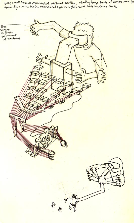
So I’ve been thinking about hands and arms. I started by thinking of extremely small hands, on my hands. So here are some drawings from that thinking.

Physical VR

This drawing is of a toy that shrinks your hands down so you can play in a small world, with small figures. Your fingers are all connected up to a group of flex sensors, which converts the analogue movement to a cluster of servos. The servos collectively control fingers on the small hands by tightening or loosening. So the movements of your fingers become roughly and awkwardly analogous to those of the small hands in the toy. There is also a screen inside some goggles hooked up to a small camera in a glass ball between the two small arms. So when you look in to the goggles, you see what is in front of your arms. There are two wheels which you can twist to point the camera in different directions, like an eye. Kind of like an analogue version of virtual reality, only right in front of you and not virtual.

Hand Finger

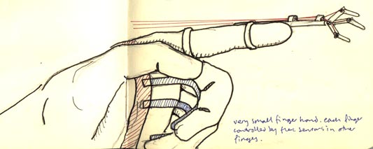
I would also like to have a very small hand at the end of my finger. To pick up pens and things. You control the small hand on one finger using your other fingers, with flex sensors (same as above). You lose one of your big hands to gain a little hand on the end of one of your fingers.

I came across Chad Thornton‘s work. He is at Google now, but he made a mechanical finger as part of his work at Carnegie Mellon Interaction Design programme (nice video here).

Maybe I’m carrying some latent affection for the Radio Shack Armatron here, I don’t know. These themes are common in films. This must be informed by Ripley’s Power Loader from Aliens:

The belt buckle, and rubberised keyboard make her rig seem really convincing, her trainers too, and how she locks into the unit. The cyborg fingers for typing in Ghost in the Shell are nice too.

No doubt there are more. It makes me think of Robocop‘s gun hip too although slightly off topic.

I like them, robot arms. I see them as a celebration of industrial process. I predict they will become a more widespread part of our lives. They are cheaper now (it appears that non-load bearing ones don’t require three phase power either) and since they are multi modal they can perform many tasks, in strange contexts. No doubt FDM or other fittings are/will be available, implications of that could be very large. Imagine a robot arm in your drive thr(o)u(gh), changing a tyre, and then printing out your happy meal. Our lives could become peppered with arrays of multi-buildy-arms.

Robotlab (via Roger Ibars) are a German partnership who have used industrial robot arms to perform a DJ set. Witnessing the arms is as important as their role. I find them disconcertingly accurate, mechanised confidence in something typically so analogue and expert and careful. There is also something about their inflexibility, their inability to reach inside certain arcs, too close to themselves. I like the way they occasionally find a sync with each other, and at other times drift out. I think these guys have a business model set up around this, so I’m very interested to see how that develops.

I want one.

Drawing phones

Hello.

I think I’m mostly going to post drawings from my sketchbooks, and talk around those for a while. Since a lot of my thinking starts like this. My sketchbooks are also places where I put ideas that would be too difficult to make, so they just get drawn instead.

I think phones mostly used to look like this:

Old phone drawing

Now they don’t. During our work for Nokia and my time at the RCA, I developed groups of ideas around phones and how their functionality influences their form. The ideas follow a continuing enthusiasm for celebration of function, something that continues to influence the work Matt and I do.

Drawing of phone 01

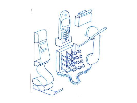
The first is a sketch of a phone dock that distributes all the things I use in the phone into discrete physical instances locally. Pretty self descriptive really, a receipt printer pushes out text messages as they arrive. To make a call, stamp out the number, or add a name card from the Rolodex, then pull down on the indicator lever, the end blinks while it rings and snaps back when the phone returns to idle or someone answers.

Mechanical phone

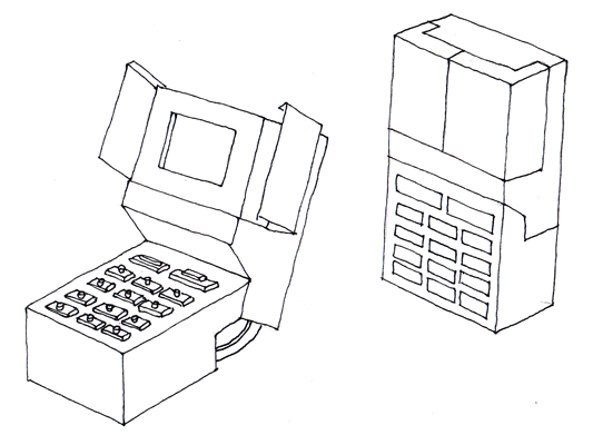
This phone explores the keypad unlock function. As it opens from its locked down position, the screen opens like a flower and all the buttons turn over like little Porsche* headlamps. Locked down, it is completely flush and faceless, no risk of pocket dialling, but fragile, mechanical and slim when open.

*(is it Porsche or am I revising history?)

Extra hand set

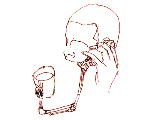
Hands free sets feel quite unsatisfying. Wouldn’t it be better if your phone came with an extra hand? This phone comes with a small robot arm (plugged into your data port), to hold your tea, or mangle paper clips while you are listening to your voice mail. Definitely needs to be more exploration of robot arms in the future.

Recent Posts

Popular Tags