This website is now archived. To find out what BERG did next, go to www.bergcloud.com.

Blog posts tagged as '3c'

Widgets, widgets, everywhere

There’s been rather an explosion of desktop, mobile, browser and Web widgets. Recently, too, I was groping round the idea of web apps situated outside the computer–but not getting very far. Then I was chatting over email about the Chumby, a cute, carryable, dedicated widget platform… and situated web apps ideas finally locked into focus:

Widgets embedded in everything.

My camera, video camera, phone, mp3 player, TV, DVD player and car stereo all have embedded electronics, a control surface and a display. My washing machine and oven have micro-controllers and an interface–I don’t know whether my house thermostat is electronic, but it could be.

In short: I am surrounded by objects which do things, all with embedded computing and screens. What if I could run whatever applications I wanted to on them? What if, let’s say, each of them was a widget platform, allowing code upload and exposing a hardware API to all sensors and controls?

Hardware as an open platform

If I was a pro-am photographer on a month-long safari shoot, I could grab a custom camera interface from the Web, set up to provide easy-access presets to the light and movement conditions I’d face. I’d repurpose a couple of the external buttons to twiddle parameters in the presets, and have a perfect wildlife interface for four weeks. At home, I’d revert to the general purpose interface or get another one.

If I could sell widgets for compact cameras, I’d sell one that was specially made for nights out. It’d assess the conditions and get the best possible picture given the dark, the necessity of taking a quick shot, and the inability of the drunk person holding the camera to stop swaying.

I’d have an interface on my washing machine that had only the single setting I use. I’d load and set the machine early in the morning or late at night, and it’d then display a red, flashing “ready to go” button that I could slap on my way out of the house, after my morning shower. Perhaps it would use the hardware API to the pressure on the water intake, to refuse to start if the shower was in use.

My TV would use its video buffer and the remote control API to give me a dedicated “record this advert” button.

Hey, maybe I’d even hack my vacuum cleaner and have it fight.

Why can’t I write widgets to run on everything in my pockets and everything in my home? I don’t really mean home automation–I mean using the existing control surface to interface with the hardware in a way that I chose.

I want to download widgets off the Web, scan barcodes with my oven to share recipes with my friends on last.microwave, and hard-code my radio to never miss Radio 4 comedy. This is what I mean about 3C products tapping into creativity, community and connectedness, by the way.

What Nikon should do

Professional Nikon cameras aren’t doing so well against Canon right now. If I were Nikon, I’d document the hardware API to the camera files, the jacks, the display and the controls, stick Bluetooth in it, and throw the camera open as a software platform. Then as a professional purchaser, I’d have a significant decision to make: Do I put down a year’s purchasing power on a Canon, and risk having a Nikon-owning competitor later creating an interface that makes them twice as effective… or get a Nikon so I never get left behind?

Embedded widgets are already here

We already have widgets in some things, of course. My Nokia N70 runs Python, which now has the ability to intercept and send SMS, run full-screen apps, and is provided with APIs to the camera, calendar, contacts, the internet and more. That the small Python app can bridge the hardware API with all the other APIs on the internet, using the existing display and keys, is what makes this so powerful.

Here’s another data-point: The Canon imageRunner series of networked copier/scanner/printers have what they call Java MEAP: A platform to write and run your own apps on the copier. (Thanks Simon Wardley for alerting me.) As this MEAP interview says:

It’s not so difficult to include a variety of useful functions in an application so that anyone can use it. Yet, as user requirements vary widely, the application becomes bloated, impairing its operability. … Users can replace the applications as their needs change and enjoy simple operation.

Exactly. Products made for everyone are complex! Let all of us help out to design them just for our friends. Canon’s doing it for workaday, now give me everyday.

Experience hooks

To recap: Generation C demand 3C products, which are the new breed of products taking the internet and their presence in the social world for granted, and treating people as involved, creative peers, not “end users.” As a design and development approach, the route of interaction design and a focus on the product life-cycle is useful. This life-cycle can be thought of as a series of experience hooks, activities around which stories gather. These hooks are opportunities for good design and I want to wrap up by looking at a few a little closer.

Commercials

I mentioned a number of ‘intrinsic activities’ associated with a product, those that aren’t specific to what the product does. They were: Design, manufacture, discovery, selection, being wished-for, purchase, being shown-off, review and resale.

The intrinsic activities are often hard to reach if the scope of design is considered to end at the physical surface of the product. Yet they still contribute, heavily, to ongoing experience of the product… and therefore to the brand (the brand is the sum over all the experiences). Since Gen C relate to their products via the activities they experience together, the design scope should include whatever is necessary to make these hard-to-reach activities good ones.

Design, here, should include advertising and marketing.

The human brain is an incredible thing. It’s a carrier bag of thoughts and emotions, stored by association and popped to the top by association too. Advertising, through whatever medium, can be used to feed in stories that’ll come to the surface when the appropriate experience hook is encountered. Or it can use the memory of a particular experience hook to show what the brand cares about.

Two examples spring to mind:

  • The Coke Happiness Machine commercial dispenses with building a glow of generic “happiness” or “family life” or “Christmas” around the logo of a soft drink. Instead it concentrates on the experience of an important intrinsic activity: Vending. This neglected moment becomes coloured with a story that makes the drink itself sparkle with fantasy and magic. This advert will improve the perceived taste of my bought drink, not just nudge me to purchase it in the first place.
  • Orange, the mobile phone operator, has in the UK a scheme called Orange Wednesdays. Orange mobile subscribers get two-for-one cinema admission once a week. I’m not sure how many people use it, but as marketing that infiltrates (and influences!) conversation, and demonstrates the company’s commitment to personal relationships and small groups, it’s spot on.

Now these are both advertising/marketing efforts that demonstrate a shift from lifestyle or aspirational branding to experience-driven brands–but they remain in traditional media.

More exciting to me are the obsession with experience shown by Amazon and Apple (see yesterday) who have a continuous approach to brand, and new media such as games (a favourite: Project Rub affects your body to communicate its story). What these have in common is interactivity and lack of explicit rules (you use play and experimentation, not instruction manuals, to find your way around Nintendo games, Amazon, and Macs).

Traditional media are good for showing. Games, shops, vending machines, interactivity: these are the media channels for experience.

Focus on individual activities

It was by considering the activities I take part in with my printer that the idea of the printer as social letterbox came about.

If this approach of looking for activities is taken to other products, more new features can be found.

Take the unboxing moment, an experience hook for stories if ever there was one (I discussed unboxing more here). Or customisation in vending machines, as explored in our metal phone project (not just a re-castable lump of metal but a performance mirroring the importance of the transformation).

Experiencing trainers

In my notebook, I have sketches of how each of these could apply to trainers.

On the left: I was trying to find a satisfying approach to customisable shoes. On the one hand, the customisation shouldn’t be superficial and lack meaning, like choosing the colours or adding stickers. On the other, it should carry the intelligence of the designers with it, so a good shoe is easy to make.

Here my sketch shows soles with slots in them, looped through with a continuous strip of velcro. The strip could be wound and re-wound, making a reconfigurable shoe. Patches or ribbons woven into the velcro could decorate it (and I’m sure we’d find a way to cover the ankles). Importantly, the more you did it the better your shoes would become, and there’s the possibility of making uncomfortable or ugly shoes (risk is vital, otherwise doing it well has no value). As well as expertise and social knowledge sharing, there’s the opportunity of more personal artistic expression. I think it would be a pretty interesting instance of co-creation.

On the right: Could unboxing be applied to trainers? Given trainers are tried on before purchases, what doesn’t vary before that great moment you wear them out of the house for the first time? Laces are often threaded in the shop, and even having to unstuff your shoes from a box full of extra-fancy paper would feel inauthentic.

How about peel-off plastic covering the leather stripes on the sides of the shoes? It’s potentially authentic, because the plastic has a protective function, and it wouldn’t be removed just for trying the shoes on. As with the peel-off protection on new mobile phone screens, it would make that experience hook – the transition between shop-owned and me-owned – special.

Technology products and websites benefit from the same approach. How about online radio you can listen to with your friends? My work at the BBC, with Tom Coates, on social software and listening tackled exactly this. (The conference session Reinventing Radio includes our Group Listening prototype towards the end–Tom is hosting the Reinventing Radio presentation [PDF].) Or how about using physical computing to address the process of discovery, besotted-ness, and eventual boredom with novel TV and radio channels. Or even an RSS reader that forgets.

While we’ve used this approach on the Web and in mobile, the physical product opportunities have the most potential. The existing areas of printers, cookers, magazine racks, underwear, wooden toys or any number of other product categories would benefit enormously, I believe, from this kind of design research and product ideation.

From pixels to plastic

Not only is there opportunity with physical things, there’s an imperative. Just as manufacturing techniques are becoming shorter-run and more accessible to individuals and small companies, the knowledge of how to use these techniques is becoming more available. People are learning how to use 3D software using free tools such as Google Sketchup, and stepping more easily to professional software, previously reserved for expert product designers. The communities gathering around actuators, electronics and microcontrollers are infected with the internet sensibility, fully aware of the social worlds their technology will inhabit. And as Instructables shows, they’re sharers through-and-through. Not only this, but the net has put logistics, vending and distribution channels at our fingertips.

We’re looking at, as Tim O’Reilly puts ita future in which the creative economy overflows the thin boundary that separates “information” from “stuff”‘. Traditional manufacturing and technology companies will soon be competing with small, responsive companies who are at once just Good Enough technologically, but way more in tune with the social and creative needs of Generation C.

The life of products

Products are not nouns but verbs. A product designed as a noun will sit passively in a home, an office, or pocket. It will likely have a focus on aesthetics, and a list of functions clearly bulleted in the manual… but that’s it.

Products can be verbs instead, things which are happening, that we live alongside. We cross paths with our products when we first spy them across a crowded shop floor, or unbox them, or show a friend how to do something with them. We inhabit our world of activities and social groups together… a product designed with this in mind can look very different.

Activities

What activities occur between me and a product? Taking a book as an example, there are a number of obvious ones: reading, marking a page, noting a comment or reference. There are also a number of activities that are due to the book also being a product which is made, bought and sold–we’ll call them the intrinsic activities. The book is involved in all of these:

  • Design
  • Manufacture
  • Discovery
  • Selection
  • Being wished-for
  • Purchase
  • Being shown-off
  • Discussion/review
  • Resale

Each of these activities associated with a product is a place where stories gather. Each is a hook for experience. When the experience is bad, the story is bad. When the experience is good, the story is good… and stories travel.

Yesterday I talked about Generation C and the way they expect products to fit, as peers, into their connected and creative communities. I said that products, media and services must transform themselves to meet these expectations.

The stories Gen C tell spread in their social and communication networks, and are used by these discerning individuals to assess products. With online and mobile stores, every moment is a buy moment. From a sales perspective alone, the stories had better be great.

At a more conceptual level, the peer relationships Generation C expects mean that the traditional do-as-you’re-told products are inappropriate: A brand that says “I’m cool, associate with me” or “You can be a great runner too” can feel condescending or trite. Gen C likes to be involved in conversations–products should express their brand through the experience. The brand, the stories, the interactions: These are all part of the product.

When we’re trying to design for the whole product, we try to remember to do these:

  • Identify the activities associated with the product, media or service. Design for the whole life-cycle, not just to make certain functions available
  • Focus on the activities intrinsic to the particular product as a thing that can be bought and sold. These are so often overlooked as experience hooks that good design can make a real difference. The intrinsic activities listed above are a good start
  • Use advertising to associate stories with the experience hooks, and to communicate the brand experience. Products are continually assessed, and always communicating the brand through the progression of experiences

Living with products

Amazon and Apple and both companies who pay a great deal of attention to the entire relationship a person has with a product. Especially good is how they deal with those intrinsic activities, those that belong to a thing by virtue of its physicality and existence in the marketplace.

Take Amazon: They don’t just sell products, they sell the whole life-cycle. You discover a book, select it using the reviews, consider it, hang onto it in your basket, finally choose to buy it. Wishlists and permanent book addresses (suitable for emails) understand that, even before you buy it, a book is a social object, present in our social world. Then afterwards you can recommend or review the book, and the site helps (even prompts!) you to sell the book on second-hand.

Apple, both in their online presence and retail stores, understand the ongoing relationship with an Apple product. The online product pages are brochure quality, always with the link to the online store. Putting together a system online is a joy; you gradually select components, learn about them, and ratchet up the price… but slowly, slowly, so there’s never a sticker-shock moment when you realise quite what you’ve specced. The retail stores are made for the funnel from aspiration (gazing into the brightly lit store) to try-out, to select, to purchase, to learn about, to come-back-when-it’s-broken.

The big problem with Apple retail is that it’s not enough about the various experience hooks of what they sell. It’s still too much like a conventional shop, with a sales counter where you do everything in one go. The stores should work more like Oslo Airport where, instead of a single, monolithic check-in experience, you have security check at one gate, boarding card at another, passport at another, and cafes and shops in-between. You move at your own pace, which means queues are smoothed out, and you only follow the process all the way to the end if you’re flying abroad, high security, international and long haul.

An Apple retail store, built like an airport, would have a big desk where you assemble your system, maybe with a form or a Lego-type toy, with assistants to help out. You’d take it to a desk to fetch your computer, and leave with it a few minutes later. In that couple of minutes, you’d make payment almost incidentally, to pass the time. Apple supplies and iPods should have a much simplified process–why not swipe your card when you enter the queue, so your transaction is pre-authorised by the time you get to the front?

It’s important to consider the owner and all the people they encounter as the “user” for any particular product. No design surface is out of scope: Aesthetics, online social software, embedded displays, the billing and vending processes, and more.

Interaction design

To summarise: Generation C, needs new products, media and services. These have to be situated in social lives, be open to co-creation, acknowledge the networks they’ll inhabit, and respect the creativity of the Gen Cs. At S&W we call these, in shorthand, 3C products. The Cs we use are creativity, connectedness and community… but pick any three.

Today I talked about our lives with these products, and the activities we have together. There are activities specific to the product itself, and those intrinsic to the thing as a bought-and-sold product… and all of them are experience hooks, opportunities for functionality appropriate to the context of use, and to bring about the brand experience. Designing for activities – interaction design, really – and taking the lessons of the Web and social software is the best process we’ve found, thus far, to provoke good thinking about the new world of stuff in our homes.

I’ll finish tomorrow with a look at a few experience hooks in particular.

3C products

Generation C

I first heard about Generation C in September of this year, at eurofoo, from Nat. Nat had picked it up from a New Zealand magazine, Idealog, here, which I’ve since received in the post and would recommend. Idealog refer back to trendwatching.com, who first pick up on the meme.

Gen C is a generation of people defined not by age but by activity. The story of how I heard of it has involved two appropriate C-words already: Community; Connectedness.

There are more:

  • Creativity
  • Content
  • Control
  • Complexity

Gen C make their own content. Gen C form strong communities, and care about communication. They want to be connected. Gen C take on broadcast media on their own terms: They get involved, and are happy to make their own celebrities. Gen C control their own lives; they’re happy with complexity and continuous partial attention. Gen C work and live creativity: they work in creative industries, don’t look down on making and crafting, and want to adapt mass market products in acts of co-creation.

Okay, it’s a big game to see how many C-words you can find… but it doesn’t invalidate the observation of this growing group.

Empowerment

I mention Gen C because it’s a trend-watchers’ and marketing observation of a move which is closer to the territory with which I’m more familiar, the internet. The internet sensibility is infecting the world of physical stuff.

What is the internet sensibility? It’s what makes Web 2.0 successful: It’s the ideas of social software, responsive dev teams, niche services and openness. From a more person-centric point of view, we could call it simply empowerment.

There’s a growing community on the internet that realises it is able to easily create new services, and swap ideas and expertise. The realisation is spreading to physical things: Craft and microelectronics are growing in popularity; clothes and home furnishings can be home-made and look professional.

Just as Web 2.0 is built around communities and the peer relationship between content producers and the former audience, Make and Craft magazines are manifestations of the spread to stuff. They are representative not just of the home-made, but an appreciation of growth of (public) creativity and the sharing of expertise. In larger markets, YouTube and MySpace put garage bands and home production alongside much larger efforts; online communities help people learn expert skills, such as photography or car modification.

And products aside, Dan Hill’s analysis of Lost shows this pattern in media; RED at the Design Council put co-creation to use in civic service design.

Expectations

Gen C or the internet sensibility, call it what you will. It’s an opportunity and a threat. The opportunity is easy to see: products, media and services, online and off, that tap into this new world will do well. Take for instance the engine of mobile communication. It drives entire content and connection industries and shows no sign of slowing. Another example: Canon’s Welcome to the playground advert is the perfect brand response to the playful, learning communities at Flickr (thanks Ben for that observation).

Canon advert

But here’s the threat: Gen C isn’t merely about communities, creation and connectedness. It expects those things. Generation C expects:

  • Co-creation. There is a growing constituency which is unhappy with shop-bought products being closed boxes. Adaptive design shows how products should allow themselves to be dissembled and augmented.
  • Sharing. Media sharing isn’t just people getting something for free. As Disney says, piracy is a business model, and it’s popular because it re-orients content from that-which-is-broadcast to that which participates in recommendations, gifting and co-consumption.
  • Sociality. I’ve talked before about how my printer should be a social letterbox. Sooner or later it’ll be frustrating that it’s not, not just an idea (though the Presto‘s getting there). I inhabit my overlapping social lives alongside my products; why do they ignore that context?
  • Networks. Social networks, the internet, and the wireless network in my home. The network allows products to exist in my home instead of on my PC, as with the Availabot–not taking advantage of this potential seems absurd. Physical computing, and the tangible interactions which much accompany it, will soon be the norm.

If these expectations aren’t met, people won’t just be individually frustrated. The proliferation of products in the market means that consumers have become more discerning than ever, and the various networks mean that knowledge and opinions are disseminated widely.

Coupled with short-run manufacture and the shared expert knowledge – that internet sensibility again – this dissatisfaction will lead to rival products which do meet the needs of Generation C.

Existing products, media and services will either adapt or be replaced.

Responses

In the course of this essay I’ve touched on some responses to Generation C and the products they’ll demand, which here we’ve been referring to as 3C products:

  • Participative and social media, shading from fan involvement in big media productions like Lost, to peer production like Ze Frank. There’s the middle ground of the disintermediated professional too, such as lonelygirl15 and Order Order. Phonetags is such an enabler too.
  • The confluence of social software and physical computing, as a way of making products that exist in our sensory worlds, and can therefore be part of our social experience of the environment (think activities like giving and hiding, and abilities such as peripheral vision). I’d point at both Availabot and Jaiku here.
  • Adaptive design, as an approach to making products that aren’t black boxes but involve the end user (ugh, a horrible world) as a peer contributor. Now my camera has a processor in it, why can’t it run a Java app that takes over the interface and gives me a custom interface, designed by me and perfectly appropriate for my purposes?

While the above concepts are useful in thinking in this area, I find more leverage in the shift from the product being something we own to something we live alongside. That takes us into activities, experience and interaction design, which I’ll discuss tomorrow.

My printer, my social letterbox

One of the trends Jack and I discuss a lot is the internet sensibility hitting the world of plastic products. What happens when stuff is conceived of not as tools, but as participants in our own creative, social, connected lives?

I was talking about this with Nat the other week and spinning up concrete examples. One was what this new wave of product would mean to a fairly traditional technology device, like the printer. So here’s my first off-the-top-of-my-head product idea:

If my desktop printer understood the lessons of social software and Web 2.0, it wouldn’t be attached just to my computer or local network. It’d be accessible by my closest family and friends, too, regardless of where they lived. These people are my primary network, the folks for whom I’d put my neck on the line, and of course I’d let them use my paper and toner, just as I’d happily leave them with my house keys.

But what would this remote printing be used for?

My family would print me photos–currently the 3 of us have a shared folder just for pictures, because it’s easy to use and totally private, but an image landing in a folder doesn’t mirror its social importance to me.

My mum, instead of scanning newspaper clippings and emailing them to me (happily, her scanner has a single button that does that whole job), she would print them straight into my house.

My close friends would send me sketches, or print out long articles that I really must read. Yes, we can do this by email–but everyone in the world can send me articles by email. I have a much closer relationship with these people, so why doesn’t my computer support that?

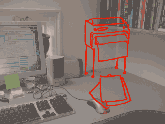
It’s the desktop printer meets social software meets the fax machine, but in everyday life rather than the office. The printer is no longer a printer, it’s my social letterbox.

Jack drew what it would look like:

Social letterbox (distressed)

The social letterbox printer sits on the wall so that when it’s finished printing, the paper falls to the desk with a satisfying thump. It prints slowly, because it’s often going to be working when I’m not there and there’s no hurry. The paper is probably cheap, perhaps thermal paper.

This is because the new social interactions around the printer now influence its form.

And now we have this letterbox, what else would we see? Perhaps magazines, subscribed to like podcasts, sent as PDFs, that my computer picks up and prints overnight, ready for me to read in the morning–just like iTunes downloading shows for me to listen to on my iPod. I’d love a zine that collated the best of my friend’s essays in their blogs. We’ve got the technology, so why not? We might send sketches – napkin doodles – or hand-written notes more often, knowing they could end up pinned to a wall. For some people, the social letterbox might be the only way they like to receive messages and mails from their family.

All of this points to a very different product from the present-day desktop printer. It could be done today–printer manufactures could bundle social letterbox software with their devices, just as digital camera manufacturers bundle photo management applications. But I think that’d be missing the point: the social interactions change the physical device itself.

As well as having a fast laser printer on the floor, I’d have a smaller, cheaper, slower social letterbox on my desk. I’d buy two printers! And we’ve doubled the size of the printer market, at a stroke.

Recent Posts

Popular Tags