This website is now archived. To find out what BERG did next, go to www.bergcloud.com.

Blog (page 58)

Ready-at-hand and Present-at-hand

I find that, picking up one of the rubber phone props, the texture arrests me somewhat and I’m suddenly conscious of the physical object in my hand. Instead of the mobile being an almost invisible conduit for the flow of communications, something I speak and hear through, I’m now aware of it as a device in my hand.

Of course this is temporarily true whenever I get a new, unfamiliar phone, and I begin to talk through the phone only when I get to know it.

In Where the Action Is (embodied interaction and tangible computing), Paul Dourish discusses Heidegger’s distinction between “ready-to-hand” (called zuhanden) and “present-at-hand” (vorhanden). The first is when you act through something, and the equipment fades into the background. Dourish gives the computer mouse as an example: You feel as though you are operating the menus, icons and so on directly, and not as though you’re asking the mouse to do it on your behalf.

The second, present-at-hand, is when the mouse becomes an object of study in its own right. Instead of it being something that equips you for a task (it being the joining between these two), you have bumped up against some aspect of its nature that makes you focus on it as an entity. This can impede your use of it as this early leaflet, How to Make Friends by Telephone, says. On page 4, this advice is given:

“Speak TO the person at the other end of the line—not TO the telephone—then you’re more apt to be pleasant and understanding.”

How does this interaction guideline change when we constantly switch between acting through the phone (to talk) and interacting with it (to consult an address book, or write a text message)? Does regarding the phone as an object of interaction prevent us from acting through it, and reduce its well-suitedness to being a communication device?

Maybe a good place to look is the Blackberry, which mixes these two forms of interaction happily and successfully. I wonder whether part of its success is due to small touches such as the on-switch pointed out by Rod McLaren:

“The BlackBerry is usually left on all the time, and when slipped back into the holster a magnet switches off the screen. The holster is more than just an inert wrap of protective plastic: as well as protecting the screen, it saves battery life and allows the handset to appear instant-on and ready.”

When you unholster a Blackberry, you don’t need to turn on or unlock the keypad. Perhaps this makes it easier to “act through” the physical device to directly manipulate the data of emails and appointments.

A question

Now I’m thinking in this way, it’s fun to consider some counterfactuals. Imagine that mobile phones were regularly covered with awkward materials (high friction and abrasive). What forms of physical interaction would we design in, in order that the phone “disappear” and become something that we could act through?

No answer I’m afraid, but something I’ll be considering.

Form and woodturning

Following up on the rubber forms and mechanical wood material explorations, we look here at turned wood, how it reacts with the expectation of the mobile phone, and what questions it provokes.

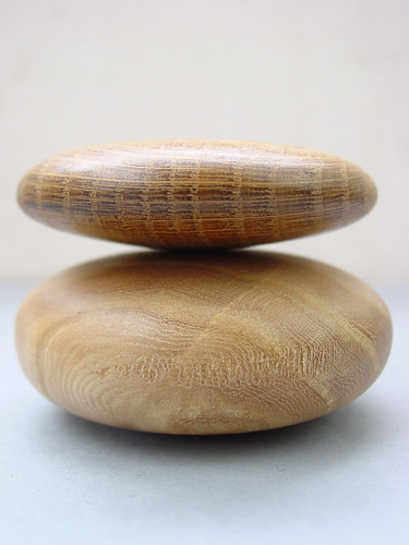
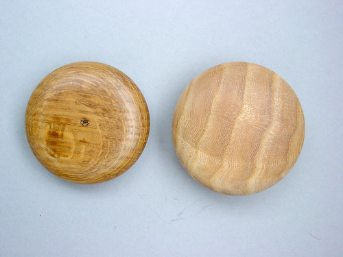
These wooden pills, made for us by Duncan Kramer, run completely counter to the painful, awkward silicone rubber shapes.

Making by Duncan Kramer

We just wanted these objects in our hands. They look a little like make-up compacts, or something else very definitely non-technological. The wooden surface is organic and permeable; it will absorb things. It smells of wood. When you hold one of these pebbles in your hand, it just begs the question: What if this lit up with phone-ness, how would it look?

In the movie The Final Cut, Robin Williams plays an editor who assembles memorial biopics of regular individuals after they die. His video editing workstation—keyboard, screen housing and all—is wooden. It seems apt.

Robin Williams in The Final Cut.

Wood is organic. Wood weathers. There’s something about turning one of the pills in your hand, and taking two and rubbing and clacking them together. The turned wood pills feel like they should be taking part in rock stacking, or one of Andy Goldsworthy’s natural, ephemeral sculptures.

Stacking.

We go through these explorations because we want to discover the natural movements of the material—what you want to do with them. What are my natural moves with my current mobile phone? I tap it on the table mainly, I guess, and that has no function. But with a wooden phone, like one of these, I want to spin it, and turn it over and over in my palm. These are intuitive actions every bit as valid as our “intuitive” want to poke at a keypad button or flip a toggle switch. I believe that when we use these new materials to make a phone, we should look at how these movements can be used in our everyday interactions.

Other material explorations

Other material explorations are linked from the Materials explored page.

Form and silicone rubber

These silicone rubber and latex objects are the least technological of our material explorations. Simply by producing the familiar shape of the mobile phone in unfamiliar materials, we can investigate our expectations of the texture and comfort of the purely physical form.

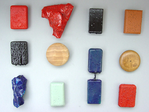
What you can see in this picture is a collection of rubber-covered wooden blocks (the connected one is latex), produced for us by Duncan Kramer (see also his biography). There are a couple of turned wood shapes, which I’ll discuss separately.

Making by Duncan Kramer

I’m only going to show the photos of the models and immediate impressions in this post, to avoid spinning off into speculation (as I did in a couple of draft posts already).

Defiant

What does it means when a phone is defiant about being put in your pocket?

High friction surface

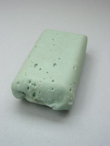
This light green surface has very high friction. With its bubbles and tiny holes it looks a little like a coral. To the touch, the only way to describe it is dry. It’s not sticky, but it defies slipping easily into your pocket. Yet the surface, when you push it, gives slightly. If you mark it with your thumbnail, it remembers a little. All surfaces have this kind of memory eventually, as they accumulate cracks and scratches, but this one acknowledges it too.

Awkward

Where do you put your phone when you’re not using it, and when you are using it?

Floor surfacing.

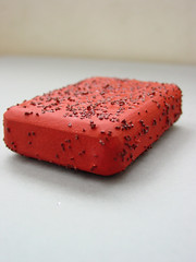
These wooden blocks are painted with factory floor surfacing. The black dotting you see on the surface is extremely hard carbon grit: The paint doesn’t chip, and you can’t pick the grit off. It’s beautiful, sharp and painful. You wouldn’t want to hold one of these against your cheek, and it’d shred the inside of your pocket if you kept it in there for any length of time.

Yet, despite the abrasive surface, the shape of the object compels me to touch it. Maybe it’s because I so strongly associate shapes that would fit in my hand with items I should pick up (I’ve written more about this in Expectations). I think I also recognise this kind of tentative touching and, paradoxically, it’s from expensive or fragile materials: I hold this scratchy block carefully… in the same way as I’d hold a delicate, inflated origami box. It’s curious that the same kind of interaction is triggered by a possibility of damage to either the handler or the handled.

Broken

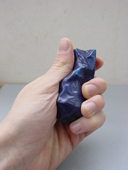
When we look at a crumpled object, how do we expect it to feel or function?

Rubber rock.

Like the other rubbers, this blue, crumpled object feels warmer to the touch than plastic. It gives a little when you push it, but not too much. It’s more comfortable to hold in some ways than in others. Looking at it, you expect it to be broken, but it will keep this shape. It’s an aesthetic I like, personally. It’s punk.

Linked

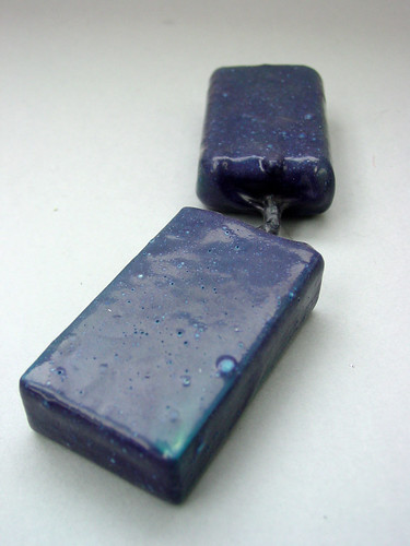
If you were making a clamshell phone, covered completely in rubber, I think you’d have to join the two portions something like this. The latex coating on these blocks turns into a connecting cord.

Connected latex-covered blocks.

I’m not sure of the origins of this piece—whether Duncan made connected blocks accidentally or deliberately—but I like the way there’s no plug or socket for the join: The same material wraps everything.

Other material explorations

Other material explorations are linked from the Materials explored page.

Expectations

Looking at the items I’ve talked about so far, especially the rubber ones, I’m trying to understand why holding a phone-shaped object in my hand seems to spark more ideas than looking at an upshaped material sample. I hasten to add that this post is extremely speculative, but I think it’s something to do with the clash between expectation based on shape and experience of mobile phones, and the reality of the material itself.

There’s something about the proportions of a mobile that says, very loudly, “this is a mobile phone.” In fact, this holds true for all kinds of distinctively proportioned shapes: Television (4:3), postcards (3:2), cinema (16:9) and more. I’ve sketched some below.

Some familiar proportions.

The sense of expectation is so strong that as soon as we encounter something shaped like a mobile phone, we start to treat it as a mobile phone. The shape stands in for the whole mental symbol of “phone.” When people see our wooden phone templates (shown in the post on fabric), for example, they often put one to their ear. It’s only natural to do so.

The flipside of this expectation is that it’s hard to see exactly what’s wrapped up in that single symbol.

It’s easier to explain what I mean if we consider a different, strong symbolic shape. When you watch television, you look at the picture through the TV and not at the device itself… but how much is the plastic box itself bringing to the experience? How can you tell?

Consider typography: Letterforms are extremely strong symbols. Think about the training typographers have to see the arrangement of the material comprising the letters (ink, neon tubes) and its properties as a material (perhaps it dominates the illustrations on the page, or connotes a feeling of modernity) rather than reading the letters themselves.

My question about the mobile phone is: To what degree does my historic experience of mobile phones influence my impressions of and my interactions with this particular physical thing? What is contingent upon the physical object?

By having objects that make you expect mobile-phoneness but then strongly conflict with that expectation, like the high-friction rubber surfaces, this question can be drawn out. In that sense, the silicone rubber material exploration is very simple: It’s about awkwardness and conflict, just to see what it revealed.

Holiday update

Hi folks. This is just a quick update to say thanks for the links, and to let you know that there are a couple of new write-ups of material explorations in the works.

This weblog has had a few links (I track it using Technorati and del.icio.us at the moment). It’s always good to see a link out there, and doubly so if there’s commentary or a question attached. Also I like to see what people draw out from what we’re writing.

So thank you Putting People First (Mark Vanderbeeken blogs about experience design and innovation) and Peter Hansen (blogging on user experience and innovation) who mentioned our personalisation angle (here and here).

And thanks too, Small Surfaces, which is a new-to-me blog on mobile user interaction and interaction design. Those are high-quality links, and I’m drawn particularly to these posts on Wabi Sabi and Simplicity and to an Adaptive Task-Based Interface for mobiles(see the mockup). Small Services mentioned our material focus, and how we’re looking at the wider effects of material.

The material aspect is also highlighted by Textually (in a post here), a blog about how mobile textile is used around the world. Influx Insights, a blog on trends and brands, begins by talking about material, and draws out our comments on local manufacture. Incidentally, I’d like to hear examples of locality influencing design in other manufacturing areas, if anybody knows of some.

Timo Arnall at IxD (digital design centre in Norway) mentioned Thinking Through Making in particular, which is good because I’ll be coming back to that soon.

A very different topic is brought up by Anne Galloway (sociology and anthropology, research blog) when she asks how everyday usage and luxury/status are related, or whether personalisation is for the many or the few? It’s not a simple question, and it’s something we’ve spent a fair amount of time discussing. Local manufacture is one type of personalisation, but so is bespoke high fashion. Given this has come up, I’ll attempt to pull together some comments and thoughts from a few people in the New Year.

Speaking of the holidays…

Coming up

I’m working on posts on the rubber and wood-turning material explorations, but it seems too close to the festive season to post them now. Instead, enjoy the quiet time on the Web and have a happy holiday!

Fabric handicraft

This material exploration took us in the direction of fabric and, in particular, what non-specialists would do at home if the phone encouraged them to make use of handicrafts and fabric.

Now, personally I’m not handy with a needle and thread. I can sew a button on, even using the matchstick trick as explained by a Genuine Tailor™, but I don’t have a sewing machine or the kind of knowledge that tells me what angle to cut at, what stitch to use… you get the picture. We were looking for someone who has this kind of knowledge, but wasn’t an expert. Full disclosure: I asked my sister, Kat Webb, to help out.

She’s ideal for this exploration. She has what I’d call “fabric literacy”: She knows her way around the tools, and is adept enough to make simple clothes for parties, or use fabric, beads and stitching for cards and decoration. But she’s not what we’d call a practitioner—it’s an occasional evening pastime only.

(If I can explain a little why this target audience is good: Think about email. Email has to be good for people whose primary job skills aren’t in computers. To design a good email (or IM) application, you can assume basic computer and written literacy, and that’s it. With that starting point, you can see what qualities your email system needs to exhibit. For example, memorable, short email addresses mean people don’t have to learn another interface to record them—they can just write them down with pen and paper. This kind of focus is important.)
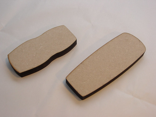
Phone templates, made from MDF with a laser cutter

Kat spent an hour or so on each of five pretend phone covers. We gave her some template phone shapes to use as a prop. I’ll show you what she came up with, and talk a little about the ideas they inspire.
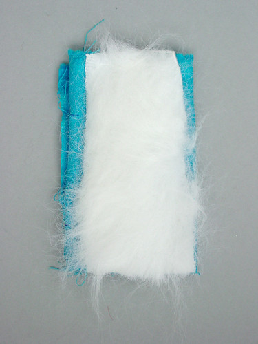
Fluffy cover. Making by Kat Webb

Texture

Something this fluffy tells stories by virtue of its difference from regular mobiles. I’ve got my mobile in my hand so much of the time, when I’m expecting a call, mooching on the Underground, or sitting with friends in a bar. Often I’m not even looking at it, I’m just playing. Why shouldn’t it be something that feels pleasant? There’s the problem about it getting dirty, of course, and that fabric wears… but people have pretty and delicate purses which are handled just as often, and those aren’t a problem. So what’s the difference? Maybe it’s something to do with the fact phones don’t invite these kind of covers, and I’ll come back to it later. In the meantime, just think about a mobile you want to stroke.
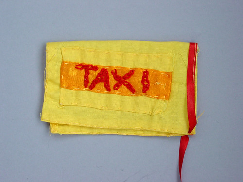
Money pouch

Taxi

It’s a simple gag, this one: You need somewhere else to keep a spare tenner for the taxi home because if it’s in your wallet on a big night out, it’s going to get spent. And what else do you always have with you? Your phone.

To draw a moral out (admit it, you knew I’d work one in), think about why there aren’t covers like this already: Here’s one reason: It’s hard to make well-fitting covers, because the people who can make creative and good-looking covers generally aren’t engineers. Here’s another: Uses like the “taxi” pocket cover are highly situated in certain social groups and geographical areas. With a culture of mass manufacture, the designers who might make these covers are too far from the people who might buy them, and so the ideas don’t come to fruition.

Instead of this manufacture culture, how about one where phone covers (even the phones themselves) are designed and made locally, in runs of only a few hundred, if that? How could we make it possible for non-experts to co-design the phone for their friends, neighbours, and people in their town? I’m talking about a culture of casual manufacture (that is, amateur and part-time), or folk factories (bottom-up and commonsense).
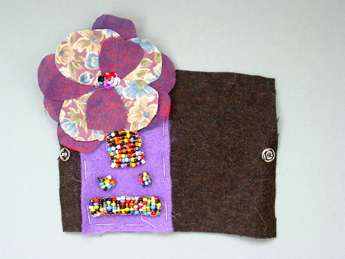
Beads, felt and flower
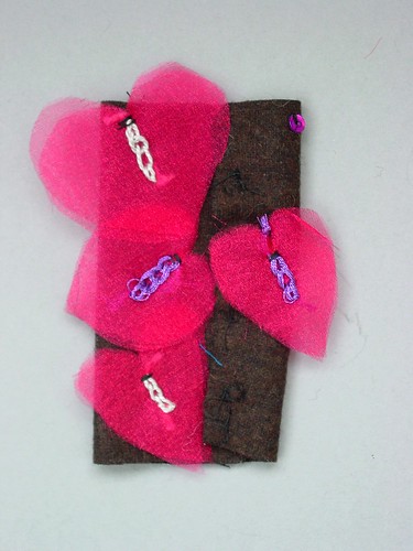
Gauze and velcro

Repositioning

Something that doesn’t really come across in these photos is the material itself. The brown background is hard felt, which is tough but can eventually be torn. The red and purple flower petals are made from transparent gauze, which shimmers and can—just—be seen through. The beads are tightly threaded and joined together, and they make a surface that’s fun to run your nail along.

All the elements have velcro on the back, and can be repositioned to sit anywhere on the silk. It’s enjoyable, moving the pieces around to make different patterns. In the spirit of material exploration, these objects make me think in two, quite new directions:

Layering is true to the way paper (in the form of magazines) and fabric (as gauze and crochet) work. It also, as the layers disappear, demonstrates the impermanence of the material. Yet, although removing layers is generally destructive, it’s so compelling: We pick, we peel, we unwrap. How about a cover where the layers are different colours, and can be torn off to reveal the layer underneath, like a gobstopper? You’d spend your idle time making swirl and stripe patterns, or peeling all the way back to a solid colour, or using the torn-off scraps for notes and phone numbers. It would be a cover that invited you to participate with it.

And speaking of participation, I also think of patchwork. If the cover is composed of many similar parts, these flowers, or squares of fabric could be individually decorated and swapped. I’m thinking especially of the pattern of activity in schools around friendship bracelets here (example; more to see; detailed site). Kids invest time in knotting these bands, and give them as a demonstration of friendship and caring. Could individual patches have a similar use, if they were made to be carefully decorated and given to others? I’m wary of appearing to see a cultural practice and advocating leaping in to take advantage of it commercially… Instead I’m just thinking, why doesn’t the physical form of my phone lend itself more to object-centered sociality (ably described by Jyri Engeström)?

These are both ideas I’d like to explore further.
Face

Doll

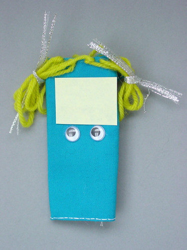
I’ve left my favourite till last. Kat made me laugh with this—it’s a mobile phone with hair. If you don’t keep its hair up in bunches, you can’t see the screen. To be honest, it feels like I have to give my phone that much grooming, maintenance and attention already, so we might as well make it explicit.

Again, just holding this in my hand sparks ideas: Is playing with a doll a physical casual game for young children? Could we have equivalents now? What other interruptible attractions could the surface of my mobile have—a Zen garden, rosaries?

Reflections

One of the reasons people don’t make covers like this now may be because it’s too difficult. Once you take the plastic cover off a phone, you also lose the keys, the power switch, the splash-proofing, and the battery cover. The outer surface is too solid, and the inner surface is too weak. How good it would be to have an in-between surface which still had keys and splash-proofing, but wasn’t robust enough to go in your pocket with your keys.

Perhaps that surface could also have fabric fasteners on it (as in the third photo, above), to encourage people to make other covers.

I’m reminded of John Maeda talking about nude electronics and fabrics. He said: Have technology toys always been… naked… until recently? […] The object inside can be pure, simple, and cool; while its clothing can be warm, vivacious, and simply outrageous.

Practically, a fabric cover, especially a layered one, means that my phone in my pocket won’t have a tough exterior to smash up my camera or rub away at my jeans. But for people to use fabrics, the covers have to be “vivacious” and “outrageous”, which are judged subjectively, and so we also need a culture of local manufacture. What we’re finding in this exploration is that there are changes the phone manufacturer can do to encourage that, and illustrations we can make to provoke designers into thinking that way.

Other material explorations

Other material explorations are linked from the Materials explored post.
Materials explored

As I suggested in Material explorations, we picked a number of different materials to explore in this way (there are some others where we’ve used a different approach). I’ll be linking to them here, and this post will bounce to the top whenever a new one is added.

The material explorations are are:

Material explorations

Our major challenge in this strand isn’t “how do we make a phone out of wood?” A mobile phone isn’t just a physical form, so instead we need to investigate how wood affects the networks of people using and creating the phones. Once we’ve researched this, we can design a mobile phone that illustrates those changes, and build it properly. This brings us to the real challenge: How do we even begin finding the answers?

One significant strategy we use is a particular approach to material exploration (another, the use of design briefs, I’ll come back to in a future post). Sometimes thinking can be done with your hands, through a process of making, and through considering the object when it’s finished

Sometimes our best thinking can be done with our hands, through a process of making, and through considering the object when done. The physical object tends to differ from the imagined one, and that difference challenges us to understand and develop it.

Thinking though making

For example: Let’s stick with wood, and say we want to make a wooden phone. We’re attracted by the potential of the warmth and textural qualities of wood. For instance, contrast the particular appeal of wooden toys and their clunk-clunk with the slide-click of a metal keypad cover on a sliding mobile.

Wood is actually one of the materials we explored, and we tried two distinct approaches. We made the simple shape of the mobile phone, and also some larger-scale pieces to try out different wooden movements. We learnt quickly from this process. One point that come up: Although you can make buttons in wood, the build quality doesn’t give the fluidity of movement of plastic buttons. Ratchet mechanism and hinges feel more true to the medium.

From the final shapes, we’re now able to test our expectations. It’s one thing to imagine a wooden mobile phone—it’s quite another to hold it in your hand, and use it as a prop. Whereas we’d started on the warmth and mechanical qualities of the wood, another property now makes itself visible. There’s a gracefulness to the robustness of the wooden surface: A wooden table can show scratches and burns well and improve with age, whereas a scratch on my iPod drives me potty. The material can suggest new avenues that we hadn’t thought to explore initially.

These material explorations operate as catalysts with the ideas that come up from other strategies like brainstorming, and help us reach richer concepts. We can then dedicate the bulk of our time to building those out into physical working prototypes, which can then be used, we hope, as inspiration for designers.

Relationships

There’s another aspect to the material prototypes I haven’t touched on yet, and that’s our relationships with craftspeople and product designers. We use experts to perform these material explorations, preferably whilst we sit with them. Eventually, we may be working with these folks to develop the major prototypes at the end of the project.

The material explorations let us test out different ways to communicate. It turns out that the brief you give to a material-oriented craft worker is a long way from the one you’d use to get the best out of a product designer… but that’s another topic I’ll be coming back to.

Mechanical experiments in wood

The material exploration brief in this case dealt with the ways mechanical forms could be of interest when using wood. Through this we made particular references to traditional toy making, cabinet making and cigar boxes (these are areas that demonstrate the specific material qualities of wood that had attracted us).

Jack worked with Robert Phillips, to produce as many forms as possible in 1½ days. They spent the first day looking at possible mechanical housing for phones and the second on glueless joinery. The objects are larger than normal phones, but feel really human.

Physical actions

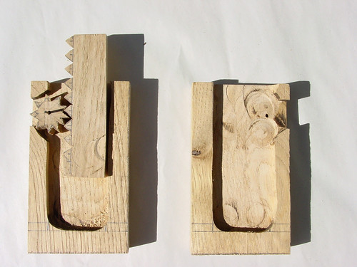
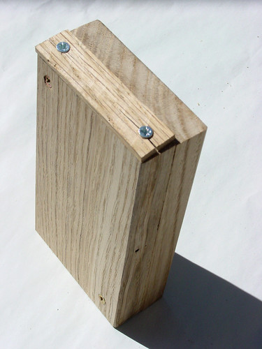
The physical actions which come naturally to a wooden model are very different to those in plastic. This model uses a cogged thumb-wheel to elevate a screen:

Making by Robert Phillips.

Mapping the action onto the phone

You can see how this works:

Screen elevation cogs

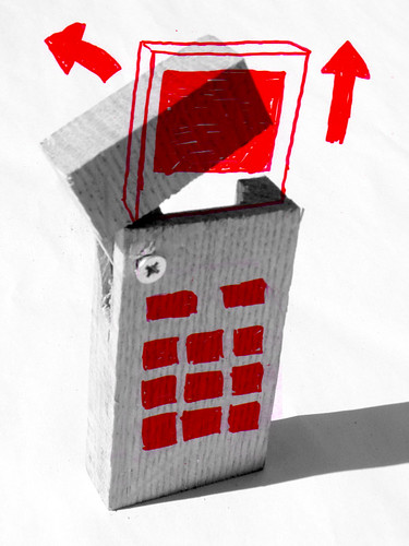
This kind of action really comes to life when you use the solidity of the wood to hide the screen, and a hinged flip-top to pull the screen out.

Flip-top action, for the phone

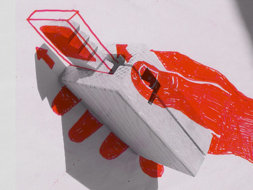
Button-pressing is another familiar action, but again this doesn’t work so well with wood. What does work well? Squeezing works. The Apple Mighty Mouse has a squeezing action built into it. Being plastic, it doesn’t provide much feedback to your hand. Wood, on the other hand, has a flexibility in it which offers feedback very well: You need a certain level of force to start squeezing, then it initially has a lot of give, to provide encouragement that you’re performing an expected action. Towards the end of the squeeze, it pushes back to indicate you’re done. (Incidentally, this same tactile force-feedback curve is designed into well-constructed buttons, like keyboard keys.)

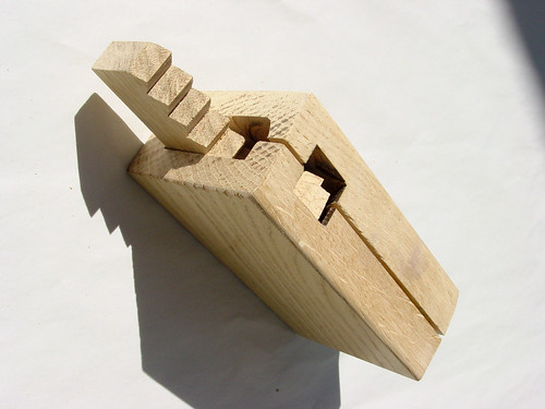
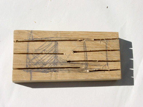
Slotted form

The slots allow a squeezing action

Joinery

It’s not always effective (or pleasing) to glue or screen bits of wood together. Better joins can be had by constructing shapes that fit tightly with one another. These shapes are different depending on the kind of junction you need and the direction of the grain of the wood, and get you thinking about what kind of mobile phone forms they’d evolve into.

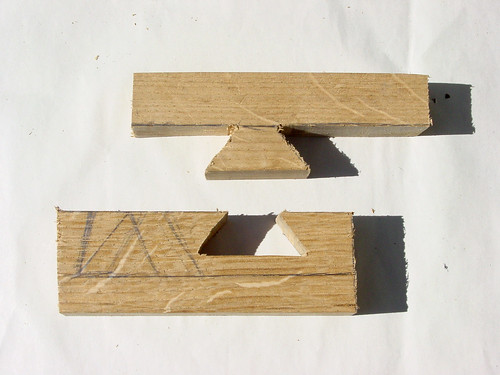
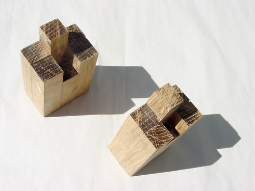
This dovetail joint makes me think about the extras we hang off the bottom of mobile phones, because it’ll come off very easily from side-to-side, but is strong against any kind of pulling action. It’s much nicer than a plug-and-socket, such as that used by a headphone, where it seems almost magical that the plug stays in, even when upside-down.

Dovetail

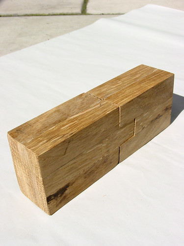
Two identical shapes can be complementary and slot together:

Identical and complementary shapes

Together, a self-contained form

This kind of combining could be a very well-understood mapping to certain actions you perform with phones in pairs… sending business cards via infra-red, for example. It’s not obvious how to join phones like that, and the performance of using the infra-red doesn’t properly show its capabilities.

This combination, on the other hand, shows it very well: The mobile phones are equals, and when joined they comprise a system which other phones can’t join. At this point, they make a new unit which could use the screen to display options particular to the situation. What’s more, you’d find out about this functionality by natural exploration, instead of reading the manual, just as mobile phones give us holes to listen into to hint to the speaker placement.

Misc

One other form:

Big box rattle

This block of wood here is hollow and has a bead inside it. We’re so used to small things inside containers, it’s easy to forget just how natural using a rattle is. Now, imagine the bead inside was invisibly impeded in some way—when you rattled the phone, it would feel like it was going through water, perhaps, instead of air. What would that make you think, that you had a ton of missed calls building up, perhaps?

Our expectations of tactile responses are so strong, it makes us sensitive to small differences, and it’s a shame not to take advantage of that. This object does exactly what material explorations are supposed to do: By confronting it at face value, we’re forced to think of ways it could be real, and those thoughts can lead to new ideas.

In this case, I’m inspired by Mikael Fernström’s explorations into sound objects, as reported by Timo Arnall, which included: One exciting and pragmatic idea that Mikael mentioned was simulating ‘peas in a tin’ to hear how much battery is left in a mobile device. Excellent.

Other material explorations

Other material explorations are linked from the Materials explored page.

Nokia Personalisation – Overview

We’ve been working with Chris Heathcote at Nokia, Insight Foresight on mobile phone personalisation. We’re addressing questions about mobile phone manufacture, and who takes responsibility for how they’re used, and what they represent. The work is grounded heavily in prototyping and making, building on research Chris has already done. We’re documenting the project’s progress and the physical outputs here.

Some early starting points for the project have been to look at how materials affect the form of the mobile, and in particular, what new opportunities for change they give us. Note that this isn’t a product design brief, so we’re not trying to improve the design of mobile phones in general. But rather we’re looking at what happens when the shell of the mobile is made out of paper, for example, or is stitched. These present opportunities that only emerge when you’re not having to go through a 10k+ unit production run. For example, the highest quality products, historically, were often hand-made, and these were the ones most tailored to specific needs.

As well as looking at how materials (and the practices of the people who work with these materials) affect the phone, we’re also looking at how personalisation of Nokia phones can change their meaning or impact culturally.

Large-scale manufacture is inevitably distanced from the very precise social context of use. Once we bring in short-run manufacture, however, the mobile can be more culturally situated. Manufacture can occur locally, and be influenced and shaped by everyday usage. Consider, for example, if there was a factory at the end of your road, making mobile phones in runs of only 200. Would that change the way you engage with the production process or, eventually, alter the way phones existed in the social life of you and your neighbours? We’re pretty sure it would, and that’s one of the areas of investigation.

(Given this, we’re also brushing up against questions about bespoke creation of expensive items. Electronics are often seen as disposable, and on first glance this jars with traditional luxury goods: Antiques are handed down over generations. Then again, expensive clothes are sometimes kept for a single season. So what happens when the clip-on cover is worth more than the phone it houses?)

Making by Robert Phillips.

To sum up: We’re working with practitioners of a number of different crafts to explore how their materials affect the mobile phone. We’re experimenting with the short-run manufacturing techniques available in small workshops and on desktops to look at, for example, the impact of Rapid Form Prototyping on phone housing. We’ll be presenting what we make, and what we figure out, on this blog.

And of course, all comments are welcome! Our email address is below, and please mark your email as private if you’d prefer it not to be on this blog.

—Jack and Matt.

Recent Posts

Popular Tags