This website is now archived. To find out what BERG did next, go to www.bergcloud.com.

Blog (page 51)

Stories about Silicon Roundabout

[Allow me to introduce Georgina Voss! She’s based with us over the summer, doing a study of the Old St area. If you’re in the area, it would be super helpful if she could meet you too. Read what she has to say then get in contact. -Matt]

So this is like the first day at school for me, complete with new bright orange backpack – finding out where people go at lunchtimes, which groups hang out where, and what makes this different from other schools.

But to back up a bit. I’m a researcher from Brighton, an ethnographer with an interest in the in creative industries, communities and user activities. I’ve just arrived at Old Street this morning for a project on the place itself. There’s a growing cluster of tech, new media and design firms around here, which the denizens have playfully called Silicon Roundabout after its Californian big brother. The aim is to carry out an ethnography of the social world of Silicon Roundabout: where it came from, how it operates, where people go and what they do, what does it mean to work in a place like this? AnnaLee Saxenian did something very similar with her work on the rise of Silicon Valley and decline of Route 128 in the late 1980s (published as Regional Advantage: Culture and Competition in Silicon Valley and Route 128). Using an ethnographic approach to examine the culture of the two places, Saxenian uncovered the casual communities and networks in California which cut across the formal boundaries of firms. Compared to the more hierarchical and rigid social structures and histories of Route 128 in Massachusetts, people working in the start-ups of the Valley were able to share and develop ideas more easily.

And this is what is interesting here: what stories and histories are there to tell about Silicon Roundabout? Hi-tech clusters are nothing new – in the UK alone there we have Silicon Fen (Cambridge). Silicon Beach (Brighton) and Silicon Glen (the Central Belt triangle in Scotland). But there aren’t any narratives about the culture and norms around the Roundabout, and it’d be pretty fascinating to dig into this. Matt at S&W is interested too, so he’s given me a desk and space on the blog through the summer – and here I am.

But I need help! What I’m doing is observational fieldwork, and that means meeting people and chatting and hanging out and observing. It would be ace to meet people who work around here (and further afield too) – chats over coffee, cake or beer would be great. I’ll be here 2-3 days a week, in the daytime and the evening too. At the moment I’m with the boys in Schulze & Webb (battling with the wireless on my prehistoric laptop, eating homemade biscuits). Whilst I’m being hosted by them throughout the project, it would also be very useful to spend time with other companies on the Roundabout too, from between a few days to a couple of weeks. You can get hold of me at gsvoss@gmail.com if you’re interested – it would be very splendid to hear from folks.

(Some background on me. I like researching, writing and teaching about outlaw innovation, the creative industries, communities, technology histories, user activities, gender and sexuality, and ethics. I finished my PhD in 2008 – the thesis was on how the North American online adult entertainment industry innovated around technologies, and whether their stigmatized status affected what they did. If you like I can tell you more when we have coffee.)

What if GPS worked like Here & There?

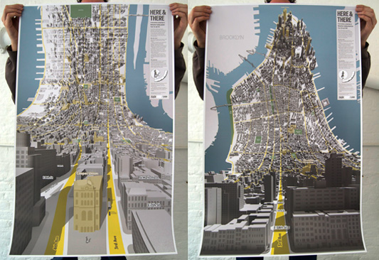
You get used to the Here & There projection really fast. Timo Arnall, friend of S&W, was talking to Jack:

I’ve been sitting here staring at the map, pretty much on and off since yesterday. It comes across as a totally natural projection! … it’s as if you have wired two separate bits of my brain together; the bit that does maps, and the bit that does perspective.

Here’s a comparison:

uptown-comparison

Thanks Chris Woebken for the photo!

It starts feeling weird that you can’t see over rooftops.

And while these prints we’ve shown so far are tied to two intersections (one looking from 3rd and 7th, and the other from 3rd and 35th), yes we are working on doing it on the fly, and yes we’re looking at generating projections from all kinds of places for one-off prints.

The natural question is, what would this look like driving round Manhattan? (If you forget about the traffic.) As Fast Company and Gizmodo said, Garmin should do it. They totally should. And so here it is.

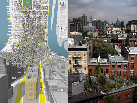
The Here & There projection is on the left, and the equivalent normal view is on the right. Click through and watch the HD version. It’s cool.

There’s another video too, that shows how the streets distort to make the projection possible.

Here’s what I’d like for my future magic in-car navigation system:

  • the superpower to see through the city into the distance
  • real-time!
  • traffic volume overlaid on the distant city map, with my route
  • a way to peek around corners
  • seeing further the faster my car is going

Any more?

Here & There influences

I’m going to tell you a little bit about the influences on Here & There, a project about representation of urban places, from when it began. It was warmly received when I first presented some corners of it back at Design Engaged in 2004, before Schulze & Webb existed. Here & There is a projection drawing from maps, comics, television, and games.

This particular version is a horizonless projection in Manhattan. The project page is here, where large prints of the uptown and downtown views can be seen and are available to buy.

I’ve been observing the look and mechanisms in maps since I began working in graphic design. For individuals, and all kinds of companies, cities are an increasing pre-occupation. Geography is the new frontier. Wherever I look in the tech industry I see material from architects and references and metaphors from the urban realm. Here & There draws from that, and also exploits and expands upon the higher levels of visual literacy born of television, games, comics and print.

The satellite is the ultimate symbol of omniscience. It’s how we wage wars, and why wars are won. That’s why Google Earth is so compelling. This is what the map taps into.

The projection works by presenting an image of the place in which the observer is standing. As the city recedes into the (geographic) distance it shifts from a natural, third person representation of the viewer’s immediate surroundings into a near plan view. The city appears folded up, as though a large crease runs through it. But it isn’t a halo or hoop though, and the city doesn’t loop over one’s head. The distance is potentially infinite, and it’s more like a giant ripple showing both the viewers surroundings and also the city in the distance.

schulze-holding-posters

Origins and sources

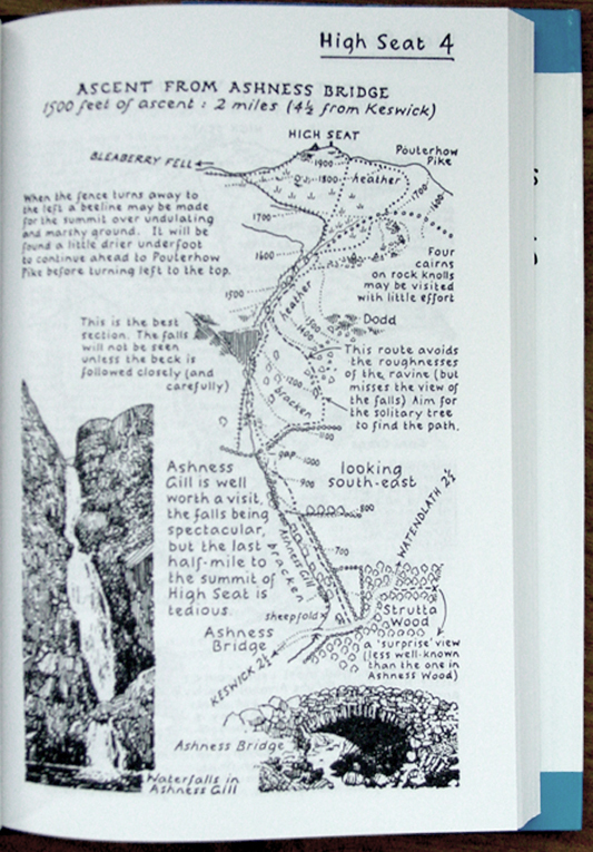
Some of my favourite maps are drawn by a British writer, walker and accountant named Alfred Wainwright. Phil Baines provides background:

“Wainwright was an accountant born in Lancashire who fell in love with the English Lake District and moved there to live and work. All his free time was spent walking the fells, and he began his series of seven ‘pictorial guides to the Lakeland Fells’ in 1952 as a way of repaying his gratitude to them. The work took 13 years.” (Type & Typography)

Wainwright’s walking maps are drawn to suit their context of use, the books are intended to be used while walking. As the reader begins their walk, the map represents their location in overview plan. As the walk extends through the map, the perspective slowly shifts naturally with the unfolding landscape, until the destination is represented in a pictorial perspective view, as one would see it from their standpoint.

Wainwright spread

This is a reversal of the Here & There projection. In Wainwright’s projection we stand in plan, and look into perspective. Wainwright’s view succeeds in open ground where one can see the distance… but in a city you can only see the surrounding buildings. Wainwright and Here & There both present what’s around you with the most useful perspective, and lift your gaze above and beyond to see the rest.

David Hockney presents a fantastic dissection of perspective in the film A Day on the Grand Canal with the Emperor of China or Surface Is Illusion But So Is Depth. He describes a very old painting from China which depicts a journey along the grand canal. I really like how he describes the scene as ‘making sense.’

He justifies a deviation from Western perspective, that to represent things as they strike your eye is not even functionally as good as some other interpretative distortions. In this painting in which there’s a grossly distorted perspective, in which there aren’t even any rules, it still makes sense because it changes how you put yourself in the painting, and that changes where you put yourself outside it.

Augmented reality

There is a element in the map, in the uptown view, of a bus. Its destinations in both directions are shown. (I love NY bus routes, the cross town super power!) This is to explore how augmenting the map with local information might work.

bus-context

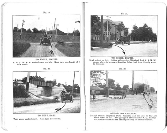
One of my intentions with the project is to make an exploration into way-finding devices. One of my favourite examples of augmented reality is from these American Road maps from 1905. The map is stored in a book, and good for only one route. In fact, it isn’t a map as we’d typically understand one.

American Road Maps 1905

Michaels, H. Sargent. Photographic Runs: Series C, Chicago to Lake Geneva to Delavan, Delavan to Beloit. Chicago: H. Sargent Michaels, 1905. Used with permission from Prof. Robert French, Osher Map library, University of Southern Maine, Owls Head Transportation Museum.

The book dates from before the national road sign infrastructure was introduced to American highways or inter-city roads. Each page is a photo of a junction, with every junction between the two cities included, and an arrow is drawn over the photo to say which direction to take. As the driver progresses along their route, they turn pages, each junction they arrive at corresponding to the one in the current photo. (Many thanks to Steve Krug for the sharing his discovery of these great pieces.)

First person to God games

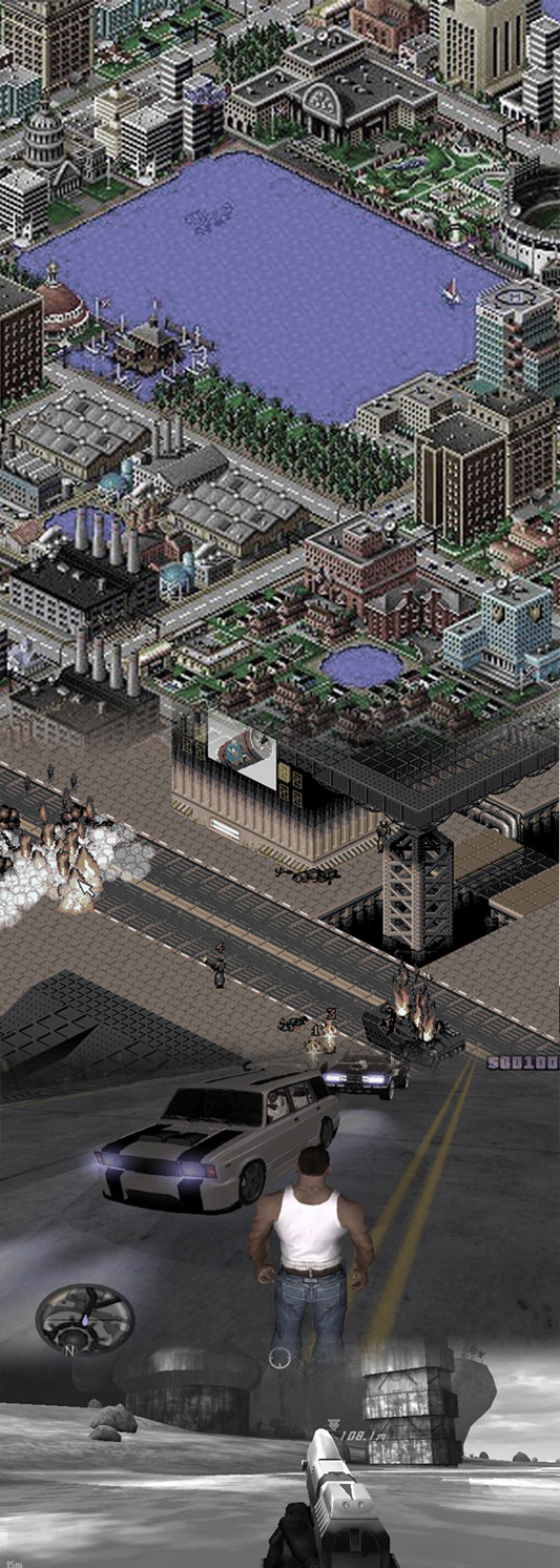
I don’t like the way maps (in-game maps) work in most video games. They seem to break my flow of play, and locating one’s actor in the game isn’t satisfying. I’d love to see a first person or third person shooter where the landscape bent up to reveal a limited arc of the landscape in plan over distance. As a video game, the Here & There projection slides from Halo, through GTA into Syndicate, to end in SimCity.

game collage

Although I never played it, I’ve heard a lot about Luigi’s Mansion for the Nintendo GameCube. Luigi wonders around a haunted mansion and hoovers up ghosts with a vacuum cleaner. I heard about a mechanic in the game which involved a virtual Gameboy Advance in the game. Luigi could take it out and use it to inspect the world. The game played out in the third person with a view of Luigi in place, but I think when you look in the Advance, it gave a first person view from Luigi’s position. Well, if it didn’t, it should have done.

I know that in some special games the Gameboy Advance could be plugged into the GameCube, to be used as a special controller. It would be amazing to use the second screen in a controller for that first person perspective. Imagine if you could guide your actor around in third person and glance down at the screen in your hands for close inspection or telescopic sniping.

Powers and cities

Recently Matt Jones and Rod Mclaren discussed Jason Bourne and James Bond and how they use cities. Jones characterises Bourne in contrast to Bond:

“… in addition, Bourne wraps cities, autobahns, ferries and train terminuses around him as the ultimate body-armour”

For Bourne, the city is his power, Jones continues:

“A battered watch and an accurate U-Bahn time-table are all he needs for a perfectly-timed, death-defying evasion of the authorities.”

I like to talk about the projection as a superpower, the power to be both in the city and above it.

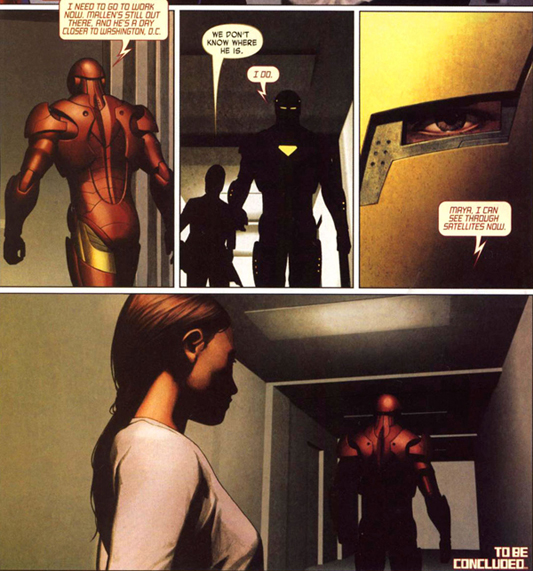
Last year Warren Ellis wrote an Iron Man arc called Extremis. As ever, fine stuff. And with great pictures from Adi Granov too.

Ellis, unsatisfied with controlling the Iron Man suit by normal means (sensors, or weeny joysticks in the gloves or something) as an exoskeleton (picture Ripley in the clumsy Powerloader), Stark must ingest the Extremis serum in order to match his enemy, Mallen, and prevent him from his destructive path into Washington. The serum welds Stark to his tech. It leaves him ‘containing’ the membrane-like ‘undersheath’ he uses to control the Iron Man suit. It is stored inside his bones.

Iron Man mind control

The final sequence of panels in the penultimate book has Stark wearing the Iron Man suit, setting off to confront his enemy, his recent transformation has left him with new powers…

Iron Man leaves to confront Mallen

“I can see through satellites now.”

What a thought! Within one field of view, to be both in the world and to see yourself in it. The power of looking through, and occupying, your own field of vision. Awesome.

What if the projection appeared inside location-aware binoculars? Hold them up, and live satellite images are superimposed in ‘the bend’ onto the natural view of the city as it lifts up into plan! You’d see the traffic and people that just pulled out of view into a side street from above mapped onto your natural view.

Timo Arnall posted a video showing a Google Streetview pan controlled with the digital compass inside the device:

It begins to reveal how Here & There might feel if it were moving beneath your feet.

Thanks

I would like to thank both James King (art direction) and Campbell Orme (technical direction) for their tireless efforts in bringing this work to life. Email them and make them work on your stuff. They are talented, humane and brilliant designer/thinkers.

Art prints of Here & There have been produced in a limited run and can be purchased here. Please buy one and stick it on a wall.

Here & There, and Wired UK

As long as I’ve know Jack Schulze, he’s been working with maps. The first one I remember was a way of mapping Barbican, which is a three dimensional architectural maze of a housing and cultural development in central London, and notoriously difficult to find your way around. I’ll get him to dig out the results.

Late last year he started working with James King and Campbell Orme on an equivalent projection of Manhattan. We’ve had huge prints of the results in the studio these last few weeks, and it’s startling to look at: at the bottom of the map, buildings stand in three-dimensions. Then, looking into the distance, the city curls up and around into the sky, smoothly transforming into a more traditional map.

Here’s a detail of that happening:

uptown-detail.jpg

You should see the entire thing.

ANYWAY. What I mean to say is that, as his friend and business partner, I’m enormously proud to announce the following:

First! Here & There — a horizonless projection in Manhattan is out in the world for people to see.

Second! It is featured in Wired UK magazine, issue 2, which hits the shops today. Not only has it been given a massive gatefold (not kidding, you have to see it), but there’s a photo of Jack with his big blue eyes too. Awww.

Third! Here & There is just too beautiful to keep to ourselves, and too high res to keep to the Web. So we’ve produced a limited run of art prints, and we’re selling them as from today.

Check out the Here & There project website to read more and get prints. Happy day!

Pulse Links: Home Automation, Personal Informatics

Some great exploration around the idea of personal informatics in this fantastic post from Lee Maguire, which hinges nicely on this question:

So what happens when the device that records your medical status is also the device you use to update your social connections?

Far more interesting than the “write” of home automation is the “read” of gathering personal informatics.

HP have been marketing their “personal servers” recently, but exploring the site reveals that they think the primary purpose of a home server is being a smart NAS: storing media. Wouldn’t it be more interesting to have a home server that ran applications, gathered informatics? And to do so in a simple, consumer-friendly manner.

This is the pattern that devices like the Current Cost embody: it sits in your house, and sucks up information. It’d be nice for that to be part of a platform, perhaps one I can get at over my home broadband connection.

Right now, this is all doable, but at the geekier end of the spectrum. Andy Stanford-Clarke put his house on Twitter (the account is now private, but there’s a good screengrab here) – its energy consumption, its water consumption, its doorbell, its telephone. This was lots of work and fiddly, but wouldn’t it be nice if it was easier? Andy’s collected some links about the project here.

If there was to be a personal informatics server – rather than a baby-NAS – then it could be even smaller, even simpler than the HP models. It’d be something more at a router scale. One of the best examples on the market of a product that’d be an ideal personal informatics server is probably the Netgear NSLU2 (discontinued, but available secondhand); whilst it’s designed to turn USB hard disks into network-attached storage, it also works very well as a silent, low-power Linux server, ideal for performing simple, network-connected tasks. Even more interesting is the Viglen MPC-L – a low-power, AMD-Geode based computer with keyboard, mouse, and Xubuntu distribution for £99. Whilst it’s underpowered for most desktop computing tasks, it’s an ideal miniature server. Whilst Viglen haven’t made that use of it explicit, it’s surely in the back of most geek’s minds. Andy Stanford-Clarke has connected some notes on the Viglen here.

The next question: how do you get that kind of functionality/platform out of complex, bespoke Linux boxes and onto routers (or digiboxes, or similarly pervasive white boxes), with a UI anyone could use?

I’m not sure. But you could do worse than starting them early on the idea of personal informatics – exactly what the Power Hog does. It’s a piggy bank that plugs into an electrical outlet. The pig’s nose is another outlet, but one that can only be activated by putting coins into the piggybank. The piggybank can, of course, later be emptied; but what a lovely way to teach children about the cost of energy. And it’s a smart piece of product design: because the nose (and, presumably, tail) are removable components, the Power Hog can be internationalised with a set of adaptors, rather than through multiple, costly, SKUs.

Fantastical Design

Sometimes, it’s worth joining the dots between a few things you find. In this case, that was this image of a breadboard that dumps its crumbs onto a birdfeeder.

(The original image isn’t available at the moment, http://curroclaret.es having been temporarily taken offline due to excess bandwidth; I’ll link to it in due course.)

It’s both a piece of design and a visual joke: it connects two ideas (birds eat crumbs; breadboards collect crumbs) in the shortest possible distance. The entire rationale, the entire concept behind the design is laid flesh. Is it a product, a thing that makes sense in the world? Not really. The realities of kitchen design start to impinge if you think about it too long. Instead, it’s perhaps best to look at it and smile; if there’s something to be learned from it, it’s perhaps that two ideas really be connected as simply as with a bent piece of tubing.

The birdfeeder made me think a little about other examples of fantastical design, both real and imaginary. I’m not sure I’m anywhere near finding a deep interconnected thread between these, but I think as a juxtaposition of images, they all tie nicely together. In the meantime, here’s where the birddfeeder lead me.

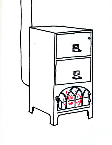
Coincidentally, it made for a nice comparison to a recent post from friend of S&W Rod Mclaren, where he posits the idea for a combined filing cabinet and stove:

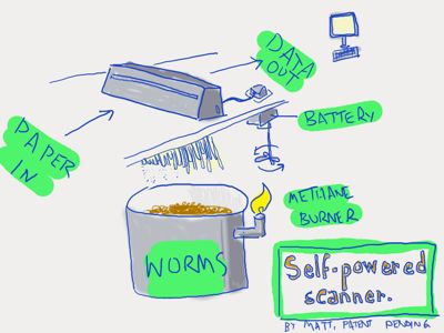
It also reminded me of a presentation of Matt’s about some of his favourite science fiction and the ideas therein, and, specifically, this slide:

There’s obviously a historical precedent for this kind of fantastic design and thought – practical ideas realised in somewhat absurd means – such as Heath Robinson’s gusset tightener:

or, if you’re American, the fantastic contraptions of Rube Goldberg:

Fantastical, outlandish design somewhat comes to a head in the work of Tim Hunkin, who somehow manages to balance a delightful sense of the absurd with solid, realistic technical skill; he’s only interested in the working and the real, and yet his sense of the absurd is at least as well refined as Heath Robinson’s.

What do all these things have in common? They explore the value of the absurd, be it absurd simplicity – as in the birdfeeder – or absurd complexity – as in Heath Robinson’s complex series of magnets and pulleys. What value does this kind of sketching, or thinking-out-loud, have for the practicing designer? I’m not entirely sure – after all, I am not a “practicing designer” myself. They remind me a little of Matt Ward’s sketching technique (which Jack discussed in his talk about Olinda): starting at extremes, and slowly iterating towards realism (and complexity). The birdfeeder, the filing cabinet, the shredder, all act a little like another form of “physical Powerpoint”: they may not be realistic, but they are highly expressive. And maybe that’s the value of this kind of design. Once the aims or thinking behind an artefact have been explained clearly, and succinctly – no matter how absurd – then it’s possible to iterate towards realism, towards a more sensible and sensical design.

The Utility of the Unfinished

This video got me thinking.

It’s footage of a simple Augmented Reality experiment from a programmer at British independent games developers Introversion, imagining what one element (the world map) of their strategy game Defcon might look like if there was an AR component to it.

I’m not as interested in the technical aspect of this experiment as I am the aesthetic.

I was struck by how well-suited the blue-on-blue, information-dense and highly representational display of Defcon is as an aesthetic for augmented reality. It helps to have a clear distinction between the real and the augmented. By making the augmented several degrees lower in fidelity than the real, it enhances the utility of the augmented elements. It creates seams between the real and the unreal, and helps the user process both real-world and AR information faster.

A few other things that struck me as being similar to this:

Jack spoke at This Happened in London last year about the Olinda project, and talked a little at the end about the form factor. Specifically: why it doesn’t look “prettier”. And he explains:

Each of the elements are trying to say what they do themselves in their own language.

Matt has described this to me as “physical PowerPoint”. You instantly know from looking at this thing that it’s not necessarily finished yet; not quite complete. And rather than letting you down, that incompleteness (in this case, an aesthetic one) opens up a communication. It informs the observer that they can engage in a kind of dialogue with the radio, about what it is and what it does. Its form is not final, and that means that there is still space to explore and examine that form. A more finished project would shut out any such exploration from the user or observer, and simply impose its form on them; the only reactions left are accepting that form, denying it, or ignoring it.

monospaced type

Monospaced type that’s used for writing, not code. Most corporate communication takes on the same form: laser-printed, perhaps even letter-headed, smartly formatted documents, all of which look finished. But it’s so rare that the kind of documents we use in corporate communications are finished. More likely, they’re work in progress – either iterations of a report yet to be completed, reference materials for negotiations yet to be conducted, or as starting points for discussions that likely end on a completely different note. So why present them as concrete, unapproachable objects? By presenting the documents in barely-styled (yet thoughtfully laid out) monospace text, their role as intermediate objects becomes more obvious.

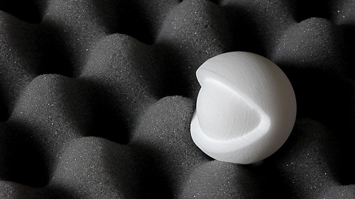
fabbed plastic
(Image from maxbraun, under a Creative Commons licence).

Rapid-prototyping plastic. The not-quite complete has not just look, but also feel, and as rapid-prototyping becomes more and more commonplace – and better understood by a wider audience – that unusual texture of fabbed plastic will quickly become another useful shorthand for “not a sketch, but not complete either”. This is a tactile shorthand that emphasises the boundaries between the world (of complete, final materials) and the work-in-progress.

Wireframe in situ

One technique that S&W has been using recently to illustrate design work is placing sketches or wireframes in situ. Whilst wireframes themselves are incomplete artefacts, designed to be work in progress, they still suffer for being uniformly incomplete. Wireframes themselves can be almost too beautiful, and this means that it becomes all-too-easy to criticise them as only wireframes, rather than as part of a product that exists in the world. Contextualising the sketches into the photograph places the design into the world. This enables the design to be understood within the world, and also (importantly) to highlight the seams between the unfinished design and the finished world around it.

How finished an artefact is is an important indicator of its relationship to the world: not just an indication of where it is in its lifecycle, but also one that explains how it should be understood, and that opens a dialogue between the observer and the artefact. It’s important that there is authenticity in the unfinished state. All the examples above are of things that are in a transition state between non-existant and final; they are not finished items that have then been distressed or made to appear cosmetically unfinished.

This is unlikely to be the last time I’ll write about this stuff on Pulse Laser; it feels like it has legs, and it’s something that I’m noticing more and more examples of. Given that, it only seems appropriate that this post remains

Endless Notebooks

“I’d describe myself as an inventive, but bad, prototyping engineer; I’ve got a shallow knowledge of most fabrication processes”

One of the things Jack has a shallow knowledge of is bookbinding. This morning, he’s talking to me about some interesting notebooks he’s been making, and about a product – and service – that could emerge from his explorations into this craft. Jack shows me a selection of books in various stages of completion. The process of manufacture, especially at the one-off scale he manufactures them, is relatively simple, and worth explaining, as it’s critical to his subsequent explorations into product.

You start with the paper, and the insides. Your paper stock is folded over to create several sections of the appropriate size and thickness. Once these have all been created, they’re stitched along their spine to hold the section together, and cut (usually with a guillotine) to the same thickness. This isn’t the primary way the spine holds together; it’s more of a convenience. Then, the sections are glued together, with a three thin strips of tape extending horizontally over the first and large page, and a thick scrim wrapping their outer edges. Finally, a thin piece of paper is strongly glued over the spine, and it’s this glue that holds the spine together.

Jack demonstrates the uncovered book

All that remains is to add the cover – two pieces of card for the front and back, and a third thin one for the spine, along with endpapers and a cloth covering. The book is not made to fit its cover – the cover is cut to match the paper size, however that has turned out. The end result is almost exactly like any hardback book you’d find for sale today.

Why make your own notebooks, though? What’s wrong with the ones on the shop shelves?

Designing books around needs rather than form-factor

One reason to make your own book is to meet needs that existing books cannot. In Jack’s case, this is all about the paper – or, rather, how the paper reacts to different kinds of writing implement. Whilst a fairly traditional, smooth paper stock makes sense for writing notes in ballpoint, or sketching with pencil, Jack also likes to work with a thick brush pen, and a much thicker, rougher stock suits this better.

(I tend to approach purchasing notebooks by thinking about form-factor first, and considering the paper second. When you’re making your own, it’s much easier to reverse that thought-process and think about the paper first – and, based on my own experience of notebooks, that’s likely to lead to much greater satisfaction with the end product.)

Given that Jack likes to both write and draw in his sketchbooks, why not make a book that includes both paper types? He shows me a book without a cover. The uncovered book has three paper stocks in it: a regular, smooth stock at the front for writing notes; a thick, rough stock at the back for brushwork; and, in the middle, larger pieces of paper that are folded in. Some of these unfold into a roughly A3-sized piece of paper; one, in the center, unfolds into a giant panorama for illustrating skylines.

Jack demonstrates the panorama page

The three stocks are built up and then bound together into a cover. This immediately demonstrated something else that Jack learned from the uncovered book: whilst the three sections were equally sized in terms of page count, they really should have been equal in thickness: because the paper stocks are all of different thicknesses, the book ends up being slightly lopsided.

There were two other notable problems with this book: firstly, that because of the different kinds of work that occur in each section, Jack was more likely to use up one section faster than another, and secondly, that it still ends.

The next experiments were about building a book that wouldn’t end.

Making a re-usable sketchbook

The next notebook Jack shows me is made of nine sections of pages, bound into three bound clusters – like three little sketchbook inners. These are bound together into a book, but not in a traditional manner; instead, the piece of scrim at the end of the section “overlaps” and sticks up into the pages, clearly indicating the end of a section. The scrim makes the binding process obvious to the book’s owner, and it’s the binding process – and the user’s visibility of it – that allows the idea of a service to form around this product.

Jack points out the scrim in the reusable notebook

Jack explains his notion of the service: it’s a way to preserve the contents of your notebook as an archive, whilst keeping the book in use as an ongoing tool. When you get to the second fold of scrim, you should find a note telling you it’s time to send the book off to be dismantled. This needs to be a really fast process for the service to work well – overnight, ideally; whilst your notebook is away, you won’t be able to take notes, so we need to make sure it can be returned to you as fast as you can. Fortunately, rebinding the book is a very, very quick process, especially for a skilled binder. It is, after all, just glue.

The service cuts out the sections from your book, and rebinds it with new sections. It also scans all the pages that have been removed and uploads them to a Flickr-like service. This is definitely a secondary characteristic of the service, and not the primary goal; however, so many notebooks are destined to be scanned, it seems sensible to offer it, and it helps act as another kind of archival, more akin to backup. The service then returns the freshly bound book, and the archived sections, to the sender.

There’s nothing to force us stopping at just binding pages in. The service could also bind in content printed on demand – upcoming trips from Dopplr, editorial content, short fiction, favourite photographs from Flickr. The notebook becomes genuinely personalised for the owner. I note that the service paradigm makes it possible to know quite accurately how much on-demand content to provide – the more frequently a notebook owner sends their book in, the shorter the timeframe the Dopplr page should cover, for instance.

When Jack suggested the notion of editorial content he asked “what if Monocle had a sketchbook at the back?” I thought back to Rod McLaren observing that the stock Monocle is printed on is particularly apt for drawing on:
What if we reverse that idea: make the a notebook, printed on beautiful stock, with sixteen pages of Monocle at the back? Given such a service is likely to be subscription-based, what better model to use than one of publishing a magazine – except it’s a customised magazine, built especially for you, and largely blank pages?

And this, of course, matches the way we work: a small amount of work in progress, ongoing, imperfect; the rest archived off for reference and posterity. There’s still value in that remainder, but it’s not worth carrying around everywhere with you. The notebook remains of relevance in the present; the separated, archived sections become archival content. This reminds me a lot of Hedeigger: the current notebook, in your hands, is Zuhanden, “ready-to-hand”, a practical concern; the archival sections are Vorhanden, “present-at-hand”, reified information.

I’ve seen other forms of endless notebooks on shop shelves, recently. They have a fold like an envelope on the back cover, and when you reach the end of one book, you tuck the cover of the next into it and keep going. Of course, this eventually becomes unwieldy, but it’s a far simpler solution to a notebook running out.

Jack’s product, however, engages a little more with the notion of bookhood in the notebook: that the book should only be the things of immediate concern, and there needs to be an important way to transition content from the book to the archive. It also focuses on the notebook solely as a product – and the most interesting thing Jack talked to me about was not the notebook as a product, but the notebook as a service.

A service built around permanence

One other interesting aspect of such a service was the idea of a way to emphasise the permanence of the bookmaking process: specifically, by limiting the number of covers in circulation.

The content of these sketchbooks always belongs to the owner; the archived sections and the online archive likewise. But the covers are the property of the service; as more people use them, the binding process means that the back endpaper will build up with patina and wear, giving the book a character of itself. When you cancel your subscription, you turn in your notebook one last time, and receive only archival content back. A new subscriber will get their sketchbooks bound into those covers, the history of previous owners building up on the rear endpaper. I liked that as a way as emphasising the permanence not only of the binding process, but of books themselves, as Jack himself pointed out: ‘books are the longest-surviving information artefacts we have,’ made out of cloth, and glue, and paper – but mainly glue: ‘glue’s amazing‘.

The idea of a service built around these endless notebooks is a fascinating one. I commented that the big weak link in the chain is having to turn in your notebook to update it; finding ways to make this is swift and painless as possible is going to be very important.

I think that the service makes more sense the more local it becomes: rather than couriering your notebook special delivery to a centralized binding point, why not just turn it in at a local franchise? That helps to stress the value of the contents – you can hand over your notebook yourself, ensuring it doesn’t get lost in transit – and also helps cut out the slowest part of the process, the transport. Local binding services might become like 1-hour photo developing services; a drum scanner, a skilled binder, and a lot of glue are all you need. By building the service around local nodes, it also becomes likely that the service will become more personal, and that’s also critical to overcome the trust boundaries that most creatives will likely have when it comes to letting their notebook out of their site.

Finally, the local aspect of such a service can be brought out in another way: through the paper stock used. Paper is manufactured at local levels and it makes sense to build such services around products from local papermills or suppliers. As long as a representative of the overall service confirms that paper stock is fit for use, it means that regional franchises will all have appropriate regional variance in their final product; another way that history and patina is worked into the shells.

It’s likely such a service might not be cheap, but it’s easy to see how the combination of archival, digital backup, and endless pages might be attractive to a certain kind of creative, especially if the franchise outlets were near enough to their hubs. One in Soho, one in Shoreditch; one in the Mission, one in Amsterdam; as a member of a worldwide subscription service, you’d be able to drop into a franchise wherever you were to refresh your book and backup your work, knowing that you were part of an exclusive club built upon one of the strongest, most resilient forms of data storage in history.

And you’d never run out of pages in your notebook, either.
Genuine outbreaks of the future

…is a phrase employed by Warren Ellis, via the fictional character of Tony Stark/Iron-Man to describe the vigor-restoring shock of the new that we all need occasionally.

This year’s Etech conference looks like it will be a veritable spa of such treatments, at least, I certainly hope it will be. S&W have particpated in Etech many times in the past, but – happily – we have been involved in curating it this year – with myself (Advisor to S&W) and Matt Webb having participated in the programme committee.

We’re both really happy with how it’s shaped up, both in terms of the themes and the people coming along to present – with plenty on past/current/future Pulse Laser topics of augmented cities, materials, “pixels-to-plastic” rapid prototyping and maufacturing as well as things we know nothing about but are fascinated by the possibilities of, such as Synthetic Biology.

In tight times, we need to make sure the credit crunch is not accompanied by a “future crunch”. Ingenuity and ideas – genuine outbreaks of the future are what’s needed more than ever. If you can make it to Etech this year, I’m pretty sure that’s what we’ll get.

Early registration discount ends today… after which the price goes up by $300 – but if you use the code “et09gpcc” when you register you’ll continue to get 10% off the cost.

Hurry!

If products are people too, let them have a thousand true fans…

My first post on the Pulse Laser, in my newish role as an advisor to S&W, brings me to consider one of Jack and Matt’s mantras: that products are people too.

As Matt said in his talk at Reboot in 2007, it’s a extremely useful heuristic.

It’s useful in it’s apparent common-sense basis — after all, we personify at the drop of a hat, as Byron, Nass and others have pointed out for many years; but also in the almost absurd directions one can stretch the metaphor in order to see what drops out.

From the anthropomorphic surface-aesthetic of Alessi, to the 1st-person-puppetry of a NASA probe’s twittered stream of reports from another world – it would seem we welcome the products that, at least superficially, perform as people do.

But what other directions can we find then we squeeze the soapbar of this slippery saying a little harder?

One that’s been preoccupying me, and finding it’s way into my discussion with Jack and Matt are the ways that the economics of producing a product and producing media might start mirroring each other. Kevin Kelly posted a fascinating essay on the new economics of scale for artists and craftsmen, called “1000 true fans“.

I find myself asking:  if products are people too, then could they exist with a thousand true fans?

I hope you’ll excuse rather a long quote from Kevin Kelly’s piece as a scene-setter:

“the long tail is a decidedly mixed blessing for creators. Individual artists, producers, inventors and makers are overlooked in the equation. The long tail does not raise the sales of creators much, but it does add massive competition and endless downward pressure on prices. Unless artists become a large aggregator of other artist’s works, the long tail offers no path out of the quiet doldrums of minuscule sales.

Other than aim for a blockbuster hit, what can an artist do to escape the long tail?

One solution is to find 1,000 True Fans. While some artists have discovered this path without calling it that, I think it is worth trying to formalize. The gist of 1,000 True Fans can be stated simply:

A creator, such as an artist, musician, photographer, craftsperson, performer, animator, designer, videomaker, or author – in other words, anyone producing works of art – needs to acquire only 1,000 True Fans to make a living.

A True Fan is defined as someone who will purchase anything and everything you produce. They will drive 200 miles to see you sing. They will buy the super deluxe re-issued hi-res box set of your stuff even though they have the low-res version. They have a Google Alert set for your name. They bookmark the eBay page where your out-of-print editions show up. They come to your openings. They have you sign their copies. They buy the t-shirt, and the mug, and the hat. They can’t wait till you issue your next work. They are true fans.”

Could Kelly’s solution extend to the design, manufacture, marketing and distribution of products?

Cross-reference Kelly with Sterling’s notion of the Spime: something that is information first and last, and a physical thing merely sometimes. Cross-reference Kelly with Gershenfeld’s sub-$20k rapid fab-labs. Design, maufacturing, marketing is becoming contingent, personalised. Distribution is dematerialising, and if one were being optimistic about Sterling’s vision  – so is waste.

On demand, on-desire products.

S&W recently produced an advanced prototype piece of social hardware for the BBC Audio and Music R&D team: a radio called Olinda. When they put the pictures live, there was quite a bit of desire to own an Olinda expressed by those commenting.

I joked with Matt and Jack that they should put the price tag of producing a prototype out there, and see who wanted one – or perhaps the price of a short-run of limited edition Olinda, which would reduce it perhaps from four figures a piece to three… Or perhaps the next generation of Olinda, with their input?

Would people buy something like that?

Perhaps a true fan of an established product designer or brand. After all, in tradtional design the likes of Ross Lovegrove or Marc Newson can command premium prices for their limited edition, but still ultimately mass-produced works.

This would be something different though potentially – not buying into a product design as a brand, but more like micro-investing in a product at it’s conception. Almost like a distributed commission of something that you’ve followed the progress of like a work of art.

Perhaps you’ve been part of the debate, shaping the potentialities – suggesting scenarios or sources of inspiration – or even componentry. Just like the small, passionate fanbase of a much-loved but non-mainstream performing artist there’s a relationship between you and the product, and crucially all the other fans of the product, perhaps mediated by services like GetSatisfaction. Certainly, already, some products on GetSatisfaction already have a fanbase talking to each other. Essential reading for product marketers…

It puts me to mind a little of what Matt Hanson is trying to do in film with A Swarm of Angels. Not only recruiting investment, but particpation in a cultural product they want to bring into the world.

This model would be a potential new spin on both human-centered design and product marketing. Collect the desires and needs of your customer base, but they’ve bought into the design process revealing something new about that. They are true fans of the designers, and the design process – invested in it both financially and aspirationally.

You can see some of this in communities such as Etsy, where crafters and product families definately have fanbases that are loyal to them; and they are rewarded by requests and delightful suprises both in the new products created in the dialogue and the level of attention they receive.

Is this possible in the arena of more complex products with behaviour, connectivity, and services woven into them? Is it possible where there’s not a direct relationship to the artisan or designer – that is, could it scale to work for larger companies and brands? After all, as Kelly says, this isn’t the path to megahits – it’s more about catering to many niches with equal attention, rigor and passion.

I think we’d argue that products and services for ‘generation-c’ can’t afford not to generate, nurture and learn from their ‘fanbase’, as soon the means of creating such products will lie with the fanbase themselves. It’s rich territory for designers and makers working today for sure: creating products and potentialities for products that will garner a fanbase through their lifetime has always been their goal.

In the recent past of industrial design and manufacture this was the mass-produced ‘megahit’ of the ‘design classic': the Aalto stool, the Eames chair, the Ive pods – but the breadth and depth of niches that this post-industrial scenario offers for viable, sustainable, economic exploration is something new I think, and one that post-industrial design firms such as S&W are itching to explore.

As a true fan, as well as advisor, I can’t wait to see what they make of it.

Recent Posts

Popular Tags