This website is now archived. To find out what BERG did next, go to www.bergcloud.com.

Blog (page 45)

Ashdown x 4iP

The suite of UK education products we’ve been designing and building, codenamed Ashdown, is also known as School Report Card.

I am extremely happy to say, today, that Ashdown is funded by an investment from 4iP/Channel 4. Read 4iP’s reasons for investing, and what TechCrunch Europe find interesting.

For us, it’s the ideal project: Ashdown has to be beautiful, inventive and mass-market. There’s the humanising of big data, with big information design and technical challenges. And it’s about citizenship. Giving people tools to know and understand more, to have agency in the world and to work together – as parents, teachers, pupils and government – to improve schools and society. These are all goals and qualities we care about deeply.

It’s an important moment for us, too, an opportunity for BERG to put its product and design instincts on the line. And, strategically, Ashdown is in an good space for us, sitting neatly between client services and our self-funded new product development. It brings good balance to the studio.

We love working with the folks at 4iP, and we’re totally looking forward to seeing where this takes us. It’s been full of great challenges already.

Check out our posts about Ashdown so far for a taste of our approach. More in the coming months!

Week 233

I’m currently at home with a stack of decongestants and a swimming head. Being ill at a time the studio is running at capacity is decided not what’s needed, but I’ve been out of sorts for weeks, so it’s time to fix it with Albos oil, no going out, and a stack of books. I’ve just finished reading Where wizards stay up late and next is either Founders at work or The Pixar Touch. These last two are because I’m curious about what sort of company BERG is. I mean, we have values and ambitions – some tacit, some known, and some being worked out – but what sort of beast would we like to be? What are the qualities of successful studios? Where are the well-trodden paths? I’m curious about Pixar, because their work is inventive, beautiful and popular, and because of how highly they value creative processes. Also because they were a technology company and production house for nine years, and then leapt to storytelling and Toy Story. So: reading.

Meanwhile, back in the closing weeks of 2009, we’re running three multi-month projects: Ashdown, Kendrick, and this stage of our work with Bonnier. Each will have public output over the coming two or three months. Very public in some cases. It was busy early this week and I moved from my desk to the sofa. In the room were, in clockwise order from my normal desk: Nick Ludlam (who has joined us for a couple months to work on iPhone development in Kendrick. He’s startlingly talented, and we love having him here); Tom Armitage (writing, deep deep data diving, and bringing Ashdown to life); Matt Jones (design direction, business development and a little travelling this week); Matt Brown (who has a cosy nest of monitors and graphics tablets, out of which comes beautiful, clever visuals and a startlingly broad selection of music); and Jack Schulze (who is in and out filming a lot of the time). Elsewhere: Georgina Voss continues her research around UK education, Benjamin Manktelow continues his into cybernetics, and we’re working with two other designers pretty much full time too. The studio is pretty crowded and there’s no room for meetings, so I’m pleased that the builders start work Monday on partitioning the new studio space. That should take three weeks, during which time we have some sweet pitches and maybe some workshops. And of course, this week, there’s been the usual mix of risks, exciting prospects, project flutters, and surprises.

On surprises: I tell you, there is nothing, nothing that makes me happier than when someone says “hey, look at this,” and they’ve made something incredible. It must be happening twice a day at the moment, and it makes my heart sing.

It’s good, the studio humming along like this. The work is good, the pipeline is being kept healthy and moving, and admin is under control. But as I said, we are at capacity, and that has its consequences. We aren’t able to spend enough time on our own projects and when one of us is running at a little less than 100% – like me, this week – we’ll feel it. I know I’m behind on proposals and important conversations, by several weeks in some cases, and while I should be able to catch up, it should never have happened. Even the small things: there have been some great comments on the blog recently, about business strategy even, and I wanted to address them — but ran out of time this week. We have no burst capacity… I, personally, have no burst capacity. That means strategic growth (as opposed to organic growth) is put at risk.

So I’m also giving thought to how we can be more efficient and relaxed with the same level of output. Can proposals and sales be more routinised? What else? Why do some innocuous tasks suddenly feel like a Big Deal and become hard to do? How can well-being and happiness be maintained? Maybe we should print out more pictures.

I’m too cryptic. Let’s bring this down to earth. It’s a lovely, productive studio full of lovely, productive people. I bought some new brown shoes on Tuesday. And if you’d like something to read before you wind up the week, may I direct your attention towards our first guest editorial on this blog, by our friend and inspiration Megan Prelinger, and we are extremely proud to have her contribute on design, technology, and mid-century Modern: Another Science Fiction: An Intersection of Art and Technology in the Early Space Race. Wonderful.

Friday links: things to look at

Not many words in the links today; instead, some nice things to look at, from all of us at BERG.

Jim Denevan makes gigantic freehand drawings in the earth.

roomba-light-trails.jpg

More geometric patterns: this time, what happens when you take a long-exposure of a Roomba in the dark.

Eric Testroete made his own head out of paper for Halloween. Only larger.

Another Science Fiction: An Intersection of Art and Technology in the Early Space Race

Matt Jones writes...

This week, we’re proud to present a guest post from Megan Prelinger, cofounder of The Prelinger Library. Megan’s piece is the first in an occasional series of guest blogposts we're going to commission from friends, colleagues and others we admire. In it, she previews her book "Another Science Fiction: Advertising the Space Race 1957–62" that hits on some of our studio's obsessions - mid-20thC art, design and... rocketry...

As an historian, I dig through found evidence of past decades looking for unseen intersections between technology and design. The two were of course close mutual contextualizers during the mid-century Modern era and incredibly, the untapped historical record of this era is rich and multi-layered: Monthly and weekly periodicals recorded events as they unfolded, catching disinformation and hypotheses along with facts, and a tremendous range of imagery that was never captured in books or annuals as part of the designated record of the era.
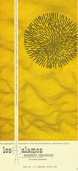
Artwork: Number IX by Oli Sihvonen. Advertisement: LASL in Missiles & Rockets, 1 Feb., 1960

Artwork: Number IX by Oli Sihvonen. Advertisement: LASL in Missiles & Rockets, 1 Feb., 1960

The most compelling imagery is in industrial trade magazine advertising. Aviation Week and Missiles and Rockets of the 1950s and 60s, were both published out of the U.S. during the peak of the Cold War.
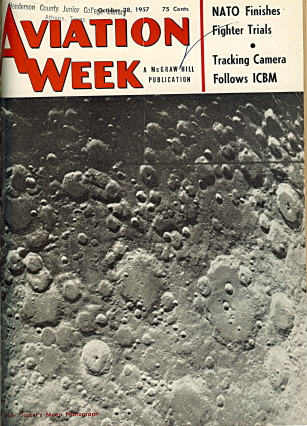
Aviation Week, October 1957

Aviation Week, October 1957

Aviation Week has published since the 1940s and is still a world leader in covering military and civilian aerospace technology developments. Missiles and Rockets was a short-lived competitor (1956 – 65), whose pages made up for in style what they lacked in tenure.
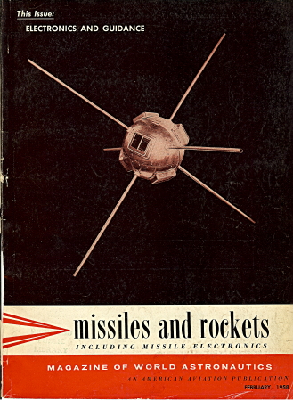
Missiles and Rockets, February 1958

Missiles and Rockets, February 1958

Within the realm of monthly and weekly periodicals, trade publications aimed at working professionals within industry are less examined than their internationally-known general interest counterparts such as Science and Scientific American. Together they offer a body of advertising literature that forms a time capsule of the emerging dynamic between design and technology during the late 1950s and very early 1960s, the peak of technological eruption during the Cold War in the U.S. During those years mid-century Modern design asserted itself within the trade-based advertising literature as a powerful visual language with a killer application.

Recruitment advertisements for the Los Alamos Scientific Laboratory in Los Alamos, New Mexico, illustrate a special case of the relationship between Modernism and industry. This is a set of five images appropriated from regional fine painters into service for the recruitment campaign at Los Alamos.
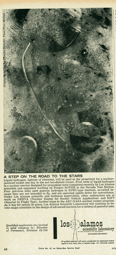
Artwork: Space by Charles Stewart. Advertisement: LASL in Missiles and Rockets, 26 Nov., 1962

Artwork: Space by Charles Stewart. Advertisement: LASL in Missiles and Rockets, 26 Nov., 1962

The dominant activity of the Laboratory was then, as now, nuclear weapons development. A place seared into public memory by its role as the site of the research and testing of the first atomic bomb, the Laboratory has, since the end of the civil nuclear rocket programs, been mostly a weapons research laboratory. However in the 1950s and 60s there was initiative and federal funding to adapt the atomic legacy to civil purposes. Toward that end Project Rover, sited at the Laboratory, was devoted to the development of a strictly civil-applicable nuclear rocket. The project yielded the NERVA (Nuclear Engine for Rocket Vehicle Application) rocket — mothballed before it was ever tested after political support for it dried up — and the development of small nuclear batteries used in lunar exploration. In those, Laboratory’s program roster included civil space activity as a very large second area of research and development. The dominance of space-related visual motifs in these artworks indicates the widespread prevalence of the civil space program as a leading face of a technological directive that served both martial and peaceful objectives.

Between the two World Wars, a fine arts tradition was established and flourished in nearby Taos, New Mexico, founded by both American and European expatriate artists. Members of this group were thousands of miles from the other early modernist painters, yet their work was in dialogue with the dominant themes of modernism. In New Mexico the movement took shape in the emphasis on a spare, sun-dominated landscape expressed in the works of the Taos artists.

Painter Emil Bisttram started making paintings titled Space Images as early as 1954.1 In his work, the interplanetary and interstellar landscape of space that the enormous New Mexico sky brought into close juxtaposition with the high desert is recast as a suitable subject for depiction in an abstract expressionist mode. Bisttram’s Ascending, has been subtitled by the Laboratory: “scientific objectivity characterizes the examination of natural forces in the experimental laboratories at Los Alamos.”2 In the painting, Bisttram combines an abstraction of space with a strong suggestion of the mechanical engineering processes that will get us there:

Artwork: Ascending by Emil Bisttram, 1958. Advertisement: LASL in Missiles and Rockets, 6 June, 1960

Artwork: Ascending by Emil Bisttram, 1958. Advertisement: LASL in Missiles and Rockets, 6 June, 1960

The form that dominates the center right of the painting, and the lines that attach all the forms to one another, are suggestive of engineering diagrams. Or even internal rocket structure, or just the process of forming connection between one idea and the next. One possible extrapolation, that the abstracted systems/bodies at the top, bottom, and left center of the image represent planets and orbits, is left to the viewer’s imagination.

The geographic relationship between the LASL research station and the landscape that inspired the Taos artists led to a neighborly connection between the two that adds considerable depth to the relationship between the images and their “subject matter.” Incredibly, a catalog prepared for an exhibition of the works, titled Art and the Atom, explains that the works were not commissioned for the advertisements. Instead advertisements were created by Laboratory personnel director Robert Meier based on pre-existing artworks. In other words, the “profound dialogic relationship with environment”3 that inspired the artists was an independent parallel to the functionally dialogic relationship with the environment held by the LASL nuclear test facility. These parallel lines of development are expressed poetically in Art and the Atom:

“The artist is aware of space, mass, motion and energy. He is cognizant of our world in conjunction with outer space and is abreast of the development in the world of science. He searches intuitively rather than theoretically. The scientist is equally involved with the same observations. He explores the potentials; he is the discoverer: the man of research. Both artist and scientist are involved with the mysteries of the Universe.”
—Leone Kahl, Director, Stables Art Gallery, Taos, ca. 19634
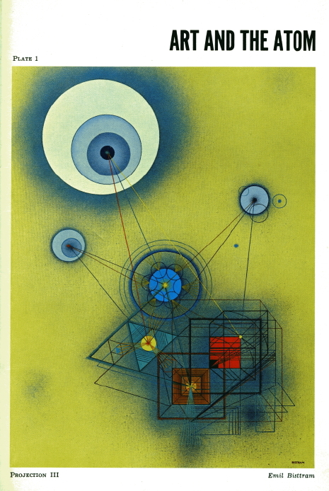
Exhibition catalog, pub. The Stables Art Gallery of Taos. n.d., circa 1963.

Exhibition catalog, pub. The Stables Art Gallery of Taos. n.d., circa 1963.

In the foreword to Art and the Atom, Reginald Fisher, then director of the El Paso Museum of Art, writes that “the semantics of this exhibition revolve around such terms as: space, energy, motion, dynamics, thrust, propulsion, acceleration, curiosity, probe, experiment, empirical, technology, mystery, experience.” He notes that the paintings were selected from pre-existing artworks “on the basis of the capacity of the particular piece to portray symbolically the essence of the research field under consideration [for recruitment].” The remaining historical evidence of this transaction between industry and artist is mute on the question of how the artists felt having their works utilized in this manner, or whether any chose to opt out.

Below is a straightforward meditation by Bisttram on the shapes and spaces that emerge when a painter contemplates a starscape. The inky midnight blue shades here echo the tones used by Van Gogh in his Starry Night, but here space is foregrounded through the omission of a ground plane. The figure–ground shift in this image has captured what the Earth-centric regulatory approach to space neglects to account for: that in space there is no “ground,” only the whole new spatial logic of the solar system environment. Titled Moon Magic by the artist, its catalog description carries the added thought, “Mysteries of the universe provide the dynamics for projects.”
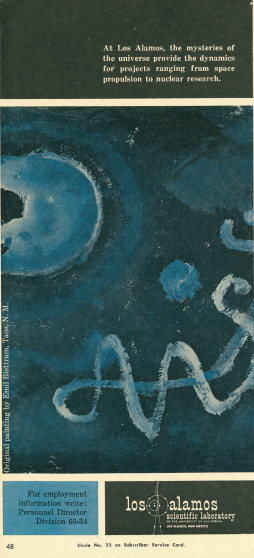
Artwork: Moon Magic by Emil Bisttram, 1958. Advertisement: LASL in Missiles and Rockets, 25 April, 1960

Artwork: Moon Magic by Emil Bisttram, 1958. Advertisement: LASL in Missiles and Rockets, 25 April, 1960

Taos artist Oli Sihvonen extends the visual language connecting atomics research and space themes to the regional landscape. In the top image (far above), a background field that could be sand, desert, or stylized space billows behind a round shape that suggests the sun, or of course, the atom, or perhaps is meant to suggest both at the same time. The work is titled Number IX, and in the catalog bears the subtitle “Diverse scientific interests ranging from basic research to space problems.” The organic shape of the rippled background suggests the desert, a natural environment. The image takes a step toward minimalism in its reduction of the field to its two dominant shapes, the golden rectangular ground and the spherical black figure of the “sun.”

The work below by Sihvonen is titled Blue Spot, subtitled “Experimentation in nuclear motion and energy:”

Artwork: Blue Spot by Oli Sihvonen. Advertisement: LASL in Missiles and Rockets, 5 October 1959

Artwork: Blue Spot by Oli Sihvonen. Advertisement: LASL in Missiles and Rockets, 5 October 1959

The blue spot disrupts the conventionally romantic stylization of planetary or solar bodies by contracting the sphere to its minimal form. Sihvonen here seems to references the early 20th century Russian constructivists, with the prolonged vertical angular shape aimed at the planetary circle. It brings to mind El Lissitzsky’s constructivist graphic composition Beat Back the Whites with the Red Wedge which pioneered the use of juxtaposed triangle and circle as a graphic strategy to represent political conflict. I find it ironic that the graphic legacy of Communist action should be re-articulated and put into service — whether with or without the artists’ sanction — in the service of American Cold War-era weapons and civil space technological programming.

The investigation that yielded the discovery of these artworks and their history is part of a larger project: In Spring 2010 Blast Books will publish my monograph Another Science Fiction: Advertising the Space Race 1957–62, which gathers and interprets over 175 advertising images from Aviation Week and Missiles and Rockets. It clusters the advertisements into five subjects, including those that recruit for satellites, for human space exploration, for propulsion systems engineering, and for projects that recast space as a new landscape. Lastly, Mid-Century Modern Space rounds out the book with a longer discussion of industry’s use of modern design in advertising. This essay was adapted from this chapter.

The book itself is but one product of the cultural enterprise co-developed by my spouse Rick and myself: The Prelinger Library (http://www.prelingerlibrary.org), a private research library that is open to the public in San Francisco. We are an experimental, image-appropriation friendly library with both analog and digital holdings, including over 30,000 titles and ephemeral artefacts in the areas of media, technology, and landscape and social history. Thanks to BERG for visiting us this past summer! All are invited.


  1. Gerald Peters Gallery, Modernist Themes in New Mexico: Works by Early Modernist Painters. Introduction by Barbara G. Bell.
  2. Art and the Atom: An Exhibition of Contemporary Art Used in Scientific Advertisements. Gallery catalog, Stables Art Gallery, Taos. Robert Meier, Assistant Personnel Director in Charge of Recruitment, Los Alamos Scientific Laboratory, curator. N.d., circa 1963.
  3. Art and the Atom, first verso page of Foreword.
  4. Art and the Atom, first verso page of “Catalogue” section.

1 in 3 schools are what? A story of what statistics can tell us

In the UK, schools are inspected every few years to make sure they’re educating kids well and run effectively.

Ofsted, the agency that visits the schools and writes the inspection reports, yesterday released their 2008/09 Annual Report. It’s a 160 page beast of stats, strengths and weaknesses, everything schools and the government need to focus their congratulations and new efforts. There’s a short commentary at the beginning which is great, but on the whole it has quite a lot of technical language.

The Daily Mail covered the report with a shocking headline, How 1 in 3 schools fail to provide adequate teaching. Gosh.

We decided to have a basic poke at the numbers ourselves, since we’ve just started working on Ashdown and have them all handy. (Ashdown is our name for a suite of beautiful and useful products we’re making for parents and teachers around UK schools data.)

So let’s have a look.

It’s pupils that matter to parents, so let’s look at 9- and 14-year-olds.

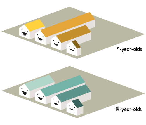
There are some 160,000 9-year-olds at schools in England that have been inspected in the last year (between September 2008 and August 2009). And about 161,000 14-year-olds, if you care about secondary schools. Let’s see how they break down…

9+14-year-olds at recently inspected schools in England

Pupils at schools recently graded by Ofsted in England

Happy schools are better schools.

A shade off two-thirds of all 9-year-olds and all 14-year-olds go to schools that are good or outstanding. But how about that Daily Mail headline? What does “not adequate” mean?

To find out about that I should say something about how Ofsted gives grades to schools. This is the terminology bit.

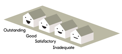
Oftsed grades

Ofsted do a few types of inspection, one of which is called a “Section 5 Inspection.” At the top of a report (here’s an example, taken totally at random) there’s a line called “Overall effectiveness of the school.” Right by it is a grade… 1 and 2 are outstanding and good respectively. There are also grades 3 and 4.

Grade 3 is “satisfactory.” You can read how Ofsted inspectors evaluate schools. It’s a bit dry, but in a nutshell a grade of ‘satisfactory’ means this: there’s nothing wrong with student performance, school leadership, value for money, or possibilities for improvement. Ofsted promise to inspect the school again within 3 years, and will make an interim visit just about half the time.

“Inadequate,” grade 4, means something is wrong with either how the kids are being educated, or the ability of the teachers to lead and improve the school. It’s pretty harsh.

1 in 3 schools are what?

Looking at our numbers, one in three pupils go to schools that are satisfactory or inadequate. Hang on, the headline said “fail to provide adequate teaching.” But only one in twenty pupils go to “inadequate” schools. Nineteen out of twenty go to schools that are satisfactory or better.

My confusion, I guess, arises because the headline uses a word which is very close to Ofcom’s own terminology – “inadequate” (grade 4) and “adequate” (in the headline, unused by Ofsted) – and so becomes ambiguous. That’s a shame. Is satisfactory adequate or not? I have no idea. How much do we care? The ambiguity obscures these discussions, but it’s great that journalism is provoking them. It’s huge, the difference in the numbers, between “satisfactory” being a grade we celebrate or one we don’t tolerate.

It’s also worth thinking about the purpose of these kind of statistics. What are stats for?

Let’s revisit Ofsted inspections. If you look again at a report (here’s another random example) and scroll riiight to the bottom, you’ll get a letter from the inspectors themselves written to the pupils of the school. In it the inspectors outline the strengths and weaknesses of the school, and what the school (and the pupils) need to do to improve. And that’s the whole point. It reinforces what’s good, and points out where effort is needed.

The Annual Report does a similar job. It’s a summary view to help focus the congratulations and efforts of parents, teachers and government bodies. Is it great or a concern that 19 out of 20 pupils go to schools that are satisfactory or better? Should we say only 19 out of 20?

In short: is “satisfactory” good enough? These numbers don’t tell us. That’s a matter for public debate.

A new kind of journalism

Holding that the job of statistics is to help target effort, we can go a little further.

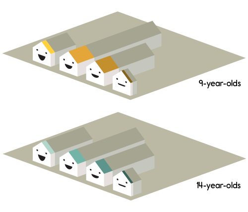
We made another chart, for pupils at the “most deprived” schools, and how those schools are doing. Ofsted define the “most deprived” schools as the 20% of schools with the highest proportion of free school meals, so we did the same. (That means we’re looking at inspected schools in England that offer free school meals to 26% of their pupils or more.)

9+14-year-olds-02a

Pupils at “most deprived” schools recently graded by Ofsted in England

A couple of things to note here… the first is that we’re dealing with 37,000 9-year-olds and 23,000 14-year-olds. That’s a lot of kids. The second is that the general shape of the graph has changed. There are, proportionately, more inadequate schools.

And that’s an interesting story: if you’re a pupil aged 9 or 14, anywhere in England, we’ve seen you have about 1 in 20 chance of being at inadequate school. But if you go to one of the most deprived schools, that’s more like 1 in 13.

Now that sucks. Should we really allow there to be more inadequate schools in the most deprived areas? Shouldn’t those schools, in fact, be so well funded that they’re better than schools in general? Well, that priorities decision is a matter for our democratic system, and these are the kind of numbers journalism can provide to inform that debate.

Reports and reporting

What Ofsted’s Annual Report shows is that most pupils – a very large majority – go to schools that are satisfactory, good, or outstanding. But that pupils who go to the most deprived schools aren’t quite as lucky. I still don’t know what the difference is really like, on the ground, between a “satisfactory” and a “good” school, but I’ll reveal my personal politics: I’m glad I now have an opinion where the government should be targeting my tax money, and, from the inspection evaluation notes, I think that the report shows that generally schools are doing a great job.

There are a hundred stories like this in the data. It’ll take a bunch of hard graft and some clever maths to find the really surprising stories (that’s part of what we’re up to). But it’s all there. Actually it’s mostly all there in Ofsted Annual Report too, but percentages are hard to read and so another big part of Ashdown’s job is to add friendly meaning and understanding. That is, to point out which of these hundreds of numbers are important, from the perspective of pupils, parents and teachers.

Thanks Tom for a whole load of number crunching very early in the project, and thanks Matt Brown for whipping up these graphs!

Now back to your regularly scheduled programming…

Humanising data: introducing “Chernoff Schools” for Ashdown

“Hello Little Fella” is a group I started on Flickr a few years ago, spotting faces.

For a little while I had been taking pictures of objects, furniture, buildings and other things in my environment where I recognised, however abstract, a face.

I tagged them with what I thought the appropriate greeting – “hello little fella!”  – and soon it caught on with a few friends too.

Currently there are over 500 pictures from 129 people in there.

This is not an original thought – there are many other groups such as the far-more-successful “Faces In Places” – which has over 14000 pictures and almost 4000 members.

Why is it so popular?

Why do we love recognising faces everywhere?

In part, it’s due to a phenomenon called “Pareidolia”

“[a] psychological phenomenon involving a vague and random stimulus (often an image or sound) being perceived as significant. Common examples include seeing images of animals or faces in clouds, the man in the moon, and hearing hidden messages on records played in reverse.”

Researchers, using techniques such as magnetoencephalography (!) have discovered that a part of our brains – the Fusiform Face Area – makes sure anything that resembles a face hits us before anything else…

Here comes the science bit – from Early (M170) activation of face-specific cortex by face-like objects. by Hadjikhani, Kveraga, Naik, and Ahlfors:

“The tendency to perceive faces in random patterns exhibiting configural properties of faces is an example of pareidolia. Perception of ‘real’ faces has been associated with a cortical response signal arising at approximately 170 ms after stimulus onset, but what happens when nonface objects are perceived as faces? Using magnetoencephalography, we found that objects incidentally perceived as faces evoked an early (165 ms) activation in the ventral fusiform cortex, at a time and location similar to that evoked by faces, whereas common objects did not evoke such activation. An earlier peak at 130 ms was also seen for images of real faces only. Our findings suggest that face perception evoked by face-like objects is a relatively early process, and not a late reinterpretation cognitive phenomenon.”

So, all-in-all humans are very adept at seeing other human faces then – even if they are described in abstract, or not even human.

How might we harness this ability to help humanise the complex streams of data we encounter every day?

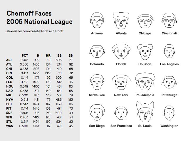
One visualisation technique that attempts to do just that is the “Chernoff Face”

Hermann Chernoff first published this technique in 1972 (the year I was born).

Matt’s Webb’s mentioned these before in his talk, ‘Scope’, and I think I first became aware of the technique when I was at Sapient around ten years ago. Poking into it at that time I found the investigations of Steve Champeon from 1995 or so into using a Java applet to create Chernoff faces.

There’s interesting criticism of the technique, but I’ve been waiting for the right project to try it on for about a decade now – and it looks like Ashdown just might be the one.

Ashdown is our codename for a suite of products and services around UK schools data. We’re trying to make them as beautiful and useful as possible for parents, teachers and anyone else who’s interested. There’s more on Ashdown here.

Over the last couple of weeks, the service design of the ‘alpha’ has started to take shape – and we’ve been joined by Matthew Irvine Brown who is art-directing and designing it.

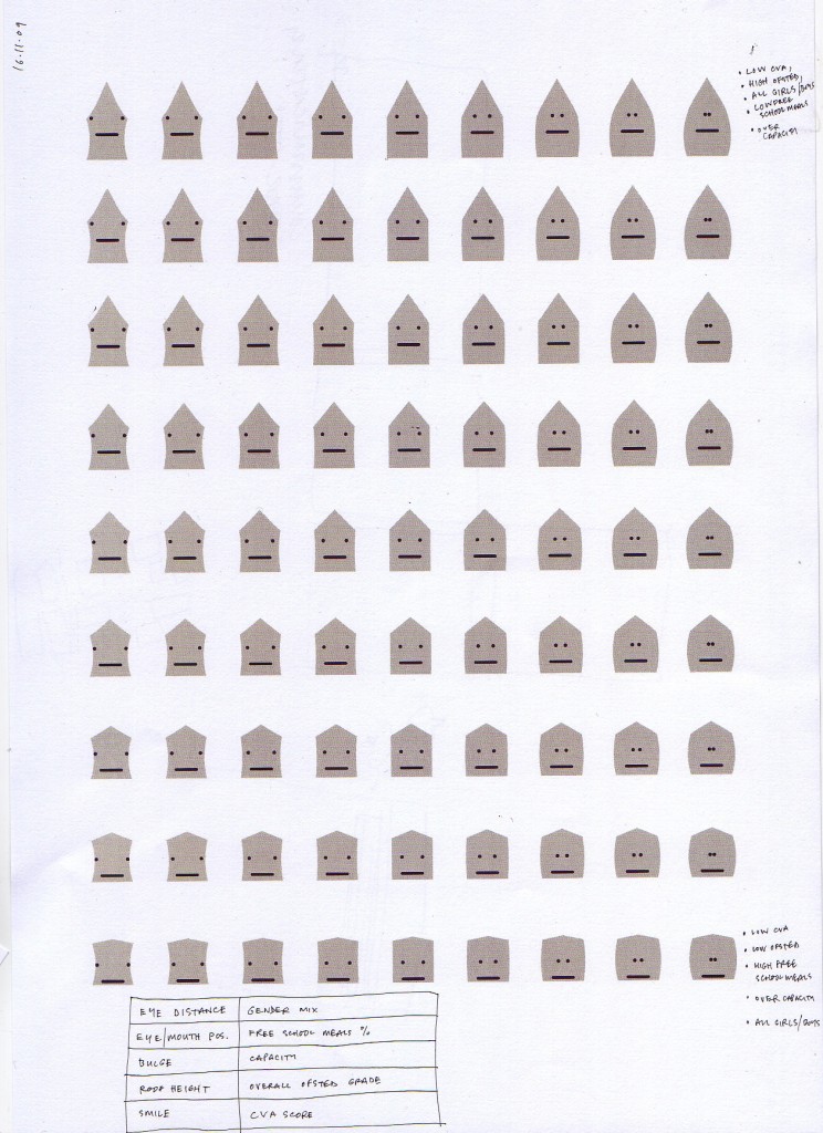
In one of our brainstorms, where we were discussing ways to visualise a school’s performance – Webb blurted “Chernoff Schools!!!” – and we all looked at each other with a grin.

Chernoff Schools!!! Awesome.

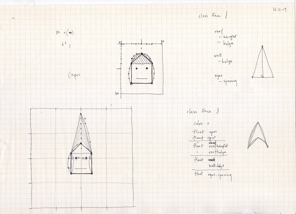
Matt Brown immediately started producing some really lovely sketches based on the rough concept…

drawing_2009-11-16 0.jpeg

And imagining how an array of schools with different performance attributes might look like…

drawing_2009-11-16 1.jpeg

Whether they could appear in isometric 3D on maps or other contexts…

drawing_2009-11-20

And how they might be practically used in some kind of comparison table…

chernoff-schools-nearby_500w

Since then Tom and Matt Brown have been playing with the data set and some elementary processing code – to give the us the first interactive, data-driven sketches of Chernoff Schools.

It’s still early days – but I think that the Chernoff Schools are an important step in Ashdown finding its character and positioning – in the same way as the city-colours and ‘sparklogos’ we came up with early on in Dopplr’s life were.

It’s as much a logo, a mascot and an endearing, ownable emblem as it is a useful visualisation.

I can’t wait to see how the team develops it over the coming months.

Week 232

Let me get the business plate-spinning out of the way. Yesterday we completed the year-end accounts, which I first mentioned here in week 218. On the face of it, 2008/09 wasn’t much better than 2007/08 — revenue was up, but margins were down. But look closer: July to December 2008 was flat. Even stevens. January through June 2009 made up for it, and at the same time the company reconfigured for growth (Tom and Matt J both started; Shownar launched and with it came our focus on media design), the beginning of the Great Leap Forward. You can see a shift from high-burn short consultancy by principals to multiple, simultaneous longer projects with teams, and our wage bill shoots up too. The decreased margins have paid for increased available attention, which has been parlayed into the building of internal expertise, cash-flow, and room to experiment and invest. We’ll need that.

Also recently and this week: Accounts for Ashdown set up and first VAT return submitted (it’s a separate company for funding purposes), and I’m enjoying Xero which is just as quirky as MYOB but more modern; two office manager interviews, and very hopeful about one of those; some consultancy with the BBC on the Shownar transition on Thursday; couple of contracts to chase (Kendrick will start Monday); talking with the architects about options and clarifications with builders.

Matt Jones is out the office for the rest of the week, at the RCA for the Design Interactions brief, in Stockholm with Bonnier, and speaking at CAT London. Jack Schulze is out of the office all week, in Oslo with AHO for workshops and with Touch, and in Stockholm with Bonnier.

Ashdown will be announced imminently. Matt Brown has been designing for the alpha last week and this, prettiness and thoughtfulness are coming through. Tom is breathing code into some of the designs, and beginning to answer some deep questions about the nature of the data. The data Ashdown deals with is not easily modelled or poured into structured databases. It’s messy and must be interrogated with code that starts broken and gradually gets more sophisticated. We’ve taken to calling this kaizen, the discipline of continuous small improvements. What we’re doing isn’t hard in that we need genius insights, it’s hard in the sense it will take 3 months of baby steps to get there. Kaizen. At the moment everything is broken. Next month it won’t be broken quite so much. Let’s go.

Meanwhile: Georgina Voss has begun her research into UK education, and Benjamin Manktelow is swimming in cybernetics.

I think I should spend some time this week visualising company activity and team capacity.

Monday Links: Visualising memory, books, and the sky at night

Matt mentioned we haven’t had many pictures on the blog recently, so it’s about time I rectified that.

Choose Your Own Adventure

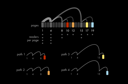
It’s been linked all over the web, but it’s still very much worth pointing out this lovely essay and series of visualisations of Choose Your Own Adventure books. Beyond the obvious prettiness of it, it’s a shrewd piece of work – I particularly enjoyed the insight into the changing editorial trends of the books, obtained simply from the visualisation work. Don’t forget to check out the “animations” and “gallery” at the top of the page – the animated versions of some of the graphics are particularly attractive. A really vivid example of the way visualisation work can be both useful and informative as well as beautiful.

Chumby One

Chumby have launched the Chumby One, a new version of their internet-connected device that can play Flash applications. The Chumby was always a hard product to explain – reliant on applications being installed into it, a squishy and unusual form factor, a quite high price tag. I’m really loving the design of the One, though: it’s much more straightforward and makes its intended usage (a kind of bedside/tabletop connected screen) much clearer. The inclusion of an FM radio helps put it into the bedside category, too. Still, there’s something about its new form factor (well illustrated in this Engadget review that is in many ways more endearing – simple because of its readibility – than the original, squishy box.

The most interesting point – for me, anyhow – is the pricecut. At nearly half the price – $119 compared to $199 – of the original Chumby, it becomes a much more attractive proposition, especially if you’re not entirely sure what you’d do with it. Not only cheaper, then, but also improved. It’s interesting to see a product slowly defining its edges over time.

Bear with me, but I think this is beautiful. It’s ICU64, a real-time debugger for Commodore 64 emulators. On the right in the video is the emulator; on the left is ICU64, displaying the memory registers of the virtual C64. To begin with, you can see the registers being filled and decompressed to in real time; then, you can see the ripple as all the registers empty and are refilled. And then, as the game in question loads, you can see registers being read directly corresponding to sprite animation. What from a distance appears to be green and yellow dots can be zoomed right into – the individual values of each register being made clear. It’s a long video, but the first minute or two makes the part I liked clear: a useful (and surprisingly beautiful) visualisation of computer memory. It helps that the computer in question has a memory small enough that it can reasonably be displayed on a modern screen.

Zeiss Star Projector

Over at BLDGBLOG, Geoff Manaugh ruminates about putting a planetarium projector onto the fourth plinth in Trafalgar Square:

A rain-proof planetarium machine could be installed in public, anchored to the plinth indefinitely. Lurking over the square with its strange insectile geometries, the high-tech projector would rotate, dip, light up, and turn its bowed head to shine the lights of stars onto overcast skies above. Tourists in Covent Garden see Orion’s Belt on the all-enveloping stratus clouds—even a family out in Surrey spies a veil of illuminated nebulae in the sky.

The Milky Way rolls over Downing Street. Videos explaining starbirth color the air above Pall Mall and St. Martin in the Fields goes quiet as ringed orbits of planets are diagrammed in space half a mile above its steeple.

The Zeiss Star Projector Manaugh illustrates his article with is a beautiful object (see above), and it’s the best I can do to illustrate this link; the idea has a few implementation details, you might say, but there’s an undeniable poetry in it, and that idea feels like a very beautiful picture to end on.

Matt Jones speaking at CAT event, November 19th, London

I’ll be giving a short talk about the work of our studio – focussing on what we call “Immaterials” – at the CAT London event next Thursday, 19th November.

Friends-Of-BERG Adam Greenfield, Kevin Slavin and Iain Tait will be prognosticating also, so it promises to be a fine day of futurity and fun.

Hope to see some of you there.

Jack Schulze at Ad-Age IDEA conference, November 12th, New York City

Just a quick note to say that Jack is in NYC today speaking at the IDEA conference.

It’s an amazing line-up, where he’ll be presenting BERG’s work alongside Paola Antonelli of MOMA, Perry Chen of Kickstarter, David Chang of Momofuku restaurants and… Kid Sister! Hopefully he will remember get her autograph for me.

Recent Posts

Popular Tags