Project Kendrick is in the world! As Matt Webb mentioned before, it’s a new iPhone app for language learning we produced with our friends at Hodder Education, and is the latest addition to a best-selling range of language learning products called the Michel Thomas Method.
Michel Thomas was a celebrity linguist with an amazing life story. Escaping from concentration camps during the Second World War; tortured by the Gestapo; teacher of celebrities such as Doris Day, Woody Allen and Barbara Streisand — it even says his “last known identity” was that of Michel Thomas. Awesome. What a brief to work with. I’ll come back to him in a sec. Here’s a little clip of the finished app in action:
The mighty Nick Ludlam and I brewed it up together, with direction, input and advice from the rest of the BERG crew. And I’d like to tell you a little about the behind-the-scenes stuff — the craft of making and thinking — that went into it.
Kick-off
Nick and I began the main building work late last year. As you can imagine, we had a brilliant brief to work with. Schulze, Webb and Jones presented us with a huge swathe of thinking. The big-picture strategic vision; the sites, situations and contexts these apps could find themselves in (“can we make this as useful for 30 seconds on the bus as it would be for 30 minutes of concentrated listening at home?”); even little napkin sketches of UI details. All gourmet brainfood. Now all we had to do was get it into the world.
The Learning Room: beautiful, ambient, immersive
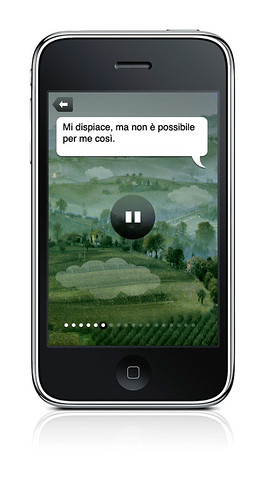
One of the first things that struck us (and probably you, if you’ve ever tried one of the CD box sets) was Michel Thomas’ voice. It’s utterly captivating, and can feel quite hypnotic at times. Have a listen again, without the visuals:
Immediately, we all agreed that whatever user interface we came up with would have to complement — even celebrate — this listening and learning experience without getting in the way. The idea of a ‘Learning Room’ quickly emerged — somewhere ambient, immersive, and hypnotic, where you could concentrate for substantial lengths of time without getting bored or distracted. And of course it would have to be a pleasure to use. Matt Jones came up with a cracker of a challenge by asking us to “Make The Best Pause Button In The World.” Brilliant.
Here, I was doing some drawing while listening to Michel Thomas’ voice for the very first time. Looking back, this one pretty much laid the foundations for the next few months’ work.
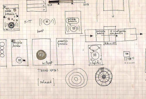
Look at the notes. KITT from Knight Rider immediately came to mind. A talking play/pause button. Products as People, I guess. And it’s interesting that those little geometric doodles started to happen straight away as well. I imagine there’s a really primal link between hearing sound and seeing patterns, and this was probably something I hoped we would touch on later.
Immediately after the first drawing, I put together a little animated sketch of how the Best Pause Button In The World might work.
The main goal here was for me to do just enough to describe the idea, so that Nick could take it and iterate it in code. He’d then show me what he’d built; I’d do drawings or further animations on top of it, and so on and so on. It’s a fantastic way of working. Before long, you start finishing each others’ sentences. Both of us were able to forget about distinguishing between design and code, and just get on with thinking through making together. It’s brilliant when that happens.
Then we tried this. A kind of pastoral landscape with a floating, talking pause button. And speech bubbles. Too much.
And then an idea about using generated bokeh effects and imperceptible zoom effect that never reaches a climax. Too strange.
Here, we were exploring how to use animation and interactivity in a small portion of the screen (to save precious processing power), and make it seem to be operating in a bigger space than it actually was.

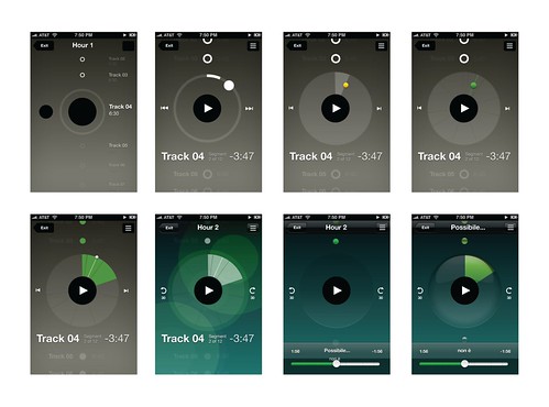
Originally, we wanted to use a pond-like rippling effect (that one below on the left), but it turns out drawing transparent, overlapping filled circles, as well as streaming audio and animating the pause button, took too much juice. The little blue flower at bottom right was the first step toward the final design.
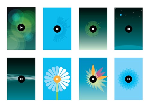
Here we developed the little blue flower, adding texture and depth to give it a bit of tactility.
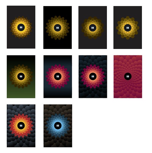
And here’s how you draw a procedural petal.
The pause state was really important to get right too. Here you can see us getting a bit too Bang & Olufsen before dialling it back to something more approachable, shiny and Apple-y.
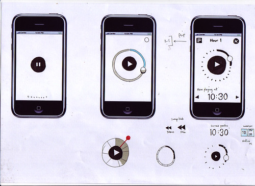
And of course this is where we ended up:

Materials and tuning
Every so often we’d catch ourselves talking solemnly and straight-faced about some detail involved in building the Learning Room. Then we’d take a step back. “Dude. It’s a talking flower. How the hell did we end up here?” Looking back, there’s no real process or rationale I could outline. It’s a product of many things — our personalities, references to things we like; doodling; tinkering; sketching; prototyping and so on. But, overall, it was born from the material itself.
How much CPU did we have left after streaming audio and making the pause button animate in response to Michel Thomas voice? Not much, it turns out. We spent a lunch hour thinking and drawing, came up with thirty-odd ideas, tried a few of them out, and the flower ended up sticking around, for a few reasons: Nick could draw it procedurally in code; animate it efficiently at a decent frame rate; the symmetrical, primal pattern looked striking; the visuals adapt to different languages; the flower scales down to icon size nicely, and most of all, using it feels completely unique, yet strangely appropriate. Our friends from Hodder were closely involved right the way through, and ultimately, it was their faith in this design-led approach that allowed us to get these ideas into the world and into your hand.
Overall, I’d say the whole UI — from the Learning Room, to the Store, to the Flashcards — went through five or six complete iterations before we settled on something that felt simple and smooth enough for a release. Then, we tuned, tuned and tuned. Matt Jones has talked about Disney’s idea of plussing before, and again I don’t think it’s possible to describe it as a discrete thing. It just seems to happen when you really get a feel for the material (or rather immaterial) you’re working with. You develop a laser-like focus on ‘rightness’, and devote yourself to getting rid of anything that doesn’t make the experience as delightful as possible.
It’s been a brilliant product to work on, and hopefully it’ll help more people discover the strange, hypnotic magic of the Michel Thomas Method. Why not give it a try? – we’d love to know what you think of it.
15 Comments and Trackbacks
1. Francophone said on 20 May 2010...
The language program sounds worthwhile but the World War 2 stories were raked over the coals by the LA Times.
http://offkilter.org/thomas.html
2. Rob said on 21 May 2010...
I’m going to try this app out.
The design is kind of topical I guess:
http://www.bp.com/bodycopyarticle.do?categoryId=1&contentId=7052055
3. Rob said on 21 May 2010...
sorry, not very constructive… love seeing the process involved in all of this. Makes you realise how much effort is behind all this ‘invisible’ design.
4. James King said on 21 May 2010...
Brilliant stuff, Matt & Nick. Congratulations! I wonder whether you picked up some language skills during the prototyping?
5. Moritz said on 27 May 2010...
Thanks for sharing. “Learning through the process” is often so much more important than the final results . The work that you guys do and the insight you share are the best possible proove there is. The outcomes are nevertheless always beautiful and reflect the work and lessons learned. Thanks for inspiring.
6. Ryan said on 4 June 2010...
Another great iPad Iphone app is Language Master. You can learn French, German, Italian and Greek. Check it here- http://www.languagemastersuite.com or http://www.hooraysociety.com
7. Ra-ey Saleh said on 7 June 2010...
Great work.
Any plans on porting this for Windows or Android?
Ra-ey
8. David said on 16 July 2010...
Hi, I agree with everyone, this is a great app, I’m half way through the German course and really enjoying the flexibility of the app, being able to go anywhere with it is great. Nice design too. However, since upgrading to iOS4 when I pause and rewind the circle it freezes. Any chance you will be doing an update to fix this? Thanks
9. James Fenton said on 28 July 2010...
A double whammy: exciting app and a great post.
Really enjoy seeing other people’s design and prototyping process. The level of detail into drawing a procedural petal was a really nice insight.
Looks a fantastic app with a really cool interface…
…and to top it all off the Michel Thomas CDs have been amazing in building up my French speaking confidence in the past, so will definately be downloading this as soon as I can.
Many thanks!
10. Max said on 2 August 2010...
Hi BERG team,
Great stuff and thanks for sharing all the different prototype stages. I remember that flower design from a couple of months back… it’s certainly intriguing!
11. Insane said on 5 September 2010...
Insane subliminal marketing.
British company making a design looking like the BP (Britsh Petroleum) one… sounds a too nice coincidence.
12. magnus said on 20 June 2011...
Great app, but can you connect the remote button on the earphones so it can be used to pause/play.
It is difficult to use the pause button on the screen if you are out walking/running…and sometimes the screen gets locked when you listen to a longer section.
/magnus
13. nigel said on 17 June 2012...
Hi, Im just starting with French and I have to say this is a very rare app, the care that seems to have gone into it is very high and it looks like one of those situations when people make some thing even behond what that can do, like luck has worked in hand with hard with and genus.
Very well done… briliant absolutely briliant, Im very sure michel thomas is picking up love from this where ever he is for sure we know this.
Ok reason for my post is this..
We need more Langauges guys, french spanish, german and Italian is fantasic but lets remember there is not the BIG 1… where is Chinese Mandarin?
Every one that is any one that is trying to learn a langauge at the moment, every one puts Mandarin at no1 right?
Personally id like to see the following courses.
MANDARIN
RUSSIAN
ARABIC
JAPANESE
I will be buying french, spanish, german here and checking back to this blog if there is any update about other languages especially Mandarin.
Trackback: irvinebrown » Michel Thomas iPhone app 15 August 2010
[…] can read more about our working process behind the scenes over on the BERG blog. ← […]
Trackback: A tale of two apps - nick.recoil.org 26 October 2012
[…] are more details of the design process in the “Behind the scenes” post that Matt Brown wrote up for the BERG Blog, and a comprehensive Flickr image set of the […]