This website is now archived. To find out what BERG did next, go to www.bergcloud.com.

Blog posts from October 2006

My printer, my social letterbox

One of the trends Jack and I discuss a lot is the internet sensibility hitting the world of plastic products. What happens when stuff is conceived of not as tools, but as participants in our own creative, social, connected lives?

I was talking about this with Nat the other week and spinning up concrete examples. One was what this new wave of product would mean to a fairly traditional technology device, like the printer. So here’s my first off-the-top-of-my-head product idea:

If my desktop printer understood the lessons of social software and Web 2.0, it wouldn’t be attached just to my computer or local network. It’d be accessible by my closest family and friends, too, regardless of where they lived. These people are my primary network, the folks for whom I’d put my neck on the line, and of course I’d let them use my paper and toner, just as I’d happily leave them with my house keys.

But what would this remote printing be used for?

My family would print me photos–currently the 3 of us have a shared folder just for pictures, because it’s easy to use and totally private, but an image landing in a folder doesn’t mirror its social importance to me.

My mum, instead of scanning newspaper clippings and emailing them to me (happily, her scanner has a single button that does that whole job), she would print them straight into my house.

My close friends would send me sketches, or print out long articles that I really must read. Yes, we can do this by email–but everyone in the world can send me articles by email. I have a much closer relationship with these people, so why doesn’t my computer support that?

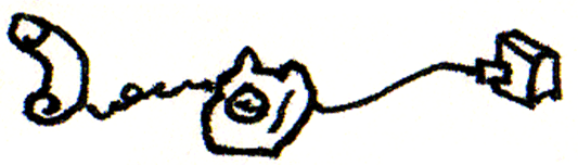
It’s the desktop printer meets social software meets the fax machine, but in everyday life rather than the office. The printer is no longer a printer, it’s my social letterbox.

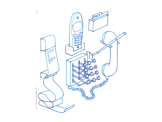
Jack drew what it would look like:

Social letterbox (distressed)

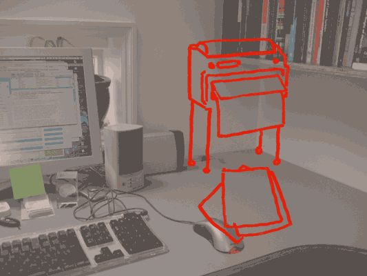
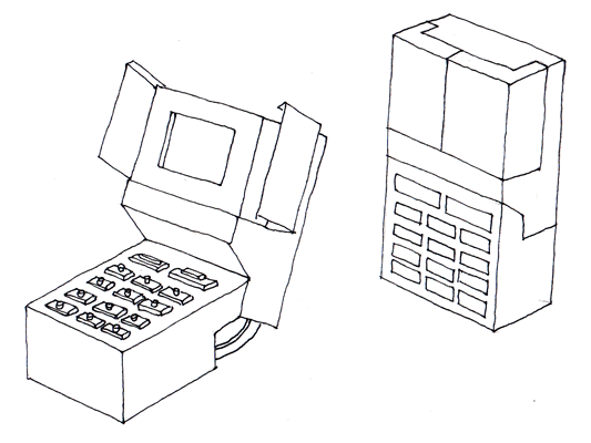
The social letterbox printer sits on the wall so that when it’s finished printing, the paper falls to the desk with a satisfying thump. It prints slowly, because it’s often going to be working when I’m not there and there’s no hurry. The paper is probably cheap, perhaps thermal paper.

This is because the new social interactions around the printer now influence its form.

And now we have this letterbox, what else would we see? Perhaps magazines, subscribed to like podcasts, sent as PDFs, that my computer picks up and prints overnight, ready for me to read in the morning–just like iTunes downloading shows for me to listen to on my iPod. I’d love a zine that collated the best of my friend’s essays in their blogs. We’ve got the technology, so why not? We might send sketches – napkin doodles – or hand-written notes more often, knowing they could end up pinned to a wall. For some people, the social letterbox might be the only way they like to receive messages and mails from their family.

All of this points to a very different product from the present-day desktop printer. It could be done today–printer manufactures could bundle social letterbox software with their devices, just as digital camera manufacturers bundle photo management applications. But I think that’d be missing the point: the social interactions change the physical device itself.

As well as having a fast laser printer on the floor, I’d have a smaller, cheaper, slower social letterbox on my desk. I’d buy two printers! And we’ve doubled the size of the printer market, at a stroke.

Drawing phones

Hello.

I think I’m mostly going to post drawings from my sketchbooks, and talk around those for a while. Since a lot of my thinking starts like this. My sketchbooks are also places where I put ideas that would be too difficult to make, so they just get drawn instead.

I think phones mostly used to look like this:

Old phone drawing

Now they don’t. During our work for Nokia and my time at the RCA, I developed groups of ideas around phones and how their functionality influences their form. The ideas follow a continuing enthusiasm for celebration of function, something that continues to influence the work Matt and I do.

Drawing of phone 01

The first is a sketch of a phone dock that distributes all the things I use in the phone into discrete physical instances locally. Pretty self descriptive really, a receipt printer pushes out text messages as they arrive. To make a call, stamp out the number, or add a name card from the Rolodex, then pull down on the indicator lever, the end blinks while it rings and snaps back when the phone returns to idle or someone answers.

Mechanical phone

This phone explores the keypad unlock function. As it opens from its locked down position, the screen opens like a flower and all the buttons turn over like little Porsche* headlamps. Locked down, it is completely flush and faceless, no risk of pocket dialling, but fragile, mechanical and slim when open.

*(is it Porsche or am I revising history?)

Extra hand set

Hands free sets feel quite unsatisfying. Wouldn’t it be better if your phone came with an extra hand? This phone comes with a small robot arm (plugged into your data port), to hold your tea, or mangle paper clips while you are listening to your voice mail. Definitely needs to be more exploration of robot arms in the future.

From pagerank to pagefeel?

Back in June, at reboot8, I presented a series of web browser enhancement ideas based on an investigation of the human senses. (The slides and my notes are online: Making Senses.)

The concept of taste led me to imagine what it would be like to take a hyperlink on a webpage, and pop it in your mouth (taste starts on slide 7). Just like our tongue picks up a 4 or 5 flavours, but sometimes we really enjoy a salty or bitter taste and sometimes we don’t, what are the 4 or 5 tastes of a webpage that we like depending on our mood and nutritional requirements of the day?

Web page taste

In my sketch, tasting a link involves hovering over it and having a flavour summary pop up. This includes a thumbnail of the page at the end of the hyperlink, it’s extracted terms (corresponding to the smell), and a bar chart of the 4 page tastes (flavour is a combination of all of these). The 4 I chose, with only a little thought, were:

  • Is it an outward-linking page, like a contents page, or an inwardly focused page like an essay?
  • Is it frequently updated?
  • Is the text more in the 3rd person, like a corporate or academic page, or more about the 1st person–subjective, like a blog or journal?
  • Do many people link to this page, ie what is its pagerank?

They’re okay, as tastes, I think, but really could be better.

Fast forward a few months…

At eurofoo06, Ben Gimpert presented on the “Theomatics of Food” (he has a culinary background). He spoke about mouthfeel, that sensory experience of taste, materiality, stickiness… it’s a grand word.

Where I really pricked my ears up was when Ben joined taste to mouthfeel. What is the feel, he asked, of the main tastes? He speculated:

  • “Sour” mouthfeel: pucker-y
  • “Salty” mouthfeel: chewy
  • “Bitter” mouthfeel: coating-y
  • “Sweet” mouthfeel: crunchy

(I don’t recall whether he mentioned umami/pungent or spicy in this section too.)

Now this I like. Given those 4 tastes, and their corresponding feelings, are what we need to make a first-pass judgement on whether we need the buckets of chemicals available in any given food… could I use these real tastes to make the equivalent 4 for webpages?

What does my browser-mouth taste when I click a link? What are the basic flavours of HTML? What is the pagefeel?

So I think I’ll revise my original 4 web tastes. They’ll still take a lot of datamining to calculate, but that’s fine. Perhaps crunchy pages are like popcorn, ones people stay on for not much time, but when they click away it tends to be on another, almost identical page. Coating-y pages are ones that linger… could these be social sites, where you get embroiled in the community, sticky sites?

Chewy sites are long and worthwhile: academic papers, pages that are knowledge hubs, using keywords from a lot of separate parts of the web. And I’m not sure what pucker-y/sour is. Sour makes me think of lemons, which makes me think of citric acid at the centre of the metabolic cycle, which tastes nasty but is at the middle of all life. Perhaps the equivalent for the web is hyperlinks. Pages with a lot of hyperlinks on them are the concentrated stuff of life on the web, and so they taste very, very sour.

Okay, enough of that silliness.

I still think it’s worth taking huge quantities of every metric we can gather about the web and web browsing behaviour – page linger time, click-away time, search terms, text reading age, word tense, link network position, everything – and datamining it as much as we can. Maybe out of all of that we’ll find some stable metrics for describing pages, possibly even those pagefeels, and those will be great additions to search engines and web browsers.

Alternative taste suggestions welcome!

Visiting a model railway exhibition

Last weekend saw Jack and I take a trip to the Western Modern Railway Society‘s West Of London Model Railway Exhibition in South Ruislip. It’s been 18 years or more since I’ve been to a model railway exhibition. I wanted to see what it was like now.

Railway controls

First observation: Nothing has changed. The technology is the same as it was–the trains are controlled with a voltage knob wired to the track, and the points are controlled by switches directly connected. I guess I was expecting some involvement of computers, or some automation… but maybe that’s not the point. I did see two chaps operating trains on the same layout, communicating only through on-layout signals, just as regular train operators would. It’s apparently very absorbing, operating the controls.

I don’t know whether this was true when I last went to an exhibition, but the technology was surprisingly unreliable. Trains often needed assistance to get over a rough patch in the track, especially at slow speeds, and people were often doing small amounts of maintenance. The scenery, on the other hand, sometimes looked neglected (on some layouts).

…but maybe that’s to do with the two types of layout we saw. Some layouts were all about having a place to run your model trains. The scenery was incidental, and there a number of layouts had a large sidings to store all the locomotives, carriages and freight.

Railway sidings

The second type of layout was all about the model. The adverts in the background would be in character, the trees and landscape were well decorated, and the whole layout would be accompanied by a narrative of what sort of industry was assumed to be nearby, the purpose of the particular junction, the time period, and so on.

Railway rockies

This model of the Canadian Rockies was particularly impressive, as were the tricks the maker used to create good-looking trees and ground. The whole layout was created in 10 weeks, but the maker generally made only one layout every 3 years. I don’t know how typical that is.

I was surprised not to see any futuristic trains. There was a small layout of Croydon Tramlink and a single layout which included diesel and electric era trains, but otherwise locomotives dominated. But where was the TGV, or a maglev? Perhaps this is simply because layouts with more points are more exciting, and futuristic, high speed trains don’t work like that.

One last point: The show was half layouts and half stands, where the stands combined tool shows, magazine sellers, and individuals making and selling trees or constructed kit locomotives. It was good to see the combination of larger and smaller sellers.

Railway exhibition

In summary, it was fascinating to go an exhibition by hobbyist model-makers, especially ones who have a small industry supporting them, taking mass produced objects (houses and trains) and completing their look for their own layout. But it was disappointing to see the lack of change over the past two decades–though I don’t know how true this is, given my hazy memories and this very small sample size.

What I got most out of the visit was an idea of the various motivations of people in the community. Some like the agency of controlling the train, some like modelling, some are selling, some have train collections they’d like to see on the tracks (but no space for a layout). Without all these people gathered around the single hobby, it wouldn’t do well. But it does make me wonder what other hobbies people would gather around, and what a model railway hobby would look like using modern technology and an internet sensibility. I have a few ideas.

Lines and buttons

History of the Button is a blog, well, “Tracing the history of interaction design through the history of the button, from flashlights to websites and beyond.” [via Chris Heathcote’s links]

It’s great to look at early designs, when buttons were still brand new, and folks were still coming to terms with an action that could trigger an arbitrary amount of work. We think of a button press as the work itself, launching the missile or punching the letter, whatever, not simply completing the circuit that joins the actual cause (mechanical or electrical energy) to the effect. The button has become a by-word for easy. The 1960s sci-fi books I’ve read, when they want to express the maximum amount of crazy future thinking, talk about relays: devices that convert a button press to an action in a circuit that can do anything at all. Yet we barely think about relays now, or how incredible buttons are. When did buttons stop being modern?

(And, really, were they ever modern? A button on a shirt joins two pieces of cloth with effort far less than sewing, and it can be undone, and the physical object provides a focus for interaction too, the affordance that these things can be joined. Perhaps the name and job of “button” gets continually recycled, with only the physical implementation changing over the years.)

On a similar note:

I really enjoy collections of single design elements. Timo Arnall has written The dashed line in use, making the (dashed line) connection between his use of this element in indicating RFID interactions and how it occurs in instruction manuals, paths, graphs, as ellipsis… He also talks about how the line indicates a seam, a visible join between two things that still maintains the two things as separate.

The dashed line for RFID is doubly appropriate first because the field is invisible and, second, because the indicated interaction hasn’t happened yet–it exists only in potential.

Is there a dashed line to be drawn between Timo’s work and the history of the button?

Recent Posts

Popular Tags