This website is now archived. To find out what BERG did next, go to www.bergcloud.com.

Blog posts tagged as 'product'

Friday Links: rolling, mapping, driving, products.

This week’s been buzzing and busy – everybody’s back in the studio after a week of holidays, festivals, and trips to India. That means the studio mailing list has been buzzing again, and so it’s time to take the cream of the links and get them onto the blog.

Matt J found Gearbox, a company making “smart toys” to pair with your smartphone. Their first toy is a ball that rolls the direction you tilt your phone in. They explain:

We are then leveraging the connectivity and computing power of the phone to create a fully interactive experience for the user. Our first app for the ball is Sumo. I throw my ball on a table, you throws yours on the table and then we can try and sumo each others ball off the table. However, while our physical balls are moving there is also an onscreen component with online stats, profiles, damage, powerups and other aspects of gameplay that aren’t possible with a regular remote control toy. For instance, when the balls collide they can sustain “damage” and roll slower or I could get a powerup to reverse your controls for a few seconds.

Aside from the games we produce we are also opening up the APIs for the ball so any app developer with no hardware knowledge can build their own games or applications and bring them to the real world.

Smashing; it’s the open-API that really sets these toys apart from something more constrained, like Sony’s Rolly. And this is only their first product!

hustler-poster.jpg

Joey Roth’s ‘Charlatan / Martyr / Huslter‘ poster has been doing the rounds, recently, and with good reason – it’s lovely. But equally lovely is the attention to detail on the webpage selling it. Matt W sent it to our internal list, commenting on how the product page “communicates desire” – the closeups of the type and paper stock, the shot (reproduced above) of copies being stacked. It reinforces that it’s not just an EPS on a piece of paper; it’s a real product, and Roth’s website makes you want it.

fata-morgana.jpg

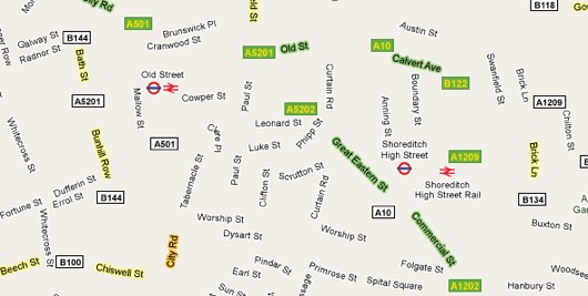
Damon Zucconi’s Fata Morgana is, essentially, Google Maps without the Maps: roads, land, and water are all stripped away leaving just place names and street names. Even zoomed in, as above, the effect persists. Maps made just of names and streets aren’t a new thing – but there’s a strange juxtaposition in seeing them in slippy, interactive javascript form.

Here’s a short demonstration of an official version of The Settlers of Catan for Microsoft’s Surface. It’s a little underwhelming – very literal in some of its metaphors. That said, I loved the interaction between physical tokens and the board – in particular, the way the “visor” has an X-ray effect on cards underneath it. By making it a very realistic – and carefully masked – X-ray effect, the metaphor actually holds up better. It’s very much an understanding of the Surface as a Magic Table rather than a big window.

racer.jpg

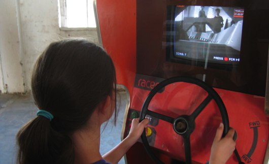
And finally – this is Racer. An old arcade cabinet; a remote control car on a small circuit; a remote camera, and timing circuitry. Put them together and you’ve got this charming and effective game. A tiny, remote-control version of C’était un Rendez-vous, if you like. This video of it in action is great – alas, I couldn’t embed it, so I hope the link suffices.

Say hello to Schooloscope

Schooloscope is a new project from BERG, and I want to show it to you.

What if a school could speak to you, and tell you how it’s doing? “I have happy kids,” it might say. “Their exams results are great.”

Schools in England are inspected by a body called Ofsted. Their reports are detailed and fair — Ofsted is not run by the government of the day, but directly by Parliament. And kids in schools are tracked by the government department DCSF. They publish everything from exam results to statistical measurements of improvement over the school careers of the pupils.

Cooooomplicated.

What Schooloscope does is tell you how your school’s doing at a glance.

There are pictures of smiling schools. Or unhappy ones, if the kids there aren’t happy.

Each school summarises the statistics in straightforward, natural English. There are well over 20,000 state schools in England that we do this for. We got a computer to do the work. A journalism robot.

You can click through and read the actual stats afterwards, if you want.

Why?

A little of my personal politics. Education is important. And every school is a community of teachers, kids, parents, governors and government. The most important thing in a community is to take part on an equal footing and with positive feeling. Parents have to feel engaged with the education of their children.

As great as the government data is, it can be arcane. It looks like homework. It’s full of jargon… and worse, words that look like English but that are also jargon.

Schooloscope attempts to bring simplicity, familiarity, and meaning to government education data, for every parent in England.

A tall order!

This is a work in progress. There are lots of obvious missing features. Like: finding schools should be easier! There are bugs. There’s a whole bunch we want to do with the site, some serious and some silly. And full disclosure here: over the next 6 months we’re working on developing and commercialising this. Schooloscope is a BERG project funded by 4iP, the Channel 4 innovation fund. Is it possible to make money by being happily hopeful about very serious things and visualising information with smiling faces? I reckon so.

Anyway. The way we learn more is by taking Schooloscope public, seeing what happens, and making stuff.

The team! Tom Armitage and Matt Brown have worked super hard and made a beautiful thing which is only at the start of its journey. They, Matt Jones and Kari Stewart are taking it into the future. Also Giles Turnbull, Georgina Voss, and Ben Griffiths have their fingerprints all over this. Tom Loosemore and Dan Heaf at 4iP, thanks! And everyone else who has given feedback along the way.

Right, that’s launch out of the way! Let’s get on with the job of making better schools and a better Schooloscope.

Say hello to Schooloscope now.

Designing keyboards for the future

spectrum-keyboard.png

The future of 1982, that is.

Rick Dickinson, of Dickinson Associates, has uploaded a whole portfolio of images to Flickr – both illustrations and photographs – from his work designing the hardware for the ZX Spectrum. You can view the whole set here.

It’s a lovely slice of British technology history – designing what the home computing revolution would look like. But it’s also full of some lovely illustration, showing just how product design overlaps both engineering and more aesthetic disciplines.

And I really liked this drawing of the keyboard.

(Image: “Sketch for how the keyboard plate might be fixed” by Rick Dickinson on Flickr)

Monday Links: Visualising memory, books, and the sky at night

Matt mentioned we haven’t had many pictures on the blog recently, so it’s about time I rectified that.

Choose Your Own Adventure

It’s been linked all over the web, but it’s still very much worth pointing out this lovely essay and series of visualisations of Choose Your Own Adventure books. Beyond the obvious prettiness of it, it’s a shrewd piece of work – I particularly enjoyed the insight into the changing editorial trends of the books, obtained simply from the visualisation work. Don’t forget to check out the “animations” and “gallery” at the top of the page – the animated versions of some of the graphics are particularly attractive. A really vivid example of the way visualisation work can be both useful and informative as well as beautiful.

Chumby One

Chumby have launched the Chumby One, a new version of their internet-connected device that can play Flash applications. The Chumby was always a hard product to explain – reliant on applications being installed into it, a squishy and unusual form factor, a quite high price tag. I’m really loving the design of the One, though: it’s much more straightforward and makes its intended usage (a kind of bedside/tabletop connected screen) much clearer. The inclusion of an FM radio helps put it into the bedside category, too. Still, there’s something about its new form factor (well illustrated in this Engadget review that is in many ways more endearing – simple because of its readibility – than the original, squishy box.

The most interesting point – for me, anyhow – is the pricecut. At nearly half the price – $119 compared to $199 – of the original Chumby, it becomes a much more attractive proposition, especially if you’re not entirely sure what you’d do with it. Not only cheaper, then, but also improved. It’s interesting to see a product slowly defining its edges over time.

Bear with me, but I think this is beautiful. It’s ICU64, a real-time debugger for Commodore 64 emulators. On the right in the video is the emulator; on the left is ICU64, displaying the memory registers of the virtual C64. To begin with, you can see the registers being filled and decompressed to in real time; then, you can see the ripple as all the registers empty and are refilled. And then, as the game in question loads, you can see registers being read directly corresponding to sprite animation. What from a distance appears to be green and yellow dots can be zoomed right into – the individual values of each register being made clear. It’s a long video, but the first minute or two makes the part I liked clear: a useful (and surprisingly beautiful) visualisation of computer memory. It helps that the computer in question has a memory small enough that it can reasonably be displayed on a modern screen.

Zeiss Star Projector

Over at BLDGBLOG, Geoff Manaugh ruminates about putting a planetarium projector onto the fourth plinth in Trafalgar Square:

A rain-proof planetarium machine could be installed in public, anchored to the plinth indefinitely. Lurking over the square with its strange insectile geometries, the high-tech projector would rotate, dip, light up, and turn its bowed head to shine the lights of stars onto overcast skies above. Tourists in Covent Garden see Orion’s Belt on the all-enveloping stratus clouds—even a family out in Surrey spies a veil of illuminated nebulae in the sky.

The Milky Way rolls over Downing Street. Videos explaining starbirth color the air above Pall Mall and St. Martin in the Fields goes quiet as ringed orbits of planets are diagrammed in space half a mile above its steeple.

The Zeiss Star Projector Manaugh illustrates his article with is a beautiful object (see above), and it’s the best I can do to illustrate this link; the idea has a few implementation details, you might say, but there’s an undeniable poetry in it, and that idea feels like a very beautiful picture to end on.

Be selective with your innovation, and other wisdom from GameLayers

Our friends at GameLayers recently took the hard decision to retire their launch product, PMOG, and dedicate their efforts to a new game, Dictator Wars (on Facebook), where they can spend more time on game design and less on the supporting infrastructure. They have many enthusiastic players already. Good on them!

I’m always impressed with good, hard decisions. If you’ve ever had a sleepless night over a project, you can imagine how tough it must be to, a year or even more later, walk away from it. Projects are tangled thickets of history and emotion. Corner turns are hard, and killing your babies doubly so. GameLayers have displayed good strategy.

Justin’s post on their learnings is insightful and leaves me yet more impressed. He shares three thoughts as to what makes a good product in interactive media. It’s much more widely applicable. I’ve picked a sentence from each:

  • Be selective with your innovation. Keep as much of your product predictable, so people can find their way to the gem of awesome that you have pioneered.
  • Serious Business. … if you want to actually hire people to work with you, pay kickass artists to make content for your game, and afford to buy new shoes, figure out what people would want to pay for if they were using your software.
  • First Five Minutes. If someone can’t figure out what to do in the first five minutes of your interactive experience, you are hosed.

All so true! There’s more. Go read it.

Recent Posts

Popular Tags