This website is now archived. To find out what BERG did next, go to www.bergcloud.com.

Blog posts tagged as 'olinda'

The Utility of the Unfinished

This video got me thinking.

It’s footage of a simple Augmented Reality experiment from a programmer at British independent games developers Introversion, imagining what one element (the world map) of their strategy game Defcon might look like if there was an AR component to it.

I’m not as interested in the technical aspect of this experiment as I am the aesthetic.

I was struck by how well-suited the blue-on-blue, information-dense and highly representational display of Defcon is as an aesthetic for augmented reality. It helps to have a clear distinction between the real and the augmented. By making the augmented several degrees lower in fidelity than the real, it enhances the utility of the augmented elements. It creates seams between the real and the unreal, and helps the user process both real-world and AR information faster.

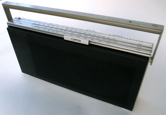
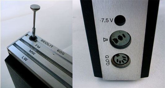
A few other things that struck me as being similar to this:

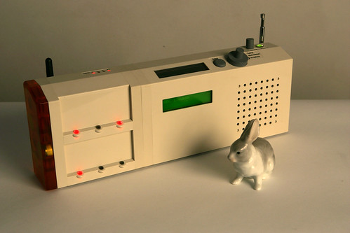
Jack spoke at This Happened in London last year about the Olinda project, and talked a little at the end about the form factor. Specifically: why it doesn’t look “prettier”. And he explains:

Each of the elements are trying to say what they do themselves in their own language.

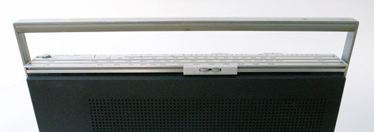
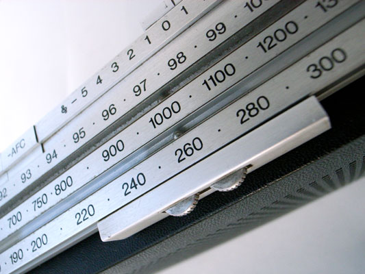
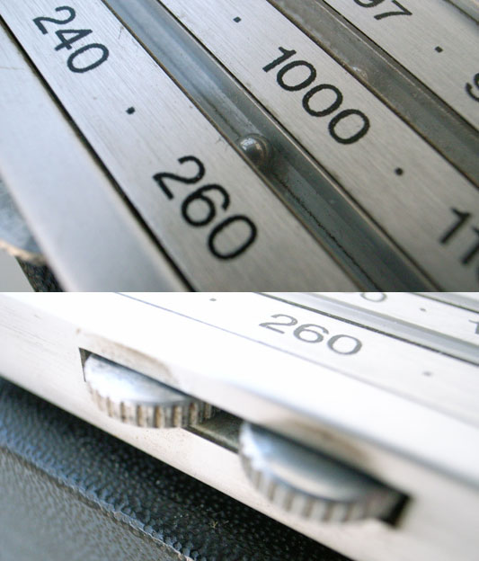
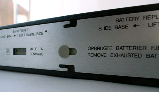
Matt has described this to me as “physical PowerPoint”. You instantly know from looking at this thing that it’s not necessarily finished yet; not quite complete. And rather than letting you down, that incompleteness (in this case, an aesthetic one) opens up a communication. It informs the observer that they can engage in a kind of dialogue with the radio, about what it is and what it does. Its form is not final, and that means that there is still space to explore and examine that form. A more finished project would shut out any such exploration from the user or observer, and simply impose its form on them; the only reactions left are accepting that form, denying it, or ignoring it.

monospaced type

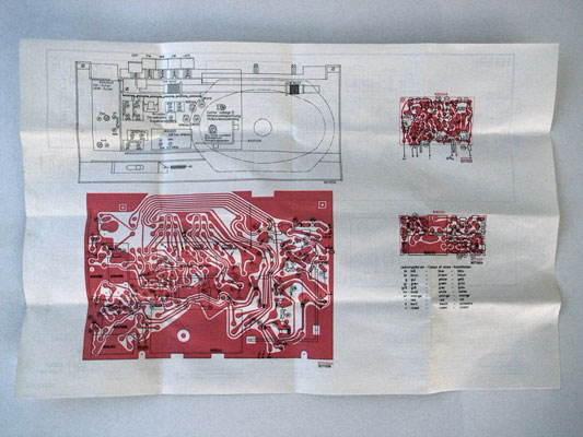
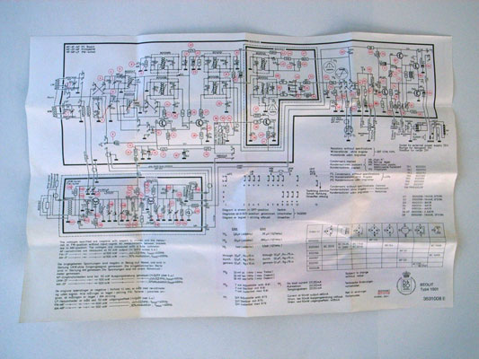
Monospaced type that’s used for writing, not code. Most corporate communication takes on the same form: laser-printed, perhaps even letter-headed, smartly formatted documents, all of which look finished. But it’s so rare that the kind of documents we use in corporate communications are finished. More likely, they’re work in progress – either iterations of a report yet to be completed, reference materials for negotiations yet to be conducted, or as starting points for discussions that likely end on a completely different note. So why present them as concrete, unapproachable objects? By presenting the documents in barely-styled (yet thoughtfully laid out) monospace text, their role as intermediate objects becomes more obvious.

fabbed plastic
(Image from maxbraun, under a Creative Commons licence).

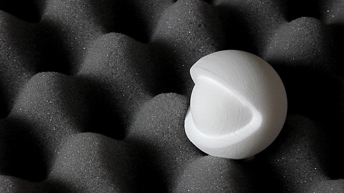
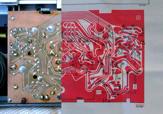
Rapid-prototyping plastic. The not-quite complete has not just look, but also feel, and as rapid-prototyping becomes more and more commonplace – and better understood by a wider audience – that unusual texture of fabbed plastic will quickly become another useful shorthand for “not a sketch, but not complete either”. This is a tactile shorthand that emphasises the boundaries between the world (of complete, final materials) and the work-in-progress.

Wireframe in situ

One technique that S&W has been using recently to illustrate design work is placing sketches or wireframes in situ. Whilst wireframes themselves are incomplete artefacts, designed to be work in progress, they still suffer for being uniformly incomplete. Wireframes themselves can be almost too beautiful, and this means that it becomes all-too-easy to criticise them as only wireframes, rather than as part of a product that exists in the world. Contextualising the sketches into the photograph places the design into the world. This enables the design to be understood within the world, and also (importantly) to highlight the seams between the unfinished design and the finished world around it.

How finished an artefact is is an important indicator of its relationship to the world: not just an indication of where it is in its lifecycle, but also one that explains how it should be understood, and that opens a dialogue between the observer and the artefact. It’s important that there is authenticity in the unfinished state. All the examples above are of things that are in a transition state between non-existant and final; they are not finished items that have then been distressed or made to appear cosmetically unfinished.

This is unlikely to be the last time I’ll write about this stuff on Pulse Laser; it feels like it has legs, and it’s something that I’m noticing more and more examples of. Given that, it only seems appropriate that this post remains

Olinda, first look

Rabbit infront of the radio

I’m pleased to be able to bring you Olinda, the social radio prototype we’ve designed and built for BBC Audio & Music.

Tristan Ferne, who commissioned Olinda and leads the BBC Radio Labs, is currently at the Futuresonic Conference, discussing what happens when you put social networks and the Web inside consumer electronics – in particular, this radio – and is giving the folks there the very first look. But for those of us not in Manchester…

For background, photos and more, check out Olinda.

Beautiful Beolit

A couple of months back I visited Tom and Durrell at Luckybite to discuss some of the Olinda development. During our conversation, Durrell described one of his favourite portable radios, the Bang & Olufsen Beolit 600. I bought one.

Beolit radio

The range was produced between 1971 and 1981 and aside from its elegance and good audio quality, the detailing is very deft.

Radio details

Tuning with magnets

The chassis is constructed from aluminium strips, holding plastic shells front and back. The controls for the radio are spread out along the front and back edges of the top face. On the back edge are buttons for band selection and two sliders for volume and tone. The entire front edge is a horizontal tuning slider.

Tuning slider long
Tuning slider overview

The slider can be grabbed and pushed quickly up and down the length for coarse tuning. To tune precisely the two small kinked wheels are rolled under the thumb to give fine control. The remarkable detail is in how the selected frequency is indicated:

Tuning slider detail

Two very small steel bearings sit in covered grooves in the aluminium chassis, one for each tuning band. The tuning slider conceals a magnet, which drags the bearings along the scale inside their grooves (the aluminium is of course unaffected by the magnetism). The position of the bearings corresponds to markings on the surface of the radio which indicates the frequency the radio is tuned to.

It’s a really nice example of celebrating functionality. There is no functional need for the bearings. The additional cost to develop and manufacture can’t possibly have made financial sense. Why not use an arrow? But tuning is what radios do, and something which articulates this most familiar function so poetically just had to be done.

I love how the furthest bearing twitches along more slowly than the closer one.

Construction

Structurally the radio is a square of four lengths of extruded and cut aluminium, with the front and back plastic shells tucked in. What’s exciting is that taking the radio apart isn’t work: there are no machine screws or self-tappers.

Base fixings
Base fixings 02

The base plate of the radio can slide. Sliding it a little way first unlocks the back shell. Removing the back allows the base to slide more, which releases the more rarely removed front shell. All this is achieved with a clever system of grooves and nooks.

Beolit in bits

Coming off first, the back shell gives access to the battery. The front shell reveals something else.

The repair manual

Inside the front shell, there is a little envelope. Inside the envelope there is a piece of folded paper.

Beolit envelope

Screen printed on the paper are all the instructions for repairing the radio. There is an abstracted circuit diagram and also an image of the actual PCB. The radio contains its own data sheet, physically!

data sheet physical
data sheet abstract

I’ve cut these last two images together to show that the PCB and the print in the diagram are to scale (the screens were probably made from the same drawing).

data sheet and PCB

Olinda connections

One of Olinda‘s jobs is to communicate the potential for hardware APIs. Matt discussed this in detail in his post on widgets.

Olinda is expandable and modular. For this to be effective, the core services of the central unit really have to be accessible from it’s periphery. We don’t mean superficial expansion or extension of lineout (like adding a speaker), but actually change the nature of the object, to grow from it’s core. There is an obvious predecessor in consumer electronics in hi-fi separates, although it is limited in that the turntable cannot affect the services available through the interface, on the amplifier. The extensions for Olinda will be able to make the radio a new object with each addition (In our case main and social do this).

Part of this project is to discuss modularity. (While designing the physical radio itself is a large part of the work, the larger project is about communicating the core ideas.) The connector is effectively a serial connection between the main unit and the extensions (plus a few extras). This could have manifested as a serial cable with two sockets on each unit, much as they appear on old printers and the like. Although traditional connections and cables have historical precedent, they do not sufficiently raise modularity.

We were clear early that the mechanism for connection should be visible, rather than discreet. It should go out of its way to invite extension (Matt discusses these ideas with reference to the Levittown Homes in his talk, The Experience Stack). One should see how it extends and the connection be mechanically explicit. The use of the mechanism, the act of extending should feel really satisfying too. For the reasons described above the serial cable fails.

Connector developments

Each module needs to include a surface which connects to the previous. Software and power aside, the implication should be that the units are infinitely extensible. To begin with we examined the possibility of a mechanical connection, something with toggle clamps or vertical stacking.

Japanese Joinery 01
Japanese Joinery 02

Kiyoshi Seike’s book on Japanese joinery includes some beautiful imagery, above.

wood test

In some early work we experimented with connections in wood. As the process progressed and more influences on the form of the radio emerged, we chose to explore a system of magnets and studs. This delivered the most satisfying feeling and the building brick aesthetic taps nicely into the familiar heritage of Lego.

This idea came out of both Apple’s MagSafe power connector, and a previous project on RFID which touched on using magnets for tactile feedback to make reading RFIDs more like pressing a button

So in the final model, the entire end surfaces of the modules are positive and negative connectors.

Milled 01
Milled 02

These two images show the progression of the studs, looking for a good fit and a good feel. These models also explore how the magnets are to be included.

copper-connector.jpg

There are eight electrical connections between the modules. These are a line of sprung copper domes, held against copper blanks on the opposite face by the force of the magnets.

Most recent test

Above is the most recent and final connectors prototype before machining, and the image following gives an impression of the final form.

CAD connectors

Much of the early work in this process was produced with the help of Jeff Easter, thanks Jeff!

Olinda interface drawings

Last week, Tristan Ferne who leads the R&D team in BBC Audio & Music Interactive gave a talk at Radio at the Edge (written up in Radio Today). As a part of his talk he discussed progress on Olinda.

Most of the design and conceptual work for the radio is finished now. We are dealing with the remaining technicalities of bringing the radio into the world. To aid Tristan’s presentation we drew up some slides outlining how we expect the core functionality to work when the radio manifests.

Social module

Social Module sequence

This animated sequence shows how the social module is expected to work. The radio begins tuned to BBC Radio 2. A light corresponding to Matt’s radio lights up on the social module. When the lit button is pressed, the top screen reveals Matt is listening to Radio 6 Music, which is selected and the radio retunes to that station.

Tuning

Tuning drawing

This detail shows how the list management will work. The radio has a dual rotary dial for tuning between the different DAB stations. The outer dial cycles through the full list of all the stations the radio has successfully scanned for. The inner dial filters the list down and cycles through the top five most listened to stations. We’ll write more on why we’ve made these choices when the radio is finished.

Drawing Olinda

Drawing hybrids and inbreds

We are around half way through the development of Olinda, the digital radio prototype we’re building for the BBC. Most of my efforts over the weeks since Matt’s post have been focused on how the object should behave and physically manifest. 

This post discusses some early drawing processes. We use drawing to surface and test many ideas easily and early. These drawing processes are also used to reach unexpected forms, and to examine why an object should look like it does.

About three weeks ago I met with Matt Ward from Goldsmiths. Ward has developed a drawing process which he works through to explore and interrogate ideas. Here we used it to develop ideas around products. His position for understanding how a product can manifest begins with a framework that includes how objects respond to anticipated contexts and tasks, in situations within a culture of consumption. He sketched this for me, and I’ve included it below. I like that it includes the designer, in a ‘context of production’. 

Ward diagram

Ward’s approach is this. Begin by taking an existing radio, and draw it at the centre of a page. From here, choose four contexts or situations for development, like ‘in the kitchen’ or ‘listening to the football’. Write these labels in the four corners of the page surrounding the original sketch of the radio. Then evolve the form in the centre towards imagined new forms in response to the four situations.

The point here is to get away from the original form as far as possible, and to make many drawings. Below there are radios that are – more and less literally – in the contexts of decorating, the bathroom, kitchens and shop shelves.

Early Olinda Sketches

Sometimes this leads to very strange things.

Hand blobs

Critically, the purpose for such an exercise is not to draw good products but to begin evolving forms outside of an expected mold. As soon as a form emerges which catches, it is redrawn on a separate page, and bred between other sketches to develop new hybrids.

Olinda radio hybrids

One is being selective in this process, but it is surprising how little control there is over what you expect to emerge, forcing issues with the sketches rarely yields anything satisfying. But this is not a storming, random process. It is very methodical, as a process of deconstruction. It is using drawing as thinking, which is its power.

What emerges is the discovery of what it is about that original radio that persists, in spite of the violent evolution. The drawings are really about ways of housing these commonalities, so you start thinking in terms of materials very quickly. The other thing that happens is you see particular twists. For example a kitchen radio should have legs, in order to sweep crumbs out from underneath it.

Making and drawing

In parallel to these processes, we have been in the workshop making objects from which to derive further drawings. This process started by thinking out a critical aspect of the form, in this case the connection between the two separate Olinda modules.

Early connector experiments

Once things start to get made, materials start to influence drawings and further made experiments. As the pieces of wood were cut, the shapes started to yield new directions and the wooden blocks emerged as a combinatorial way of interrogating traditional and less likely forms.

Early form tests

These are then fed back into the drawing and imagined interfaces are penned onto surfaces.

Early interface drawings

Some of the drawings begin to imply unlikely material qualities. The social module here looks like it’s been knitted from wool. The drawing is from a little over a week ago, and is based on a model used to investigate certain materials and assembly.

Olinda wool module

When Olinda is an object, it will be a product of unusual influences. It is unlikely that in this project such radical deviations from expected form will be appropriate. But these processes have made it possible to interrogate the assumptions embedded in the form of products. Objects like Olinda respond to forces from many territories, but the reasoning around that is a separate discussion.

Say hello

A couple of months ago I put the feelers out for interns. Well, we have two starting today. Say hello to:

Alex Chadwick is an electrical engineer. In-between touring the canyons of the US and university in October, he’s coding and building the guts of Olinda, getting us stocked up with microcontrollers, and has me really, really wanting a decent oscilloscope (apparently it’s super useful, but I’ll be happy if it can sing and dance). Many thanks to David Smith for putting us in touch.

Jeff Easter is an interaction designer currently studying Design Interactions at the RCA. He’s been with us for a week before, on user flows and screen design, and for September it’s more of the same, plus photography, carpentry, and iterating, iterating, iterating on form design.

Both super chaps. It’s going to be an excellent month.

BBC Olinda digital radio: Social hardware

If you asked me to pick the two cards Schulze & Webb play with abandon in the consultancy game, they’d be Product and Experience.

Products should be what toy companies call shelf-demonstrable–even sitting in a box in shop, a product can explain itself to the customer (or at least tell its simplest story in a matter of seconds). Organisationally, understanding a website or component of a mobile service as a product means being able to describe it in a single sentence, means understanding the audience, means focusing on a single thing well, means having ‘this is what we are here for’ as a mantra for the team, and it means being able to (formally or informally) have metrics and goals. Here’s it in a nutshell: You know it’s a product when it has an ethos–when the customers and the team know pretty much what the product would do in any given circumstance.

Then we play Experience. The experiential approach is how you and the product live together and interact. The atoms are cognitive (psychology and perception), while the day-to-day is it’s own world: Play, sociality, cultural resonance, and more. Each of these is an area of experience to be individual understood in terms of how it can be used. The third level of experience we deal with is context: How the product is approached (physically and mentally), and how it fits in with other products, people and expectations.

We can go a long way, and make decent recommendations of directions and concrete features, with those two cards.

And now we’re making a radio. As much as we’ve said these approaches apply across media, services and (physical, consumer) product, working with physical products has recently been only in our own research. Hey, until now. Until now!

Olinda is a digital radio prototype for the BBC

For the past month we’ve been working on the feasibility of Olinda, a DAB digital radio prototype for the BBC (for non-UK readers: DAB is the local digital radio standard, getting traction globally). That stage is almost over now – oh and yes, it’s feasible – so now’s a good time to talk.

Olinda puts three ideas into practice:

  • Radios can look better than the regular ‘kitchen radio’ devices. Radios can have novel interfaces that make the whole life-cycle of listening easier. At short runs, wood is more economic as plastic, so we’re using a strong bamboo ply. And forget preset buttons: Olinda monitors your listening habits so switching between two stations is the simplest possible action, with no configuration step.
  • This can be radio for the Facebook generation. Built-in wifi connects to the internet and uses a social ‘now listening’ site the BBC already have built. Now a small number of your friends are represented on the device: A light comes on, your friend is listening; press a button and you tune in to listen to the same programme.
  • If an API works to make websites adaptive, participative with the developer community, and have more appropriate interfaces, a hardware API should work just as well. Modular hardware is achievable, so the friends functionality will be its own component operating through a documented, open, hardware API running over serial.

What Olinda isn’t is a far-future concept piece or a smoke-and-mirrors prototype. There’s no hidden Mac Mini–it’s a standalone, fully operational, social, digital radio.

The intention with Olinda is that it’s maximum 9 months out: It’s built around the same embedded DAB and wifi modules the manufacturers use. And it has to be immediately understandable and appealing for the mass market. Shelf-demonstrable is the way to go.

The BBC should be able to take it to industry partners, and for those partners to see it as free, ready-made R&D for the next product cycle. We have a communications strategy ready around this activity.

So that’s why I’m proud to say that, when complete, the BBC will put the IPR of Olinda under an attribution license–the equivalent of a BSD or Creative Commons Attribution. If a manufacturer or some person wants to make use of the ideas and design of the device, they’re free to do so without even checking with the BBC, so long as they put the BBC attribution and copyright for the IPR that’s been used on the bottom.

More later

The feasibility wraps up in the next week or so, as I budget the build phase. When build starts, we have an intern starting–perhaps two (yes, we got a great response to putting those feelers out). But that deserves its own post.

And there’s a lot to talk about. For start, what Olinda will look like (we have drawings and form experiments). And how the Product and Experience approaches will manifest.

That’s for later. In the meantime, here’s the Frontier Silicon Venice 5 module operating on a breadboard:

Venice 5

The DAB module is wrapped in insulation tape, and you can make out the stereo socket (it’s blurry because it’s standing out of the focal plane) and the antenna. Running from the breadboard is a serial cable to my computer which is assembling and decoding messages for tuning, playing, receiving radio text messages and so on.

Thanks to Tristan Ferne, Amy Taylor and John Ousby and their teams at BBC Audio & Music Interactive for making this happen.

(Incidentally: Olinda, the name of this project, is aspirational, chosen from Italo Calvino’s Invisible Cities (Olinda is transcribed at the bottom of that page). We could do worse that help along the radio industry in the same way Calvino’s city grows.)

Recent Posts

Popular Tags