This website is now archived. To find out what BERG did next, go to www.bergcloud.com.

Blog posts tagged as 'mobilephones'

Product sketch: Clocks for Robots

As a studio we have recently been quite pre-occupied with two themes. One is new systems of time and place in interactive experiences. The second is with the emerging ecology of new artificial eyes – “The Robot Readable World”. We’re interested in the markings and shapes that attract the attention of computer vision, connected eyes that see differently to us.

We recently met an idea which seems to combine both, and thought we’d talk about it today – as a ‘product sketch’ in video to start a conversation hopefully.

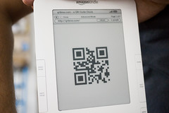
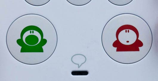
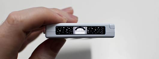
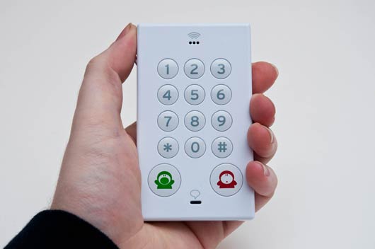
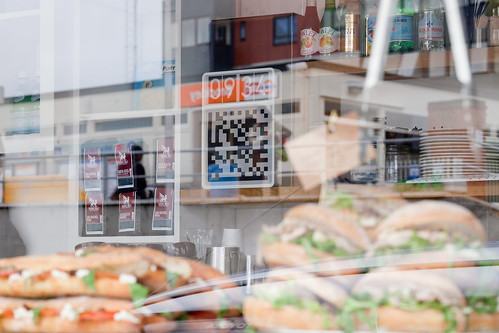
Our “Clock for Robots” is something from this coming robot-readable world. It acts as dynamic signage for computers. It is an object that signal both time and place to artificial eyes.

It is a sign in a public space displaying dynamic code that is both here and now. Connected devices in this space are looking for this code, so the space can broker authentication and communication more efficiently.

BERG-Clocks-20110909-005

The difference between fixed signage and changing LED displays is well understood for humans, but hasn’t yet been expressed for computers as far as we know. You might think about those coded digital keyfobs that come with bank accounts, except this is for places, things and smartphones.

Timo says about this:

One of the things I find most interesting about this is how turning a static marking like a QR code into a dynamic piece of information somehow makes it seem more relevant. Less of a visual imposition on the environment and more part of a system. Better embedded in time and space.

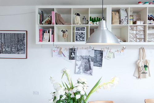
In a way, our clock in the cafe is kind of like holding up today’s newspaper in pictures to prove it’s live. It is a very narrow, useful piece of data, which is relevant only because of context.

If you think about RFID technology, proximity is security, and touch is interaction. With our clocks, the line-of-sight is security and ‘seeing’ is the interaction.

BERG-Clocks-20110909-011

Our mobiles have changed our relationship to time and place. They have radio/GPS/wifi so we always know the time and we are never lost, but it is at wobbly, bubbly, and doesn’t have the same obvious edges we associate with places… it doesn’t happen at human scale.


^ “The bubbles of radio” by Ingeborg Marie Dehs Thomas

Line of sight to our clock now gives us a ‘trusted’ or ‘authenticated’ place. A human-legible sense of place is matched to what the phone ‘sees’. What if digital authentication/trust was achieved through more human scale systems?

Timo again:

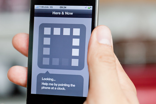
In the film there is an app that looks at the world but doesn’t represent itself as a camera (very different from most barcode readers for instance, that are always about looking through the device’s camera). I’d like to see more exploration of computer vision that wasn’t about looking through a camera, but about our devices interpreting the world and relaying that back to us in simple ways.

BERG-Clocks-20110909-008

We’re interested in this for a few different reasons.

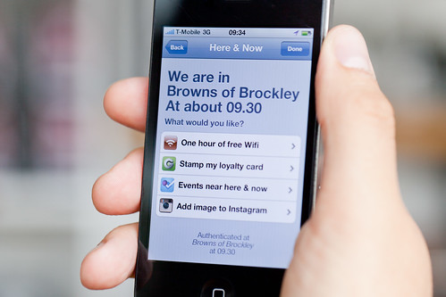
Most obviously perhaps because of what it might open up for quick authentication for local services. Anything that might be helped by my phone declaring ‘I am definitely here and now’ e.g., as we’ve said – wifi access in a busy coffee shop, or authentication of coupons or special offers, or foursquare event check-ins.

BERG-Clocks-20110909-007

What if there were tagging bots searching photos for our clocks…

…a bit like the astrometry bot looking for constellations on Flickr?

But, there are lots directions this thinking could be taken in. We’re thinking about it being something of a building block for something bigger.

Spimes are an idea conceived by Bruce Sterling in his book “Shaping Things” where physical things are directly connected to metadata about their use and construction.

We’re curious as to what might happen if you start to use these dynamic signs for computer vision in connection with those ideas. For instance, what if you could make a tiny clock as a cheap solar powered e-ink sticker that you could buy in packs of ten, each with it’s own unique identity, that ticks away constantly. That’s all it does.

This could help make anything a bit more spime-y – a tiny bookmark of where your phone saw this thing in space and time.

Maybe even just out of the corner of it’s eye…

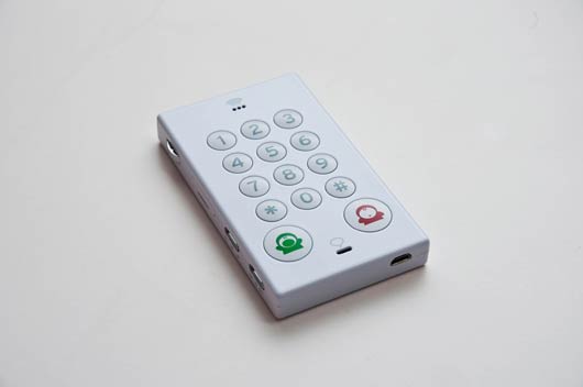
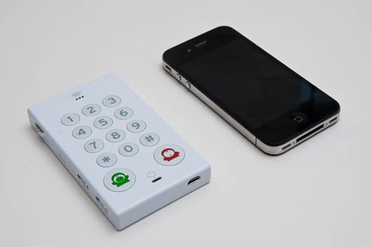
As I said – this is a product sketch – very much a speculation that asks questions rather than a finished, finalised thing.

We wanted to see whether we could make more of a sketch-like model, film it and publish it in a week – and put it on the blog as a stimulus to ourselves and hopefully others.

We’d love to know what thoughts it might spark – please do let us know.


Clocks for Robots has a lot of influences behind it – including but not limited to:

Josh DiMauro’s Paperbits
e.g. http://www.flickr.com/photos/jazzmasterson/3227130466/in/set-72157612986908546
http://metacarpal.net/blog/archives/2006/09/06/data-shadows-phones-labels-thinglinks-cameras-and-stuff/

Mike Kuniavsky:

Warren Ellis on datashadows

Bruce Sterling: Shaping Things

Tom Insam‘s herejustnow.com prototype and Aaron Straup Cope’s http://spacetimeid.appspot.com/, http://www.aaronland.info/weblog/2010/02/04/cheap/#spacetime

We made a quick-and-dirty mockup with a kindle and http://qrtime.com

BERG-Clocks-20110912-016

John’s Phone

johnsphone-1.jpg

I mentioned the John’s Phone on the studio mailing list last week. We ended up getting one to look at in the studio; it arrived this week, and I spent some time exploring it.

The John’s Phone is a simple mobile phone made by Dutch design firm John Doe. The phone came about as an attempt to take the ultra-simplicity of their From The Supermarket to a mobile phone. To quote their blogpost on the subject:

We’ve always wondered why most affordable phone looks so dull and boring. All cell phones are great high-tech product we like to use every day. Why not spend more time in designing. It’s the things we don’t see that are the most essential to creating a great design. A great design is a present. Why not make yourself happy with a present everyday in your pocket.

johnsphone-2.jpg

It’s a really immediate product: the entire front face is devoted to the keypad and physical interface. The top of the phone has an LCD display, positioned much like an old-fashioned pager; the side of the phone, which you can just see in the pictures above, has a rocker switch for volume, a SIM card slot, a switch for the ringer volume, and a power switch.

The phone makes its intention clear: the immediacy of use and that interface is more important to it than any screen or display-based interaction. It’s all about phone calls and phone numbers.

The John’s Phone is almost exactly the same size as an iPhone 4 – but its keypad takes up as much space as the touch screen does on the iPhone. The touchscreen has become a focal point of the design of smartphones, the hardware being designed around that bright rectangle. The John’s Phone is equally designed around its interface (or, at least, the “input” element of that interface) – it just happens to be a physical keypad.

johnsphone-3.jpg

There are delightful, surprising touches. There’s a biro hidden down the side, where you might expect a stylus on an old touchscreen phone. You can use it to write in the addressbook hidden in the back of the phone.

But that paper addressbook sums up some of the problems with a phone this simple. Is that simplicity for the purpose of simplification, or to support an aesthetic of simplicity?

The website for the phone claims that it’s “the world’s simplest cellphone“. That’s true – if you agree with their idea of what a cellphone is.

For instance, if you believe text messaging to be a fundamental feature of a cellphone, then the John’s Phone doesn’t even live up to your expectations of what a mobile phone is. But if all you want your mobile phone to do nothing but send and receive calls – which is true of many phone owners – then it really is a simple, satisfying expression of that goal. Satisfaction with the device comes down to what your expectations – or requirements of it – are when you first pick it up.

That aesthetic of simplicity is at times complicated by the technology the phone runs on. Whilst John Doe promote the paper addressbook as the best way to store your phone numbers, reading the manual reveals that there is a ten-number memory built into the phone.

How do you put numbers into that memory? By typing **1*01234567890# (to put “01234 567890″ into slot “1”).

Doesn’t that, as an interface, feel totally at odds with the aesthetic the physical device is cultivating?

(Of course, “reading the manual” seems like an activity also at odds with a device already so explicit in its physical form; had I not done so, I’d have been perfectly happy not knowing about that feature.)

button-closeup.jpg

At first, the character-design on the “hello” and “goodbye” buttons seems at odds with the restrained, minimal physical exterior.

As you use the phone, though, you’ll get to see a lot more of that character. He’s called Fony, and he appears throughout the phone’s operation. He’ll wave hello and goodbye to you when you turn the phone on and off.

fony-asleep.jpg

When the phone’s asleep, you might see him tucked up in bed.

fony-electrocuted.jpg

When you charge the phone, he gets electrocuted from time to time (which seems curel to a character I’d imagine I was supposed to be sympathetic towards).

I can appreciate the care and attention in the realisation of Fony. He’s charming and never intrusive on the phone’s screen, often explaining what the phone’s currently doing through his appearance (rather than through text, which there’s very little space for). John Doe say (in their explanation of his design) that “Fony makes John’s a friendly phone“. I think he’s part of that friendliness – but not nearly as much as the much more immediate friendliness of the clear, simply designed hardware.

It’s important to factor the price of the product into any discussion of it. The John’s Phone costs €70 – about £50. That puts it in line with fairly cheap pay-as-you-go phones. (And: the John’s Phone is sold unlocked from any carrier, so that’s £50 without any carrier-subsidy).

Price changes the the relationship to a product. At £150, this would be a premium product designed for a wealthy few as a provocative statement – but likely a “second phone”.

At the current price, it’s a much more relevant purchase for a wider audience. If that price were even lower, new – and larger – audiences become available.

johnsphone-4.jpg

It’s only fair, in the end, to criticise the John’s Phone in light of that initial quotation from John Doe, which serves as a kind of design brief:

A great design is a present. Why not make yourself happy with a present everyday in your pocket.

A device that makes you happy; a device that is a delight every time you pick it up. By those criteria, the John’s Phone is clearly a success. Everyone who’s seen ours wants to pick it up and take a look; everyone who picks it up smiles, and plays with it, explores its secrets; everyone wants to answer the question “is it really a phone”?

Yes, it is. And it’s not just an ultra-simple phone; it’s an affordable ultra-simple phone, that you can buy right now. All credit to John Doe for taking their vision of what a mobile phone could be, and making it real, at the right price.

Recent Posts

Popular Tags