This website is now archived. To find out what BERG did next, go to www.bergcloud.com.

Blog posts tagged as 'dimensions'

BBC Dimensions: integrating with BBC News

Back in 2009, we started the work that would become http://howbigreally.com and http://howmanyreally.com with the BBC, releasing those two prototypes over the last two years under the banner of “BBC Dimensions“.

Our intention from the beginning was to design the service as a module that could be integrated into bbc.co.uk at a later date if they proved successful with audiences.

Earlier this year, Alice worked with the engineers at BBC News to do just that, and now the first BBC News stories featuring the “How Big Really” module are starting to appear.

Here are a couple of examples – a story on the vast amount of space given over to car parking in the world, illustrated with the module juxtaposing the total space used by parked cars over the island of Jamaica!

http://howbigreally.com functionality integrated into BBC News

…and a more recent example showing the size of a vast iceberg that has just broken free of a glacier on Greenland.

http://howbigreally.com functionality integrated into BBC News

Of course, as with the original http://howbigreally.com prototype, you can customise the juxtaposition with the post-code of somewhere you’re familiar with – like your home, school or office.

The team worked hard to integrate the prototype’s technology with BBC News’s mapping systems and the the look/feel of the site overall.

Here’s Alice on some of the challenges:

We worked with the BBC Maps team to create a tool that could be used by editors, journalists and developers to create How Big Really style maps. Chris Henden and Takako Tucker from the team supplied me with the BBC Maps Toolkit and did a great job of explaining some of its more nuanced points, particularly when I got into trouble around Mapping Projections.

The tool takes an SVG representation of an area, including a scale element, converts it to a JSON object that is then rendered onto a map using the BBC Maps Toolkit. Immediate feedback allows the map creator to check their SVG is correct, and the JSON representation of the shape can then be used to build the map in future.

It’s really satisfying for us to see something that started as a conceptual prototype back in 2009 find it’s way into a daily media production system of the scale and reach of BBC News.

Thanks to all the team there – also Chris Sizemore, Lisa Sargood and Max Gadney for shepherding the project from whiteboard sketches to become part of the BBC journalist’s digital toolkit.

How Big Really, 1940’s style

Our friend Will Wiles, erstwhile deputy editor of Icon and author of “Care of wooden floors” unearthed this brilliant vintage visualisation: the scale of the Golden Gate Bridge overlaid on central London.

The Golden Gate Bridge in London

It really is HowBigReally.com 70 years earlier!

Perhaps we should have called it “EMPHATIC COMPARISON”

Walk the Marianas Trench!

Hearty congratulations to James Cameron on reaching the bottom of the ocean at the Marianas Trench.

If you’re not a millionaire film director with cutting-edge tech, then you can still experience the extreme distance he travelled with the site we developed with the BBC, HowBigReally.com

The walk from our studio

Enter your postcode and get an idea of how far the bottom of the Marianas Trench is from where you live… or even better, calculate a route to take a walk that’s the same distance as James Cameron travelled in his submersible!

In other Marianas Trench news… A Canadian band that goes by that name has a lead guitarist named Matt Webb…

The design behind How many really

How big really is now just over a year old, released just before I started work at BERG, and I still find myself totally engaged with the simplicity of the concept. It’s a solid, easy to digest punch of information that translates unknown quantities into something instantly recognisable. How many really is the second part of the experiment, and I was tasked with working on the design. This is a little write up of the design process.

We started off by following a workshop Webb & Jones had run with the BBC to kick off the initial concept of examining quantity. Myself, James Darling & Matt Brown spent a week whiteboarding, sketching and iterating, to try and nail down some initial ideas.

The first thought was the variables with which we could use to convey changes in quantity. Time, movement, zoom & scale were all identified as being potentially useful.

We started to construct sentences that could tell a story, and break down into portions to allow new stories to slot in.

Looking at splitting grids into sections to show different variables.

We thought a bit about avatars, and how to use them in visual representations of data, in this case combining them with friends’ names and stories.

Looking at combining avatars with ‘bodies’. Bird suits, vehicles, polaroids.

An early narrative concept, setting up the story early on and sending you through a process of experience. We thought about pushing bits of stories to devices in real time.

After a bit more crunching and sketching, we broke everything down into two routes:

  • Scale – influenced by Powers of 10, used to compare your networks to increasing sizes of numbers,
  • Grouping / snapping – used to take your contacts and run them through a set of statistics, applying them personally to historical events and comparing them against similar events in different times.


What became clear after the sketching was the need to show a breadcrumb trail of information, to give the user a real sense of their scale compared to the numbers we were looking at. Eames’ Powers of 10 video achieves this – a set of steps, with consistent visual comparisons between each step.

Perfect for showing the relevance of one thing in relation to the next, or a larger collective group. But the variation in the stories we’d be showing meant that we didn’t want bespoke graphics for each individual scenario. We tested out a quick mockup in illustrator using relatively sized, solid colour squares.

Despite the lack of rich textures and no visual indicators of your current position in the story, the impact was there. We added Facebook / Twitter avatars for signed in states, and worked on a colour palette that would sit well with BBC branding.

The next problem was dealing with non-signed in states. How many really was always designed to work with social networks, but we wanted it to be just as relevant with no Facebook or Twitter credentials – for classrooms, for example. We took a trip to the V&A to view the Isotype exhibition that was on at the time.


That’s 85 year old iconography and infographic design that looks as relevant today as it did back then. A real sense of quantity through simple pictograms. Completely fantastic. We set about designing a stack of isotype influenced icons to work with the site when users weren’t signed into their social networks.

And the icons in context…

We used a bit of Isotype inspiration for the organisation of the grouping stories – evenly spaced grids of icons or avatars.

The rest of the site was intended to stay consistent with How big really. We used photography in place of bespoke graphics for the story panels, as the graphical output varies for each user.

How many really is an entirely different beast to How big really. Rather than each dimension being a solid, one shot hit, the value is in backing up simple visuals with interesting narratives. We spent almost as much time on the written aspect of stories as we did on the aesthetics and interaction. I hope it gives a little context to numbers and figures we often take for granted. Please do have a browse around!

BBC Dimensions: How Many Really?

Update, February 2013: Howmanyreally.com has now finished its prototype trial, and is no longer live.


About two years ago, we started work with Max Gadney on a series of workshops looking at how digital media could be used for relating stories and facts from both history and current affairs.

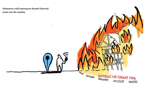
One of the concepts was called ‘Dimensions’ – a set of tools that looked to juxtapose the size of things from history and the news with things you are familiar with – bringing them home to you.

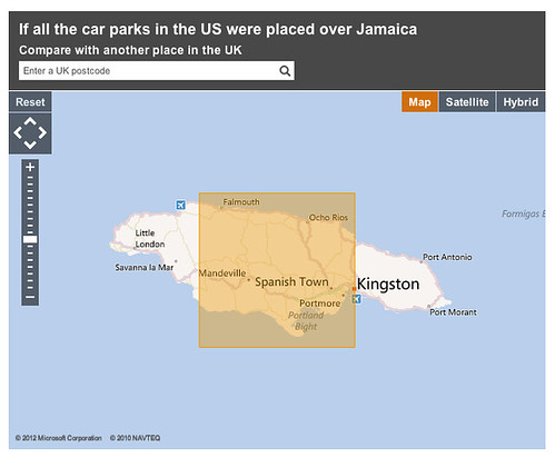
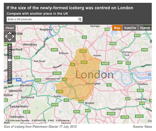
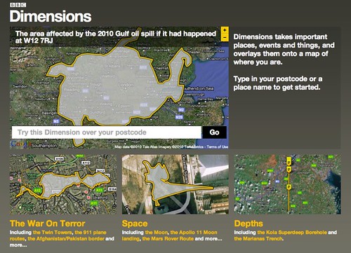
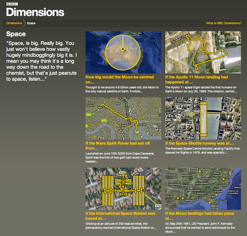
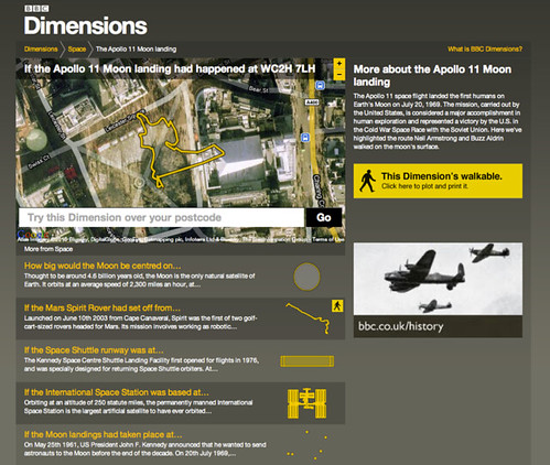
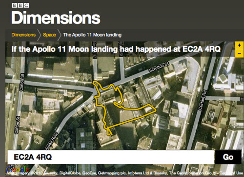
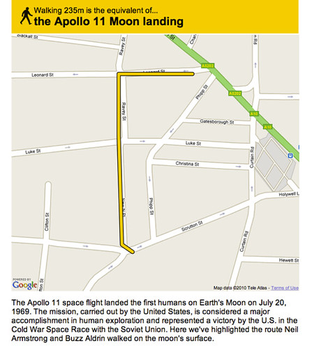
About a year ago, we launched the first public prototype from that thinking, http://howbigreally.com, which overlaid the physical dimensions of news events such as the 2010 Pakistan Floods, or historic events such as the Apollo 11 moonwalks on where you lived or somewhere you were familiar with.

It was a simple idea that proved pretty effective, with over half-a-million visitors in the past year, and a place in the MoMA Talk To Me exhibition.

Today, we’re launching its sibling, howmanyreally.com

BBC Dimensions: How Many Really

You can probably guess what it does from the URL – it compares the numbers of people who experienced an event with a number you can relate to: the size of your social network.

For example, the number of people who worked at Bletchley Park cracking codes and ushering in the computer age…

bletch_home

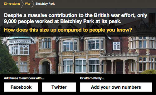
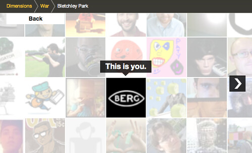
I can sign in with my Twitter account

bletch_1

and I’m placed at the centre…

bletch_2

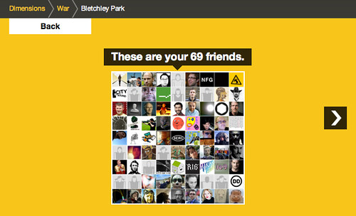
Clicking to zoom out shows me in relation to those I follow on Twitter…

bletch_3

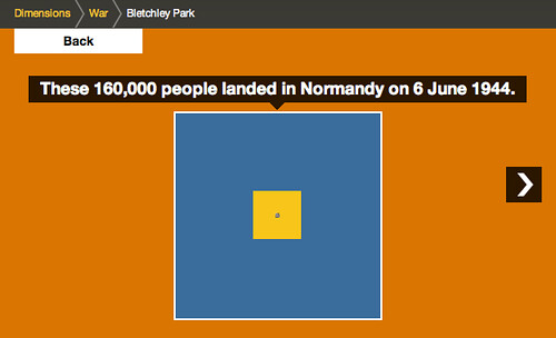
Zooming out again places that group in relation to those working at Bletchley Park in 1945.

bletch_4

Which, in turn, is then compared to the Normandy Landings

bletch_5

…and finally the 1.5m people in the Home Guard

bletch_6

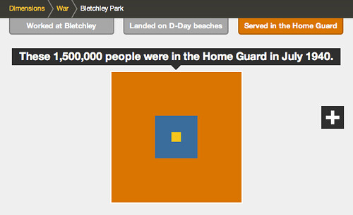
Despite the difference between the size of the final group and your social network, it can still just be made out at the centre of the diagram, helping us imagine the size of the group involved in these efforts during World War 2.

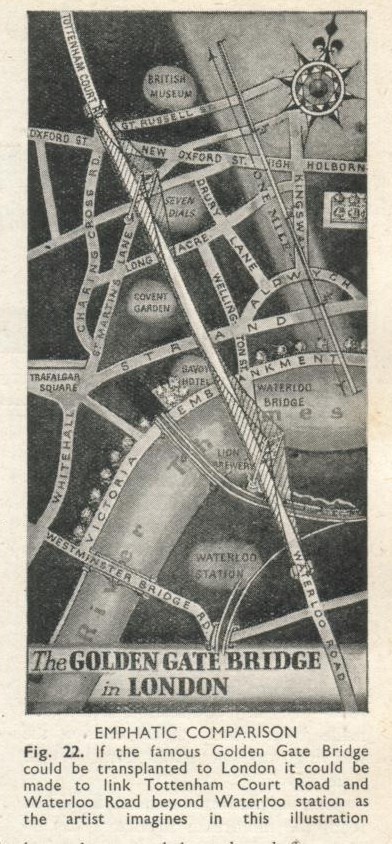
Of course this visualisation owes much to the pioneering work of the Office of Charles & Ray Eames – particularly their “Powers of 10” exploration of relative scale, which is a shared source of inspiration in the studio.

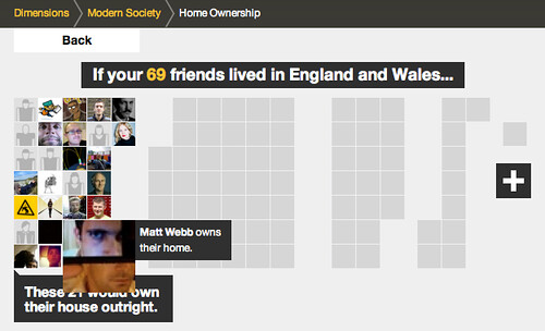
There is another type of comparison featured in the prototype – one which during development we likened to an assembly in a school playground – where your friends are gathered into different groups.

For example, this one looks at home ownership in England and Wales:

homes_home

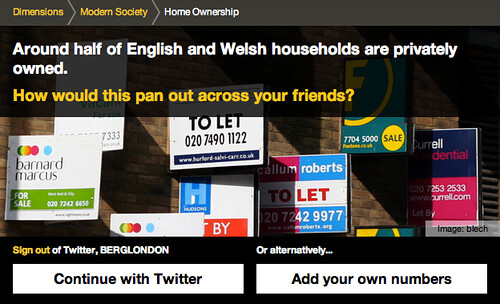
Starting again from your twitter network…

homes_1

This visualisation starts to arrange your social network in groups…

homes_2

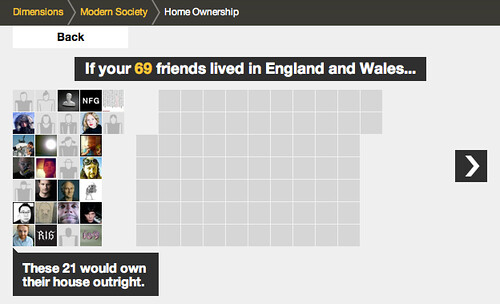
relating to the different experiences…

homes_3

homes_4

homes_5

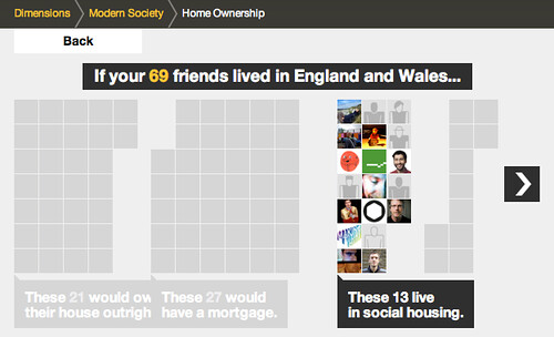
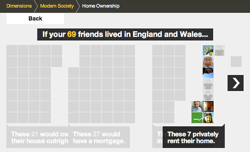
and you can also rollover the individual avatars in this version, to see the individual’s experience…

homes_hilight

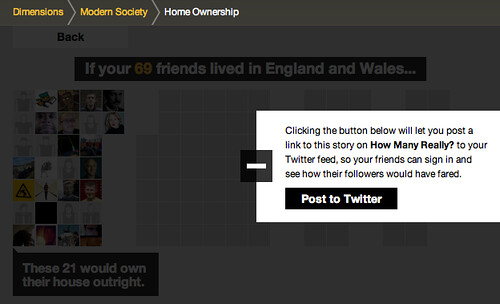
All the ‘dimensions’ in howmanyreally.com allow you to post what you’ve discovered to your social networks, if you want…

homes_post_to_twitter

There are a lot of influences on howmanyreally – both from the Eames, and in the case above – the work of Isotype, which I hope we’ll go into in a further post.

But for now let me encourage you to explore howmanyreally.com yourself. It’s little bit of a different animal from its sibling IMHO, which had such an immediate visual punch. This is a slower burn, but in my experience playing with it, I’ve found it can be just as powerful.

Both human history and current affairs unfortunately feature an high percentage of turmoil and tragedy.

While I’ve selected some rather neutral examples here, juxtaposing your friends with numbers of those injured, enslaved or killed through events in the past can really give one pause.

In its way, I’ve found howmanyreally.com a tool for reflection on history. A small piece that I can loosely join to a larger exploration of the facts. I really hope that’s your experience too.

If you don’t wish to use your social network accounts in connection with howmanyreally, you can enter a number you’re familiar with to centre the comparison on – for instance the size of a school class, or those in your office perhaps.

own_numbers

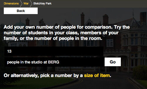
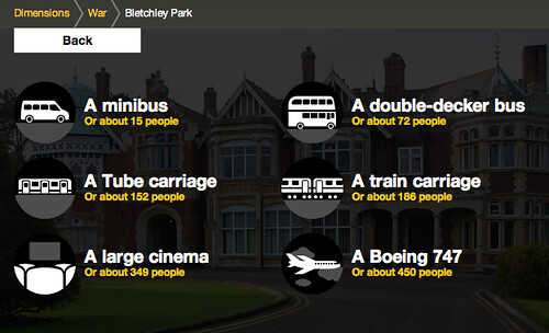
Or you can choose one of the comparisons we’ve prepared – for instance the number of people typically in a large cinema…

thing_numbers

As with howbigreally.com – if the prototype is successful, these new visualisations are designed to be incorporated as an element within the bbc.co.uk history and news sites. So do give your feedback to the BBC team through the contact details on the site.

It’s just left to me to say thanks to the team at the BBC who originally commissioned these explorations into history at human scale, including Lisa Sargood, Chris Sizemore, and Max Gadney.

Howmanyreally (and Dimensions as a whole) has been a fascinating and rewarding piece to work on, and thanks many members of the studio who have made it happen: Nick Ludlam, Simon Pearson, Matt Webb, Denise Wilton – and the core team behind its genesis, design and development: Alex Jarvis, James Darling, Peter Harmer and Tom Stuart.

BBC Dimensions: The Pakistan Floods

BBC Dimensions: Area affected by the 2010 Pakistan Floods
Shortly after the launch this week of BBC Dimensions at http://howbigreally.com, it was given a good test of how the system can respond to current events as well as bringing the scale of historical events and places home.

Max Gadney, who commissioned the project at the BBC, and KeltieCochrane (who produced the inforgraphic assets that are superimposed on the maps) collaborated to quickly produce a ‘Dimension’ based on map graphics on the BBC News site, showing the extent of the current terrible flooding in Pakistan.

Initially it’s superimposed over the UK, centred on London. When I saw it stretched from the Bay of Biscay, across Britain – to almost the tip of Norway, it gave me real pause. I went and donated to the Disasters Emergency Committee.

You can donate to the emergency fund at http://www.dec.org.uk

Introducing BBC Dimensions

About a year ago we did some workshops with the BBC, to look at new ways in which history could be explored and explained using digital media. We came up with 30 or so ideas which got narrowed down to 5 ‘microbriefs’ for possible future prototyping.

BBC History Workshop, July 2009

One of our favourites from the off was an idea we called “Dimensions”.

BBC Dimensions original sketch

From our original concept document:

“We want to bring home the human scale of events and places in history. The Apollo 11 Moon walk explored an area smaller than Trafalgar Square; the distance between your WW1 trench and the enemy could only be as much as from your front door to the street corner.
Dimensions is a feature on websites that juxtaposes the size of historical events with your home and neighbourhood. You’re hearing about the span of the base of the Great Pyramids, or the distance of the book depository from JFK, or the extent of the Great Fire of London… Dimensions overlays this map on a satellite view of where you live.”

Earlier this year we began to design and build a public prototype of the BBC Dimensions concept which we’re putting live today.

It lives at http://howbigreally.com and it’ll be available as a trial for the next few months.

Let me give you a little tour.

BBC - Dimensions
The home page is a collection of what we’ve been calling ‘packages’ – themed collections of ‘Dimensions’. For instance here: ‘The War On Terror, ‘Space’ and ‘Depths’

What’s a Dimension then? Well, basically what it says right there on the homepage: “Dimensions takes important places, events and things, and overlays them onto a map of where you are.”

You can have a play right there and then by entering your postcode or a place name. It understands most things that google maps understands. We’ve built the prototype using google maps, but there’s no reason why it couldn’t work on top of another mapping system eventually.

As we were building the prototype, the BP Deepwater Horizon oil-spill disaster occurred, and you might have seen the excellent visualisation at http://www.ifitwasmyhome.com/ by Andy Lintner.

When we saw that and how well it was received – we knew we were on the right track! Dimensions is a platform to explore a lot more in that vein.

Wandering into the ‘Space’ package reveals a few different types of dimension – sizes, plans, routes.
BBC - Dimensions - Space

The routes, such as that taken by the Apollo 11 moonwalkers mentioned in the original concept really can be revealing when juxtaposed on your postcode, or an area you know well…

BBC - Dimensions - The Apollo 11 Moonwalks

For instance if I type in our studio’s postcode…

BBC - Dimensions - If the Apollo 11 Moonwalks happened around BERG's studio!

I can see that Buzz and Neil would have barely left the building’s carpark…

Some Dimensions let you go a step further, literally – by allowing you to plot a route around your neighbourhood, or perhaps your commute, or perhaps a nearby bit of countryside – so that you can viscerally experience the distances involved.

BBC - Dimensions - Creating a walkable route of the Apollo 11 Moonwalks

You point and click on the map to make your walk like so – a little gauge runs along the bottom so you can see how far you have left to plot…

BBC - Dimensions - Creating a walkable route of the Apollo 11 Moonwalks

…and when you’re happy with your route you can print out a map to take on your dimensional ramble.

BBC - Dimensions - Creating a walkable route of the Apollo 11 Moonwalks

The distance just about takes us from the front-door of our studio to a refreshing pint in one of our locals, The Book Club. Just the thing after a moonwalk.

And that’s Dimensions!

One of the things I love about it is things like that – where something huge and momentous is made grokkable in the familiar. I also love that that’s all it really does.

It’s a bit like a digital toy – that just does one thing, very clearly (we hope) and delights in doing so.

It’s imagined that if the prototype is successful, it will be integrated into the main BBC site for embedding into history and news storytelling online.

The prototype system that we’ve made allows designers and producers at the BBC to create as many Dimensions as they want to using standard SVG creation tools. It’s also possible that this system could be opened up for local history enthusiasts to create their own dimensions to contribute.

The BBC worked with KeltieCochrane to create the initial content that’s in this prototype, and it was fantastic to see the system we built fill up with their work. My favourite’s The Colossus of Rhodes. Brilliant.

We’ll write some more here about both possible futures and the behind-the-scenes of Dimensions later. In the mean-time, many thanks to Matt Brown, Tom Armitage, Matt Webb, Phil Gyford and Paul Mison who worked on this with me, and Max Gadney for giving us a lovely brief.

Alan Kay once said that “A change of perspective is worth +80 IQ points”– that’s the goal of BBC Dimensions. So long as it delivers tiny bursts of that along with the little grins of ah-ha it seems to generate, we’ll be very happy.

You can find the BBC Dimensions prototype at http://howbigreally.com

Recent Posts

Popular Tags