-
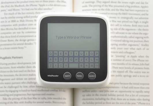
How come I’d never heard of WikiReader before? It’s a $99 device for reading Wikipedia from a memory card. There’s no network connection of any form, just a micro-SD slot, meaning it’ll last for a year on three AA batteries. You can update it at any point by downloading a new dump; if that’s not possible, you can get a new dump sent to you on a memory card for a small fee. It’s got a touch-screen, so the UI doesn’t have to be localised – foreign keyboards can be implemented in software. And, best of all, it has a hardware button marked “Random” – capturing one of the hidden joys of Wikipedia.It feels like a nice companion to an e-reader: book in one hand, universal lookup device in the other, and not a network connection in site. The chunky form-factor also makes it really robust and immediate; something I’d consider slinging in a bag, especially for trips abroad. It’s designed by Openmoko, and available now.
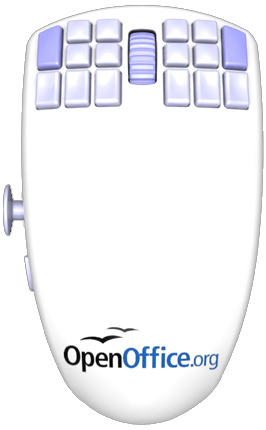 Another open-source product making its debut in hardware is the OpenOffice.org Mouse (pictured left). Eighteen buttons, an analogue joystick… I admit to sucking my teeth in disbelief when I first saw it; the comparisons that have been made to the Homer seem justified.
But take a step back, and consider it more slowly, and perhaps it’s not the car-crash it seems; instead, its problems are more subtle. Chris Messina has a sharp takes on this:
What I worry about, however, is that pockets of the open source community continue to largely be defined and driven by complexity, exclusivity, technocracy, and machismo… so far I’ve see little indication that open source developers take seriously the need for simpler, easier, and more intuitive future-forward interfaces. Perhaps I’m wrong or just uninformed, but so long as products like the OpenOfficeMouse continue to characterize the norm in open source design, I’m not likely going to be able to soon recommend open source solutions to anyone but the most advanced and privileged users.
Friend of BERG Phil Gyford picks up a similar point:
The problem isn’t that it has appalling design — it’s poor and uninspired, but it’s not the worst thing ever.
The fundamental problem is that the product is aiming for two very specific, probably unreconcilable, niche audiences (hard-core gamers and hard-core office workers) while associating itself with a brand (OpenOffice) that wants to be completely mainstream.
I think Phil’s right. If this was pitched as, say, an EVE Online mouse, I’d probably go “oh, that makes sense for a game and UI that complex”. But for a brand trying to be taken seriously as a mainstream alternative to expensive office suites, this seems misguided, and only perpetuates preconceived notions of Open Source’s attitude towards design.
- Schulze has bought a new car, and trust him to buy the only car I’ve seen with its own font. That is: not a font designed for the car, but a font made by the car.
Toyota motion-captured an iQ from overhead using software written in openFrameworks, and used it to generate a handwriting font built out of careful cornering and handbrake turns. It feels like the opposite of DHL’s fake GPS art: Toyota are keen to show the software and prove it actually works. Best of all, they’ll even let you download – and use – the font itself.
- I couldn’t let a round-up of links go with a mention to James Bridle’s recreation of MENACE, Donald Michie‘s learning machine to play noughts-and-crosses built only out of matchboxes and beads, which he first demonstrated at Playful two weeks ago.
James was kind enough to bring his MENACE to a recent BERG drinks evening, and it drew the gasps it thoroughly deserves; 301 matchboxes is an imposing piece of computing.
- And, finally, a nice little piece of what you might call design research: Giles Turnbull investigates nomenclatures for legobricks, surveying a selection of children he knows:
This language of Lego isn’t just something our family has invented; every Lego-building family must have its own vocabulary. And the words they use (mostly invented by the children, not the adults) are likely to be different every time. But how different? And what sort of words?
Hence, a survey. I asked fellow parents to donate their children for a few minutes, and name a selection of Lego pieces culled from the Lego parts store.
Lovely. (Personally, I called a Brick 1×1 a “one-bobble” and a plate 1×1 a “flat one-bobble”).
Links for a Monday Morning
Before this: Tangled histories
After this: Week 231
Recent entries from
Tom Armitage
-
Friday Links – Kinects, jittergifs, and robots
March 11, 2011
-
Week 300
March 8, 2011
-
Totems and City Avatars
February 23, 2011
-
Four Thousand Years of Urban Growth
February 21, 2011
-
Tom at Data & Cities, San Francisco, this week
February 7, 2011
Archive
Popular Tags
- 3c
- acts
- advertising
- alumni
- animation
- announcement
- apps
- ar
- art
- ashdown
- augmented reality
- augmentedreality
- availabot
- basaap
- bbc
- berg
- books
- bots
- celebrating-function
- cities
- citytracking
- comics
- communication
- communications
- companionspecies
- computer vision
- computervision
- concept
- conferences
- conversationalui
- cybernetics
- data
- dentsu london
- design
- dimensions
- drawing
- drivetime
- electronics
- elements
- eversion
- film
- friday
- friday links
- friends
- future
- futures
- games
- goldsmiths
- graphicdesign
- graphics
- hardware
- hat
- havasu
- hiring
- history
- hopeful monsters
- howbigreally
- howwework
- illustration
- india
- infovis
- interaction
- interactions
- interface
- ipad
- iphone
- journalism
- kendrick
- kinect
- knitting
- language
- lego
- light
- lightpainting
- links
- little printer
- looking
- machinelearning
- machines
- macroscopes
- magazine
- magplus
- making future magic
- makingfuturemagic
- manufacture
- manufacturing
- map
- maps
- materialexploration
- materials
- matt webb
- mechanical
- media
- mediasurfaces
- metaphors
- mobile
- mobile-phone
- mobilephones
- models
- moma
- mujicomp
- music
- near future
- night
- nokia
- nokiapersonalisation
- olinda
- optical
- packaging
- papernet
- participation
- patina
- people
- peripherals
- photographs
- photography
- play
- politeness
- posters
- press
- print on demand
- printing
- process
- product
- products
- projection
- prototyping
- radio
- rca
- research
- rfid
- robot readable world
- robot-arms
- robots
- schooloscope
- sci-fi
- scifi
- screens
- senses
- sensor-vernacular
- sensors
- sketching
- social
- space
- stories
- studio
- surface
- suwappu
- SVK
- synecdoche
- talk
- talks
- teaching
- team
- technology
- timelapse
- timo arnall
- touch
- toys
- trains
- travel
- TV
- typography
- ubicomp
- upcoming
- update
- vending
- video
- videophones
- visualisation
- web
- webapps
- week notes
- weeknotes
- work
- work-talks
- workshops
- writing
One Comment or Trackback
1. Matt Webb said on 9 November 2009...
The Toyota iQ font is an interesting example of how the history of something colours it and fills or inflates it somehow. Something we found before, working on customisation, is that there’s broadly two reasons why customisation might be important: the product might more closely match your personal needs; you have a closer relationship with it.
So with customisation (we were working on mobile phones) we ended up concentrating on how customisation can be used as part of your product relationship: you might witness the process, which might be highly celebrated, turning your product into some kind of fetish. You then have stories and histories with your product, the telling of which you can use to show off or inform people you know, so the product becomes a thing which has its own social contributions.
The iQ font is great in part because it’s beautiful but in part because we can see it being made, with the car that you now want to buy and drive. It has its own life.
I don’t know, vagueness, but there’s maybe something in this.