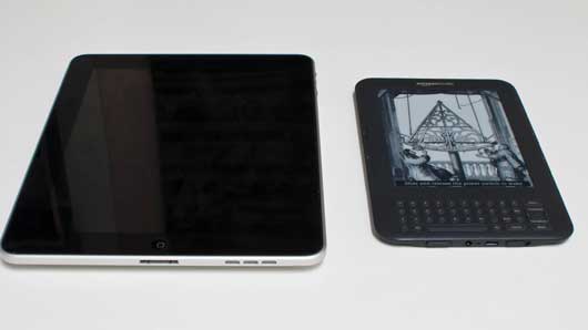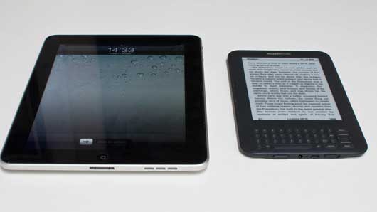
These two objects are asleep. They’re not in use; they’re waiting to be used. You approach them, touch a button, stroke a switch, and they wake up.

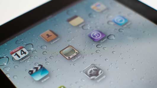
The iPad bursts into life, its backlight on, the blinking “slide to unlock” label hinting at the direction of the motion it wants you to make. That rich, vibrant screen craves attention.
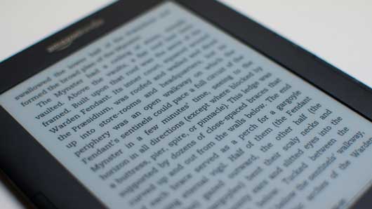
The Kindle blinks – as if it’s remembering where it was – and then displays a screen that’s usually composed of text. The content of the screen changes, but the quality of it doesn’t. There’s no sudden change in brightness or contrast, no backlight. If you hadn’t witnessed the change, you might not think there was anything to pay attention to there.

It’s glowing rectangles all the way down: those backlit screens that suck your attention. Matt J described it nicely a few years ago:
the iPhone is a beautiful, seductive but jealous mistress that craves your attention, and enslaves you to its jaw-dropping gorgeousness at the expense of the world around you.
When the iPad wakes up, everything else in the room disappears; your attention’s been stolen by that burst of light.
This metaphor has percolated right into mainstream understanding. Look at this Microsoft advert: they’re making a virtue of a phone that, ideally, you have to look at less.
But, of course, when you look at the phone, it lights up and steals your attention.
Attention-seeking is something we often do when we’re uncomfortable, though – when we need to remind the world we’re still there. And the strongest feeling I get from my recently-acquired Kindle is that it’s comfortable in the world.

That matte, paper-like e-ink screen feels familiar, calm – as opposed to the glowing screens of so many devices that have no natural equivalents. The iPad seems natural enough when it’s off – it has a pleasant glass and metal aesthetic. But hit that home button and that glow reveals its alien insides.
Perhaps the Kindle’s comfort is down to its single-use nature. After all, it knows it already has your attention – when you come to it, you pick it up with the act of reading already in mind.
That comfort is important to the Kindle’s intended purpose, though. As I wrote on Flickr:
“…this is a device that always seems content with itself. Just sitting there, not caring if you pick it up or not. Like a book.”
If this device is to replace, for many people, a book, it needs to manifest some of those qualities: safe, nonthreatening, no more distracting than a few hundred of pages of text intend to be. It needs a quiet confidence to make you trust it more.

I took this photograph the other weekend because, reading some short stories in a coffee shop, the reader looked perfectly at home with wood, and paper, and clocks, and illustration. To paraphrase Sesame Street: some of these things are like the others. It was strange to see an electronic device so at home in the physical realm (mainly thanks to that uncanny screen) – and yet the Kindle looks somehow out of place next to more “active” devices such as my laptop, phone, or TV.
That “quiet confidence” runs both ways, too: the Kindle’s sleeping state is practically identical to its “awake” state, and it’s equally comfortable in both. By contrast, I don’t think the iPad is comfortable when it’s asleep: it just turns its backlight off entirely. Nothing to see here, carry on.
If Mujicomp is all about devices we’re comfortable inviting into our homes, shouldn’t we be inviting in devices that will be comfortable in those environments? Not awkward, seeking attention through flashing lights or occasional, violent bursts into life, but well-appointed, content devices. Devices that are as happy “asleep” as “awake”, that don’t crave attention with bright screens, but earn it through modest usefulness, and good companionship. House-trained products.
The Kindle, much like a paperback book, is just as happy “asleep” as it is in use. It’s a reminder that the design of genuinely ubiquitous devices and products is not just about what they are like in use; it is also about what they are like when they are just present.