This is a short talk that I gave as part of a 45-minute workshop with Matthew Somerville at The Media Festival Arts 2010. As part of a session on how arts and cultural bodies can use open data, I talked about what I felt open data was, and what the more interesting opportunities it affords to are.
What is open data?
I’d describe “open data” as: “Making your information freely available for reuse in practical formats with no licensing requirements.
It’s not just sticking some data on a website; it’s providing it in some kind of data-format (be it CSV, XML, JSON, RDF, either via files or an API) for the intended purpose of being re-used. The more practical the format, the better.
You can still own the copyright; you can still claim credit. That doesn’t stop the data being open. But open data shouldn’t require payment.
More importantly:
What isn’t open data?
It’s not just sticking up web pages and saying it’s open because you won’t tell me off for scraping it.
It’s not any specific format. One particular crowd will tell you that open data has to be RDF, for instance. That is one format it can be, but it doesn’t have to be.
The success of your open data platform depends on how useful people will find it.
How do I know if it’s useful?
A good rule of thumb for “good open data” – and, by “good”, I mean “easy for people to use”, is something I’ve seen referred to as “The P Test“, which can be paraphrased as:
“You can do something interesting with it – however simple – in an hour, in a language beginning with P.”
Making something super-simple in an hour in Perl/PHP/Python (or similar, simple scripting language, that doesn’t begin with P, like Ruby or Javascript) is a good first goal for an open data set. If a developer can’t do something simple in that little time, why would they spend longer really getting to grips with your information? This, for me, is a problem with RDF: it’s very representative of information, as a data format, but really, it’s bloody hard to use. If I can’t do something trivial in an hour, I’m probably going to give up.
What are the benefits of open data?
The big benefit of open data is that it gets your “stuff” in more places. Your brand isn’t a logo, and it isn’t a building; it’s this strange hybrid of all manner of things, and your information is part of that. That information might be a collection, or a catalogue, or a programme. Getting that information in more places helps spread your brand.
As well as building your profile, open data can also build collaboration and awareness. I can build something out of someone else’s information as a single developer messing around, sure – but I can also build products around it that stand alone, and yet build value.
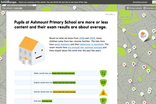
For instance, Schooloscope. Schooloscope looks at data about UK schools and put it together to give you a bigger picture. A lot of reporting about schools focuses on academic performance. Schooloscope is more interested in a bigger picture, looking at pupil happiness and change over time. We built this site around DFE data, Edubase data, and Ofsted reports. We’re building a product in its own right on top of other people’s data, and if the product itself is meaningful, and worthwhile… then that’s good for both your product and the source data – not to mention that data’s originators.
But for me, the biggest thing about open data is: it helps grow the innovation culture in your organisation.
The number-one user of open data should be you. By which I mean: if your information is now more easily accessible via an API (for instance), it makes it easier to build new products on top of it. You don’t have to budget for building interfaces to your data, because you’ve done it already: you have a great big API. So the cost of innovation goes down.
(A short note on APIs: when you build an API, build good demos. When I can see what’s possible, that excites me, as a developer, to make more things. Nothing’s worse than a dry bucket of data with no examples.)
Similarly: the people who can innovate have now grown in number. If you’ve got information as CSV – say, your entire catalogue, or every production ever – then there’s nothing to stop somebody armed with Excel genuinely doing something useful. So, potentially, your editorial team, your marketing team, your curators can start exploring or using that information with no-one mediating, and that’s interesting. The culture begins to move to one where data is a given, rather than something you have to request from a technical team that might take ages.
And, of course, every new product that generates data needs to be continuing to make it open. Nothing’s worse than static open data – data that’s 12, 18 months old, and gets updated once a year as part of a “big effort” – rather than just adding a day to a project to make sure its information is available to the API.
What’s the benefit for everyone else?
This is just a short digression about something that really interests me. Because here’s the thing: when somebody says “open data”, and “developers using your information”, we tend to imagine things like this:
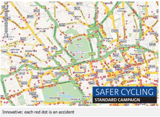
Schuyler Erle called the above kind of map “red dot fever”: taking geolocated data and just putting it all on a map, without any thought. This isn’t design, this isn’t a product, this is just a fact. And it’s about as detached from real people as, to be honest, the raw CSV file was.
So I think one thing that open-data allows people to do is make information human-scale. And by which I mean: make it relevant, make it comprehensible, move it from where the culture might be to where *I* am.
And that lets me build an ongoing relationship with something that might have been incomprehensible.
I should probably show you an example.
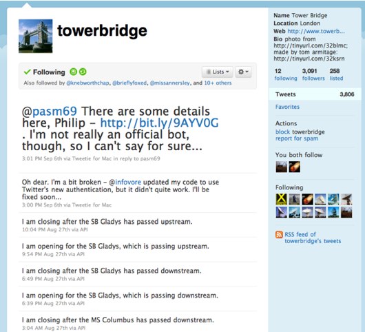
This is a Twitter bot that I built. It tells you when Tower Bridge is opening and closing. I stole the data from their website.
Or rather: Tower Bridge itself tells you when it’s opening and closing. Things on Twitter talk in the first person, so it should be itself. It becomes another voice in my Twitter stream, not just some bot intruding like a foghorn.
It exposes a rhythm. I built it because I used to work near Tower Bridge – I saw it every day. I liked the bot most when I was out of London; I’d see it opening and closing and know that London was still going on, still continuing. It has a silly number of followers, but not many of them interact with it daily. And yet – when you do, it’s useful; some friends found it helpful for reminding them not to leave the office for a bit.
And: you learn just how many times it opens/closes, but not in a numeric way; in a visceral way of seeing it message you.
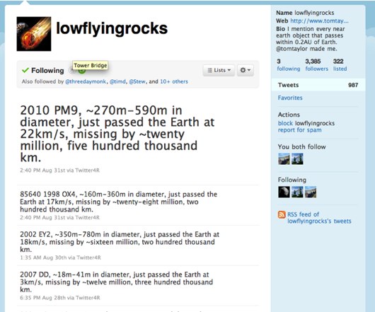
This is Low Flying Rocks by my friend Tom Taylor. It’s a bot that scrapes NASA data about asteroids passing within 0.2AU AU of Earth (an AU being 0.2 of the distance from the Earth to the sun). That’s quite close! What you discover is a) there are lots of asteroids passing quite close, and b) we know that they’re there. You both learn about the universe, and a little bit about our capacity to understand it. And you learn it not in some big glut of information, but slowly, as a trickle.
It feels more relevant because it’s at my scale.
And that leads to my final point.
Synecdoche
I want to talk about synecdoche, because I think that’s what these kind of Twitter bots are.
Synecdoche’s a term from literature, best explained as “the part representing a whole“. That’s a terrible explanation. It’s better explained with some examples:
“A hundred keels cut the ocean“; “keel” stands for “ship“. “The herd was a hundred head strong“; “head” stands for “cow“.
So: for me, Tower Bridge is synecdoche, for the Thames, for London, for the city, for home. Low Flying Rocks is synecdoche not only for the scale of the universe, all the activity in the solar system, the earth’s place in that – but also for NASA, for science, for discovery.
Synecdoche allows you to make big, terrifying data, human-scale.
I was thinking, to wrap this session up, about a piece of data I’d like if I was building a Twitter bot, and I decided that what I’d love would be: what the curtain at the Royal Opera House was doing.

It sounds boring at first: it’s going to go up and down a few times in a performance. That means once an evening, and perhaps the odd matinee.
But it’s also going to go up and down for tech rehearsals. And fire tests. And who knows what else. It’s probably going up and down quite a lot.
And, as that burbles its way into my chat stream, it tells me a story: you may only think there’s a production a day in the theatre, but really, the curtain never stops moving; the organisation never stop working, even when you’re not there. I didn’t learn that by reading it in a book; I learned it by feeling it, and not even by feeling all of it – just a tiny little bit. That talking robot told me a story. This isn’t about instrumenting things for the sake of it; it’s about instrumenting things to make them, in one particular way, more real.
Yes, from your end, it’s making APIs and CSV and adding extra functionality to existing projects that are probably under tight budgets. But it allows for the things you couldn’t have planned for.
Open Data allows other people to juxtapose and invent, and tell stories, and that’s exciting.