This website is now archived. To find out what BERG did next, go to www.bergcloud.com.

Blog posts tagged as 'mobile-phone'

“Companion Species” in Icon’s special edition on Mobile Phones

Icon #106

Will Wiles, the Deputy Editor of the design magazine Icon, asked us recently to contribute to a special issue on Mobiles Phones alongside James Bridle, Kazys Varnelis, Marko Ahtisaari and Will Self, among others.

I wrote a short piece on smartphones as ‘companion species’, that reflects a lot of ongoing themes and discussions in the studio around designing the behaviour of sensate devices with ‘fractional intelligence‘.

They see the world differently to us, picking up on things we miss.

They adapt to us, our routines. They look to us for attention, guidance and sustenance. We imagine what they are thinking, and vice-versa.

Dogs? Or smartphones?

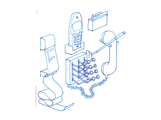
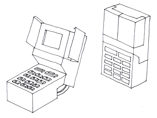
Mobile devices (can we still call them phones?) are being packed full of sensors, processing power. They are animated by ever-more-sophisticated software, dedicated to understanding the world around them (in terms of advances in computer vision and context-awareness) and understanding us (speech recognition and adaptive ‘agent’ software such as Apple’s ‘Siri’)

They are moving – somewhat awkwardly – from being our tools to becoming our newest companion species.

Donna Haraway, theorist on our transformation into cyborgs, published ‘The Companion Species Manifesto’ in 2003. It addresses the relationship between domestic dogs and humans, but there is much in there to inspire designers of smartphones, apps and agents.

“Cyborgs and companion species each bring together the human and non-human, the organic and technological, carbon and silicon, freedom and structure, history and myth, the rich and the poor, the state and the subject, diversity and depletion, modernity and postmodernity, and nature and culture in unexpected ways.”

Using inspirations from theory such as Haraway, and fiction – such as Philip Pullman’s ‘Daemons’ from his ‘Dark Materials’ books – we can perhaps imagine a near-future that is richer and weirder than the current share-everything-all-the-time/total-gamified-personal-productivity obsessions of silicon valley.

A future of digital daemons would be one of close relationships with software that learned and acted intuitively – perhaps inscrutably at first, but with a maxim of ‘do no harm, with maximum charm’.

Intel’s Genevieve Bell recently spoke of the importance of designing relationships with – and crucially, between our technologies – so that we not in the centre of an arms-race of ever-more-complex 1-to-1 interactions with our phones, tablets and apps. She memorably quoted a research subject that likened her collection of digital devices to a ‘needy backpack of baby birds’

Much better to have one faithful, puppy-smart daemon device, working at our side to round everything (and every thing) up and relate what it senses to us?

At BERG we are fond of quoting MIT roboticist Rodney Brooks – who said that fifty years of sustained work by the brightest and the best in artificial intelligence would get us things that were ‘smart as puppies’ if we’re lucky.

This seems like a fine goal to us, rather than creating uncanny, flawed and frustrating analogues of human intelligence and interactions – such as Siri, or if we cast our minds back a decade – Microsoft’s ‘Clippy’.

This future might also free the form of our devices – from glowing rectangles that suck our attention from the world, to subtler physical avatars representing our companions – things that listen, watch, speak – to us and for us.

Our companion species as are likely to inhabit the biomimetic descendants of the Nike fuelband or the now-mundane bluetooth headsets as Ive’s perfectionist slabs of glass and alloy.

Also, companion species might be shared, as a family pet is now – bound to home and hearth rather than the predominant 1-to-1 ‘personal computing’ paradigm of the last 40 years or so.

What forms might these ‘household spirits’ take? Nest’s smart thermostat has pursued the Ives/Rams route of tasteful (if ironically, cold) elegance, whereas our own Little Printer takes a rather different approach…

There will be more diverse responses to these new categories of digital/physical extensions to ourselves, our homes, cars and cities. Which is as it should be.

I hope it triggers explosion of form and interaction beyond the glowing touchscreen hegemony. The advent of ‘digital companion species’ should be a cambrian moment for design.

My Weekend On Series 40

Taking my iPhone to a music festival didn’t really seem like the most sensible idea: a capacitive touchscreen in a potentially muddy field? A battery that only just lasts a day? It’s not exactly suited to the wilderness, not to mention a little fragile.

At the same time: it’s exactly the place that connectivity comes in handy, for finding lost friends. And so I decided to take a spare. Unfortunately, all my old phones are locked to the wrong network, so it was time to make a trip to a phone shop and buy a cheap pay-as-you-go phone.

2760-closed

I ended up with the Nokia 2760, otherwise known as the “second cheapest Nokia in the shop”, which seemed like a safe bet. The clamshell form factor was another layer of protection from the elements (when I wasn’t sure what the weather would be like), and perhaps more importantly, meant that the keypad buttons were much larger than on equivalent candybar-shaped devices. That was a distinct advantage given the potential for drunk, clumsy texting when in the vicinity of the Somerset Cider bus.

I spent a weekend away from pervasive connectivity, from GPS, from Twitteriffic, from thousands of apps, and instead just took the state-of-the-art when it comes to really cheap, no-frills phones.

And, you know, it was absolutely fine. The phone does everything you’d expect it to: it makes calls, it sends texts, it has a simple camera, and it has an alarm clock. I still have the muscle memory for Nokia’s T9 implementation. I could have installed Opera Mini on it (far better than the built-in browser) primarily for using Twitter, but really, I wouldn’t mess with it in any other way. And, of course, the hardware is great, as you’d expect from a firm with the industrial design experience of Nokia: it’s pleasant to hold in the hand, and it certainly doesn’t feel cheap. Also, it’s small; smartphones really have made me forget how tiny phones had got at one point, and the 2760 is a reminder that much smaller packages still exist.

Using the Nokia over the long weekend also reminded me that my usage of mobile phones has actually changed very little in the past decade. When it comes to the functionality of a phone, there’s almost no difference between my iPhone and the Nokia: they call, they make texts, they have a few useful features. Most of the change in my use comes down to the “smart” half of the smartphone: all the features that have converged from other devices. I no longer carry an iPod around with me; I no longer need an A to Z on me; I write my to-do lists into Things rather than my notebook; I can get on the web without complicated Bluetooth rituals.

2760-open

But none of it is necessarily unique – or vital – to my experience of the phone-as-mobile-communicator. I enjoyed the practicality and immediacy of the Nokia. I often find the wall of phones you see in shops tiring now – a series of black slabs, all identical in appearance thanks to the ubiquitous touchscreen, all to be distinguished by the software they run (which is usually never demonstrated in shops). The 2760 wears its phone-ness on its sleeve.

The magic of mobile phones is, first and foremost, that they are wireless communicators. You can talk, to other people, anywhere in the world, without wires. Everything else – all the magic in your convergence device – is something else. What phones have become, but perhaps they’ve transcended that description of phone-ness. All that is nice to have, for sure, and I’m very glad to have my iPhone back, but I was not once inconvenienced.

And here’s the big takeaway for me: it was fascinating to realise just how good the low-end products on the mass market today are. It’s easy to talk excitedly about innovation, and the new possibilities brought by every-more-advanced technology. It’s not much harder to be excited by products for emerging and developing markets, finding ingenious ways to bring costs right down and, potentially, change lives that have never experienced new kinds of technology. But it’s a lot harder to be excited the territory that lies between those two: refinement for the mass market of the developed world; products so unashamedly not new, but instead a continuation of past innovation, often doing nothing more than bringing that technology to a wider market at a lower price.

That’s as much part of design as new and shiny, and we don’t talk about it enough. The design community talks a lot about products like the iPod, but never the $20 MP3 players you find in the Sears catalogues. We talk about Chumbys and Pleos, but never the hundreds of items on shelves in Toys R Us right now, that are selling, and played with, and distill (sometimes well, sometimes terribly) so many of the ideas we, as a design community, talk about, into a $30 toy.

We shouldn’t stop talking about the iPods and the Roombas, either, but it’s worth remembering there is a world outside the five or six ubiquitous examples that do the rounds in conference season. And that’s what I learned when I bought a cheap mobile phone to take to a field.

RFID icons

Earlier this year we hosted a workshop for Timo Arnall‘s Touch project. This was a continuation of the brief I set my students late last year, to design an icon or series of icons to communicate the use of RFID technology publicly. The students who took on the work wholeheartedly delivered some early results which I summarised here.

This next stage of the project involved developing the original responses to the brief into a small number of icons to be tested, by Nokia, with a pool of 25 participants to discover their responses. Eventually these icons could end up in use on RFID-enabled surfaces, such as mobile phones, gates, and tills.

Timo and I spent an intense day working with Alex Jarvis and Mark Williams. The intention for the day was to leave us with a series of images which could be used to test responses. The images needed consistency and fairly conservative limits were placed on what should be produced. Timo’s post on the workshop includes a good list of references and detailed outline of the requirements for the day.

I’m going to discuss two of the paths I was most involved with. The first is around how the imagery and icons can represent fields we imagine are present in RFID technology.

Four sketches exploring the presence of an RFID field

The following four sketches are initial ideas designed to explore how representation of fields can help imply the potential use of RFID. The images will evolve into the worked-up icons to be tested by Nokia, so the explorations are based around mobile phones.

I’m not talking about what is actually happening with the electromagnetic field induction and so forth. These explorations are about building on the idea of what might be happening and seeing what imagery can emerge to support communication.

The first sketch uses the pattern of the field to represent that information is being transferred.

Fields sketch 01

The two sketches below imply the completion of the communication by repeating the shape or symbol in the mind or face of the target. The sketch on the left uses the edge of the field (made of triangles) to indicate that data is being carried.

Fields sketch 02

I like this final of the four sketches, below, which attempts to deal with two objects exchanging an idea. It is really over complex and looks a bit illuminati, but I’d love to explore this all more and see where it leads.

Fields sketch 03

Simplifying and working-up the sketches into icons

For the purposes of our testing, these sketches were attempting too much too early so we remained focused on more abstract imagery and how that might be integrated into the icons we had developed so far. The sketch below uses the texture of the field to show the communication.

fields-04.jpg

Retaining the mingling fields, these sketches became icons. Both of the results below imply interference and the meeting of fields, but they are also burdened by seeming atomic, or planet sized and a annoyingly (but perhaps appropriately) like credit card logos. Although I really like the imagery that emerges, I’m not sure how much it is doing to help think about what is actually happening.

Fields sketch 05

Fields sketch 06

Representing purchasing via RFID, as icons

While the first path was for icons simply to represent RFID being available, the second path was specifically about the development of icons to show RFID used for making a purchase (‘purchase’ is one of the several RFID verbs from the original brief).

There is something odd about using RFID tags. They leave you feeling uncertain, and distanced from the exchange or instruction. When passing an automated mechanical (pre-RFID) ticket barrier, or using a coin operated machine, the time the machines take to respond feels closely related to the mechanism required to trigger it. Because RFID is so invisible, any timings or response feels arbitrary. When turning a key in a lock, this actually releases the door. When waving an RFID keyfob at reader pad, one is setting off a hidden computational process which will eventually lead to a mechanical unlocking of the door.

Given the secretive nature of RFID, our approach to download icons that emerged was based on the next image, originally commissioned from me by Matt for a talk a couple of years ago. It struck me as very like using an RFID enabled phone. The phone has a secret system for pressing secret buttons that you yourself can’t push.

Hand from Phone

Many of the verbs we are examining, like purchase, download or open, communicate really well through hands. The idea of representing RFID behaviours through images of hands emerging from phones performing actions has a great deal of potential. Part of the strength of the following images comes from the familiarity of the mobile phone as an icon–it side-steps some of the problems faced in attempting to represent an RFID directly.

The following sketches deal with purchase between two phones.

Purchase hands sketch

Below are the two final icons that will go for testing. There is some ambiguity about whether coins are being taken or given, and I’m pleased that we managed to get something this unusual and bizarre into the testing process.

Hands purchase 01

Hands purchase 02

Alex submitted a poster for his degree work, representing all the material for testing from the workshop:

Outcomes

The intention is to continue iterations and build upon this work once the material has been tested (along with other icons). As another direction, I’d like to take these icons and make them situated, perhaps for particular malls or particular interfaces, integrating with the physical environment and language of specific machines.

Japanese repair culture and distributed manufacture

I’ve just finished Cities by John Reader, on the history of cities, and it’s chock full of information and great stories.

Cities, John Reader

This story, on Japanese manufacture, is lengthy but so good I have to quote it in full:

Bicycles were extremely popular in Japanese cities at the end of the nineteenth century, when the import of goods that Japanese manufactures could not compete with on price — or could not make at all — was damaging the national economy. Clearly, if bicycles could be made in Japan, both the massive demand for an individual means of transport and the national economy would be server at the same time. As Jane Jacobs points out in her book The Economy of Cities, Japan could have responded to this challenge by inviting foreign manufacturers to establish plants in the country — though this would have brought little profit to the Japanese themselves. Or they could have built a factory of their own — which would have required large investments in specialised machinery and the training of a skilled labour force. The Japanese followed neither of these options. Instead they exploited an indigenous talent for ‘economic borrowing’ — or imitation, as non-specialists would call it. It worked like this:

Not long after the importation of bicycles had begun, large numbers of one- and two-man repair shops sprang up in the cities. Since imported spare parts were expensive and broken bicycles too valuable to cannabalise, many repair shops found it worthwhile to make replacement parts themselves — not difficult if each of the shops specialised in making only one or two specific parts, as many did. In this way, groups of bicycle repair shops were in effect manufacturing entire bicycles before long, and it required only an enterprising individual to begin buying parts on contract from the repairmen for Japan to have the beginnings of a home-grown bicycle manufacturing industry.

So, far from being costly to develop, bicycle manufacturing in Japan paid for itself at every stage of its development. And the Japanese got much more than a bicycle industry from the exercise. They had also acquired a model for many of their other industrial achievements: imitation and a system of reducing complex manufacturing work to a number of relatively simple operations which could be done in small autonomous workshops. The pattern was applied to the production of many other goods, and underwrote the soaring economic success of Japan during the twentieth century. Sony began life at the end of the Second World War as a small shop making tubes on contract for radio assemblers. The first Nikon cameras were exact copies of the Zeiss Contax; Canon copied the Leica; Toyota Landcruisers were powered by copies of the Chrysler straight-six engine.

Here are the reasons this is great:

  • It’s distributed manufacture, a network of independent units operating as a single factory, but in a more agile way.
  • It reminds us that the idea of interchangeable parts is relatively new–and was a world-changer. It parallelised and distributed manufacture. Are we at the level of interchangeable parts in software yet? Despite common protocols like HTTP, I don’t think so, not quite.
  • It points to an alternative to the mass manufacture and assembly line of Fordism. The parts can be accessed separately from the assembly, we can build our own neighbourhood factories for custom goods! Mass manufacture doesn’t imply treating workers like interchangeable parts too! What’s more, it bootstraps off mass manufacture and makes something different out of it.

The most exciting reason?

This pattern is happening, right now, in India with mobile phones. 100s of small shops repair and rebuild phones with generic components and reverse-engineered schematics, supported by a developed training and tool-production infrastructure.

How long before we’re seeing cheap-as-chips kit phones, assembled by entrepreneurs harvesting the market stands of Delhi?

RFID Interim update

Last term during an interim crit, I saw the work my students had produced on the RFID icons brief I set some weeks ago. It was a good afternoon and we were lucky enough to have Timo Arnall from the Touch project and Younghee Jung from Nokia Japan join us and contribute to the discussion. All the students attending showed good work of a high standard, overall it was very rewarding.

I’ll write a more detailed discussion on the results of the work when the brief ends, but I suspect there may be more than I can fit into a single post, so I wanted to point at some of the work that has emerged so far.

All the work here is from Alex Jarvis and Mark Williams.

Alex began by looking at the physical act of swiping your phone or card over a reader. The symbol he developed was based on his observations of people slapping their Oyster wallets down as they pass through the gates on to the underground. Not a delicate, patient hover over the yellow disc, but a casual thud, expectant wait for the barrier to open, then a lurching acceleration through to the other side before the gates violently spasm shut.

RFID physical act 01

More developed sketches here…

RFID physical act 02

I suspect that this inverted tick will abstract really well, I like the thin line on the more developed version snapping the path of the card into 3D. It succeeds since it doesn’t worry too much about working as an instruction and concentrates more on a powerful cross-system icon to be consistently recognisable.

Verbs

The original brief required students to develop icons for the verbs: purchase, identify, enter (but one way), download, phone and destroy.

Purchase and destroy are the two of these verbs with the most far-reaching and less immediate consequences. The aspiration for this work is to make the interaction feel like a purchase, not a touch that triggers a purchase. This gives the interaction room to grow into the more complex ones that will be needed in the future.

This first sketch, on purchase, from Alex shows your stack of coins depleting, something nice about the dark black arrow which repeats as a feature throughout Alex’s developments.

RFID Purchase 01

Mark has also been tackling purchase, his sketches tap into the currency symbols, again with a view to represent depletion. Such a blunt representation is attractive, it shouts “this will erode your currency!”

RFID Purchase 03

Mark explores some more on purchase here:

RFID Purchase 02

Purchase is really important. I can’t think of a system other than Oyster that takes your money so ambiguously. Most purchasing systems require you to enter pin numbers, sign things, swipe cards etc, all really clear unambiguous acts. All you have to do is wave at an Oyster reader and it costs you £2… maybe: The same act will open the barrier for free if you have a travel card on there. Granted, passengers have already made a purchase to put the money on the card, but if Transport for London do want to extend their system for use as a digital wallet they will need to tackle this ambiguity.

Both Mark and Alex produced material looking at the symbols to represent destroy, for instances where swiping the reader would obliterate data on it, or render it useless. This might also serve as a warning for areas where RFID tags were prone to damage.

RFID Destroy 01

I like the pencil drawing to the top right that he didn’t take forward. I’ve adjusted the contrast over it to draw out some more detail. Important that he distinguished between representing the destruction of the object and the data or contents.

Williams Destroy sketches

Mark’s sketches for destroy include the excellent mushroom cloud, but he also looks at an abstraction of data disassembly, almost looks like the individual bits of data are floating off into oblivion. Not completely successful since it also reminds me of broadcasting Wonka bars in Charlie and the Chocolate Factory and teleporting in Star Trek, but nice none the less.

Drawing

This is difficult to show online, but Alex works with a real pen, at scale. He is seeing the material he’s developing at the same size it will be read at. Each mark he makes he is seeing and responding to as he makes it.

Jarvis Pen

He has produced some material with Illustrator, but it lacked any of the impact his drawings brought to the icons. Drawing with a pen really helps avoid the Adobe poisoning that comes from Illustrator defaults and the complexities of working out of scale with the zoom tool (you can almost smell the 1pt line widths and the 4.2333 mm radius on the corners of the rounded rectangle tool). It forces him to choose every line and width and understand the success and failures that come with those choices. Illustrator does so much for you it barely leaves you with any unique agency at all.

It is interesting to compare the students’ two approaches. Alex works bluntly with bold weighty lines and stubby arrows portraying actual things moving or downloading. Mark tends towards more sophisticated representations and abstractions, and mini comic strips in a single icon. Lightness of touch and branching paths of exploration are his preference.

More to come from both students and I’ll also post some of my own efforts in this area.

Drawing phones

Hello.

I think I’m mostly going to post drawings from my sketchbooks, and talk around those for a while. Since a lot of my thinking starts like this. My sketchbooks are also places where I put ideas that would be too difficult to make, so they just get drawn instead.

I think phones mostly used to look like this:

Old phone drawing

Now they don’t. During our work for Nokia and my time at the RCA, I developed groups of ideas around phones and how their functionality influences their form. The ideas follow a continuing enthusiasm for celebration of function, something that continues to influence the work Matt and I do.

Drawing of phone 01

The first is a sketch of a phone dock that distributes all the things I use in the phone into discrete physical instances locally. Pretty self descriptive really, a receipt printer pushes out text messages as they arrive. To make a call, stamp out the number, or add a name card from the Rolodex, then pull down on the indicator lever, the end blinks while it rings and snaps back when the phone returns to idle or someone answers.

Mechanical phone

This phone explores the keypad unlock function. As it opens from its locked down position, the screen opens like a flower and all the buttons turn over like little Porsche* headlamps. Locked down, it is completely flush and faceless, no risk of pocket dialling, but fragile, mechanical and slim when open.

*(is it Porsche or am I revising history?)

Extra hand set

Hands free sets feel quite unsatisfying. Wouldn’t it be better if your phone came with an extra hand? This phone comes with a small robot arm (plugged into your data port), to hold your tea, or mangle paper clips while you are listening to your voice mail. Definitely needs to be more exploration of robot arms in the future.

Recent Posts

Popular Tags