This website is now archived. To find out what BERG did next, go to www.bergcloud.com.

Blog posts tagged as 'interaction'

RFID Interim update

Last term during an interim crit, I saw the work my students had produced on the RFID icons brief I set some weeks ago. It was a good afternoon and we were lucky enough to have Timo Arnall from the Touch project and Younghee Jung from Nokia Japan join us and contribute to the discussion. All the students attending showed good work of a high standard, overall it was very rewarding.

I’ll write a more detailed discussion on the results of the work when the brief ends, but I suspect there may be more than I can fit into a single post, so I wanted to point at some of the work that has emerged so far.

All the work here is from Alex Jarvis and Mark Williams.

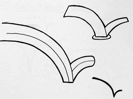
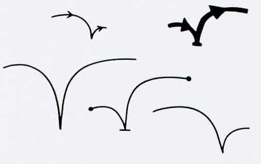
Alex began by looking at the physical act of swiping your phone or card over a reader. The symbol he developed was based on his observations of people slapping their Oyster wallets down as they pass through the gates on to the underground. Not a delicate, patient hover over the yellow disc, but a casual thud, expectant wait for the barrier to open, then a lurching acceleration through to the other side before the gates violently spasm shut.
RFID physical act 01

More developed sketches here…

RFID physical act 02

I suspect that this inverted tick will abstract really well, I like the thin line on the more developed version snapping the path of the card into 3D. It succeeds since it doesn’t worry too much about working as an instruction and concentrates more on a powerful cross-system icon to be consistently recognisable.

Verbs

The original brief required students to develop icons for the verbs: purchase, identify, enter (but one way), download, phone and destroy.

Purchase and destroy are the two of these verbs with the most far-reaching and less immediate consequences. The aspiration for this work is to make the interaction feel like a purchase, not a touch that triggers a purchase. This gives the interaction room to grow into the more complex ones that will be needed in the future.

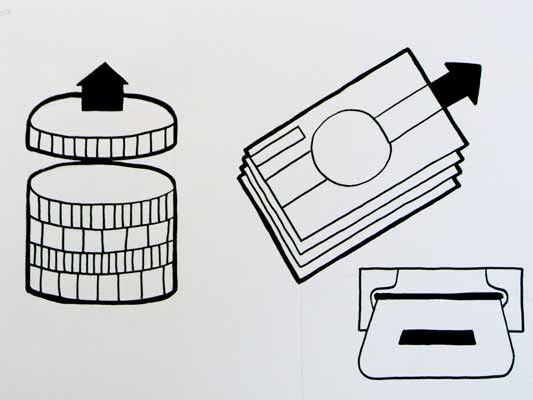
This first sketch, on purchase, from Alex shows your stack of coins depleting, something nice about the dark black arrow which repeats as a feature throughout Alex’s developments.
RFID Purchase 01

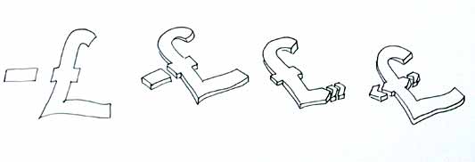
Mark has also been tackling purchase, his sketches tap into the currency symbols, again with a view to represent depletion. Such a blunt representation is attractive, it shouts “this will erode your currency!”
RFID Purchase 03

Mark explores some more on purchase here:
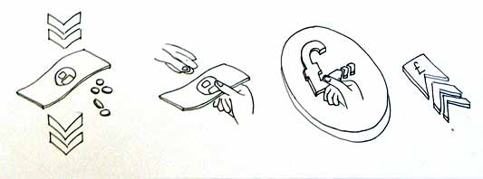
RFID Purchase 02

Purchase is really important. I can’t think of a system other than Oyster that takes your money so ambiguously. Most purchasing systems require you to enter pin numbers, sign things, swipe cards etc, all really clear unambiguous acts. All you have to do is wave at an Oyster reader and it costs you £2… maybe: The same act will open the barrier for free if you have a travel card on there. Granted, passengers have already made a purchase to put the money on the card, but if Transport for London do want to extend their system for use as a digital wallet they will need to tackle this ambiguity.

Both Mark and Alex produced material looking at the symbols to represent destroy, for instances where swiping the reader would obliterate data on it, or render it useless. This might also serve as a warning for areas where RFID tags were prone to damage.
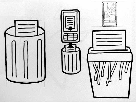
RFID Destroy 01

I like the pencil drawing to the top right that he didn’t take forward. I’ve adjusted the contrast over it to draw out some more detail. Important that he distinguished between representing the destruction of the object and the data or contents.
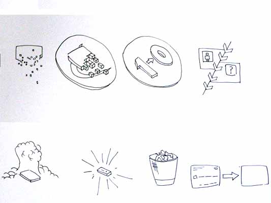
Williams Destroy sketches

Mark’s sketches for destroy include the excellent mushroom cloud, but he also looks at an abstraction of data disassembly, almost looks like the individual bits of data are floating off into oblivion. Not completely successful since it also reminds me of broadcasting Wonka bars in Charlie and the Chocolate Factory and teleporting in Star Trek, but nice none the less.

Drawing

This is difficult to show online, but Alex works with a real pen, at scale. He is seeing the material he’s developing at the same size it will be read at. Each mark he makes he is seeing and responding to as he makes it.
Jarvis Pen

He has produced some material with Illustrator, but it lacked any of the impact his drawings brought to the icons. Drawing with a pen really helps avoid the Adobe poisoning that comes from Illustrator defaults and the complexities of working out of scale with the zoom tool (you can almost smell the 1pt line widths and the 4.2333 mm radius on the corners of the rounded rectangle tool). It forces him to choose every line and width and understand the success and failures that come with those choices. Illustrator does so much for you it barely leaves you with any unique agency at all.

It is interesting to compare the students’ two approaches. Alex works bluntly with bold weighty lines and stubby arrows portraying actual things moving or downloading. Mark tends towards more sophisticated representations and abstractions, and mini comic strips in a single icon. Lightness of touch and branching paths of exploration are his preference.

More to come from both students and I’ll also post some of my own efforts in this area.

Experience hooks

To recap: Generation C demand 3C products, which are the new breed of products taking the internet and their presence in the social world for granted, and treating people as involved, creative peers, not “end users.” As a design and development approach, the route of interaction design and a focus on the product life-cycle is useful. This life-cycle can be thought of as a series of experience hooks, activities around which stories gather. These hooks are opportunities for good design and I want to wrap up by looking at a few a little closer.

Commercials

I mentioned a number of ‘intrinsic activities’ associated with a product, those that aren’t specific to what the product does. They were: Design, manufacture, discovery, selection, being wished-for, purchase, being shown-off, review and resale.

The intrinsic activities are often hard to reach if the scope of design is considered to end at the physical surface of the product. Yet they still contribute, heavily, to ongoing experience of the product… and therefore to the brand (the brand is the sum over all the experiences). Since Gen C relate to their products via the activities they experience together, the design scope should include whatever is necessary to make these hard-to-reach activities good ones.

Design, here, should include advertising and marketing.

The human brain is an incredible thing. It’s a carrier bag of thoughts and emotions, stored by association and popped to the top by association too. Advertising, through whatever medium, can be used to feed in stories that’ll come to the surface when the appropriate experience hook is encountered. Or it can use the memory of a particular experience hook to show what the brand cares about.

Two examples spring to mind:

  • The Coke Happiness Machine commercial dispenses with building a glow of generic “happiness” or “family life” or “Christmas” around the logo of a soft drink. Instead it concentrates on the experience of an important intrinsic activity: Vending. This neglected moment becomes coloured with a story that makes the drink itself sparkle with fantasy and magic. This advert will improve the perceived taste of my bought drink, not just nudge me to purchase it in the first place.
  • Orange, the mobile phone operator, has in the UK a scheme called Orange Wednesdays. Orange mobile subscribers get two-for-one cinema admission once a week. I’m not sure how many people use it, but as marketing that infiltrates (and influences!) conversation, and demonstrates the company’s commitment to personal relationships and small groups, it’s spot on.

Now these are both advertising/marketing efforts that demonstrate a shift from lifestyle or aspirational branding to experience-driven brands–but they remain in traditional media.

More exciting to me are the obsession with experience shown by Amazon and Apple (see yesterday) who have a continuous approach to brand, and new media such as games (a favourite: Project Rub affects your body to communicate its story). What these have in common is interactivity and lack of explicit rules (you use play and experimentation, not instruction manuals, to find your way around Nintendo games, Amazon, and Macs).

Traditional media are good for showing. Games, shops, vending machines, interactivity: these are the media channels for experience.

Focus on individual activities

It was by considering the activities I take part in with my printer that the idea of the printer as social letterbox came about.

If this approach of looking for activities is taken to other products, more new features can be found.

Take the unboxing moment, an experience hook for stories if ever there was one (I discussed unboxing more here). Or customisation in vending machines, as explored in our metal phone project (not just a re-castable lump of metal but a performance mirroring the importance of the transformation).

Experiencing trainers

In my notebook, I have sketches of how each of these could apply to trainers.

On the left: I was trying to find a satisfying approach to customisable shoes. On the one hand, the customisation shouldn’t be superficial and lack meaning, like choosing the colours or adding stickers. On the other, it should carry the intelligence of the designers with it, so a good shoe is easy to make.

Here my sketch shows soles with slots in them, looped through with a continuous strip of velcro. The strip could be wound and re-wound, making a reconfigurable shoe. Patches or ribbons woven into the velcro could decorate it (and I’m sure we’d find a way to cover the ankles). Importantly, the more you did it the better your shoes would become, and there’s the possibility of making uncomfortable or ugly shoes (risk is vital, otherwise doing it well has no value). As well as expertise and social knowledge sharing, there’s the opportunity of more personal artistic expression. I think it would be a pretty interesting instance of co-creation.

On the right: Could unboxing be applied to trainers? Given trainers are tried on before purchases, what doesn’t vary before that great moment you wear them out of the house for the first time? Laces are often threaded in the shop, and even having to unstuff your shoes from a box full of extra-fancy paper would feel inauthentic.

How about peel-off plastic covering the leather stripes on the sides of the shoes? It’s potentially authentic, because the plastic has a protective function, and it wouldn’t be removed just for trying the shoes on. As with the peel-off protection on new mobile phone screens, it would make that experience hook – the transition between shop-owned and me-owned – special.

Technology products and websites benefit from the same approach. How about online radio you can listen to with your friends? My work at the BBC, with Tom Coates, on social software and listening tackled exactly this. (The conference session Reinventing Radio includes our Group Listening prototype towards the end–Tom is hosting the Reinventing Radio presentation [PDF].) Or how about using physical computing to address the process of discovery, besotted-ness, and eventual boredom with novel TV and radio channels. Or even an RSS reader that forgets.

While we’ve used this approach on the Web and in mobile, the physical product opportunities have the most potential. The existing areas of printers, cookers, magazine racks, underwear, wooden toys or any number of other product categories would benefit enormously, I believe, from this kind of design research and product ideation.

From pixels to plastic

Not only is there opportunity with physical things, there’s an imperative. Just as manufacturing techniques are becoming shorter-run and more accessible to individuals and small companies, the knowledge of how to use these techniques is becoming more available. People are learning how to use 3D software using free tools such as Google Sketchup, and stepping more easily to professional software, previously reserved for expert product designers. The communities gathering around actuators, electronics and microcontrollers are infected with the internet sensibility, fully aware of the social worlds their technology will inhabit. And as Instructables shows, they’re sharers through-and-through. Not only this, but the net has put logistics, vending and distribution channels at our fingertips.

We’re looking at, as Tim O’Reilly puts ita future in which the creative economy overflows the thin boundary that separates “information” from “stuff”‘. Traditional manufacturing and technology companies will soon be competing with small, responsive companies who are at once just Good Enough technologically, but way more in tune with the social and creative needs of Generation C.

Lines and buttons

History of the Button is a blog, well, “Tracing the history of interaction design through the history of the button, from flashlights to websites and beyond.” [via Chris Heathcote’s links]

It’s great to look at early designs, when buttons were still brand new, and folks were still coming to terms with an action that could trigger an arbitrary amount of work. We think of a button press as the work itself, launching the missile or punching the letter, whatever, not simply completing the circuit that joins the actual cause (mechanical or electrical energy) to the effect. The button has become a by-word for easy. The 1960s sci-fi books I’ve read, when they want to express the maximum amount of crazy future thinking, talk about relays: devices that convert a button press to an action in a circuit that can do anything at all. Yet we barely think about relays now, or how incredible buttons are. When did buttons stop being modern?

(And, really, were they ever modern? A button on a shirt joins two pieces of cloth with effort far less than sewing, and it can be undone, and the physical object provides a focus for interaction too, the affordance that these things can be joined. Perhaps the name and job of “button” gets continually recycled, with only the physical implementation changing over the years.)

On a similar note:

I really enjoy collections of single design elements. Timo Arnall has written The dashed line in use, making the (dashed line) connection between his use of this element in indicating RFID interactions and how it occurs in instruction manuals, paths, graphs, as ellipsis… He also talks about how the line indicates a seam, a visible join between two things that still maintains the two things as separate.

The dashed line for RFID is doubly appropriate first because the field is invisible and, second, because the indicated interaction hasn’t happened yet–it exists only in potential.

Is there a dashed line to be drawn between Timo’s work and the history of the button?

Recent Posts

Popular Tags