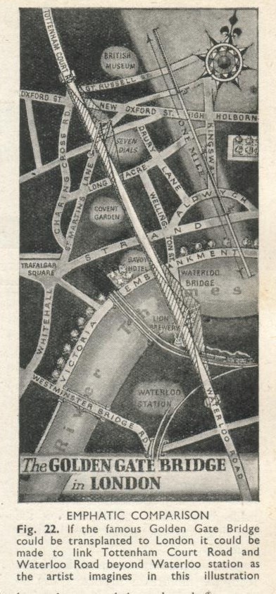
Our friend Will Wiles, erstwhile deputy editor of Icon and author of “Care of wooden floors” unearthed this brilliant vintage visualisation: the scale of the Golden Gate Bridge overlaid on central London.
If you’re not a millionaire film director with cutting-edge tech, then you can still experience the extreme distance he travelled with the site we developed with the BBC, HowBigReally.com
Enter your postcode and get an idea of how far the bottom of the Marianas Trench is from where you live… or even better, calculate a route to take a walk that’s the same distance as James Cameron travelled in his submersible!
How big really is now just over a year old, released just before I started work at BERG, and I still find myself totally engaged with the simplicity of the concept. It’s a solid, easy to digest punch of information that translates unknown quantities into something instantly recognisable. How many really is the second part of the experiment, and I was tasked with working on the design. This is a little write up of the design process.
We started off by following a workshop Webb & Jones had run with the BBC to kick off the initial concept of examining quantity. Myself, James Darling & Matt Brown spent a week whiteboarding, sketching and iterating, to try and nail down some initial ideas.
The first thought was the variables with which we could use to convey changes in quantity. Time, movement, zoom & scale were all identified as being potentially useful.
We started to construct sentences that could tell a story, and break down into portions to allow new stories to slot in.
Looking at splitting grids into sections to show different variables.
We thought a bit about avatars, and how to use them in visual representations of data, in this case combining them with friends’ names and stories.
Looking at combining avatars with ‘bodies’. Bird suits, vehicles, polaroids.
An early narrative concept, setting up the story early on and sending you through a process of experience. We thought about pushing bits of stories to devices in real time.
After a bit more crunching and sketching, we broke everything down into two routes:
Scale – influenced by Powers of 10, used to compare your networks to increasing sizes of numbers,
Grouping / snapping – used to take your contacts and run them through a set of statistics, applying them personally to historical events and comparing them against similar events in different times.
What became clear after the sketching was the need to show a breadcrumb trail of information, to give the user a real sense of their scale compared to the numbers we were looking at. Eames’ Powers of 10 video achieves this – a set of steps, with consistent visual comparisons between each step.
Perfect for showing the relevance of one thing in relation to the next, or a larger collective group. But the variation in the stories we’d be showing meant that we didn’t want bespoke graphics for each individual scenario. We tested out a quick mockup in illustrator using relatively sized, solid colour squares.
Despite the lack of rich textures and no visual indicators of your current position in the story, the impact was there. We added Facebook / Twitter avatars for signed in states, and worked on a colour palette that would sit well with BBC branding.
The next problem was dealing with non-signed in states. How many really was always designed to work with social networks, but we wanted it to be just as relevant with no Facebook or Twitter credentials – for classrooms, for example. We took a trip to the V&A to view the Isotype exhibition that was on at the time.
That’s 85 year old iconography and infographic design that looks as relevant today as it did back then. A real sense of quantity through simple pictograms. Completely fantastic. We set about designing a stack of isotype influenced icons to work with the site when users weren’t signed into their social networks.
And the icons in context…
We used a bit of Isotype inspiration for the organisation of the grouping stories – evenly spaced grids of icons or avatars.
The rest of the site was intended to stay consistent with How big really. We used photography in place of bespoke graphics for the story panels, as the graphical output varies for each user.
How many really is an entirely different beast to How big really. Rather than each dimension being a solid, one shot hit, the value is in backing up simple visuals with interesting narratives. We spent almost as much time on the written aspect of stories as we did on the aesthetics and interaction. I hope it gives a little context to numbers and figures we often take for granted. Please do have a browse around!