This website is now archived. To find out what BERG did next, go to www.bergcloud.com.

Blog posts tagged as 'design'

Media Surfaces: Incidental Media

Following iPad light painting, we’ve made two films of alternative futures for media. These continue our collaboration with Dentsu London and Timo Arnall. We look at the near future, a universe next door in which media travels freely onto surfaces in everyday life. A world of media that speaks more often, and more quietly.

Incidental Media is the first of two films.

The other film can be seen here.

Each of the ideas in the film treat the surface as a focus, rather than the channel or the content delivered. Here, media includes messages from friends and social services, like foursquare or Twitter, and also more functional messages from companies or services like banks or airlines alongside large traditional big ‘M’ Media (like broadcast or news publishing).

All surfaces have access to connectivity. All surfaces are displays responsive to people, context, and timing. If any surface could show anything, would the loudest or the most polite win? Surfaces which show the smartest most relevant material in any given context will be the most warmly received.

Unbelievably efficient

I recently encountered this mixing in surfaces. An airline computer spoke to me through SMS. This space is normally reserved for awkwardly typed highly personal messages from friends. Not a conversational interface with a computer. But now, those pixels no longer differentiate between friends, companies and services.

Mixing Media

How would it feel if the news ticker we see as a common theme in broadcast news programmes begun to contain news from services or social media?

Media Surfaces mixed media

I like the look of it. The dominance of linear channel based screens is distorted as it shares unpredictable pixels and a graphic language with other services and systems.

Ambient listening

This screen listens to its environment and runs an image search against some of the words it hears. I’ve long wanted to see what happens if the subtitles feed from BBC television broadcast content was tied to an image search.

Media Surfaces ambient listening

It feels quite strange to have a machine ambiently listening to words uttered even if the result is private and relatively anodyne. Maybe it’s a bit creepy.

Print can be quick

This sequence shows a common receipt from a coffee shop and explores what happens when we treat print as a highly flexible, context-sensitive, connected surface, and super quick by contrast to say video in broadcast.

Media Surfaces print can be quick 01

The receipt includes a mayorship notification from foursquare and three breaking headlines from the Guardian news feed. It turns the world of ticket machines, cash registers and chip-and-pin machines into a massive super-local, personalised system of print-on-demand machines. The receipt remains as insignificant and peripheral as it always has, unless you choose to read it.

Computer vision

The large shop front shows a pair of sprites who lurk at the edges of the window frames. As pedestrians pass by or stand close, the pair steal colours from their clothes. The sketch assumes a camera to read passers-by and feed back their colour and position to the display.

Media Surfaces computer vision 01

Computer vision installations present interesting opportunities. Many installations demand high levels of attention or participation. These can often be witty and poetic, as shown here by Matt Jones in a point of sale around Lego.

We’ve drawn from great work from the likes of Chris O’Shea and his Hand from Above project to sketch something peripheral and ignorable, but still at scale. The installation could be played with by those having their colours stolen, but it doesn’t demand interaction. In fact I suspect it would succeed far more effectively for those viewing from afar with no agency over the system at all.

In contrast to a Minority Report future of aggressive messages competing for a conspicuously finite attention, these sketches show a landscape of ignorable surfaces capitalising on their context, timing and your history to quietly play and present in the corners of our lives.

Incidental Media is brought to you by Dentsu London and BERG. Beeker has written about the films here.

Thank you to Beeker Northam (Dentsu London), and Timo Arnall, Campbell Orme, Matt Brown, and Matt Jones!

Patina

leicam4.jpg

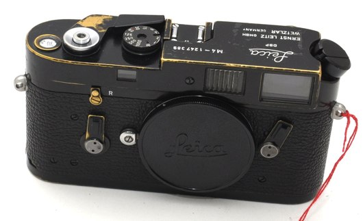
I saw this picture via The Online Photographer a few days ago. It’s a Leica M4, being sold second-hand right now on eBay, for the premium prices such cameras command.

I loved the wear at the edges, where the black paint has been worn away to reveal the brass underneath. It’s not broken; it hasn’t been mistreated. It’s just been well-used in its 35-year-odd lifespan.

And, in some ways, it’s more attractive for its wear. This isn’t a camera that’s been locked away in its packaging by an over-protective collector; it’s been well-used for its intended purpose. Part of the attraction to such an object isn’t just the aesthetic quality of its patina: there’s also something attractive about the action that wear represents. As a photographer, I’m attracted to this wear because in some ways, it represents the act of photography.

I’m not sure I’m explaining this well. Here’s another example.

prayer-feet.jpg

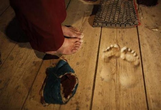
I was looking through my links for other articles about wear and patina, and I found this Reuters photograph from last year. It’s of the floor of a Tibetan monastery, where, over twenty years of daily prayer, Hua Chi has worn his own footprints into the floor.

He has knelt in prayer so many times that his footprints remain deeply, perfectly ingrained on the temple’s wooden floor.

Every day before sunrise, he arrives at the temple steps, places his feet in his footprints and bends down to pray a few thousand times before walking around the temple.

The footprints are three centimeters (1.2 inches) deep where the balls of his feet have pressed into the wood.

1.2 inches of prayer. There’s something beautiful about the smooth imprints of a human foot worn into wood. But the wear itself also comes to symbolise the action that led to it: in this case, Hua Chi’s prayers.

Patina is the effect of actions made solid; photography into worn paint, prayer into a worn floor. It is verbing turned into a noun.

Shared Lives

Nouns and verbs. That reminded me of this post about “The Life Of Products” by Matt W, from nearly four years ago. Matt wrote:

Products are not nouns but verbs. A product designed as a noun will sit passively in a home, an office, or pocket. It will likely have a focus on aesthetics, and a list of functions clearly bulleted in the manual… but that’s it.

Products can be verbs instead, things which are happening, that we live alongside. We cross paths with our products when we first spy them across a crowded shop floor, or unbox them, or show a friend how to do something with them. We inhabit our world of activities and social groups together… a product designed with this in mind can look very different.

Wear is, of course, both a noun and a verb. It’s the verb that inevitably happens through use, and it’s the noun that the verb leaves behind. Patina is the history of a product written into its skin.

And, of course, it takes time for wear to occur. Objects start their lives pure, unworn, ready to be both used and shaped by that use. In Products are People Too, Matt’s 2007 talk from Reboot 9, he said:

Products exist over time. We meet them, we hang out with them, we live life together.

Patina is a sign of a life shared.

tarnished-laptop.jpg

Here’s a life I’ve shared.

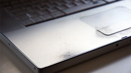
This is my three-and-a-half year old laptop. It’s my second aluminium Mac, and, just as with my previous laptop, the surface has tarnished right underneath where my palms rest. It’s not a fault – that black speckling is just what happens when perispiration meets aluminum. It’s not as beautiful as the Leica, or the monastery floor – but it’s not as ugly as cracked and chipped plastic.

I think that might be one reason I’ve kept it quite so long: the material and form of the exterior have encouraged me to hold onto the laptop. Certainly much longer than if it had been poorly constructed, becoming damaged rather than worn.

In his talk at Frontiers of Interaction in 2009, Matt J showed this photograph of Howies’ “Hand-Me-Down jacket”.

It’s a jacket that’s designed to last. Howies ensure they have the materials to repair it, encouraging the owner to mend the jacket rather than throw it out. Inside the jacket is the label above: name tags to last several generations, indicating periods of ownership.

The label is surprising because it serves as a reminder that the product will last. The encouragement to pass something on, and to measure ownership in years, acts as a reminder that there’s no reason to throw the jacket out.

It seems absurd to have to be reminded of that.

But: how many essentially functional pieces of clothing have you or I thrown out? How many items that could be repaired have ended up in the bin? How many objects have never had the time to acquire a patina – thrown out before their time was truly up?

It’s sad that we have to be reminded that objects can last. I cannot deny that there’s a role for inexpensive, cheaply-manufactured, and somewhat disposable products – but they shouldn’t condition us into thinking that’s how all products are.

Designing things that want to be kept

I read an article – which, alas, I can’t find a link to at the moment – about the disposal and lifespan of mobile phones in the USA. The most shocking item in it was that, when questioned as to the lifespan of a mobile phone, most Americans responded with “about 24 months”. A mobile phone may not last like a Leica or a Stradivarius… but it’ll last a good bit longer than two years before it’s beyond use.

24 months was, of course, the length of common cellphone contracts. And so, as contracts expired, and network providers told their customers they were eligible for a new phone, they began to assume there had to be something wrong with the old phone. And it would go in the bin.

When the patina an object gains is attractive, it acts as an encouragement to keep it. Good jeans really come into their own as they wear down and develop creases, rips, rough patches. It’s why my favourite pair say something along the lines of “wash me as little as possible!” inside.

It’s important to note: the wear I’m discussing isn’t related to things breaking. Things break because they’re worn out, or poorly designed, or used inappropriately. Patina is that wear which comes from entirely “correct” usage of a product. That usage might be intense – a professional guitarist’s instrument will acquire patina far faster than mine will – but it is, nontheless, the intended usage of the object.

I’m not sure patina can be designed. After all, it’s a product of the relationship between product and owner.

The form it takes can be shaped – by the materials used in a product, by the nature and frequency of operations that an owner might perform. I suppose that a product can be designed to age gracefully, to wear attractively; it’s just the exact nature of that wear that’s out of a designer’s hands.

In considering the patina a product might develop, you of course have to ask a series of interesting questions: about longevity, about sustainability, about materials, about manufacturing. Going beyond “peak X” and towards “resilient X”, as Matt J said. But I think the most interesting questions – at the very heart of that consideration – are emotional ones. “What if someone adores your product? What if someone really does want to make a product a part of their life? What will your product look like when it’s been worn into the ground by virtue of its own success?

I don’t think there are single answers to those questions, but they’re great questions to have to consider.

(One answer, which leaps to mind for me, can be found in The Velveteen Rabbit – one of those children’s books that manages to be, of course, both profoundly sad and yet uplifting with it. The toy rabbit in question discovers that if his owner loves him enough, he becomes real. Products are people, too, right there in 1920s children’s books).

jim-marshall-m4.jpg

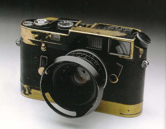
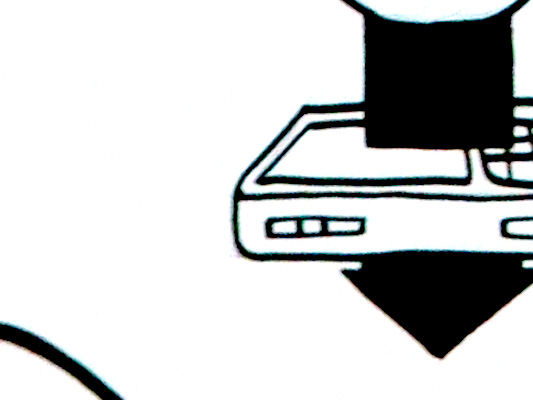
Another Leica M4 to end with: this one belonging to the photographer Jim Marshall, noted for his music photography since the 60s. (If you don’t know the name, you’ll almost certainly know his work).

Marshall made so many striking images with this camera and others like it, and, in that making, gave it its unique patina. It’s a camera as rock’n’roll as the subjects it shot. Somewhere in that wear – buried in the scuff-marks, the scratches, the flaked paint – are Jimi Hendrix, John Coltrane, Johnny Cash at Folsom Prison: the “life lived together” of Marshall and his camera.

Say hello to Michel Thomas. Or bonjour, ciao, ¡hola…

When the Michel Thomas Method language course CDs arrived at the studio, we played them on the stereo immediately. But the post was late so it arrived only the day before we were due to speak with the publishers. We tore up all our ideas and started again.

Michel Thomas teaches with no homework and no repetition. Listening to him, it’s a little like being in a classroom with other students and a little like being hypnotised.

You don’t learn, you flow.

As a design studio, we knew we had to carry the same experience onto the phone, using just the regular audio and a decent respect for the philosophy.

We designed and produced the brand new iPhone app. Check it out in the App Store: Learn a Language with Michel Thomas.

You can learn French, Spanish, Italian and German. It’s free to get the app (you get a preview of each language), and then you buy hour-by-hour as you improve.

In the flesh, the screen on the right is animated. It draws you in as you listen to the voice.

Do a pulsating pause button and tactile flower petals have a place in an audio language course app? Yes. (You have to hear Michel to understand why. I’m not kidding.)

Because mobile phones are, well, mobile, you might want to keep that learning flow going while you’re on the bus. So there’s a flashcard game. You can play one of dozens of preset decks, or make your own from favourite phrases.

This one is from the Spanish course.

There’s also the shop. I like that the “pay as you learn” store is in the exact same place as where you thumb through the course contents. I think we went through 4 iterations until it felt this smooth.

Product invention?

Between this, Popular Science+, and Schooloscope, you can see a little of our philosophy about product invention.

Work in the popular market, and be inventive, beautiful.

Respect the materials. I believe with Michel Thomas we’ve taken what’s best about the experience and made a hybrid with what’s best about the iPhone. We’re best when we partner with people who are just working out what they want to do, and we can discover together.

But what I’m proudest about is that this is a design-led product in a commercial marketplace. This isn’t just for Michel Thomas fans (though there are many). By bringing the feeling of Michel to the iPhone, his courses can find a whole new audience, and a whole load more fans.

Michel Thomas is available for your iPhone and iPod Touch now, at the App Store: Learn a Language with Michel Thomas.

See the official site for more pics and videos.

Congratulations to the team, Matt Brown, Nick Ludlam, and Matt Jones! Thanks also to Guy Moorhouse for the microsite. And, especially, thanks to Vivian and Helen and the whole Hodder team. It has been a pleasure.

Growth Assembly

herbicide_sprayer1

Growth Assembly, by Alexandra Daisy Ginsberg & Sascha Pohflepp.

Worldwide shipping of manufactured things is very inefficient. Why not ship devices and utensils in a single envelope? As seeds.

As ideas.

Maps as service design: The Incidental

Schulze & Webb worked as part of the team producing a unique service for the world’s biggest furniture and design event: Salone del Mobile in Milan, this year.

The British Council usually maintains a presence there, promoting British design and designers through an exhibition. This year, they had decided they would rather present some kind of service offering rather than a physical exhibition in a single venue.

Daniel Charny, of Fromnowon contacted us early on in the project, when they were moving the traditional thinking of staging an exhibition of to something that was more alive, distributed and connected to the people visiting Salone from Britain whilst also connecting those around the world who couldn’t be there.

From the early brainstorms we came up with idea of a system for collecting the thoughts, recommendations, pirate maps and sketches of the attendees to republish and redistribute the next day in a printed, pocketable pamphlet, which, would build up over the four days of the event to be a unique palimpsest of the place and people’s interactions with it, in it.

Åbäke, a collective of graphic designers who came up with the look and identity of the finished publication, alongside a team from the British Council ventured out to Milan to establish a temporary production studio for The Incidental, while S&W provided remote support from the UK, and the technology to harvest the twitter posts, blog mentions and flickr photos to be included in the edition, overlaid on the map to be produced overnight.

One thing that’s very interesting to us that is using this rapidly-produced thing then becomes a ’social object’: creating conversations, collecting scribbles, instigating adventures – which then get collected and redistributed.

As author/seer Warren Ellis points out, paper is ideal material for this:

“…cheap. Portable. Biodegradable/timebound/already rotting. Suggestion of a v0.9 object. More likely to be on a desk or in a pocket or bag or on a pub table than to be shelved. More likely to be passed around.”

The Incidental is feedback loop made out of paper and human interactions –  timebound, situated and circulating in a place.

Here’s the first edition from the Wednesday of the event:

There’s some initial recommendations from the British Council team and friends, but the underlying abstracted map of Milan remains fairly unmolested.

Compare that to the last edition on Saturday, where the buzz of the event has folded back into the artifact:

blog-pic-2

The map now becomes something less functional – which it can probably afford, as you the visitor have internalised it – and becomes something more emotional or behavioural: a heat-map-like visualisation of where’s hot and what’s happened.

The buzz about TheIncidental during the event was clear from the twitterfeed, which itself was feeding the production.

We were clearly riffing on the work done by our friends at the RIG with their “Things our friends have written on the internet” and the thoughts of Chris Heathcote, Aaron and others who participated in Papercamp back in January.

Since then there’s been a flurry of paper/map/internet activity, including the release recently of the marvellous Walking-Papers project by Mike Migurski of the mighty Stamen, which we talked about briefly in The New Negroponte Switch.

As well as coverage from more design-oriented blogs such as PSFK and Dezeen, there was also some encouraging commentary from our peers – many of whom saw this as the first post-Papercamp project.

Ben Terrett of the RIG said:

“Over in Milan at the Salone di Mobile they’ve created a thing called The Incidental. It’s like a guide to the event but it’s user generated and a new one is printed every day. When I say user generated, I mean that literally. People grab the current day’s copy and scribble on it. So they annotate the map with their personal notes and recommendations. Each day the team collect the scribbled on ones, scan them in and print an amalgamated version out again. You have to see it, to get it. But it’s great to see someone doing something exciting with ‘almost instant’ printing and for a real event and a real client too.

The actual paper is beautiful and very exciting. It has a fabulous energy that has successfully migrated from the making of the thing to the actual thing. Which is also brilliant and rare.”

To quote the patron saint of S&W again, Warren Ellis said:

“This is a wonderful idea that could be transposed to other events.”

Aaron Straup-Cope of Flickr, and author of many thoughts on what he calls the Papernet said:

“they are both lovely manifestations of Rick Prelinger’s “abundant present” and a well-crafted history box, something that people can linger over and touch and share, for the shape of the event.”

Our neighbours in East London, and brand identity consultants Moving Brands said:

“What a great way to create international conversation and connecting the tangible with the digital.”

Russell Davies said:

“I love the way it gets past digital infatuation and analogue nostalgia. Digital stuff is used for what it’s good for; eradicating time and distance, sharing, all that. Analogue stuff is used for what it can do well; resilience, undestandability, encouraging simple, human contributions. It’s properly ‘post digital’, from a design team and a client who are fluent in the full range of media possibilities. Not just digital, not just print. It integrates media in the same way real people do; knowing what it’s like to send a twitter and knowing what it’s like to scribble a note on a beermat at 3 in the morning.”

All credit to the team who were in Milan. They worked some punishing hours producing the paper each day, partly due to the demanding nature of the event itself and of course the demanding nature of trying something completely new. Huge and hearty congratulations to them for pulling it off.

As we didn’t attend Salone, it was only recently when we got together with the British Council team to discuss what worked and what didn’t that we saw the finished artifacts.

blog-pic-1

It was fantastic to see and touch them. In that moment, it became obvious that their dual-role was as both service and souvenir.

Here & There influences

I’m going to tell you a little bit about the influences on Here & There, a project about representation of urban places, from when it began. It was warmly received when I first presented some corners of it back at Design Engaged in 2004, before Schulze & Webb existed. Here & There is a projection drawing from maps, comics, television, and games.

This particular version is a horizonless projection in Manhattan. The project page is here, where large prints of the uptown and downtown views can be seen and are available to buy.

I’ve been observing the look and mechanisms in maps since I began working in graphic design. For individuals, and all kinds of companies, cities are an increasing pre-occupation. Geography is the new frontier. Wherever I look in the tech industry I see material from architects and references and metaphors from the urban realm. Here & There draws from that, and also exploits and expands upon the higher levels of visual literacy born of television, games, comics and print.

The satellite is the ultimate symbol of omniscience. It’s how we wage wars, and why wars are won. That’s why Google Earth is so compelling. This is what the map taps into.

The projection works by presenting an image of the place in which the observer is standing. As the city recedes into the (geographic) distance it shifts from a natural, third person representation of the viewer’s immediate surroundings into a near plan view. The city appears folded up, as though a large crease runs through it. But it isn’t a halo or hoop though, and the city doesn’t loop over one’s head. The distance is potentially infinite, and it’s more like a giant ripple showing both the viewers surroundings and also the city in the distance.

schulze-holding-posters

Origins and sources

Some of my favourite maps are drawn by a British writer, walker and accountant named Alfred Wainwright. Phil Baines provides background:

“Wainwright was an accountant born in Lancashire who fell in love with the English Lake District and moved there to live and work. All his free time was spent walking the fells, and he began his series of seven ‘pictorial guides to the Lakeland Fells’ in 1952 as a way of repaying his gratitude to them. The work took 13 years.” (Type & Typography)

Wainwright’s walking maps are drawn to suit their context of use, the books are intended to be used while walking. As the reader begins their walk, the map represents their location in overview plan. As the walk extends through the map, the perspective slowly shifts naturally with the unfolding landscape, until the destination is represented in a pictorial perspective view, as one would see it from their standpoint.

Wainwright spread

This is a reversal of the Here & There projection. In Wainwright’s projection we stand in plan, and look into perspective. Wainwright’s view succeeds in open ground where one can see the distance… but in a city you can only see the surrounding buildings. Wainwright and Here & There both present what’s around you with the most useful perspective, and lift your gaze above and beyond to see the rest.

David Hockney presents a fantastic dissection of perspective in the film A Day on the Grand Canal with the Emperor of China or Surface Is Illusion But So Is Depth. He describes a very old painting from China which depicts a journey along the grand canal. I really like how he describes the scene as ‘making sense.’

He justifies a deviation from Western perspective, that to represent things as they strike your eye is not even functionally as good as some other interpretative distortions. In this painting in which there’s a grossly distorted perspective, in which there aren’t even any rules, it still makes sense because it changes how you put yourself in the painting, and that changes where you put yourself outside it.

Augmented reality

There is a element in the map, in the uptown view, of a bus. Its destinations in both directions are shown. (I love NY bus routes, the cross town super power!) This is to explore how augmenting the map with local information might work.

bus-context

One of my intentions with the project is to make an exploration into way-finding devices. One of my favourite examples of augmented reality is from these American Road maps from 1905. The map is stored in a book, and good for only one route. In fact, it isn’t a map as we’d typically understand one.

American Road Maps 1905

Michaels, H. Sargent. Photographic Runs: Series C, Chicago to Lake Geneva to Delavan, Delavan to Beloit. Chicago: H. Sargent Michaels, 1905. Used with permission from Prof. Robert French, Osher Map library, University of Southern Maine, Owls Head Transportation Museum.

The book dates from before the national road sign infrastructure was introduced to American highways or inter-city roads. Each page is a photo of a junction, with every junction between the two cities included, and an arrow is drawn over the photo to say which direction to take. As the driver progresses along their route, they turn pages, each junction they arrive at corresponding to the one in the current photo. (Many thanks to Steve Krug for the sharing his discovery of these great pieces.)

First person to God games

I don’t like the way maps (in-game maps) work in most video games. They seem to break my flow of play, and locating one’s actor in the game isn’t satisfying. I’d love to see a first person or third person shooter where the landscape bent up to reveal a limited arc of the landscape in plan over distance. As a video game, the Here & There projection slides from Halo, through GTA into Syndicate, to end in SimCity.

game collage

Although I never played it, I’ve heard a lot about Luigi’s Mansion for the Nintendo GameCube. Luigi wonders around a haunted mansion and hoovers up ghosts with a vacuum cleaner. I heard about a mechanic in the game which involved a virtual Gameboy Advance in the game. Luigi could take it out and use it to inspect the world. The game played out in the third person with a view of Luigi in place, but I think when you look in the Advance, it gave a first person view from Luigi’s position. Well, if it didn’t, it should have done.

I know that in some special games the Gameboy Advance could be plugged into the GameCube, to be used as a special controller. It would be amazing to use the second screen in a controller for that first person perspective. Imagine if you could guide your actor around in third person and glance down at the screen in your hands for close inspection or telescopic sniping.

Powers and cities

Recently Matt Jones and Rod Mclaren discussed Jason Bourne and James Bond and how they use cities. Jones characterises Bourne in contrast to Bond:

“… in addition, Bourne wraps cities, autobahns, ferries and train terminuses around him as the ultimate body-armour”

For Bourne, the city is his power, Jones continues:

“A battered watch and an accurate U-Bahn time-table are all he needs for a perfectly-timed, death-defying evasion of the authorities.”

I like to talk about the projection as a superpower, the power to be both in the city and above it.

Last year Warren Ellis wrote an Iron Man arc called Extremis. As ever, fine stuff. And with great pictures from Adi Granov too.

Ellis, unsatisfied with controlling the Iron Man suit by normal means (sensors, or weeny joysticks in the gloves or something) as an exoskeleton (picture Ripley in the clumsy Powerloader), Stark must ingest the Extremis serum in order to match his enemy, Mallen, and prevent him from his destructive path into Washington. The serum welds Stark to his tech. It leaves him ‘containing’ the membrane-like ‘undersheath’ he uses to control the Iron Man suit. It is stored inside his bones.

Iron Man mind control

The final sequence of panels in the penultimate book has Stark wearing the Iron Man suit, setting off to confront his enemy, his recent transformation has left him with new powers…

Iron Man leaves to confront Mallen

“I can see through satellites now.”

What a thought! Within one field of view, to be both in the world and to see yourself in it. The power of looking through, and occupying, your own field of vision. Awesome.

What if the projection appeared inside location-aware binoculars? Hold them up, and live satellite images are superimposed in ‘the bend’ onto the natural view of the city as it lifts up into plan! You’d see the traffic and people that just pulled out of view into a side street from above mapped onto your natural view.

Timo Arnall posted a video showing a Google Streetview pan controlled with the digital compass inside the device:

It begins to reveal how Here & There might feel if it were moving beneath your feet.

Thanks

I would like to thank both James King (art direction) and Campbell Orme (technical direction) for their tireless efforts in bringing this work to life. Email them and make them work on your stuff. They are talented, humane and brilliant designer/thinkers.

Art prints of Here & There have been produced in a limited run and can be purchased here. Please buy one and stick it on a wall.

Infinite Zoom into Milk

In 1977 Charles and Ray Eames made a documentary film called Powers of Ten. The second half of the film includes a slow zoom into a man’s hand, right the way through cells and molecules all the way down to an atomic structure. It’s extraordinarily engaging, beginning at a familiar human context, and visualising something desperately distant and unknowable.

About a year ago James King brought a book to my attention from a series called Analysis of the Massproduct Design by Japanese product designer Taku Sato.

Analysis of the Massproduct Design is just like the Eames Powers of Ten video but for everyday products.

Taku Sato book covers

Each book takes a manufactured product and breaks down the content, graphics, construction and packaging page by page. The books are like infinite zooms into fabrication and history.

There are four, in turn looking at Xylitol Lime Mint chewing gum, a Fujifilm disposable camera, ‘Licca the fashion dress up doll by Takara Co.’ and a litre of milk from the Meiji Dairies Corporation. The blurb reads:

…we will take up and focus on one mass-produced product seen everywhere in our daily life without special attention paid to and from the point of view of design we try to take a closer look at and analytically examine it to find what kinds of ideas, efforts, ingenuities have been put in to it.

Each book begins with an overview and in some cases a history. This is from the book on the Fujifilm disposable camera.

Fujifilm overview

As the book progresses, spreads examine the product in greater and greater detail. Near the end of the Fujifilm book, there’s a photographic one micrometer cross section of the film stock.

fujifilm book film detail

One of my favourites spreads is from the book examining Xylitol chewing gum and is titled ‘The Feeling on the Teeth When Chewed.’ It’s about the material qualities of tablets versus sticks of gum. A quote:

The firmness of a chewing gum changes gradually with the passing of the time of its being chewed. In order to make this change of the chewing feeling close to an ideal one, the elements that should make up of the chewing gum are controlled… The figure shows the strength of the chewing exerted in the mouth measured with an analyzing device called RheoMeter. These graphs will tell you how different the chewing feelings are between ordinary sheet-type chewing gum and sugar coated chewing gum.

An ideal chewing feeling! A RheoMeter! They’ve got a machine for testing the chewiness of gum.

chewiness spread

I think Taku Sato actually designed the packaging for the milk carton he analyses. One of the spreads shows what each of the indents on the base of the cartons are for. Ambiguity in the translation adds to the mystery in some cases:

…(image a) is a little dented. This is for securing the stability of the carton when placed straight on a table… The number (image c) is the filling machine’s column index. The embossed information works for cause of the trouble to be clarified when it happens.

Taku Sato milk base

The books feel like imaginary manuals. They offer the seductive illusion that with this book the object can be completely known, all secrets unravelled. They somehow imply that if all was lost, objects like these could be reconstructed with this knowledge alone.

A while back I came across the term ‘Spime’ in Bruce Sterling‘s book Shaping Things. He uses the word to characterise smart objects which talk about their histories, how they were made, where they were sourced, where they’ve been, etc. Spimes might be a cars which announce their locations, or a packaged beef steak which shows the cow it comes from and where that cow was raised.

Sato’s books are raw Spime porn. Objects showing off their shiny interiors, construction and their ancestors. The celebrity biographies of mass produced objects.

Olinda interface drawings

Last week, Tristan Ferne who leads the R&D team in BBC Audio & Music Interactive gave a talk at Radio at the Edge (written up in Radio Today). As a part of his talk he discussed progress on Olinda.

Most of the design and conceptual work for the radio is finished now. We are dealing with the remaining technicalities of bringing the radio into the world. To aid Tristan’s presentation we drew up some slides outlining how we expect the core functionality to work when the radio manifests.

Social module

Social Module sequence

This animated sequence shows how the social module is expected to work. The radio begins tuned to BBC Radio 2. A light corresponding to Matt’s radio lights up on the social module. When the lit button is pressed, the top screen reveals Matt is listening to Radio 6 Music, which is selected and the radio retunes to that station.

Tuning

Tuning drawing

This detail shows how the list management will work. The radio has a dual rotary dial for tuning between the different DAB stations. The outer dial cycles through the full list of all the stations the radio has successfully scanned for. The inner dial filters the list down and cycles through the top five most listened to stations. We’ll write more on why we’ve made these choices when the radio is finished.

RFID icons

Earlier this year we hosted a workshop for Timo Arnall‘s Touch project. This was a continuation of the brief I set my students late last year, to design an icon or series of icons to communicate the use of RFID technology publicly. The students who took on the work wholeheartedly delivered some early results which I summarised here.

This next stage of the project involved developing the original responses to the brief into a small number of icons to be tested, by Nokia, with a pool of 25 participants to discover their responses. Eventually these icons could end up in use on RFID-enabled surfaces, such as mobile phones, gates, and tills.

Timo and I spent an intense day working with Alex Jarvis and Mark Williams. The intention for the day was to leave us with a series of images which could be used to test responses. The images needed consistency and fairly conservative limits were placed on what should be produced. Timo’s post on the workshop includes a good list of references and detailed outline of the requirements for the day.

I’m going to discuss two of the paths I was most involved with. The first is around how the imagery and icons can represent fields we imagine are present in RFID technology.

Four sketches exploring the presence of an RFID field

The following four sketches are initial ideas designed to explore how representation of fields can help imply the potential use of RFID. The images will evolve into the worked-up icons to be tested by Nokia, so the explorations are based around mobile phones.

I’m not talking about what is actually happening with the electromagnetic field induction and so forth. These explorations are about building on the idea of what might be happening and seeing what imagery can emerge to support communication.

The first sketch uses the pattern of the field to represent that information is being transferred.

Fields sketch 01

The two sketches below imply the completion of the communication by repeating the shape or symbol in the mind or face of the target. The sketch on the left uses the edge of the field (made of triangles) to indicate that data is being carried.

Fields sketch 02

I like this final of the four sketches, below, which attempts to deal with two objects exchanging an idea. It is really over complex and looks a bit illuminati, but I’d love to explore this all more and see where it leads.

Fields sketch 03

Simplifying and working-up the sketches into icons

For the purposes of our testing, these sketches were attempting too much too early so we remained focused on more abstract imagery and how that might be integrated into the icons we had developed so far. The sketch below uses the texture of the field to show the communication.

fields-04.jpg

Retaining the mingling fields, these sketches became icons. Both of the results below imply interference and the meeting of fields, but they are also burdened by seeming atomic, or planet sized and a annoyingly (but perhaps appropriately) like credit card logos. Although I really like the imagery that emerges, I’m not sure how much it is doing to help think about what is actually happening.

Fields sketch 05

Fields sketch 06

Representing purchasing via RFID, as icons

While the first path was for icons simply to represent RFID being available, the second path was specifically about the development of icons to show RFID used for making a purchase (‘purchase’ is one of the several RFID verbs from the original brief).

There is something odd about using RFID tags. They leave you feeling uncertain, and distanced from the exchange or instruction. When passing an automated mechanical (pre-RFID) ticket barrier, or using a coin operated machine, the time the machines take to respond feels closely related to the mechanism required to trigger it. Because RFID is so invisible, any timings or response feels arbitrary. When turning a key in a lock, this actually releases the door. When waving an RFID keyfob at reader pad, one is setting off a hidden computational process which will eventually lead to a mechanical unlocking of the door.

Given the secretive nature of RFID, our approach to download icons that emerged was based on the next image, originally commissioned from me by Matt for a talk a couple of years ago. It struck me as very like using an RFID enabled phone. The phone has a secret system for pressing secret buttons that you yourself can’t push.

Hand from Phone

Many of the verbs we are examining, like purchase, download or open, communicate really well through hands. The idea of representing RFID behaviours through images of hands emerging from phones performing actions has a great deal of potential. Part of the strength of the following images comes from the familiarity of the mobile phone as an icon–it side-steps some of the problems faced in attempting to represent an RFID directly.

The following sketches deal with purchase between two phones.

Purchase hands sketch

Below are the two final icons that will go for testing. There is some ambiguity about whether coins are being taken or given, and I’m pleased that we managed to get something this unusual and bizarre into the testing process.

Hands purchase 01

Hands purchase 02

Alex submitted a poster for his degree work, representing all the material for testing from the workshop:

Outcomes

The intention is to continue iterations and build upon this work once the material has been tested (along with other icons). As another direction, I’d like to take these icons and make them situated, perhaps for particular malls or particular interfaces, integrating with the physical environment and language of specific machines.

RFID Interim update

Last term during an interim crit, I saw the work my students had produced on the RFID icons brief I set some weeks ago. It was a good afternoon and we were lucky enough to have Timo Arnall from the Touch project and Younghee Jung from Nokia Japan join us and contribute to the discussion. All the students attending showed good work of a high standard, overall it was very rewarding.

I’ll write a more detailed discussion on the results of the work when the brief ends, but I suspect there may be more than I can fit into a single post, so I wanted to point at some of the work that has emerged so far.

All the work here is from Alex Jarvis and Mark Williams.

Alex began by looking at the physical act of swiping your phone or card over a reader. The symbol he developed was based on his observations of people slapping their Oyster wallets down as they pass through the gates on to the underground. Not a delicate, patient hover over the yellow disc, but a casual thud, expectant wait for the barrier to open, then a lurching acceleration through to the other side before the gates violently spasm shut.

RFID physical act 01

More developed sketches here…

RFID physical act 02

I suspect that this inverted tick will abstract really well, I like the thin line on the more developed version snapping the path of the card into 3D. It succeeds since it doesn’t worry too much about working as an instruction and concentrates more on a powerful cross-system icon to be consistently recognisable.

Verbs

The original brief required students to develop icons for the verbs: purchase, identify, enter (but one way), download, phone and destroy.

Purchase and destroy are the two of these verbs with the most far-reaching and less immediate consequences. The aspiration for this work is to make the interaction feel like a purchase, not a touch that triggers a purchase. This gives the interaction room to grow into the more complex ones that will be needed in the future.

This first sketch, on purchase, from Alex shows your stack of coins depleting, something nice about the dark black arrow which repeats as a feature throughout Alex’s developments.

RFID Purchase 01

Mark has also been tackling purchase, his sketches tap into the currency symbols, again with a view to represent depletion. Such a blunt representation is attractive, it shouts “this will erode your currency!”

RFID Purchase 03

Mark explores some more on purchase here:

RFID Purchase 02

Purchase is really important. I can’t think of a system other than Oyster that takes your money so ambiguously. Most purchasing systems require you to enter pin numbers, sign things, swipe cards etc, all really clear unambiguous acts. All you have to do is wave at an Oyster reader and it costs you £2… maybe: The same act will open the barrier for free if you have a travel card on there. Granted, passengers have already made a purchase to put the money on the card, but if Transport for London do want to extend their system for use as a digital wallet they will need to tackle this ambiguity.

Both Mark and Alex produced material looking at the symbols to represent destroy, for instances where swiping the reader would obliterate data on it, or render it useless. This might also serve as a warning for areas where RFID tags were prone to damage.

RFID Destroy 01

I like the pencil drawing to the top right that he didn’t take forward. I’ve adjusted the contrast over it to draw out some more detail. Important that he distinguished between representing the destruction of the object and the data or contents.

Williams Destroy sketches

Mark’s sketches for destroy include the excellent mushroom cloud, but he also looks at an abstraction of data disassembly, almost looks like the individual bits of data are floating off into oblivion. Not completely successful since it also reminds me of broadcasting Wonka bars in Charlie and the Chocolate Factory and teleporting in Star Trek, but nice none the less.

Drawing

This is difficult to show online, but Alex works with a real pen, at scale. He is seeing the material he’s developing at the same size it will be read at. Each mark he makes he is seeing and responding to as he makes it.

Jarvis Pen

He has produced some material with Illustrator, but it lacked any of the impact his drawings brought to the icons. Drawing with a pen really helps avoid the Adobe poisoning that comes from Illustrator defaults and the complexities of working out of scale with the zoom tool (you can almost smell the 1pt line widths and the 4.2333 mm radius on the corners of the rounded rectangle tool). It forces him to choose every line and width and understand the success and failures that come with those choices. Illustrator does so much for you it barely leaves you with any unique agency at all.

It is interesting to compare the students’ two approaches. Alex works bluntly with bold weighty lines and stubby arrows portraying actual things moving or downloading. Mark tends towards more sophisticated representations and abstractions, and mini comic strips in a single icon. Lightness of touch and branching paths of exploration are his preference.

More to come from both students and I’ll also post some of my own efforts in this area.

Recent Posts

Popular Tags