Another batch of SVK torches have arrived in the office… Which reminded me to tell the story of the SVK logo.
Alex and, before him – Matt Brown, had been working up some fairly slick logos; which didn’t seem to quite fit with the story or the world of Thomas Woodwind.
I had a bit of a brain-fart and sent the following to Alex and Jack to see if we could spike it in a new direction.
Heimdall is the public brand – it’s the respectable, publicly-traded corporation with the big HQ – that’s got a polished logo that cost £18 million quid from Wolff-Olins or Interbrand.
SVK is a skunkworks project.
Its logo was never meant to be seen by civilians. It’s an in-joke, a source of nerd-pride. It’s been developed by sociopathic geniuses who haven’t talked to anyone normal since 1998. It’s likely got a logo that they generated in WordArt Wizard in Powerpoint.
It’s perhaps more of the world of the sorts of insignia that Trevor Paglen collects
Of course – this is a reasonable, plausible direction – but we are also making an object that we want people to respond to – so maybe it shouldn’t be completely unpolished.
Perhaps then…
The nerds in the SVK team picked the most socialised one of their number to beg the person in corporate marketing and design whose iphone they once de-bricked to give them a spare hour before the pub to tidy it up
“no, i’m afraid – it’s above your pay grade to ask what SVK means. sorry yeah, no it’s an awesome logo. thanks. it’s just a joke for the guys. yeah i was being a dick. etc.”
Hey presto. They got a logo.
Other things that got thrown in the pot…
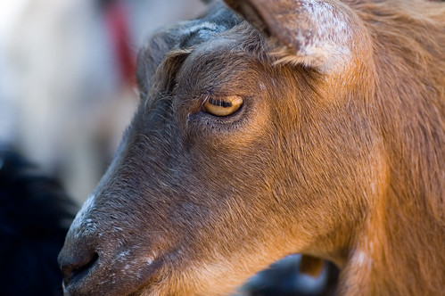
Goat’s eyes are unnerving (to most people?) and often feature in the portrayal of the demonic…
Although this one seems quite sweet.
And… some of Gavin Rothery’s awesome art-direction evolution and process around the movie Moon, …aaaand fictional logos in James Bond Movies…
Oh, and I almost forgot – Warren pointed us at SCHWA. Remember SCHWA?
Anyway.
Here’s Alex’s evolution of the SVK logo based on those discussions and influences…
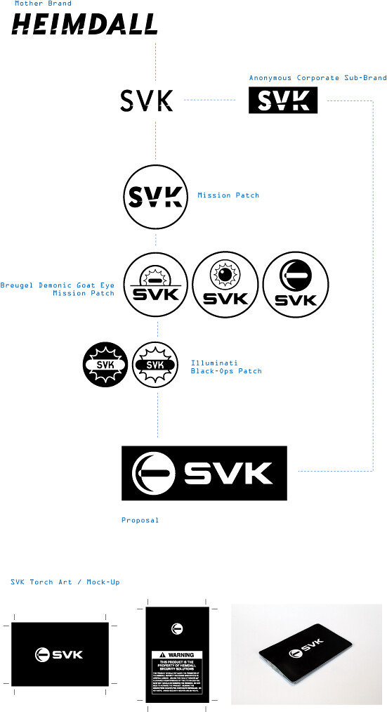
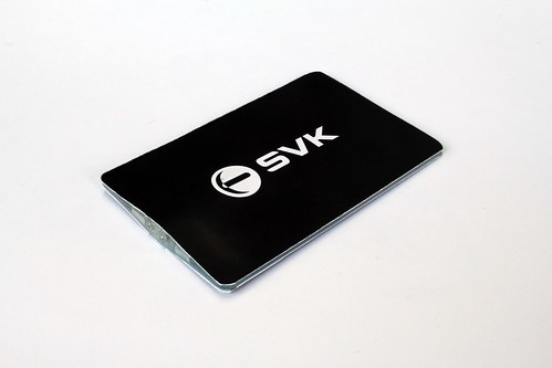
And what the final version looks like:
Standby for more SVK news…
2 Comments and Trackbacks
1. haveacupoftea said on 27 June 2011...
About that torch SVK logo : for what it’s worth, first thing that comes to mind is a Scandinavian maritime shipping company! (Hints : the anchor-like drawing, and for some reason letters that I associate with Scandinavia : starting SV like Sverige, ending K like Maersk, S+K like SKF, and probably numerous other unconscious references).
2. Dan Bullock said on 27 June 2011...
Very intriguing development! Looking good and haveacupoftea giving us a interesting insight of approach there.