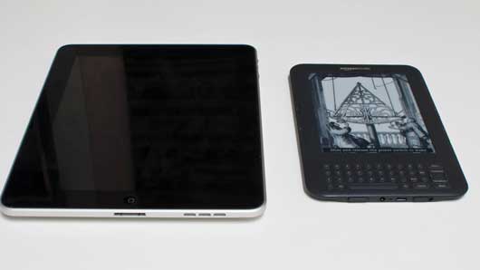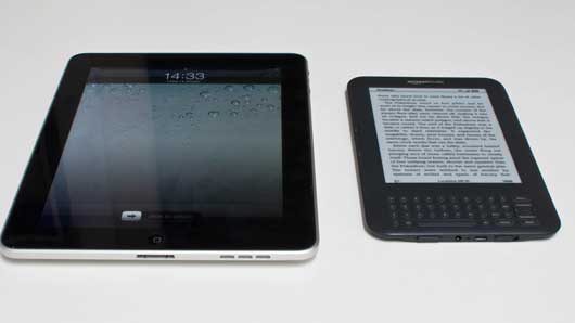
These two objects are asleep. They’re not in use; they’re waiting to be used. You approach them, touch a button, stroke a switch, and they wake up.

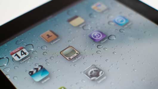
The iPad bursts into life, its backlight on, the blinking “slide to unlock” label hinting at the direction of the motion it wants you to make. That rich, vibrant screen craves attention.
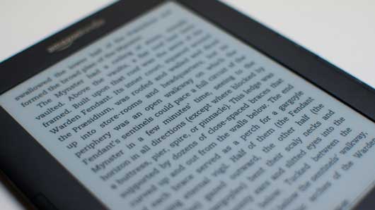
The Kindle blinks – as if it’s remembering where it was – and then displays a screen that’s usually composed of text. The content of the screen changes, but the quality of it doesn’t. There’s no sudden change in brightness or contrast, no backlight. If you hadn’t witnessed the change, you might not think there was anything to pay attention to there.

It’s glowing rectangles all the way down: those backlit screens that suck your attention. Matt J described it nicely a few years ago:
the iPhone is a beautiful, seductive but jealous mistress that craves your attention, and enslaves you to its jaw-dropping gorgeousness at the expense of the world around you.
When the iPad wakes up, everything else in the room disappears; your attention’s been stolen by that burst of light.
This metaphor has percolated right into mainstream understanding. Look at this Microsoft advert: they’re making a virtue of a phone that, ideally, you have to look at less.
But, of course, when you look at the phone, it lights up and steals your attention.
Attention-seeking is something we often do when we’re uncomfortable, though – when we need to remind the world we’re still there. And the strongest feeling I get from my recently-acquired Kindle is that it’s comfortable in the world.

That matte, paper-like e-ink screen feels familiar, calm – as opposed to the glowing screens of so many devices that have no natural equivalents. The iPad seems natural enough when it’s off – it has a pleasant glass and metal aesthetic. But hit that home button and that glow reveals its alien insides.
Perhaps the Kindle’s comfort is down to its single-use nature. After all, it knows it already has your attention – when you come to it, you pick it up with the act of reading already in mind.
That comfort is important to the Kindle’s intended purpose, though. As I wrote on Flickr:
“…this is a device that always seems content with itself. Just sitting there, not caring if you pick it up or not. Like a book.”
If this device is to replace, for many people, a book, it needs to manifest some of those qualities: safe, nonthreatening, no more distracting than a few hundred of pages of text intend to be. It needs a quiet confidence to make you trust it more.

I took this photograph the other weekend because, reading some short stories in a coffee shop, the reader looked perfectly at home with wood, and paper, and clocks, and illustration. To paraphrase Sesame Street: some of these things are like the others. It was strange to see an electronic device so at home in the physical realm (mainly thanks to that uncanny screen) – and yet the Kindle looks somehow out of place next to more “active” devices such as my laptop, phone, or TV.
That “quiet confidence” runs both ways, too: the Kindle’s sleeping state is practically identical to its “awake” state, and it’s equally comfortable in both. By contrast, I don’t think the iPad is comfortable when it’s asleep: it just turns its backlight off entirely. Nothing to see here, carry on.
If Mujicomp is all about devices we’re comfortable inviting into our homes, shouldn’t we be inviting in devices that will be comfortable in those environments? Not awkward, seeking attention through flashing lights or occasional, violent bursts into life, but well-appointed, content devices. Devices that are as happy “asleep” as “awake”, that don’t crave attention with bright screens, but earn it through modest usefulness, and good companionship. House-trained products.
The Kindle, much like a paperback book, is just as happy “asleep” as it is in use. It’s a reminder that the design of genuinely ubiquitous devices and products is not just about what they are like in use; it is also about what they are like when they are just present.
10 Comments and Trackbacks
1. Jonas said on 14 January 2011...
Tom, thanks for this really interesting blog post.
A related thing that came to my mind while I read your thoughts about sleeping devices is the LED on the current MacBook Pros. When the MacBook is in sleep mode the LED usually blinks. Other laptops usually do this too, often with blue or green LEDs constantly glowing or blinking fast. The LEDs on Apple laptops however are white and blink in a rhythm that is similar to the breathing of a sleeping adult. Apple even filed a patent for that: http://goo.gl/LFIl7
I thought this was quite interesting and if I think about it a sleeping MacBook does indeed seem more peaceful and not so much begging for attention than a laptop with a fast blinking green LED.
2. Steve said on 18 January 2011...
Why is it everyone talks about the Kindle as a synonym for eReaders?
There are better devices, cheaper, lighter ones and most of all not bounded in a closed system of digital supplies (by Amazon). Check out Bookeen or Bebook for example. I dont understand why customers fulfil the role promoting a corporates strategy in becoming the one and only.
3. xman said on 18 January 2011...
I am the opposite. I much prefer my iPad to my Kindle, it feels much more alive and responsive and I want to turn it on. Like a good book it sucks you in – there is no point in reading a book that doesn’t! The kindle only has hidden shallows. (The reading experience on the kindle is fine though I prefer the kindle app on the iPad, doing anything else on the kindle is just horrible and it feels rather fragile and badly built when you handle it)
4. Alper said on 18 January 2011...
The same applies also to devices that you would like to take out with you for instance to a cosy bar/restaurant. Pulling out an iPad there could seriously wreak havoc on the mood lighting.
Also I heard some people remark that they would be reluctant to do a lot of stuff on their phones (like controlling the lights or interacting with the music) in a club because they don’t want to be labelled as ‘nerds’. Having interfaces that are either more ambient or more (club-)fashionable would be very welcome.
5. ThomasGC said on 18 January 2011...
Nice post. Totally agree. My Kindle is “just there”. It does not demand my attention. It does not distract. A humble, unpretentious device.
6. Aditya said on 19 January 2011...
Absolutely love the post. There’s something in the design of things that defines their world and their destinies. I hope the Kindle holds its own.
7. Gary said on 21 January 2011...
I just want iPhones banned in cinemas. Why pay £8 to sit behind some illuminated fool, because he’s unable to stop updating his Facebook page.
It’s impossible to watch a movie in those circumstances.
So yeah, no iPhones in cinemas and mobile scramblers on buses, so I can start reading books without earplugs again.
8. Julian Bleecker said on 27 January 2011...
Insightful stuff Tom. Our jealous screens pose a dilemma, often told about the relationship between inside and outside, on or off, engagement and disengagement and lots of that tracks back to the attention-suck of these lustful voids.
From a design perspective, it’s curious to think about the ways these devices indicate their state, or change their state. Some of the Android mobiles blink asleep like an old tube television powering down. (Remember that? We may be the last generation with a visual memory of the powering down of television “tubes.”) And people were tripping over themselves to express their gooey admiration for Ives breathing/glowing laptops during their sleep state.
In a more pragmatic light, there’s lots of good stuff in Matt Richtel’s series of articles on attention and where it’s going and the consequences. He’s just done a recent short article on pedestrians getting clipped whilst bouncing around to their various audio cocooning phones and pods. It’s thorough journalism, I think and worth keeping alongside of this topic.
(http://www.npr.org/templates/story/story.php?storyId=129384107)
(http://topics.nytimes.com/topics/reference/timestopics/people/r/matt_richtel/index.html)
Thanks again.
Julian
9. Rob Peters said on 30 January 2011...
Excellent article. The iPad & Kindle differences can been seen as a Metaphor for our on-line interaction between individuals. Do we focus on the individual we are interacting with and “disappear” like the Kindle? Or like the iPad are we so focused on ourselves that we need to talk more than we listen and “flash” our bright colors?
I trust my Kindle to do it’s job and allow me to focus on reading! It disappears and is of great service. I hope I can do the same!
10. Mick said on 9 February 2011...
Thanks for the clever article.
Truly, it is the analogue e-ink that makes the difference. This passive substance, observable but not radiating, is the mark of any “real” things (paper, books and indeed furniture), and opposed by all “virtual” devices (phones, laptops, TV screens but also microwave displays).
In the heart of the matter, unbeknown to us, is the matter of refresh rate. At any given refresh rate, our eyes are unaware of the effort required of them (of us) to keep track of the menacing display. All the while the e-ink lays there at infinite-Hz/sec, just waiting for our eyes to notice it, indeed, lay on it, and rest.