Nick found this lovely work from Karsten “Toxi” Schmidt: a cover for Print magazine. The final piece of work – a 3D print-out of generated text – is lovely; just as beautiful, however, are all the steps in the process, “growing” type through reaction diffusion. The video above is one such illustration, but the whole write-up is fascinating, and definitely worth your time.

Matt J’s post a few days ago about ‘magic tables‘ reminded me of a recent post by Jason McIntosh over at The Gameshelf, comparing the iPad to cocktail arcade cabinets. You know: those cabinets with the screen in the table, designed to be sat around, a part of a conversation rather than a focused activity. Like the in picture above. McIntosh makes some strong points, most notably:
Thinking about what defines a particular game medium, one doesn’t always consider elements like the player’s physical posture, and where they sit relative to their fellow players. But the experience of playing a digital game with a friend on the iPad proves quite different than that of sitting side-by-side on a couch with Xbox controllers in hand, or sitting alone with a mic strapped to your head. Your sense of posture and presence is part of the game’s medium, as much as the material of the game’s manufacture.
Presence as part of a medium – fantastic.
I enjoyed this gigantic, Lego-Mindstorms-powered chess set. Not as much for the technological “wow” factor as the little details: the Knights’ legs pawing at the air as they move, and, best of all, the way the pieces politely get out of each others’ way as they move about. Machines embody politeness in a most curious way.
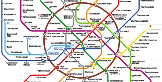
Art Lebedev have redesigned the Moscow Metro map. Never an easy task, subway mapping, but the result is striking. I’m not sure how much better or worse it is than the previous map: I’m not a Moscow local. But it’s clear from the fascinating “process” page just how much care and attention went into the design. The inner ring is clearly iconic, but their more eccentric representations are perhaps the most interesting – the topographic versions in particular.
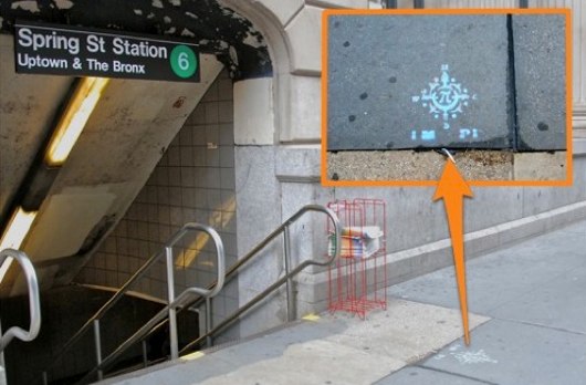
And, finally, how’s this for proper augmented-reality: NYC The Blog report that stencilled compass roses are appearing spray-painted outside subway exists, to help travellers’ get their bearings. Brilliant, and not a screen held at head-height in sight.
2 Comments and Trackbacks
1. Dan W said on 25 June 2010...
The pavement stencil compass reminds me of the compass embedded in the base of the Legible London monoliths, which are increasingly installed outside tube stations: http://www.flickr.com/photos/antimega/4693432101/ (photo via @Blech).
2. Matt Cooper said on 15 July 2010...
Having a little bit of anecdotal info about the NY compasses, apparently they’re barely noticed by New Yorkers.
Part of the problem being that they’re underfoot most of the time. And I imagine that by the time you’ve concentrated on coming up the steps onto the streets, you’ll have stepped over them…
but there is something in it. The seed of an idea perhaps…