In the UK, schools are inspected every few years to make sure they’re educating kids well and run effectively.
Ofsted, the agency that visits the schools and writes the inspection reports, yesterday released their 2008/09 Annual Report. It’s a 160 page beast of stats, strengths and weaknesses, everything schools and the government need to focus their congratulations and new efforts. There’s a short commentary at the beginning which is great, but on the whole it has quite a lot of technical language.
The Daily Mail covered the report with a shocking headline, How 1 in 3 schools fail to provide adequate teaching. Gosh.
We decided to have a basic poke at the numbers ourselves, since we’ve just started working on Ashdown and have them all handy. (Ashdown is our name for a suite of beautiful and useful products we’re making for parents and teachers around UK schools data.)
So let’s have a look.
It’s pupils that matter to parents, so let’s look at 9- and 14-year-olds.
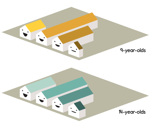
There are some 160,000 9-year-olds at schools in England that have been inspected in the last year (between September 2008 and August 2009). And about 161,000 14-year-olds, if you care about secondary schools. Let’s see how they break down…

Pupils at schools recently graded by Ofsted in England
Happy schools are better schools.
A shade off two-thirds of all 9-year-olds and all 14-year-olds go to schools that are good or outstanding. But how about that Daily Mail headline? What does “not adequate” mean?
To find out about that I should say something about how Ofsted gives grades to schools. This is the terminology bit.

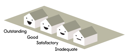
Ofsted do a few types of inspection, one of which is called a “Section 5 Inspection.” At the top of a report (here’s an example, taken totally at random) there’s a line called “Overall effectiveness of the school.” Right by it is a grade… 1 and 2 are outstanding and good respectively. There are also grades 3 and 4.
Grade 3 is “satisfactory.” You can read how Ofsted inspectors evaluate schools. It’s a bit dry, but in a nutshell a grade of ‘satisfactory’ means this: there’s nothing wrong with student performance, school leadership, value for money, or possibilities for improvement. Ofsted promise to inspect the school again within 3 years, and will make an interim visit just about half the time.
“Inadequate,” grade 4, means something is wrong with either how the kids are being educated, or the ability of the teachers to lead and improve the school. It’s pretty harsh.
1 in 3 schools are what?
Looking at our numbers, one in three pupils go to schools that are satisfactory or inadequate. Hang on, the headline said “fail to provide adequate teaching.” But only one in twenty pupils go to “inadequate” schools. Nineteen out of twenty go to schools that are satisfactory or better.
My confusion, I guess, arises because the headline uses a word which is very close to Ofcom’s own terminology – “inadequate” (grade 4) and “adequate” (in the headline, unused by Ofsted) – and so becomes ambiguous. That’s a shame. Is satisfactory adequate or not? I have no idea. How much do we care? The ambiguity obscures these discussions, but it’s great that journalism is provoking them. It’s huge, the difference in the numbers, between “satisfactory” being a grade we celebrate or one we don’t tolerate.
It’s also worth thinking about the purpose of these kind of statistics. What are stats for?
Let’s revisit Ofsted inspections. If you look again at a report (here’s another random example) and scroll riiight to the bottom, you’ll get a letter from the inspectors themselves written to the pupils of the school. In it the inspectors outline the strengths and weaknesses of the school, and what the school (and the pupils) need to do to improve. And that’s the whole point. It reinforces what’s good, and points out where effort is needed.
The Annual Report does a similar job. It’s a summary view to help focus the congratulations and efforts of parents, teachers and government bodies. Is it great or a concern that 19 out of 20 pupils go to schools that are satisfactory or better? Should we say only 19 out of 20?
In short: is “satisfactory” good enough? These numbers don’t tell us. That’s a matter for public debate.
A new kind of journalism
Holding that the job of statistics is to help target effort, we can go a little further.
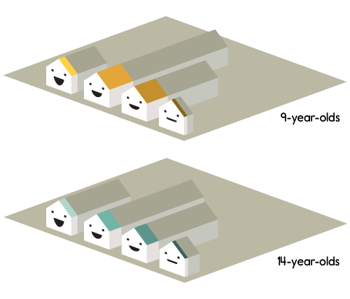
We made another chart, for pupils at the “most deprived” schools, and how those schools are doing. Ofsted define the “most deprived” schools as the 20% of schools with the highest proportion of free school meals, so we did the same. (That means we’re looking at inspected schools in England that offer free school meals to 26% of their pupils or more.)

Pupils at “most deprived” schools recently graded by Ofsted in England
A couple of things to note here… the first is that we’re dealing with 37,000 9-year-olds and 23,000 14-year-olds. That’s a lot of kids. The second is that the general shape of the graph has changed. There are, proportionately, more inadequate schools.
And that’s an interesting story: if you’re a pupil aged 9 or 14, anywhere in England, we’ve seen you have about 1 in 20 chance of being at inadequate school. But if you go to one of the most deprived schools, that’s more like 1 in 13.
Now that sucks. Should we really allow there to be more inadequate schools in the most deprived areas? Shouldn’t those schools, in fact, be so well funded that they’re better than schools in general? Well, that priorities decision is a matter for our democratic system, and these are the kind of numbers journalism can provide to inform that debate.
Reports and reporting
What Ofsted’s Annual Report shows is that most pupils – a very large majority – go to schools that are satisfactory, good, or outstanding. But that pupils who go to the most deprived schools aren’t quite as lucky. I still don’t know what the difference is really like, on the ground, between a “satisfactory” and a “good” school, but I’ll reveal my personal politics: I’m glad I now have an opinion where the government should be targeting my tax money, and, from the inspection evaluation notes, I think that the report shows that generally schools are doing a great job.
There are a hundred stories like this in the data. It’ll take a bunch of hard graft and some clever maths to find the really surprising stories (that’s part of what we’re up to). But it’s all there. Actually it’s mostly all there in Ofsted Annual Report too, but percentages are hard to read and so another big part of Ashdown’s job is to add friendly meaning and understanding. That is, to point out which of these hundreds of numbers are important, from the perspective of pupils, parents and teachers.
Thanks Tom for a whole load of number crunching very early in the project, and thanks Matt Brown for whipping up these graphs!
Now back to your regularly scheduled programming…
6 Comments and Trackbacks
1. Clare P said on 25 November 2009...
The first set of charts, looking at all 9- and 14-year-olds, work really well, but I had to look quite hard at the second set of charts to work out what they were saying. Especially if you look at the chart for 9-year-olds at deprived schools, the trends look broadly similar at first glance: greater numbers in ‘good’ and ‘satisfactory’ schools, fewer in ‘outstanding’ and the least in ‘inadequate’. The changes you want to focus on are in the proportions of only 20% of the data shown, meaning that they are quite small on chart, so the story you are telling doesn’t leap out. I wonder if something more pie-like would work better here? You would lose the direct comparison with the whole population (so you would need more charts), but the proportions might be easier to see.
2. Matt said on 29 November 2009...
One problem with evaluating schools based on student performance is that you don’t have students of equal ability at each school. If they had good longitudinal data, measuring progress of individuals. That can make schools with good students look bad if they aren’t being challenged. It would be informative to a graphic view of that.
3. Cait said on 2 December 2009...
My ten pence:
There’s a slew of data which is *very* local, not represented in the OFSTED reports, which may still make this a difficult exercise to fully inform parents. Subjective example: Nora’s school is in a deprived area, gains a satisfactory rating but the SATS results on top of that, as revealed just recently are pretty bad. Frankly, on paper, you would put Nora’s school last on your list, if at all. Which means it is under-subscribed. Anyone can get in to Nora’s school.
Nora’s school is also the one that all, *all* children of locally based refugees are sent to. So there’s a sizeable chunk of kids who don’t speak English at all, who speak it haltingly, and also, who up and leave inthe middle of term, or indeed join. Unsurprisingly, the SATS results for the school are *abysmal* compared to other schools in the area, but if you look more closely, you find a school which is incredibly well supported, which has specialist services, which takes those refugee children and does amazing work with them. All the good kids get good results, and all the kids who need hard work to help them get decidedly average results, which is probably better than they would have done anywhere else.
Now, repeat that pattern around the country, and you’ve got some very skewed school results dotted about the place, where if you’re not careful you could end up repeating the sort of Daily Mail line, but there again, I would query how on earth you’d be able to get hold of these mitigating factors, and how you would apply them to your data?
OFSTED reports do mitigate to an extent, but again, they don’t represent mitigating factors in terms of definable data, on the whole?
Trackback: links for 2009-11-30 - paulcarvill.com 1 December 2009
[…] 1 in 3 schools are what? A story of what statistics can tell us – Blog – BERG (tags: education information statistics visualization schools) […]
Trackback: The smiley face of stats « Ferrotype 5 February 2010
[…] design agency used real data from the Ofsted Annual report 2008-09 to try to use these faces to disentangle the Daily Mail headline “ A Lesson in incompetence : 1 in 3 schools fail to […]
Trackback: Ferrotype » The smiley face of stats 18 February 2010
[…] design agency used real data from the Ofsted Annual report 2008-09 to try to use these faces to disentangle the Daily Mail headline “ A Lesson in incompetence : 1 in 3 schools fail to […]