Blog posts from March 2009

Fantastical Design

Sometimes, it’s worth joining the dots between a few things you find. In this case, that was this image of a breadboard that dumps its crumbs onto a birdfeeder.

(The original image isn’t available at the moment, http://curroclaret.es having been temporarily taken offline due to excess bandwidth; I’ll link to it in due course.)

It’s both a piece of design and a visual joke: it connects two ideas (birds eat crumbs; breadboards collect crumbs) in the shortest possible distance. The entire rationale, the entire concept behind the design is laid flesh. Is it a product, a thing that makes sense in the world? Not really. The realities of kitchen design start to impinge if you think about it too long. Instead, it’s perhaps best to look at it and smile; if there’s something to be learned from it, it’s perhaps that two ideas really be connected as simply as with a bent piece of tubing.

The birdfeeder made me think a little about other examples of fantastical design, both real and imaginary. I’m not sure I’m anywhere near finding a deep interconnected thread between these, but I think as a juxtaposition of images, they all tie nicely together. In the meantime, here’s where the birddfeeder lead me.

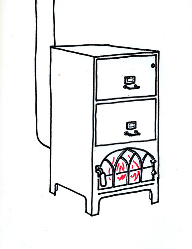
Coincidentally, it made for a nice comparison to a recent post from friend of S&W Rod Mclaren, where he posits the idea for a combined filing cabinet and stove:

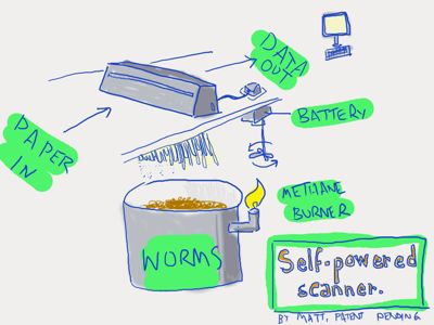
It also reminded me of a presentation of Matt’s about some of his favourite science fiction and the ideas therein, and, specifically, this slide:

There’s obviously a historical precedent for this kind of fantastic design and thought – practical ideas realised in somewhat absurd means – such as Heath Robinson’s gusset tightener:

or, if you’re American, the fantastic contraptions of Rube Goldberg:

Fantastical, outlandish design somewhat comes to a head in the work of Tim Hunkin, who somehow manages to balance a delightful sense of the absurd with solid, realistic technical skill; he’s only interested in the working and the real, and yet his sense of the absurd is at least as well refined as Heath Robinson’s.

What do all these things have in common? They explore the value of the absurd, be it absurd simplicity – as in the birdfeeder – or absurd complexity – as in Heath Robinson’s complex series of magnets and pulleys. What value does this kind of sketching, or thinking-out-loud, have for the practicing designer? I’m not entirely sure – after all, I am not a “practicing designer” myself. They remind me a little of Matt Ward’s sketching technique (which Jack discussed in his talk about Olinda): starting at extremes, and slowly iterating towards realism (and complexity). The birdfeeder, the filing cabinet, the shredder, all act a little like another form of “physical Powerpoint”: they may not be realistic, but they are highly expressive. And maybe that’s the value of this kind of design. Once the aims or thinking behind an artefact have been explained clearly, and succinctly – no matter how absurd – then it’s possible to iterate towards realism, towards a more sensible and sensical design.

The Utility of the Unfinished

This video got me thinking.

It’s footage of a simple Augmented Reality experiment from a programmer at British independent games developers Introversion, imagining what one element (the world map) of their strategy game Defcon might look like if there was an AR component to it.

I’m not as interested in the technical aspect of this experiment as I am the aesthetic.

I was struck by how well-suited the blue-on-blue, information-dense and highly representational display of Defcon is as an aesthetic for augmented reality. It helps to have a clear distinction between the real and the augmented. By making the augmented several degrees lower in fidelity than the real, it enhances the utility of the augmented elements. It creates seams between the real and the unreal, and helps the user process both real-world and AR information faster.

A few other things that struck me as being similar to this:

Jack spoke at This Happened in London last year about the Olinda project, and talked a little at the end about the form factor. Specifically: why it doesn’t look “prettier”. And he explains:

Each of the elements are trying to say what they do themselves in their own language.

Matt has described this to me as “physical PowerPoint”. You instantly know from looking at this thing that it’s not necessarily finished yet; not quite complete. And rather than letting you down, that incompleteness (in this case, an aesthetic one) opens up a communication. It informs the observer that they can engage in a kind of dialogue with the radio, about what it is and what it does. Its form is not final, and that means that there is still space to explore and examine that form. A more finished project would shut out any such exploration from the user or observer, and simply impose its form on them; the only reactions left are accepting that form, denying it, or ignoring it.

monospaced type

Monospaced type that’s used for writing, not code. Most corporate communication takes on the same form: laser-printed, perhaps even letter-headed, smartly formatted documents, all of which look finished. But it’s so rare that the kind of documents we use in corporate communications are finished. More likely, they’re work in progress – either iterations of a report yet to be completed, reference materials for negotiations yet to be conducted, or as starting points for discussions that likely end on a completely different note. So why present them as concrete, unapproachable objects? By presenting the documents in barely-styled (yet thoughtfully laid out) monospace text, their role as intermediate objects becomes more obvious.

fabbed plastic
(Image from maxbraun, under a Creative Commons licence).

Rapid-prototyping plastic. The not-quite complete has not just look, but also feel, and as rapid-prototyping becomes more and more commonplace – and better understood by a wider audience – that unusual texture of fabbed plastic will quickly become another useful shorthand for “not a sketch, but not complete either”. This is a tactile shorthand that emphasises the boundaries between the world (of complete, final materials) and the work-in-progress.

Wireframe in situ

One technique that S&W has been using recently to illustrate design work is placing sketches or wireframes in situ. Whilst wireframes themselves are incomplete artefacts, designed to be work in progress, they still suffer for being uniformly incomplete. Wireframes themselves can be almost too beautiful, and this means that it becomes all-too-easy to criticise them as only wireframes, rather than as part of a product that exists in the world. Contextualising the sketches into the photograph places the design into the world. This enables the design to be understood within the world, and also (importantly) to highlight the seams between the unfinished design and the finished world around it.

How finished an artefact is is an important indicator of its relationship to the world: not just an indication of where it is in its lifecycle, but also one that explains how it should be understood, and that opens a dialogue between the observer and the artefact. It’s important that there is authenticity in the unfinished state. All the examples above are of things that are in a transition state between non-existant and final; they are not finished items that have then been distressed or made to appear cosmetically unfinished.

This is unlikely to be the last time I’ll write about this stuff on Pulse Laser; it feels like it has legs, and it’s something that I’m noticing more and more examples of. Given that, it only seems appropriate that this post remains

Recent Posts